Fibers of Failure: Classifying Errors in Predictive Processes


1
KTH Royal Institute of Technology, Brinellvägen 8, 114 28 Stockholm, Sweden
2
Department of Mathematics, CUNY College of Staten Island, 2800 Victory Blvd, Staten Island, NY 10314, USA
3
Computer Science, CUNY Graduate Center, 365 5th Ave, New York, NY 10016, USA
4
Department of Mathematics, Stanford University, 450 Serra Mall, Stanford, CA 94305, USA
5
Unbox AI, Stanford, CA 94305, USA
*
Authors to whom correspondence should be addressed.
Algorithms 2020, 13(6), 150; https://0-doi-org.brum.beds.ac.uk/10.3390/a13060150
Submission received: 29 May 2020
/
Revised: 18 June 2020
/
Accepted: 20 June 2020
/
Published: 23 June 2020
(This article belongs to the Special Issue Topological Data Analysis)
Abstract
:Predictive models are used in many different fields of science and engineering and are always prone to make faulty predictions. These faulty predictions can be more or less malignant depending on the model application. We describe fibers of failure (FiFa), a method to classify failure modes of predictive processes. Our method uses Mapper, an algorithm from topological data analysis (TDA), to build a graphical model of input data stratified by prediction errors. We demonstrate two ways to use the failure mode groupings: either to produce a correction layer that adjusts predictions by similarity to the failure modes; or to inspect members of the failure modes to illustrate and investigate what characterizes each failure mode. We demonstrate FiFa on two scenarios: a convolutional neural network (CNN) predicting MNIST images with added noise, and an artificial neural network (ANN) predicting the electrical energy consumption of an electric arc furnace (EAF). The correction layer on the CNN model improved its prediction accuracy significantly while the inspection of failure modes for the EAF model provided guiding insights into the domain-specific reasons behind several high-error regions.
MSC:
62R401. Introduction
All models are wrong; some models are useful—as Box famously wrote [1]. To improve a model, to make the model less wrong, is a central process in the development and practical use of statistical models. When working with a predictive model, a user of the model may accumulate ground truth observations connected to the model inputs and model predictions. Even so, the model may fail in different ways—a model improvement computed on global error measures often performs worse than a model improvement that handles different error types separately.
In this article we describe fibers of failure (FiFa): a method that uses the Mapper algorithm from topological data analysis (TDA) to classify error types based on observed errors paired with corresponding input data. Our method uses the observed errors as a part of the Mapper process in order to construct a Mapper model of the space of possible inputs to the predictive model that separates distinct error types from each other—each error type forms a distinct connected component in the fibers of the map from inputs to error measurements. We also suggest two types of methods—qualitative and quantitative—to use the error types to improve the predictions.
We demonstrate our method on two examples: first on a convolutional neural network (CNN) trained on MNIST digits and then used on a noise-distorted version of the MNIST digits, and next on data from a neural network process that predicts the electrical energy (EE) consumption of an electric arc furnace (EAF). In the CNN case, the classification of error types allows us to construct a prediction correction layer that produces a dramatic improvement in model performance, forming an example of where our quantitative approach performs well. For the EAF case, the quantitative approach is far less impressive. Instead, the qualitative approach—inspecting the error types for information to feed into further model refinements—uncovers actionable characteristics of the material processed by the furnace. Specific materials cause mispredictions, and the metallurgical modeling processes can be improved by using information about the materials that are particularly prone to mispredictions.
The FiFa method builds on Mapper, an algorithm from topological data analysis that constructs a graphical (or simplicial complex) model of arbitrary data. The use of Mapper has shown to be successful in a wide range of application areas, from medical research studying cancer, diabetes, asthma, and many more topics [2,3,4,5], and genetics and phenotype studies [6,7,8,9,10], to hyperspectral imaging, material science, sports, and politics [11,12,13,14]. Of note for our approach are, in particular, the contributions to cancer, diabetes, and fragile X syndrome [2,3,6] where Mapper was used to extract new subgroups from a segmentation of the input space.
More closely related to our work, ref. [15] used Mapper to analyze the weights learned by CNN models. In their work, they identify meaningful structures in the topology of the space of learned weight vectors internal to the neural network architectures. This differs from our work in that FiFa provides a model for the input space to a predictive model, not a model for the parameter space of the model.
A couple of works [16,17] have looked at using the output from a classifier as a component in constructing filter functions for Mapper. One study [16] used Mapper for explainable modeling, with a highly customized method for creating a cover for the filter functions they use. Another study [17] estimated a filter function from input data and used the result to construct a variation on the Mapper algorithm.
CNN models have shown to be susceptible to noisy and adversarial examples of images they have been trained to predict, with a dramatic decrease in accuracy as a result [18,19,20,21,22,23]. Furthermore, the deep learning research community has recently increased its focus on how to make deep learning models more transparent and interpretable. This includes dedicated workshops at major machine learning conferences [24,25,26,27], attention from grant agencies [28], and published papers presenting various interpretability approaches, such as [29,30,31,32], visualization techniques [33,34,35,36,37,38,39], hybrid models [40,41], input data segmentations [35,42,43], and model diagnostics with or without blackbox interpretation layers [44,45,46,47,48,49,50,51] to name a few prominent directions.
Shapley additive explanations (SHAP), a recent development in the field of interpretable machine learning [52], has previously been used to uncover the effects of each input variable on the prediction by a model predicting the EE of an EAF [53]. However, SHAP does not reveal subsets of the prediction domain where the underlying model predicts values far off from the true values. All models, regardless of type, are susceptible to errors of one or more distinct types. Locating and analyzing these distinct error types furthers the understanding of the model’s adaptation to the training data. Thus, FiFa could help to make the statistical models predicting the EE consumption more transparent by presenting the most significant variables demarcating a distinct error type from the rest of the data. The use of FiFa can also help in adjusting the consistent model error biases that are prevalent in the non-linear statistical model, thereby possibly reducing the error of the model in the following step.
2. Materials and Methods
2.1. Topological Data Analysis (TDA)
TDA stems from topology and displays three important properties; coordinate invariance, deformation invariance, and compression [54]. These three properties differentiate TDA from geometry-based data analysis methods.
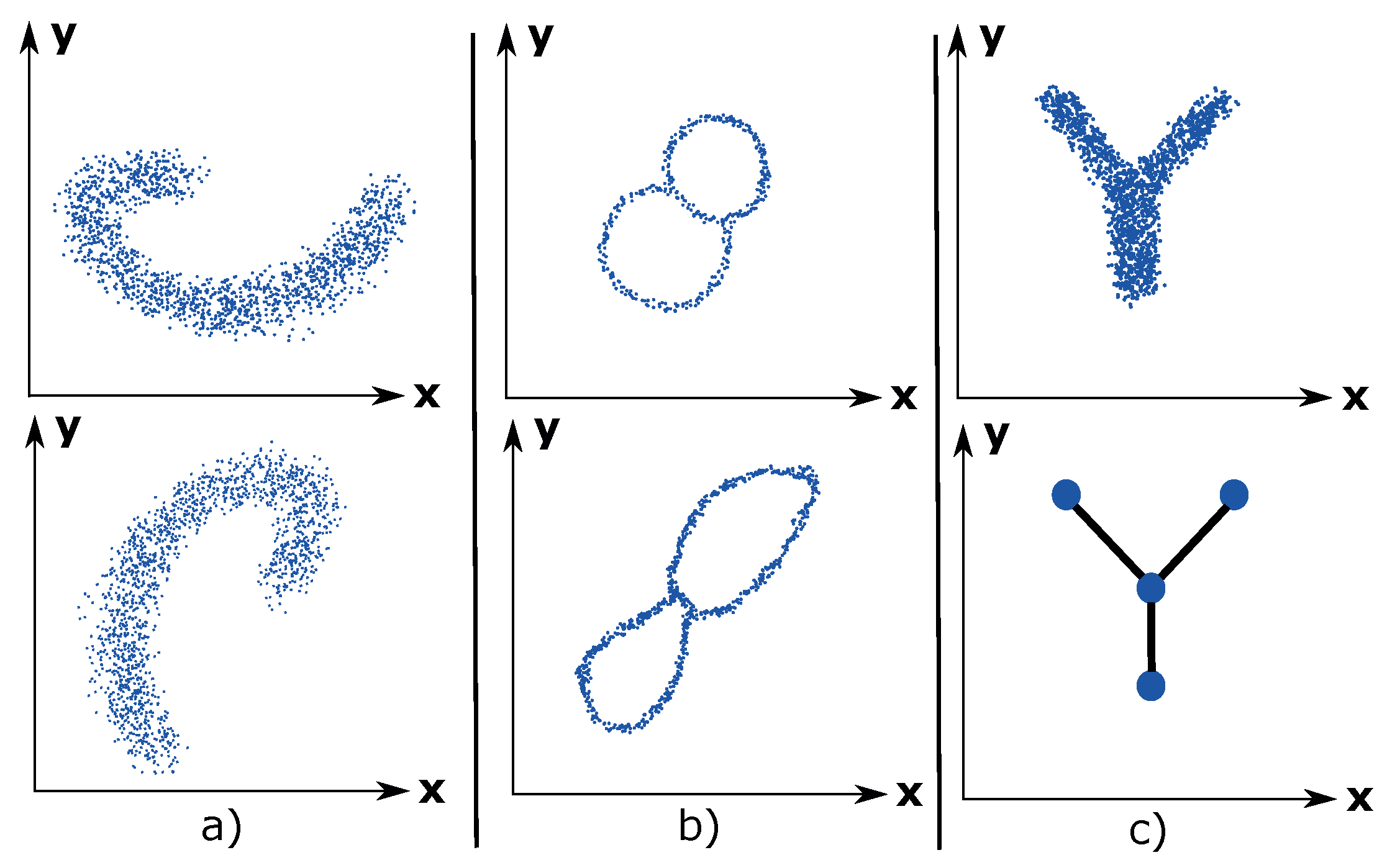
Coordinate invariance: TDA only considers the distances between data points as a notion of similarity (or dissimilarity). This means that a topological model can be rotated freely in space in order to enhance the visual analysis of the data. Compare this property with a common data analysis tool, such as principal component analysis (PCA), which ultimately decides the visual outcome of the data due to its projection of the data into maximum variance space of two or three dimensions. Figure 1a illustrates the coordinate invariance property for an arbitrary dataset.
Deformation invariance: Topology explains shapes in a different way compared to geometry. For example, a sphere and a cube are identical (homeomorphic) according to topology. Likewise, a circle and an ellipse are identical. White noise is inherent to any dataset and can be considered as a deformation of the underlying distribution of the dataset. Due to the deformation invariance property, TDA is a suitable method for analyzing noisy datasets and thus presents a more accurate visualization of the underlying dataset. An example of deformation invariance is the figure-8-shaped dataset in Figure 1b).
Compression: This property enables TDA to represent large datasets in a simple manner. Imagine having a dataset of millions of data points that have the shape of the letter Y. See Figure 1c). The compression property enables TDA to approximate the dataset using 4 nodes, which contains the data points, and 3 edges, which express the relations between the data points. This property makes TDA highly scalable.
2.2. Mapper
Mapper has had success in a wide range of application areas, from medical research studying cancer, diabetes, asthma, and many more topics [2,3,4,5], and genetics and phenotype studies [6,7,8,9,10], to hyperspectral imaging, material science, sports, and politics [11,12,13,14]. Of note for our approach are, in particular, the contributions to cancer, diabetes, and fragile X syndrome [2,3,6] where Mapper was used to extract new subgroups from a segmentation of the input space.
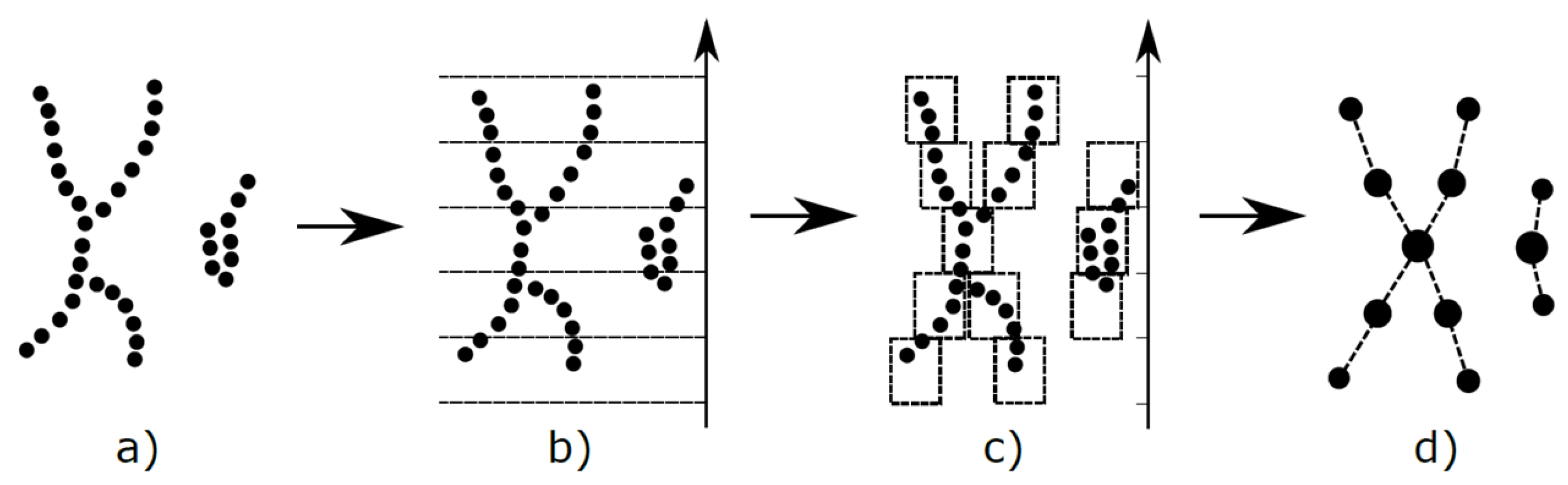
Mapper [55] is an algorithm that constructs a graphical (more generally a simplicial complex) model for a point cloud dataset. The graph is constructed systematically from some well defined input data. It was defined by [55], and has been shown to have great utility in the study of various kinds of datasets, as described previously. It can be viewed as a method of unsupervised analysis of data, in the same way as principal component analysis, multidimensional scaling, and projection pursuit can, but it is more flexible than any of these methods. Comparisons of the method with standard methods in the context of hyperspectral imaging have been documented in [11,12]. An illustration of Mapper is shown in Figure 2.
Let X be a finite metric space. The following steps construct the Mapper complex:
- Choose a collection of maps , or equivalently some . These are usually chosen to be statistically meaningful quantities such as variables in the dataset, density or centrality estimates, or outputs from a dimensionality reduction algorithm such as PCA or MDS. These are usually referred to as lenses or filters.
- Choose a covering of : an overlapping partition of possible filter value combinations.
- Pull the covering back to a covering of X, where .
- Refine the covering to a covering by clustering each .
- Create the nerve complex of the covering : as vertices of the complex we choose the indexing set of , and a simplex is included if . If we are only interested in the underlying Mapper graph, it suffices to add an edge connecting any two vertices whose corresponding sets of data points share some data point.
One fundamental inspiration to the Mapper algorithm is the Nerve lemma.
Nerve Lemma: If X is some arbitrary topological space and is a good cover with index i then , where has simplex if and only if .
Here, a good cover is a cover such that is either contractible or empty for all
If the function f, and the covering are chosen well enough, the covering may well be a good cover, in which case the topology of the Mapper complex reflects the topology of X itself.
The filters act as measures of enforced separation: data points with sufficiently different values for the filter function are guaranteed to be separated to distinct vertices in the Mapper complex, while the nerve complex construction ensures that connectivity information is not lost in the process.
In practice, one particular covering construction has gained widespread use. It creates axis-aligned overlapping hyperrectangles by the following process:
- For each , select (1) a positive integer and (2) a positive real number , with .
- For each filter where , let and denote the minimum and maximum values taken by , and construct the unique covering of the interval by subintervals of equal length . For the interior intervals in this covering, enlarge them by moving the right and left hand endpoints to the right and the left, respectively. For the leftmost (respectively rightmost) interval, perform the same enlargements on the right (respectively left) hand endpoints. Denote the intervals we have created by , from left to right.
- Construct the covering of X by all “cubes” of the form where . Note that this is a covering of X by overlapping sets.
Mapper has several implementations available: Python Mapper [57], Kepler Mapper [58], and TDAMapper [59] are all open source, while Ayasdi Inc. (http://ayasdi.com) provides a commercial implementation of the algorithm.
For our work we are using the Ayasdi implementation of Mapper.
2.3. FiFa: The General Case
In summary, the FiFa method is based on the following steps:
- Create a Mapper model that uses a measure of prediction failure as a filter.
- Classify hotspots of prediction failure in the Mapper model as distinct failure modes.
- Use the identified failure modes to construct a model correction layer or to provide a guidance for model refinement.
The process can be seen as classifying failure modes by analyzing the fibres of the map that goes from the input space to the observed prediction failure—analyzing the fibers of failure.
2.3.1. Mapper on Prediction Failure
The filters in the Mapper function have the effect of ensuring a separation of features in the data that are separated by the filter functions themselves. In the setting of prediction failures, we leverage this feature to create Mapper models that enforce a separation on prediction errors, allowing the subsequent analysis to identify contiguous regions of input space with consistent and large prediction errors.
We name the process of using Mapper with prediction error as a filter in order to classify prediction failures as the fibers of failure method, and the resulting Mapper model we name a FiFa model.
2.3.2. Extracting Subgroups
Subgroups of the FiFa model with tight connectivity in the graph structure and with homogeneous and large average prediction failure per component cluster provide a classification of failure modes. These can be selected either manually or using a community detection algorithm. When extracting subgroups manually, the intent is always to extract groups wherein the prediction error is as close to constant as possible. For community detection, most existing work in this area should be applicable. The Mapper implementation we are using uses a grouping method based on agglomerative hierarchical clustering (AHCL) [60,61] and Louvain modularity [62]. This grouping algorithm used by Ayasdi is patented [63].
2.3.3. Quantitative: Model Correction Layer
Once failure modes have been identified, one way to use the identification is to add a correction layer to the predictive process. This is done by using a classifier to recognize input data similarly to a known failure mode, and by adjusting the predictive process output according to the behavior of the failure mode in available training data.
Train classifiers. For our illustrative examples, we demonstrate several “one versus rest” binary classifier ensembles where each classifier is trained to recognize one of the failure modes (extracted subgroups) from the Mapper graph.
Evaluate bias. A classifier trained on a failure mode may well capture larger parts of test data than expected. As long as the space identified as a failure mode has consistent bias, it remains useful for model correction: by evaluating the bias in data captured by a failure mode classifier we can calibrate the correction layer.
Adjust model. The actual correction on new data is a type of ensemble model, and has flexibility on how to reconcile the bias prediction with the original model prediction—or even how to reconcile several bias predictions with each other. In the example cases used in this paper, we showcase two different methods for adjusting the model: on the one hand by replacing a classifier prediction with the most common class in the observed failure mode, and on the other hand by using the mean error as an offset.
Note on Type S and Type M errors.
The authors of [64] argue that for model evaluation, the distinction between Type I and Type II errors is less useful than a distinction between Type S (sign) and Type M (magnitude) errors. Drawing on these error types, we will structure our quantitative adjustments in the continuous case with careful attention paid to Type S errors.
To elaborate, if a failure mode is found to have consistently overly-high predictions, adjusting with the observed bias of the failure mode is likely to produce a better prediction for all points in the failure mode. However, a failure mode that has errors in both directions will exacerbate some errors when adjusting for bias in that failure mode.
We apply this philosophy primarily in our design of model correction layers: by restricting bias corrections to cases that have large (handling Type M) and consistent (handling Type S) errors, we can rely on a bias correction to improve prediction for all the observations it corrects.
2.3.4. Qualitative: Model Inspection
Identifying distinct failure modes and giving examples of these is valuable for model inspection and debugging. Statistical methods, such as Kolmogorov–Smirnov (KS) testing, can provide measures of how influential any one feature is in distinguishing one group from another and can give notions of what characterizes any one failure mode from other parts of input space. With examples and distinguishing features in hand, we can go back to the original model design and evaluate how to adapt the model to handle the failure modes better.
2.4. Statistical Modeling
We have chosen specific statistical measures to evaluate prediction errors for the two examples, described here in Section 2.4.1. For the subsequent qualitative analysis (as described in Section 2.3.4 above), we use the Kolmogorov–Smirnov statistic, described in Section 2.4.2, to determine the pairwise degree of dissimilarity between distributions.
2.4.1. Performance Metrics
The metrics used to evaluate the improved performance using the FiFa corrective layer for the EAF EE prediction model will be the coefficient of determination, , and the regular error function, .
The regular error function is preferable over the absolute error function, since an overestimation differs from an underestimation in a practical EAF process context.
The regular error is defined as:
where is the true value, is the predicted value, and .
The coefficient of determination is a measure of how well the statistical model approximates the true data points. It is a function of the total sum of squares, , and the residual sum of squares, .
where and . is the mean value of .
For the MNIST prediction model, which is a classifier-type statistical model, we used the prediction accuracy as a performance metric. MNIST contains 10 classes and the prediction accuracy defined as the fraction of the correctly predicted images in the set of images.
where
N is the number of images in the image set, , is the predicted class, and is the true class.
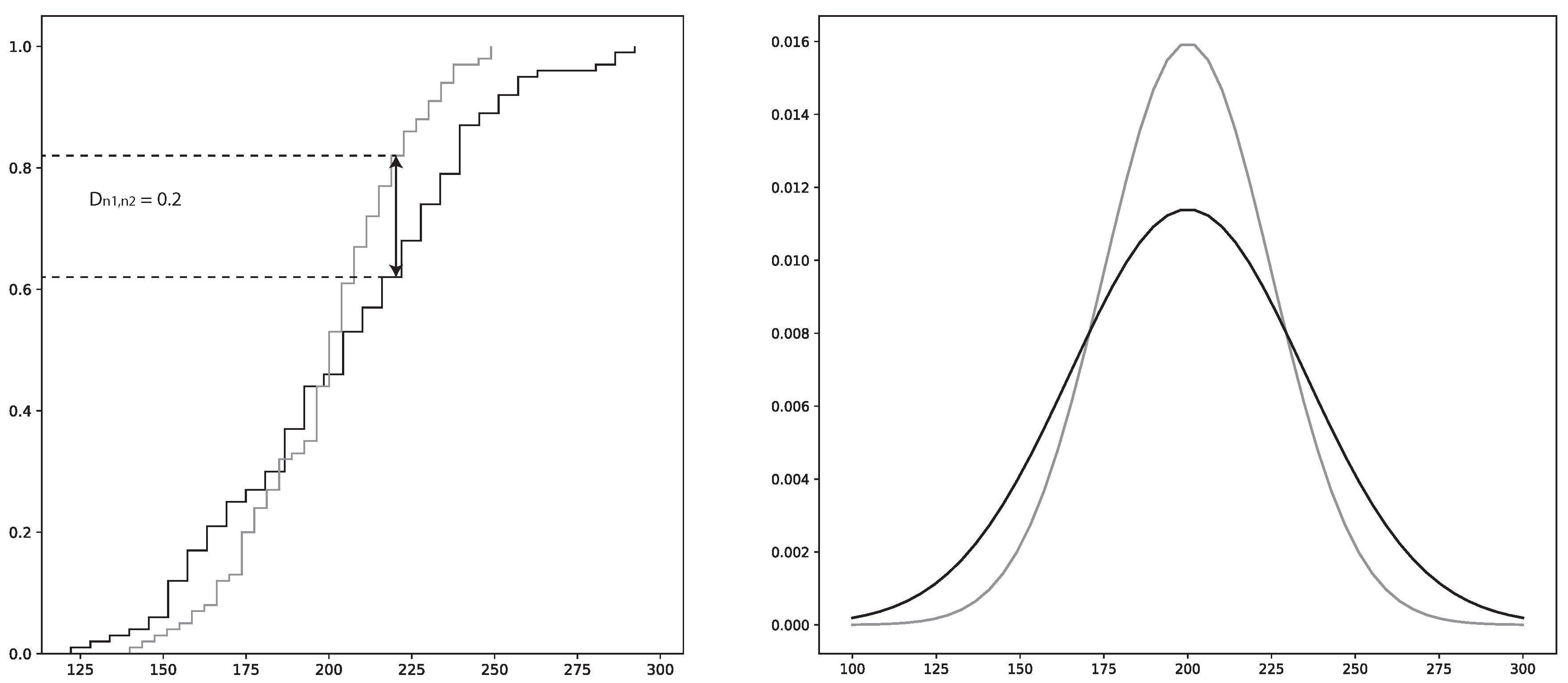
2.4.2. Kolmogorov–Smirnov (KS) Statistic
The KS statistic can be used to measure dissimilarity between the cumulative distribution functions (CDF) of two samples. This is specifically known as the two-sample KS test and gives the maximum difference between the two distributions [65]. The KS-test is a non-parametric statistical test which is favorable, since many of the parameters governing the EAF process are of varying classes of distributions [66].
To perform a KS test, the KS-value has to be calculated by using the null hypothesis, ; i.e., that the two samples have the same distribution. The confidence level, i.e., p-value, is the probability that the two samples come from the same distribution. The KS-value can have values in the range , where 0 indicates that the distributions of respective sample are identical and where 1 indicates that the distributions are totally different. Hence, a low p-value in tandem with a high KS-value is a strong indicator that the two samples are different
The two-sample KS test calculation proceeds as follows:
where and are the two distribution functions. and are the number of instances in each sample from the two distributions, respectively. x is the total sample space. sup is the supremum function. is illustrated in Figure 3.
is rejected if the following condition is satisfied:
where is a pre-determined significance level and c is the threshold value calculated using and the cumulative KS distribution [67].
The KS-test is used by FiFa to present the variables that separate a specific error group from the rest of the data. Thus, one of the samples will be from the specific error group and the other sample will be from the rest of the data. Using the KS-test on each variable will show the variables whose distributions are the most different between the two samples.
The main drawback of the KS-test is that it reduces the difference between the two distributions to the point of maximum difference of the CDF. Hence, the maximum difference may not be representative over the complete distribution space. To combat this shortcoming in the analysis, the plotted distributions of the two samples will be provided as a complementary tool.
2.5. MNIST Data with Added Noise
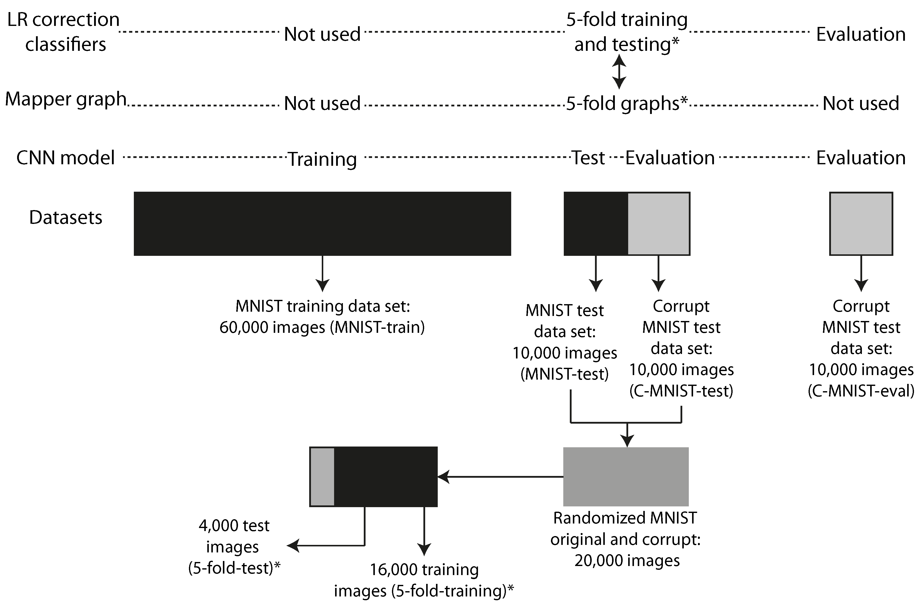
As a first example, we have chosen to work with the MNIST [68] database of handwritten digits and used the methods from the MNIST-C [69] test set. In order to provoke prediction failures to analyze, we have used the MNIST database as-is for training purposes, but have created noisy samples for evaluations, using the impulse noise method used in MNIST-C: The noise corruption was created by introducing random binary flips on 25% of the pixels of each of the images in the test portion of the database. The predictive model was trained exclusively on clean MNIST images, but then evaluated on its ability to generalize to the impulse noise corrupted images we created. Figure 5 illustrates how the different datasets are related in the experiments.
2.6. Electric Arc Furnace
The EAF process accounted for 28% of the total world production of steel, on average, between 2008 and 2017, and is therefore the second most common melting furnace in steelmaking [70]. It is a resource and energy intensive process, where electrical energy (EE) can account for up to 66% of the total energy input. See Table 1.
The amount of EE consumed by the EAF sheds light on the potential to optimize the consumption of EE. The gain is twofold. First, the cost for producing steel will be reduced in tandem with a reduced EE consumption. Second, the environmental impact will be reduced since less energy is needed for each batch of produced steel. Numerous studies utilizing statistical models (machine learning) to optimize the EE of the EAF have previously been conducted. A review on the subject concluded that non-linear statistical models have significantly better performance over linear statistical models when predicting the EE of the EAF [76]. The main reason for this is that the EAF process itself is subjected to numerous non-linear impositions governed by its physicochemical nature, and delays imposed by downstream and upstream processes. Delays are also imposed by unpredictable events, such as equipment failures. This has been discussed in depth in previous research [66,76]. Hence, the choice of a statistical modeling framework has to be adapted to the non-linearity of the process.
However, non-linear statistical models are almost impossible to analyze due to their complex mapping of the input data to the output data. This hampers the process engineers’ understanding, and therefore trust, in the model. It is always of paramount importance that the process operators trust the tools that are used to guide the process towards minimum operating costs and environmental impacts. Previous tools that have been applied to these types of statistical models are permutation feature importance and SHAP [53,66]. However, these tools only provide the relative importance of each feature for each prediction, while FiFa provides subgroups where the error by the modes is unusually large. Hence, FiFa could prove to be a valuable tool in the arsenal of interpretable machine learning methods for the steel process engineers.
2.7. Selected Models for Analysis
In order to produce examples of FiFa in action, we have produced two distinct predictive models—one for each dataset described in preceding sections. Specifications about the software used in the experiments can be viewed in Table A3.
2.7.1. CNN Model Predicting Handwritten Digits
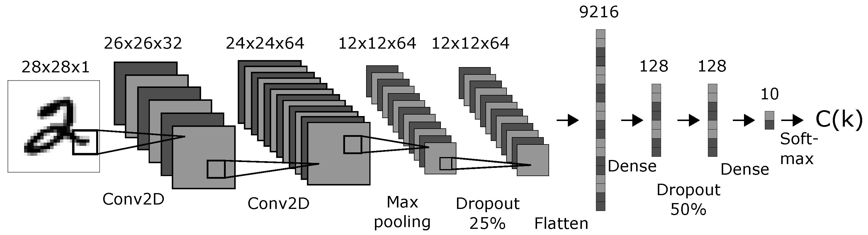
We created a CNN model with a topology shown in Figure 4. The topology and parameters were chosen arbitrarily with the only condition: that the resulting model performed well on the original MNIST test dataset. The activation functions was “softmax” for the classification layer and “ReLU” for all other layers. The optimizer was Adadelta with learning rate , , and [77]. We trained the model on 60,000 clean MNIST training images (MNIST-train) through 12 epochs and tested it on 10,000 clean MNIST images (MNIST-test). The accuracy on the test-set of 10,000 clean MNIST images was 99.05%. We created 10,000 corrupt MNIST images (C-MNIST-test) using 25% random binary flips on the clean test images. The code is available in the Supplementary material [78]. The accuracy on the corrupt MNIST images was 40.45%. The datasets used to train, test, and evaluate the CNN model are illustrated in Figure 5.
2.7.2. ANN Model Predicting the EE Consumption of an EAF
The chosen model framework was the artificial neural network (ANN), which is commonly used for modeling non-linear problems and has previously been used to model the EE consumption of the EAF [66,76]. A grid-search was conducted to find the optimal numbers of hidden layers and hidden nodes, and the most optimal delay variable from a set of 5 variables representing the delays imposed on the process. See Table A1 and Table A2 in the Appendix A for details regarding the grid-search. The variables used in the selected model are shown in Table 2. The variables were chosen based on their respective contributions to the increase or reduction in EE from a physicochemical perspective. In order to investigate the stability of each set of parameters, a total of 10 model iterations were conducted for each grid-search parameter setup. The strategy employed to select the best model was to pick the model with the highest mean and the difference between maximum and minimum of less than 0.05. See Appendix A and the software used to create the models.
The selected model parameters using the grid-search had 1 hidden layer with 20 hidden nodes. The delay variable was “all delays”. The rest of the variables are shown in Table 2.
2.8. FiFa on the MNIST Model
2.8.1. Quantitative
To create the Mapper graph we used the following approach:
- Filters: Principal component 1, probability of Predicted digit, probability of ground truth digit, and ground truth digit. Our measure of predictive error is the probability of ground truth digit. By including the ground truth digit itself, we separate the model on ground truth, guaranteeing that any one one failure mode has a consistent ground truth that can be used for corrections.
- Metric: Variance normalized euclidean.
- Variables: 9472 network activations: all activations after the dropout layer that finishes the convolutional part in the network and before the softmax layer that provides the final predictions. These are the layers with 9216, 128, and 128 nodes displayed in Figure 4.
- Instances: We used 16,000 data points (5-fold-training), and a selection of 4 of the 5 folds from a randomized mix of the MNIST-test and C-MNIST-test datasets. See Figure 5 for an illustration.
We purposely omitted the activations from the Dense-10 layer as input variables because of the direct reference to the probabilities for both the ground truth digit and the predicted digit.
The following variables were used in filter functions or in the subsequent analysis, but were not used to create the FiFa model:
- Ten activations from the Dense-10 layer, which consist of the probabilities for each digit, 0–9.
- Seven-hundred and eighty-four pixel values representing the flattened MNIST image of size 28 × 28 × 1.
- Six variables: prediction by the CNN model, ground truth digit, corrupt or original data (binary), correct or incorrect prediction (binary), probability of the predicted digit (highest value of the Dense-10 layer), and probability of the ground truth digit.
Hence, the total number of variables in our analysis was 10,272.
From partitioned groups in the Mapper graph, we retain as failure modes those groups that have at least 15 data points and have less than 99.05% correct predictions, which is the accuracy of the CNN model on the original MNIST test data (MNIST-train). We then trained logistic regression classifiers in a one versus rest scheme on each group using the same 16,000 data points (5-fold-training) used to create the Mapper graph. (The one versus rest scheme is an ensemble method for converting a binary classifier to a classifier able to work on more than two groups. For each group, a separate classifier is trained to distinguish that group from the rest of the data. To use the classifier ensemble, the individual classifier results are combined to form a classification of the data.) We used logistic regression (LR) models with the following parameters. Penalty function: . Regularization parameter . The regularization term that corrects the most number of MNIST images on the 5-fold-test dataset will be used.
Using the best performing model ensemble, we evaluated each model on a second dataset, called C-MNIST-eval, which consisted of 10,000 new corrupt images using 25% binary flips on the original MNIST test dataset (C-MNIST-test). The same impulse noise method was used both to produce test images to evaluate the performance of the CNN as input to the Mapper process, and for the final evaluation of the performance of the combined CNN + correction layer model. Hence, we used the same noise pattern as the corrupt images used for testing the CNN model. See Section 2.7.1 for details regarding the noising methodology.
As we trained the classifiers on groups containing many wrong predictions, it was expected that the classifiers would classify member points with wrong predictions on the test datasets. Hence, we offset the predicted digits in the 5-fold-test and the C-MNIST-eval datasets with the ground truth digit of the group each classifier was trained on. We attempted to exploit the consistent bias of the classifiers to improve the accuracy of the now combined CNN and classifier ensemble.
The FiFa procedure was repeated using five different splits of the training and test datasets in order to mitigate the effects of selection bias when creating the Mapper graph. This procedure is equivalent to the 5-fold cross-validation methodology in the field of machine learning used to mitigate the effects of selection bias. Hence, each of the 5 Mapper graphs were created using 5 different selections of 16,000 (5-fold-training) of the available 20,000 data points consisting of 10,000 test MNIST images (MNIST-test) and 10,000 corrupt MNIST test images (C-MNIST-test) using 25% binary flips. See Section 2.7.1 for details regarding the noising methodology. The rest of the 4000 data points (5-fold-test) were used to evaluate the ensemble correction classifier. See Figure 5 for a detailed illustration on how the datasets were created and how they are related.
2.8.2. Qualitative
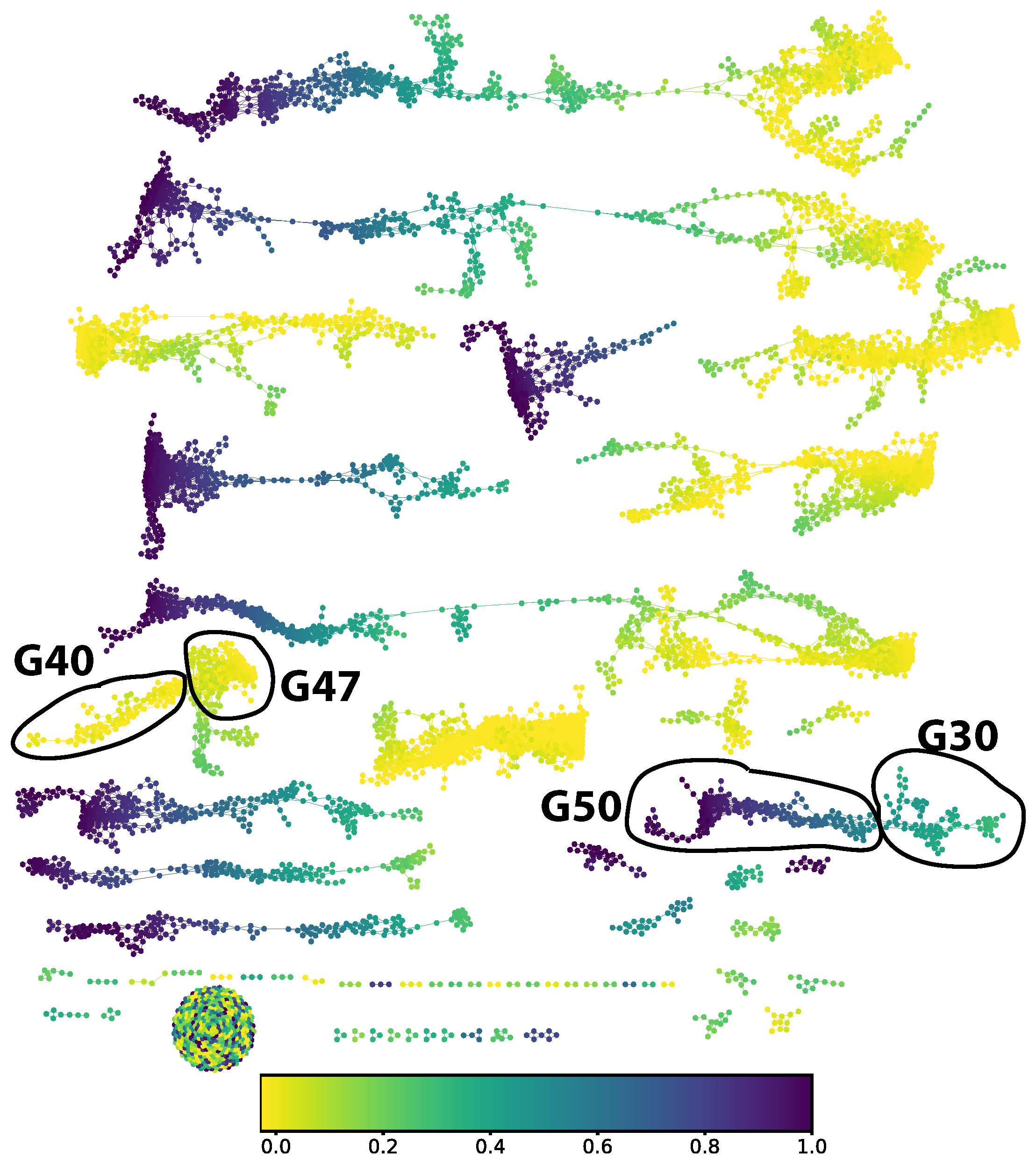
We chose to study the digit 5. From the Mapper graph (in Figure 6) the part corresponding to a ground truth digit 5 decomposes into two connected components. We split out four groups of approximately locally constant prediction error: groups 30, 40, 47, and 50 in the numbering scheme generated by the community finding algorithm used.
For these four groups of observations, we then generated on the one hand the distributions of classifications from the CNN classifier—seen in Figure 8—and on the other hand a collection of saliency maps [79] to allow us to inspect the different responses of individual neural network activations to digits in the various groups. We chose activations to inspect by looking for the highest KS-score when comparing each group to the correctly classified group 50.
2.9. FiFa on the EE Consumption Model
2.9.1. Quantitative
The following parameters were used to create the Mapper graph:
- Filters: principal component 1, the model error, and the true EE consumption.
- Metric: inter-quartile range (IQR) normalized euclidean.
- Variables: forty-eight variables; see Table A4.
- Instances: the same data points, from 9533 heats, used to train the ANN model for predicting the EE consumption.
We trained an ensemble of logistic regression classifiers in a one versus rest scheme to identify membership in each of the groups with at least 15 data points in the training data. To make the corrected model more attractive to the model users, we restricted the resulting classifiers to ensure that each classifier would produce explainable adjustments. A classifier within the ensemble is qualified to adjust the test data if the following two conditions are satisfied:
- The average error value imposed by the predicted data points on the training data, , must be of the same sign (type S error) as the average group error value, . This is to ensure that the errors of the predicted data points by each classifer are consistent with errors of the groups they have been trained to predict.
- The error after adjustment of the group data cannot be worse than the group error,.This is to verify that the classifier can identify data points that have, on average, somewhat similar error values as the group it is trained to identify.
The mean error, standard error, max/min errors, and are recorded prior to the adjustment and after the adjustment of the test data. The number of test data points is 2384. The ensemble with the highest decrease in standard error and highest increase in for the test data is chosen. The following values for the logistic regularization parameters, C, were used to determine the best performing classifier ensemble: .
Unlike the CNN model case, the FiFa procedure was not repeated using five different splits of the training and test datasets. A model that is used in practice will predict on data that have been generated from a future point in time with respect to the data used to train the model. Hence, the test data must be selected in chronological order from the training data. Hence, a K-fold cross-validation does not make sense in this case.
2.9.2. Qualitative
The qualitative inspection for each of the two Mapper graphs was conducted by selecting 4 of the largest groups. Two with the highest -values and two with the lowest -values. Each of the groups was then compared to the rest of the data points. The 5 variables with the highest KS-values and the 5 variables with the lowest KS-values were analyzed further using EAF process expertise to determine reasons behind the model prediction error. The variables were selected if the p-value () was lower than 0.01 in order to reduce the probability of selecting a variable whose KS-value was due to randomness. In addition, the variables were prone to contain extreme outliers. Hence, the distribution plots for each variable are shown for all values that are not part of the 1000-quantile.
3. Results and Discussion
3.1. MNIST Model
3.1.1. Quantitative
The logistic regression model with the best adjustment on the corrupt data had a C-value of 1000. The average number of data points in all failure mode groups in the five folds was 4937 of the total 16,000 (5-fold-training). The average number of clean data points in all groups in the five folds was 10.4, accounting for a fraction of 0.21% of the 4937 data points. This also means that the failure mode groups encompass roughly 62% of all corrupt data points, on average, in each training set of the 5-folds. The numbers of failure modes (extracted subgroups) in each fold were 41, 41, 41, 41, and 37, respectively.
Table 3 shows the accuracy on the two test datasets using CNN with and without FiFa. The correction layer improved the CNN model by 6.05%pt on the 5-fold-test dataset and 18.43%pt on the C-MNIST-eval dataset. This is considered a significant improvement over the original CNN model.
3.1.2. Qualitative
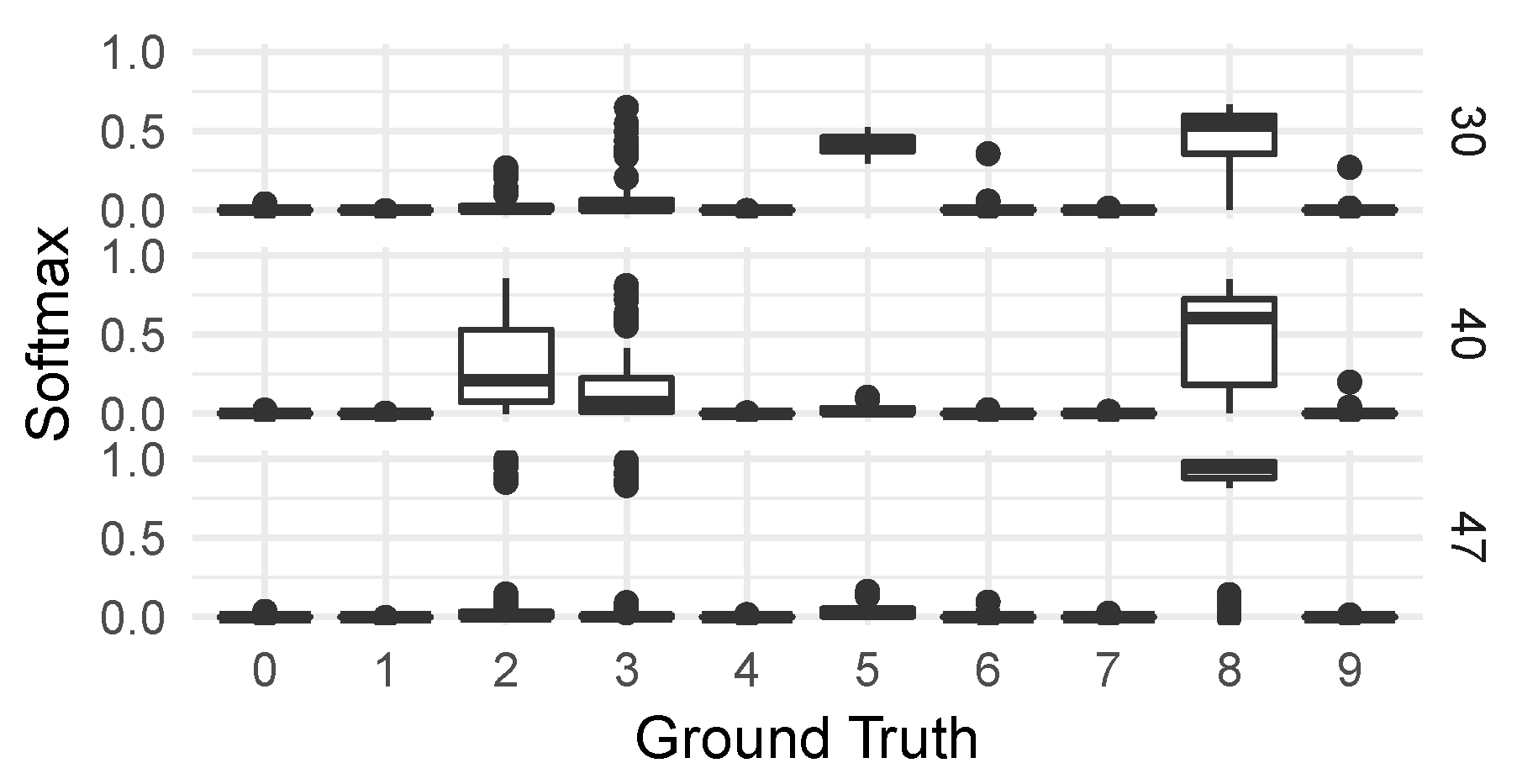
For the qualitative analysis, we chose to focus on four groups with digit five as the ground truth digit: group 50, which is not one of the failure mode groups, and groups 30, 40, and 47, all part of the total 39 failure mode groups. The location of each group in the Mapper graph is shown in Figure 6. The distributions of predicted probabilities for each digit in the three failure mode groups are shown in Figure 7: group 30 is the group with the highest probability to the digit five, while 40 and 47 are more focused on eight, two, and three. All three groups favor digit eight, as their mean probabilities are between 0.5 and 0.9.
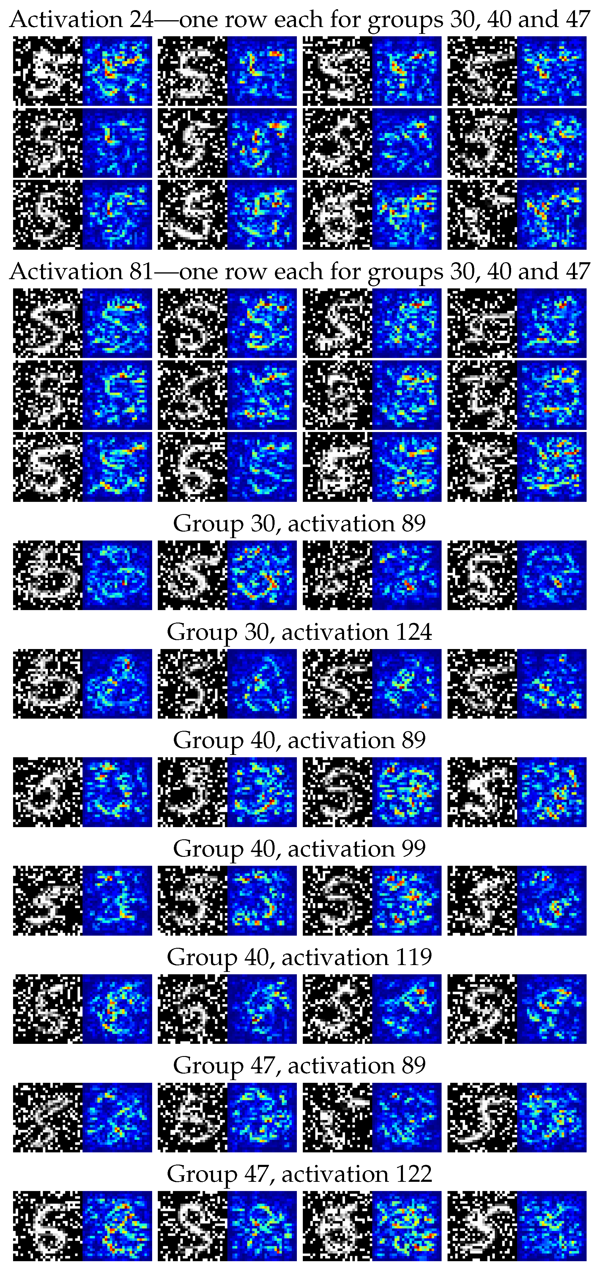
We compared these three failure modes with the non-failure group 50 and extracted the five activations with the highest KS-values from the Dense-128 layer; see Figure 4. To illustrate the differences between the three failure modes regarding the activations, we have provided a selection of saliency maps [79] for all images considered as true members of each of the three failure mode groups. These were all produced using the keras-vis Python package.
Figure 8 shows a selection of noisy images and their saliency maps for some of the activations’ highest KS-values within the Dense-128 layer. The two leftmost image pairs were selected based on visual clear saliency maps with respect to digits. The two rightmost were selected based on most unclear/noisy saliency maps. The full collection of saliency maps for these groups can be found in our Supplementary Material [78].
The activations 24 and 81, present in all three groups, display activity that is consistent with an activation detecting features of the digit five. The activations 89 and 99 correspond closer to an activation for the digit three and 119; 122 and 124 correspond to activations for the digit eight. In particular, in the last three groups, noise that closes loops in a written five tend to have high saliency.
In Table 4 we show the percentage of blank saliency maps, indicating how often an activation by the neuron is missing completely for the group’s classified membership images. A blank saliency map for a particular image means that the neuron does not “send” its contribution further down the neural network, because the activation is equal to zero. For example, consider a neuron particularly prone to recognize digit five that also has a large percentage of blank saliency maps for a certain set of images. The resulting predictions will have a lower probability for digit five than another set of images with lower percentage of blank saliency maps.
3.2. EE Consumption Model
3.2.1. Quantitative
In total, 7806 data points were captured by 88 groups containing 15 or more data points. This corresponds to 82% of the total data points since the total number of data points to create the Mapper graph was 9533. The adjustment results from the classifier ensembles are shown in Table 5. A reduction in Std. and an increase in the -value can be seen after the adjustment by the ensemble classifier. While this is indeed an improvement, it is hard to justify the improvement from a practical EAF process perspective. The standard improvement is only 121 kWh/heat, which from a process perspective is within the white noise of physico-chemical phenomena underpinning the EAF process. For example, the 121 kWh improvement is an approximate equivalent of 300 kg less scrap added to the heat. This small amount could easily be attributable to current scrap weighting sensitivity levels and is therefore comparable to the variations in the data due to white noise.
3.2.2. Qualitative
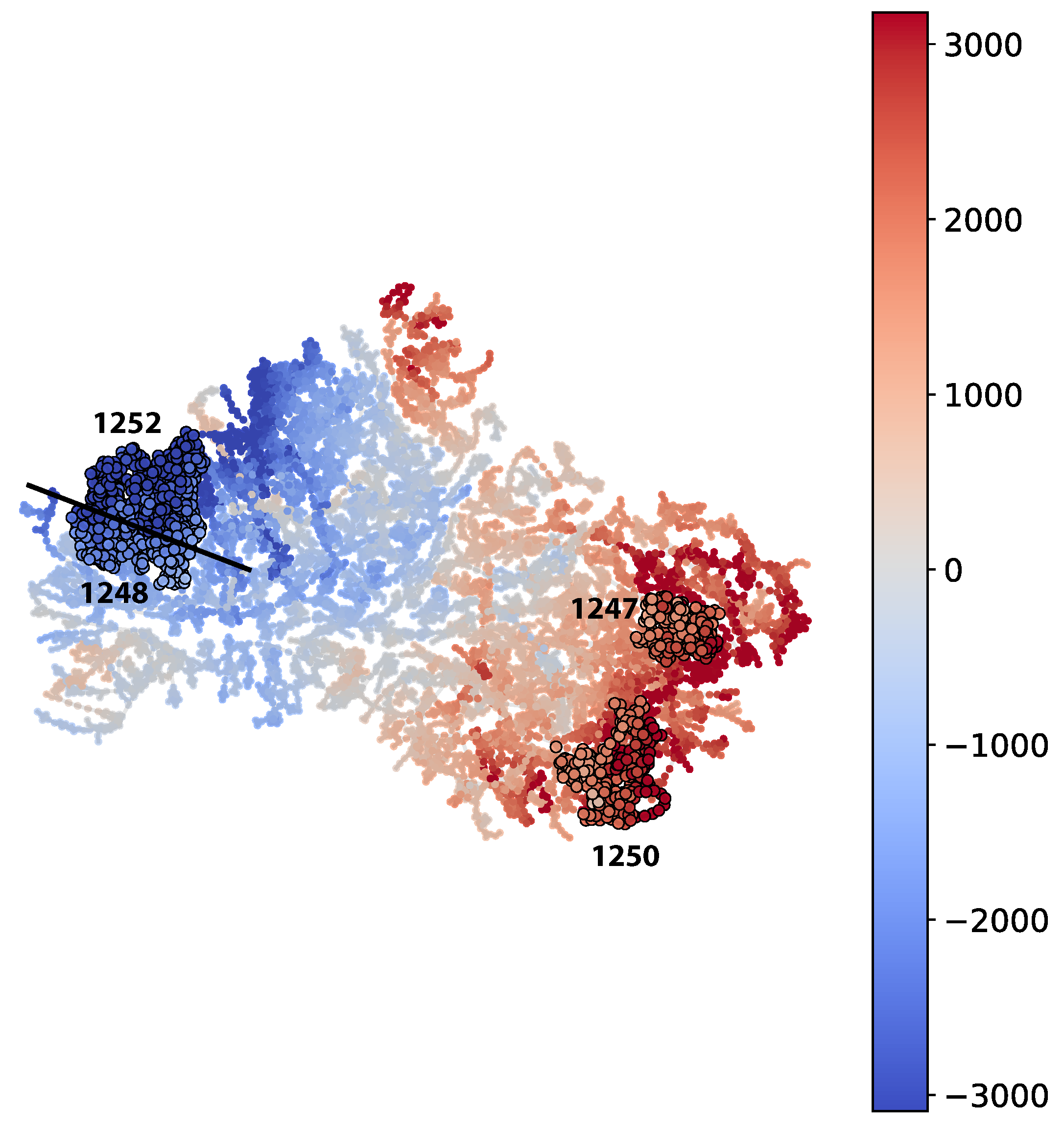
The Mapper graph is shown in Figure 9. It is possible to observe an ability for Mapper to separate subgroups with high positive error from subgroups with high negative error.
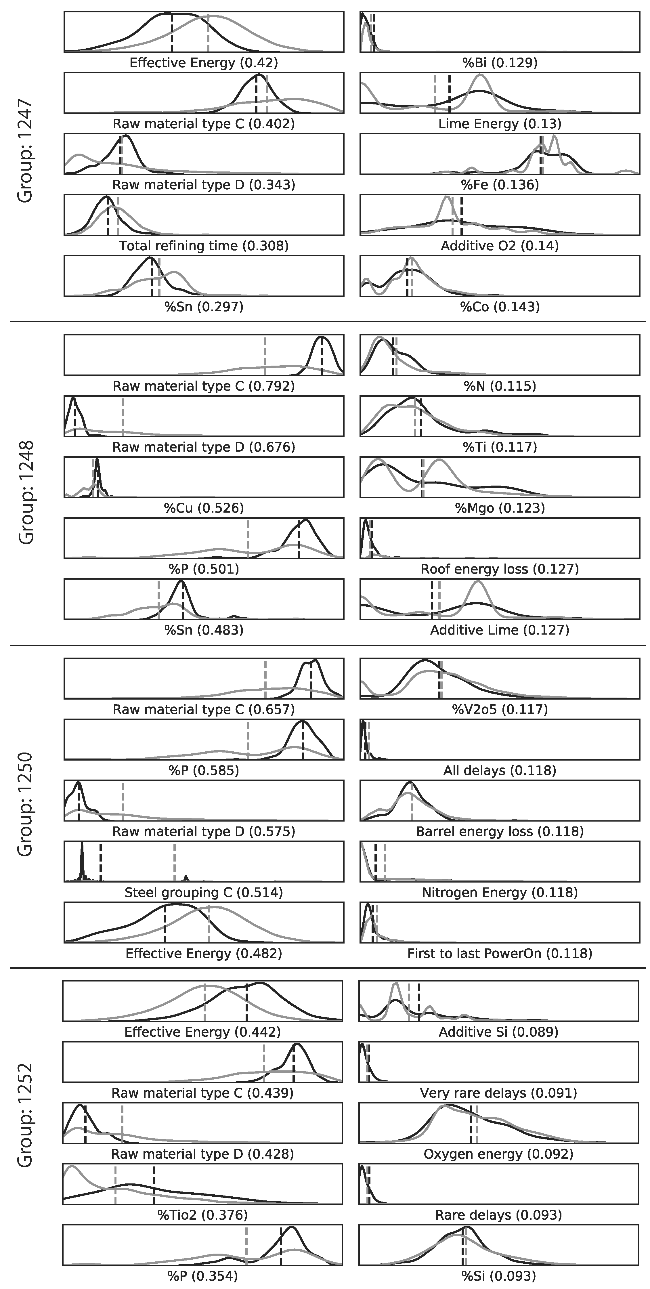
Near zero p-values are present for all top-five KS-value variables in all four groups highlighted in Figure 10. However, the differences in KS-values, which take values from 0 to 1, vary between 0.331 to 0.792. A higher KS-value indicates that the two samples are not from the same distribution compared to a KS-value that is lower, as discussed in Section 2.4.2.
The use of FiFa made it possible to pinpoint raw material types C and D as two of the most predominant variables in separating each of the four groups from the rest of the data. From process experience it is known that raw material types have a large effect on the energy dynamics within the furnace and thus also on the EE consumption. Since raw material types are variable in the prediction model, it is clear that the model misjudges the impact of these raw material types on the true EE consumption.
The effective energy is a proprietary variable estimating the amount of energy that is effectively utilized during the EAF process. It is closely related to the energy dynamics of the process, but was not used as a input variable for the prediction model. However, it is possible to observe that group 1247 and group 1250 have lower effective energy than the rest of the data, while group 1252 has a higher effective energy than the rest of the data. The prediction model overestimates the EE for the heats in group 1247 and group 1250, while it underestimates the EE for the heats in group 1252.
4. Conclusions
This study demonstrated the use of fibers of failure, FiFa, to analyze distinct error modes from two predictive processes; namely, the CNN model predicting handwritten digits from the MNIST dataset and the ANN model predicting the EE consumption of an EAF. This was accomplished by using both a quantitative and a qualitative approach on two diverse cases.
For the CNN model predicting corrupt MNIST images (C-MNIST-eval), a 18.43 percentage accuracy increase was achieved using the quantitative path. Using the qualitative approach, the CNN model was prone to misclassifying “5” as “8” for several selected failure modes. This is not surprising, since “5” and “8” have similar “traces” when written by hand. The results from the saliency maps provided further support to this conclusion by highlighting areas of higher and lower activations in the penultimate dense layer of the CNN model.
For the ANN model predicting the EE consumption of an EAF, the qualitative approach provided some interesting insights. It was found that two distinct raw material types out of the seven available raw material types were among the five variables with the highest KS-values for the four selected subgroups. This provides a guidance when improving future models with regard to the two raw material types. However, the quantitative approach did not significantly improve the EE predictions. The performance improvement was in magnitude comparable to added noise by measurement errors in the EAF process.
Author Contributions
Conceptualization, M.V.-J. and G.C.; methodology, L.S.C., M.V.-J. and G.C.; software, L.S.C. and M.V-J; validation, L.S.C.; formal analysis, L.S.C.; investigation, L.S.C.; resources, G.C. and M.V-J; data curation, L.S.C. and M.V.-J.; writing—original draft preparation, L.S.C. and M.V.-J.; writing—review and editing, all authors; visualization, L.S.C. and M.V.-J.; supervision, P.G.J. and M.V.-J.; project administration, M.V.-J. and P.G.J.; funding acquisition, P.G.J. All authors have read and agreed to the published version of the manuscript.
Funding
This research was funded by “Hugo Carlssons Stiftelse för vetenskaplig forskning” in the form of a scholarship granted to L.S.C. Partial support for this project was provided to M.V.-J. by a PSC-CUNY Award, jointly funded by The Professional Staff Congress and The City University of New York.
Acknowledgments
We want to thank the plant engineers at the Outokumpu Stainless Avesta mill for their support and data provisioning during this project. We also want to thank our two anonymous reviewers for extensive and helpful feedback.
Conflicts of Interest
The authors declare no conflict of interest. The funders had no role in the design of the study; in the collection, analyses, or interpretation of data; in the writing of the manuscript, or in the decision to publish the results.
Abbreviations
The following abbreviations are used in this manuscript:
| SHAP | Shapley Additive Explanations |
| AHCL | Agglomerative Hierarchical Clustering |
| PCA | Principal Component Analysis |
| ANN | Artificial Neural Network |
| CNN | Convolutional Neural Network |
| EAF | Electric Arc Furnace |
| EE | Electrical Energy |
| FiFa | Fibres of Failure |
| KS | Kolmogorov–Smirnov |
| LR | Logistic Regression |
| TDA | Topological Data Analysis |
| CDF | Cumulative Distribution Function |
Appendix A

Table A1.
The parameters that were varied and the resulting total number of models used in the grid-search.
Table A1.
The parameters that were varied and the resulting total number of models used in the grid-search.
| Parameter | Values | Description | Number of Parameters |
|---|---|---|---|
| Delay variables | See Table A4. | 5 unique segmentations of the delays imposed during each heat | 5 |
| Hidden layers | Number of layers between the input and output layers | 2 | |
| Hidden nodes | Number of nodes in each hidden layer | 24 | |
| Total number of models: | 240 |
Table A2.
Parameters that were not varied in the grid-search. Specifications can be seen in the Scikit-learn package MLPRegressor that was used to create the models. See Table A3 for the software used to create the models.
Table A2.
Parameters that were not varied in the grid-search. Specifications can be seen in the Scikit-learn package MLPRegressor that was used to create the models. See Table A3 for the software used to create the models.
| Parameter | Value | Description |
|---|---|---|
| Output variable | Electrical Energy | The goal of the model is to optimize for the true EE consumption |
| No. training data points | 9533 | Selected from approximately 2 subsequent years of production |
| No. test data points | 2384 | Selected in chronological order with respect to the training data |
| Activation function | Logistic | Function applied between layers in the network |
| Tolerance | Minimum change before training stops | |
| Max iterations | 5000 | Maximum number of iterations before training stops |
| No. iterations with no change | 20 | Number of iterations with no change (below tolerance) before training stops |
| Validation fraction | 0.2 | Fraction of training data used as validation set |
| Optimizer | Adam | First moment vector = 0.9. Second moment vector = 0.999 [80]. |
| Learning rate | 0.001 | Constant learning rate. |
Table A3.
Software used in the experiments.
| Software | Purpose |
|---|---|
| Anaconda | Python software bundle [81]. |
| Scikit-learn | Python package providing basic machine learning models |
| Keras | Python package providing deep learning modeling; CNN. |
| Keras-vis | Python package providing visualisation tools for Keras. |
| Pandas | Python package for handling tabular data |
| Matplotlib | Python package for plotting and drawing of Mapper graphs |
| Ayasdi SDK | Python package used to retrieve results from Mapper provided by Ayasdi, Inc. [82]. |
Table A4.
All variables used in the EAF case. The “Count” column shows the number of variables representing the parameter. The ANN/FiFa column indicates whether the variables were used as input variables in their respective models: “x” indicates the variable(s) is part of the model while “-” indicates the variable is absent. Completely absent variables in both ANN and FiFa were still part of the qualitative analysis using the KS-statistic to identify groups in the Mapper graph.
| Parameter(s) | Description | Unit | Count | ANN/FiFa |
|---|---|---|---|---|
| Electrical energy | The electrical energy consumption logged in the transformer system | kWh | 1 | -/- |
| Error | The error from the ANN model predicting the electrical energy consumption | kWh | 1 | -/- |
| Pre-heater energy | The calculated energy provided to the scrap by the scrap pre-heater | kWh | 1 | -/x |
| Other energy variables | Related to the proprietary energy model used to determine when the molten steel is ready for tapping. | kWh | 12 | -/- |
| Total Weight | Total input weight of charged material | kg | 1 | x/x |
| Metal Weight | Total input weight of metallic material | kg | 1 | -/x |
| Slag Weight | Total input weight of oxide material | kg | 1 | -/x |
| Oxide composition | Weight percent of 11 oxides and 1 flouride | wt% | 12 | -/x |
| Metal composition | Weight percent of 26 alloying elements | wt% | 26 | -/x |
| Additive Propane | Total input of propane | 1 | x/x | |
| Additive O2 | Total input of oxygen gas through lance | 1 | x/x | |
| Additive O2 Burner | Total input of oxygen gas through burner | 1 | x/x | |
| Additive N2 | Total input of nitrogen gas through lance | 1 | -/x | |
| Rawtypes | Total input weight of each raw material category | kg | 7 | x/x |
| Process Time | Defined as start of the heat to the end of the heat | min | 1 | x/x |
| Tap-To-Tap Time | Defined in the proprietary logging system | min | 1 | x/x |
| Power-on Time | Defined as the total time the electrical energy source is powered on | s | 1 | -/- |
| Power-off Time | Defined as the total time the electrical energy source is powered off | s | 1 | -/- |
| First to last power-on | Time between first to last power on of the electrical energy source | min | 1 | -/x |
| Charging Time | Total time spent charging scrap into the furnace | min | 1 | -/x |
| Melting Remelting Time | Total time in melting and remelting stags of the process | min | 1 | -/x |
| Melting Time | Total time in the melting stage of the process | min | 1 | -/x |
| Refining Time | Total time in the refining stage of the process | min | 1 | -/x |
| Tapping Time | Total time spent in the tapping stage | min | 1 | -/x |
| Preparation Time | Total preparation time before the start of the process. | min | 1 | -/x |
| All Delays | Includes all delays imposed on the heat | s | 1 | x/x |
| Only wait delays | Includes only delays classified as “wait” type | s | 1 | x/x |
| Rare delays⋆ | All delays excluding those that are expected to frequently occur | s | 1 | x/x |
| Very rare delays† | All delays excluding those that are very rare | s | 1 | x/x |
| Common delays | All delays except those defined in ☆ and † | s | 1 | x/x |
| Steeltype categories | The categorization of steel types produced in the EAF | - | 8 | -/- |
| Production indices | To keep order of the heats relative to the production supply chain | - | 6 | -/- |
References
- Box, G.E. Robustness in the strategy of scientific model building. In Robustness in Statistics; Elsevier: Amsterdam, The Netherlands, 1979; pp. 201–236. [Google Scholar]
- Nicolau, M.; Levine, A.J.; Carlsson, G. Topology based data analysis identifies a subgroup of breast cancers with a unique mutational profile and excellent survival. Proc. Natl. Acad. Sci. USA 2011, 108, 7265–7270. [Google Scholar] [CrossRef] [Green Version]
- Li, L.; Cheng, W.Y.; Glicksberg, B.S.; Gottesman, O.; Tamler, R.; Chen, R.; Bottinger, E.P.; Dudley, J.T. Identification of type 2 diabetes subgroups through topological analysis of patient similarity. Sci. Transl. Med. 2015, 7, 311ra174. [Google Scholar] [CrossRef] [Green Version]
- Hinks, T.; Brown, T.; Lau, L.; Rupani, H.; Barber, C.; Elliott, S.; Ward, J.; Ono, J.; Ohta, S.; Izuhara, K.; et al. Multidimensional endotyping in patients with severe asthma reveals inflammatory heterogeneity in matrix metalloproteinases and chitinase 3–like protein 1. J. Allergy Clin. Immunol. 2016, 138, 61–75. [Google Scholar] [CrossRef] [PubMed] [Green Version]
- Schneider, D.S.; Torres, B.Y.; Oliveira, J.H.M.; Tate, A.T.; Rath, P.; Cumnock, K. Tracking resilience to infections by mapping disease space. PLoS Biol. 2016, 14, e1002436. [Google Scholar]
- Romano, D.; Nicolau, M.; Quintin, E.M.; Mazaika, P.K.; Lightbody, A.A.; Hazlett, H.C.; Piven, J.; Carlsson, G.; Reiss, A.L. Topological methods reveal high and low functioning neuro-phenotypes within fragile X syndrome. Hum. Brain Mapp. 2014, 35, 4904–4915. [Google Scholar] [CrossRef] [Green Version]
- Carlsson, G. The shape of biomedical data. Curr. Opin. Syst. Biol. 2017, 1, 109–113. [Google Scholar] [CrossRef]
- Cámara, P.G. Topological methods for genomics: Present and future direction. Curr. Opin. Syst. Biol. 2017, 1, 95–101. [Google Scholar] [CrossRef] [PubMed] [Green Version]
- Savir, A.; Toth, G.; Duponchel, L. Topological data analysis (TDA) applied to reveal pedogenetic principles of European topsoil system. Sci. Total Environ. 2017, 586, 1091–1100. [Google Scholar]
- Bowman, G.; Huang, X.; Yao, Y.; Sun, J.; Carlsson, G.; Guibas, L.; Pande, V. Structural Insight into RNA Hairpin Folding Intermediates. JACS Commun. 2008, 130, 9676–9678. [Google Scholar] [CrossRef]
- Duponchel, L. Exploring hyperspectral imaging data sets with topological data analysis. Anal. Chim. Acta 2018, 1000, 123–131. [Google Scholar] [CrossRef]
- Duponchel, L. When remote sensing meets topological data analysis. J. Spectr. Imaging 2018, 7, a1. [Google Scholar] [CrossRef] [Green Version]
- Lee, Y.; arthel, S.D.B.; Dlotko, P.; Moosavi, S.M.; Hess, K.; Smit, B. Quantifying similarity of pore-geometry in nanoporous materials. Nat. Commun. 2017, 8, 1–8. [Google Scholar] [CrossRef] [PubMed] [Green Version]
- Lum, P.Y.; Singh, G.; Lehman, A.; Ishkanov, T.; Vejdemo-Johansson, M.; Alagappan, M.; Carlsson, J.; Carlsson, G. Extracting insights from the shape of complex data using topology. Sci. Rep. 2013, 3. [Google Scholar] [CrossRef] [Green Version]
- Brüel Gabrielsson, R.; Carlsson, G. Exposition and interpretation of the topology of neural networks. In Proceedings of the 2019 18th IEEE International Conference On Machine Learning And Applications (ICMLA), Boca Raton, FL, USA, 16–19 December 2019; pp. 1069–1076. [Google Scholar]
- Saul, N.; Arendt, D.L. Machine Learning Explanations with Topological Data Analysis. Available online: https://sauln.github.io/blog/tda_explanations/ (accessed on 25 May 2020).
- Carrière, M.; Michel, B. Approximation of Reeb spaces with Mappers and Applications to Stochastic Filters. arXiv 2019, arXiv:1912.10742. [Google Scholar]
- Zhou, Y.; Song, S.; Cheung, N.M. On Classification of Distorted Images with Deep Convolutional Neural Networks. arXiv 2017, arXiv:1701.01924. [Google Scholar]
- Dodge, S.; Karam, L. Understanding How Image Quality Affects Deep Neural Networks. In Proceedings of the 2016 Eighth International Conference on Quality of Multimedia Experience (QoMEX), Lisbon, Portugal, 6–8 June 2016. [Google Scholar]
- Cisse, M.; Adi, Y.; Neverova, N.; Keshet, J. Houdini: Fooling Deep Structured Visual and Speech Recognition Models with Adversarial Examples. In Proceedings of the Advances in Neural Information Processing Systems 30, Long Beach, CA, USA, 4–9 December 2017. [Google Scholar]
- Yuan, X.; He, P.; Zhu, Q.; Bhat, R.R.; Li, X. Adversarial Examples: Attacks and Defenses for Deep Learning. IEEE Trans. Neural Netw. Learn. Syst. 2019, 30, 2805–2824. [Google Scholar] [CrossRef] [Green Version]
- Moosavi-Dezfooli, S.M.; Fawzi, A.; Frossard, P. DeepFool: A simple and accurate method to fool deep neural networks. arXiv 2015, arXiv:1511.04599. [Google Scholar]
- Chen, S.; Xue, M.; Fan, L.; Hao, S.; Xu, L.; Zhu, H.; Li, B. Automated poisoning attacks and defenses in malware detection systems: An adversarial machine learning approach. Comput. Secur. 2018, 73, 326–344. [Google Scholar] [CrossRef]
- Wilson, A.G.; Kim, B.; Herlands, W. Interpretable Machine Learning for Complex Systems, NIPS 2016 Workshop. arXiv 2016, arXiv:1611.09139. [Google Scholar]
- Tosi, A.; Vellido, A.; Alvarez, M. Transparent and Interpretable Machine Learning in Safety Critical Environments. 2017. Available online: https://sites.google.com/view/timl-nips2017 (accessed on 25 May 2020).
- Wilson, A.G.; Yosinski, J.; Simard, P.; Caruana, R.; Herlands, W. Interpretable ML Symposium. arXiv 2017, arXiv:1711.09889. [Google Scholar]
- Varshney, K.; Weller, A.; Kim, B.; Malioutov, D. Human Interpretability in Machine Learning, ICML 2017 Workshop. arXiv 2017, arXiv:1708.02666. [Google Scholar]
- Gunning, D. Explainable Artificial Intelligence (XAI). DARPA Broad Agency Announcement DARPA-BAA-16-53. 2016. Available online: https://www.aaai.org/ojs/index.php/aimagazine/article/view/2850 (accessed on 25 May 2020).
- Hara, S.; Maehara, T. Finding Alternate Features in Lasso. arXiv 2016, arXiv:1611.05940. [Google Scholar]
- Wisdom, S.; Powers, T.; Pitton, J.; Atlas, L. Interpretable Recurrent Neural Networks Using Sequential Sparse Recovery. arXiv 2016, arXiv:1611.07252. [Google Scholar]
- Hayete, B.; Valko, M.; Greenfield, A.; Yan, R. MDL-motivated compression of GLM ensembles increases interpretability and retains predictive power. arXiv 2016, arXiv:1611.06800. [Google Scholar]
- Tansey, W.; Thomason, J.; Scott, J.G. Interpretable Low-Dimensional Regression via Data-Adaptive Smoothing. arXiv 2017, arXiv:1708.01947. [Google Scholar]
- Smilkov, D.; Thorat, N.; Nicholson, C.; Reif, E.; Viégas, F.B.; Wattenberg, M. Embedding Projector: Interactive Visualization and Interpretation of Embeddings. arXiv 2016, arXiv:1611.05469. [Google Scholar]
- Selvaraju, R.R.; Das, A.; Vedantam, R.; Cogswell, M.; Parikh, D.; Batra, D. Grad-CAM: Why did you say that? arXiv 2016, arXiv:1611.07450. [Google Scholar]
- Thiagarajan, J.J.; Kailkhura, B.; Sattigeri, P.; Ramamurthy, K.N. TreeView: Peeking into Deep Neural Networks Via Feature-Space Partitioning. arXiv 2016, arXiv:1611.07429. [Google Scholar]
- Gallego-Ortiz, C.; Martel, A.L. Interpreting extracted rules from ensemble of trees: Application to computer-aided diagnosis of breast MRI. arXiv 2016, arXiv:1606.08288. [Google Scholar]
- Krause, J.; Perer, A.; Bertini, E. Using Visual Analytics to Interpret Predictive Machine Learning Models. arXiv 2016, arXiv:1606.05685. [Google Scholar]
- Zrihem, N.B.; Zahavy, T.; Mannor, S. Visualizing Dynamics: From t-SNE to SEMI-MDPs. arXiv 2016, arXiv:1606.07112. [Google Scholar]
- Handler, A.; Blodgett, S.L.; O’Connor, B. Visualizing textual models with in-text and word-as-pixel highlighting. arXiv 2016, arXiv:1606.06352. [Google Scholar]
- Krakovna, V.; Doshi-Velez, F. Increasing the Interpretability of Recurrent Neural Networks Using Hidden Markov Models. arXiv 2016, arXiv:1611.05934. [Google Scholar]
- Reing, K.; Kale, D.C.; Steeg, G.V.; Galstyan, A. Toward Interpretable Topic Discovery via Anchored Correlation Explanation. arXiv 2016, arXiv:1606.07043. [Google Scholar]
- Samek, W.; Montavon, G.; Binder, A.; Lapuschkin, S.; Müller, K.R. Interpreting the Predictions of Complex ML Models by Layer-wise Relevance Propagation. arXiv 2016, arXiv:1611.08191. [Google Scholar]
- Hechtlinger, Y. Interpretation of Prediction Models Using the Input Gradient. arXiv 2016, arXiv:1611.07634. [Google Scholar]
- Lundberg, S.; Lee, S.I. An unexpected unity among methods for interpreting model predictions. arXiv 2016, arXiv:1611.07478. [Google Scholar]
- Vidovic, M.M.C.; Görnitz, N.; Müller, K.R.; Kloft, M. Feature Importance Measure for Non-linear Learning Algorithms. arXiv 2016, arXiv:1611.07567. [Google Scholar]
- Whitmore, L.S.; George, A.; Hudson, C.M. Mapping chemical performance on molecular structures using locally interpretable explanations. arXiv 2016, arXiv:1611.07443. [Google Scholar]
- Ribeiro, M.T.; Singh, S.; Guestrin, C. Nothing Else Matters: Model-Agnostic Explanations By Identifying Prediction Invariance. arXiv 2016, arXiv:1611.05817. [Google Scholar]
- Singh, S.; Ribeiro, M.T.; Guestrin, C. Programs as Black-Box Explanations. arXiv 2016, arXiv:1611.07579. [Google Scholar]
- Phillips, R.L.; Chang, K.H.; Friedler, S.A. Interpretable Active Learning. arXiv 2017, arXiv:1708.00049. [Google Scholar]
- Ribeiro, M.T.; Singh, S.; Guestrin, C. Model-Agnostic Interpretability of Machine Learning. arXiv 2016, arXiv:1606.05386. [Google Scholar]
- Ribeiro, M.T.; Singh, S.; Guestrin, C. “Why Should I Trust You?”: Explaining the Predictions of Any Classifier. arXiv 2016, arXiv:1602.04938. [Google Scholar]
- Lundberg, S.M.; Lee, S.I. A Unified Approach to Interpreting Model Predictions. In Advances in Neural Information Processing Systems 30; Guyon, I., Luxburg, U.V., Bengio, S., Wallach, H., Fergus, R., Vishwanathan, S., Garnett, R., Eds.; Curran Associates, Inc.: Red Hook, NY, USA, 2017; pp. 4765–4774. [Google Scholar]
- Carlsson, L.S.; Samuelsson, P.B.; Jönsson, P.G. Interpretable Machine Learning—Tools to Interpret the Predictions of a Machine Learning Model Predicting the Electrical Energy Consumption of an Electric Arc Furnace. Steel Research International. 2000053. Available online: http://xxx.lanl.gov/abs/https://0-onlinelibrary-wiley-com.brum.beds.ac.uk/doi/pdf/10.1002/srin.202000053 (accessed on 25 May 2020).
- Offroy, M.; Duponchel, L. Topological data analysis: A promosing big data exploration tool in biology, analytical chemistry and physical chemistry. Anal. Chim. Acta 2016, 910, 1–11. [Google Scholar] [CrossRef] [PubMed]
- Singh, G.; Mémoli, F.; Carlsson, G. Topological Methods for the Analysis of High Dimensional Data Sets and 3D Object Recognition. Available online: https://research.math.osu.edu/tgda/mapperPBG.pdf (accessed on 25 May 2020).
- Carlsson, G. Topology and data. Am. Math. Soc. 2009, 46, 255–308. [Google Scholar] [CrossRef] [Green Version]
- Müllner, D.; Babu, A. Python Mapper: An Open-Source Toolchain for Data Exploration, Analysis and Visualization. Available online: http://danifold.net/Mapper (accessed on 10 September 2018).
- Saul, N.; van Veen, H.J. MLWave/Kepler-Mapper: 186f (Version 1.0.1); Zenodo: Geneva, Switzerland, 2017. [Google Scholar] [CrossRef]
- Pearson, P.; Muellner, D.; Singh, G. TDAMapper: Analyze High-Dimensional Data Using Discrete Morse Theory; CRAN: Vienna, Austria, 2015. [Google Scholar]
- Edwards, A.W.; Cavalli-Sforza, L.L. A method for cluster analysis. Biometrics 1965, 21, 362–375. [Google Scholar] [CrossRef]
- Murtagh, F.; Contreras, P. Algorithms for hierarchical clustering: An overview. Wiley Interdiscip. Rev. Data Min. Knowl. Discov. 2012, 2, 86–97. [Google Scholar] [CrossRef]
- Blondel, V.D.; Guillaume, J.L.; Lambiotte, R.; Lefebvre, E. Fast unfolding of communities in large networks. J. Stat. Mech. Theory Exp. 2008, 2008, P10008. [Google Scholar] [CrossRef] [Green Version]
- Sexton, H.; Kloke, J. Systems and Methods for Capture of Relationships Within Information. U.S. Patent 10,042,959, 7 August 2018. [Google Scholar]
- Gelman, A.; Tuerlinckx, F. Type S error rates for classical and Bayesian single and multiple comparison procedures. Comput. Stat. 2000, 15, 373–390. [Google Scholar] [CrossRef]
- Dodge, Y. The Concise Encyclopedia of Statistics; Springer: New York, NY, USA, 2009; pp. 283–287. ISBN 978-0-387-32833-1. [Google Scholar]
- Carlsson, L.S.; Samuelsson, P.B.; Jönsson, P.G. Using Statistical Modeling to Predict the Electrical Energy Consumption of an Electric Arc Furnace Producing Stainless Steel. Metals 2020, 10, 36. [Google Scholar] [CrossRef] [Green Version]
- Pratt, J.; Gibbons, J. Concepts of Nonparametric Theory; Springer: New York, NY, USA, 1981; pp. 318–344. ISBN 978-1-4612-5931-2. [Google Scholar]
- LeCun, Y.; Cortes, C.; Burges, C. The MNIST Dataset of Handwritten Digits(Images); NYU: New York, NY, USA, 1999. [Google Scholar]
- Mu, N.; Gilmer, J. MNIST-C: A robustness benchmark for computer vision. arXiv 2019, arXiv:1906.02337. [Google Scholar]
- World Steel Association. Steel Statistical Yearbook 2018. Available online: https://www.worldsteel.org/steel-by-topic/statistics/steel-statistical-yearbook.html (accessed on 29 April 2020).
- Kirschen, M.; Badr, K.P.H. Influence of Direct Reduced Iron on the Energy Balance of the Electric Arc Furnace in Steel Industry. Energy 2011, 36, 6146–6155. [Google Scholar] [CrossRef]
- Sandberg, E. Energy and Scrap Optimisation of Electric Arc Furnaces by Statistical Analysis of Process Data. Ph.D. Thesis, Luleå University of Technology, Luleå, Sweden, 2005. [Google Scholar]
- Pfeifer, H.; Kirschen, M. Thermodynamic analysis of EAF electrical energy demand. In Proceedings of the European Electric Steelmaking Conference, Venice, Italy, 26–29 May 2002; Volume 7. [Google Scholar]
- Steinparzer, T.; Haider, M.Z.F.E.G.M.H.A. Electric Arc Furnace Off-Gas Heat Recovery and Experience with a Testing Plant. Steel Res. Int. 2014, 85, 519–526. [Google Scholar] [CrossRef]
- Keplinger, T.; Haider, M.S.T.T.P.P.A.H.M. Modeling, Simulation, and Validation with Measurements of a Heat Recovery Hot Gas Cooling Line for Electric Arc Furnaces. Steel Res. Int. 2018, 89, 1800009. [Google Scholar] [CrossRef] [Green Version]
- Carlsson, L.S.; Samuelsson, P.B.; Jönsson, P.G. Predicting the Electrical Energy Consumption of Electric Arc Furnaces Using Statistical Modeling. Metals 2019, 9, 59. [Google Scholar] [CrossRef] [Green Version]
- Zeiler, M.D. ADADELTA: An Adaptive Learning Rate Method. arXiv 2012, arXiv:1212.5701. [Google Scholar]
- Vejdemo-Johansson, M.; Carlsson, G.; Carlsson, L. Supplementary Material for Fibres of Failure; Figshare: Boston, MA, USA, 2018. [Google Scholar] [CrossRef]
- Simonyan, K.; Vedaldi, A.; Zisserman, A. Deep inside convolutional networks: Visualising image classification models and saliency maps. arXiv 2013, arXiv:1312.6034. [Google Scholar]
- Kingma, D.P.; Ba, J. Adam: A Method for Stochastic Optimization. arXiv 2014, arXiv:1412.6980. [Google Scholar]
- Anaconda Distribution for Python. Available online: https://www.anaconda.com/products/individual (accessed on 25 May 2020).
- Ayasdi Python SDK Documentation Suite. Available online: https://platform.ayasdi.com/sdkdocs/ (accessed on 10 September 2018).
Figure 1.
Frameworks TDA inherits from topology. (a) Coordinate invariance. The dataset has been rotated approximately 100 degrees clockwise. (b) Deformation invariance. The dataset has been stretched along the y = x line. (c) Compression of a dataset into 4 nodes and 3 edges.
Figure 1.
Frameworks TDA inherits from topology. (a) Coordinate invariance. The dataset has been rotated approximately 100 degrees clockwise. (b) Deformation invariance. The dataset has been stretched along the y = x line. (c) Compression of a dataset into 4 nodes and 3 edges.

Figure 2.
Illustration of Mapper for the case when ; i.e., . Refer to the descriptions of the Mapper algorithm in Section 2.2 for each of the steps (a–d).
Figure 2.
Illustration of Mapper for the case when ; i.e., . Refer to the descriptions of the Mapper algorithm in Section 2.2 for each of the steps (a–d).

Figure 3.
The two-sample Kolmogorov–Smirnov (KS)-test illustrated for the random variables X and Y, where and [66]. Left: The cumulative distribution functions (CDF) of X and Y. , calculated using Equation (5), is shown as the difference between the upper and lower dashed lines; 100 samples were drawn from each distribution. Right: The probability density functions of X and Y.

Figure 4.
The topology for the CNN model. The numbers display the dimensions of the layers in the model. The abbreviations, such as Conv2D, describe the specific transformations performed between layers in the model. The activation function for the classification layer was “softmax”, and for the other layers it was “ReLU”. The optimizer used was “Adadelta” [77].

Figure 5.
An illustration how all datasets relate to all steps in FiFa for the MNIST model case. The asterisk (*) marker emphasizes that the 5 Mapper graphs and the corresponding LR correction classifiers were created using 5 folds of a randomized combination of the MNIST-test and C-MNIST-test datasets. These datasets are shown in the bottom of the figure. The names in parentheses are the names of the datasets as they are referred to in the text and subsequent figures and tables.

Figure 6.
One of the five Mapper graphs created by the activations from the CNN model on four of the five folds, i.e., 16,000 images (5-fold-training), as explained in Section 2.8.1. The graph is colored with the probability of predicting the ground truth digit. The colorbar is for interpreting the values of the coloring. The circled nodes and edges are the groups 30, group 40, 47, and 50. The other four Mapper graphs are shown in the Supplementary Material [78].

Figure 7.
The failure modes for a ground truth of five. We see the distributions of predictions for the three failure modes: only group 30 attaches any significant likelihood to the digit 5 at all, while all three favor eight. For group 40, the digits two and three are also commonly suggested; this happens somewhat more rarely in groups 30 and 47.

Figure 8.
Examples of noisy images and saliency maps for activations in the penultimate dense layer for the three main failure modes identified for noisy 5s. The two leftmost images were chosen as the most clear saliency maps with respect to digits. The two rightmost were selected based on unclear/noisy saliency maps. All saliency maps are from images classified as members of the respective failure mode group. All saliency maps can be found in our Supplementary Material [78].

Figure 9.
The Mapper graph. The groups 1247, 1248, 1250, and 1252 have highlighted nodes and are marked in the figure. The color-bar represents values, with respective coloring in the graph, for . The values are in kWh/heat. The line between the adjacent groups 1248 and 1252 is present for interpretability purposes. Number of data points and for each group; group 1247: 165, 2160 kWh/heat. Group 1248: 202, −2740 kWh/heat. Group 1250: 213, 2350 kWh/heat. Group 1252: 355, −2970 kWh/heat.

Figure 10.
Distribution plots for the 5 variables with the highest (left) and lowest (right) KS-values, respectively. Truncated distributions (values within the 1000-quantiles) for the group (black) and the rest (gray) are shown. The dashed lines indicate the means of respective distribution. The values in parenthesis show the KS-values. Number of data points and for each group; group 1247: 165, 2160 kWh/heat. Group 1248: 202, −2740 kWh/heat. Group 1250: 213, 2350kWh/heat. Group 1252: 355, −2970 kWh/heat.

Table 1.
The following percentages of energy sinks and energy sources are computed from a synthesis of reported values [71,72,73,74,75].
| Energy Factor | Percentage | |
|---|---|---|
| In | Electric | 40–66% |
| Oxidation | 20–50% | |
| Burner/fuel | 2–11% | |
| Out | Liquid steel | 45–60% |
| Slag and dust | 4–10% | |
| Off-gas | 11–35% | |
| Cooling | 8–29% | |
| Radiation and electrical losses | 2–6% |
Table 2.
Variables used in the final electrical energy consumption model.
| Variable(s) | Description | Unit |
|---|---|---|
| Total Weight | Total input weight of charged baskets | kg |
| Raw material types | Total input weight of each of 7 raw material categories | kg |
| Additive Propane | Total input of propane through burners | Nm |
| Additive O2 Burner | Total input of oxygen through burner | Nm |
| Additive O2 | Total input of oxygen through lance | Nm |
| Process Time | Defined as start of the heat to the end of the heat | min |
| Tap-To-Tap Time | The time between the end of the last heat to the end of the current heat | min |
| All Delays | Includes all delays imposed on the heat | s |
Table 3.
Performance of the CNN as compared to CNN with FiFa-driven improvements both on the average of the five folds of test data (5-fold-test) and on entirely corrupted test data (C-MNIST-eval). The improvements by the classifier ensemble are for the best performing parameters. The FiFa-driven improvement produces an 18.43%pt increase in accuracy on the C-MNIST-eval dataset, which consists of only corrupt MNIST images. In addition, the percentage of clean images of the adjusted predictions by the correction layer was only 0.21%.
| Dataset | 5-Fold-Test | C-MNIST-Eval |
|---|---|---|
| (Number of Images) | (4000) | (10,000) |
| CNN | 69.40% | 41.14% |
| CNN+LR | 75.45% | 59.57% |
Table 4.
The percentage of blank saliency maps for each of the five neurons with the highest absolute KS-values (compared to group 50) in the Dense-128 layer. The percentages only include saliency maps from the images classified as members of the respective failure mode group. Blank saliency maps do not contribute to the subsequent layers in the network because the activation is zero. The neuron numbers with bold font are the neurons qualitatively identified as encoding digit five. We observe that the neurons encoding digit five have predominantly larger percentages of blank saliency maps. This means that digit five receives lower probability for the number of images equating to the percentage of blank saliency maps.
| Group 30 | |||||
| Neuron | 24 | 33 | 81 | 89 | 124 |
| %Blank | 36.1% | 26.2% | 60.7% | 0% | 8.2% |
| Group 40 | |||||
| Neuron | 24 | 81 | 89 | 99 | 119 |
| %Blank | 82.2% | 91.8% | 0% | 4.1% | 17.9% |
| Group 47 | |||||
| Neuron | 24 | 49 | 81 | 89 | 122 |
| %Blank | 70.6% | 54.3% | 84.3% | 0.5% | 3.6% |
Table 5.
Results before and after the adjustments on the test data using logistic regression with . The chosen logistic regression classifier ensemble was the one that, to the highest extent, reduced the standard deviation of error and increased . (See Appendix A) C for the results from the logistic regression classifier ensembles with the other C-values.
| Type | |||||
|---|---|---|---|---|---|
| Unit | - | kWh | kWh | kWh | kWh |
| Original | 0.50 | −70 | 1988 | −13,954 | 6520 |
| Adjusted | 0.56 | −81 | 1867 | −12,284 | 7123 |
© 2020 by the authors. Licensee MDPI, Basel, Switzerland. This article is an open access article distributed under the terms and conditions of the Creative Commons Attribution (CC BY) license (http://creativecommons.org/licenses/by/4.0/).
Share and Cite
MDPI and ACS Style
Carlsson, L.S.; Vejdemo-Johansson, M.; Carlsson, G.; Jönsson, P.G. Fibers of Failure: Classifying Errors in Predictive Processes. Algorithms 2020, 13, 150. https://0-doi-org.brum.beds.ac.uk/10.3390/a13060150
AMA Style
Carlsson LS, Vejdemo-Johansson M, Carlsson G, Jönsson PG. Fibers of Failure: Classifying Errors in Predictive Processes. Algorithms. 2020; 13(6):150. https://0-doi-org.brum.beds.ac.uk/10.3390/a13060150
Chicago/Turabian StyleCarlsson, Leo S., Mikael Vejdemo-Johansson, Gunnar Carlsson, and Pär G. Jönsson. 2020. "Fibers of Failure: Classifying Errors in Predictive Processes" Algorithms 13, no. 6: 150. https://0-doi-org.brum.beds.ac.uk/10.3390/a13060150
Note that from the first issue of 2016, this journal uses article numbers instead of page numbers. See further details here.