AirInsight: Visual Exploration and Interpretation of Latent Patterns and Anomalies in Air Quality Data

1
School of Information Science and Technology, Northeast Normal University, Changchun 130024, China
2
Key Laboratory of Intelligent Information Processing of Jilin Universities, Changchun 130024, China
3
Library, Northeast Normal University, Changchun 130024, China
4
State Environmental Protection Key Laboratory of Wetland Ecology and Vegetation Restoration, School of Environment, Northeast Normarl University, Changchun 130024, China
*
Authors to whom correspondence should be addressed.
†
These authors contributed equally to this work.
Sustainability 2019, 11(10), 2944; https://0-doi-org.brum.beds.ac.uk/10.3390/su11102944
Submission received: 16 March 2019
/
Revised: 7 May 2019
/
Accepted: 15 May 2019
/
Published: 23 May 2019
(This article belongs to the Special Issue Artificial Intelligence and Cognitive Computing: Methods, Technologies, Systems, Applications and Policy Making)
Abstract
:Nowadays, huge volume of air quality data provides unprecedented opportunities for analyzing pollution. However, due to the high complexity, most traditional analytical methods focus on abstracting data, so these techniques discard the original structure and limit the understanding of the results. Visual analysis is a powerful technique for exploring unknown patterns since it retains the details of the original data and gives visual feedback to users. In this paper, we focus on air quality data and propose the AirInsight design, an interactive visual analytic system for recognizing, exploring, and summarizing regular patterns, as well as detecting, classifying, and interpreting abnormal cases. Based on the time-varying and multivariate features of air quality data, a dimension reduction method Composite Least Square Projection (CLSP) is proposed, which allows appreciating and interpreting the data patterns in the context of attributes. On the basis of the observed regular patterns, multiple abnormal cases are further detected, including the multivariate anomalies by the proposed Noise Hierarchical Clustering (NHC) method, abruptly changing timestamps by Time diversity (TD) indicator, and cities with unique patterns by the Geographical Surprise (GS) measure. Moreover, we combine TD and GS to group anomalies based on their underlying spatiotemporal correlations. AirInsight includes multiple coordinated views and rich interactive functions to provide contextual information from different aspects and facilitate a comprehensive understanding. In particular, a pair of glyphs are designed that provide a visual representation of the temporal variation in air quality conditions for a user-selected city. Experiments show that CLSP improves the accuracy of Least Square Projection (LSP) and that NHC has the ability to separate noises. Meanwhile, several case studies and task-based user evaluation demonstrate that our system is effective and practical for exploring and interpreting multivariate spatiotemporal patterns and anomalies in air quality data.
1. Introduction
With the rapid development of the social economy and the improvement in public life conditions, urban air pollution has become a hot topic and has attracted progressively more attention [1]. The new Ambient Air Quality Standard of China defines six kinds of major pollutants (, , , , , and ), which are sufficient to give a more comprehensive evaluation of urban air quality. Under the new standard, air quality data are collected continuously by monitoring stations throughout the whole country. The gathered data are typically multivariate, temporal, and geographically labeled.
An increasing number of works have been devoted to the analysis of air quality data, but most of them have been limited to analyzing the patterns of only one major pollutant in a specific city or monitoring station because of the complexity, diversity and large volumes of data [2,3]. Determining the best approach to handling complicated air quality data to obtain multivariate temporal patterns and the relationships between different regions is a great challenge. The results of the analysis provide support for the pollution abatement of specific pollutants and areas. For example, AirVis [4] is a web-based visual analytic system that supports a collaborative analysis of spatiotemporal and multivariate features. However, it is implemented using only eight air quality monitoring stations in Beijing and is incapable of managing big data. Moreover, it is rare to find a study that focuses on detecting anomalies in air quality; for example, a particular city has a unique appearance compared with its adjacent locations, even if they have similar topographies and climate conditions. Obtaining divergent air quality data for a region despite other similarities to its neighbors can drive the analysis of air pollution causes and development of prevention measures. Furthermore, most of the previous works have obtained conclusions by computing isolated indicators [5,6], and the lack of meaningful contextual information has limited their further applications. Visual analytics is a new technology that makes up for this flaw. It is dedicated to transforming complex data into concise graphics that not only support the exploration of hidden patterns in the data but also assist in the comprehension of the patterns found. Thus, it is imperative to establish a comprehensive visual analysis platform that can analyze the regular patterns of air quality and potential anomalies. Such a technique helps the departments involved in environmental protection formulate effective policies to improve air quality; it even enables non-professional users to understand the patterns of air pollution.
In this paper, we propose AirInsight, an interactive visual analytic system that supports the interactive visual inspection of multivariate spatiotemporal patterns and anomalies from a variety of perspectives. In order to facilitate users’ effective perception of data features, we propose a dimension reduction method called Composite Least Square Projection (CLSP), which generates an explicable layout that maintains both the multivariate data distribution and attribute information. CLSP outperforms the traditional projection solutions by enhancing the observation of preliminary patterns as well as the interpretation of patterns through a layout that embeds the multivariate context. For the purpose of exploring multivariate features more deeply, we propose the Noise Hierarchical Clustering (NHC) algorithm to extract inherent patterns and separate outliers. Considering that there are still some noteworthy anomalies hidden in regular patterns that reflect significant changes among similar timestamps or adjacent cities, we further introduce two indicators called time diversity (TD) and geographical surprise (GS) to quantize the data anomaly strength in these two cases. By utilizing them together, we further define all data by four categories of spatiotemporal anomalies and assist users in finding interesting data items intuitively. Multiple linked views are integrated into AirInsight to visualize the above analysis results. At the same time, a variety of contextual information is provided to help users understand the extracted patterns. Moreover, we design a pair of novel glyphs called R-Shield and A-Shield to summarize the normal and abnormal temporal patterns, respectively, of a specific city. By linking the glyphs in the temporal evolution process, several meaningful transform states can be revealed. The contributions of this work are the following:
- A visual analysis framework for exploring patterns of multivariate spatiotemporal data. We propose a dimension reduction method called CLSP and a clustering algorithm called NHC, which provide two levels of pattern extraction and interpretation in the context of attribute information.
- A novel strategy for detecting and classifying anomalies. We combine two indices to identify and group abnormal cases according to inherent spatiotemporal relationships, which can guide users in the analysis of representative instances for further understanding.
- A visual analytic system integrating summarization glyphs and multiple coordinated views for air quality data. This tool allows analysts to explore and interpret regular patterns and anomalies from different aspects and levels.
2. Literature Review
2.1. Visualization of Air Quality Data
With the extensive use of Internet of Things (IoT), a massive volume of data is being generated and collected [7]. This is a cornerstone of city computing [8], but it renders traditional methods of numerical analysis ineffective. Increasingly more visual analytic methods are being applied to explore and interpret IoT data by combining automated analysis for different fields, such as non-residential building performance analysis [9], public transport optimization using mobile phone data [10], and so on.
As a common type of data collected by sensors, air quality data have attracted the attention of many scholars. Most works have comprised time-varying analysis and regional research. Du et al. [11] proposed an adaptive multiscale trend view that could flexibly reveal the linear and periodical temporal patterns of air quality. Similarly, Li et al. [12] integrated the variations in multiple pollutants. They also studied the various air quality features in time and space and designed Global Distribution View, which jointly visualizes the spatiotemporal and clustering information in a neat form. Through even deeper analysis, Zhou et al. [13] illustrated how spatial clusters changed over different time scales and used a storyline design to depict evolving changes for different locations. Another essential requirement for the visual analysis of air quality consists of correlation detection. The Time-Correlation-Partitioning (TCP) tree [14] presented a novel visual representation that concisely describes both the variable hierarchy and the temporal variation in correlations hidden in air quality data. Qu et al. [15] not only considered the correlation between different kinds of pollutants but also accounted for the influence of weather data on air conditions.
However, few works have paid attention to abnormal cases of air pollution. Li et al. [16] extracted events of air quality data and detected various co-occurrence patterns among them. Although they could find pollution-related urban agglomeration, the lack of extracted temporal variation for the target city limited the determinacy of the discovered events. In this paper, we propose a comprehensive system for air quality data that supports not only regular pattern analysis but also abnormal event detection in time and space.
2.2. Visualization of Multivariate Data
Analysis of multivariate data is an important and challenging research topic. Displaying an abstract data structure and discovering latent features generally rely on visualization.
Two major types of visualization approaches can be summarized as direct display and visual space projection. The parallel coordinate plot [17] and radar chart [18] are common methods of direct display: the attributes are represented as axes and the data items are drawn as lines across the axes. However, it is difficult for users to intuitively determine the relationships among items because tracking all the axes simultaneously is difficult, especially when the number of items increases along with the inevitable clutter. The other type, visual space projection, aims to map items from a high-dimensional space to the visual space while preserving relationships as much as possible. Thus, a poorly understood data structure can be observed and understood intuitively. Principal component analysis (PCA) [19], multidimensional scaling (MDS) [20], and t-distributed stochastic neighbor embedding (t-SNE) [21] are widely used projection methods. In the projection layout, users can quickly discover clusters through the densities of points. However, the lack of attribute information limits the user’s understanding. In recent years, Radviz [22] and star coordinates [23] have been proposed. In these methods, the attributes are used as anchor points or axes aligned on a circle, and data are projected into the circle according to the attribute strengths. Nevertheless, these methods are strongly affected by the ordering of the attributes. Moreover, the relationships among the data are not considered, so items with different quantities and the same proportion are projected to the same position. To address this drawback, RadViz++ [24] includes histograms over each attribute cell. The histograms show the data distribution and are linked with brushed data, thereby explaining ambiguity.
The data context map [25] was developed to overcome the above shortcomings by mapping attribute points and data points together on the basis of their integrated similarities. However, its availability is restrained to air quality data whose items greatly outnumber the attributes. Building on this method, we propose CLSP, which can reduce errors and enhance the effectiveness of handling such types of data.
2.3. Visualization of Anomaly Detection
Extensive works have studied anomaly detection by visual analytic approaches in the past several years. Wilkinson presented hdoutliers [26], which was based on a distributional model that could deal with big complex data. It has widespread applications, even for a mixture of categorical and continuous variables. Nevertheless, apart from multivariate features, real-life data sets often have temporal and geographical tags, for which this type of global method is powerless.
In order to assist users in finding temporal anomalies, Muelder et al. [27] portrayed the behaviors of compute nodes over time by applying a force-directed layout that aggregated similar patterns and distinguished abnormal timelines. Similarly, Xu et al. [28] introduced a time-aware outlier-preserving technique to extend Marey’s graph and achieved effective anomaly detection in manufacturing processes. Unlike the approaches that focus on a time axis, Shi et al. [29] linked two time-slots in a projection view in a method that supported the analysis of temporal evolution and multivariate features of different items. Cao et al. [30] designed glyphs with a time arc to detect anomalous users in social media data. For a deeper analysis of spatiotemporal anomalies, several visual analytic systems have been developed [31,32]. For example, a visual analytic system named Voila, developed by Cao et al. [33], achieved an interactive anomaly detection performance through a tensor-based unsupervised algorithm that analyzed the current spatiotemporal state by incorporating the historical states.
However, a significant limitation of these existing approaches is that they only consider unidirectional temporal variations while ignoring the periodicity in temporal data. Further, they are restricted to finding items that behave normally individually but abnormally compared with adjacent locations. In this paper, we propose a novel strategy that allows for the detection of abnormal cases from an integral space–time perspective.
3. Overview
3.1. Data Description
The data used in this research are fetched from a weather website (http://www.tianqihoubao.com/aqi) that releases air quality monitoring data in China. The website contains daily data for different cities and records six kinds of major air pollutants, namely, , , , , , and . After data cleaning, we compute the Individual Air Quality Index (IAQI) for each pollutant using its concentration. Moreover, the Air Quality Index (AQI) of each piece of data is defined as the max IAQI.
The chosen data are dated from December 2013 to November 2016. We defined an annual period as the time from December of one year to November of the next year. Geographically, our data cover 88 cities in China (Figure 1), and we divide these cities according to their geographical locations into 8 regions: North China, Central China, South China, Southwest, Northwest, Northeast, East China, and East China coastal area.
3.2. Analytical Tasks
The proposed AirInsight system is designed to satisfy several needs that allow an environmental expert to discover and understand the multivariate regular patterns and anomalies in air quality data. After discussions with an expert and repeated refinements of the requirements, we finally summarize the analytical tasks as follows:
- T1: Multivariate pattern extraction. Summarize the common pollution patterns in China, show their multivariate features, and compare their spatiotemporal distributions.
- T2: Temporal trend exploration. Cluster timestamps with similar air quality patterns and reveal the periodic temporal laws of different clusters. For a chosen target location, find abnormal timestamps that change dramatically.
- T3: Geographic feature inspection. Identify commonalities and difference among cities at levels of temporal trends. For a specific timestamp, detect abnormal cities that have unique multivariate patterns.
3.3. Workflow
To achieve these tasks, we design the analysis pipeline (illustrated in Figure 2), which contains the following modules:
- Preliminary exploration of patterns. We propose a dimension reduction method, CLSP, that generates a composite layout. Data and attribute information are blended to form a composite distance matrix. From the constructed matrix, we perform the projection and obtain the final view from which users can observe and interpret multivariate patterns (T1).
- Extraction of inherent patterns. Using the result of the projection, we define more intuitive patterns using an improved hierarchical clustering method (NHC), which can not only extract clusters but also separate outliers (T1).
- Detection of latent anomalies. To find anomalies that are common in the global distribution but unique for a particular aspect, we calculate TD to detect abruptly changing timestamps (T2). At the same time, GS is introduced to find abnormal cities among their neighboring regions (T3). Furthermore, we combine these two indices and define the different abnormal performances of samples (T2 and T3).
- Visual analysis module. This module consists of three main views: (a) Projection view supports flexible switching between scatter mode and glyph mode to provide an overview of the multivariate data distribution with spatiotemporal information (T2 and T3) or further explore a specific city under the summarization glyphs (T3). (b) Trend view summarizes the distribution of different clusters for each timestamp (T2) and compares the patterns changing with time for different cities (T3). (c) Abnormity classification view exhibits the performance of all data under the anomaly indices (T2 and T3). In addition, we provide rich interaction functions, such as filtering and brushing, to help users explore interesting features with more flexibility.
4. Methods
4.1. Preliminary Exploration of Patterns
In this section, we explain the CLSP method, which maps multivariate spatiotemporal data and attributes in visual space.
4.1.1. Vectorized Representation
We let S denote a sample set, A denote an attribute set. One month of data from a city is defined as a sample. Here, , where n is the product of the number of cities and the number of months. For the data studied in this paper, n is 3168. Each sample is a temporally ordered sequence and combines attribute values, , where is the number of days that belong to , and m is the number of attributes. Table 1 shows the sample from Chengdu in March 2014.
The attribute set consists of m vectors, . Each attribute vector has n dimensions, and , in which each dimension is the mean value of and can be computed as
4.1.2. Construction of Composite Distance Matrix
Inspired by the data context map [25], we construct a composite distance matrix that stores the relationships among sample vectors and attribute vectors. As demonstrated in the orange block in Figure 3, the matrix consists of four submatrices: stores the pairwise diversities between sample vectors, stores the pairwise diversities between attribute vectors, stores the diversities between sample vectors and attribute vectors, and is the transpose of matrix . Since the characteristics of different vectors are distinct, we choose different methods that are suitable to quantify different kinds of diversities.
Similar to the data context map, we apply the Pearson correlation coefficient [34] to evaluate the distance between a pair of attribute vectors and construct submatrix . With regard to the distance between a sample vector and an attribute vector , “” [25] is used as follows:
where is the maximum of the IAQI (500), and it can be thought of as the theoretical maximum of . The is a significance distance. It is small for when is large, so when the mean value of a sample’s k-th attribute is high, the relationship between the sample and the k-th attribute is close. Using Equation (2), we can construct the submatrices and .
Nevertheless, the sample vector in this paper is a multivariate time-series. When we perform a diversity evaluation of submatrix , it is vital to take into account the whole temporal trend of the two vectors. In addition, the length of the vectors may not be equal since the number of days in each month is not the same. In order to overcome the above challenges, we apply dynamic time warping (DTW) [35], which can compute the shape similarity of two temporal vectors with unequal lengths. Under certain conditions, DTW extends or shortens two time-series to find the optimal alignment for all timestamps; this sets the accumulated distance of the aligned paths equal to the smallest value. When we compare two timestamps in the process of finding aligned paths, we introduce the structural similarity index (SSIM) [36] for multivariate features.
Since the diversities of the four submatrices are quantified by different means, their value ranges are also diverse. To construct the final composite distance matrix using the same scale, we set the mean values of these submatrices to be the same and fuse them. This matrix can evaluate all three kinds of relationships among samples and attributes and provide a foundation for projection.
4.1.3. Projection of Vectors
On the basis of the composite distance matrix, we map samples and attributes into visual space. In contrast to the data sets in the data context map [25], air quality data are characterized by having a sample number that is much larger than the number of attributes, and stores less information than and . To ensure that the accuracy of and is maintained as much as possible in the projection layout, we adopt two mapping steps: we map the samples first and then embed the attributes into the samples layout. Figure 3 shows the pipeline of the whole projection process.
Step 1: Map sample vectors
In this step, we utilize the Least Square Projection (LSP) [37], which is efficient for large data sets. The core process of LSP is mapping a representative subset first and then efficiently embedding others into the subset layout. To select a subset that best represents the original distribution, we use the SF-Kmedoids algorithm [38] on the basis of submatrix to split the samples into multiple clusters and define the centroid of each cluster as a control point. Then, the classical MDS algorithm [20] is applied to map them into 2D space. Since each point is located in the convex hull of its neighboring points, we embed other samples into the layout of the control points according to the neighborhood relationship among all samples. The projection results of samples are shown in Figure 4a, which was obtained using the air quality data analyzed in this paper. Each orange point represents a sample, and the Chengdu sample in March 2014 is marked in the figure.
Step 2: Embed attribute vectors
To embed attributes into the layout generated in step 1, we regard all samples as new control points. According to submatrices , , and , we build the neighborhood relationship system of attributes. Using the same method as in step 1, we embed the attributes and obtain the final layout containing both samples and attributes . As shown in Figure 4b, each orange point is a sample, and the gray symbols represent attributes.
4.1.4. CLSP Evaluation
The core reason for choosing LSP as the foundation of our method is that it has high computational efficiency and can preserve neighborhood relationships in visual space, as verified by Paulovich et al. [37]. Although our CLSP method has one more step, little extra time is consumed because the attribute set is small. Also, the ability to retain neighborhood relations results in a more compact layout, which achieves the visualization goal of being able to quickly find associated data, and the multivariate patterns can be observed more effectively.
Moreover, the ability to handle multiple kinds of relationships makes CLSP more powerful than LSP. The data mapping in the first step maintains submatrix to the greatest extent without any other interference. The second step of embedding attributes ensures that and are adequately considered. To prove the validity of CLSP, we adopt a commonly used strategy to evaluate the projection quality for each submatrix. For one sample vector or attribute vector, we find the k nearest vectors in the original space and the k nearest points in the projection layout. Furthermore, we can calculate the proportion of repetition between them. For each submatrix, we assess the mean repetition proportions (MRP) of all included vectors. Table 2 shows the MRP of the air quality data we studied, and k is set to 20% of the corresponding vector count.
We find that and improve significantly, while remains unchanged. This result means that CLSP can better maintain the relationships between the data and attributes without losing the relationships among attributes. is also improved, which is also beneficial when the size of the data is large enough.
4.2. Extraction of Inherent Patterns
4.2.1. Clustering
According to the projection results shown in Figure 4, a distinct cluster and some discrete points can be observed. To further examine the patterns in detail, we perform clustering for the sample points. Since there are some extremely separate points, it is not rational to utilize partition clustering methods, such as K-means [39], which assigns labels to every data item and ignores abnormal patterns. Another widely used method, DBSCAN [40], is a kind of incomplete clustering method and can recognize noises. However, it is hard for users to obtain a satisfying result for data with uneven densities since DBSCAN significantly depends on the selection of the two parameters.
In this paper, we propose the Noise Hierarchical Clustering (NHC) algorithm to effectively extract regular patterns and abnormal patterns. Similarly, our method starts by setting each point as a cluster and then merges the two most similar clusters. Contrary to the traditional hierarchical clustering method [41], we set a threshold to additionally control the termination of cluster merging. When the point number of a cluster is larger than the threshold, it will not be merged with any other clusters. The algorithm will be terminated if no clusters can be merged. Hence, we can split a sizable consecutive point cloud into some finer clusters, which can be regarded as general patterns, while the cluster that does not meet the threshold will be disintegrated as noises. We apply NHC to the results of projection in Section 4.1; Algorithm 1 presents the NHC process.
| Algorithm 1: Noise Hierarchical Clustering of sample points |
| Input: Projection results , Threshold Output: Clusters, noises
|
4.2.2. NHC Evaluation
Figure 5 shows a comparison between our NHC method, DBSCAN, and K-means. The colors of the points encode cluster labels, and the black points represent noises. To highlight the noises, we set a larger radius for them than other clustered points. In the NHC process, we set to 200; in the DBSCAN process, we set the minimum number of points required to form a dense region to 4 and the radius to 0.15; and in the K-means process, we set the number of clusters to 5. From Figure 5a,b, it can be observed that our method separates the clusters more elaborately when the points are intensive. As shown in Figure 5a,c, the noises are separated from the regular patterns and highlighted in our method. Thus, NHC performs better when dealing with uneven data distributions.
According to Algorithm 1, is the threshold to control the maximum number of points in a cluster. We can adjust the parameter to obtain different clustering results. Figure 6 shows the results of NHC by setting to different values. In Figure 6a, most points are grouped into three clusters, which are marked by green, yellow, and blue. Compared with Figure 5a, in which is 200, we find that the green cluster in Figure 6a is a combination of three small clusters in Figure 5a. In Figure 6b,c, the points are further divided into more clusters, and more noises are separated. Thus, we can conclude that the smaller the value, the more clusters and more noises we get.
4.3. Detection of Latent Anomalies
By clustering, we can detect some noises on the basis of multivariate features. In this section, we further consider the spatiotemporal information and introduce two evaluation indices to detect potential anomalies that are mostly hidden in regular multivariate patterns.
4.3.1. Time Diversity
Typically, the air quality of a city for one month is similar to that for its neighboring months. The clustering results of Xizang for May 2015 is taken as an example; the results are divided into the same clusters for April and June 2015 and the corresponding months in 2014 and 2016. However, due to abrupt climate changes or related urban policies, the air quality of a given month may present different characteristics from its time neighborhood. To discover these kinds of anomalous events, we introduce an indicator called time diversity (TD), inspired by the work of Zhang et al. [42].
Considering periodic variations, we define the time neighborhood of sample as , where is the number of neighboring timestamps of . In this paper, is set to 8: the previous month, the next month, and these three months in the two adjacent years. Figure 7 shows the time neighborhood of May 2015; the orange grid represents May 2015 and the blue grids represent neighboring timestamps. From the clustering results in Section 4.2, the TD of each month is computed as
In Equation (3), represents the cluster that sample belongs to, while is the cluster label of . For all samples in , is the number of samples belonging to , and is the number of samples belonging to . is a real number in the range [−1, 1]. The closer the value of is to −1, the more likely that and its time neighborhood belong to the same cluster and vice versa. Hence, the higher the TD of a sample point, the more abnormal the air quality in that month.
4.3.2. Geographic Surprise
Next, we introduce Bayesian surprise [43,44], which is used to detect geographic anomalies, and refer to hereinafter as geographic surprise (GS). Generally, the air quality data of the locations in one area have similar features in light of their similar topographic characteristics and climate conditions. This can be taken as our expectation. When we observe the data distribution of an area at a timestamp, we will not be surprised if it is consistent with that of adjacent cities. In this case, the observed data match our expectation. By contrast, if we find a unique city that possesses different air quality compared with adjacent cities, it is not in accordance with our expectation, and it can be regarded as a surprising event. Thus, the impact on expectation can be used to find abnormal cases, and we use GS to quantify this impact for every sample point.
For sample , we define several expected values and an observed value. Let X be the corresponding expected data set of sample set S, and X can be written as , where q is the number of expectations. can be regarded as the prior probability, which is independent and artificially defined. At the same time, let Y be the observed data set and . After observing new data , our expectation will be unmet and, as a result, change. We use to model the updated likelihood of event occurring in the face of . According to Bayes’ Rule, is a posterior probability, and it is proportional to the product of the prior probability and standardized likelihood. It can be calculated as
The essence of the impact on expectation is the difference between the prior and posterior probability distributions. Thus, we use relative entropy to calculate GS:
In this paper, we map all the sample vectors from the original space to space and form the observed data set Y. In addition, two expected models, and , are involved:
- : at a certain timestamp, the air quality of different cities in the same area is the same.
- : at a certain timestamp, the air quality of all cities is the same.
We not only specify the regional features of air quality as but also define to prevent inaccuracy caused by the artificial division of geographical areas. To balance the two expected models rationally, we define the prior probability by and .
According to Equation (5), the value of GS is always positive. The closer the value is to 0, the more likely it is that the sample is consistent with adjacent cities. Thus, the higher the GS value of the corresponding sample, the more abnormal the related city at a particular timestamp.
4.3.3. Abnormity Classification
Using the above indices, we designed an abnormity classification view that provides an overview of abnormal cases and divides them into four categories according to the evaluation indices. As shown in Figure 8, the horizontal axis indicates TD, and the vertical axis indicates GS. Each sample is represented by a circle, whose size is proportional to the sum of the absolute values of TD and GS, so users can easily locate representative abnormal samples. Using the air quality data presented in this paper, we obtain result ranges for TD and GS of [−1, 1] and [0, 0.3], respectively. Furthermore, we set the classifying thresholds of GS and TD to the mean value of the maximum and minimum, respectively. On the basis of these different ranges, we define four kinds of samples:
- Insusceptible samples. These are in the top-left corner (Figure 8a), with a low value of TD and a high value of GS. This combination means that these samples remain stable and different from adjacent cities for long periods. It is important to analyze these samples and understand why they have unique features and are entirely unaffected by their neighboring areas.
- Accidental samples. These are in the top-right corner (Figure 8b), with high values of both TD and GS. These samples possess entirely different features both temporally and spatially. One of them can indicate an accidental event.
- Ordinary samples. These are in the bottom-left corner (Figure 8c), with low values of both TD and GS. These samples enjoy long-term stability and high similarity compared with adjacent cities. Each sample can guide users in finding a specific case that covers large areas and long periods.
- Susceptible samples. These are in the bottom-right corner (Figure 8d), with a high value of TD and a low value of GS. This means that the samples change abruptly and become consistent with adjacent cities. It can be inferred that these samples may be affected by other cities.
From Figure 8, we find that most data are ordinary samples or susceptible samples, and there exist a few insusceptible samples that are worth further exploration. From the abnormity classification view, users can quickly locate unusual samples with specific spatiotemporal characteristics and further trace the detailed contextual information through other views.
4.4. Visual Analytic System
Integrating the above analysis methods leads to the proposed visual analytic system, AirInsight (Figure 9), which consists of three main views: (a) projection view, (b) trend view, and (c) abnormity classification view. These three views can facilitate the analyses of most requirements. Further, (d) map view and (e) radar view are also provided to display supporting information. We also provide a control panel to manage color mapping schemes and filter interesting data points. In this section, we describe the designs of the three main views, as well as the rich interactions provided in AirInsight.
4.4.1. Projection View
The design of the projection view is based on the layout described in Section 4.1. It includes two modes: (1) scatter mode, which is devoted to providing an overview of data and attributes, and (2) glyph mode, which contains multiple linked glyphs to show the time-varying process of a chosen city with rich context.
Scatter Mode: As shown in Figure 4b and Figure 9a, we use large gray symbols with different shapes to represent attribute points, while the remaining small round points represent sample points. For the scatter diagram, color is an essential visual encoding channel. Our design includes three color mapping schemes for sample points:
- Attribute values, such as and , which assist in the in-depth exploration of a particular attribute’s features.
- Spatiotemporal contextual information, including geographic and time labels with different granularities. This information is critical for analyzing associations between spatiotemporal patterns and multiple variables.
- Additional evaluation indicators: (1) The densities of overlapping scatterplots (Figure 9a, Scatter mode), computed by kernel density estimation (KDE); [45] this information strengthens the abilities to distinguish scatter distributions and observe patterns. (2) Clustering results, discussed in Section 4.2, which exhibit regular patterns and outliers. (3) Values of TD and GS, described in Section 4.3, which facilitate the exploration of the relationships between hidden anomalies and attributes.
Glyph Mode: To acquire a deeper insight into temporal variations in the air quality of a city of interest, we designed two artistic glyphs to visually summarize the regular patterns and emphasize the abnormal timestamps, as shown in Figure 10. These are named R-Shield (Figure 10a) and A-Shield (Figure 10c), respectively. After obtaining the clustering results, R-Shield is assigned for each cluster if the following two timestamp characteristics are present: (1) the TD value of a timestamp equals , as well as that of its time neighborhood; (2) the groups consist of at least two continuous timestamps. The remaining discrete timestamps and outliers extracted by the clustering process are treated as A-Shields.
The glyphs encode four fundamental metrics: attribute values, time clues, TD, and GS. A-Shield comprises two parts: the inner circle and the outer sectors (Figure 10c). The inner circle’s color depicts TD, where red represents a high value and green represents a low value. The number marked in the center indicates the index of the current timestamp. At the same time, there are six outer sectors corresponding to the six kinds of pollutants, and their heights represent the deviations between the attribute values and the mean AQI of the current city. This mean value is presented as a stable circular baseline. When there is a positive deviation, the sector protrudes outwardly. Conversely, the sector is inwardly recessed if there is a negative deviation. The major pollutant can be found by comparing the sector heights and finding the most outwardly protruding sector.
R-Shield (Figure 10a) is designed by extending A-Shield, and it contains information for multiple timestamps. Its size indicates the number of the included timestamps. The interior of R-Shield is a spiral heatmap (Figure 10b), whose radial axis and angular axis represent years and months, respectively. The color of each grid encodes the corresponding TD value. In addition, the wavy outer sectors depict the attribute deviations of all the timestamps included in that specific R-Shield.
We provide two options for the color scheme of the outer sectors. One option is based on attribute deviations (Figure 10a,c). This facilitates the comparison between two glyphs and the recognition of abnormal attributes. However, it is not intuitive enough when glyphs with dissimilar sizes and scattered locations are compared only by their heights. The other option is based on the attribute variations in A-Shield compared with its last timestamp (Figure 10d), while the colors in R-shield are green by default. This mechanism can emphasize variation in an attribute over time.
Additionally, abnormal timestamps from a geographical perspective are highlighted by red dots on timestamps whose GS value exceeds a specified threshold (Figure 10e). The threshold can be set from the control panel. After clicking one red dot, additional gray sectors appear along the circular baseline; these new sectors represent the mean values of other cities in the same geographical area at the current timestamp. This function can help users to recognize the causative pollutants of the anomaly in detail.
Visual clutter is a potential drawback of this design, and it is common for glyph-based visualizations. To solve this problem, a force-directed collision detection method is implemented to separate overlapping glyphs. In addition, when the number of timestamps of a glyph exceeds a user’s visual endurance, they can hover over the glyph to enlarge the spiral heatmap and bring it to the foreground.
State transitions [46,47,48], which are important features in visual analysis, are usually extracted and explored in the form of a node-link diagram. For example, Natalia et al. [49] designed state transition graphs for the semantic analysis of movement behaviors. In order to analyze state transitions of air quality, we use Bezier curves to connect scattered glyphs (Figure 10a, Glyph mode) on the basis of the time sequence, and a curve’s color transition (from green to yellow) indicates the direction of the time flow. These curves preserve the continuity of time and show the transitions between the stable state, unstable state, recurrence state, and saltation state in a time-varying process (Figure 11).
The stable state (Figure 11a), which is indicated by the absence of lines in the layout, reflects a stationary time-varying process since all the timestamps belong to a single R-Shield. On the contrary, a line connecting two A-Shields indicates an unstable state (Figure 11b), which reveals that the air quality changes from one anomalous condition to another anomalous condition. Moreover, the recurrence state (Figure 11c) signifies that a loop exists between two regular patterns and indicates the periodicity rules. Dramatically changing data define the saltation state (Figure 11d), which is a noteworthy turning point that prompts analysts to look into causes.
4.4.2. Trend View
The trend view (Figure 9b) displays the temporal trend of different cities using the clustering results and the distributions of multivariate patterns among different timestamps. Similar to the traditional Parallel coordinate plot (PCP) [17], the successively placed axes represent continuous timestamps. The ticks on the axes are the cluster labels, and each line represents a city. By tracing and comparing the line trends, we can observe the temporal variations in the air quality of a city. However, when the lines become dense, it is hard to pinpoint the axis tick that contains the largest amount of data or, in other words, the tick that is representative of the major multivariate pattern at a specific timestamp. To make up for this limitation, we added a gray bar to each tick whose width encodes the number of passing lines. Therefore, by tracing the bars on the same tick of all axes, we can find the cyclical temporal rule of this pattern.
4.4.3. Interactivity
We provide the following interactive functions that allow users to switch between different temporal/spatial contexts and draw in-depth conclusions that are based on linked multiviews.
Context switching. We provide interfaces for users to switch color mapping schemes. As described in Section 4.4.1, there are various schemes for the scatters or glyphs in the projection view. In addition, the points in the map view can be colored according to the values of any attribute for a specific month; this scheme displays the geographical distribution of air quality.
Filtering. When users want to check the air quality samples for a specific situation, they can set various conditions and filter out scatters in the projection view. AirInsight offers multiple selectors and range sliders that allow the user to jointly filter the data on the basis of both spatiotemporal information and statistical indicators, such as geographic labels, clustering results, and so on.
Brushing. AirInsight supports the linkage of projection view, trend view, and map view by brushing. When sample points are brushed in the projection view, a hovering radar chart (Figure 9e) showing the attribute values of the selected samples will appear. Simultaneously, the sizes of the marks in the map view will change, along with the number of brushed samples in corresponding cities. The trend view highlights the lines and time axes of a specified city. A bar is included above each time axis, and the bar’s height encodes the number of samples related to this timestamp. Apart from this, when the city lines in trend view are brushed, the projection view highlights the sample points of the selected cities, and the map view highlights the corresponding city marks.
Focusing. Users are able to focus on a city of interest and perform detailed inspections. When users click a city mark in the map view, the glyphs will appear in the projection view as time curves are drawn dynamically. At the same time, the trend view will highlight this city and erase lines that are not geographically adjacent, and circles are added to the time axes in colors that encode the GS value of the corresponding timestamps (Figure 9b).
5. Case Studies and User Evaluations
5.1. Case 1: Exploration of Multivariate Patterns
Using AirInsight, the analyst, who is an environmental expert, started by exploring the multivariate patterns of air quality data in China. To visually perceive preliminary patterns, he first looked at the projection view and employed the point densities to encode the point colors (Figure 9a, Scatter mode). After examination, he found a mass composed of points that are grouped together more tightly in the top-left corner, around the symbol (Figure 9a, Point cloud I). Also, some points are plotted closely together and far from the symbol in the bottom-right corner, where the other attribute symbols are distributed (Figure 9a, Point cloud II). He thus inferred that the above two groups of data points possess distinct multivariate features. At the same time, he realized that there is a low correlation between and the other attributes because of the enormous spatiotemporal difference.
In order to further inspect specific differences and identify more intricate patterns, the analyst set the color mapping scheme to reflect the clustering results. He quickly found that there are two clusters, C1 and C2 (Figure 12a), located in the peripheries of the attribute symbols, similar to the previous findings. Next, he used AQI values to map point colors to preliminarily distinguish these two clusters. The samples in C1 exhibit higher AQI values and more severe air pollution, while all the samples in C2 are indicative of better air quality. To further compare these two clusters in detail, the analyst successively screened out and brushed them, and he then checked other linked views. Then, the popup radar chart (Figure 12b,c), map view (Figure 12d,e), and trend view (Figure 12f,g) displayed their multivariate spatiotemporal contexts. He observed apparent distinctions between the two following clusters:
- The multivariate pattern of C1 only appears in specific months (Figure 12f), especially in the winter months, rather than June and July, while C2 exists in every month (Figure 12g). Furthermore, the number of C1 cases decreases year by year, while the distribution of C2 cases among different months becomes more uniform; the latter pattern is a good sign that the air quality in China has generally progressively improved.
As an environmental expert, the analyst confirmed these findings. He explained that the production of is closely related to solar radiation, so C2 cases are more common in summer and in some sun-intensive areas. The other kinds of pollutants are mainly derived from the burning of fossil fuels and are produced in large amounts, particularly during the period in which central-heating is frequently used in cold areas. This explains why the air pollution in northern China in winter is especially serious.
5.2. Case 2: Finding and Understanding Temporal Anomalies
The analyst decided to identify some hidden temporally anomalous events and explore the specific difference by tracing the whole time-varying process. First, he checked the abnormity classification view (Figure 8) and found an interesting point with a high TD value. The analyst chose the point representing the 3rd timestamp of Nanning, which has a high TD value (0.565), and he then switched the projection view into glyph mode (Figure 13). At the same time, he set the colors of A-Shields to reflect the attribute variations relative to their last timestamps. From the R-shields in Figure 13, the analyst observed three regular patterns:
- The smallest R-shield R1, located with most of the attribute symbols, only contains two timestamps that fall in winter. By comparing its outer sectors with those of other R-shields, he found that R1 has the highest , , and values and the lowest values.
- The biggest R-shield R2, plotted near the symbol, contains a large proportion of all timestamps, especially those that fall in spring and autumn. Except for a few timestamps, the values of and in R2 fluctuate above and below the baseline.
- R3, located near R2 and the symbol, contains the majority of timestamps that fall in summer. All attribute values of R3 are below the baseline, implying that it has the best air quality condition.
By tracing the temporal links, the analyst found an apparent recurrent state between R2 and R3. Combining this observation with the previous analyses, he was aware that this recurrent state is caused by the transition from spring to autumn. Since all the samples integrated into these three R-shields have low TD and low GS values, the analyst defined them as “ordinary samples”. Hence, he inferred that the cities in the same area as Nanning have similar regular patterns.
To locate temporal anomalies, the analyst continued his exploration by inspecting the A-Shields with high TD values, which often lead to the occurrence of saltation states and unstable states. By examining the inner color of A-Shields and sequential temporal lines, he became interested in A1, which has a high TD value and is linked to R1 by a long curve. This indicates a typical saltation state in which air quality changes dramatically at the 3rd timestamp. After observing it more closely, he discovered that the color of the outer sector that represents in A1 is deep green, which means that pollution decreases considerably compared with the last timestamp. By looking up the relevant climatic information, he found that there is a thicker temperature inversion layer in Nanning at the 1st and 2nd timestamps. A thick temperature inversion layer prevents atmospheric convection and can lead to air pollution. The arrival of cold air at the 3rd timestamp breaks the condition and disperses the fog and haze.
Beyond that, the analyst also found two sequential saltation states between A2 and R2: the air quality changes dramatically and then immediately returns to the original condition. The outer sectors in A2 are colored in different shades of orange, which suggests that all the attributes are elevated at the 13th timestamp, while R2 reflects much better air conditions. From this, the analyst inferred that an unexpected pollution event occurs in short bursts at the 13th timestamp. Since this timestamp has a low GS value and is identified as a “susceptible sample”, it serves as a reminder to domain experts who analyze pollution causes to not only consider Nanning’s own factors but also account for the impact of surrounding cities.
One unstable state exists between A3 and A4. During this period, increases at the 27th timestamp, decreases at the 28th timestamp, and stabilizes after the 29th timestamp. The analyst referred to the calendar and realized that this period is around Chinese New Year, and he deduced that the observed increase in air pollution is the result of excessive burning of fireworks and firecrackers.
5.3. Case 3: Exploration of Geographic Anomalies
AirInsight also allows users to explore geographic anomalies, which can help domain experts analyze the causes of pollution in different cities from a macro perspective. The analyst continued to scrutinize the abnormity classification view (Figure 8). He was interested in the sample representing the 17th timestamp for Ordos, which is a typical “insusceptible sample” that has a high GS value of 0.21 and a low TD value of −0.75. Thus, he regenerated the projection view to focus on Ordos (Figure 14a).
To investigate the reason for the unique performance of the 17th timestamp, he clicked the red point on the corresponding grid. As a result of this action, the mean condition of cities in the same area was shown as additional outer gray sectors (Figure 14 G1). By comparing the heights of the gray sectors with those of the original sectors, he realized that this geographical anomaly is caused by lower values of , , and . Then, the analyst further examined the whole view and quickly observed that most timestamps are incorporated into two nearby R-Shields. This means that the air quality in Ordos is less volatile. Hence, he surmised that the disparities between Ordos and its adjacent cities are not the result of accidental events.
To verify this hypothesis, he reduced the GS threshold to filter more samples that are less abnormal. After updating the marks of the samples that exceed the threshold, he discovered another two anomalous events (Figure 14 G2 and G3) and then clicked the red to further explore the specific abnormal manifestations. Surprisingly, adjacent cites in G2 possess more serious pollution and better conditions. Meanwhile, cities in G3 have higher and . According to the process of analysis, he conjectured that Ordos has better air quality over prolonged periods compared with its adjacent cites.
To confirm this, he brought up the highlighted trend view (Figure 14b) to explore the degree of anomalous geographical conditions over the entire timeline. Observing this view presents a satisfactory result: even though all city lines have similar variation trends, the line for Ordos is always above the others, especially in winter. He further combined the analysis with the radar chart (Figure 14c) and found that the cluster labels at the top of the trend view have higher pollution values. Therefore, he ultimately drew the conclusion that the air in Ordos remains clean in the long term and is better than that in other cities in the same area.
5.4. User Evaluations
The system received positive feedback from the environmental expert at Northeast Normal University. Among all the modules, the expert found that the linkage of the projection view, map view, and trend view was the most useful. He acknowledged that the visual analysis that fuses temporal, spatial, and multivariate perspectives was indispensable for drawing his conclusions. In addition, summarizing the multidimensional time-varying laws of an individual city by using glyphs makes the system far stronger than other general-purpose software. He also agreed that it was easy to explore the cities and months of interest using the interactive operations, especially brushing. Apart from these remarks, the expert also appreciated the effectiveness of the abnormity classification view. He believed that this is a novel direction of air quality data analysis, and it inspired him to further analyze the causes of pollution on the basis of detected anomalies.
To the best of our knowledge, a fully quantitative comparison between AirInsight and other baseline systems is not feasible because few studies [12,16] have focused on the comprehensive exploration of regular patterns and anomalies in air quality data, and these few studies have objectives that differ from the goal of AirInsight. In order to further evaluate the effectiveness and powerfulness of our visual system, we developed a simple system as a baseline to compare with AirInsight. As shown in Figure 15, the simple system integrates a map view and a line chart, both of which are common conventional visualization methods. The map view plays the same role as it does in AirInsight by showing the geographical location of the studied data. The line chart shows the temporal variation in the monthly mean values, with each line representing one pollutant in one location. After clicking a city of interest, the line chart will also focus on the selected city. As an example, Figure 16 presents the variation in air quality for Changchun.
We performed a task-oriented user study with 13 participants (5 females and 8 males). All the participants are graduate students and have little knowledge of air pollution. The tasks are as follows:
- Task1. Identify the pollutant that is the most distinct from others.
- Task2. Analyze the difference in spatiotemporal distribution when high and appear.
- Task3. Describe the differences in air quality in different seasons in Changchun and identify the most unusual month.
- Task4. Compare the air quality in cities in North China and find the most distinctive city.
After a brief introduction to the AirInsight system and the simple system, the participants were asked to freely explore them individually and complete the tasks. The comparison results are as follows:
- AirInsight. For Task 1 and Task 2, all the participants provided the right answers in a few minutes. They all agreed that the views were legible and that the interactions were easy to learn. Most students completed Task3 and Task4 in 25 min. During the process of Task4, ten participants preferred to observe the trend view, while the others first screened the points belonging to North China in the abnormity classification view and identified the abnormal city faster than the former subjects.
- The simple system. For Task 1, almost all participants indicated that the line chart contained too much information and clutter. They could not identify the unique pollutant and only learned that might have the highest value. For Task2, participants were forced to examine each city’s line chart one by one. Although the results can be retained and compared using screenshots, they believed that the process was very boring, cumbersome, and required a good memory. For Task3, although most of the participants gave the correct answer, they said that it was difficult to observe the six pollutants at the same time. During the process of Task4, the participants indicated that the difficulty was further enhanced. They not only needed to measure six pollutants at the same time but also needed to compare different views. Only two boys insisted on completing the task. It took more than 40 min to save and compare all of the screenshots of the northern cities.
In summary, our system can help users to obtain the features of air quality data effectively.
6. Discussion
6.1. Rationale
Dimension reduction and clustering are commonly used methods to identify patterns and processes for mining big data, and many works have integrated both of them into a visual analytic system. However, there is still a question that is worth discussing: How do we choose the order of dimension reduction and clustering?. As mentioned in the literature [50], the schemes by which these processes are combined can be divided into several types and generate different results. Each scheme should be chosen on the basis of actual application requirements since they all have advantages and disadvantages. In this study, we chose to apply clustering to a data set that was already projected. The rationale of our scheme, as well as that of other applicable options, are discussed below:
Independent Algorithms: Since the dimension reduction and clustering processes are executed independently and do not affect each other, the two algorithms can optimize their results to the maximum extent. However, the clusters in the projection view may be intermingled and difficult to distinguish. It is not consistent with our goals, which included adding glyphs that display clustering information in the projection view. Independent algorithms result in overlapped glyphs, and they require users to apply more effort to trace a time-varying trend.
Clustering Preprocessing for Dimension Reduction: One possibility is to execute a clustering algorithm with high-dimensional data and then project the data into visual space using some clustering results, which can be cluster assignments or centroids. In this way, the clustering algorithm is unaffected and will get optimal results. Moreover, the found clusters can be kept together in low-dimensional space. Following this idea, we considered clustering the sample vectors first and then using the centroids in each cluster and the noises as control points for step 1 in CLSP. However, too few control points lead to inaccurate projection results because the expert often hopes to obtain fewer than 10 clusters for easy analysis. In the system proposed in this paper, the user’s ability to obtain an overview of the data was an important design requirement, and it is achieved by the projection view. In order to ensure the accuracy of dimension reduction, we vetoed this scheme. Another alternative is to additionally consider the similarities among cluster labels when quantifying the diversities among sample vectors. This scheme fully emphasizes the clustering result, and the corresponding projection view can better display the found clusters. However, in contrast to the traditional dimension reduction methods, CLSP leads to a composite layout that uses nearby sample and attribute points to demonstrate the relatively high value of the sample’s attribute. Additional information about cluster labels reduces the interpretability of the projection layout and makes it hard to observe the relationships between samples and attributes.
Dimension Reduction Preprocessing for Clustering: We finally chose to perform dimension reduction and then cluster the samples in low-dimensional space. This scheme leads to accurate projection results since the dimension reduction is not affected by the clustering process. However, one of the main disadvantages is that it results in potentially misleading clustering results. Since the information will be inevitably lost during the projection, the clustering results cannot fully reflect the data relationship in high-dimensional space. As mentioned above, in this study, the projection layout is the basis for most analyses, and the number of clusters required is relatively small. After balancing, we finally chose this way to get the results that are most applicable to our goal.
6.2. Scalability
The scalability of AirInsight is also an issue worthy of discussion. As a web-based system, it is easy for users to access and migrate new data. In this study, AirInsight was applied to air quality data that contains six kinds of pollutants in 88 cities over 3 years; however, it can be easily extended to the analysis of more samples and even more general problems related to multivariate spatiotemporal data.
AirInsight does not limit the geographic scale of data. Users can study large-scale urban agglomeration, as well as analyze the data from several locations or even one location. For air pollution, the system is also suitable for further analysis of the monitoring stations.
In this work, each timestamp is a month, and the combination of DTW and SSIM is applied to measure their distance. Actually, when the granularity of time is smaller or even when is no longer a time series, the method of quantifying diversity can be replaced by methods that only consider the multivariate features, such as the commonly used Euclidean distance. As the number of timestamps increases, the trend view adds a scroll bar to expand the screen and display more time axes. Further, for the spiral heatmap in glyphs, focus+context techniques give users the ability to observe more time grids. However, when the number of timestamps increases to an unacceptable level and the temporally sequential lines are cluttered, the time-varying process is hard to identify. The animation supported in AirInsight can mitigate this problem. In the future, we will introduce line-simplified visualization techniques, such as edge-bundling technology [51].
For the multivariate features of the data, the higher the number of attributes, the more display space required. In the system, both glyphs and radar charts can be enlarged to show more multivariate information. However, after testing, we found that when the data exceed 30 dimensions, the observation power is significantly reduced. Also, in the projection view, we use different symbols that represent attributes. When the number of symbols exceeds the range that humans can remember and identify, new visual metaphors that are more intuitive and distinguishable are needed.
In addition to our final visualization system, several proposed methods can independently meet more requirements of other application fields. CLSP can be used to create an interpretable dimensional reduction layout, NHC can be used to analyze clusters and noises, and the anomaly detection strategy can be used to detect and classify spatiotemporal anomalies.
As an interdisciplinary application involving environmental science and visual analysis, our work applies data mining algorithms and statistical analysis indicators to extract and present hidden patterns and anomalies in big air quality data. For air quality experts, we provide the possibility to analyze correlations among multiple pollutants and find differences in pollutants among different regions or at different times. At the same time, users can diagnose cities with long-term stability, cities with dramatic changes, and urban groups with similar patterns, our system is also friendly to users without a professional background since visualization technology makes huge amounts of data readable and straightforward. For example, media reporters who want to summarize the air quality of a city over a given time span can find the city of interest from the map view and click it. From the obtained glyph view, they can define the most common air condition according to the R-Shield with the maximum radius and inspect the trend view to compare it with other cities in the same area.
6.3. Limitations
Although we received positive feedback from users, there are still some limitations that need to be discussed.
One is the size of the data that the system can manage to ensure a good analytical experience. We tested the system on an Intel Core 3.6 GHz computer with 16 GB RAM. On the basis of this implementation, we recorded the running time required for the data studied in this paper. As shown in Table 3, we divided the preprocessing stage into several subprocesses, including constructing the difference matrix (CLSP), projecting (CLSP), NHC, and computing TD and GS. The most time-consuming part is constructing the difference matrix, whose computational complexity is . In other words, the running time of this process is closely related to the total number of samples and attributes, and it will grow exponentially as the size of the data increases. In the future, we will aim to design a parallel computing algorithm to reduce time costs. Another time-consuming part is projecting; the time-intensiveness of this step is primarily due to the selection of control points by SF-Kmedoids, which can be optimized by improved methods. Aside from the limitations of preprocessing, we further tested interactivity performance with different data sizes. We randomly generated three sizes of projected samples: 5000, 10,000, and 20,000. The experimental results do not reveal any delays, and the linkage between views by brushing or clicking is not affected when using a sample number of 5000 or 10,000. When the data size reaches 20,000, the initial rendering of all views takes about 3 s, and the linkage between views by brushing had some delays. Thus, we regard 20,000 as the data size limit that our system can support. In summary, our system can support the exploration of 20,000 data items with real-time response, although users need to perform preprocessing with an acceptable runtime when they analyze a new data set.
Our users also raised some issues worth mentioning after they used AirInsight. Four participants reported that the glyphs showed rich information when they first saw them, and although they were useful and intuitive, it took some effort to fully understand the details when they first accessed them. In addition, one user pointed out that our work lacked an analysis of the sensitivity of anomalies in different temporal and spatial scales. This is a significant issue that can be further studied in the future. After brushing the projection view, the map view and trend view can only display statistics separately, rather than spatiotemporal joint distribution. They fail to solve more complex problems, such as brushing samples and comparing the most common month in each location. Also, bivariate color scales that are green and red at their extremes are not friendly to color-blind users. In the future, more accessible methods of visual mapping should be considered in AirInsight, such as mapping values in grayscale, to meet the needs of different kinds of users.
7. Conclusions
The problem of analyzing multivariate spatiotemporal laws of air quality data is challenging due to the innate data complexity and latent associations. In this paper, we have presented our design of an innovative visual analysis system, AirInsight, to address this problem. Our system supports multivariate spatiotemporal pattern exploration and abnormal case analysis. A visual analysis framework and a spatiotemporal anomaly detection strategy are designed. In the analysis process, we also propose an interpretable dimensionality reduction algorithm CLSP and a clustering algorithm NHC that can diagnose noises. Several coordinated views and novel intuitive glyph designs are included in this system to provide rich contextual information. We also described three case studies and user evaluations to demonstrate that our work enables the user to explore multivariate patterns, trace time-varying processes, compare different cities, and find abnormal timestamps and cities.
As a wider variety of big data are collected, artificial intelligence provides an effective way to handle interdisciplinary issues. Automated algorithms can give users answers to complex questions. However, finding out what causes such results is not an easy task, which often requires integrating contextual information, triggering a wide use of visualization. Based on this, we propose the visual analysis system that combines both the automation algorithms and the interactive visual representations to mine and interpret the potential features in big data. In the future, we will further explore the effective combination of artificial intelligence and visual analysis, such as developing more interpretable automation algorithms, assisting users in adjusting model parameters through visualization, and so on.
Author Contributions
Conceptualization, H.Z.; methodology, K.R.; software, Y.L. and Z.L.; writing–original draft preparation, D.Q.
Funding
This research was funded by National Natural Science Foundation of China under Grant grant number 41671379.
Acknowledgments
Thanks to the experts who provided requirements and user feedback for our work, as well as the participants who actively participated in the evaluation of the system.
Conflicts of Interest
The authors declare no conflict of interest.
References
- Ma, Z.; Hu, X.; Sayer, A.M.; Levy, R.; Zhang, Q.; Xue, Y.; Tong, S.; Bi, J.; Huang, L.; Liu, Y. Satellite-based spatiotemporal trends in PM2.5 concentrations: China, 2004–2013. Environ. Health Perspect. 2015, 124, 184–192. [Google Scholar] [CrossRef] [PubMed]
- Yang, Y.; Cao, Y.; Li, W.; Li, R.; Wang, M.; Wu, Z.; Xu, Q. Multi-site time series analysis of acute effects of multiple air pollutants on respiratory mortality: A population-based study in Beijing, China. Sci. Total Environ. 2015, 508, 178–187. [Google Scholar] [CrossRef]
- Liu, J.; Han, Y.; Tang, X.; Zhu, J.; Zhu, T. Estimating adult mortality attributable to PM2.5 exposure in China with assimilated PM2.5 concentrations based on a ground monitoring network. Sci. Total Environ. 2016, 568, 1253–1262. [Google Scholar] [CrossRef] [PubMed]
- Liao, Z.; Peng, Y.; Li, Y.; Liang, X.; Zhao, Y. A web-based visual analytics system for air quality monitoring data. In Proceedings of the 2014 22nd International Conference on Geoinformatics, Kaohsiung, Taiwan, 25–27 June 2014; pp. 1–6. [Google Scholar]
- Chen, Y.; Wang, L.; Li, F.; Du, B.; Choo, K.K.R.; Hassan, H.; Qin, W. Air quality data clustering using EPLS method. Inf. Fusion 2017, 36, 225–232. [Google Scholar] [CrossRef]
- Gutiérrez, L.; Mena, R.H.; Ruggiero, M. A time dependent Bayesian nonparametric model for air quality analysis. Comput. Stat. Data Anal. 2016, 95, 161–175. [Google Scholar] [CrossRef]
- Lomotey, R.K.; Pry, J.C.; Chai, C. Traceability and visual analytics for the Internet-of-Things (IoT) architecture. World Wide Web 2018, 21, 7–32. [Google Scholar] [CrossRef]
- Zheng, Y.; Wu, W.; Chen, Y.; Qu, H.; Ni, L.M. Visual analytics in urban computing: An overview. IEEE Trans. Big Data 2016, 2, 276–296. [Google Scholar] [CrossRef]
- Miller, C.; Nagy, Z.; Schlueter, A. A review of unsupervised statistical learning and visual analytics techniques applied to performance analysis of non-residential buildings. Renew. Sustain. Energy Rev. 2018, 81, 1365–1377. [Google Scholar] [CrossRef]
- Di Lorenzo, G.; Sbodio, M.; Calabrese, F.; Berlingerio, M.; Pinelli, F.; Nair, R. Allaboard: Visual exploration of cellphone mobility data to optimise public transport. IEEE Trans. Vis. Comput. Graph. 2016, 22, 1036–1050. [Google Scholar] [CrossRef] [PubMed]
- Du, Y.; Ma, C.; Wu, C.; Xu, X.; Guo, Y.; Zhou, Y.; Li, J. A visual analytics approach for station-based air quality data. Sensors 2017, 17, 30. [Google Scholar] [CrossRef] [PubMed]
- Li, J.; Xiao, Z.; Zhao, H.Q.; Meng, Z.P.; Zhang, K. Visual analytics of smogs in China. J. Vis. 2016, 19, 461–474. [Google Scholar] [CrossRef]
- Zhou, Z.; Ye, Z.; Liu, Y.; Liu, F.; Tao, Y.; Su, W. Visual Analytics for Spatial Clusters of Air-Quality Data. IEEE Comput. Graph. Appl. 2017, 37, 98–105. [Google Scholar] [CrossRef]
- Guo, F.; Gu, T.; Chen, W.; Qu, H. Visual Exploration of Air Quality Data with A Time-Correlation Partitioning Tree Based on Information Theory. ACM Trans. Interact. Intell. Syst. 2018, in press. [Google Scholar] [CrossRef]
- Qu, H.; Chan, W.Y.; Xu, A.; Chung, K.L.; Lau, K.H.; Guo, P. Visual analysis of the air pollution problem in Hong Kong. IEEE Trans. Vis. Comput. Graph. 2007, 13, 1408–1415. [Google Scholar] [CrossRef] [PubMed]
- Li, J.; Chen, S.; Zhang, K.; Andrienko, G.; Andrienko, N. COPE: Interactive Exploration of Co-occurrence Patterns in Spatial Time Series. IEEE Trans. Visual. Comput. Graph. 2018. [Google Scholar] [CrossRef] [PubMed]
- Heinrich, J.; Weiskopf, D. State of the Art of Parallel Coordinates. In Eurographics (STARs); 2013; pp. 95–116. Available online: http://joules.de/files/heinrichstate2013.pdf (accessed on 15 May 2019).
- Mayr, G.V. Die Gesetzmäßigkeit im Gesellschaftsleben; Oldenbourg: Berlin, Germany, 1877; p. 78. (In German) [Google Scholar]
- Pearson, K. LIII. On lines and planes of closest fit to systems of points in space. Lond. Edinb. Dublin Philos. Mag. J. Sci. 1901, 2, 559–572. [Google Scholar] [CrossRef]
- Cox, T.F.; Cox, M.A. Multidimensional Scaling; Chapman and Hall/CRC: London, UK, 2000. [Google Scholar]
- Maaten, L.V.D.; Hinton, G. Visualizing data using t-SNE. J. Mach. Learn. Res. 2008, 9, 2579–2605. [Google Scholar]
- Hoffman, P.; Grinstein, G.; Marx, K.; Grosse, I.; Stanley, E. DNA visual and analytic data mining. In Proceedings of the Visualization’97 (Cat. No. 97CB36155), Phoenix, AZ, USA, 24 October 1997; pp. 437–441. [Google Scholar]
- Lehmann, D.J.; Theisel, H. Orthographic star coordinates. IEEE Trans. Vis. Comput. Graph. 2013, 19, 2615–2624. [Google Scholar] [CrossRef]
- de Carvalho Pagliosa, L.; Telea, A.C. RadViz: Improvements on Radial-Based Visualizations++. Informatics 2019, 6, 16. [Google Scholar] [CrossRef]
- Cheng, S.; Mueller, K. The data context map: Fusing data and attributes into a unified display. IEEE Trans. Vis. Comput. Graph. 2016, 22, 121–130. [Google Scholar] [CrossRef]
- Wilkinson, L. Visualizing Big Data Outliers through Distributed Aggregation. IEEE Trans. Vis. Comput. Graph. 2018, 24, 256–266. [Google Scholar] [CrossRef] [PubMed]
- Muelder, C.; Zhu, B.; Chen, W.; Zhang, H.; Ma, K.L. Visual analysis of cloud computing performance using behavioral lines. IEEE Trans. Vis. Comput. Graph. 2016, 22, 1694–1704. [Google Scholar] [CrossRef] [PubMed]
- Xu, P.; Mei, H.; Ren, L.; Chen, W. ViDX: Visual diagnostics of assembly line performance in smart factories. IEEE Trans. Vis. Comput. Graph. 2017, 23, 291–300. [Google Scholar] [CrossRef] [PubMed]
- Shi, L.; Liao, Q.; He, Y.; Li, R.; Striegel, A.; Su, Z. SAVE: Sensor anomaly visualization engine. In Proceedings of the 2011 IEEE Conference on Visual Analytics Science and Technology (VAST), Providence, RI, USA, 23–28 October 2011; pp. 201–210. [Google Scholar]
- Cao, N.; Shi, C.; Lin, S.; Lu, J.; Lin, Y.R.; Lin, C.Y. Targetvue: Visual analysis of anomalous user behaviors in online communication systems. IEEE Trans. Vis. Comput. Graph. 2016, 22, 280–289. [Google Scholar] [CrossRef] [PubMed]
- Thom, D.; Bosch, H.; Koch, S.; Wörner, M.; Ertl, T. Spatiotemporal anomaly detection through visual analysis of geolocated twitter messages. In Proceedings of the 2012 IEEE Pacific Visualization Symposium (PacificVis), Songdo, Korea, 28 February–2 March 2012; pp. 41–48. [Google Scholar]
- Chae, J.; Thom, D.; Bosch, H.; Jang, Y.; Maciejewski, R.; Ebert, D.S.; Ertl, T. Spatiotemporal social media analytics for abnormal event detection and examination using seasonal-trend decomposition. In Proceedings of the 2012 IEEE Conference on Visual Analytics Science and Technology (VAST), Seattle, WA, USA, 14–19 October 2012; pp. 143–152. [Google Scholar]
- Cao, N.; Lin, C.; Zhu, Q.; Lin, Y.R.; Teng, X.; Wen, X. Voila: Visual anomaly detection and monitoring with streaming spatiotemporal data. IEEE Trans. Vis. Comput. Graph. 2018, 24, 23–33. [Google Scholar] [CrossRef] [PubMed]
- Pearson, K. Note on regression and inheritance in the case of two parents. Proc. R. Soc. Lond. 1895, 58, 240–242. [Google Scholar]
- Keogh, E.; Ratanamahatana, C.A. Exact indexing of dynamic time warping. Knowl. Inf. Syst. 2005, 7, 358–386. [Google Scholar] [CrossRef]
- Wang, Z.; Bovik, A.C.; Sheikh, H.R.; Simoncelli, E.P. Image quality assessment: From error visibility to structural similarity. IEEE Trans. Image Process. 2004, 13, 600–612. [Google Scholar] [CrossRef]
- Paulovich, F.V.; Nonato, L.G.; Minghim, R.; Levkowitz, H. Least square projection: A fast high-precision multidimensional projection technique and its application to document mapping. IEEE Trans. Vis. Comput. Graph. 2008, 14, 564. [Google Scholar] [CrossRef]
- Park, H.S.; Jun, C.H. A simple and fast algorithm for K-medoids clustering. Expert Syst. Appl. 2009, 36, 3336–3341. [Google Scholar] [CrossRef]
- MacQueen, J. Some methods for classification and analysis of multivariate observations. In Proceedings of the Fifth Berkeley Symposium on Mathematical Statistics and Probability, Oakland, CA, USA, 21 June–18 July 1965; Volume 1, pp. 281–297. [Google Scholar]
- Ester, M.; Kriegel, H.P.; Sander, J.; Xu, X. A Density-Based Algorithm For Discovering Clusters in Large Spatial Databases With Noise. Available online: https://www.aaai.org/Papers/KDD/1996/KDD96-037.pdf (accessed on 21 May 2019).
- Sibson, R. SLINK: An optimally efficient algorithm for the single-link cluster method. Comput. J. 1973, 16, 30–34. [Google Scholar] [CrossRef]
- Zhang, Y.; Luo, W.; Mack, E.A.; Maciejewski, R. Visualizing the impact of geographical variations on multivariate clustering. Comput. Graph. Forum 2016, 35, 101–110. [Google Scholar] [CrossRef]
- Correll, M.; Heer, J. Surprise! Bayesian Weighting for De-Biasing Thematic Maps. IEEE Trans. Vis. Comput. Graph. 2017, 23, 651–660. [Google Scholar] [CrossRef] [PubMed]
- Itti, L.; Baldi, P. Bayesian surprise attracts human attention. Vis. Res. 2009, 49, 1295–1306. [Google Scholar] [CrossRef] [PubMed] [Green Version]
- Van Kerm, P. Adaptive kernel density estimation. Stata J. 2003, 3, 148–156. [Google Scholar] [CrossRef]
- Bach, B.; Shi, C.; Heulot, N.; Madhyastha, T.; Grabowski, T.; Dragicevic, P. Time curves: Folding time to visualize patterns of temporal evolution in data. IEEE Trans. Vis. Comput. Graph. 2016, 22, 559–568. [Google Scholar] [CrossRef]
- Hadlak, S.; Schumann, H.; Cap, C.H.; Wollenberg, T. Supporting the visual analysis of dynamic networks by clustering associated temporal attributes. IEEE Trans. Vis. Comput. Graph. 2013, 19, 2267–2276. [Google Scholar] [CrossRef] [PubMed]
- van den Elzen, S.; Holten, D.; Blaas, J.; van Wijk, J.J. Reducing snapshots to points: A visual analytics approach to dynamic network exploration. IEEE Trans. Vis. Comput. Graph. 2016, 22, 1–10. [Google Scholar] [CrossRef] [PubMed]
- Andrienko, N.; Andrienko, G. State transition graphs for semantic analysis of movement behaviours. Inf. Vis. 2018, 17, 41–65. [Google Scholar] [CrossRef]
- Wenskovitch, J.; Crandell, I.; Ramakrishnan, N.; House, L.; Leman, S.; North, C. Towards a Systematic Combination of Dimension Reduction and Clustering in Visual Analytics. IEEE Trans. Visual. Comput. Graph. 2018, 24, 131–141. [Google Scholar] [CrossRef]
- David, S.; Brandon, H.; Jeffrey, H. Divided edge bundling for directional network data. IEEE Trans. Vis. Comput. Graph. 2011, 17, 2354–2363. [Google Scholar]
Figure 1.
Urban distribution of the research. Each circle represents a city. Color of the circle encodes the geographical division of the city.
Figure 1.
Urban distribution of the research. Each circle represents a city. Color of the circle encodes the geographical division of the city.

Figure 2.
Workflow of AirInsight.

Figure 3.
Pipeline of two-step projection.

Figure 4.
Projection results. (a) Projection of sample vectors after Step 1. (b) Projection of sample vectors and attribute vectors after Step 2.
Figure 4.
Projection results. (a) Projection of sample vectors after Step 1. (b) Projection of sample vectors and attribute vectors after Step 2.

Figure 5.
Results of different clustering methods.

Figure 6.
Results of NHC with different values. (a) Cluster result by setting to 300. (b) Cluster result by setting to 100. (c) Cluster result by setting to 50.
Figure 6.
Results of NHC with different values. (a) Cluster result by setting to 300. (b) Cluster result by setting to 100. (c) Cluster result by setting to 50.

Figure 7.
Neighbor timestamps of May 2015.

Figure 8.
Abnormity Classification view. (a) Insusceptible block. (b) Accidental block. (c) Ordinary block. (d) Susceptible block.
Figure 8.
Abnormity Classification view. (a) Insusceptible block. (b) Accidental block. (c) Ordinary block. (d) Susceptible block.

Figure 9.
Analyzing regular patterns and anomalies in air quality data using AirInsight. (a) Projection view. (b) Trend view. (c) Abnormity classification view. (d) Map view. (e) Radar view. (f) Control panel.
Figure 9.
Analyzing regular patterns and anomalies in air quality data using AirInsight. (a) Projection view. (b) Trend view. (c) Abnormity classification view. (d) Map view. (e) Radar view. (f) Control panel.

Figure 10.
Design of glyphs.

Figure 11.
Typical states in a time-varying process.

Figure 12.
Multivariate patterns and corresponding spatiotemporal context. (a) Projection view after brushing C1 and C2. (b) Multivariate patterns of C1. (c) Multivariate patterns of C2. (d) Spatial context of C1. (e) Spatial context of C2. (f) Temporal context of C1. (g) Temporal context of C2.
Figure 12.
Multivariate patterns and corresponding spatiotemporal context. (a) Projection view after brushing C1 and C2. (b) Multivariate patterns of C1. (c) Multivariate patterns of C2. (d) Spatial context of C1. (e) Spatial context of C2. (f) Temporal context of C1. (g) Temporal context of C2.

Figure 13.
Projection view in glyph mode after selecting Nanning.

Figure 14.
Projection view of glyph mode and trend view for Ordos. (a) Projection view; (b) Trend view; (c) Radar chart.
Figure 14.
Projection view of glyph mode and trend view for Ordos. (a) Projection view; (b) Trend view; (c) Radar chart.

Figure 15.
The simple system integrating a map and line chart.

Figure 16.
The line chart of Changchun.


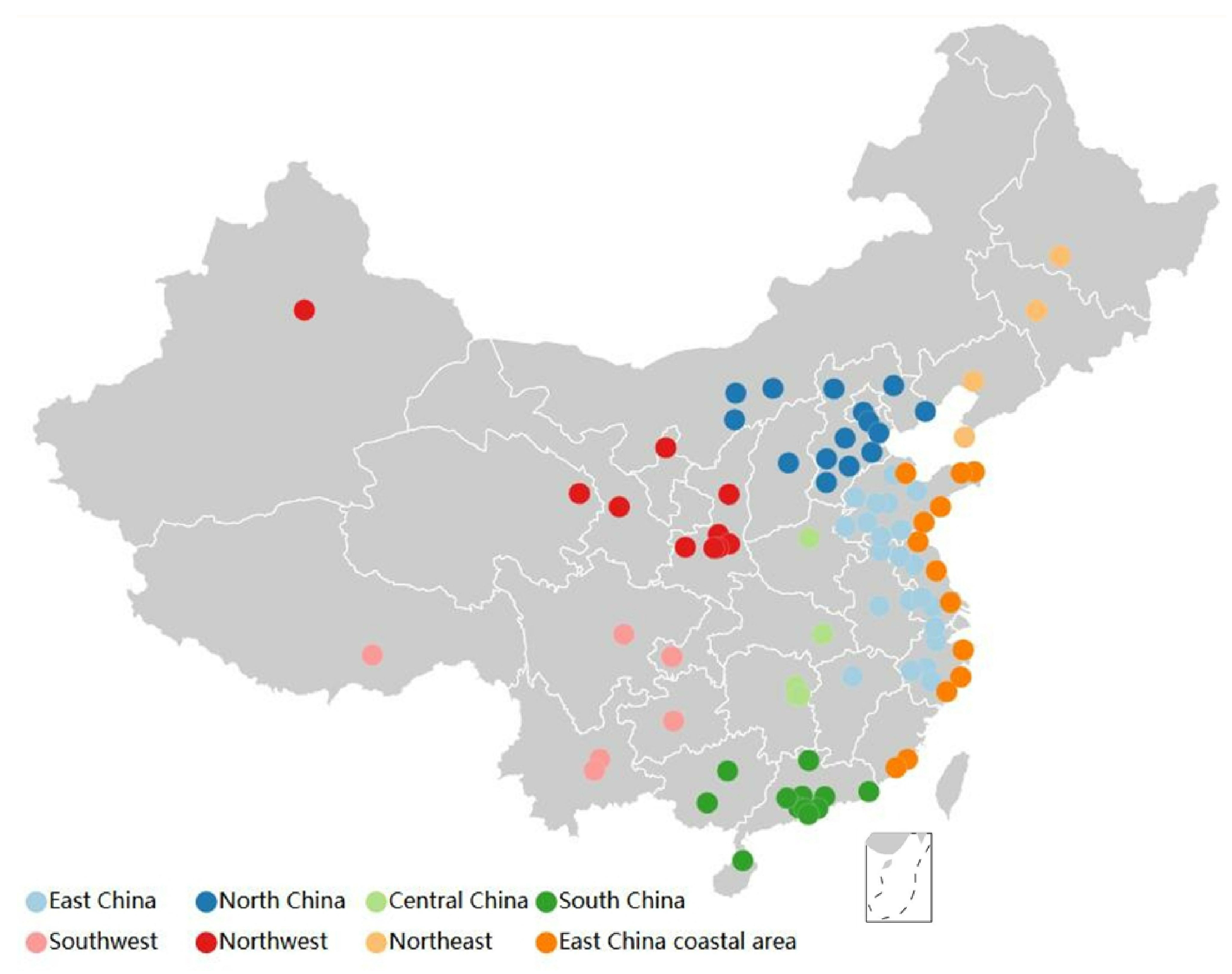
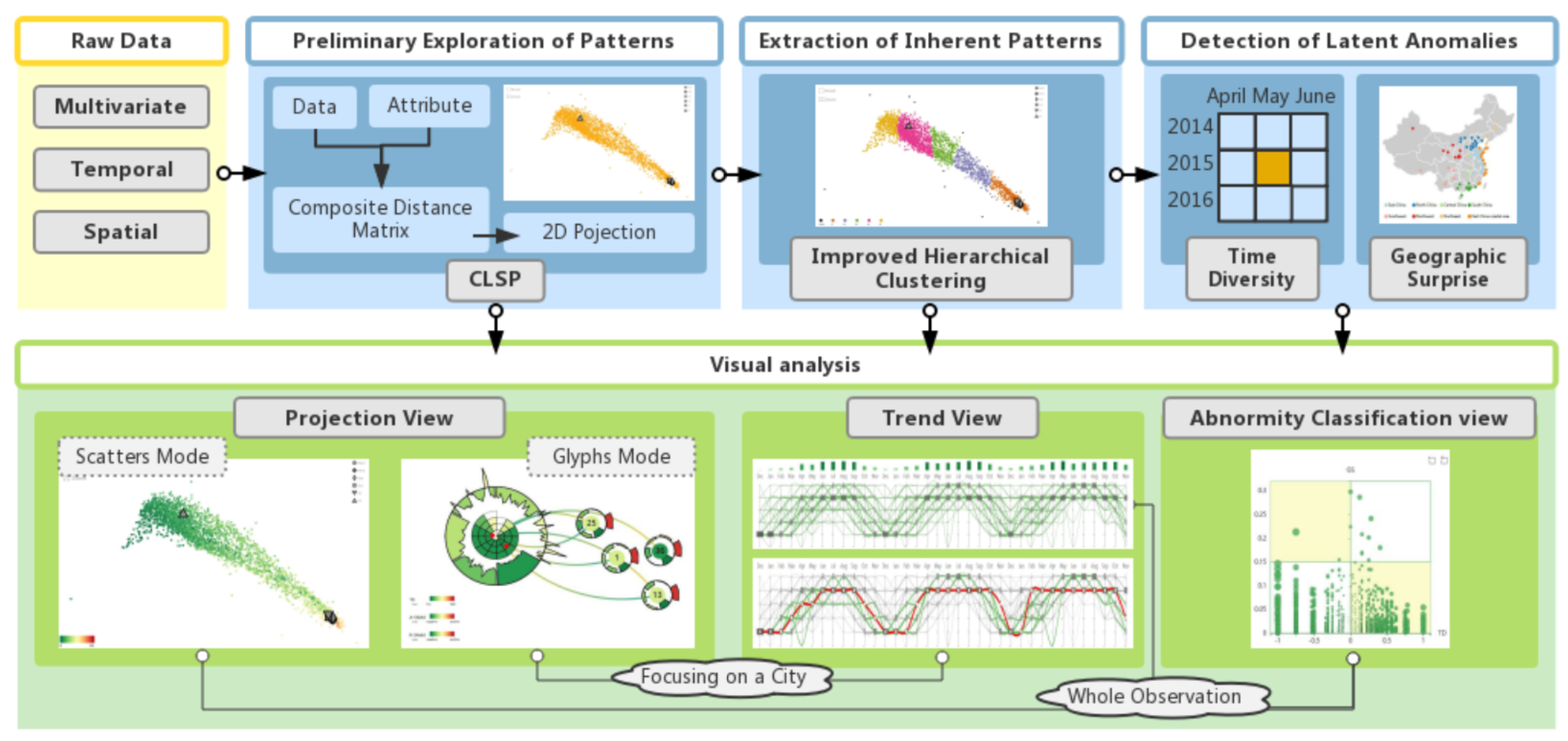
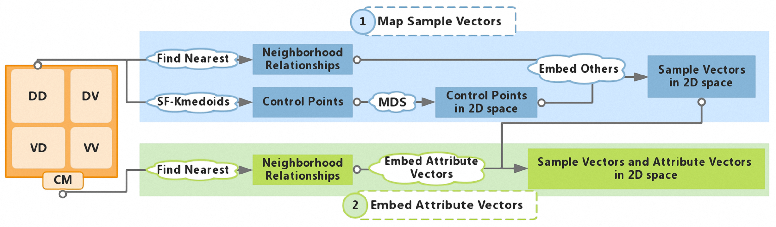
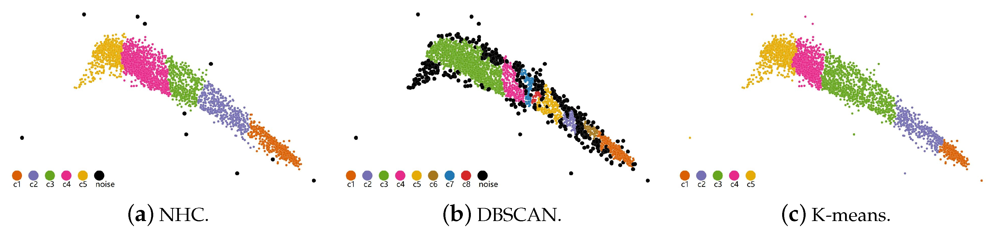
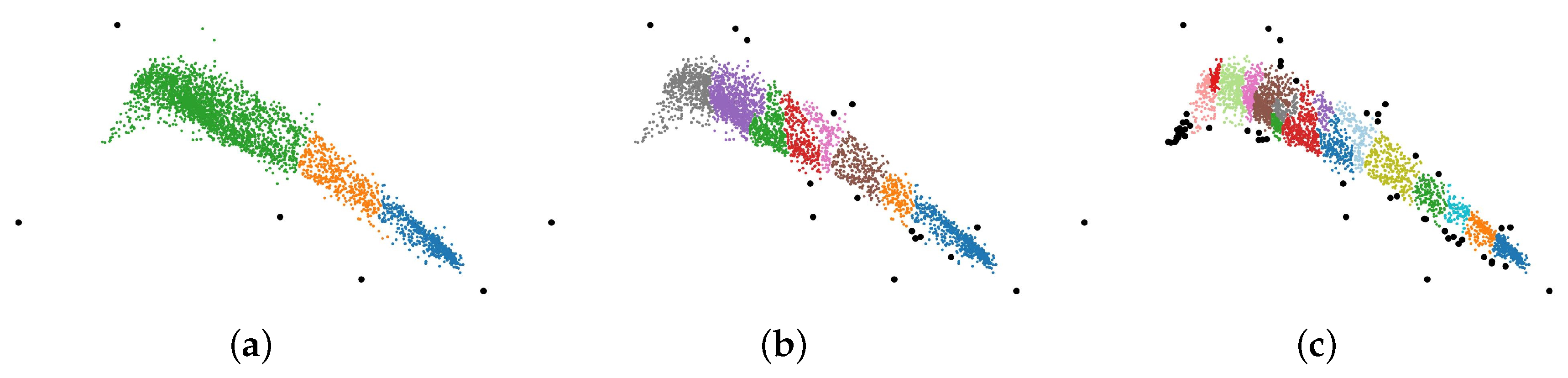
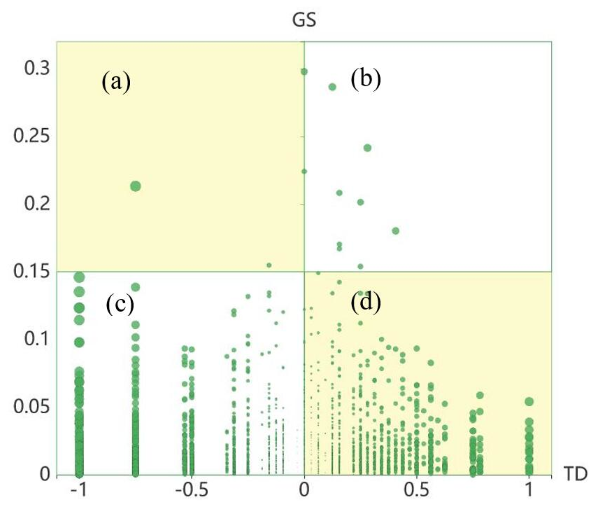
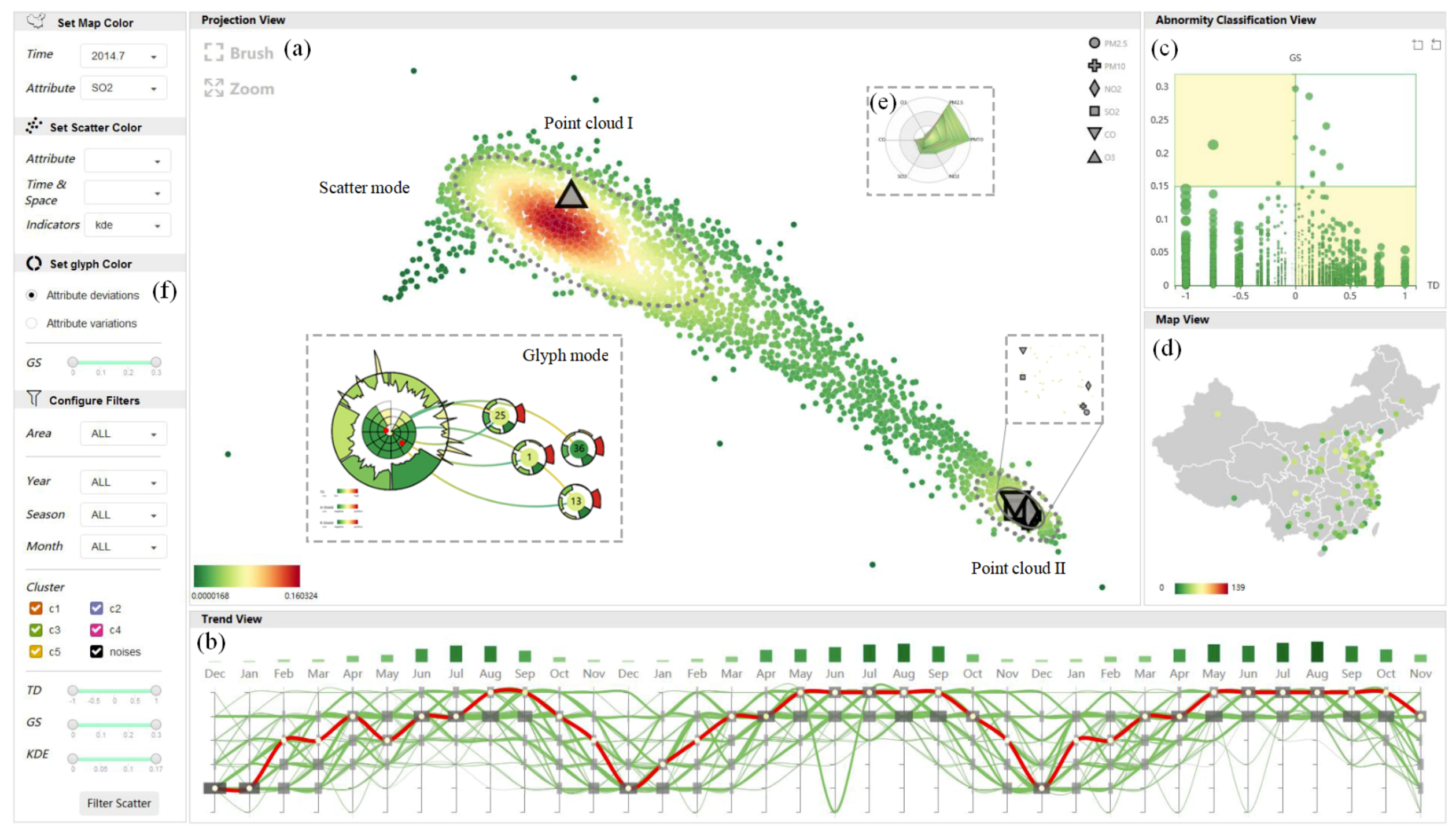
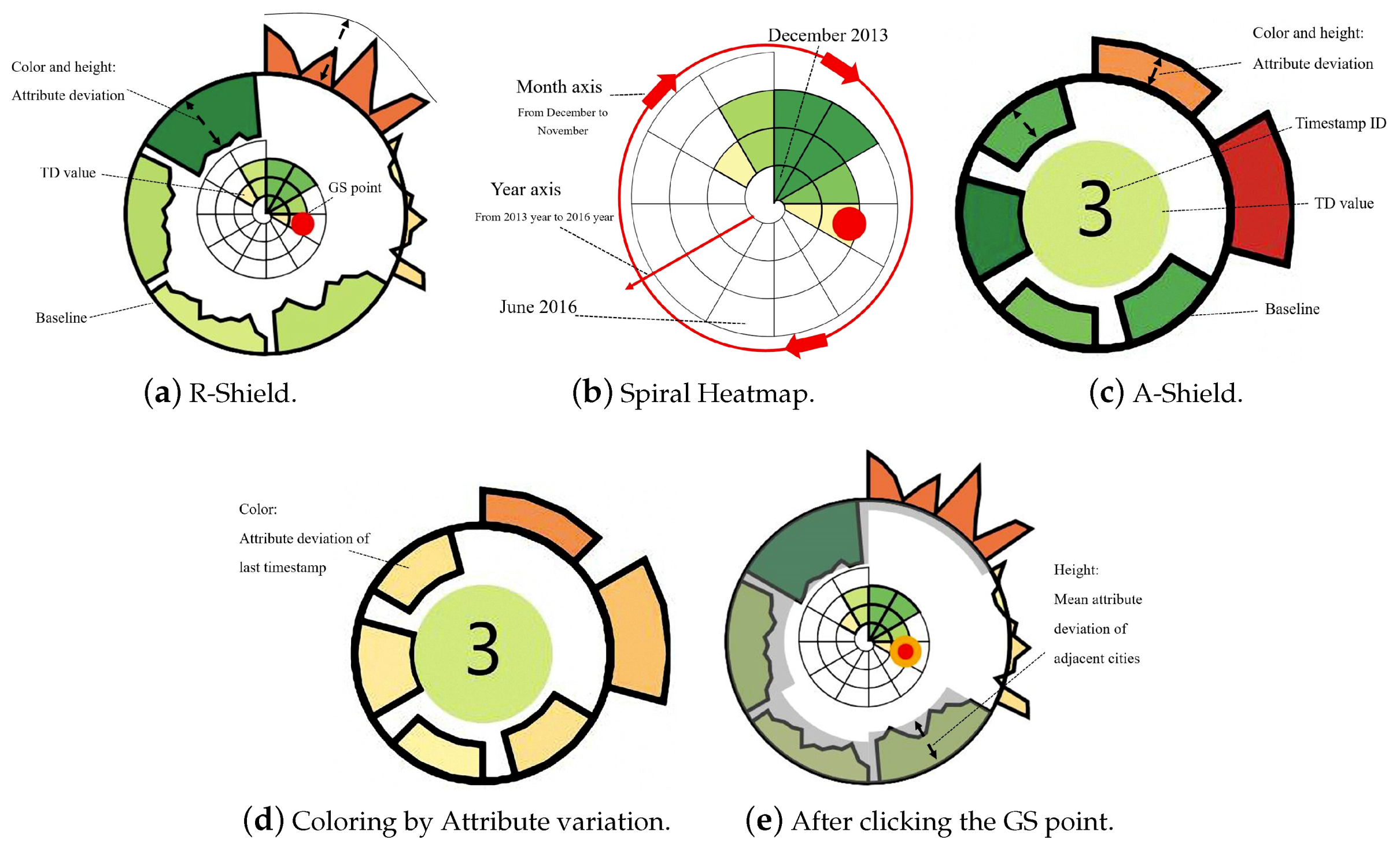
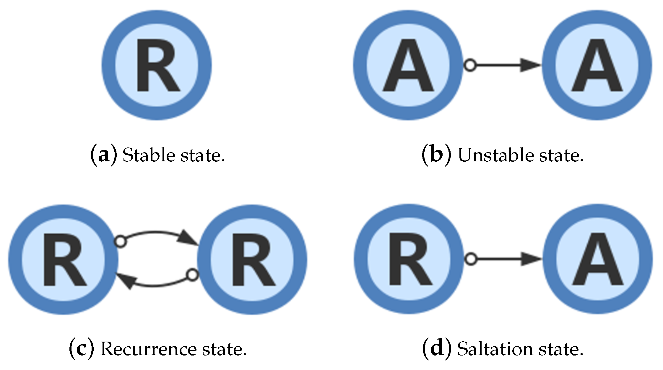
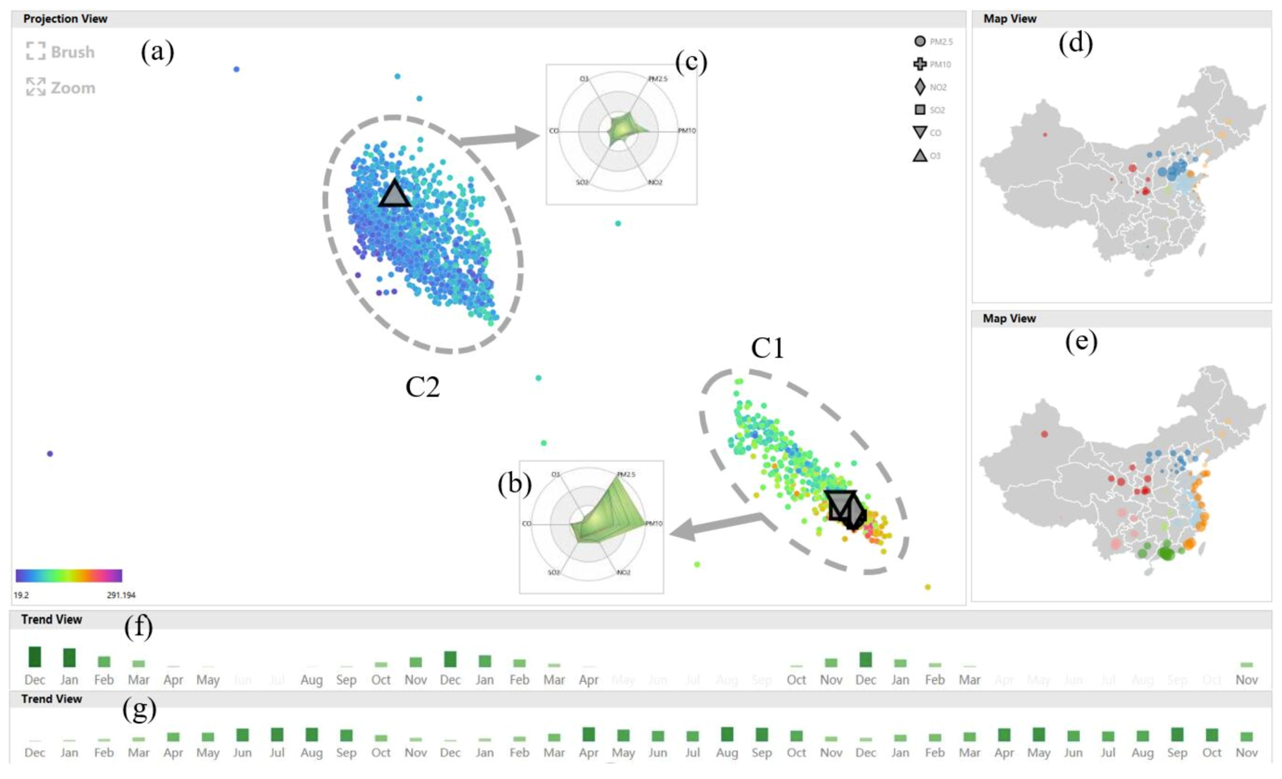
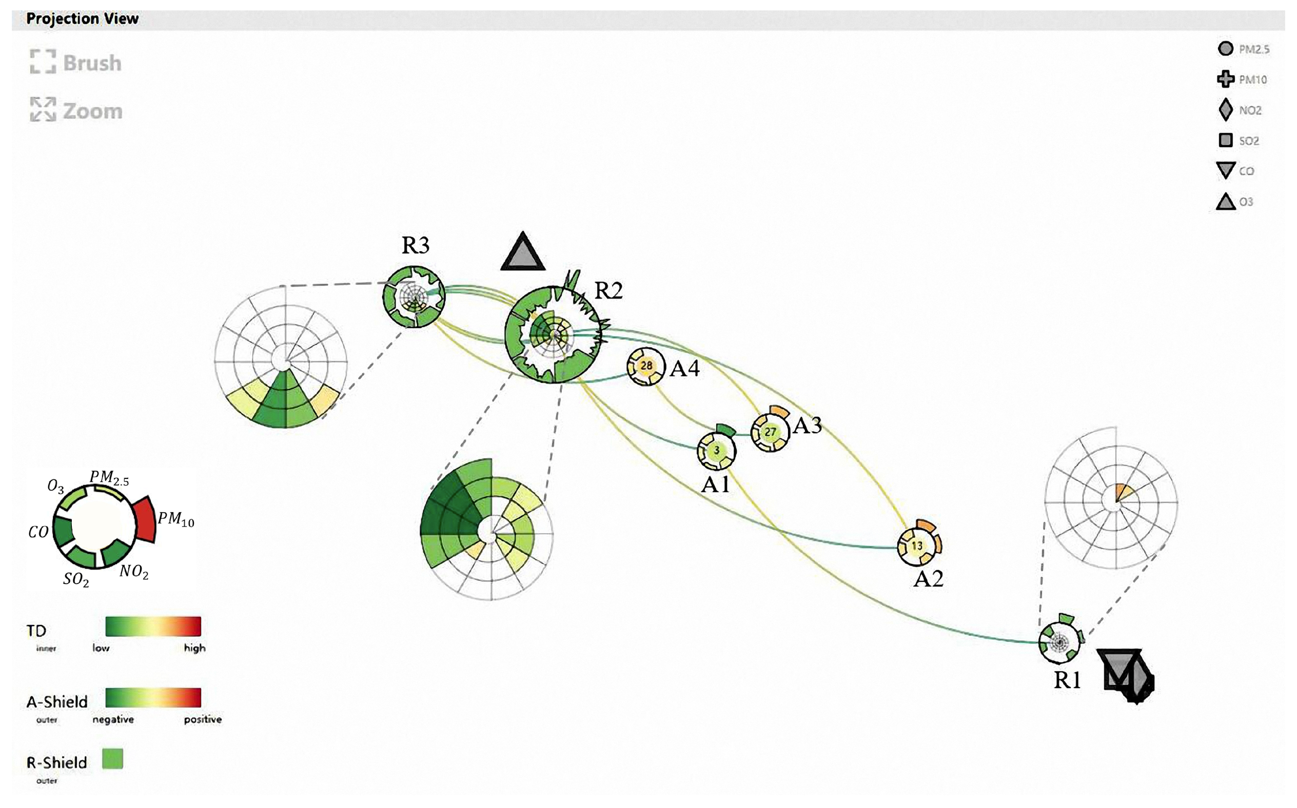
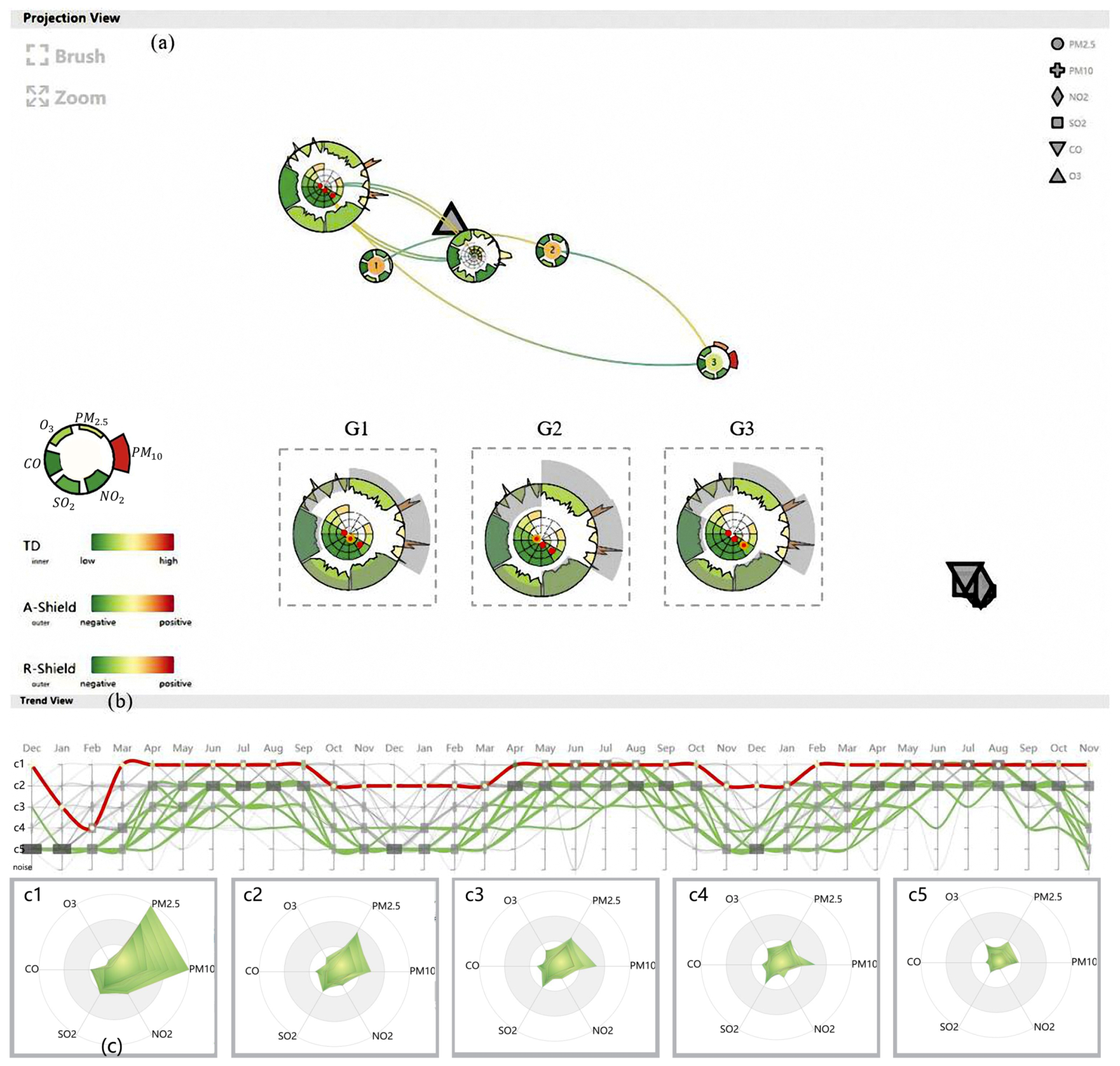
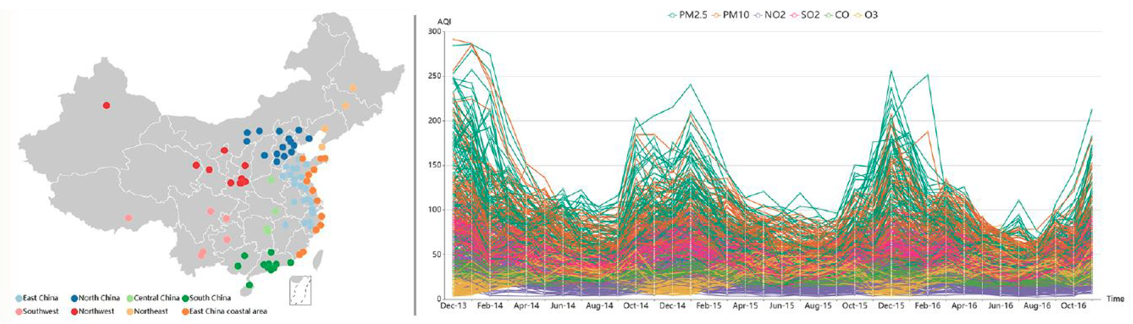
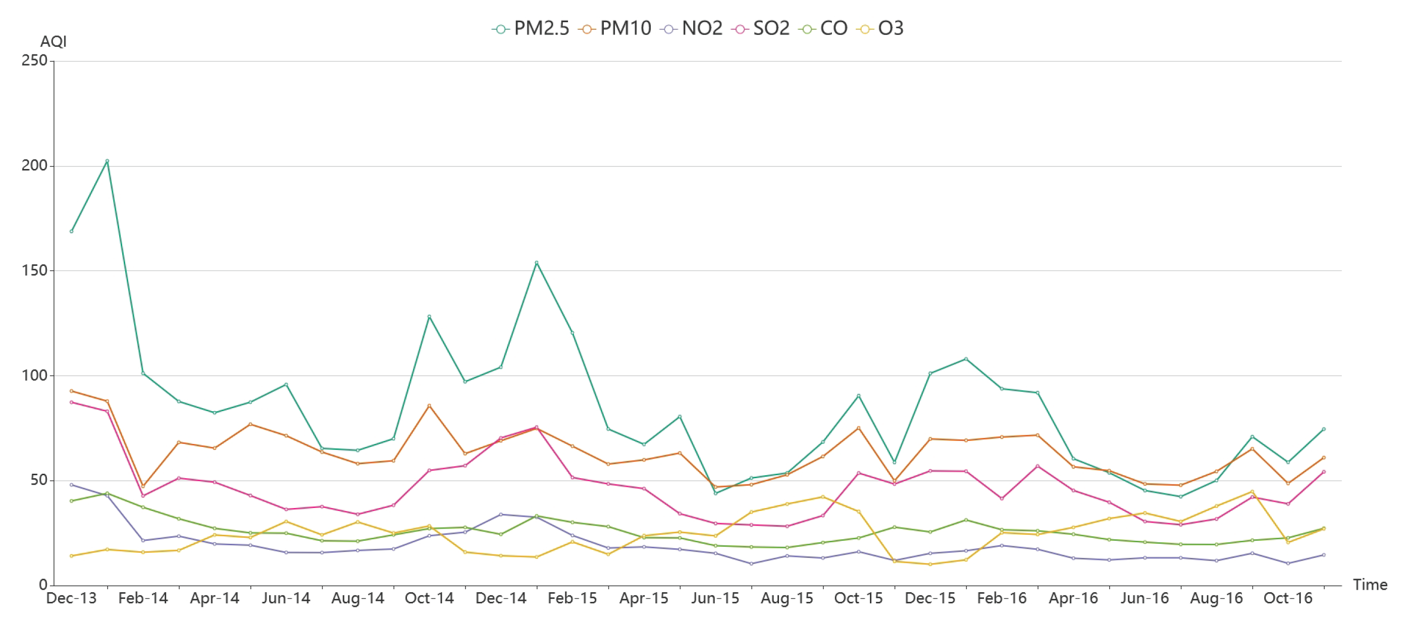
Table 1.
The sample from Chengdu in March 2014.
| City | Time | ||||||
|---|---|---|---|---|---|---|---|
| Chengdu | 2014/3/1 | 68 | 70 | 20 | 69 | 26 | 16 |
| Chengdu | 2014/3/2 | 73 | 72 | 15 | 64 | 27 | 15 |
| Chengdu | 2014/3/3 | 65 | 60 | 16 | 54 | 28 | 10 |
| Chengdu | 2014/3/4 | 59 | 61 | 16 | 58 | 30 | 19 |
| Chengdu | 2014/3/5 | 87 | 75 | 21 | 82 | 33 | 11 |
| Chengdu | 2014/3/6 | 63 | 58 | 20 | 64 | 35 | 12 |
| Chengdu | 2014/3/7 | 84 | 71 | 16 | 67 | 36 | 9 |
| Chengdu | 2014/3/8 | 43 | 44 | 10 | 57 | 28 | 26 |
| Chengdu | 2014/3/9 | 94 | 82 | 18 | 83 | 35 | 13 |
| Chengdu | 2014/3/10 | 129 | 104 | 34 | 88 | 40 | 12 |
| Chengdu | 2014/3/11 | 137 | 105 | 39 | 90 | 38 | 23 |
| Chengdu | 2014/3/12 | 115 | 111 | 28 | 90 | 29 | 15 |
| Chengdu | 2014/3/13 | 102 | 118 | 24 | 80 | 24 | 18 |
| Chengdu | 2014/3/14 | 59 | 73 | 10 | 50 | 18 | 31 |
| Chengdu | 2014/3/15 | 100 | 90 | 25 | 88 | 28 | 23 |
| Chengdu | 2014/3/16 | 179 | 136 | 33 | 103 | 39 | 36 |
| Chengdu | 2014/3/17 | 172 | 124 | 46 | 95 | 35 | 31 |
| Chengdu | 2014/3/18 | 163 | 121 | 29 | 109 | 38 | 28 |
| Chengdu | 2014/3/19 | 160 | 131 | 51 | 93 | 38 | 30 |
| Chengdu | 2014/3/20 | 58 | 80 | 13 | 59 | 23 | 23 |
| Chengdu | 2014/3/21 | 53 | 67 | 13 | 53 | 17 | 23 |
| Chengdu | 2014/3/22 | 63 | 62 | 11 | 59 | 23 | 8 |
| Chengdu | 2014/3/23 | 82 | 67 | 11 | 67 | 28 | 12 |
| Chengdu | 2014/3/24 | 158 | 117 | 23 | 97 | 36 | 24 |
| Chengdu | 2014/3/25 | 165 | 120 | 26 | 98 | 40 | 23 |
| Chengdu | 2014/3/26 | 211 | 137 | 29 | 103 | 45 | 22 |
| Chengdu | 2014/3/27 | 211 | 144 | 35 | 110 | 48 | 22 |
| Chengdu | 2014/3/28 | 203 | 139 | 30 | 104 | 45 | 30 |
| Chengdu | 2014/3/29 | 208 | 151 | 36 | 112 | 55 | 18 |
| Chengdu | 2014/3/30 | 113 | 92 | 20 | 57 | 37 | 23 |
| Chengdu | 2014/3/31 | 40 | 50 | 12 | 52 | 26 | 23 |
Table 2.
Comparing the MRP of LSP and CLSP.
| LSP | 0.445515 | 0.459782 | 0.298815 | 0.722222 |
| CLSP | 0.475259 | 0.645123 | 0.404991 | 0.722222 |
| UP | 6.68% | 40.31% | 35.53% | 0 |
Table 3.
Running time of preprocessing stage.
| Constructing the Difference Matrix (CLSP) | Projecting (CLSP) | NHC | TD | GS | |
|---|---|---|---|---|---|
| Running time (sec.) | 1554.054 | 777.396 | 6.771 | 0.007 | 32.189 |
© 2019 by the authors. Licensee MDPI, Basel, Switzerland. This article is an open access article distributed under the terms and conditions of the Creative Commons Attribution (CC BY) license (http://creativecommons.org/licenses/by/4.0/).
Share and Cite
MDPI and ACS Style
Zhang, H.; Ren, K.; Lin, Y.; Qu, D.; Li, Z. AirInsight: Visual Exploration and Interpretation of Latent Patterns and Anomalies in Air Quality Data. Sustainability 2019, 11, 2944. https://0-doi-org.brum.beds.ac.uk/10.3390/su11102944
AMA Style
Zhang H, Ren K, Lin Y, Qu D, Li Z. AirInsight: Visual Exploration and Interpretation of Latent Patterns and Anomalies in Air Quality Data. Sustainability. 2019; 11(10):2944. https://0-doi-org.brum.beds.ac.uk/10.3390/su11102944
Chicago/Turabian StyleZhang, Huijie, Ke Ren, Yiming Lin, Dezhan Qu, and Zhenxin Li. 2019. "AirInsight: Visual Exploration and Interpretation of Latent Patterns and Anomalies in Air Quality Data" Sustainability 11, no. 10: 2944. https://0-doi-org.brum.beds.ac.uk/10.3390/su11102944
Note that from the first issue of 2016, this journal uses article numbers instead of page numbers. See further details here.