Article

Communicating Climate Change through ICT-Based Visualization: Towards an Analytical Framework

Department of Thematic Studies—Unit of Water and Environmental Studies/Centre for Climate Science and Policy Research, Linköping University, Linköping 581 83, Sweden
*
Author to whom correspondence should be addressed.
Sustainability 2013, 5(11), 4760-4777; https://0-doi-org.brum.beds.ac.uk/10.3390/su5114760
Submission received: 1 July 2013 / Revised: 28 October 2013 / Accepted: 30 October 2013 / Published: 7 November 2013
(This article belongs to the Special Issue Communication for and about Sustainability)

Abstract

:
The difficulties in communicating climate change science to the general public are often highlighted as one of the hurdles for support of enhanced climate action. The advances of interactive visualization using information and communication technology (ICT) are claimed to be a game-changer in our ability to communicate complex issues. However, new analytical frameworks are warranted to analyse the role of such technologies. This paper develops a novel framework for analyzing the content, form, context and relevance of ICT-based visualization of climate change, based on insights from literature on climate change communication. Thereafter, we exemplify the analytical framework by applying it to a pilot case of ICT-based climate visualization in a GeoDome. Possibilities to use affordable advanced ICT-based visualization devices in science and policy communication are rapidly expanding. We thus see wider implications and applications of the analytical framework not only for other ICT environments but also other issue areas in sustainability communication.

1. Introduction

The challenge of communicating climate change to non-scientific audiences is a key concern in climate science and policy [1]. Recent reviews of climate change communication literature have identified an increasing trend in the amount of scholarly papers addressing the issue of how to communicate the scientific basis of climate change, as well as its implications and relevant action strategies, in ways that encourage learning and engagement among various audiences [2,3,4,5].
During the last decade, the climate change communication literature has shifted its focus from public understanding of climate change and questions related to how to address information deficits and increase scientific literacy among audiences, to the issue of barriers and driving forces for public learning and engagement in climate change [4,5]. For instance, the potential of encouraging learning and engagement through public and stakeholder participation in deliberative fora such as focus groups, workshops or consensus conferences has been highlighted [6,7]. However, such initiatives are often limited to a small group of citizens, and there is a risk that only specific groups, such as people with strong opinions or privileged socio-economic backgrounds choose to participate [8]. Another way of communicating climate change, which has the potential of including larger audiences, is to use advances of information and communication technology (ICT) to communicate complex sustainability issues, e.g., through visual representations of both geospatial and abstract data [9,10,11]. In particular, the interactive potentials of new and emerging ICT may hold a potential to facilitate communication beyond the deficit model of climate communication and engage audiences in climate-related issues [12].
This paper contributes to the transdisciplinary field of science communication known as climate visualization, which we define as “interactive research platforms, which use computer graphics to create visual images of the causes and effects of climate change and of mitigation and adaptation options” ([12], p. 5). ICT-based visualization is often claimed to provide a powerful means of communicating large amounts of data [13], but there is a lack of systematic studies analyzing how it affects audiences’ understanding of complex sustainability phenomena, such as climate change.
This paper develops a framework for analyzing the content, form, context and relevance of ICT-based climate change visualization, based on insights from literature on climate change communication (CCC). The full review of CCC literature published between 2000 and 2011 is reported in a previous paper [5]. For the purposes of the present paper, we will highlight recommendations from this literature regarding how to communicate climate change and use the lessons learnt from the CCC literature as input to construct an analytical framework.
Thereafter, we apply the analytical framework to reflect upon a pilot case taken from the WorldView visualization project, which uses immersive dome visualizations to communicate causes, effects and responses to climate change with a variety of audiences. Such reflection is in our view a critical step in developing ICT-based visualizations that are perceived by their audiences as being relevant and informative. The paper focuses on the case of an interactive dome visualization, one of the rapidly growing areas of ICT-based science communication, since this type of visualization is becoming increasingly common in planetariums and science centres around the world and is popular with both lay and expert target groups. Moreover, the format provides an apt environment for designing controlled studies of interactive visualization. The findings are however applicable to other areas of interactive science communication. With the rapid development of the interactive entertainment industry, possibilities to use affordable advanced ICT based visualization devices in science and policy communication are rapidly expanding. We thus see wider implications and applications of our analytical framework not only for other ICT environments but also other issue areas in sustainability communication.

2. Communication of Climate Change: Towards an Analytical Framework

The dimensions included in the analytical framework presented below were identified through scrutinizing what the climate change communication literature suggests with respect to basic components of any communication process, i.e., the message, the media and the audience, e.g., [14]. Specifically, we will address these issues by scrutinizing the climate change communication literature with regards to (a) the content of climate change communications, and how this content is expressed, e.g., through communicative tools such as metaphors and prototypical examples; (b) the form of the communications, i.e., communication mediums and formats; (c) the context, with focus on target audiences’ expected or perceived need for knowledge, their interpretative frames and their preconceptions of climate change.
The literature review, which has informed our analytical framework, encompassed 92 peer reviewed articles published between 2000 and 2011. These articles were identified through the Scopus and Academic Search Premier databases. The search words used for identifying relevant articles were: climate change, global warming, communication, public, public understanding and public engagement (for further details, see [5]).

2.1. Content of Climate Change Communication

Fear-inducing messages have been much debated in the literature on climate change communication. Western societies have long been characterized by a complex relationship with weather and climate. Analysis of climate discourses since the Middle Ages [15] indicates a pattern of fear related to extreme weather events and climate change. Contemporary climate change discourse is one of fear about future change, expressed in words such as “climate catastrophe” or “climate shock” [15,16]. The issue of climate change is often communicated in apocalyptic terms focusing on worst-case scenarios, for example, by comparing climate change to—and describing it as worse than—war, terror attacks, etc. [14]. Even though the catastrophic impacts may be caused by both human emissions of green house gases (GHG) and climate variations, the apocalyptic discourse is predominantly associated with scenarios of how socio-economic and technological change effects emissions and ultimately the climate.
However, communication researchers have identified the pitfalls of the fear-based approach. Strong and scary images and messages may make audiences aware of the urgency of climate change, but rather than spurring engagement, they may lead to inaction if audiences feel that the problems associated with climate change are far too severe for them to address in their everyday lives [17,18,19,20]. Hence, in communicating messages, attracting attention differs markedly from spurring engagement and empowering people to make informed decisions. To achieve the latter two, studies have pointed to the need for communicators to focus on local impacts of climate change, thereby making it relevant for the audience on a personal level, and to highlight concrete action strategies which may be implemented on a local level [19,20]. While scary stories and fear-inducing images evoke feelings of helplessness, being overwhelmed, and lack of personal control over the situation [18], messages perceived as containing information of personal relevance to the addressee are more likely to make that individual feel motivated to listen to and think about the message [21]. This can for example be achieved by visualizing local adaptation measures and by means of messages that focuses on tangible vulnerability of homes and possible adaptation measures rather than doomsday messages of, for example, the dramatic effects of major sea level rise 100 years or more into the future.
The alarmist tendency in climate communication prompts assessment of how the storyline of the presentation is presented and comprehended. Particular views of history and the future are often embedded in environmental messages, i.e., what has happened and what this will lead to. The story-line concept captures the fact that environmental messages often feature core messages through a simplified structure, crystalized patterns conveying cause and effects, key actors, and preferred solutions [22,23]. Analyzing the content of the storyline as well as how it is perceived by the audience are important dimensions for analysis of climate visualization.
The selection of data, as well as the geospatial and temporal scale are of significance in communicating climate change. The selection of parameters is of particular importance to support the storyline and to meet the interest of a specific audience. When selecting parameters, oftentimes the inclusion of several climate change scenarios and the delimitation to specific geospatial areas or flexibility in scale is of importance to provide a credible representation of scientific data as well as to make the data relevant to the audience [7]. The selected time frame (e.g., if the represented scenario covers a 30 or a 90 year period) is a further factor that influences the individual understanding and perceived relevance of the presented data.
Earlier studies of climate change communication point to the importance of communicating scientific uncertainties in a way that a non-scientific audience may relate to [24,25,26,27]. However, it has also been suggested that to lay people, the most pressing uncertainty issue is perhaps not that of scientific nature, but doubts on the effectiveness of various responses to climate change, and the degree of responsibility expected from individual laypeople [28]. Who should take responsibility for action and to what effect are two elusive issues in environmental debate. First, who are conferred key roles in taking action remains a contested item in the environmental debate. While environmental communication may want to ground an issue in the personal context of the receiver, it also supports the idea of making private citizens primary responsible for climate action. The “pass the buck” syndrome, i.e., shifting responsibilities to other actors, is reoccurring in environmental politics and debate, for instance, national parliamentarians refer the quest of climate action from the law-making bodies to individuals—either in form of consumers or a younger generation capable of change—at local level or international negotiations [29]. Second, the participants in a Swedish focus group study on climate change stated that although they felt that as citizens they ought to take action to mitigate climate change, they were frustrated by the fact that they perceived their actions as having little actual impact [28]. Consequently, we need to pay attention to which key actors that are presented as most influential and responsible for mitigating climate change, why they are highlighted and how uncertainties on the effect of their actions are conveyed.
Other important aspects related to content include the use of metaphors, key concepts and prototypical examples. The role of metaphors in influencing how we conceive and interpret the world around us has repeatedly been emphasised, not least in relation to environmental issues [30,31,32,33,34,35,36]. Earlier studies of media discourse on climate change illuminate how metaphors draw attention to some aspects of a phenomenon, concept, or situation while hiding others [30,33]. Likewise, analyses of which key concepts and prototypical examples that are highlighted in climate communication shape the way climate change is perceived and which types of responses that are seen as appropriate. For instance, in an analysis of the function of images of melting glaciers, which are often used as prototypical examples in climate change discourse, Doyle [37] notes that these are “powerful symbols of a fragile earth at risk from the impacts of climate change”, but they also “produce a distancing effect, relegating climate change impacts to a remote and inaccessible place, where animals and habitats are affected rather than humans” ([37], p. 142).

2.2. Form: Communication Mediums and Formats

Moser [18] notes that the choice of communication mediums and formats is an important dimension in climate change communication. When it comes to climate visualization, we argue for the need to pay attention to the selection of ICT tools and the visual representation itself. ICT tools commonly used in sustainability communication range from highly interactive and oftentimes web-based tools to presentation formats on flat-screen or immersive environments that allow for various degrees of user interaction. The selection of ICT tools influences both the accessibility and the degree of interactivity, and requires a prior assessment of the user profile and level of expertise, the type of information and tasks that should be included in the tool, e.g., [38,39].
The term visual representation refers to any form of representation (i.e., photograph, drawing, symbol, map etc.) that can be perceived by the human visual system. Within sustainability visualization, however, geospatial representations or landscape visualizations are most frequent, which implies a focus on the selection of colour maps, symbols, the inclusion of scales, uncertainties, and the degree of interactivity, for example, in selecting parameters and changing attributes. In particular, factors that influence the perception of the visualized data, such as colour, need to be carefully considered as they provide the form for how participants make sense of a message [40].

2.3. Context: Target Audiences’ Interpretation of Climate Change Communication

The climate change communication literature emphasizes that we should segment target groups and take their expected or perceived need for knowledge, their interpretative frames and their preconceptions or previous knowledge into account when communicating climate change [6,18]. This means that there is a need to tailor communication to the target audiences. Many attempts have been made to segment the public into various audiences [41,42,43,44,45]. However, this is not an easy task, and even among audiences that may seem homogeneous, there could be large variation in how issues related to climate change are understood and interpreted. Moser [18] argues that climate communicators need to identify their audiences’ pre-existing beliefs as to whether human induced climate change is real and, if so, how severe effects it may have. Thereafter, communicators need to match the content and framing of the message to the preconceptions, i.e., level of knowledge, of their audiences, and to their interests, values, and concerns. Taking the interpretative frames and the preconceptions of the audiences into account when communicating, calls for reconsideration of audiences as active co-constructors of climate change communication and thereby could be seen as a strategy to counter one-way communication based on the deficit model.

2.4. An Analytical Framework for ICT-Based Climate Visualization

In accordance with the climate change communication literature, we argue that an analytical framework for ICT-based visualization must take into account both the content and form of the visualization activities, as well as the reception context, i.e., how audiences perceive and interpret messages expressed through visualization (see Table 1). In addition, we propose analysis of the relevance of the visualization, as perceived by the audience.
Table 1. Analytical framework of ICT-based climate change visualization.
Analytical focusTimingExamples of methods
Content
  • Storyline
  • Data selection (spatial, temporal scales)
  • Key actors
  • Metaphors, key concepts, prototypical examples
Ex-ante
  • Content analysis
  • Discourse analysis
  • Metaphor analysis
  • Literature review
Form
  • Selection of ICT tool
  • Visual representation
Ex-anteUser-centered experiments:
Read-aloud protocols
Web-protocols
Controlled experiments
Visualization-supported dialogues
Focus groups
Interviews
Context
  • Audiences’ expected/perceived need for knowledge
  • Audiences’ interpretative frames
  • Audiences’ preconception
Ex-ante and/or in itinereEx-ante:
e.g., Surveys, Mindmaps, In-depth interviews, Focus groups
In itinere: interactivity during communication event; dialogue between communicator and audience
RelevanceAudiences’ perceptions of whether the visualization is relevant and informativeEx-postSurveys, in-depth interviews, focus groups
It has been pointed out that to assess science communication, the goals and objectives of such communication must be clear, and suitable methods to follow up whether the goals were achieved need to be applied, e.g., [2,46]. Among the wide variety of objectives for public communication of science and technology, Neresini and Pellegrini ([46], p. 243) note that many such activities aim to produce change with respect to knowledge, attitudes or behavior, and thus they argue for assessment of the outcomes of science communication in terms of changes produced by the communication. We argue, however, that due to the many methodological challenges of assessing whether such changes can be ascribed to the visualization event, or if other factors may also have influenced them [46], our framework cannot provide tools for analyzing outcomes in terms of changes produced by visualization. The analytical framework outlined in Table 1 was instead designed to analyze audience perceptions of whether a particular climate visualization event was relevant and informative for the intended audience, i.e., whether it is seen as matching the audience’s expected or perceived need for knowledge, and contributing to provide new information which may advance audiences’ previous understandings.
As far as methods are concerned, the CCC literature employs a wide variety of methods to analyze how climate change communication activities are perceived and understood by their audiences. Likewise, the broader literature on public communication of science and technology gives little direction as to any one type of methodology more suited than others to analyze the outcomes of such communication. Thus, in the analytical framework we list several types of social science methods that may be used either as stand-alone methods to analyze particular dimensions of ICT-based climate visualization, or in a mixed-methods approach to produce a deeper understanding of the entire process of designing, implementing and assessing visualizations.
Obviously, all the elements included in our framework could be analyzed in retrospect, to learn from experience and bring these lessons into the design of new communication events. However, as pointed out by Neresini and Pellegrini ([46], p. 241), “activities related to PCST [public communication of science and technology], develop through time”. Taking this as a starting point, elements of the analytical framework could also be used for analysis in the ex-ante (design), in itinere (implementation) and ex-post (conclusion) phases of climate change visualization (ibid.), as illustrated in Table 1.
It is worth noting that the dimensions of ICT-based visualization, as listed in Table 1, are causally interlinked, as e.g., the selection of a specific ICT tool would influence the options for which data can be included. This might in turn influence the selection of methods for analysis as well as the timing of the analysis.

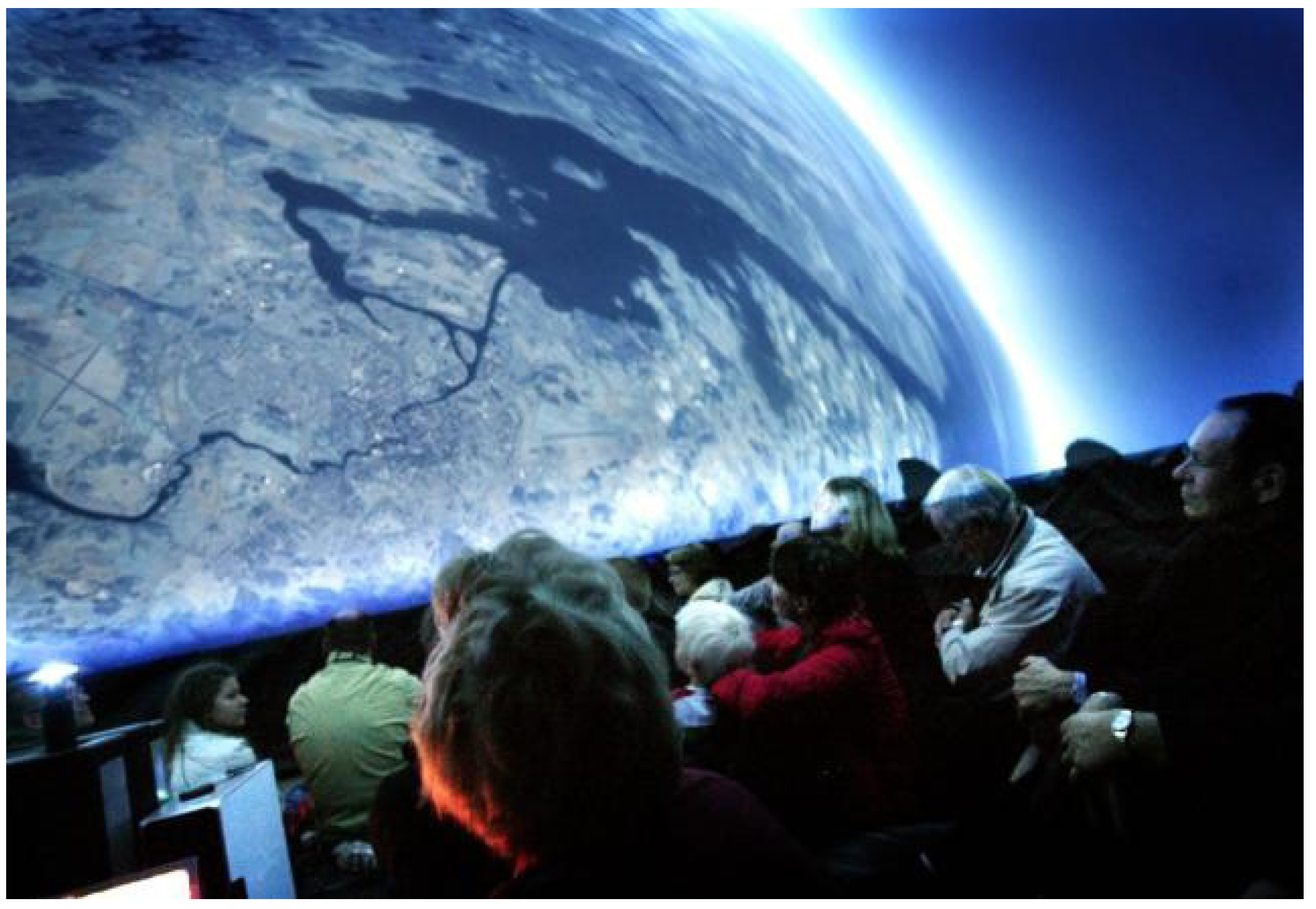
3. A Pilot Case of Interactive Climate Visualization

In the following, we will apply the analytical framework to a pilot case taken from the WorldView visualization project, which arose in 2008 from co-operation between climate researchers, visualization researchers, and the Norrköping Visualization Centre [47]. Data, narratives, and related material were selected and produced for an immersive dome environment, in which ICT-based visualization techniques were used to communicate climate science and policy research. Climate visualization modules were created that can be adapted to various groups and for education, science communication, and decision making. The created modules are setups of climate information, e.g., visual representations of summer and winter temperature under different greenhouse gas emission scenarios, or individual countries’ emissions historically, per capita or today. These modules can be used individually or in various combinations to address different audiences. Modules on changing temperature for summer and winter under a selection of emission scenarios could for instance be used in a setting for agriculture experts and complemented with information on growing seasons etc. Similarly, only one dataset could be part of a school presentation, discussing what energy futures are expected under the different scenarios and what this entails for consumption. Currently, the climate visualization program is presented in two settings: (1) an inflatable GeoDome with a single fish-eye projector and seating for 20–25 adult visitors (see Figure 1) and (2) a digital dome theatre with space for 100 visitors. The GeoDome® is an integrated immersive learning environment, developed by the US based company The Elumenati [48]. The digital dome in the Norrköping Visualization Centre includes 165 degrees of a 15-metre-diameter sphere, and has a total screen surface of approximately 300 square meters. It uses six separate projectors, enabling the entire screen to be used for images at a total resolution of 3710 × 3180 pixels [49]. The program is aimed towards various audiences, ranging from students in junior high school to a mixed general audience, as well as initiated stakeholders such as officials, politicians, and climate negotiators.
Figure 1. Visitors in the inflatable GeoDome.
Sustainability 05 04760 g001
The pilot case refers to presentations in the GeoDome to a mixed audience, primarily consisting of decision-makers and citizens visiting the “Swedish Politicians Week,” a fair for political issues and policy makers in Almedalen, Sweden, 2009. The Swedish politicians’ week attracts a wide range of politicians, public and private professionals and a general public. We want to stress that the GeoDome presentation was not originally developed in accordance with the analytical framework, but combining the literature review with our findings from the WorldView presentations has contributed to the development of the framework. In the following, we will use the framework to exemplify central dimensions that we propose should be taken into account in analyzing ICT-based climate change visualization. The audience’s expected/perceived need for knowledge is addressed through a survey (see Section 3.3.1 and the online supplementary material), while the other dimensions are addressed by describing the WorldView presentation in relation to findings from our literature reviews. This enabled us to identify strengths and limitations in the WorldView GeoDome presentation. Our analysis will therefore shed light on what was included in the GeoDome presentation, as well as what was missing and should be considered for future visualizations. As such, the presentation serves to exemplify implications of the analytical framework.

3.1. Content

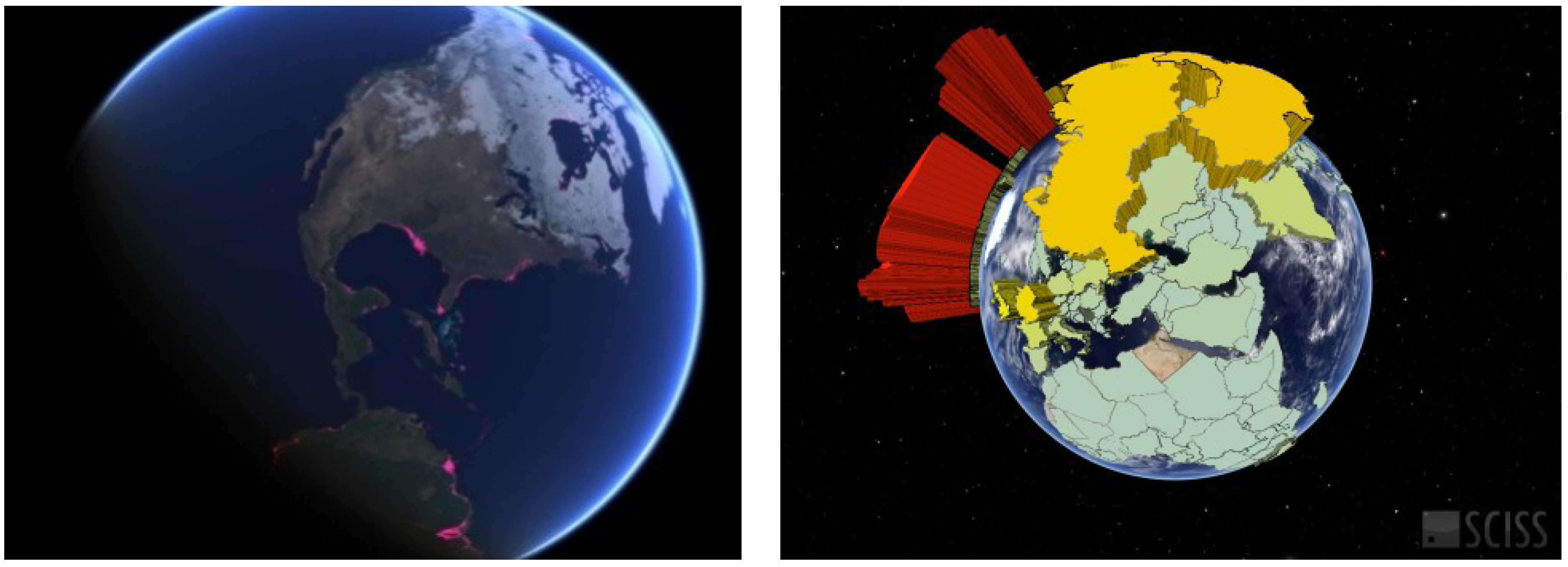
3.1.1. Storyline and Data Selection

The presentation focused on examples of causes and effects of climate change and potential policy and lifestyle change alternatives. The half-hour GeoDome presentation started with two questions to the audience, who were encouraged to vote with a mobile audience response system. A bar chart representing the responses of the audience as a relative distribution was displayed immediately after a brief introduction to climate change. The visualization-supported part of the presentation started with a brief introduction to the emission of greenhouse gases and the possible effects of an increased concentration of greenhouse gases in the atmosphere accompanied with a “flight” from outside the solar system to the earth, displaying the earth’s atmosphere as a thin line on the horizon (see Figure 1). The causes of climate change were discussed on the basis of spatial representations of greenhouse gas emissions per country based on modelled historical cumulative and current national and per capita data (see Figure 2). This part of the presentation focused on a discussion of historical responsibility of early-industrialized nations to the impact of individual consumption.
Two different climate scenarios (A2 and B2) and the mean temperature change for summer and winter from the base years 1961–1990 to 2071–2100 were presented to capture the framework of the IPCC storylines to deal with the inherent uncertainties of future societal development as well as to present the range of possible future changes. The presenter used the visualizations of different scenarios to acknowledge that the data selection for scenarios hinge on assumptions on how society will develop. The story focused on Europe and in particular Sweden to capture the reflections of the participants on the potential local effects. Other similar data were available on demand throughout the presentation, in particular change in precipitation for the same time period and scenarios. To discuss possible effects of temperature increase, the current distribution of permafrost around the globe was presented and the effects of a melting of this permafrost on emissions of methane to the atmosphere, as well as projected changes in Arctic Sea ice cover for both March and September sea ice extension for the time scales 2021–2030 and 2071–2080 were presented. The impacts for local ecosystems were discussed. A clear distinction was made by the expert presenter that only the melting of land-ice such as glaciers will impact on the global sea level, before a map of the global population density was displayed to discuss the distribution of densely populated areas in coastal areas around the globe. From the issue of global sea level rise, the focus continued to the Baltic Sea and the Isle of Gotland, and the particular venue of the GeoDome presentation, to show the potential increase of a coastline with one meter or two meter sea level rise at the particular setting of the presentation. The presenter emphasised the uncertainty of the data underpinning these scenarios. The storyline rounded up with positive synergies of mitigation activities and returned to the interactive voting system with a few concluding policy and lifestyle questions, which the audience responded to and discussed when the results were displayed on screen.
Figure 2. Visual representations of geospatial data: sea level rise and global CO2 emissions, 1850–2006 (software: Uniview, Sciss).
Sustainability 05 04760 g002

3.1.2. Key Actors, Prototypical Examples, Key Concepts, and Metaphors

The key actors mentioned in the presentation were nation states, in particular in relation to international agreements, and individual citizens, in relation to lifestyle changes. Less focus was directed to other potentially relevant actors, for instance business, local decision makers, universities, or non-governmental organizations (NGOs).
Two prototypical examples visualized in the presentation was the planet in the black empty space and the atmosphere surrounding the globe. The presentation established these two images in the beginning by showing how ”our home planet” was situated in space and by zooming in and tilting the globe showing how the thin layer of atmosphere protects it.
Two common words in the presentation were “change” and “emissions”. The presentation did not address at all “adaptation”, which is another key measure area for dealing with the effects of climate change. “Tipping points” was a key metaphor used in the narrative, but it was not visualized. Spatial adjectives such as “low” and “high”, “larger” and “smaller” were used to describe the effects and solutions to climate change, rather than for example other relational adjectives, such as intensive, effective, or normative ones, such as better or worse.
For future development of narratives for climate visualization, we see a potential for deliberate and reflected use of linguistic devices such as prototypical examples, adjectives and metaphors, to underline the messages communicated through visual representations. Given the vast literature on how such communicative resources matter to sense-making of complex science [32,50,51,52], we argue that there is much to be gained from careful analysis of how different linguistic resources included in the narrative contribute to facilitate or counteract understanding of climate change. One potential trap of ICT-based visualization presentations is that the storyline may be formed by what is possible to visualize. For instance, the omission of adaptation or certain key actors in our exemplifying case could, in part, be attributed to the lack of visualizations in the format of the presentation. The data that lends itself most conveniently to the technological format may get precedence over other aspects. Appropriation to the technology can thus set the frames for the content of the presentations.

3.2. Form

3.2.1. Selection of ICT Tool and Visual Representation

The ICT tool used for this particular event was the visualization software Uniview [53] which provides an interactive visualization platform with 3D computer graphics features. While the Uniview software has predominantly been developed for digital planetariums, the application Uniview Geoscope enables the presentation of geospatial data. Even though the software in the GeoDome setting has to be controlled by a trained technician, it provides a high level of flexibility when moving from the global to the local scale or changing settings and datasets over the globe. A significant restriction has however been the lack of support for time-animated data as well as for the overlay of data sets.
The presentation was facilitated by a climate expert from the Swedish Meteorological and Hydrological Institute, who guided the audience through the presentation, explained the data and opened up for questions from the audience. The expert followed a general storyline, but the audience was able to request going back to specific themes/visuals or to include alternative data on the subject (e.g., other scenarios, parameters).
The data that were selected for this particular event were all of geospatial format. Mainly three types of visual representations were applied: (1) Thematic maps based on climate model results following a specified colour map; (2) Colour coded thematic maps based on country borders (choropleth map); (3) Extruded regional representations (prism map), i.e., a three-dimensional thematic map, in which the defined region’s height and colour is proportional to the specific value for this region, e.g., the total GHG emissions per country. Further, a simple representation of one and two meter sea level rise as isolines in two different colours were overlapping areal pictures of the venue where the GeoDome presentation was held. The aim of this was to enable the participants to orient themselves and achieve a strong sense of place for potential future impacts. The colour maps followed predominantly a traditional setup of, e.g., temperature scales from white (yellow) or colour scales with multiple hues in combination with the increased height of the extruded regions.
We argue that in general the selection of ICT tool and visual representations was adequate for this particular GeoDome production. Nevertheless, a higher level of interactivity, e.g., a system that allows the audience to influence the selection of parameters, to go back and forth or influence the colour map for specific parameters would have potentially increased the engagement and capacity to explore and understand the information contained in this presentation. Moreover, it is important to keep in mind how individual the perception and understanding of such representations as applied in this case study are. In particular studies of colour perception in different social and cultural contexts are still rare and emphasise the need for flexibility and interactivity in visualization supported climate communication. Further, images which illustrate the potential effects of climate change have not been used during this production. “Iconic” images frequently used in climate change communication, e.g., of polar bears, melting glaciers or floods in developing countries, have been argued to decrease audiences’ engagement with climate change, since they frame climate change as a severe problem with catastrophic consequences, but which is distant in time and space, and almost impossible to influence for a lay person [37,54]. On the other hand, the deliberate choice not to include photographic images also makes the presentation lack an enhanced sense of identification or recognition which could have been achieved through the inclusion of images of, e.g., humans, places or images of nature.

3.3. Context

3.3.1. Expected/Perceived Need for Knowledge

As suggested by our analytical framework, we surveyed how a mixed audience of citizens and policymakers perceived interactive climate visualization. A questionnaire was distributed to visitors to one of the early presentations in the WorldView project, given in the inflatable GeoDome. The survey was administered in real time after the presentation. The survey was constructed of questions with grading, multiple choice or free text answers. Of a total of 180 visitors, 113 respondents completed the questionnaire, giving a response rate of 63%. The number of respondents, however, is too low to provide any conclusive indications. In this paper, we use the results from the questionnaire results only as examples of how the analytical framework could be applied. Information on the survey design can be found as supplementary material.
The GeoDome presentation attracted a mixed audience visiting the “Swedish politicians’ week” fair, and the survey indicates that different target groups had different views on whether the presentation met their expectations and their need for knowledge. The survey results are merely indicative, but provide us with insight into the experienced relevance of and challenges facing climate visualization as a tool for climate change communication. Most respondents (73%) regarded the WorldView climate visualization as highly or somewhat relevant to their professional roles, and there was no significant variation between groups. Politicians at both the national and regional/local levels found WorldView highly or somewhat relevant, while the largest groups that found it not particularly relevant were private visitors and business representatives. Participants were asked to describe in what areas visualization could effectively facilitate climate communication. Many respondents focused on the potential of using climate visualizations in specific contexts, the two main ones mentioned in free-text answers being (1) school/education and (2) decision making. Participants also believed that climate visualization could simplify science communication and that it was an engaging tool that could create stronger interest in this important issue.
The respondents who did not see potential or relevance in climate change visualization felt that the presentation provided no new information, and that its data as well as the questions posed in the survey needed to be improved. The quality of the projection and the limited comfort of the GeoDome were also criticized. We interpret this criticism as related to a mismatch between the respondents’ expectations, or their perceived need for knowledge, and what was presented in the GeoDome. While the visualization was primarily developed for a target audience of decision makers, it should not come as a surprise that private visitors and business professionals expressed skepticism about its relevance. This underlines the importance of analyzing the target audiences prior to the visualization event and, if possible, giving room for interaction between visitors and scientists/science communicators to give visitors the chance of raising questions which are particularly relevant to them. In retrospect, it would probably have been wise to include some question about the participants’ background and interest in climate change in the voting exercise in the beginning of the visualization session, to enable the presenter to raise aspects of relevance for the different target groups simultaneously present in the GeoDome. Another strategy would have been to announce that different sessions had different foci, and thus would be of varying interest to various audiences.

3.3.2. Interpretative Frames

As previously mentioned, each visitor to the GeoDome presentation received a box linked to an interactive voting system, which allowed the audience to respond to questions about climate change on the global, national, and individual scales. Thereby, some indications of how the visitors interpreted climate-related issues were provided during the GeoDome session. Some questions were obtained from the Eurobarometer 2008 survey [55], asking about participant confidence in the EU’s 20% GHG emission reduction target, or related to lifestyle choices, such as “What would you be prepared to reduce to achieve this goal?” These survey results were immediately presented on the dome screen, prompting discussion among participants. This was a way of linking discussions in the GeoDome to the visitors’ different understandings of how the challenges of climate change should be met. This interactive feature increased the dialogue during the session, but also led to several discussions with participants after the presentation and text-comments in the survey that the way the questions were formulated or the limitations given by the scale voting system or a pre-selected number of responses did not correspond to their individual perception of the issue.
Such on-spot explorations of how visitors interpret climate change and related issues could be undertaken as part of the in itinere process which uses interactivity and dialogue between communicator and audience as tools for adapting presentations to the actual audience. For ex-ante purposes, presentations could be designed to take into account the substantial body of knowledge about the profiles of sub-groups of the general public in different country contexts. Segmentation of target audiences for climate communication, their world-views, values and perceptions of climate change, have been undertaken for instance in the United States [41], the United Kingdom [42] and Sweden [43]. Taking knowledge of audience groups’ world-views and frames into consideration when developing climate change visualizations could contribute to identify relevant questions which would make sense to the visitors to discuss during the session.

3.3.3. Preconception

To further study audiences’ preconceptions, we suggest that a mindmap exercise be sent out to visitors prior to a visualization event. For this purpose, we have developed a digitalized tool for cognitive mapping, where respondents outline their spontaneous associations to a given topic, e.g., climate change, and highlight linkages between their associations [56]. Cognitive maps offer great potential for the assessment of knowledge, understanding, and general concepts before a learning event and for evaluating the effect of the event [57]. Cognitive mapping could reveal multiple layers of information, both generated through word-count and categorizing, but also in terms of expressed linkages between these categories. Such mindmap exercises identify representations of climate change on an individual level. Taken together, however, they give quick insight into which associations and linkages between concepts that are more dominant among a target audience for climate visualization. Hence, we argue that information gathered through mindmap exercises could indicate dominant discourses structuring individual representations of climate change among an audience.
A mindmap exercise was not conducted prior to the WorldView presentation included in this pilot case, but it would be a valuable tool for assessing how audiences understand the issue of climate change. Based on this information, visualization events could ideally be designed to match the level of knowledge and the representations of the audience. For dome presentations aimed for school pupils, it would also be possible to provide teachers with teachers’ guides adapted to the profile of the specific group of pupils, to follow up on the visit to the dome.

3.3.4. Relevance

In the exploratory survey of the GeoDome audience, respondents indicated that the dome presentation might be highly relevant to certain professional activities, such as decision making and education. There were mixed perceptions on whether the presentation was informative or not. However, the survey provided us with few clues as to why and in what respects the dome presentation was perceived as relevant and informative. For future studies of the relevance of climate visualization, we advocate the use of qualitative methods such as focus groups, i.e., group interviews where a small number of participants discuss a specific issue, under the guidance of a moderator [58,59]. Focus group methodology is appropriate for both exploring audience perceptions in depth, and providing a broad “map of opinions” of how audience groups perceive visualizations. We especially advocate semi-structured focus groups that can be conceptualized as “thinking societies in miniature”, well suited for exploration of sense-making of complex science-based issues [60,61].

4. Conclusions

This paper set out to develop a framework for analyzing the content, form, context and relevance of ICT-based climate change visualization, based on insights from literature on climate change communication. Climate visualization is a relatively new field in sustainability communication. However, work on science communication including satellite data, field data, and climate modelling results has been ongoing in recent decades and is opening up new perspectives for a larger public. Advanced spatial graphics that allow us to introduce various visualized datasets into a presentation, however, are still evolving rapidly, and will provide us with new ways of interactively communicating with a large number of target groups and stakeholders. Such visualization offers particular potential for integrating qualitative and policy data such as national climate policy goals related to emission reduction, in combination with natural scientific data such as the modelled effects of climate change on temperature, ethical principles for distributing responsibilities for mitigating emissions combined with data on historical or per capita emissions, or simultaneous display of global emission scenarios combined with examination of socio-ecological story lines and uncertainties within the scenarios, models and coupled effects.
The pilot case of ICT-based climate visualization presented in this paper illustrated how the analytical framework can be used to identify aspects of a visualization that may affect how participants make sense of the message. For instance, we found that the software used in the GeoDome presentation described in this paper provided a high level of flexibility in terms of moving between local and global scales, but lacked support for time-animated data and overlay of data sets. Although there was some room for interactivity in terms of dialogue between communicator and audience, and opportunity for the audience to voice their opinions on responses and responsibilities related to climate change via an interactive voting system, it was not possible for the audience to influence the selection of parameters. In our view, this is an important area for future development of sustainability visualizations, since it might have the potential to increase the relevance of the visualization for different audiences. In terms of content, the presentation followed the logic of the IPCC reports, but it lacked a coherent strategy for communicating uncertainties in science as well as on action alternatives.
Developing ICT-based sustainability visualizations is often time-consuming and costly. To make such visualizations relevant to the audience, it is important to gain knowledge about the preconceptions of the audience, their interests, values and concerns, when developing the visualization. In the case of the GeoDome presentation, we found that although it was well received by local, regional and national politicians, private visitors and business representatives found it less relevant. We conclude that a more structured analysis of target audiences, their preconceptions and perceived need for knowledge would have been valuable to counter the lack of relevance experienced by some members of the audience. Furthermore, visualizations that allow interactivity and dialogue between science communicators and audience, as well as between members of the audience, hold the potential of being experienced as relevant by heterogeneous audiences as well. Hence, for development of future ICT-based climate visualizations, we propose that the analytical framework should be applied already from the design phase, to reflect upon central dimensions related to form as well as content of the visualization, and to take the preconceptions and expectations of the audience into account.
With the rapid technological development of user-friendly and affordable interactive ICT-based visualization, it will most likely increasingly be used to convey other sustainability issues, and in particular to enhance understanding and analysis of the linkages between environmental, social, economic and technological factors, for instance in achieving the United Nations Sustainable Development Goals. Although we take our entry point for the analytical framework in climate visualization, it is applicable to other areas of sustainability science. The core features we have identified in terms of content, form, context and relevance as well as its deployment in form of analytical focus, timing and methods (Table 1), are important to consider in all sustainability visualization. The applicability of the framework would be further refined by future research. Further analysis are needed on, for instance, how the suggested framework applies to other ICT-based visualization tools, such as web-based desktop applications, other user groups, such as homeowners or students, and other issue areas, such as food and water security.

Supplementary Materials

Supplementary materials can be accessed at: https://0-www-mdpi-com.brum.beds.ac.uk/2071-1050/5/11/4760/s1.

Acknowledgments

This research was made possible through generous grants of the Swedish Research Council (project No. 2008-1723) and the NordForsk funding of the Nordic Centre of Excellence NORD-STAR (Nordic Strategic Adaptation Research).

Conflicts of Interest

The authors declare no conflict of interest.

References

  1. UNEP climate change strategy. Available online: http://www.unep.org/pdf/UNEP_CC_STRATEGY_web.pdf (accessed on 1 July 2013).
  2. Moser, S. Communicating climate change: History, challenges, process and future directions. Wiley Interdiscip. Rev. Clim. Change 2010, 1, 31–53. [Google Scholar] [CrossRef]
  3. Wolf, J.; Moser, S. Individual understandings, perceptions, and engagement with climate change: Insights from in-depth studies across the world. Wiley Interdiscip. Rev. Clim. Change 2011, 2, 547–569. [Google Scholar] [CrossRef]
  4. Nerlich, B.; Koteyko, N.; Brown, B. Theory and language of climate change communication. Wiley Interdiscip. Rev. Clim. Change 2010, 1, 97–110. [Google Scholar]
  5. Wibeck, V. Enhancing learning, communication and public engagement about climate change—some lessons from recent literature. Environ. Educ. Res. 2013. [Google Scholar] [CrossRef]
  6. Nisbet, M.; Scheufele, D. What’s next for science communication? Promising directions and lingering distractions. Am. J. Bot. 2009, 96, 1767–1778. [Google Scholar] [CrossRef]
  7. Sheppard, S.R.J.; Shaw, A.; Flanders, D.; Burch, S.; Wiek, A.; Carmichael, J.; Robinson, J.; Cohen, S. Future visioning of local climate change: A framework for community engagement and planning with scenarios and visualisation. Futures 2011, 43, 400–412. [Google Scholar] [CrossRef]
  8. Few, R.; Brown, K.; Tompkins, E. Public participation and climate change adaptation: Avoiding the illusion of inclusion. Clim. Policy 2011, 7, 46–59. [Google Scholar]
  9. Sheppard, S.R.J. Landscape visualisation and climate change. Environ. Sci. Policy 2005, 8, 637–654. [Google Scholar] [CrossRef]
  10. Sheppard, S.R.J. Visualizing Climate Change: A Guide to Visual Communication of Climate Change and Developing Local Solutions; Routledge: London, UK, 2012. [Google Scholar]
  11. Wiek, A.; Iwaniec, D. Quality criteria for visions and visioning in sustainability science. Sustain. Sci. 2013. [Google Scholar] [CrossRef]
  12. Neset, T.; Johansson, J.; Linnér, B.-O. (Eds.) State of Climate Visualization; CSPR Report 2009:4; Linköping University: Linköping, Sweden, 2009.
  13. Ware, C. Visual Thinking in Design; Morgan Kaufmann: Burlington, MA, USA, 2008. [Google Scholar]
  14. Fiske, J. Introduction to Communication Studies, 3rd ed.; Routledge: London, UK, 2011. [Google Scholar]
  15. Hulme, M. The conquering of climate: Discourses of fear and dissolution. Geogr.J. 2008, 174, 5–16. [Google Scholar] [CrossRef]
  16. Linnér, B.-O. Klimatpolitik och domedagsbasuner. In Apocalypse now—fakta, ideologi och domedags-scenarior i klimatförändringarnas kölvatten; (in Swedish). Gustafsson-Lundberg, J., Liljefors Persson, B., Eds.; Föreningen lärare i religionskunskap: Lomma, Sweden, 2008. [Google Scholar]
  17. Moser, S.; Dilling, L. Making climate hot: Communicating the urgency and challenge of global climate change. Environment 2004, 46, 32–46. [Google Scholar] [CrossRef]
  18. Moser, S. Talk of the city: Engaging urbanites on climate change. Environ. Res. Lett. 2006, 1, 1–10. [Google Scholar] [CrossRef]
  19. Nicholson-Cole, S.A. Representing climate change futures: A critique on the use of images for visual communication. Comput. Environ. Urban Syst. 2005, 29, 255–273. [Google Scholar] [CrossRef]
  20. O’Neill, S.; Nicholson-Cole, S. “Fear won’t do it”: Promoting positive engagement with climate change through visual and iconic representations. Sci. Commun. 2009, 30, 355–379. [Google Scholar] [CrossRef]
  21. Kahlor, L.; Rosenthal, S. If we seek, do we learn? Predicting knowledge on global warming. Sci. Commun. 2009, 30, 380–414. [Google Scholar] [CrossRef]
  22. Harré, R.; Brockmeier, J.; Mühlhäuser, P. Greenspeak: A Study of Environmental Discourse; Sage Publications: Thousand Oaks, CA, USA, 1999. [Google Scholar]
  23. Davies, B.; Harré, R. Positioning: The discursive production of selves. J. Theory Soc. Behav. 1990, 20, 43–63. [Google Scholar] [CrossRef]
  24. Budescu, D.; Broomell, S.; Por, H. Improving communication of uncertainty in the reports of the Intergovernmental Panel on Climate Change. Psychol. Sci. 2009, 20, 299–308. [Google Scholar] [CrossRef]
  25. Fortner, R.W.; Lee, J.-Y.; Corney, J.R.; Romanello, S.; Bonnell, J.; Luthy, B.; Figuerido, C.; Ntsiko, N. Public understanding of climate change: Certainty and willingness to act. Environ. Educ. Res. 2000, 6, 127–141. [Google Scholar] [CrossRef]
  26. Morton, T.A.; Rabinovich, A.; Marshall, D.; Bretschneider, P. The future that may (or may not) come: How framing changes responses to uncertainty in climate change communications. Glob. Environ. Change 2011, 21, 103–109. [Google Scholar] [CrossRef]
  27. Poortinga, W.; Spence, A.; Whitmarsh, L.; Capstick, S.; Pidgeon, N.F. Uncertain climate: An investigation into public scepticism about anthropogenic climate change. Glob. Environ. Change 2011, 21, 1015–1024. [Google Scholar] [CrossRef]
  28. Wibeck, V.; Linnér, B.-O. Public understanding of uncertainties in climate science and policy. In Global Change Management: Knowledge Gaps, Blindspots and Unknowables; Ibisch, P., Cybulla, F., Geiger, L., Eds.; Nomos Verlagsgesellschaft: Baden-Baden, Germany, 2012. [Google Scholar]
  29. Linnér, B.-O. Learning for Survival. In Att lära för överlevnad: utbildningsprogrammen och miljöfrågorna 1962–2002; (in Swedish). Stiftelsen Etermedia i Sverige, Arkiv förlag: Lund, Sweden, 2005. [Google Scholar]
  30. Asplund, T. Metaphors in climate discourse: An analysis of Swedish farm magazines. J. Sci. Commun. 2011, 10. A01. [Google Scholar]
  31. Koteyko, N.; Thelwall, M.; Nerlich, B. From carbon markets to carbon morality: Creative compounds as framing devices in online discourses on climate change mitigation. Sci. Commun. 2010, 32, 25–54. [Google Scholar] [CrossRef]
  32. Lakoff, R.; Johnson, M. Metaphors We Live by; University of Chicago Press: Chicago, IL, USA, 1980. [Google Scholar]
  33. Nerlich, B. Climategate’: Paradoxical metaphors and political paralysis. Environ. Values 2010, 19, 419–442. [Google Scholar] [CrossRef]
  34. Nerlich, B.; Jaspal, R. Metaphors we die by? Geoengineering, metaphors, and the argument from catastrophe. Metaphor Symb. 2012, 27, 131–147. [Google Scholar] [CrossRef]
  35. Wibeck, V. Images of environmental management: Competing metaphors in focus group discussions of Swedish environmental quality objectives. Environ. Manag. 2012, 49, 776–787. [Google Scholar] [CrossRef]
  36. Wibeck, V. Social representations of climate change in Swedish lay focus groups: Local or distant, gradual or catastrophic? Public Underst. Sci. 2012. [Google Scholar] [CrossRef]
  37. Doyle, J. Picturing the clima(c)tic: Greenpeace and the representational politics of climate change communication. Sci. Cult. 2007, 16, 129–150. [Google Scholar] [CrossRef]
  38. MacEachren, A.M.; Kraak, M.-J. Research challenges in geovisualization. Cartogr. Geogr. Inf. Sci. 2001, 28, 3–12. [Google Scholar] [CrossRef]
  39. Maceachren, A.M.; Gahegan, M.; Pike, W.; Brewer, I.; Cai, G.; Lengerich, E.; Hardistry, F. Geovisualization for knowledge construction and decision support. IEEE Comput. Graph. Appl. 2004, 24, 13–17. [Google Scholar]
  40. Neset, T.-S.; Wibeck, V.; Uhrqvist, O.; Johansson, J. Visualizing Climate Change: The Potential of Dome Presentations as a Tool for Climate Communication. In Proceedings of the Eurographics 2010, Norrköping, Sweden, 3–7 May 2010; pp. 31–35.
  41. Leiserowitz, A.; Maibach, E.; Roser-Renouf, C.; Hmielowski, J. Global Warming’s Six Americas, May 2011; Yale Project on Climate Change Communication: New Haven, CT, USA, 2011. [Google Scholar]
  42. A framework for pro-environmental behaviours. Available online: http://www.defra.gov.uk/publications/files/pb13574-behaviours-report-080110.pdf (accessed on 1 July 2013).
  43. Swedish Environmental Protection Agency (SEPA). Allmänheten och klimatförändringen 2009; (in Swedish). Report 6311; SEPA: Stockholm, Sweden.
  44. Maibach, E.W.; Leiserowitz, A.; Roser-Renouf, C.; Mertz, C.K. Identifying like-minded audiences for global warming public engagement campaigns: An audience segmentation analysis and tool development. PLoS One 2011, 6. [Google Scholar] [CrossRef]
  45. Akerlof, K.; Bruff, G.; Witte, J. Audience segmentation as a tool for communicating climate change. Park Sci. 2011, 28, 55–64. [Google Scholar]
  46. Neresini, F.; Pellegrini, G. Evaluating Public Communication of Science and Technology. In Handbook of Public Communication of Science and Technology; Routledge: New York, NY, USA, 2008. [Google Scholar]
  47. Norrköping Visualization Centre. Available online: http://www.visualiseringscenter.se (accessed on 1 July 2013).
  48. The Elumenati. Available online: http://www.elumenati.com/products/geodome (accessed on 1 July 2013).
  49. Norrköping Visualization Centre. Available online: http://www2.visualiseringscenter.se/technology/en/index.php (accessed on 1 July 2013).
  50. Moscovici, S. The Phenomenon of Social Representations. In Social Representations; Farr, R., Moscovici, S., Eds.; Cambridge University Press: Cambridge, UK, 1984. [Google Scholar]
  51. Höijer, B. Emotional anchoring and objectification in the media reporting on climate change. Public Underst. Sci. 2010, 19, 717–731. [Google Scholar] [CrossRef]
  52. Olausson, U. “We’re the ones to blame”: Citizens’ representations of climate change and the role of the media. Environ. Commun. 2011, 5, 281–299. [Google Scholar]
  53. SCISS. Available online: http://www.sciss.se (accessed on 1 July 2013).
  54. Manzo, K. Beyond polar bears? Re-envisioning climate change. Meterol. Appl. 2010, 17, 196–208. [Google Scholar] [CrossRef]
  55. Europeans’ attitudes towards climate change. Available online: http://ec.europa.eu/public_opinion/archives/ebs/ebs_300_full_en.pdf (accessed on 1 July 2013).
  56. Mindmap Analyzer. Available online: http://www.mindmap-analyzer.se (accessed on 1 July 2013).
  57. Lourdel, N.; Gondran, N.; Laforest, V.; Debray, B.; Brodhag, C. Sustainable development cognitive map: A new method of evaluating student understanding. Int. J. Sustain. High. Educ. 2007, 2, 170–182. [Google Scholar]
  58. Marková, I.; Grossen, M.; Linell, P. Dialogue in Focus Groups: Exploring Socially Shared Knowledge; Equinox: London, UK, 2007. [Google Scholar]
  59. Wibeck, V.; Öberg, G.; Abrandt-Dahlgren, M. Learning in focus groups: An analytical dimension for enhancing focus group research. Qual. Res. 2007, 7, 249–262. [Google Scholar] [CrossRef]
  60. Jovchelovitch, S. Contextualising Focus Groups: Understanding Groups and Cultures. In Proceedings of the V Meeting of “Conversation et Language”, Paris, France; 2001. [Google Scholar]
  61. Wilkinson, S. Focus group methodology: A review. Int. J. Soc. Res. Methodol. 1998, 1, 181–203. [Google Scholar]

