Article

Towards Smart Campus Management: Defining Information Requirements for Decision Making through Dashboard Design

Department of Management in the Built Environment, Faculty of Architecture, Delft University of Technology, Julianalaan 134, 2628 BL Delft, The Netherlands
*
Author to whom correspondence should be addressed.
Submission received: 4 March 2021 / Revised: 30 April 2021 / Accepted: 2 May 2021 / Published: 11 May 2021

Abstract

:
At universities worldwide, the notion of a ‘smart campus’ is becoming increasingly appealing as a response to the multitude of challenges that impact campus development and operation. Smart campus tools are widely used to support students and employees, optimise space use and save energy. Although smart campus tools are supposed to support campus managers in their decision-making processes, the use of the information delivered by smart campus tools and their application in organisational processes has received little attention. In this paper, we focus on the use of dashboards in the connection of IoT information to strategic decision-making processes in the management of university campuses. To this end, we developed a briefing approach for dashboards that expresses the needs of campus management and matches the structure of decision-making processes. In two cases, dashboards based on this approach were use-tested by stakeholders for defining information requirements for IoT applications. The results suggest that users are able to use dashboards for assessing portfolio performance and determining interventions. Through iteration the usability of the dashboard is improved and information requirements are refined, resulting in a brief for a campus management dashboard. The results suggest that the briefing approach can be used to determine IoT information requirements, though further research is required to study indications and contra-indications of the proposed method.

1. Introduction

At universities across the world, the notion of a ‘smart campus’ is becoming increasingly appealing as a response to the multitude of challenges that impact campus development and operation. Firstly, universities are faced with an increasingly uncertain demand for facilities, both qualitatively and quantitatively. A growing share of international students results in a more uncertain student influx [1] and a more diverse demand for student facilities and services on campus [2,3]. Furthermore, as securing research funding from public or private sources is increasingly competitive in ‘academic capitalism’ [4,5], there is competition for financial resources. This results in more temporary employment contracts and uncertainty in the demand for offices and laboratories. Secondly, the modernisation of many campuses is becoming pressing. Many campuses in Europe and the United States consist largely of ageing buildings that are often in need of renovation and therefore (re)investment [6,7]. Combined with reduced government funding, this leads universities to alternative financing models. Newell and Manaf [8] observe a tendency amongst five Australian universities to use different funding models for their investments such as leasing, debt funding, donations and private development. In the UK, universities have already invested significantly using, e.g., private bond issuing, commercial bank lending and loans from the European Investment Bank [9]. Put together, these challenges greatly increase the difficulty of strategic decision making in campus management.
The combination of more ambitious goals and pressure on energy, financial and human resources drive universities to invest in efficient campus management, including by means of information, through smart tools. In previous research, the authors researched the use of smart campus tools in universities. Smart campus tools are defined as follows: “a smart campus tool is a service or product with which information on space use is collected real-time to improve utilization of the current campus on the one hand, and to improve decision making about the future campus on the other hand” [10]. Although there are many examples of smart campus tools available in both practice and literature, the utilization of information delivered by smart campus tools in organisational processes has received little attention [11].
In previous research we studied strategic decision-making processes in campus management and explored how information from the Internet of Things (IoT) can support them. The conclusion was that the IoT can deliver valuable information to the overview of real estate supply and its performance. As this overview normally requires information from many different sources, its creation tends to be very time-consuming. A more efficient and reliable alternative is to bring together data from various IoT applications, other databases and sources in a platform that supports automated production of overviews [11].
Based on that, the main objective of the present research is to develop an appropriate connection of IoT applications and their data to real-life decision-making processes. The paper reports on two cases (Radboud University and TU Delft) in which organisations are supported to determine the information needs for their decision-making processes by designing dashboards.
In addition to the managerial results, the design outcomes (the dashboards) are also of interest for the case study organisations: they provide examples of the performance required in strategic decision making. Therefore, the secondary objective of this research is to design usable dashboards for campus managers, using the conceptual design in Figure 1 as a starting point. The main research question of this paper is thus: How can the information demand of campus management be matched to the capabilities of IoT applications, and optimally displayed in a dashboard?
Design research is chosen as the strategy to answer the main research question, as the subject calls for an operational exploration of the fundamental principles and conditions of dashboards that contain information from the IoT. The dashboard designs presented in this paper express indicators and relations relevant to campus management, which are first designed, and then refined and tested together with users. The novelty of this research lies in this use of design research. To the best of the authors’ knowledge, there is no research that fulfils the following conditions: (a) it discusses dashboard prototyping as a needs analysis method for IoT applications in campus management (see Section 2.2), and (b) the dashboard designs report a combination of indicators from the IoT and legacy systems related to all four stakeholder perspectives in campus management (see Section 3.1).
The rest of this paper is structured as follows: first, Section 2 discusses the use of design research (2.1) and the use of dashboards and dashboard design for the purposes of this research (2.2), and introduces the cases (2.3). Then, Section 3 discusses the design principles of the dashboard (3.1), followed by the design outcomes (3.2) and then the determination of requirements through dashboard design (3.3). Finally, Section 4 concludes the paper.

2. Materials and Methods

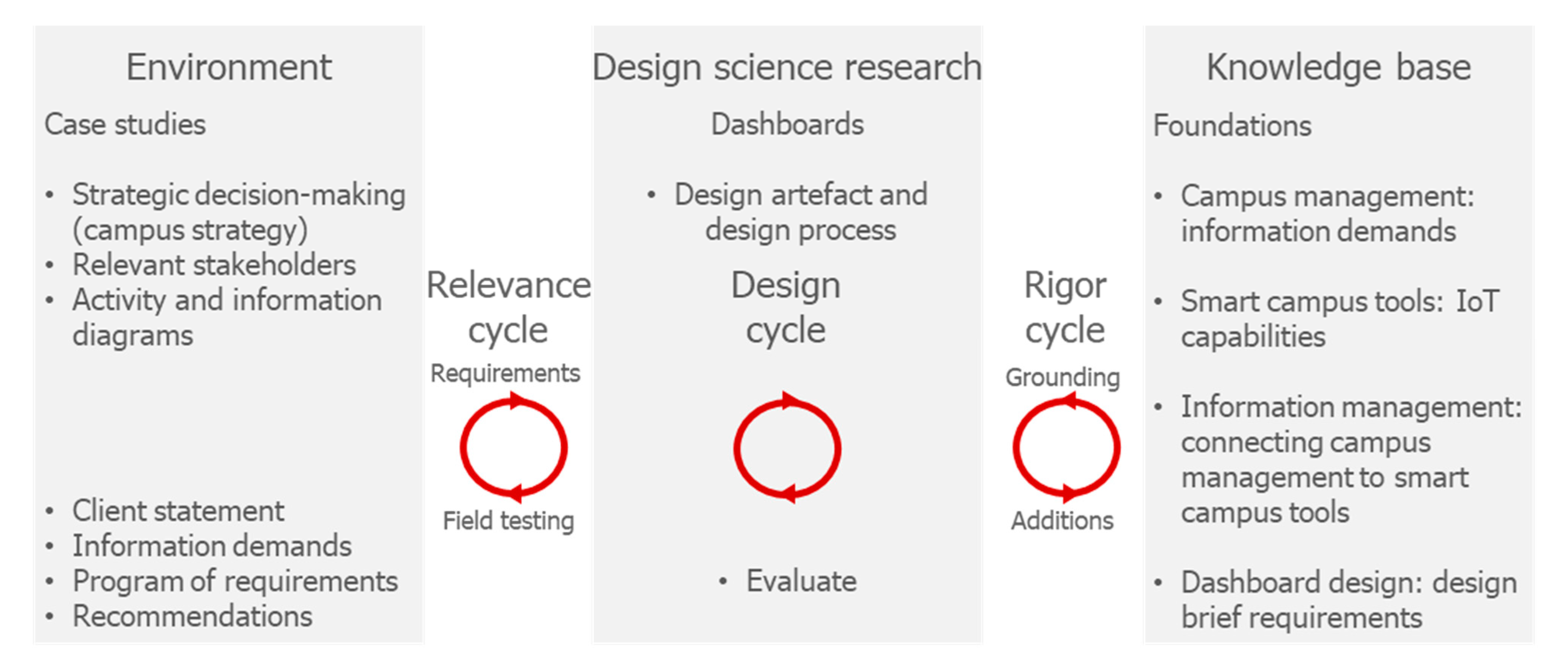
2.1. Design Research Strategy

In order to answer the main research question, design research was conducted as described in Van Aken [12,13], Hevner et al. [14] and Hevner [15]: prototypical dashboards were designed for specific campus questions and the design process and the performance of the design results was studied.
Figure 2 shows the parts of the research positioned in the framework of Hevner [15]. This framework consists of three cycles:
  • In the relevance cycle a problem is formulated for which an artefact needs to be designed and requirements to design and test the artefact;
  • In the design cycle the researcher iterates between designing and testing the artefact that is designed to solve the research problem;
  • In the rigor cycle the problem and the design outcomes are grounded in the scientific knowledge base.
In this research, both cases formulate their own specific problems. The dashboard prototypes are designed in the design cycle and tested together with relevant stakeholders. By grounding the dashboard design in existing theory and research, the knowledge generated through the design outcomes in both cases can be added to the knowledge base.
Accordingly, the design research leads to multiple design outcomes: an object design, a process design, and an implementation design (in accordance with Hevner [15]). In this research, those design outcomes are as follows:
  • The process design is the sequence of activities to realise the object design. The process design describes which steps should be taken to determine information requirements for campus decision making. Testing the process design is the main objective of this research.
  • The object design is the dashboard prototype. The dashboard is based on previous research, and is designed to support campus managers in determining the match between the demand for and supply of real estate and subsequent steps in making a campus strategy. The two resulting object designs and their usability are the secondary objective of this research.
  • The implementation design is a brief, which specifies (a) practical use requirements for the dashboard, (b) which information the dashboard needs to show to support the specific decision process and (c) which steps need to be taken to organise the dashboard accordingly. The implementation design thus reports the outcomes of the main and secondary objectives to each case.
The research design of a case is shown in Figure 3. Following the client statement, which describes the problem faced by the case and its requirements for a solution, the authors design dashboard prototypes based on dashboard design principles (from the knowledge base). The results are tested in two workshops, which took place online (due to COVID-19 restrictions) with a group of stakeholders. In each case, six participants were selected in consultation together with the client. These participants were professionals who were involved in strategic campus decision-making processes. The design of the dashboard prototypes was implemented in Microsoft Excel, a program (1) with sufficient facilities for combining various data sources and visualising data and (2) familiar to participants. The goal of the workshops was to determine the information requirements for the dashboard, which moved from what is maximally possible (workshop 1) to what is required by the participants (workshop 2). Prior to the use of the dashboard in the first workshop, users were introduced to the dashboard through a presentation and a short instruction video. Observers recorded the interactions during the workshops, which were then coded and analysed in three ways:
A1:
The number of interactions with each indicator: this was used to select which indicators were actually required in the dashboard.
A2:
The quality of the interactions with each indicator: this was used to (a) determine if participants understood the contents of the dashboard and (b) to identify opportunities to improve the dashboard.
A3:
The interventions determined by the participants on the basis of the dashboard: this was used to understand if participants could use the dashboard to complete the assignments.
As Figure 3 shows, the outcomes of analysis A1 and A2 were used to refine the design of the dashboards. They were thus part of the process design, which was proposed and tested as the main objective of this paper. The dashboard designs and analysis A3 give information about the object designs and how they were used by participants, and were thus connected to the secondary objective of this paper.

2.2. Dashboards and Dashboard Design

The use of dashboard design in this research needs to be grounded from two perspectives. Firstly, dashboard design is one of several methods to determine information requirements, i.e., the main objective of this paper. Secondly, dashboards are one of several methods to present information in decision making in campus management, i.e., the secondary objective of this paper. First this section discusses the use of dashboards as a means to present information in decision making, after which it moves to determining information requirements through their design.
Dashboards are an increasingly popular instrument in the field of performance management [16,17]. Over time, dashboards have evolved from stand-alone displays of KPIs to interactive enterprise-wide decision support systems [17]. This is cause for some confusion: some distinguish dashboards as instruments for operational decision making from scorecards as instruments for strategic decision making [18], while others define a dashboard more broadly as an instrument to be tailored to a specific type of decision or objective [19,20]. This research uses a more broad interpretation of dashboards, after Few: “a visual display of the most important information needed to achieve one or more objectives; consolidated and arranged on a single screen so the information can be monitored at a glance” [19].
This broader definition of dashboards requires further specification and alignment with their objective. Table 1 describes the characteristics of the dashboards designed in this research for the purposes of informing strategic decision making processes in campus management.
Dashboards can also be positioned against multiple criteria decision analysis (MCDA) approaches. Here, dashboards and MCDA approaches are seen as complementary rather than competing. MCDA deals with the structuring and solving of problems involving multiple criteria, such as the problems studied in the cases of this research. There is a broad range of MCDA approaches available, which have also been applied to problems in real estate management [21,22]. Following the results of our previous research, we focused on a specific activity in the decision-making process: the overview of the supply of real estate and its performance. Dashboards are well-suited to provide such an overview in a visual display, on a single screen. The objective of this overview was to create a basis for subsequent actions. In subsequent steps of this decision-making process (defining strategies and weighing and selecting strategies), MCDA approaches are usable. A dashboard combining information from the IoT with other campus management indicators actually provides a reliable basis for MCDA modelling of decisions and their impact on the criteria displayed in the dashboard.
Following the discussion about the use of dashboards to present information, the next issue is the use of dashboard design as a method to determine information requirements. Within information management this is related to the activity of requirements analysis for (information) systems development [23], also termed needs analysis or requirements engineering. The first step of requirements analysis is requirements elicitation, which concerns itself with gathering and organising information requirements from stakeholders [24]. The use of prototyping (in our case, dashboard design) is a common method to achieve this [24,25].
Other methods to elicit requirements are traditional techniques, e.g., surveys and interviews, group techniques, e.g., brainstorms and focus groups, or contextual and cognitive techniques [24,25]. Tuunanen et al. [24] review these techniques in order to find a method that (1) has the possibility to reach a wide range of users, i.e., a community, and (2) has two-directional communication, allowing for interaction and understanding of the users. In this research, the intended users of the dashboards are a small, homogeneous group; hence, its development does not have to involve many users. Furthermore, the real-time communication by IoT devices distributed in an environment affects the way users interact with it [25,26], which is another reason to use more interactive, two-directional elicitation methods such as prototyping and iterative design [26].

2.3. Case Descriptions

Two case studies were included in this research: Radboud University (RU) and TU Delft (TUD). The case selection was based on the following reasons:
  • Both cases were included in previous research [11], in which the information requirements for their processes of creating a real estate strategy were studied;
  • Key stakeholders have indicated that it is difficult to produce an overview of their real estate portfolio and its performance for use in strategic decision making;
  • They have expressed a desire to make more decisions on a portfolio level, which would require such information;
  • Currently they do not have any IoT applications implemented but wish to do so in the future.
In both cases, the dashboards display information derived from the available data on the real estate portfolio and complemented with fictive data where the sources would have been IoT applications. Further case-specific information on the use of the available data is given in the case descriptions.

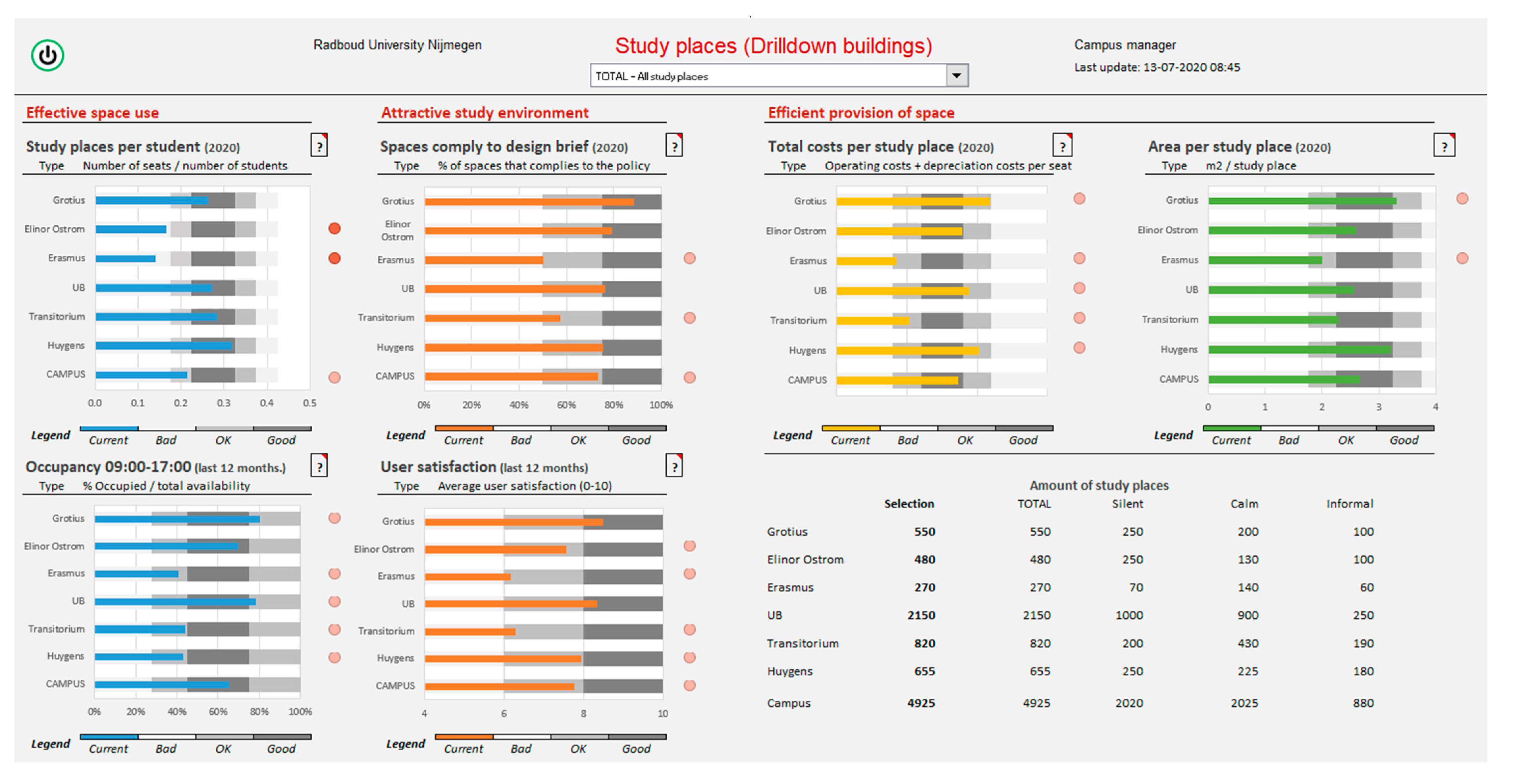
2.3.1. Radboud University Nijmegen
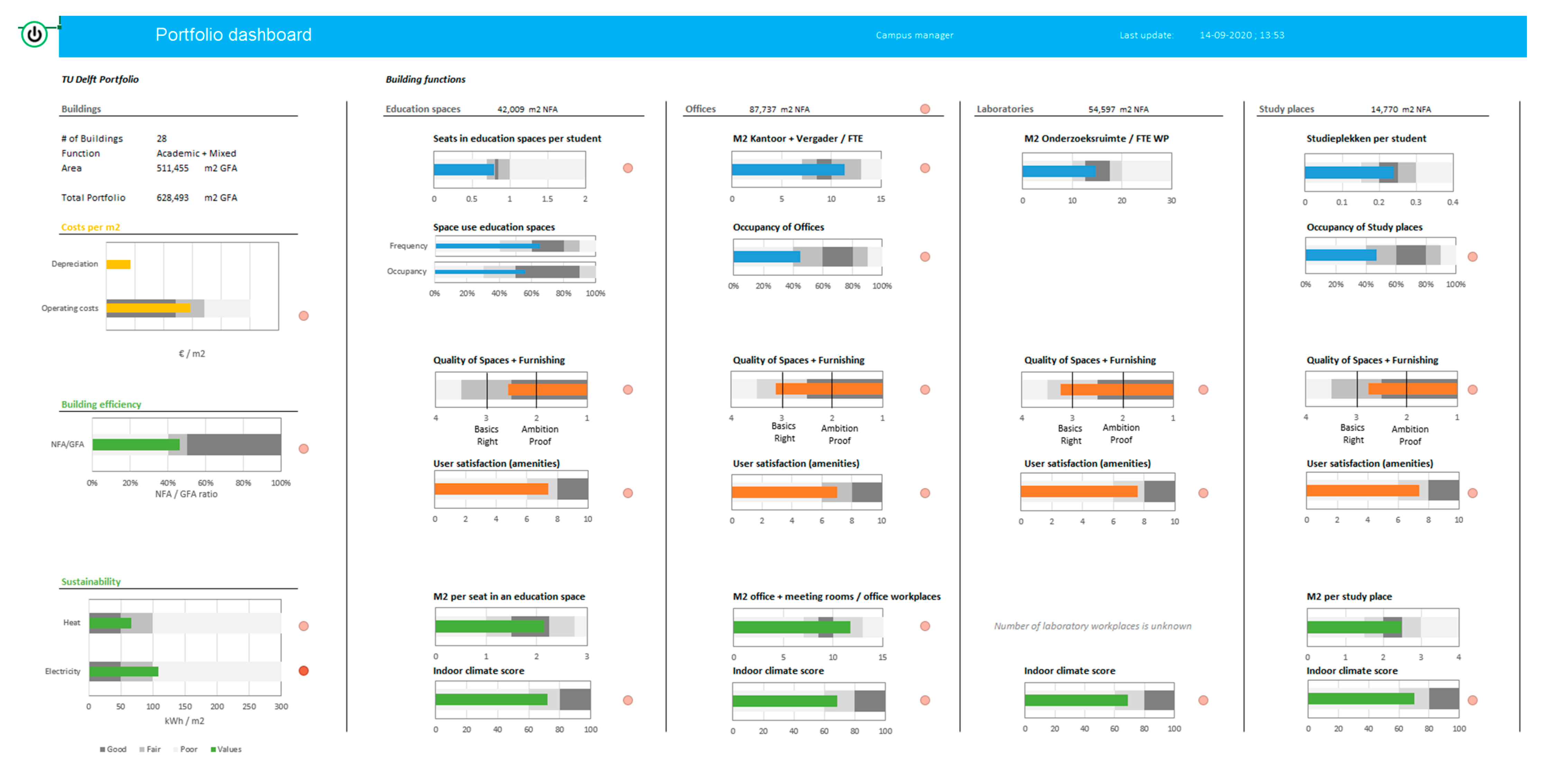
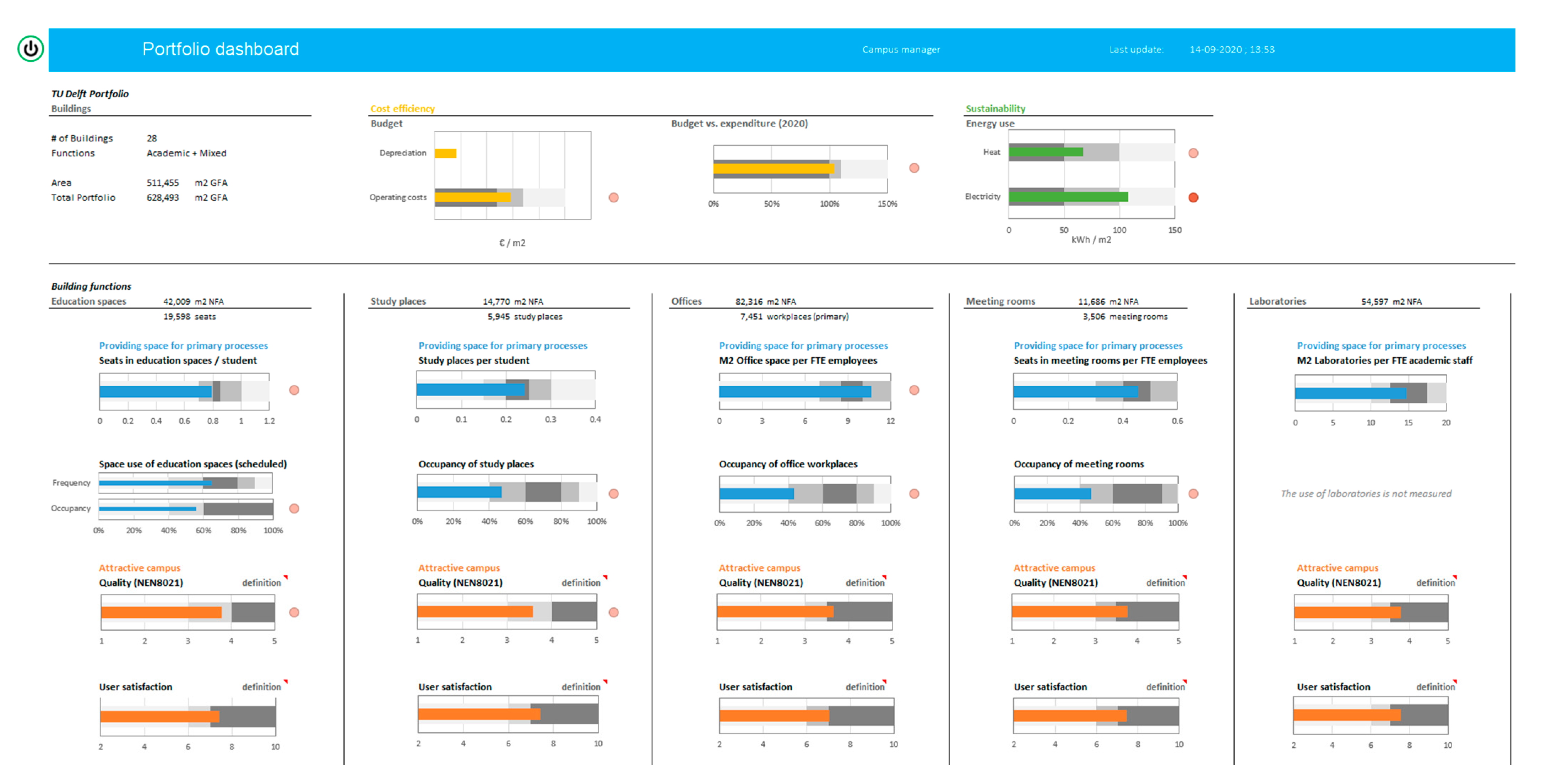
Radboud University (RU) is a university with around 22,000 students located in Nijmegen, the Netherlands. The university has concentrated its activities on its campus, which was formerly an area in the periphery of Nijmegen, but now it has become immersed by the city. At the start of 2020 the university established a new real estate strategy. The strategy focuses on sustainability and optimal use of the existing buildings on the one hand, and on further developing towards a livelier campus on the other hand. RU wants to accommodate growth maximally in the existing area and further increase the utilisation of the buildings. Rather than longer opening hours across the campus, it chooses for a synergy of existing functions. A higher utilisation is achieved by implementing modern office concepts, improving the scheduling of education and implementing smart tools to show the available capacity within the existing spaces to the users.
In this research, the university chose to focus the case on its study places. In the existing situation, there are many types of study places in the various buildings of the university. Each student uses mostly the study places of their own faculty and the library building. There is no overview of all the study places; furthermore, the management of the study places is organised in different ways. In the future the university wants to use all study places as flexible, shared facilities that can be used by any student at the university. At the time of the research, following the transfer of study place assets from the faculties to the department of campus and facilities, a project group was working towards a uniform way of managing them. This included stating the desired quality and quantity of study places, the use of personnel and the required finances.
The RU campus has around 28 university buildings, six of which contain study places. Beyond their location, not much information on study places is available. The floor area per study place and costs of each building are known. However, the number and type of study places are not registered. In the dashboard, information is required on room level, including floor area, type, capacity and costs. Consequently, what was displayed in the dashboard prototypes had to be supplemented with hypothetical, plausible data, both for the real estate indicators and the information that would be delivered through IoT. This should not influence the quality of the results. Even with fictive data, workshop participants could assess the performance of the real estate portfolio and define interventions based on that. Any deviation from reality would not impede utilization of the indicators included in the dashboard and, therefore, the workshops would still provide the envisaged feedback.

2.3.2. TU Delft

TU Delft (TUD) is a university with around 26,000 students located in Delft, The Netherlands. TUD houses its activities on its campus, located south of Delft’s city centre. In 2019 the university’s Campus and Real Estate (CRE) department established a new campus strategy, which focuses on optimal use of the existing facilities and resources to realise the university’s ambitions and accommodate growth. The campus strategy includes the construction of new buildings in the south of the campus, intensifying the use of existing buildings in the middle of the campus, and disposition of buildings in the north of the campus.
In this research, TUD chose to focus on dashboards for the whole portfolio and for separate buildings to be used in reporting and updating its campus strategy. A first version of this dashboard had been made to show the current performance of the portfolio and buildings, but which would also serve as a basis for showing the expected performance as a result of the campus strategy. The main issue with these dashboards is how to provide an overview of a building or portfolio at one glance. Furthermore, the case offers the opportunity to further develop the first version of the existing dashboards and develop a vision on which information from IoT is valuable to include in those dashboards.
There are around 60 buildings on the TUD campus. It was decided to focus on buildings, wholly or partially used for academic purposes, which included around 80 percent of the area in the portfolio. The floor area and space types were known for each space. The capacity was also largely known for each space. The number of users, quality, costs and energy use were known for each building. Space utilisation data was known per room for education spaces and study places, based on a 2019 survey. The dashboard was thus based on real data, with the exception of the information to be delivered by IoT. Therefore, in contrast to the first case, it was expected that the participants would frequently relate the information in the dashboard to their existing knowledge of the campus.

3. Results

3.1. Principles for Dashboard Design

The design of the dashboards in this research is based on a knowledge base combining theories and instruments from corporate real estate management (CREM), building automation, the IoT and information management. The dashboard is further detailed using design principles for dashboards as outlined by Few [19]. Following the earlier definition by Few (see Section 1), there are several requirements for dashboards—just as in a dashboard of a car: a dashboard should not display all information, but the information that is needed to perform a specific activity such as driving a car. This information is collected from multiple sources: a car dashboard obtains data from sensors in the tank, engine, transmission, etc., to report fuel levels, speed, rotations, etc. Finally, information is reported succinctly and meaningfully to the user, e.g., by showing a meter with thresholds for maximum speed or for fuel tank content, or simply by displaying an alert when a seatbelt is not used.
From CREM several principles are drawn for a dashboard to be used in university campus management, based on Den Heijer [27]. These principles direct choices on which type of indicators to consider and which to omit (to avoid information overload), and how to report them. The principles are:
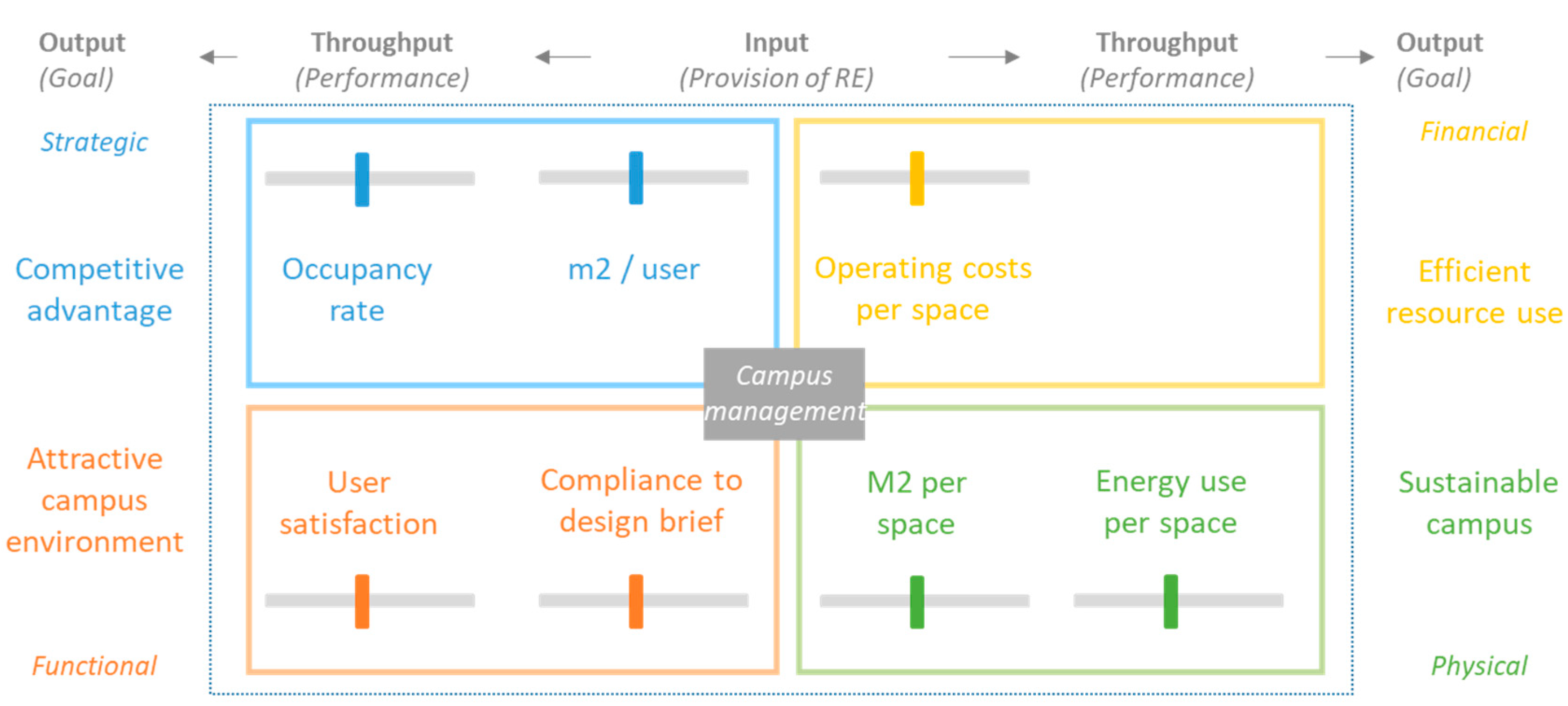
  • The dashboard reports on the process of adding value through real estate. Real estate is positioned as the input, the use of the real estate as the throughput, and the organisational performance as output;
  • The four stakeholder perspectives must be present in the dashboard. If a dashboard is tailored towards a specific group, the dashboard should include information on the other perspectives. The question is, what are the key indicators per perspective;
  • Preferably, the indicators should be related to each other—e.g., euro/m2, users/m2, etc.;
  • The indicators in the dashboard are customised to the type of campus decision, and limited in number by the requirement to fit on a single screen;
  • The stakeholder perspectives are applicable on multiple abstraction levels: e.g., on the organisational level of the university, faculty or department and on the real estate level of a building portfolio, building or set of spaces.
From the IoT, lessons with regards to the sensing of properties of the environment with various technologies are drawn [11,28]. The real-time data supplied by the IoT allows for better use of spaces on campus by users on a day-to-day basis. Furthermore, real estate managers can make better decisions about demand in the long term, when real-time data collection is used as a ‘ground truth’ [29,30] for actual space use. Previous research provides overviews of the management information that can be made available through IoT applications.
From information management, lessons on the use of information technologies (IT) are drawn, including those of the IoT, in order to deliver value in organisations. In previous research [11] process and information analyses were conducted for both cases presented here. These analyses match the demand for information from campus management and the supply of information from the IoT and other IT systems, and thus serve as a foundation for the information requirements to be satisfied in the dashboard.
The information requirements for an overview of existing spaces include various space characteristics such as type, area, capacity, condition level and level of amenities. The IoT complements these with information on frequency and occupancy rates, user satisfaction, energy use and indoor environmental quality. These requirements are combined with the five principles from CREM to guide the conceptual design (see Figure 1). This conceptual design is the starting point of the cases: designing what is possible with IoT applications. Following that, the cases focus on selecting what is desired from IoT applications.
After determining which information to display, the next issue is how to display it. Table 2 provides several considerations with regards to displaying information. Each property of a dashboard is matched with initial values for the real estate dashboards and matching indicators. The variations in timing depend on the type of information displayed. For the existing situation, the current performance of real estate indicators is shown. For IoT indicators this is the year-to-date performance. In addition, a comparison over the past five years is required because real estate indicators tend to change very slowly. The most important comparisons in the dashboard, aside from the comparison in time, are a comparison to norms determined by the organisation and a comparison across buildings. Visual indicators are used to draw user attention to poor performance. Finally, data on objects and past interventions are added to provide further context to the contents of the dashboards.
An important choice drawn from Few [19] is the use of bullet graphs for clear visual communication. The advantage of bullet graphs is that they enable the display of performance on an indicator across multiple divisions of the portfolio and compared to values for poor, medium and good performance. Figure 4 shows an example of a bullet graph used in one of the dashboards in this research. The overlay of measurement on requirements makes it easier to discern which parts of the portfolio perform well and which do not.

3.2. Dashboard Designs and Design Outcomes

3.2.1. Radboud University

The dashboard design for RU was determined by two information needs that must be satisfied: (1) establishing the match between the demand for spaces and the supply of spaces and (2) identifying trends that may impact the future demand for spaces. This led to the initial division into two dashboards (Figure 5 and Figure 6). Each dashboard initially contained eight indicators, four related to the provision of real estate and four related to space use: study places per student, average stay duration, the percentage of spaces that comply to the brief, user satisfaction, total costs per study place, occupancy, floor area per study place and energy use per study place. In the main dashboard, the performance on each indicator was visible for every type of study place and the whole portfolio. In the trends dashboard, the performance on the whole portfolio over the past five years was visible. In both dashboards, the user could navigate between viewing the performance on a campus-level or selecting a specific building.
After the first workshop, the indicators stay duration and energy use were omitted as they were found to be of less importance to determine the performance of the study place portfolio (see Section 3.3.1). Furthermore, two other dashboards were made (see Appendix A): one in which the main dashboard displayed the performance per building rather than per type of study place, and another that offered a more detailed insight into the performance on four criteria. These were tested in workshop 2.
The dashboard tested in workshop 2 complied to the requirements set in Section 3.1: (1) it positioned traditional real estate indicators in the top row as input and indicators based on information from the IoT below them as throughput; (2) it contained indicators in each stakeholder perspective; (3) it defined the indicators in such a way that their values could be related to each other; (4) it was customised for decisions on the study places of the university and (5) it reported on both a portfolio and a building level. Both the main dashboard and the alternative to the main dashboard were found to be useful by the participants. The additional dashboard was also found to be useful, but requires further development and testing.

3.2.2. TU Delft

The dashboard design for TUD focused primarily on resolving the challenge of displaying the information in a clear way. Firstly, there was a challenge in what could be reported on a building level, i.e., costs and energy use, and information to be reported across the different space types of the building, i.e., education spaces, study places, offices and laboratories (and later meeting rooms). This led to the design of a dashboard showing the performance on the level of the whole portfolio or a selected building. The design of the dashboards was identical. To help navigate through the building dashboard, an overview was given of the buildings, which required the most attention. Initially, the dashboard contained five building-level criteria (Figure 7): operating costs, depreciation costs, building efficiency and energy use in warmth and electricity. For each space type, it contained six criteria: seats (or m2) per user, space utilisation in frequency and/or occupancy, quality, user satisfaction, floor area per seat and an indoor environmental quality score.
After the first workshop, the indicators building efficiency, m2 per seat and the indoor environmental quality score were omitted because they were deemed less important in determining the performance of the portfolio (see Section 3.3.1). A financial criterion was added to reflect the use of resources during the year: budget vs. expenditure. The type of office spaces was further distinguished into offices and meeting rooms. After these amendments, a trends dashboard was made to show the development in past years (see Appendix A). Finally, the overview to help navigate through the building dashboard was improved, based on feedback. In the first version, this overview included a ranking per space type to direct the user to the buildings requiring attention for each space type. This was adjusted to one overview with a list of the five buildings requiring the most overall attention. The dashboard tested in the second workshop is displayed in Figure 8.
The dashboard tested in workshop 2 complied with the requirements set in Section 3.1: (1) it positioned traditional real estate indicators as input and indicators drawing information from the IoT below them as throughput per stakeholder perspective and space type; (2) it contained indicators from each stakeholder perspective; (3) it defined the indicators in such a way that their values could be related to each other; (4) it was customised for decisions on the buildings of the university and (5) it reported on both a portfolio and a building level. The main dashboard was found to be useful by the participants. The trends dashboard and the overview for navigation were not sufficiently used in the workshops to evaluate thoroughly and require further development.

3.2.3. Design Outcomes (Analysis A3)

In each workshop, the participants were asked to complete two assignments using the dashboard: first, to assess the performance of the whole portfolio, and second, to determine interventions per building. This analysis discusses these interventions as the outcomes of using the dashboards. The proposed interventions for specific buildings were compared to initial conclusions drawn up by the main author. For each specific building, the three most important interventions were drawn up a priori and compared to the interventions proposed by the participants. Each intervention could occur multiple times across buildings, and they could be determined in separate occurrences by participants, as there were three outcomes of workshop 1 and 2 outcomes of workshop 2.
Table 3 lists the most important interventions drawn up in the RU case, the number of times they occur and to what extent these interventions were also defined by the participants. Each intervention could occur six times at most, as there were six buildings, which could potentially all require the same intervention. Then, the interventions determined by the participants were compared to the number of times these interventions could have been determined. Table 4 shows that participants were able to define multiple interventions. They were particularly focused on silent study places in workshop 1. In workshop 2, participants were focused more on identifying qualitative interventions. Furthermore, the table shows that the participants identified five interventions, which were not identified in the author’s main conclusions. The identification of these interventions shows an ability to combine the information from the dashboard with knowledge about the campus, the buildings and its users that is not contained in the dashboard: e.g., discussing how to redevelop quality requirements, by sending students to other buildings or by naming the planned disposition of a building as an intervention.
Table 4 shows the results for the TUD case. Here, the number of possible occurrences of interventions was based on the buildings selected by the participants to study, as there were more than 40 buildings in the model. The selected buildings differed somewhat per workshop group. Similar to the first case, participants were able to define multiple interventions. The results show that participants were mainly focused on quantitative interventions (increase or reduction of a type of space), and less on qualitative interventions. Furthermore, the participants defined four additional interventions. These interventions and the additional comments revealed a need for more specific information on occupancy patterns, which could be delivered through drill-down dashboards (see case 1). Furthermore, they show the ability of participants to connect the information in the dashboards to existing knowledge of the portfolio, e.g., the current tenants’ demands and satisfaction levels.

3.3. Refining and Adjusting Dashboard Information Requirements

3.3.1. Relative Importance of Indicators (Analysis A1)

This analysis studies the use frequency of indicators during the assignments in order to determine which indicators to exclude from the dashboards. In each assignment, participants first completed the assignment and were then asked to state their conclusions. First, the number of mentions per indicator during the navigation was counted; then, the indicators were ranked from 1 to 8 based on those counts. The score indicates the average rank of each indicator during each workshop. The results of the workshops were averaged. Based on the average, rank indicators were categorised in terms of their importance and compared to the use of indicators mentioned by participants in their conclusions, also based on an average of counts.
The outcomes of both cases were also compared to the performance on each indicator according to the dashboards (i.e., where the dashboards draw the user’s attention to). The comparisons showed that there was little to no relation between what the model draws attention to and what the participants look at. This suggests that the participants of the workshop used the model based on their own expertise and not just by what the model indicates. This is a positive finding with respect to usability, which is the subject of the third analysis.
The outcomes of the analysis for the RU case are reported in Table 5. In the first workshop, based on the use of the indicators in the assignments, study places/student, occupancy, compliance to the brief and user satisfaction were determined to be of high importance; floor area per place was of medium importance; costs, stay duration and energy use were categorised as low importance. The use of the indicators in formulating conclusions supported these findings. Based on these results, stay duration and energy use were omitted from the dashboard in the second workshop. Despite low importance, costs were not omitted, following the dashboard requirement of including information from each stakeholder perspective. The results of the second workshop were very similar to those of the first.
The outcomes of the analysis for the TUD case are reported in Table 6. The table distinguishes building-level and space-type indicators because each space-type indicator was repeated per space type and was thus used much more frequently in the assignments. Consequently, these indicators were counted separately for each space type and averaged prior to their ranking. The use of indicators in formulating conclusions deviated slightly from the assignments, especially for sustainability and user satisfaction. Based on the results, building efficiency and indoor climate score were omitted because of low scores; additionally, m2 per seat was removed to reduce the information load. On the other hand, sustainability remained in the dashboard following the requirement of including information from each stakeholder perspective.
The results of the second workshop are similar to the first workshop, except for sustainability. Furthermore, given the feedback of some of the participants, it should be considered to add the m2 per seat indicator to the dashboard again.

3.3.2. Information Quality and Flow (Analysis A2)

In this analysis, the quality of the use of indicators during the assignments was analysed. Based on observation, the use of an indicator was labelled as positive or negative. Positive uses, which suggest sufficient information quality and flow, reacted to a positive or negative situation in the model, seeking relations between indicators or seeking relations with the real-life context. Negative uses, which suggest insufficient information quality and flow, ignorance of the situation in the model, confusion about what is displayed or a dead end (the user gets stuck in the interpretation of the model due to wrong interpretations). Each of these uses was counted in the transcript of the workshop, with the relationships between indicators counted as 0.5 point per indicator and all other types of uses as 1 point. Ignorance of situations in the model was determined by comparing the points to which the model draws attention with if the participants pay attention to those points.
In both cases, the number of positive interactions during the first workshop greatly outnumbered the number of negative interactions: see Table 7. At RU the ratio was 6.1:1, at TUD 5.2:1. This analysis supports the initial observations made during the workshops, namely that participants were able to use the model well to complete the assignments and form conclusions. Between the cases a difference can be observed in how the model was used: at RU participants made sense of the information by reacting to what was in the model and relating indicators to each other, while at TUD participants made more connections between what was in the model and the situation in reality. This is thought to be the effect of using fictive data in the first case, which forced participants to focus on what was in the dashboard.
The primary objective towards workshop 2 was to reduce the number of negative interactions by improving information quality. At RU there was some confusion about the definitions of study places per student, stay duration and occupancy. To resolve this, pop-ups giving the definitions were added next to each indicator. In addition, for study places per student and occupancy, a ‘drilldown’ dashboard was made that enabled the users to see the differences in performance during education weeks and exam weeks. At TUD, there was confusion with regards to the definitions of quality, user satisfaction and the indoor climate score. Here, pop-ups giving the definition of the latter two were added to remove confusion, while for quality a link led to the description of an existing framework for defining quality.
As a result of these changes, in workshop 2 the ratio of positive to negative interactions increased at TUD from 5.2:1 to 8.7:1. At RU, the ratio decreased from 6.1:1 to 5.4:1. However, the decrease is due to one new participant, who participated only in workshop 2. If the group including this participant was excluded from the results, the ratio increased to 8.5:1. At RU, the confusion concerning indicators was reduced, which suggests that the adjustments to the model had an effect. However, the alerts for the cost indicator were fairly often ignored, which suggested further improvement to the information quality of this indicator is needed. At TUD, the confusion with regards to costs increased as well. This was largely due to the addition of another financial indicator between the first and the second workshop. Furthermore, participants indicated that, to be able to reach conclusions, they needed additional information on indicators such as quality and user satisfaction, despite clarity in their definitions. Here a similar ‘drilldown’ dashboard as in the first case would be useful.

4. Conclusions

The main question to be answered in this research was: How can the information demands of campus management be matched to the capabilities of IoT applications, and optimally displayed in a dashboard? This research question is connected to the main objective of this research (to develop a connection between IoT applications and real-life decision-making processes) and a secondary objective (to design usable dashboards for campus managers).
With regards to the secondary objective, the results described the translation of various principles and the outcomes of process and information analysis into a conceptual design for dashboards. The designs for both cases were evaluated and were found to be compliant with the principles outlined in Section 3.1. Next, the results of analysis A1 showed that the participants made use of indicators in all four stakeholder perspectives to formulate different kinds of interventions (see analysis A3). These results show that it is possible to design usable dashboards for a portfolio of study places and for an entire real estate portfolio at a university, combining data from existing systems and data to be delivered by IoT, based on the combination of principles from various fields [11,19,23,27].
Additionally, the findings from analysis A2 suggest that involving participants in the design process improved the usability of the dashboards, as the refined dashboards resulted in a higher ratio of positive to negative interactions. This is supported by participants, who indicated that the workshops enabled them to learn how to use the dashboards and work with their information. Specifically, the introduction of the dashboard in the first workshop was appreciated. Analysis A2 also showed that for some indicators such as quality, user satisfaction, but also occupancy and m2 per user, participants may require definitions and explanations. ‘Drilldown’ dashboards were proposed as a solution (case 1) for analysts to determine interventions with precision.
With regards to the main objective, the results describe how the workshops resulted in the selection of indicators (analysis A1) and how improvements to the design resulted in improved usability in the second workshop (analysis A2). In the first case, the information requirements for the IoT were determined to be occupancy and user satisfaction; in the second case, the dashboard was required to include data on frequency and occupancy (depending on space type) and on user satisfaction. Next to the information requirements for the IoT, the design process also resulted in further information requirements. For example, in both cases requirements were formulated for the measurement and reporting of quality. The use of multiple workshops to test the dashboards, to assess which indicators are useful and if the total dashboard is still a good overview, helps with the selection of information. Prototyping (see Section 2.2) is thus found to be a suitable method for the purpose of this research, as suggested by [24,25,26].
In the process of dashboard prototyping, the number of iterations (workshops) is a factor to consider. Especially when there are many indicators involved and participants feel that one or more of the excluded indicators should be reconsidered, a third workshop is useful. It can also help to test different dashboard alternatives, including different indicators per stakeholder perspective. In the second case, a third workshop could have been used to specify the indicators per space type. However, more iterations may also result in loss of focus or confusion. In case 2, the addition of an indicator after the first workshop was found to result in confusion. Therefore, workshops should generally work towards the use of fewer indicators, the addition of previously removed indicators or specifying existing indicators.
Finally, the results were used to develop design briefs, i.e., implementation designs. These design briefs covered the intended use of the dashboards, detailed definitions for each indicator, including information source, and procedures for addressing the complexity of acquiring the data and translating it to the information in the dashboard. Based on that and the existing situation, costs for acquiring and maintaining the data were estimated and a step-by-step plan was made for each organisation to realise the dashboard. In both cases, the design briefs were received positively by stakeholders and the client.
Though the dashboards seem quite similar, the client statements and departure points of the cases were different, leading to different outcomes. At Radboud University the objective was to help the Campus and Facilities department to manage the portfolio of study places, following the recent transfer of ownership from the faculties to their department. The results showed that even when not much information is available, dashboard design helps to make decisions on structuring information and thus on data collection. The step-by-step plan thus comprised specific steps, e.g., the acquisition of IoT applications, making a policy detailing quality requirements and the data collection to monitor that policy.
At TU Delft, the objective was to give the CRE department an overview of the portfolio and buildings for use in updating the campus strategy. Compared to the first case an initial design and more information were available. The results showed how dashboard design helps to consolidate information on both a building-level and space-type level in the same screen in a simple, usable way. In particular, this design showed how to organise information on a higher order: to help understand what part of the building or portfolio requires attention, how important that part is, and how comparisons across space types can be made. The step-by-step plan included more generic steps than in the previous case, e.g., decide per space type in which way to measure frequency/occupancy and determine how to measure quality across the portfolio. Within each step, more detailed decisions have to be made.
In summary, the use of dashboard design shows several positive indications for determining IoT information requirements. The designed dashboards could be used by participants to complete the assignments, and led to several indications on how the designs may be further improved. Further research is needed to better understand how choices in the dashboard design affect results. This includes application of the dashboards in tactical and operational decision making.

Author Contributions

Conceptualization, B.V., M.A., A.K., A.D.H.; methodology, B.V., M.A., A.K., A.D.H.; software, B.V.; validation, B.V., M.A., A.K., A.D.H.; formal analysis, B.V.; investigation, B.V.; resources, B.V.; data curation, B.V.; writing—original draft preparation, B.V.; writing—review and editing, B.V., M.A., A.K., A.D.H.; visualization, B.V.; supervision, M.A., A.K., A.D.H.; project administration, M.A.; funding acquisition, M.A., A.D.H. All authors have read and agreed to the published version of the manuscript.

Funding

The two case studies reported in this paper are separately funded. The case study of Radboud University was funded through an agreement to conduct research related to (1) the development of the university’s campus strategy and (2) the development of the information systems, which support campus decision making. The case study of TU Delft has been funded through an agreement with the university’s Campus and Real Estate department and Executive Board to conduct research on several strategic themes related to the development and management of the campus.

Institutional Review Board Statement

Given the relationship of the participants to the researchers and the nature of this research, this research was conducted in compliance with the university’s ethical guidelines. Therefore, a review was not applicable.

Informed Consent Statement

Informed consent was waived due to (a) minimal risk for subjects and (b) the fact that no personal data was collected or stored.

Data Availability Statement

The data presented in this study are placed under embargo at https://0-doi-org.brum.beds.ac.uk/10.4121/13664213.v1, and available on request from the corresponding author. The data are not publicly available because the workshops contain potentially sensitive information.

Acknowledgments

The authors would like to thank all the participants in both cases for their fruitful collaboration.

Conflicts of Interest

The main author is employed part-time as a policy officer at the Campus and Real Estate department of TU Delft, which also participates as a case study in this research.

Appendix A. Additional Dashboard Designs

Figure A1. Buildings dashboard ‘Study places Radboud University’ (tested in workshop 2).
Buildings 11 00201 g0a1
Figure A2. Drilldown dashboard ‘Study places Radboud University’ (tested in workshop 2).
Buildings 11 00201 g0a2
Figure A3. Trends dashboard TU Delft (workshop 2).
Buildings 11 00201 g0a3
Figure A4. Overview of buildings TU Delft (workshop 2). The dashboard shows the five buildings that require the most attention and to which aspects attention should be directed.
Buildings 11 00201 g0a4

Appendix B. Information Quality and Flow Analysis

Table A1. Positive and negative interactions of users with the dashboard in workshop 1 (Radboud).
Workshop 1Positive (Confirmation)Negative (Disproval)
IndicatorsReaction to alerts, TrendsRelation Between IndicatorsConnection to realityIgnoring AlertsConfusion (Definitions etc.)Dead Ends
Study places per student2175121
Stay duration823270
Total costs144.51000
Occupancy1884250
Compliance to brief188.53110
User satisfaction15105110
m2/place1261210
Energy use1330400
Confirmation/Disproval19031
Table A2. Positive and negative interactions of users with the dashboard in workshop 2 (Radboud).
Workshop 2Positive (Confirmation)Negative (Disproval)
IndicatorsReaction to alerts, TrendsRelation Between IndicatorsConnection to realityIgnoring AlertsConfusion (Definitions etc.)Dead Ends
Study places per student13711230
Stay duration
Total costs45.52410
Occupancy1462120
Compliance to brief153.57120
User satisfaction143.56310
m2/place87.56320
Energy use
Confirmation/Disproval13525
Table A3. Positive and negative interactions of users with the dashboard in workshop 1 (TU Delft).
Workshop 1Positive (Confirmation)Negative (Disproval)
IndicatorsReaction to alerts, TrendsRelation Between IndicatorsConnection to realityIgnoring AlertsConfusion (Definitions etc.)Dead Ends
Costs832010
Building efficiency30.54000
Sustainability60.52100
m2 per user3117.527050
Frequency and occupancy15815200
Quality185.5186130
User satisfaction128.58250
m2 per seat136.57220
Score indoor climate1606830
Confirmation/Disproval26150
Table A4. Positive and negative interactions of users with the dashboard in workshop 2 (TU Delft).
Workshop 2Positive (Confirmation)Negative (Disproval)
IndicatorsReaction to alerts, TrendsRelation Between IndicatorsConnection to realityIgnoring AlertsConfusion (Definitions etc.)Dead Ends
Costs42.53160
Building efficiency20.50000
Sustainability111.510000
m2 per user2711.529020
Frequency and occupancy198.529050
Quality1889220
User satisfaction1869350
m2 per seat000000
Score indoor climate000000
Confirmation/Disproval226.526

References

  1. OECD. Education at a Glance 2019. OECD Indicators; OECD Publishing: Paris, France, 2019. [Google Scholar]
  2. TU Delft. Campus NL—Investeren in de Toekomst (Commissioned by the VSNU and 14 Universities); TU Delft, Faculty of Architecture, Dept. Management in the Built Enviroment (MBE): Delft, The Netherlands, 2016. [Google Scholar]
  3. Sankari, I.; Peltokorpi, A.; Nenonen, S. A call for co-working—users’ expectations regarding learning spaces in higher education. J. Corp. Real Estate 2018, 20, 117–137. [Google Scholar] [CrossRef] [Green Version]
  4. Schulze-Cleven, T.; Olson, J.R. Worlds of higher education transformed: Toward varieties of academic capitalism. High. Educ. 2017, 73, 813–831. [Google Scholar] [CrossRef]
  5. Lepori, B.; Reale, E. The changing governance of research systems. Agencification and Organisational Differentiation in Research Funding organisations. In Handbook of Science and Public Policy; Simon, D., Ed.; Edward Elgar Publishing: Cheltenham, UK, 2019. [Google Scholar]
  6. Den Heijer, A.; Tzovlas, G. The European Campus—Heritage and Challenges; TU Delft: Delft, The Netherlands, 2014. [Google Scholar]
  7. Kadamus, J. The State of Facilities in Higher Education. 2013 Benchmarks, Best practices, & Trends; Sightlines: Guilford, CT, USA, 2013. [Google Scholar]
  8. Newell, G.; Manaf, Z. Education as an Asset Class; Western Sydney University: Penrith, NSW, Australia, 2017. [Google Scholar]
  9. McCann, L.; Hutchison, N.; Adair, A. External funding of major capital projects in the UK Higher Education sector: Issues of demand, supply and market timing? J. Prop. Res. 2019, 36, 97–130. [Google Scholar] [CrossRef]
  10. Valks, B.; Arkesteijn, M.H.; den Heijer, A.C.; Putte, H.J.M.V. Smart campus tools. Adding value to university goals by measuring real-time space use. J. Corp. Real Estate 2018, 20, 103–116. [Google Scholar] [CrossRef]
  11. Valks, B.; Arkesteijn, M.H.; Koutamanis, A.; Heijer, A.C.D. Towards a smart campus: Supporting campus decisions with Internet of Things applications. Build. Res. Inf. 2021, 49, 1–20. [Google Scholar] [CrossRef]
  12. Van Aken, J.E. Management Research Based on the Paradigm of the Design Sciences: The Quest for Field-Tested and Grounded Technological Rules. J. Manag. Stud. 2004, 41, 219–246. [Google Scholar] [CrossRef]
  13. Van Aken, J.E. Management Research as a Design Science: Articulating the Research Products of Mode 2 Knowledge Production in Management. Br. J. Manag. 2005, 16, 19–36. [Google Scholar] [CrossRef]
  14. Hevner, A.R.; March, S.T.; Park, J.; Ram, S. Design Science in Information Systems Research. MIS Q. 2004, 28, 75. [Google Scholar] [CrossRef] [Green Version]
  15. Hevner, A.R. A Three Cycle View of Design Science Research. Scand. J. Inf. Syst. 2007, 19, 87–92. [Google Scholar]
  16. Bremser, W.; Wagner, W.P. Developing Dashboards for Performance Management. CPA J. 2013, 83, 62–67. [Google Scholar]
  17. Yigitbasioglu, O.M.; Velcu, O. A review of dashboards in performance management: Implications for design and research. Int. J. Account. Inf. Syst. 2012, 13, 41–59. [Google Scholar] [CrossRef]
  18. Cokins, G. The promise and perils of the balanced scorecard. J. Corp. Account. Financ. 2010, 21, 19–28. [Google Scholar] [CrossRef]
  19. Few, S. Information Dashboard Design: The Effective Visual Communication of Data; O’Reilly: North Sebastopol, CA, USA, 2006. [Google Scholar]
  20. Eckerson, W.W. Performance Management Strategies. How to Create and Deploy Effective Metrics. Bus. Intell. J. 2009, 14, 24–27. [Google Scholar]
  21. Arkesteijn, M.; Valks, B.; Binnekamp, R.; Barendse, P.; de Jonge, H. Designing a preference-based accommodation strategy: A pilot study at Delft University of Technology. J. Corp. Real Estate 2015, 17, 98–121. [Google Scholar] [CrossRef]
  22. Zavadskas, E.K.; Turskis, Z.; Šliogerienė, J.; Vilutienė, T. An integrated assessment of the municipal buildings’ use including sustainability criteria. Sustain. Cities Soc. 2021, 67, 102708. [Google Scholar] [CrossRef]
  23. Bytheway, A. Investing in Information. The Information Management Body of Knowledge; Springer International Publishing: Cham, Switzerland, 2014. [Google Scholar]
  24. Tuunanen, T. A new perspective on requirements elicitation methods. J. Inf. Technol. Theory Appl. 2003, 5, 7. [Google Scholar]
  25. Lim, T.; Chua, F.; Tajuddin, B.B. Elicitation Techniques for Internet of Things Applications Requirements: A Systematic Review. In ICNCC 2018; ACM: Taipei City, Taiwan, 2018. [Google Scholar]
  26. Bergman, J.; Olsson, T.; Johansson, I.; Rassmus-Gröhn, K. An exploratory study on how Internet of Things developing companies handle User Experience Requirements. In Proceedings of the International Working Conference on Requirements Engineering, Utrecht, The Netherlands, 19–22 March 2018; Springer: Utrecht, The Netherlands, 2018; pp. 20–36. [Google Scholar]
  27. Den Heijer, A. Managing the University Campus; Eburon Academic Publishers: Delft, The Netherlands, 2011. [Google Scholar]
  28. Valks, B.; Arkesteijn, M.; Heijer, A.D. Smart campus tools 2.0 exploring the use of real-time space use measurement at universities and organizations. Facilities 2019, 37, 961–980. [Google Scholar] [CrossRef] [Green Version]
  29. Sadd, J.L.; Hall, E.S.; Pastor, M.; Morello-Frosch, R.A.; Lowe-Liang, D.; Hayes, J.; Swanson, C. Ground-Truthing Validation to Assess the Effect of Facility Locational Error on Cumulative Impacts Screening Tools. Geogr. J. 2015, 2015, 1–8. [Google Scholar] [CrossRef] [Green Version]
  30. Sadd, J.; Morello-Frosch, R.; Pastor, M.; Matsuoka, M.; Prichard, M.; Carter, V. The Truth, the Whole Truth, and Nothing but the Ground-Truth: Methods to Advance Environmental Justice and Researcher–Community Partnerships. Health Educ. Behav. 2013, 41, 281–290. [Google Scholar] [CrossRef] [PubMed]
Figure 1. Conceptual design for the structure of the dashboards, based on previous research (see also Section 3).
Buildings 11 00201 g001
Figure 2. Design research cycles in this research (adapted from [15]).
Buildings 11 00201 g002
Figure 3. Research design for one case, displayed twice to show the relationship between the analyses and main and secondary objectives. The resulting design brief answers the client statement. The analyses of the testing phase inform the knowledge base. A1, A2 and A3 denote the three analyses reported in the paper. Emphasis in bold denotes relevance to each objective.
Buildings 11 00201 g003
Figure 4. Example of a bullet graph (own illustration).
Buildings 11 00201 g004
Figure 5. Main dashboard ‘Study places RU’ (tested in workshop 2).
Buildings 11 00201 g005
Figure 6. Trends dashboard ‘Study places RU’ (tested in workshop 2).
Buildings 11 00201 g006
Figure 7. Main dashboard ‘Portfolio TUD’ (tested in workshop 1).
Buildings 11 00201 g007
Figure 8. Main dashboard ‘Portfolio TUD’ (tested in workshop 2).
Buildings 11 00201 g008
Table 1. Dashboard characteristics (based on Few [19]).
PropertiesValues (Main Dashboard)Values (Further Dashboards)
RoleStrategicAnalytical
Type of dataQuantitativeQuantitative
Data domainReal estate managementReal estate management
Type of measuresKPIsKPIs
Span of dataEnterprise-wideEnterprise-wide
Update frequencyMonthlyMonthly
InteractivityStaticInteractive (drill-down, filters etc.)
Mechanisms of displayPrimarily graphicalIntegration of graphics and text
Portal functionalityNo portal functionalityConduit to additional data
Table 2. Considerations for the display of information in dashboards (based on Few [19]).
PropertiesValues (Dashboards)Considerations
Common dashboard information per business practicesPreviously determined, to be refined through the workshops for each case-
Variations in timing: year to date, month to date, etc.Year-to-date or 5 years—to dateDetermined by the nature of the objectives supported by the dashboard
Enrichment through comparison: relation to past, future, norm, average, etc.Relation to past point in time
Relation to norm
Relation to other spaces/buildings/average
Text usually suffices for comparison (instead of visual); especially time series provide rich context
Enrichment through evaluation: use of visual indicators to draw attentionVisual indicators that indicate when a space /building performs inadequatelyIndicators need not be binary, but too much distinct states will become too complex
Non-quantitative data: top 10 customers, issues to investigate, etc.Addition of interventions, object data to support information in dashboards-
Table 3. Interventions in case RU. Workshops 1 and 2 are abbreviated as WS1 and WS2.
Case RUAuthor’s Main ConclusionsParticipants’ Main ConclusionsAdditional Comments
InterventionsWS1WS2WS1
(3 groups)
WS2
(2 groups)
# of occurrences in the dashboard model# of occurrences/possible occurrences
I1Add silent study places within existing m2 (decreasing m2/study place and costs/study place)337/92/6Proposed in one additional building (WS1)
I2Reduce calm and informal study places/replace them for silent study places101/3-
I3Transform calm study places into silent study places320/90/4
I4Invest in the quality of the study places321/92/4Specified to power outlets, ventilation, Wi-Fi (WS2)
I5Take measures to reduce energy usage200/6-
I6Stimulate students to find the existing silent study places101/3-
I7Add informal study places within existing m2 (decreasing m2/study place and costs/study place)131/30/6
I8Reduce silent and informal study places by removing study places (increasing m2/place)01-0/2
I9Discuss quality requirements with students--2/3-
I10Dispose of Building 2--2/3-
I11Send students to another building--1/31/2
I12Further research in what intervention to choose for calm study places---2/2
I13Use other spaces in Building 4 to create extra study places---2/2
Table 4. Interventions in Case TUD for the buildings that were selected by the participants in the assignments.
Case TUDAuthor’s Main ConclusionsParticipants’ Main ConclusionsAdditional Comments
Type of interventionWS1WS2WS1
(3 groups)
WS2
(2 groups)
# of occurrences in the dashboard model# of occurrences/possible occurrences
I1Increase the number of research spaces per user101/2-Proposed at the expense of other space types (WS1)
I2Reduce the energy emissions on campus230/22/4
I3Reduce the number of study places (increasing the m2/user)111/32/2Research the use in specific buildings to determine action (WS2)
I4Increase the quality of all space types101/2-Also consider styling and tenant’s wish to invest in the entrance (WS1)
I5Reduce the number of office spaces per user132/21/4Discuss where tenant’s dissatisfaction comes from (WS1)
I6Invest in the quality of offices and laboratories (and meeting rooms)02-1/2
I7Increase the number of study places within existing m21-1/1-
I8Reduce number of education spaces within existing m2--1/3-
I9Discussion about cost levels at the university--2/3-
I10Spread students between study place locations--1/3-
I11Further research on the use of study places to determine further action---1/1
Table 5. Use of the indicators during the assignments and in forming conclusions (case RU). Asterisks (*) denote instances in which the importance based on the conclusions deviates from the importance based on the assignments.
IndicatorsWorkshop 1Workshop 2
AssignmentsConclusionsAssignmentsConclusions
Rank
(1–8)
ImportanceImportanceRank
(1–6)
ImportanceImportance
Study places per student2.5HighHigh1.3HighHigh
Stay duration6.2LowLow-
Total costs6.0LowLow6.0LowLow
Occupancy2.3HighHigh3.5HighHigh
Compliance to brief3.5HighHigh3.3HighHigh
User satisfaction3.0HighHigh3.5HighHigh
m2/place5.2MediumMedium3.5HighLow *
Energy use7.3LowMedium *-
Table 6. Use of the indicators during the assignments and in forming conclusions (case TUD). Asterisks (*) denote instances in which the importance based on the conclusions deviates from the importance based on the assignments.
IndicatorsWorkshop 1Workshop 2
AssignmentsConclusionsAssignmentsConclusions
Rank (1–9)ImportanceImportanceRank (1–6)ImportanceImportance
Building-level
Costs3.8HighHigh3.3MediumMedium
Building efficiency6.7LowLow-
Sustainability5.8MediumLow *1.3HighHigh
Space-type
m2 per user2.0HighHigh3.0HighMedium *
Frequency and occupancy3.7HighMedium *3.0HighMedium *
Quality4.0HighMedium *5.5MediumMedium *
User satisfaction6.0LowMedium *5.0MediumLow *
m2 per seat5.7MediumMedium-
Score indoor climate7.3LowLow-
Table 7. Sum of positive and negative instances, comparing cases and workshops (see Appendix B for details).
CaseWorkshop 1Workshop 2
Positive instancesNegative instancesRatioPositive instancesNegative instancesRatio
Radboud University190316.1:1135255.4:1
TU Delft261505.2:1226.5268.7:1
Publisher’s Note: MDPI stays neutral with regard to jurisdictional claims in published maps and institutional affiliations.

