Interactive Visual Analysis of Mass Spectrometry Imaging Data Using Linear and Non-Linear Embeddings


1
Institute of Computer Science, Westfälische Wilhelms-Universität Münster, 48149 Münster, Germany
2
Institute of Hygiene, Westfälische Wilhelms-Universität Münster, 48149 Münster, Germany
*
Author to whom correspondence should be addressed.
Information 2020, 11(12), 575; https://0-doi-org.brum.beds.ac.uk/10.3390/info11120575
Submission received: 2 November 2020
/
Revised: 1 December 2020
/
Accepted: 2 December 2020
/
Published: 9 December 2020
(This article belongs to the Special Issue Trends and Opportunities in Visualization and Visual Analytics)
Abstract
:Mass spectrometry imaging (MSI) is an imaging technique used in analytical chemistry to study the molecular distribution of various compounds at a micro-scale level. For each pixel, MSI stores a mass spectrum obtained by measuring signal intensities of thousands of mass-to-charge ratios (-ratios), each linked to an individual molecular ion species. Traditional analysis tools focus on few individual -ratios, which neglects most of the data. Recently, clustering methods of the spectral information have emerged, but faithful detection of all relevant image regions is not always possible. We propose an interactive visual analysis approach that considers all available information in coordinated views of image and spectral space visualizations, where the spectral space is treated as a multi-dimensional space. We use non-linear embeddings of the spectral information to interactively define clusters and respective image regions. Of particular interest is, then, which of the molecular ion species cause the formation of the clusters. We propose to use linear embeddings of the clustered data, as they allow for relating the projected views to the given dimensions. We document the effectiveness of our approach in analyzing matrix-assisted laser desorption/ionization (MALDI-2) imaging data with ground truth obtained from histological images.
1. Introduction
All living organisms are, on the small scale, made up from a myriad of different organic molecules ranging in size from small metabolites to DNA and very large proteins. The highly complex interplay and arrangement of these compounds in cells, tissues, and organs forms the basis of life itself. Consequently, the absence or unwanted presence of certain molecules in the wrong place can perturb the whole system and lead to malignancies. Therefore, scientists investigate tissue characteristics by analyzing their chemical composition, in order to gain a better understanding of the mechanisms behind certain diseases, to find new biomarkers, and to eventually improve treatment. To understand the complex biochemical system of the biological processes however, detailed insights about abundances of different biomolecules and changes in their concentration along with their precise location in the tissue are required. Next to highly developed optical methods like fluorescence microscopy, where molecular targets are selectively stained and visualized with high spatial resolution [1], mass spectrometry imaging (MSI) has, in recent years, developed into a feasible technique for the untargeted visualization of molecular distributions [2]. Here, micro-volumes of material are methodically removed from the tissue surface and analyzed with mass spectrometry. Depending on the task at hand, intact or highly fragmented macromolecules have to be transferred from the condensed to the gas phase and ionized. Subsequently, the produced ions can be analyzed according to their mass to charge ratio (-ratio). With the position data linked to the generated mass spectrum, each of these measurements represents a single pixel of the image plane that contains signal intensity information for hundreds of ion species. The entirety of all pixels can accordingly be used to visualize the distribution of any of the detected molecular ion species [3], see Section 2 for more details.
The analysis of MSI data faces the challenge that both imaging space distribution and spectral information need to be considered together to define image regions that are homogeneous within the complete spectral information or certain parts of it. Existing methods (see Section 4) either allow for the manual selection and visualization of certain peaks from the spectra or the use of automatic clustering techniques on all peaks of the spectrum. Analyzing individual peaks using color-coded intensity values for the selected -ratio allows for an understanding of the spatial distribution of the respective compound within the imaged tissue. However, it does not allow for an analysis of the entire spectral information such that important information about other compounds and underlying relations between expression levels may be missed. Clustering the spectral information by taking all peaks of the spectrum into consideration uses all information at hand, but the quality of its result depends on various factors. Clustering methods are valuable to define groups of pixels with similar spectra, but they need to be embedded in a framework that allows for the interpretation of the clustering results and their refinement through further analysis steps, see Section 3 for the individual tasks identified within a requirement analysis.
We propose an interactive visual analysis approach (see Section 5) that allows for
- the detection of image regions based on both all relevant information contained in the spectra and the spatial distribution in the imaging space and
- the analysis of the detected image regions to compare different regions with respect to which compounds are decisive for forming the regions and contrasting them against other regions.
The detection of image regions is based on an interactive cluster generation step that uses non-linear embeddings of all spectral information and interactively selected sub-populations in combination with image-space visualization using coordinated interaction. The analysis of the detected clusters strives for revealing which spectral dimensions are responsible for cluster formation. We propose linear embeddings that assimilate the non-linear embeddings using intuitive interactions for separating the labeled data and, thus, allow for the detection of discriminant dimensions. These dimensions are interactively selected for further comparative cluster analysis using statistical graphics and coordinated image-space views. We evaluate our approach by applying it to various use case scenarios including MSI data with provided known ground truth obtained by histological imaging, see Section 6. We show that our approach is capable of identifying all relevant image regions and, furthermore, for detecting the most relevant peaks of the spectrum.
2. Background
As already elucidated in the introduction, mass spectrometry imaging (MSI) allows for the localized mass spectrometric analysis of a wide range of molecular classes. For the analysis of intact macromolecules, matrix assisted laser desorption/ionization (MALDI) and desorption electrospray ionization (DESI) are the most commonly used techniques [4,5]. While in DESI a focused stream of charged aerosol is used to desorb material from the surface with pixels sizes down to 100 μm in MALDI a tightly focused laser is used for material ejection and ionization allowing for pixel sizes down to 1–2 μm [6]. Representing the most widespread technique for the analysis of intact macromolecules in the field, we here concentrate on the example of MALDI-MSI. For this method, a flat sample is covered with a homogeneous layer of a chemical adjuvant—called the MALDI matrix—that extracts and incorporates the analyte molecules from the tissue without compromising their lateral distribution [7]. Upon irradiation with nanosecond-long pulses of tightly focused laser light, the highly absorptive matrix material disintegrates rapidly in a highly localized micro-explosion. As a result, intact analyte molecules are released into the gas phase and concurrently ionized from a defined volume of sample [8]. To boost the crucial ionization step, a laser-based post-ionization method, coined MALDI-2, was recently introduced, that sizeably increases the sensitivity of the method for certain analyte classes [9].
Data sets generated with MALDI-MSI comprise of a defined number of pixels, each containing its spatial information as well as the respective mass spectrum. In mass spectrometry, hundreds to thousands of ion species can be analyzed in parallel according to their -ratio forming a mass spectrum. While the -ratios of detected ions can often be used to identify the underlying molecular species based on molecular weight, signal intensities are to a first order related the abundance of the respective species in the examined volume [10]. Mapping these signal intensities according to their spatial coordinates, therefore, allows for visualizing the distribution of a great number of molecular species within the examined sample plane from a single multi-dimensional data set.
Registered as a continuous set of intensity values, mass spectra are often pre-processed prior to analysis to pick out spectral features, often referred to as peaks, each representing a certain molecular ion species [11]. For visualization, most commonly the signal intensities of these features are color-coded and displayed over the investigated image plane. In addition, more sophisticated strategies for data processing involving more than one feature have been implemented, cf. Section 4. Figure 1a shows a peak-picked spectrum (intensities over -ratios) for the selected pixel of the image shown in Figure 1b, where the grayscale values in the image reflect the normalized peak intensity of the spectrum of each pixel. One can select a peak in the spectrum and show the spatial distribution of intensities for that selected -ratio using color coding in image-space, see Figure 1c.
Most often applied to the analysis of tissue sections, MALDI-MSI has found its way into numerous applications in biology and medicine [5]. In oncology, for example, MALDI-MSI has been used to identify malign tissue solely based on its lipid composition [12]. In pharmacological research it has been used to visualize the distribution of certain drugs and their respective metabolites in whole animal sections [13].
Data presented in this work were taken from Soltwisch et al. [9] and measured using MALDI-2 with different MALDI-matrices from tissue sections of mouse brain as well as rat testis on a modified commercial Synapt G2 S (Waters, Milford MA, USA) mass spectrometer [14]. Mass spectra were peak picked for the 500 most intense peaks in the mass range from 500 to 900 and exported using the software HDImaging (Waters).
3. Requirement Analysis
Data description. Using a mathematical notation, the given data can be described as a field with a 2D domain and a range that consists of spectra. The field is sampled equidistantly in both spatial dimensions. At each sample for , where and describe the spatial resolutions, a spectrum is given by an n-dimensional vector of scalar values, which represent the peak intensities. As additional meta information, we hold the -ratios for the n selected peaks. The dimensionality n of the range is commonly in the range of hundreds of dimensions.
Analysis tasks. A requirement analysis was performed with the data providers (co-authors of the paper), who are also the target users of the interactive visual analysis system.
The overall goal of the analysis of MSI data was to define meaningful image regions from the spectral information and to compare the spectral information of these image regions to each other. It is of particular interest which peaks allow for distinguishing image regions and how the related compounds are distributed within the different image regions. The individual tasks can be formulated as:
- (T1)
- Which image regions form homogeneous areas with respect to the entire spectral information?
- (T2)
- Which peaks are most descriptive to distinguish image regions?
- (T3)
- What are the distributions of descriptive peaks within an image region?
- (T4)
- How do the spectra/descriptive peaks compare for different image regions?
4. Related Work
A common approach to analyze MSI data is that a view of a spectrum is linked to an image view. The spectrum view typically shows the spectrum of one pixel or the average of all pixels in the form of an intensity graph over the ratio axis, where one may select a peak of interest. The image view is then updated by showing the color-coded intensity values of all pixels for the selected peak (-ratio). A respective example is shown in Figure 1. This is common practice, but does not allow for a reliable analysis of the entire spectral information, especially not for detecting multi-dimensional clusters. Examples for such analysis tools are many: Datacube [15] plots spectra of each pixel along with the information of their -ratio. Interactive peak selection is supported and the spectra are linked to an image viewer. While some tools have issues with larger data sizes, Datacube is capable of handling high-resolution imaging data. BatMass [16], Mirion [17], BIOMAP [18], and MSiReader [19] follow the same idea. MSIdV [20] further allows for classifying peaks having similar characteristics and output those respective images in TIFF along with the numerical quantities of classified peaks. EXIMS [21] supports a full pipeline for peak picking including spectra pre-processing, data normalization to limit the effect of high intensity peaks, and image denoising. MSSpectre [22] also includes MSI data pre-processing such as noise filtering and manual peak detection.
Another main analysis approach is to apply an automatic clustering approach on the spectral information and showing the respective image segmentation in the image viewer. Different clustering methods have been proposed, but clustering methods, generally, depend on parameter settings. Some default settings can be used, but the clustering quality may differ for different MSI data sets. Different clustering methods may be tried, but without having ground truth information about the scanned tissue, it is impossible to know whether all structures have been detected. EXIMS [21] supports a fuzzy c-means clustering technique applied on filtered intensity images. Datacube [15] supports data clustering by using self organizing maps. Cardinal [23] uses principal component analysis (PCA), linear discriminant analysis (LDA), and regularized nearest shrunken centroid clustering. Similarly, Lipostar [24] allows for generating multivariate statistical plots using methods such as PCA or partial least-squares approaches. MSiReader [19] computes correlation to pre-defined reference distributions to rank by similarity. Other tools such as SCiLS [25] also offer image segmentation methods based on clustering without revealing the underlying algorithm. Closest to our approach is the work by Abdelmoula et al. [26,27], where the spectral information is automatically clustered in hierarchical 2D t-SNE embeddings. We also use 2D t-SNE embedding, but propose an interactive cluster generation, where image information is provided using coordinated views and sub-populations can be interactively selected and visualized in a re-configured 2D embedding for more detailed cluster selection (similar to generating cluster hierarchies). Most importantly though, automatic clustering approaches do not allow for an intuitive analysis of the clustering outcome, cf. Tasks (T2–T4) in Section 3. Our interactive visual analysis tool provides such an interpretation of cluster formations. To our knowledge, our approach is the first that proposes an interactive visual tool for cluster identification and analysis for MSI data.
There exist other imaging methods than MSI that also produce images where each pixel is represented by intensities over a spectrum. Magnetic resonance spectroscopic imaging (MRSI) is such a methodology used in medical contexts. Nunes et al. [28] provided a survey on visual analysis approaches for MRSI data and report shortcomings that are similar to those for MSI data analysis. They report that mainly individual peaks are selected for further analysis in color-coded images. Recently, Jawad et al. [29] tried to overcome such shortcomings by proposing a visual analytics tool for MRSI data. The main difference to MSI data is that MRSI data typically also captures non-spectral magnetic resonance (MR) images that can be used in the analysis. Jawad et al. performed a segmentation on the MR images to define brain regions, which can then be analyzed with respect to the spectral information. For MSI data, we have to define image segments only by spectral information (and pixel neighborhoods). Garrison et al. [30] analyzed MRSI data by looking into ratios of metabolite concentrations. Hyperspectral imaging is another imaging method used for remote sensing that also captures spectral information per pixel. Common approaches include per-pixel manual analysis of spectral signatures and machine learning approaches after several image processing steps [31]. It is common practice that the subsets of peaks (here called bands) used in the analysis are predefined based on experience (e.g., for mineral mapping in geoscience) [32].
The visual analysis of multi-dimensional feature spaces of data sets with a spatial domain was proposed by Blaas et al. [33] and Linsen et al. [34]. While Blaas et al. used linear projections, Linsen et al. applied an automatic clustering and interactively analyzed/refined the clustering outcome. Many papers have been published since then and are summarized in a recent survey by He et al. [35]. When spectral imaging is used for data acquisition, the dimensionality of the feature space is commonly in the range of hundreds. We propose an interactive cluster detection algorithm based on non-linear projections and compare it to automatic clustering results. Non-linear projections have shown to outperform linear projections in terms of cluster separation. Most prominently, the t-distributed stochastic neighbor embedding (t-SNE) has shown to preserve neighborhoods well, which is crucial for maintaining cluster structure during projection [36]. An approximate scheme was proposed to increase the computational performance [37]. We use t-SNE for cluster detection within an interactive setting. However, most importantly, this is only the first step of our analysis. Afterwards, we use linear embeddings of the multi-dimensional feature space, where the samples now have labels reflecting the clusters. Separating the labeled classes in a linear embedding allows for relating the cluster formations back to the feature space’s original dimensions.
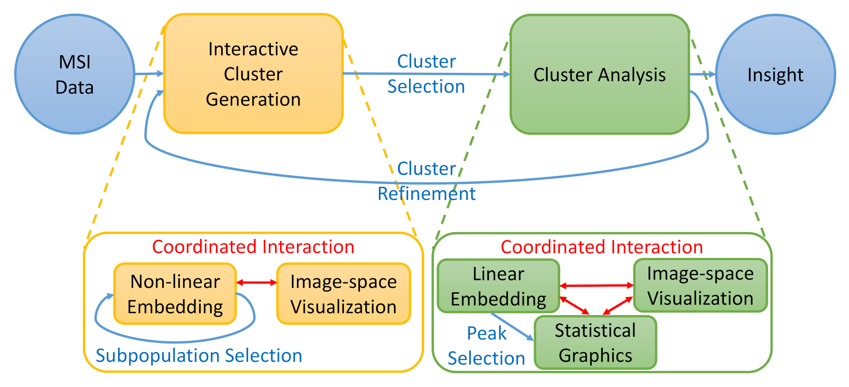
5. Methodology
To address the analysis tasks mentioned in Section 3, we built an interactive visual analysis tool for MSI data that allows for the identification and analysis of clusters in spectral space that form regions in image-space. The analytical workflow is illustrated in Figure 2. Given the MSI data, clusters/image regions can be interactively generated (Task T1) using coordinated views of visualizations in spectral space (using non-linear embeddings of entire data and sub-populations) and image-space. Afterwards, the detected clusters can be selected for a detailed (comparative) analysis. The clustering results impose a labeling of the data samples (pixels). Peaks relating to specific compounds that are descriptive for the selected cluster can be identified using linear embeddings of the labeled spectral space (Task T2). The properties of selected peaks can be analyzed in spectral and image-space using statistical graphics and image-space visualization, respectively (Tasks T3 and T4). The cluster analysis may lead to the desire for cluster refinement iterating back to the interactive cluster-generation step.
5.1. Interactive Cluster Generation
Given MSI data as described in Section 3, meaningful clusters are groups of pixels that form image regions and have similar spectra (and dissimilar to spectra of other pixels). Hence, visual encodings of both image-space and the spectral information are required to allow for a suitable cluster generation (Task T1).
Non-linear embedding. For the visual encoding of the spectral space, the peaks can be interpreted as spectral dimensions, i.e., each MSI pixel can be represented as a point in an n-dimensional spectral space, where n is the number of considered peaks. A typical pre-processing step before computing lower-dimensional embeddings is a normalization of the dimensions [38], which we also perform here.
Design space. Multidimensional data visualization has been a hot topic in visualization for many years and many different approaches exist. Most prominent examples are scatterplot matrices (SPLOM [39]), parallel coordinate plots (PCP [40]), or dimensionality reduction (DR). SPLOM and PCP do not scale well with the number of dimensions n. The number of plots in an SPLOM actually grows quadratically in n. The number of axes in a PCP obviously grows linearly in n, but the number of dimension pairs to be analyzed by re-ordering the axes still grows quadratically. Since we are dealing with hundreds of dimensions, SPLOM and PCP are not the optimal choice. Moreover, SPLOM and PCP are targeted at pairwise analyses of dimensions, while we are interested in seeing clusters within the multidimensional space. DR allows for seeing multidimensional clusters, if the projection from the multidimensional to the 2D visual space is chosen appropriately. Many projection methods exist. They can be roughly categorized into linear and non-linear approaches. Linear approaches allow for a better interpretability, as they avoid non-linear deformations, which includes the ability of relating detected clusters back to the original dimensions. However, the linearity restricts flexibility of the projection. For example, points lying on a curved manifold cannot be projected reliably into a linear space, cf. the famous Swiss roll example. Indeed, for the MSI data sets we analyzed, linear projections did mostly not allow for a good cluster separation (cf. Section 6). Thus, we decided to use non-linear embeddings for DR.
Among non-linear embeddings, variants of the multi-dimensional scaling (MDS) approach have been popular for a long time [41]. Recently, t-SNE has become increasingly popular [36]. While MDS tries to preserve pairwise n-dimensional distances in the 2D embedding, t-SNE tries to preserve neighborhoods. More precisely, t-SNE models probability distributions of point pairs in the n-dimensional space assuming normal distribution and in the 2D space assuming Student t-distribution and tries to bring the probability distributions into accordance by minimizing the Kullback–Leibler divergence between the two distributions. The minimization process typically starts with a random 2D distribution and iteratively improves it by performing gradient-descent steps. Since we are interested in observing clusters, i.e., groups of neighboring points, t-SNE was considered the most appropriate choice in our case. However, t-SNE has the disadvantage of being computationally rather costly. Since our data sets tend to be quite large and we want to perform interactive re-configurations (see below), we chose to apply the recently proposed approximate t-SNE computation based on a tree data structure [42], which consumes much less computation time and memory.
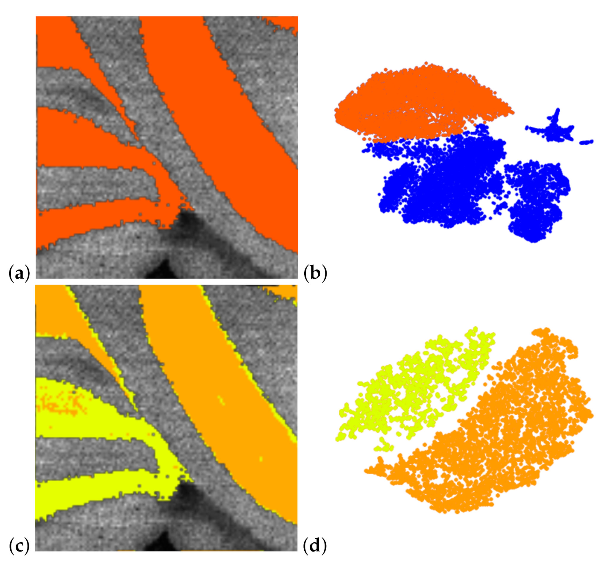
Given the 2D t-SNE embedding, groups of points can be selected interactively using a lasso tool and assigned to a cluster. For example, in Figure 3b, the group of points that are projected to the upper part of the 2D t-SNE embedding (highlighted in red) is identified as a cluster. The visual representation of the 2D embedding can be adjusted by assigning an opacity value to the point rendering, which leads to a plot that conveys point density. This is useful for detecting areas of highest point density in case many points clutter and clusters are not so clearly separated.
Investigating sub-populations. Let us consider the case where two clusters are quite similar to each other and rather dissimilar to all other clusters. Then, the optimization of the overall structure of all clusters may lead to a 2D embedding, where the two similar clusters are located very closely to each other and may not be identified as separate clusters anymore. In principle, though, the t-SNE approach would be able to produce a 2D embedding that keeps the two clusters separated when only focusing on this sub-population. Thus, we allow for an interactive selection of clusters to detect sub-clusters in 2D t-SNE embeddings that are re-configured by only considering the selected sub-population. Figure 3b shows a 2D t-SNE embedding of the entire data set, where a group of points is selected (highlighted in red). Only these selected points are then considered to re-configure the 2D t-SNE embedding to an embedding of that sub-population. Figure 3d shows that the selected sub-population splits into two clusters that are selected interactively (highlighted in yellow and orange). These clusters could not be observed in Figure 3b. Our tool allows for interactively selecting any sub-population for further investigation in a newly computed 2D t-SNE embedding, which includes iterative refinement of a sub-population as in hierarchical clustering. The re-configuration of the 2D t-SNE embeddings can be computed interactively due to using the approximate t-SNE computation scheme [42]. For large sub-populations, it may take up to a few seconds, which is still acceptable for the analysts.
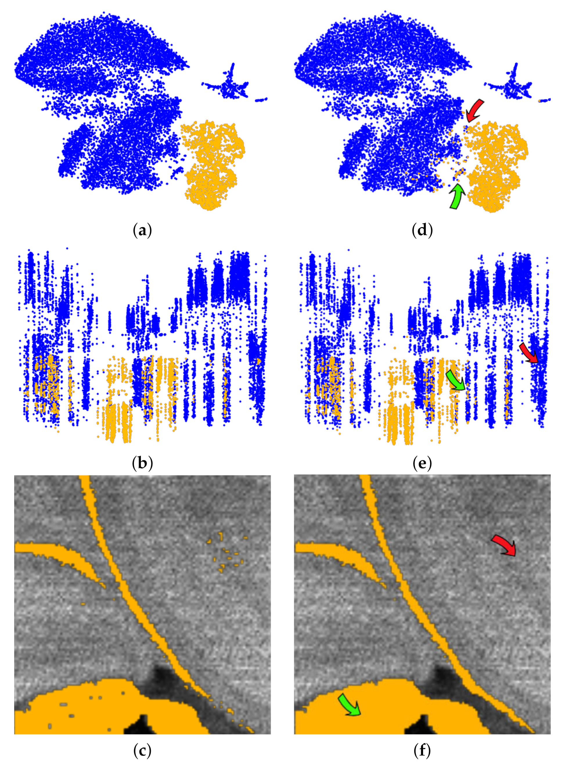
Coordinated interaction with image-space view. Defining clusters in the 2D embedding only consider spectral information. To relate it back to the image we use coordinated views. For image-space visualization, we simply highlight selections made in the 2D embedding by color-coding the respective pixels at their locations in image-space. For example, the yellow cluster selected in Figure 4a relates to the yellow pixels in Figure 4c. Similarly, multiple cluster selections are shown in image-space by assigning to different clusters different colors, see Figure 3c,d.
In Figure 4c, we observe in the image-space visualizations that the selected cluster actually forms regions in the image-space. We experienced that it is quite common that these regions exhibit some (small) holes or that some isolated pixels show up. Our tool allows for selecting these pixels in the image-space visualization for further investigation. We can form a new cluster with those pixels and compare them to the old cluster using the methods described below, see Section 5.2. In Figure 4, we assumed the holes in the regions to be caused by imaging artifacts and added them to the existing yellow cluster, see Figure 4f, which also makes them appear as yellow dots in the coordinated spectral space view, see Figure 4d. Green arrows point at pixels that were interactively added. Similarly, we can remove isolated yellow points interactively in the image space, see Figure 4f, which makes them appear as blue dots in the coordinated spectral space view, see Figure 4d. Red arrows point at pixels that were interactively removed. Thus, we can use coordinated interaction of spectral and image-space views to generate clusters as groups of pixels that have similar spectra and form image regions.
Integrated view. Another observation we can make from Figure 4 is that the selected cluster actually forms multiple image regions. We could use the lasso tool in the coordinate image-space view to separate them. However, we also propose an integrated view that allows for splitting the cluster in the point-based view, which may allow for more efficient and intuitive interactions. The integrated view uses both spectral and image information. It uses a 3D layout, where two dimensions are used for the 2D embedding and the third dimension reflects proximity of pixels in the image-space.
To compute pixel proximity, we sort the pixels according to a 2D space-filling curve. A space-filling curve for 2D images is a continuous curve that traverses the 2D image-space by visiting each pixel exactly once. Hence, the space-filling curve traversal defines a 1D order of the pixels. Different schemes exist such as Peano [43], Sierpinski [44], Hilbert [45], or z-curves [46], which have also been applied for volume visualization purposes [46,47]. Hilbert curves are constructed recursively by connecting parts of squares to a polygonal line. They have the nice property that they preserve vicinity, i.e., close-by pixel appear close to each other in the generated ordering, which is why we decided to use them for our implementation. Hilbert curves have already proven to work well for several applications, e.g., [47,48,49].
We use the Hilbert curve to move the points of the 2D embedding in the third dimension, i.e., the point that represents the pixel that occurs at the ith location in the order imposed by the Hilbert curve is moved by i units in the third dimension. Using parallel projection for rendering the 3D scatterplot, the front view resembles exactly the 2D embedding (as in Figure 4a), while the side view replaces one of the axes of the embedding with the Hilbert curve dimension, see Figure 4b. (The result after adjusting regions in Figure 4f is shown in Figure 4e with green and red arrows pointing at pixels that were added and removed, respectively.) For interacting with the 3D scene, we follow the idea of ScatterDice [39], i.e., the user can select which axis pair out of the three axes shall be shown and, when exchanging an axis, an animation between the two views is triggered, which follows the concept of rolling a dice and allows for keeping the mental map.
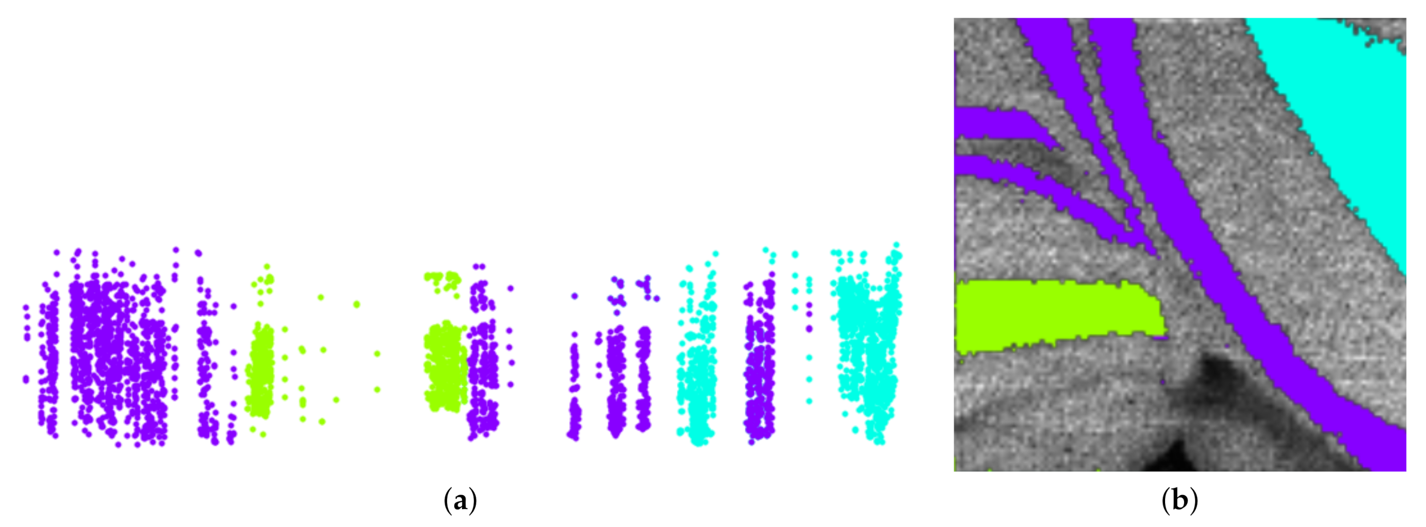
Figure 4b shows that by choosing the Hilbert curve for the horizontal dimension we observe that the selected yellow cluster decomposes into separate clusters, which can be easily selected in that view. Figure 5 shows how even rather nested image regions can be separated with a few interactions into connected regions.
5.2. Cluster Analysis
Having generated clusters, it is of interest to understand what formed the clusters, i.e., which peaks are the ones that mainly contributed to the cluster formation (Task T2). While non-linear embeddings allow for higher flexibility leading to better cluster separation, their use in relating the cluster formation back to the original dimensions is limited. Linear embeddings would allow for such an interpretability. Hence, we propose to use linear embeddings for the cluster analysis step. The nature of the problem at hand is different from the original problem we faced. Initially, the goal was to generate a clustering from unlabeled data. Now, the clusters have been generated, i.e., we are dealing with the analysis of labeled data.
Linear embedding. The goal was to find a linear embedding that best separates the clusters of a given labeled multi-dimensional data set. Automatic approaches exist such as variants of linear discriminant analysis (LDA), e.g., [50], but we are interested in providing a user-centric approach, where the user can select interactively, which clusters to separate, possibly giving the separation of one cluster more weight than the separation of others, possibly focusing only on two clusters, or possibly focusing on one cluster against the rest. Hence, we want to provide an interactive cluster separation approach.
We follow the approach by Molchanov and Linsen [51]. They assume labeled multi-dimensional data and project them to a 2D visual space using a linear projection, where labels are color-coded to distinguish the given clusters. For each given cluster, the median is computed and used as a control point for the cluster. Then, the control points can be moved to any desired position in the 2D visual space to separate the clusters. Obviously, using linear projection, it is not possible to perfectly achieve the desired position for all control points. Instead, a least-squares optimization is performed.
Figure 6 shows a linear projection for a data set with four labels indicated by the four colors. The control points highlighted with a black frame were moved to separate the clusters as much as possible. Thus, the linear projection tries to assimilate the initial non-linear embedding that was used as a starting point to generate the clusters. Apparently, the linear projection does not allow for a perfect separation of the clusters, but by moving the control points, the clusters’ overlap is being minimized.
Star coordinates. The reason for using linear projections in this analysis step was that we can easily relate the projection matrix to the initial dimensions. This relates to the concept of star coordinates (SCs) [52]. SCs plot the projected dimension axes in the form of vectors. The vectors all emerge from the origin and their tips are the columns of the projection matrix, i.e., the tip of the vector for dimension i is given by the ith column of the projection matrix. We plot all vectors in a separate view to not overload the linear embedding view. Since we are dealing with hundreds of dimensions, the SC plot is already cluttered when just showing the vectors, see Figure 7.
SCs have been used in literature for decision tree construction to classify different objects [53], perform cluster analysis [54], finding trends for decision making [55], and visualizing linearly separable clusters [56]. However, for our data sets with hundreds of dimensions, it would not be possible to interact with the vectors in an intuitive way. Cluster separation by SC interactions would have been a tedious, if not impossible, task. This is why we proposed to interact with the control points as described above.
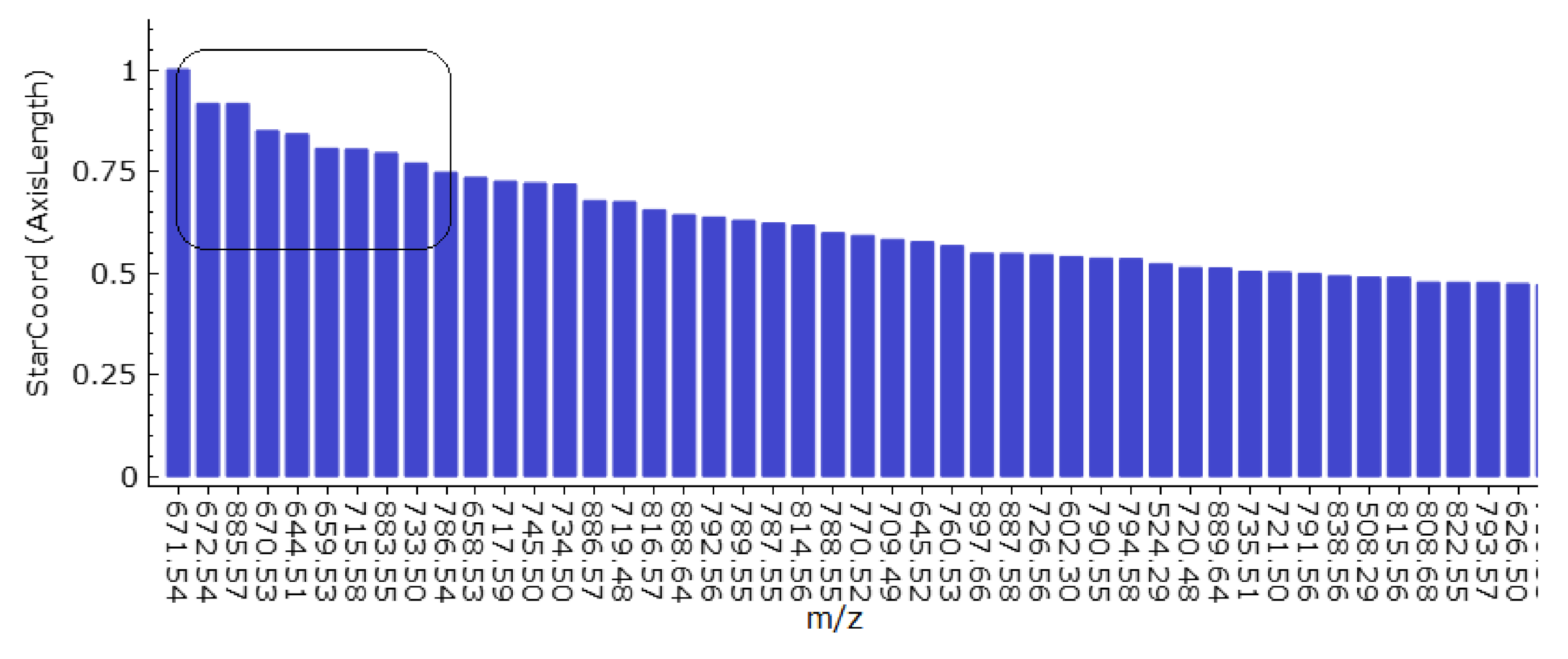
Peak selection. The SC view in Figure 7 is indeed cluttered, but we are not interested in observing all the dimension axes. Instead, we are only interested in those dimension axes that stand out, i.e., those with elongated vectors. These are the dimension axes that have been given more weight to create the linear projection. Thus, when interacting with the control points in Figure 6 to separate clusters, we can observe in the coordinated SC view in Figure 7, which dimensions change their weight to obtain separation.
Once the user has obtained a linear projection view that satisfactorily separates the cluster(s) under investigation, we can return the dimension axes with the largest weight. Since it would be rather cumbersome to select them in the SC view, we propose a bar chart that visualizes the (normalized) weights of the dimensions in decreasing order, see Figure 8. We are interested in the dimensions with the largest weight. How many dimensions these are depends on their weight distribution. The weight distribution can be easily observed from the bar chart and we can select the most discriminant dimensions for the interactively performed cluster separation, cf. black frame in Figure 8.
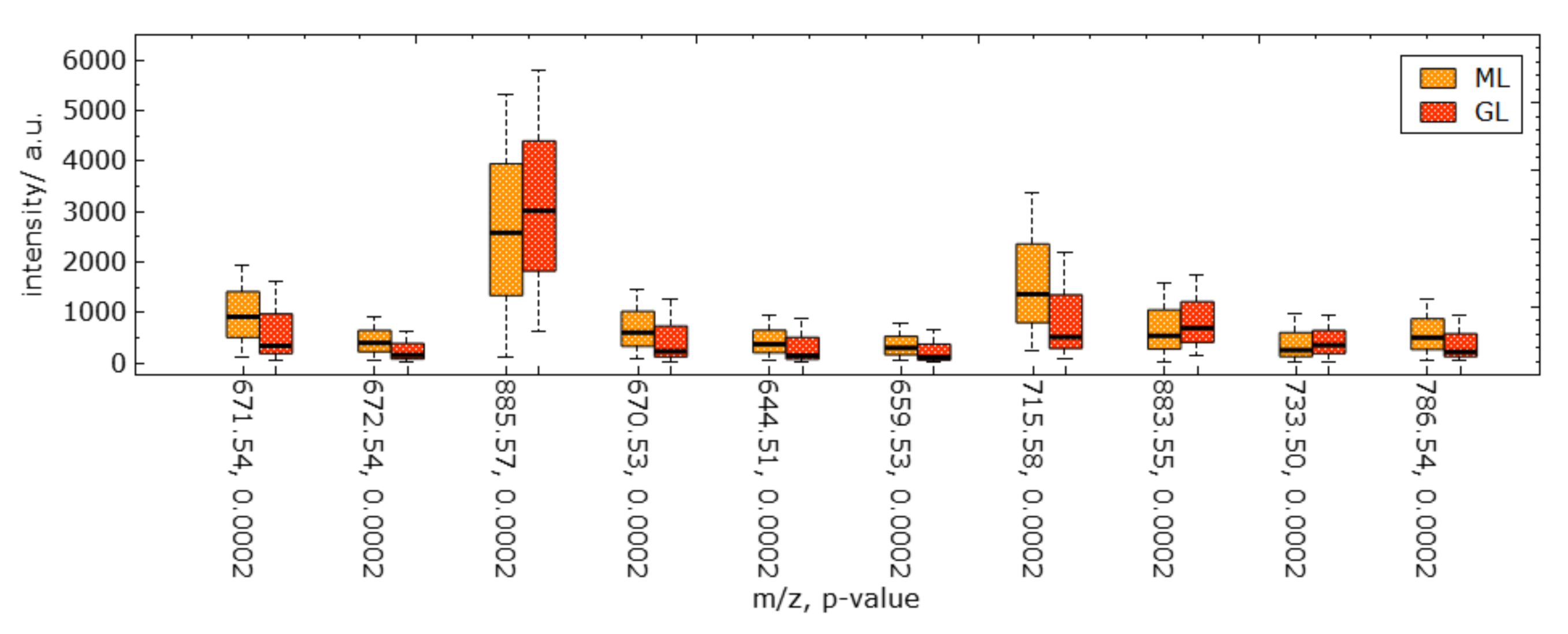
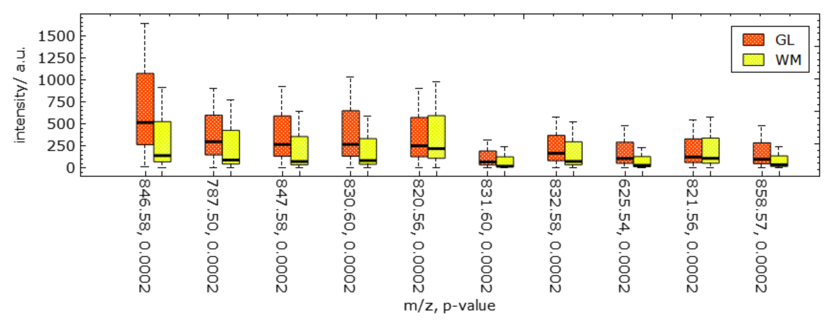
Statistical graphics. The selected peaks can be further investigated using statistical plots. Since we have detected the peaks that best discriminate a cluster of interest, we are interested in investigating the intensity values of the detected peaks for the cluster (Task T3) and comparing them against other clusters or against the rest (Task T4). A widely used approach for such comparisons of groups is to use statistical plots such as boxplots. Boxplots summarize the distributions of the intensity values of a group by revealing main statistical values including the median, the interquartile range, and the min–max range in the form of whiskers. We propose to have one statistical plot with juxtaposed boxplots for each of the selected peaks in the given order, see Figure 9. For the boxplots, we report the original intensities, i.e., without normalization, as it provides additional information, whether values are generally high for an -ratio, or not.
The boxplots provide insights into how much the distribution of selected clusters differ. In such a comparison, it is commonly of interest to quantify the differences. This can be achieved by computing p-values. Here, the null hypothesis is that the distributions are equal. Thus, we perform a two-tailed test to compute whether we can reject the null hypothesis in favor of the one hypothesis, which states that there is a statistically significant difference between the distributions (against the confidence interval). We first test for normality of the distributions. In case of normality, we use a parametric test (Student t-test) for computing the p-values, otherwise a non-parametric test (Wilcoxon test). The p-values are reported in the statistical plots for each peak together with the peak’s -ratio.
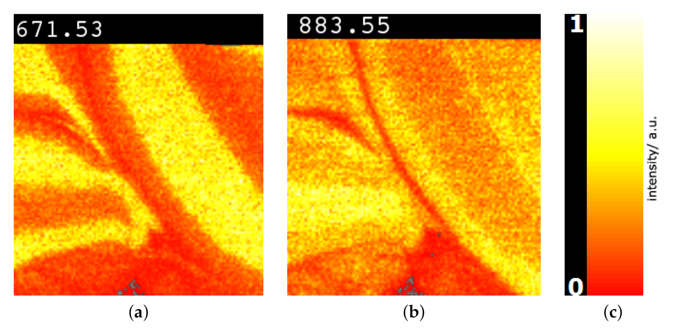
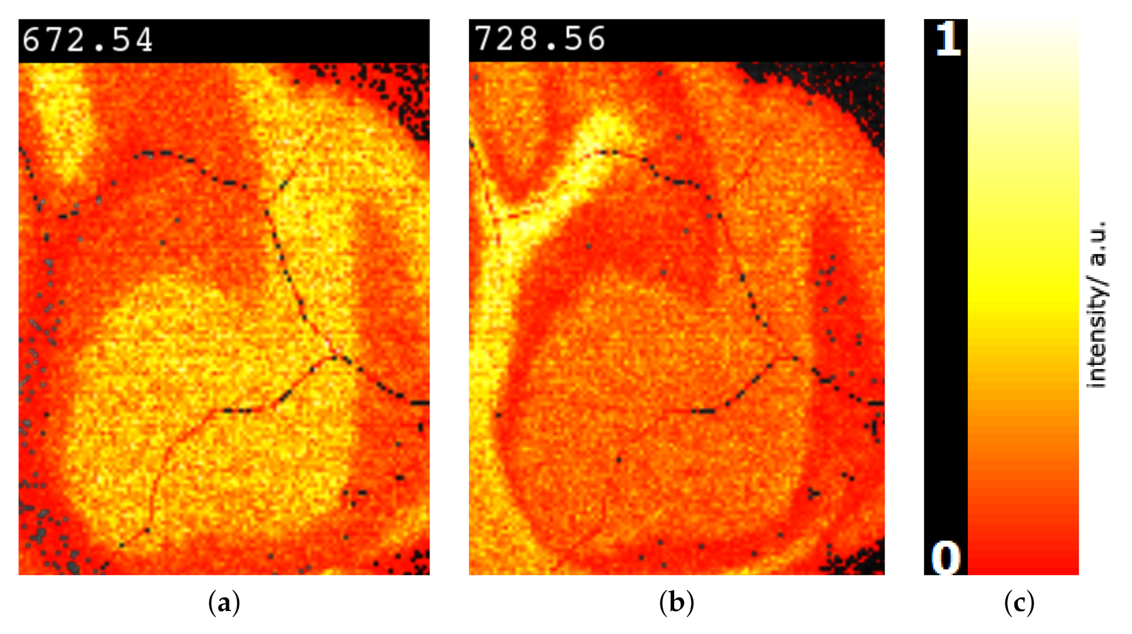
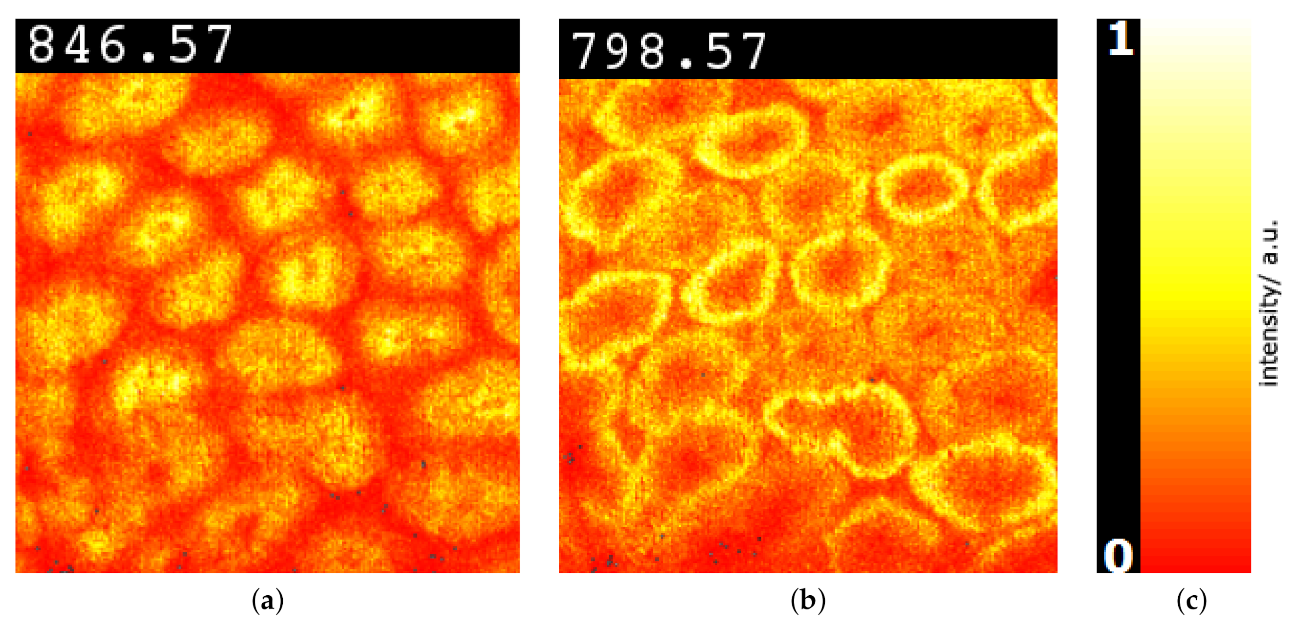
Image-space visualization. Having identified peaks that allow for distinguishing selected image regions, it is of interest to visualize the intensity distributions of these peaks in the image space. This allows for validating the peak selection and observing where in image space intensities differ. For the image-space visualization of the intensity distribution of a selected peak we use a typical color mapping of the intensities. Different color maps can be chosen such as the multi-hue luminance color map shown in Figure 10c. Using this color map, Figure 10a,b show examples for the selected peaks. We can observe that these peaks indeed exhibit regional differences. Moreover, we observe that the two peaks exhibit different intensity patterns.
6. Results
To validate our approach and the proposed methods, we perform three case studies using the data sets taken from the study by Soltwisch et al. [9]. The reason for using those data is that histological H&E stain images are provided in addition, see Figure 11d, Figure 12d and Figure 16c, which represent the ground truth for detecting the image regions. For the first two cases, we even have some manual annotations.
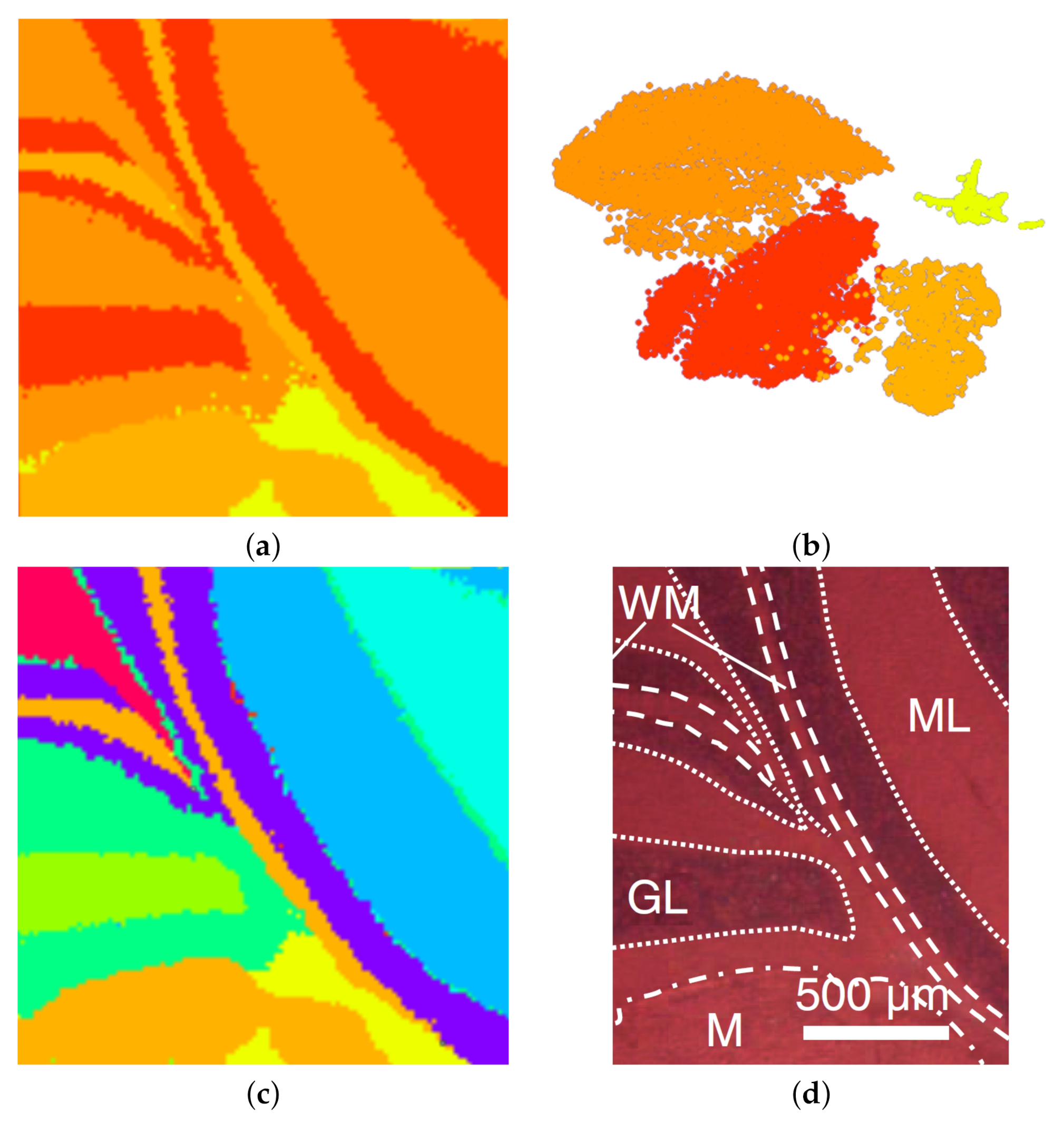
Mouse cerebellum in negative ion mode. The first MSI data set we considered is that of a mouse cerebellum in a negative ion mode with pixels and for each pixel a spectrum of 500 peaks after peak picking. We start our analysis by visualizing the spectral information in the non-linear embedding. We can immediately observe four clusters, which we select interactively as shown in Figure 11b. By visual inspection, one can observe that the corresponding image regions in Figure 11a already match the given ground truth in Figure 11d quite well. The main regions such as white matter (WM), granular layer (GL), and molecular layer (ML) were well segmented. As the histological images are not registered with the MSI data, we only perform a qualitative analysis here. We further analyze the data set by selecting each of the four clusters and generate non-linear embeddings for each of them individually. Figure 3 shows that the upper cluster actually splits into two clusters when only considering this sub-population for a re-configured non-linear embedding. If homogeneous regions in spectral space still form multiple connected regions in image-space, we can further split them using the space-filling curve approach, as shown in Figure 5. The resulting image regions can be cleaned by adjusting the clustering decisions for noisy pixels using image-space operations, as shown in Figure 4. The overall result of the interactive cluster generation is shown in Figure 11c. When compared to the ground truth in Figure 11d, this outcome can be considered of high quality. (Please note that the ground truth image is missing a part on the right when compared to the MS image.)
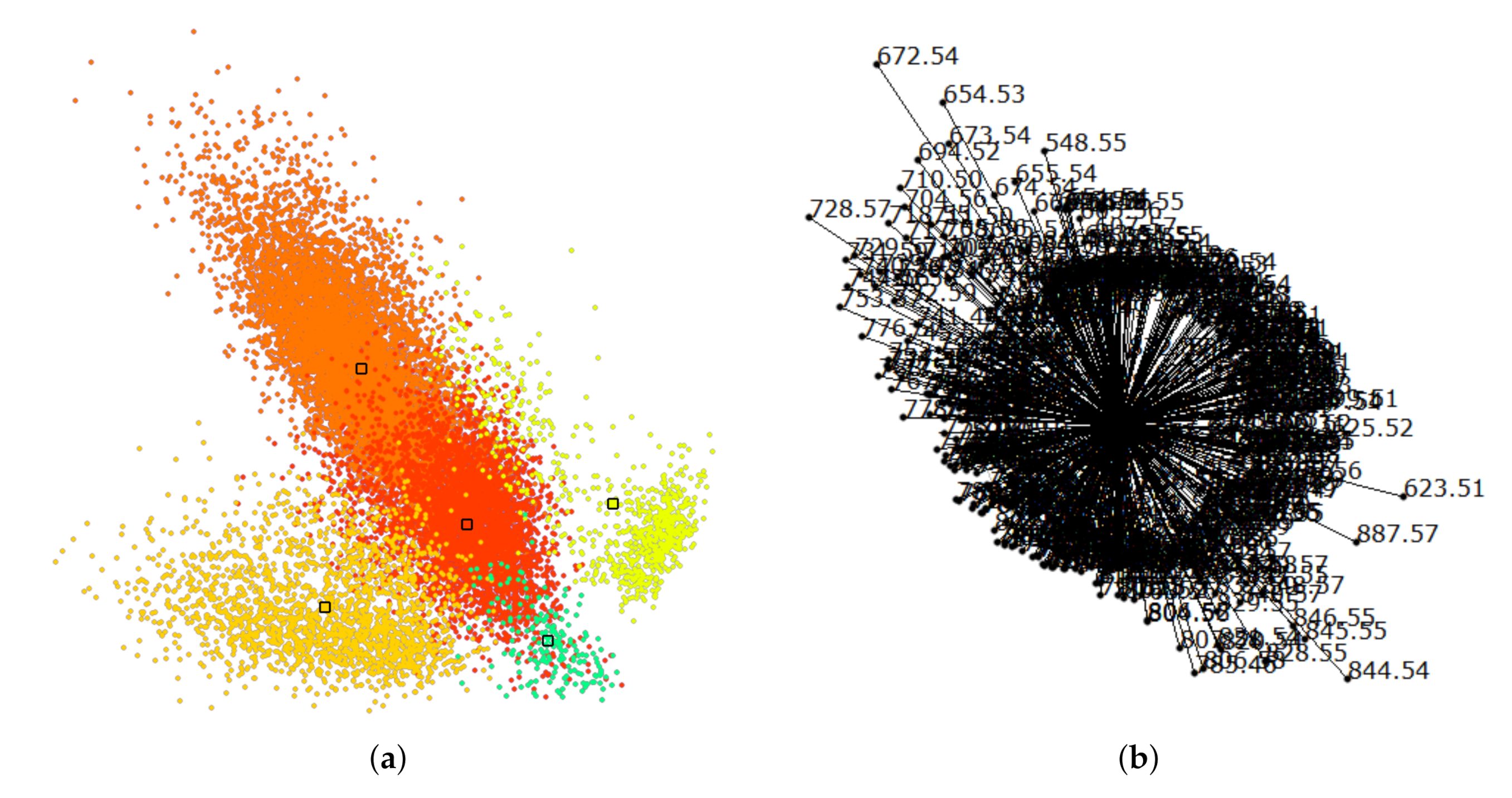
Next, we further want to interpret the detected clusters. Now, we are dealing with labeled data. Figure 6 shows the linear embedding obtained by trying to separate the labels using the interaction with control points. We observe that clear separation as in the non-linear embeddings is not possible with linear embeddings. However, the cluster overlap is minimized. The respective SC configuration is shown in Figure 7 and the bar chart of the longest axes in Figure 8. We select the longest axes in the bar chart and investigate them in statistical graphics. Figure 9 compares the red and orange clusters of Figure 6 using juxtaposed boxplots of the most discriminant peaks. We observe statistical significance in all these peaks. Figure 10 shows the spatial distribution of intensities for two selected peaks. We observe that both of them exhibit certain structures in the image quite well. Still, neither of them exhibits all structures, which is why we needed to take a multi-dimensional data analysis approach.
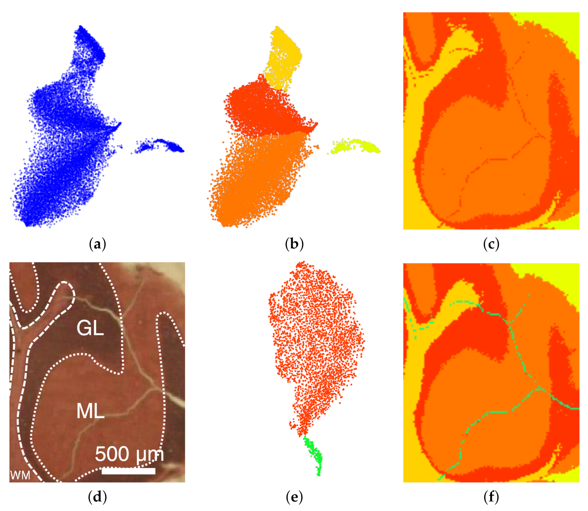
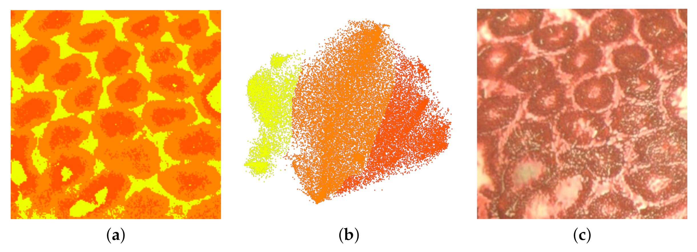
Mouse cerebellum in positive ion mode. The second MSI data set we considered is that of a mouse cerebellum in a positive ion mode with pixels and for each pixel a spectrum of 500 peaks after peak picking. We conducted an interactive visual analysis following the same workflow as above. Figure 12a shows the non-linear embedding and Figure 12b the interactive selection of clusters in the non-linear embedding. Figure 12c shows the respective image regions. Selecting the red cluster and computing a non-linear embedding for the sub-population allows us to split the cluster into two meaningful structures, see Figure 12e. Figure 12f shows the final result of the interactive cluster generation, which again matches very well the ground truth in Figure 12d. In particular, we can relate the red cluster to the region annotated as granular layer (GL) and the orange cluster to the region annotated as molecular layer (ML).
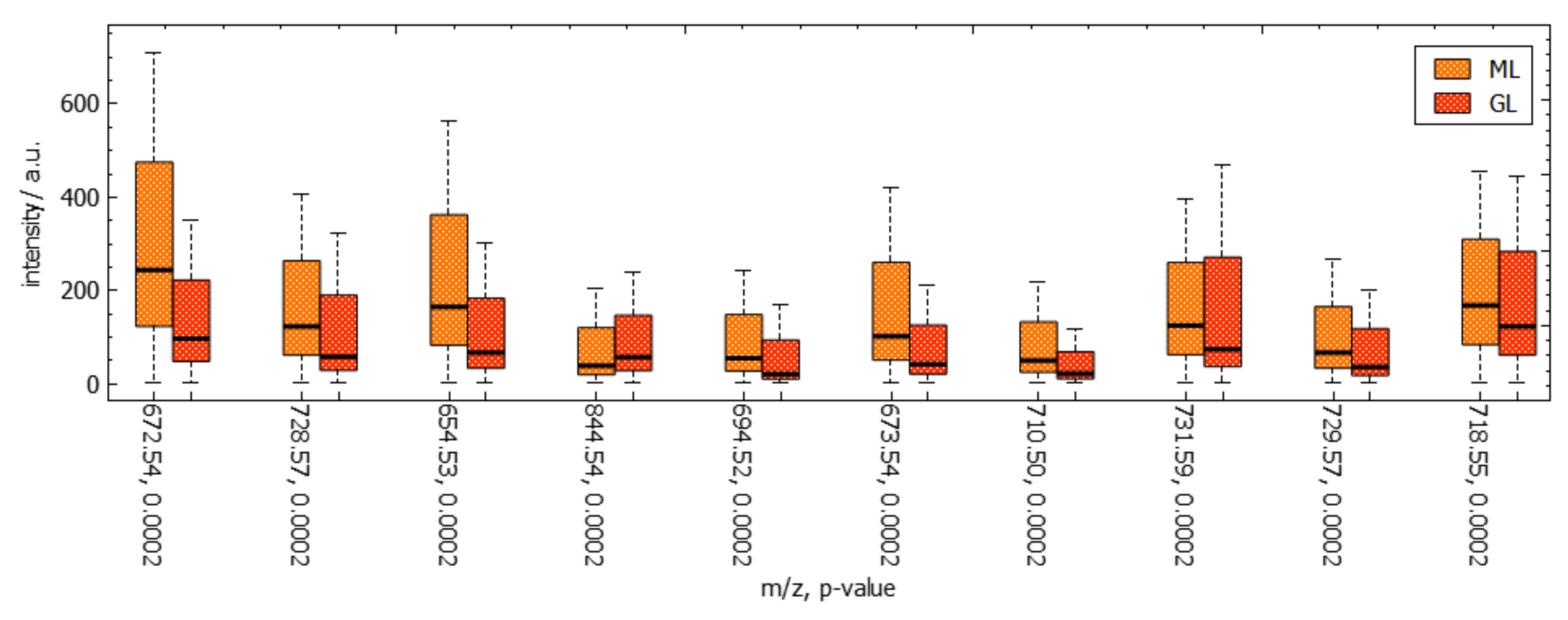
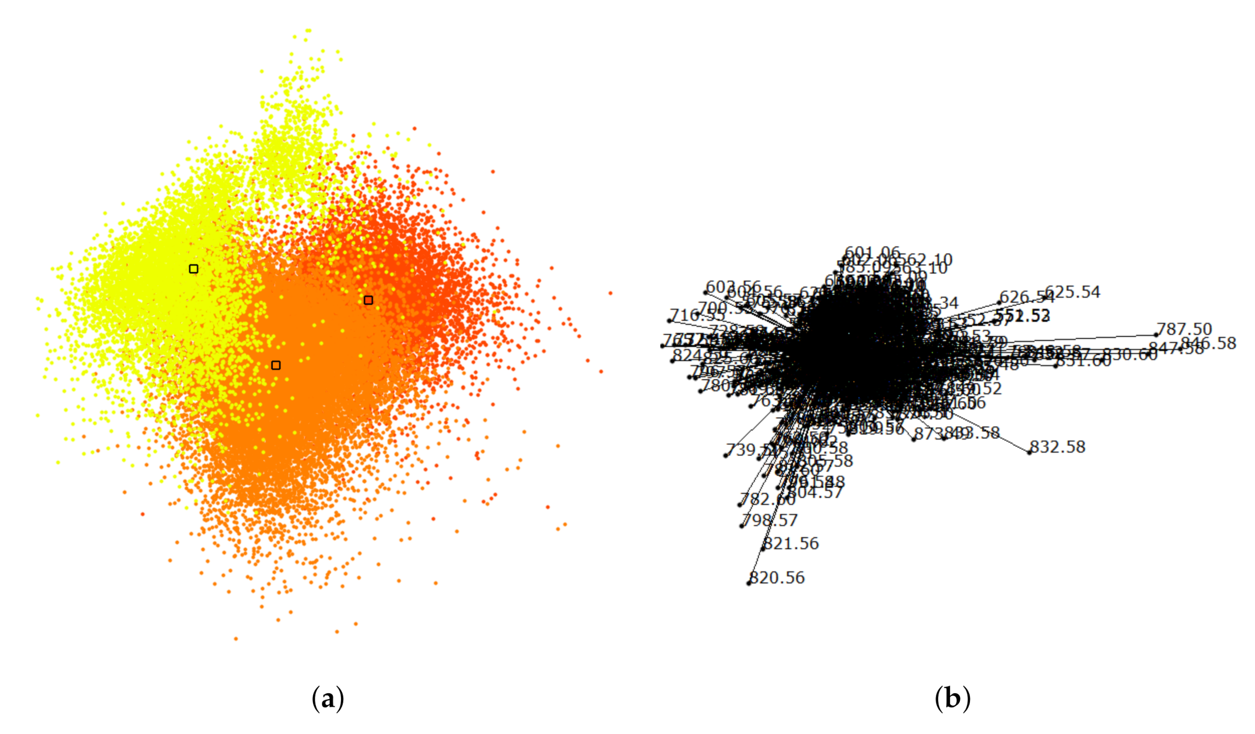
Cluster analysis via linear embeddings and SC delivers most discriminant peaks. Figure 13a shows the linear embedding obtained after separating the clusters by interacting with their control points and Figure 13b shows the respective SC configuration. Figure 14 shows the comparative visualization of the orange vs. the red cluster and Figure 15 the color-coded spatial intensity distributions of selected peaks. Again, we observe that the peaks are relevant for detecting meaningful image regions, but also that we need to combine multiple peaks for observing all structures.
Rat testis. The third MSI data set we considered is that of a rat testis in positive ion mode with pixels and for each pixel a spectrum of 500 peaks after peak picking. We followed again the same analytical workflow. Here, the clusters were not so well separated in the non-linear embedding, but using transparency for point rendering we were able to select three somewhat separated clusters, see Figure 16b. The respective image-space visualization in Figure 16a nevertheless conveys structures that match the ground truth in Figure 16c very well. Cluster analysis via linear embeddings and SC (see Figure 17) delivers most discriminant peaks, as shown in Figure 18 for the red vs. the yellow cluster. The image-space visualizations of selected peaks in Figure 19 exhibits again significant structures but also the necessity for analyzing multiple peaks simultaneously.
7. Discussion and User Feedback
Parameters and reproducibility. The quality of the non-linear embedding is crucial for cluster detection. The t-SNE approach is generally applicable, but requires us to choose an appropriate perplexity parameter, which determines the size of the Gaussian kernels used in the normal distributions. We used perplexity of 50 when considering the full data sets and 25 when considering a sub-population. We investigated the influence of the perplexity value on the outcome and discovered that the results are quite robust against changes. Parameter tuning was not necessary. Moreover, the t-SNE approach requires a random initialization, which influences the outcome of the 2D embedding computation. However, for all MSI data sets considered, the 2D embeddings were generated very robustly and results were easily and reliably reproducible. Hence, the initial configuration did not influence the analysis outcome in a noticeable manner.
Detection of discriminant peaks. In the cluster analysis step, an alternative to our peak selection mechanism via the linear embeddings would have been to choose the dimensions with lowest computed p-values. However, we observed that some peaks happen to have low p-values for selected clusters, while the image-space visualization revealed no obvious structure. The reason for this is that the values for that peak were generally low for all structures such that the statistically significant increase was irrelevant. With our selection of discriminant peaks via the separation in linear embeddings, we did not encounter such cases. All peaks that were considered discriminant, indeed showed relevant structures. Of course, some of the selected peaks exposed similar structures.
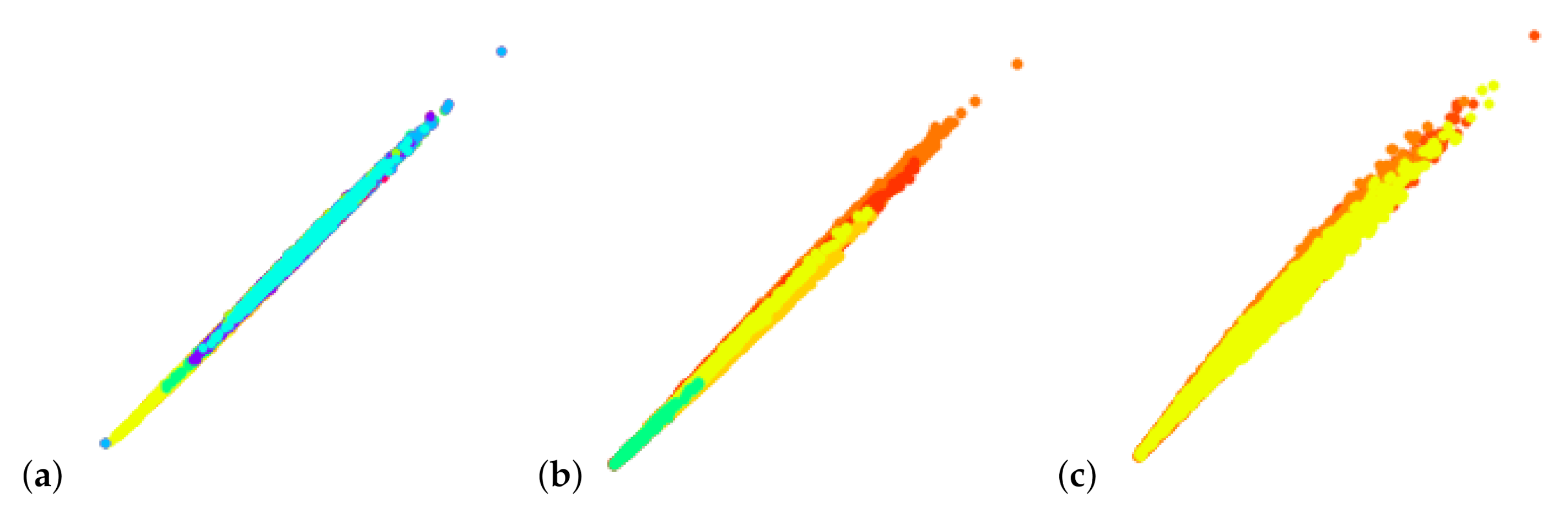
Principal component analysis (PCA) is quite commonly applied to derive 2D linear projections. However, PCA does not consider labeled data and, consequently, does not target cluster separation. We tested PCA for linear embeddings for the data sets shown in this paper and never obtained suitable results that would allow us to separate clusters, see Figure 20. Hence, PCA is neither useful for the cluster detection step nor for the cluster analysis step.
User feedback. When performing interactive sessions with domain experts, they were very positive about the tool. They rated it as very useful and stated that their community would be interested in using this tool. We have not yet made our tool publicly available, but based on this positive feedback would like to do so soon. The experts were particularly positive about the cluster analysis/interpretation step. They are currently using the SCiLS tool [25] in their laboratory and report that the automatic clustering produces satisfactory results, but that an interactive cluster analysis as we propose is not provided. Cluster analysis in the SCiLS tool uses an ROC analysis, i.e., there is no interaction mechanisms for refining the clustering. The interactivity was appreciated as a unique selling point for our tool. They also pointed us to the paper by Abdelmoula et al. [26,27], which is using automatic clustering in a 2D t-SNE embedding. This work has gained attention in their community due to good clustering results, but its main drawback is that it does not reveal what drives the cluster formation. Using our linear embedding, we are able to provide such information in the form of the most discriminant peaks.
8. Conclusions
We presented an approach for interactive cluster generation and analysis for mass spectrometry imaging data. The generation step based on coordinated interaction in non-linear embeddings of spectral information and image-space views produces desirable results. The refinement of the non-linear embedding for selected sub-population allows for detecting clusters with more subtle differences. We validated our cluster generations by comparing against ground truth obtained from histological images. Our results matched the ground truth very well.
Of particular value to domain experts was the ability of our tool to interpret the clusters, i.e., to investigate which peaks drive the cluster formation. Our tool accomplishes this by a simple control point interaction for trying to separate clusters in a linear embedding, given the clustering result in the form of labeled data. We observe that we can find discriminant peaks by looking at the dimension axes with largest weight. The detected peaks reliably exhibit relevant structures. We also observe that individual peaks reveal different structures, which documents that a multi-dimensional analysis is necessary.
The interpretability of analysis results plays a role of increasing importance the more that automatic components such as machine learning methods are incorporated into analytical workflows, which relates to the current trend of explainable artificial intelligence. We documented that interactive visualization components can reveal much insight into analysis results such that results can be interpreted in a way that develops trust into the analysis process. This train of thought enables opportunities for visualization research in many application domains.
Author Contributions
M.J. was mainly responsible for developing and implementing the methodology. L.L. initiated the project, provided ideas, and supervised the developments. J.S. and K.D. provided the data sets and served as domain scientists for the requirement analysis, domain-specific feedback, and the evaluation. All authors have read and agreed to the published version of the manuscript.
Funding
This research received no external funding.
Conflicts of Interest
The authors declare no conflict of interest.
References
- Yuste, R. Fluorescence microscopy today. Nat. Methods 2005, 2, 902. [Google Scholar] [CrossRef] [PubMed]
- Buchberger, A.R.; DeLaney, K.; Johnson, J.; Li, L. Mass Spectrometry Imaging: A Review of Emerging Advancements and Future Insights. Anal. Chem. 2018, 90, 240–265. [Google Scholar] [CrossRef] [PubMed]
- Cole, L.M. (Ed.) Imaging Mass Spectrometry; Springer: New York, NY, USA, 2017. [Google Scholar] [CrossRef] [Green Version]
- Ifa, D.R.; Wu, C.; Ouyang, Z.; Cooks, R.G. Desorption electrospray ionization and other ambient ionization methods: Current progress and preview. Analyst 2010, 135, 669–681. [Google Scholar] [CrossRef] [PubMed]
- Aichler, M.; Walch, A. MALDI Imaging mass spectrometry: Current frontiers and perspectives in pathology research and practice. Lab. Investig. 2015, 95, 422–431. [Google Scholar] [CrossRef] [Green Version]
- Kompauer, M.; Heiles, S.; Spengler, B. Atmospheric pressure MALDI mass spectrometry imaging of tissues and cells at 1.4-mm lateral resolution. Nat. Methods 2016, 14, 90–96. [Google Scholar] [CrossRef]
- Bouschen, W.; Schulz, O.; Eikel, D.; Spengler, B. Matrix vapor deposition/recrystallization and dedicated spray preparation for high-resolution scanning microprobe matrix-assisted laser desorption/ionization imaging mass spectrometry (SMALDI-MS) of tissue and single cells. Rapid Commun. Mass Spectrom. 2010, 24, 355–364. [Google Scholar] [CrossRef]
- Dreisewerd, K. The Desorption Process in MALDI. Chem. Rev. 2003, 103, 395–426. [Google Scholar] [CrossRef]
- Soltwisch, J.; Kettling, H.; Vens-Cappell, S.; Wiegelmann, M.; Muthing, J.; Dreisewerd, K. Mass spectrometry imaging with laser-induced postionization. Science 2015, 348, 211–215. [Google Scholar] [CrossRef]
- Ellis, S.R.; Bruinen, A.L.; Heeren, R.M.A. A critical evaluation of the current state-of-the-art in quantitative imaging mass spectrometry. Anal. Bioanal. Chem. 2014, 406, 1275–1289. [Google Scholar] [CrossRef]
- Ràfols, P.; Vilalta, D.; Brezmes, J.; Cañellas, N.; del Castillo, E.; Yanes, O.; Ramírez, N.; Correig, X. Signal preprocessing, multivariate analysis and software tools for MA(LDI)-TOF mass spectrometry imaging for biological applications. Mass Spectrom. Rev. 2016, 37, 281–306. [Google Scholar] [CrossRef]
- Kriegsmann, J.; Kriegsmann, M.; Casadonte, R. MALDI TOF imaging mass spectrometry in clinical pathology: A valuable tool for cancer diagnostics (Review). Int. J. Oncol. 2014, 46, 893–906. [Google Scholar] [CrossRef] [PubMed] [Green Version]
- Stoeckli, M.; Staab, D.; Schweitzer, A. Compound and metabolite distribution measured by MALDI mass spectrometric imaging in whole-body tissue sections. Int. J. Mass Spectrom. 2007, 260, 195–202. [Google Scholar] [CrossRef]
- WATERS. The Science of What’s Possible. Available online: http://www.waters.com/waters/en_GB/SYNAPT-G2-Si-High-Definition-Mass-Spectrometry/nav.htm?cid=134740622&locale=en_GB (accessed on 30 November 2020).
- Klinkert, I.; Chughtai, K.; Ellis, S.R.; Heeren, R.M. Methods for full resolution data exploration and visualization for large 2D and 3D mass spectrometry imaging datasets. Int. J. Mass Spectrom. 2014, 362, 40–47. [Google Scholar] [CrossRef]
- Avtonomov, D.M.; Raskind, A.; Nesvizhskii, A.I. BatMass: A Java Software Platform for LC–MS Data Visualization in Proteomics and Metabolomics. J. Proteome Res. 2016, 15, 2500–2509. [Google Scholar] [CrossRef] [PubMed] [Green Version]
- Paschke, C.; Leisner, A.; Hester, A.; Maass, K.; Guenther, S.; Bouschen, W.; Spengler, B. Mirion—A software package for automatic processing of mass spectrometric images. J. Am. Soc. Mass Spectrom. 2013, 24, 1296–1306. [Google Scholar] [CrossRef] [PubMed]
- Martin, R.; Markus, S. BioMap. Available online: https://ms-imaging.org/wp/biomap/ (accessed on 30 November 2020).
- Bokhart, M.T.; Nazari, M.; Garrard, K.P.; Muddiman, D.C. MSiReader v1.0: Evolving Open-Source Mass Spectrometry Imaging Software for Targeted and Untargeted Analyses. J. Am. Soc. Mass Spectrom. 2018, 29, 8–16. [Google Scholar] [CrossRef]
- Hayakawa, E.; Fujimura, Y.; Miura, D. MSIdV: A versatile tool to visualize biological indices from mass spectrometry imaging data. Bioinformatics 2016, 32, 3852–3854. [Google Scholar] [CrossRef] [Green Version]
- Wijetunge, C.D.; Saeed, I.; Boughton, B.A.; Spraggins, J.M.; Caprioli, R.M.; Bacic, A.; Roessner, U.; Halgamuge, S.K. EXIMS: An improved data analysis pipeline based on a new peak picking method for EXploring Imaging Mass Spectrometry data. Bioinformatics 2015, 31, 3198–3206. [Google Scholar] [CrossRef] [Green Version]
- Albert-Jan, Y.; Joris, B.; Marilou, D.; Marnix, K.; Michel, C.; Roeland, L.; Steven, B.; Taco, W. MS Spectre: Mass Spectrometry Analysis Software. Available online: http://ms-spectre.sourceforge.net/ (accessed on 30 November 2020).
- Bemis, K.D.; Harry, A.; Eberlin, L.S.; Ferreira, C.; van de Ven, S.M.; Mallick, P.; Stolowitz, M.; Vitek, O. Cardinal: An R package for statistical analysis of mass spectrometry-based imaging experiments. Bioinformatics 2015, 31, 2418–2420. [Google Scholar] [CrossRef] [Green Version]
- Goracci, L.; Tortorella, S.; Tiberi, P.; Pellegrino, R.M.; Di Veroli, A.; Valeri, A.; Cruciani, G. Lipostar, a Comprehensive Platform-Neutral Cheminformatics Tool for Lipidomics. Anal. Chem. 2017, 89, 6257–6264. [Google Scholar] [CrossRef]
- Zweigniederlassung Bremen der Bruker Daltonik GmbH, University of Bremen. SCiLS. Available online: https://scils.de/ (accessed on 30 November 2020).
- Abdelmoula, W.M.; Balluff, B.; Englert, S.; Dijkstra, J.; Reinders, M.J.; Walch, A.; McDonnell, L.A.; Lelieveldt, B.P. Data-driven identification of prognostic tumor subpopulations using spatially mapped t-SNE of mass spectrometry imaging data. Proc. Natl. Acad. Sci. USA 2016, 113, 12244–12249. [Google Scholar] [CrossRef] [PubMed] [Green Version]
- Abdelmoula, W.M.; Pezzotti, N.; Höllt, T.; Dijkstra, J.; Vilanova, A.; McDonnell, L.A.; Lelieveldt, B. Interactive Visual Exploration of 3D Mass Spectrometry Imaging Data Using Hierarchical Stochastic Neighbor Embedding Reveals Spatiomolecular Structures at Full Data Resolution. J. Proteome Res. 2018, 17, 1054–1064. [Google Scholar] [CrossRef] [PubMed] [Green Version]
- Nunes, M.; Laruelo, A.; Ken, S.; Laprie, A.; Bühler, K.A. A Survey on Visualizing Magnetic Resonance Spectroscopy Data. In Eurographics Workshop on Visual Computing for Biology and Medicine; Viola, I., Bühler, K., Ropinski, T., Eds.; The Eurographics Association: Geneva, Switzerland, 2014. [Google Scholar] [CrossRef]
- Jawad, M.; Molchanov, V.; Linsen, L. Coordinated Image and Featurespace Visualization for Interactive Magnetic Resonance Spectroscopy Imaging Data Analysis. Int. Conf. Inf. Vis. Theory Appl. 2019, 10, 118–128. [Google Scholar]
- Garrison, L.; Vašíček, J.; Grüner, R.; Smit, N.N.; Bruckner, S. SpectraMosaic: An Exploratory Tool for the Interactive Visual Analysis of Magnetic Resonance Spectroscopy Data. In Eurographics Workshop on Visual Computing for Biology and Medicine; Kozlíková, B., Linsen, L., Vázquez, P.P., Lawonn, K., Raidou, R.G., Eds.; The Eurographics Association: Geneva, Switzerland, 2019. [Google Scholar] [CrossRef]
- Murchie, S.L.; Seelos, F.P.; Hash, C.D.; Humm, D.C.; Malaret, E.; McGovern, J.A.; Choo, T.H.; Seelos, K.D.; Buczkowski, D.L.; Morgan, M.F.; et al. Compact Reconnaissance Imaging Spectrometer for Mars investigation and data set from the Mars Reconnaissance Orbiter’s primary science phase. J. Geophys. Res. Planets 2009, 114, E00D07. [Google Scholar] [CrossRef] [Green Version]
- Pelkey, S.M.; Mustard, J.F.; Murchie, S.; Clancy, R.T.; Wolff, M.; Smith, M.; Milliken, R.; Bibring, J.P.; Gendrin, A.; Poulet, F.; et al. CRISM multispectral summary products: Parameterizing mineral diversity on Mars from reflectance. J. Geophys. Res. Planets 2007, 112. [Google Scholar] [CrossRef]
- Blaas, J.; Botha, C.P.; Post, F.H. Interactive Visualization of Multi-Field Medical Data Using Linked Physical and Feature-Space Views. In Proceedings of the 9th Joint Eurographics/IEEE VGTC Conference on Visualization, Norrkoping, Sweden; Eurographics Association: Goslar, Germany, 2007; pp. 123–130. [Google Scholar]
- Linsen, L.; Long, T.V.; Rosenthal, P. Linking Multidimensional Feature Space Cluster Visualization to Multifield Surface Extraction. IEEE Comput. Graph. Appl. 2009, 29, 85–89. [Google Scholar] [CrossRef]
- He, X.; Tao, Y.; Wang, Q.; Lin, H. Multivariate Spatial Data Visualization: A Survey. J. Vis. 2019, 22, 897–912. [Google Scholar] [CrossRef] [Green Version]
- van der Maaten, L.; Hinton, G. Visualizing data using t-SNE. J. Mach. Learn. Res. 2008, 9, 2579–2605. [Google Scholar]
- Pezzotti, N.; Lelieveldt, B.P.F.; van der Maaten, L.; Höllt, T.; Eisemann, E.; Vilanova, A. Approximated and User Steerable tSNE for Progressive Visual Analytics. IEEE Trans. Vis. Comput. Graph. 2017, 23, 1739–1752. [Google Scholar] [CrossRef] [Green Version]
- Rubio-Sánchez, M.; Sanchez, A. Axis Calibration for Improving Data Attribute Estimation in Star Coordinates Plots. Vis. Comput. Graph. IEEE Trans. 2014, 20, 2013–2022. [Google Scholar] [CrossRef]
- Elmqvist, N.; Dragicevic, P.; Fekete, J. Rolling the Dice: Multidimensional Visual Exploration using Scatterplot Matrix Navigation. IEEE Trans. Vis. Comput. Graph. 2008, 14, 1539–1548. [Google Scholar] [CrossRef] [PubMed] [Green Version]
- Inselberg, A. The plane with parallel coordinates. Vis. Comput. 1985, 1, 69–91. [Google Scholar] [CrossRef]
- Cox, T.F.; Cox, M.A.A. Multidimensional Scaling; Chapman and Hall: London, UK, 1994. [Google Scholar]
- van der Maaten, L. Accelerating t-SNE using tree-based algorithms. J. Mach. Learn. Res. 2014, 15, 3221–3245. [Google Scholar]
- Peano, G. Sur une courbe, qui remplit toute une aire plane. Math. Ann. 1890, 36, 157–160. [Google Scholar] [CrossRef]
- Sierpínski, W. Sur une nouvelle courbe continue qui remplit toute une aire plane. Bull. Acad. Sci. Crac. 1912, 462–478. [Google Scholar]
- Hilbert, D. Über die stetige Abbildung einer Linie auf ein Flächenstück. In Dritter Band: Analysis· Grundlagen der Mathematik· Physik Verschiedenes; Springer: Berlin/Heidelberg, Germany, 1935; pp. 1–2. [Google Scholar]
- Pascucci, V.; Laney, D.E.; Frank, R.J.; Scorzelli, G.; Linsen, L.; Hamann, B.; Gygi, F. Real-time Monitoring of Large Scientific Simulations. In Proceedings of the 2003 ACM Symposium on Applied Computing, Melbourne, FL, USA; ACM: New York, NY, USA, 2003; pp. 194–198. [Google Scholar] [CrossRef] [Green Version]
- Weissenböck, J.; Fröhler, B.; Gröller, E.; Kastner, J.; Heinzl, C. Dynamic Volume Lines: Visual Comparison of 3D Volumes through Space-filling Curves. IEEE Trans. Vis. Comput. Graph. 2019, 25, 1040–1049. [Google Scholar] [CrossRef]
- Holzmüller, D. Efficient neighbor-finding on space-filling curves. arXiv 2017, arXiv:1710.06384. [Google Scholar]
- Skubalska-Rafajłowicz, E. Applications of the space—filling curves with data driven measure—Preserving property. Nonlinear Anal. Theory Methods Appl. 1997, 30, 1305–1310. [Google Scholar] [CrossRef]
- Ye, J. Least Squares Linear Discriminant Analysis. In Proceedings of the 24th International Conference on Machine Learning, Corvalis, OR, USA; ACM: New York, NY, USA, 2007; pp. 1087–1093. [Google Scholar] [CrossRef]
- Molchanov, V.; Linsen, L. Interactive Design of Multidimensional Data Projection Layout. In EuroVis-Short Papers; Elmqvist, N., Hlawitschka, M., Kennedy, J., Eds.; The Eurographics Association: Geneva, Switzerland, 2014. [Google Scholar] [CrossRef]
- Kandogan, E. Star coordinates: A multi-dimensional visualization technique with uniform treatment of dimensions. In Proceedings of the IEEE Information Visualization Symposium, Salt Lake City, UT, USA, 8–13 October 2000; Volume 650, p. 22. [Google Scholar]
- Teoh, S.T.; Ma, K.L. StarClass: Interactive Visual Classification using Star Coordinates. In Proceedings of the 2003 SIAM International Conference on Data Mining, San Francisco, CA, USA, 1–3 May 2003; pp. 178–185. [Google Scholar]
- Chen, K. Optimizing star-coordinate visualization models for effective interactive cluster exploration on big data. Intell. Data Anal. 2014, 18, 117–136. [Google Scholar] [CrossRef] [Green Version]
- Khalid, N.E.A.; Yusoff, M.; Kamaru-Zaman, E.A.; Kamsani, I.I. Multidimensional Data Medical Dataset Using Interactive Visualization Star Coordinate Technique. Procedia Comput. Sci. 2014, 42, 247–254. [Google Scholar] [CrossRef] [Green Version]
- Kiyadeh, A.P.H.; Zamiri, A.; Yazdi, H.S.; Ghaemi, H. Discernible visualization of high dimensional data using label information. Appl. Soft Comput. 2015, 27, 474–486. [Google Scholar] [CrossRef]
Figure 1.
(a) Mass spectrum from the data set of rat testis with the 500 most intensive peaks depicted as intensities over -ratios for a selected pixel indicated in (b). Grayscale values of average peak intensity over all 500 peaks for each pixel (b). Color-coded spatial intensity distribution in image-space for selected peak with -ratio 846.5753 (c). Data was taken from [9].

Figure 2.
Analytical workflow: Clusters in MS spectra that form image regions are interactively generated and their spectral properties are interactively analyzed. Both steps are performed using coordinated views of (non-linear or linear) embeddings of spectral information and image-space visualizations.

Figure 3.
Sub-population selection in non-linear embedding (b) for further analysis in a re-configured non-linear embedding (d) allows refinement of clusters. Respective image regions are highlighted in the coordinated image-space views (a,c). Methodology applied to mouse cerebellum in negative ion mode data set [9].

Figure 4.
Non-linear embedding of spectral information (a) allows for interactive cluster detection, e.g., the one highlighted in yellow. Coordinated image-space views (c) highlight the respective image region. Integrated view (b) of non-linear embedding with space-filling curve allows for detection of image regions within a cluster. Coordinated interaction in spectral and image views allows for generation of suitable image regions (d–f). Methodology applied to mouse cerebellum in negative ion mode data set [9].

Figure 5.
Non-linear embedding of sub-population with horizontal axis being replaced by space-filling curve (a) allows for separation of continuous image regions even in rather nested cases. (b) Methodology applied to mouse cerebellum in negative ion mode data set [9].
Figure 5.
Non-linear embedding of sub-population with horizontal axis being replaced by space-filling curve (a) allows for separation of continuous image regions even in rather nested cases. (b) Methodology applied to mouse cerebellum in negative ion mode data set [9].

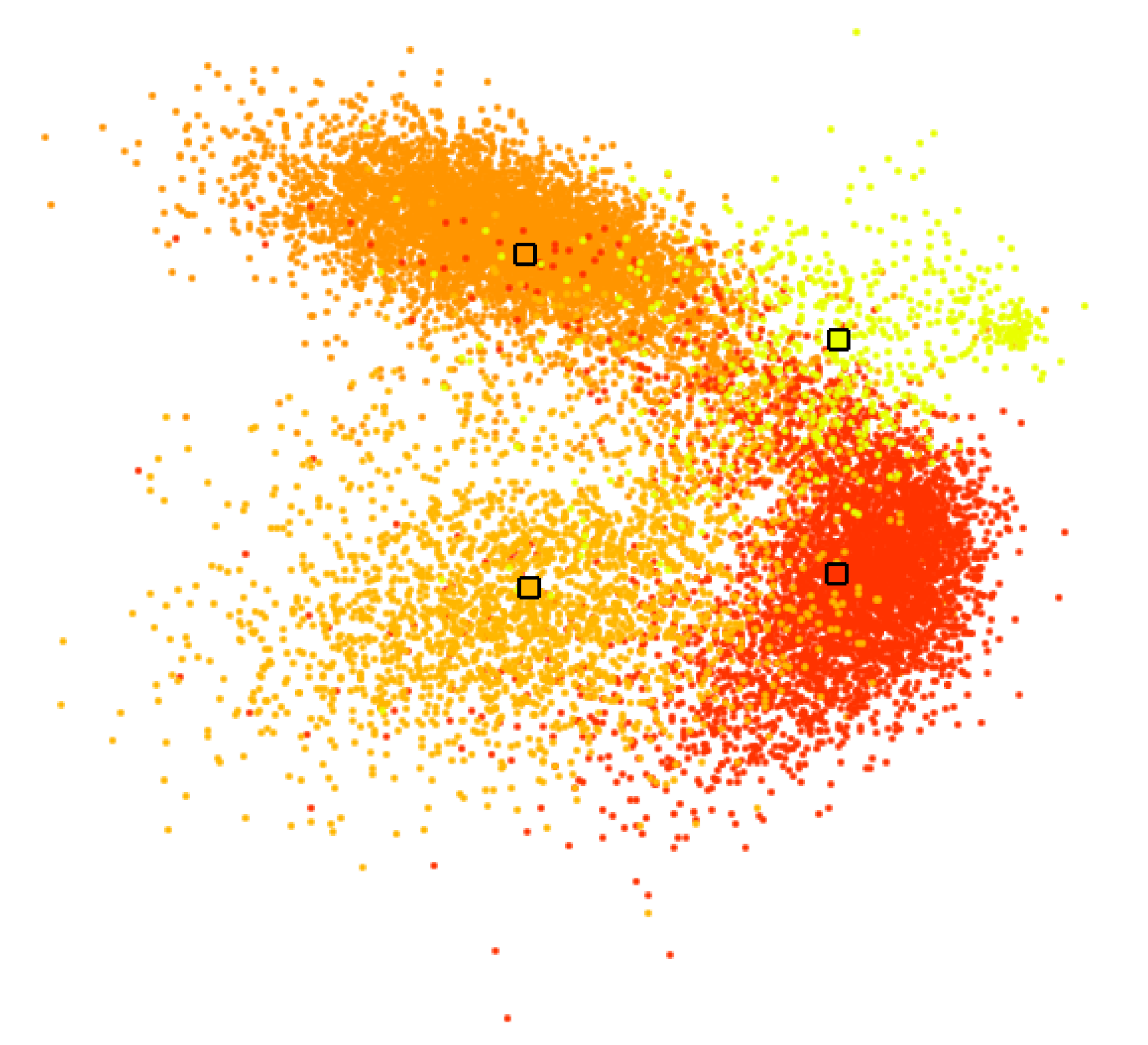
Figure 6.
Linear embedding of labeled data, where color-coded labels correspond to interactively generated clusters in Figure 11b. Medians of labeled groups highlighted by black frames serve as control points for interactive cluster separation.
Figure 6.
Linear embedding of labeled data, where color-coded labels correspond to interactively generated clusters in Figure 11b. Medians of labeled groups highlighted by black frames serve as control points for interactive cluster separation.

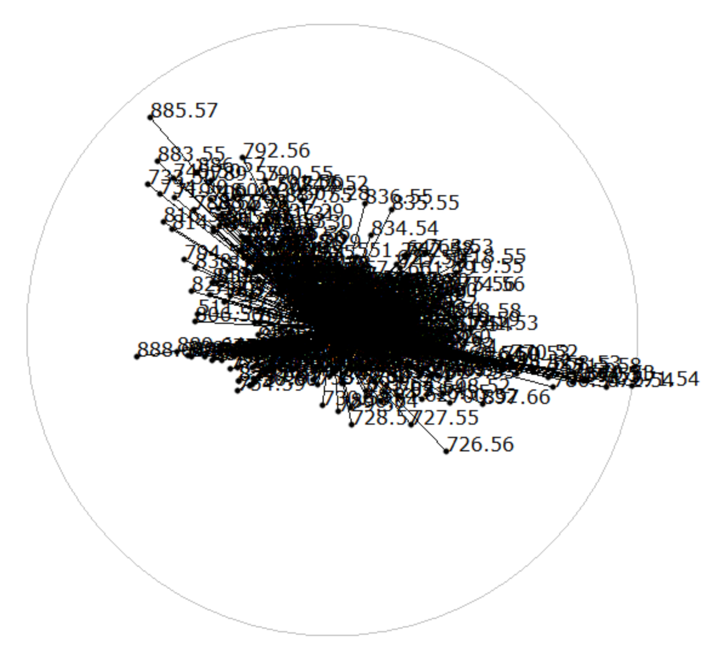
Figure 7.
Star coordinates (SCs) of linear embedding in Figure 6 reveals which dimensions were given more weight to separate clusters in the form of long dimension axis vectors.
Figure 7.
Star coordinates (SCs) of linear embedding in Figure 6 reveals which dimensions were given more weight to separate clusters in the form of long dimension axis vectors.

Figure 8.
Bar chart visualization of decreasing dimension axis lengths of Figure 7 allows for easy selection of dimensions with highest weight, which represent most discriminant peaks for cluster separation in Figure 6.

Figure 9.
Juxtaposed boxplot visualization for discriminant peaks selected in Figure 8 allows for quantitative comparative analyses of peak intensity distributions between selected image regions. Computed p-values for each peak are reported after its -ratio in the labels of the horizontal axis.
Figure 9.
Juxtaposed boxplot visualization for discriminant peaks selected in Figure 8 allows for quantitative comparative analyses of peak intensity distributions between selected image regions. Computed p-values for each peak are reported after its -ratio in the labels of the horizontal axis.

Figure 10.
Image-space visualization for peaks with -ratios 671.53 (a) and 883.55 (b) selected in Figure 9: Multi-hue luminance color map (c) exhibits spatial intensity distributions. Methodology applied to mouse cerebellum in negative ion mode data set [9].

Figure 11.
Mouse cerebellum in negative ion mode data set [9]: Interactive selection of clusters in non-linear embedding (b) reveals image regions (a) close to ground truth (d). Further interactive cluster refinement delivered an enhanced result (c).
Figure 11.
Mouse cerebellum in negative ion mode data set [9]: Interactive selection of clusters in non-linear embedding (b) reveals image regions (a) close to ground truth (d). Further interactive cluster refinement delivered an enhanced result (c).

Figure 12.
Mouse cerebellum in positive ion mode data set [9]: Non-linear embedding of spectral information (a) and interactive selection of clusters in the non-linear embedding (b) reveals image regions (c) close to ground truth (d). Selecting the red cluster in (b) for generating a non-linear embedding of the sub-population (e) allows for a refined and improved result (f).

Figure 13.
Mouse cerebellum in positive ion mode data set [9]: (a) Linear embedding of labeled data, where color-coded labels correspond to interactively generated clusters and respective regions in Figure 12f. (b) Corresponding SC configuration.

Figure 14.
Juxtaposed boxplot visualization allows for quantitative comparative analyses of peak intensity distributions between regions for selected discriminant peaks according to Figure 13. Here, the granular layer (GL) and molecular layer (ML) have been selected for comparison (cf. Figure 12).

Figure 15.
Image-space visualization of mouse cerebellum in positive ion mode data set [9] for peaks with -ratios 672.54 (a) and 728.57 (b) selected in Figure 14. Multi-hue luminance color map (c) exhibits spatial intensity distributions.

Figure 16.
Rat testis data set [9]: Interactive selection of clusters in non-linear embedding (b) reveals image regions (a) close to ground truth (c).
Figure 16.
Rat testis data set [9]: Interactive selection of clusters in non-linear embedding (b) reveals image regions (a) close to ground truth (c).

Figure 17.
Rat testis data set [9]: (a) Linear embedding of labeled data, where color-coded labels correspond to interactively generated clusters and respective regions in Figure 16. (b) Corresponding SC configuration.

Figure 18.
Juxtaposed boxplot visualization allows for quantitative comparative analyses of peak intensity distributions of selected image regions (cf. Figure 17) for selected discriminant peaks.
Figure 18.
Juxtaposed boxplot visualization allows for quantitative comparative analyses of peak intensity distributions of selected image regions (cf. Figure 17) for selected discriminant peaks.

Figure 19.
Image-space visualization of rat testis data set [9] for peaks with -ratios 846.57 (a) and 798.57 (b) selected in Figure 18. Multi-hue luminance color map (c) exhibits spatial intensity distributions.

Figure 20.
PCA for linear embeddings does not allow for observing/separating clusters: (a) Mouse cerebellum in negative ion mode, (b) mouse cerebellum in positive ion mode, and (c) rat testis data sets [9].
Figure 20.
PCA for linear embeddings does not allow for observing/separating clusters: (a) Mouse cerebellum in negative ion mode, (b) mouse cerebellum in positive ion mode, and (c) rat testis data sets [9].

Publisher’s Note: MDPI stays neutral with regard to jurisdictional claims in published maps and institutional affiliations. |
© 2020 by the authors. Licensee MDPI, Basel, Switzerland. This article is an open access article distributed under the terms and conditions of the Creative Commons Attribution (CC BY) license (http://creativecommons.org/licenses/by/4.0/).
Share and Cite
MDPI and ACS Style
Jawad, M.; Soltwisch, J.; Dreisewerd, K.; Linsen, L. Interactive Visual Analysis of Mass Spectrometry Imaging Data Using Linear and Non-Linear Embeddings. Information 2020, 11, 575. https://0-doi-org.brum.beds.ac.uk/10.3390/info11120575
AMA Style
Jawad M, Soltwisch J, Dreisewerd K, Linsen L. Interactive Visual Analysis of Mass Spectrometry Imaging Data Using Linear and Non-Linear Embeddings. Information. 2020; 11(12):575. https://0-doi-org.brum.beds.ac.uk/10.3390/info11120575
Chicago/Turabian StyleJawad, Muhammad, Jens Soltwisch, Klaus Dreisewerd, and Lars Linsen. 2020. "Interactive Visual Analysis of Mass Spectrometry Imaging Data Using Linear and Non-Linear Embeddings" Information 11, no. 12: 575. https://0-doi-org.brum.beds.ac.uk/10.3390/info11120575
Note that from the first issue of 2016, this journal uses article numbers instead of page numbers. See further details here.