1. Introduction
Any epidemiological analysis trying to obtain a list of the main facilitators for the spread of the virus must use human geographical information [
1]. COVID-19 has produced an unprecedented change in mobility [
2,
3]. Governments have implemented restrictive measures to contain the pandemic. These measures have been mainly focused on reducing social contacts [
4]. This is a direct effort towards controlling the COVID-19 spread, at a stage where the test and trace strategy is impractical [
5]. Mobility restriction measures range from the closure of schools and large gatherings to the complete lockdown of the population and economic hibernation. Different countries have implemented dissimilar measures, varying their severity and duration [
6]. Lifting these restrictions will lead societies to a new normality, and how much it will resemble the old normality is still unclear. At this point, it seems likely that societies will transition to a new basal mobility structure [
7]. It is important to analyze and understand these sources of geographical information as soon as possible. Many public sources of mobility data can be used to measure physical distancing among the population during the COVID-19 crisis such as [
8,
9,
10]. Unfortunately, most of these sources provide limited insights, focusing on specific movement modalities (e.g., public transport occupancy, public bike system usage, road densities). An alternative to public data is the data provided by private technological entities, which have access to a high volume of information through applications installed in mobile phones [
11]. Even though the segment of the population with these applications installed is not a perfect reflection of society (e.g., young segments of society are over-represented while elders and kids are under-represented), it is large enough to provide reliable estimations. At the moment, data provided by private entities represents the most reliable public source of information to explore the big picture from the perspective of people [
12]. Such sources of data include the ones provided by Google and Facebook as described in Materials and Methods (
Section 2).
The study of human mobility has been highly improved with the analysis of mobile-phone information [
13]. Mobile data has been used for purposes so diverse as population mapping [
14,
15,
16], analyzing the usage of urban space [
17,
18,
19,
20] or establishing relations between social networks and mobility [
21,
22,
23]. In all of them, one of the main issues arising when working with private data sources is the imperfect knowledge about the nature of the data. For reasons of privacy preservation, raw data is never provided. Instead, data go through heavy pre-processing and anonymization procedures [
24]. Additionally, the conditions under which data are collected are not fully transparent either, as baselines and contextual information are often missing.
The goals of this project are three-fold:
First, to investigate the relation between different private data sources in a well-known setting and to describe how the relation between these sources and the complementary nature of the context can provide a better understanding of mobility. For our analysis, Spain has become the perfect country, providing a clear natural experiment for cross-comparison between different sources. The COVID-19 pandemic in Spain, and the political measures taken to control its spread in the country, provide the almost perfect experimental setup indeed. Spain implemented a complete and sudden lockdown on 15 March 2020, while the first mild restrictions were put in place less than a week before (progressive closure of schools and banning of large gatherings) [
6]. After the pandemic peaked in April, Spain gradually recovered mobility levels and services during the span of two months (May and June).
Second, we will study the reaction of the Spanish population to the implementation of these measures. We aim to study Spain’s demographics and consider the relation between restriction policies, social behavior, and pandemic evolution. This shock to mobility that was applied in a uniform way in an otherwise very heterogeneous country, in such a short notice, may help interpret both mobile-based data in general as well as the specific data for the scenario. Both analyses will help react to mobility crises in the future.
Third, we will also study the progression towards a new normality in comparison with the old one. This may be helpful in the adaptation of mobility policies to the new social setting. Our aim is to detect which areas or regions presented more hysteresis, this is, which areas of Spain took more time to come back to the new normality, if any.
From these contributions, we derive the following conclusions in the fields of mobility, public policy, pandemic response, and social behavior. These are further detailed throughout the paper, particularly in
Section 4:
Using mobility data sources without accounting for their nature and origin can be misleading.
Both relative and absolute mobility measures provide relevant and complementary insights, if properly recognized.
Absolute measures are good for epidemiological purposes but lack a contextualization, which is often needed for change assessment and for economic regulation.
Relative measures are good for socioeconomic purposes but are highly dependant on baseline values, which may not be available or may not be reliable.
Spain’s lockdown saw a great adherence from population for eight straight weeks, which resulted in a fast containment of the pandemic.
The main lockdown implemented in Spain appears appropriate and proportional to the situation, while the hard lockdown implemented for two weeks had little additional effect.
Weekends, particularly Sundays, under lockdown, show the greatest absolute change in mobility (most people stays at home), but at the same time show the smallest relative effect. Fridays have the biggest relative change in mobility (most people change their routine).
The new normality (i.e., the weeks after the lockdown) shows mobility recovering to values similar to a regular period during weekends. Working days in urban regions account for the biggest changes in mobility patterns.
High density regions related to the large urban centers of Madrid and Barcelona show the largest lag in getting back to a new normality, with reductions in mobility becoming more persistent.
The Geographical Context of Spanish COVID-19 Epidemics
We briefly introduce the geographic patterns of the pandemic in Spain during the period in which we perform our mobile-data analysis from March 2020 to the end of June 2020. The first cases of COVID-19 in Spain were reported on 31 January, in the Canary Islands. For roughly a month, all detected cases were imported from other countries. The first cases, with an unknown contagion source, were diagnosed during the last week of February, although community transmission was probably present earlier while undetected [
25]. The month of March is thus where our analysis should begin. The number of cases reached the number of 999 on 9 March. At this point, a few several regional governments proclaimed the first generalized measures, with the closure of schools. This escalated until 14 March, when the Spanish government declared the state of alarm. This directly imposed movement restrictions on the whole population, allowing only essential activities and work-related journeys. There was a five-day delay between the first tentative measures and a full soft lockdown. A considerable shock as this entailed a ban on any geographical mobility between Spanish provinces. These restrictions were reinforced on 29 March with the implementation of a hard lockdown, which suspended all mobility not related to essential services at any geographical level. This lasted until 12 April, when work trips were approved again while geographical mobility was still prohibited, esp. w.r.t. movement between different regions. The first generalized de-confinement measures were adopted two weeks later, on 26 April, when kids under 14 (and a tutor) were allowed outdoors for an hour. On 2 May, small businesses were allowed to open only for pre-arranged appointments. This de-confinement process continued progressively until 21 June, when the last mobility restrictions in Spain were lifted. This is why our analysis ends on 27 June.
At administrative level 2, Spain is composed of 17 regions and two autonomous cities (Ceuta and Melilla). The latter is not included in the analysis because their distinct nature would require a separate study. Even so, the 17 regions of Spain differ significantly in socioeconomic factors, as shown in
Table 1. Two regions (Catalonia and Madrid) include the largest metropolitan areas and had the most COVID-19 cases in absolute terms. The other regions can be categorized as being dense or sparse (as determined by the population density), and as having their population centered on urban areas or not (as determined by the percentage of people living in cities with 50 K or more inhabitants). Cantabria and Aragon are examples of the most uncommon cases, the first being fairly dense, with population centered on small towns, and the second being sparse, with population centered on cities. Extremadura is a prototypical sparse and rural region, while Madrid is extremely dense and urban.
We also notice that the attack rate after the period we have investigated was very heterogeneous. We observe a 10-fold difference between Canarias and La Rioja, and a 7-fold difference between neighboring regions such as Murcia and Castilla-La Mancha. Geographical extension and population density have played a role in the evolution for two reasons. First, the level of international connectivity of Madrid and Barcelona (Catalunya) is large [
26], so the initial imported cases arrived there, together with the north of Spain (Navarra, Euskadi, La Rioja). When confinement measures were applied uniformly to the whole country, the epidemiological situation was very different in Valencia (less advance) than Catalunya, the neighbor to the North. The region with more advanced epidemics was Madrid. In other words, when Spanish authorities ordered confinement, the number of deaths related to COVID-19 was already very high in Madrid, as opposed to some of the other regions such as Andalucia or Murcia. The second reason is that socioeconomic factors play a key role in transmission: income, and poverty levels are associated with higher propagation. The distribution of income and poverty in Spain follows similar patterns of geographical heterogeneity to other European countries [
27].
With this context in mind, we proceed with the rest of the paper. It is structured as follows. First, we describe the methodology, i.e., the data used in this work
Section 2), and then we proceed with the results, which include a general study of mobility trends for all regions and data sources (
Section 3.1), a discussion on the anomalies observed (
Section 3.2), an analysis on the daily trends (
Section 3.3) and some insights on the new normality (
Section 3.4). Finally, we discuss the results and review our conclusions in
Section 4.
2. Materials and Methods
For this work we have considered the data published by the Facebook Data for Good program (FDG) [
28], by the Google mobility assessments [
29], and by Apple [
30]. At the time of our analysis, Apple only provided one single mobility metric: the number of address search requests via the Apple Maps application. In practice, this measure was too different from the other sources as to be directly compared. Furthermore, while it was possible to assess the anonymization effect on the data for FDG and Google, we have not been able to do the same in the case of Apple. For these reasons, we disregard Apple data in this analysis.
Private mobility indices are typically provided at a certain level of aggregated granularity. With administrative level 1 being country, level 2 in Spain corresponds to regions (17 Autonomous Communities or CC.AA.), and level 3 to province (50 of them in Spain). As we will see next, the Google data are provided at level 2 (regions), while Facebook data are provided at level 3 (province), a smaller geographical granularity. Therefore, the latter will be aggregated to level 2 in our work.
2.1. Facebook Data for Good
Facebook Data for Good presents multiple data sets of mobility, all of them accompanied by a general description of how they are obtained. There are two main data sets of particular relevance for the purpose of this work: a remain-in-tile index and a movement-between-tiles index [
31]. Both are based on GPS data from a sample of users that have activated the tracking system on their mobile phones, dividing the space into level 16 tiles (squares of roughly 500 × 500 m). The first one, remain-in-tile, provides the percentage of people that remain in the same tile, computed as the total ratio of smartphones providing a signal that does not change between tiles in the span of a whole day. The second one, movement between tiles, estimates mobility by computing how many different tiles are visited by the sample of people, compared to the same number obtained during the same day of the week in the period prior to the pandemics (February 2020) [
24].
For the rest of this work, we will use the remain-in-tile index, as it provides a more pure measurement. Notice that the remain-in-tile is an absolute measure, and thus it does not depend on a baseline. This makes it straightforward to interpret, and a good candidate for counting people who are following confinement, as long as the group of people that accepted to be pinned represent a good sample of the population. The anonymization of data prevents us from evaluating the degree of fitness between the data sample and the overall population distribution. A certain amount of bias is to be expected, as the penetration of smartphones and the Facebook app varies significantly among cohorts. As with Google, the elder population and the younger population could be slightly underrepresented, and this may entail a certain bias. Nonetheless, the considerable size of the sample leads us to believe that the data can provide a reliable picture.
We assess Facebook’s sample size in two ways. First, by considering Facebook’s market penetration in the smartphone market, which is around 50–60% [
32] with smartphones being available for 70% of the population. The subsample with an activated tracking system only needs to be around 10% to have a sample of 4% of the total population. Even 1% of the population would be a very large sample in any kind of poll or survey. Second, data from active Facebook users is also available from the Facebook geoinsights maps and indicate that 1% is indeed the typical order of magnitude of the sample. The fact that Facebook requires a minimum of 300 active users to provide data (for anonymity reasons) allows us to validate the size of the sample. For example, the province of Spain with the smallest population is Soria, with roughly 90,000 people. From the data collected by Facebook, it can be inferred that this province has never pinned less than 300 people for the whole period under study. This means that the sample in Soria is always above 0.5% of the population. We have no reason to suspect a lower coverage on the rest of the provinces of Spain.
Facebook data are provided at level 3 (province) granularity. In order to compare with Google data (which is only available at level 2), we need to aggregate it. Any level 2 region is a sum of one or more level 3 provinces. To compute the level 2 data from level 3 values we use the average of provinces weighted by their population. By doing so we obtain the ratio of people that remain in tile at the level 2 aggregation for Facebook.
2.2. Google
On 2 April 2020, Google released its COVID-19 Community Mobility Reports [
29]. Since then, Google periodically releases anonymized mobility data (
http://google.com/covid19/mobility (accessed on 12 February 2021)), organized in a set of categories, including: retail, recreation, groceries, pharmacies, parks, and transit stations.These data are always provided at the administrative level 2 granularity (region). In addition to those metrics, Google also releases a Residential and a Workplace measure, estimating how much time is spent at those places.
In the case of Residential, it is based on the average number of hours spent at the place of residence for each user within a geographic location. These data are collected from those users opting into Location History and is processed using the same algorithms used for the detection of user location in Google Places, offering an accuracy of around 100 m in urban areas [
33]. The Google Mobility Reports release information for every day of the week, consisting in the differential of mobility with respect to a baseline. The comparison is always made against the first five weeks of the year 2020, from 3 January to 6 February. Therefore, this is a relative index.
Given the large number of users in Google Maps, there is no doubt that the sample size of Google is also large compared to any standard polling sample. However, the fact that Google does not provide an absolute value in the way Facebook does presents researchers with serious challenges. The most important issue to be aware of is that the baseline can indeed be tainted by the existence of non-weekend local festivities or by other variations over the normal baseline due to large-scale celebrations. As we will see, lack of access to the baseline prevents from doing proper direct comparisons between regions, and even between days, and this can complicate the interpretation of the data.
Nevertheless, Google’s residential index, which indicates the estimated time spent at the residence, should strongly correlate with Facebook’s remain-in-tile. A large fraction of people remaining at home should correspond to an increase in both indices. Their direct comparison should provide context for their interpretation and insights on their applicability.
3. Results
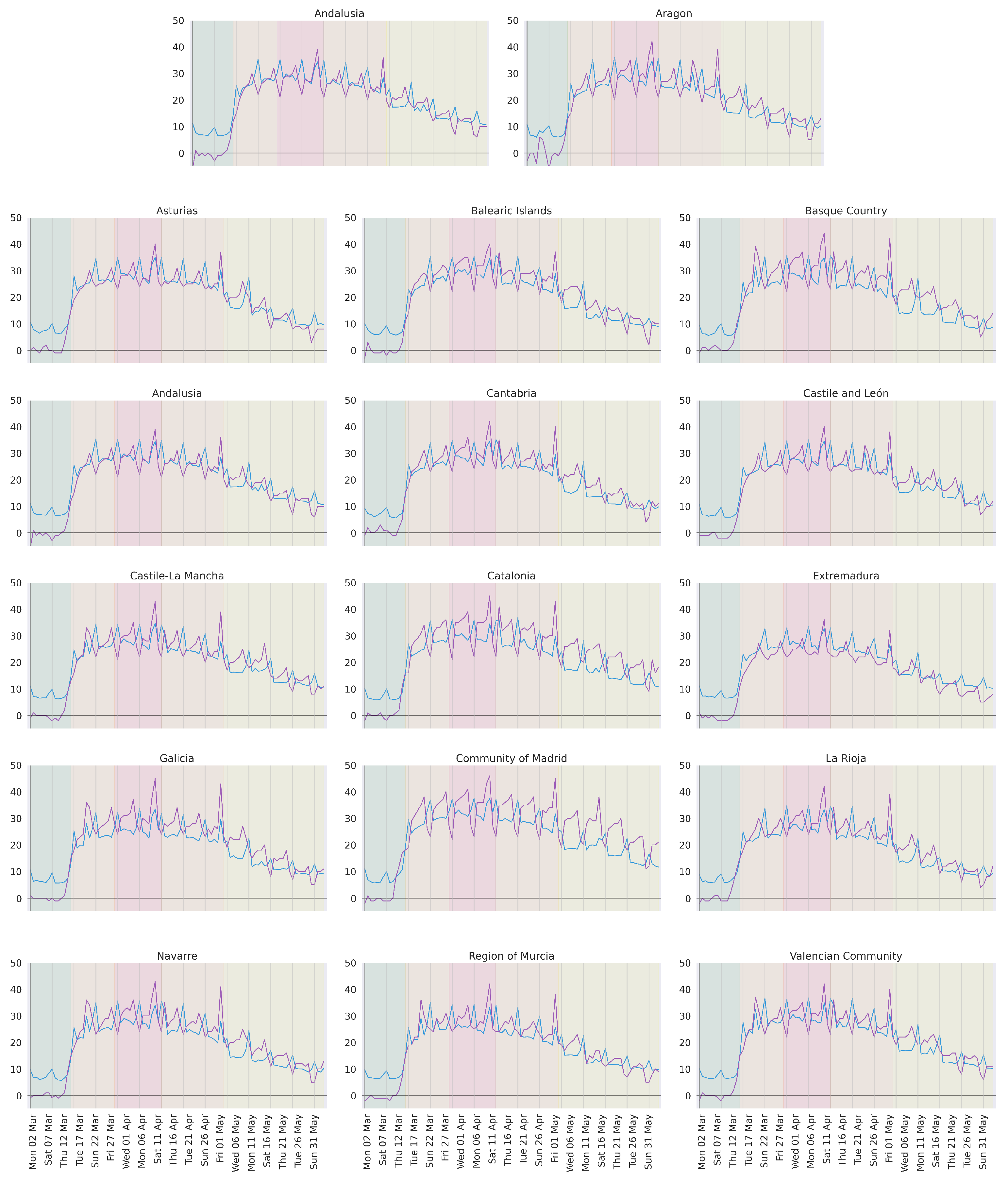
We first focus on the data obtained from Facebook’s remain in tile index, and on Google’s residential index in order to obtain the main characteristics of the confinement process in Spain during the first wave of the COVID-19 epidemic. The former is scaled (multiplied by 50) to approximate Google’s scale and to facilitate the interpretation of figures. We have no means to assess the relationship between the scale of both indices, which is why we avoid interpreting the relative volume between indicee s. Nonetheless, as we will see in
Figure 1, our scale provides a good approximation.
3.1. General Regional Trend
Our first analysis is focused on the general mobility trend in Spanish regions during the peak of the pandemic. For this, we focus on the three months around the peak of the pandemic in Spain, as shown in
Figure 1. These are March, April, and May. In this period, mobility in Spain went through at least 5 clear stages (the green, orange, red, orange, and yellow bands in
Figure 1):
1 March–13 March (2 weeks). A period previous to the declaration of the state of alarm, when mobility is expected to be normal. That would mean around zero on the Google index since this is a measure relative to normality.
14 March–27 March (2 weeks). A period of mobility containment after the declaration of the state of alarm and the establishment of a general lockdown.
28 March–12 April (2 weeks). A period of maximum mobility containment, what we call hard lockdown, after the government reinforced restrictions forbidding all movements not related to essential services.
13 April–1 May (3 weeks). General lockdown remains in place, but reinforced policies are lifted (mobility to the workplace is allowed).
2 May–20 June (7 weeks). A period of convergence towards new normality, as de-confinement measures are deployed: kids are allowed outside for a limited time, some stores are allowed to open under certain conditions, etc., This process is progressive, with new lifted restrictions every 2 weeks. It goes on until 21 June, when the state of alarm ended and new normality began.
First of all, let us emphasize the lack of significant differences among regions with regard to the general trend. All show the same overall behavior through time. Mild differences exist in the degree of confinement, and on the recovery speed during de-confinement. Madrid, for example, reaches a higher level of confinement and recovers mobility much slower than Extremadura. The main distinctive factor of regions comes from the occurrence of periodic peaks in the data (sometimes upwards, sometimes downwards). We discuss those in detail in the following section.
According to both mobility indicators, the Spanish society assumed and implemented the general lockdown in a matter of 48 h (from 12 March to 14 March). This level of mobility restrain was sustained for seven weeks. For reference, Wuhan, the source of the pandemic, held its lockdown for approximately eight weeks [
34]. Spain’s mobility was minimized from 15 March, with the declaration of the state of alarm, to 2 May, with the approval of de-confinement measures (consecutive orange, red and orange bands in
Figure 1). After 2 May, restrictions were gradually lifted, causing a progressive recovery of mobility that officially ended on 21 June.
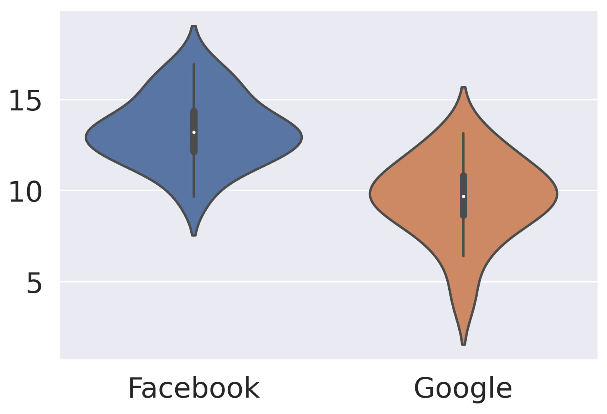
Within the seven lockdown weeks, there was a hard lockdown during two of them. Since restrictions were enforced by law enforcement, mobility during these two weeks is a good estimate for the maximum amount of mobility restriction that can be held in Spain while keeping essential services running.
To further understand the role of the hard lockdown, we compute an estimate of its impact on mobility. We are interested in its effect when compared to mobility under regular lockdown. The regular lockdown includes five weeks of lockdown data (the last two weeks of March and the last three weeks of April), during which traveling to industry and construction workplaces was allowed. This sort of lockdown is assumed to have a less damaging effect on the economy, but it enables infection among co-workers. To compare mobility between both periods we measure the corresponding area under the curve. The higher the area, the higher the constraint. For each period, we normalize the area by the number of weeks. The results for all 17 regions are shown in
Figure 2 as a separate distribution for the Google and Facebook indices. In this case, Facebook is the most interesting source, since it is an absolute measure and allows us to measure the volume of people. This data indicates an increase between 10% and 15% of the people who stayed put. The relevance of that number for the containment of the pandemic is unknown to us. We do not know how the evolution of the pandemic would have been had the hard lockdown not been implemented. One may argue that many more people would have been infected since regular lockdown enables transmission on the workplace. However, the number of detected cases did not show any change after the hard lockdown ended. On the contrary, it continued to decrease at a similar rate. One may also argue that the hard lockdown had a psychological effect on society, boosting resiliency to confinement. This seems to be a valid hypothesis, looking at how much mobility recovers right after the hard lockdown is lifted. If that was the case, the state of alarm might have lost adherence faster without a hard lockdown.
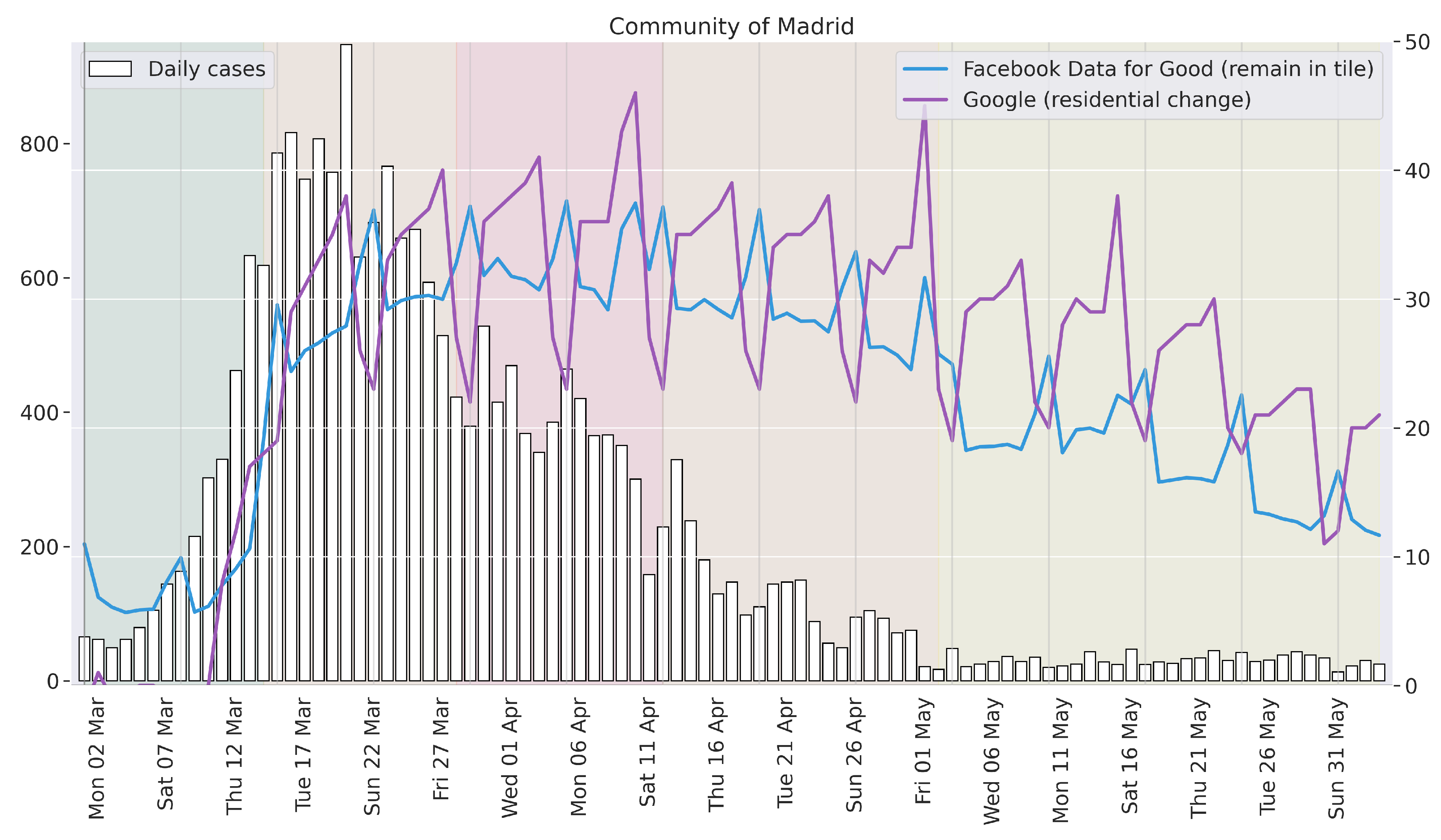
To observe the effect and timing of the policies implemented, we can compare them with the pandemic status. For this purpose, we use the number of daily reported cases, plotting it against the mobility curves. To approximate the date of the contagion from the date of the report, we shift this data two weeks early. This is motivated by current estimates [
35], which assert that the vast majority of COVID-19 patients develop symptoms (if any) before day 14 after contagion.
Figure 3 shows this comparison for the case of Madrid [
36], the region with the most cases and the strongest lockdown adherence.
In
Figure 3, we observe the beginning of the lockdown overlapping with the initial containment of the pandemic. That is, the number of contagions halts its exponential trend around the date of the state of alarm declaration. Although we do not know the exact role of the state of alarm, it is shown to be a clearly correlated factor. The seven weeks of general lockdown coincide with the seven weeks of strongest pandemic rate reduction. That is the time it took the pandemic to reach a basal situation in the region, with less than 100 reported cases a day. According to this estimate, this situation may have been reached around the starting date of the de-confinement process. If this was the case, the duration of the Spanish lockdown (7 weeks) was a very good fit for the evolution of the pandemic. A shorter lockdown may have induced a significantly higher risk of relapse, and a longer one seemed unnecessary given the contagion numbers estimated to be taking place in early May. Let us remark that, during the crisis, policymakers could use only the measure of current daily cases for their decision making—that is, without the 2-week shift we performed in
Figure 3. The de-confinement process was therefore a bolder (and riskier) initiative than what
Figure 3 illustrates.
3.2. Peaks and Anti-Correlation between Similar Measures
The general trend described in the previous section is explained on the basis of the different stages of confinement enforced by the Spanish government. On top of this trend, we can see the occurrence of a number of peak values, happening periodically and in all regions. These peaks occur mostly on Sundays (marked with grey vertical lines in
Figure 1), and to a lesser degree on Fridays and Saturdays. Let us discuss Sundays and Fridays in detail since Saturdays seem to be a middle ground, transitioning between both.
Sunday peaks are anti-correlated in terms of relative mobility (Google goes down) and absolute mobility (Facebook goes up). This means that the number of people moving is small when compared to the same measure in the days of confinement surrounding those. It also means that the number of people moving is not so different from what it used to be when compared to the same day of the week during the old normality. In other words, people were not moving much on Sundays before the COVID-19 crisis, and during the crisis, they were moving less. Accordingly, even though the decrease in mobility on Sundays is not as big as on the other days of the week, it still accounts for the day of the week with less absolute mobility. That would make Sundays the best candidates for increasing the mobility of the at-risk population.
In contrast, Friday peaks exhibit a rather different behavior. In this case, the relative mobility decreases sharply (Google goes up), while the absolute mobility remains stable or decreases mildly (Facebook goes flat or slightly up). This indicates that Fridays are the days with the most different mobility patterns with respect to the previous normality (relative change), which speaks of the high amount of mobility taking place on a normal Friday. On these days it is when society is showing its biggest change, leveling mobility to the rest of the working week. That would make Fridays the best candidates for communication and for institutional support to individuals such as mental health assessments. Let us remind the reader that these insights may be reinforced by the bias in the data, which favors the presence of younger segments of society.
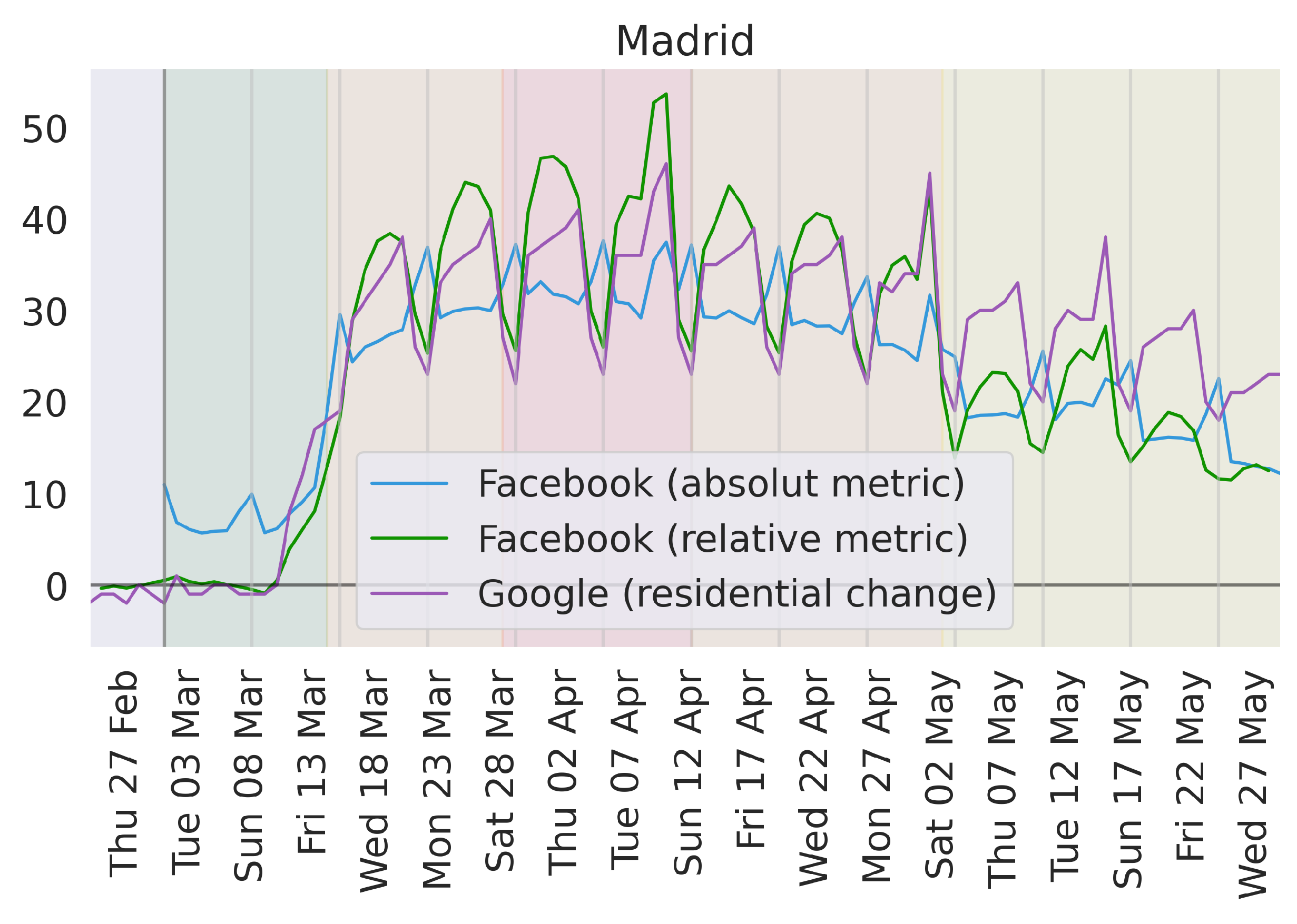
Let us now conduct an experiment to validate the hypothesis that peaks are related to the relative or absolute nature of measures. We transform the Facebook measure from an absolute one to a relative one, using the analogous remain in tile data as a baseline, from 24 February to 8 March, before the first regional restriction measures. This baseline is computed weekday-wise, in a similar fashion to Google metrics. The result is shown in
Figure 4, together with the original Facebook data, and the Google measure. The first obvious change is in Sundays, which now peak downwards like Google. In fact, our relative Facebook measure perfectly aligns with Google around weekends (Friday to Monday) during the whole lockdown. This may be caused by differences in the data (both data sources have different resolutions to measure movement), or by differences in the baselines given the daily consistency.
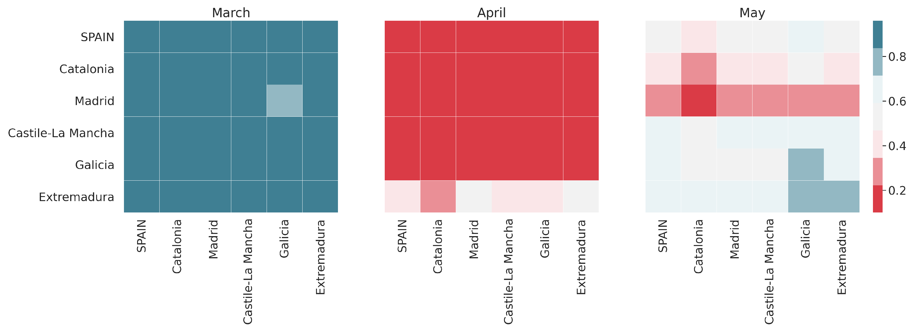
Understanding the nature of these peaks is important because of the effect these may have on certain metrics. As shown in
Figure 5, the Pearson correlation between Facebook’s remain in tile, and Google’s residential index vary significantly from month to month. In March, mobility exhibited a very clear trend as a result of the establishment of confinement measures. In this setting, the correlation between both indices is clear (around 0.9 Pearson correlation on average), and the peaks are not disruptive enough to alter it. On the other hand, mobility during April was stable, as the whole month was under lockdown. This entails an overall flat behavior of the indicators. In this context, the inverted peaks have a dramatic effect, disrupting all correlations between indices. Finally, May appears as a middle ground. There is a generalized mobility trend, which reduces the upsetting effect of the peaks, but the trend is not strong enough to completely overpower the noise.
3.3. Daily Trend
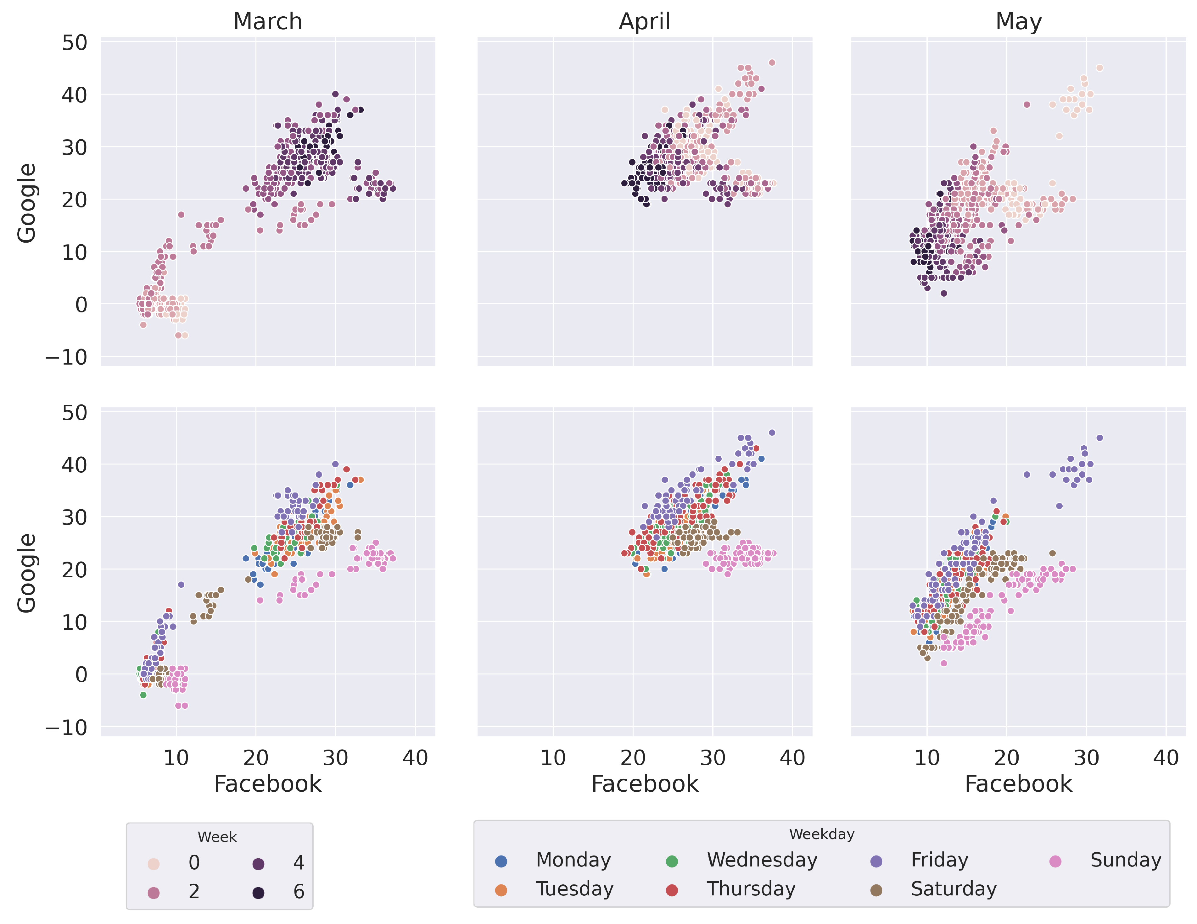
Weekdays have an important role in the characterization of mobility. Let us now study the same data, but rather from the perspective of days this time. To do so, we plot the Facebook and Google mobility indices as two different axes.
Figure 6 provides two visualizations for the first three months of the pandemic in Spain. On the top row, the color gradient shows the change through time, week by week. On the bottom row, weekdays are color-coded to illustrate the differences between days. In these plots, the horizontal axis shows absolute change (the more to the right, the bigger number of people stay at home) while the vertical axis shows relative change (the more up, the more percentage of people stay at home in comparison with normal instances of that day).
The first visible thing in
Figure 6 is the correlation between both values, as all data are mostly gathered around the diagonal. The top row shows the evolution of mobility, starting from the axis origin (bottom left) and suddenly jumping to the top-right quarter of the plot as lockdown is implemented. The last Friday and Saturday before the lockdown (second week of March) are the only days in the middle of that jump. During confinement (April) data are rather stable in that area, until the de-confinement measures (May) bring it down and left again, but this time in a slow manner.
The visualization using both Google and Facebook as the axes shows a clear correlation between them. In general, as relative mobility increases/decreases, so does absolute mobility. However, this relation seems to be somewhat dependant on the day of the week. As shown on the bottom row of
Figure 6, Sundays have a rather different behavior in terms of relative mobility (it shows less variance in this metric) while Friday represents the opposite (it shows more variance in relative mobility). This is a different visualization of the same phenomenon observed in the peaks of
Figure 1 and discussed in
Section 3.2.
3.4. The New Normality
In the second half of May, Spain started to lift the confinement measures that had been in place in the country for two months [
6]. The process was asymmetrical, with regions with better pandemic indicators, such as the number of daily cases or the number of available hospital beds, de-confining faster than others. Detailed maps of the differential treatment of regions can be found in governmental sources [
37]. This process ended on 21 June, when the state of alarm (along with all the mobility restrictions) was lifted. On that date, the whole country officially entered what was called the new normality.
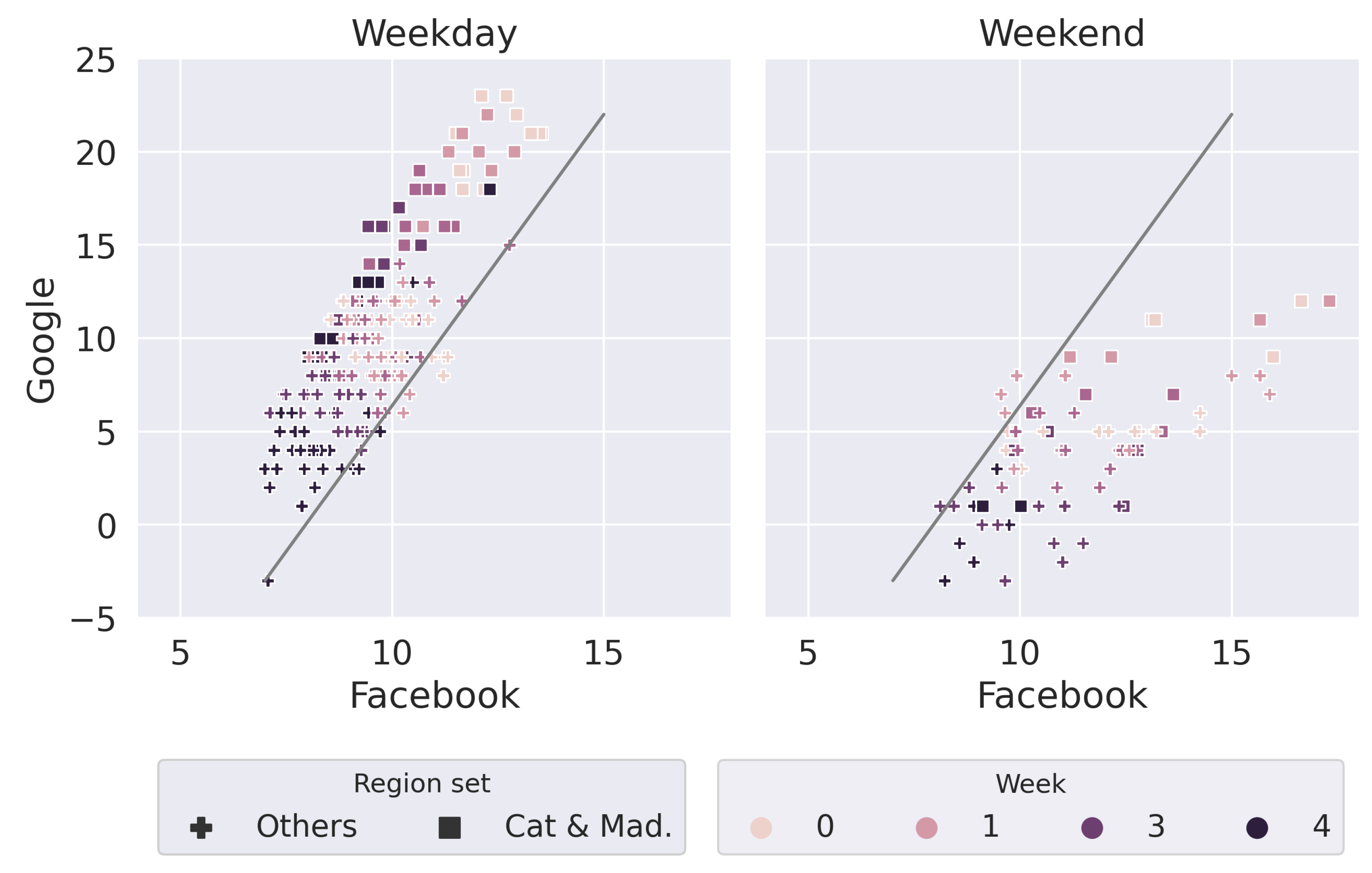
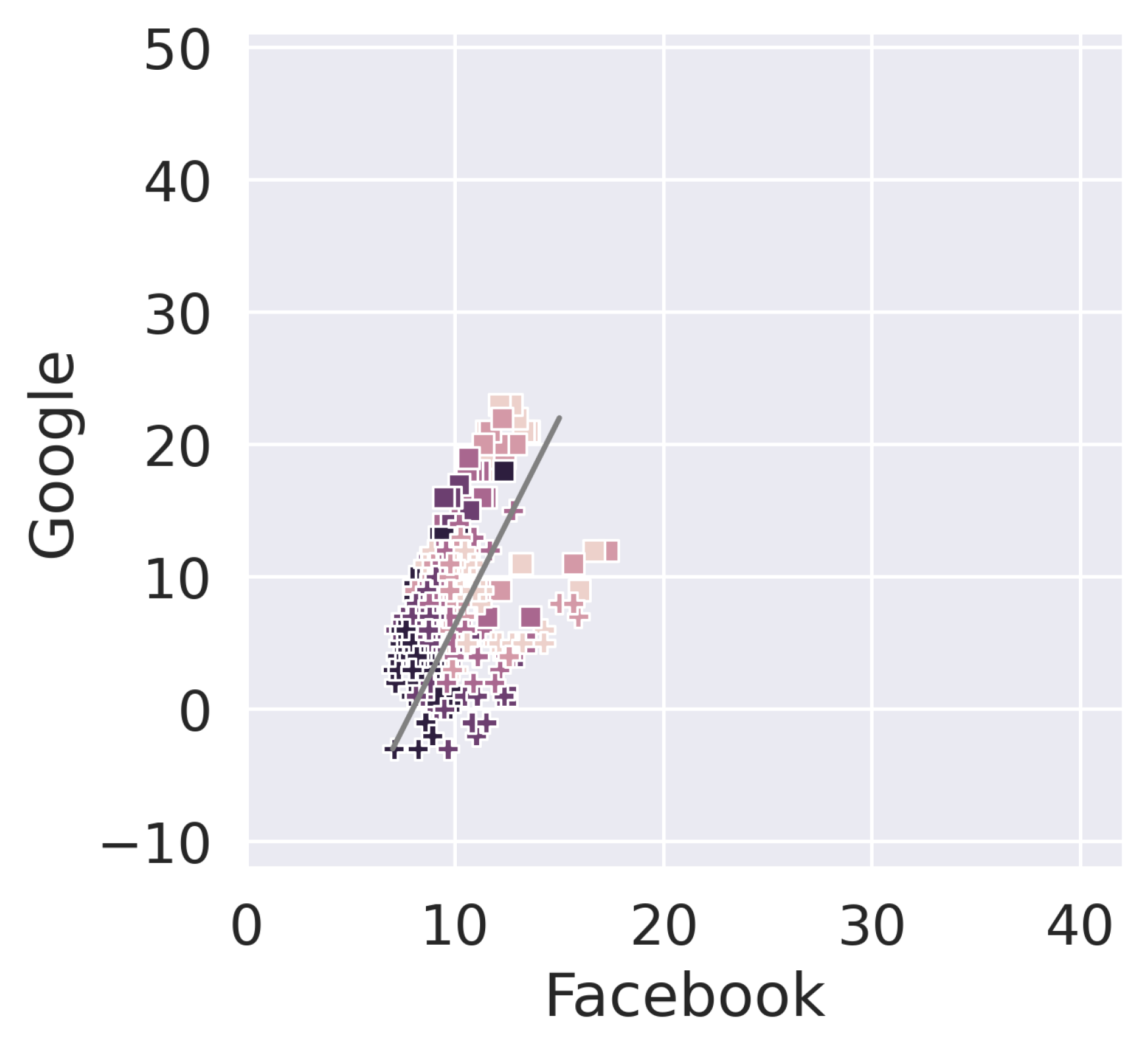
Figure 7 includes the last four weeks of state of alarm (but without a generalized lockdown), and the first one of new normality. To facilitate visualization we zoom in the image and we make the axis scale with respect to
Figure 6. Nonetheless, in order to enable comparison with the rest of the period under study, we plot the same data in
Figure 8, using the scale used in
Figure 6.
The progression of mobility towards the origin of axes is still visible as weeks go by (in color gradient), for both working days (Monday to Friday) and weekend days (Saturday and Sunday). To compare the new normality with the old one, we must focus on the Google axis, since this is relative to a baseline (3 January to 6 February). On the weekends, mobility is already at Google baseline levels, with all values being in the range between −5 and 5 during the last week (the new normal one). In contrast, working days are showing a higher difference with respect to the baseline, with several values in the last week between 5 and 15 in the Google axis. This indicates that the change implemented by Spanish society during the new normality is focused on working days, while weekends are back to how they were.
The recovery of old normality is not homogeneous among regions either. Catalonia and Madrid, the regions with the biggest metropolitan areas, clearly lag behind. Asturias, Navarre, La Rioja, Region of Murcia, Extremadura, and Galicia are way ahead. Of those, only Murcia has a population density above 100 (132 people/km2), hinting a potential relationship with this indicator. The lag of Catalunya and Madrid during the first 4 weeks is likely related to the fact that these regions were slightly behind in the removal of restriction measures. However, during the 5th and last week of data, all regions were under the same conditions, and Catalunya and Madrid still exhibit higher levels of mobility reduction. This might be related to the role of large metropolitan areas, where it is harder to keep a safe distance. Another possibility is the presence of a higher degree of awareness of the problem given that both regions reported the highest absolute volume of infections during the pandemic. Both these factors are strong psychological enablers of self-responsibility, which may have an effect on adherence to mobility reduction during the new normality.
The fact that Catalonia and Madrid are the regions where this effect is more noticeable is actually related to their urban cores. In the case of Catalonia, the differences appear in the metropolitan area of Barcelona. Actually, even in October, mobility levels have never been back to the same levels as before [
38]. The fact that these changes in the new normality have been stronger in high density areas is remarkable. Both gravity and radiation models of mobility point to the higher population and higher density areas to have a larger mobility [
39,
40]. This is indeed the case in Spain with large mobility concentrated in Madrid and Barcelona. Our result indicates that either a fraction of the population can easily tune out of mobility and get self-contained more easily in high concentration areas or key parameters of the mathematical model are more affected by changes in behavior due to the legal and social environment in a pandemic.
4. Discussion
We have considered the use of geographical position private data sources (Google and Facebook) from mobile phones in order to assess the levels of mobility in Spain. By doing so, we draw conclusions on three fronts. First, on the behavior and particularities of private geographical data sources. Second, on how mobility changed during the COVID-19 pandemic in Spain. Furthermore, finally, how the return to the new normality depended on socio/geographic factors.
Regarding private data sources, we have shown the differences between using an absolute measure (like Facebook) and a relative measure (like Google). Both of them have limitations when used in isolation. The former lacks a contextualization of its values, while the latter depends entirely on the baseline used. When used together, they provide a visualization of mobility where consistent patterns can be easily identified (as presented later in this section). For specific purposes, using a single data source may suffice, as long as it fits the goal:
An absolute measure like Facebook’s can be very useful for epidemiological purposes, as it provides a pure measurement of mobility. This includes estimating the number of contacts in a society, modeling the spread of the virus, and measuring the impact of policies on absolute mobility.
A relative measure like Google’s can be very useful for socioeconomic purposes, as it provides a contextualized measurement of mobility. This includes understanding the change caused by the new normality, and the economic impact of mobility restriction policies.
On the second topic of this paper—the analysis of Spanish mobility during the COVID-19 pandemic—we extract several conclusions. On one hand, data shows a huge mobility containment, sustained for a month and a half (15 March to 1 May, approximately), very close to its theoretical limit (as represented by the mobility during the hard lockdown). This duration was sufficient to contain the spread of the virus and to bring infection numbers down to a traceable scale. In hindsight, the policies implemented in Spain seem appropriate and proportional to the severity of the situation. That being said, the role, timing, and convenience of the hard lockdown remains to be further discussed. Our work shows a relatively modest contribution of this policy to mobility reduction. On the other hand, the hard lockdown may have had an effect on prolonging adherence.
Our work identifies mild differences between regions during the three months of restricted movement. Certain regions had a stronger adherence to confinement than others, mostly in relative terms. This may be caused by regional differences in mobility prior to the pandemic, which is used as a baseline for the relative measurement. A similar artifact is formed by the inverted peaks of weekends, where a relative measure spikes down and an absolute measure spikes up. As demonstrated, this is the result of combining a measure relative to the weekday with an absolute measure.
We also saw significant differences depending on the day of the week. Weekends exhibit the highest volume of mobility reduction in absolute terms, even during the hard lockdown, when traveling to work was forbidden for all except for essential services workers. At the same time, weekends have the smallest mobility reduction in relative terms, indicating that the effort society had to make in this regard with respect to its previous patterns was smaller. Fridays and Sundays are particularly relevant days, the former because it represents the biggest change from normal behavior, and the latter because it represents the biggest absolute decrease in mobility. These particularities could be exploited for the general good.
Finally, we analyzed the new normality by looking at the weeks of de-confinement, up until 27 June, a week after the state of alarm was lifted on the whole of Spain. In this period, we found Saturdays and Sundays to be already at pre-pandemic levels of mobility. In contrast, working days (Monday to Friday) still show significant differences. The new normality also shows differences between regions, particularly for working days. Regions with large metropolitan areas exhibit a reduction in mobility between 4% and 14% after restrictions were lifted. Indeed, the new normality seems to have its main effect on urban working days.
One intriguing outcome of our study is the unforeseen anti-correlation between two variables that, according to their definition, should have a similar behaviour: Google’s residential vs. Facebook’s remain-in-tile. Hypotheses can be articulated about the reasons behind these differences and we have discussed this in depth in
Section 3.2. Other reasons for these differences may be attributed to the way these metrics are computed, e.g., FB’s remain-in-tile accounts for short trips such as nearby shopping while Google’s residential has a much lower range of dozens of meters. It is obvious that there is an opportunity to investigate further by analysing the regional differences in behaviour between weekends and weekdays based on the length of the trips. This anti-correlation should also be seen as a warning on the responsibility and importance of interpreting the data meticulously, esp. when the results of the work can lead to recommendations on the modification of policies with potential high impact.
These last results point to significant changes in the parameters of mathematical models that try to unveil the level of mobility for a particular region. This might provide important insights not only on the effects of restrictions in total levels of mobility but also on the selection of the transport model. Future work needs to cross-reference these private sources of data with the level of occupancy of public transport to understand better how it affects the criteria to select public or private transport [
41,
42] and how it could be modified in a pandemic.


 ,
, 


