
The Sketch Map Tool Facilitates the Assessment of OpenStreetMap Data for Participatory Mapping

 , ,
, ,  , , , , and
Abstract
:1. Introduction
2. The Sketch Map Tool
3. Materials and Methods
3.1. OpenStreetMap History Database and the Ohsome API
3.2. Map Rendering and Style
3.3. Image Processing
3.4. OpenStreetMap Quality Analyses
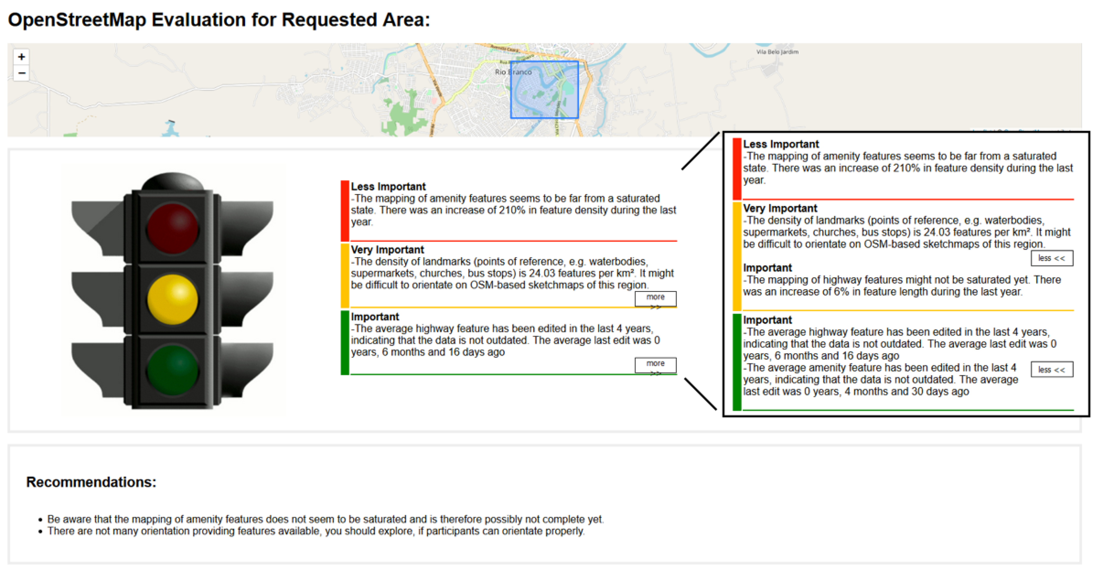
- Saturation of mapped amenitiesAs many common POIs, e.g., restaurants, educational and cultural facilities in OSM are tagged with the amenity key [33], it is useful to know, if they are likely to be mapped completely or not. In the latter case, some important reference points for the participants to orientate themselves on the sketch maps might be missing. As many categories of amenity features are rendered with special icons (e.g., a coffee cup for a café) [33] they are very valuable when orienting on sketch maps. The analysis of the recent density of orientation providing features, which will be explained below, is related. In the analysis described here, the focus does not lie on the current quantity of orientation providing features, but on the estimated completeness of their mapping. If it is inferred that the mapping of amenity features is close to a state of completion or has been completed, an easier orientation for the participants in a sketch map study is likely, and level green is reported. To obtain an indicator for the mapping completeness of relevant features, we analyze their saturation. When the number of added features falls below a certain threshold, one can infer that the mapping of these features is close to a state of completion or has been completed [34]. Rehrl and Gröchenig [10] use as a threshold the case when the number of created features in a year falls below three percent of the total count of features. We simplify this analysis by inspecting the increase in the density of features per year, as in unsaturated phases one can expect that there are more features to add than to delete, and consequently there is an increase in the density of features above a certain threshold. In our implementation of the analysis, the change is inspected relative to the number of features per km2 in the previous year, instead of relative to the total number of features per km2 in the year in which the new features have been created. As almost complete data can already be expected to provide most of the important landmarks, the three percent threshold of Rehrl and Gröchenig is too strict in our use case, besides the differences in measuring this indicator, which also impede a usage of the same threshold. In our tests 5% for the threshold from yellow to green and 10% for the threshold from red to yellow seemed adequate, when compared to our own estimations of mapping completeness. Like with all parameters of the analyses, it might be necessary to adjust these values as soon as more experiences from practical usage of the tool are available or other use cases are considered. We also included a 25% threshold, which needs to be surpassed in at least one year, to ensure that there has been a stage of growth at all and not just a lack of data as an explanation for small relative growth. If this threshold is failed, a red level is reported. Generally, we consider this analysis’ results as less important (weight = 0.5) compared to the other analyses, as a saturation of the mapping of amenity features does imply an easier orientation, but its impact is expected to be less heavy than that of the density of such orientation providing features. The weight makes the influence of this analysis on the general score smaller than the influence of analyses, which are rated as more important and therefore have higher weights. In case a lack of data is presumed, the importance is considered to be moderate (weight = 1), because a negative impact on the ability of participants to orientate on the sketch maps is expected.
- Density of orientation providing featuresAs described in the previous paragraph, mapped POIs are important for the orientation of participants when using sketch maps. The same significance applies to landmarks, e.g., touristic attractions or natural features. The density of these features can therefore be analyzed for obtaining an indicator of how well participants in sketch map studies can orientate themselves on the maps. We are analyzing the recent combined density of railway stations, shops, places of worship, bus stops, hotels, touristic attractions, pharmacies, hospitals, restaurants, gas stations, schools, universities, colleges, town halls, police stations, fire brigade stations, parks, national parks, mountain peaks, waterways such as rivers, and water bodies such as lakes. Thresholds that seemed adequate in providing a green, yellow or red rating of how many of such features are mapped that can provide better orientation, are 30 features per km2 for the threshold from yellow to green and 10 features per km2 for the threshold from red to yellow. We derived these values from multiple map extracts of areas in which we could either navigate well, fairly or hardly. The POI densities in these areas have been compared and the thresholds have been chosen in a way in which they reflect our own navigability based on POI density. These exploratory values can be further improved when more data about sufficient POI densities for the various use cases are available. The results are weighted as very important (weight = 2), because it is crucial for the usability of paper-based sketch maps, that participants can orientate themselves properly on them.
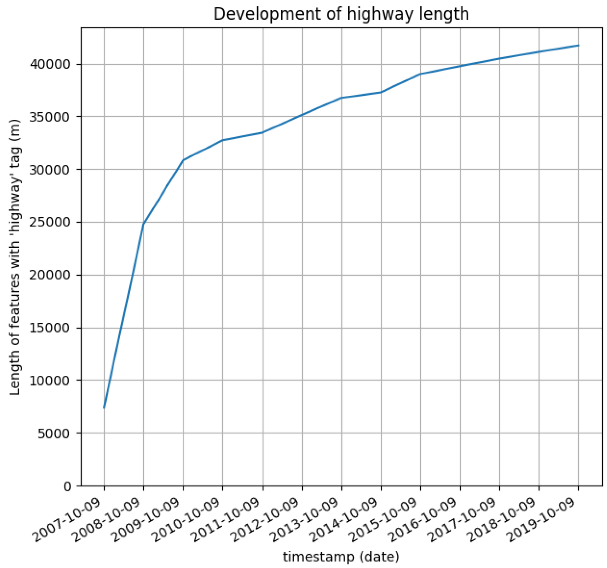
- Saturation of the road network mappingThe analysis of the saturation of the road network mapping is carried out in a similar way as the analysis of the amenity mapping saturation. In their OSM quality analysis framework “iOSMAnalyzer” [11] Barron, Neis and Zipf analyzed the completion of the mapping of different categories of roads by inspecting their monthly increase in feature length and comparing this increase to the increase in feature length of road categories lower in the hierarchy. When gathering data about disaster risk, there is the need to have reliable data for all road categories. Using sketch maps to capture urban flooding, one must expect that not just roads high in the hierarchy such as motorways, but also especially roads that are lower in the hierarchy such as streets in residential areas are affected. Therefore, we do not distinguish between different road categories when analyzing the increase in feature length. When a possible study area is selected, it is preferable that all the roads that are in this area are mapped completely. As this analysis follows a rationale very similar to that of the amenity mapping saturation analysis, we apply the same way of analyzing, i.e., inspecting the relative yearly growth—now regarding the feature length instead of the density—with exploratory thresholds of 5% and 10% for the detection of saturation and 25% for the detection of growth stages, i.e., the absence of a lack of data. The road network has an integral importance in the use of sketch maps because it is not only an aid for orientation, but also subject to markings in many sketch map applications. This analysis has therefore weight = 1 when a stage of completion or growth has been detected and weight = 2 when there is a possible lack of data.
- Important sourcesIt is possible to gather knowledge about the precision of mapped features by inspecting the sources of data (e.g., [35]). To enable users to inspect important sources, this analysis reports all sources that have been named in a source tag in a share of at least 2% of all mapped features in the chosen area. Although it is not typical to add source tags to individual features in the current mapping practice of OSM (they should be included in changesets, which are not inspected here) it was common in the past [36] and therefore many source tags remain on single features. These sources and their respective shares are not evaluated automatically but presented to the user so that he can inspect the important sources and consider their trustworthiness and their relevance for the specific study. As the conclusions depend on manual inspections, this analysis is not considered in the general score (weight = 0).
- Currentness of the dataWhen using sketch maps, it is preferable that all real-world features are mapped in their current state. For example, if a building has been torn down, it should not appear in recent OSM data anymore, and if a new supermarket has opened, it should be visible in OSM. Barron, Neis and Zipf [11] stated the possibility of analyzing the currentness of OSM data by visualizing its latest modification, as the user doing the last change indirectly confirms the correctness of the feature. They point out that this approach is problematic, when features are already mapped correctly and there is no need to change them. To avoid this problem, we inspect the average time passed since the last modification of all features in relevant categories and use thresholds that are long enough so that there is some change to be expected in the real world (e.g., changing opening hours, newly built houses, closed stores). This should cause the average time since the last edit to be below a certain threshold if there is an active community ensuring currentness of the data. The used thresholds are 4 years from yellow to green and 8 years from red to yellow. Two categories of features are checked for their currentness. Because of their explained importance, features tagged with amenity = * and highway = * are analyzed for their average currentness. The result is reported for both categories. The result’s importance is considered to be moderate (weight = 1), as outdated map data might cause confusion among participants in sketch map studies.
3.5. Workflow
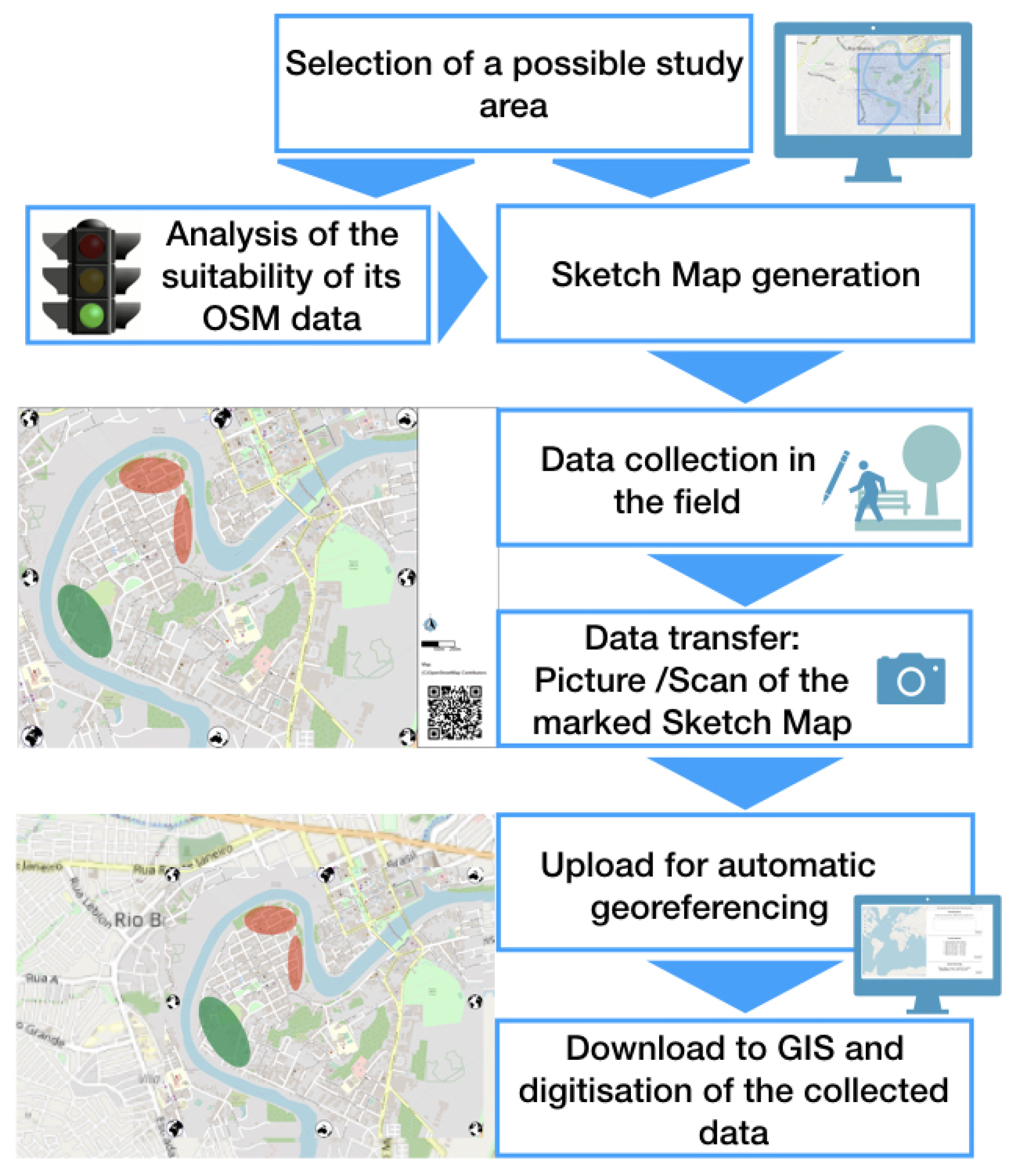
- Selection of possible study areasTo assess the fitness of an intended research area regarding the quality characteristics mentioned in Section 3.4 using the Sketch Map Tool or for the generation of a sketch map, the area of interest can either be marked as a rectangle on the map, or specified directly as a bounding box with the corresponding coordinates. In this case, the values of the bounding box must be entered via minimum longitude, minimum latitude, maximum longitude, maximum latitude, where latitude is a decimal number between −90.0 and 90.0 and longitude is a decimal number between −180.0 and 180.0. If more than one area needs to be assessed, it is possible to enter or select several areas.
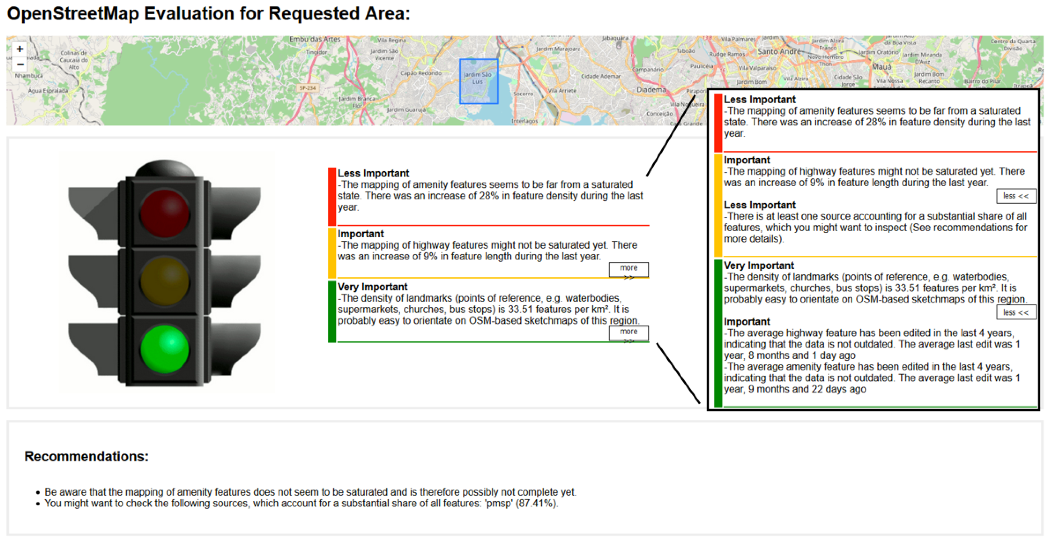
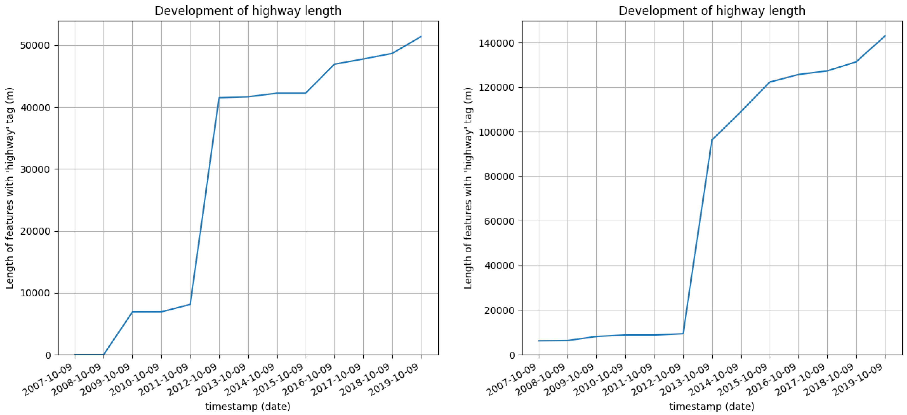
- Analysis and ResultsSubsequently, the selected areas can be evaluated using the Analyze button. The result contains an assessment of the fitness of the OSM data for participatory mapping, which is displayed as a traffic light depending on the quality of the existing data. Additionally, the different criteria which were considered for the outcome are specified in a written form. Concluding recommendations are given to help the user to be aware of possible problems that might occur during a sketch map study and further information which could be helpful to check beforehand. To enable a better understanding of the results as well as to give more details, additional visualizations of the data are provided. These visualizations include for example the plotting of the feature length development for highway features and the feature density development for amenity features. The shares of different POI and landmark categories of these features are provided in form of a pie chart to allow insights on which types of POIs might be used as reference points by sketch map study participants in this area.
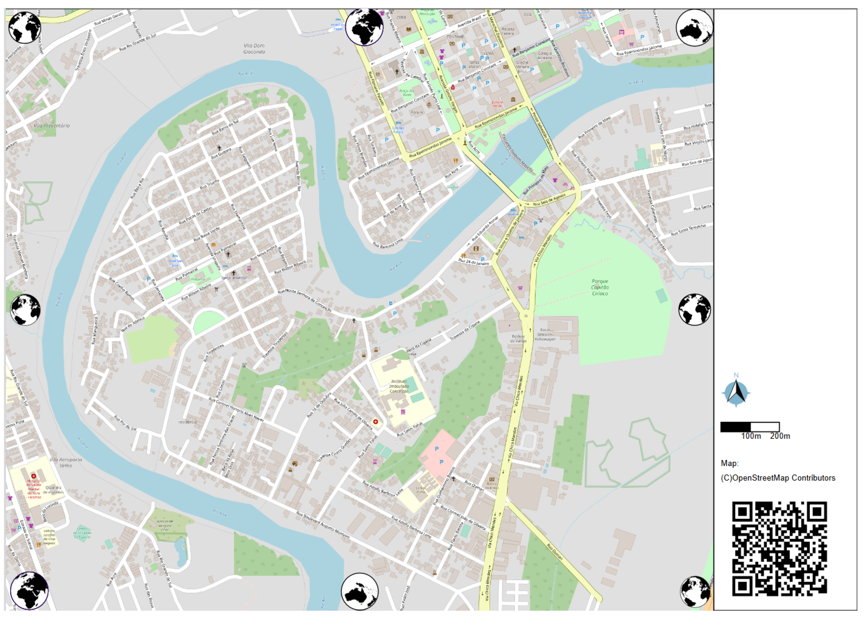
- Sketch Map GenerationAfter successfully evaluating a possible study area’s OSM data, having taken notice of possible problems, and deciding for that study area, the next step in the workflow is the generation of printable sketch maps. To generate a map for a sketch map study, the requested area can be selected in the same way as during the analyses by drawing a bounding box on the map or by providing coordinates. The area can, but does not have to be analyzed beforehand. Again, multiple areas can be selected to obtain several maps at one time. The user can choose between different paper formats and has the option to extend the bounding box automatically to generate a map with the optimal scale for the chosen paper format. This means that there are no blank spaces except the area where the QR code and scale are placed. The size of the rendered map is determined by both the paper format and the bounding box selection—and will be automatically chosen to print the map as big as possible on the chosen paper format. As soon as the generation is finished, a PDF file of the acquired sketch map is provided for download, which can be used for a field study. The map can either be printed out or used digitally. In both cases, the findings can be drawn in as needed, but must not cover the QR Code.
- UploadThe map can be digitized into the GeoTIFF format using the Upload function of the Sketch Map Tool. To do this, the previously created and marked sketch map can be photographed. The maps are designed as such that they can be photographed even under unfavorable illumination conditions and in tilted positions, although the quality is enhanced under favorable conditions and the correct recognition is more likely. After the upload, a GeoTIFF file of the area is provided for download and can be used for further applications. In our work, we use the open-source GIS software QGIS [37] to further process the generated GeoTIFF files.
4. Results
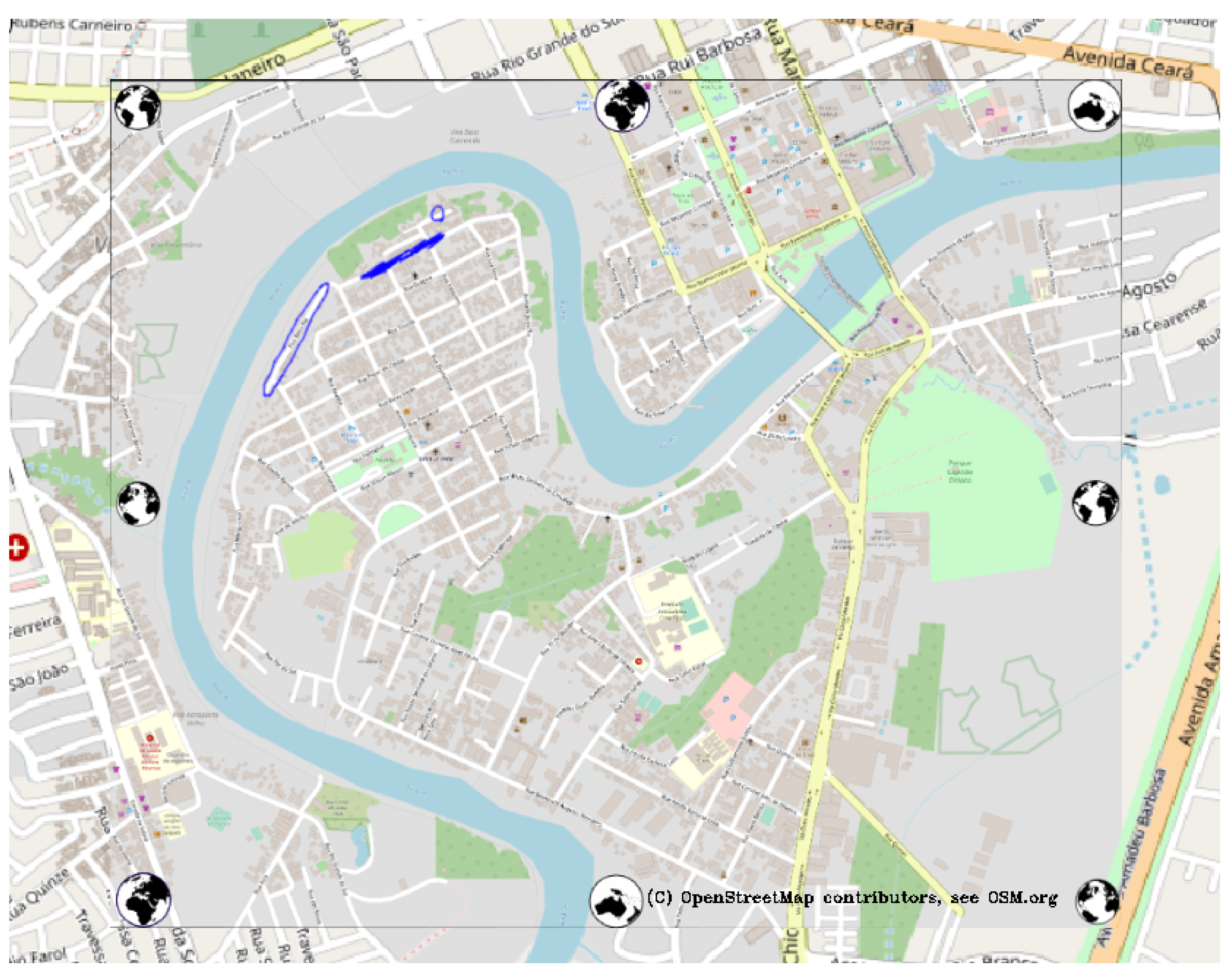
4.1. Case Study—Rio Branco
4.2. Case Study—São Paulo
5. Discussion
6. Conclusions
Author Contributions
Funding
Acknowledgments
Conflicts of Interest
References
- Clark-Ginsberg, A. Participatory risk network analysis: A tool for disaster reduction practitioners. Int. J. Disaster Risk Reduct. 2017, 21, 430–437. [Google Scholar] [CrossRef]
- Cheung, W.; Houston, D.; Schubert, J.E.; Basolo, V.; Feldman, D.; Matthew, R.; Sanders, B.F.; Karlin, B.; Goodrich, K.A.; Contreras, S.L.; et al. Integrating resident digital sketch maps with expert knowledge to assess spatial knowledge of flood risk: A case study of participatory mapping in Newport Beach, California. Appl. Geogr. 2016, 74, 56–64. [Google Scholar] [CrossRef] [Green Version]
- O’Neill, E.; Brennan, M.; Brereton, F.; Shahumyan, H. Exploring a spatial statistical approach to quantify flood risk perception using cognitive maps. Nat. Hazards 2015, 76, 1573–1601. [Google Scholar] [CrossRef]
- Klonner, C.; Usón, T.J.; Marx, S.; Mocnik, F.-B.; Höfle, B. Capturing Flood Risk Perception via Sketch Maps. ISPRS Int. J. -Geo-Inf. 2018, 7, 359. [Google Scholar] [CrossRef] [Green Version]
- Boschmann, E.E.; Cubbon, E. Sketch Maps and Qualitative GIS: Using Cartographies of Individual Spatial Narratives in Geographic Research. Prof. Geogr. 2014, 66, 236–248. [Google Scholar] [CrossRef]
- Bustillos Ardaya, A.; Evers, M.; Ribbe, L. Integrated Participatory Methodologies for Disaster Risk Reduction: Tools to Analyze Complex Systems through Participatory Processes in Brazil. In Strategies and Tools for a Sustainable Rural Rio de Janeiro; Nehren, U., Schlüter, S., Raedig, C., Sattler, D., Hissa, H., Eds.; Springer International Publishing: Berlin/Heidelberg, Germany, 2019; pp. 361–376. [Google Scholar] [CrossRef]
- Klonner, C.; Marx, S.; Usón, T.; Höfle, B. Risk Awareness Maps of Urban Flooding via OSM Field Papers- Case Study Santiago de Chile. In Proceedings of the 13th International Conference on Information Systems for Crisis Response and Management, Rio de Janeiro, Brazil, 22–25 May 2016. [Google Scholar]
- Klonner, C.; Aeschbach, N.; Usón, T.J.; Höfle, B. Participatory Mapping and Visualization of Flood Risk Perception: An Example from Eberbach, Germany. Int. J. Disaster Risk Sci. 2020, 12, 56–71. [Google Scholar] [CrossRef]
- Degrossi, L.C.; Porto de Albuquerque, J.; Santos Rocha, R.D.; Zipf, A. A taxonomy of quality assessment methods for volunteered and crowdsourced geographic information. Trans. GIS (TGIS) 2018, 22, 542–560. [Google Scholar] [CrossRef] [PubMed]
- Rehrl, K.; Gröchenig, S. A Framework for Data-Centric Analysis of Mapping Activity in the Context of Volunteered Geographic Information. ISPRS Int. J. Geo-Inf. 2016, 5, 37. [Google Scholar] [CrossRef] [Green Version]
- Barron, C.; Neis, P.; Zipf, A. A Comprehensive Framework for Intrinsic OpenStreetMap Quality Analysis. Trans. GIS 2014, 18, 877–895. [Google Scholar] [CrossRef]
- Stamen Design. About Field Papers. Available online: http://fieldpapers.org/about (accessed on 19 October 2020).
- Klonner, C.; Blessing, L. Gathering Local Knowledge for Disaster Risk Reduction: The Use of Sketch Maps in Group Discussions. In Proceedings of the ISCRAM 2019 Conference, Valencia, Spain, 19–22 May 2019; pp. 1397–1398. [Google Scholar]
- Fitzsimmons, S. Field Papers Printer. Available online: https://github.com/fieldpapers/fp-printer (accessed on 19 October 2020).
- Klonner, C.; Hartmann, M.; Djami, L.; Zipf, A. “Ohsome” OpenStreetMap Data Evaluation: Fitness of Field Papers for Participatory Mapping. In Proceedings of the Academic Track at the State of the Map, Heidelberg, Germany, 21–23 September 2019; Minghini, M., Grinberger, A.Y., Juhász, L., Yeboah, G., Mooney, P., Eds.; Springer: Berlin/Heidelberg, Germany, 2019; pp. 35–36. [Google Scholar] [CrossRef]
- QR Code Is a Registered Trademark of Denso Wave Incorporated. Available online: https://www.qrcode.com/en/ (accessed on 1 March 2021).
- Python Software Foundation. Python. Available online: https://www.python.org/ (accessed on 31 October 2020).
- WHATWG. HTML Living Standard. Available online: https://html.spec.whatwg.org/ (accessed on 31 October 2020).
- W3C. Cascading Style Sheets Home Page. Available online: https://www.w3.org/Style/CSS/ (accessed on 31 October 2020).
- Ecma International. ECMAScript® 2020 Language Specification. Available online: https://www.ecma-international.org/ecma-262/ (accessed on 31 October 2020).
- Ronacher, A.; Flask Contributors. Flask. Available online: https://palletsprojects.com/p/flask/ (accessed on 31 October 2020).
- Raifer, M.; Troilo, R.; Mocnik, F.; Schott, M. OSHDB—OpenStreetMap History Data Analysis (Version 0.5.10). Zenodo 2020. [Google Scholar] [CrossRef]
- Raifer, M.; Troilo, R.; Kowatsch, F.; Auer, M.; Loos, L.; Marx, S.; Przybill, K.; Fendrich, S.; Mocnik, F.; Zipf, A. OSHDB: A framework for spatio-temporal analysis of OpenStreetMap history data. Open Geospat. Data Softw. Stand. 2019, 4, 3. [Google Scholar] [CrossRef]
- Auer, M.; Eckle, M.; Fendrich, S.; Kowatsch, F.; Loos, L.; Marx, S.; Raifer, M.; Schott, M.; Troilo, R.; Zipf, A. Ohsome—Eine Plattform zur Analyse raumzeitlicher Entwicklungen von OpenStreetMap-Daten für intrinsische Qualitätsbewertungen. AGIT J. 2018, 4, 162–167. [Google Scholar]
- Pavlenko, A. Mapnik. 2018. Available online: https://mapnik.org/ (accessed on 20 October 2020).
- Zverev, I. Nik4. Available online: https://github.com/Zverik/Nik4 (accessed on 20 October 2020).
- OpenStreetMap Wiki Contributors. Overpass API. OpenStreetMap Wiki. Available online: https://wiki.openstreetmap.org/w/index.php?title=Overpass_API&oldid=2057486#Public_Overpass_API_instances (accessed on 7 December 2020).
- OpenStreetMap Carto Contributors. OpenStreetMap Carto. N.D. Available online: https://github.com/gravitystorm/openstreetmap-carto (accessed on 31 October 2020).
- Karl Wettin. Carto-Style-Hydda. Available online: https://github.com/karlwettin/carto-style-hydda (accessed on 31 October 2020).
- OpenCV Team. About [OpenCV]. 2020. Available online: https://opencv.org/about/ (accessed on 20 October 2020).
- Leutenegger, S.; Chli, M.; Siegwart, R.Y. BRISK: Binary robust invariant scalable keypoints. In Proceedings of the 2011 International Conference on Computer Vision, Barcelona, Spain, 6–13 November 2011; pp. 2548–2555. [Google Scholar]
- Warmerdam, F.; Rouault, E.; GDAL Contributors. GDAL. Available online: https://gdal.org/index.html (accessed on 31 October 2020).
- OpenStreetMap Wiki Contributors. Key: Amenity. OpenStreetMap Wiki. Available online: https://wiki.openstreetmap.org/w/index.php?title=Key:amenity&oldid=1989135 (accessed on 7 December 2020).
- Gröchenig, S.; Brunauer, R.; Rehrl, K. Estimating Completeness of VGI Datasets by Analyzing Community Activity over Time Periods. In Connecting a Digital Europe Through Location and Place; Lecture Notes in Geoinformation and Cartography; Huerta, J., Schade, S., Granell, C., Eds.; Springer International Publishing: Berlin/Heidelberg, Germany, 2014. [Google Scholar] [CrossRef]
- Touya, G.; Brando-Escobar, C. Detecting Level of Detail Inconsistencies in VGI Datasets. Cartogr. Int. J. Geogr. Inf. Geovisualization 2013, 48, 134–143. [Google Scholar] [CrossRef] [Green Version]
- OpenStreetMap Wiki Contributors. Key: Source. OpenStreetMap Wiki. Available online: https://wiki.openstreetmap.org/w/index.php?title=Key:source&oldid=2061096 (accessed on 7 December 2020).
- Open Source Geospatial Foundation Project. QGIS Geographic Information System. 2020. Available online: https://qgis.org/en/site/ (accessed on 7 December 2020).
- OpenStreetMap Wiki Contributors. PMSP Buildings Import. OpenStreetMap Wiki. Available online: https://wiki.openstreetmap.org/w/index.php?title=PMSP_Buildings_Import&oldid=1892323 (accessed on 7 December 2020).
- OpenStreetMap Wiki Contributors. Highways. OpenStreetMap Wiki. Available online: https://wiki.openstreetmap.org/w/index.php?title=Highways&oldid=2026021 (accessed on 7 December 2020).
- Seto, T.; Kanasugi, H.; Nishimura, Y. Quality Verification of Volunteered Geographic Information Using OSM Notes Data in a Global Context. ISPRS Int. J. Geo-Inf. 2020, 9, 372. [Google Scholar] [CrossRef]


| i | Analysis | |
|---|---|---|
| 1 | Saturation of mapped amenities | 0.5 (1.0 when a lack of data is presumed) |
| 2 | Saturation of the road network mapping | 1.0 (2.0 when a lack of data is presumed) |
| 3 | Important sources | 0.0 (manual inspection needed) |
| 4 | Currentness of the amenity data | 1.0 |
| 5 | Currentness of the road network data | 1.0 |
| 6 | Density of orientation providing features | 2.0 |
Publisher’s Note: MDPI stays neutral with regard to jurisdictional claims in published maps and institutional affiliations. |
© 2021 by the authors. Licensee MDPI, Basel, Switzerland. This article is an open access article distributed under the terms and conditions of the Creative Commons Attribution (CC BY) license (http://creativecommons.org/licenses/by/4.0/).
Share and Cite
Klonner, C.; Hartmann, M.; Dischl, R.; Djami, L.; Anderson, L.; Raifer, M.; Lima-Silva, F.; Castro Degrossi, L.; Zipf, A.; Porto de Albuquerque, J. The Sketch Map Tool Facilitates the Assessment of OpenStreetMap Data for Participatory Mapping. ISPRS Int. J. Geo-Inf. 2021, 10, 130. https://0-doi-org.brum.beds.ac.uk/10.3390/ijgi10030130
Klonner C, Hartmann M, Dischl R, Djami L, Anderson L, Raifer M, Lima-Silva F, Castro Degrossi L, Zipf A, Porto de Albuquerque J. The Sketch Map Tool Facilitates the Assessment of OpenStreetMap Data for Participatory Mapping. ISPRS International Journal of Geo-Information. 2021; 10(3):130. https://0-doi-org.brum.beds.ac.uk/10.3390/ijgi10030130
Chicago/Turabian StyleKlonner, Carolin, Maximilian Hartmann, Rebecca Dischl, Lily Djami, Liana Anderson, Martin Raifer, Fernanda Lima-Silva, Lívia Castro Degrossi, Alexander Zipf, and João Porto de Albuquerque. 2021. "The Sketch Map Tool Facilitates the Assessment of OpenStreetMap Data for Participatory Mapping" ISPRS International Journal of Geo-Information 10, no. 3: 130. https://0-doi-org.brum.beds.ac.uk/10.3390/ijgi10030130