
Geovisual Analytics Approach to Exploring Public Political Discourse on Twitter


Abstract
:1. Introduction and Political Context

2. Justification for Visual Analytics and Twitter Use
3. Data Collection and Analysis
3.1. Spatial Data and Demographic Attributes
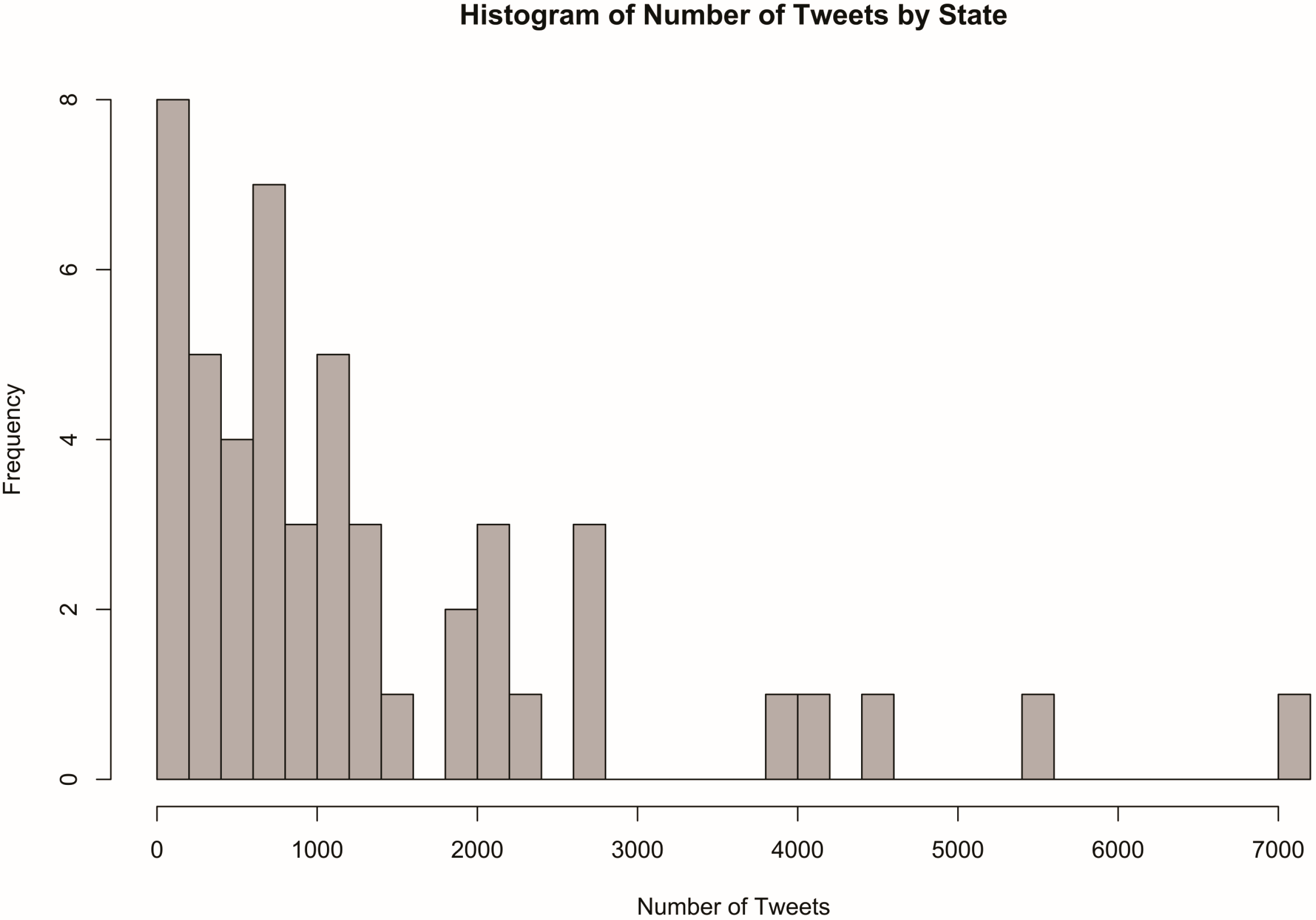
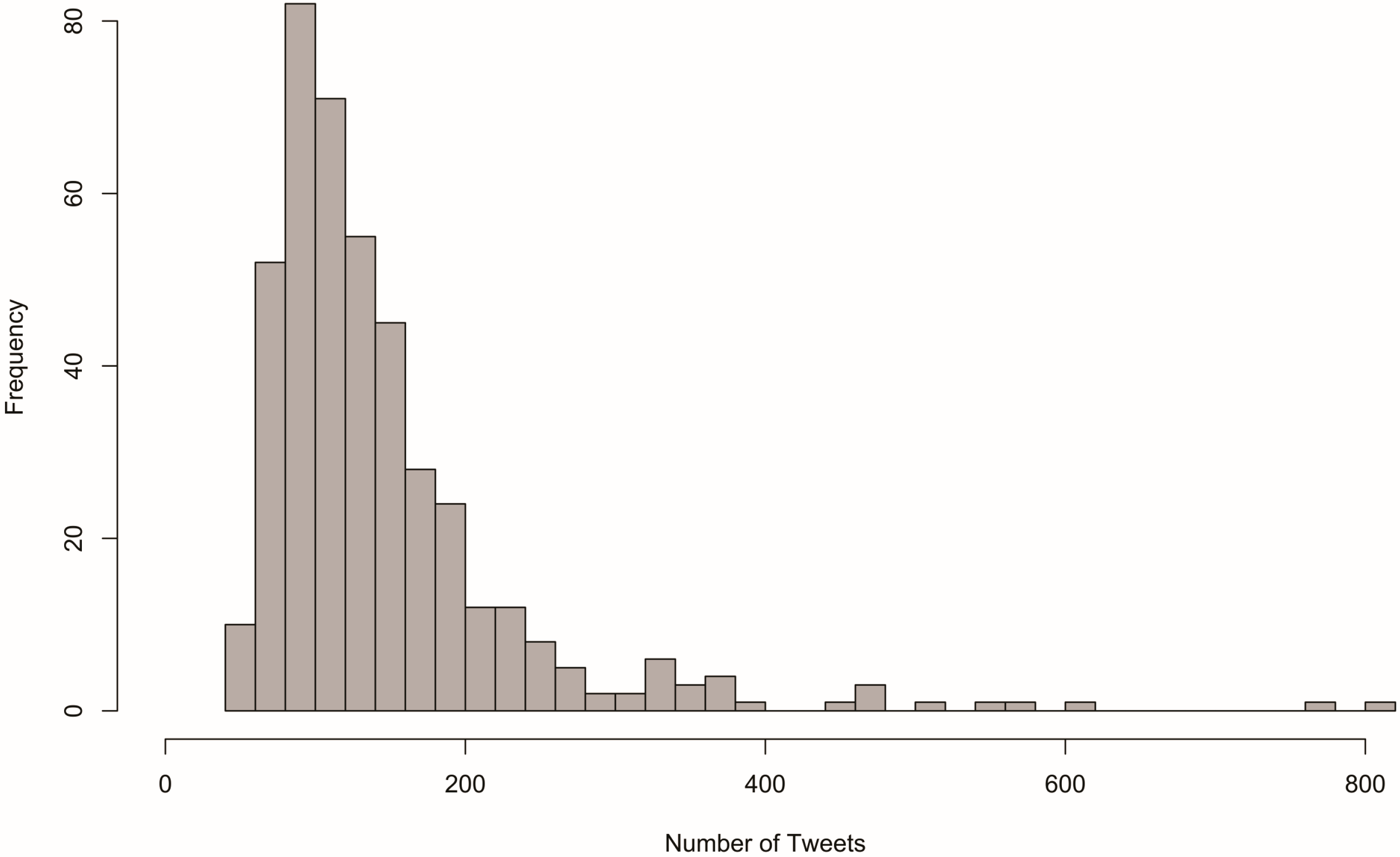
3.2. Tweet Collection
3.3. Statistical Analysis of Tweets


| Rank | Term | Frequency |
|---|---|---|
| 1 | gop | 7699 |
| 2 | obama | 7256 |
| 3 | work | 3877 |
| 4 | congress | 3743 |
| 5 | gopshutdown | 2919 |
| 6 | house | 2734 |
| 7 | tea | 2725 |
| 8 | pay | 2423 |
| 9 | republican | 2405 |
| 10 | boehner | 2367 |
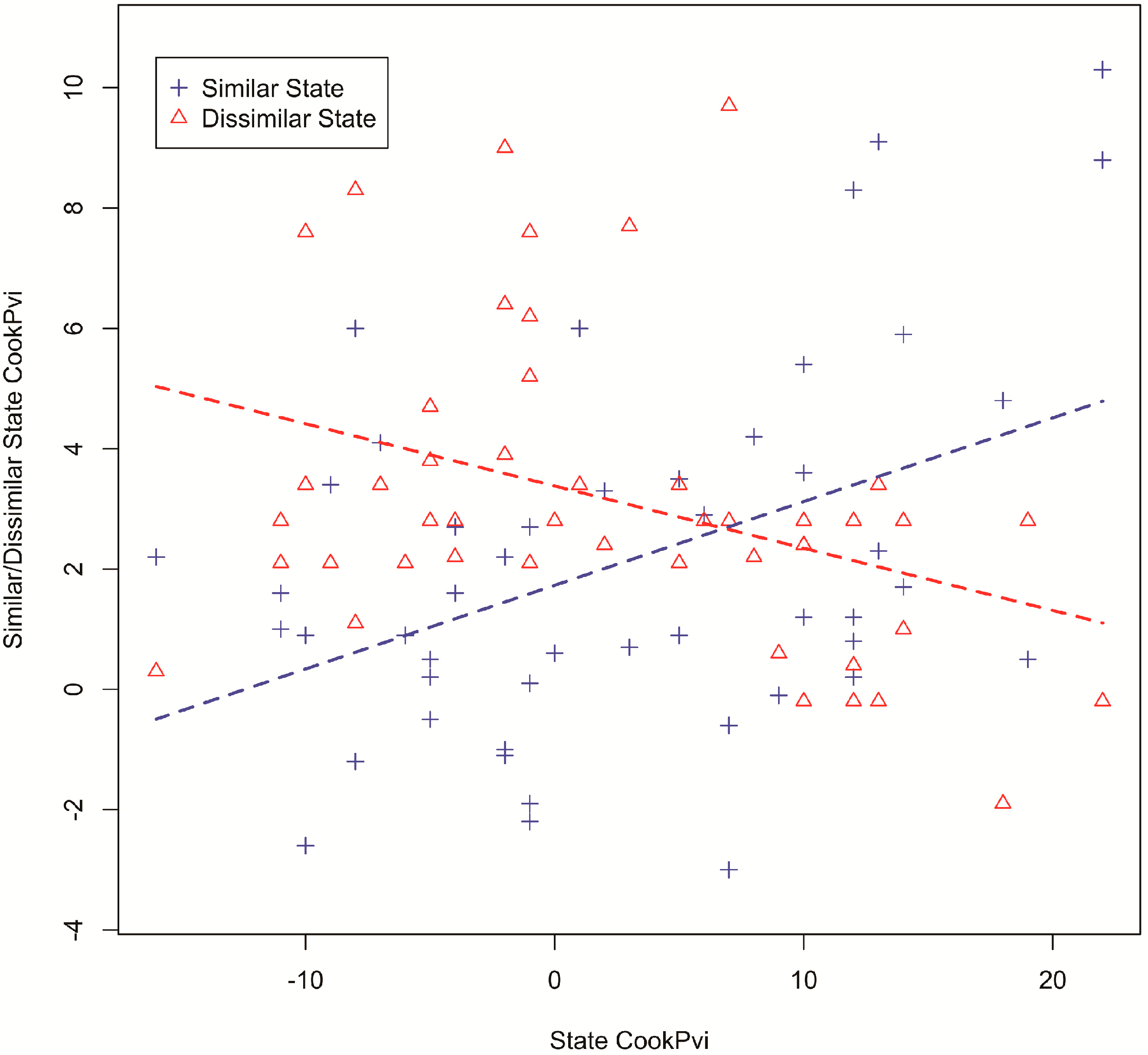
3.4. Examining Links among Places, Politics and Tweets
| Estimate | p-Value | R-Square | |
|---|---|---|---|
| β1 | 0.13913 | 0.00199 | 0.1895 |
| β2 | −0.10342 | 0.00706 | 0.1474 |

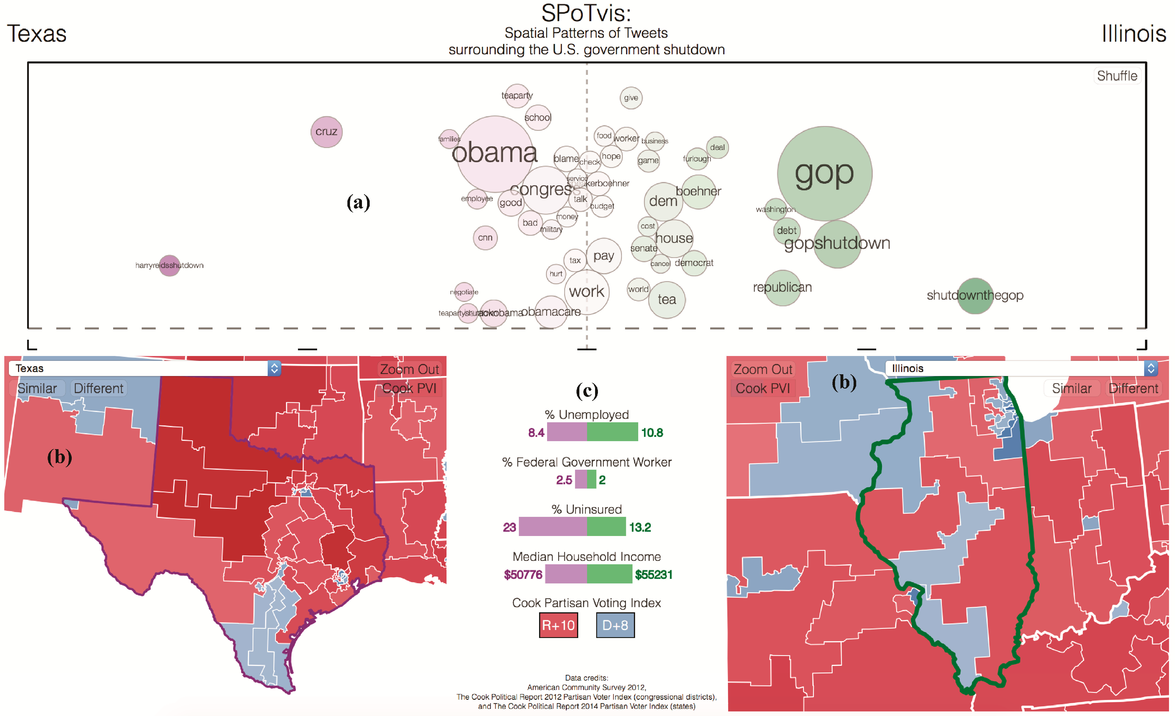
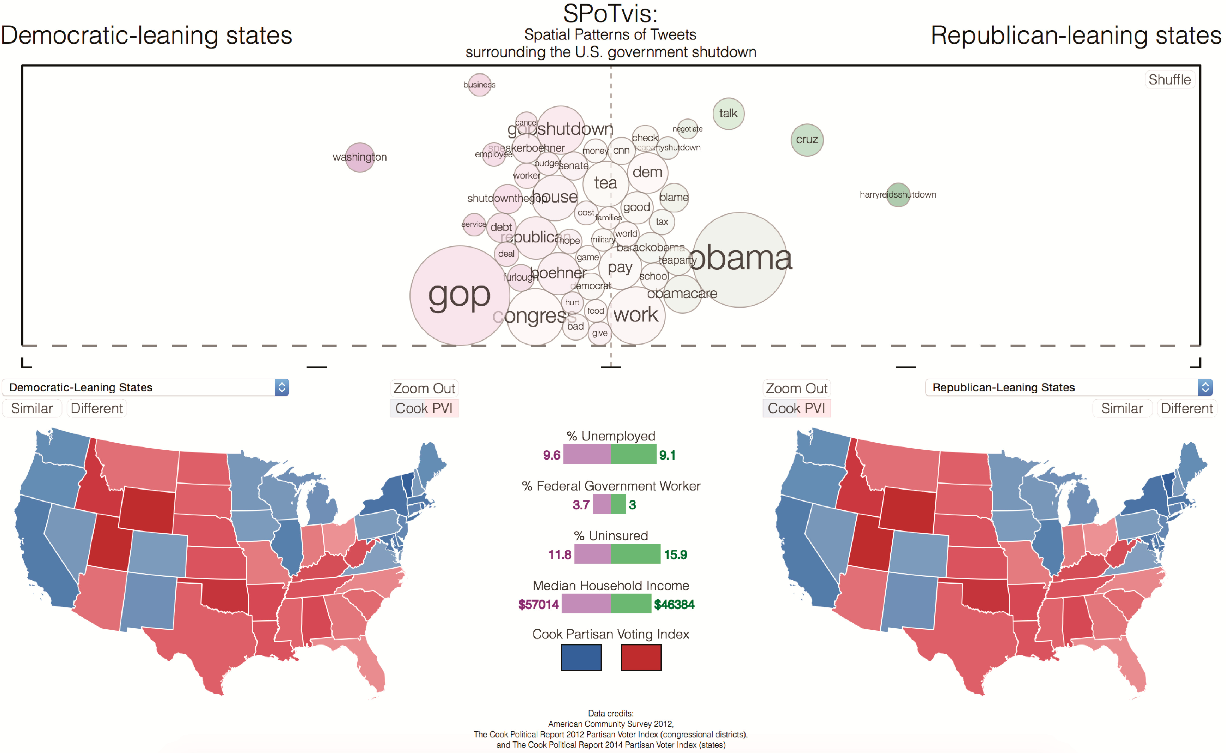
4. SPoTvis Design, Functionality and Use
4.1. Design Rationale

4.2. Implementation
4.3. Performance and Usability
4.4. Data Exploration


5. SPoTvis User Evaluation
“The purpose of visualization is insight”.-Stuart Card, Jock Mackinlay and Ben Shneiderman [27]
5.1. Contextualizing Insight
5.2. Study Design
5.3. SPoTvis Assessment/Part 1
5.3.1. Report Analysis
5.3.2. Report Results
| Role | Task(s) | Approach | Interactions | Exemplary Insights |
|---|---|---|---|---|
| Chinese Journalist | Report to China on the 2013 U.S. Government shutdown | Data-driven | Compare all spatial entities by political party; compare two districts (same party); compare two districts (different parties); show similar districts | Democratic-leaning states blame GOP; Republican-leaning states likely blame Harry Reid; term usage varies regardless of party affiliation at the district level |
| Journalist | Find greatest difference in term use by political party; explore relationships between Cook PVI and demographics | Data-driven | Demote words to focus on specific subsets; compare all Democratic-leaning states/districts with all conservative-leaning states/districts using drop-down menus; click on map views to compare the spatiality of within/between political leanings with demographics | Terms “obama” and “gop” were more popular in Republican and Democratic-leaning states, respectively; terms “gopshutdown” or “shutdownthegop” were more often used in Democratic districts; terms “work”, “house”, “school” and “pay” correlated with districts having high levels of unemployment, uninsured and low median household income; in many states, the higher the Cook PVI was, the better welfare and income was |
| Human Scientist | Explore the concerns of population beyond the noise created by certain political terms | Data-driven | Demote “noise” words, such as “Obama”, “GOP”, “Democrats”, “Republicans”, etc.; compare remaining words and demographic variables between one Republican state (WY) and all Democratic-leaning states; demote “meaningful” words to analyze “noise” words by political party | Terms “pay”, “blame”, “school”, “talk” and “cnn” were used more by conservative leaning entities; terms “hope”, “debt”, “good”, “bad”, “furlough” and “worker” were used more by Democratic-leaning entities; terms “families”, “military” and “food” were used similarly between parties; Republican-leaning states used “noise” terms more frequently |
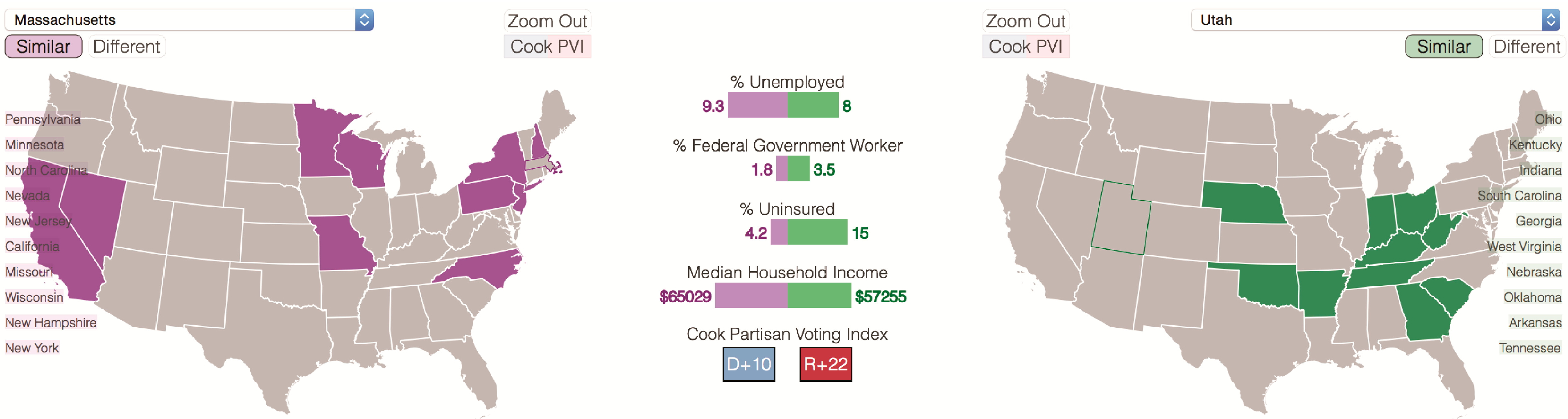
| Political Scientist | Explore the relation of ethnic origin (Hispanic) and the perception of the 2013 shutdown | Data-driven | Select NM as the reference state, because of its high Hispanic/Latino population composition; compare term usage between reference state and all other states | The pattern in the shutdown perception and ethnic origin is not clear; a slight pattern in the similarity of terms occurs in states with the highest ratio of Hispanic population, but similar results also appear in some of the states with the lowest Hispanic population; the level of perception recoded by this dataset seems to reflect more the political preferences of places |
| Role | Task(s) | Approach | Interactions | Exemplary Insights |
|---|---|---|---|---|
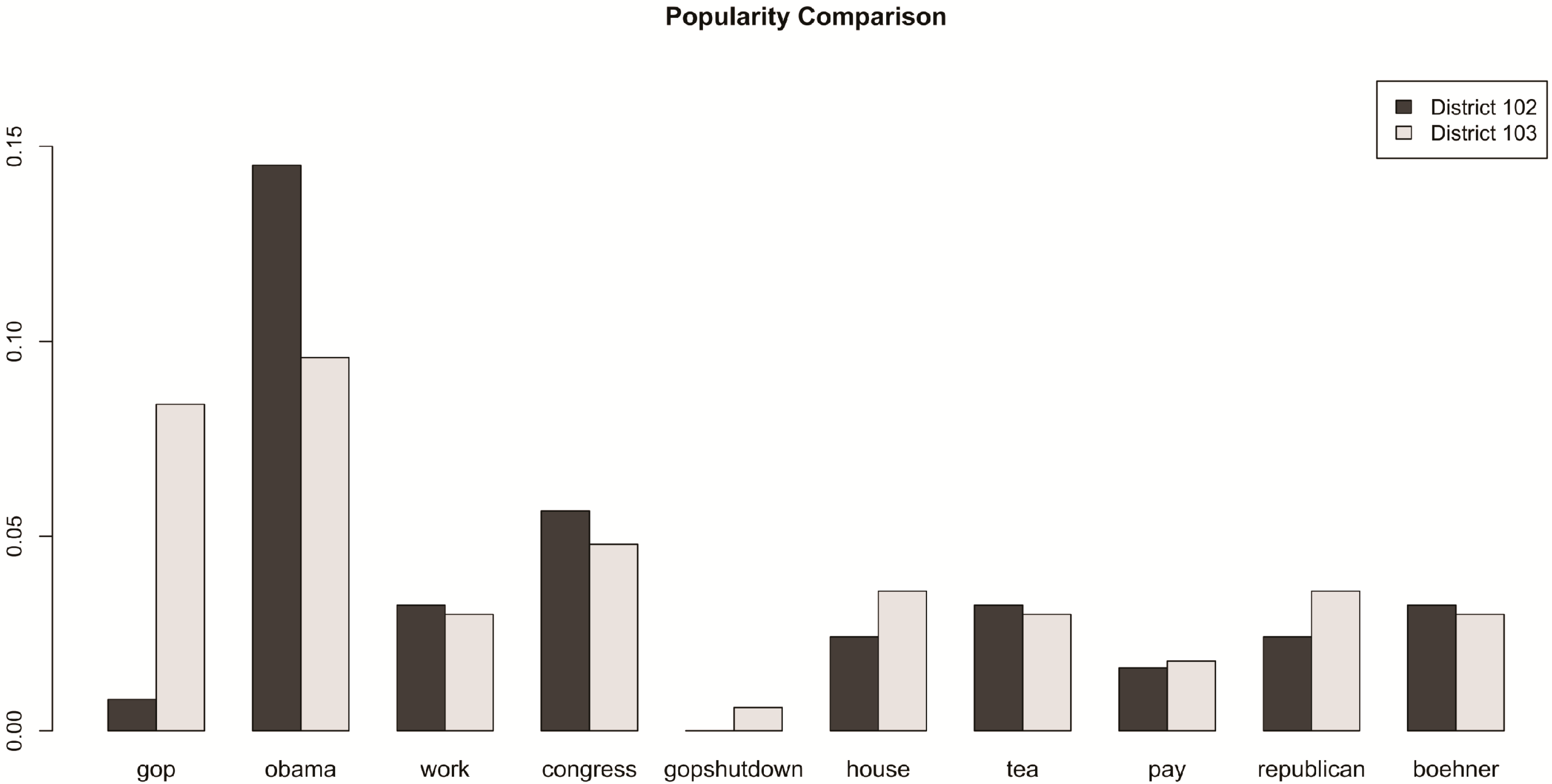
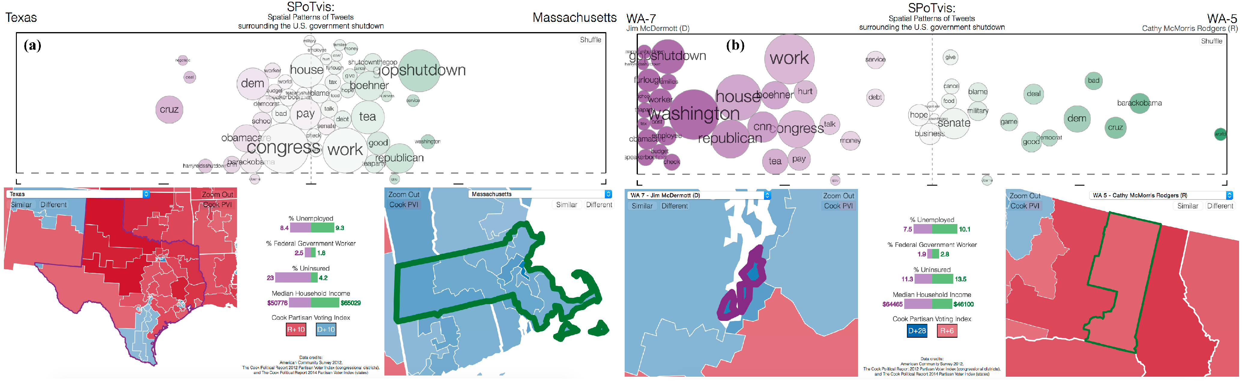
| Political Scientist | Identify districts in Colorado (CO) that most closely reflect the Twitter behavior of the entire state | Spatially-driven | Compare the spread of keywords for each state-district pairing | CO 1 district is most similar in term usage to the aggregate view of the entire state of CO; CO 6 is most different in term usage to the aggregate view of CO |
| University News Journalist | Explore how congressional districts adjacent to the one that the University resides in compare in overall characteristics and term usage surrounding the government shutdown | Spatially-driven | Compare the spread of keywords for each university district-adjacent district pairing | Cook PVI is largely Republican for all districts in the study, yet large differences in term usage, potentially influenced by Democratic-leaning individuals associated with the university; terms populating nearby districts included “furlough”, “worker”, “employee”, “cost”, “boehner” and “money,” while university district used terms “cancel”, “food”, “washington”, “service”, “barackobama” and “gop” more often |
| Graphics Enthusiast | Exploration | Spatially-driven | Compare the spread of keywords between two states based on adjacency; compare the spread of keywords between districts within a state; compare the spread of keywords between the district and its respective state | OR in comparison with ID shows a clearer blame game as compared to FL in comparison with GA; polarized use of words between conservative MN 7 district and Democratic MN 8; Democratic TX 28 more focused on “congress” as compared to the overall conservative leaning of TX, which was more focused on “gop” and “obama” |
| Not Specified | Exploration | Spatially-driven | Compare the spread of keywords between two states based on adjacency; compare the spread of keywords between two states based on political leaning | WA and OR were seemingly interested in very different aspects of the shutdown; OR was more focused on the shutdown itself (GOP and members of the house), while WA expressed more opinion about potential reactions due to the shutdown (like work, money, debt, military, etc.); Twitter conversation gravitated around Obama and Obamacare in conservative-leaning states, while Democratic leaning states conversed more about the GOP and Republicans |
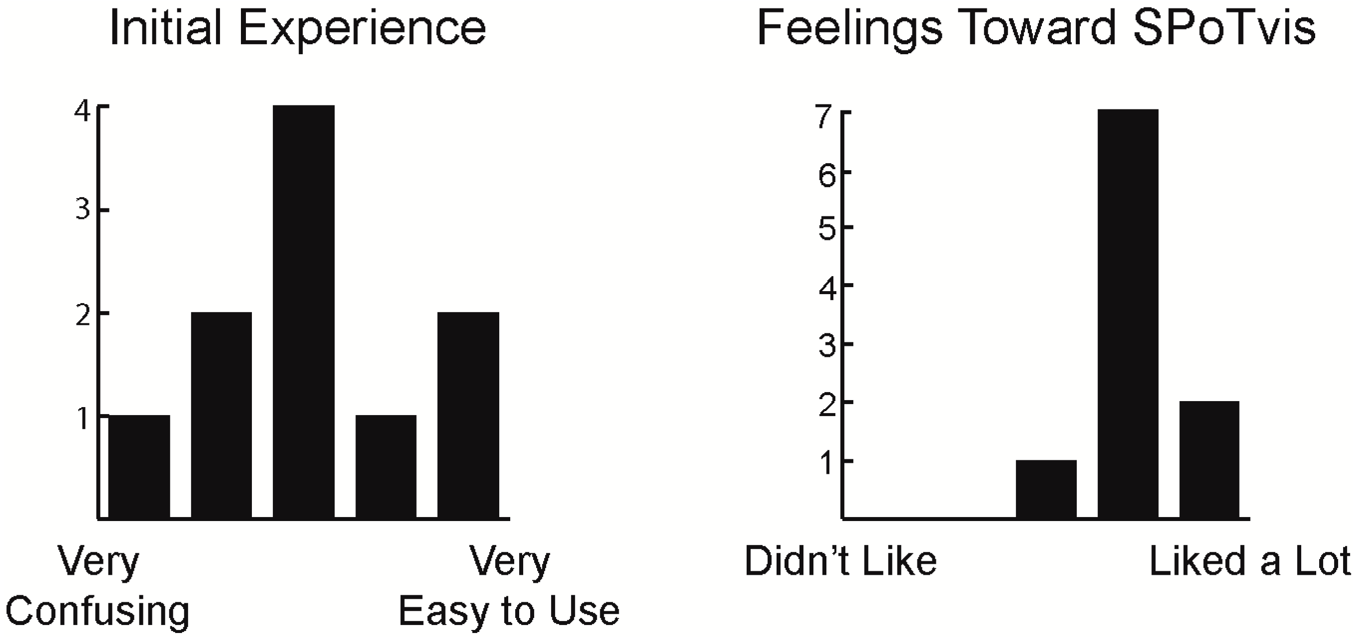
5.4. SPoTvis Assessment/Part2
5.4.1. User Experience

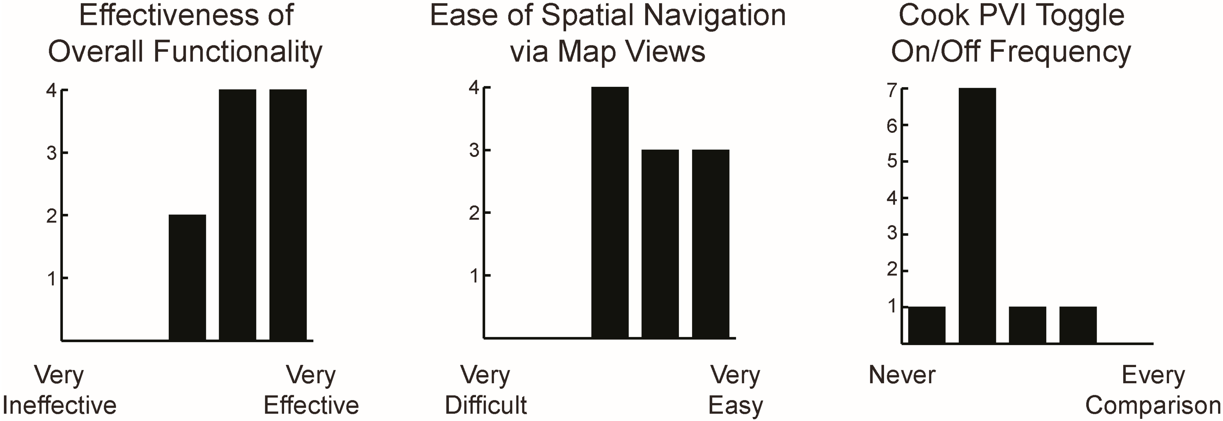
5.4.2. Design Evaluation

5.4.3. Functionality Evaluation

5.4.4. Future Applications and Summary
6. Conclusions
Supplementary Materials
Acknowledgments
Author Contributions
Conflicts of Interest
References
- Thomas, J.J.; Cook, K.A. (Eds.) Illuminating the Path: The Research and Development Agenda for Visual Analytics, 1st ed.; IEEE Computer Society: Los Alamos, CA, USA, 2005.
- MacEachren, A.M. Cartography as an academic field: A lost opportunity or a new beginning? Cartogr. J. 2013, 50, 166–170. [Google Scholar] [CrossRef]
- GeoVISTA “SPoTvis”. Available online: http://www.geovista.psu.edu/SPoTvis/ (accessed on 14 February 2015).
- Vieweg, S.; Hughes, A.L.; Starbird, K.; Palen, L. Microblogging during two natural hazards events: What twitter may contribute to situational awareness. In Proceedings of the SIGCHI Conference on Human Factors in Computing Systems, Atlanta, GA, USA, 10–15 April 2010; pp. 1079–1088.
- Signorini, A.; Segre, A.M.; Polgreen, P.M. The use of Twitter to track levels of disease activity and public concern in the US during the influenza A H1N1 pandemic. PLoS One 2011, 6, e19467. [Google Scholar] [CrossRef] [PubMed]
- Scharl, A.; Hubmann-Haidvogel, A.; Weichselbraun, A.; Lang, H.P.; Sabou, M. Media watch on climate change—Visual analytics for aggregating and managing environmental knowledge from online sources. In Proceedings of the 46th Hawaii International Conference on System Sciences (HICSS), Grand Wailea, HI, USA, 7–10 January 2013; pp. 955–964.
- MacEachren, A.M.; Robinson, A.C.; Jaiswal, A.; Pezanowski, S.; Savelyev, A.; Blanford, J.; Mitra, P. Geo-twitte analytics: Applications in crisis management. In Proceedings of the 25th International Cartographic Conference, Paris, France, 3–8 July 2011; pp. 3–8.
- Smith, M.A.; Rainie, L.; Shneiderman, B.; Himelboim, I. Mapping Twitter Topic Networks: From Polarized Crowds to Community Clusters. Pew Intern. Am. Life Proj. 2014. Available online: http://www.pewinternet.org/2014/02/20/mapping-twitter-topic-networks-from-polarized-crowds-to-community-clusters/ (accessed on 16 September 2014).
- Diakopoulos, N.; Naaman, M.; Kivran-Swaine, F. Diamonds in the rough: Social media visual analytics for journalistic inquiry. In Proceedings of the IEEE Symposium on Visual Analytics Science and Technology (VAST), Lake City, UT, USA, 24–29 October 2010; pp. 115–122.
- Xu, P.; Wu, Y.; Wei, E.; Peng, T.Q.; Liu, S.; Zhu, J.J.; Qu, H. Visual analysis of topic competition on social media. IEEE Trans. Vis. Comput. Graphics 2013, 19, 2012–2021. [Google Scholar] [CrossRef]
- Havre, S.; Hetzler, B.; Nowell, L. ThemeRiver: Visualizing theme changes over time. In Proceedings of the IEEE Symposium on Information Visualization, Salt Lake City, UT, USA, 9–10 October 2000; pp. 115–123.
- Tsou, M.H.; Yang, J.A.; Lusher, D.; Han, S.; Spitzberg, B.; Gawron, J.M.; Gupta, D.; An, L. Mapping social activities and concepts with social media (Twitter) and web search engines (Yahoo and Bing): A case study in 2012 US Presidential Election. Cartogr. Geogr. Inform. Sci. 2013, 40, 337–348. [Google Scholar] [CrossRef]
- Bodnar, T.; Salathé, M. Validating models for disease detection using Twitter. In Proceedings of the 22nd International Conference on World Wide Web Companion, Rio de Janeiro, Brazil, 13–17 May 2013; pp. 699–702.
- Viégas, F.B.; Wattenberg, M. Timelines tag clouds and the case for vernacular visualization. Interactions 2008, 15, 49–52. [Google Scholar] [CrossRef]
- Funkhouser, H.G.; Walker, H.M. Playfair and his charts. Econ. Hist. 1935, 3, 103–109. [Google Scholar]
- IBM “Many Eyes”. Available online: http://www-969.ibm.com/ (accessed on 5 April 2014).
- Viegas, F.B.; Wattenberg, M.; van Ham, F.; Kriss, J.; McKeon, M. Manyeyes: A site for visualization at internet scale. IEEE Trans. Vis. Comput. Graph. 2007, 13, 1121–1128. [Google Scholar] [CrossRef] [PubMed]
- Wordle. Available online: http://www.wordle.net/ (accessed on 5 April 2014).
- Viegas, F.B.; Wattenberg, M.; Feinberg, J. Participatory visualization with Wordle. IEEE Trans. Vis. Comput. Graph. 2009, 15, 1137–1144. [Google Scholar] [CrossRef] [PubMed]
- Cui, W.; Wu, Y.; Liu, S.; Wei, F.; Zhou, M.X.; Qu, H. Context preserving dynamic word cloud visualization. In Proceedings of the Pacific Visualization Symposium (PacificVis), Taipei, Taiwan, 2–5 March 2010; pp. 121–128.
- Cui, W.; Liu, S.; Tan, L.; Shi, C.; Song, Y.; Gao, Z.; Qu, H.; Tong, X. Textflow: Towards better understanding of evolving topics in text. IEEE Trans. Vis. Comput. Graph. 2011, 17, 2412–2421. [Google Scholar] [CrossRef] [PubMed]
- Collins, C.; Viegas, F.B.; Wattenberg, M. Parallel tag clouds to explore and analyze faceted text corpora. In Proceedings of the 2009 IEEE Symposium on Visual Analytics Science and Technology (VAST), Atlantic City, NJ, USA, 11–16 October 2009; pp. 115–122.
- Bostock, M.; Carter, S.; Ericson, M. At the National Conventions, the Words They Used. New York Times. 2012. Available online: http://www.nytimes.com/interactive/2012/09/06/us/politics/convention-word-counts.html/ (accessed on 13 December 2013).
- Harrower, M.; Brewer, C.A. ColorBrewer.org: An online tool for selecting colour schemes for maps. Cartogr. J. 2003, 40, 27–37. [Google Scholar] [CrossRef]
- Shneiderman, B. The eyes have it: A task by data type taxonomy for information visualizations. In Proceedings of the 1996 IEEE Symposium on Visual Languages, Boulder, CO, USA, 3–6 September 1996; pp. 336–343.
- Bostock, M.; Ogievetsky, V.; Heer, J. D3 data-driven documents. IEEE Trans. Vis. Comput. Graph. 2011, 17, 2301–2309. [Google Scholar] [CrossRef] [PubMed]
- Card, S.K.; Mackinlay, J.D.; Shneiderman, B. (Eds.) Readings in Information Visualization: Using Vision to Think, 1st ed.; Morgan Kaufmann Publishers Inc.: San Francisco, CA, USA, 1999.
- North, C. Toward measuring visualization insight. IEEE Comput. Graph. Appl. 2006, 26, 6–9. [Google Scholar] [CrossRef] [PubMed]
- Chang, R.; Ziemkiewicz, C.; Green, T.M.; Ribarsky, W. Defining insight for visual analytics. IEEE Comput. Graph. Appl. 2009, 29, 6–9. [Google Scholar] [CrossRef] [PubMed]
- Ruths, D.; Pfeffer, J. Social media for large studies of behavior. Science 2014, 346, 1063–1064. [Google Scholar] [CrossRef] [PubMed]
- Elwood, S. Geographic Information Science: New geovisualization technologies–emerging questions and linkages with GIScience research. Progress Hum. Geogr. 2009, 33, 256–263. [Google Scholar] [CrossRef]
© 2015 by the authors; licensee MDPI, Basel, Switzerland. This article is an open access article distributed under the terms and conditions of the Creative Commons Attribution license (http://creativecommons.org/licenses/by/4.0/).
Share and Cite
Nelson, J.K.; Quinn, S.; Swedberg, B.; Chu, W.; MacEachren, A.M. Geovisual Analytics Approach to Exploring Public Political Discourse on Twitter. ISPRS Int. J. Geo-Inf. 2015, 4, 337-366. https://0-doi-org.brum.beds.ac.uk/10.3390/ijgi4010337
Nelson JK, Quinn S, Swedberg B, Chu W, MacEachren AM. Geovisual Analytics Approach to Exploring Public Political Discourse on Twitter. ISPRS International Journal of Geo-Information. 2015; 4(1):337-366. https://0-doi-org.brum.beds.ac.uk/10.3390/ijgi4010337
Chicago/Turabian StyleNelson, Jonathan K., Sterling Quinn, Brian Swedberg, Wanghuan Chu, and Alan M. MacEachren. 2015. "Geovisual Analytics Approach to Exploring Public Political Discourse on Twitter" ISPRS International Journal of Geo-Information 4, no. 1: 337-366. https://0-doi-org.brum.beds.ac.uk/10.3390/ijgi4010337