1. Introduction
A large body of evidence going back more than two decades shows that exposure alone is not sufficient for understanding trends in disaster losses, and that social and economic vulnerability are critical ingredients [
1,
2]. West Africa has been identified as one of the regions that is most vulnerable to climate change both in terms of exposure to climate hazards [
3,
4] and social vulnerability [
5,
6]. Tools such as spatial vulnerability assessment are useful for understanding patterns of vulnerability and risk to climate change at multiple scales and have been applied in Africa perhaps more than any other region [
5,
6,
7]. The demand for vulnerability maps among development agencies and governments is increasing as greater emphasis is placed on scientifically sound methods for targeting adaptation assistance [
8].
Mapping is useful because climate variability and extremes, the sensitivity of populations and systems to climatic stressors, and adaptive capacities are all spatially differentiated. The interplay of these factors produces different patterns of vulnerability. Typically, spatial vulnerability assessment involves data integration in which geo-referenced socio-economic and biophysical data, including those derived from remote sensing, are combined with climate data to understand patterns of vulnerability and, in turn, inform where adaptation may be required. Maps have proven to be useful boundary objects in multi-stakeholder discussions, providing a common basis for discussion and for deliberations over adaptation planning [
9,
10]. Maps can help to ground discussions on a solid evidence base, especially in developing country contexts where geographic information may not be easily accessible for all stakeholders.
Spatial data integration and spatial analysis have become standard tools in the toolkit of climate change vulnerability assessments. The United Nations Environment Programme (UNEP) Programme of Research on Climate Change Vulnerability, Impacts and Adaptation (PROVIA) Research Priorities on Vulnerability, Impacts and Adaptation [
11] highlights “measuring and mapping vulnerability” as a first priority for supporting adaptation decision-making. In many cases vulnerability assessment (VA) is synonymous with spatial vulnerability assessment, owing in part to an understanding that vulnerability and its constituent components exhibit high degrees of spatial and temporal heterogeneity [
10]. The purposes vary according to the specific study, but spatial VAs are generally intended to identify areas at potentially high risk of climate impacts—so-called climate change “hotspots” [
12]—and to better understand the determinants of vulnerability in order to identify planning and capacity building needs.
Because of their wall-to-wall coverage, remote sensing data have the potential to fill important data gaps in data-poor developing country contexts. The goal of this paper is to illustrate the utility of remote sensing data in combination with other data sources, both climatic and socioeconomic, in illuminating regions that are vulnerable to climate change. This paper briefly describes the frameworks, data, methods, and results for two mapping efforts, one for Mali and the other for Coastal West Africa. Detailed presentation of methods, results and uncertainties are provided elsewhere [
13,
14] (see
http://community.eldis.org/.5bf8c6aa and
http://community.eldis.org/.5c1ec83b); the focus here is on the remote sensing data products and the approaches used for data integration. We conclude with a discussion on the potential and shortcomings of using remote sensing data as surrogates for other data sources, the benefits and challenges of data integration, and the lessons learned from these mapping exercises.
Vulnerability mapping and the quantification of vulnerability is not without shortcomings, and more critical perspectives are provided in a number of other publications [
8,
10,
12,
15]. Readers desiring a more in depth look at the challenges of vulnerability mapping, including issues around uncertainty, are advised to read these publications. We address the limitations of the methods described in this paper in
Section 4. Despite these caveats, the spatial vulnerability index construction methods described here are widely used in the literature and have been found to be useful to policy audiences seeking to better understand the factors contributing to vulnerability [
5,
7,
9,
10,
16].
2. Methods and Data
2.1. Mali Vulnerability Mapping
As a framework for the Mali vulnerability map, the authors of the report [
12] utilized the Intergovernmental Panel on Climate Change (IPCC) Fourth Assessment Report (AR4) conceptual framework, which separates vulnerability to climate stressors into three components: exposure, sensitivity, and adaptive capacity [
17]. This is a precursor to the more recent IPCC framework, more familiar to the natural hazards community, which conceptualizes risk as a function of hazard, exposure and (social) vulnerability [
18] (see
Section 2.3). The approach for Mali was to map the general vulnerability of the population rather than to develop separate vulnerability layers for individual systems (e.g., ecosystems); sectors (e.g., water or agriculture); or population sub-groups (e.g., pastoralists). However, given the high dependence of the majority of the population on subsistence-based agriculture, many of the indicators selected had this population in mind.
We used a spatial index approach, in which raw data values are represented as percentiles. In other words, each data layer was transformed to an indicator with a range of 0–100 (with 100 representing most vulnerable). In a few cases we trimmed the tails of the distribution before converting to the 0–100 score. Continuous indicators were assessed for skewness. A number of the indicators (especially climate variables) exhibited a long right-tail in the distribution, and hence we chose to winsorize (trim the tails) at inflection points in the data. We also removed from consideration the thinly settled far north regions, which tended to have more extreme values for climate and socioeconomic indicators. The goal was to seek a relatively good distribution of scores in the 0–100 range while grounding decisions in substantive considerations of what represents high and low levels of vulnerability. For example, for market accessibility, we decided that any travel times over 36 hours represented an absolutely high level of vulnerability (i.e., a score of 100) such that travel times over that level were not incrementally worse. We inverted indicators where high values in the raw data were associated with low vulnerability (e.g., precipitation). Finally, we had to convert some ordinal indicators (e.g., Anthropogenic Biomes) to scores based on characteristics of the biomes. After normalization, the indicators were then averaged to produce sub-indices for exposure, sensitivity, and adaptive capacity, which were then averaged to produce the overall vulnerability index. We also used principal components analysis (PCA) as an alternative aggregation method, which produced broadly similar results.
The eighteen spatial indicators we utilized are found in
Table 1. Selection of indicators was guided by the literature on factors known to contribute to each component of vulnerability, as well as by data availability and quality (see Annex IV of the Mali report for justifications related to each indicator). For climate exposure indicators we relied heavily on FEWSNET historical climate data [
19] (4 of 6 indictors), and for sensitivity and adaptive capacity indicators we relied extensively on spatially interpolated Demographic and Health Survey (DHS) data (3 of 12 indicators). Each data layer was justified based on its conceptual proximity to the three vulnerability components [
15], and choices were consistent with the variables that have been found to be associated with harm from climate variability and change, including education levels [
20], climate variability [
21], and marginal (semi-arid and arid) environments and geographically remote areas in poor developing regions [
12,
22]. The guiding approach was to identify a limited number of high-quality spatial data sets that best represent the component of interest while avoiding the temptation to add low-quality data (data of high uncertainty or coarse spatial resolution), thereby “contaminating” the results. We had reasonably high confidence in the validity and reliability of each of the data sets included; data limitations are explored in Annex IV of the Mali report.
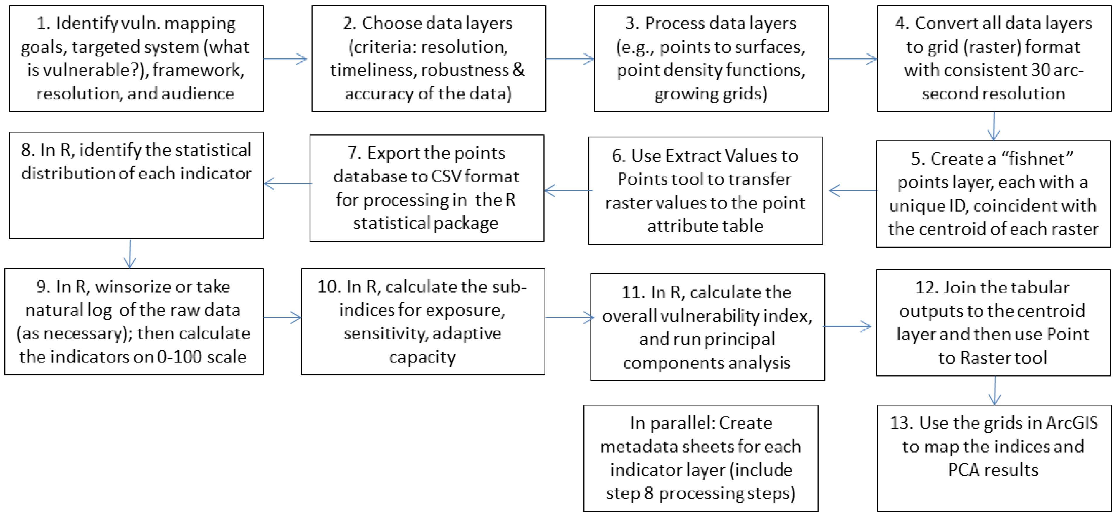
Our processing involved the following steps. We converted all the original spatial data layers from their original formats (
Table 1, Column 3) into grids at a common 30 arc-second (approximately 1 km
2) resolution. We chose this cell size because it was the resolution of our highest-resolution data sets, and we felt that the interpolated surfaces for a number of our point-based data sets (e.g., the Demographic and Health Survey cluster-level data, conflict data, and health facilities data) could achieve a better representation of spatial variability at 1 km
2. However, it is worth bearing in mind that the nominal 1 km
2 resolution of the outputs is based on inputs of varying resolutions, from 10 sq. km grids to subnational units (in Mali these are termed
regions and
cercles), depending on the parameter. This is an issue we return to in the discussion.
Prior to normalization, grids were converted to tabular comma-separated values (CSV)-format files using a common grid referencing system. All data transformations and aggregations were performed in the R statistical package. All indicators were given equal weights except for the three indicators derived from Demographic and Health Survey (DHS) cluster-level data: household wealth, child stunting, and education level of the mother. The justification for this weighting was that these indicators were deemed to be closer to our interest in food and livelihood security, and because the data are at a higher spatial resolution than most of the other sensitivity and adaptive capacity indicators. After transformation and aggregation, the data were re-exported to ArcGIS to produce the final maps. A processing flow chart is shown in
Figure 1; methods are further described in CIESIN [
23].
Since the ranges of scores in the resulting component sub-indices (exposure, sensitivity, adaptive capacity) significantly varied based on the underlying distributions of indicator scores, we rescaled the resulting component scores so that they ranged from 0–100, and then averaged the three components together to create an overall vulnerability index. Climate projections were incorporated in an annex.
Table 1.
Indicators used for the Mali climate vulnerability mapping exercise.
Table 1.
Indicators used for the Mali climate vulnerability mapping exercise.
| Component | Data Layer | Original Data Format |
|---|
| Exposure | Average annual precipitation (1950–2009) | Raster (with point inputs) |
| Inter-annual coefficient of variation (CV) in precipitation (1950–2009) | Raster (with point inputs) |
| Percent of precipitation variance explained by decadal component (1950–2009) | Raster |
| CV of the Normalized Difference Vegetation Index (NDVI) (1981–2006) * | Raster |
| Long-term trend in temperature in July–August–September (1950–2009) | Raster (with point inputs) |
| Flood frequency (1999–2007) * | Raster |
| Sensitivity | Household wealth (2006) | Point |
| Child stunting (2006) | Point |
| Infant mortality rate (IMR) (2006) | Polygon |
| Poverty index by commune (2008) | Polygon |
| Conflict events/political violence (1997–2012) | Point |
| Soil organic carbon/soil quality (1950–2005) * | Raster (with point inputs) |
| Malaria stability index | Raster |
| Adaptive Capacity | Education level of mother (2006) | Point |
| Market accessibility (travel time to major cities) | Raster (with polyline inputs) |
| Health infrastructure index (2012) | Point |
| Anthropogenic biomes (2000) * | Raster |
| Irrigated areas (area equipped for irrigation) (1990–2000) | Raster |
Figure 1.
Vulnerability mapping processing flow chart.
Figure 1.
Vulnerability mapping processing flow chart.
2.2. Mali Vulnerability Mapping Data Integration
Remote sensing data were used for each of the indicators in
Table 1 that have an asterisk (*).
Figure 2,
Figure 3,
Figure 4 and
Figure 5 show the raw and transformed versions of these indicators. Note that the right panels of each figure show no data above 17.2°N latitude. We excluded from consideration all areas north of that latitude, a region that is very sparsely populated, because USAID was primarily interested in programming in more densely populated regions to the south, and because climate variability and change may have less of an impact due to already harsh conditions. The information included and the rationale for incorporating these indicators is described in this section.
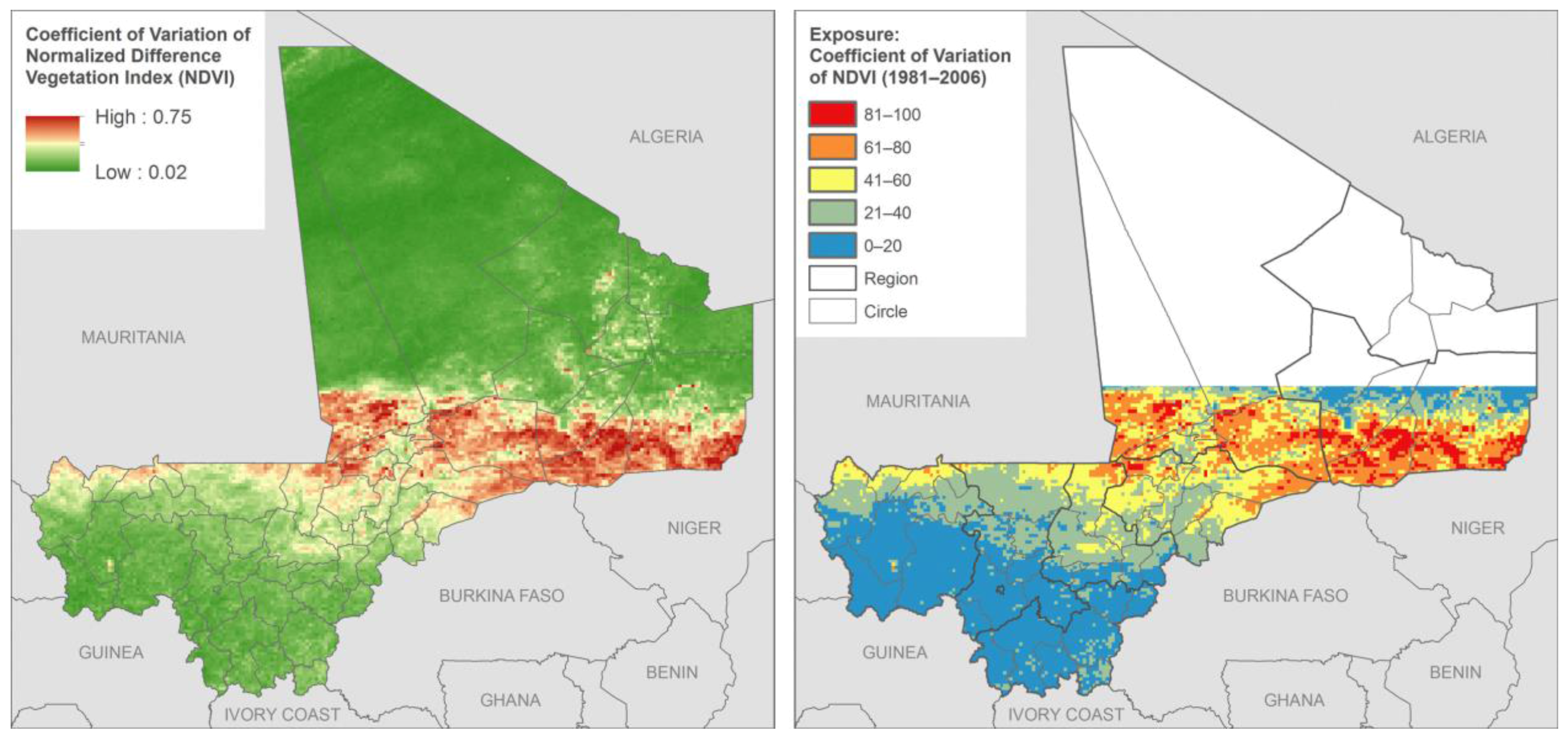
The climate exposure indicators sought to measure average conditions and trends for temperature and precipitation, as well as variation in precipitation and, at the extreme, flood events. As mentioned, the FEWSNET climate data were of reasonably high spatial resolution, but are based on
in situ monitoring networks that are relatively sparse given the size of Mali’s territory, so they are gap filled with satellite data. The satellite data used to fill spatial gaps in the in situ monitoring networks include MODIS Land Surface Temperature (LST) and Multisatellite rainfall estimates (RFE2) from NOAA CPC [
24]. The Coefficient of Variation of Normalized Difference Vegetation Index (NDVI) (1981–2006) (
Figure 2) indicator supplements the Interannual Coefficient of Variation in Precipitation (July–August–September) indicator by providing higher spatial resolution data, based on satellite observations of greenness for the month of August for a 25-year period. August was selected since this is typically a month of peak rainfall for the growing season. This indicator can be interpreted as the reliability of rainfall in a given year for crop production or livestock grazing.
The flood frequency layer was generated as part of the Global Assessment Report on Risk Reduction [
25] (
Figure 3). It is based on three sources: (1) A GIS modeling using a statistical estimation of peak-flow magnitude and a hydrological model using HydroSHEDS dataset and the Manning equation [
26] to estimate river stage for the calculated discharge value; (2) observed flood from 1999 to 2007, obtained from the Dartmouth Flood Observatory (DFO); and (3) frequency from UNEP/GRID-Europe PREVIEW flood dataset [
27]. The unit of measurement is the expected average number of events per 100 years. The observed flood data are produced by the Dartmouth Flood Observatory from MODIS 250 m data. Because the observed flood data does not have comprehensive global coverage, they are used to validate and calibrate the model. Since there are few river gauge networks in Africa, these data are among the few available to assess flood risk. The flood risk equates to higher exposure to climate extremes in low lying and riparian areas.
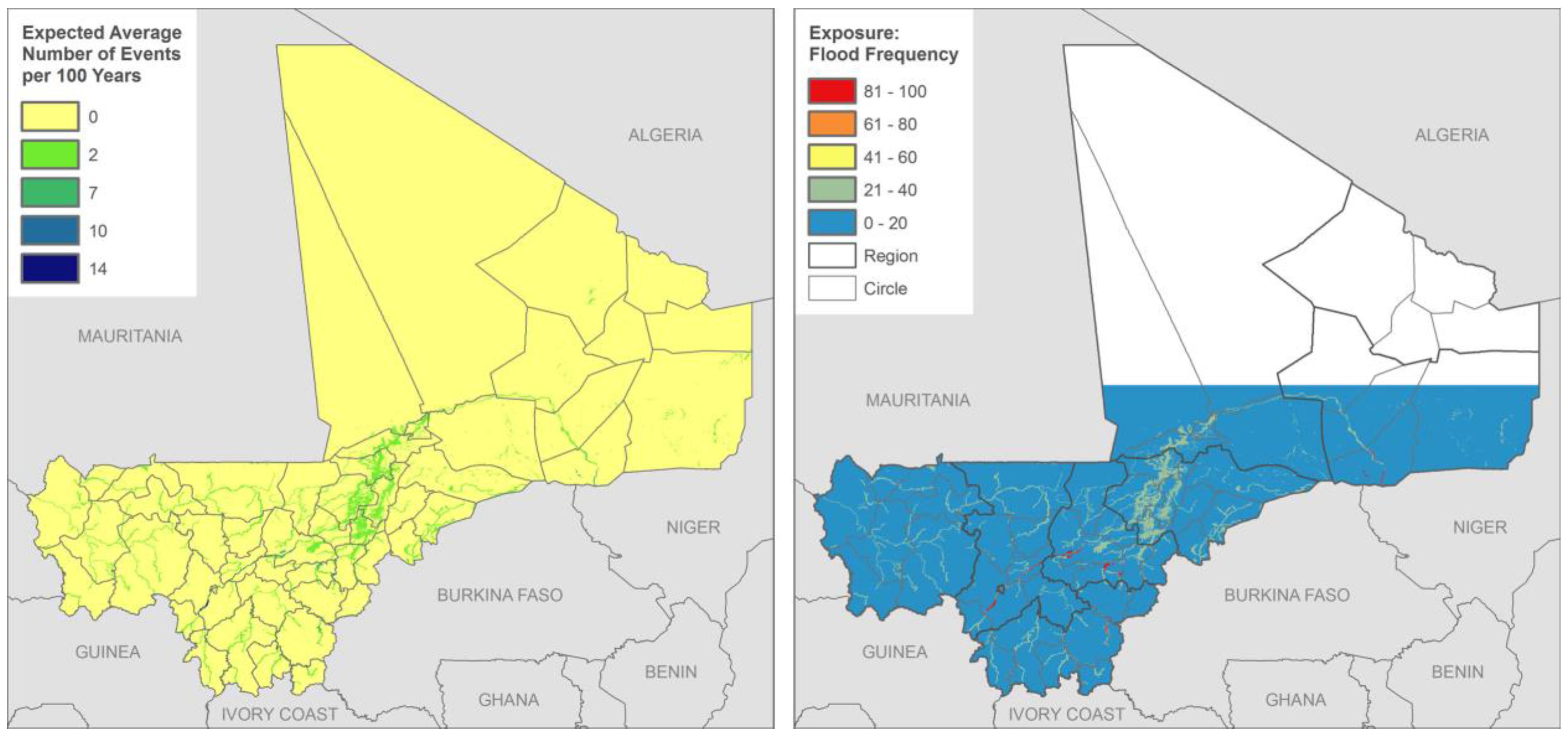
Soil carbon (
Figure 4) was mapped by the International Soil Resources Information Centre (ISRIC) using MODIS data. The data represent an approximation of the soil organic carbon in top soil, which is 0–20 cm. The authors make clear that the true accuracy of the resulting maps depends on the quality of the input data and the interpolation method used. The correlation with MODIS imagery was based on 12,000 profiles for the whole of Africa, which means that each soil profile represents on average 1500 pixels. Interpolations over large distances occur because the data locations are clustered with large gaps for some parts of Africa. These data were included because soil carbon is an important predictor of crop yields. Higher soil organic carbon would also indicate lower sensitivity to climate variability, since soil water retention is associated with organic carbon [
28].
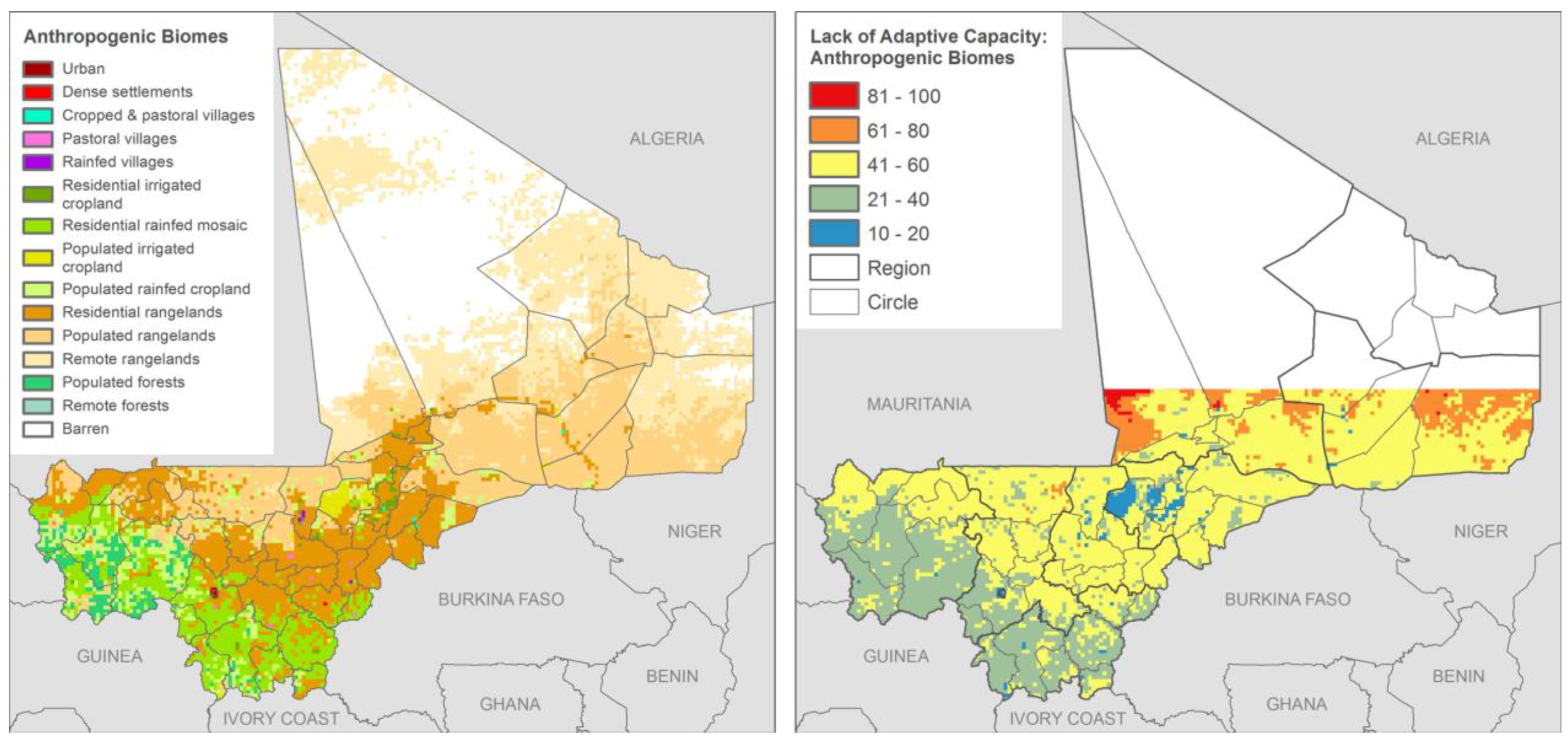
Anthropogenic Biomes (
Figure 5) is itself a composite data set generated with thee data layers: population density, land use (specifically crop, pasture, and irrigated lands), and land cover [
29]. The latter is defined by percent trees and bare earth based on the Vegetation Continuous Fields MOD44B, 2001 percent tree cover, collection 3 [
30]. We included anthropogenic biomes in preference to FEWSNET livelihood zones because it is a higher spatial resolution data set, and it does a better job of pulling out the livelihood diversification of the inland delta of Mali. The inland delta represents a relatively unique area of flat topography through which the Niger River flows, which results in seasonal flooding that enhances crop and pastureland production and irrigation potential. This results in higher adaptive capacity than the climate zone would suggest based on precipitation alone. Since the Anthropogenic Biomes are categorical data, we needed to use expert judgment to recode each biome into a 0–100 score, based on the number of livelihood options available in each region.
These data were combined with data for exposure, sensitivity and adaptive capacity from non-satellite sources, including among other things distance to market derived from road infrastructure data, health infrastructure locations, conflict events, and DHS interpolated surfaces based on cluster points for household wealth, child stunting, and maternal education levels. The integration method, as described above, was to average the transformed scores across indicators first by component, and then to average the stretched component scores to come up with an overall vulnerability index.
Figure 2.
Interannual Coefficient of Variation in Greenness (NDVI)—Derived from GIMMS, raw data (left) and transformed (right).
Figure 2.
Interannual Coefficient of Variation in Greenness (NDVI)—Derived from GIMMS, raw data (left) and transformed (right).
Figure 3.
Flood Extent (events per 100 years)—Derived in part from MODIS flood extent data at the Dartmouth Flood Observatory, raw data (left) and transformed (right).
Figure 3.
Flood Extent (events per 100 years)—Derived in part from MODIS flood extent data at the Dartmouth Flood Observatory, raw data (left) and transformed (right).
Figure 4.
Soil Carbon Partly Derived from MODIS data raw data (left) and transformed (right).
Figure 4.
Soil Carbon Partly Derived from MODIS data raw data (left) and transformed (right).
Figure 5.
Anthropogenic Biomes raw data (left) and transformed (right).
Figure 5.
Anthropogenic Biomes raw data (left) and transformed (right).
2.3. Coastal West Africa Exposure Mapping
The Coastal West Africa mapping built on experience gained in the Mali mapping but took a slightly different approach. Because our focus was on climate stressors in the coastal zone (storm surge, flooding, and sea level rise) and the exposure of economic and social systems, we use the term exposure mapping as opposed to vulnerability mapping. Instead of the IPCC AR4 vulnerability framework, we used the IPCC Special Report on Climate Extremes (SREX) risk framework, later adopted by the IPCC fifth assessment report (AR5), which construes risk as emanating from the spatial intersection of exposure to extreme events and vulnerable systems [
18]. This was because the focus was on exposure to seaward hazards rather than describing the complex human-environment system. A full description of methods and the rationale for the indicators used in the study is found in de Sherbinin
et al. [
14].
For this study, we constructed two main indices, a Social Vulnerability Index (SVI) and an Economic Systems Index (ESI). The SVI measures a combination of population density and growth together with poverty, seeking to approximate the population size and susceptibility to coastal extremes (
Table 2). The ESI sought to measure relative levels of economic activity that could be exposed to seaward hazards, including crop production, GDP, and urban service and industrial sector activities (using night-time lights as a proxy). These aggregate indices were constructed from raw data in a manner identical to the Mali vulnerability mapping; the main difference was that we faced greater constraints in the availability of consistent data covering all 10 coastal countries, and hence had to rely more on global and regional data sets. All indices were calculated for the coastal zone, defined as a 200 kilometer strip from the coastline inland. This covers somewhat larger areas than what might normally be construed as “coastal”, but we chose this larger area in recognition of the fact that the economic impacts of climate change in the coastal zone will not be confined to the coastline itself, but will affect activities further inland.
Table 2.
Indicators used in the social vulnerability index of the coastal study.
Table 2.
Indicators used in the social vulnerability index of the coastal study.
| Indicator | Date or Date Range | Original Data Format |
|---|
| Population density | 2010 | Raster (derived from polygon) |
| Population growth | 2000–2010 | Raster (derived from polygon) |
| Subnational poverty and extreme poverty | 2005 | Polygon |
| Maternal education levels | circa 2008 | Point |
| Market accessibility (travel time to markets) | circa 2000 | Polyline |
| Conflict data for political violence | 1997–2013 | Point |
2.4. Coastal West Africa Data Integration
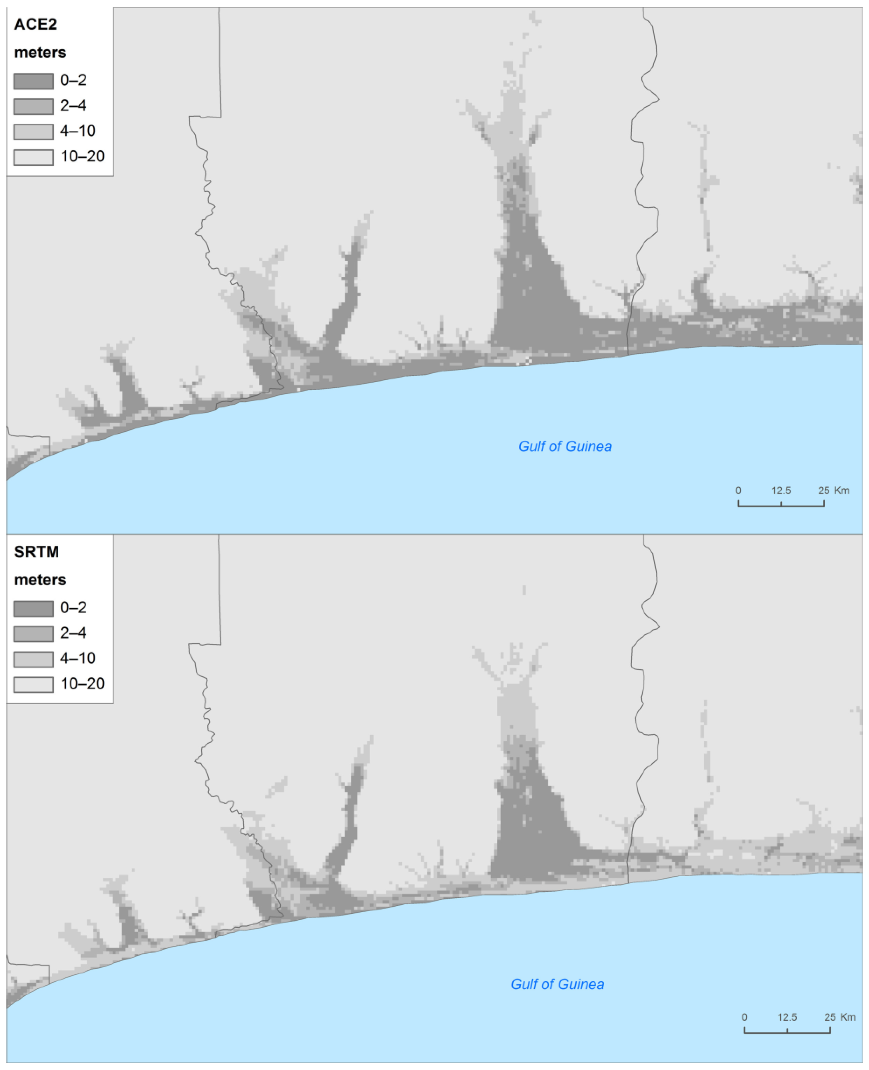
The low elevation coatal zone (LECZ) was mapped using the Altimeter Corrected Elevations 2 (ACE2) data set to identify areas at potential risk of inundation from sea-level rise, surge, or river-bank flooding. In the absence of more detailed modeling studies of surge risk and likely future relative changes in sea level for coastal West Africa, we term the areas at risk of sea level rise and storm surge as being in LECZ bands of 0–5, 5–10, and 10–20 m above mean sea level. Although global mean sea-level rise by the end of this century is predicted to range from 0.3–1.2 meters depending on the rate of warming and the response of ice sheets [
31], storm surge can greatly expand the area affected by seaward impacts. Basic data on coastal topography are available through publicly accessible global data sets such as the National Aeronautics and Space Administration (NASA) Shuttle Radar Topography Mission (SRTM) global digital elevation model (DEM) (90 m resolution); the European Space Agency ACE2 data set (which merges SRTM with Satellite Radar Altimetry) (90 m resolution) [
32]; and the Advanced Spaceborne Thermal Emission and Reflection Radiometer (ASTER) Global Digital Elevation Model (GDEM) (15 m resolution). It should be emphasized that all global DEMs contain inaccuracies [
33]. In our assessment, ACE2 had the advantage over SRTM and ASTER GDEM of accurately returning ground values in areas of dense forest cover such as mangroves; for this reason and based on evaluations against SRTM that showed that ACE2 consistently returned slightly lower elevations (
Figure 6), we chose to use this data set. Note that we did explore the use of the Dynamic Interactive Vulnerability Assessment (DIVA) model, but were unable to obtain the data. We examined data from Dasgupta
et al. [
34], which incorporate the DIVA results, but because they rely heavily on SRTM data we found that they under estimate the areas at low elevations.
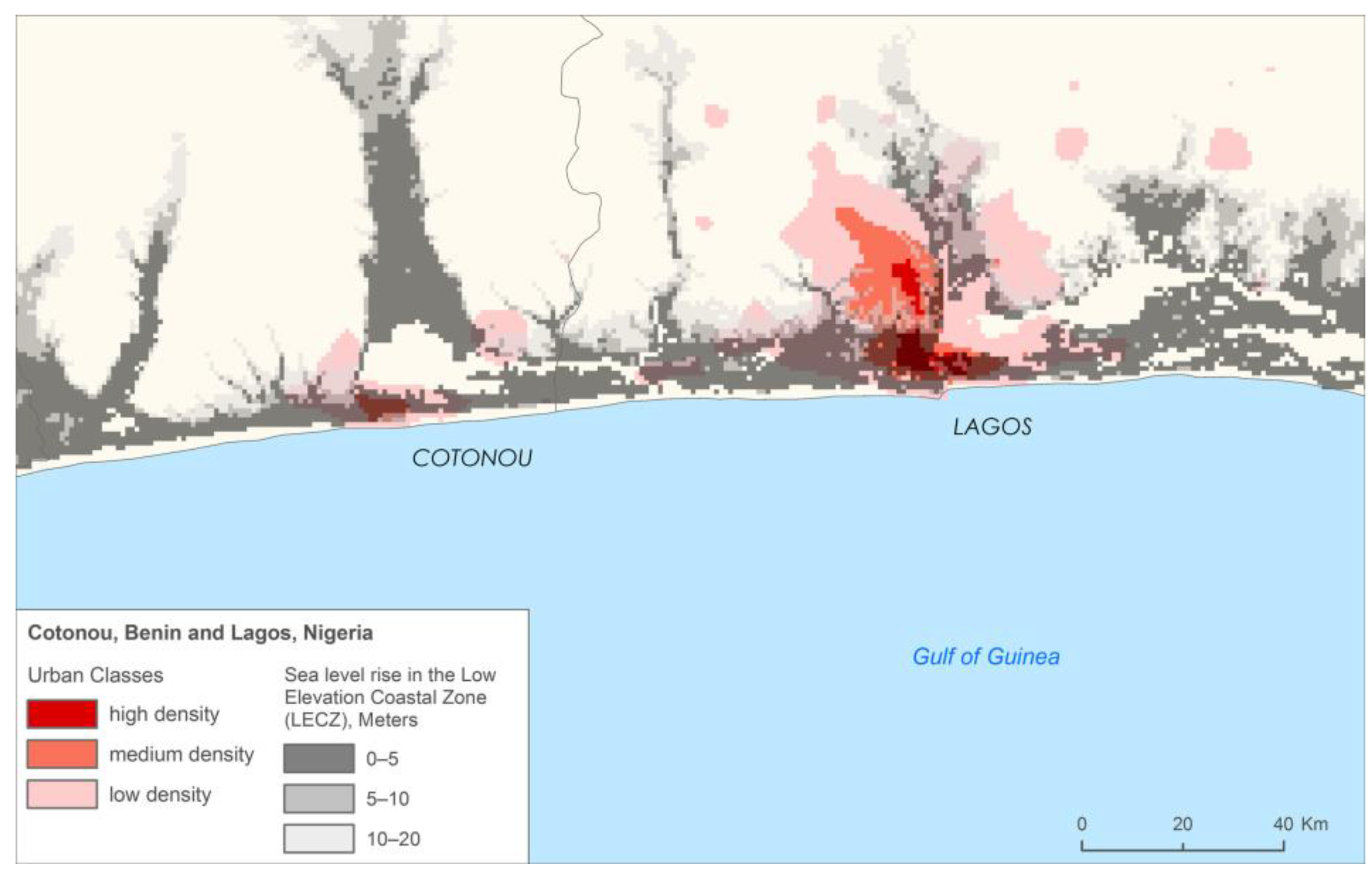
We used night-time light imagery from the defense meteorological satellite program/operational linescan system (DMSP/OLS) nighttime stable light (NTL) to map the urban areas in 2010. When proper thresholds are applied, this data set has the advantage of providing a consistent metric of urban extent when compared to the semi-automated classification of optical imagery.
Figure 7 shows different classes of urban density—high, medium, and low—based on different luminosity thresholds from the nighttime lights, superimposed on the 0–5 and 5–10 m LECZ. Lagos, Nigeria, and Cotonou, Benin, were found to be highly exposed to sea level rise and storm surge. Indeed, Cotonou is already experiencing alarming degrees of coastal erosion.
Figure 6.
Comparison of SRTM with ACE2 in Coastal Benin.
Figure 6.
Comparison of SRTM with ACE2 in Coastal Benin.
Figure 7.
Urban areas of Cotonou, Benin and Lagos, Nigeria in comparison to the LECZ.
Figure 7.
Urban areas of Cotonou, Benin and Lagos, Nigeria in comparison to the LECZ.
Figure 8.
Mangroves and the LECZ.
Figure 8.
Mangroves and the LECZ.
Figure 9.
Landsat-scale deforestation data aggregated to one square kilometer pixels.
Figure 9.
Landsat-scale deforestation data aggregated to one square kilometer pixels.
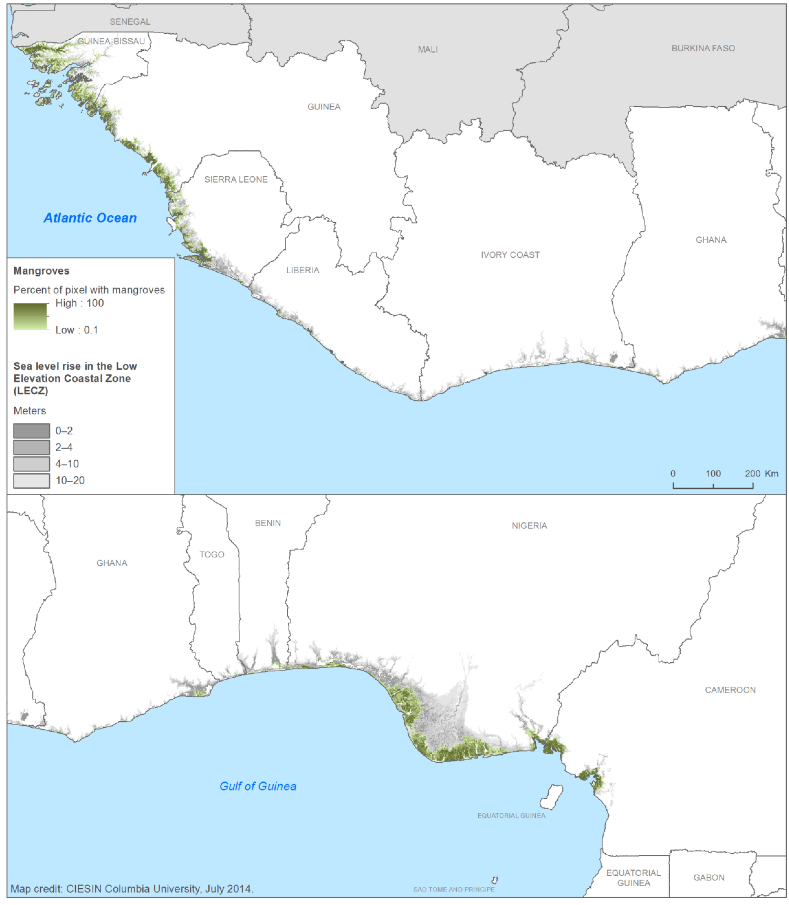
Because of USAID’s interest in biodiversity and natural systems in the coastal zone for their potential buffering capacity and concerns over their loss, we also mapped mangrove systems and forest loss. These two layers were also derived from remote sensing imagery. Giri
et al. [
35] mapped mangroves globally using 30 m Landsat imagery. The coastal zone of West Africa has mangroves throughout, but the mangroves are especially concentrated in Guinea Bissau and the Niger Delta (
Figure 8). Sea level rise will certainly have impacts on the viability of these ecosystems, but by the same token they represent an important form of natural coastal defense.
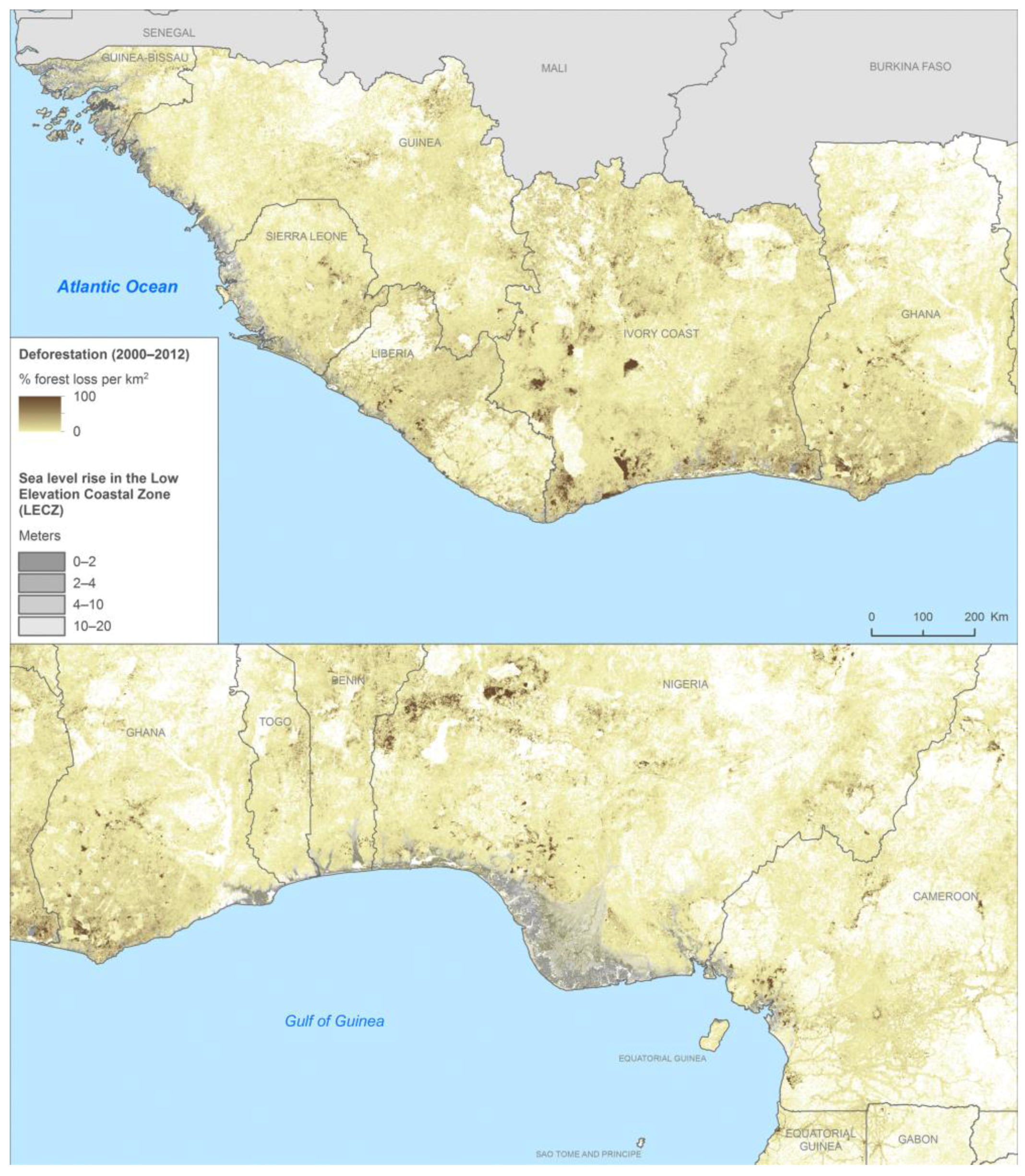
The deforestation data for West Africa were derived from Hansen
et al. [
36] which was the first ever global assessment of forest loss and gain using Landsat 30 m imagery. We aggregated the 30 m imagery to 30 arc-second (~1 km) pixels that indicated the percent of the pixel that had experienced deforestation from 2000 to 2012 (
Figure 9). This was intended to provide a quick picture of the hotspots of deforestation, especially those near the coastal zone.
A key difference from the Mali vulnerability mapping is that none of the remote sensing derived indicators were actually integrated into the synthetic indices we created. For the coastal mapping, we simply overlaid the indices (SVI and EVI) and mangrove and deforestation areas onto the LECZ to visualize the degree of exposure and the potential for harm.
3. Results
Before addressing the results for Mali, it is important to emphasize that the maps depict relative vulnerability within the country, not an absolute level of vulnerability that is comparable to other countries. Mali is a poor, landlocked country with a largely agrarian economy, and, as such, exhibits high levels of climate vulnerability when compared to many other countries (see, for example, the Notre Dame Global Adaptation Index).
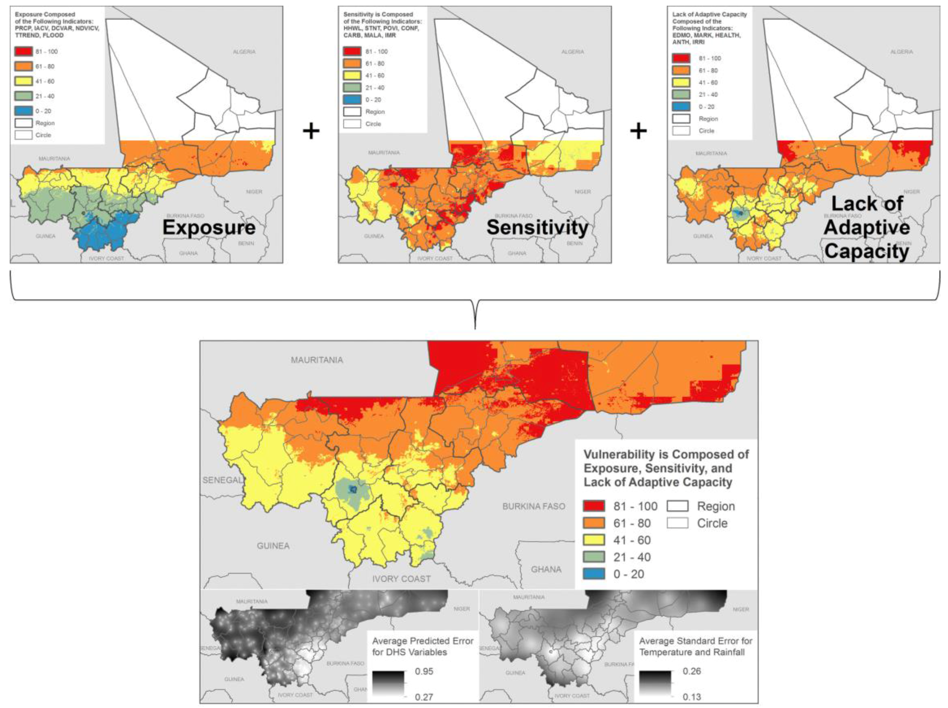
Figure 10.
Mali vulnerability mapping: Components of vulnerability rolled up into an overall vulnerability index. Note: Northern portions of Mali were excluded owing to low population densities.
Figure 10.
Mali vulnerability mapping: Components of vulnerability rolled up into an overall vulnerability index. Note: Northern portions of Mali were excluded owing to low population densities.
Figure 10 shows how the three components for the Mali vulnerability mapping are rolled up into an overall vulnerability index (VI). The exposure map depicts the generally south to north gradient of exposure indicators, with lower rainfall, higher temperatures, and higher rainfall variability in the north when compared to the south. The sensitivity map shows highest sensitivity in the densely settled southeast of the country, and the adaptive capacity component generally shows highest adaptive capacity near the capital and close to the Niger river (adaptive capacity is represented as “lack of adaptive” capacity, consistent with high values representing higher vulnerability in the other components), with adaptive capacity declining as distance from those features increases. The overall vulnerability map is strongly influenced by the south-north gradient of the climate exposure indicators, though there is a pocket of relatively lower vulnerability in Timbuctoo and Gao (northeast Mali), roughly corresponding to the arc of the Niger River. Broadly, areas of highest vulnerability are just north of the 500 mm isohyet for rainfall, making the northern limit of rainfed agriculture.
When targeting adaptation work, it is important to also take into account the relative size of the populations living in the highest vulnerability regions. In Mali, populations vary substantially for each of the five vulnerability classes (from low, 0–20, to very high, 80–100). Approximately 40% of Mali’s population resides in areas classified as medium vulnerability (VI of 40–60), and 32% reside in medium-high vulnerability (VI of 60–80). Only 6% reside in areas of highest vulnerability, and the population density in these mostly northern regions is only seven persons per sq. km, compared with a density of more than 3600 persons per sq. km for the low vulnerability category.
Partly as a result of this mapping effort, a major USAID-funded climate adaptation project was launched in the Mopti region, which is located along the Niger River in an area of moderate to moderately high vulnerability but relatively high population densities. The resulting vulnerability map also includes uncertainty maps for the most important indicators: The FEWSNET-derived climate exposure indicators and those derived from the DHS survey. Together, these made up seven of eighteen indicators.
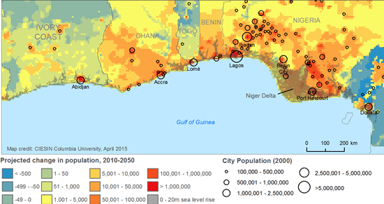
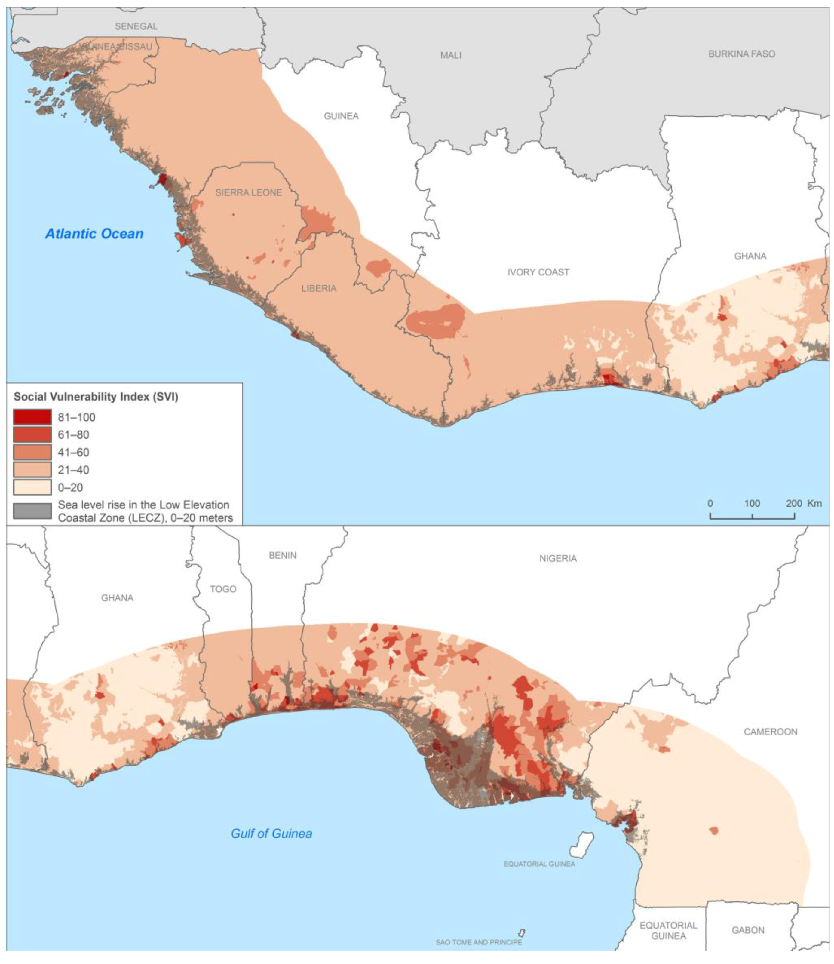
Figure 11 depicts the SVI in relation to the LECZ for coastal West Africa. Within the limitations of this kind of study (mapping scale, data gaps, and uncertainties), the map highlights a number of areas that have high vulnerability and are likely to be at substantial future risk. Taking these in turn, areas of high population and social and economic exposure in the LECZ include the Niger Delta, Lagos, and Cotonou. This has to do with the intense urban and economic development in these areas, high population density and rapid population growth. Population projections suggest a more than threefold increase in population in the 0–5 m LECZ band from 2010 to 2050, from 15.4 to 56.6 million people, with 73% of the total (41.5 million) in Nigeria [
14]. In the Niger Delta patterns of high social and economic exposure are associated with oil and gas exploitation and high levels of poverty and conflict. Separate work [
37] has identified the Niger Delta as a global hotspot of urban expansion and flood risk.
Coast lines tend to rise more steeply in the western portions of the region, from Guinea to Liberia, resulting in lower levels of overall exposure. Côte d’Ivoire, Ghana, and Togo lie somewhere between these two extremes. Accra, for example, has the advantage of being largely outside the 20 m elevation LECZ. Guinea-Bissau is low-lying but is thinly populated with very little in the way of economic assets exposed. Overall, the combination of armed conflict, economic assets, population density (in Lagos, Benin City, Delta, and Port Harcourt), and projected population growth puts Nigeria at the top of the list of high exposure countries in West Africa. In terms of natural systems, the coastal mangroves, salt marshes, estuaries, and lagoons of West Africa are all highly vulnerable to seaward stressors while simultaneously providing a buffering capacity against storm surge. A mapping of the protected areas in the region that was part of this exercise found that these systems are currently under-protected.
In terms of utility, this study was used as a reference document in the preparation of two major USAID calls for proposals: the West Africa Biodiversity and Climate Change (WA-BiCC) project, a portion of which seeks to build coastal resilience in areas experiencing mangrove loss, and the SERVIR/West Africa project, which seeks to use geospatial tools for decision making in West Africa. While this does not “prove” the validity of the methods (an issue we turn to in the limitations below), it does show that in decision making contexts, such maps have proven valuable for programming and priority setting.
Figure 11.
SVI in relation to the West Africa LECZ.
Figure 11.
SVI in relation to the West Africa LECZ.
4. Limitations
Here, we describe a number of limitations with vulnerability index construction that affect our results. While we do not feel these limitations invalidate the work, we do feel that it is important for users of the maps to be aware of these issues.
Results of vulnerability index mapping are influenced by available data and the choice of indicators. While our choices were guided by theoretical considerations, it is clear that had data not been available for certain indicators, or had different choices been made, it would have would have influenced the results. We performed a sensitivity analysis on the Mali data to determine the change in vulnerability index resulting from the omission of individual indicators, and found that the index score changed by between −10 and +15 out of 100 points depending on location. We felt that this was within a tolerable level, but this remains in the eye of the beholder. Ultimately, the proof of the validity of a vulnerability index should be in its predictive power. One would assume that damages from exposure to a given event (e.g., drought)—whether malnutrition, deaths, or economic losses—will be higher in areas of greater vulnerability. By examining outcomes in comparison to predicted vulnerability, one could adjust the indicators and the weighting to obtain a model with the best fit. This could inform index construction for countries facing similar natural hazards and with similar social vulnerability. While we did include some outcome measures (infant mortality and child malnutrition) in our index, they did not reflect outcomes of shocks but rather what could be termed background levels. A next step in this work would be to examine outcomes in relation to exposure to shocks.
Another set of limitations has to do with the functional form of the relationship among indicators or among the components that contribute to vulnerability [
15]. For example, for the Mali vulnerability map we assume that the observed minimum and maximum values (or their winsorized equivalents) have the same meaning across input layers. For example, the method implies that a travel time of 36 hours to the nearest population center has the same impact on sensitivity and adaptive capacity as having an infant mortality rate (IMR) of 135 deaths per 1000 live births, since both have a transformed score of 100. However, it may be that an area with an IMR of 135 is significantly more vulnerable. Another simple factor that makes the extremes not comparable is that for some indicators, the values are based on an interpolated surface with high spatial precision, which generates more extreme values or “long tails” in the data distribution (e.g., market accessibility). Others (e.g., IMR and the poverty index by commune) are averaged within spatial units, which artificially reduce the extremes. Although we trimmed the tails of the continuous raster surfaces in such a way as to increase the vulnerability scores for lower values on the raw scale, we would once again need outcome measures to be able to benchmark any two indicators to any “absolute” vulnerability level.
Following standard practice, another assumption we make is to assume a linear relationship between the input layers and the conceptual category being measured. However, the functional relationship might be very different. It might be a step function, or sigmoid, or asymptotic if there are critical thresholds involved, or it might be exponential if high values trigger cascading problems that do not show up at lower levels. We considered taking the natural logarithm of the raw data as part of the transformation process for some indicators but did not have a strong theoretical justification for doing so. The interaction among the components relates to this. Currently we use an additive approach, but the interaction might be multiplicative. For example, if capacity is high enough, it may not matter much if your sensitivity or exposure is very high. Another way to put this is that the assumption that the three components are fungible—that good levels in one component compensate for bad levels in another, across the whole range of values—might not be true. One possible solution is to take the geometric mean of the indicators, thereby ensuring that vulnerability does not decrease just because of improvements in other areas [
16]. However, this requires just as much theoretical justification as the additive approach, and once again could only be fully tested with robust outcome measures.
The PCA overcomes some of the shortcomings of the additive approach by not assuming any prior relationships among the indicators, but allowing those relationships to emerge from the analysis. When mapping socio-ecological vulnerability across large spatial extents (and therefore across diverse socio-ecological systems) it is likely that drivers of vulnerability will vary considerably across space [
38]. For this reason, we provided the PCA as an alternative aggregation method in the Mali mapping exercise. The overall results are similar to the additive approach, though indicators reflecting proximity to major settlements, market accessibility, and health infrastructure appear to be more influential.
5. Discussion
We conclude with a discussion on the potentials and shortcomings of using remote sensing data as surrogates for other data sources, the benefits and challenges of data integration, and the lessons learned from these mapping exercises.
First, it is worth noting that we are certainly not the first to integrate satellite remote sensing data in the assessment of climate vulnerability. Other examples include Midgley
et al. [
7], who divided nighttime lights imagery by population to assess poverty (inspired by Noor
et al. [
39] and later developed by Ghosh
et al. [
40]) as well as Tsetse Fly habitat suitability partly derived from remote sensing data on vegetation, temperature, and moisture; and Hagenlocher
et al. [
41], who similarly to this study use climate and flood data that are partially remote sensing derived. Hagenlocher
et al. [
41] also used an object-based remote sensing software package, eCognition, to process and present the indicators in distinct geographical units called geons [
42].
As mentioned earlier, remote sensing data have the benefit of providing wall-to-wall consistent coverage of a number of parameters of interest. This has both the advantage of providing consistent metrics across countries (as in the case of the ten countries of coastal West Africa) and filling in data gaps in the generally data poor context of sub-Saharan Africa. On the other hand, in order to be assured of their validity, ground trothing is important. A number of the data layers we used were modeled based on remote sensing and ground observations (e.g., the FEWSNET climate and soil carbon data sets). Yet in Africa, ground observations are often sparse, as noted in our discussion of the soil carbon data. For the FEWSNET climatic data we were able to map the uncertainty (standard errors) based on the meteorological station point data set, and this information was included in the final map (
Figure 10). However, the soil carbon data did not have a similar input points data layers from which we could calculate an uncertainty map.
There is further potential to derive information on socioeconomic characteristics of populations from remote sensing, though these methods are often either labor intensive or fraught with uncertainty (e.g., the nighttime lights poverty metrics). For example, slum mapping can be performed using remote sensing imagery [
43], but the classification often involves manual interpretation. This can be performed for individual cities [
44,
45] but is unlikely to be practicable over larger areas. Housing types in rural area may also be predictive of socioeconomic status; indeed, one of the DHS variables that goes into a composite household wealth indicator is roofing material, which can be easily observable in high resolution remote sensing imagery. Here, cost of data acquisition is likely to be a barrier to use.
The primary challenges of data integration have to do with the temporal and spatial resolution of the data sets. Temporal resolution (or scale) relates to the time frame of the assessment as well as the temporal frequency of the phenomena of interest, which is the generally the climate stressor to which the system is exposed [
46]. It can also refer to the frequency of measurement, e.g., from hourly (for climate data) to weekly (for higher resolution remote sensing data) to decadal (for census data). Generally speaking, spatial VAs integrate data representing multiple time periods. Climate analyses may require historical data for 50–100 year periods in order to adequately capture trends or the frequency of extreme events. Socioeconomic data may be limited to the dates of the most recent census or survey, and land cover data may be available for several points in time, and will often be more recent than the census or survey data. For local assessments, quite recent data may be collected by community members themselves or provided by local agencies.
It is a good practice to clearly communicate the approximate time frame that the assessment represents, and to advise users of the incorporation of older data owing to data limitations. Remote sensing data have the advantage of being relatively up-to-date compared with socioeconomic data, but this can result in temporal mismatches. It is incumbent on map producers to clearly document the date of each data set and to communicate the impact of using spatially inconsistent data (e.g., a decade old survey with a land cover map that was produced a year ago), since these will obviously have effect the interpretation of what most users would assume is a picture of current vulnerability or risk.
Turning to spatial resolution, Preston
et al. [
10] describe the common spatial resolutions of data sets used in vulnerability mapping. On the one end are biophysical data, often derived from remote sensing, that are at high spatial resolutions (~30 m to 1 km). On the other end are climate data, which can often be coarse (~50–100km). Sandwiched between are the socio-economic data from censuses and surveys that are often in heterogeneously sized units that are partly a function of population density. This is a generalized view, as there are obvious exceptions, such as coarser resolution satellite data (e.g., DMSP-OLS nighttime lights with a nominal 2.8 km resolution) or climate data from individual meteorological stations that represent highly localized areas.
Integrating data at different spatial scales can result in artifacts in the maps that unintentionally draw attention to differences between areas that are not necessarily present on the ground. For example, abrupt discontinuities across borders may be an artifact of using administrative level adaptive capacity indicators, or it may reflect actual changes owing to different governance regimes. Apart from rigorous ground-level data collection it would be difficult to determine if these discontinuities actually reflect “real” changes in on-the-ground vulnerability. Maps that include continuous variables derived from remote sensing data (e.g., the soil carbon or deforestation data) may result in maps with pixelated results that may appear noisy; in these cases the use of a low-pass filter may help to reduce the noise and increase the communication value. This is one reason we sought to generalize the deforestation data, since the 30 m Landsat data were very difficult to visually interpret.
Further issues and approaches related to spatial level, bounding boxes, and units of analysis (
i.e., subnational units, geons, or grid cells) are addressed further in de Sherbinin [
8]. All of these issues are important to address and are affected by the combinations of data that are represented in different ways (grid cells, points, lines, and polygons) and derived from fundamentally different data gathering methods. For assessments that average remote sensing and socioeconomic parameters over administrative units, they will confront the modifiable areal unit problem (MAUP), which stipulates that the results of statistical analyses are fundamentally affected by the size of the units utilized. Smaller units will tend to have more widely varying values an smaller standard deviations than larger units.
6. Conclusions
It is clear that, regardless of its limitations, remote sensing will play a growing role in vulnerability mapping efforts. It is likely that we will see more near-real time updates of vulnerability indices as remote sensing-derived biophysical factors are combined with socioeconomic parameters. This may include near-real time measurements of precipitation (e.g., Tropical Rainfall Measurement Mission (TRMM) and Global Precipitation Measurement (GPM)), soil moisture (Soil Moisture Active Passive (SMAP)), floods (MODIS flood products), vegetation response to drought (e.g., MODIS Enhanced Vegetation Index (EVI) and Normalized Difference Vegetation Index (NDVI)) on the biophysical side. On the socioeconomic side, very high resolution imagery may be used in localized studies to understand housing types and socioeconomic characteristics of populations, and over wider areas, night time lights intensity may help to assess changes in wellbeing or presence of conflict [
47]. As the demand for vulnerability maps grows, it is certain that there will be a corresponding demand for remote-sensing derived data products, especially in data poor regions.
A key lesson learned from this work is that maps are very powerful for policy communication [
9], and that when presented in policy-making contexts, they serve as important boundary objects that stimulate debate and discussion. However, with the power of maps also comes responsibility. The very power of maps, which is to simplify complex ground-based realities by abstracting information, may give them inordinate influence among policy audiences [
10], even though they may lead to wrong conclusions. It is always important to ensure there is a clear articulation of the limitations and uncertainty embedded within the maps [
8].


 ,
, 
