
Experimental Evaluation of the Usability of Cartogram for Representation of GlobeLand30 Data


1
Faculty of Geosciences and Environmental Engineering and The State-Province Joint Engineering Laboratory of Spatial Information Technology for High-speed Railway Safety, Southwest Jiaotong University, Chengdu 610031, China
2
Department of Land Surveying and Geo-Informatics, The Hong Kong Polytechnic University, Hong Kong, China
*
Author to whom correspondence should be addressed.
ISPRS Int. J. Geo-Inf. 2017, 6(6), 180; https://doi.org/10.3390/ijgi6060180
Submission received: 5 April 2017
/
Revised: 14 June 2017
/
Accepted: 17 June 2017
/
Published: 21 June 2017
(This article belongs to the Special Issue Analysis and Applications of Global Land Cover Data)
Abstract
:GlobeLand30 is the world’s first global land cover dataset at 30 m resolution for two epochs, i.e., 2000 and 2010. On the official website, the data are represented by qualitative thematic maps which show the distribution of global land cover, and some proportional symbol maps which are quantitative representations of land cover data. However, researchers have also argued that the cartogram, a kind of value-by-area representation, has some advantages over these maps in some cases, while others doubt their usability because of the possible distortion in shape. This led us to conduct an experimental evaluation of the usability of the cartogram for the representation of GlobeLand30. This experimental evaluation is a comparative analysis between the cartogram and the proportional symbol map to examine which is more effective in various kinds of quantitative analyses. The results show that the thematic map is better than the cartogram for the representation of quantity (e.g., area size), but the cartogram performs better in the representation of tendency distribution and areas’ multiple relationships. The usability of the cartogram is notably affected by map projection and the irregularity in area shapes, but the equal-area projection does not necessarily perform better than equidistance projection, especially at high latitudes.
1. Introduction
GlobeLand30 is the world’s first global land cover dataset at 30 m resolution for two epochs, i.e., 2000 and 2010, which was developed by the National Geomatics Center of China. It contains 10 major types of land cover such as vegetation, water body, tundra, permanent snow and ice, artificial surface, and cultivated lands [1]. This set of data has recently been released and donated by the Chinese Government to the United Nations for supporting global sustainable development studies. An official website has been created to provide a data service to the public (http://www.globallandcover.com/GLC30Download/index.aspx).
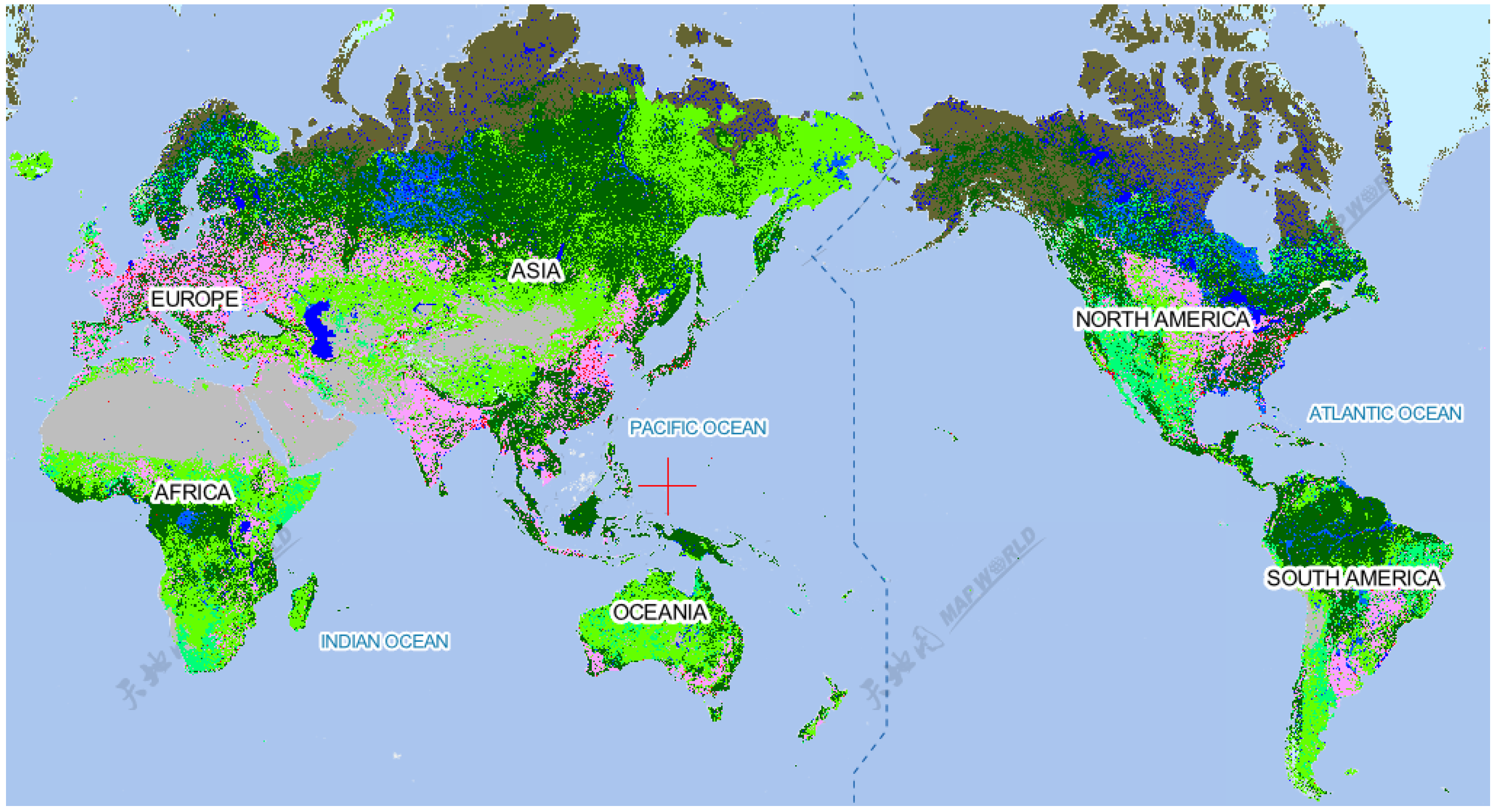
Currently, on the official website, the GlobeLand30 data are represented with qualitative thematic maps (see Figure 1) which show the distribution of global land cover, as well as some proportional symbol maps, which are quantitative representations of land cover data. However, it has been argued [2,3] that a special type of thematic map, called a cartogram (see Figure 2), is more effective for some quantitative analyses.
The use of cartograms for the visual representation of geographical data has become popular and many researchers believe that the cartogram is a very effective representation for spatial analysis. Kocmoud and House in 1998 [2] stated that the cartogram is a useful tool for visualizing the geographic distribution of “routine” data in a variety of disciplines; Inoue and Shimize 2006 [4] stated that the cartogram is a powerful method for the visual representation of statistical data. However, some other researchers doubt the usability of cartograms. Tobler in 2004 [5] reported that cartograms are difficult to use. Tao in 2010 [6] found that cartograms are hard to understand.
Li and Sun in 2010 [3] made comparative analyses of the effectiveness between thematic maps and cartograms for different purposes and found that thematic maps are more effective for the purpose of making a quantitative comparison, but cartograms are more effective for the purpose of making a qualitative comparison, e.g., electoral college votes won by candidates in a US election. This highlights the need for further study to clarify the effectiveness of cartograms in different situations, for different applications, and at different scales.
Therefore, this study aims to systematically evaluate the usability of cartograms for the representation of GlobeLand30 for various quantitative analyses.
2. Selection of Cartogram for Study
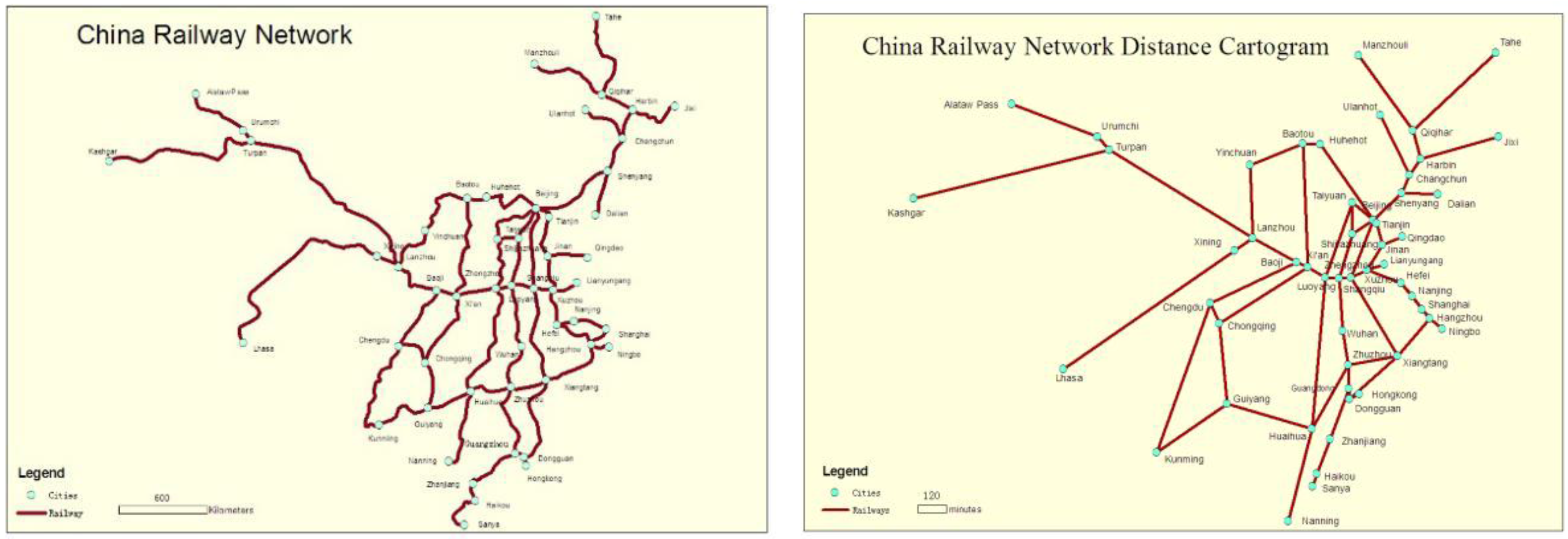
Cartograms have a long history. “In 1851, Minard published a series of maps called ‘cartogrammes,’ a foyer ‘diagraphiques’ or maps with diagrams.” [7]. There are two types: area cartograms (Figure 2) and distance cartograms (Figure 3). As distance cartograms are irrelevant to GlobeLand30 data representation, this paper will concentrate on area cartograms, which are a kind of value-by-area representation. Area cartograms communicate the geographic distribution of a statistic by replacing the geographic area with the value of concern [8,9].
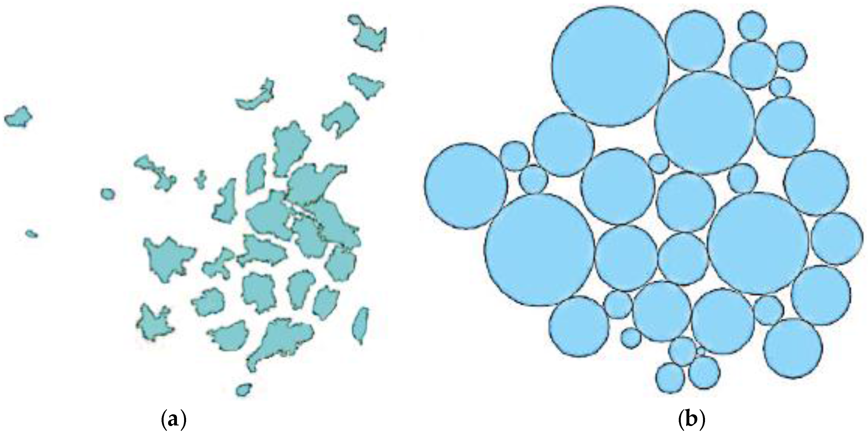
Area cartograms can be classified into two types based on the topological connectivity between neighboring areas, i.e., contiguous cartograms and non-contiguous cartograms, as shown in Figure 2 and Figure 4a. In non-contiguous cartograms (Figure 4a), the area shapes are preserved during the scaling process but the topology of the original areas (regions) is not preserved [10]. On the other hand, in contiguous cartograms, the desired size of an area is scaled according to the attributed value within the area, but the shape of the area may be distorted in order to preserve the topology, i.e., to maintain the contiguity relation with adjacent areas. A number of algorithms for contiguous cartograms are available, e.g., rubber map [11], density equalizing map projections (DEMP) [12], rubber sheet [13], interactive polygon zipping [14], line integral [15], spring relaxation [2], and diffusion [16].
Another special type of cartogram is termed the Dorling cartogram, as it was introduced by Dorling in 1996 [17]. In a Dorling cartogram, the region with a complex shape is replaced by a circle (or a square) scaled according to the attribute quantity within the region. Circles are distributed to resemble the original topology (see Figure 4b). The rectangular version of such a cartogram is called a Demers cartogram [18,19].
Between the various area cartograms [20], Li and Sun in 2010 [3] made a comparative study. They found that the diffusion cartogram is most preferred for both the purpose of making a quantitative comparison and the purpose of making a qualitative comparison. Therefore, in this study, the diffusion method is selected as the representative.
3. Design of Experiments
3.1. Source Data, Measures and Reference Maps
The GlobeLand30 contains 10 major types of land cover such as vegetation, water body, artificial surface, tundra, permanent snow and ice, and cultivated land. In this study, the data for cultivated land is used for testing because every country has a certain value, which may not be the case for some other land cover types such as tundra or permanent snow and ice.
This study aims to systematically evaluate the usability of cartograms for the representation of GlobeLand30 for various quantitative analyses. The measures used for the usability are the three elements as defined by the International Organization for Standardization (ISO): (1) effectiveness (in terms of accuracy or rate of correct recognition); (2) efficiency (in terms of time taken or the speed of recognition); and (3) satisfaction (in terms of user preference).
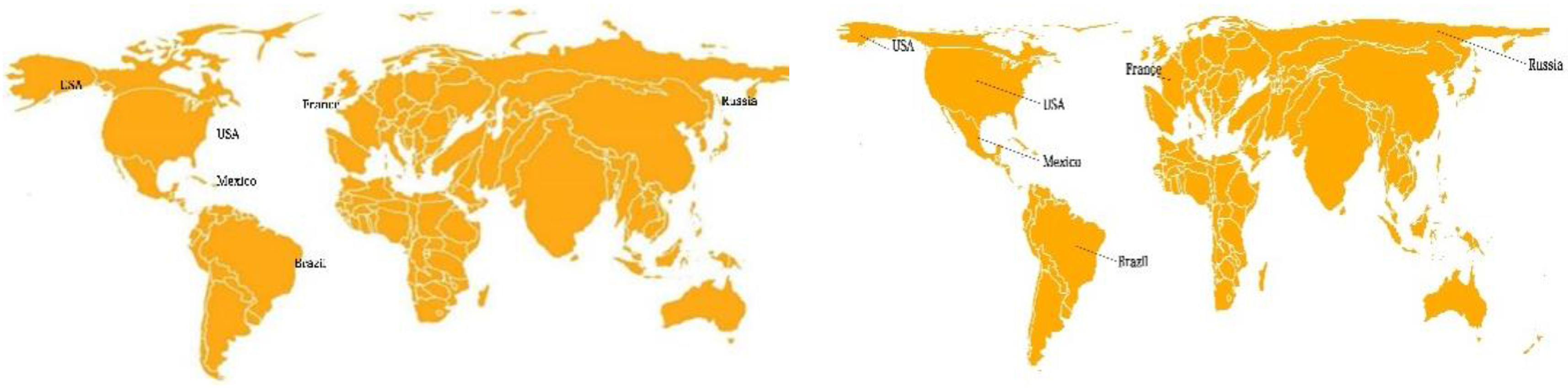
To make a comparison of preference, a proper reference map is required. In this study, proportional symbol maps are employed for comparison because cartograms can be considered as a special type of proportional symbol mapping [21]. That is, in this case, the “symbol” that is scaled in proportion to an attribute value is the geographic area for which data are aggregated. Examples of experimental maps are shown in Figure 5.
3.2. Hypothesis and Quantitative Analyses
The first hypothesis of this study is that the statements “cartograms are not hard to understand” and “cartograms are difficult to use” are not always valid. The investigation is carried out to find out when the cartograms are more effective, more efficient, and preferred.
Generally speaking, quantitative thematic maps serve three types of purposes: to provide specific quantitative information about particular locations, to provide general information about spatial patterns, and to be used for comparing patterns on two or more maps. For the evaluation, Roth in 2013 [22] suggested the use of the following five “objective primitives”: Identify, compare, rank, associate, and delineate. In this study, only the first three objective primitives are adopted, leading to three types of comparative experimental tests designed as follows: (1) recognition of the inequality (smaller or larger) of quantities at different locations; (2) recognition of the ratio relations between quantities at different locations; and (3) recognition of quantity distributions.
The second hypothesis of this study is that the usability of cartograms will be affected by map projections. A common belief is that the cartograms with equal-area projections should perform better than those cartograms with other projections. This is because the area ratio is preserved with equal-area projection. In this study, two types of map projections are employed for comparative analysis: Equal-area and equidistant. The conformal projection is excluded because it will cause too big an area distortion at high-latitude areas.
3.3. Experiments
It was decided to carry out the experiments through surveys using questionnaires. The questionnaire with maps as shown in Figure 5 was placed on the Internet and each subject (map reader) received an interlink from the experimenter so as to read and answer the questions. A total of 96 subjects participated in this study, with an almost equal number of male and female respondents, covering a wide age range, from 18 to 40 years.
4. Usability of Cartograms for GlobeLand30: Comparison with Proportional Symbol Maps
The first set of three experiments is designed to compare the usability of cartograms with proportional symbol maps.
4.1. Usability in the Recognition of the Equality or Inequality of Quantities
The first test was the recognition of the equality and inequality of two quantities between the map types. In this experiment, the subjects were asked to determine the three relationships between two regions (countries), i.e., “smaller than”, “larger than” and “same as”. In order to make tests comprehensive, the differences between two regions (countries) at three levels (small, medium, and large) were considered, as follows:
- Small differences: China vs. India, Australia vs. Kazakhstan, Mexico vs. South Africa;
- Medium differences: Australia vs. Spain, Argentina vs. Kazakhstan, Tanzania vs. Zambia;
- Large differences: Argentina vs. Brazil, Russia vs. India, France vs. Zambia.
Also, in the selection of regions for comparison, the representation from each continent and the irregularity of its boundary were taken into consideration. In order to test the efficiency, the time taken to answer these questions was recorded. If the time used by a subject, as automatically recorded in the testing system, was found to be too short, the subject was considered as not treating the experiment seriously, and their result was considered invalid and thus excluded. As a result, 84 responses were used for statistical analysis.
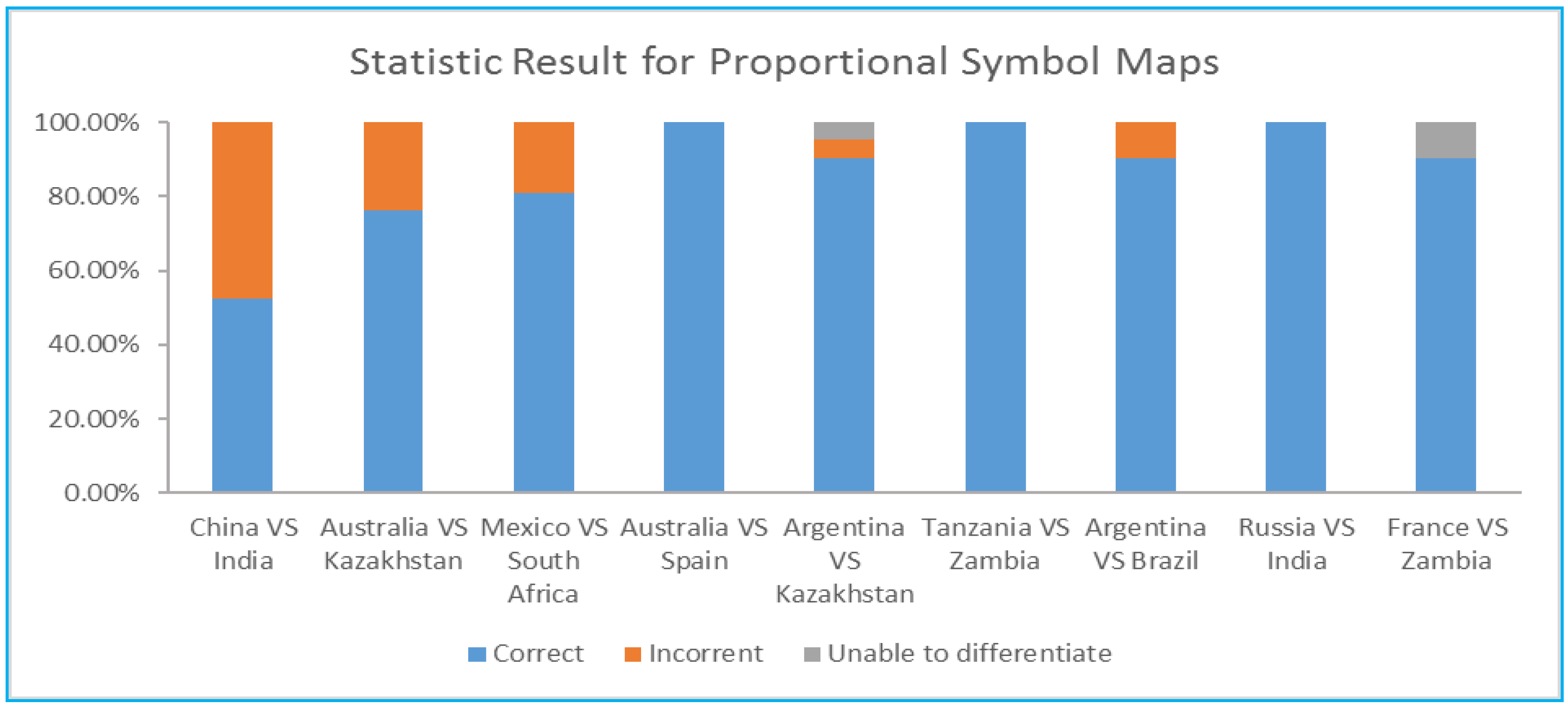
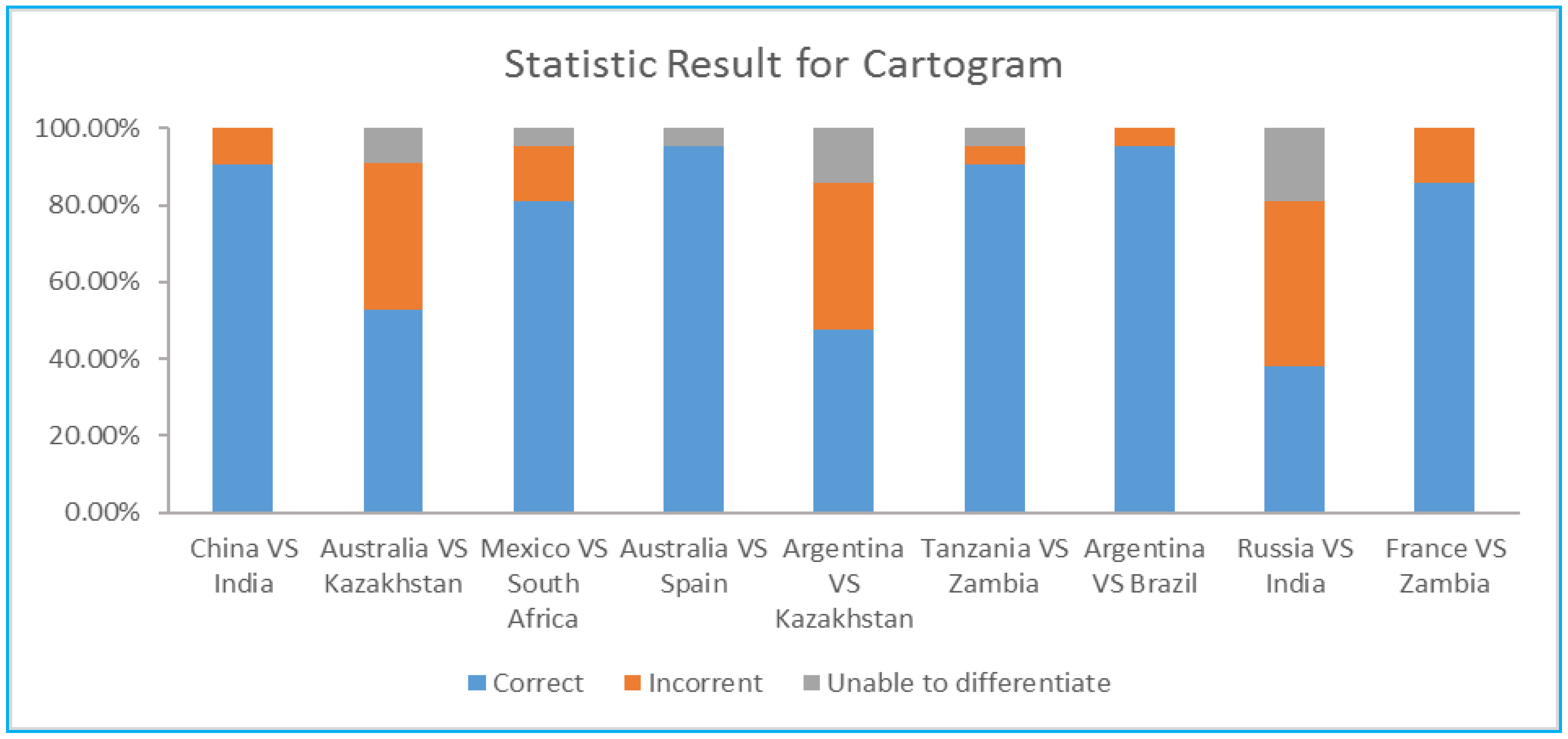
The results are shown as Table 1, where “unable” means that the respondent was unable to tell the difference between the regions. The diagrammatic representations of results are shown in Figure 6 and Figure 7. Most of the accuracies for the recognition of the circular symbols were relatively high, except for China vs. India in which the circles are almost the same size. On the other hand, the recognition of differences within cartograms was more complicated. In general, the accuracy was comparable to that for the circular symbols. However, the accuracy was rather low for the pairs like Russia vs. India, Australia vs. Kazakhstan, and Argentina vs. Kazakhstan, possibly because of the large difference in the shapes of the countries.
In terms of satisfaction, the comments from the subjects show that some people like the symbols in cartograms for those areas, which are large, and have obvious boundaries, while other people do not like them given their irregularity.
In terms of efficiency, the speed of recognition was recorded. The average time taken to obtain an answer was 106 s in the proportional symbol map and 108 s in the cartogram. Therefore, the difference is negligible.
4.2. Usability in the Recognition of the Ratio Relation between Quantities
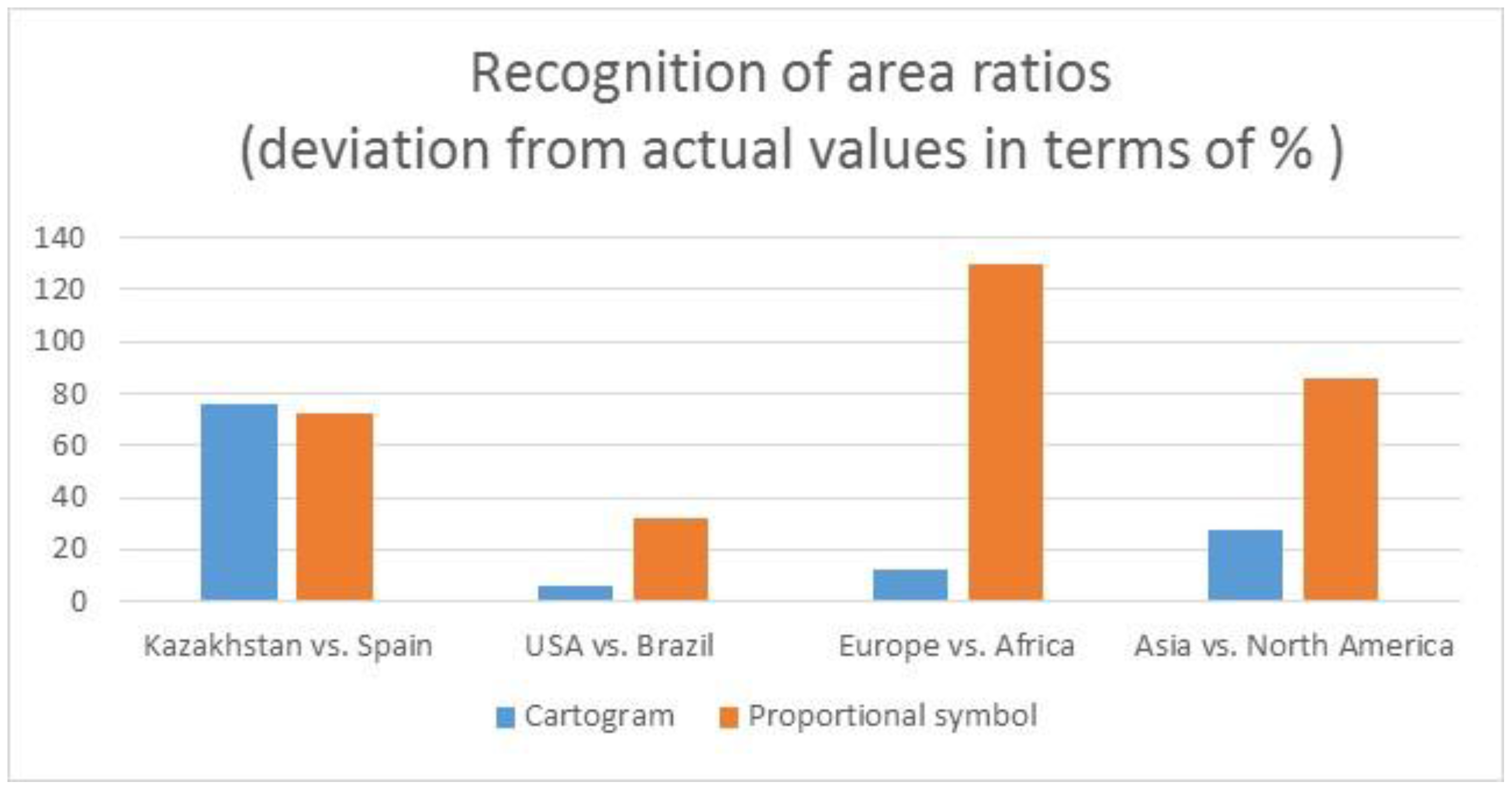
In this test, the subjects were asked to give the ratio relationship between two quantities. That is, the subjects were asked to give the multiple relationship between two countries and/or two continents. In this experiment, the country pairs chosen were Kazakhstan vs. Spain and USA vs. Brazil. The ratios of the cultivated areas are nearly 1.0 between Kazakhstan and Spain and 1.7 between USA and Brazil. A total of 71 responses were valid. The results are shown in Table 2. A graphic representation is shown in Figure 8.
When using cartograms, in the comparison of Kazakhstan vs. Spain, the responses ranged from 1 time (1×) to 3 times (3×) with an average of 1.76×. The mode was at 1.5× with nearly 50% of responses. In the comparison of USA vs. Brazil, the responses ranged from 1 time (1×) to 5 times (5×) with an average of 1.59×. The mode was also at 1.5× with nearly 50% of responses. The deviations of means from the actual ratios were 76% and 6%, respectively. In terms of efficiency, on average, it took the subjects 24.5 s to complete these two questions.
When using proportional symbol maps, in the comparison of Kazakhstan vs. Spain, the responses ranged from 1× to 3× with an average of 1.72×, and the mode was also at 1.5× with 41% of responses. In the comparison of USA and Brazil, the responses ranged from 1 time (1×) to 6 times (6×) with an average of 2.25×. The mode was also 1.5× with 40% of responses. The deviations of means from the actual ratios were 70% and 32%, respectively. In terms of efficiency, it took the subjects 35.5 s on average to complete these two questions.
By comparison, the cartogram seems to be more effective and more efficient than the proportional symbol map in the recognition of area ratios. However, if the mode is used instead of the mean in the statistical analysis, then the results for the cartogram and proportional symbols map are quite similar.
Experimental tests were also conducted at the continent scale. The pairs tested were Europe vs. Africa and Asia vs. North America. The actual ratios of cultivated lands are 1.7× and 2.6×, respectively. When using cartograms, the average ratio was 1.66× (with mode at 1.5) and 1.87× (with mode at 2), respectively, which are very close to the actual values. When using the proportional symbol maps, the resultant ratios were 3.91× (ranging from 2 to 6, without a clear mode) and 4.84× (ranging from 3 to 8, without a clear mode), respectively, which is quite deviated from the actual values. These results are also shown in Table 2 and in Figure 8.
In terms of efficiency, when using the cartogram, it took subjects 38.2 s on average to complete the task while, when using the proportional symbol map, it took subjects 36.8 s on average.
At the continent level, the cartogram seems more effective than the proportional symbol map in the recognition of area ratios. In terms of efficiency, the difference between the two is very small.
In terms of satisfaction, 71.43% of subjects preferred cartograms and 28.57% of subjects preferred proportional symbol maps.
4.3. Usability in the Recognition of Quantity Distributions
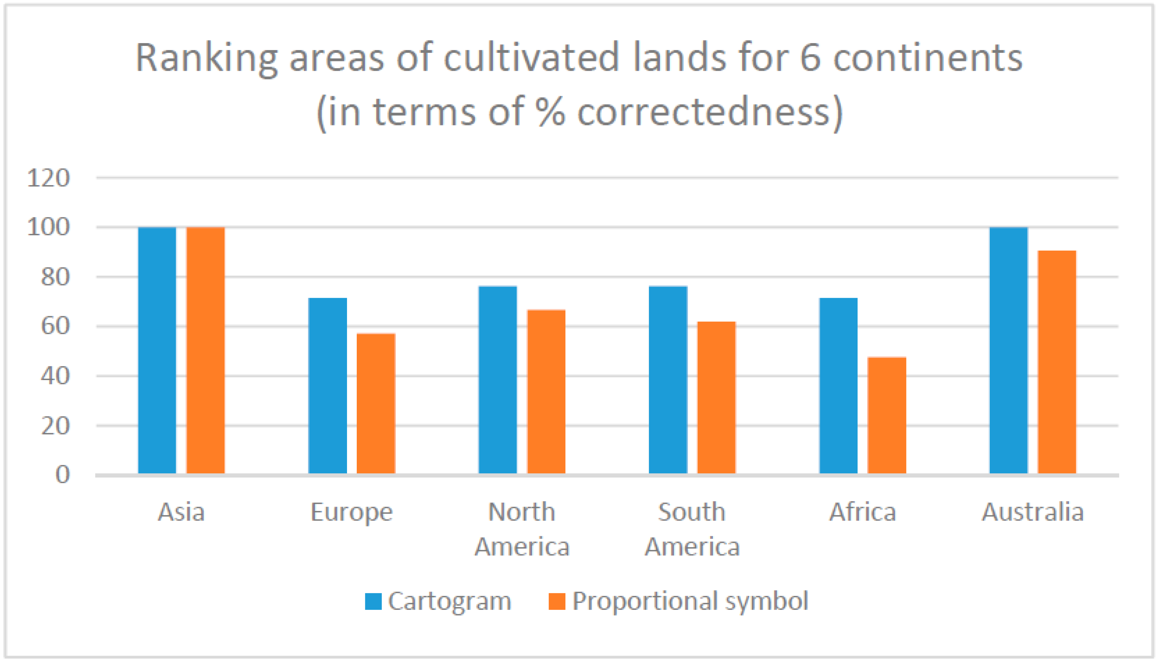
In this test, the subjects were asked to rank the cultivated lands of six continents by size. The actual order of ranking is Asia (38.41% of total land area), Europe (20.09%), North America (14.80%), South America (11.97%), Africa (11.59%), and Australia (3.14%). The experimental results are shown in Table 3 and plotted in Figure 9.
These results clearly show that the accuracy of ranking when using cartograms is much higher than when using proportional symbol maps. In terms of efficiency, when using the cartogram, it took 21.2 s on average to complete the task, while when using the proportional symbol maps, it took 23.5 s on average to complete the task. The difference is considered negligible.
5. Usability of Cartograms for GlobeLand30: Impact of Map Projection Type
As cartograms are achieved by expanding or shrinking each area on the map according to the attribute value within, it is suspected that the distortions in the area size and shape caused by the map projection at such a global scale will also have an impact on recognition when using cartograms. Therefore, an investigation into this potential impact was also conducted. Two types of map projections, equal-area and equidistance, were tested. The conformal projection is excluded because it causes too great an area distortion at high latitudes.
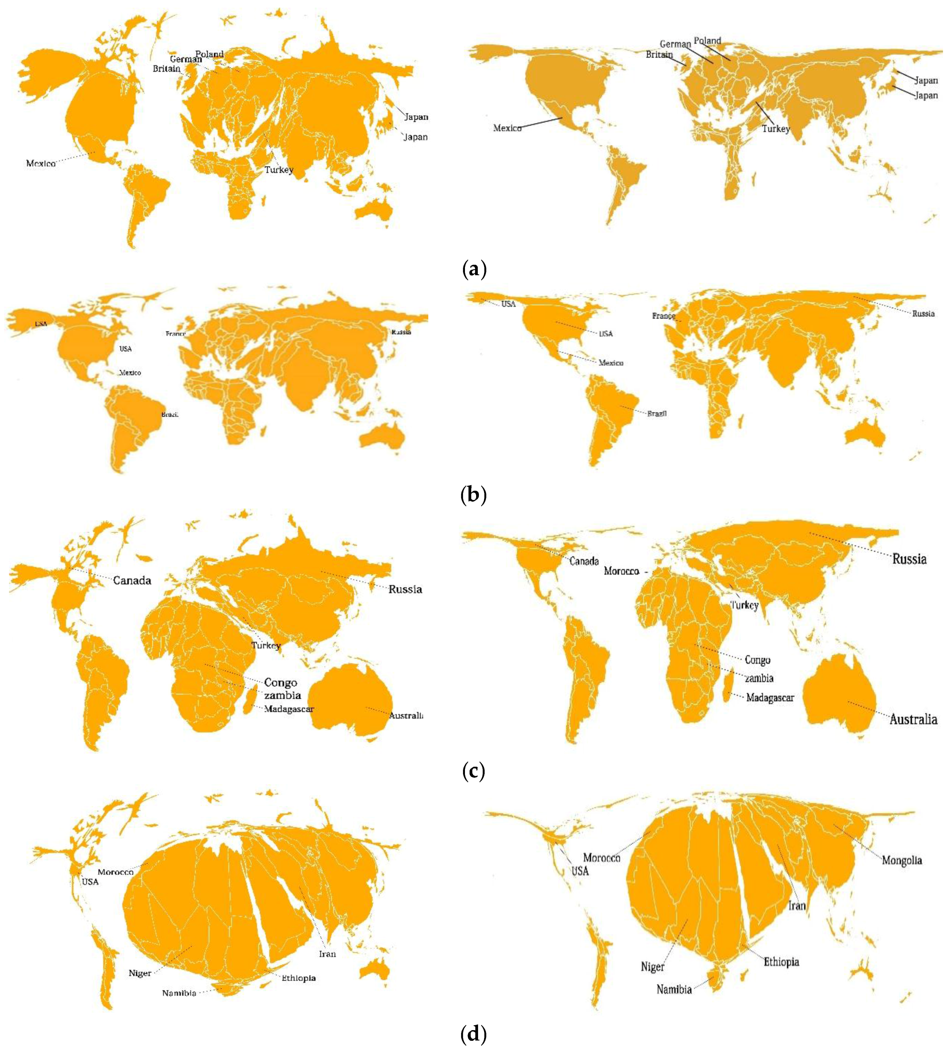
The test procedure for this experiment was similar to the one used for the comparison with proportional symbol maps. In this test, the subjects were asked to determine the relationships between the sizes of two regions (countries), with possible responses of “smaller than”, “larger than”, or “same as”. The country pairs chosen were different from those used in the previous test in order to make the results independent. The three pairs were USA vs. Russia, Brazil vs. Canada, and France vs. Mexico. The cartograms are shown in Figure 10. The results are shown in Table 4.
The results, as expected, show that the cartogram in equal-area projection performs better in general. However, it is interesting to note that, in the comparison of USA and Russia, there is almost no difference in accuracy. This result cannot be well explained convincingly, leading to further investigation. Subsequently, the land types of artificial land, grassland, water, and bare land in different country pairs were used for evaluation, to create different levels of distortions for different countries. The corresponding cartograms are shown in Figure 11 and the accuracy results are shown in Table 5.
The results indicate that cartograms with equal-area projection may underperform the cartograms with equidistance projection because (a) equal-area projection may lead to greater shape distortions (e.g., becoming narrow strips) at high latitudes; and (b) different kinds of shape distortions may be created with different sets of data.
6. Conclusions
In this study, an experimental investigation into the usability (effectiveness, efficiency, and satisfaction) of cartograms for the representation of GlobeLand30 data was carried out. In the design of the experiments, the five “objective primitives” (i.e., identify, compare, rank, associate, and delineate), recommended by Roth in 2013 [22] for the evaluation of quantitative representations were taken into consideration. The first three objective primitives were adopted, leading to three types of comparative experimental tests, i.e., (1) recognition of the inequality (smaller or larger) of quantities at different locations; (2) recognition of the ratio relations between quantities at different locations; and (3) recognition of quantity distributions. Proportional symbol maps were used as reference maps for comparison. From these experiments, it was found that:
- when comparing size inequality at the country level, cartograms are less effective;
- when comparing the area ratio and size inequality at the continental level, cartograms perform better in terms of all three usability measures;
- the usability of cartograms is greatly affected by the (shape) irregularity of the area units;
- in terms of map reading efficiency, there was no significant difference found between the two map types; and
- in terms of satisfaction, the opinions were also diverse, but more people preferred cartograms.
In all of these tests, the cartograms and proportional maps were produced by using an equal-area projection. Experimental testing was also carried out to examine whether equal-area projection would always perform better than equidistance projection, as commonly understood. Results show that cartograms with an equal-area projection may underperform those with equidistance projection, especially at high-latitude regions.
It is noted here that, in proportional symbol maps, the size of symbols should be proportional to the quantity of the area. However, in practice, quantitative data that has been classified into five to six classes and graduated symbols, instead of proportional symbols, are used. This may affect the effectiveness of proportional symbol maps. On the other hand, even when the absolute proportional symbols are used, there is also the issue of visual distortion, which may lead to the underestimation of an area symbol. All these observations deserve further investigation.
Acknowledgments
This research was supported by the National Natural Science Foundation of China (41471383), Research Fund of Surveying and Geo-Information (Grant No. 201512028), MoE Changjiang Scholars and Innovative Research Team Development Assistance Scheme (IRT13092), Hong Kong RGC (PolyU 152672/16E) and Hong Kong Polytechnic University (G-UA7K and 8-ZJK8).
Author Contributions
Rui Han and Zhilin Li designed the project and wrote this paper. Rui Han analyzed the data; Rui Han, Zhilin Li, Peng Ti and Zhu Xu designed the experiment. Rui Han conducted the experiments.
Conflicts of Interest
The authors declare no conflicts of interest.
References
- Chen, Ju.; Chen, Ji.; Liao, A.; Cao, X.; Chen, L.; Chen, X.; He, C.; Han, G.; Peng, S.; Lu, M.; et al. Global land cover mapping at 30m resolution: A POK-based operational approach. ISPRS J. Photogramm. Remote Sens. 2015, 103, 7–27. [Google Scholar] [CrossRef]
- Kocmoud, C.J.; House, D.H. A Constraint-based Approach to Constructing Contiguous Cartograms. In Proceedings of the 8th International Symposium on Spatial Data Handing, Vancouver, BC, Canada, 11–15 July 1998. [Google Scholar]
- Sun, H.; Li, Z.L. Effectiveness of Cartogram for the representation of spatial data. Cartogr. J. 2010, 47, 12–21. [Google Scholar] [CrossRef]
- Inoue, R.; Shimizu, E. A new algorithm for continuous area cartogram construction with triangulation of regions and restriction on bearing changes of edges. Cartogr. Geogr. Inf. Sci. 2006, 33, 115–125. [Google Scholar] [CrossRef]
- Tobler, W. Thirty five years of computer Cartograms. Ann. Assoc. Am. Geogr. 2004, 94, 58–73. [Google Scholar] [CrossRef]
- Tao, M. Using Cartograms in Disease Mapping. Ph.D. Thesis, The University of Sheffield, Sheffield, UK, 2010. [Google Scholar]
- Friis, H. Statistical cartography in the United States prior to1870 and the role of Joseph C. G. Kennedy and the U.S. Census Office. Am. Cartogr. 1974, 1, 131–157. [Google Scholar] [CrossRef]
- Wolf, E.B. Creating contiguous cartograms in ArcGIS 9. In Proceedings of the 2005 ESRI International User Conference, San Diego, CA, USA, 25–29 July 2005. [Google Scholar]
- Tang, F.Q. A Comparative Study of Various Travel Time Representation Approaches for a Road Network. Master’s Thesis, The Hong Kong Polytechnic University, Hong Kong, 2012. [Google Scholar]
- Krauss, M.R.D. The Relative Effectiveness of the Noncontiguous Cartogram. Master’s Thesis, Virginia Polytechnic Institute and State University, Blackbrug, VA, USA, 1989. [Google Scholar]
- Tobler, W. A continuous transformation useful for districting. Ann. N. Y. Acad. Sci. 1973, 219, 215–220. [Google Scholar] [CrossRef] [PubMed]
- Selvin, S.D.; Sacks, M.S.; Bedell, L.W.; Schulman, J. Transformations of Maps to Investigate Clusters of Disease; No. LBL-18550; University of California: Berkeley, CA, USA, 1984. [Google Scholar]
- Dougenik, J.A.; Chrisman, N.R.; Niemeyer, D.R. An algorithm to construct continuous area cartograms. Prof. Geogr. 1985, 37, 75–81. [Google Scholar] [CrossRef]
- Torguson, J.S. Cartogram: A Microcomputer Program for the Interactive Construction of Value-by-Area Cartograms. Master’s Thesis, University of Georgia, Athens, GA, USA, 1990. [Google Scholar]
- Gusein-Zade, S.M.; Tikunov, V. A new technique for constructing contiguous cartogram. Cartogr. Geogr. Inf. Syst. 1993, 20, 167–173. [Google Scholar] [CrossRef]
- Gastner, M.T.; Newman, M.E.J. Diffusion-based method for producing density-equalizing maps. Proc. Natl. Acad. Sci. USA 2004, 101, 7499–7504. [Google Scholar] [CrossRef] [PubMed]
- Dorling, D. Area Cartograms: Their Use and Creation; Concepts and Techniques in Modern Geography Series No. 59; University of East Anglia: Norwich, UK, 1996. [Google Scholar]
- Brunsdon, C.; Charlton, M. Spoilt for Choice? An Investigation into Creating Gastner and Newman-style Cartograms. In Proceedings of the GIS Research UK 23rd Annual Conference, Leeds, UK, 15–17 April 2015; University of Leeds: Leeds, UK, 2015. [Google Scholar]
- Kreveld, M.V.; Speckmann, B. On rectangular cartogram. Comput. Geom. 2006, 37, 175–187. [Google Scholar] [CrossRef]
- Wikipedia 2008. Cartogram. Available online: http://en.wikipedia.org/wiki/Cartogram (accessed on 27 April 2016).
- Stevens, J.; Smith, J.M.; Bianchetti, R.A. Mapping Our Changing World; MacEachren, A.M., Peuquet, D.J., Eds.; Department of Geography, The Pennsylvania State University: University Park, PA, USA, 2012. [Google Scholar]
- Roth, R.E. An empirically-derived taxonomy of interaction primitives for interactive cartography and geovisualization. IEEE Trans. Vis. Comput. Graph. 2013, 19, 2356–2365. [Google Scholar] [CrossRef] [PubMed]
Figure 1.
Qualitative representation of GlobeLand30 data (http://glc30.tianditu.com/).
Figure 1.
Qualitative representation of GlobeLand30 data (http://glc30.tianditu.com/).

Figure 2.
Cartogram for quantitative representation of GlobeLand30 data.
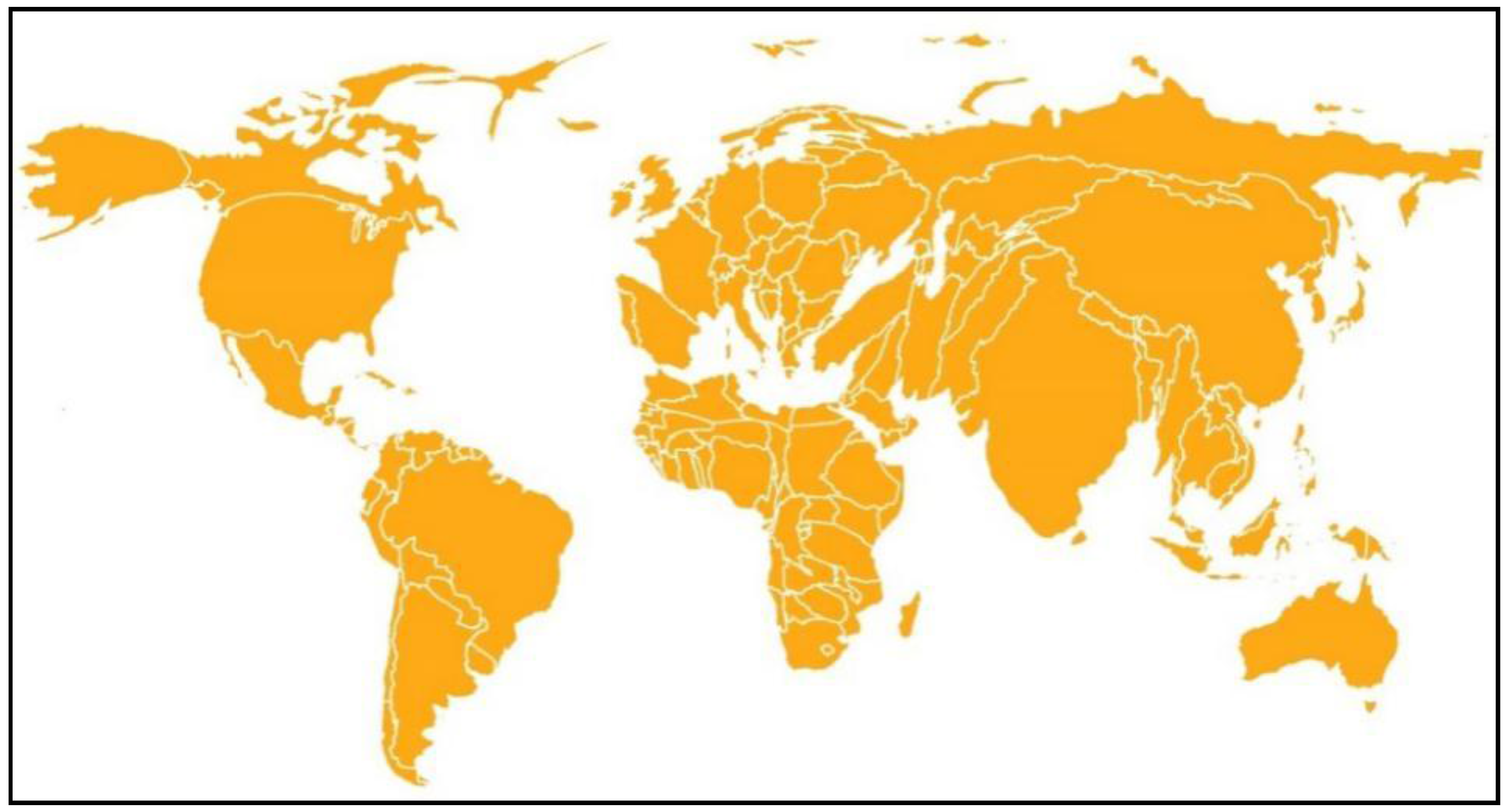
Figure 3.
Cartogram of the China Railway network [9].
Figure 3.
Cartogram of the China Railway network [9].

Figure 4.
Area cartograms: (a) discontinuous area cartogram; (b) Dorling cartogram [3].
Figure 4.
Area cartograms: (a) discontinuous area cartogram; (b) Dorling cartogram [3].

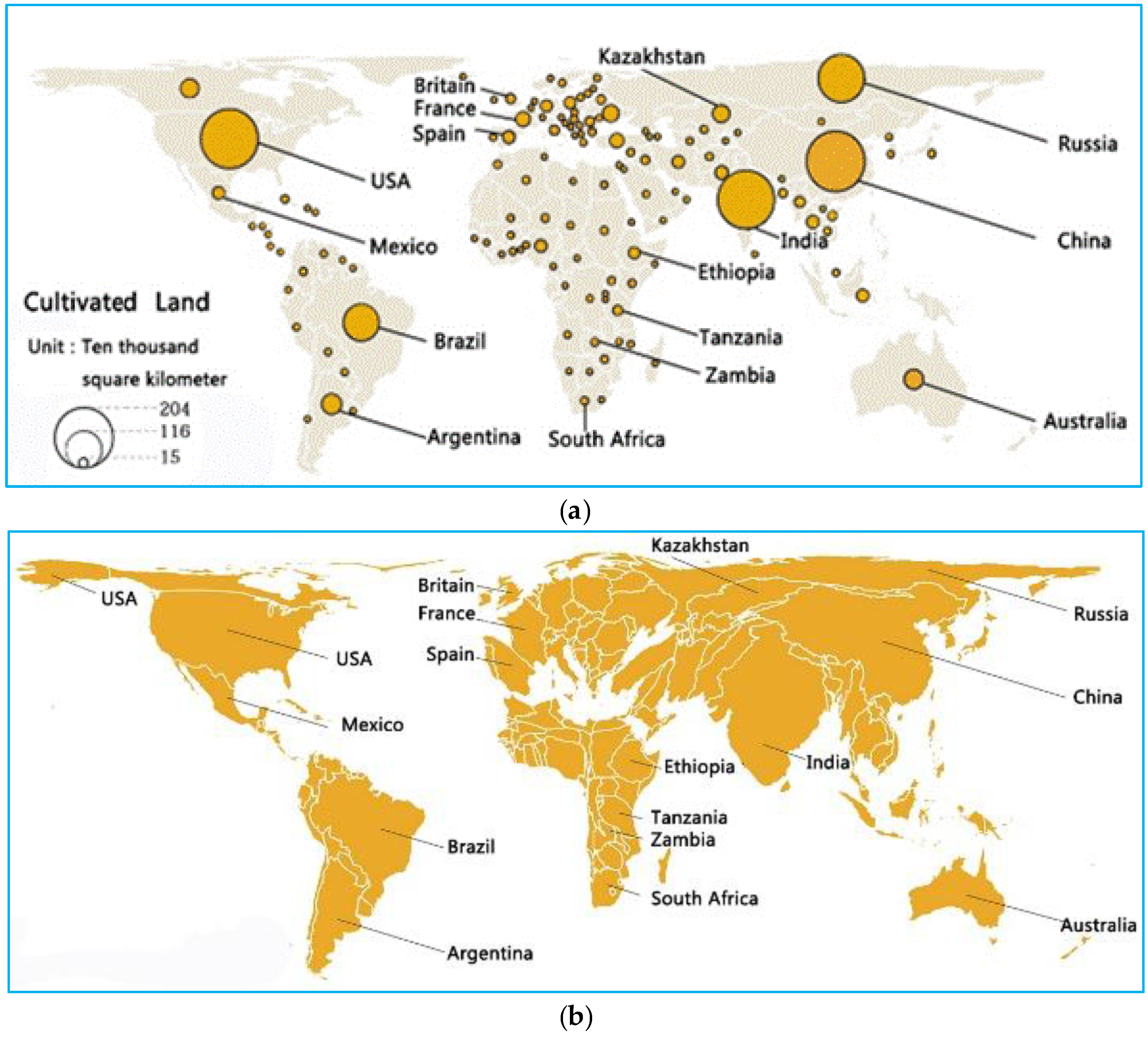
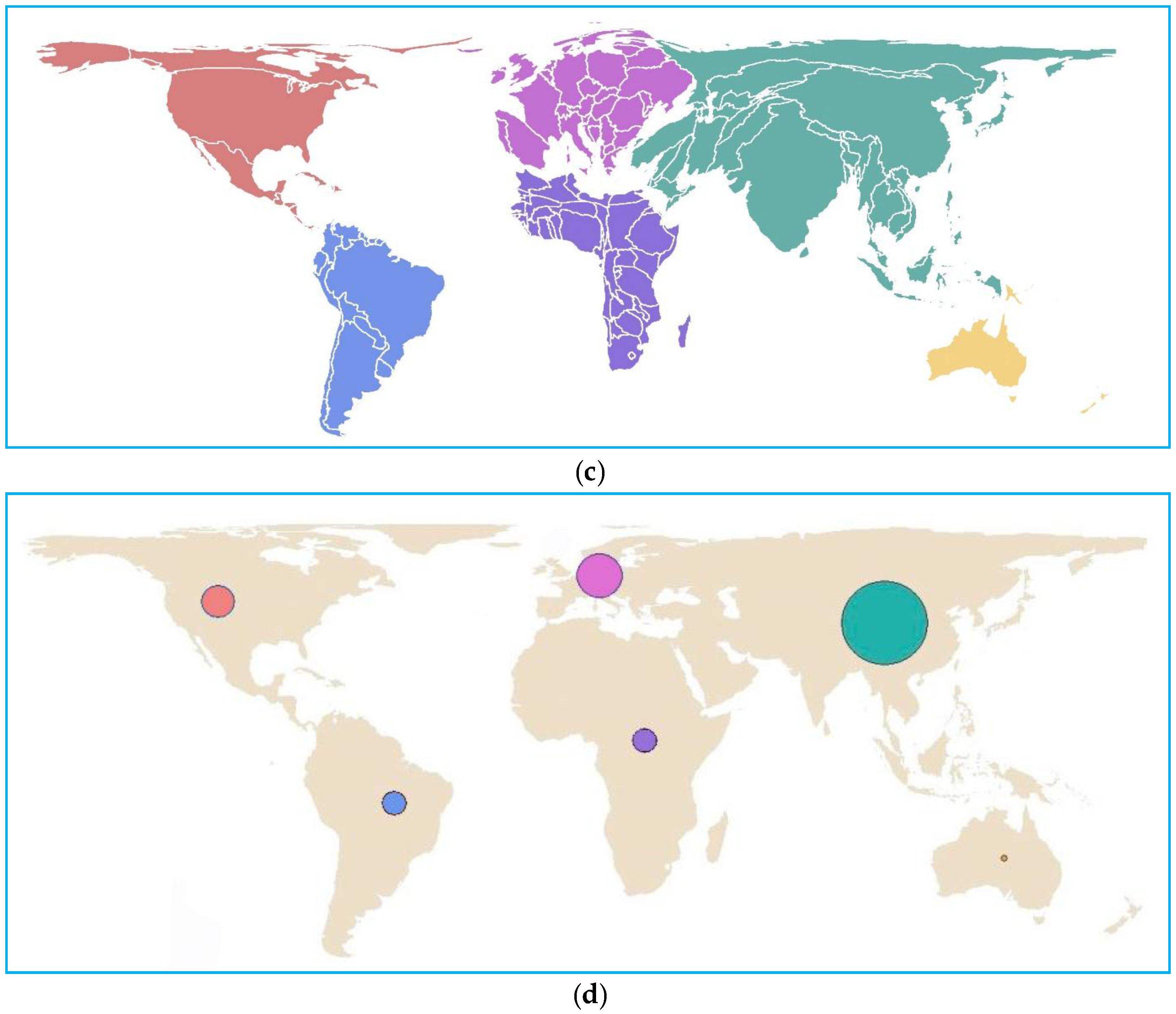
Figure 5.
Proportional maps and cartograms of cultivated lands used in this study: (a) proportional symbol map at country scale; (b) cartogram at country scale; (c) cartogram at continent scale; and (d) proportional symbol map at continent scale.
Figure 5.
Proportional maps and cartograms of cultivated lands used in this study: (a) proportional symbol map at country scale; (b) cartogram at country scale; (c) cartogram at continent scale; and (d) proportional symbol map at continent scale.


Figure 6.
Effectiveness of proportional symbol maps for the representation of GlobeLand30 data: equality or inequality of quantities.
Figure 6.
Effectiveness of proportional symbol maps for the representation of GlobeLand30 data: equality or inequality of quantities.

Figure 7.
Effectiveness of cartograms for the representation of GlobeLand30 data: equality or inequality of quantities.
Figure 7.
Effectiveness of cartograms for the representation of GlobeLand30 data: equality or inequality of quantities.

Figure 8.
Effectiveness of cartograms for the representation of GlobeLand30 data: area ratios.

Figure 9.
Statistical results of the comparison between proportional symbol maps and cartograms for accuracy in ranking continents.
Figure 9.
Statistical results of the comparison between proportional symbol maps and cartograms for accuracy in ranking continents.

Figure 10.
Cartograms of cultivated lands for three pairs of countries for the experiment, with equidistant (left) and equal-area projections (right).
Figure 10.
Cartograms of cultivated lands for three pairs of countries for the experiment, with equidistant (left) and equal-area projections (right).

Figure 11.
Cartograms for (a) artificial land; (b) grassland; (c) water; and (d) bare land, with equidistant (left) and equal-area projections (right).
Figure 11.
Cartograms for (a) artificial land; (b) grassland; (c) water; and (d) bare land, with equidistant (left) and equal-area projections (right).


Table 1.
Accuracy in the recognition of inequality in both proportional symbol maps and cartograms.
| Countries for Comparison | Actual Relations | Proportional Symbol Maps | Cartograms | ||||
|---|---|---|---|---|---|---|---|
| Correct | Incorrect | Unable | Correct | Incorrect | Unable | ||
| China vs. India | > | 52.38% | 0.00% | 47.62% | 90.48% | 0.00% | 9.52% |
| Australia vs. Kazakhstan | > | 76.19% | 0.00% | 23.81% | 52.38% | 9.52% | 38.10% |
| Mexico vs. South Africa | > | 80.95% | 0.00% | 19.05% | 80.95% | 4.76% | 14.29% |
| Australia vs. Spain | > | 100.0% | 0.00% | 0.00% | 95.24% | 4.76% | 0.00% |
| Argentina vs. Kazakhstan | > | 90.48% | 4.76% | 4.76% | 47.62% | 14.92% | 38.1% |
| Tanzania vs. Zambia | > | 100.0% | 0.00% | 0.00% | 90.48% | 4.76% | 4.76% |
| Argentina vs. Brazil | < | 90.48% | 0.00% | 9.52% | 95.24% | 0.00% | 4.76% |
| Russia vs. India | < | 100.0% | 0.00% | 0.00% | 38.1% | 19.5% | 42.86% |
| France vs. Zambia | > | 90.48% | 9.52% | 0.00% | 85.71% | 0.00% | 14.29% |
Table 2.
Accuracy in the recognition of ratio in both proportional symbol maps and cartograms.
| Regions for Comparison | Actual Ratio | Cartograms | Proportional Symbol Maps | ||||
|---|---|---|---|---|---|---|---|
| Range | Average | Deviation | Range | Average | Deviation | ||
| Kazakhstan vs. Spain | ≅1× | 1–3× | 1.76× | 76.00% | 1–3× | 1.72× | 72.00% |
| USA vs. Brazil | 1.7× | 1–5× | 1.59× | 6.47% | 1–6× | 2.25× | 32.35% |
| Europe vs. Africa | 1.7× | 1–2× | 1.65× | 11.76% | 2–6× | 3.91× | 130.0% |
| Asia vs. North America | 2.6× | 1–3× | 1.87× | 28.08% | 3–8× | 4.84× | 86.15% |
Table 3.
Accuracy for ranking cultivated lands of six continents in proportional symbol maps and cartograms.
Table 3.
Accuracy for ranking cultivated lands of six continents in proportional symbol maps and cartograms.
| Actual Ranking | 1 | 2 | 3 | 4 | 5 | 6 |
|---|---|---|---|---|---|---|
| Continent | Asia | Europe | North America | South America | Africa | Australia |
| Proportional symbol map | 100.00% | 57.14% | 66.67% | 61.90% | 47.62% | 90.48% |
| Cartogram | 100.00% | 71.43% | 76.19% | 76.19% | 71.43% | 100.00% |
Table 4.
Accuracy in the recognition of country size inequalities for maps with different projections.
Table 4.
Accuracy in the recognition of country size inequalities for maps with different projections.
| Actual Relationship | Equal-Area Projection | Equidistant Projection | |
|---|---|---|---|
| USA vs. Russia | > | 61.9% | 61.6% |
| Brazil vs. Canada | > | 90.2% | 33.3% |
| France vs. Mexico | < | 76.19% | 42.86% |
Table 5.
Accuracy of area size recognition with different map projections.
| Land Type | Country Pair | Equal-Area Projection | Equidistance Projection |
|---|---|---|---|
| Artificial Land | Poland vs. Japan | 61.9% | 71.43% |
| Britain vs. Turkey | 42.86% | 66.67% | |
| German vs. Mexico | 71.43% | 66.67% | |
| Grassland | Australia vs. Russia | 47.62% | 47.62% |
| Congo vs. Canada | 47.62% | 33.33% | |
| Central African Republic vs. Zambia | 71.43% | 47.62% | |
| Water | India vs. Congo | 47.62% | 66.67% |
| Mongolia vs. Zambia | 33.33% | 38.81% | |
| Turkmenistan vs. Mexico | 71.43% | 71.43% | |
| Bare Land | Niger vs. Iran | 42.86% | 14.29% |
| USA vs. Morocco | 90.48% | 76.19% | |
| Nigeria vs. Namibia | 66.67% | 42.86% |
© 2017 by the authors. Licensee MDPI, Basel, Switzerland. This article is an open access article distributed under the terms and conditions of the Creative Commons Attribution (CC BY) license (http://creativecommons.org/licenses/by/4.0/).
Share and Cite
MDPI and ACS Style
Han, R.; Li, Z.; Ti, P.; Xu, Z. Experimental Evaluation of the Usability of Cartogram for Representation of GlobeLand30 Data. ISPRS Int. J. Geo-Inf. 2017, 6, 180. https://0-doi-org.brum.beds.ac.uk/10.3390/ijgi6060180
AMA Style
Han R, Li Z, Ti P, Xu Z. Experimental Evaluation of the Usability of Cartogram for Representation of GlobeLand30 Data. ISPRS International Journal of Geo-Information. 2017; 6(6):180. https://0-doi-org.brum.beds.ac.uk/10.3390/ijgi6060180
Chicago/Turabian StyleHan, Rui, Zhilin Li, Peng Ti, and Zhu Xu. 2017. "Experimental Evaluation of the Usability of Cartogram for Representation of GlobeLand30 Data" ISPRS International Journal of Geo-Information 6, no. 6: 180. https://0-doi-org.brum.beds.ac.uk/10.3390/ijgi6060180
Note that from the first issue of 2016, this journal uses article numbers instead of page numbers. See further details here.