Crisis Maps—Observed Shortcomings and Recommendations for Improvement


Faculty of Geodesy, University of Zagreb, 10000 Zagreb, Croatia
*
Author to whom correspondence should be addressed.
ISPRS Int. J. Geo-Inf. 2018, 7(11), 436; https://0-doi-org.brum.beds.ac.uk/10.3390/ijgi7110436
Submission received: 21 September 2018
/
Revised: 27 October 2018
/
Accepted: 4 November 2018
/
Published: 7 November 2018
Abstract
:Cartographic communication through crisis maps takes place in a unique environment characterised by the immediate risks of considerable loss and stress. Many such maps are designed by practitioners with limited resources, pressured for time, and who often fail to pay the necessary attention to map graphics. This can reduce map clarity and make orientation to and understanding of essential crisis information difficult. To identify the most frequent shortcomings that may compromise the interpretation of depicted objects, phenomena presented, and actions required, we assessed the map graphics of 106 maps specifically designed for communication and action in crises. The results showed that they were often visually overloaded. Crisis data were not conveyed by appropriate cartographic representations, and due to the inappropriate use of visual variables, the associative and selective properties of cartographic symbols were overlooked, and their ordered and quantitative features ignored. The use of colour was often not adapted to conventional visual language, and colour symbolism was not always taken into account. The cartographic symbols used were often incomprehensible, illegible, ambiguous, and unclassified, and they lacked symbolism and hierarchical organisation. The article aims to address these problems by proposing guidelines which do not require much time or expertise, but which would ensure that cartographically correct crisis maps are well designed. Objects, phenomena or actions specific to crisis management would be indicated using appropriate map graphics and their importance highlighted, so as to make interpretation easier for all participants in a crisis event, and so facilitate crisis communication and response.
1. Introduction
There is a strong awareness in the crisis management community of the important role of maps in communicating spatial, thematic, and temporal information about a crisis. With the availability of technology for the easy and quick design of data-intensive maps, the number of maps designed to support decision-making in crisis management has grown considerably in recent decades [1,2].
The role of cartography is to deliver reliable, understandable, attractive, user-friendly, visual information through maps. When a crisis occurs, crisis maps are communication tools for all those involved. The messages exchanged via crisis maps play an important role in crisis management (for example, finding where shelters are located, how to reach a place where the injured can receive assistance, how to act, how the evacuation is proceeding, etc.). They can be used by the internal (emergency) services and/or external participants in a crisis event (civilians and casualties), directing responses and mitigating consequences. Emergency service personnel and their managers must know how to use crisis maps, which must be specially adapted for use in a unique environment characterised by the immediate risks of considerable loss and stress, and where time is of the essence. Cartographers must propose methods (new or existing) for communicating spatial information on crisis maps effectively so that it can be interpreted easily and correctly.
Although the latest research into crisis management has mostly covered the technological aspects of improving efficiency and strengthening crisis response capacity [3,4,5,6,7], there is still a need for multidisciplinary engagement of researchers and practitioners in representing crises effectively [8]. The problem of cartographic representations which fail to communicate in times of crisis was recognised after tragedies such as the terrorist attacks on 11 September 2001 in the USA, the Christmas tsunami in Indonesia, Thailand, Sri Lanka and India in 2004, and Hurricane Katrina in the USA in 2005. Immediately after these events, problems were identified, such as the lack of cartographic symbols for communication in crisis situations, and visually overloaded maps which reduced legibility and made orientation and understanding essential crisis information difficult [9,10].
As a result, research has aimed at finding adequate methods for depicting objects and phenomena, specially adjusted to specific tasks and requirements at the technical, social, semantic, and cognitive levels [11,12,13,14,15,16], and for analysing and evaluating their success among users [17,18]. Cartography can be used successfully in crisis management. The existing cartographic work has produced good examples, but they are often focused on a single natural process (for example, a flood [12,17] or a volcano [13]), one element of map graphics (for example, cartographic symbols [10], colour use [17] or a background map [15]), or a specific geographic area. The commonest types are danger maps and vulnerability assessment maps. They are used before a crisis occurs, and their primary role is to assist visualisation of the potential problems.
In this research, we concentrated on maps during or immediately after a crisis event—maps whose primary role is to facilitate communication (for further discussion on the role of maps in crisis management, see Reference [19]). The maps depicted floods, earthquakes, storms, fires, tsunamis, and other natural disasters, and technological and humanitarian crises, while the assessment covered all the integral graphic elements.
Map graphics include basic geometric and graphic elements (point, line, and area), and cartographic symbols primarily used to depict the position and quality of objects [20]. They also include rasters, which are often used as background maps, colours as independent elements, and letters to describe and name objects.
To begin with, we identified the most frequent mistakes that hinder the effective communication of spatial, thematic, and temporal information about a crisis. We set the requirements for three basic elements—the background map, basic geometric, and graphic elements (i.e., cartographic symbols) and colour use. Then we assessed the map graphics used on 106 actual crisis maps.
The outcome is a set of potential guidelines which (1) do not require much time, expertise or effort, and (2) do not depend on the map medium. The guidelines can be used to design cartographically correct crisis maps in which objects, phenomena or actions specific to crisis management are emphasised by using appropriate map graphics and their importance highlighted. This could ensure that (1) all participants in a crisis event can interpret the information shown on the map easily and correctly, and (2) facilitate crisis communication and response.
2. Material and Methods
In this paper, a crisis map means a thematic map on which objects, phenomena or actions specific to crisis management are highlighted using appropriate cartographic symbols, and represented according to their importance. They are usually produced and used during or immediately following a crisis by the internal (emergency) services and/or external participants (civilians or casualties).
We collected 106 maps depicting different crises in various parts of the world. They were published online, in press articles, studies, and research papers. Five maps were analogue (paper) and the rest digital. Most of the digital maps (50) were static, with a view-only option, and many were actually analogue maps that had simply been digitalised and published online. The other maps had interactive interfaces or content, with the options of zooming and/or choosing specific layers. One dynamic, interactive map was also found.
The selection was not limited to crisis maps designed and used during or immediately after a crisis, but also included some designed in the phase when crisis response action plans were being developed (evacuation maps, maps showing the locations of shelters, supplies, equipment, etc.). Along with real event maps, we also considered maps intended for exercises and training by crisis management services, based on potential or imaginary scenarios.
The main selection criterion was that the maps had to communicate certain predetermined messages as important sources of information for all participants in crisis management (for example, the location of shelters, how to reach places where the injured could receive assistance, how to act, evacuation routes, etc.).
The analysis included a quantitative assessment of the basic map elements (type of crisis, map scale, basic geometric, and graphic elements), and a qualitative assessment of the graphic and visual variables used to depict objects and phenomena specific to the crisis, how they were symbolised and classified, and the types of background maps used to represent them.
The maps were numbered 1 to 106 (see Supplementary Materials, Figure S1: Excerpts of the crisis maps analysed). The results of the quantitative assessment are given for each map (see Supplementary Materials, Table S1: Results of the assessment of map graphics on existing crisis maps). The maps were divided by crisis type as follows:
- Natural crises—disasters or accidents caused by natural phenomena which endanger life, property and/or the environment (for example, earthquakes, volcanic eruptions, tornadoes, hurricanes, floods, landslides, tsunamis, and storms, etc.)
- Crises caused by technology or human interference—technological incidents which by their scope, intensity and unpredictability endanger human health and life, property and/or the environment (for example, uncontrolled releases of hazardous substances, fires and explosions in industrial facilities, etc.)
- Humanitarian crises—incidents or series of incidents threatening the health, safety, and well-being of a community or large group of people, caused by nature or human intervention (for example, armed conflicts, epidemics, famine, etc.).
Some crises are not necessarily connected with a geographical area (for example, economic, financial or individual crises) so that representing them on maps makes little sense. The research conducted in this paper primarily refers to crises which always have a strong spatial association.
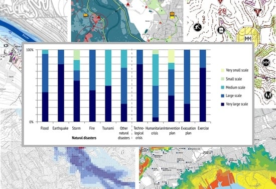
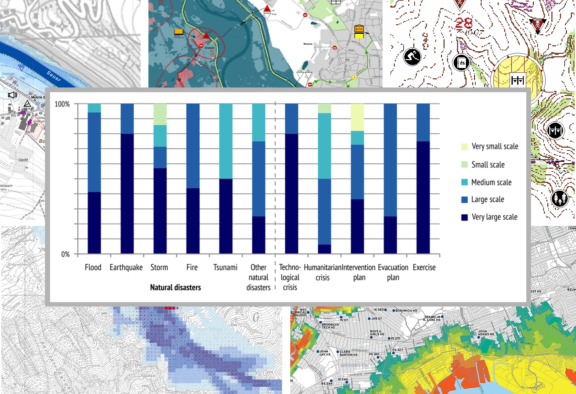
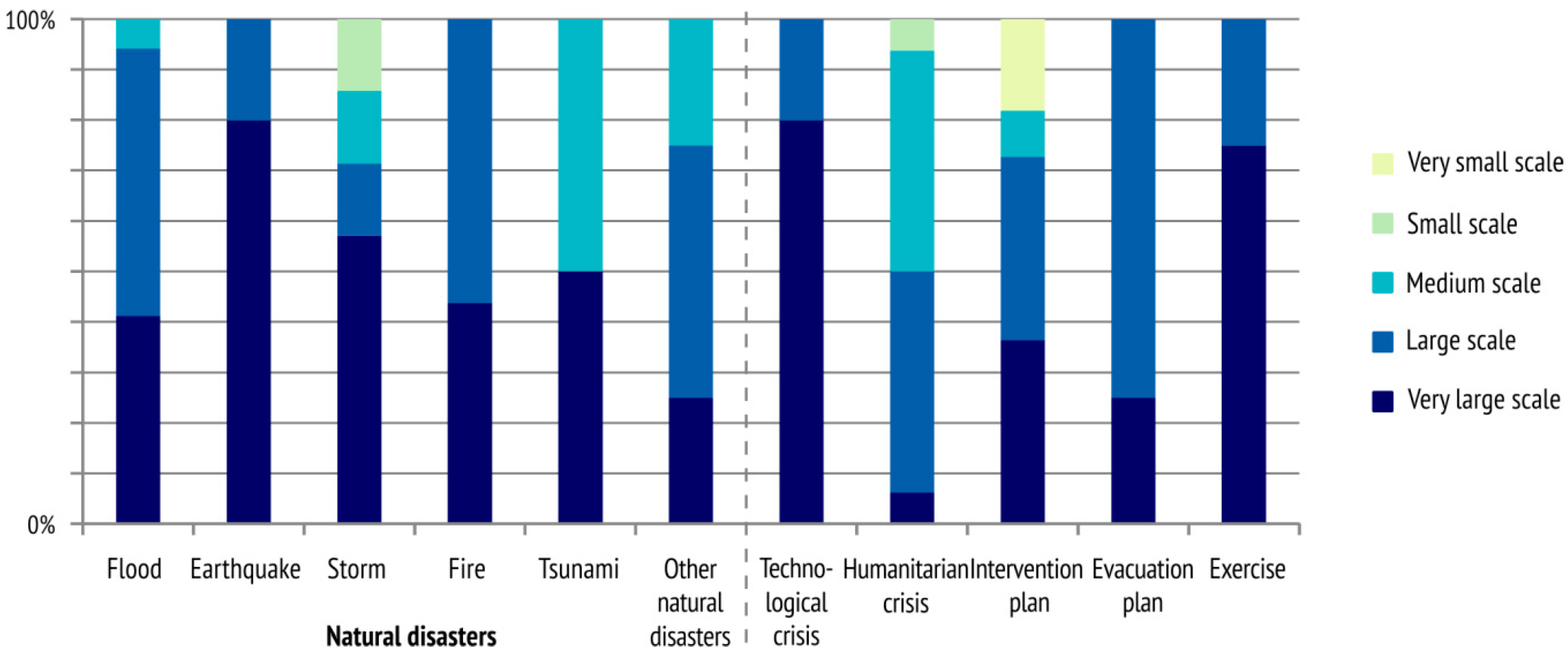
The numerical overview of the maps analysed by crisis type is given in Figure 1. Since most depicted natural disasters, they were further divided into subgroups. It is interesting to note that these maps, arranged by crisis type, correspond to data at the global level showing that floods and devastating storms are the most frequent natural disasters that strike developed countries [21]. So it is no wonder that the greatest number of maps were designed for these types of crisis.
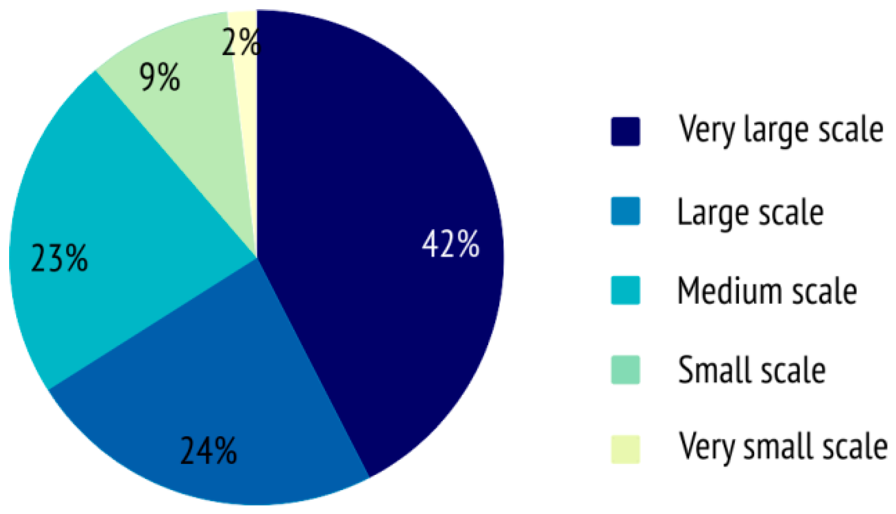
The maps were divided according to scale into five basic groups: very large-scale maps (scales larger than 1:5000), large-scale maps (from 1:5000 to 1:25,000), medium-scale maps (from 1:25,000 to 1:300,000), small-scale maps (from 1:300,000 to 1:15,000,000), and very small-scale maps (scales smaller than 1:15,000,000) (Figure 2). We based this classification on the fact that the maps represented either distinct places, such as towns, larger regions, countries or the whole world.
It was impossible to determine the exact numerical scale on some maps, so an approximate value was given. This mainly related to map excerpts published in technical and scientific publications or excerpts of cartographic representations obtained from geoinformation systems. Interactive maps with a zoom option were included among very large-scale maps if the zoom level enabled streets to be shown.
Since crises can take on different spatial dimensions, the map scale naturally depends primarily on the type of the crisis depicted. For example, natural disasters like earthquakes, tsunamis and storms usually affect a large area, which is why they are represented on small-scale crisis maps. Other natural processes, such as landslides and avalanches, often affect a smaller area, so they are depicted on larger-scale maps.
However, in Figure 3 it can be seen that there is no such connection between map scale and crisis type. This is because the map scale also largely depends on the intended role of the map. In crisis management, dividing maps into different scale groups can also be viewed according to their roles [19].
If the role of the map is to provide general information on a risk or danger, it usually shows the territory of a state, wider area, or even the whole world. This is why such maps are designed on a small scale. If the map shows information used to implement preventive measures in response to dangers that may be caused by a potential crisis, or when a damage assessment map is produced to show an affected area, these are usually done at the national or local level on a medium or large scale. If crisis map is used as a basis for carrying out crisis management actions in the preparedness phase, such as planning defence and protection measures, the scale may vary depending on the type of crisis and the size of the potentially endangered area, but is usually a large scale.
During or immediately after a crisis, when the main role of the map is to ensure communication among those responsible for crisis response, maps should be as detailed as possible on a very large scale.
2.1. Criteria for Assessing Map Graphics on Existing Crisis Maps
Map graphics are a special way of representing spatial objects on a map. They are a sign system consisting of cartographic symbols and their interrelationships (syntactic dimension), the relationships between the symbols and the objects represented (semantic dimension), and the relationships between the users and the symbols (pragmatic dimension) [22,23]. The integral components of map graphics are basic geometric and graphic elements (points, lines, and areas), cartographic symbols (symbols and diagrams), rasters, colours and letters. On crisis maps, objects, phenomena or actions specific to crisis management should be emphasised by using appropriate map graphics and given special importance.
We divided the set requirements into three map graphics elements which are found on all crisis maps—the background map, basic geometric and graphic elements (points, lines, and areas), that is, cartographic symbols, and the use of colour. The use of letters on crisis maps was not covered.
The criteria for assessing how each requirement was fulfilled ranged in complexity, depending on the relevant map graphics elements.
2.1.1. Background Map
The background map in our assessment refers to the basis for designing and using the main content of the crisis map, that is, the spatial background on which objects and actions important for crisis communication and response are represented. It is also used for general orientation and the localisation of crisis-affected areas.
Since many crisis maps today are created by the automatic layering of data from different sources over a background map, this assessment covered the visual harmonisation of the background map and the thematic data presented on the crisis. The following elements were assessed:
- Optimal visual load, which requires removal of the map overload and makes it easy to read and understand the content of the map,
- Layering, which requires that thematic information on a crisis is emphasised and prominent, while details on the background map are relegated to the background,
- Adjustability of the background map, which requires the option of selecting different map layers, adjustable zooming, setting the contrast of the background map or the transparency of thematic information, and so on.
2.1.2. Basic Geometric and Graphic Elements (Point, Line, and Area)
Bertin’s definition of graphic variations in the properties of the basic graphic elements of a map (point, line, area) [22] was taken as a basis for analysing the representation of objects and actions specific to crisis response. Visual or graphic variables in cartographic design are means of controlling the symbology or visual appearance of map elements. These visual techniques form the building blocks of a map and can be used to convey precise geographic information and create a visual hierarchy that can be understood by the viewer.
Each visual variable can be used when designing appropriate cartographic symbols to show the position and quality of a discrete object, or to present information on its properties. However, each visual variable has specific properties and is better for transcribing one aspect of information than others [24]. By using graphic variations or reshaping individual points, lines, and areas, a special symbol can be created to best express the desired property of an object on a crisis map.
On the maps, we assessed the use of visual variables. A variable was assessed on the map if it was used to depict thematic content about a crisis event. We also considered the varying of the visual variables to achieve certain qualitative (associativity and selectivity), ordered or quantitative properties in representing objects and actions for crisis response.
A visual variable may be:
- Associative, if by applying it we can associate the symbols derived and consider them equal in meaning or value.
- Selective, if the symbols derived can be spontaneously divided into different families or groups,
- Ordered, if the symbols of individual families can be ordered unambiguously,
- Quantitative, if by applying it the symbols derived can be considered mutually proportional.
Bertin [22] originally identified seven visual variables that can be manipulated to encode information: location, size, shape, orientation, colour hue, colour value, and texture. This initial set was later extended to include two variables used in cartographic design (colour saturation and arrangement) and three which are easier to manipulate through digital production methods (crispness, resolution, and transparency) [25]. A more detailed discussion of the history of visual variables with descriptions of those available can be found in References [24,25,26].
In this assessment, we only considered visual variables found on at least one of the analysed maps. They were size, shape, orientation, colour hue, colour value, texture, colour saturation, and transparency. Below are short descriptions of the individual variables (for more detailed descriptions see Reference [24]).
- Size is the amount of space occupied by the map symbol [24].The number of ordered and quantitative degrees in point and line implementation can be high if size variation is applied, but the number of selective degrees is still very limited. Generally speaking, only four or five symbols of varying sizes in the same family can be applied and clearly distinguished in cartographic depictions [20]. For example, if circles with gradually increasing diameters are to be distinguished on cartographic depictions (where they are not ordered), there must be a difference of at least 0.4 mm in their diameters. For a selective cartographic depiction of linear objects, the difference in the thickness of the lines must be at least 0.3 mm [23].
- Shape is the external form (outline) [24].Shape is essential to the design of qualitative point symbols because they can vary from highly abstract, such as circles, squares, or triangles, to highly iconic, directly mimicking the referent represented by the map symbol. Varying shapes, thus, producing symbols with the same optic weight, is associative. This means that all symbols are equal or equal in value according to their significance. A family of selective symbols cannot be obtained by varying shapes, because it would produce symbols with new, different shapes.
- Orientation is the direction or rotation of the map symbol from ‘normal’.Normal orientation is typically relative to the map’s neatline, but in some cases, it can be relative to the projected spatial coordinate system (for example, relative to the graticule) or another baseline. Orientation is also manipulated in flow maps to represent the direction of flow [24]. Orientation differences are easily discerned, and, thus effective in representing selective information. Orientation is less suitable for quantitative information, as it generally lacks an inherent order, and no single direction is emphasized over another.
- Colour hue is the dominant wavelength of the map symbol on the visible portion of the electromagnetic spectrum (for example, blue, green, or red) and is one of three visual variables associated with colour perception [24].Colour theory plays an important role in cartography [27,28] and is particularly relevant in thematic maps that use colours to designate categories or classes. A qualitative or spectral colour scheme manipulates colour hue while controlling the other components of colour. So a colour scale is selective and associative, but not ordered, as equal weight is attached to all colours. It cannot, therefore, be used to depict different quantities. A colour scale of the same intensities may, however, be applied successfully to the selective highlighting of equal value surface objects.
- Colour value is the relative amount of energy emitted or reflected by the map symbol and is the second visual variable associated with colour perception [24].Variation in colour value results in the perception of shading or areas of relative light or dark (high or low emission or reflectance of energy). Colour value is sometimes referred to as ‘lightness’ in colour theory. Variation in colour value is important for map symbols depicting ordering.
- Texture is the coarseness of the fill pattern within the map symbol [24].If we use photography to reduce or increase a field in a graphic with a uniform pattern, but still observe the same unit surface, we can speak of varying the size of the pattern. Texture is mainly used to depict the quantitative properties of areal symbols—the denser the texture, the higher the value.
- Colour saturation is the spectral peakedness of the map symbol across the visible spectrum and is the third visual variable associated with colour perception [24].From a design standpoint, colour value can be conceptualized as the amount of black, and colour saturation the amount of grey in a map symbol. Colour saturation also is referred to as ‘chroma’, ‘intensity’, and ‘purity’ in colour theory. Quantitative relations between objects of the same type can be differentiated by varying the colour saturation. Smaller values are associated with less saturated colours, adding white, while higher values are associated with more saturated colours, adding black.
- Transparency is the amount of graphic blending between a map symbol and the background or underlying map symbols [24].Varying transparency can be used to display quantitative distinctions or differences in importance or intensity [18].
2.1.3. Colour
Colour has a special place in cartography. On crisis maps, colour is contained in or associated with all the elements mentioned (background map, point, line, and area).
There are three features of colour perception: hue, value, and saturation, which are explained in Section 2.1.2. When colour is used appropriately, the organization of the perceptual dimensions of colour corresponds to the logical ordering in the data. Advice on suitable colour schemes that are attractive, support the message of the map and are appropriately matched to the nature of data can be found in Reference [29].
In addition, some objects and phenomena are often associated emotionally with certain colours. Blue is associated with water or cold, and red with heat or prohibition. In general, colours are perceived as active, passive, stimulatory, neutral, etc. This psychological aspect is often called colour symbolism. It has led to internationally accepted rules about the application of colour or conventional visual language.
The following was assessed:
- Colour symbolism, which requires the use of conventional visual language to represent objects and actions specific to crisis response
- Varying of colour value, hue and saturation, which are required to demonstrate the quantitative or selective properties of thematic information on the crisis, assessed through visual variables (see Section 2.1.2).
2.2. Assessment of Map Graphics on Existing Crisis Maps
The assessment of the collected maps draws on content analysis, a systematic approach already used in cartographic research to analyse and compare maps [30,31,32]. The content analysis method relies on identifying a set of codes which serve as operational rules that specify the definitions and intensities of different components in the maps being analysed. Ideally, using codes ensures that each map is systematically evaluated and analysed in the exact same way so that the results can be compared. It also allows for additional analysis by other researchers in the future.
Based on the defined elements of map graphics and general requirements for implementing them, an assessment of the map graphics on 106 crisis maps was carried out. A table was compiled (see Table S1 under Supplementary Materials). For the sake of repeatability, in Table S1 we have also provided codes and definitions. The codes used are considered standard cartographic variables and can be found throughout the literature [22,23,24,25,26,33]. So the results of this study can be framed within established cartographic theory.
Each map was coded for the type of the crisis depicted: flood, earthquake, storm, fire, tsunami, other natural disaster, technological crisis, humanitarian crisis, intervention plan, evacuation plan, and exercise. The map scale was determined either via a scale bar, numerical scale, or ratio (or two or more of these methods) and coded as very large-scale, large-scale, medium-scale, small-scale or very small-scale. The type of background map was coded as satellite and aerial imagery, topographic map, relief map, city map, informative map. It was also noted whether possibilities for adjusting the background map and thematic content on the crisis were included.
The maps were also coded for a variety of graphic and visual elements. If, when viewing the map, it was easy to separate the layers into the main layer and the secondary one or the background, the map was coded for optimal layering. This meant that the main content, that is information on the crisis, was emphasized and the details on the background map were relegated to the background.
The map was coded for optimal visual load if there were fewer than ten identical or similar elements per square centimetre [23]. However, since this varied according to the area presented, on most maps the visual load was subjectively estimated. Estimation is an approximation of a quantity or geometric value instead of an exact measurement [23]. Phrases such as ‘overcrowded‘, ‘stuffed’, dark’, ‘over-detailed’ and similar should be understood as spontaneous negative assessments of visual load.
A geometric–graphical element (point, line, or area) was included only if used to depict thematic content about a crisis event. In addition to coding the geometric-graphical elements, we also noted varying of visual variables (size, shape, orientation, colour hue, colour value, texture, colour saturation, and transparency) to achieve certain qualitative (associativity and selectivity), ordered or quantitative properties in representing objects and actions for crisis response. In addition, if the use of conventional visual language was noted, the maps were coded for symbolism.
Wherever possible, elements that met the set requirements were marked with a plus sign (+), while elements that failed to meet the requirements were marked with a minus sign (−). If an element of map graphics given in the table was not used on a map, or was not assessed for some other reason, it was marked zero (0). For example, there is no point in varying the size of area symbols on crisis maps because this changes their position. In exceptions or special cases, ‘partly‘ indicated that the criteria were only partly met. The signs (A), (S), (O), and (Q) were added to the plus sign (+) if associative (A), selective (S), ordered (O) or quantitative (Q) properties in designing suitable cartographic symbols were achieved by varying particular visual variable.
3. Results of the Assessment of Existing Crisis Maps—Shortcomings and Recommendations for Improvement
The assessment results are given in Table S1 under Supplementary Materials, while the elements for which shortcomings were most frequently observed are given in the subheadings below. These shortcomings may compromise the interpretation of objects and phenomena represented on a map and affect cartographic communication during a crisis. Cartographically correct recommendations were given to improve each element.
3.1. Background Map
We divided background maps into the following groups:
- Satellite and aerial imagery—orthorectified photographs of part of the Earth’s surface taken from an aircraft or a satellite.
- Topographic maps—general geographic maps with plenty of information on local conditions, including settlements, roads, bodies of water, landforms, vegetation, and territorial boundaries. All these objects are represented with equal importance.
- Relief maps—maps of landforms depicted by shading or using a hypsometric scale to create an impression of heights and height differences.
- City maps—large-scale maps of settlements designed for orientation, highlighting streets and street names, city transport routes, and major buildings, sometimes differentiated by purpose.
- Informative maps—maps containing specific information (for example, roads, bodies of water, administrative boundaries, etc.). These are often designed quickly, without paying much attention to aesthetics or completeness. Objects are depicted by simple graphic elements.
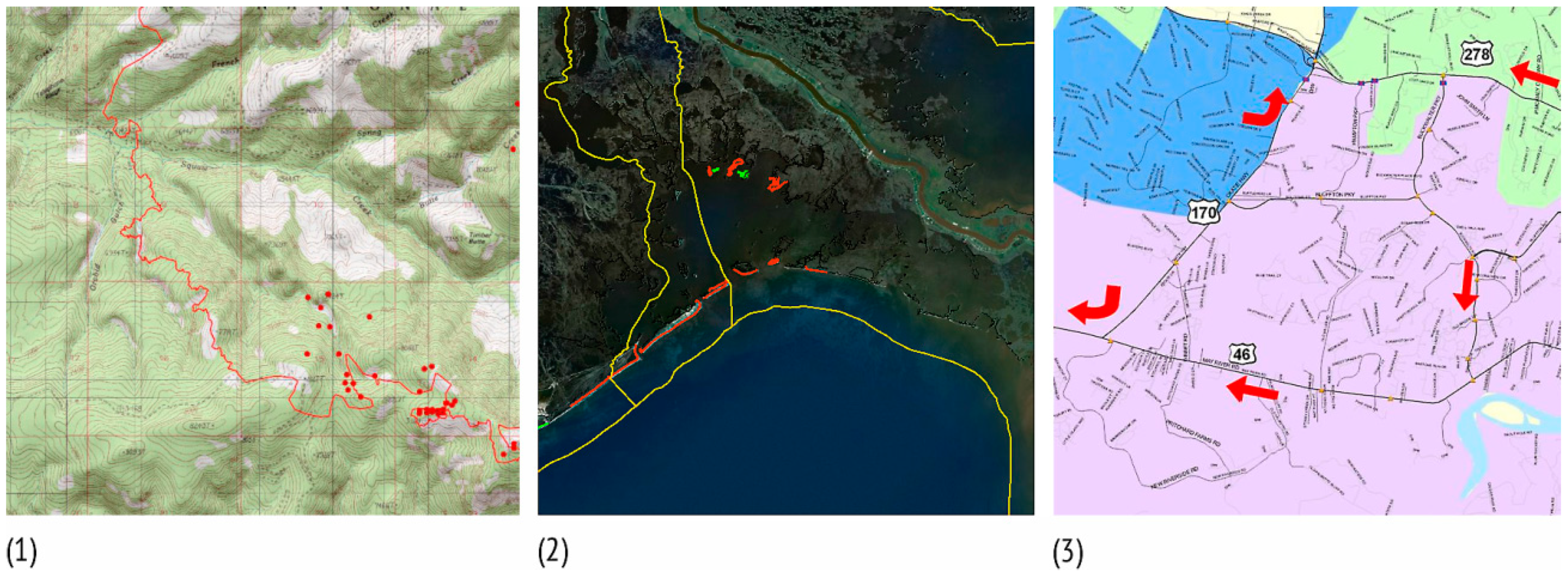
Figure 4 shows different background maps for the representation of cartographic symbols in crisis communication. We only included backgrounds found in at least one of the maps assessed.
3.1.1. Background Map—Shortcomings
The following shortcomings were observed. (1) The background map and thematic data on a crisis were often not visually harmonised. (2) The contrast between the background map and thematic content was not optimal; the background map was dominant. (3) Thematic data on a crisis were often insufficiently conspicuous or under emphasised, and the background map was not actually in the background. (4) The adjustability of the background map through digital mapping and geoinformation systems was not recognised.
3.1.2. Background Map—Recommendations for Improvement
(1) The background map must be clear and visually harmonised with thematic data on the crisis. The primary aim is to ensure quick, easy orientation and a clear understanding of the essential information on the crisis.
(2) Visual contrast is a fundamental principle in cartographic design to highlight foreground elements on maps. In this paper contrast is considered as the perceptual comparison of one portion of a visual image to another; the greater the difference, the stronger the contrast. On background maps containing a large amount of information, such as aerial photographs and topographic maps, contrast should be adjusted so that it is obvious that the thematic data presented are the primary content of the map.
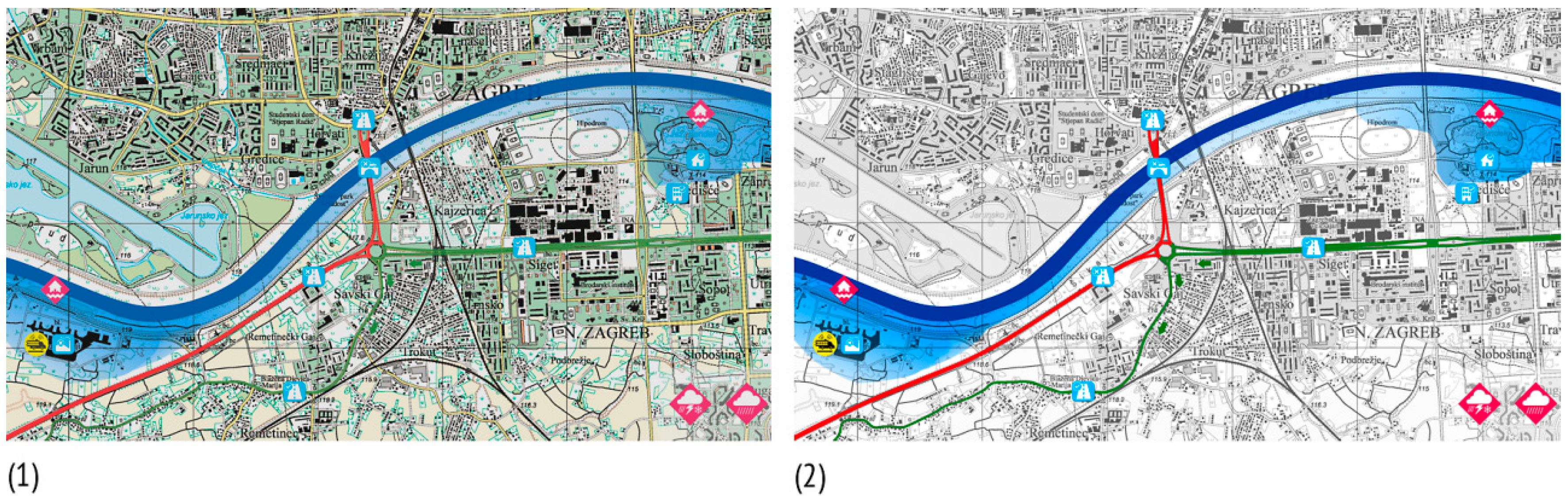
Therefore, background map elements must be graphically subordinate to thematic data on the crisis. Saturated and bright colours, and distinct and dominant graphic elements are reserved for cartographic symbols that convey information on the crisis. We considered that the contrast between the background map and thematic content was sufficient if the relationship between the elements was clear, so that it was immediately obvious which was more important (Figure 5). A quantitative measure for colour contrast to be calculated between any map object and its background is discussed in Reference [34].
(3) When optimal contrast between the background map and thematic content is achieved, a prerequisite is that optimal layering is also achieved [22,23,25]. This means that the main content, that is, information on the crisis, should be emphasised by using appropriate means of cartographic representation.
Details on the background map should be relegated to the background, for example by using smaller, less contrasting symbols, paler colours, and smaller letters. When an existing topographic map representing the entire content is used as a background map, this can be done in one colour, preferably grey or brown (Figure 5). The background map must not make it difficult to show the primary layer (information on the crisis). This can enhance clarity and prevent the monotony of viewing a map on which map graphics are not contrasted and layered.
If the layering criterion is satisfied, the user automatically separates the layers into the main and secondary ones. This is a basic characteristic of visual perception and is not a conscious operation [25].
(4) Digital mapping and geoinformation systems, combined with widely available vector and raster databases, offer various means of adjusting the background map and thematic content (selecting different map layers, individual symbolisation of data, combining different types of background maps, and adjusting the degree of contrast of the background map or the transparency of the thematic information). If zooming is possible, the adjustable zoom option should be used to set different maps (raster or vector) as a background, taking into account the default map zoom setting.
The accuracy of the background map should also be considered, along with the fact that the content and graphic features of the background map depend on the scale and purpose of the crisis map and on available resources.
3.2. Basic Geometric and Graphic Elements and Visual Variables
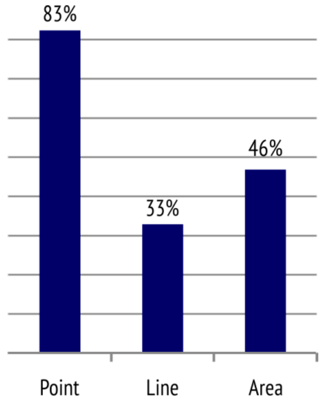
Our analysis first addressed the extent to which individual geometric and graphic elements were used to represent objects, phenomena and actions specific to crisis management (see Table S1 under Supplementary Materials). A numerical overview of point, line, and area symbols is given in Figure 6. The graph shows that the percentage of cartographic point symbols was almost twice that of line or area symbols.
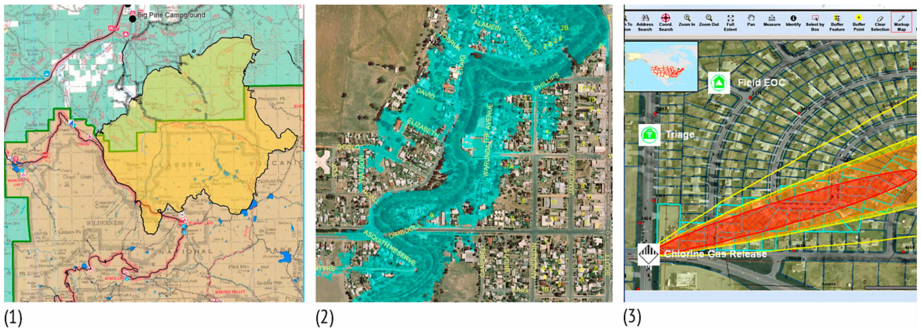
Area symbols are created by filling areas with repeated uniform or non-uniform graphic symbols. They show the qualities of discrete area objects, while quantities can also be depicted by using a grey or chromatic colour scale [33].
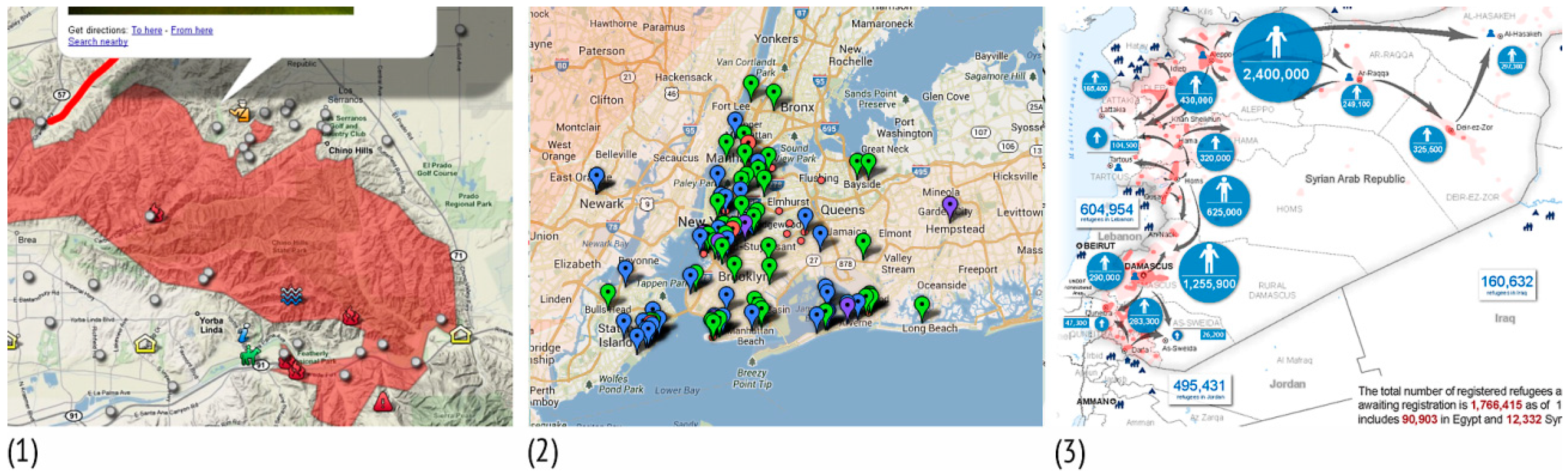
The area symbols assessed usually represented areas affected by a crisis (for example, a flooded area, wildfire-burned area, or area affected by a hazardous gas leak), and danger zones (Figure 7).
The most frequently used methods to represent the properties of a certain area symbol were varying the colour hue (ten times), colour value (eight times), and filling the area with a texture (seven times), while colour saturation was recorded on five maps.
Line symbols are created by adding additional symbols to the line (for example, arrows) or by reshaping them as a series of small pictorial or geometric symbols (for example, a dotted line).
Line symbols were used to represent fire front progression or an oil spill at sea, and to mark evacuation routes or priority roads and routes used during a crisis (Figure 8).
Colour hue variation was used six times to emphasise the classification of objects represented (for example, closed roads were marked in red and open ones in green).
Orientation variation was observed on ten maps, where lines were converted to arrows to indicate movement and recommended routes for population evacuation.
Size variation, that is, varying the thickness (width) of a line, was not used on any of the maps analysed, although it can be used to shape line symbols to represent the qualitative, ordered (hierarchical), and quantitative properties of objects (for example, to differentiate between main, regional and local roads recommended for use during a crisis).
Point symbols provide information on the position and quality of objects that cannot be credibly represented in ground-plan view.
The visual variable most frequently used was shape variation, whereby point objects can be given countless different shapes without changing their position. Generally, the largest number of point symbols used on maps are created in this way.
Graphic or pictorial symbols (pictograms) created by simplifying the essential external or symbolic characteristics of discrete objects, were used most to represent objects, phenomena, and actions specific to crisis management (on 46 maps—numbered 3, 5, 6, 7, 15, 18, 19, 20, 21, 22, 23, 25, 26, 28, 31, 32, 35, 37, 41, 42, 44, 45, 46, 47, 56, 57, 68, 72, 74, 78, 80, 81, 82, 83, 86, 87, 88, 89, 90, 91, 92, 93, 94, 97, 98, and 99 in Figure S1). The use of geometric symbols derived from basic geometric figures was observed on one crisis map (map 46 in Figure S1), where data important to military operations were added to the topographic map with the aid of geometric symbols. Alphanumeric symbols were used on fourteen maps (numbered 14, 25, 27, 36, 44, 54, 55, 58, 66, 71, 79, 94, 97, and 99 in Figure S1), pinpoints were used on ten maps (numbered 2, 8, 15, 33, 34, 66, 73, 76, 80, and 84 in Figure S1), while on five maps (numbered 4, 33, 48, 52, and 53 in Figure S1) a crisis event was marked by point symbols. Figure 9 singles out three maps which show different examples of point symbols used to represent objects, phenomena, and actions specific to crisis communication.
The greatest, most common shortcoming identified concerned the use of appropriate, clear cartographic symbols to represent objects, phenomena, and actions specific to crisis communication and response. The symbols used were incomprehensible, illegible, ambiguous, unclassified, and cluttered, and they lacked symbolism, hierarchical organisation, and other important characteristics.
Designing simple, clear, aesthetically pleasing cartographic symbols that can be understood by a wide circle of crisis map users is a complex, time-consuming task and is not the subject of this paper. However, since a consistent cartographic symbol system has been recognised as ‘the missing ingredient for crisis mapping’ [9], we believe that standardised, widely accepted cartographic symbols could improve communications and understanding key information during crises.
The shortcomings observed and problems resulting from applying inappropriate visual variables, with recommendations for the use of variables to ensure the optimal representation of the properties of objects, are given below.
3.2.1. Basic Geometric and Graphic Elements and Visual Variables—Shortcomings
We found that the use of visual variables on the crisis maps was underestimated, so in many cases, optimal representation of the objects shown was not achieved. The visual variables used (1) did not achieve the associative and selective properties of cartographic symbols; (2) did not emphasise their ordered properties; (3) did not emphasise certain quantitative properties; (4) failed to group the objects represented into classes, and (5) failed to represent movement.
3.2.2. Basic Geometric and Graphic Elements and Visual Variables—Recommendations for Improvement
(1) Shape variation was usually used to differentiate between individual symbols. However, a family of selective symbols cannot be derived using this variable, because the symbols for all objects in the same family must have the same basic shape. On crisis maps, it is important to distinguish, for example, infrastructure symbols from intervention symbols, which is why a selective visual variable should be applied.
A visual variable is selective if the cartographic symbols derived (which belong to one family) can be considered mutually different [22,24]. On crisis maps, this can be achieved if the symbols are created by varying size (for example, circles with different diameters), colour value (for example, differently shaded circles with the same diameter), texture, orientation, and colour hue (for example, differently coloured squares of the same size).
On the other hand, a visual variable is associative if all the cartographic symbols derived can be considered equal or equivalent [22,24]. To achieve associativity among objects shown on a crisis map, symbols of the same size should be used (for example, circles with the same diameter), differing in texture size, colour hue, and orientation. Symbols differing in shape, which have the same optical weight and give the impression of the same size, can also be used.
(2) A visual variable is considered ordered if by using it the symbols for individual families can be ordered unambiguously. For example, if identical symbols of different size, colour value or texture are to be arranged in order, it must be done from the smallest to the largest, from the brightest to the darkest, from the finest texture to the coarsest, or the other way round. On some maps, it was observed that symbols of different colour (all colours of the same brightness), orientation or shape were frequently used, so they could not be ordered unambiguously, because each time the user would give preference to another symbol (maps numbered 2, 4, 8, 15, 26, 33, 34, 37, 46, 47, 56, 57, 68, 71, 73, 76, 80, 82, 84, 90, 96, and 97 in Figure S1).
(3) The use of size variation was observed on four maps, where the same cartographic symbols on the same map appeared in different sizes. However, in one case, this seemed to be due to negligence or error. If quantitative relationships are presented on a crisis map, a quantitative visual variable must be used. A visual variable is considered quantitative if the symbols derived from its use can be considered mutually proportional [22,24]. This only happens with symbols of different sizes, so by varying the size of a symbol, quantitative relationships can be represented on a crisis map (for example, the number of casualties or the extent of damage).
(4) Crisis communication often requires the use of a large number of cartographic symbols to represent individual objects, phenomena, and actions specific to crisis management. It would be easier for users to remember the meanings of cartographic symbols on crisis maps if the total number was reduced. However, this is often impossible or impractical. So symbols should be divided into classes based on common characteristics (incidents, interventions, or infrastructure), and each class associated with one basic shape (a triangle, a rectangle, etc.). The basic shapes could also be filled with appropriate colours.
(5) On crisis maps, some phenomena need to be represented on the go, (for example, the arrival of a hurricane, the spread of an epidemic, the progression of a fire front, the movements of the emergency services, the opening up of evacuation routes, etc.). Arrows should be used as a universal means of representing movement. Quantity can be expressed by varying the width of the arrow, intensity by varying the length of the arrow, and the type or quality of the phenomenon by varying the colour saturation or shape of the arrow.
3.3. Colour
All the crisis maps were in colour. Colour has a special place in map-making and can be dominant, since it forms part of the content or is associated with all the map elements assessed: point (see Figure 9), line (see Figure 8), area (see Figure 7), and the background map (see Figure 4).
3.3.1. Colour—Shortcomings
The following shortcomings were observed. (1) Colour use was not always adjusted to conventional visual language; (2) colour value and saturation were rarely applied, although they are useful in representing quantity differences, and (3) the choice of colour on certain maps did not allow data to be differentiated according to classification.
3.3.2. Colour—Recommendations for Improvement
(1) Certain objects and phenomena are often associated with a certain colour. For example, we associate blue with water or cold, red with heat or prohibition, and green with plant cover or permission. The psychological responses evoked by colours are often referred to as colour symbolism and should be considered when colours are used on crisis management maps [25].
(2) Quantitative differences between objects of the same kind should be represented by changing colour saturation. Small values are associated with less saturated colours (by adding white), and large values with saturated colours (by adding black).
Using the colours of the spectrum, a scale of colours of the same brightness can be obtained. The resulting colour scale will be selective and associative, but it will not be ordered because not all colours are perceived as equally bright or intense [28].
(3) A scale of colours of the same brightness should be used for additional selective emphasis of equivalent area objects. For example, on a city map showing the boundaries of danger zones in the event of a crisis, the danger threatening residents can be represented unambiguously. However, danger zones can be differentiated further using a scale of colours of the same brightness. The information, thus obtained, is actually redundant, but on a crisis map, it can help effectively communicate risks and dangers.
Attractive colour scales which support the map’s message and match the nature of the data should also be used.
4. Discussion
In crisis situations, most maps are not designed by cartographers but by crisis managers, who do not attach the necessary importance to map graphics. Our qualitative assessment of the content analysis of 106 maps intended for crisis communication and response identified the most frequent shortcomings that compromise the interpretation of objects, phenomena, and actions represented, and consequently, cartographic communication in crisis situations.
- The background map and thematic data on the crisis were often not visually harmonised—the background map was predominant, while the crisis data were not emphasised enough.
- Visual information was often too high. Maps were cluttered and visually overloaded, which could reduce their clarity and make orientation and understanding essential crisis information difficult.
- The use of visual variables (size, shape, orientation, colour hue, colour value, texture, colour saturation, and transparency) was often inappropriate, so many maps did not achieve optimal representation of the properties of objects shown. The associative and selective properties of cartographic symbols were not achieved, and their ordered and quantitative features were not emphasised.
- The use of colour was often not adjusted to conventional visual language, and the colour scales used did not support the message shown on the map. Colour value and saturation were seldom used, although they are good for representing quantity differences. The psychological elements evoked by colours, or colour symbolism, were sometimes not taken into account.
- The greatest and most common shortcoming concerned the use of appropriate, clear map symbols to represent objects, phenomena, and actions specific to crisis communication and response. The symbols used were incomprehensible, illegible, ambiguous, unclassified, and random, and they lacked symbolism, hierarchical organisation, and other characteristics which are important when designing a cartographic symbol system.
We then provided guidelines which do not depend on the medium of publication, to ensure cartographically correct maps on which objects, phenomena or actions specific to crisis management are emphasised using appropriate map graphics and represented with special importance.
- The background map must be visually harmonised with thematic data on the crisis and must not make the representation of crisis information difficult. Objects displayed on the background map must be graphically subordinate to the thematic data. The contrast should be adjusted on background maps with a large amount of information, such as aerial photographs or topographic maps so that it is clear that the thematic data form the primary content. If an existing topographic map showing the entire content is used as a background map, a single colour should be used, preferably grey or brown.
- The cartographic symbol system for crisis communication should include point, line, and area symbols, and appropriate visual variables used when designing them. Varying the shape and colour of point symbols achieves optimal communication of their associative, selective, and ordered properties.
- It is particularly important to use colours and geometric and graphic shapes consistently, for example, according to the principle of similarity with the actual situation in nature, or by adopting symbolism. Objects in the same taxonomic groups should be represented by the same basic shape and colour.
- Cartographic symbols should be emphasised and dominate the background map through the use of bright, saturated colours, paying attention to the contrast of pictograms against the background (fill) of the symbol. With area symbols, different colour intensity should be used to emphasise the ordered characteristics of the objects.
- Cartographic symbols should be large enough to be recognisable and easily noticed. Differences in geometric and graphic shapes applied to individual symbols should always be clearly visible for the sake of legibility. Whenever possible, familiar, generally accepted cartographic symbols should be retained, since they are easier to read than newly-invented ones.
In Figure 10, we used examples from the crisis maps analysed to support our assertions. The selected examples appeared in the top ten cartographically most successful maps when the results presented in Table S1 were sorted hierarchically from the best to the worst (or from the highest number of the satisfied criteria to the lowest).
Details on the background map (maps 1, 4, and 5 in Figure 10) were relegated to the background using paler colours, while the thematic data were emphasised and prominent. The layering criterion was satisfied, so the user can automatically distinguish the main layer from the secondary layer (background). Colour symbolism was used to represent snow on the avalanche map (map 4 in Figure 10), since we associate blue with cold. Differences in quantitative relationships between objects of the same kind (the amount of snow) were represented by changing the saturation of the blue (low values of snow mass pressure were associated with a less saturated colour by adding white, while high values were associated with a more saturated colour by adding black). By varying the size of the red point symbols, the ordered value of the standard deviation of the snow mass pressure was also represented. For the selective representation of equivalent area objects, that is, hurricane risk zones (map 5 in Figure 10), a scale of colours of the same brightness was used, and the colour use was adjusted to conventional visual language—green marked the safest and red the most endangered areas. According to conventional visual language, red is usually associated with prohibition and green with permission. This criterion was met in designing the line symbols to mark recommended routes (map 2 in Figure 10), while movement was represented by varying orientation, in this case by reshaping the line as an arrow. In the examples above (maps 1, 2, and 3 in Figure 10), the cartographic point symbols used were associative (considered equivalent in presenting crisis information) because they had the same optical weight and gave the impression of the same size. In Figure 10 (map 1), selectivity was achieved by varying colour, while associativity (maps 2 and 3) was achieved by varying the shape and colour of the symbol fill so that the symbols could be clearly differentiated as belonging to certain taxonomical groups.
We are aware that cartographic communication through crisis maps takes place in a unique environment characterised by the immediate risk of considerable loss and stress, and that many such maps are designed by people with limited resources and little time. Most of the recommended guidelines do not require much time, expertise or effort, yet they may have a considerable impact on the final appearance of the map. The guidelines that require greater effort concern the application of appropriate pictorial map symbols to represent objects, phenomena, and actions specific to crisis communication and response.
Apart from the coordination of these elements, maps also have to be adjusted to the needs of the target group. Since many crisis maps today are created by the automatic layering of data from different sources over a background map, digital interactive environments can offer solutions to customize different map elements to different user needs. Furthermore, the effectiveness of the proposed design guidelines needs to be tested. Due to a heterogeneous user group in the crisis management community, this will require collaboration between the internal (emergency) services and/or external participants in a crisis event (civilians and casualties) to study how crisis maps are perceived by different age groups and education levels. Finally, the guidelines are intended to help produce symbols which are easy to understand and remember, leading ultimately to much-needed standardisation in designing the elements of crisis maps.
Even when crisis maps are designed correctly in cartographic terms, it cannot be guaranteed that participants in a crisis event will behave in accordance with the messages communicated on the maps. However, features such as an easy-to-view background map with an appropriate level of detail and spatial resolution, well-defined cartographic symbols with the harmonious use of colours, good legibility, optimal visual density and visual organisation, all facilitate easy interpretation of information and good crisis communications and response.
Supplementary Materials
The following are available online at https://0-www-mdpi-com.brum.beds.ac.uk/2220-9964/7/11/436/s1, Figure S1: Excerpts of the crisis maps analysed, Table S1: Results of the assessment of map graphics on existing crisis maps.
Author Contributions
Conceptualization, A.K.D.; Methodology, A.K.D.; Data Curation, A.K.D.; Writing-Original Draft A.K.D.; Critical review, commentary and revision, M.L.; Visualization, A.K.D.; Supervision, M.L.
Funding
This research received no external funding.
Conflicts of Interest
The authors declare no conflict of interest.
References
- Bandrova, T.; Zlatanova, S.; Konecny, M. Geoinformation for Disaster and Risk Management, Examples and Best Practices; Joint Board of Geospatial Information Societies (JB GIS) and United Nations Office for Outer Space Affairs (UNOOSA): Copenhagen, Denmark, 2010; ISBN 978-87-90907-88-4. [Google Scholar]
- Konecny, M.; Zlatanova, S.; Bandrova, T. Geographic Information and Cartography for Risk and Crisis Management; Towards Better Solutions; Springer: Berlin/Heidelberg, Germany, 2010; ISBN 978-36-42034-42-8. [Google Scholar]
- Voigt, S.; Giulio-Tonolo, F.; Lyons, J.; Kučera, J.; Jones, B.; Schneiderhan, T.; Platzeck, G.; Kaku, K.; Hazarika, M.K.; Czaran, L.; et al. Global trends in satellite-based emergency mapping. Science 2016, 353, 247–252. [Google Scholar] [CrossRef] [PubMed]
- Řezník, T.; Lukas, V.; Charvát, K.; Křivánek, Z.; Kepka, M.; Herman, L.; Řezníková, H. Disaster Risk Reduction in Agriculture through Geospatial (Big) Data Processing. ISPRS Int. J. Geo-Inf. 2017, 6, 238. [Google Scholar] [CrossRef]
- Al-Khudhairy, D.H.A. Geo-spatial information and technologies in support of EU crisis management. Int. J. Digit. Earth 2010, 3, 16–30. [Google Scholar] [CrossRef]
- Kwak, Y.-J. Nationwide Flood Monitoring for Disaster Risk Reduction Using Multiple Satellite Data. ISPRS Int. J. Geo-Inf. 2017, 6, 203. [Google Scholar] [CrossRef]
- Luchetti, G.; Mancini, A.; Sturari, M.; Frontoni, E.; Zingaretti, P. Whistland: An Augmented Reality Crowd-Mapping System for Civil Protection and Emergency Management. ISPRS Int. J. Geo-Inf. 2017, 6, 41. [Google Scholar] [CrossRef]
- Communication with Hazard Maps in Central America. Available online: http://www.hazmap.org (accessed on 10 October 2018).
- Dymon, U.J. An analysis of emergency map symbology. Int. J. Emerg. Manag. 2003, 1, 227–237. [Google Scholar] [CrossRef]
- Akella, M.K. First responders and crisis map symbols: Clarifying communication. Cartogr. Geogr. Inf. Sci. 2009, 36, 19–28. [Google Scholar] [CrossRef]
- Čerba, O.; Jedlička, K.; Čada, V.; Charvát, K. Centrality as a Method for the Evaluation of Semantic Resources for Disaster Risk Reduction. ISPRS Int. J. Geo-Inf. 2017, 6, 237. [Google Scholar] [CrossRef]
- Meyer, V.; Kuhlicke, C.; Luther, J.; Fuchs, S.; Priest, S.; Dorner, W.; Serrhini, K.; Pardoe, J.; McCarthy, S.; Seidel, J.; et al. Recommendations for the user-specific enhancement of flood maps. Nat. Hazards Earth Syst. Sci. (NHESS) 2012, 12, 1701–1716. [Google Scholar] [CrossRef] [Green Version]
- Charlton, D. New Approaches to Volcanic Hazard Mapping at Campi Flegrei, Southern Italy. Doctoral Thesis, University College London, London, UK, 2018. [Google Scholar]
- Dransch, D.; Rotzoll, H.; Poser, K. The contribution of maps to the challenges of risk communication to the public. Int. J. Digit. Earth 2010, 3, 292–311. [Google Scholar] [CrossRef] [Green Version]
- Svatonova, H.; Kolejka, J. Comparative Research of Visual Interpretation of Aerial Images and Topographic Maps for Unskilled Users: Searching for Objects Important for Decision-Making in Crisis Situations. ISPRS Int. J. Geo-Inf. 2017, 6, 231. [Google Scholar] [CrossRef]
- Robinson, A.C.; Pezanowski, S.; Troedson, S.; Bianchetti, R.; Blanford, J.; Stevens, J.; Guidero, E.; Roth, R.E.; MacEachren, A.M. Symbol Store: Sharing map symbols for emergency management. Cartogr. Geogr. Inf. Sci. 2013, 40, 415–426. [Google Scholar] [CrossRef]
- Seipel, S.; Lim, N.J. Color map design for visualization in flood risk assessment. Int. J. Geogr. Inf. Sci. 2017, 31, 2286–2309. [Google Scholar] [CrossRef] [Green Version]
- Kunz, M.; Hurni, L. How to enhance cartographic visualizations of natural hazards assessment results. Cartogr. J. 2011, 48, 60–71. [Google Scholar] [CrossRef]
- Kuveždić Divjak, A.; Lapaine, M. The Role of the Map in a Crisis Management Environment: Applying the Theory of Cartographic Communication and Visualization. Coll. Antropol. 2014, 38 (Suppl. 1), 187–193. [Google Scholar]
- Spiess, A.; Baumgartner, U.; Arn, S.; Vez, C. Topographic Maps—Map Graphic and Generalisation; Cartographic Publication Series No. 17; Swiss Society of Cartography: Zurich, Switzerland, 2002. [Google Scholar]
- The World Economic Forum. Which Natural Disasters Hit Most Frequently? Available online: https://www.weforum.org/agenda/2016/01/which-natural-disasters-hit-most-frequently (accessed on 15 July 2018).
- Bertin, J. Semiology of Graphics: Diagrams, Networks, Maps; University of Wisconsin Press: Madison, WI, USA, 2010; ISBN 978-15-89482-61-6. [Google Scholar]
- Frangeš, S. Grafika Karte u Digitalnoj Kartografiji (Map Graphics in Digital Cartography). Doctoral Thesis, University of Zagreb, Zagreb, Croatia, 1998. [Google Scholar]
- Roth, R. Visual Variables. In The International Encyclopedia of Geography; Richardson, D., Castree, N., Goodchild, M.F., Kobayashki, A., Liu, W., Marston, R.A., Eds.; Wiley: Hoboken, MJ, USA, 2017; pp. 1–11. ISBN 978-0-470-65963-2. [Google Scholar]
- MacEachren, A.M. How Maps Work: Representation, Visualization and Design; Guilford: New York, NY, USA, 1995; ISBN 978-15-72300-40-8. [Google Scholar]
- White, T. Symbolization and the Visual Variables. In The Geographic Information Science & Technology Body of Knowledge, 2nd Quarter 2017 Edition; Wilson, J.P., Ed.; Association of American Geographers: Washington, DC, USA, 2017. [Google Scholar]
- Brewer, C.A. Color Use Guidelines for Mapping and Visualization. In Visualization in Modern Cartography; MacEachren, A.M., Taylor, D.R.F., Eds.; Elsevier Science: Tarrytown, NY, USA, 1994; pp. 123–147. ISBN 9781483287928. [Google Scholar]
- Brewer, C.A. Spectral Schemes: Controversial. Color Use on Maps. Cartogr. Geogr. Inf. Syst. 1997, 24, 203–220. [Google Scholar] [CrossRef]
- Harrower, M.; Brewer, C.A. ColorBrewer.org: An Online Tool for Selecting Colour Schemes for Maps. Cartogr. J. 2003, 40, 27–37. [Google Scholar] [CrossRef]
- Muehlenhaus, I. Another Goode Method: How to Use Quantitative Content Analysis to Study Variation in Thematic Map Design. Cartogr. Perspect. 2011, 69, 7–30. Available online: http://www.cartographicperspectives.org/index.php/journal/article/view/cp69-muehlenhaus/60 (accessed on 10 October 2018). [CrossRef]
- Fish, C.; Calvert, K. An Analysis of Interactive Solar Energy Web Maps for Urban Energy Sustainability. Cartogr. Perspect. 2017, 85. [Google Scholar] [CrossRef]
- Roth, R.E.; Quinn, C.; Hart, D. The Competitive Analysis Method for Evaluating Water Level Visualization Tools. In Modern Trends in Cartography. Lecture Notes in Geoinformation and Cartography; Brus, J., Vondrakova, A., Vozenilek, V., Eds.; Springer: Cham, Switzerland, 2015; pp. 241–256. ISBN 978-3-319-07925-7. [Google Scholar]
- Robinson, A.H.; Morrison, J.L.; Muehrcke, P.C.; Kimerling, A.J.; Guptill, S.C. Elements of Cartography, 6th ed.; John Wiley & Sons, Inc.: New York, NY, USA, 1995; ISBN 978-81-26524-54-9. [Google Scholar]
- Lupa, M.; Szombara, S.; Chuchro, M.; Chrobak, T. Limits of Colour Perception in the Context of Minimum Dimensions in Digital Cartography. ISPRS Int. J. Geo-Inf. 2017, 6, 276. [Google Scholar] [CrossRef]
Figure 1.
Maps grouped by crisis type. The percentage of maps analysed for each group is given above the column.
Figure 1.
Maps grouped by crisis type. The percentage of maps analysed for each group is given above the column.
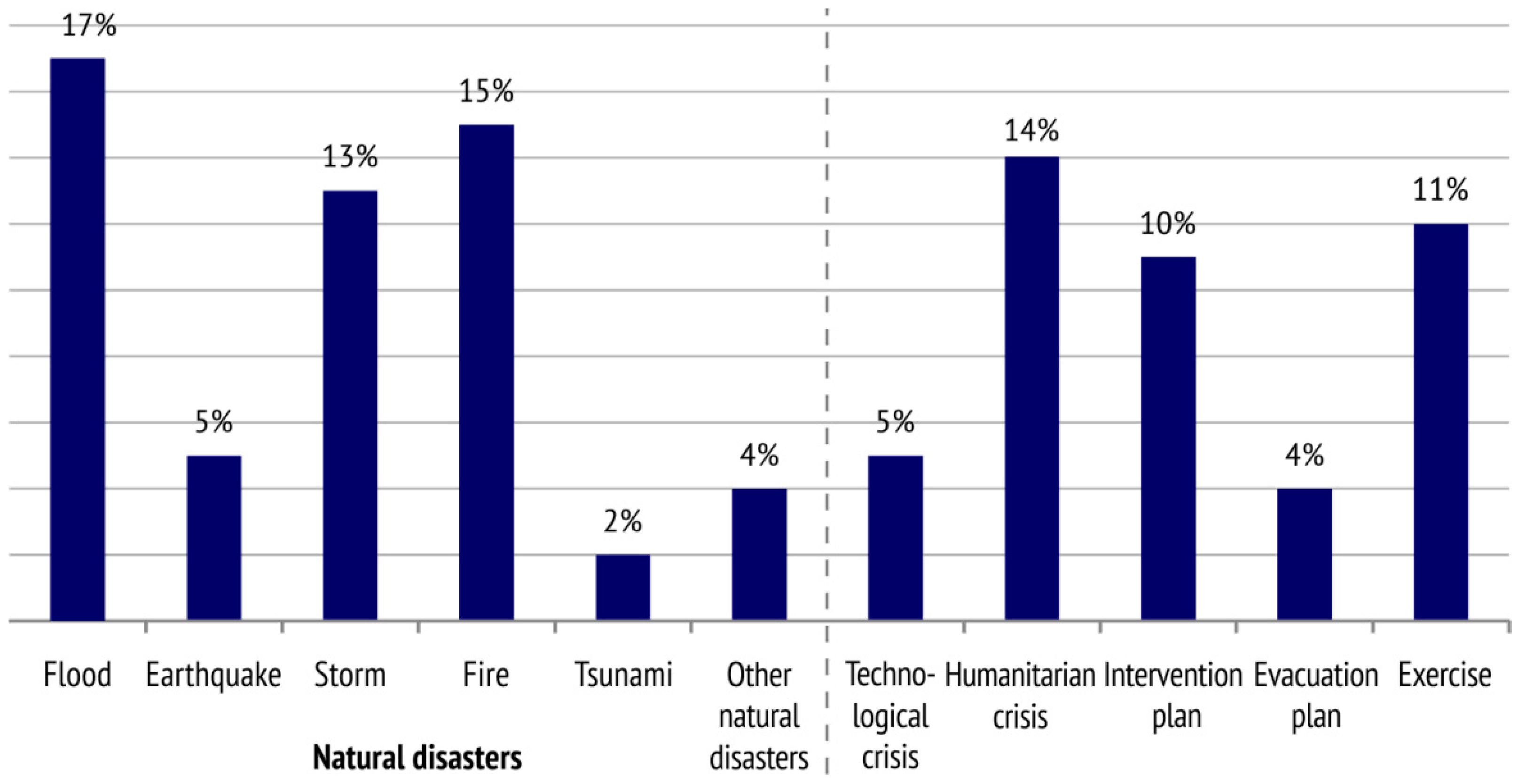
Figure 2.
Maps divided according to scale into five groups (very large-scale maps, large-scale maps, medium-scale maps, small-scale maps and very small-scale maps).
Figure 2.
Maps divided according to scale into five groups (very large-scale maps, large-scale maps, medium-scale maps, small-scale maps and very small-scale maps).

Figure 3.
The relationship between crisis type and scale on the maps collected. Crisis communication maps are designed on a large or very large scale, regardless of the type of the crisis depicted.
Figure 3.
The relationship between crisis type and scale on the maps collected. Crisis communication maps are designed on a large or very large scale, regardless of the type of the crisis depicted.

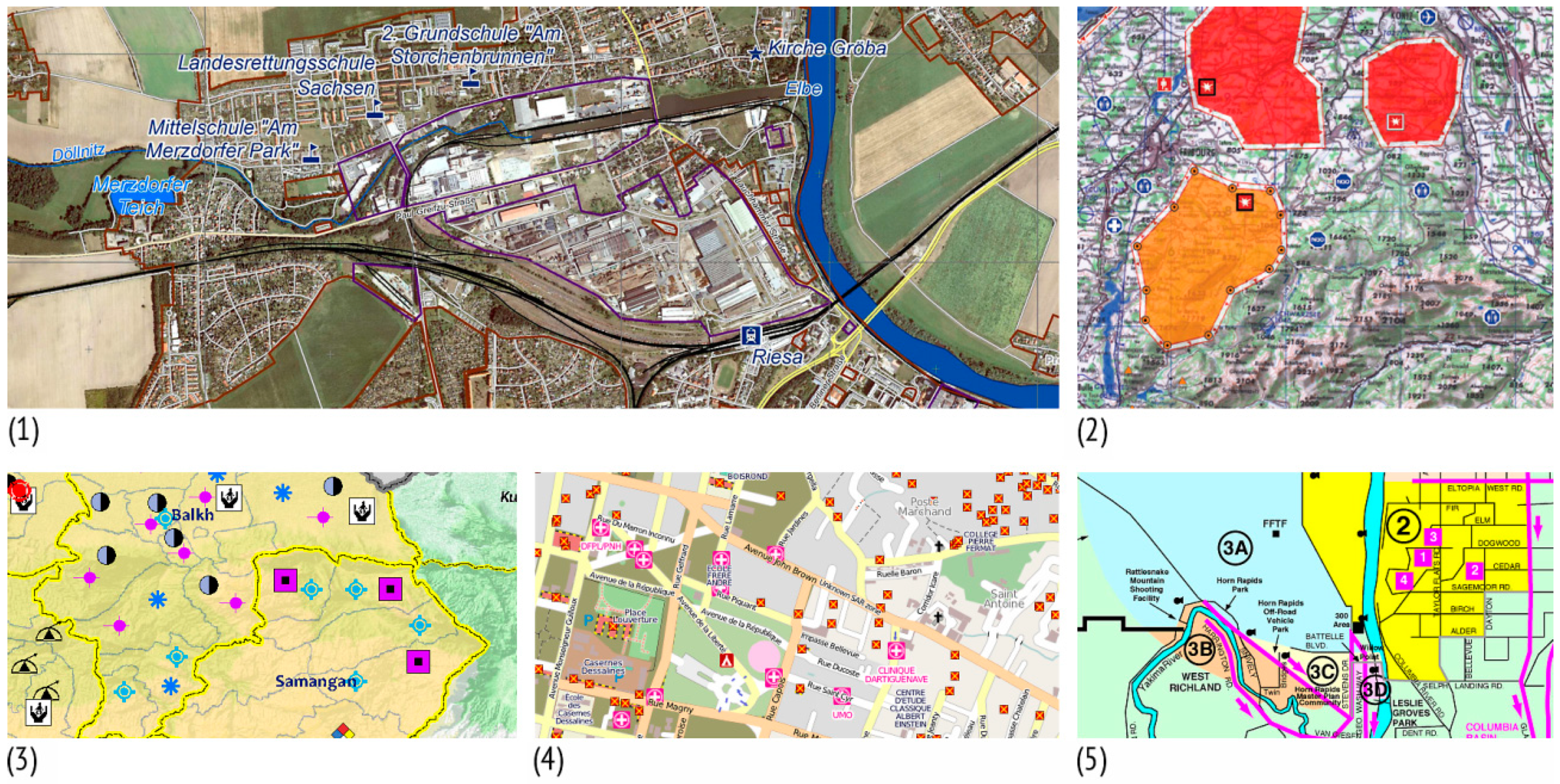
Figure 4.
Examples of different background maps for the representation of cartographic symbols in crisis communication: (1) aerial photograph (Map No. 19 in Figure S1), (2) topographic map (Map No. 94 in Figure S1), (3) relief map (Map No. 98 in Figure S1), (4) city map (Map No. 78 in Figure S1) and (5) informative map (Map No. 14 in Figure S1).

Figure 5.
When optimal contrast between the background map and thematic content about a crisis event is achieved, optimal layering will also be achieved. (1) Too little light-dark and colour contrast. (2) Sufficient contrast between the background map and thematic content about the crisis event. Grey on a background map forms a neutral ground for other colours.

Figure 6.
Geometric and graphic elements analysed divided into three groups (points, lines, areas). The percentage of elements used for each group is given above the column.
Figure 6.
Geometric and graphic elements analysed divided into three groups (points, lines, areas). The percentage of elements used for each group is given above the column.

Figure 7.
Examples of area symbols used to represent: (1) a wildfire-burned area (Map No. 42 in Figure S1), (2) a flooded area (Map No. 10 in Figure S1), and (3) an area affected by a hazardous gas leak (Map No. 31 in Figure S1).

Figure 8.
Examples of line symbols used to represent: (1) fire front progression (Map No. 4 in Figure S1), (2) oil pollution (Map No. 85 in Figure S1), and (3) evacuation routes during a crisis (Map No. 12 in Figure S1).

Figure 9.
Examples of point symbols used to represent: (1) objects and actions during a fire (Map No. 45 in Figure S1), (2) calls for emergency assistance after a hurricane (Map No. 84 in Figure S1), and (3) the number of refugees due to a humanitarian crisis (Map No. 3 in Figure S1).

Figure 10.
Good examples of map graphics on the crisis maps analysed (1) (Map No. 35 in Figure S1), (2) (Map No. 1 in Figure S1), (3) (Map No. 102 in Figure S1), (4) (Map No. 103 in Figure S1), and (5) (Map No. 38 in Figure S1). Correctly used map graphics contribute not only to clarity, legibility and layout, but also facilitate crisis communication and response.

© 2018 by the authors. Licensee MDPI, Basel, Switzerland. This article is an open access article distributed under the terms and conditions of the Creative Commons Attribution (CC BY) license (http://creativecommons.org/licenses/by/4.0/).
Share and Cite
MDPI and ACS Style
Kuveždić Divjak, A.; Lapaine, M. Crisis Maps—Observed Shortcomings and Recommendations for Improvement. ISPRS Int. J. Geo-Inf. 2018, 7, 436. https://0-doi-org.brum.beds.ac.uk/10.3390/ijgi7110436
AMA Style
Kuveždić Divjak A, Lapaine M. Crisis Maps—Observed Shortcomings and Recommendations for Improvement. ISPRS International Journal of Geo-Information. 2018; 7(11):436. https://0-doi-org.brum.beds.ac.uk/10.3390/ijgi7110436
Chicago/Turabian StyleKuveždić Divjak, Ana, and Miljenko Lapaine. 2018. "Crisis Maps—Observed Shortcomings and Recommendations for Improvement" ISPRS International Journal of Geo-Information 7, no. 11: 436. https://0-doi-org.brum.beds.ac.uk/10.3390/ijgi7110436
Note that from the first issue of 2016, this journal uses article numbers instead of page numbers. See further details here.