1. Introduction
Smart cities, environmental monitoring and evaluation, the “Internet of Things”, and movement networks are among recent developments that have refocused attention on geospatial big data. All of them rely on communication of large data from multiple networked wireless sensors, typically including spatial and temporal information. The sensors send large amounts of data at very high temporal frequency, hence leading to data ‘overload’ in terms of storing, managing, processing, and visualizing the data with conventional GIS applications and databases.
Data streams are utilized to move this highly dynamic spatio-temporal sensor observation data around. A data stream is defined as “a continuous flow of data where the system has no control over the volume of data arriving or number of updates, and only a fraction of the whole stream is archived at any given point in time” [
1]. This definition agrees with Reference [
2] that discusses the properties of data streams and further states that data streams are usually transported over the web and are unbound in size.
The high frequency and continuous unbound nature of data streams leads to challenges when deriving knowledge from the underlying observations. A case in point is the knowledge discovery and visualization of data from data streams. A streaming visualization is defined as one that constantly transforms in response to the continuous flow of data and adapts to changes observed in incoming data [
1]. In most cases, literature about streaming visualizations does not provide new definitions for these kinds of visualizations but rather adaptations of the batch spatio-temporal data visualizations. There has also been found to be a big overlap between streaming data visualization and time series visualization, dynamic network visualization and event detection techniques [
1].
To make sense of the high frequency, constantly changing observations about phenomena on earth, users are constantly looking for methods that will assist them to derive knowledge, patterns and in consequence insights. Earth observation systems developers conversely need guidelines on how to develop spatio-temporal data infrastructures and visualizations tailored to the end users’ specifications and requirements pertaining to streaming data environments. Knowledge extraction and gaining insights from highly dynamic, continuous spatio-temporal observations in data streams is a collaborative task that involves both users and system developers in the design and development of visualizations. This falls within the definition and scope of spatio-temporal visual analytics, which is defined as the science of analytical reasoning supported by interactive visual interfaces. Geospatial visual analytics is a sub field of visual analytics that specializes in geospatial data [
3,
4,
5].
Traditional visual analytics and geovisualization methods were designed for batch data and are not sufficient for data that is constantly changing [
4]. A literature search revealed that the distinguishing characteristics of spatio-temporal sensor observations in streaming data have not yet been defined. Once they are defined, the way in which patterns are derived from this type of streaming data, visualization methods for spatio-temporal events detected in such data, and current visual analytics user interactions for such data need to be reviewed and expanded, if necessary. A framework for visual analytics of spatio-temporal streaming data, which defines and characterizes the sensor observations and describes analytic tasks, visualization types and user interactions for them, will assist both developers and users to draw insights from large amounts of frequently changing data.
Existing frameworks for visual analytics of geospatial, spatio-temporal streaming data are reviewed in this paper. The review considers how the frameworks characterize the domain of spatio-temporal streaming data and looks at which factors are addressed in the framework following on from previous work [
6]. The paper further proposes a framework for visual analytics of streamed spatio-temporal sensor observation data.
The structure of the paper is as follows:
Section 2 presents a state of the art review of geo-visual analytics frameworks, a review of streaming data visual analytics and a review of design considerations when visualizing dynamic data.
Section 3 presents the proposed framework for visual analytics of spatio-temporal streamed sensor observation data. The results of the application of the framework to selected use cases are presented in
Section 4, followed by a discussion of results and conclusion in
Section 5.
2. State of the Art Review
Two fields of research are combined in this study: Spatio-temporal data visual analytics and steaming data visual analytics; hence the visual analytics process in these two fields is examined. The state of the art review presents and investigates how existing frameworks in these two fields of research address the visual analytics process.
2.1. The Visual Analytics Process
Visual analytics aims to assist users in gaining insights from data using visual interpretations of the data and interacting with the data in the process [
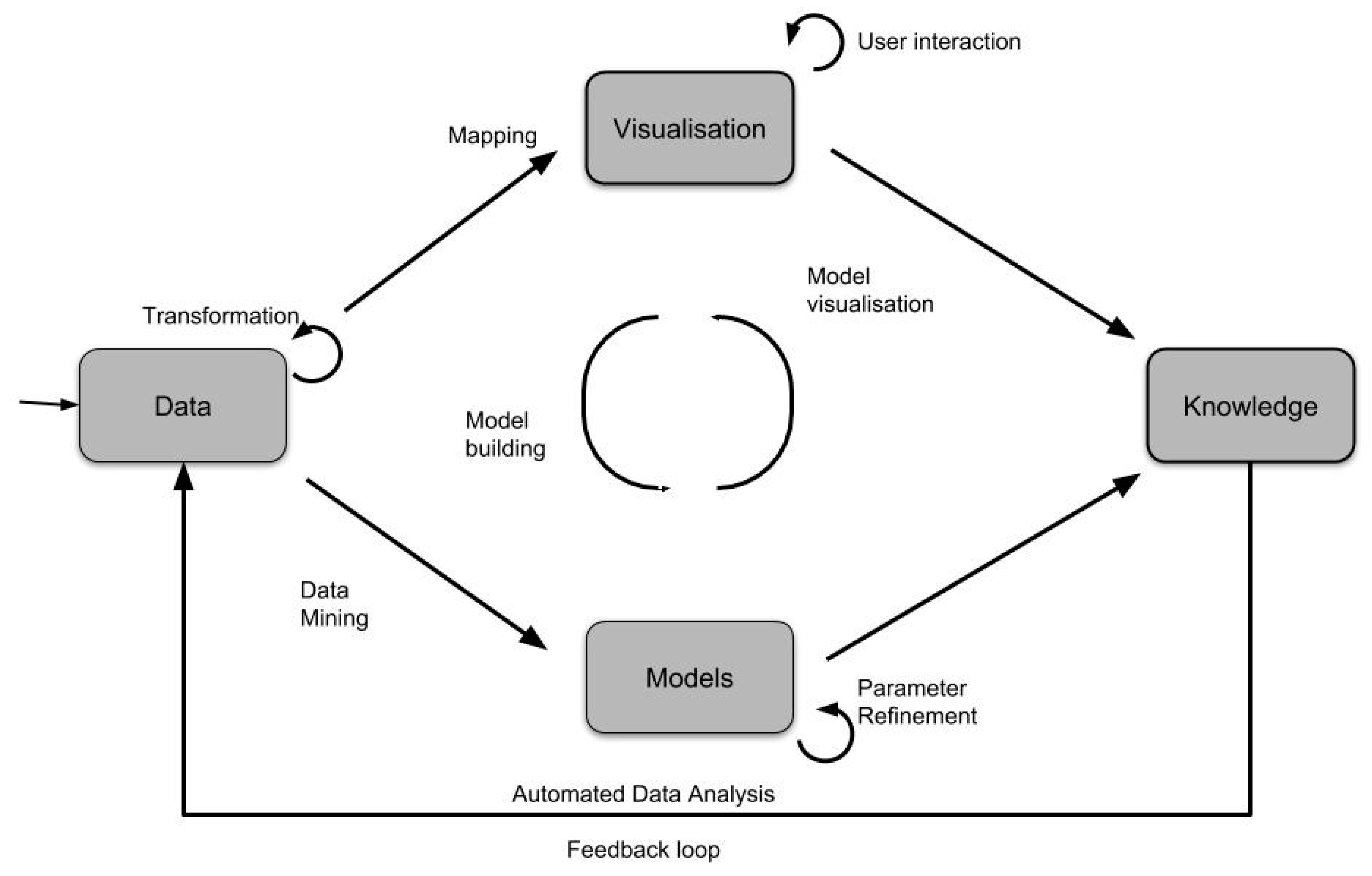
5]. The knowledge discovery part of the visual analytics process is discussed in detail with the widely accepted diagram that illustrates the process as a tight integration of Data, Models about the data, Visualizations and Knowledge [
7].
Figure 1 is an adaptation of the illustration of the visual data exploration process that was first introduced by Reference [
7]. Illustrated in the diagram is the fact that in order to derive knowledge from data, one must first understand the data. Understanding the data helps selection of appropriate data analysis models based on the tasks at hand. The data analysis models, coupled with appropriate visualizations, assist in gaining insights, knowledge generation, and knowledge communication about the data.
This paper focuses on the human led process of deriving knowledge from unbound streams of sensor observations that contain geospatial data. It follows the visual analytics process, as defined by Reference [
7], with specific focus and application to aforementioned data.
In earlier work, in order to understand the visual analytics process for unbound streams of sensor data, a taxonomy of visual analytics methods for streamed geospatial data was presented following an extensive review of existing classifications across the field of visual analytics [
6]. Based on this classification, a spatio-temporal visual analytics framework for streaming sensor observations should comprise four factors: Data, visualization types, user interactions, and analytic tasks. The literature review in this paper thus explores how existing frameworks address these four factors. A definition of the visual analytics process is also provided.
2.2. Geovisual Analytics Frameworks for Spatio-Temporal Events and Observations
The importance of including analytic tasks in the process of gaining insights from data supported by visualizations and human in the loop interactions has been highlighted in References [
8,
9]. Earlier classifications of human led analytic tasks include locate, identify, distinguish, categorize, cluster, distribution, rank, compare, associate, and correlate [
9,
10]. A high-level model-based visualization taxonomy that considers the design model, user model and the object of study is presented in Reference [
8]. The design model discusses assumptions that are made about the data by the system. The user model represents the assumptions that the user makes about the data and the interpretation they expect based on their knowledge and understanding of the data. This high-level classification shows that the analytic tasks do not always exist at the same level but can be further categorized into the user model and the design model.
Spatio-temporal data comprises three important components, namely geographic location, temporal information and the thematic attributes describing a real-life phenomenon. Analysis of spatio-temporal data should consider the unique characteristics of space and time, mostly characterized by Tobler’s first law of geography that states that “all things are related but near things are more related than distant things” [
7,
11]. These special characteristic of spatio-temporal data as well as the first law of geography should therefore be considered by the analytic task that is being modelled and by the visualizations that represent them. Spatio-temporal events are defined as significant changes that occur within a specific period or at a certain moment in time [
12].
A survey of the state of the art in visual analytics research [
13] introduces the concept of “analysis space” to categorize the themes within visual analytics research. The analysis spaces presented include Space and Time and Multivariate data. These two spaces are interesting to the geospatial and spatio-temporal research presented in this paper as we find that sensor observed phenomena can be multivariate in nature. Two notable types of spatio-temporal analysis were presented; firstly, trajectory visualizations that use density methods to visualize large numbers of trajectories on a map. The trajectories are represented as 2D density and 3D stacked maps or space time cubes. Trajectory visualization is discussed in more detail in
Section 4. BirdVis is another application that was reviewed in Reference [
13]. This application is used to visually forecast hotspots and uses interactive coordinated multi-views for user interaction and visualization.
A visual analytics framework for spatio-temporal analysis and modelling [
4] argued that models for deriving patterns from spatio-temporal events were not fully supported by existing visual analytics methods. The framework components presented in [
4] include data storage for raw and analyzed data, visual tools for display of the results, computational tools and user interaction controls that are linked to the data selection and grouping tools (analysis support tools). The framework uses existing statistical analysis tools, specifically around clustering and spatio-temporal generalization of univariate and bivariate data. The available displays are centered on time series displays that highlight the temporal dimension and cartographic map displays that highlight the spatial dimension. It is our view that this methodology provides a good basis that can be improved and expanded upon to include more types of analytic tasks and can be segmented according to the type of spatio-temporal event. This would require an analysis and classification of spatio-temporal events.
Another study [
12] discusses now-casting of multi-dimensional lightning data by combining statistical analysis and interactive visual exploration to identify spatio-temporal patterns. The data analysis models focus on identifying lightning track features and predicting future lightning clusters. The graphic user interface allows for the predicted lightning clusters along with the prediction certainty to be visualized on a Space Time Cube, a three-dimensional and a two-dimensional map view. The user interaction available in this application include ability to load a data file, choosing a data visualization type, choosing a now-casting interval and setting spatial and temporal data ranges.
It is concluded from this review that most spatio-temporal visual analytics frameworks have focused extensively on deriving patterns such as clustering and classification of spatio-temporal phenomena, from univariate, bivariate, and multivariate data. Some work has been done in analysis of a phenomenon for a specific time moment and less visual analytics work has been done on time intervals and periods.
2.3. Visual Analytics Frameworks for Streaming Data
An additional aspect of interest to this study is that of continuous unbounded measurements of data that are not controlled by consuming application, but rather by the sensors making the observations. A review of frameworks that focus on visual analytics of streaming data is thus conducted. From the review, challenges of steaming data were found to include [
1,
14]:
“The one pass constraint”—which means that data is only seen once and not all of it is stored, therefore processing needs to happen on the stream.
“Concept drift”—refers to the case where statistical properties of the data keep changing.
“Concept evolution”—refers to the case where new features appear in the data model, which render the state of older features outdated or supplement the pre-existing data
Streaming data is often multivariate.
Frequency of updates is either very high or at random intervals.
The high volume of updates leads to massive amounts of data, which at times exceed the computing resources allocated for processing and visualization of the data. A combination of high velocity and high volume of streaming data are the major contributing challenges that affect processing and visualization of streaming data
The heterogeneous nature of data from the streams, meaning that the data are not standardized.
A framework for real time visual analytics of streaming data [
15] defines streaming visualization data types as: (1) Local visualizations where each data item that arrives is shown independently; (2) Incremental visualizations, which are updated on arrival of new record; (3) Sliding window visualizations, which operate on a predefined period and use all observations within that period; and (4) Global visualizations, which visualize all records ever received.
In most of the frameworks that were reviewed, streaming data are visualized using linked, interactive maps and histograms which have a drill down interaction to get more details as part of a whole, similar to filtering or overview first plus details on demand. Other notable visualizations include a word cloud, a dendrogram and an area spline chart which are linked to each other in a dashboard view [
15].
A summary of common functionality in streaming data visualizations frameworks is presented based on two notable applications, namely NStreamAware and StreamVis. NStreamAware is based on Apaches’ streaming infrastructure, Spark, and has a visualization component NVisAware, which is a web based visual analytics application. NStreamAware and NVisAware have been applied to streaming text data in Reference [
16]. The data is analyzed in sliding windows and presented in a dashboard of linked charts, node-linked diagrams and treemaps. Geospatial, cartographic displays were not available in the system. StreamVis [
14] is a framework that focuses on temporal behavior in streaming multivariate data, but may also be used in batch mode. This framework focuses on finding similarity patterns in data and uses a linked stream graph view, time slice similarity plot and a relationship display to visualize relationships amongst the variables. StreamVis organizes data in time intervals and compares these time intervals to determine the temporal behavior of a measured phenomenon. It has been observed through this study that, although streaming data frameworks exist, many of them focus on text-based data applications and there is very little information regarding spatio-temporal measurements of observed phenomena. Streaming data frameworks that do consider measurements of observed phenomena, such as StreamVis, focus on time series visualization and temporal behavior of the displayed phenomena.
Table 1 presents an overview of selected articles in the literature review of spatio-temporal event frameworks and streaming data frameworks. This overview summarizes the type of data, and visualizations and analysis addressed by the frameworks.
2.4. Design Considerations in Dynamic Data Visualization
Several design considerations have been identified from the literature review. The considerations relevant to this study are categorized by their characteristics as multivariate data challenges, spatio-temporal data complexities and streaming data challenges. These design challenges need to be addressed as far as possible by the visualizations. The respective challenges are discussed henceforth. As the number of variables increases, it becomes very challenging to display the relationships between them meaningfully. The challenges that affect multivariate data displays are discussed in Reference [
14]. These issues include over crowded plots and inability to consistently show relationships. Secondly, apart from the well-known challenges of spatio-temporal relationships, there are some issues that arise from visualization of spatio-temporal data. These issues include visualization of specific phenomena across multiple scales. These have been addressed in Reference [
18] where visualizations of spatio-temporal evolution of multiple categories are explored at multiple geographic scales. Thirdly, streaming data applications suffer two types of challenges; machine level and human centered problems [
1]. Human centered problems are context preservation, mental preservation and change blindness preservation. These changes refer to the user being unable to perceive changes that occur between timestamps or the inability to remember the previously seen state. Machine level (data) issues are the accumulation of data, missing or incomplete data and handling of heterogeneous data. Other identified challenges for real time visual analytics include the large amount of data received at any given time, arrival of data features that have not been seen before, extreme data values, and most importantly, the inability of existing analysis methods to handle incremental change [
19].
2.5. Review of Analytic Tasks
This study is interested in discovering patterns based on a priori knowledge as well as discovering unexpected patterns from the data streams. Therefore, a review of analytic tasks based on pattern seeking in data streams as well as spatio-temporal events was undertaken. The most comprehensive recent state of the art review for spatio-temporal knowledge discovery was found in Reference [
11]. Spatio temporal data mining or knowledge discovery is the process of finding interesting patterns, most of which were previously unknown from large spatio-temporal data.
Table 2 provides an overview of selected literature for seeking for patterns in spatio-temporal data and data streams. The most common pattern seeking topics discussed in spatio-temporal literature is the discovery of outliers, finding relationships, clustering, and classification. Literature about pattern seeking in data streams covers a lot more of the categories, but there is a notable gap in the task of finding relationships. Developing new algorithms for finding relationships in data is beyond the scope of this study, however, most suitable visualizations for finding relationships between data variables will be explored.
2.6. Review of Vizualisations of Patterns in Spatio-Temporal Data
Following the review of pattern seeking tasks it was found necessary to investigate how these tasks are visualized. This information is vital to the framework for consolidating knowledge about which tools are available and also helps formulate design considerations. A summary of the review is presented in
Table 3.
3. Proposed Framework
Subsequent to the literature review presented in the previous section, the following gaps were identified:
The characteristics of spatio-temporal sensor observations need to be defined for the case of streaming data.
The tasks of deriving patterns from this type of streaming data need to be updated and expanded upon.
The existing visualizations of spatio-temporal events need to be tested on streaming data for compatibility, failing which they need to be modified
The existing visual analytics user interactions need to be tested on data streams and categorized to assist application developers to choose relevant user interactions for their specific use cases.
The design process in this study is an adaptation of Munzner’s four step nested model for visualization design [
31]. Munzner’s four steps are: Characterization of the data and vocabulary for the data domain; abstraction into operations and data types; design of the visual encoding techniques; and finally, creation of the algorithms to efficiently execute the techniques.
The first purpose of the proposed framework is to assist users in discovering knowledge from data streams of spatiotemporal sensor observation measurements and the second purpose is to assist application developers with design rules when developing this type of applications. The gaps identified above will be addressed. The presentation of the framework begins with a characterization of the observations from sensor networks (
Section 3.1) and corresponding design considerations (
Section 3.2). This is followed by a classification of the pattern seeking tasks (
Section 3.3). Next, the conceptual model (
Section 3.4) and the information model (
Section 3.5 and
Section 3.6) are presented. Finally, an application of the visualization framework to the use cases is presented in
Section 4.1 and explained by means of an implementation in
Section 4.2.
3.1. Domain Characterisation
The first point of departure of the proposed method is to define the spatio-temporal environment which we will refer to as the “sensor space”. The method follows the Open Geospatial Consortium (OGC) standards regarding sensor observations. The types of sensors considered for this study include in situ sensors and mobile sensors. A sensor is considered as a device that is reporting on its location at any given time, and additionally, records and reports measurements about at least one attribute about the phenomenon that it is observing. The definitions of a sensor and an observation, as described by the ISO 19156 and the OGC implementation thereof are adopted. According to the ISO 19156:2011, an observation is “an act of measuring or otherwise determining the value of a property”, or put more simply, an observation is an action with a result that has a value that describes some phenomenon [
32,
33]. Similarly, a sensor is defined as “a type of observation procedure that provides the estimated value of some observed property as its output”. The sensor observations are expected to be provided using a combination of ISO/Open Geospatial Consortium (OGC) Observations and Measurements (O&M), and the Unidata Common Data Model (CDM) described in Reference [
34].
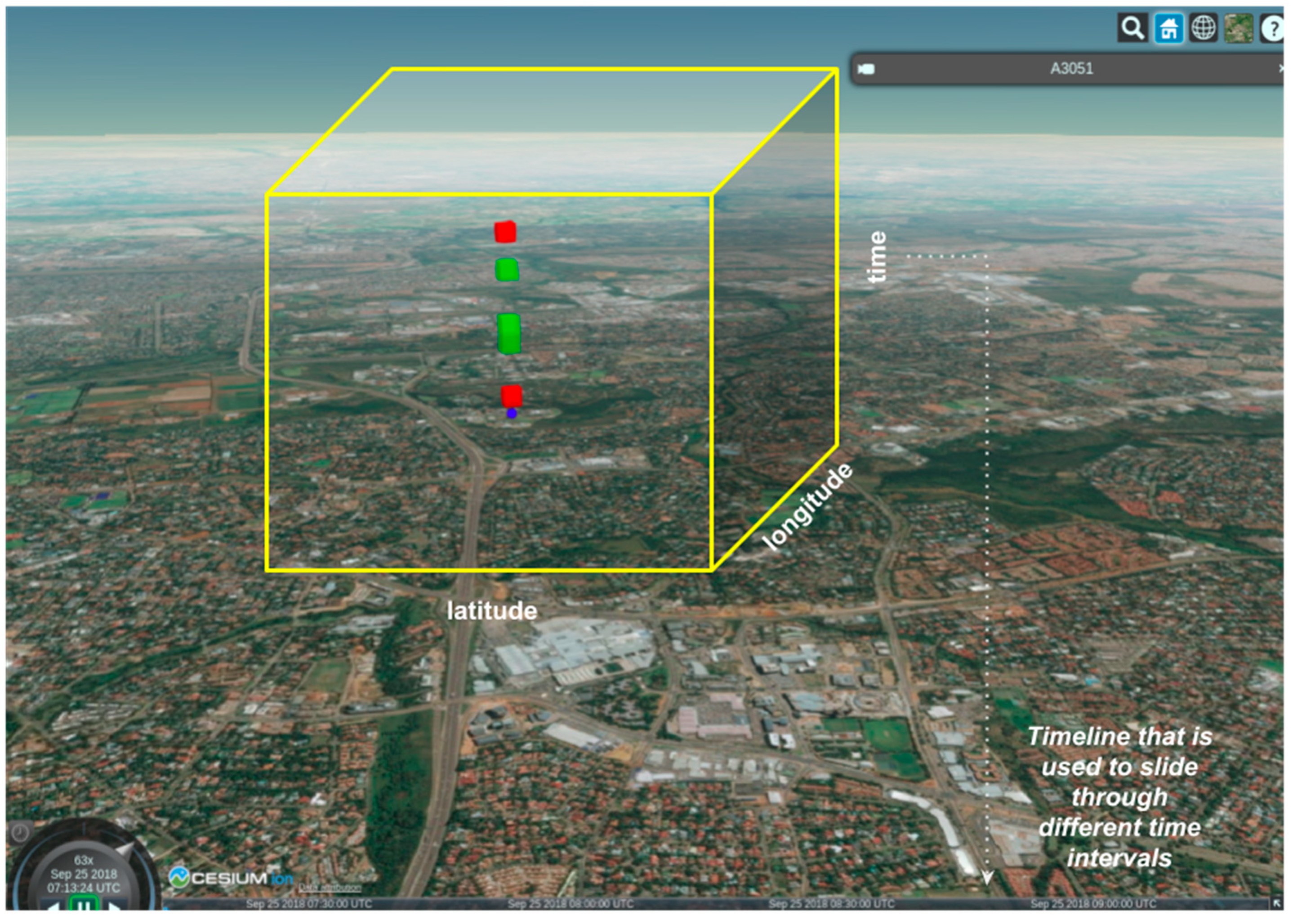
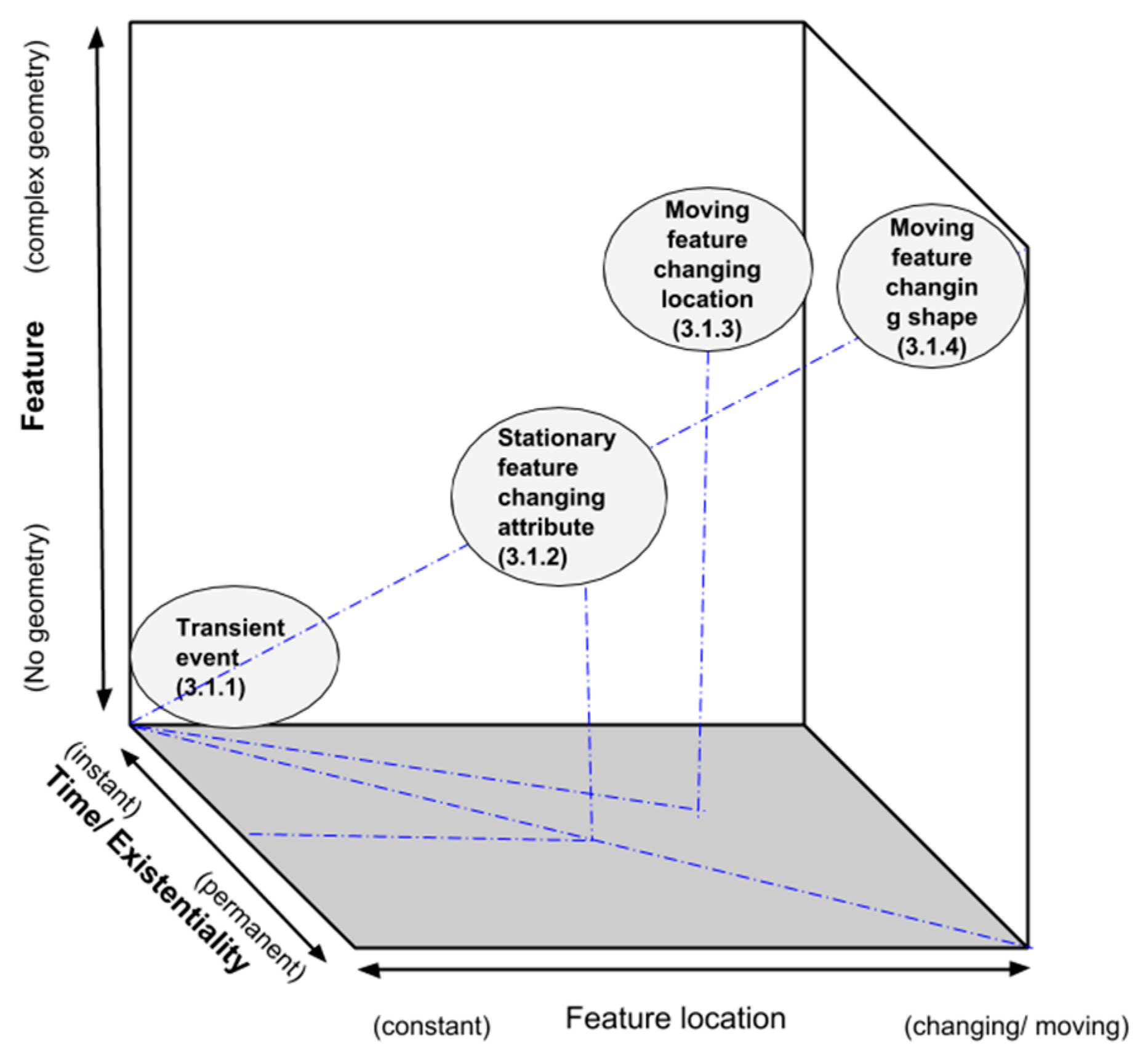
The sensor space illustrated in
Figure 2 is defined by three dimensions: The feature description, the temporal existence and the feature location. The feature description dimension describes the geometry of the observed property, ranging from unknown geometry at the origin to complex geometry on the extreme end. The temporal existence dimension describes the valid time of an observation, or the time when the observation “existed”. This dimension ranges from instant (transient) observation at the origin to permanently existing observation on the extreme end. The feature location dimension represents the change from stationary, at the origin, to moving features on the extreme end.
Figure 2 shows that transient observations are closer to the origin of the sensor space as they do not have a known geometry and occur during a limited period, whereas moving features that are changing in shape occur at the extreme opposite side of the cube because of their changing complex geometry at different locations and their longer temporal existence. The types of sensor observations, described by the sensor space are provided below in subsequent subsections, using usage scenarios.
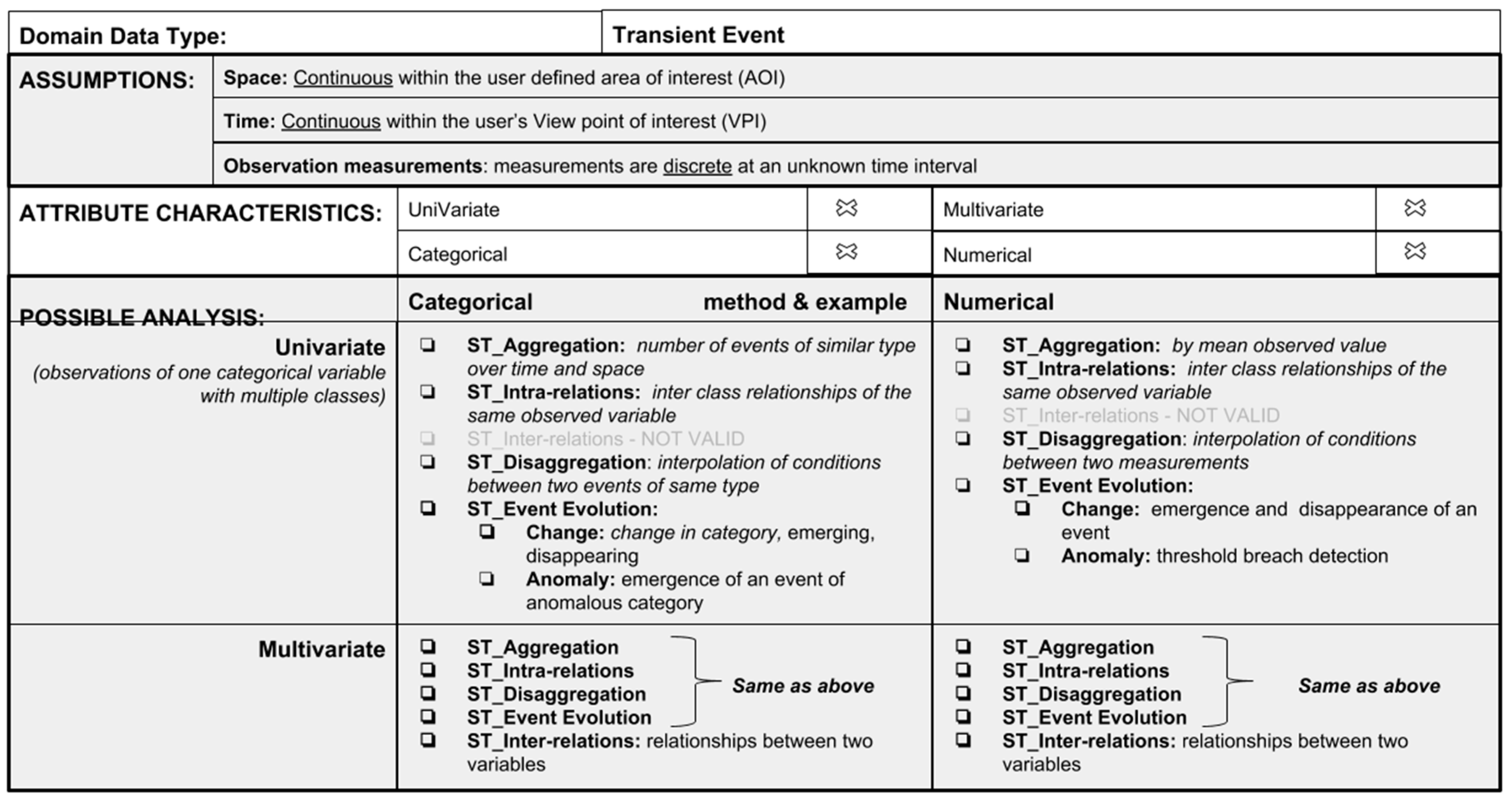
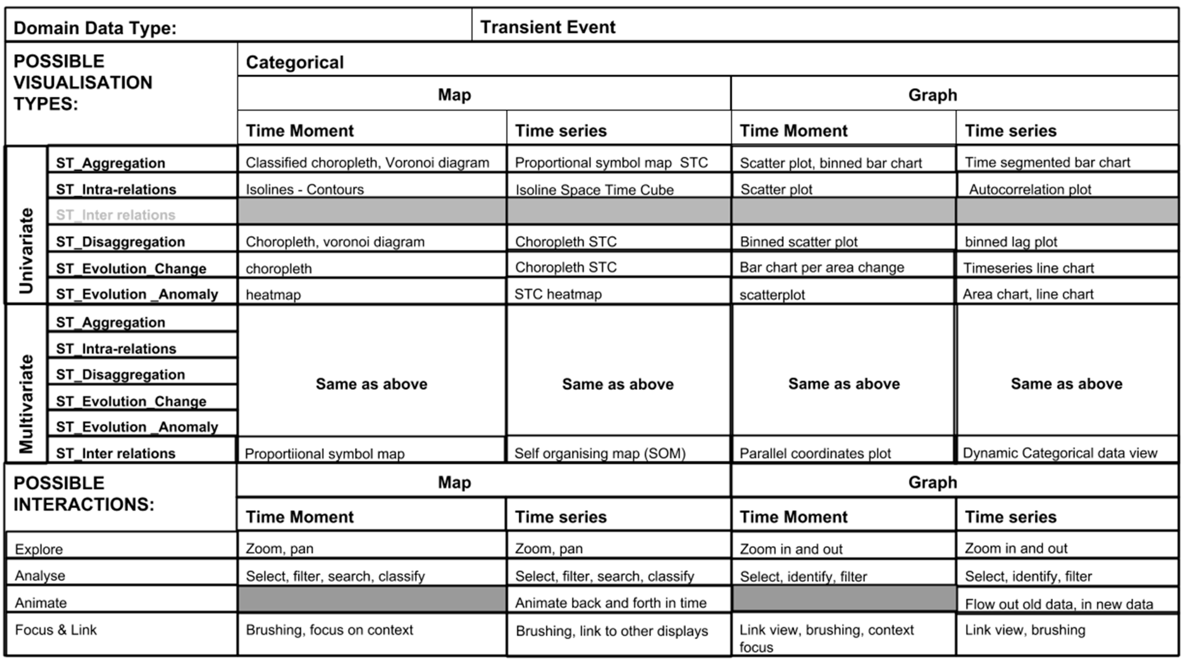
3.1.1. Observations of a Transient Event
A transient spatio-temporal event is an event that occurs in a location without it being expected or at a known location where it is not likely to be repeated. It is usually observed within a short time moment.
A scenario of such an event is a lightning strike that happens during a thunderstorm and causes substantial damage to certain insured infrastructure. Without immediately being observed, it is difficult to quantify the time of incidence and the directly measured intensity that resulted in the damage. This information may be necessary for an insurance claim. Another scenario may be that of hazardous materials in a lab where quantities are monitored, and leaks are prevented. If sensors are installed around the area, a user experience dashboard based on an underlying visual analytics framework would make it possible to identify and send warnings about the hazardous leak in time for the necessary response to be undertaken.
3.1.2. Observations of Attributes of a Stationary Feature
An observation of attributes of a stationary feature implies that the phenomenon being observed has a fixed location. An example is a water reticulation network of a specific known area that has water pressure and water flow sensors at known nodes of the network, which are monitored through a single dashboard. The water flow sensors monitor the amount of water that flows through the network at a selected aggregated time interval that is set by the user. In the case of loss of pressure, the monitoring team can immediately deduce that there is a water leak in the preceding nodes and respond to the leak timeously. Relationships between the pressures at certain nodes may also be determined using relationships based analytic tasks which would make it possible to determine the amount of water being consumed.
3.1.3. Observations of Attributes of a Moving Feature
The moving feature is adopted from the ISO 19141:2008 standard and its OGC implementation. A moving feature is defined as “a feature whose location changes over time” [
35]. A description for this scenario is one of a shipping vessel moving through the ocean. At any given time, the ports authority would like to be able to analyze the location and trajectories of the ships heading their way and the type of cargo they are carrying for logistics purpose. Another scenario would be that of researchers monitoring water quality in the ocean and sea state using wave gliders that are moving into different depth levels over time. The measurements acquired by these gliders can be streamed back to a dashboard that is set up to track their movement, location, and measurements during the mission.
3.1.4. Observations of Attributes of a Moving Feature with Changing Shape
This case is similar to the previous case and derives from the moving feature specification; however, the geometry of the feature is not constant. This case may refer to long-term observations of the surface color of a lake, that is changing shape and size as a result an increase or decrease in water levels. Another scenario is that of a wildfire event sweeping through a known area. The geometric size of the fire and its attributes such as the fire intensity and flame height can be monitored as it progresses.
3.2. Design Considerations
It is evident from the domain characterization that streaming spatio-temporal data has both spatio-temporal observations and streaming data properties. Spatio-temporal data observations can be either univariate or multivariate in nature. As a result, the design challenges that are addressed by this framework include considerations for multivariate data, movement data and high velocity data.
The framework will address the following design considerations:
Overloading of data displays that results from displays of multivariate data.
Handling heterogeneous data observations from multiple sensors.
Change blindness that is caused by too many changes, resulting from high velocity and movement data.
Multi scale display as a result of the rate of movement of moving features and consequently their changing spatial distribution.
Highlighting of important changed aspects when faced with too many sensors.
Dealing with missing data records. In some instances, some sensors will be expected to report measurements at a determined interval and these readings may not come through. It is also important to communicate the missing records to the visualization if this is the case as these have the potential of affecting data aggregation results if the data records are missing for an extended period of time.
3.3. Classification of Patterns and Corresponding Analytic Tasks for Spatio-Temporal Sensor Observations
The type of patterns that are expected to be uncovered within streaming spatio-temporal data are derived from known spatiotemporal data analysis methods commonly used in cartography and GIScience, as well as some that are derived from studies of live streams of data [
20,
21,
22,
23,
24,
25,
36].
Table 4 identifies the patterns and describes the analytic task required to uncover the pattern so that it can be illustrated in visualizations of spatio-temporal data. For example, in order to reveal aggregation patterns in spatio-temporal aggregations of a specific variable, its statistical distribution, spatial distribution, temporal aggregation, and hierarchical aggregation needs to be determined.
3.4. Conceptual Model
The basis of the conceptual model takes into account how users already interact with GIS based systems and applications, such as ArcGIS and QGIS, in terms of the interaction between the design model (system) and the user model (GIS users), however we bring into this model aspects that are specific to streaming spatio-temporal data, not generic GIS functionality.
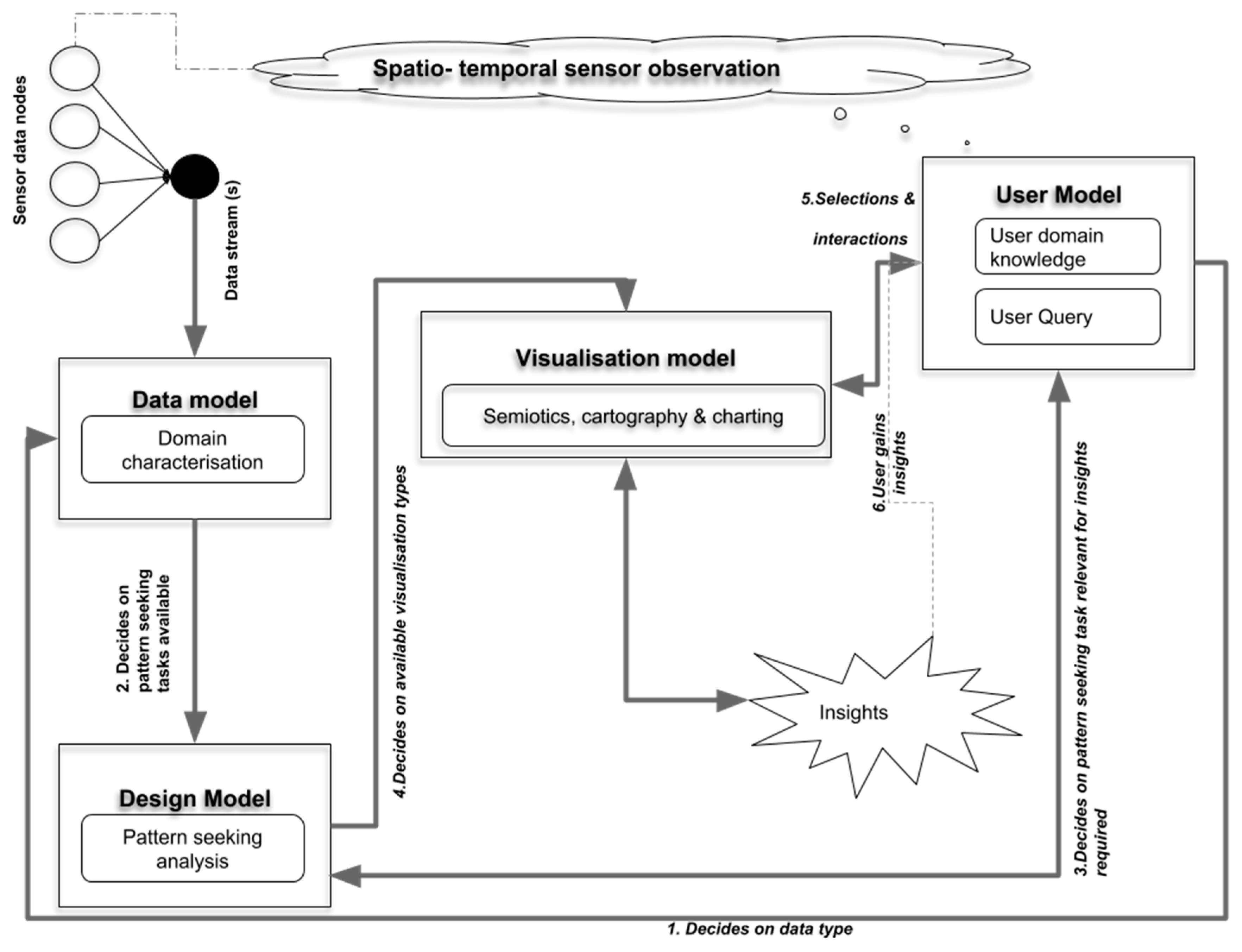
Figure 3 provides an overview of the conceptual model and interactions between the components.
The conceptual model is driven by four components, namely:
Data Model—to define and provide an understanding of the data based on its characteristics and the geospatial domain.
Design model—to use the definition of the data as provided by the data model to decide on what models and visual processes are possible.
User model—to enable the user to ask questions and use their “domain knowledge” to decide what information is useful and valid. The user query is a spatio-temporal window, which is defined as a combination of the Area of Interest (AOI) and View Time of Interest (VToI) also referred to as the viewer time window of observation.
Visualization model—focuses on displaying “amount of change”, “birth” and “cessation” to allow the user to be able to track the change and counter inattentional blindness. The visualization model relies on the visualization primitives to display the amount of change and uses visualization tools as mechanisms to package the visualizations to enable a seamless user experience. Several visualization tools have been developed and most of them rely on the same chart and map-based visualizations. This study will use modifications of the space time cube for time series and a modification of the dynamic categorical data view (DCDV) and parallel coordinates for visualization of multivariate observations [
38]. Overview and details on demand linked views will also be used to handle multiscale challenges.
3.5. Streaming Data Information Model Design
The purpose of the information model is to derive reusable objects that are essential to the description of the process of visualization of streaming geospatial data, as stated in the conceptual design and illustrated in
Figure 3. The main elements of the framework are described as:
Data type descriptor: A description of the observations also referred to as data
Assumptions made about this data type
Characteristics of the attributes of the data type
Possible pattern seeking task; based on the description of the attributes
Possible visualization based on suitability to the task and the characteristics of the attributes
Possible interactions that will help the user query and interpret the results
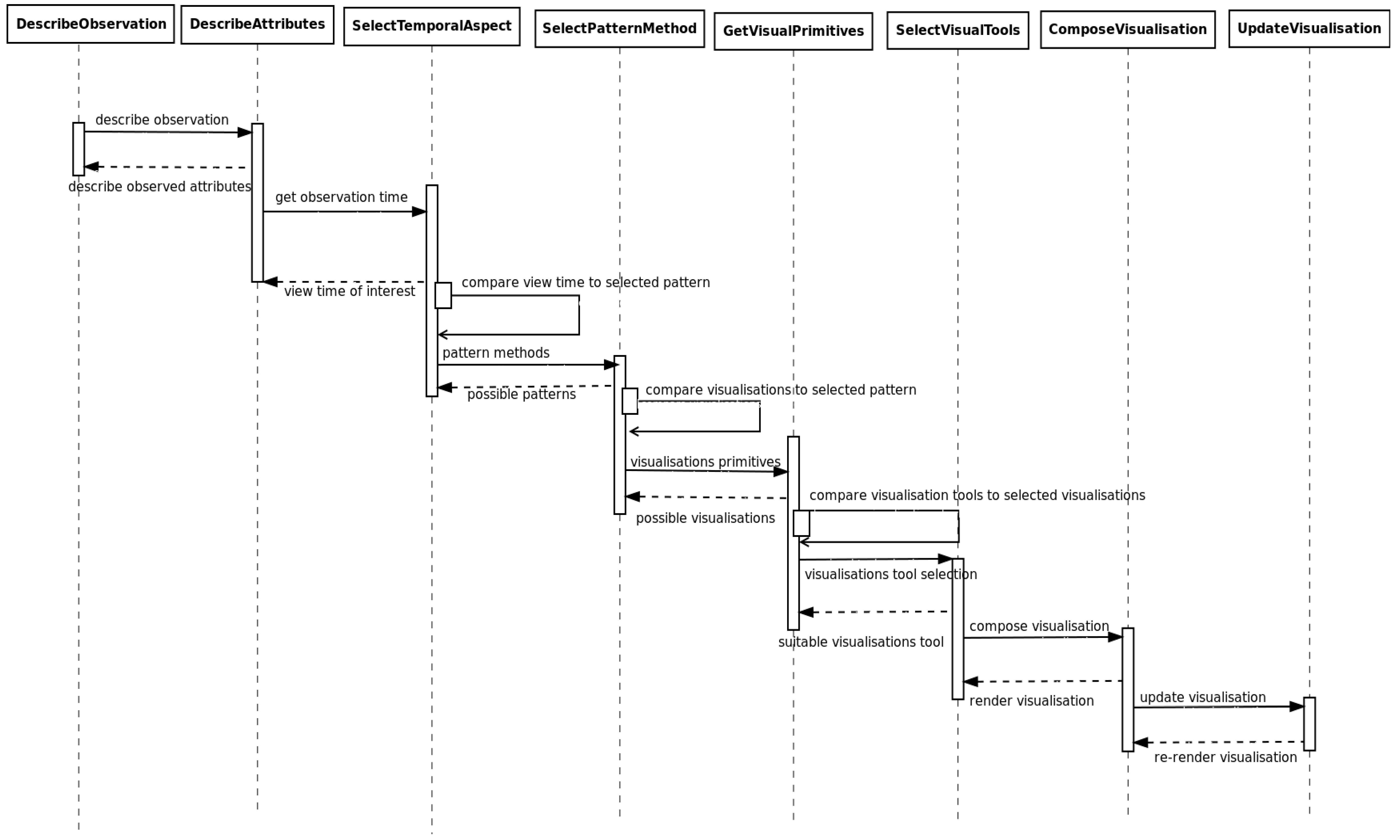
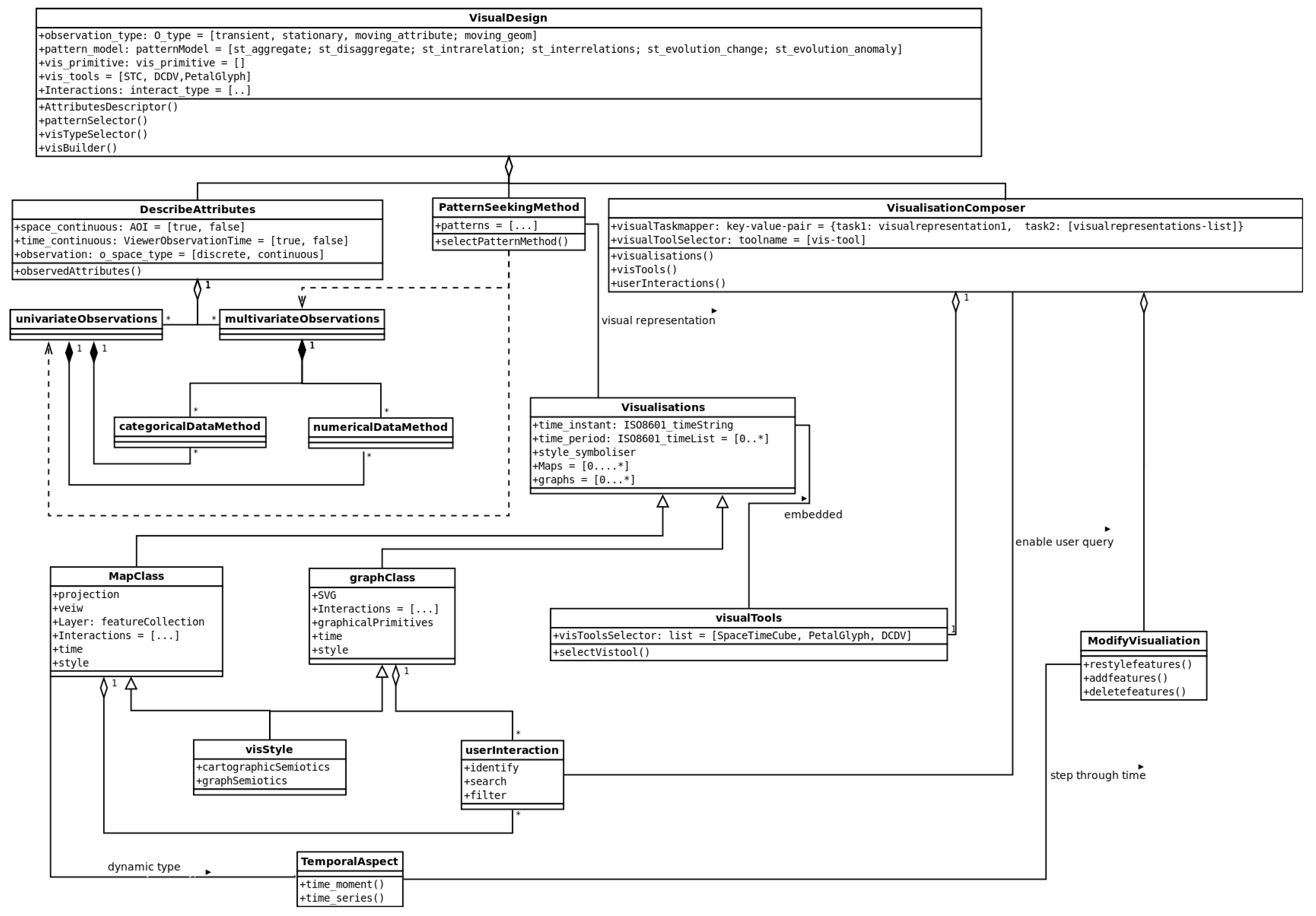
The main components of the information model are discussed with the use of a class diagram
Figure 4 and a sequence diagram
Figure 5 to illustrate the interaction between the components. The main class in
Figure 4,
visualDesign shows the collection of the components, as described in the framework.
Observation_type describes whether the data comes from an observation of transient event, a stationary or moving feature, as discussed in the domain characterization section. The
describeAttributes class gives a characterization of the observed phenomenon in terms of its continuity in space and time as well as the list and characteristics of the attributes. This covers the assumptions that are made about the phenomenon and its observations. The multivariate and univariate observation classes as well as the description of whether the observations are categorical or numerical are part of the description of the attributes that are used to decide what pattern seeking task is possible by the
PatternSeekingMethod class. The pattern seeking methods is used by the
Visualizations class to review which types of visualizations would be the most beneficial to portraying the selected patterns. The base visualizations can either be map or graph based, and takes into account the temporal aspect of the phenomenon being observed based on the user’s interests, which are modelled in the
userInteraction class. The type of graphs and map representations described in the visualization class depend on a style object based on cartographic and graphing semiotics. They describe the colors, hues, and shapes to be used to provide optimum effect. The primitives and the interactions are then embedded in the visualization tools; in this case, at least one of three:
SpaceTimeCube,
Multiscale Plot, and
Time Dynamic Parallel Coordinates View. The components together inform the final visualization that will be presented to the user for interaction to gain knowledge and insights about the data.
The sequence of interactions as shown in
Figure 5 begins with a description of the observation, which is in line with the OGC’s Observation and Measurements specification amended with the type of observation according to the “sensor space”. The attributes of the observations are then examined, at which point the user is expected to select an attribute or attributes of interest. The temporal dimension of selected attribute is then examined by the system simultaneous to the user’s selection of an area and view-time of interest. Given the temporal and spatial knowledge of the observation and attributes of interest, a pattern of interest is selected which then informs on how this data should be visualized. An appropriate visualization is then composed and gets updated as of when new observed measurements become available.
Appendix A shows how the design method above can be used to plan the visualization of streaming geospatial data by application to the data types.
3.6. Encoding
A JSON based encoding is recommended to represent the development of the visualizations discussed. The JavaScript Object Notation is a text-based, language independent, data interchange syntax. JSON has been widely adopted because it is concise, human readable, and can be used to communicate data across different types of programming languages. As an example, JSON can also be used to communicate server requests as a payload, which is sent from a JavaScript based application to a Python server. The server can consequently send the results back as a serialized JSON string. The most notable components of the encoding are provided in
Table 5.
Appendix B shows an example of the encoding applied to the transient observations lightning use case.
The following section will show the constructed visualizations and will discuss how their construction has addressed the specific design challenges.
4. Framework Application
4.1. Application Use Cases
4.1.1. Using the Space Time Cube for Visualization of Time Series Data
The space time cube was developed as early as the 1970s by Hagerstrand [
39,
40] to represent two dimensional space and adding time as a third dimension to illustrate spatio-temporal movements and events. Several adaptations of the space time cube have been developed to visually show patterns in spatio-temporal data. These adaptations of the space time cube include representation of spatial events [
39], temporal data [
41], movement analysis [
42,
43], and eye movement data [
44].
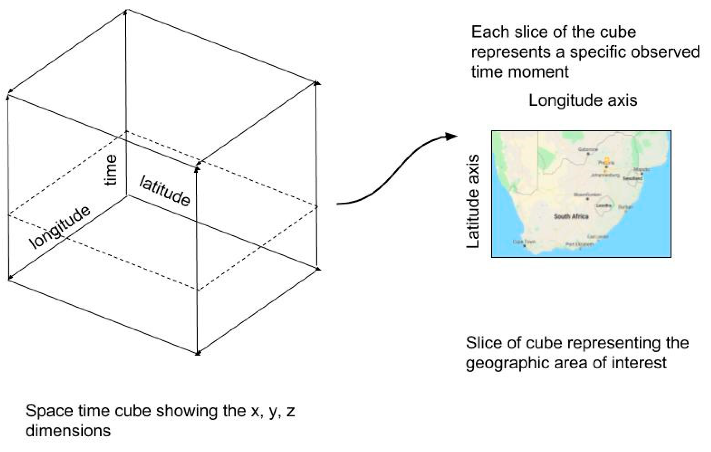
In this study, the space time cube is defined as a rectangular prism, where length and width are defined by the bounding box that encompasses a specific geographic area of interest; and the height of the rectangular prism represents the time stamps of the view time of interest, which can also be referred to the as the time window of interest of the observations. Each slice of the rectangular prism represents a single time moment, which is equal to the observation time, as in
Figure 6. The surface area of each slice represents the thematic distribution of a selected observed property that can be modelled to display the patterns discussed, such as heatmaps, choropleths, or discrete classified points.
The user interactions available to the space time cube include the ability to slide back and forth in time allowing the user to roll back to previous events within the time window. Similarly, the user is also able to select a specific time moment that they would like to review and interrogate the local observation during any moment within the specific time window. These interactions do not interfere with the display of new data that becomes available, while the user is rolling back the display. Once the user rolls forward they are able to see new data as well.
Use cases for transient events as well as movement data were visualized using the space time cube.
Figure 7 shows results of the visualization of transient observations at a known station. The measurements were classified, categorized, and displayed using blue, green and red to represent the low medium and high observed values respectively. No user studies or human cognition studies were considered at this point in terms of color representation. Colors were chosen to be discrete and evidently different, in order to portray severity of situation. The observation window was set at three hours with a data interval of 15 min between observations. From the visualizations it is possible to see the observed trends at each location during a time step. It is also possible to see where no data was recorded; this is made evident by the gaps between the colored blocks. If the gaps are uniform, then one can deduce that the event is frequently occurring at a regular interval; although for transient data, the gaps are very sporadic in nature. A comparison between different locations can be made to identify whether the event was also observed. This enables an inference about the relationships of the classes to be made. Since the data is classified, it is also possible to observe which category is the most frequently occurring. The use case of stationary observations was not highlighted in this section as more similarities with the transient use case were observed, with the transient use case showing more interesting results on the space time cube.
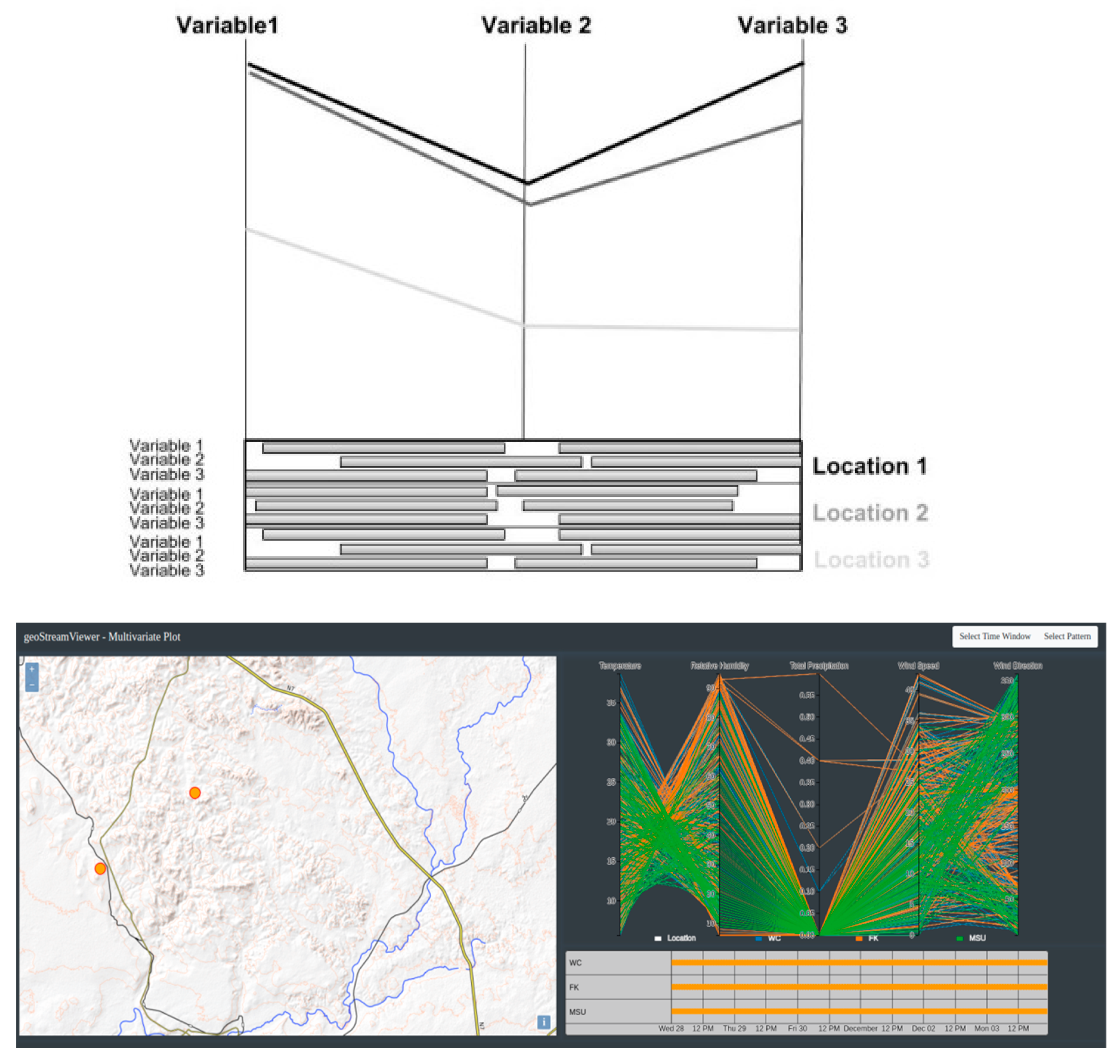
4.1.2. Using Dynamic Parallel Coordinates Plots to Visualize Multivariate Time Series Observations
Some sensors are able to record multiple observed properties at any given time and these measurements are then sent through a data stream for consumption by downstream applications. In a sensor network, not all sensors will be recording data simultaneously, and the observation time interval may or may not be constant. The multivariate plot that represents these scenarios is required to communicate this information to the user so that one can better understand the data stream offerings and make interpretations from the data. Users are expecting to be able to find inter relationships between the multiple variables recorded at multiple stations, as well as interrelationships at a single station, from this type of data.
This study thus proposes the use of a two-dimensional combined dynamic parallel coordinate’s plot that is linked to a categorized timeline view. The parallel coordinates view provides a visualization of observed measurements of the attributes of interest during one time moment of observation, across a single or multiple locations. The axes represent the observed properties, and a poly-line connects the observed measurements for each location. The associated timeline provides a view of the availability of observations within the time window of interest. A timeline view highlights the birth and cessation of observations within the time window, whilst also showing the measurements that overlap and can be compared across stations. The use of corresponding colors on the parallel coordinates plot and the timeline makes it easier to highlight patterns that may be present. The user can filter visibility of lines and show only lines of interest on the parallel coordinate’s plots. The timeline user interactions include brushing and sliding through time moments of interest within the time window, in order to highlight data of interest.
Figure 8a shows the concept design and
Figure 8b shows an implementation based on observed weather at a number of stations at various locations. From the weather station plots, it is possible to deduce that the blue and orange lines represent stations that are spatially located in the same neighborhood as their readings are all positively and highly correlated. The combined plot provides good results in terms of showing relationships between observations as well as birth and cessation of observations; however, caution should be exercised in terms of how many variables can be represented on this plot as it can get cluttered and hinder human interpretation.
4.1.3. Using Linked Views to Visualize Observations at Multiscale
Typically, multi scale visualizations are required for long term observations of movement data. Movements are not always uniform and are made up of high speed, low speed, or no speed periods. The details of area covered by a moving feature will thus not be the same across different trajectories and time periods; therefore, visualizations on one static spatio-temporal scale may limit the ability to identify and interpret certain behavior.
An overview plus details visualization is proposed for observations that lead to multi scale spatio-temporal coverage. The visualization is made of two maps, one showing the current location of a vessel and the other map showing the sub trajectories that have been covered during the time period selected by the user. The maps are complemented by two graphs that give a birds-eye perspective on the speed and direction of vessels in a user selected area during a user selected time moment. The views are link such that focusing on one highlights the related behavior on the other three views. The time lines of the map view are synchronized.
Figure 9 illustrates the behavior of moving shipping vessels in the ocean over a selected period. The map on the left shows a categorized view of the ships speed on the ground during a specific time instant. The orange dots with white centers represent ships that are stationary or moving slowly, the pink dots represent ships moving at a high speed. The graph on the left shows the average speed of the ships during the selected time window or period. The map on the right shows the distances covered by the ships during the selected period. These sub-trajectories are represented as red lines. The blue dots on the map show ships that have not changed their position between the last time instance (t
i−1) and the current time (t
i). The graph on the right shows the average heading direction of the ships during the user selected time period of interest. The heading direction of 511 in the graph on the right represents ships that did not provide their heading direction.
4.2. Platform Implementation of geoStreamViewer
A platform named geoStreamViewer was developed based on this framework and has been applied across different projects which included visual analytics of transient sensor observations, visual analytics of stationary multi-variate observations, and visual analytics of moving features.
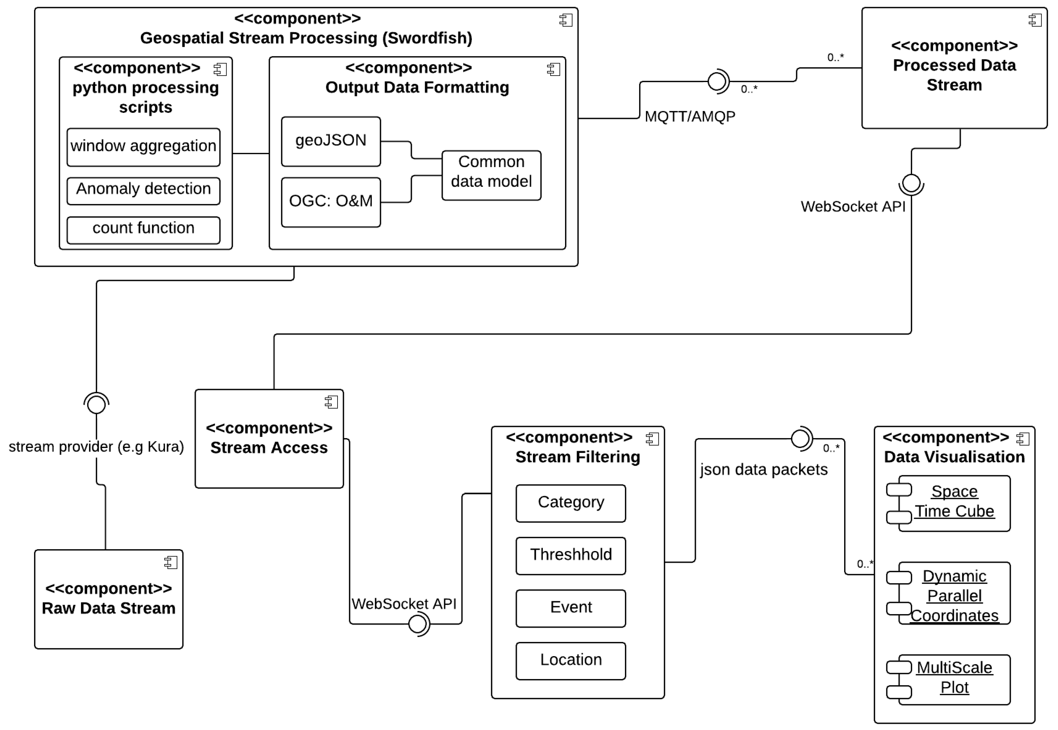
The components of the geoStreamViewer application are illustrated in
Figure 10. Raw data arrives from external data streams and is transmitted to the geospatial stream processing library SwordFish [
34]. The SwordFish library is used for geospatial processing of the data to discover known patterns and to perform aggregations of the data to avoid streaming data to the front end that is not required. The SwordFish geospatial stream processor outputs a stream of data that is formatted into a common data model, which is an extension of the Open Geospatial Consortium’s Observation and Measurements implementation in GeoJSON. The stream output from SwordFish is sent to a WebSocket end point which functions as the exchange gateway between the back-end stream processing components and the front-end data visualization components. The front end is made of a library of reusable components, which are meant to uncover and display categories, set user data thresholds, by means of filtering for this information in the data stream. The filtering component allows the user to search for specific types of events, to search for specific locations in the data stream and to set user required inputs such as dates and patterns of interest. The filtered stream packets are sent to the respective relevant visualization components.
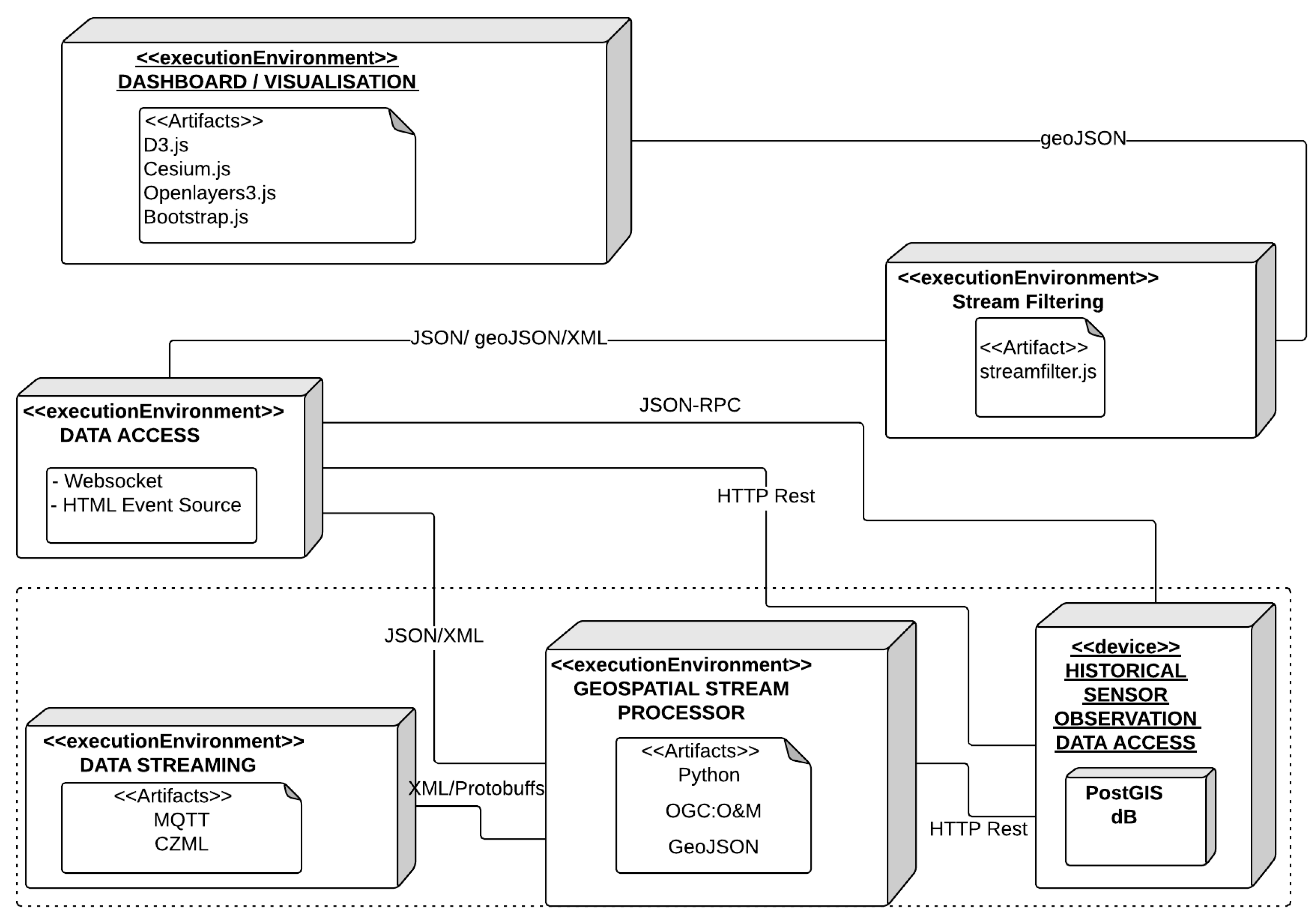
The deployment nodes of the system are illustrated in
Figure 11. The data is transmitted using the MQTT and AMQP message queuing transfer protocol libraries. The geospatial stream processing library SwordFish is built on Python and transfers data using the GeoJSON data standard. Historical data records from the streams are stored in a PostGIS database and accessed via the OGC’s Sensor Observation Service if both real-time and historical data are required. The communication between the front end and the back end is done through JavaScript’s Websocket API due to the fact that it is bidirectional and allows users to send requests and settings about the stream. The user requests are handled via the JSON RPC (Remote Procedure Call) protocol and results are streamed back to the user. The front-end stream filtering processor communicates with the visualization components through JSON data transfer. The visualizations are built from D3js, Cesium Js, and OpenLayers 4 and are combined into a dashboard view using Bootstrap JS. The frontend components of the system are most relevant to this paper as they represent the application of the framework.
Due to the unbound nature and size of data streams it is important to limit the amount of post processing of the data that happens on the front end and in the browser. It was found in this study that web-based applications face challenges when it comes to processing of observations from the data streams. As a countermeasure to processing data in the browser, the application makes provision for users to interact with the data through the WebSocket and send requests for additional information that may require post processing using JSON RPC.
5. Discussion
This paper explores visual analytics of sensor observations that are made available through data streams and proposes a framework for visual analytics of this data. The contributions of this paper are threefold; firstly, a state of the art review of frameworks for visual analytics of streaming sensor observation data, secondly, domain characterization for streaming spatio-temporal sensor observation data, and thirdly, the study proposes a framework for visual analytics of streamed spatio-temporal sensor observation data. The literature review on streaming spatio-temporal data frameworks of sensor observations revealed gaps that have been addressed by the proposed framework. This section provides a discussion of how the identified gaps were addressed by the proposed framework.
The first gap related to the characterization of the observations within the streaming data environment. Sensor observations are well described within the OGC’s Observations and Measurements, Sensor Observation Services and more recently Sensor Things, but these do not necessarily translate well into geo-visual analytics as they only describe the aspects of the data but not the visualizations or the user interactions. As such, the proposed framework has characterized the streaming geospatial observation domain by categorizing them from the users viewing perspective. This categorization is essential to the development of visual analytics tools for streaming sensor observations as it ensures that appropriate tools are selected and are fit for purpose. This characterization may not be the only possible one, but was specifically selected in alignment with open geospatial standards to ensure sustainability and independence of use case. This means that they can be applied to any observations that can be modelled within the OGC Observation descriptions.
Substantial research has been made into geo-visualization of dynamic spatial data, frameworks for spatio-temporal data and time-based data visual analytics. The literature review, however, highlighted that there is a gap in relation to analysis methods that lead to the realization of patterns. The most common pattern seeking methods for streaming data look into formation of clusters and spatio temporal frameworks investigate data classification methods. This framework has highlighted other types of patterns that can be derived from streaming spatio-temporal data. These are anomalies, outliers, inter and intra relationships, data aggregation, data disaggregation, and data evolution. This list is considered comprehensive because it was derived from an investigation of both spatio-temporal analysis methods as well as streaming data mining.
Geo-visualization of dynamic data and geo-visual analytics of spatial events and movement analytics respectively, provide elements that may be used for visualization of streaming spatio-temporal data. To address the third gap identified from literature: the need for reuse or expansion of existing visualization methods, it was necessary to first evaluate the requirements and challenges that face streaming spatio-temporal data. It was found that the three major requirements for visualization of this data are: Ability to adapt to varying scale, ability to highlight patterns and relationships, and ability to show changes over time whilst still focusing on immediate changes. As a result, three visualization tools; the space-time cube, multiscale linked plots and dynamic parallel (coordinates/sets) plots were found to address these requirements sufficiently. The multi scale linked plots and the space time cube can be used to embed other types of visualizations. A line graph can be embedded into the multiscale plot to represent a time cross profile of the journey of an observed moving feature along with a 2D map and a Space time cube.
The fourth and final gap relates to the challenges that face user interactions when working with frequently changing data without missing out on the important information. The ability to filter through data, select data, scroll forward and backwards in time, whilst ensuring to counter inattentional blindness are presented in this framework.
This framework is illustrated with the use of a class diagram and sequence diagram. The application of the framework is illustrated with the use of a component diagram and a deployment diagram. The attached
Appendix A and
Appendix B provide an example of the transient spatio-temporal events use case and an encoding for this.
6. Conclusions
This paper presents a framework for visual analytics of streamed geospatial sensor data; which is synonymous with streamed sensor observation data. The process of developing the framework began with the characterization of the domain of streaming geospatial data and aligning it to the known geospatial ISO standards and OGC implementations and four data categories were thus derived. The study then looks at pattern matching analysis in order to draw a categorization of trends and analysis patterns that would be derived from the data type in question. The pattern matching classification enables a decision to be made about which visualizations would be most suitable and what type of inferences can be drawn from the visualization of the data. This lead to the decision to test whether existing known visualizations can be used as is, or in modified form, or whether completely new visualizations were required. The design considerations for the framework were also presented and these include time series data handling, multi scale visualization displays, as well as multivariate data displays.
It has been found that no one visualization will solve all design problems for visual analytics of highly dynamic spatio-temporal sensor observations that are made available through data streams. The space time cube works very well for highlighting missing data values and showing immediate trends within a time window. The Multivariate parallel coordinates (/sets) are more effective at showing the relationships between multiple observed properties at a single or at multiple locations, when combined with a time series view and a classification by location. The linked overview and details plot is able to show visualizations across different spatio-temporal scales.
Future work includes expanding on each of the data types and providing a detail analysis of patterns derived from analysis of these data types. This paper focuses on change that happens within a sliding window. It is worth expanding this work to highlight change in streamed observations, with respect to global changes, local changes, and incremental changes.


