A Multi-Dimensional Analysis of El Niño on Twitter: Spatial, Social, Temporal, and Semantic Perspectives


1
Department of Informatics, New Jersey Institute of Technology, Newark, NJ 07102, USA
2
School of Integrated Science, James Madison University, Harrisonburg, VA 22807, USA
*
Author to whom correspondence should be addressed.
ISPRS Int. J. Geo-Inf. 2019, 8(10), 436; https://0-doi-org.brum.beds.ac.uk/10.3390/ijgi8100436
Submission received: 26 August 2019
/
Revised: 29 September 2019
/
Accepted: 2 October 2019
/
Published: 4 October 2019
(This article belongs to the Special Issue Geospatial Methods in Social and Behavioral Sciences)
Abstract
:Social media platforms have become a critical virtual community where people share information and discuss issues. Their capabilities for fast dissemination and massive participation have placed under scrutiny the way in which they influence people’s perceptions over time and space. This paper investigates how El Niño, an extreme recurring weather phenomenon, was discussed on Twitter in the United States from December 2015 to January 2016. A multiple-dimensional analysis, including spatial, social, temporal, and semantic perspectives, is conducted to comprehensively understand Twitter users’ discussion of such weather phenomenon. We argue that such multi-dimensional analysis can reveal complicated patterns of Twitter users’ online discussion and answers questions that cannot be addressed with a single-dimension analysis. For example, a significant increase in tweets about El Niño was noted when a series of rainstorms inundated California in January 2016. Some discussions on natural disasters were influenced by their geographical distances to the disasters and the prevailing geopolitical environment. The popular tweets generally discussing El Niño were overall negative, while tweets talking about how to prepare for the California rainstorms were more positive.
1. Introduction
Analyzing the discussions on social media platforms is essential to tackle the complex issues associated with disasters and risks [1,2,3,4,5]. Information can reach vast audiences immediately through social media [6,7], becoming a major source for understanding public perceptions on natural disasters [8]. The study of how people perceive risks and natural disasters on social media can advance our knowledge of risk communication [9].
Disasters and crises disrupt normal routine life and stimulate online activities, including information gathering, as well as generating and sharing information through peer channels. Such disruption and information production sets up new and temporal social structures organized by people using available information around focused interests [10]. The perception of disasters or risks is thus multi-dimensional and influenced by social, political, geographical, cultural, economic, and social factors [1,11,12,13].
Social media data have multiple dimensions, but most studies only incorporated part of dimensions, thus providing limited information [5]. This research simultaneously analyzed the discussion of El Niño, an extreme recurring weather phenomenon, on Twitter using multiple dimensions, i.e., spatial, temporal, social, and semantical. Specifically, this paper investigates how El Niño was discussed in the United States from December 2015 to January 2016 when a series of rainstorms inundated California in early January 2016.
2. Previous Work
2.1. Analysis of Social Media from Spatial, Temporal, Social, or Semantical Dimensions
Prior to the existence of social media, the traditional way of understanding human’s perception of risk or natural disasters was through the use of surveys, interviews or sketch maps [1,14,15,16,17,18]. Many recent studies have examined how natural disasters or risks are perceived on social media. Kirilenko and Stepchenkova explored the geography of Twitter and major news events that affect tweeting on climate change [8]. Graham et al. identified key considerations while analyzing social media data talking about natural disasters [19]. Veltri and Atanasova discussed the potential of using Twitter to investigate the communication on climate change using thematic analysis, semantic network analysis, and text classification [20]. Pearce et al. analyzed the hashtags and structure of Twitter users tweeting about the Intergovernmental Panel on Climate Change (IPCC) report [21]. Ukkusuri et al. and Cody et al. conducted sentiment analyses to determine people’s response to climate change news, events and natural disasters [22,23]. Williams et al. conducted network analysis to investigate Twitter users’ interactions regarding climate change [4]. Yamagata et al., Sisco, Bosetti and Weber studied the correlation between the number of tweets and local weather events [24,25]. Kirilenko, Molodtsova, and Stepchenkova found that people can recognize extreme temperature anomalies, and sometimes connect these anomalies to climate change and express themselves on Twitter [26]. Chen et al. implemented a real-time Twitter-based system for disaster management [7]. Kim et al. utilized weighted mean centers to investigate the spatial patterns of risk communication on social media [27]. Some machine learning models, such as Support vector machine (SVM) and logistic regression models are used to classify Twitter messages [3,28]. Wang, Ye, and Tsou employed spatial–temporal analysis, network analysis and content analysis on wildfire-related Twitter activities [13]. Liu and Zhao [29] examined the climate change on Weibo, the premier Chinese social networking site, during the period around the Paris Climate Summit in 2015. The results of the study indicated that in China at least, state media and international actors dominated the chatter, while NGOs and public intellectuals remained noticeably absent.
In studies relating to Hurricane Sandy, researchers analyzed people’s reactions and perceptions of the hurricane from social, spatial–temporal or semantic dimensions. The methods include social network analysis [16,17,30,31], topic modeling [32], sentimental analysis [33,34], and spatial–temporal analysis [33,34,35]. Most studies analyzed people’s discussion of natural disasters in spatial, social, temporal, or semantic dimensions. Such separate analysis would provide a limited understanding of online discussions, as complicated patterns or associations cannot be fully identified or investigated.
2.2. Data Quality and Bias
Although it is widely believed that social media can serve as a major source of understanding human’s perception of natural disasters or risks [4,8,9,24,25], it is noted that content on social media should be validated. Cutter, Boruff, and Shirley found that the perception about risks can be shaped by many factors, such as limited access to political power and representation, social capital, beliefs and customs [14]. Hibberd and Buchanan also argued that information on social media does not allow users to fully understand the economic and political impact of extreme weather [36]. Bosch, Jang and Hart pointed out that hoax frames of climate change on Twitter were more frequent in the United States than in other countries especially during major events [6,37]. In addition, Smith et al. identified the disparities between emotions expressed by users in different languages for an event on social media [38].
In addition to the personal bias, there is also a huge number of automatic (bots) or semi-automatic (cyborg) social media accounts generating massive messages that may mislead people’s perception and communication. Davis et al. estimated that between 9% and 15% of active Twitter accounts are bots [39]. Davis et al. also found that a small percentage (1%) of active Twitter users can create a large portion (16%) of geo-tagged tweets, and are able to remove those noises by classifying the “source” metadata in the collected tweets [40].
Therefore, identify data quality and potential bots is critical in analyzing social media data. Chu et al. proposed several criteria to identify Twitter bots, such as: lack of original contents, abundant presence of malicious URLs, duplicate tweets, and low reputation which is defined as the ratio between the number of Twitter followers divided by the number of Twitter followers plus the number of Twitter followings [41]. Based on the above criteria, many machine learning-based methods or platforms are developed to filter noises or identify Twitter bots automatically [28,39,42].
In this paper, instead of focusing on a specific dimension analysis, the researchers analyze the Twitter discussion in multi-dimensions to provide a comprehensive understanding of Twitter discussion. Tweets talking about El Niño, a phase of climate oscillation, had been collected for two months within which there was a week-long rainstorm on the west coast of the United States. Census data and geopolitical information are also incorporated into this study to explore how socioeconomic characteristics influence people’s discussion on Twitter. Against the backdrop of people’s understanding of El Niño, a thorough analysis of Twitter data is performed to explore how people’s perception of El Niño varied based on spatial–temporal–social–semantic dimensions before, during and after a specific storm. The bias and quality of Twitter data are also analyzed and discussed. Some insights which cannot be obtained through single dimension analysis are observed in this study. For example, the impact of geographical and geopolitical environment on people’s perception of El Niño is identified.
3. Data Collection
El Niño is a recurring climate pattern that shifts back and forth irregularly every two to seven years [43]. It has major impact on agriculture, ecosystems and the daily lives of all people. To understand the person’s reaction to, and perception of such abnormal weather conditions, the researchers collected Twitter data from 1 December 2015 to 22 February 2016 using the keywords, “El Niño” and “Elnino” globally.
In order to obtain more tweets with updated retweet numbers and favorite number, this study uses a two-stage data collection method. A Streaming Twitter API (https://developer.twitter.com/en/docs.html) was initially employed to capture the spontaneous discussion on El Niño on Twitter. However, since the Streaming API only captures tweets in real-time, most collected tweets received zero retweets or favorites at the time of initial collection. Thus, in order to obtain people’s reactions, i.e., number of favorites and retweets, of the previously collected tweets, a second round of data collection was performed using the REST Twitter API to capture the number of retweets and favorites six months later. The researchers chose a six-month waiting period to make sure that most tweets collected with the Streaming API had sufficient time to be viewed, favorited or retweeted. With the number of favorites and retweets, the collected tweets would be more representative for understanding people’s perception of El Niño.
4. Pre-Processing of the Twitter Data
4.1. Geocoding the Twitter Data
As a general rule of thumb, only 1% of tweets contain explicitly geographical coordinates. There are 168,753 tweets collected between 1 December 2015 and 22 February 2016 globally using the Streaming API. However, there were small percentage tweets (only 981) containing explicit coordinates of where the tweets were published, while a few tweets (4844) contained the names of places where the tweets were published. On the other hand, the authors, i.e., Twitter users who published such tweets, of most tweets (127,469) included their location information on their Twitter account profiles. To maximize the number of geographic locations to go with the Twitter data, this study assumes that the tweets without explicit coordinates or tagged place names were posted from the locations listed on the Twitter users’ profiles. Therefore, user profiles or place names contained in the tweets are used to geocode the tweets. In the geocoding process, the priority was given as the following:
- if a tweet contained explicitly geographical coordinates, the coordinates were to be used directly without geocoding;
- if a tweet did not include coordinates, the tagged place name in the tweet metadata was used in geocoding;
- if a tweet did not have coordinates or a tagged place name, the location information listed on the user’s profile was used in geocoding;
- and, if a tweet did not contain any information as listed above, it was to be abandoned or ignored.
There were 106,400 tweets, i.e., 63% of total tweets, geocoded based on the geographic information listed on either the tweets, or Twitter users’ profiles using the ArcGIS Online Geocoding Service (https://geocode.arcgis.com/arcgis/). This ratio of geocoded tweets is higher than the 18% or 46% in Kryvasheyeu et al.’s studies [33,34]. After filtering out the ambiguous or fictitious place names, such as “world, USA, dream”, the researchers identified 58,773 tweets located in the United States.
4.2. Identifying Topics in Tweets
To better understand the semantic discussion on El Niño on Twitter, the researchers utilized topic modeling in RapidMiner (https://rapidminer.com/) to identify the different foci within the tweets. The topic modeling techniques produce clusters of similar words [44]. In this paper, the texts of all tweets are extracted first, then converted to lower cases. The URLs, ‘RT’ and stop words in English are removed from all the texts. The Latent Dirichlet Analysis (LDA) [44] is selected in the topic modeling process.
To identify the optimal number of topics, several rounds of topic modeling are conducted with different number of topics in each round. According to the Log Likelihood and Perplexity, adding more number of topics will always achieve better performance in this topic modeling process. This is probably due to the fact that the collected tweets are so diverse in terms of languages, geographic areas and unstructured expression on Twitter. Due to the page limitation, this paper chooses the result of 20 topics in the topic modeling. Figure 1 reports the top 5 keywords those 20 topics.
Most of the tweets are classified to topic 1, 18, 10 and 7. Figure 1 shows the top keywords in each topic where the length indicates the weight of each word in its corresponding topic. The words with high weights contribute more in distinguishing the topic, namely can be considered as the signal words of that topic. The word such as CA, Storm, and Rain are frequently seen in many topics. In addition, flood, NASA, and climate change are also important keywords in a few topics. Figure 2 shows the temporal variation of number of tweets in each topic. Tweets in topic 1 and 18 increased dramatically when the storm hit CA in early January 2016, indicate strongest temporal correlation to the CA storm, followed by the topic 7 and 10. Although such semantic–temporal analysis does distinguish the tweets by contents and temporal variation, limited knowledge is gained about how people discuss El Niño on Twitter, especially since several topics have similar keywords.
4.3. Sentiment Calculation
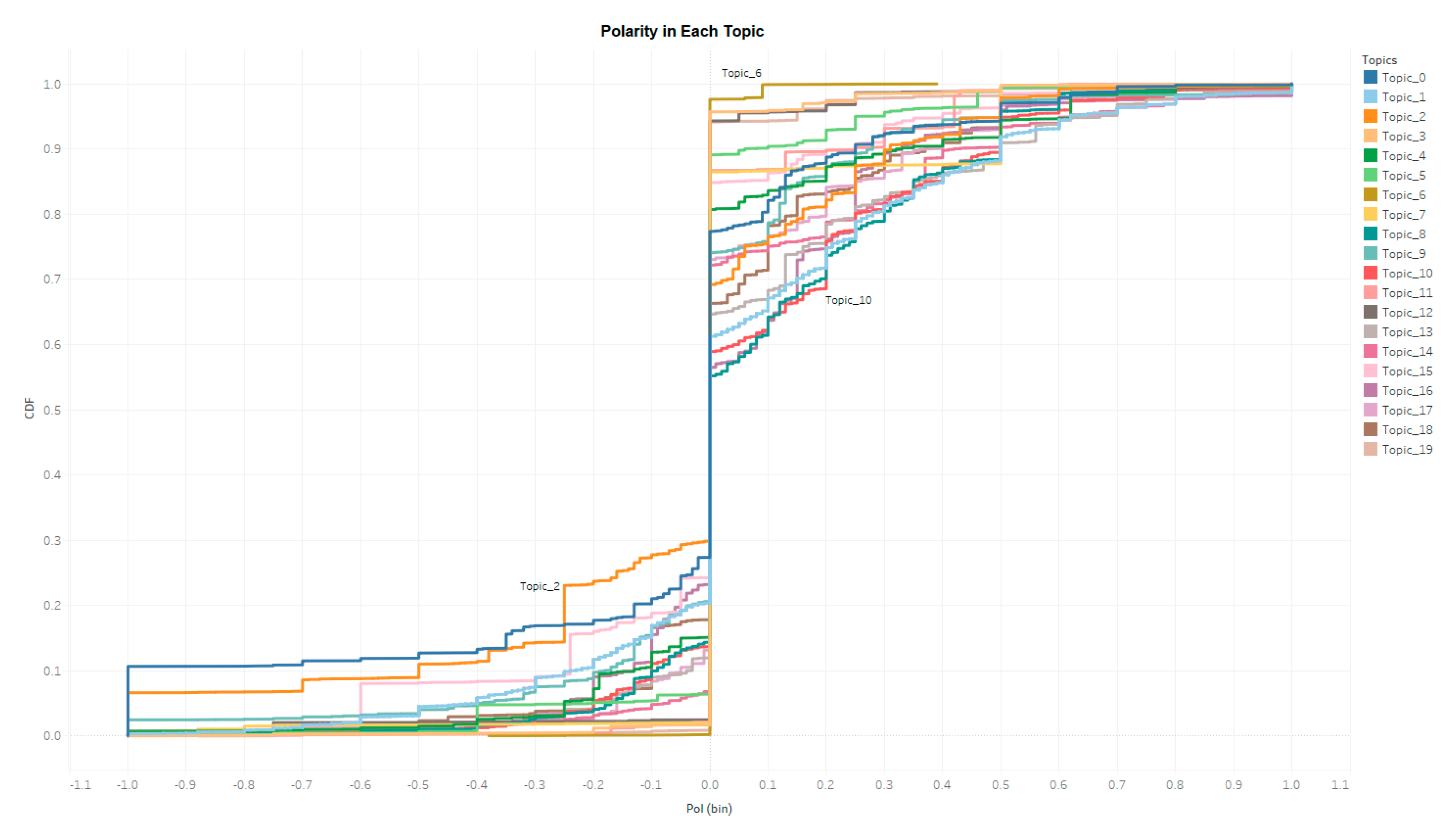
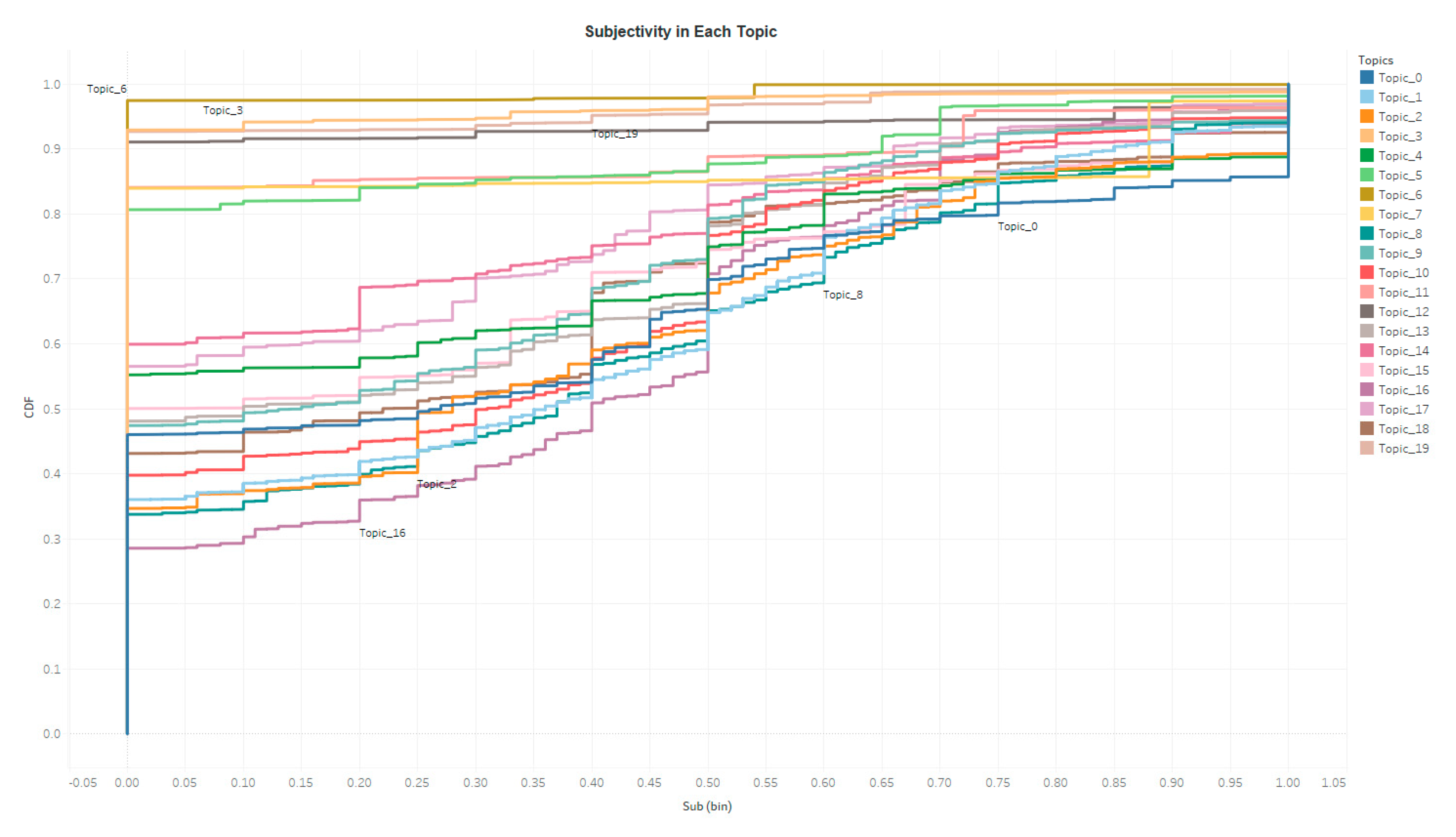
A sentimental analysis is performed for all tweets with the TextBolb Python Library (https://textblob.readthedocs.io/en/dev/). Special characters, e.g., URLs, are excluded from each tweet before this analysis. The outputs include a polarity index and a subjectivity index. The polarity index ranges from negative 1 to positive 1 indicating a very negative tone to a very positive tone, and the subjective index ranges from 0 to 1 indicating a very objective tone to a very subjective tone. Figure 3 and Figure 4 display the Cumulative Distribution Function (CDF) of polarity and subjectivity of all the tweets in each topic. Tweets in different topics present various sentiments. For example, topic 2 tends to be more objective and negative, as the polarity of tweets in topic 2 tends to be more negative and the subjective of the tweets in topic 2 is lower, namely more objective, than other topics. Again, single dimension analysis, such as sentimental analysis, only proves the sentimental variation. In-depth understanding of human’s online discussion requires analysis from multiple dimensions.
4.4. Social Network Construction
On Twitter, a user (author) can mention other Twitter users (mentioned users) in his/her tweets, and can also include several hashtags to label or signify the tweet content. By investigating who (what) are the influential and active users (hashtags), the researchers are able to identify the popular Twitter users and interest foci. This paper constructed two social networks for each topic, namely author-to-mentioned-user network and the hashtag network to identify the popular Twitter users and interest foci. For each topic, the researchers calculated the following statistics or measurements of network structure [45]:
- Frequency: The number of times an item, e.g., a hashtag or a Twitter user, has been mentioned in the collected tweets of one topic;
- Degree: The number of times an item is associated with other items, e.g., how many different hashtags/Twitter users are mentioned together with this hashtag/Twitter user in one topic:
- ○
- Indegree: In a directed network, the indegree is the number of ties an item receives from other items.
- ○
- Outdegree: In a directed network, the outdegree is the number of ties an item constructs toward other items.
Weighted degrees are calculated where the frequency is the weight.
- Eigenvector centrality: measure the influence of Twitter users or hashtags in networks. Weighted Eigenvector is calculated where the frequency is the weight.
Forty networks are thus constructed for each topic, and the frequency, degrees and eigenvector centralities are also calculated for the Twitter users and the hashtags in each network. Among those networks (i.e., topics), topic 1 contains the highest number of Twitter users and hashtags due to the large quantity of tweets in this topic, followed by topic 14 and 10.
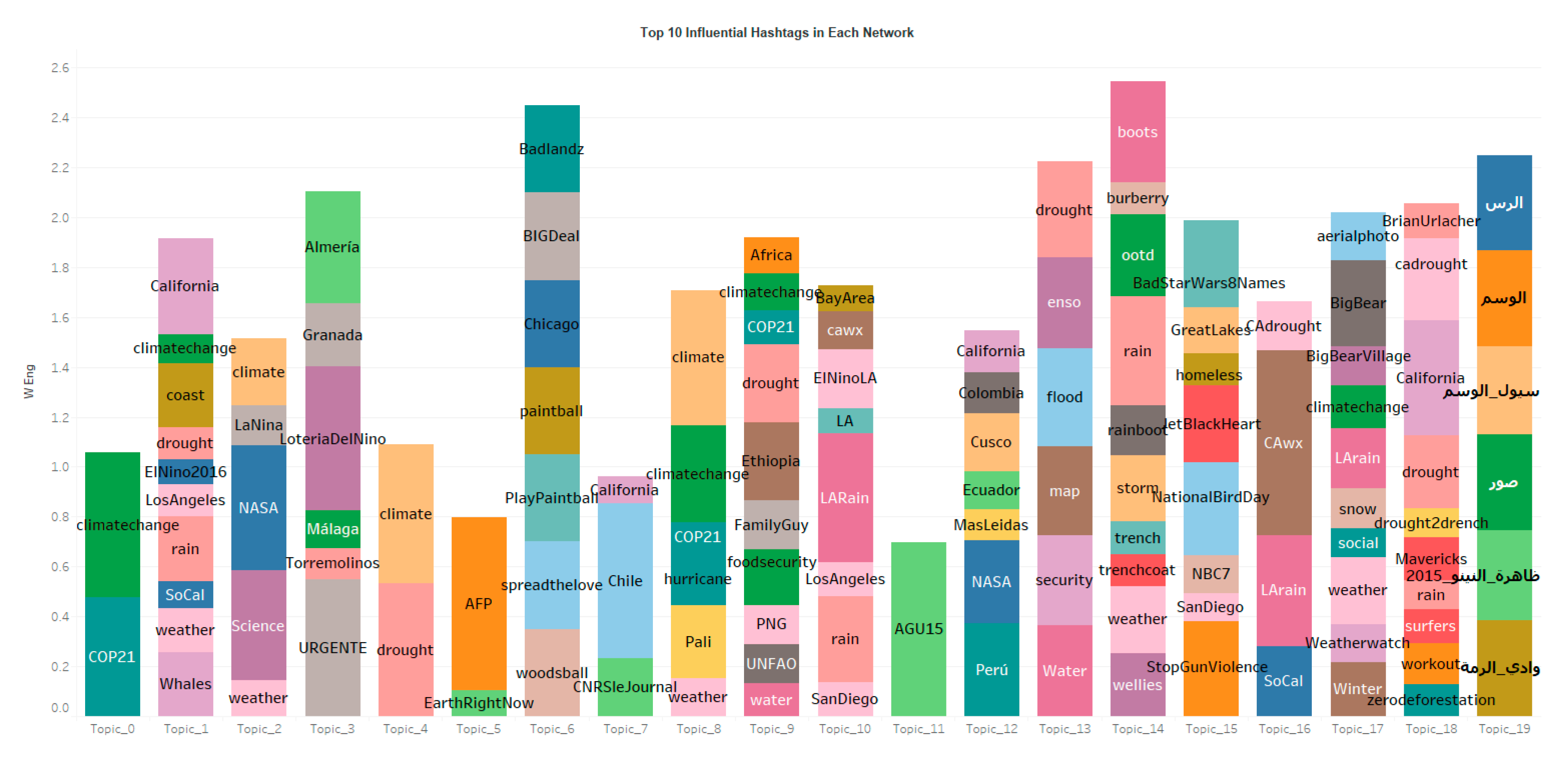
Figure 5 and Figure 6 display the top influential hashtags and users in each network where the length indicates the weighted Eigenvector centrality. Different from Figure 1 which includes the most significant keywords that distinguish each topic statistically, Figure 5 displays the most influential hashtags that best represent authors’ original intention on Twitter. Therefore, the hashtags are slightly different from the keywords. For example, the top 5 keywords in topic 19 are not the same language as the top 10 hashtags in topic 19. If we combine both figures together, more information about each topic can be obtained. For instance, the keywords that separate topic 0 from other topics are climatechange, cop and etc. The popular hashtags of topic 0 indicate that this topic focuses on climate change and COP 21, i.e., the 2015 United Nations Climate Change Conference. In addition, the keywords in topic 2 contain NASA, weather and impact. The hashtags in this topic focus on Science, NASA, La Niña and etc. Such hashtags and keywords also explain why the sentimental of topic 2 is the most objective and negative: this group of tweets is discussing the climate change due to the El Niño and La Niña with official agencies or scientific resources.
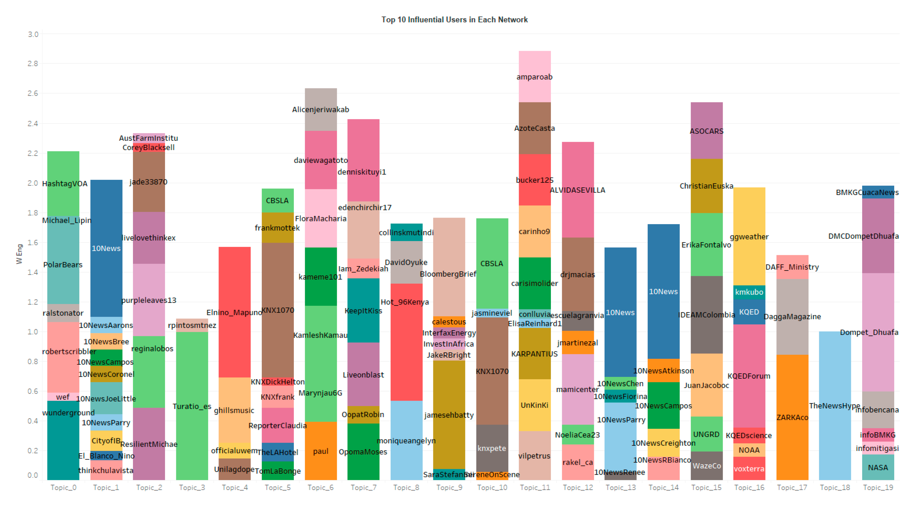
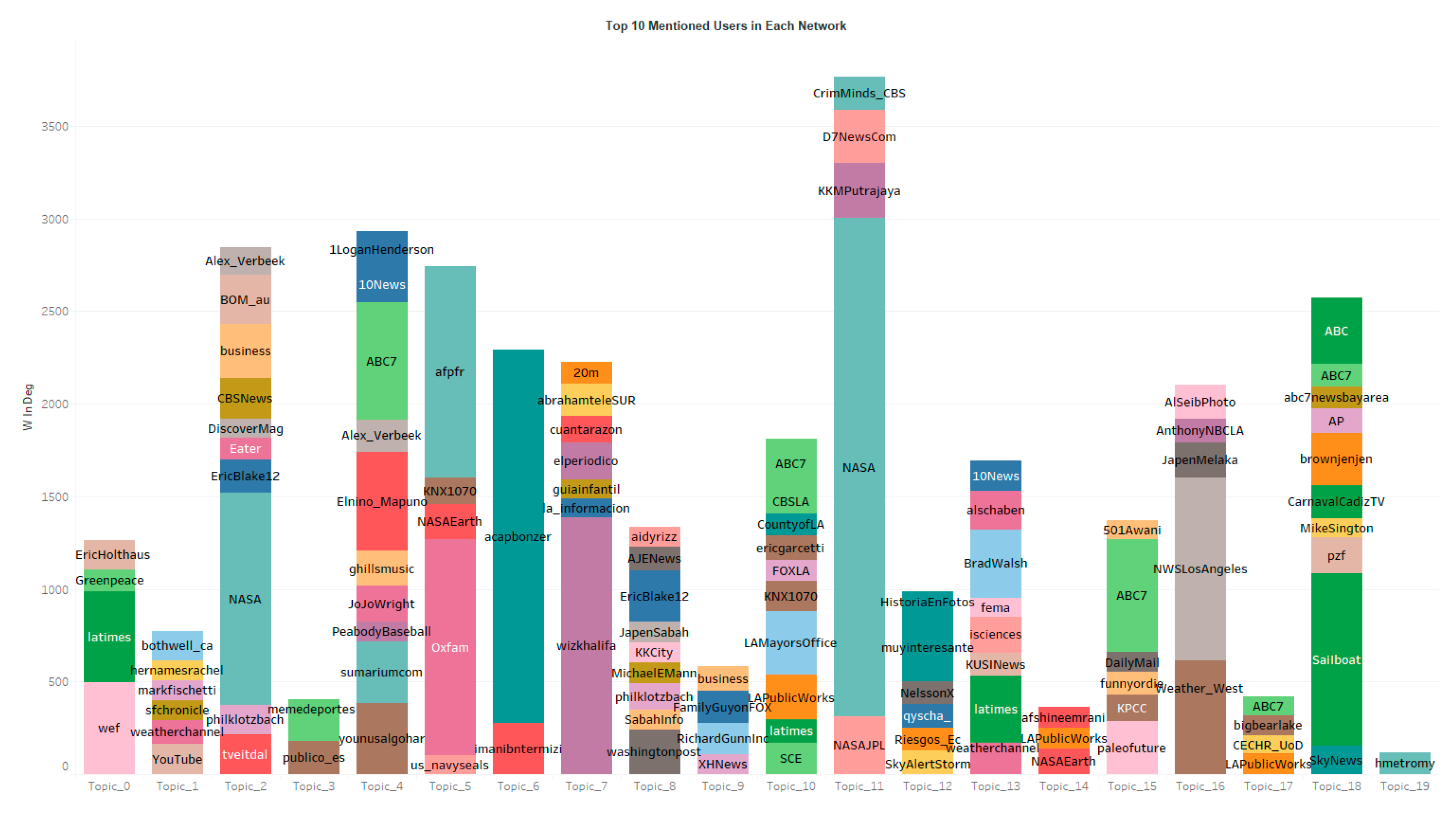
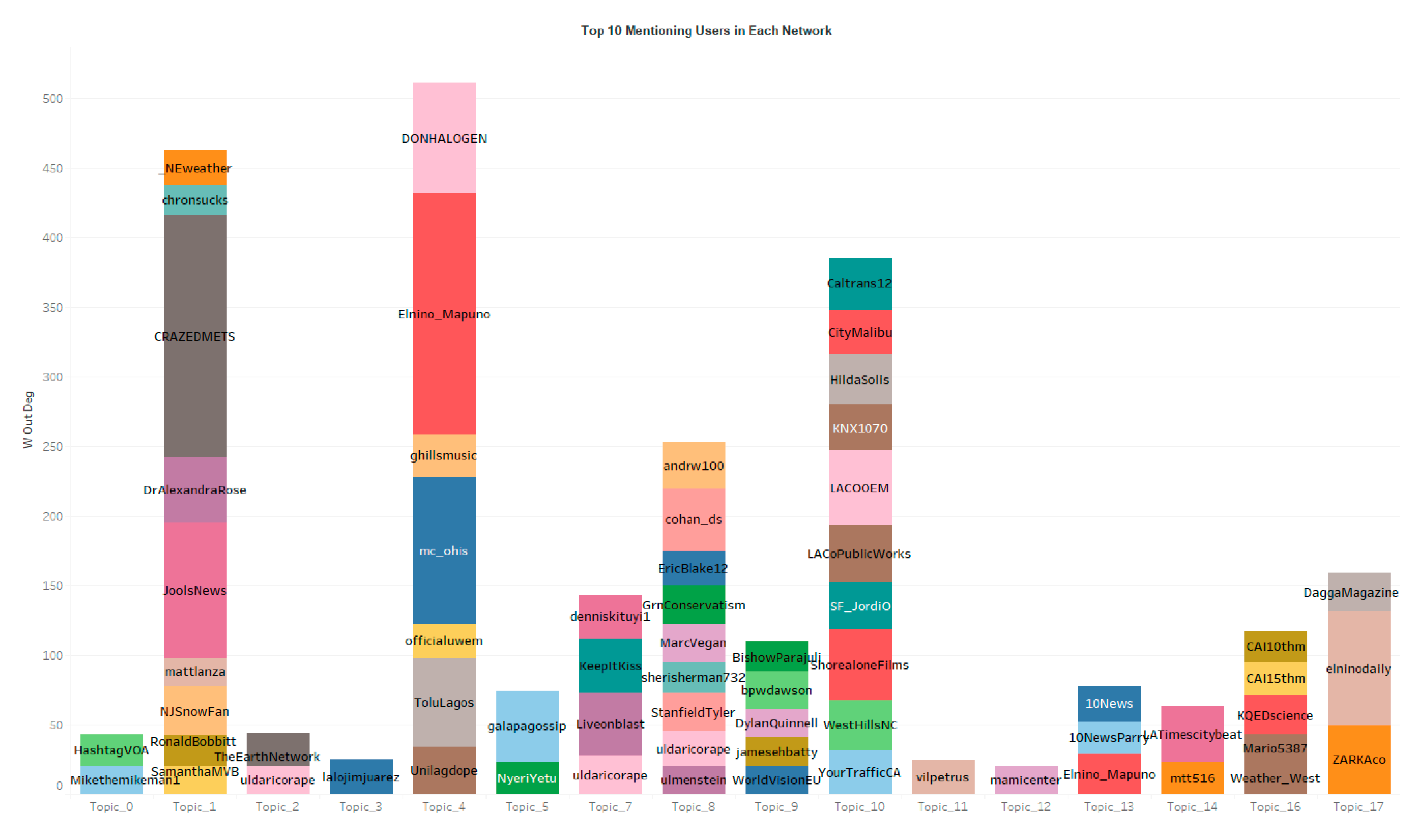
Figure 7 and Figure 8 show the most mentioned and mentioning users where the length indicates the weighted in-degree and out-degree of each user in their network.
It is clear that the local news media in CA, ABC 10 News, is the most powerful Twitter user in many topics (Figure 6). This is probability because this Twitter account is also actively interacting with other Twitter users in topic 13 (Figure 8), especially with other local news as shown in topic 1, 13 and 14, where those local news media accounts have high Eigenvector centrality (Figure 6). NASA and some national news media, such as ABC News, are frequently mentioned in topic 2, 11, 18 (Figure 7). However, those mentioned Twitter accounts are not actively interacting with other users, as they are not listed as the top mentioning users or influential users (Figure 6, Figure 8). In addition to those national news media, some local news media, e.g., ABC7, and local public agencies, such as LAMayorsOffice, are also frequently mentioned in topic 4, 10, 13, 15 and 18.
4.5. Data Quality and Bias
To access the data quality and potential bias in the collected tweets, the paper calculated the reputation of Twitter users and summarized the source of all tweets in each topic.
Specifically, the reputation is calculated based on [41]:
Figure 9 summarized the reputations of Twitter users in each topic and Figure 10 shows the sources, language and sensitivity of all tweets ordered by the number of tweets in each topic. Most tweets in topic 3, 5, 6, 7, 11, 12 and 19 are not in English. Topic 18 contains the most tweets that are published by bots or automatic tweeting services such as IFTTT, and include the most sensitive URLs. The other topics also contain a relative small portion of tweets from bots or automatic tweeting services. The reputations of Twitter users in topic 6 vary the most. This is because there is a large number of duplicated tweets in this topic where many tweets have 0 retweets, but a few tweets have huge retweets. The reputation of Twitter users in topic 19 is higher than other topics, and both topic 6 and 19 contain large number of tweets in the language of IN which is not listed on the ISO 639 language code (https://www.loc.gov/standards/iso639-2/php/code_list.php) or the Twitter official document (https://developer.twitter.com/en/docs/twitter-for-websites/twitter-for-websites-supported-languages/overview.html).
5. Multi-Dimension Analysis
Although analyses in Section 4 yield some insights of how people discuss El Niño on Twitter, such insights are limited when considered separately. For example, topic modeling classifies the tweets to different groups where tweets with similar words belong to the same group. The keywords in Figure 1 are insufficient to gain the exact meaning of those topics due to overlapped keywords. However, if we analyzed the outputs from Section 4 simultaneously, many meaningful questions can be answered. This section provides a few examples to demonstrate how the multi-dimension analysis can provide more meaningful insights to understand people’s discussion of El Niño on Twitter.
5.1. When and Where Do People Discuss El Niño
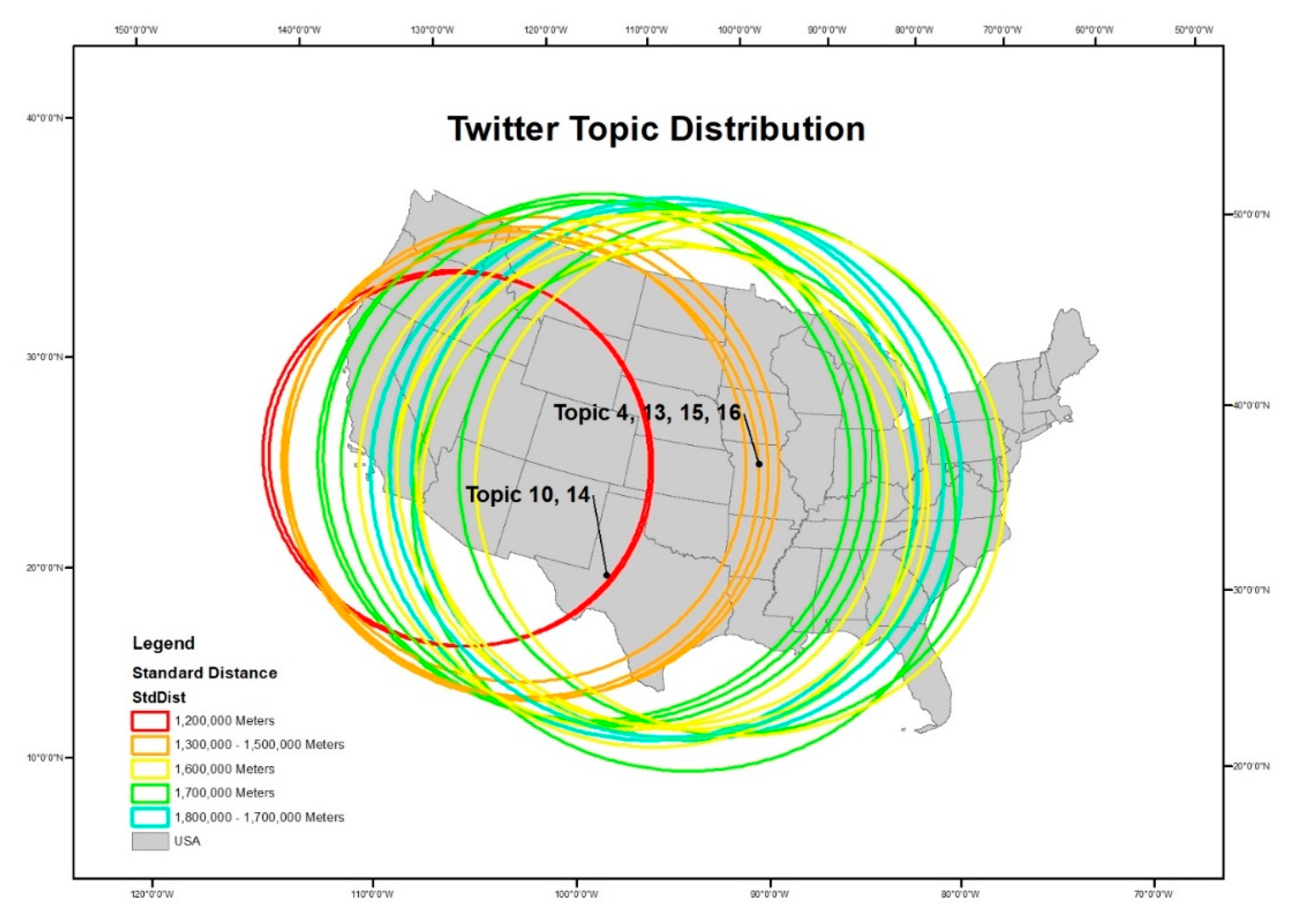
Although topic 1 has the most tweets located in the USA, topic 10 and 14 have the shortest standard distance that focuses on the west of the USA as shown on Figure 11 where the centroids of each circle indicate the mean centers of each topic and the radius of the circles represent the size of the standard distances.
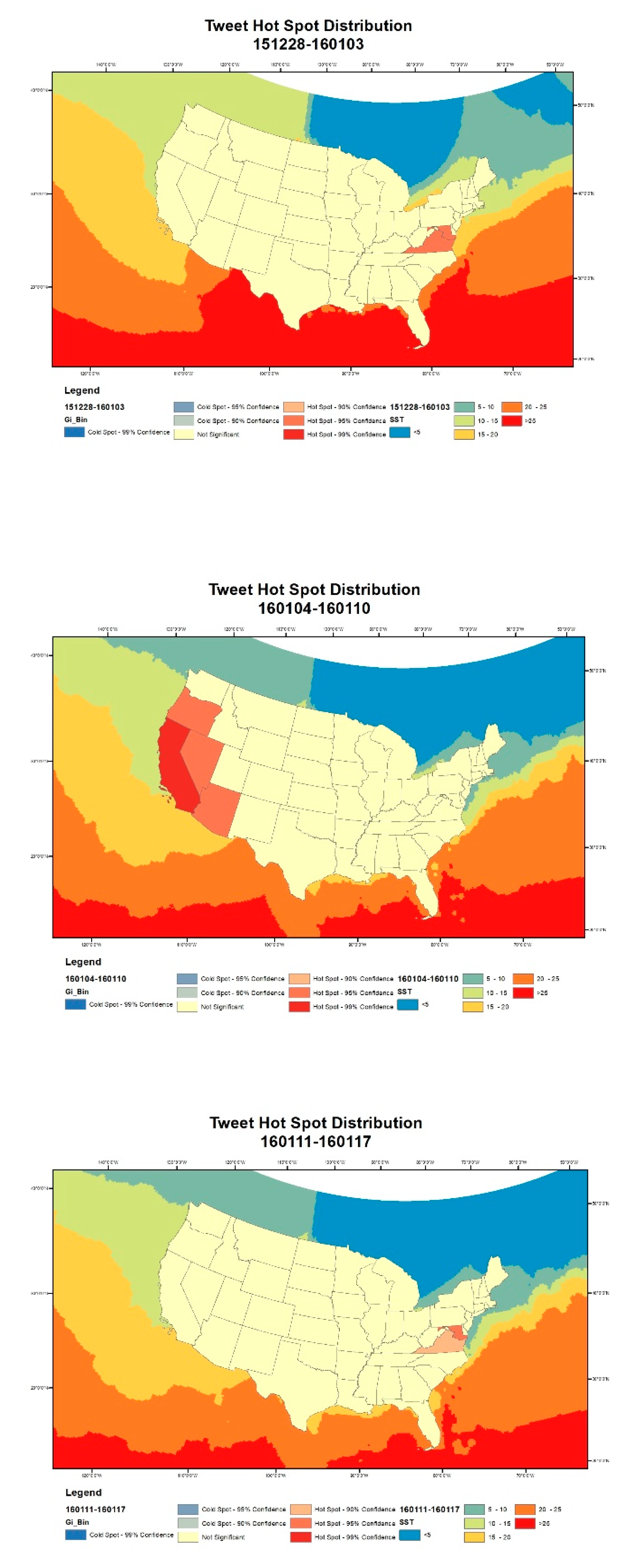
In addition to the spatial distribution of the geocoded tweets, Sea Surface Temperature (SST), an import indicator of El Niño, is also introduced to assess people’s perception and reaction to El Niño on Twitter over time and space. The geocoded tweet points were split into the same temporal internals as the SST data, e.g., 1 December 2015–6 December 2015, 7 December 2015–13 December 2015, etc. The hot–cold spots of the tweet density at the state level for each week were also calculated, and the Sea Surface Temperature (SST) of each week was added as a reference. The Polygon contiguity (first order) is selected as the spatial weight matrix in calculating the hot–cold spots.
According to Figure 12, Twitter users in the District of Columbia and surrounding areas tended to be consistently more interested in El Niño on Twitter before or after the CA storm, namely from 1 December 2015 to 3 January 2016. However, there was a sudden and abnormal increase in the SST on the west coast of the United States between 28 December 2015 and 3 January 2016, accompanied by heavy rainstorms in areas in California between 4 January 2016 and 10 January 2016 [46]. The discussion of El Niño on Twitter in California and its surrounding states thus was seen to increase dramatically between 4 January 2016 and 10 January 2016. As the SST returned to normal after 4 October 2016, the hotspots of the Discussion on El Niño came back and stayed in the District of Columbia and its nearby areas. The hot–cold spots reveal a general pattern that before or after the CA storm, Twitter users in D.C. express significant interests on the discussion of El Niño. This might be due to the concentration of federal departments and news media agencies in D.C. area. However, during the week of the CA rainstorm, Twitter users in CA and surrounding states showed more interests on El Niño due to the direct impact.
5.2. The Different Foci in Tweets
After combining all the outputs from Section 4, the different foci in tweets can be identified. Based on the common hashtags (Figure 5), the most mentioned and mentioning Twitter users (Figure 7, Figure 8), and the number of tweets in different language (Figure 2), topic 3, 5, 6, 7, 11, 12 and 19 contains significant portion of non-English tweets. This also explains why they have the least number of tweets that are geocoded in the USA. Topic 0 is a broad discussion of El Niño, for instance the World Economic Forum (@wef) is mentioned a lot. However, topic 9 and 17 also focus on the general or global discussion of El Niño. Those 3 topics are separated in the topic modeling because all of those contain a large number of tweets from one or two Twitter users, e.g., potential bots. Figure 13 calculate the number of tweets posted by each Twitter user in each topic. Topic 0 and 17 contain hug number of tweets from Twitter user tweetsbychkov while topic 9 contains many tweets from VinylrobotLA. Those extreme active Twitter users, or potential bots, lead to the Twitter discussion to 3 statistically different groups.
Topic 1 contains the highest number of tweets and geocoded tweets in the USA, and is more general of LA storm and El Niño. Topic 2 and 8 associated El Niño with climate change, and mentioned NASA or 2015 United Nations Climate Change Conference (COP 21) respectively. Therefore, their sentiment tends to be more objective and negative (Figure 3, Figure 4).
The other topics (4, 10, 13–16) talk more about the CA storm or LA rain due to the El Niño. Specifically, topic 15 and 16 are general discussion. Topic 10 focuses on how to prepare for the LA storm, thus shows more positive than other topics (Figure 3), and higher tweet density in LA than in DC (Figure 14). Both topic 13 and 14 display the near real-time report of El Niño where a lot of local news media are involved. However, topic 14 is separated from topic 13 due to the heave user of NecklaceFash who sends a lot of tweets related to boots or outfit of the day (ootd) when the LA storm came.
Scientists, national news media and local news media play important roles in disseminating and mediating discussions about El Niño events, which provides evidence that was not found in previous studies [26]. Specifically, the local news media and national news media behavior differently when reporting El Niño. As shown in Figure 6, Figure 7 and Figure 8, national new media have been mentioned a lot (e.g., in topic 18) when the tweets focusing on general discussion of El Niño, while local news media demonstrate more interests in CA storm (e.g., topic 13, 14). In addition, local news media tend to interact with other local news media on Twitter while national news media do not.
5.3. The Impact of Geopolitical Environment on Twitter Discussion
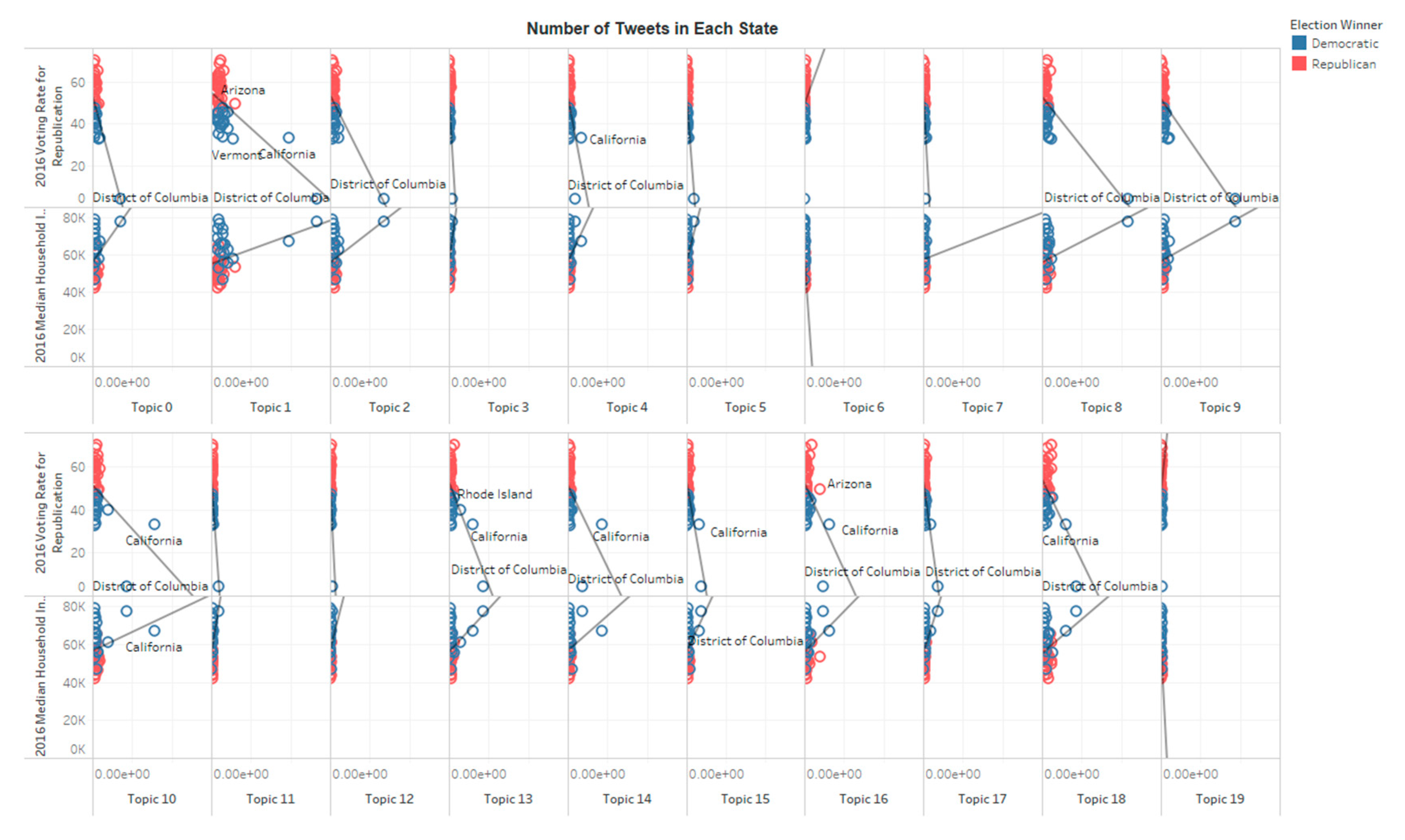
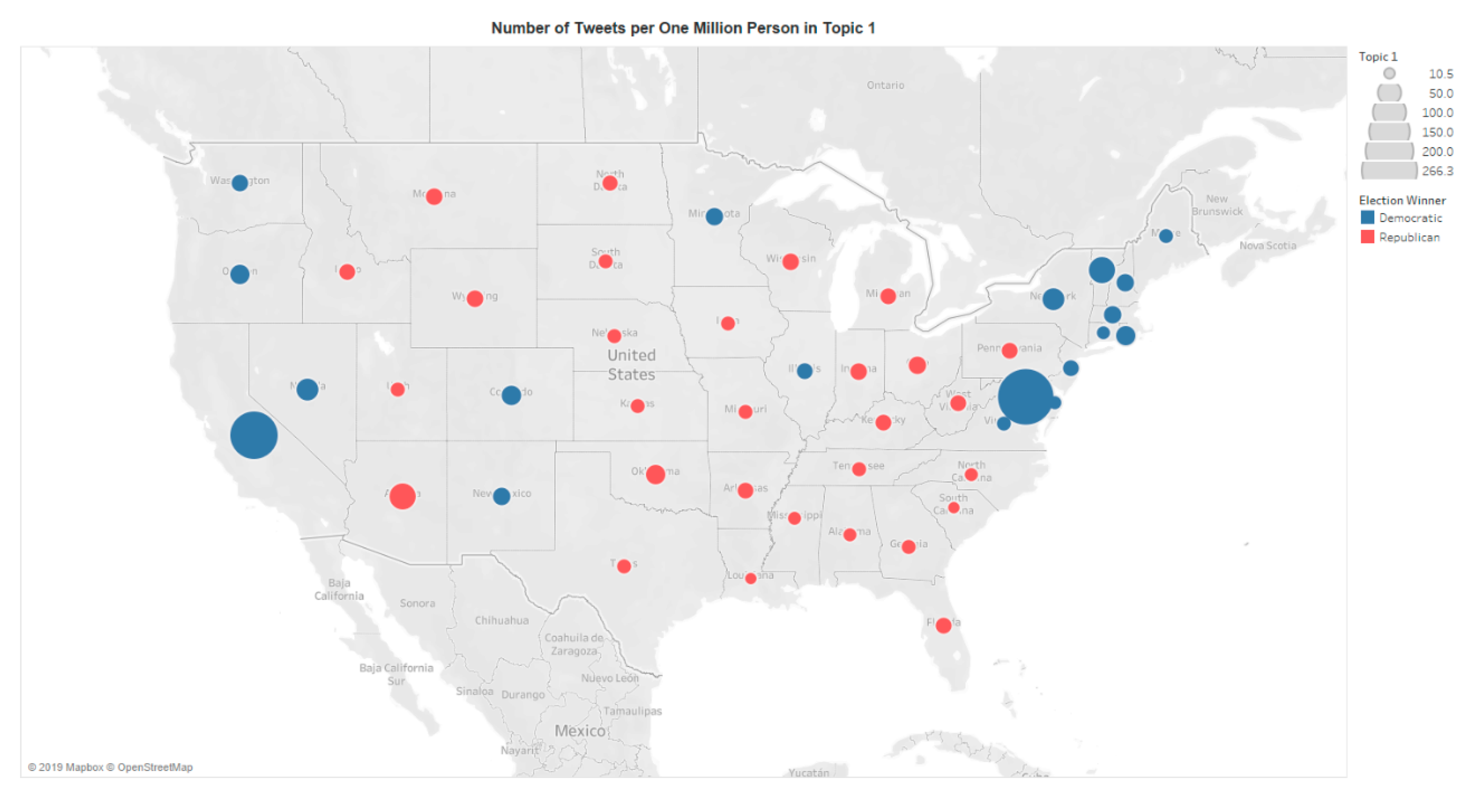
People’s perception is closely related to their nearby geographic and political environment [1,15]. The distribution of each topic is normalized by the population of each state to explore how the geopolitical environment impacts people’s discussion on El Niño on Twitter. Figure 15 depicts the distribution of the topic 1 within the United States spatially. The sizes of the dots indicate the number of tweets per one million persons in each state, and the colors represent the wining part in 2018 election. On average, people in District of Columbia and California produced the highest number of tweets, but people in District of Columbia talked more about El Niño in relation to climate change, while people in California focused on the real-time report of the storms. A clear pattern also emerged on Figure 14 indicating that people in states that voted for the Democratic Party in the 2016 Presidential Election talked more about El Niño than people in states that voted for the Republican Party. After comparing the correlation between the voting rate (data from [47]) for the two parties in each state, and the number of tweets in each topic per one million persons in each state, the researchers found that without considering DC and CA, topic 1 is the only one that significantly related to voting rate where states that favored the Republican Party had a moderate negative correlation with the number of discussions in the General Discussion on El Niño. Such a division is likely due to the factor that Democrat-led states focused more on cause, impact, and action of climate change [37], and discussions and responses to climate change news are dominated by climate change activists rather than climate change deniers [23]. However, none of those tweet densities are statistically related to the 2016 median household income in each state.
6. Discussion and Conclusions
Whenever Twitter users perceived what they thought were abnormal weather conditions, they immediately expressed their feelings and opinions on Twitter. This research analyzed the social media dynamics of a major natural disaster, El Niño, and compared the discussions of such disaster before, during and after an actual event which occurred on the west coast of the United States. A comprehensive analysis was conducted to investigate the perception of El Niño in both spatial–temporal and social–semantic dimensions. Such methods are able to identify the spatial–temporal clusters of people’s interests of specific events and can identify popular Twitter users or interest foci from Twitter data. Such multi-dimension analysis can identify complicated patterns of Twitter users’ online discussion and answer questions that cannot be addressed with single dimension analysis. For instance, this research revealed that people who were directly affected by the severe weather conditions demonstrated significant interest in them, more than people in other places. This indirectly contrasts to another study [29], where the discussions about climate change were found to be controlled by the state, enacted by state-sponsored actors and media, and remained limited to a theoretical discussion about climate change detached from the larger political context.
This paper also finds that when generally discussing a natural disaster, such as El Niño, the popular tweets tend to be negative and objective. However, when people are talking about an actual event or such disaster, the popular tweets tended to be just positive. In a discussion of the same El Niño events, people were found to have different foci. The majority of tweets in the discussion on Los Angeles Storm focused on the Los Angeles storm caused by an El Niño event. In this cluster, local news outlets were found to play a significant role in reporting the situations of the storm. In addition, there is also general discussion about El Niño events. In the general discussion on El Niño, laypeople expressed their interests and concerns on El Niño events. Tweets in the discussion on El Niño with climate change expressed serious concern about El Niño regarding climate change, global warming, drought, food security, etc., and in this discussion, scientists and national news media are seen as major contributors to the discussion.
Such diverse discussions are also related to the geopolitical environment of Twitter users. Twitter users in the District of Columbia area showed extraordinary interest in topics in the Discussion on El Niño with climate change, while Twitter users in California showed more concern for issues mentioned in the discussion on Los Angeles storm. Meanwhile, Twitter users in Democrat-led states discussed the El Niño events more than Twitter users in Republican-led states.
There are several limitations of this research. Although tens of thousands of tweets are analyzed to support the results, the analyzed tweets are still a small portion of the entire Twitter data archive, and there are a huge number of people who do not use Twitter as a major communication tool. Gathering comprehensive information on people’s discussion while not violating personal privacy is always a big challenge in big data science. Meanwhile, topic modeling separates tweets based on the statistical similarity where sarcasm or jargon cannot be detected, and is vulnerable to Twitter bots. A supervised machine learning model, such as Naïve Bay, may generate better results but requires huge human inputs. Finally, the majority of the tweets’ locations are geocoded from users’ profiles. Those locations may not represent the true locations where the tweets are actually posted.
Author Contributions
Xinyue Ye conceived and designed the study; Xinyue Ye and Xuebin Wei outlined the methodology; Xuebin Wei analyzed the data and drafted the manuscript; Xinyue Ye extensively updated the manuscript. All authors have read and approved the final manuscript.
Acknowledgments
This material is partially supported by the National Science Foundation under Grant No. 1416509. Any opinions, findings, and conclusions or recommendations expressed in this material are those of the author and do not necessarily reflect the views of the National Science Foundation.
Conflicts of Interest
The authors declare no conflict of interest.
References
- Bickerstaff, K.; Walker, G. Public understandings of air pollution: the ‘localisation’of environmental risk. Glob. Environ. Chang. 2001, 11, 133–145. [Google Scholar] [CrossRef]
- Goodchild, M.F.; Glennon, J.A. Crowdsourcing geographic information for disaster response: a research frontier. Int. J. Digit. Earth 2010, 3, 231–241. [Google Scholar] [CrossRef]
- Huang, Q.; Xiao, Y. Geographic Situational Awareness: Mining Tweets for Disaster Preparedness, Emergency Response, Impact, and Recovery. Isprs Int. J. Geo-Inf. 2015, 4, 1549–1568. [Google Scholar] [CrossRef] [Green Version]
- Williams, H.T.P.; McMurray, J.R.; Kurz, T.; Hugo Lambert, F. Network analysis reveals open forums and echo chambers in social media discussions of climate change. Glob. Environ. Chang. 2015, 32, 126–138. [Google Scholar] [CrossRef]
- Wang, Z.; Ye, X. Social media analytics for natural disaster management. Int. J. Geogr. Inf. Sci. 2018, 32, 49–72. [Google Scholar] [CrossRef]
- Bosch, T. Blogging and tweeting climate change in South Africa. Ecquid Novi Afr. J. Stud. 2012, 33, 44–53. [Google Scholar] [CrossRef]
- Chen, X.; Elmes, G.; Ye, X.; Chang, J. Implementing a real-time Twitter-based system for resource dispatch in disaster management. GeoJ 2016, 81, 863–873. [Google Scholar] [CrossRef]
- Kirilenko, A.P.; Stepchenkova, S.O. Public microblogging on climate change: One year of Twitter worldwide. Glob. Environ. Chang. 2014, 26, 171–182. [Google Scholar] [CrossRef]
- Ripberger, J.T.; Jenkins-Smith, H.C.; Silva, C.L.; Carlson, D.E.; Henderson, M. Social Media and Severe Weather: Do Tweets Provide a Valid Indicator of Public Attention to Severe Weather Risk Communication? Weather Clim. Soc. 2014, 4, 520. [Google Scholar] [CrossRef]
- Palen, L.; Vieweg, S.; Liu, S.B.; Hughes, A.L. Crisis in a Networked World: Features of Computer-Mediated Communication in the April 16, 2007, Virginia Tech Event. Soc. Sci. Comput. Rev. 2009, 27, 467–480. [Google Scholar] [CrossRef]
- Kasperson, R.E.; Renn, O.; Slovic, P.; Brown, H.S.; Emel, J.; Goble, R.; Kasperson, J.X.; Ratick, S. The social amplification of risk: A conceptual framework. Risk Anal. 1988, 8, 177–187. [Google Scholar] [CrossRef]
- Bickerstaff, K. Risk perception research: socio-cultural perspectives on the public experience of air pollution. Environ. Int. 2004, 30, 827–840. [Google Scholar] [CrossRef] [PubMed]
- Wang, Z.; Ye, X.; Tsou, M.-H. Spatial, temporal, and content analysis of Twitter for wildfire hazards. Nat. Hazards 2016, 83, 523–540. [Google Scholar] [CrossRef]
- Cutter, S.L.; Boruff, B.J.; Shirley, W.L. Social Vulnerability to Environmental Hazards. Soc. Sci. Q. 2003, 84, 242–261. [Google Scholar] [CrossRef]
- Baxter, J.; Greenlaw, K. Explaining perceptions of a technological environmental hazard using comparative analysis. Can. Geogr. Tor. 2005, 49, 61–80. [Google Scholar] [CrossRef]
- Mohaimin, S.A.; Ukkusuri, S.V.; Hugh, G. The Role of Social Networks and Information Sources on Hurricane Evacuation Decision Making. Nat. Hazards Rev. 2017, 18, 04017005. [Google Scholar]
- Sadri, A.M.; Ukkusuri, S.V.; Gladwin, H. Modeling joint evacuation decisions in social networks: The case of Hurricane Sandy. J. Choice Model. 2017, 25, 50–60. [Google Scholar] [CrossRef]
- Klonner, C.; Usón, T.J.; Marx, S.; Mocnik, F.B.; Höfle, B. Capturing Flood Risk Perception via Sketch Maps. Isprs. Int. J. Geo-Inf. 2018, 9, 359. [Google Scholar] [CrossRef]
- Graham, C.; Thompson, C.; Wolcott, M.; Pollack, J.; Tran, M. A guide to social media emergency management analytics: Understanding its place through Typhoon Haiyan tweets. Stat. J. Iaos. 2015, 31, 227–236. [Google Scholar] [CrossRef] [Green Version]
- Veltri, G.A.; Atanasova, D. Climate change on Twitter: Content, media ecology and information sharing behavior. Public Underst. Sci. 2017, 26, 721–737. [Google Scholar] [CrossRef]
- Pearce, W.; Holmberg, K.; Hellsten, I.; Nerlich, B. Climate Change on Twitter: Topics, Communities and Conversations about the 2013 IPCC Working Group 1 Report. PLoS ONE 2014, 9, 1–11. [Google Scholar] [CrossRef] [PubMed]
- Ukkusuri, S.; Zhan, X.; Sadri, A.; Ye, Q. Use of Social Media Data to Explore Crisis Informatics. Transp. Res. Rec. J. Transp. Res. Board 2014, 2459, 110–118. [Google Scholar] [CrossRef]
- Cody, E.M.; Reagan, A.J.; Mitchell, L.; Dodds, P.S.; Danforth, C.M. Climate Change Sentiment on Twitter: An Unsolicited Public Opinion Poll. PLoS ONE 2015, 10, 1–18. [Google Scholar] [CrossRef] [PubMed]
- Yamagata, Y.; Murakami, D.; Peters, G.W.; Matsui, T. A spatiotemporal analysis of participatory sensing data ‘tweets’ and extreme climate events toward real-time urban risk management. arXiv 2015, arXiv:150506188. [Google Scholar] [CrossRef]
- Sisco, M.R.; Bosetti, V.; Weber, E.U. When do extreme weather events generate attention to climate change? Clim. Chang. 2017, 143, 227–241. [Google Scholar] [CrossRef]
- Kirilenko, A.P.; Molodtsova, T.; Stepchenkova, S.O. People as sensors: Mass media and local temperature influence climate change discussion on Twitter. Glob. Environ. Chang. 2015, 30, 92–100. [Google Scholar] [CrossRef]
- Kim, I.-H.; Feng, C.-C.; Wang, Y.-C.; Spitzberg, B.H.; Tsou, M.-H. Exploratory Spatiotemporal Analysis in Risk Communication during the MERS Outbreak in South Korea. Prof. Geogr. 2017, 69, 629. [Google Scholar] [CrossRef]
- Allen, C.; Tsou, M.-H.; Aslam, A.; Nagel, A.; Gawron, J.-M. Applying GIS and Machine Learning Methods to Twitter Data for Multiscale Surveillance of Influenza. PLoS ONE 2016, 11, 1–10. [Google Scholar] [CrossRef]
- Liu, J.C.-E.; Zhao, B. Who speaks for climate change in China? Evidence from Weibo. Clim. Chang. 2017, 140, 413–422. [Google Scholar] [CrossRef]
- Sadri, A.M.; Hasan, S.; Ukkusuri, S.V.; Cebrian, M. Understanding Information Spreading in Social Media during Hurricane Sandy: User Activity and Network Properties. arXiv 2017, arXiv:170603019 Cs. [Google Scholar]
- Sadri, A.M.; Hasan, S.; Ukkusuri, S.V.; Lopez, J.E.S. Analyzing Social Interaction Networks from Twitter for Planned Special Events. arXiv 2017, arXiv:170402489 Cs. [Google Scholar]
- Sadri, A.M.; Hasan, S.; Ukkusuri, S.V.; Cebrian, M. Crisis Communication Patterns in Social Media during Hurricane Sandy. arXiv 2017, arXiv:171001887 Cs. [Google Scholar] [CrossRef]
- Kryvasheyeu, Y.; Chen, H.; Moro, E.; Hentenryck, P.V.; Cebrian, M. Performance of Social Network Sensors during Hurricane Sandy. PLoS ONE 2015, 10, e0117288. [Google Scholar] [CrossRef]
- Kryvasheyeu, Y.; Chen, H.; Obradovich, N.; Moro, E.; Hentenryck, P.V.; Fowler, J.; Cebrian, M. Rapid assessment of disaster damage using social media activity. Sci. Adv. 2016, 2, e1500779. [Google Scholar] [CrossRef] [PubMed]
- Chae, J.; Thom, D.; Jang, Y.; Kim, S.; Ertl, T.; Ebert, D.S. Public behavior response analysis in disaster events utilizing visual analytics of microblog data. Comput. Graph. 2014, 38, 51–60. [Google Scholar] [CrossRef]
- Hibberd, M.; Buchanan, M. The Difficulties in Using Social Media for Extreme Weather Emergencies. Sociol. E Polit. Sociali 2014, 17, 127–137. [Google Scholar] [CrossRef]
- Jang, S.M.; Hart, P.S. Polarized frames on ‘climate change’ and ‘global warming’ across countries and states: Evidence from Twitter big data. Glob. Environ. Chang. 2015, 32, 11–17. [Google Scholar] [CrossRef]
- Smith, K.S.; McCreadie, R.; Macdonald, C.; Ounis, I. Regional Sentiment Bias in Social Media Reporting During Crises. Inf. Syst. Front. 2018, 20, 1013–1025. [Google Scholar] [CrossRef] [Green Version]
- Davis, C.A.; Varol, O.; Ferrara, E.; Flammini, A.; Menczer, F. BotOrNot: A System to Evaluate Social Bots. In Proceedings of the WWW16—25th International Conference Companion on World Wide Web, Montreal, QC, Canada, 11–15 April 2016; pp. 273–274. [Google Scholar]
- Tsou, M.-H.; Zhang, H.; Jung, C.-T. Identifying Data Noises, User Biases, and System Errors in Geo-tagged Twitter Messages (Tweets). arXiv 2017, arXiv:171202433 Cs. [Google Scholar]
- Chu, Z.; Gianvecchio, S.; Wang, H.; Jajodia, S. Detecting Automation of Twitter Accounts: Are You a Human, Bot, or Cyborg? IEEE Trans. Dependable Secur. Comput. 2012, 6, 811. [Google Scholar] [CrossRef]
- Walt, E.V.D.; Eloff, J. Using Machine Learning to Detect Fake Identities: Bots vs. Humans. IEEE Access 2018, 6, 6540–6549. [Google Scholar] [CrossRef]
- National Oceanic and Atmospheric Administration. El Niño & La Niña. Available online: https://www.climate.gov/enso (accessed on 6 June 2019).
- Grus, J. Data Science from Scratch: First Principles with Python, 1st ed.; O’Reilly Media: Sebastopol, CA, USA, 2015. [Google Scholar]
- Hanneman, R.A.; Riddle, M. Introduction to Social Network Methods; University of California Riverside: Riverside, CA, USA, 2005. [Google Scholar]
- Jenner, L. NASA Observes Extreme Rainfall Over Southern California. NASA, 26-Jan-2017. Available online: http://www.nasa.gov/feature/goddard/2017/nasa-observes-extreme-rainfall-over-southern-california (accessed on 29 April 2017).
- Politico. 2016 Election Results: President Live Map by State, Real-Time Voting Updates. Available online: http://www.politico.com/2016-election/results/map/president (accessed on 26 September 2017).
Figure 1.
The top 5 keywords in each topic.
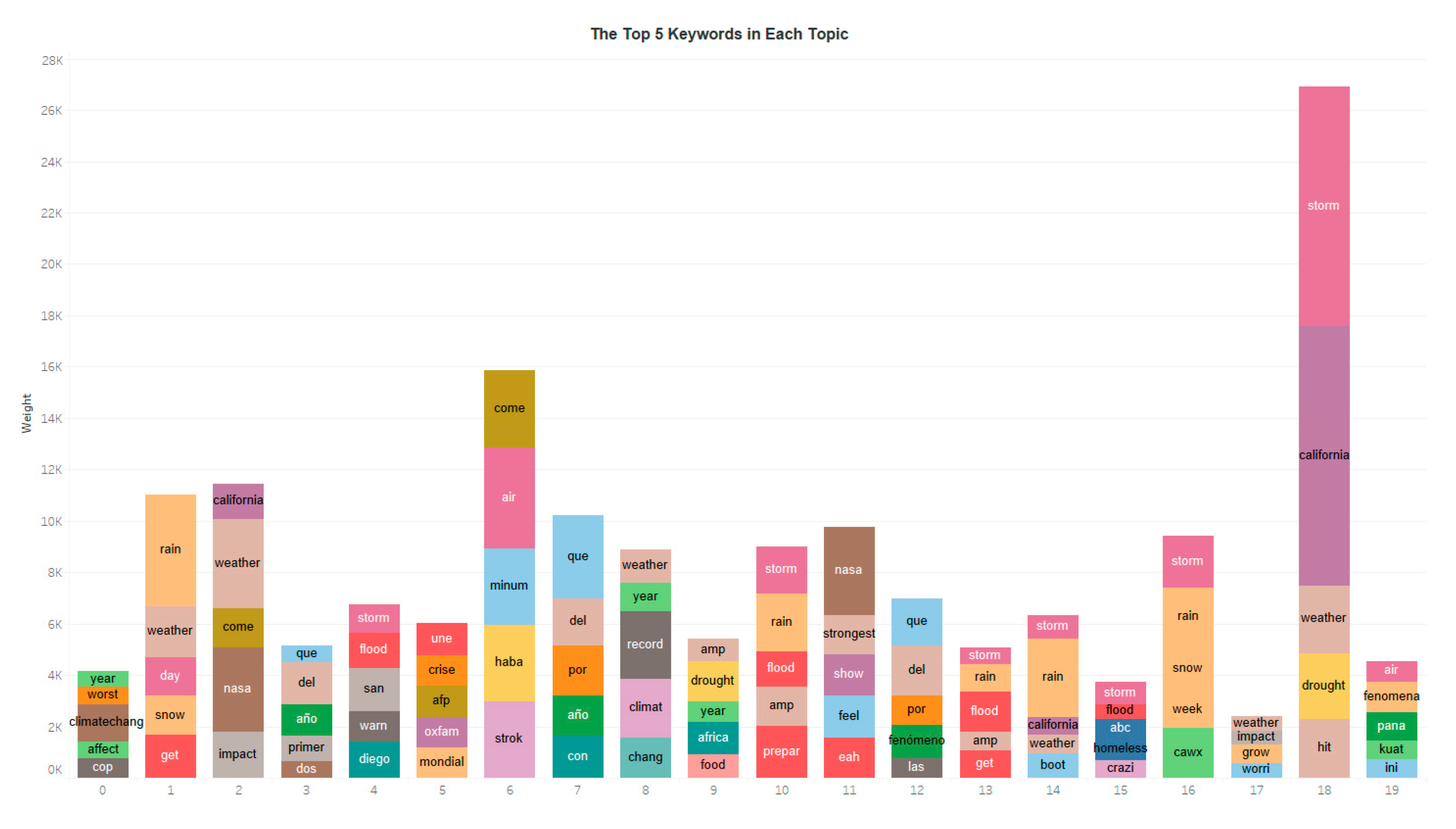
Figure 2.
Number of tweets in each topic.
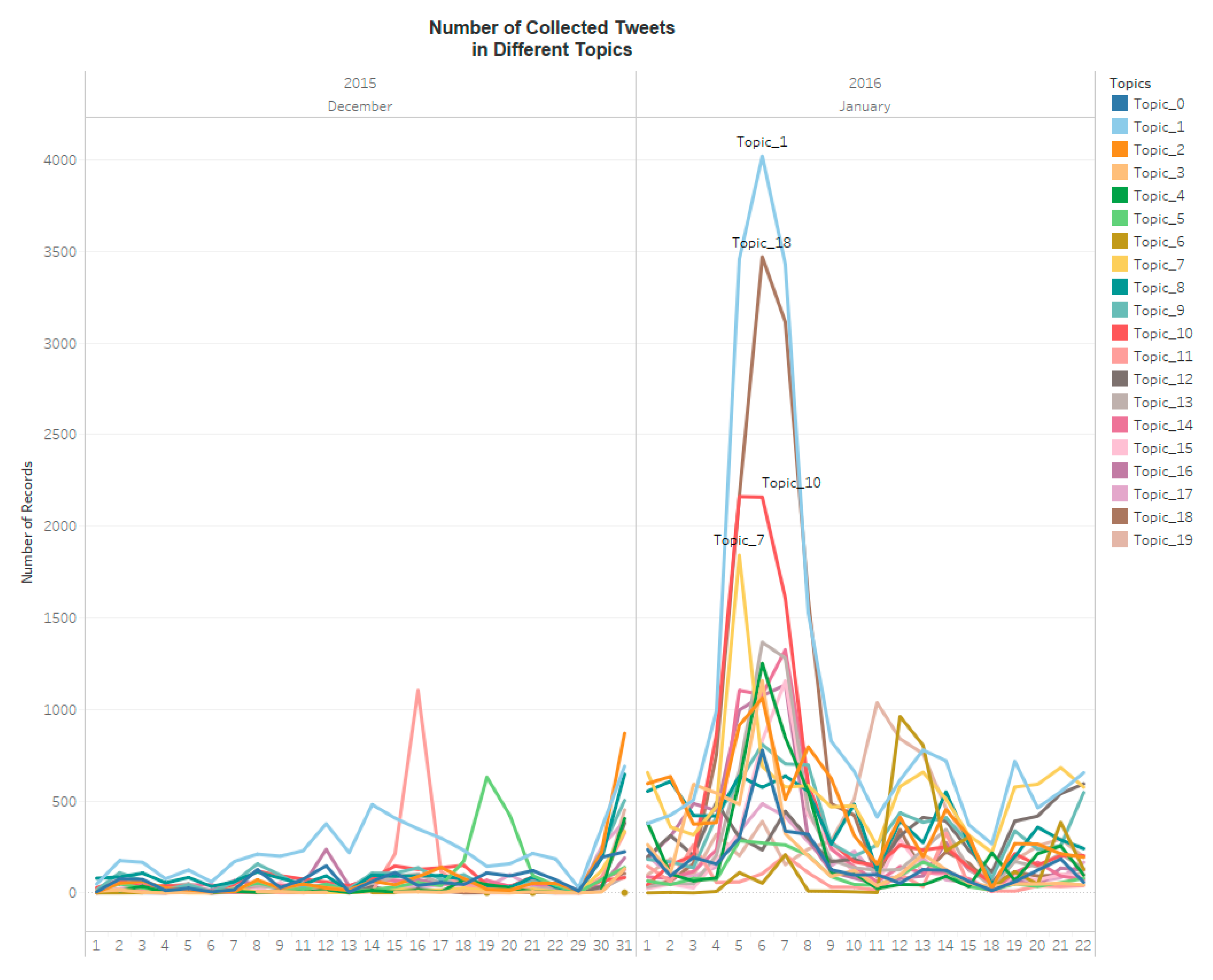
Figure 3.
Polarity in each topic.

Figure 4.
Subjectivity in each topic.

Figure 5.
The top 10 influential hashtags (excluding El Niño).

Figure 6.
The top 10 influential users.

Figure 7.
The top 10 mentioned users.

Figure 8.
The top 10 mentioning users.

Figure 9.
Reputation of Twitter users.
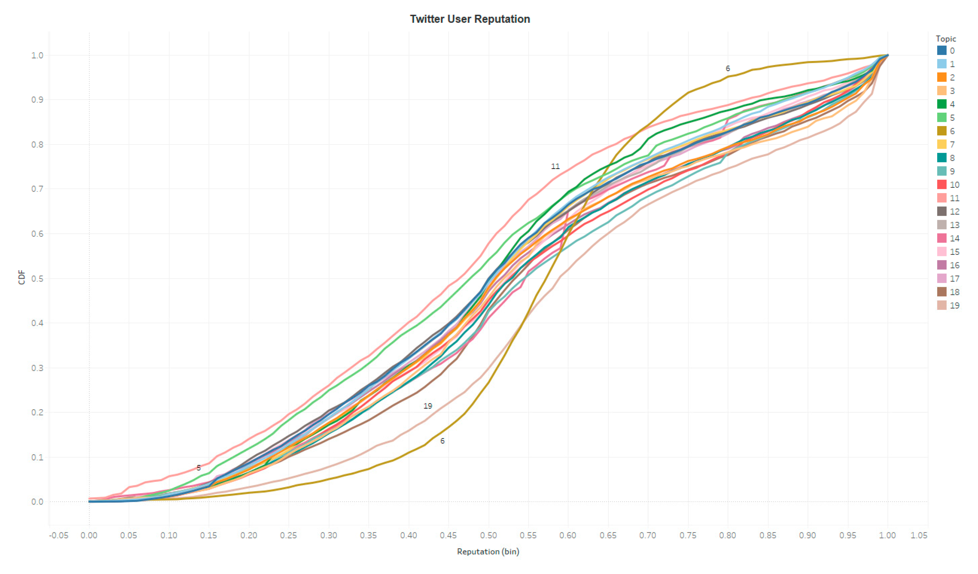
Figure 10.
Tweet source, language and sensitivity.

Figure 11.
Twitter topic distribution in the USA.

Figure 12.
Spatial–temporal variation of Twitter point before, during and after the CA storm.

Figure 13.
Number of tweets per Twitter user.
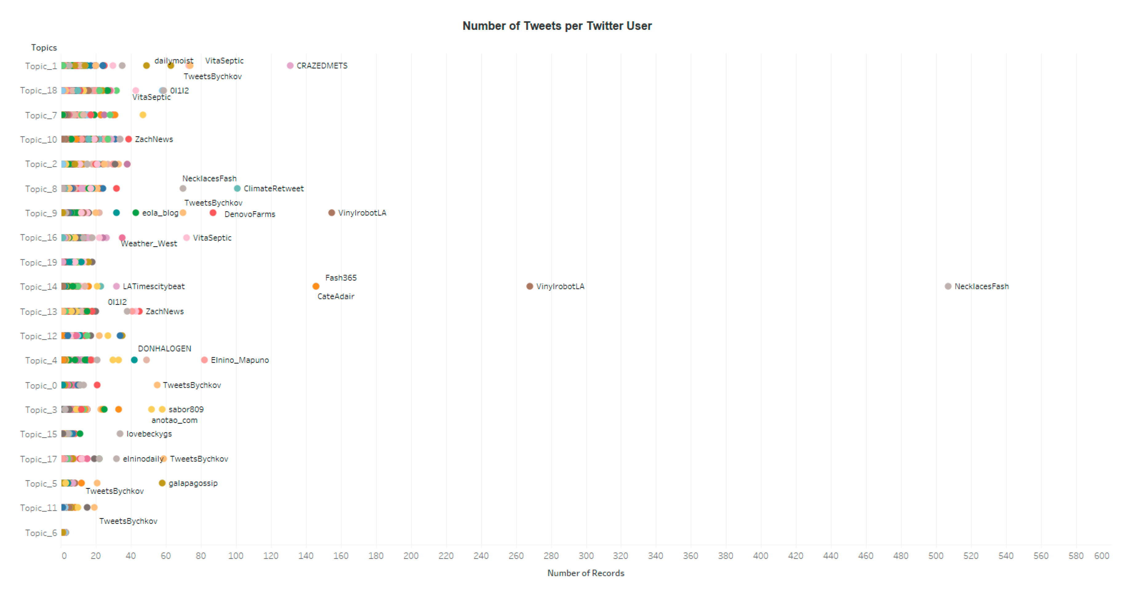
Figure 14.
Number of Tweets in each state.

Figure 15.
Spatial distribution of tweets in topic 1.

© 2019 by the authors. Licensee MDPI, Basel, Switzerland. This article is an open access article distributed under the terms and conditions of the Creative Commons Attribution (CC BY) license (http://creativecommons.org/licenses/by/4.0/).
Share and Cite
MDPI and ACS Style
Ye, X.; Wei, X. A Multi-Dimensional Analysis of El Niño on Twitter: Spatial, Social, Temporal, and Semantic Perspectives. ISPRS Int. J. Geo-Inf. 2019, 8, 436. https://0-doi-org.brum.beds.ac.uk/10.3390/ijgi8100436
AMA Style
Ye X, Wei X. A Multi-Dimensional Analysis of El Niño on Twitter: Spatial, Social, Temporal, and Semantic Perspectives. ISPRS International Journal of Geo-Information. 2019; 8(10):436. https://0-doi-org.brum.beds.ac.uk/10.3390/ijgi8100436
Chicago/Turabian StyleYe, Xinyue, and Xuebin Wei. 2019. "A Multi-Dimensional Analysis of El Niño on Twitter: Spatial, Social, Temporal, and Semantic Perspectives" ISPRS International Journal of Geo-Information 8, no. 10: 436. https://0-doi-org.brum.beds.ac.uk/10.3390/ijgi8100436
Note that from the first issue of 2016, this journal uses article numbers instead of page numbers. See further details here.