Analyzing Newspaper Maps for Earthquake News through Cartographic Approach


Geomatics Engineering Dept., Civil Engineering Faculty, Istanbul Technical University, Maslak, Istanbul 34469, Turkey
*
Author to whom correspondence should be addressed.
ISPRS Int. J. Geo-Inf. 2019, 8(5), 235; https://0-doi-org.brum.beds.ac.uk/10.3390/ijgi8050235
Submission received: 14 November 2018
/
Revised: 10 April 2019
/
Accepted: 5 May 2019
/
Published: 21 May 2019
(This article belongs to the Special Issue Human-Centered Geovisual Analytics and Visuospatial Display Design)
Abstract
:This study focuses on newspaper maps, which have an important role in conveying spatial information to newspaper readers. Maps and map-like items in the main Turkish newspapers within a certain period were evaluated in regard to the scope of the study. A database was constructed to organize the collected data and conduct the analysis. In addition to cartographic and thematic analyses, the database allows “georeferencing” to be conducted as well. However, the current study focused on the cartographic and thematic properties of these maps. Their deficiencies were identified from a cartographic perspective and with that, the parts of newspapers that maps are mostly included in were investigated, and we aimed to identify the topics and events that increase map usage in newspapers. For this purpose, maps of earthquake-related news were evaluated as a case study to show some spatial and thematic determinations. Thus, the contribution of newspapers to spatial thinking abilities and geographic knowledge of the readers was evaluated by cartographers. The study proves the importance of cartography in spreading knowledge through maps in newspapers. This opens up new possibilities for future studies to develop a different cartographic perspective on map usage and improve the geographic knowledge of newspaper readers.
1. Introduction
Maps are common spatial tools that do not require people to be professionals to use them in daily life. People can be exposed to maps through different channels. Maps, in written media, are an important way of spreading geographic and spatial data to society and provide an opportunity to improve people’s spatial thinking. Since some news items contain geographical component, the “where” question is of important journalistic concern. Maps also provide the answer to “why” and “how” questions by being an efficient means of showing location and describing geographical relationships [1,2]. Using only text is not as explanatory as maps are for describing spatial relationships and cognition [3]. There is also no other graphic representation tool that could show spatial relationships as good as a map can. Maps also play a fundamental role in the society´s geographic education [3], because they provide an opportunity to enhance spatial thinking and map reading skills. Cartographic tools can be easily reached; however, newspapers provide this through daily news without any extra effort by the reader. Newspaper maps are a unique cartographic genre, because there is no other spatial thinking tool that has such a large audience [3,4]. Maps and map-like contents have reached millions of people through newspapers. Therefore, newspapers are a cheap, easy, and influential way to convey a spatial tool to people in their everyday lives.
Since maps have such an important role, their cartographic analyses should be taken into consideration. A few studies in cartographic literature have shown similar concerns about journalistic cartography [3,4,5,6,7,8,9]. The most detailed studies related to map use in the news were carried by Mark Monmonier in the 1980s. The book Maps with the News (1989), which was published as part of his studies, examined the use of maps in the news, including some case studies on newspapers, channels, and magazines between 1870 and 1985. Monmonier’s study involved the use of maps in the news about some different topics in the U.S., Canada, and the UK in 1985. Therefore, with Monmoniner’s important contributions, the studies examined the map use of newspapers in the U.S., Canada, the UK, Finland, and Slovenia [3,4,5,9]. Other than these similar studies, in 1985 and 1988, Balchin conducted two studies on the use of maps in different media tools such as TV programs and press media [6,7]. He focused on the usage and deficiencies of cartographic parameters in the maps.
Distinctly, this study looks the data from newspapers with a different methodology and approach, as mentioned in Section 2. Mainly, its purpose is to analyze the maps in newspapers with their different aspects to determine the potential worth of cartographic knowledge and to determinate the cartographic situations of the maps. From this point of view, this study aims to
- Collect map and map-like items from selected newspapers in a certain period;
- Classify of the items in newspapers according to their spatial and thematic features to construct a web-based and geo-spatial database to share with researchers;
- Investigate which parts of newspapers the maps are mostly included in;
- Determine the topics and events that increase map usage in the newspapers.
For these purposes, in the main study, we collected map and map-like items from selected newspapers in the study period (1928–2000) and classified them according to their spatial and thematic features to construct a web-based and geo-spatial database which was introduced for the first time in Turkey to share with researchers. Therefore, in addition to a thematic analysis, certain cartographic parameters such as “map types” and “map elements”, which were determined according to cartographic references [1,10,11,12,13,14], were analyzed through the database (for detailed information: mentioned in Section 2.1).
The results obtained from these analyses and maps on earthquake news were used as the case study in order to show the increase of map usage in a specific topic for a certain period (1990–2000). Maps of earthquake-related news were examined in the scope of the case study with similar concerns and methodology to the main study (mentioned in Section 3). During these investigations, a dramatic increase was seen in the map usage during the study period in the year 1999. The reasons for the leap are discussed and certain cartographic parameters of the maps on earthquake related news were evaluated consistent with the purposes of the main study. The deficiencies and quantities of the cartographic parameters of these maps were determined and interpreted.
This study is basically aimed at making a contribution to cartographic literature with the analysis of the data and the results of the analysis. It is believed that further contributions to the sub-topics of cartography, such as map use and cognition, can be made with the data that can be used in future studies.
2. Methodology
To analyze newspaper maps, data was obtained from 8 selected newspapers within a specific time interval. The time interval for the main research was the Alphabet Revolution of Turkish Republic (1928) and the period when web newspapers were launched (2000). While some of these newspapers were printed throughout the whole period, others were not. These newspapers were chosen according to their circulation in their publication periods. They are nationally recognized daily newspapers and are distributed throughout Turkey. Because they do not present tabloid news, these are considered to be part of the ‘quality press’ of their time periods. Weekend or special issues of these newspapers were not taken into consideration in the scope of the research. Except for these supplements, all categories of newspaper (politic, sport, advertisement, economy pages, etc.) were investigated during the archive section of research. All items were collected from those newspapers in both libraries manually by camera and using online sources [15,16].
2.1. Structure of Database
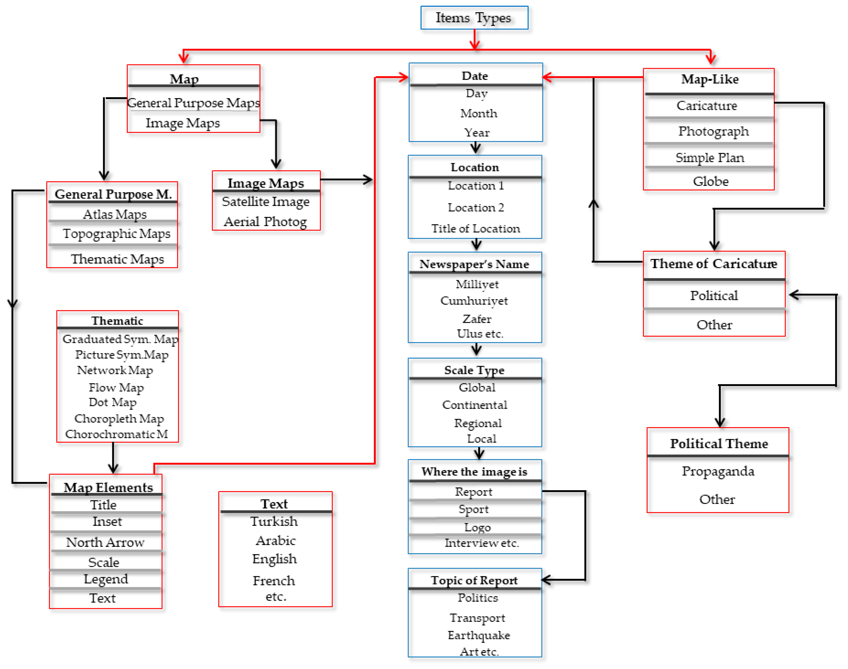
After the data collection stage, more than 7000 items (map or map-like) of the years between 1928 and 2000 were obtained. It was decided that a hierarchical web-based database should be set up to examine these contents, which would enable them and their related news to be saved. This would make it easier to search and review map and map-like items according to their dates, newspaper names, newspaper sections the items are in, and their subjects. Therefore, the database offers the possibility for researchers to select one or more search criteria according to their research specifics. The designed structure of the database also allows cartographic and thematic analyses to be conducted (Figure 1).
The data group of the study was classified into two categories: maps and map-like items. During data entry to the database, it was decided that certain items were “maps” (Figure 2).
Those items could answer “where”, “how”, and “why” questions in accordance with the general map definition [1,2]. From maps, information on distances, directions, and area sizes can be retrieved and relations understood and quantified [13]. On the other hand, it has been seen that some items called ‘pictorial maps’ which have been used in different studies in the literature [6,7,8,17,18] did not show similar features to the map, and they did not provide these criteria. Since there is no content map that transmits spatial information, an analysis is needed under the “map-like” heading [19] (Figure 3).
These decorative items, which often contain subtle signals and map-like elements, are ideal for advertising the accompanying events’ geographic focus [3] and are seen as illustrations, cartoons, simple plans, globes or photographs in the newspapers. In particular, illustrations and cartoons of some newspapers use a simple outline, like a national boundary, to identify a series of geographically grouped news briefs. It was observed that these cartographic cues contribute to a newspaper’s structure by helping regular readers quickly locate short items from world, national, and local news [3]. Additionally, it has been decided to add a subclass called “propaganda”, since it contains propaganda messages in cartoons. “Simple plans”, which are usually seen in the advertisement section of newspapers to show the locations of new residential places, are generally raw sketchy drawings. Also, these items do not show any similar features to maps. The items collected under the title “photograph” are photographs containing maps and map-like items. The other subtitle of the map-like section of the database is “globe”. It is mainly used both in the advertisement section of the newspapers and the logo designs of a series of articles, columns, and meteorology news. Although all of these items show spatial features, they do not match the map description.
In the database, if the items are defined as maps, they can be classified under two main titles: “General purpose maps” or “image maps”. Although atlas and topographic maps were not observed among the collected items during the study, to allow further studies, the database contains three headings named “atlas maps”, “thematic maps”, and “topographic map” under the title of “general purpose maps”. The other main title “image maps” involves 2 different types, “Satellite Images” and “Aerial Photographs”, which were found in the data of the study.
It was observed that the maps of newspapers are more thematic maps. Although thematic maps are named according to their subject, in this work, they were subdivided in the database based on the visual variables in accordance with the literature [1,12,13,14]. Regarding this classification; “graduated symbol maps” using form and size, “picture symbol maps” using form and size, such as icons, letters, figures, and numbers, “network maps” using linear form and size, “flow maps” using form, size, and orientation, “dot maps’” using form and size, “choropleth maps” using color values, and “chorochromatic maps (mosaic maps)” using color and pattern were determined. Multiple selections were also selected around the parameters. In other words, each map was marked with both “picture symbol maps” and “chorochromatic maps” according to its nature.
In addition, as another cartographic analysis, the map elements “legend”, “text”, “north arrow”, “scale information”, “title”, “inset”, “bibliography”, and “projection and datum information” of all general purpose maps were evaluated. While some cartographic sources have suggested that title, legend, source (bibliography), north arrow, and scale should be included on maps intended for presentation, some of them express that some of these, for example, “north arrow”, are optional [12,13]. However, in this study, for all contents, present or missing parameters were processed in the database. The text parameters were also evaluated according to the map language used (Turkish, English, Arabic, German, etc.). Some analyses on the nature of the attributes were interpreted manually. Although it is important in map reading, many newspaper maps do not include a graphic scale bar and representative fraction, which thus had to be predicted. Therefore, their geospatial coverage was taken into account for their scale-based classifications as “global”, “continental”, “regional”, and “local”, which could be seen under scale types. The maps examined under the heading global scale were small-scale maps in which the entire world was shown. The continental scale maps were maps of a whole continent or different continents. These maps were frequently seen in the same continent or where intercontinent movement was shown. The maps on the regional scale were maps designed to visualize an event that took place between one or more regions (Mediterranean region, Middle East region, Istanbul city, Paris city). Local scale maps were generally large-scale maps, such as districts, neighborhoods, and villages. Specifically, examples of news items such as traffic accidents and natural disasters were frequently encountered.
Dates of all items were entered into the database in the form day/month/year. At the same time, the name of the newspaper from which each item was taken was stored in the database. Another classification focused on the parts of the newspaper to reflect the use of map and map-like items, such as “report”, “sport”, “strip cartoon”, “logo”, “column”, “caricature”, “article series”, “advertisement”/“announcement”, and “weather forecast”. The part of the newspaper that each item was in was examined. Therefore, the parts of the newspaper that mostly use graphically presented items were explored. Another subtitle below the “report” title was used to determine the purposes of the selected items. Map and map-like items that have such topics as “politics”, “transportation”, “criminal”, “earthquake”, “contagious disease/epidemiological”, “propaganda”, “sport”, “social life”, “economy”, “science”, “art”, and “education” are usually included in report pages. An item could be saved under multiple topics, like “politics and economy”.
To carry out the above categorization, data could also be obtained geospatially. To realize data queries based on spatial features, a database including geographic information was designed. All the database entries could be done using the “bounding box” field, which contains a geographic quadrangle of the approximate extent of the maps in [lon1, lat1, lon2, lat2] format. For example, the bounding box of a world map should be [–180, –90, 180, 90], while the one for a map of Europe is something like [–25, 34, 60, 80]. If the map title contains geographic names, it is possible to geocode the database entry in a semi-automatic, user supervised way. Therefore, the database allows ‘Georeferencing’ to be conducted as well. According to the search criteria, researchers could also use the database to obtain spatial distribution of maps and map-like items on the world map online.
The database features were constructed by using a computer programming language called C Sharp (C#) in Microsoft Visual Studio 2015 platform. In addition, for the display of maps at various scales the Google Maps infrastructure was used. The web-based spatial database, which has been constructed in Turkish for now, can be reached from the following link http://mapstoreofnews.com/. An English-language version of the database will be added in the following periods so that the maps of newspapers from around the world can be analyzed with the same aims.
2.2. Possible Queries
Every item (map or map-like) can be queried based on ‘newspaper name’ and ‘specific date range’ (e.g., 1 January 1990–1 January 2000). Also, all of them recorded in the database can be queried spatially. If the users of the database select the south-east and north-west points of the area to be queried, items entering this field can be obtained. The other query for all items is which part of the newspaper the item is in. In addition, all news related to a certain topic can be queried (in this direction, 28 different subjects can be queried with the database). For instance, all map or map-like contents used on ‘sport pages’ can be obtained, or all items used in ‘report of transportation’ can be available with the help of the database. By selecting the parameters in the approximate scale section, all map and map-like items in that scale can be reached as well. All of these criteria can be queried by multiple selections with different combinations. Some query examples have been given as follows of the article. A format of query sentence was designed to easy interpretation for every readers (beginning with #01), this format was used when the query samples are given in the other examples. However, for the explanation of technic details of the first 3 examples were shown with SQL sentences. Since the tables and fields are in Turkish in the SQL lines corresponding to this sentence, the titles are in Turkish. The red fields are selected ones and the black fields are non-selected ones from the interface.
Examples:
Simple format of query:
#01: Image Type Query: ‘Map’ and ‘Map-like’> Date: ‘01/01/1990-31/12/1990’> Where the image is (Section): ‘Report’> Topic of the Report: ‘Earthquake’ » Result: 70 items
Query #01
| Image Type | : ‘Map’ → goruntuTipiID = 1 & ‘Map-like’ → goruntuTipiID = 18 |
| Date | : ‘01.01.1990-31.12.1990’ → goruntuTarihi |
| Section | : ‘News’ → bolumID = 1 |
| Topic | : ‘Earthquake’ → bolumAltID = 2012 |
SQL = “SELECT goruntuid, goruntuNo, goruntuAdi, islemTarihi, goruntuTarihi, webSitesi, aciklamalar, image, AktifPasif, goruntuTipiID, konumBaslik, Nokta, Zoom, konumBaslik2, Nokta2, konumBaslik3, Nokta3, konumBaslik4, Nokta4, Zoom2, nokta1_1, nokta1_2, nokta2_1, nokta2_2, nokta3_1, nokta3_2, nokta4_1, nokta4_2, bolumID, bolumAltID FROM KYTGoruntulerTBL where (goruntuTipiID IN (1,18)) and (goruntuTarihi between ‘01.01.1990’ and ‘12.31.1990’) and bolumID IN (1) and bolumAltID IN (2012) order by goruntuNo, goruntuTarihi”
Result: 70 Items
#02: Image Type Query: ‘Map’ and ‘Map-like’> Date: ‘01/01/1990-31/12/1990’> Scale: ‘Regional’> Where the image is: ‘Report’> Topic of the Report: ‘Earthquake & Economy’ » Result: 5 items
Query #02
| Image Type | : ‘Map’ → goruntuTipiID = 1 & ‘Map-like’ → goruntuTipiID = 18 |
| Date | : ‘01.01.1990-31.12.1990’ → goruntuTarihi |
| Scale | : ‘Regional’ → olcekTipiID = 1 |
| Section | : ‘New’ → bolumID = 1 |
| Topic | : ‘Earthquake’ → bolumAltID = 2012 & ‘Economy’ → bolumAltID = 2021 |
SQL = “SELECT goruntuid, goruntuNo, goruntuAdi, islemTarihi, goruntuTarihi, webSitesi, aciklamalar, image, AktifPasif, goruntuTipiID, konumBaslik, Nokta, Zoom, konumBaslik2, Nokta2, konumBaslik3, Nokta3, konumBaslik4, Nokta4, Zoom2, nokta1_1, nokta1_2, nokta2_1, nokta2_2, nokta3_1, nokta3_2, nokta4_1, nokta4_2, olcekTipiID, bolumID, bolumAltID FROM KYTGoruntulerTBL where (goruntuTipiID IN (1,18)) and (goruntuTarihi between ‘01.01.1990’ and ‘12.31.1990’) and olcekID IN (1) and bolumID IN (1) and bolumAltID IN (2012,2021) order by goruntuNo, goruntuTarihi”
Result: 5 Items
#03: Image Type Query: ‘Map-like’> Date: ‘01/01/1990-01/01/2000’> Where the image is: “Advertisement” » Result: 94 items
Query #03
| Image Type | : ‘Map-like’ → goruntuTipiID = 18 |
| Date | : ‘01.01.1990-01.01.2000’ → goruntuTarihi |
| Section | : ‘Advertisement’ → bolumID = 2030 |
SQL = “SELECT goruntuid, goruntuNo, goruntuAdi, islemTarihi, goruntuTarihi, webSitesi, aciklamalar, image, AktifPasif, goruntuTipiID, konumBaslik, Nokta, Zoom, konumBaslik2, Nokta2, konumBaslik3, Nokta3, konumBaslik4, Nokta4,Zoom2, nokta1_1, nokta1_2, nokta2_1, nokta2_2, nokta3_1, nokta3_2, nokta4_1, nokta4_2, olcekTipiID, bolumID, bolumAltID FROM KYTGoruntulerTBL where (goruntuTipiID IN (18)) and (goruntuTarihi between ‘01.01.1990’ and ‘01.01.2000’) and bolumID IN (2030) order by goruntuNo, goruntuTarihi”
Result: 94 Items
“Map elements” can only be searched for on general purpose maps. The map element section does not give any information about the nature of the attributes. If the user of the database would like to query missing/present map elements, all parameters can be selected individually or in multiple formats for query. In this way, the user can find present/missing attributes of the output and interpret the correct or incorrect usage manually. Also, the subheading of the thematic map can be queried individually or in multiple selections. One or more sub-headings can be selected to obtain the suitable map for querying. Map elements and thematic maps also can be queried with another section of the database (the date range, the newspapers names, the section of the newspapers, topics of the report and georeferencing, scale etc.) by multiple selections. Some query examples as follows:
- #04: Image Type Query: ‘Map’> Date: ‘01/01/1990-01/01/2000’> Map Elements: ‘Title’> Where the image is: ‘Report’> Topic of the Report: ‘Earthquake’ » Result: 21 items
- #05: Image Type Query: ‘Map’> Date: ‘01/01/1990-01/01/2000’> Map Elements: ‘Legend & Title’> Where the image is: ‘Report’> Topic of the Report: ‘Earthquake’ » Result: 5 items
- #06: Image Type Query: ‘Map’> Date: ‘01/01/1990-01/01/2000’> Scale: ‘Regional’> Map Elements: ‘Legend & Title & Production Information’> Where the image is: ‘Report’> Topic of the Report: ‘Earthquake’ » Result: 1 items
- #07: Date: “01/01/1990-01/01/2000”> Newspapers Name: “Sabah”> Image Type Query: “Map”> Map Types: “General Purpose Maps” > General Purpose Maps: “Thematic Maps”> Thematic Maps: “Network Maps”> Where the image is: “Report”> Topic of the Report: “Earthquake” » Result: 12 items)
3. Overview of the Database
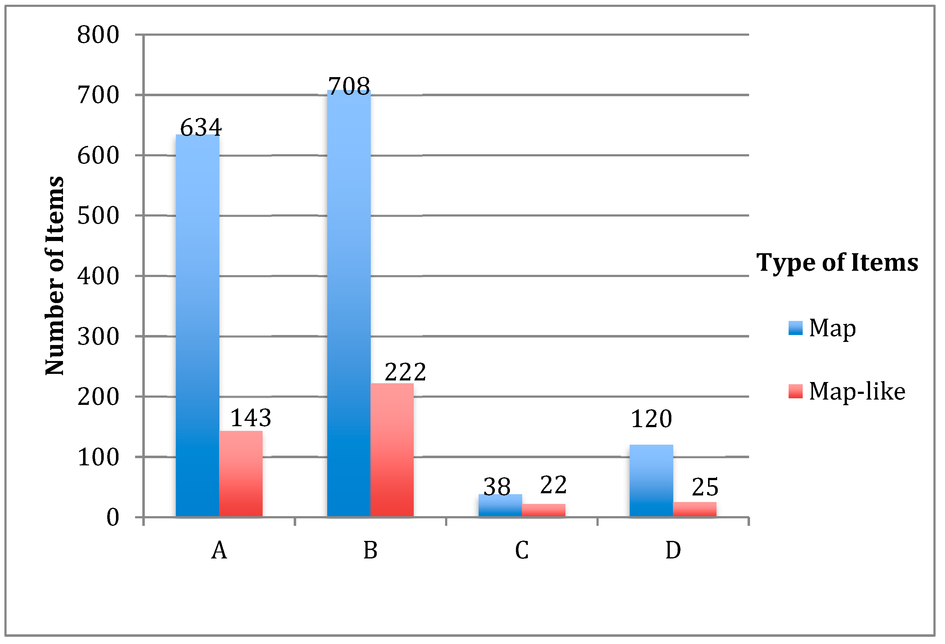
The general statistics for the period between 1990 and 2000, the time period of the case study, were obtained using the query and database opportunities are described in Section 2. The first of these statistics is the distribution of all items (map and map-like) in newspapers (only four newspapers (A, B, C, D) from eight were published during the selected period. For easier interpretation of the table, the letters A, B, C, D are given instead of newspaper names (NPN): letter A is for ‘Cumhuriyet’, B is for ‘Sabah’, C is ‘Star’, D is for ‘Tercuman’) by year in the study period, as can be seen in Table 1.
According to this statistic, newspaper B had the largest number of maps and map-like contents in its 10 years of publication. Newspaper A, which covered the whole study period, followed newspaper B with 777 items. Newspaper C began its publication in 1999. Therefore, only one year of data for this newspaper was included in the study. Newspaper D ended its publications in 1994. For this reason, there was no data from this newspaper between 1994 and 1999. Similar to newspaper C, a small number of data entries for this newspaper were provided due to the short duration of publications. The distribution of types of these items is shown in Figure 4. When considering the ratio of map-like items to all items in each newspaper, it can be seen that newspaper C had the highest number of map-like items.
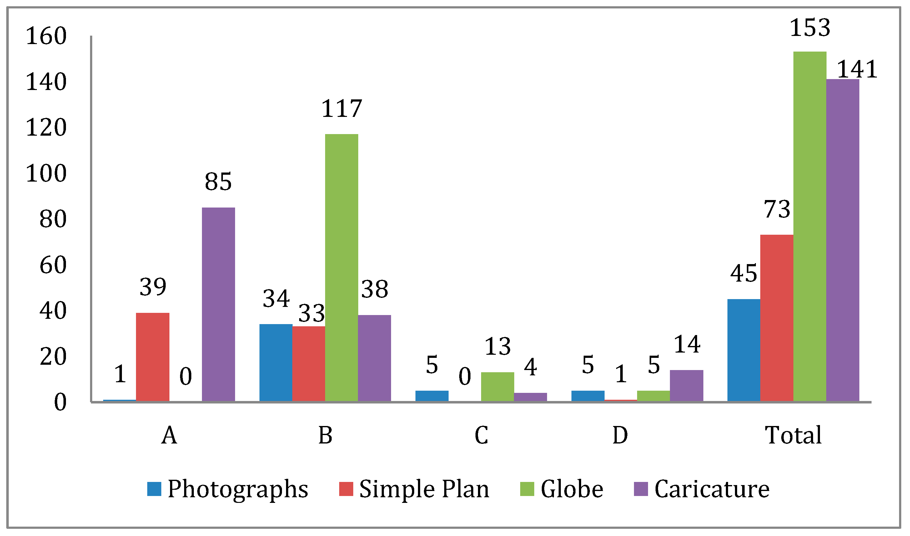
Focusing on the sub-headings of the map-like items of the newspapers, the distribution of contents is shown in Figure 5. The globe is the most commonly used map-like newspaper item that is generally seen in advertising pages and logos.
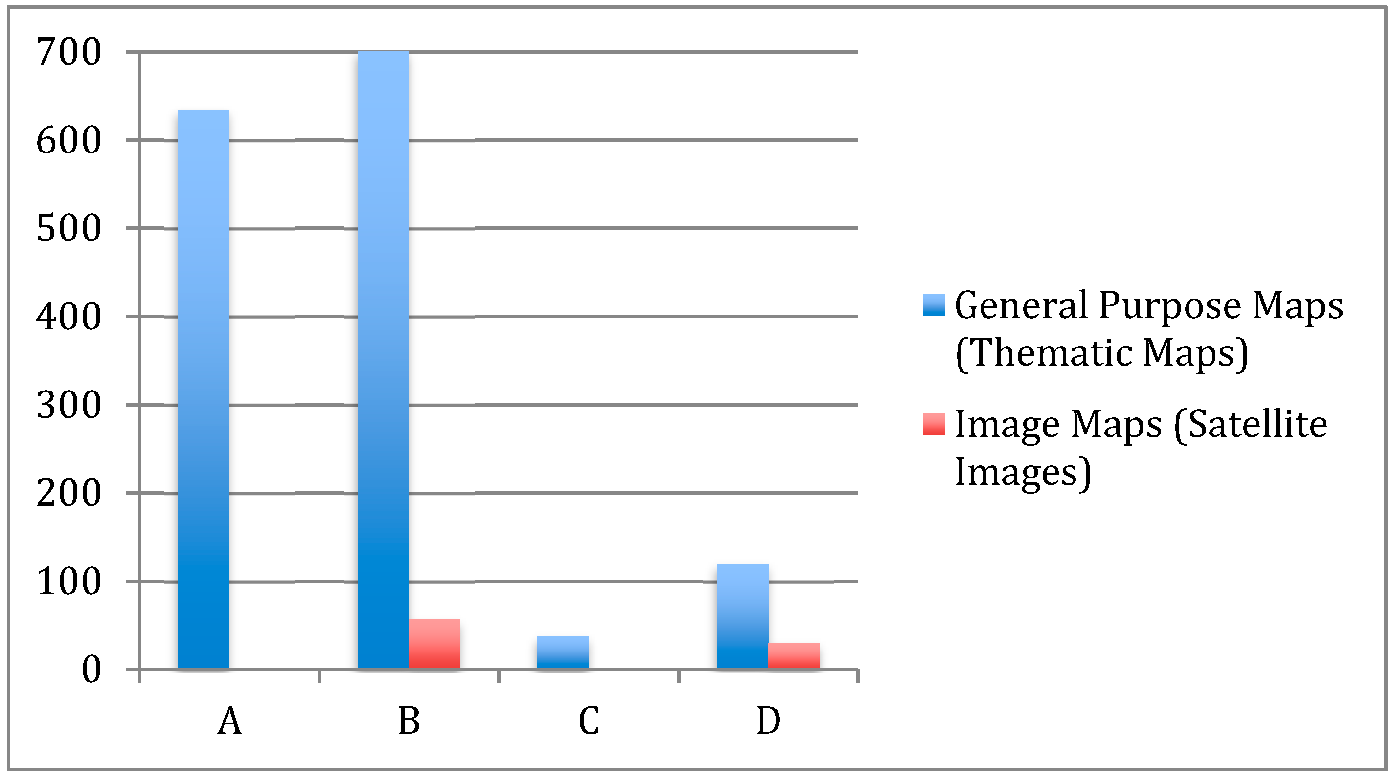
Figure 6 shows the statistics related to the main titles of maps. However, as mentioned before in Section 2.1, since data were not available in other class except thematic maps under the title of general purpose maps, the table was organized in this way. Similarly, there are only satellite images under the title of image maps. In other words, since there were no aerial photographs in the newspapers, all image maps were satellite images. Due to the technological conditions of the period, it was difficult to obtain satellite images, so the number of satellite images was low.
Based on Figure 6, it was determined that newspaper maps are generally thematic maps. The results of the analysis on classification of thematic maps are given in Table 2. When focusing on the subheadings of thematic maps in the database, it can be seen that the picture symbol maps which are usually seen on politic pages of newspapers is the most used thematic map type. Icons of planes, soldiers, and guns were commonly used in this kind of map to show locational details of events such as bombings, explosions, war operations, etc. For similar purposes, it was seen that letters, numbers, and geometric icons were also used with a legend in these maps. Apart from the political pages, this kind of map was also seen in the other sections of the newspapers, such as in weather forecasts and to show the distribution of branches in advertising pages. In news about transportation, drug trafficking, and migratory routes in report pages, network maps were mostly used. The announcement and critique of road, bridge, and railway projects were popular topics for usage of this map type. Usage of flow maps was not seen in any example. Dot maps were not very common map types in the newspapers. It was observed that choropleth and chorochromatic maps were used in the spread of color printing technology for newspapers. These maps were used to show the hierarchy of seismic zones, the distribution of votes in elections, changing country borders, areas affected by a natural disaster, etc.
The basic map design elements of these maps were also evaluated through the database (Table 3), as follows:
Legend: According to related queries, 452 of 1500 maps had a “legend”. Specifically, 56% of choropleth maps, 53% of chorochromatic maps, 35% of network maps, 18% of graduated symbol maps, and 53% of picture symbol maps had a legend. Since information of some symbols on maps is usually explained in the text of the news, usage of legends was in this range. A lack of a legend or explanation in the text of the news instead of a legend was considered without the main text of the news; it is difficult to obtain proper spatial or thematic information with the geographic information from the maps, which, in addition, inhibits the spatial thinking and map reading skills of map users [6].
Title: Similar to the legend, only 40% of all maps had a “title”; others had already been given titles in the news. However, this was missing and explanation had to be sought in the text.
Text: Text was the most used parameter in maps. However, the usage of basic parameters for specifying type, font, style, and size [1,20] can be interpreted manually. Visual and intellectual hierarchies of explanatory text are essential parts of map design.
Inset Maps: Although inset maps can be very helpful in solving difficult design and layout problems [12], they were used in only 210 maps (of 1500).
Directional Indicator (North Arrow): The usage of north arrow or another directional indicator was also very low and was mainly used for decorative purposes. “If the reader is apt to familiar with areas” or “since many readers usually assumes that the north is top of the page, use of indication of orientation is optional” are some opinions discussed among cartographers about this attribute [12,13]. Although this is perhaps not a serious deficiency as convention places north at the top of the map in the majority of cases, it so happens that “off the north” presentations are by no means uncommon, as editors try to squeeze maps into column widths. If there is a departure from convention, attention should be drawn to it by adding a conspicuous north point [6].
Projection and Datum Information: Since, generally, newspaper maps that are location maps are not included in the newspaper for technical purposes [3], it was expected that there would be no example in the 1500 maps. However, for continental areas, an appreciation of the sphericity of the Earth is desirable [6].
Production and Resources: The rate of this information in all maps was very low. They were generally used in out of subject areas of maps cited from foreign media sources.
Scale: Despite the widespread opinion that “all maps must have a scale” [12], only 6.2% of the 1500 maps contained scale information. This is a serious defect, as it is impossible to judge the size of the area being shown or to estimate the distance [6]. For this purpose, a new approach was offered for scaling in this study for easy perception and access for data users. The parameters explained in Section 2.1 were determined approximately for all maps and map-like contents. According to the results of related inquires, it can be seen that the regional visualizations were very common in the newspapers (Figure 7).
One of the aims of this study was to explore which parts of newspapers mostly use maps and map-like items. For this purpose, the statistics regarding sections of newspapers based on database analyses were determined. According to Figure 8, the section of the newspaper that has mostly used maps and map-like items was report pages with 1500 items (see the abbreviation list of section names under Figure 8). Sections of caricature and advertisement followed report pages with 135 and 193 items, respectively. Except for these, it was seen that some other sections of newspapers use map and map-like contents, such as Sport, Article Series, and Weather Forecasts. The sports pages of the newspapers in Turkey include news about soccer in general. For this reason, news related to other sports activities, such as the Olympics or marathon races, is presented more in the report pages. Hence, sports news was also processed under the topic of reports in the database (Figure 8 and 9). Daily repetitive forecast maps were archived and entered into the database when they contained designs of icon changes in seasonal changes. Therefore, a small number of forecast maps can be accessed through the database. Except for these specific determinations, the dramatic differences between the volume of map usage in report pages and in other sections was expected, because the topic content of the report pages is broader than the others.
Topics of the reports can also be analyzed through the database. Although maps and map-like items on a variety of subjects were seen, the main issues are shown in Figure 9 (see the abbreviation list of section names under Figure 9). As can be seen in the statistics, a dramatically higher number of maps and map-like items were used in relation to political issues. Consistent with this study, comprehensive studies of map use in the news media have shown some consistent patterns in terms of thematic coverage, with conflict, war, and geopolitical issues being highly represented. Monmonier’s (1986) study of The Times of London and four US newspapers for 1940 and 1980 showed that news maps of military and geopolitical themes tended “to be high both proportionately and numerically during periods of conflict and less significant at other times” [3,8]. Therefore, the wars (World War II, Gulf war, Vietnam war, Falkland war), terrorist attacks (in Eastern Turkey and the Middle East), political and diplomatic crises (Cyprus crisis between Turkey and Greece, some examples of Middle Eastern and African countries), changes of borders (breakup of Yugoslavia, dissolution of Soviet Union), which are the most common political issues have been used a large number of maps. The other most popular topics were the economy, natural resources (especially major pipelines, and international relations for energy agreements), tourism, elections (national and international), natural disasters and earthquakes, transportation (critics and announcements about roads, railways, and underground projects), etc.
List1: S1: Report, S2: Sport, S3: Caricature, S4: Logo, S5: Advertisement, S6: Forecast, Other: Interview, Kids, Article Series, Column
List 2: T1: Politics, T2: Transportation, T3: Tourism, T4: Earthquake, T5: Epidemiological, T6: Election, T7: Natural Resources, T8: Economy, T9: Sport, Other: Other (19) topics
The general analysis of 1912 maps and map-like images used in four newspapers between 1990 and 2000 is described based on the database queries. Except for these general determinations, other specific queries can be made for various purposes with different combinations of criteria.
4. Case Study: Cartographic Analyses of Maps in Earthquake Related News
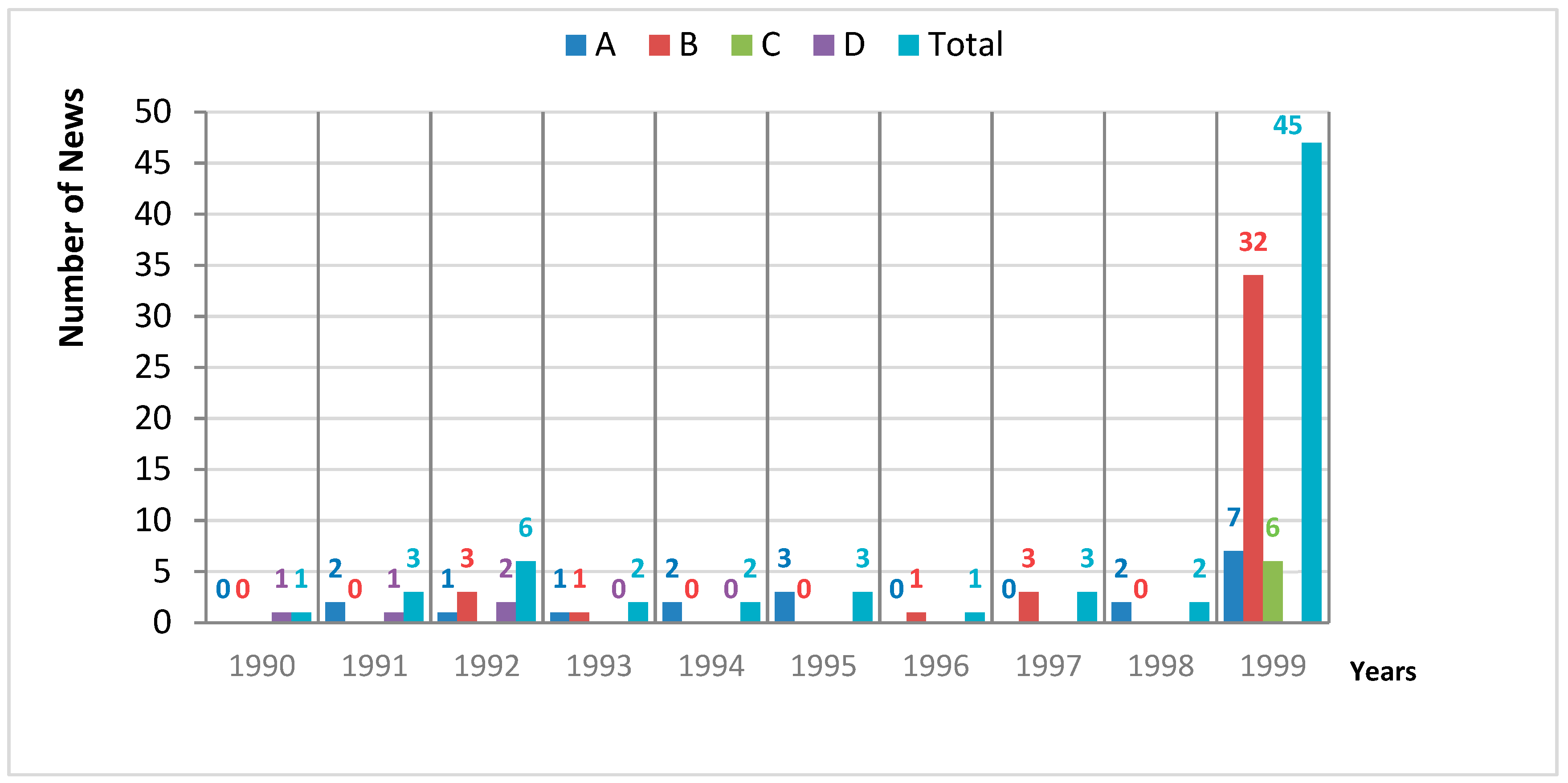
All items archived between years 1970 and 2000 of selected newspapers were categorized on the database. However, as a case study, maps on earthquake news from 1990 to 2000 were selected for the article. This was because, as a result of queries through the database, it was seen that while the number of maps used in earthquake news was 19 between 1970 and 1990, this number was 68 (Figure 9, Column4) between 1990 and 2000. These results were provided from queries through the database selecting time intervals 1970 to 1990 and 1990 to 2000. For this reason, in this section, the reasons for increasing the use of maps and cartographic reviews of these maps are discussed.
In the period covered by the case studies, five devastating earthquakes occurred in Turkey. They took place in the years 1992, 1995, and 1998, and two of them occurred in the year 1999, with magnitudes of 6.8, 5.9, 6.2, 7.4, and 7.2, respectively [21,22,23,24,25,26]. The total number of map contents used in the earthquake reports was 68 within 1500 maps in between 1990 to 2000. The annual distribution of these maps can be seen in Figure 10.
It has been seen that the cause of dramatic increase in the use of maps was the occurrence of earthquakes between the years 1990 and 2000. Specifically, when analyzing the yearly frequency distribution of maps and map-like items used in the earthquake report pages, it was observed that the frequency of map use leaped in the year 1999 (Figure 10). This dramatic change was the result of two destructive earthquakes in 1999, which took place in the same region. Despite the deaths and losses of other earthquakes (1992, 1995, and 1998), they did not appear in the print media as much as the earthquakes in 1999. The primary reason for this is that the fatality rates of the earthquakes in 1999 were very high, and they had a more devastating effect on the area and people’s daily lives, while other earthquakes only affected the urban and rural life [21,23,24]. The 1999 earthquakes took place in the industrial region of Turkey, where 40% situated of the industrial facilities are situated. In this study, five of the 68 maps (in 70 map and map-like items) were used to show only the affected industrial area in the region (Figure 11).
The increase in map usage in newspapers in 1999 might have also been due to technological developments. However, this point could be argued, because only 13 months had passed from the previous earthquake, which took place in 1998 (Figure 10). Thus, this was rather an editorial decision to use spatial visualization, since the 1999 earthquakes had serious social and economic impacts on the country. Using maps gives exact information about the locations of the affected areas, offering easier perception for the readers.
In addition to these determinations, some cartographic evaluations of used maps were obtained. This investigation was related to the design of these maps. In this direction, parameters of “map types”, “map elements” and the “scale” of maps of earthquake-related news were evaluated. With regard to “map types”, only two maps of 68 were “satellite images”, the rest were “thematic maps”. It was already expected that the maps would be “thematic”, because the search topic was about only earthquakes. The classification of thematic maps can be accessed in Figure 12 to show the most commonly used thematic map types in earthquake-related news. According to this, 34 maps used form and size such as icons, letters, figures, and numbers as picture symbol maps. The distribution of tents among the disaster zone, affected points, and damaged settlements are some examples for the usage of these maps. When using network maps to show seismic zones and earthquake lines on different scales, chorochromatic and choropleth maps are used to distinguish enumeration units of the maps using colors or color values in general. To give a hierarchy of affected zones in earthquake zones, graduated symbol maps are used. Only one example of a dot map was found, where it was used to show the distribution of earthquake affected areas in 1999.
The database used a different approach to determine the scale factors, and according to that, each map in this study was examined under four subtitles: “global”, “continental”, “regional”, and “local”. Due to the large number of the maps of earthquakes in 1999, the regional maps were seen to be the majority (Figure 13). Global scale maps, which were mostly used to show the general fault systems of the Earth, were not common among these maps. The use of local and continental scale maps was, as expected, very low.
The “map elements” were analyzed by selecting all parameters one by one (Table 4). The table gives detailed quantitative cartographic information about the maps.
As a result of the queries, some missing/present information about the map elements for 66 maps was obtained. First of all, consistent with the general statistics of the study (Section 3), there were only five maps from 66 with scale information. As given in the general statistics in Section 3, ‘north arrow’ is another parameter that was not shown in many maps of earthquake-related news. Only four of the 66 maps had an orientation. One third of the 66 maps had a “title”, which might be because sufficient information about the maps had already been given in the text of the news. In addition, it might be that the title of the news might also give enough information about the contents of the map, making a map title itself not necessary [6]. Another map element named the “inset (locator)” was used in four of the 66 maps. The use of an inset map enables the main map to be more understandable for map readers. On a smaller or larger scale, it describes and highlights the spatial relationships of areas where events and activities have taken place, making them more understandable for readers [12].
“Text” was the most widely used map element in these 66 maps. Although 60 maps contained text, its use was mostly not in accordance with cartographic rules. It was observed that the fonts and letter sizes of natural and manmade features were not sufficiently considered with definitions in the literature [1,20]. The other issue is that maps are important products that require great responsibility from their producers; thus, the information about the person or organization that created the maps might be a part of the “bibliography” of maps, as it is with other products that require copyright. However, consistent with the general statistics, the results of the case study show that majority of the maps did not include this information. Only two of the 66 maps contained “resource and production information”. Thus, maps used in newspapers might be taken under the protection of the intellectual property rights. Even though “legend” is a significant parameter for a map, only 19 of the 66 maps, not only the maps of earthquake-related news, but maps for the other news topics, had a legend. It was observed that the legend information was usually explained in a little text box on the maps or in the text of the news. It seems that legends do not have extensive use in maps, because a verbal explanation is preferred instead.
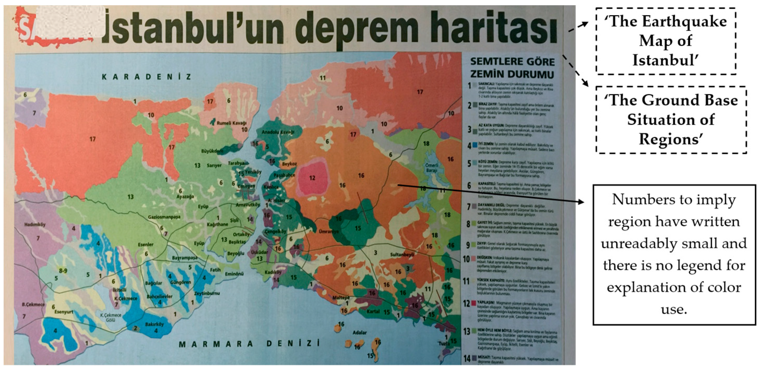
With these results, it appears the nature of each attributes and their usages have been manually interpreted by authors. As a result of these evaluations, some mistakes regarding cartographic parameters were identified, preventing the maps from fulfilling their initial purpose. If cartography is a technic of communication, the measure of a “good map” is how well it conveys information from a cartographic perspective. Aesthetic issues certainly play a role in effective cartography, but it is the issue of communication that holds the central role in cartographic design [27]. Therefore, the analysis of the case study found that the maps are generally uninformative or misinformative. Almost 25% of the 66 maps were considered uninformative. In addition, some of these maps were not compatible with the news content. This might be due to the fact that the maps were used to enhance the visual appearance of the newspaper pages rather than to convey knowledge. It was also stated by Monmonier in Maps with the News that some news maps are principally informative, while others are largely decorative [3,8]. The map titled “The Earthquake Map of Istanbul” shown in Figure 14 is considered an example of an uninformative map, because although a map should be legible [8], its appearance is complicated. The symbols do not have enough separation to be seen individually. It is also thought that this map is a geological map made for other scientific purposes without concern of comprehensibleness and with no references given. Additionally, confusing legend use can be seen, and even the colors of the enumeration units used are not defined in a legend to show the hierarchy of colors. The legend should include a clear explanation of what each symbol associated with them represents; base information should also be explained in the legend if it is not obvious [12]. Query for Figure 14: “Date: ‘01/01/1990-01/01/2000’> Newspapers Name: ‘Sabah’> Image Type Query: ‘Map’> Map Types: ‘General Purpose Maps’> General Purpose Maps: ‘Thematic Maps’> Thematic Maps: ‘Choropleth Maps’> Map Elements: ‘Legend & Text & Title’> Where the image is: ‘Report’> Topic of the Report: ‘Earthquake’ “). In the following examples; Date> Image Type> Map Types> General Purpose Maps> Thematic Maps> Where the Image is> Topic of the Report: ‘Earthquake ‘are the common parameters of the case study. However, subtitles of Thematic Maps> Map Elements> Scale were determined to be optimal search terms to reach the different examples in earthquake- related maps. All these parameters could be queried with multiple selections.
Like Figure 14, Figure 15 is complicated in terms of visual appearance, because all information written on the maps and separation of land–sea are not clearly understandable.
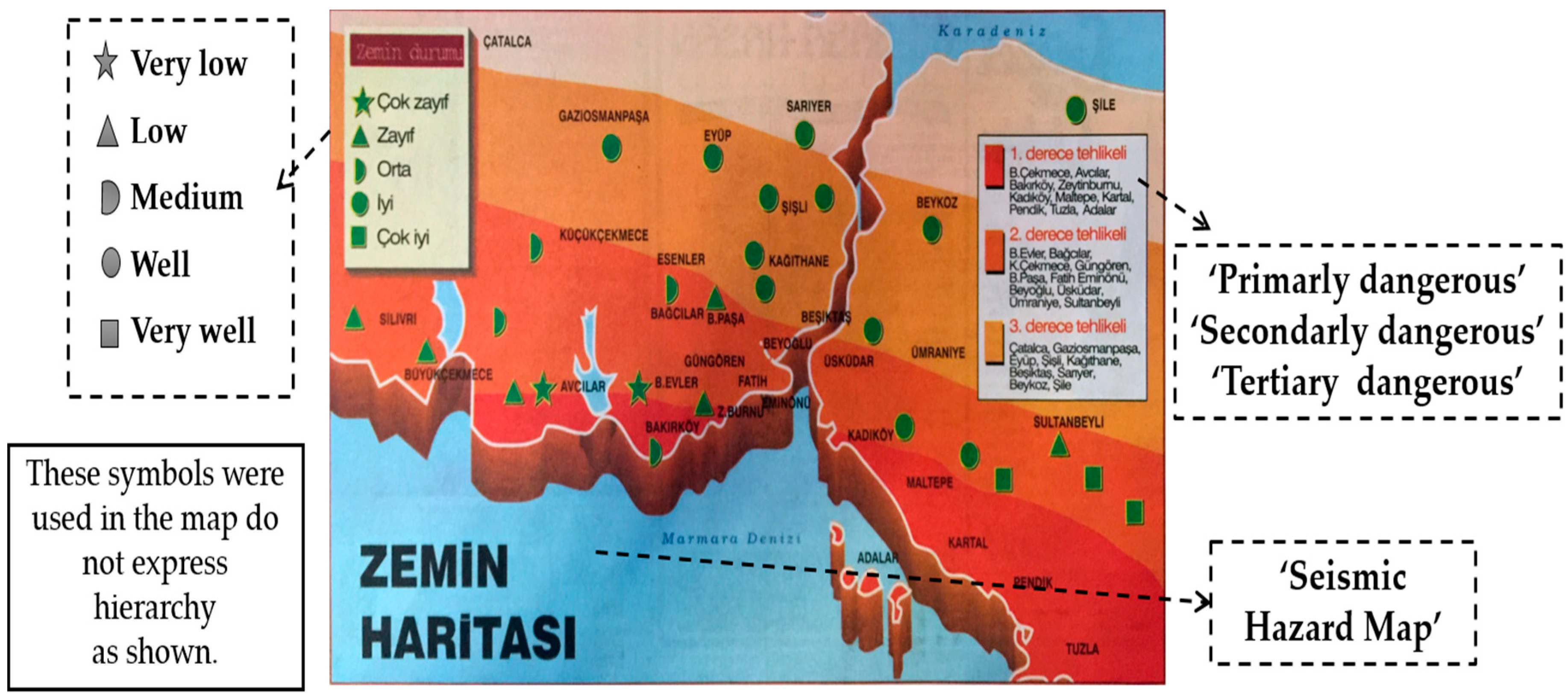
Similarly, as seen in Figure 16, there is no hierarchy between the symbols used in the legend on the left. The other legend on the right uses hues to show the “level of the seismic hazard zone”. The hue hierarchy of primary, secondary, and tertiary dangerous zones has been shown correctly.
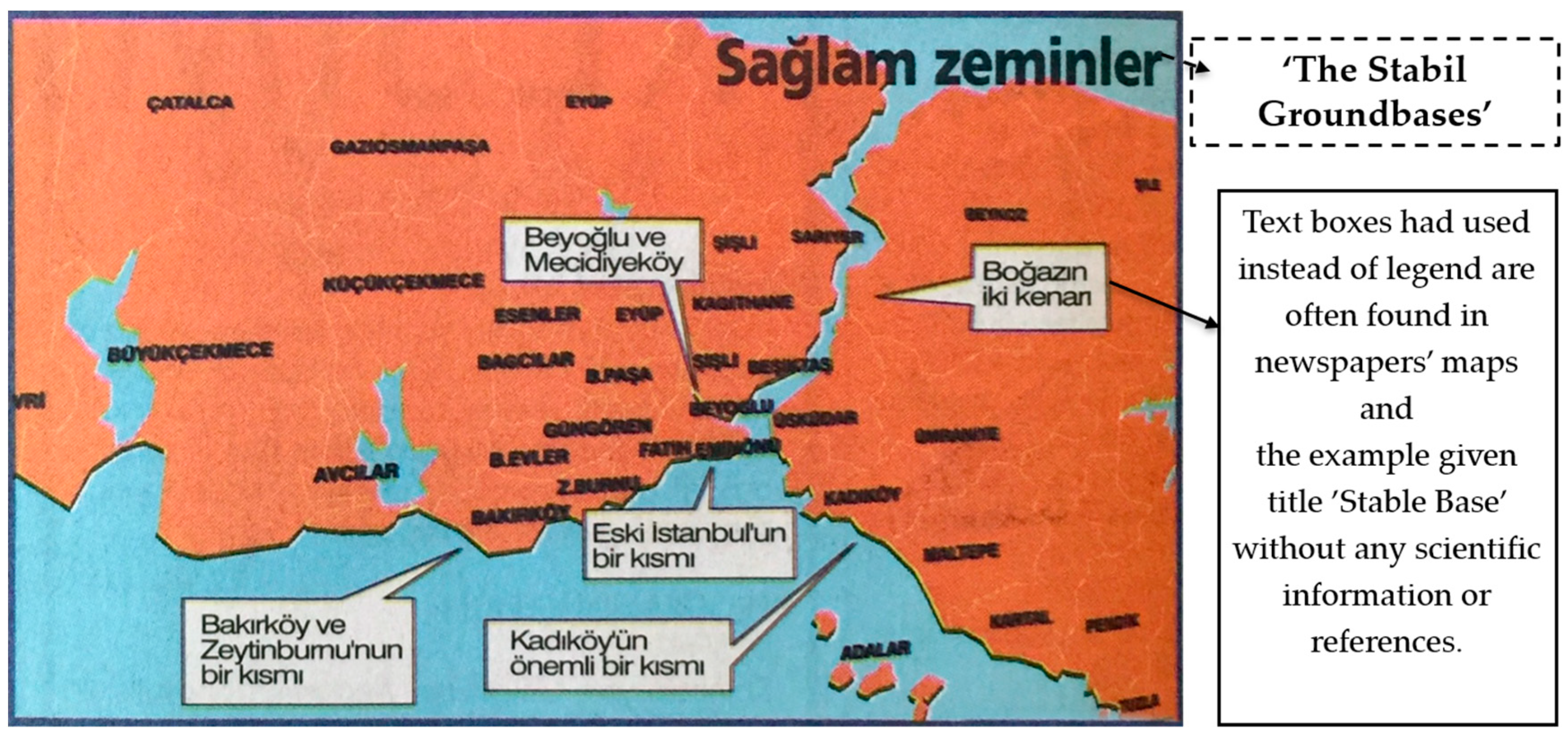
As mentioned before, the legend information is usually explained in a little text box on the maps or in the text of the news (Figure 15 and Figure 17). This usage was seen in 52% of 66 maps according to the interpretation of queries. In Figure 17, points shown are explained using text boxes on the maps. Furthermore, there is no any scientific reference to the given information in the main text of the news.
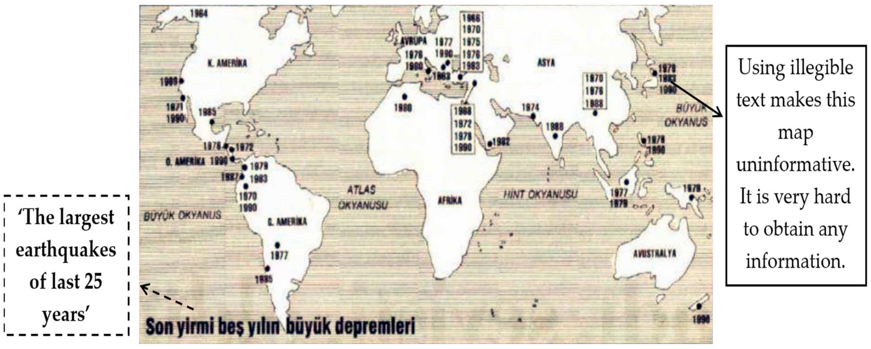
Also, 16% of 60 maps were considered to have a complicated, illegible text design, which makes it harder to understand any information included in these maps (Figure 18).
In the example shown in Figure 19, the second-degree risk zone, which is displayed as a green zone, is seen as a straight line. This visualization makes the accuracy of spatial information given by the map problematic. Furthermore, in this example, the text design of the natural and manmade objects is not proper. These interpretations are concluded with the thought that the given map is uninformative.
Another important aspect is that maps might also be used to knowingly mislead the readers (4% of 66 maps). This can be illustrated by a map published in the year 1997 (Figure 20) making speculations about an earthquake in the same region, which actually happened in the year 1999. The map titled ‘Scary Anticipation” was in the economy pages, showing a worst-case earthquake scenario without any scientific basis in the news text.
The designs of the maps of earthquake-related news were interpreted according to the described criteria. In addition, the factors that increase the use of maps in newspapers have been discussed. With all these determinations, some results have been reached.
5. Results and Discussion
As a result of the thematic and spatial review of the maps earthquake related news, 25% of 66 maps were considered ‘uninformative’, and these maps were generally used to enhance visual appearance of the news. 16% of the maps using text were considered to have a complicated and illegible text design. Therefore, this usage makes it harder to understand any information included in these maps. Since 4% of these maps might also be used to knowingly mislead, these maps were considered ‘misinformative’, spreading speculative information about the news. As discussed in the previous sections (Section 3 and Section 4), it was observed that the use of some cartographic parameters might be missing or inaccurate. Therefore, it can be concluded that most newspaper maps that are basic location maps are generally simple in content and symbolization and have designs that can be understood without specialized training [3]. In this context, newspapers play a fundamental role in continuing adult geographic education [3]. Since map reading training is not included in the basic education steps in some countries, such as Turkey [28], the way that newspapers utilize maps to convey public interest events is very important. Newspaper maps have a crucial responsibility in spreading spatial information to the public, because they are an economical and influential way to reach people from every socio-cultural level with or without a cartographic background. However, some of the maps that were evaluated through the unique database work were considered to have been designed with a poor technique and a lack of a cartographic point of view, consistent with findings of similar studies in the literature [3,6,8]. As stated above, the evaluation of newspaper maps identified a lot of cartographic errors and deficiencies. Thus, it could be concluded that the design of maps used in newspapers related to earthquakes is lacking or/and incorrect with regard to the cartographic discipline. It can be observed that the usage of maps reflects not only a belief in the news value of the story it accompanies, but often is used as visual enhancement or in the absence of a suitable photograph [3].
Thematically, maps in newspapers are used as part of an explanation for politic agreements, peace or war operations, and conflicts between countries, contagious/epidemiological diseases, transportation announcements, and natural disasters in report pages. However, it was observed that map visualization has been more frequently used in sociologically traumatic events, such as earthquakes in 1999, which have affected the whole society economically and psychologically. In particular, the effects of earthquakes on industrial areas have caused the media to give the story more space using spatial components to increase the understanding of readers, since using only text in news is both inadequate and less influential than including maps to describe spatial relationships. With all the analyses, it can be understood that maps are an important and powerful tool in newspapers that contribute to the spatial thinking of communities. The use of spatial information might be made more effective by the collaboration of journalists and cartographers.
We believe that our study, which included analyses of map diversity and map use in newspapers, the usage of the spatial phenomenon, and the construction of a database from the collected data is a contribution to the cartographic literature. In addition, the study might expand the research area by allowing similar analyses of maps and map-like items related to different topics to be conducted, as well as more experimental studies related to how newspaper readers perceive these items from certain time intervals using the database. We plan to use this database more effectively for these purposes. Thereby, new strategies could be found to benefit the great potential of maps in the media.
Author Contributions
Conceptualization, [Pinar Sarin and Necla Ulugtekin]; Methodology, [Pinar Sarin and Necla Ulugtekin]; Software, [Pinar Sarin]; Validation, [Necla Ulugtekin]; Formal Analysis, [Pinar Sarin and Necla Ulugtekin]; Investigation, [Pinar Sarin]; Resources [Pinar Sarin and Necla Ulugtekin]
Acknowledgments
We are grateful for the remarkable contribution and encouragement of Rahmi Nurhan Çelik, M. Tevfik Özlüdemir from Istanbul Technical University, Department of Geomatic Engineering and also Cevahir Kayam from Istanbul University, Department of History.
Conflicts of Interest
The authors declare no conflict of interest.
References
- Kraak, M.; Ormeling, F. Cartography: Visualization of Spatial Data; Pearson Educated Limited: London, UK, 2010. [Google Scholar]
- Sinton, D.S.; Bednarz, S.; Gersmehl, P.; Kolvoord, R.; Uttal, D. The People’s Guide to Spatial Thinking; National Council for Geographic Education: Washington, DC, USA, 2013. [Google Scholar]
- Monmonier, M. Maps with the News: The Development of American Journalistic Cartography; University of Chicago Press: Chicago, IL, USA, 1989. [Google Scholar]
- Kosonen, K. Maps, Newspapers and Nationalism: The Finnish Historical Experience. GeoJournal 1999, 48, 91–100. [Google Scholar] [CrossRef]
- Rauh, K.; Petrovic, D. Maps in Newspapers in Slovenia. Geodetski Vestnik (J. Assoc. Surv. Slov.) 2006, 50, 632–641. [Google Scholar]
- Balchin, W.G.V. Media Map Watch: A Report. Geography 1985, 70, 339–343. [Google Scholar]
- Balchin, W.G.V. The Media Map Watch in the UK. In Cartographie dans les Médias Sillery; Gauthier, M.J., Ed.; Presses de l’Universite du Quebec: Quebec City, QC, Canada, 1988. [Google Scholar]
- Kent, R.B.; Sanders, J.M. Map Use in Regional Newspapers in the Midwestern United States. Cartographica 1993, 30, 94–101. [Google Scholar] [CrossRef]
- Churchill, R.R.; Stege, E.H. From Afghanistan to Iraq in media maps: Journalistic Construction of Geographic Knowledge. Cartogr. Perspect. 2006, 54, 55–68. [Google Scholar] [CrossRef]
- Ormeling, F. Atlas Terminology and Atlas Concept. In Proceedings of the International Wshap, Bondung, Indonesia, 14–18 July 1997. [Google Scholar]
- Liben, L.S. Thinking through Maps. In Spatial Schemas and Abstract Thought; Gattis, M., Ed.; MIT Press: Cambridge, MA, USA, 2001; pp. 45–77. [Google Scholar]
- Tyner, J. Introduction to Thematic Cartography; Prentice Hall: Englewood, NJ, USA, 1992. [Google Scholar]
- Slocum, T. Thematic Cartography and Visualization; Prentice Hall: Upper Saddle River, NJ, USA, 1999. [Google Scholar]
- Kimerling, J.; Buckley, A.; Muehrcke, P.; Muehrcke, J. Map Use, Reading and Analysis; Esri Press Academic: Redlands, CA, USA, 2009. [Google Scholar]
- Sarin, P.; Ulugtekin, N. The Map Archiving from Turkish Newspapers. In Proceedings of the FIG Commission 3& Commission 7 and Annual Meeting, Sofia, Bulgaria, 17–21 May 2015. [Google Scholar]
- Sarin, P.; Ulugtekin, N. Usage of Published Maps in Turkish Newspapers. In Proceedings of the International Cartographic Conference 2017, Washington, DC, USA, 2–7 July 2017. [Google Scholar]
- Holmes, N. Pictorial Maps; Herbert Press: London, UK, 1991. [Google Scholar]
- Cosgrove, D.E.; Dora, V. Mapping Global War: Los Angeles, the Pacific, and Charles Owens’s Pictorial Cartography; Annals of the Association of American Geographers: Abingdon, UK, 2005. [Google Scholar]
- Pang, I.C.P.; Aghai, R.; Yang, M.; Pang, B. Creating Realistic Map-Like Visualizations: Results from User Studies. J. Vis. Lang. Comput. 2017, 43, 60–70. [Google Scholar] [CrossRef]
- Robinson, H.A.; Morrison, L.J.; Muehrcke, C.P.; Kimerling, J.A.; Guptill, C.S. Elements of Cartography; John Wiley&Sons, Inc.: Hoboken, NJ, USA, 1995. [Google Scholar]
- Gülkan, P.; Yakut, A.; Sucuoğlu, H.; Yücemen, M.S.; Çıtıpıtıoğlu, E. A Seismic Damage Assessment Form for Engineered Construction; Earthquake Engineering Research Center, METU: Ankara, Turkey, 1994. [Google Scholar]
- Bogazici University Press. March 13, 1992 (M = 6.8) Erzincan Earthquake: A Preliminary Reconnaissance Report; Bogazici University Press: Istanbul, Turkey, 1992. [Google Scholar]
- Balta, E. Earthquake and Social Change: The Case of Dinar. Master’s Thesis, METU, Ankara, Turkey, 1998. Unpublished work. [Google Scholar]
- Adalier, K.; Aydingun, O. June 27, 1998 Adana-Ceyhan (Turkey) Earthquake: Engineering Reconnaissance Report; Technical Report No. Geo98-9; Department of Civil Engineering, Eastern Mediterranean University: Famagusta, North Cyprus, 1998; 45p. [Google Scholar]
- Kandilli Observatory and Earthquake Research Institute. Available online: http://www.koeri.boun.edu.tr/sismo (accessed on 5 September 2018).
- Scawthorn, M. Kocaeli (Izmit) Earthquake of 17 August 1999; Bogazici University, Multidisciplinary Center for Earthquake Engineering State University of New York: Buffalo, NY, USA, 1999. [Google Scholar]
- University Of Colorado Boulder, Cartographic Communication Content. Available online: http://idp-key-resources.org/documents/0000/d04193/000.pdf (accessed on 9 April 2019 ).
- Ulugtekin, N. Overview of Turkish School Atlases. II.; Turkish Map and Technique Assembly(Printed in Turkish), Turkish: Ankara, Turkey, 1989; pp. 759–764. [Google Scholar]
Figure 1.
Syllabus of principle of the database.

Figure 2.
An example of maps (1999_08_18).
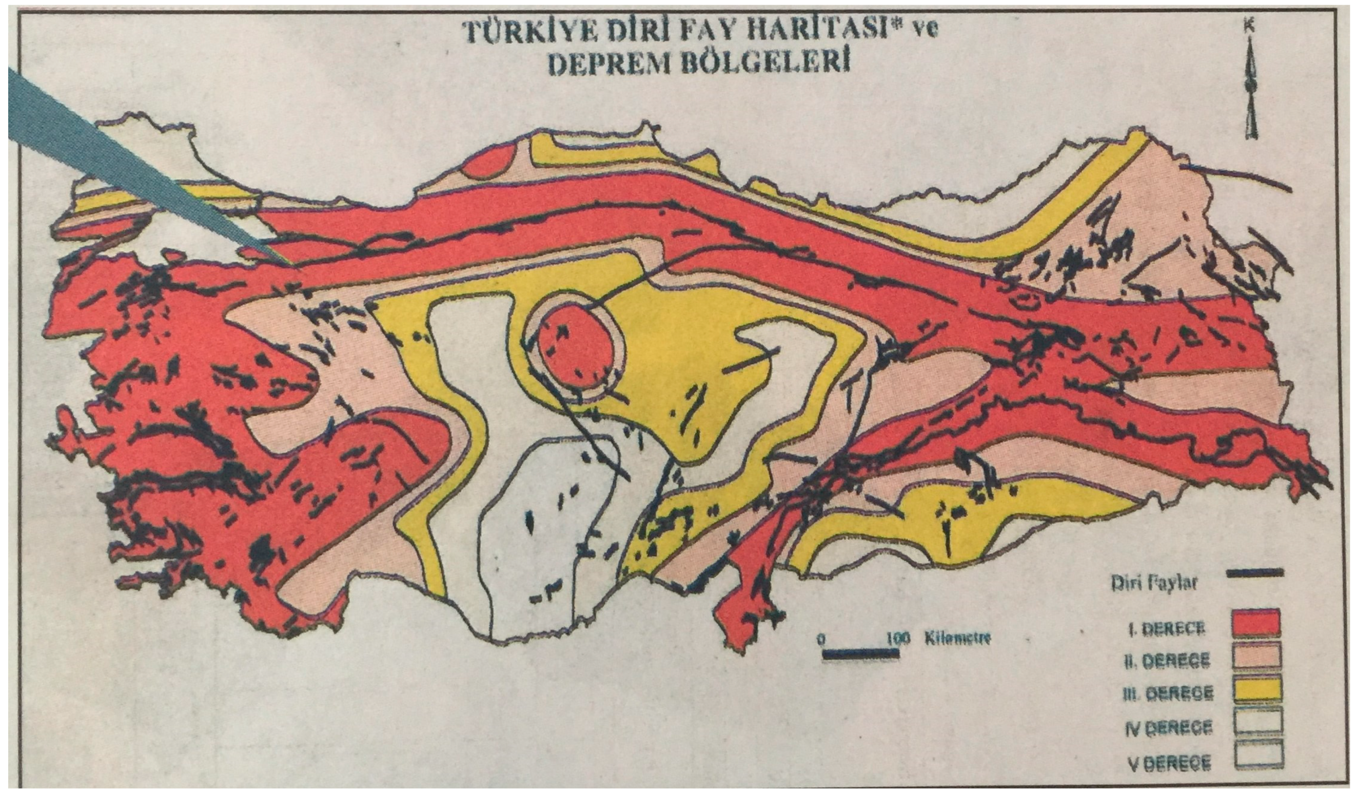
Figure 3.
An example of map-like (1992_03_02).

Figure 4.
Number of map and map-like items on newspapers.

Figure 5.
Number of sub-titles of map-like items.

Figure 6.
Number of thematic maps and satellite images of newspapers.

Figure 7.
Number of scale parameters on newspapers.
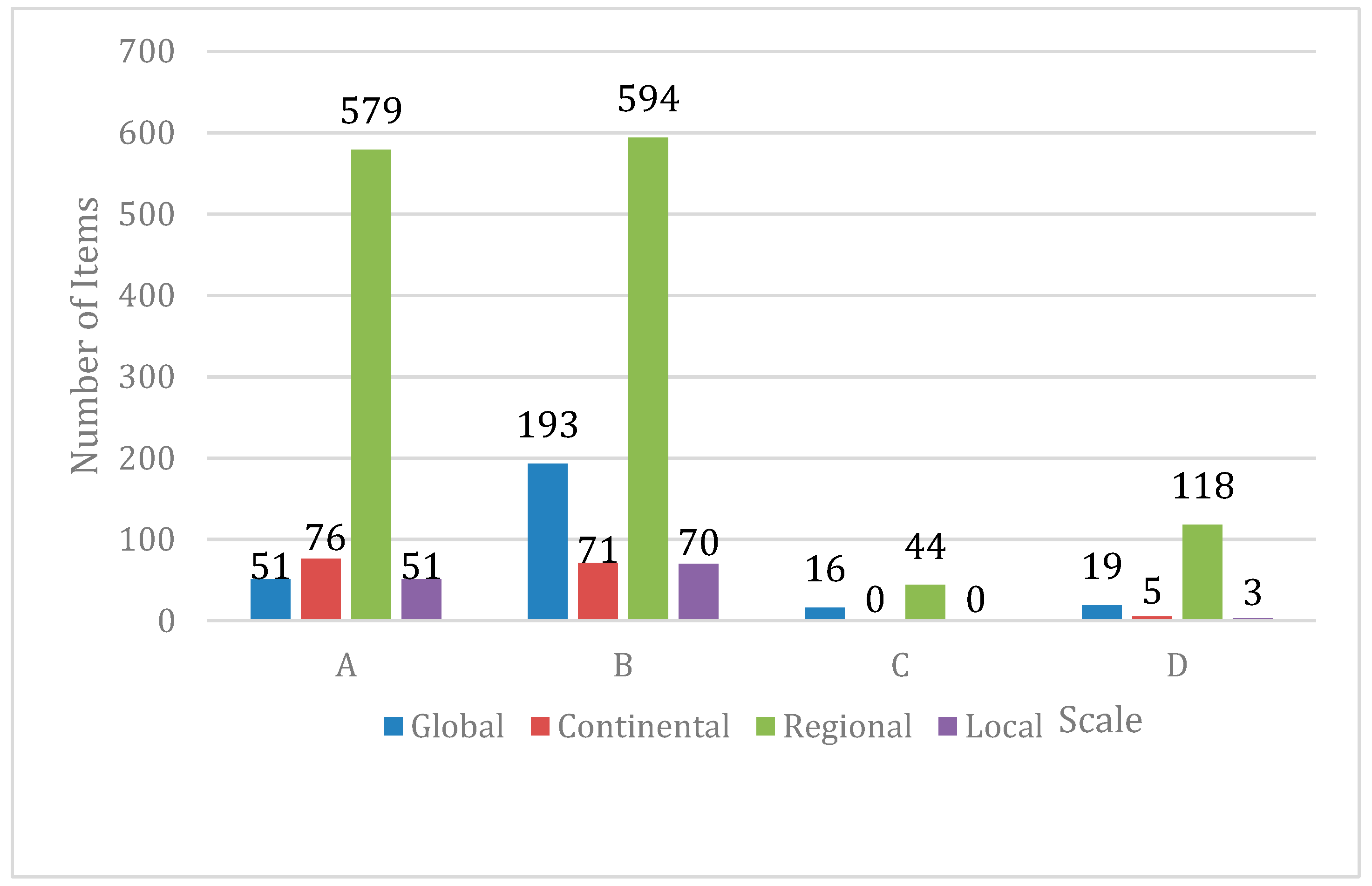
Figure 8.
Number of used map and map-like items in sections of newspapers.

Figure 9.
Main topics of reports using map and map-like items.
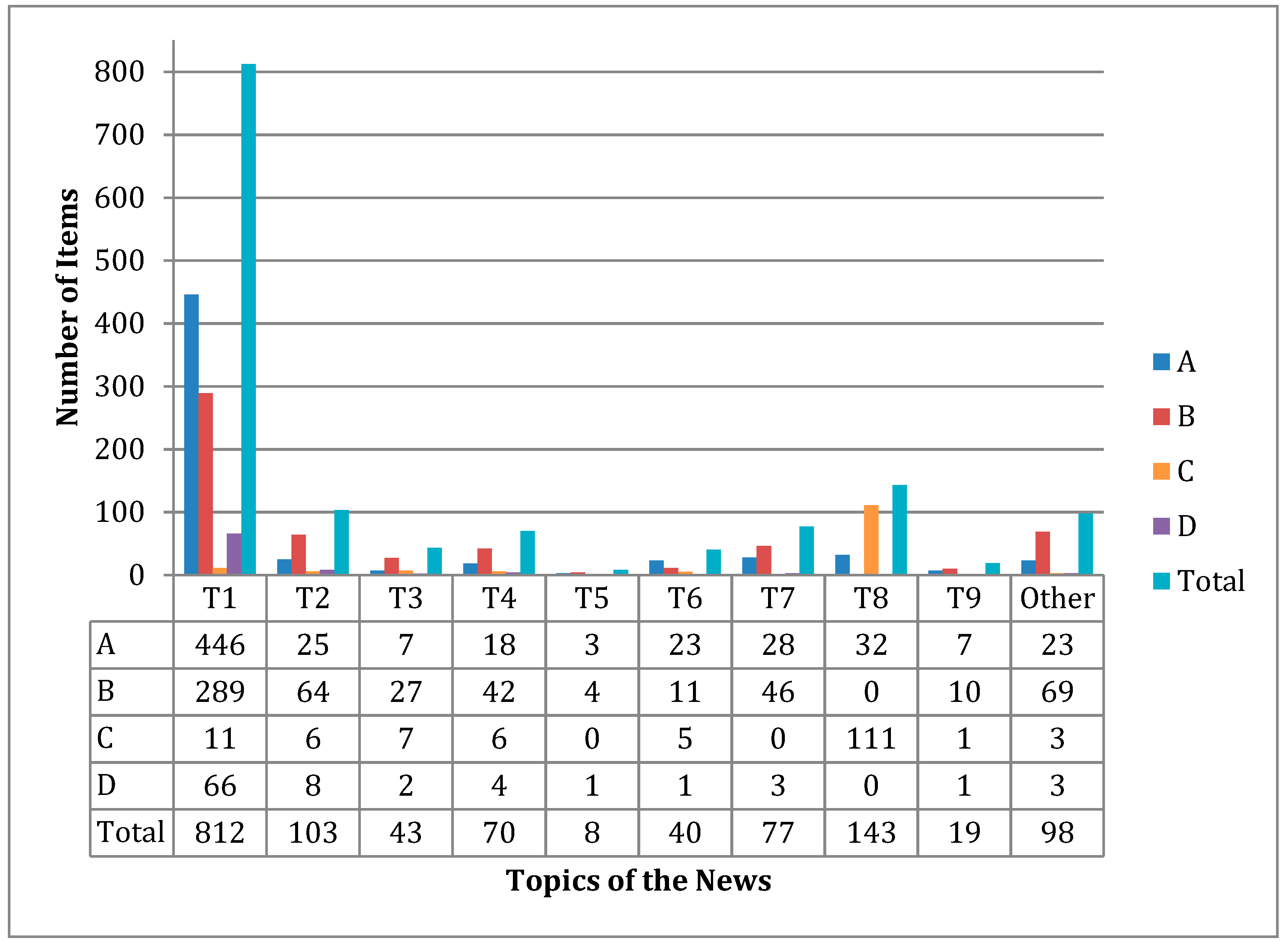
Figure 10.
Distribution of maps in earthquake-related news.

Figure 11.
Affected industrial complex in the region (1999_08_24 in B).
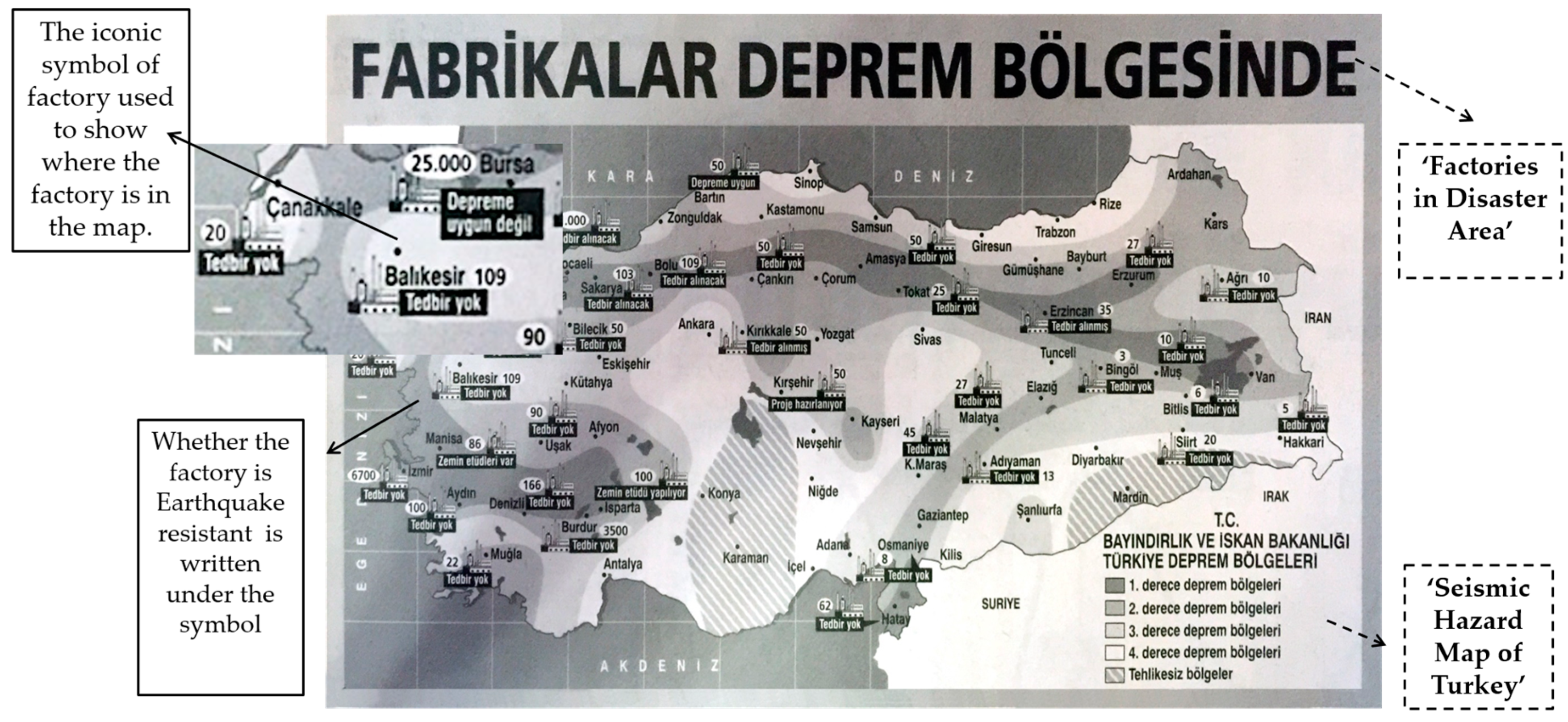
Figure 12.
Usage of thematic map types in earthquake-related news.

Figure 13.
Usage of scale parameters by newspapers.
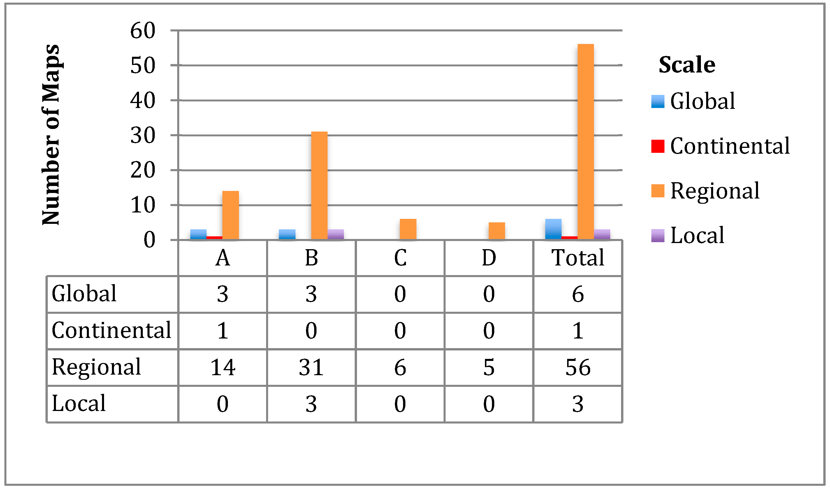
Figure 14.
Example of uninformative map (1999_11_19 in B).

Figure 15.
Example of uninformative map (1995_05_30 in A).

Figure 16.
In addition, right legend uses (1999_11_16 in B).

Figure 17.
Example of uninformative map (1999_09_02 in B).

Figure 18.
Illegible text design in maps (1991_11_12 in A).

Figure 19.
Misinformative example (1996_08_10 in B).
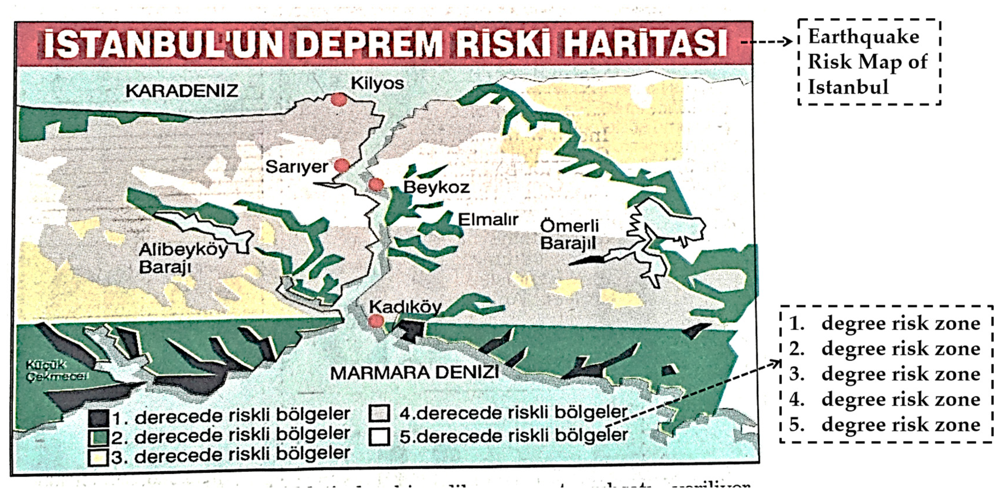
Figure 20.
Speculative example given title of ‘Scary Anticipation’ (1997_08_19 in B).


Table 1.
Distribution of all items in the period.
| NpN/Year | 1990 | 1991 | 1992 | 1993 | 1994 | 1995 | 1996 | 1997 | 1998 | 1999 | Total |
|---|---|---|---|---|---|---|---|---|---|---|---|
| A | 123 | 96 | 71 | 102 | 91 | 94 | 64 | 32 | 25 | 39 | 777 |
| B | 67 | 29 | 112 | 109 | 93 | 110 | 76 | 111 | 78 | 145 | 930 |
| C | _ | _ | _ | _ | _ | _ | _ | _ | _ | 60 | 60 |
| D | 44 | 30 | 27 | 34 | 10 | _ | _ | _ | _ | _ | 145 |
| Total | 234 | 155 | 210 | 245 | 194 | 204 | 140 | 143 | 103 | 244 | 1912 |
Table 2.
Distrubition of thematic map types in newspapers.
| (Thematic) Map Types/NpN | A | B | C | D | Total |
|---|---|---|---|---|---|
| Graduated Symbol Maps | 150 | 45 | 1 | 9 | 205 |
| Picture Symbol Maps | 280 | 179 | 2 | 22 | 483 |
| Network Maps | 188 | 214 | 15 | 21 | 438 |
| Flow Maps | 0 | 0 | 0 | 0 | 0 |
| Dot Maps | 1 | 7 | 0 | 0 | 8 |
| Choropleth Maps | 30 | 18 | 0 | 7 | 65 |
| Chorochromatic Maps | 63 | 52 | 8 | 12 | 135 |
Table 3.
Situation of map elements.
| Map Elements/NpN | A | B | C | D | Total |
|---|---|---|---|---|---|
| Legend | 266 | 143 | 9 | 34 | 452 |
| Text | 597 | 598 | 34 | 100 | 1329 |
| Inset | 129 | 74 | 2 | 5 | 210 |
| North Arrow | 8 | 12 | 3 | 2 | 25 |
| Projection & Datum Info | 0 | 0 | 0 | 0 | 0 |
| Scale | 68 | 15 | 0 | 10 | 93 |
| Title | 313 | 229 | 21 | 36 | 599 |
| Production & Resource Info | 4 | 7 | 0 | 1 | 12 |
Table 4.
‘Map Elements’ within 66 maps in earthquake-related news.
| Map Elements/NpN. | A | B | C | D | Total |
|---|---|---|---|---|---|
| Legend | 10 | 14 | 3 | 1 | 27 |
| Text | 15 | 35 | 5 | 5 | 60 |
| Inset | 3 | 1 | 0 | 0 | 4 |
| Directional Indicator | 0 | 1 | 3 | 0 | 4 |
| Projection & Datum Info | 0 | 0 | 0 | 0 | 0 |
| Scale | 1 | 4 | 0 | 0 | 5 |
| Title | 13 | 19 | 3 | 0 | 35 |
| Production & Resource Info | 0 | 2 | 0 | 0 | 2 |
© 2019 by the authors. Licensee MDPI, Basel, Switzerland. This article is an open access article distributed under the terms and conditions of the Creative Commons Attribution (CC BY) license (http://creativecommons.org/licenses/by/4.0/).
Share and Cite
MDPI and ACS Style
Sarın, P.; Uluğtekin, N. Analyzing Newspaper Maps for Earthquake News through Cartographic Approach. ISPRS Int. J. Geo-Inf. 2019, 8, 235. https://0-doi-org.brum.beds.ac.uk/10.3390/ijgi8050235
AMA Style
Sarın P, Uluğtekin N. Analyzing Newspaper Maps for Earthquake News through Cartographic Approach. ISPRS International Journal of Geo-Information. 2019; 8(5):235. https://0-doi-org.brum.beds.ac.uk/10.3390/ijgi8050235
Chicago/Turabian StyleSarın, Pınar, and Necla Uluğtekin. 2019. "Analyzing Newspaper Maps for Earthquake News through Cartographic Approach" ISPRS International Journal of Geo-Information 8, no. 5: 235. https://0-doi-org.brum.beds.ac.uk/10.3390/ijgi8050235
Note that from the first issue of 2016, this journal uses article numbers instead of page numbers. See further details here.