User Evaluation of Map-Based Visual Analytic Tools

 , , , , and
Abstract
:1. Introduction
1.1. User Evaluation of Tools for Visual Analysis
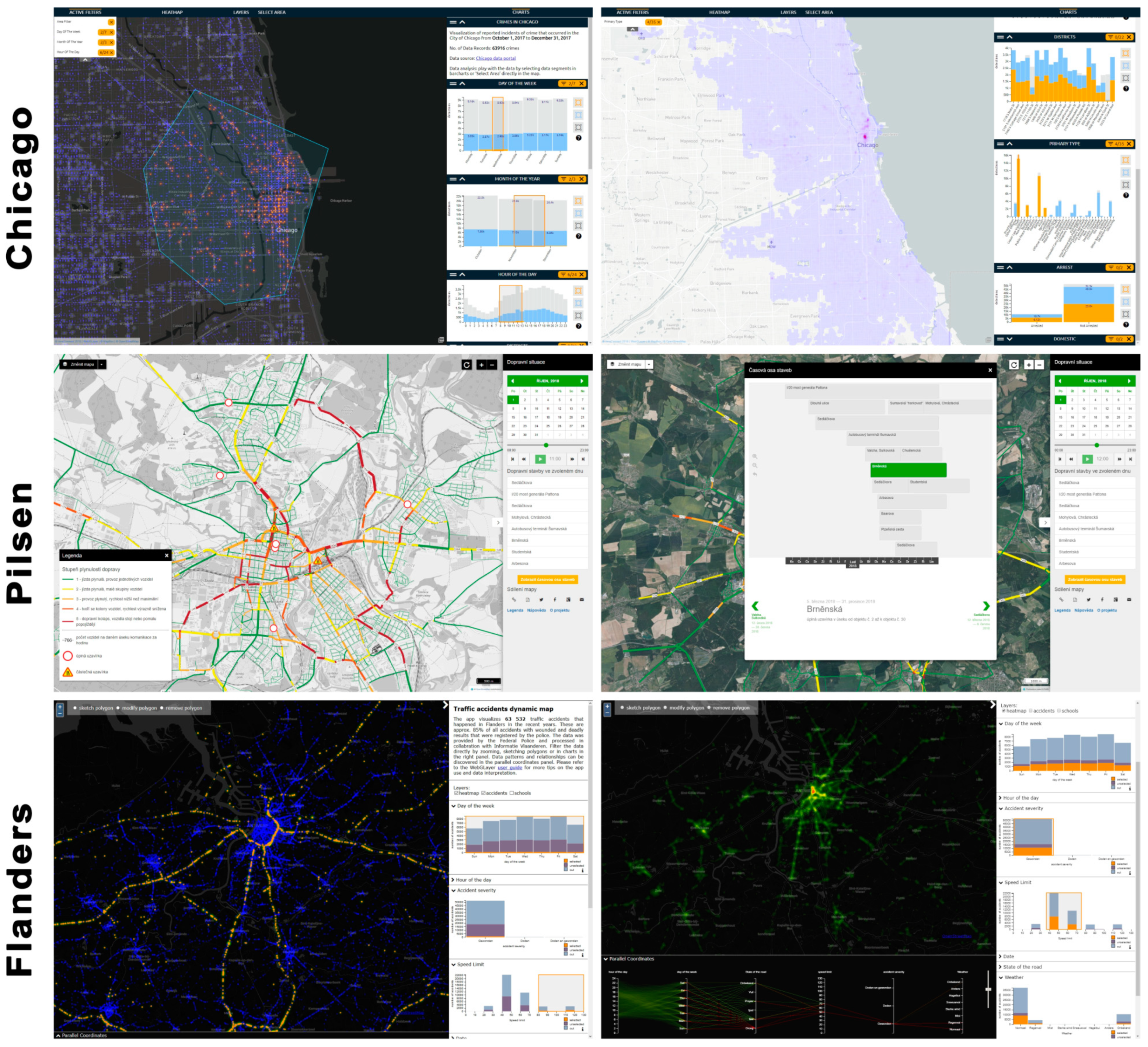
1.2. Description of the Investigated Tools
1.3. Research Aims
- To test the user accessibility of the selected maps;
- To find problems and shortcomings in the evaluated web maps;
- To formulate recommendations for map authors based on these findings.
2. Methods
2.1. Design of the Experiment
2.1.1. Static Part
2.1.2. Dynamic Part
- Change the color of the heatmap.
- Display on the map all the crimes which happened on Saturday from 17:00 to midnight.
- Find out how many of these crimes were (say aloud).
- Mark any area on the map using the “Polygon” tool.
- Change map type to “Basic OSM”.
- Display the legend of the map.
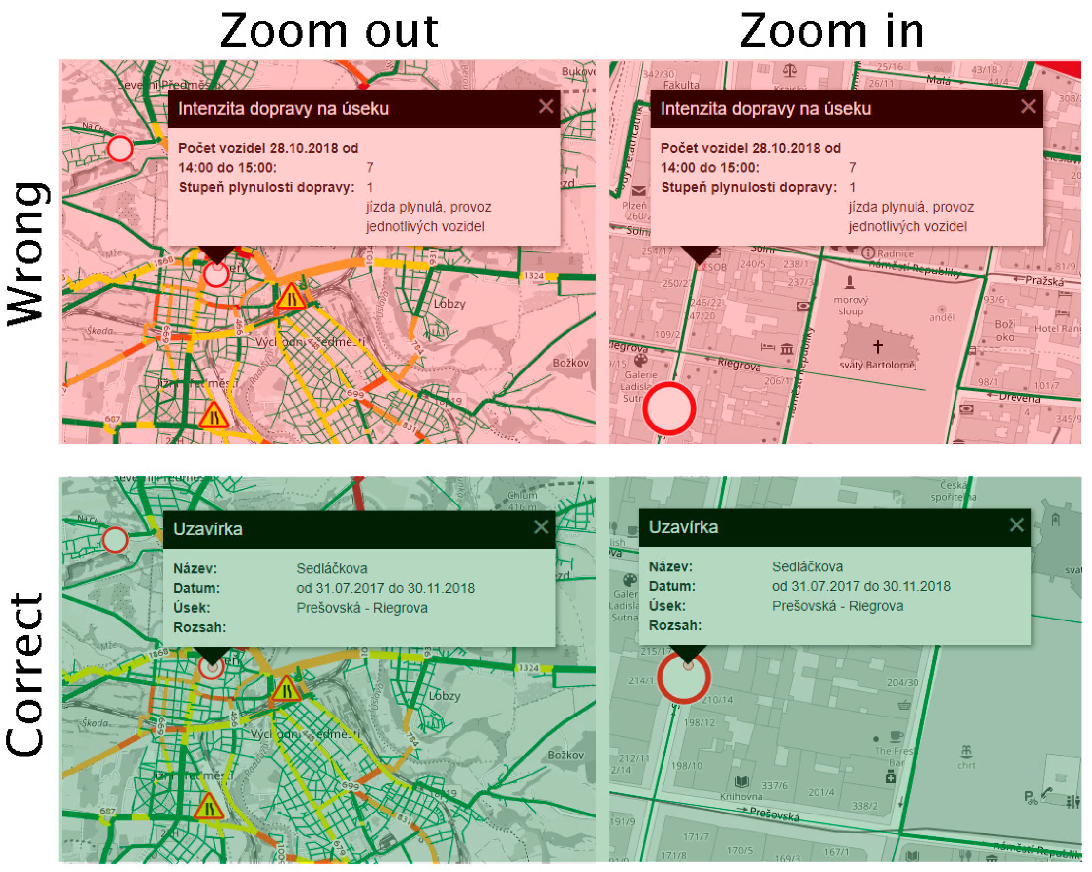
- Find out information about the road closure in the center of Pilsen at 17:00 on 31 October 2018.
- Display the “Timeline of constructions” and find out when the Šumavská Bus Terminal will be closed (say aloud).
- Switch map layer to accidents.
- View all traffic accidents that occurred during rain (“regenval”).
- Estimate how many of these accidents happened within a speed of 40–50 km per hour (say aloud).
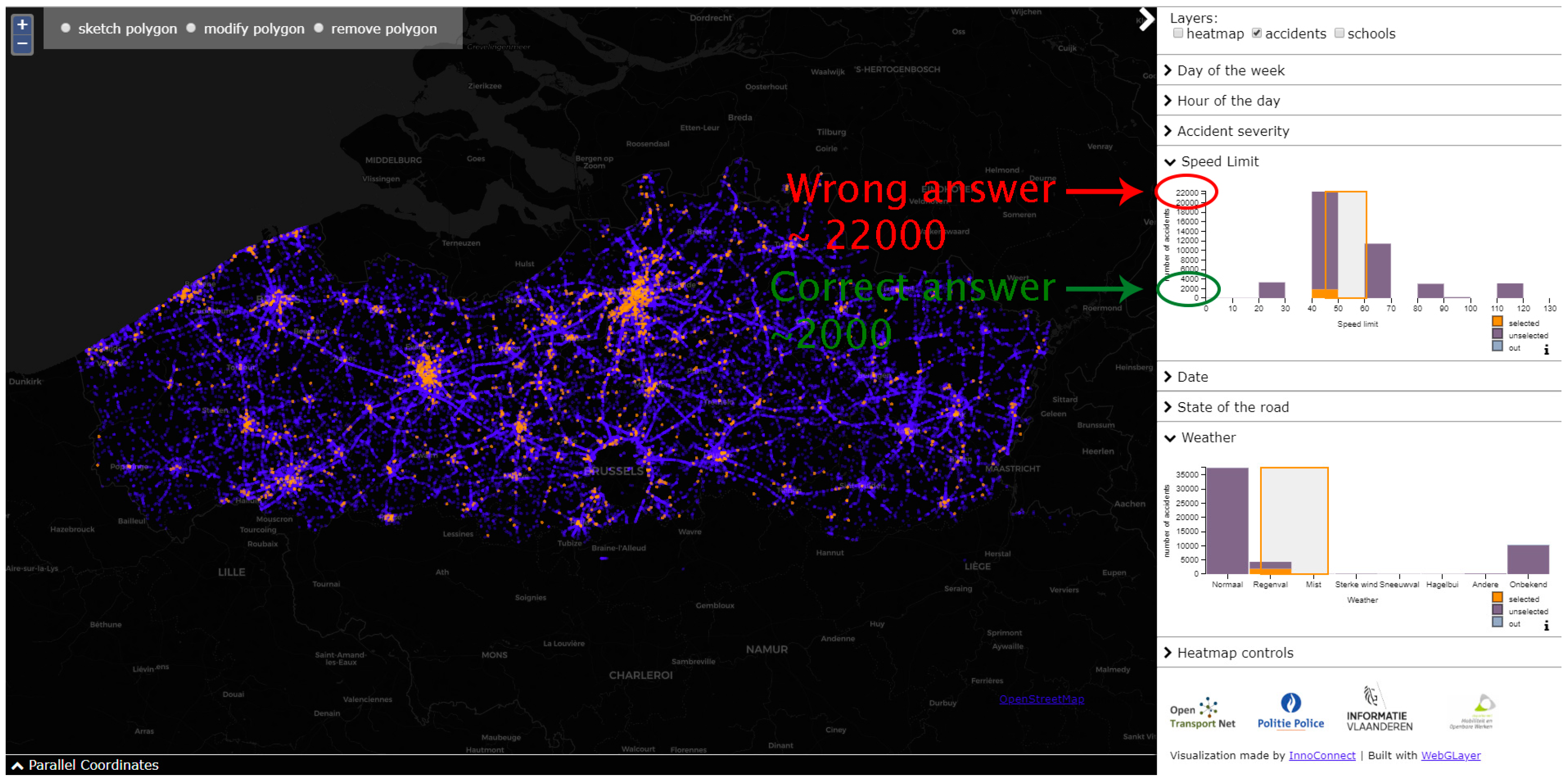
- Verbally interpret the parallel coordinates plot.
2.1.3. Experiment Description
2.2. Participants
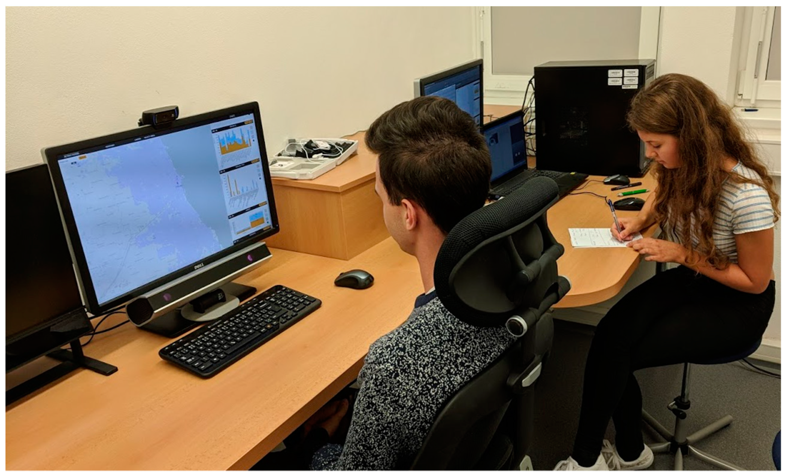
2.3. Apparatus
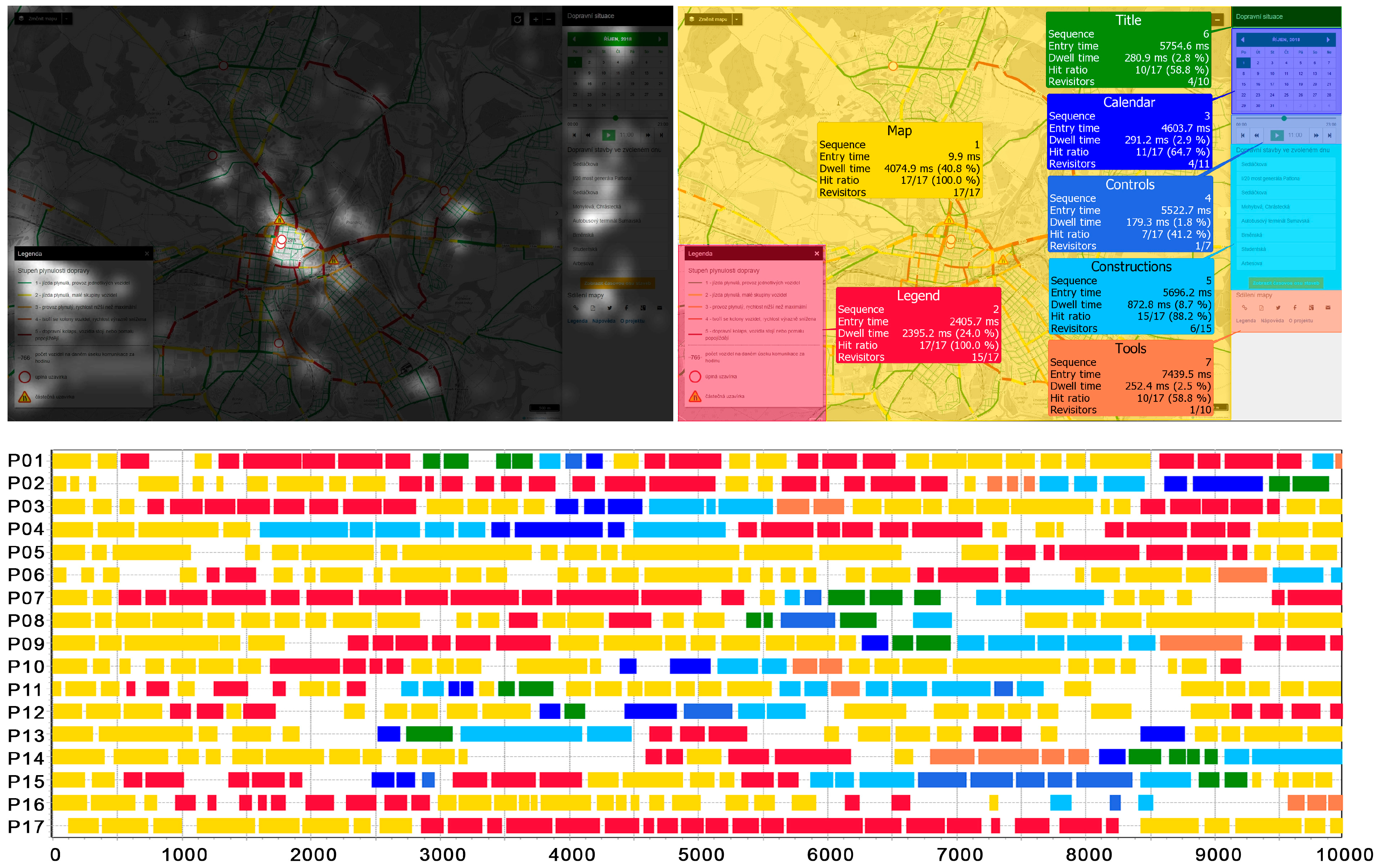
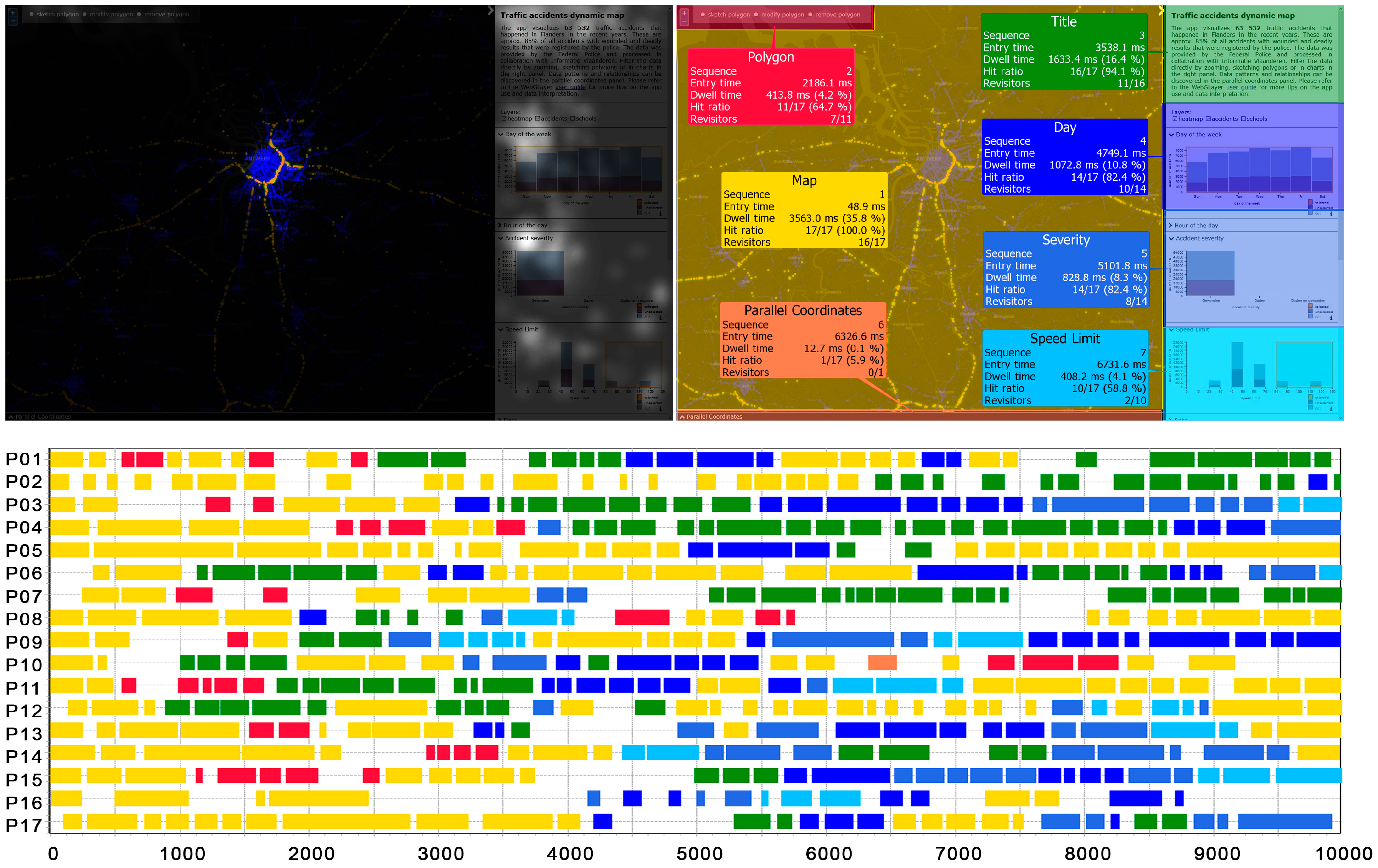
2.4. Methods of Analysis
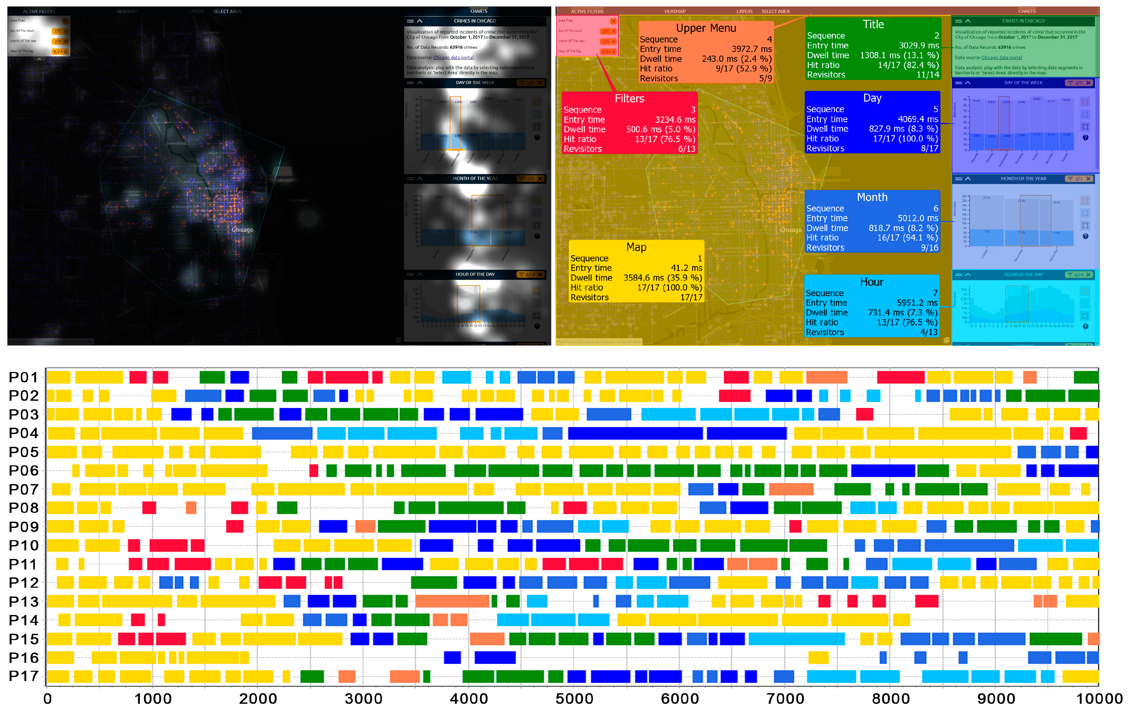
- Sequence—order of gaze hits into the AOIs based on entry time;
- Entry time—average duration for the first fixation into the AOI;
- Dwell time—sum of all fixations and saccades within an AOI/number of participants;
- Hit ratio—how many participants looked at least once into the AOI;
- Revisitors—number of participants with more than one visit in the AOI.
3. Results
3.1. Static Part
3.1.1. Chicago Map
3.1.2. Pilsen Map
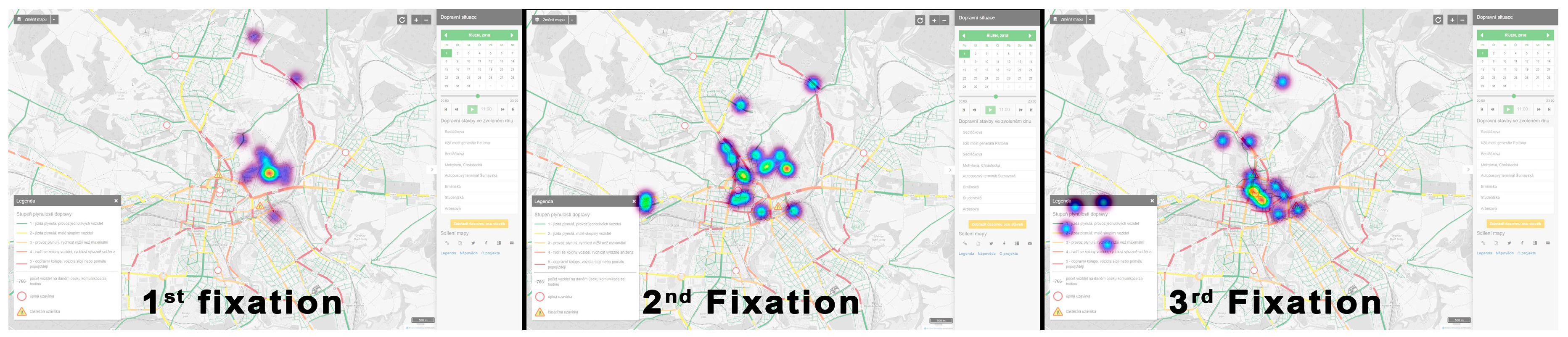
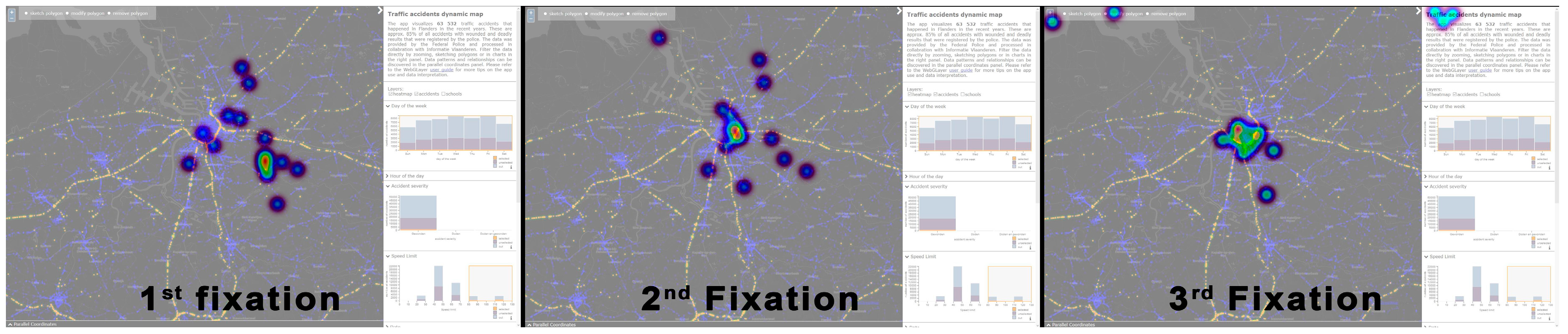
3.1.3. Flanders Map
3.2. Dynamic Part
3.2.1. Chicago Map
3.2.2. Pilsen Map
3.2.3. Flanders Map
4. Recommendations and Discussion
4.1. Chicago Map
4.2. Pilsen Map
4.3. Flanders Map
4.4. Research Limitations
5. Conclusions
- Important features (title, legend) should be placed within the GUI on the left side.
- If a user creates a selection based on a selected time range or another attribute value, the value of this selection should be highlighted. The value of the selection should be displayed in the maximum available data views, and the value should be given in a sufficiently large, distinctive font and in a contrasting color.
- All the point symbols in the map should be interactive (“clickable”).
- When selecting values in bar charts or histograms, both mouse-drag and mouse-click should be supported.
- The parallel coordinates plot should be designed and implemented carefully. It is advisable to create tooltips or a help function for it. The parallel coordinates plot serves to identify clusters based on attribute values, so it is advisable to color these groups within the implicit visualization.
- It would be beneficial to use also quantitative analyses—statistical evaluation of eye-tracking metrics like dwell time, number of fixations, or scanpath length. Quantitative measures will be helpful when two or more variants of the maps are developed, and the experiment will serve to find out which of them is the most usable. In that case, the experiment will need to be designed differently. The learning effect will be significant, so a higher number of participants divided into two (or more) groups will be necessary.
- It would be beneficial to intensify the mixed design of research experiments, which combines the advantages of quantitative and qualitative methods. Specifically, it is advisable to combine eye-tracking and observation with other research methods such as user logging (providing quantitative data about user interaction), interview, or think aloud (providing a better insight into user thinking or reasons for making errors when working with interactive maps).
- Investigation of user strategies during the work with the interactive environment might be investigated. The freely available tool Scangraph [60] is suitable for this purpose. Scangraph serves to identify similar user strategies. Another related sub-topic is the identification of differences between expert users and laypersons when working with interactive maps, which were previously identified, for example, in interactive 3D geovisualizations [34].
- Finally, interactive maps for visual analytics are very variable, from web maps [32,36], through 3D maps [40,61], to immersive virtual environments [7], and each of these forms should be evaluated by user testing. However, because of this variability, the results of such evaluation would only be able to be transferred or compared only partially. In general, user testing should be a part of the development of any interactive map.
Author Contributions
Funding
Acknowledgments
Conflicts of Interest
References
- Andrienko, G.; Andrienko, N.; Jankowski, P.; Keim, D.; Kraak, M.J.; MacEachren, A.; Wrobel, S. Geovisual analytics for spatial decision support: Setting the research agenda. Int. J. Geogr. Inf. Sci. 2007, 21, 839–857. [Google Scholar] [CrossRef]
- Konečný, M. Cartography: Challenges and potential in the virtual geographic environments era. Ann. GIS 2011, 17, 135–146. [Google Scholar] [CrossRef]
- Zhu, L.F.; Wang, Z.L.; Li, Z.W. Representing Time-Dynamic Geospatial Objects on Virtual Globes Using CZML-Part I: Overview and Key Issues. ISPRS Int. J. Geo-Inf. 2018, 7, 97. [Google Scholar] [CrossRef]
- Lin, H.; Batty, M.; Jørgensen, S.E.; Fu, B.; Konečný, M.; Voinov, A.; Torrens, P.; Lu, G.; Zhu, A.X.; Wilson, J.P. Virtual Environments Begin to Embrace Process-based Geographic Analysis. Trans. GIS 2015, 19, 493–498. [Google Scholar] [CrossRef]
- Thomas, J.J.; Cook, K.A. Illuminating the Path: The Research and Development Agenda for Visual Analytics; IEEE Computer Society Press: Richland, WA, USA, 2005. [Google Scholar]
- Jedlička, K.; Hájek, P.; Čada, V.; Martolos, J.; Šťastný, J.; Beran, D.; Kolovský, F.; Kozhukh, D. Open Transport Map—Routable OpenStreetMap. In Proceedings of the 2016 IST-Africa Week Conference, Durban, South Africa, 11–13 May 2016; pp. 1–11. [Google Scholar]
- Havenith, H.-B.; Cerfontaine, P.; Mreyen, A.-S. How Virtual Reality Can Help Visualise and Assess Geohazards. Int. J. Digit. Earth 2019, 12, 173–189. [Google Scholar] [CrossRef]
- Patton, C.V.; Sawicki, D.S. Basic Methods of Policy Analysis and Planning; Routlege: Abingdon, VA, USA, 1993; pp. 154–196. [Google Scholar]
- McAleer, S.R.; Kogut, P.; Raes, L. The Case for Collaborative Policy Experimentation Using Advanced Geospatial Data Analytics and Visualisation. In Proceedings of the International Conference on Internet Science, Thessaloniki, Greece, 22–24 November 2017; pp. 137–152. [Google Scholar]
- Freitas, C.M.; Luzzardi, P.R.; Cava, R.A.; Winckler, M.; Pimenta, M.S.; Nedel, L.P. On evaluating information visualization techniques. In Proceedings of the working conference on Advanced Visual Interfaces, Trento, Italy, 22–24 May 2002; pp. 373–374. [Google Scholar]
- Scholtz, J. Beyond usability: Evaluation aspects of visual analytic environments. In Proceedings of the 2006 IEEE Symposium on Visual Analytics Science and Technology, Baltimore, MD, USA, 31 October–2 November 2006; pp. 145–150. [Google Scholar]
- Scholtz, J.; Plaisant, C.; Whiting, M.; Grinstein, G. Evaluation of visual analytics environments: The road to the Visual Analytics Science and Technology challenge evaluation methodology. Inf. Vis. 2014, 13, 326–335. [Google Scholar] [CrossRef]
- Tory, M.; Moller, T. Evaluating visualizations: Do expert reviews work? IEEE Comput. Graph. Appl. 2005, 25, 8–11. [Google Scholar] [CrossRef] [PubMed]
- Scholtz, J. Developing qualitative metrics for visual analytic environments. In Proceedings of the 3rd BELIV’10 Workshop: Beyond time and errors: Novel evaluation methods for Information Visualization, Florence, Italy, 5 April 2008; pp. 1–7. [Google Scholar]
- Andrienko, G.L.; Andrienko, N.; Keim, D.; MacEachren, A.M.; Wrobel, S. Challenging problems of geospatial visual analytics. J. Vis. Lang. Comput. 2011, 22, 251–256. [Google Scholar] [CrossRef]
- Roth, R.E.; Çöltekin, A.; Delazari, L.; Filho, H.F.; Griffin, A.; Hall, A.; Korpi, J.; Lokka, I.; Mendonça, A.; Ooms, K. User studies in cartography: Opportunities for empirical research on interactive maps and visualizations. Int. J. Cartogr. 2017, 3, 61–89. [Google Scholar] [CrossRef]
- Robinson, A.C.; Chen, J.; Lengerich, E.J.; Meyer, H.G.; MacEachren, A.M. Combining usability techniques to design geovisualization tools for epidemiology. Cartogr. Geogr. Inf. Sci. 2005, 32, 243–255. [Google Scholar] [CrossRef]
- Roth, R.; Ross, K.; MacEachren, A. User-centered design for interactive maps: A case study in crime analysis. ISPRS Int. J. Geo-Inf. 2015, 4, 262–301. [Google Scholar] [CrossRef]
- Schnürer, R.; Sieber, R.; Çöltekin, A. The Next Generation of Atlas User Interfaces: A User Study with “Digital Natives”. In Modern Trends in Cartography; Springer: Heidelberg, Germany, 2015; pp. 23–36. [Google Scholar]
- Alacam, Ö.; Dalci, M. A usability study of WebMaps with eye tracking tool: The effects of iconic representation of information. In New Trends in Human-Computer Interaction; Springer: Berlin, Germany, 2009; pp. 12–21. [Google Scholar]
- Ooms, K.; Çöltekin, A.; De Maeyer, P.; Dupont, L.; Fabrikant, S.; Incoul, A.; Kuhn, M.; Slabbinck, H.; Vansteenkiste, P.; Van der Haegen, L. Combining user logging with eye tracking for interactive and dynamic applications. Behav. Res. Methods 2015, 47, 977–993. [Google Scholar] [CrossRef] [PubMed]
- Stehlíková, J.; Řezníková, H.; Kočová, H.; Stachoň, Z. Visualization Problems in Worldwide Map Portals. In Modern Trends in Cartography; Brus, J., Vondrakova, A., Vozenilek, V., Eds.; Lecture Notes in Geoinformation and Cartography; Springer: Cham, Switzerland, 2015; pp. 213–225. [Google Scholar]
- Burian, J.; Popelka, S.; Beitlová, M. Evaluation of the Cartographical Quality of Urban Plans by Eye-Tracking. ISPRS Int. J. Geo-Inf. 2018, 7, 192. [Google Scholar] [CrossRef]
- Roth, R.E.; Harrower, M. Addressing map interface usability: Learning from the lakeshore nature preserve interactive map. Cartogr. Perspect. 2008, 46–66. [Google Scholar] [CrossRef]
- Göbel, F.; Kiefer, P.; Raubal, M. FeaturEyeTrack: Automatic matching of eye tracking data with map features on interactive maps. GeoInformatica 2019, 1–25, in press. [Google Scholar]
- Kurzhals, K.; Fisher, B.; Burch, M.; Weiskopf, D. Eye tracking evaluation of visual analytics. Inf. Vis. 2016, 15, 340–358. [Google Scholar] [CrossRef]
- Krassanakis, V.; Cybulski, P. A review on eye movement analysis in map reading process: The status of the last decade. Geod. Cartogr. 2019, 68, 191–209. [Google Scholar]
- Kiefer, P.; Giannopoulos, I.; Raubal, M.; Duchowski, A. Eye Tracking for Spatial Research: Cognition, Computation, Challenges. Spat. Cogn. Comput. 2017, 17, 1–19. [Google Scholar] [CrossRef]
- Çöltekin, A.; Heil, B.; Garlandini, S.; Fabrikant, S.I. Evaluating the effectiveness of interactive map interface designs: A case study integrating usability metrics with eye-movement analysis. Cartogr. Geogr. Inf. Sci. 2009, 36, 5–17. [Google Scholar] [CrossRef]
- Çöltekin, A.; Fabrikant, S.; Lacayo, M. Exploring the efficiency of users’ visual analytics strategies based on sequence analysis of eye movement recordings. Int. J. Geogr. Inf. Sci. 2010, 24, 1559–1575. [Google Scholar] [CrossRef]
- Golebiowska, I.; Opach, T.; Rod, J.K. For your eyes only? Evaluating a coordinated and multiple views tool with a map, a parallel coordinated plot and a table using an eye-tracking approach. Int. J. Geogr. Inf. Sci. 2017, 31, 237–252. [Google Scholar] [CrossRef]
- Brady, D.; Ferguson, N.; Adams, M. Usability of MyFireWatch for non-expert users measured by eyetracking. Aust. J. Emerg. Manag. 2018, 33, 28. [Google Scholar]
- Popelka, S.; Vondrakova, A.; Hujnakova, P. Eye-Tracking Evaluation of Weather Web Maps. ISPRS Int. J. Geo-Inf. 2019, 8, 256. [Google Scholar] [CrossRef]
- Herman, L.; Juřík, V.; Stachoň, Z.; Vrbík, D.; Russnák, J.; Řezník, T. Evaluation of User Performance in Interactive and Static 3D Maps. ISPRS Int. J. Geo-Inf. 2018, 7, 415. [Google Scholar] [CrossRef]
- Nétek, R.; Pour, T.; Slezaková, R. Implementation of Heat Maps in Geographical Information System–Exploratory Study on Traffic Accident Data. Open Geosci. 2018, 10, 367–384. [Google Scholar] [CrossRef]
- Kubíček, P.; Kozel, J.; Štampach, R.; Lukas, V. Prototyping the visualization of geographic and sensor data for agriculture. Comput. Electron. Agric. 2013, 97, 83–91. [Google Scholar] [CrossRef]
- Řezník, T.; Charvát, K.; Lukas, V.; Junior, K.C.; Kepka, M.; Horáková, Š.; Křivánek, Z.; Řezníková, H. Open Farm Management Information System Supporting Ecological and Economical Tasks. In Proceedings of the Environmental Software Systems. Computer Science for Environmental Protection: 12th IFIP WG 5.11 International Symposium, ISESS 2017, Zadar, Croatia, 10–12 May 2017; pp. 221–233. [Google Scholar]
- Burian, J.; Zajíčková, L.; Popelka, S.; Rypka, M. Spatial aspects of movement of Olomouc and Ostrava citizens. Int. Multidiscip. Sci. Geoconference Sgem: Surv. Geol. Min. Ecol. Manag. 2016, 3, 439–446. [Google Scholar]
- Kubíček, P.; Konečný, M.; Stachoň, Z.; Shen, J.; Herman, L.; Řezník, T.; Staněk, K.; Štampach, R.; Leitgeb, Š. Population distribution modelling at fine spatio-temporal scale based on mobile phone data. Int. J. Digit. Earth 2018, 1–22. [Google Scholar] [CrossRef]
- Herman, L.; Řezník, T. 3D web visualization of environmental information-integration of heterogeneous data sources when providing navigation and interaction. Int. Arch. Photogramm. Remote Sens. Spat. Inf. Sci. 2015, 40, 479. [Google Scholar] [CrossRef]
- Russnák, J.; Ondrejka, P.; Herman, L.; Kubíček, P.; Mertel, A. Visualization and spatial analysis of police open data as a part of community policing in the city of Pardubice (Czech Republic). Ann. GIS 2016, 22, 187–201. [Google Scholar]
- Horák, J.; Ivan, I.; Inspektor, T.; Tesla, J. Sparse Big Data Problem. A Case Study of Czech Graffiti Crimes. In The Rise of Big Spatial Data; Springer: Cham, Switzerland, 2017; pp. 85–106. [Google Scholar]
- Roberts, J.C. State of the art: Coordinated & multiple views in exploratory visualization. In Proceedings of the Fifth International Conference on Coordinated and Multiple Views in Exploratory Visualization, Zurich, Switzerland, 2 July 2007; pp. 61–71. [Google Scholar]
- Neset, T.-S.; Opach, T.; Lion, P.; Lilja, A.; Johansson, J. Map-based web tools supporting climate change adaptation. Prof. Geogr. 2016, 68, 103–114. [Google Scholar] [CrossRef]
- Ježek, J.; Jedlička, K.; Mildorf, T.; Kellar, J.; Beran, D. Design and Evaluation of WebGL-Based Heat Map Visualization for Big Point Data. In The Rise of Big Spatial Data; Springer: Heidelberg, Germany, 2017; pp. 13–26. [Google Scholar]
- Edsall, R.; Andrienko, G.; Andrienko, N.; Buttenfield, B. Interactive maps for exploring spatial data. In Manual of Geographic Information Systems; ASPRS: Bethesda, MD, USA, 2008; pp. 837–857. [Google Scholar]
- Lewis, J.R. Testing small system customer set-up. In Proceedings of the Human Factors Society Annual Meeting, Seattle, WA, USA, 25–29 October 1982; pp. 718–720. [Google Scholar]
- Lewis, J.R. Evaluation of Procedures for Adjusting Problem-Discovery Rates Estimated from Small Samples. Int. J. Hum. -Comput. Interact. 2001, 13, 445–479. [Google Scholar] [CrossRef]
- Voßkühler, A.; Nordmeier, V.; Kuchinke, L.; Jacobs, A.M. OGAMA (Open Gaze and Mouse Analyzer): Open-source software designed to analyze eye and mouse movements in slideshow study designs. Behav. Res. Methods 2008, 40, 1150–1162. [Google Scholar] [CrossRef] [PubMed] [Green Version]
- Blignaut, P. Fixation identification: The optimum threshold for a dispersion algorithm. Atten. Percept. Psychophys. 2009, 71, 881–895. [Google Scholar] [CrossRef] [PubMed]
- Komogortsev, O.V.; Jayarathna, S.; Koh, D.H.; Gowda, S.M. Qualitative and quantitative scoring and evaluation of the eye movement classification algorithms. In Symposium on Eye-Tracking Research & Applications; Texas State University: Austin, TX, USA, 2010; pp. 65–68. [Google Scholar]
- Ooms, K.; Krassanakis, V. Measuring the Spatial Noise of a Low-Cost Eye Tracker to Enhance Fixation Detection. J. Imaging 2018, 4, 96. [Google Scholar] [CrossRef]
- Popelka, S. Optimal eye fixation detection settings for cartographic purposes. In Proceedings of the 14th SGEM GeoConference on Informatics, Geoinformatics and Remote Sensing, Albena, Bulgaria, 17–26 June 2014; pp. 705–712. [Google Scholar]
- Popelka, S. Eye-Tracking (nejen) v Kognitivní Kartografii [Eye-Tracking (Not Only) in Cognitive Cartography], 1st ed.; Palacký University Olomouc: Olomouc, Czech Republic, 2018; 248p, ISBN 978-80-244-5313-2. [Google Scholar]
- SensoMotoricInstruments. BeGaze Software Manual; SensoMotoric Instruments: Berlin, Germany, 2008. [Google Scholar]
- Edsall, R.M. The parallel coordinate plot in action: Design and use for geographic visualization. Comput. Stat. Data Anal. 2003, 43, 605–619. [Google Scholar] [CrossRef]
- Zhou, H.; Yuan, X.; Qu, H.; Cui, W.; Chen, B. Visual clustering in parallel coordinates. In Proceedings of the Computer Graphics Forum, Eindhoven, The Netherlands, 26–28 May 2008; pp. 1047–1054. [Google Scholar]
- Manson, S.M.; Kne, L.; Dyke, K.R.; Shannon, J.; Eria, S. Using eye-tracking and mouse metrics to test usability of web mapping navigation. Cartogr. Geogr. Inf. Sci. 2012, 39, 48–60. [Google Scholar] [CrossRef]
- Herman, L.; Popelka, S.; Hejlová, V. Eye-tracking Analysis of Interactive 3D Geovisualization. J. Eye Mov. Res. 2017, 10, 1–15. [Google Scholar] [CrossRef]
- Doležalová, J.; Popelka, S. ScanGraph: A Novel Scanpath Comparison Method Using Visualisation of Graph Cliques. J. Eye Mov. Res. 2016, 9. [Google Scholar] [CrossRef]
- Herman, L.; Russnák, J.; Stuchlík, R.; Hladík, J. Visualization of traffic offences in the city of Brno (Czech Republic): Achieving 3D thematic cartography through open source and open data. In Proceedings of the 25th Central European Conference of Useful Geography: Transfer from Research to Practice, Brno, Czech Republic, 12–13 August 2017; pp. 270–280. [Google Scholar]


| Participant | Sex | Experience | Dev. X (°) | Dev. Y (°) | Tracking Ratio (%) |
|---|---|---|---|---|---|
| P01 | Female | High | 1.1 | 0.5 | 96.4 |
| P02 | Male | Average | 0.7 | 0.4 | 98.9 |
| P03 | Female | Average | 0.5 | 0.7 | 98.3 |
| P04 | Male | Average | 0.5 | 0.5 | 99.2 |
| P05 | Female | Average | 0.6 | 0.6 | 95.7 |
| P06 | Male | Average | 0.4 | 0.3 | 94.9 |
| P07 | Male | High | 0.3 | 0.3 | 94.4 |
| P08 | Female | High | 0.3 | 0.5 | 97.0 |
| P09 | Male | High | 0.5 | 0.2 | 96.9 |
| P10 | Male | High | 0.5 | 0.5 | 99.2 |
| P11 | Male | High | 0.7 | 0.5 | 99.8 |
| P12 | Male | High | 0.2 | 0.4 | 98.7 |
| P13 | Male | High | 0.2 | 0.7 | 98.4 |
| P14 | Male | High | 1.5 | 1.1 | 96.2 |
| P15 | Male | High | 0.5 | 0.3 | 99.5 |
| P16 | Female | Average | 0.7 | 1.2 | 93.3 |
| P17 | Female | Average | 0.3 | 0.5 | 98.3 |
| Task | Problem | No. of Participants |
|---|---|---|
| 1—Change the color of the heatmap. | Participant did not change the color for 30 s. | 1 |
| 2—Display all the crimes which happened on Saturday from 17:00 to midnight. | Participant expected that the layer crime would have an influence on the display of results. | 3 |
| Task was not fulfilled. | 1 | |
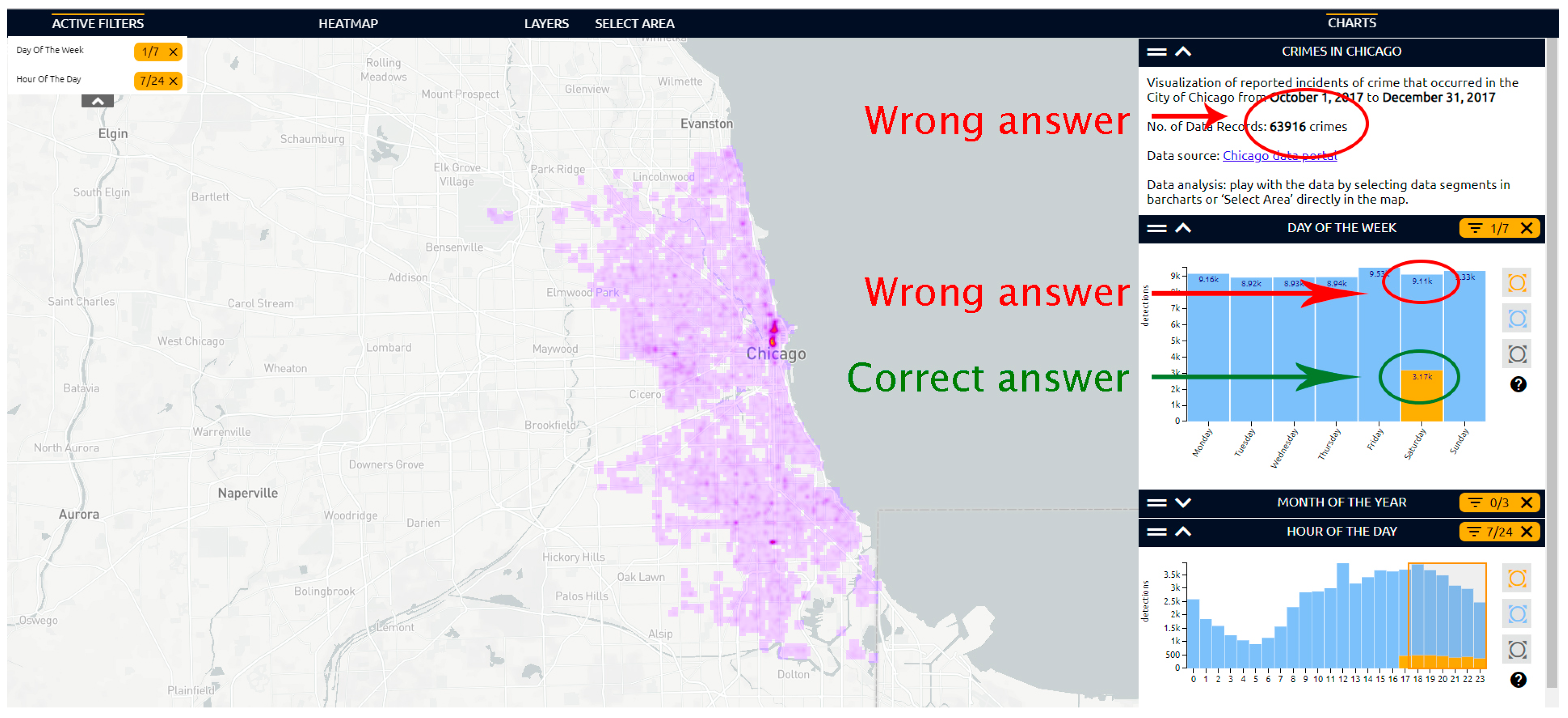
| 3—Find out how many of these crimes there were on a specific day at a specific time. | Participant gave the total number of registered crimes. | 7 |
| Participant gave the wrong number. | 5 | |
| Participant did not find the number. | 4 | |
| 4—Mark any area in the map using the “Polygon” tool. | Participant did not draw the polygon. | 2 |
| Participant had problems with finishing the polygon. | 1 |
| Task | Problem | No. of Participants |
|---|---|---|
| 1—Change map type to “Basic OSM”. | - | 0 |
| 2—Display the legend of the map. | Participant did not find the legend. | 1 |
| 3—Find information about the road closure in the center of Pilsen at 17:00 on 31 October 2018. | Participant clicked outside the road closure | 11 |
| 4—Display the “Timeline of constructions” and find out when the Šumavská Bus Terminal will be closed. | - | 0 |
| Task | Problem | No. of Participants |
|---|---|---|
| 1—Switching map layer to accidents. | Participant did not change the layer for 30 s. | 1 |
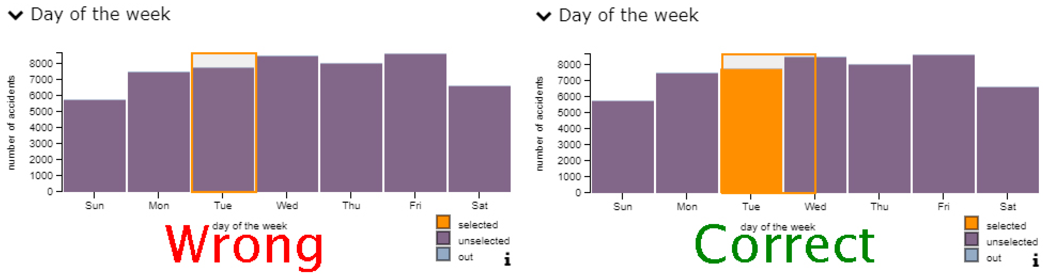
| 2—View all traffic accidents that occurred during rain (“regenval”). | Participant tried to mark graph by means of clicking instead of dragging. | 12 |
| Participant selected the correct field, but the graph did not change. | 7 | |
| Participant completed the task with help (“try to drag instead of click”) | 2 | |
| Task was not completed. | 2 | |
| 3—Estimate how many of these accidents happened within the speed range of 40–50 km per hour. | Participant estimated the total number of accidents within the speed range (not those occurring in rain) | 4 |
| 4—Verbally interpret the parallel coordinates plot. | Investigated separately | |
© 2019 by the authors. Licensee MDPI, Basel, Switzerland. This article is an open access article distributed under the terms and conditions of the Creative Commons Attribution (CC BY) license (http://creativecommons.org/licenses/by/4.0/).
Share and Cite
Popelka, S.; Herman, L.; Řezník, T.; Pařilová, M.; Jedlička, K.; Bouchal, J.; Kepka, M.; Charvát, K. User Evaluation of Map-Based Visual Analytic Tools. ISPRS Int. J. Geo-Inf. 2019, 8, 363. https://0-doi-org.brum.beds.ac.uk/10.3390/ijgi8080363
Popelka S, Herman L, Řezník T, Pařilová M, Jedlička K, Bouchal J, Kepka M, Charvát K. User Evaluation of Map-Based Visual Analytic Tools. ISPRS International Journal of Geo-Information. 2019; 8(8):363. https://0-doi-org.brum.beds.ac.uk/10.3390/ijgi8080363
Chicago/Turabian StylePopelka, Stanislav, Lukáš Herman, Tomas Řezník, Michaela Pařilová, Karel Jedlička, Jiří Bouchal, Michal Kepka, and Karel Charvát. 2019. "User Evaluation of Map-Based Visual Analytic Tools" ISPRS International Journal of Geo-Information 8, no. 8: 363. https://0-doi-org.brum.beds.ac.uk/10.3390/ijgi8080363