1. Introduction
Over the past two decades, public participatory (PP) mapping has evolved rapidly from paper to digital mapping [
1,
2,
3]. Social media (SM) platforms that provide huge volume of crowdsourced data to digital mapping are not regarded as an appropriate participatory mapping resource, even though SM can be used as a pioneering platform that increases individual participation rates for PP mapping with its features of large data production capacity and uninterrupted data collection platforms. Global Navigation Satellite Systems’ (GNSS) antennas in smart devices and public use of these devices, enable and foster location-based crowdsourced applications. The data is generated by the users of these applications and is referred to as Volunteered Geographic Information (VGI) [
4,
5]. The users can be thought of as unconscious volunteers for social media (SM) VGI, as deliberate volunteers for peer production VGI and as public participators for in citizen science based VGI [
6,
7,
8]. The way of producing these forms of VGI is referred to as neo-geography in that it adopts neo-geographers (i.e., volunteers) who contributes to mapping activity without being expert [
9]. This inexperience with regards to data production is questioned in the context of data quality [
10,
11,
12], demographic bias (such as, gender, socioeconomic and educational aspects) [
13,
14] sampling bias (referring to volunteer sampling) and its impact on the generated data [
15,
16].
In their very first form, citizen science projects in the very first forms were carried out with the use of paper maps [
1]. However, with the technological developments in computer and web sciences, nowadays they are mostly carried out with the help of a range of online platforms [
17,
18,
19] designed for collecting data for citizen science purposes. These platforms are designed to collect data within a limited time period for specified purposes. On the other hand, there are also dedicated webpages deployed for local citizen science projects such as DYFI (Did You Feel It) [
20]. DYFI served by the USGS, collects data from volunteers with regards to how intense they feel an earthquake, in order to show the extent of damage and shaking intensities on a map. Although the project is designed and structured to collect and process data, the count in terms of volunteers’ response responses to individual earthquakes (the participation rate) to each earthquake is pretty low [
21]. Although the project has been replicated for different countries such as New Zealand, Italy and Turkey [
20,
22] there is still not any organized approach by the relevant authorities [
23].
SM platforms, although not seen as the proper way to organize citizen-based projects, still have a high and continuous data serving capacity around the world involving 3 billion of users [
24]. In fact, SM with its wide, continuous, active data collection and serving capacity can be used as a pioneering platform for carrying out citizen-based projects especially for monitoring out of the ordinary events such as multi-emergency circumstances in big cities. However, bias in SM data can be seen an obstacle with regard to such projects. In order to use SM data as a citizen-based monitoring system, the data georeferenced in a particular area (such as a city, region or country) should be pre-assessed. In this way, ways in which to use and interpret the SM data as a tool with regard to city monitoring can be inferred.
1.1. SMD Studies on Emergency Mapping
SMD has already in use for disaster management for more than a decade. Houston, et al. [
25] present a comprehensive literature on the functionality of SM in terms of the disaster management phases. The very first example of event detection with SMD was conducted by Sakaki, et al. [
26]. Social media was also considered for disaster relief efforts by Gao, et al. [
27] and Muralidharan, et al. [
28], for crisis communication by Acar and Muraki [
29] and McClendon and Robinson [
30] and for evacuation ontology by Ishino, et al. [
31] and Iwanaga, et al. [
32].
Most of the former and latter studies have focused text-based filtering at first for detecting an event [
33,
34,
35,
36]. The filtering techniques were mostly used for a limited number of keywords related to a disaster domain (such as; hurricane, flood and storm for meteorological disasters) [
36]. In respect to that, this kind of studies has selection bias due to determined keywords [
37]. This might not be a problem for coarse-grained spatial analyses due to an abundance of data however; this may lead cause detection problems for the local events. Yet the studies are mostly basing on an event type instead of being a comprehensive monitoring system to detect any disastrous event anomalies. In addition to that, the spatial grain of the detection analyses are mostly coarse as county or city level [
35,
36], even the studies are focusing the spatial consideration at first [
37].
Historical data exploration plays an important role in comprehensively monitoring unusual events in a fine-grain spatial level within a city [
37,
38]. That is why SMD should be assessed in terms of anomalies, trends and bias. In this way, citizen footprints on social media can be interpreted in several ways as base maps for further local event detection investigations. The most operational use of the proposed method can be on emergency mapping because of rapid succession and the ability to compare the difference with the daily life trends. Since, phases of emergency management requires rapid real-time data on the region of interest to compare the ongoing situation with the preparedness plans.
1.2. Aim and Region of the Study
In this study, the aim is to propose a methodology for bias investigation in order to reveal citizens’ footprints in a city and to produce reference maps (most likely regional anomaly maps, representation maps, spatiotemporal bias maps, etc.). The city of Istanbul was chosen as the case study area as it is one of the biggest cities in the world with 18 million inhabitants and one which expects a major earthquake that could possibly have a catastrophic impact on the city [
39,
40]. Twitter platform is used as the data source, since it is one of the most commonly-used social media network for spreading the information all over the world [
24,
41]. Such data is referred to as Social Media Data (SMD) in this paper. With regard to the investigation of the SMD, the methodology includes the following steps: data acquisition and data tidying, determination of the representation and temporal bias in the data, data normalization for removing user representation bias, detection of anomalies in non-spatial and spatial data, the discretization of anomalies and the production of a trend map and the investigation of spatiotemporal bias. The data investigation outcomes in this study are discussed from the perspective of citizen-based event mapping with the use of SM data. In this way, the assessment techniques with regard to SM data is presented in this study for the benefit of the citizen-based geospatial mapping capacity building.
1.3. Bias in SM-VGI
Nearly half of the world population are unrepresented in SM due to internet censorship or access unavailability [
42]. Consequently, this study of bias in social media data (SMD) starts with a consideration of the inadequacy of the technological and political infrastructure. Moreover, the usage rate of smart devices and computers affects the representation rate of societies and individuals. In addition to the representation of societies may not be equal which is mostly explained in terms of demographic (age, education, social status) differences. For several reasons, some parts of a society might be over-represented while other parts may be under or not represented at all [
15,
43]. However, determining demographic bias is mostly not possible due to the lack of availability of volunteers’ personal data in VGI [
16,
44]. Additionally, volunteers of the platform might not even be a person, in that they can be a bot, a staff team member (who embodies and promotes a company) and/or a troll (a fake account).
Basiri, et al. [
44] suggest that there are more than 300 types of bias and that crowdsourced data might tend to have some of those. Since volunteers are contributing directly without being asked to participate, SMD do not include
“selection bias.” However, the volunteers diversely show
“representation bias” due to their immense activity rate. Also, population density possibly creates
“systematic bias” over space. Due to the reputation of places, volunteers tend to share popular locations more, to flaunt and to be visible at the same page with others. This is referred to as
“Bandwagon bias” and as which affects the spatial distribution of VGI. “
Status-quo bias” is also a reflection of the demographic background of volunteers over space and is seen as specific types sharing a point of interest [
44]. While Bandwagon and Status-quo biases plead to spatial bias, the temporal dimension creates varying patterns with regard to changing activities or participation rate s corresponding to the time of day, day of the week and season of the year. This changing trend is referred to as “
spatiotemporal bias” and entails misinterpretation in the case of a comparison of improper temporal slices.
There have been number of attempts to identify spatial patterns, trends and biases with regard to the SMD. Li, et al. [
45] conducted a research on Twitter and Flickr data at the county level in order to understand users’ behavior as a result of demographic characteristics. The study also offers some exploratory graphs about the number of tweets over time and presents tweet density maps that are normalized by the population density at the county level. Another study is about understanding the demographic characteristics of users who enable location services on Twitter [
41]. The study offers strong evidence based on demographic effects on the tendency of enabling geo-services and geotagging. Lansley and Longley [
46] searched for the dynamics of the city of London using topic modelling and quantified the correspondence of topics with the users’ characteristics and location. Arthur and Williams [
47] conducted a research to identify regional identity and inter-communication between cities. The researchers found that regional identity that is quantified by text similarity and sentiment analysis of posted tweets in terms of several UK cities. Malik, et al. [
48] conducted research to find the relationship between the census population and the number of geotagged tweets using statistical tests. They found that there were no impacts of population on tweets density. However, they did identify several other impacts such as the income level of the population, being in a city center and the age of the population. Another study with regard to the user bias in terms of the tweeting frequency of users, proposed the removal of the top 5% of active users from the data to avoid such biases [
49].
In this respect, the studies carried out mostly focused on the demographic background of the users, the relationship between population and tweets density, representation bias or topic variances over coarse-grained space. However, those were not searching for a year based fine spatial data pattern and for biases that can allow the monitoring a city with a better interpretation of spatiotemporal data. However, this study is designed to present spatiotemporal variances with regard to representation diversity and anomalies and trends in the data, without blocking or removing any users’ data that is a commonly adopted way of previous studies for data cleansing.
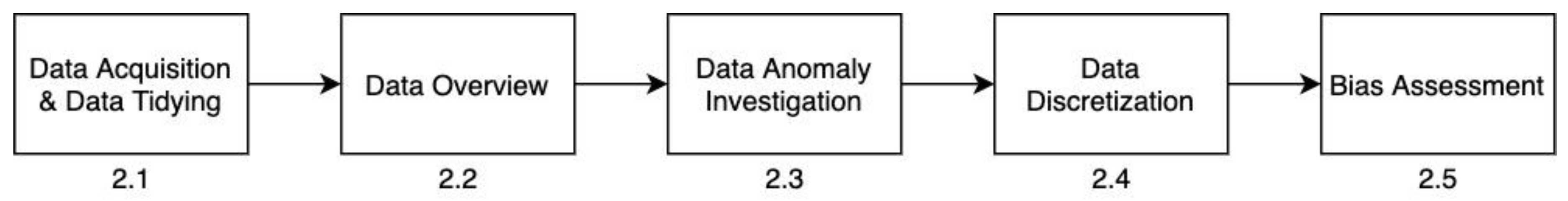
2. Materials and Methods
The methodology of this study is presented in five subsections and the conceptual flow of methodology can be followed from
Figure 1. In the first
Section 2.1, details of data acquisition techniques and data tidying steps are explained. In the second
Section 2.2, the data investigation methodology in terms of users’ activity levels and temporal levels are introduced. In addition, the application of user-weighted normalization techniques is introduced to investigate the impact of users’ activity levels on the temporal data variation. In the third
Section 2.3, details of the investigation of data anomalies are presented in two stages anomaly detection over non-spatial data and anomaly detection over spatially-indexed data. In the fourth
Section 2.4, the methodology involved in obtaining regular data is explained in order to produce spatially-indexed overall trend data and a map. In the fifth
Section 2.5, bias assessment details are incorporated into the methodology flow. Bias investigation in terms of temporal levels is explained step-by-step in this last part.
2.1. Data Acquisition and Data Tidying
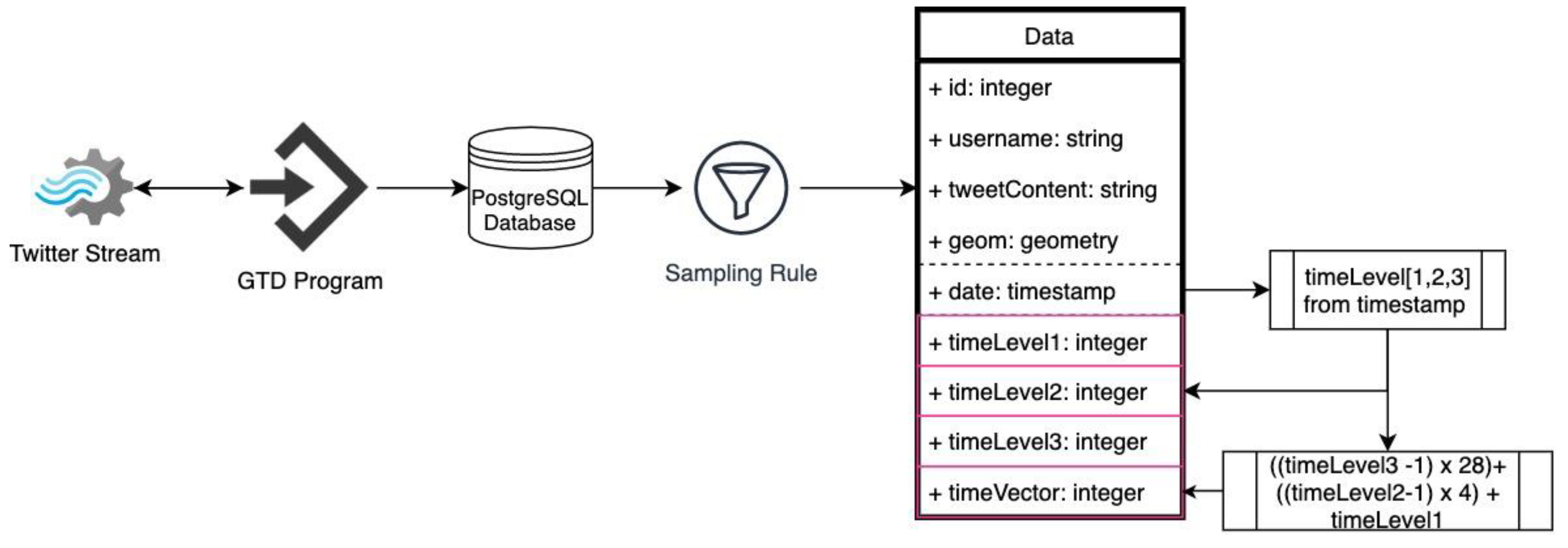
The data flow of this part is composed of the following steps—data downloading, storing, sampling and tidying (
Figure 2). Geo Tweets Downloader (GTD) [
50] is chosen as the downloading software, since this study aims to monitor tweeting pattern within a spatial bounding box. GTD is a software that uses Twitter APIs to download georeferenced tweets and ingests this data into PostgreSQL in real time. GTD has acquired data during the year 2018 within the bounding box of Istanbul City. There were several interruptions such as electricity and internet cuts in the downloading server during this data acquisition process that lasted for one full year. Therefore, the acquired data has been sampled into weeks. Data continuity from Monday to Sunday inclusive was determined as the only sampling rule and starting from the first week of each month, each hour was checked as to whether or not there was a missing data. Based on this, the data was composed of 12 complete selected weeks belonging to each month of the 2018 year.
Data was tidied with the addition of three temporal level columns for further investigation in the following sections. The first level (timeLevel1) shows four different time intervals of the day; night (00:00–06:00), before midday (6:00–12:00), after midday (12:00–18:00) and evening (18:00–00:00). The second level (timeLevel2) shows the day of the week from Monday to Sunday inclusive. The third level (timeLevel3) shows the month of the year from January to December inclusive. In the database time level values are represented by an integer value. On this basis, timeLevels 1, 2 and 3 have 4, 7 and 12 integer values, respectively. In addition to these time level columns, a time vector column was calculated with the formula given in
Figure 2. According to this calculation, the timeVector has values from 1 (night, Monday, January) to 336 (evening, Sunday, December).
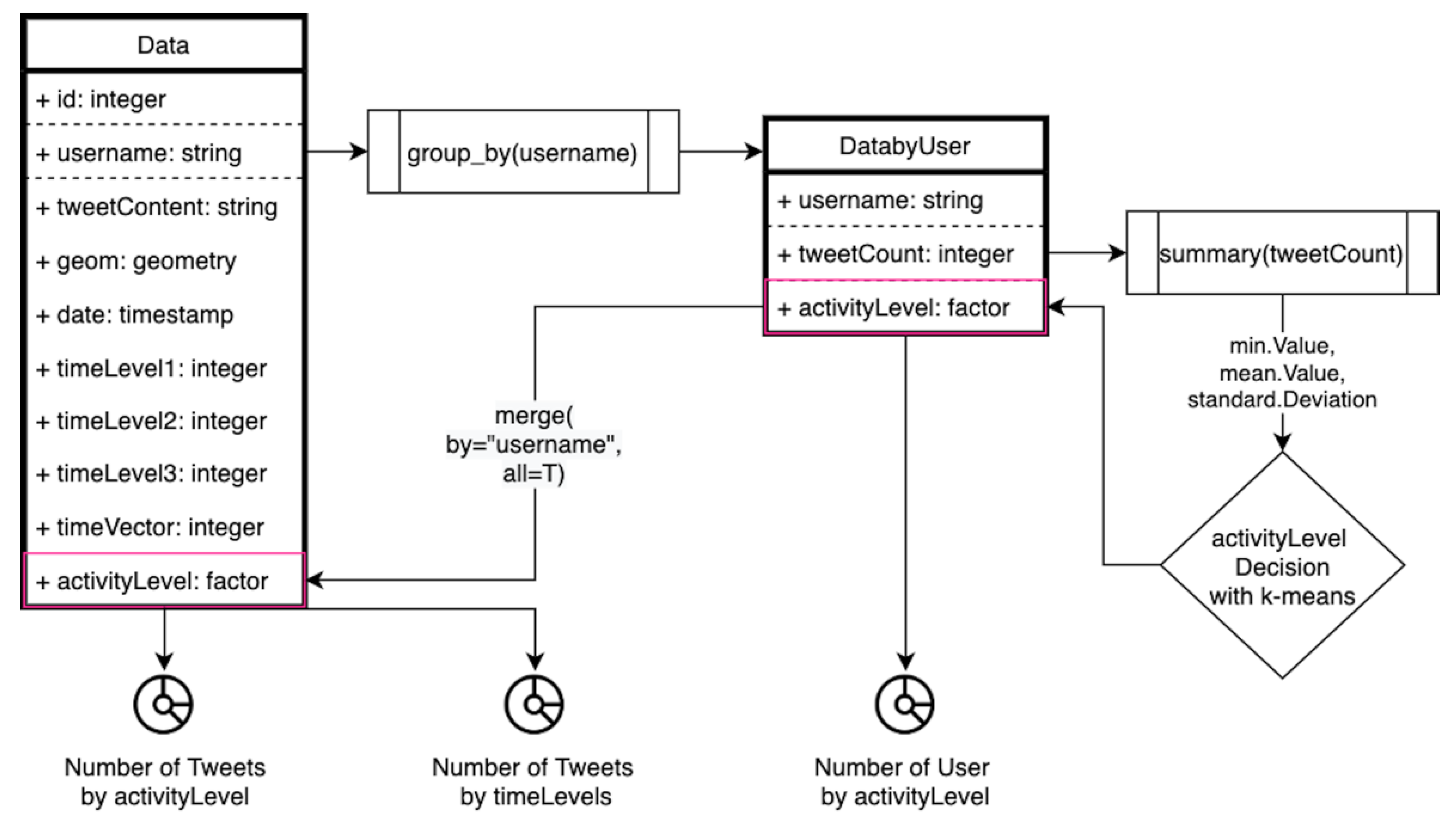
2.2. Data Overview
Data investigation was composed of a user representation level search, the tweet count variation in terms of time level and a normalized tweet count in terms of time level. The investigation started with data generators representation levels that may cause noisy weights over data. The activity level of each user was determined by using one of the most common k-means clustering technique on the overall users’ activities. In terms of the activity level decision, 1. data was grouped by username, 2. a tweet count for each user was calculated, 3. the min, mean, standard deviation values of tweet counts were calculated (
Figure 3). The histogram of the tweet count was not well represented since it was highly right skewed. However, a summary of tweet count is as follows:
| Min. | 1st Qu. | Median | Mean | 3rd Qu. | Max. | Std. |
| 1.00 | 1.00 | 4.00 | 53.91 | 17.00 | 4378.00 | 185.474 |
4. As the tweet number 1 is associated with many users in the overall dataset, it has been separated as the first cluster. Since the data is not normally distributed, the k-means clustering is applied on the remained dataset by separating it into 3 clusters. In the k-means clustering implementation, we followed the traditional approach as listed below.
4 is chosen to be clusters number
Place the centroids c1, c2, c3 and c4 randomly
Repeat steps 4 and 5 until convergence or until the end of a fixed number of iterations
For each user’s tweet number—find the nearest centroid (c1, c2, c3 and c4)—assign the user to that cluster
For each cluster j = 1..4 - new centroid = mean of all points assigned to that cluster
End
Each cluster representation can be seen in
Table 1.
According to this, the min value 1 was specified as the single representation class of the activity level, the max value of cluster 2 (261) is bounding the upper part of the second activity class, the max value of cluster 3 (944) is bounding the upper part of the third activity class and lastly, the max the max value of cluster 4 (4378) is bounding the upper part of the fourth activity class. With the addition of the user activity levels to datasets as shown in
Figure 3, the number of users and tweets in terms of activity level were investigated in terms of the plots in the “Results” section.
The number of tweets in terms of time levels was also investigated in terms of the circular bar plots in the “Results” section, to make general inferences with regard to any temporal bias. The variation in the number of tweets was firstly plotted over the raw data count without any weighting. In addition, the number of tweets is normalized with the technique described below. The normalized number of tweets in terms of time level is investigated in order to discuss the impacts of the representation level to temporal data variations.
Due to the nature of the SMD data, there is a noticeable variance in the number of tweets and user behaviors which lead to some data being “outlier,” a term which is used to describe any unusual behaviors. However, it is often not possible to determine whether those outlier data are invalid or whether the data represent valid information for the overall dataset or task to achieve. Therefore, in this paper, those outlie tweet numbers/users’ behaviors, which deviate noticeably from the overall data, are purposely not removed but rather all the users are assigned weights based on their activity levels. Through the use of these assigned weights, each user is represented at various levels in the used data latter. Thus, we followed two-step normalization procedures (entitled inter-normalization and intra-normalization) to capture and handle each particular user’s behavior and the tweet information that exists.
In terms of intra-normalization, each users’ weight is determined based on their tweeting numbers in comparison with the overall tweet dataset. In this paper, we follow the analogy that if user A tends to send large numbers of tweets (e.g., ~100) on a normal day, this number of tweets will increase--accordingly in the event of a disaster occurrence. On the other hand, user B, who tends to send a smaller number of tweets (e.g., 1 or 0) on a normal day, will increase the number of tweets in parallel with this normal daily tweet number. Therefore, user A is assigned with a smaller weight than is user B for each tweet. This approach can allow us to cope with any discrepancy in tweeting behavior between the users. The weight determination of each user is carried out on their overall tweet numbers in the overall dataset and each user’s tweet number is divided by the maximum () number of tweets.
The user weighting is implemented as follows:
where
is the determined weight of the
i’th user,
is the total tweet numbers and
is the maximum number of tweets which were sent respectively.
After each user’s weight is determined, the overall tweet number (
) of each user in the general pool is calculated by simply multiplying the user weight with the users’ overall tweet number. Consequently, the inter-normalization is completed by allowing each user tweet’s number to contribute in a ‘compromising manner’ to the general pool. In addition, by following this procedure, each user’s contribution is utilized without being ignored or removed from the dataset. After gathering the weighted tweet numbers (
) from each user, in the intra-normalization, time-based tweet numbers are summed, and the commonly-used cube root transformation is implemented for each time-based tweet number (2) and the min-max normalization is applied on this gathered (
) tweet numbers dataset
where
is the transformed tweet number on a time
t.
N is the weighted user numbers which are tweeted at time
t and
is the weighted tweet numbers from the intra-normalization. Consequently, that applying intra and inter-normalization procedures enable the representation of each user and each tweet in the final normalized dataset.
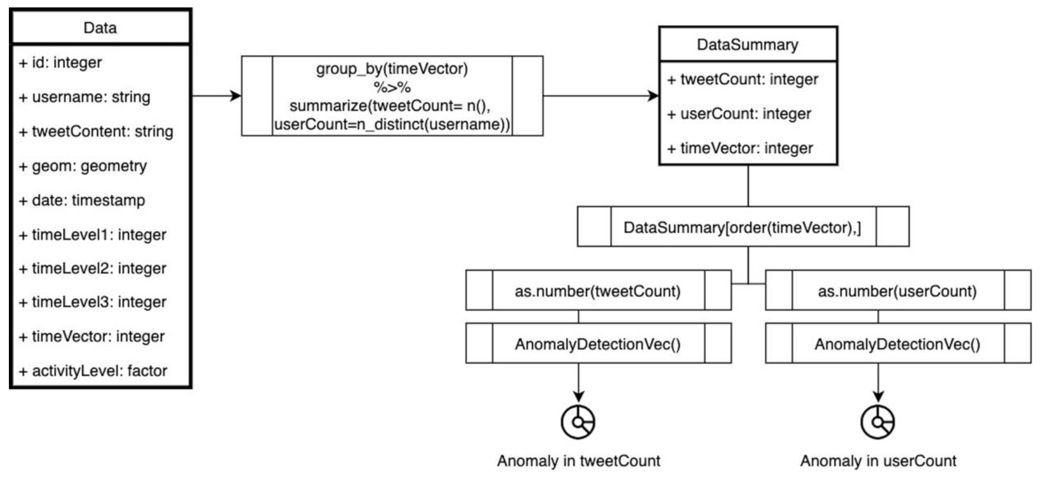
2.3. Anomaly in Data
The anomaly investigation was carried out in two stages that were applied to both non-spatial data and spatial data. The AnomalyDetection R package [
51,
52] was adopted for the applications. The package was created by Twitter for anomaly detection and for visualization where the input Twitter data is highly seasonal and also contains a trend. The package utilizes the Seasonal Hybrid Extreme Studentized Deviate test (S-H-ESD) which uses time series decomposition and robust statistical metrics along with the ordinary Extreme Studentized Deviate test (ESD). The S-H-ESD provides sensitive anomaly output specializing in Twitter data, with the ability to detect global anomalies as well as anomalies have a small magnitude and which are only visible locally. To compute the S-H-ESD test, Anomaly Detection package provides support for the time series method and for the vector of numerical values method where the time series method gets the timestamp values as inputs while the vector method requires an additional input variable “period” for serialization. Both methods require a maximum anomaly percentage, “max_anoms” (upper bound of ESD) and the “direction” of the anomaly (negative, positive or both) [
51,
52].
In this study, the vector method of the AnomalyDetection package is used. The period variable is set as 28, since 7 days of data is used and since each day is divided into 4 periods according to the hour of the given tweets. Hochenbaum, et al. [
53] experimented with 0.05 and 0.001 as the maximum anomaly percentages in their experiments. They achieved better precision, recall and F-measure values with 0.001, though with very few differences between each other. Considering the experiment setup of Hochenbaum, Vallis and Kejariwal [
53], the maximum anomaly percentage is chosen as 0.02 as the optimum value.
For the first anomaly application stage as presented in
Figure 4, 1. data are grouped by timeVector and summarized as tweetCount, userCount and normalizedTweetCount, 2. the counts are ordered by timeVector, 3. anomaly detection is applied to the vectorized counts.
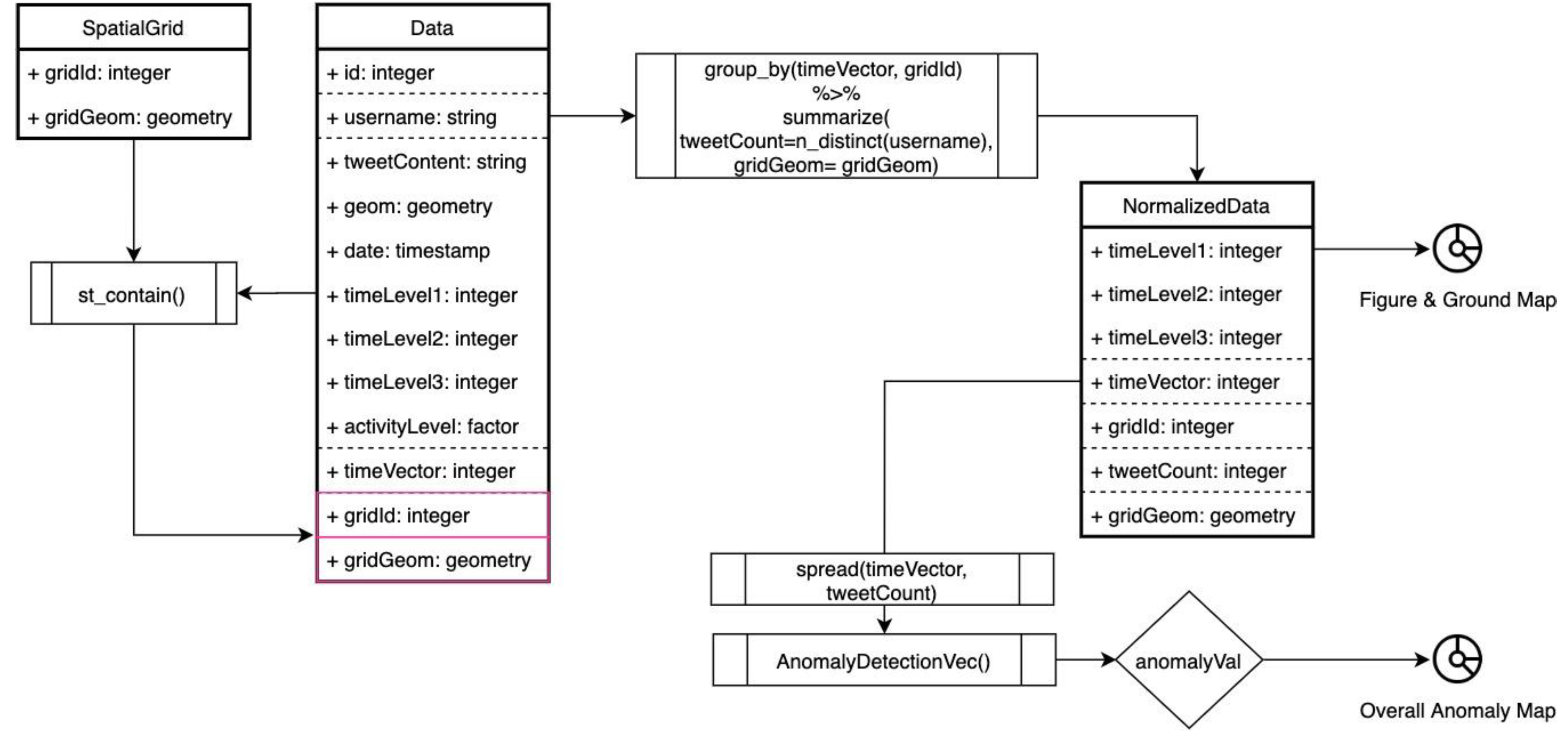
For the second stage, spatiotemporal anomaly is assessed as presented in
Figure 5. The steps are 1. spatial grids (1 × 1 km) within the Istanbul bounding box, which is spatially joined with the data, 2. data is grouped by timeVector and gridId and summarized as tweetCount (as the distinct count of the usernames) and grid geometry, 3. a figure and ground map is visualized to display unrepresented spatial grids, 4. anomaly detection is applied to the spatially normalized tweetCount for each grid, 5. anomaly assessment is done with the normalized anomaly rate in terms of time intervals, 6. an anomaly map is visualized and spatial pattern is tested with the Moran I.
In the second step, tweets from the same user within the same time interval and a 1 × 1 km grid are counted as 1 tweet. This is done to avoid over-representation of a user. In the fifth step, the normalized anomaly rate is formulated (3) for the anomaly assessment. The anomaly and expected values that are provided by the AnomalyDetectionVec part is used with the timeVector indexes (i) in this formula and the normalized anomaly rate is calculated for each grid and timeVector pair. The overall anomaly map is produced with the sum of the normalized anomaly rate for each grid. By this normalized anomaly rate values, the most anomalous spatial grids were plotted and tested with the Moran’s
I algorithm.
Moran’s
I is the measure of global and local spatial autocorrelation. Global and local Moran’s I are utilized for this part and for the following parts of the study, in order to determine the observed anomalies, trends and temporal differences, either clustered, dispersed or random in space. The “spdep” R package [
54] was used to calculate global and local Moran’s
I which are formulated (4), (5) based on the feature’s location and the values of the features [
55].
The variables are
n = number of features indexed by
i and
j,
x = spatial feature values,
= mean of
x,
wij = matrix of feature value weights. The values of Moran’s
I range from −1 (negative spatial autocorrelation) to 1 (positive spatial autocorrelation) and returns 0 value for a random distribution. The Spdep package provides moran.test() and localmoran() functions. In this study, both for global and local spatial autocorrelation calculations, moran.test() and localmoran() functions were used with the following arguments:
x (the numeric vector of the feature attributes), listw (spatial weights for neighboring lists that is calculated by the nb2listw function in the spdep package), zero.policy (specified as TRUE to assign zero value for features with no neighbors). The functions’ return values include Moran statistics (I, I
i) and the
p-value of the statistics (
p value, Pr()). A value of less than 0.05 for the
p-value means that the hypothesis is accepted and is spatially correlated for Moran’s
I [
54,
55]. It is also taken into consideration for interpreting the results of all Moran’s
I tests in this study.
2.4. Data Discretization and Trends
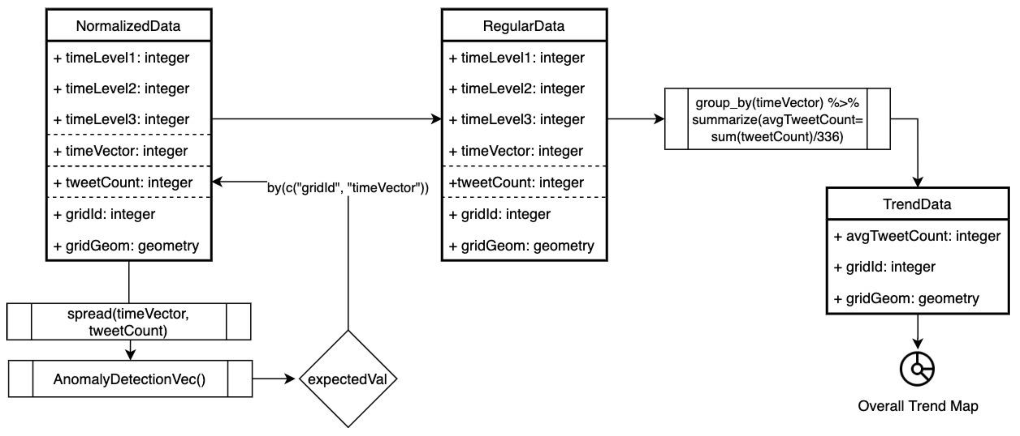
In this part of the study, the trend dataset is manipulated as presented in
Figure 6. Steps are as follows: 1. detected anomalies in the data were discretized, 2. the discretized anomalies were replaced with expected values in terms of gridId and timeVector and assigned as regular data, 3. data were grouped by gridId with the summary of the tweetCount mean value for the overall trend data, 4. an overall trend map was produced and tested with Moran I for the trend values’ spatial pattern determination. The trend map so produced represented the general dynamics of the city and was also used as the reference in order to quantify the spatiotemporal bias in the next section.
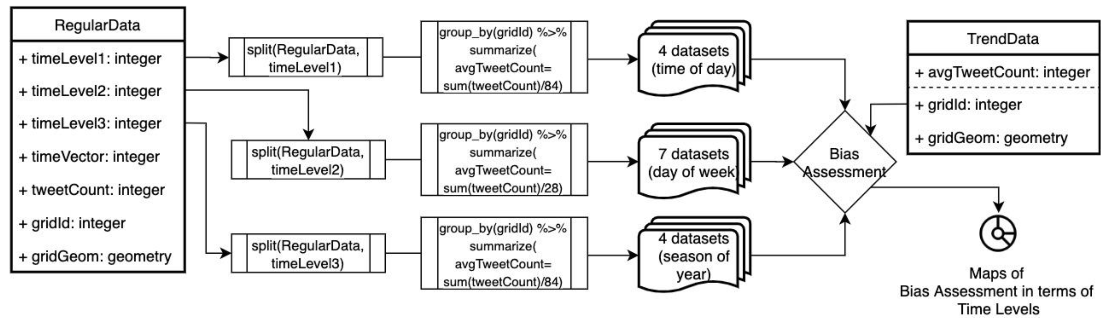
2.5. Spatiotemporal Bias Assessment
The spatiotemporal bias was assessed in terms of hour, day and seasonal levels and the flow of the assessment was displayed in the
Figure 7. The assessment steps are as follows: 1. data was divided into sub-datasets in terms of time levels as 4 sub-datasets (night, bmidday, amidday, evening) for timeLevel1, 7 sub datasets (from Monday to Sunday) for timeLevel2, 4 datasets (winter, spring, summer, autumn) for timeLevel3, 2. these sub-datasets were grouped by gridId and summarized as average tweetCount, 3. each grouped and summarized dataset was assessed with a comparison between the avgTweetCount of each grid in the sub-data and the trend data, 4. Maps of the bias assessment were visualized and tested with the Moran I for spatial pattern investigation.
In the bias assessment part of the flow, the comparison was handled by taking the average tweet counts’ difference in sub-datasets and trend data. This differences in value were plotted in five classes; two classes (low, less) for negative values, a trend class for 0 values, two classes (more, high) for positive values. These values were tested with the Moran I for quantifying the spatial correlation of the values.
3. Results
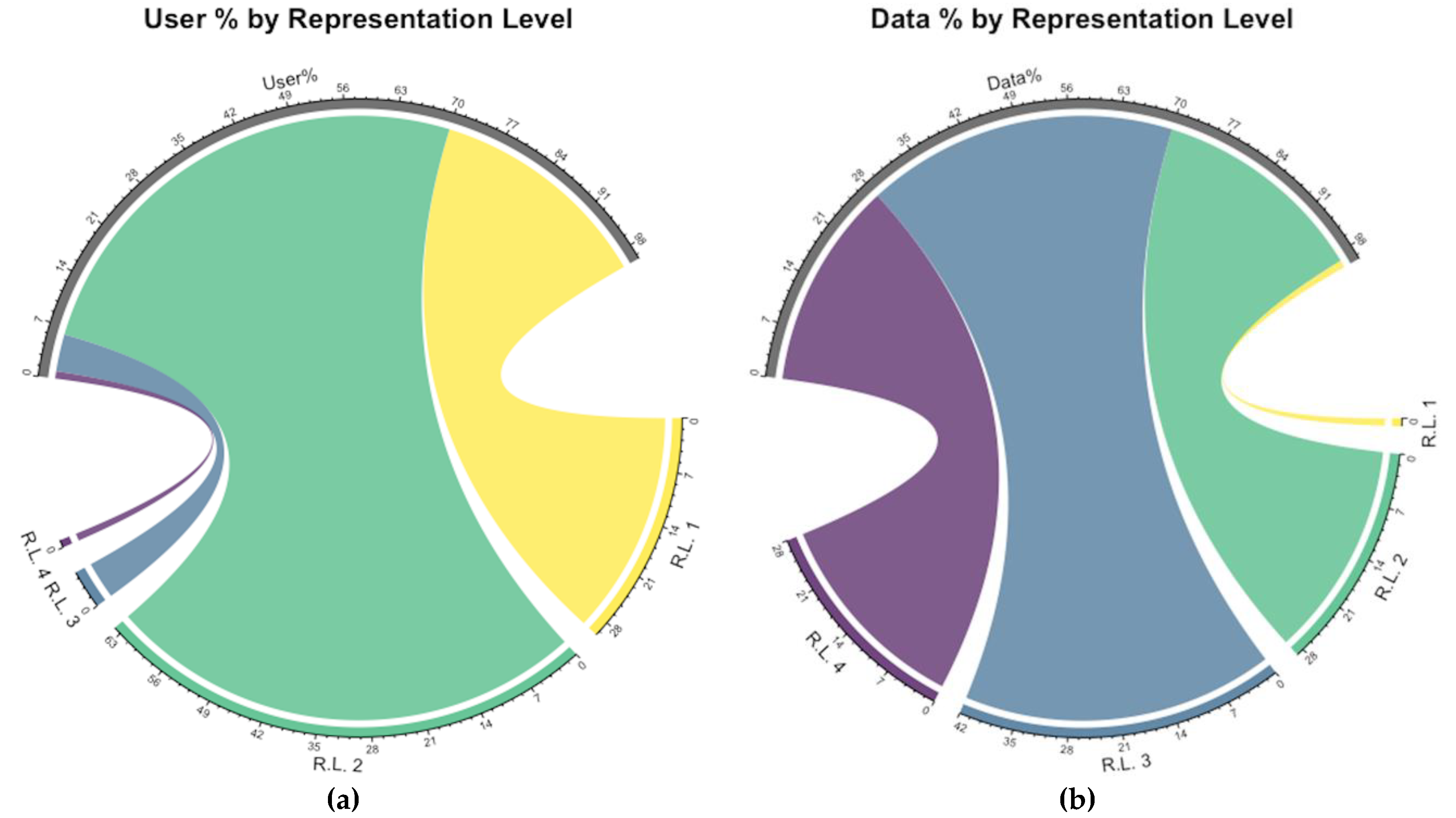
Data acquired and sampled for this study cover over 4 million tweets generated by nearly 76 thousand volunteers. The most active volunteer has 4378 tweets, while one third of all volunteers have just one tweet within all data. Average tweet count per user is 54 with 186 standard deviation. This reveals that the activity of volunteers is disunited and the most active group is highly overrepresented. This condition requires scrutinization to understand whether those groups are more active due to the unordinary situations or as their general behavior. As initial step to explore data, user’s activity levels are classified by depending on the k-means clustering method instead using min, mean and standard deviation values of user’s tweet numbers as explained in the methodology. In respect to this, users’ representation levels (R.L.) are classified as a single (1), second level representation (2), third level (3) and fourth level (4) as the highest active class. The percentage of users per representation levels (a) and the percentage of tweet amounts corresponding to users’ representation levels (b) are illustrated in
Figure 8 as chord diagrams. The diagrams present, nearly 90% of users represent themselves one time or less than 262 times, just the opposite their total representation in data equals to less than 30%. This initial analysis uncovers the reality in diverse representation levels of users and this variation points to representation bias. Many studies in literature omit the data come from over-represented groups in order to decrease representation inequality but also cause a big chunk of data to conceal in this way.
The total number of tweets belongs to each user helps to draw an overview of users’ representation. However, this might be misinterpreted without consideration of temporal variation. The high representation of a user may indicate either over-representation regularly spread overtime or a specific situation that has greater importance for just one period of time. In other words, some of the users considered as over-represented themselves while they do this representation in a limited time interval but underrepresented for the rest of the time. In respect to that, representation varies among users, likewise, it varies for a user temporally due to several circumstances such as seasonal (summer or winter), emergencies (natural disasters, terror attacks), politics (election, referendum).
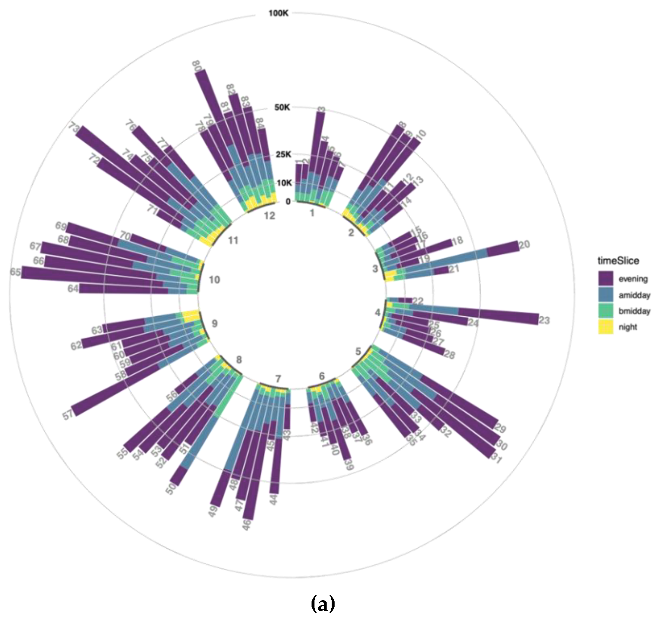
In order to explore a number of tweets to each temporal level in one hand, a circular bar plot is combined. This gives the general temporal variation view of tidied data with some delusions due to inequalities in user/bot representations. Each bar in the plot represents daily data size according to the stacked time slices of the day as it is explained in the methodology section. Data without any weights considering user representation and normalization is visualized in
Figure 9a. With respect to that, data production during a nighttime interval is pretty low or almost none for some days, not because of system failure but because of temporal reasons. The biggest number of tweets is generated in the evening time for nearly every day though it is explicitly less than after middays for some days such as 20, 49, 50 (
Figure 9a).
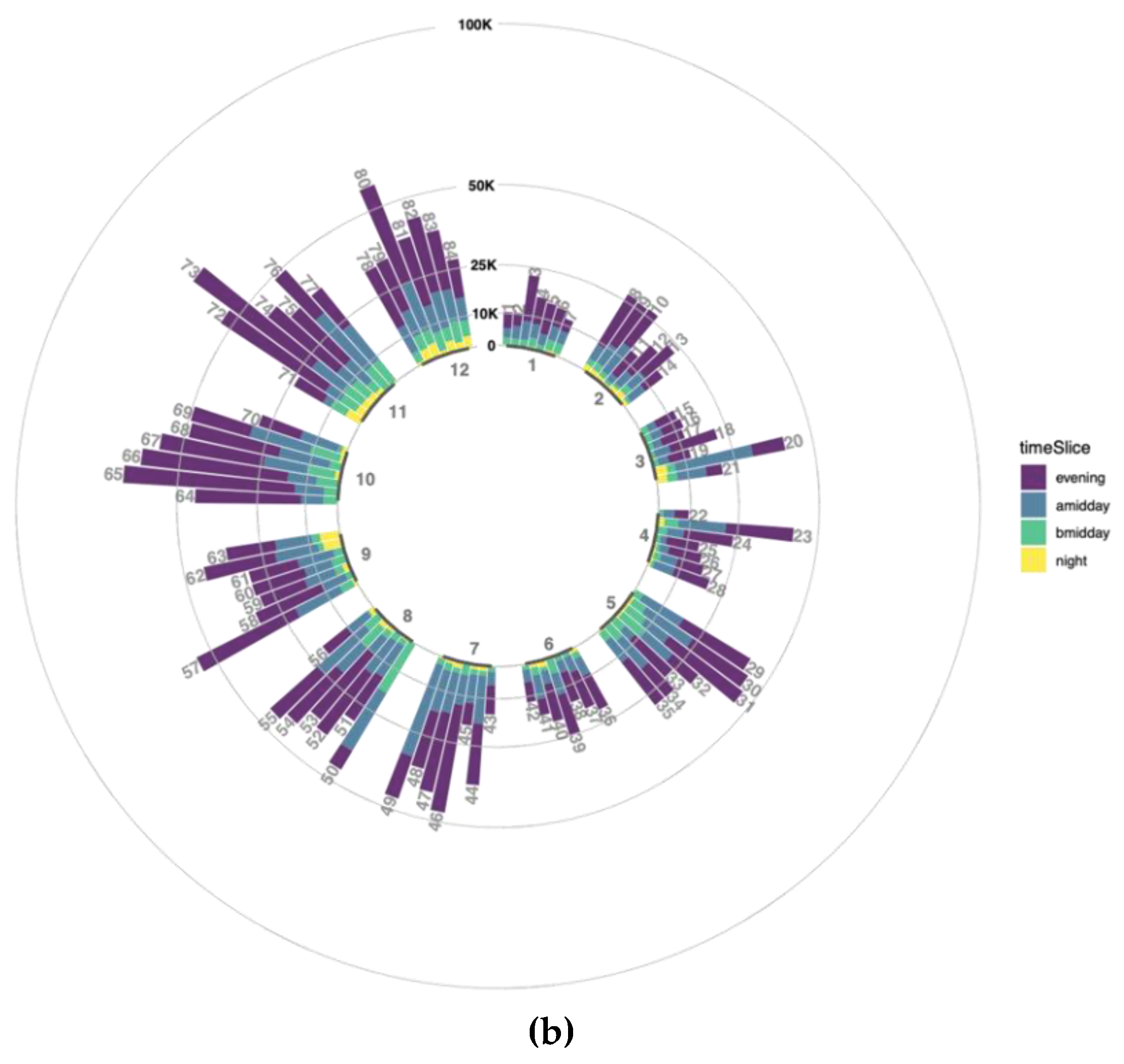
There might be several misinterpretations while assessing the number of tweets in regard to time slices due to diverse representation levels of users. In order to avoid this, number of tweets to temporal level 1 is normalized by weight assignment to each user. According to that normalization, tweet counts for each time slice are recalculated by taking the sum of each user tweet count multiplied with its user weight. Normalized data is displayed in
Figure 9b as similar to
Figure 9a. The number of tweets is obviously decreasing for all bars and a higher decreasing relative to previous numbers means higher overrepresentation level is normalized for time slices.
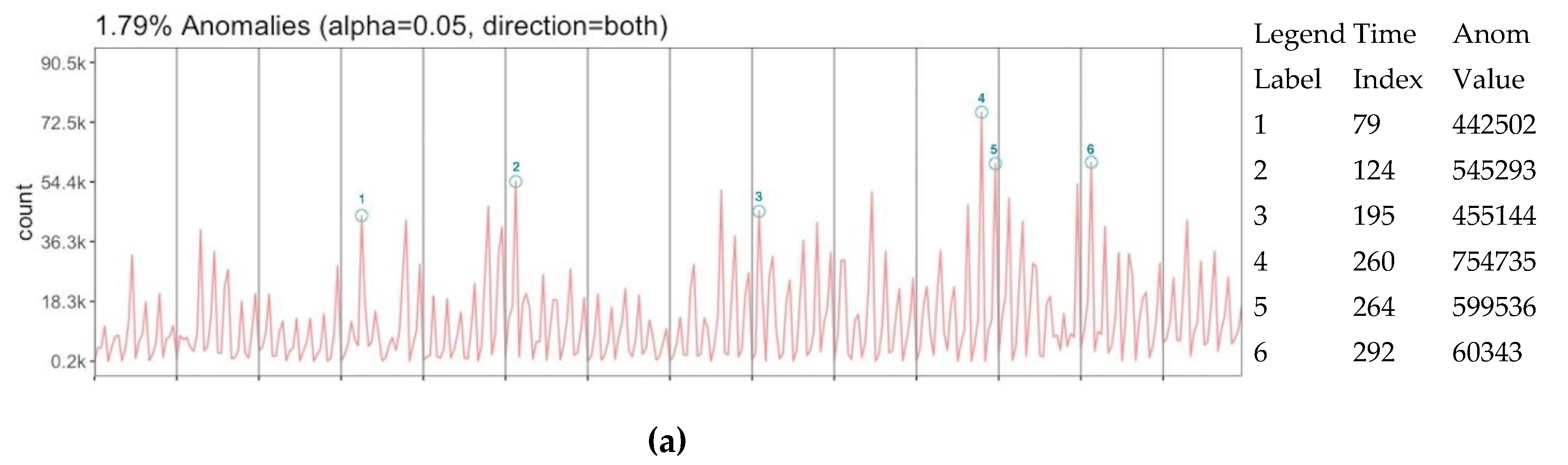
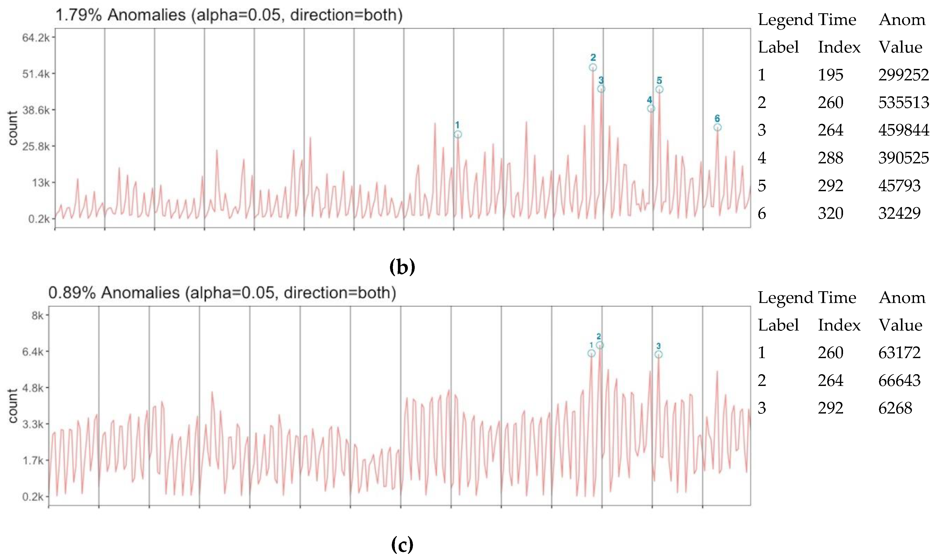
Diversity in representation level might create uncertainty on the number of data and requires to question whether data has any trend to do further inferences depending on that. In this general perspective without any location-based dimension, data is assessed with the anomaly detection algorithm in order to extract any trending activity. Three anomaly assessments are performed over tweet count (a), user count (b) and normalized tweet count (c) (
Figure 10) respect to the time vector. While tweet count and user count have 6 anomaly slices which 4 of them are matched with each other, the normalized count has 3 anomaly slices that are all the common with both tweet and user count anomalies. According to these matches, diversity in representation creates three more anomalies than the normalized representation. However, the matching anomaly slices 195 between the tweet and user count is also notable to be considered even it is not in the normalized count anomaly. Anomaly values in overall data are detected at 1.79%, 1.79% and 0.89% respectively. This can be interpreted that data has strong trends for the assessment of 24 periodic time slices.
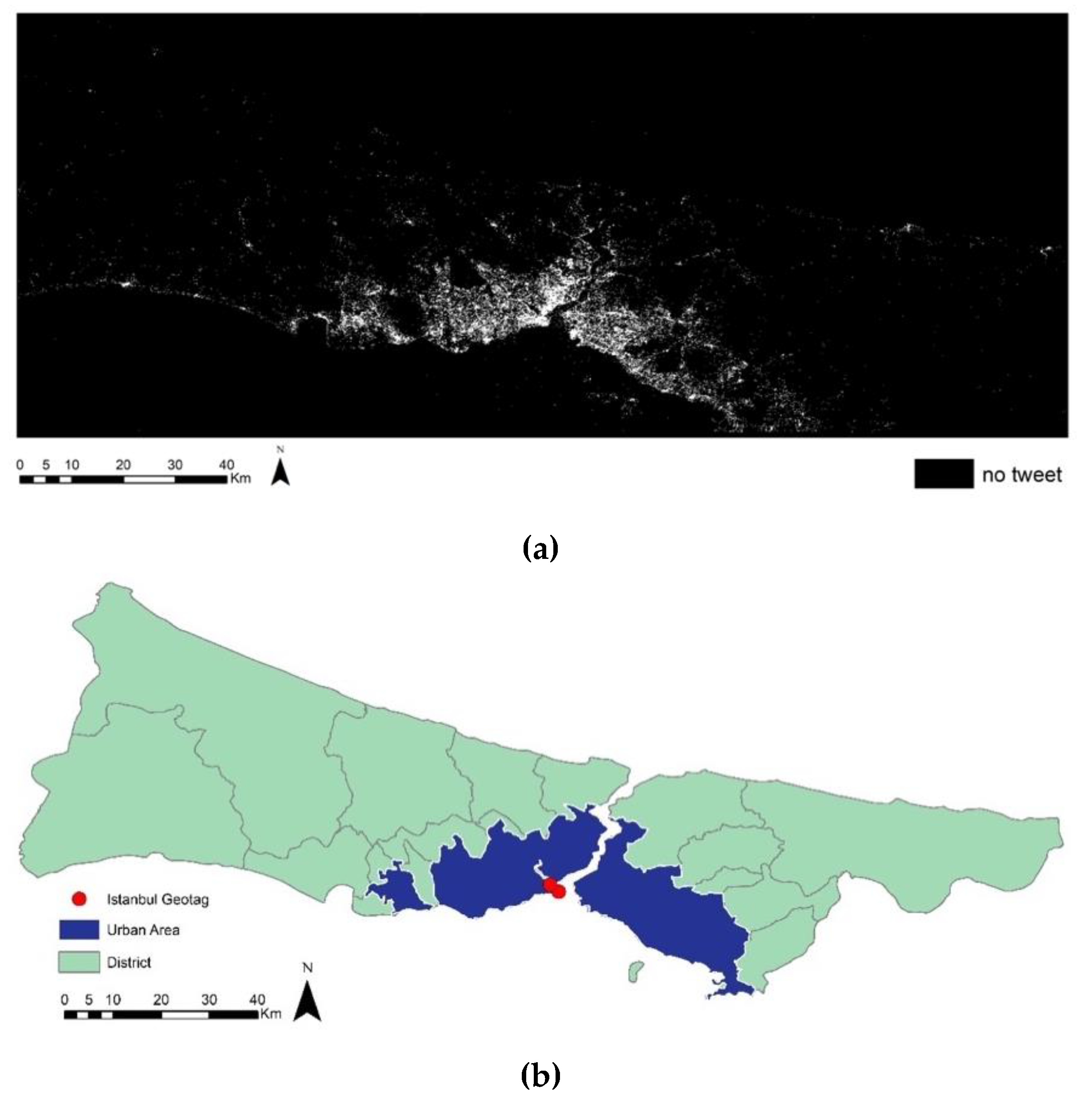
Besides diverse representation levels of users, spatial representation is another aspect in order to understand data. Istanbul bounding box is divided into 100 m × 100 m grids to visualize this representation as represented and “unrepresented” grids as missing data. Figure and ground map (
Figure 11a) of the missing data perfectly match the shape of the city (
Figure 11b). This matching can be taken as Twitter is a living bionic tool for Istanbul that more or less represents the living area of the city.
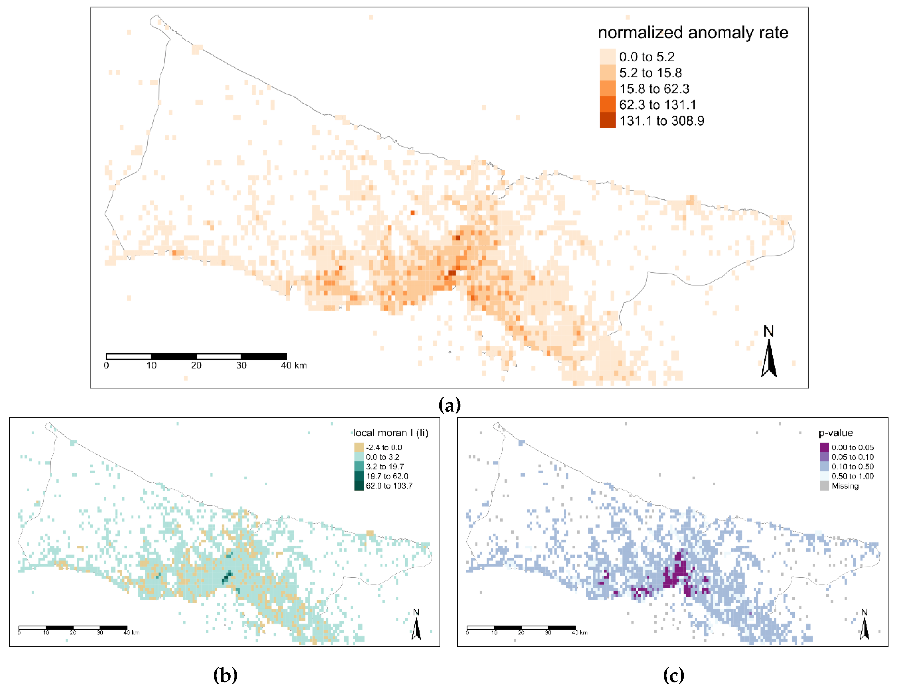
A lattice-based monitoring system was designed in order to understand the spatial footprints of users. Grid size is determined as 1 km × 1 km since it is well enough for fine-grained event detection. The number of tweets is spatiotemporally normalized corresponding to the grids. In order to explore the spatial dynamics of the Istanbul, anomaly analysis is performed for each grid over the spatially normalized tweet count values as time vector with 336 slices. Each detected anomaly values for a grid is normalized with the overall anomaly amount detected in its time interval. In this way, the detected anomaly magnitude for a grid is calculated regarding the overall anomaly. The normalized anomaly rate per grid was calculated by adding all anomaly magnitudes for a grid and visualized in
Figure 12. This reveals the locations where most likely to have an anomaly in the city. In addition, this anomaly tendency map was tested with global and local Moran’s I spatial correlation algorithm. The global I score and the
p-value were found to be 0.24 and less than 0.0001, respectively, which means the values were slightly positively correlated and the significance of the test is pretty high. In order to assess the positive and negative spatial autocorrelation, the anomaly tendency map was also tested with local Moran’s I. It appears from
Figure 12a, there are high anomaly rates in the center part of Istanbul, the local Moran’s test confirms that there is positive spatial autocorrelation with the high positive Ii (
Figure 12b) and low
p-value (
Figure 12c) in this area.
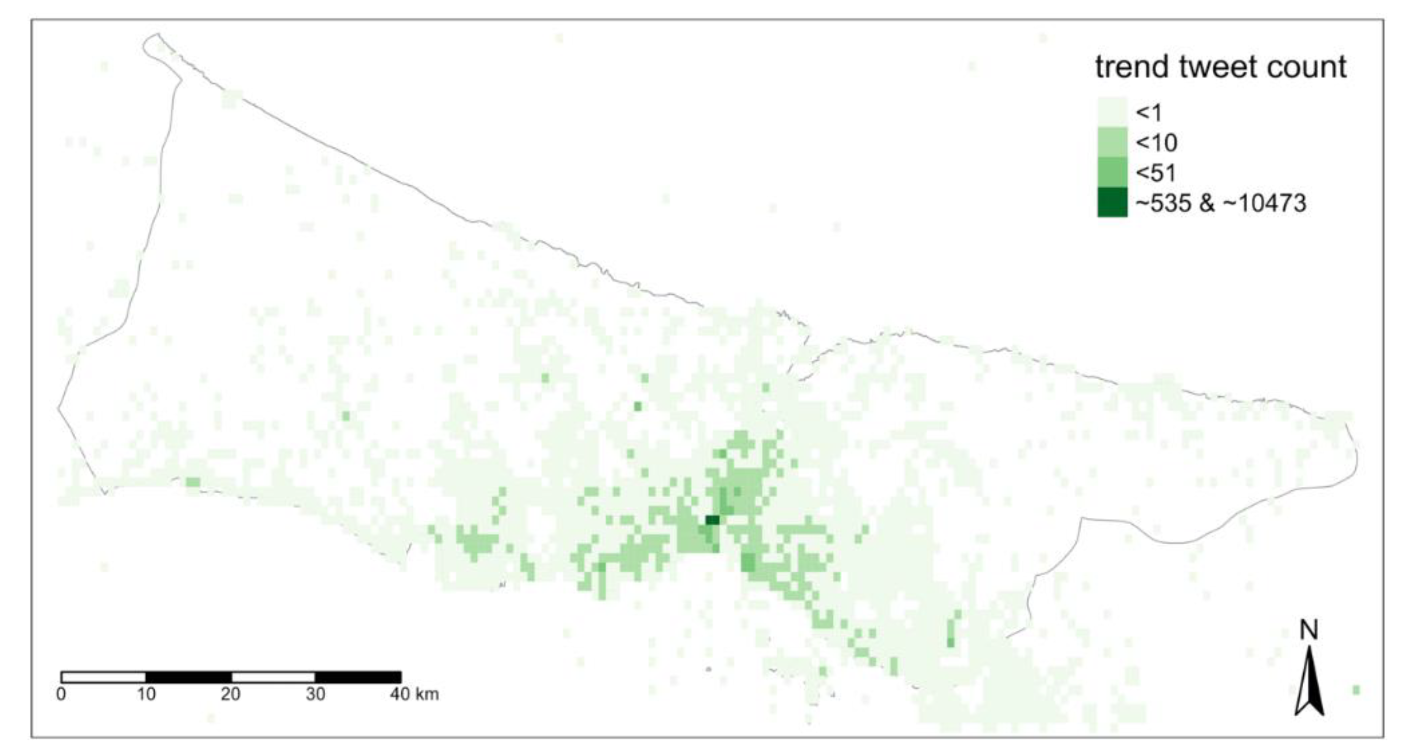
In order to understand general dynamics of the city, data was discretized from its anomalies detected previously. The anomalous values were replaced with the expected values for the related part of the data. In
Figure 13, the average value of this retrieved trend data was represented in 4 classes. The first class includes the two most active grids that have an average of 535 and 10,473 for 6-h. These spots are outliers and the closest value to the outliers is approximate to 50 tweets average in defined temporal level. There are two main reasons behind these outliers. The first, Istanbul geotags of social media platforms (
Figure 11b) are located within these grids. The second, spots are located in the central area of Istanbul (
Figure 11b) where the old city and touristic attractions are dense. The second and third classes grids by their activity have nearly the other 10% of the grids. The area covered with the second and third classes is matching with the urban area of Istanbul. These darker green grids show the central location bias of the data for general terms but also give the opportunity of monitoring them with the higher capacity of users’ representation. The last class that covers nearly 90% of spatial grids include less than 1 tweet average within the 6-h interval. This lowest active class comprehends mostly residential areas, rural parts and seaside. While general activities within the darker areas presumed to be easily inferred from the tweet contents, the lowest active area could be easily spotted when there are extraordinary events.
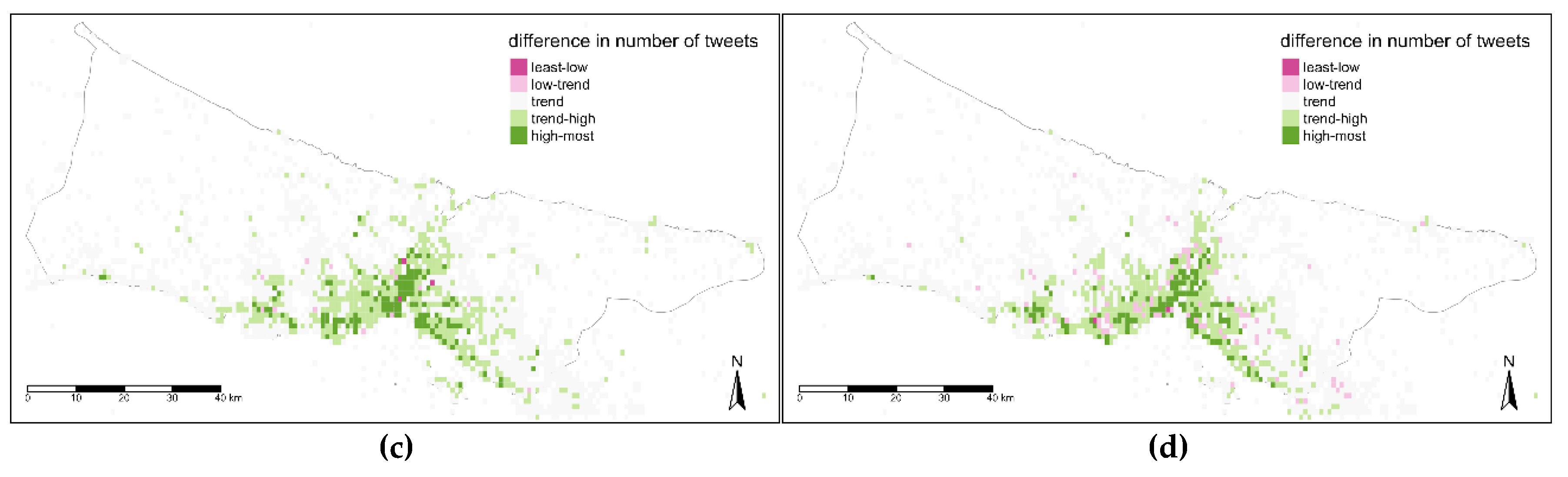
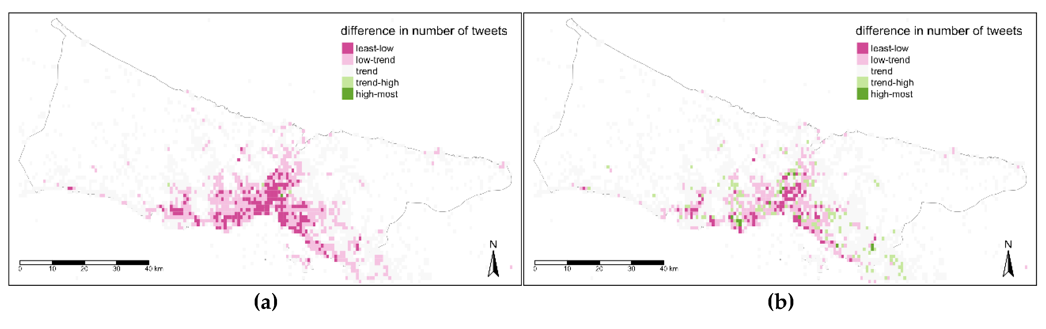
Time is another aspect to detail spatial data review and citizens’ footprints might vary in terms of different time levels. Therefore, the comparison between the trend map and maps belonging to different time levels was tackled at three temporal levels. The difference values defined with five classes that are below trend (least-low, low-trend), trend, above-trend (trend-high, high most). Difference values have positive and negative numbers, in addition, with the few exceptions values are not differentiated to much in these maps. With respect to this, threshold values for these classes were determined manually after exploring the data with several automatic classification techniques (such as; quantile, equal, standard deviation, kmeans, etc.). In
Figure 14, the night map (a) has lower values than the trend map in the central parts while fringe parts of the urban areas have near values to trend. The difference in the second map (b) is more diverse and in some distributed areas the value is higher than the trend. In the third map for after midday time (c) and fourth map for evening time (d), the difference was reversed as the values are higher nearly in all parts of the city but dense in the central area of Istanbul (
Figure 14a).
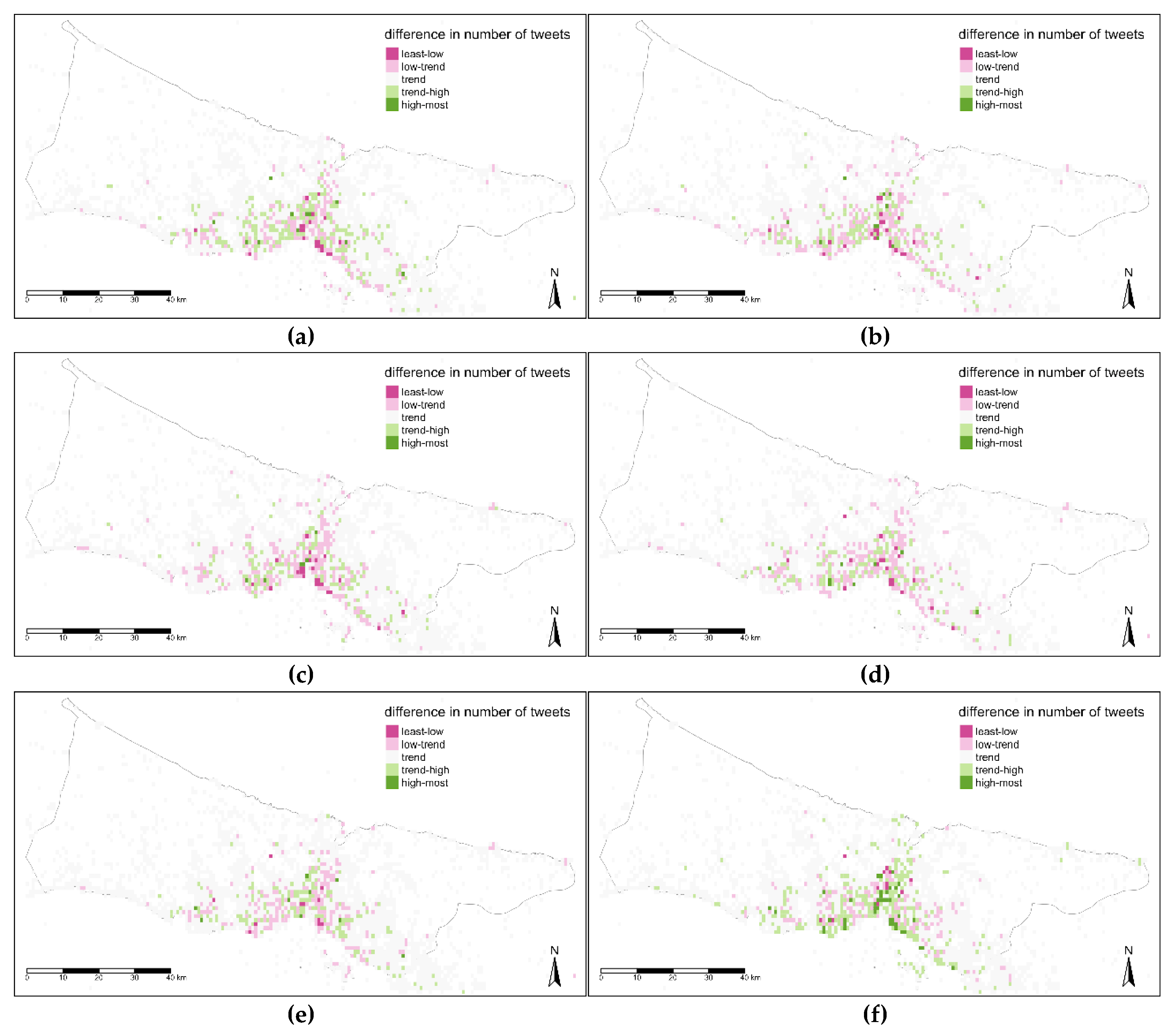
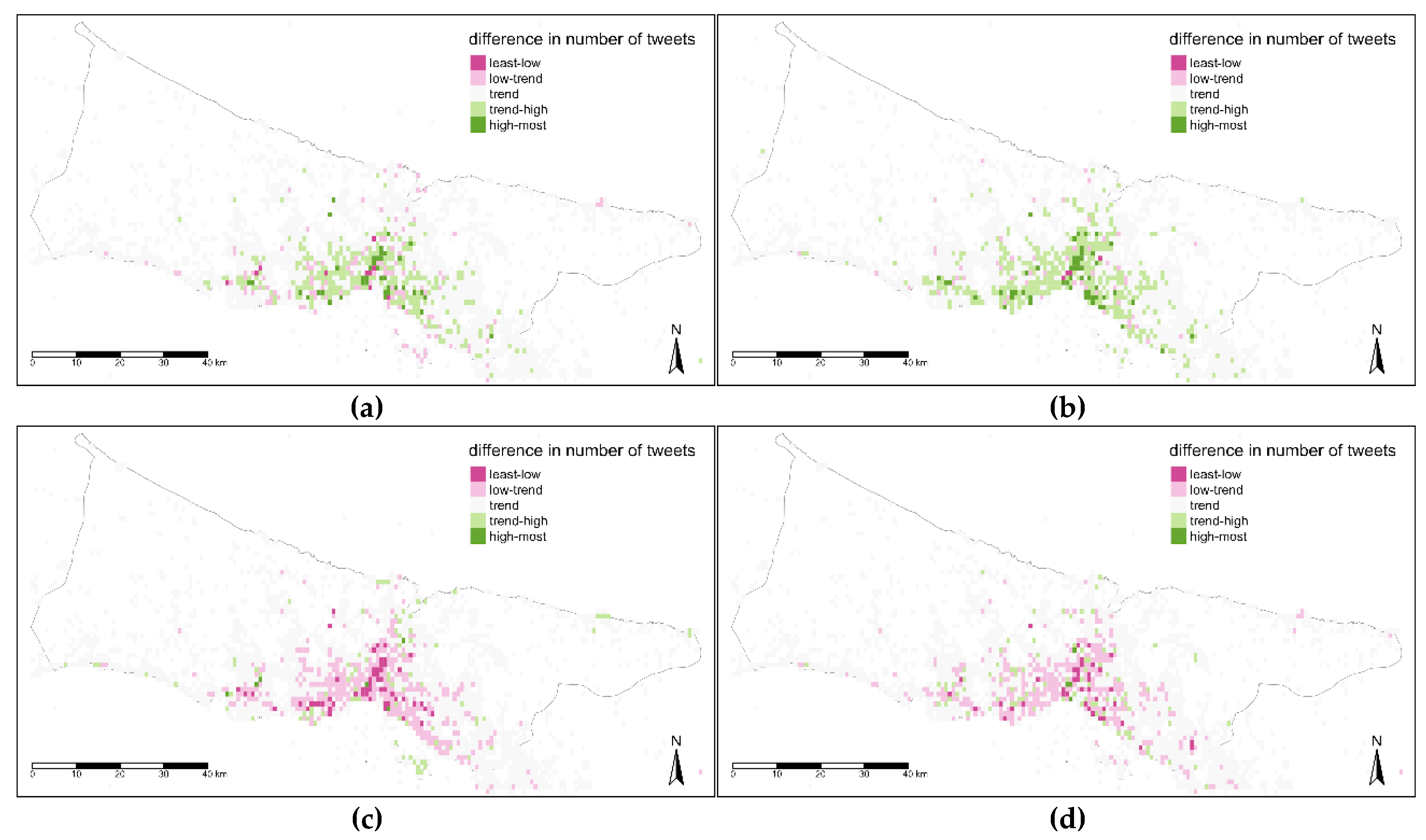
For the second temporal level, days of the week were considered. It is explicitly seen, maps of weekdays (a, b, c, d, e) are pretty similar to each other while the weekend days (f, g) apart from them with the spots having higher values near Istanbul Strait and along seaside (
Figure 15). Basing on this weekday’s map, there are no direct clustered values for a region and central areas are a mix of classes above and below trend values. The most part belongs to classes that are less than the trend in weekdays, while the most and specifically the central and coastline parts have higher values than trends for weekends.
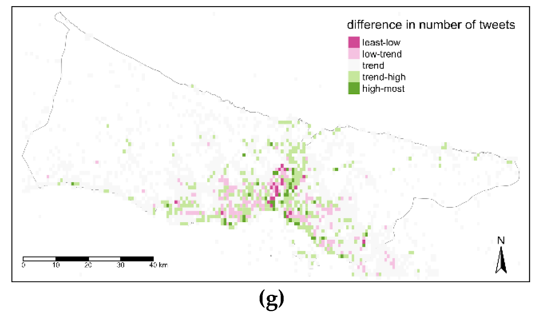
In the third time level assessment, seasons of the year were mapped (
Figure 16). The central area has high value spots in winter and spring seasons while this area has less value in summer and autumn seasons (
Figure 16). These seasonal plots reflect one side class for all parts of the city, that are above trend for winter and spring, below trend for summer and autumn.
Global Moran’s I was adopted to test the comparison maps’ values spatial correlation. Though the I value is changing between −0.1 and 0.1 for each map and the
p-values are above 0.1, it is not possible to say the time variance is spatially auto correlated. That means there is no significant difference between the difference values spatially although there is certain difference between the trend and time level maps as those seen in
Figure 14,
Figure 15 and
Figure 16.
4. Discussion
Social media is an invaluable source of data that is generated by human sensors due to its immense sensing capability and continuity [
56,
57]. Though it has various types of accountholders [
58], the content and the spatial activity of each of them varies too [
59]. There is research that provides background information to explain the activities of users on social media and categorizing them [
41,
60]. And some research on the credibility of users [
61,
62] and some others try to determine coordinated users who behave together and manipulate data content [
63]. And studies claim social media is full of rumors and most part of the accountholders spreading wrong information while there are emergencies and do not correct the content even if they are informed later [
64,
65]. In respect to this, social media data requires to be assessed without removing any data but accepting all these deficits and considering them with the nature of itself, since it is not possible to control each user credibility in real-time without historical data or demographic information. Although data includes several issues such as credibility, rumors, representation inequalities in terms of user, it has a reference pattern in order to be assessed for monitoring systems. This study evaluated and presented general citizen footprint, most likely regional anomaly maps and spatiotemporal biases in Istanbul. These inferences as reference maps provide interpretation easiness for monitoring the city.
This study evaluates a-year SMD with the methodology given in
Section 2.1. From the data revealed in this study it has been realized that to investigate the spatiotemporal change in SMD, the difference in representation levels of users should be normalized. For spatial exploration, miscellaneous representations of users are avoided with the spatio-temporal normalization technique. Anomalies that data might have due to an unusual event or coordinated users’ activity, detected and replaced with the expected value. The locations, which tend to have more anomaly counts are determined as location biased spots. And the data norm displays the most represented locations by the more account holders. Besides that, the data norm is used as reference to explore spatiotemporal biases. It is obvious that data has several kinds of biases and the evaluated data can be used as a reference to discriminate any abnormality.
The results of this study can be enhanced with the finer spatial grain for lattice-based monitoring and finer time grain instead of 6 hourly. Further studies can also be developed over data content by doing several text analyses in order to find the most co-occurred word in a lattice and make a contribution to the reference map in that way.
Istanbul is the most populated city in Turkey with over 15 million citizens [
66] and 3 million visitors which makes this city very important to be monitored for the sake of the living standards and responsive emergency management as well. There are several smart city projects separate conducted by local authorities; however, those projects are limited with the base map digitization or some municipality paperwork processes. Since citizens of Turkey have high potentials to generate spatial data on Twitter compared to other many countries, Twitter is eligible for citizen-based projects in Istanbul [
41]. In further studies, evaluated data in this study provide the benchmarking knowledge to establish a dynamic monitoring system for Istanbul.
This study exposed four outcomes as mentioned below. The first outcome reveals that highly active users generate the majority of the data and as a general approach, removing this data within a pseudo-cleaning process conceals a large amount of data. The second one is the anomaly outcome results changes due to the diverse representation levels of the users. That is why; data normalization in terms of representation levels plays an important role in the detection of the true anomaly. The third outcome exposes that, as shown in
Figure 12a, spatiotemporally normalized data represent strong spatial anomaly tendency at the urban center. The last outcome shows that the trend data is dense in the urban center and the spatiotemporal bias assessments show the data density varies in terms of the time of day, day of week and season of the year.
Twitter API is used in this study as in commonly used for other academic studies. Twitter declares that this API provides randomized 1% of public tweets in real-time [
67]. There are empirical research that tests this randomization by comparing this sampled amount with the Firehose API data which provides the whole public tweets [
68,
69]. Studies found out there is no significant indication that the sampling of the Twitter API is biased with one exception since Twitter randomized the tweets by assigning ID for each tweet regarding the millisecond time. Because, this randomization is plausible since it exceeds a person’s capability to share tweets in that quickness, unlike a bot. The used data within this study is normalized both spatially and non-spatially to avoid representation bias that can also eliminate noise due to bot accounts.
In this study, PostgreSQL with the PostGIS extension is used for data handling. PostgreSQL is an open-source relational database management system (RDBMS) that can be deployed to different environments such as a desktop, a cloud or a hybrid environment database. The storing capacity and the time cost for the processes rely on the specifications of the environment. This relational database is adequate to handle a large amount of data for basic operations (such as; insert, select and update) as in this study but could not be the best option for big data studies transactions [
70]. NoSQL database like MongoDB has enhanced functionality on the big data processing performance especially the ones performed on unstructured data. SMD has unstructured content and RDBMS has issues while structuring the big amount of data. For this reason, NoSQL should be preferred while processing the big amount of unstructured text of SMD [
70,
71]. This work is also planned to extend with other cities’ data including text mining in the context of space-time and the finer-grained temporal analyses. Therefore, in further studies a NoSQL database management system will be considered to handle such data.
There are numerous studies that conceptualize the measures of data quality in the context of VGI [
72,
73]. Data quality studies on VGI are mostly tackling data quality measures such as; completeness, positional accuracy and granularity on Open Street Map [
11,
73,
74]. Generally, approaches for data quality are assessed in two class as intrinsic and extrinsic. In the intrinsic assessment, there is no use of an external reference map unlike extrinsic data quality assessment [
75]. SMD was assessed in several aspects in this study in order to understand data bias, anomalies and trends. Since there is no external data use for these assessments within this study, this study provides the methodology for assessing the intrinsic data quality of the SMD.
The methodology proposed in this study can be used to extract the unbiased daily routines of the social media data of the regions for the normal days and this can be referred for the emergency or unexpected event cases to detect the change or impacts. Data assessment in this study is based on revealing the citizen footprints in SM and designed to explore anomalies, trends and bias within data.
In further studies, inferences from this study will be used to functioning a citizen-based monitoring system for Istanbul. The system design conceptually will follow the steps; tweets are collected in real-time, a number of tweets from the distinct users for each spatial grid is calculated, normalized number of tweets is assessed with the anomaly detection algorithm with regression line over trend data, detected anomalies are assessed with the most likely regional anomaly maps and the decision is made for emergency conditions. In addition, the proposed methodology is planned to work out on other big cities in order to contribute to other researchers by providing the results (reference maps) on a designed webpage for our future projects.


