Visualizing When, Where, and How Fires Happen in U.S. Parks and Protected Areas


1
Center for Geospatial Analytics, North Carolina State University, Raleigh, NC 27695, USA
2
Department of Parks, Recreation and Tourism Management, North Carolina State University, Raleigh, NC 27695, USA
*
Author to whom correspondence should be addressed.
ISPRS Int. J. Geo-Inf. 2020, 9(5), 333; https://0-doi-org.brum.beds.ac.uk/10.3390/ijgi9050333
Submission received: 10 April 2020
/
Revised: 6 May 2020
/
Accepted: 16 May 2020
/
Published: 20 May 2020
(This article belongs to the Special Issue Geospatial Advances in Landscape Ecology)
Abstract
:Fire management in protected areas faces mounting obstacles as climate change alters disturbance regimes, resources are diverted to fighting wildfires, and more people live along the boundaries of parks. Evidence-based prescribed fire management and improved communication with stakeholders is vital to reducing fire risk while maintaining public trust. Numerous national fire databases document when and where natural, prescribed, and human-caused fires have occurred on public lands in the United States. However, these databases are incongruous and non-standardized, making it difficult to visualize spatiotemporal patterns of fire and engage stakeholders in decision-making. We created interactive decision analytics (“VISTAFiRe”) that transform fire history data into clear visualizations of the spatial and temporal dimensions of fire and its management. We demonstrate the utility of our approach using Big Cypress National Preserve and Everglades National Park as examples of protected areas experiencing fire regime change between 1980 and 2017. Our open source visualizations may be applied to any data from the National Park Service Wildland Fire Events Geodatabase, with flexibility to communicate shifts in fire regimes over time, such as the type of ignition, duration and magnitude, and changes in seasonal occurrence. Application of the tool to Everglades and Big Cypress revealed that natural wildfires are occurring earlier in the wildfire season, while human-caused and prescribed wildfires are becoming less and more common, respectively. These new avenues of stakeholder communication are allowing the National Park Service to devise research plans to prepare for environmental change, guide resource allocation, and support decision-making in a clear and timely manner.
1. Introduction
The compounding effects of climate change, expanding human development, and limited public funding have significant implications for fire management on public lands and protected areas [1,2,3,4,5]. Land managers face a myriad of interacting fire management concerns that vary considerably across space and time. For example, wildfires could become more severe, and the available window for fuel treatment programs could become more constricted as future temperature and moisture conditions fluctuate outside historical norms [1]. In some regions, sea level rise threatens parks’ natural fire regimes [2] while in others, changes to lightning strike frequency [2] and vegetation growth [6] require land managers to adapt management strategies to these shifting climate conditions [3]. Parks and protected areas are also impacted by changes in human behavior, such as increased tourism and housing development near park boundaries [3,5,6]. Urbanization, sprawl [4], and amenity-driven development [7] has increased the area of the wildland–urban interface (WUI) around public lands [8], which has had drastic impacts on some fire regimes [9]. In addition, WUI can be particularly difficult and expensive to protect from wildfires [10].
In order to reduce the risk of catastrophic wildfires [11,12] and to protect ecological function [13,14], protected area managers have increasingly prioritized the maintenance and supplementation of natural fire regimes with prescribed fires [5,11]. This shift in philosophy away from a suppression-based fire management strategy and toward fuel treatment programs has necessitated more detailed understanding and communication of natural fire regimes [11,12]. Understanding historic variation in fire regimes in protected areas can help managers recognize how environmental factors and human influence have shaped fire patterns and help develop reference conditions, which is critical in informing future management decisions [13]. When considering fire management in complex WUI environments, the ability of agencies to communicate fire policy and describe how fire conditions are changing is vital to building public trust for programs that may impact WUI communities or public land users [9]. These challenges are further compounded, as funding for fuel treatment in United States protected areas has not kept pace with needs [10], and can be unpredictable due to rare large and expensive wildfires that often divert resources to extinguishing active wildfires and away from proactive fuel treatments [11].
There are numerous but disparate databases rich with spatiotemporal information on past wildfires in protected areas to facilitate understanding and communication of fire regimes. These databases are often only accessible via data queries to those with specialist knowledge of the relevant database [14,15]. Fire history datasets in the United States are complex and non-standardized [16]. Spatial information, such as ignition points, fire footprints, infrastructure locations, and vegetation, are recorded in separate spatial databases [15] and often explored with static or web-based maps [15,17]. For example, long-term fire history in U.S. National Parks is typically communicated with static maps of large fire perimeters [18,19] or in large databases that require experience with geographic information systems (GIS) [20]. The National Park Service’s (NPS) interactive web maps of long-term history feature multiple layers of polygon data, obscuring interannual variability and trends [21]. Conversely, highly detailed interactive web tools like InciWeb help users explore currently burning fires [22] but do not offer historical perspectives. Understanding complex fire regime dynamics and communicating them to the public requires the ability to analyze and visualize both spatial and non-spatial historical fire data, such as fire perimeters, fire type, response type, infrastructure involved, and fire cause [23,24]. While maps can illuminate the spatial characteristics of individual fires, patterns become more complex to quantify and visualize as more fires, overlapping through time, are added [14,18,19]. Yet, it is these often-hidden patterns that are critical to understanding long-term fire regime dynamics [25]. This problem is compounded by the disparate and incomplete nature of fire history databases; no one single repository comprises complete fine-scale records of fire history [16]. To gain insight on fire patterns, it is important to visualize information on when, how, and where fires occur simultaneously and interactively [16,17] in a manner navigable and engaging to users from non-science backgrounds and the public [26].
Fire managers need clear visualizations of fire occurrences across space and time to help make decisions and communicate fire trends in the face of compounding challenges like land and climate change. Here, we introduce Visual Interpretation of the SpatioTemporal Arrangement of Fire Regimes (VISTAFiRe), an open source analytics tool to help stakeholders clearly and quickly visualize the spatial and temporal dimensions of fire regime histories in parks and protected areas. Our goal was to blend simple yet effective visualization techniques into a user-friendly web-based tool that can be used for communication among fire managers and stakeholders of protected areas. We demonstrated visualizations of changing fire regimes in Big Cypress National Preserve and Everglades National Park from 1980-2017. These parks’ rich spatial datasets, long history of prescribed fire management, frequent low-intensity fires, ecological sensitivity, and proximity to dense population centers make them ideal for examining complex fire regime patterns. We visualized Everglades and Big Cypress fires by ignition source (human-caused, natural, and prescribed), date, and size, as well as plotted their footprints on an interactive map; all of which are linked with selecting, filtering, and brushing actions. We leveraged open source tools so the visualization can be recreated with other existing datasets. This approach offers a new, reproducible, and interactive visualization method for fire history that sparks insight into complex fire patterns across space and time.
2. Development of Visualization Tool
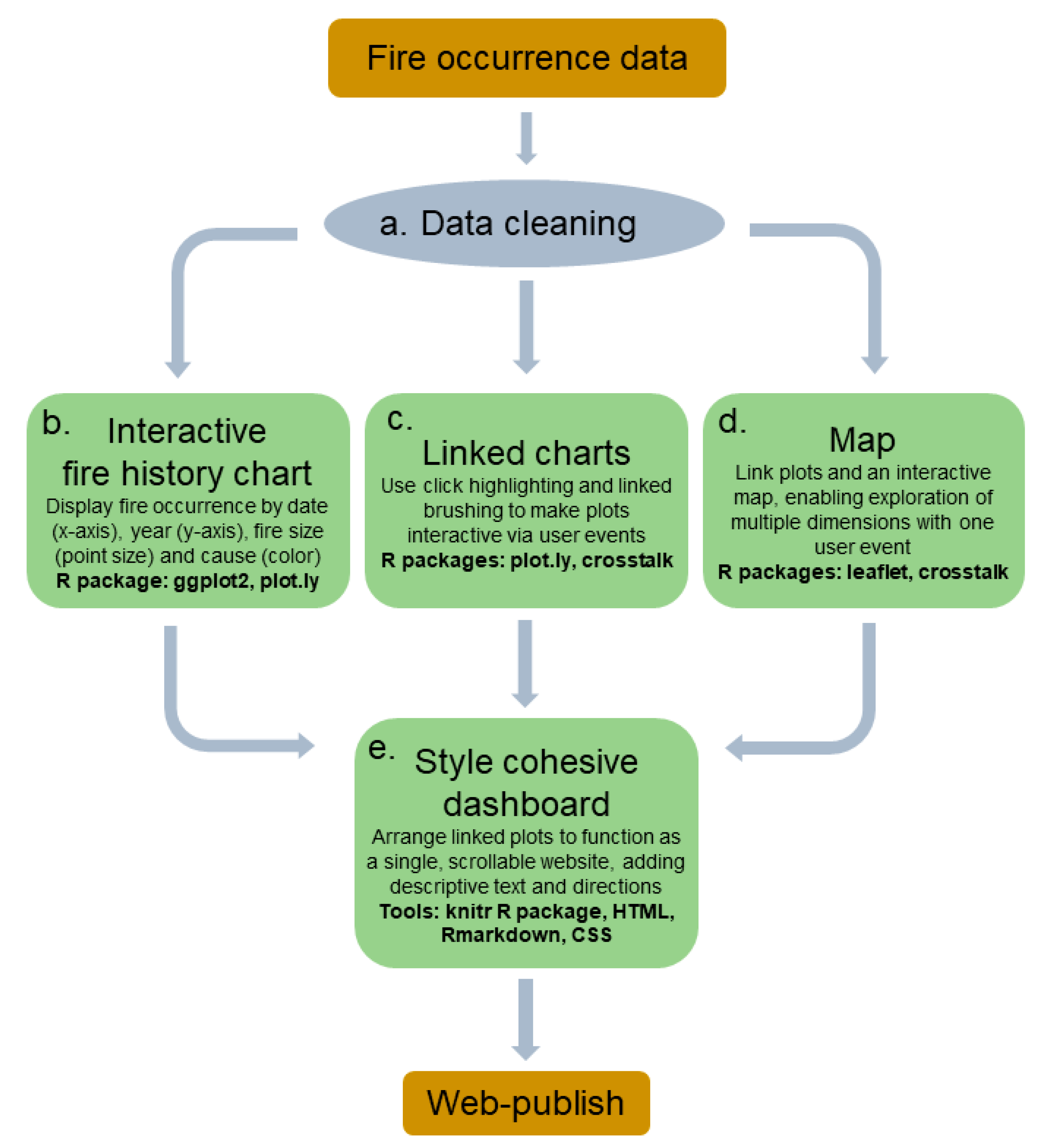
We used a composite of open source tools to create an interactive fire history visualization based on tabular data (Figure 1).
Fire occurrence data are routinely recorded in national databases by the agencies responsible for fire management. Data fields often include occurrence date, fire size, duration, ignition location, footprint of the fire, information on the cause of the fire, types of suppression efforts, and cost to control the fire.
In the United States, information about fires on public lands is stored in one of several databases depending on the fire location and response. Fires in National Parks and on Bureau of Land Management lands are reported into the Wildland Fire Management Information (WFMI) database, while Fish & Wildlife Service use the Fire Management Information System (FMIS) [15]. The U.S Forest Service uses a mix of agency-specific and interagency databases to manage fire history data, track ongoing fires, and coordinate fire response [15]. Fire footprints are often kept in local geodatabases, largely independent of national tabular databases. Due to the multitude of databases and diverse reporting practices, data cleaning, formatting, and standardization was necessary in preparing data for the visualization tool. Data cleaning involved reclassifying fires into four ignition sources/causes: human-caused wildfire, natural wildfire, prescribed fire, and mutual aid fires (Figure 1a). Mutual aid fires are wildfires that occur outside of park boundaries, but for which NPS fire crews provide support. Where there were missing or clearly erroneous values, we first contacted the database managers for clarification and additional information and/or searched for other records of that fire. If neither approach was successful, we omitted those entries. We formatted numbers and dates to meet programming requirements.
We used R Statistical Software [27] and the Ggplot2 library [28] to create the fire history chart that forms the basis of the interactive visualization [29] (Figure 1b). The chart plots fires over time by size and cause. The fire month and day is on the x-axis, and fire year is on the y-axis. The size of the point is relative to the fire’s size [29], and the color represents the ignition source. This format displays interannual variability and seasonality, as well as changes to these patterns over time. We created two supporting plots that summarize fire frequency and fire size data by week to show average fire activity throughout the study period.
We used the Plot.ly R library [30] to make the fire history chart responsive to user actions, such as hovering, clicking, and dragging. Plot.ly leverages the Plotly Javascript library and enables interactivity by creating an HTML widget. Multiple widgets can be linked together to highlight multiple dimensions of the data simultaneously (Figure 1c). To tease apart patterns and allow focused queries, we used plot.ly to enable filtering by fire cause as well as provide detailed information about each fire. When a user clicks a fire point on the chart, the other fires of the same cause are highlighted while the rest are faded. This action is triggered across all three plots: The main fire history chart and the two supplemental summary charts. This action can be undone by double-clicking anywhere on the chart. Any of the four ignition sources can be hidden completely by clicking on that source in the legend. Users can hover the mouse over any fire to produce a pop-up with detailed information, such as the fire duration, date, and the name of the fire. Plot.ly’s HTML widgets also enable zooming, panning, and exporting to static image formats.
We linked the fire history chart to an interactive map of fire occurrence to allow users to explore the temporal and spatial dimensions of the data simultaneously (Figure 1d). Using the R package Leaflet [31], which leverages the Javascript library of the same name, we displayed the perimeter of each fire on an interactive web map. We simplified the fire footprint polygons by 99% to optimize the response time. We connected the fire perimeter map to the fire history chart described above using the brushing and linking technique (Figure 1d) [12,32,33,34,35]. The data in the chart and the map are linked so that when a user drags their mouse to select a specific area of the tabular data, the perimeter of the selected fire is highlighted on the map. The user can highlight in up to four different colors to compare queries. We styled the dashboard using CSS and HTML (Figure 1e). We used Knitr to create an HTML webpage that is available, along with the code that created it, through GitHub: go.ncsu.edu/vistafire.
3. Application of Visualization Tool and Results
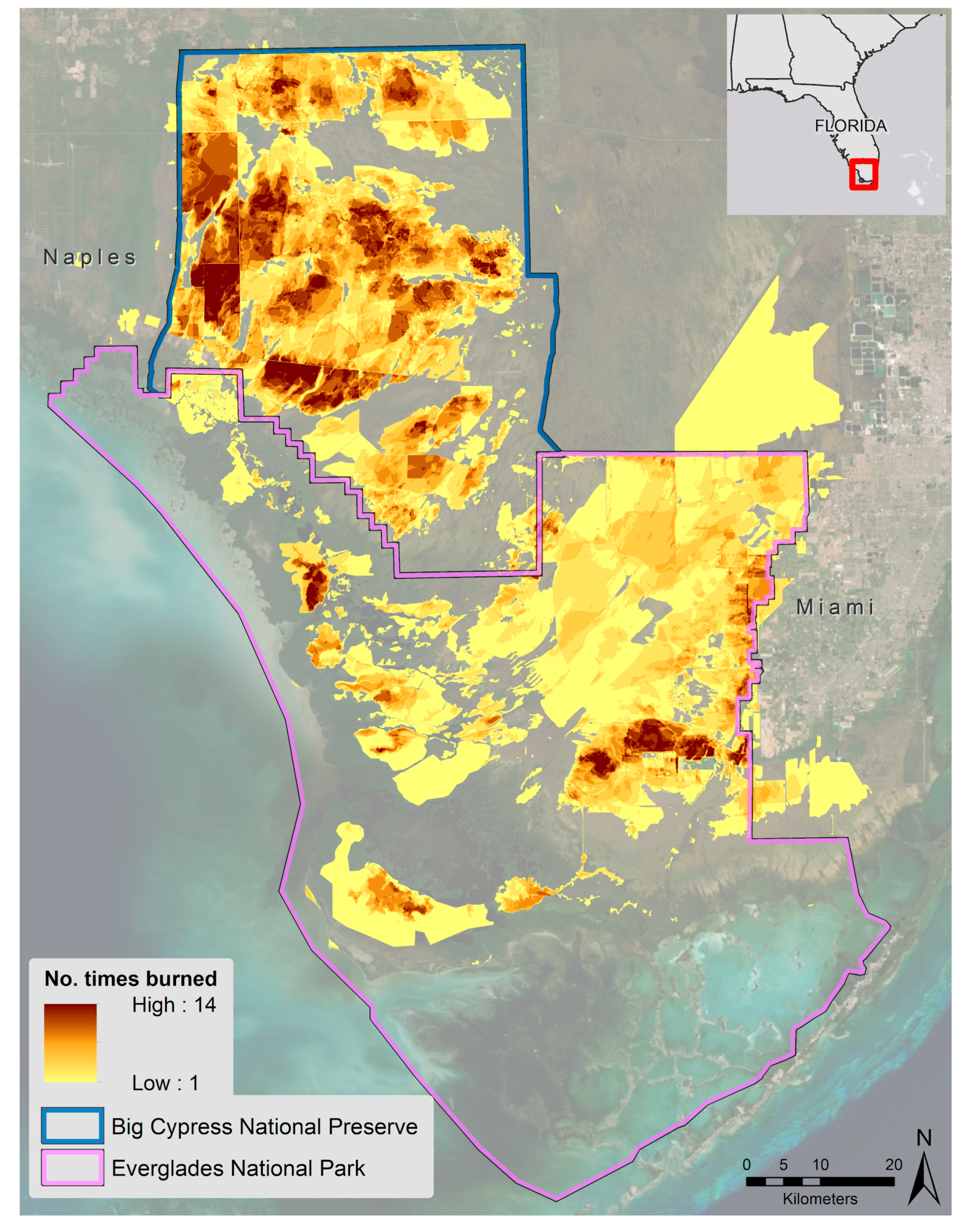
We piloted the visualization on South Florida’s Big Cypress National Preserve and Everglades National Park (Figure 2). Everglades and Big Cypress have complex fire regimes characterized by frequent low-intensity fires on sawgrass prairies and more intense infrequent fires in pine forests and tree hammocks [36] (Figure 2).
Fire is a vital process in these ecosystems, but proximity to tribal lands, urban areas, and other protected areas warrants careful fire management to preserve ecological function as well as protect human safety and nature-based tourism [13]. National Park Service officials heavily manage the region with a fuel treatment program that has burned an average of 49,000 acres a year of prescribed fires between 1980 and 2017. Because government funding for fuel treatments is limited, evidence-based strategic planning and meaningful representation of data to stakeholders is important for securing and allocating financial and human resources.
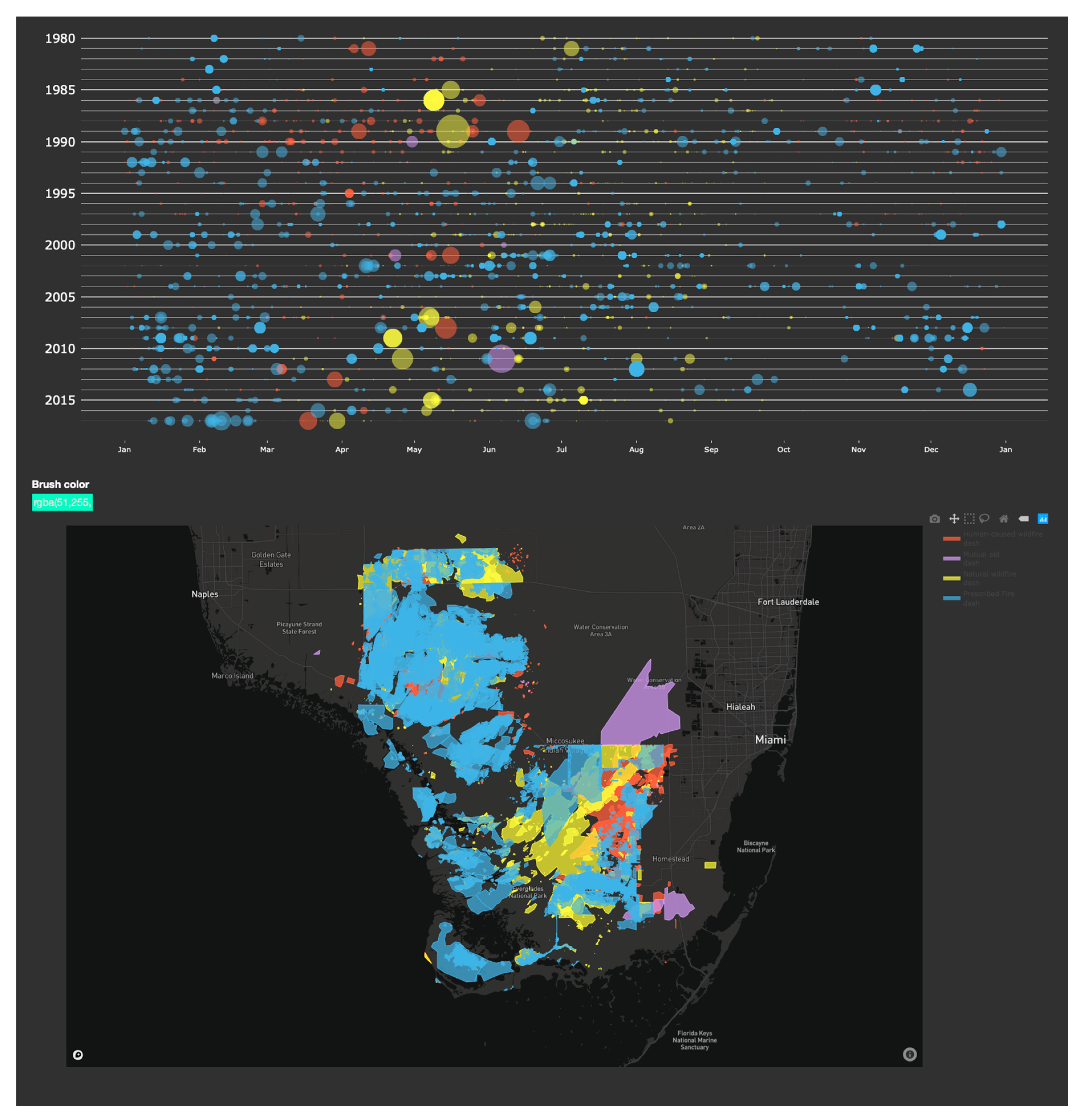
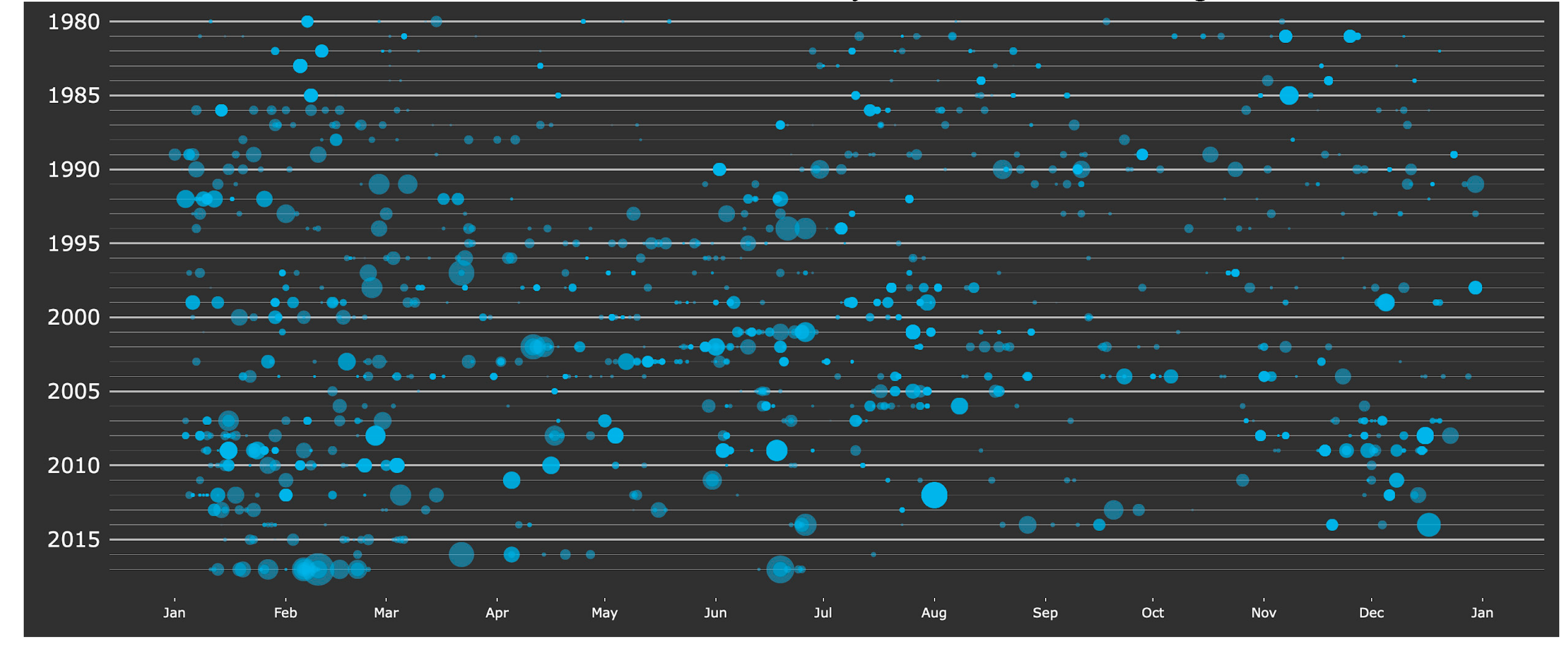
We used data downloaded from the National Park Service’s Wildland Fire Events Geodatabase containing all fires from 1980 to 2017. The study period reflects the extent of reliable fire perimeter data for both parks. These data contained attributes, such as the fire’s acreage, size, cause category (human or natural), specific cause codes, responding agency, source (e.g., unmanned aerial systems (UAS) mapping or handheld GPS), and the spatial footprint of the fire (datum WGS84). The resulting visualization (Figure 3 and Figure 4) yields insight into changing trends and patterns of wildfire and prescribed fires over the past 45 years.
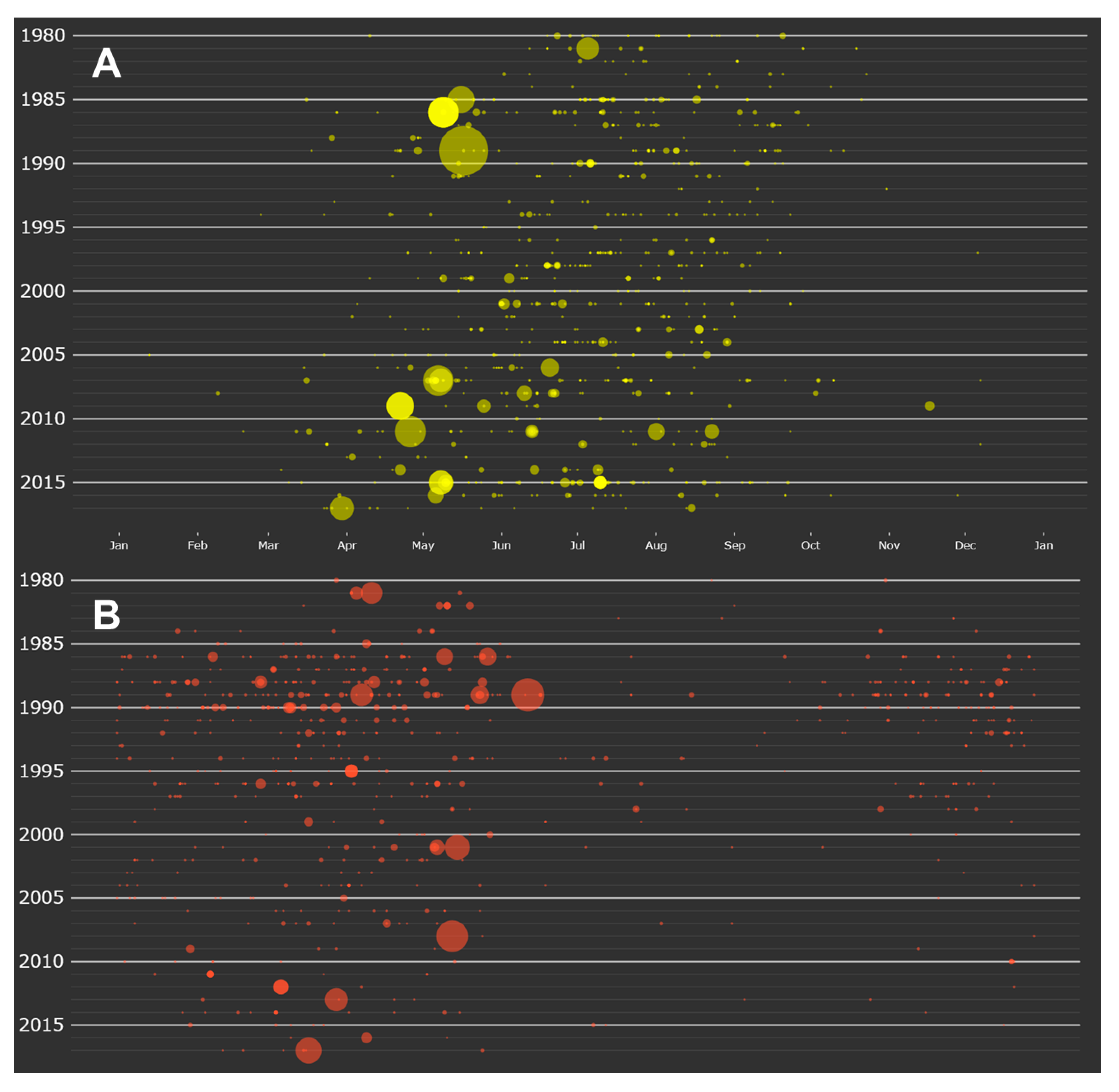
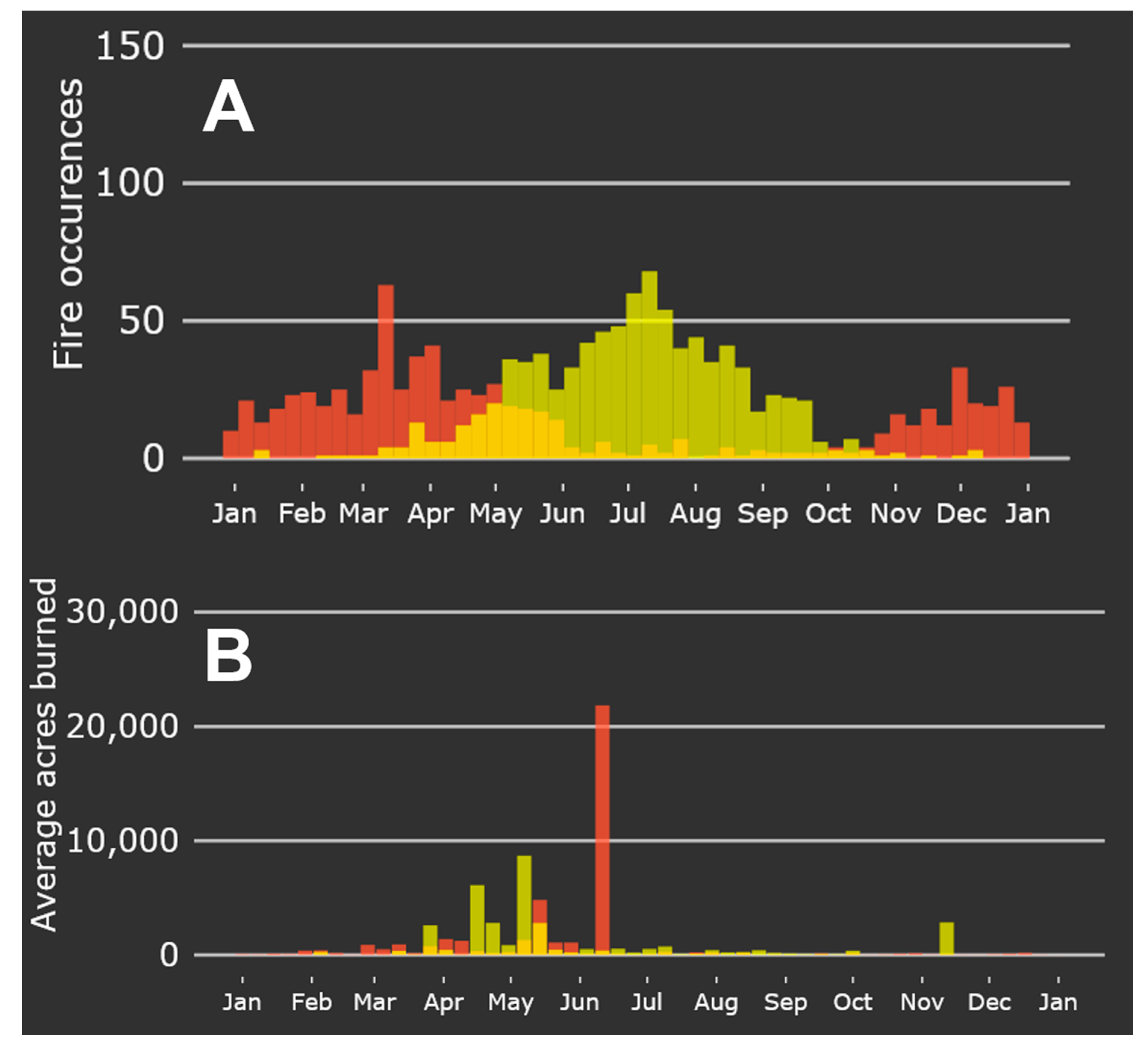
In considering natural wildfires in the main fire history chart, it is apparent that the natural wildfire season is shifting earlier in the winter season (Figure 5A). In the 1980s, the first wildfire of the year occurred in April or May. Since 2005, the earliest wildfires have occurred in March, and even as early as February 9 in 2008. In addition, the visualization shows that the largest wildfire of the year occurs at the beginning of the fire season, while subsequent fires are much smaller. Exploration of human-caused wildfires (Figure 5B) shows a distinct reduction in ignitions since 2000, particularly during winter months.
Juxtaposing the annual patterns of natural and human-caused wildfires show that their fire seasons peak inversely of each other (Figure 6). The height of human-caused wildfire occurrences is in winter, while natural wildfire occurrences are more numerous in summer.
Isolating prescribed fire activity on the main visualization shows an increase in the number and acreage of prescribed fires over the study period (Figure 7); however, these fires are much more consistent in size and distribution across the calendar year than wildfires (Figure 5A).
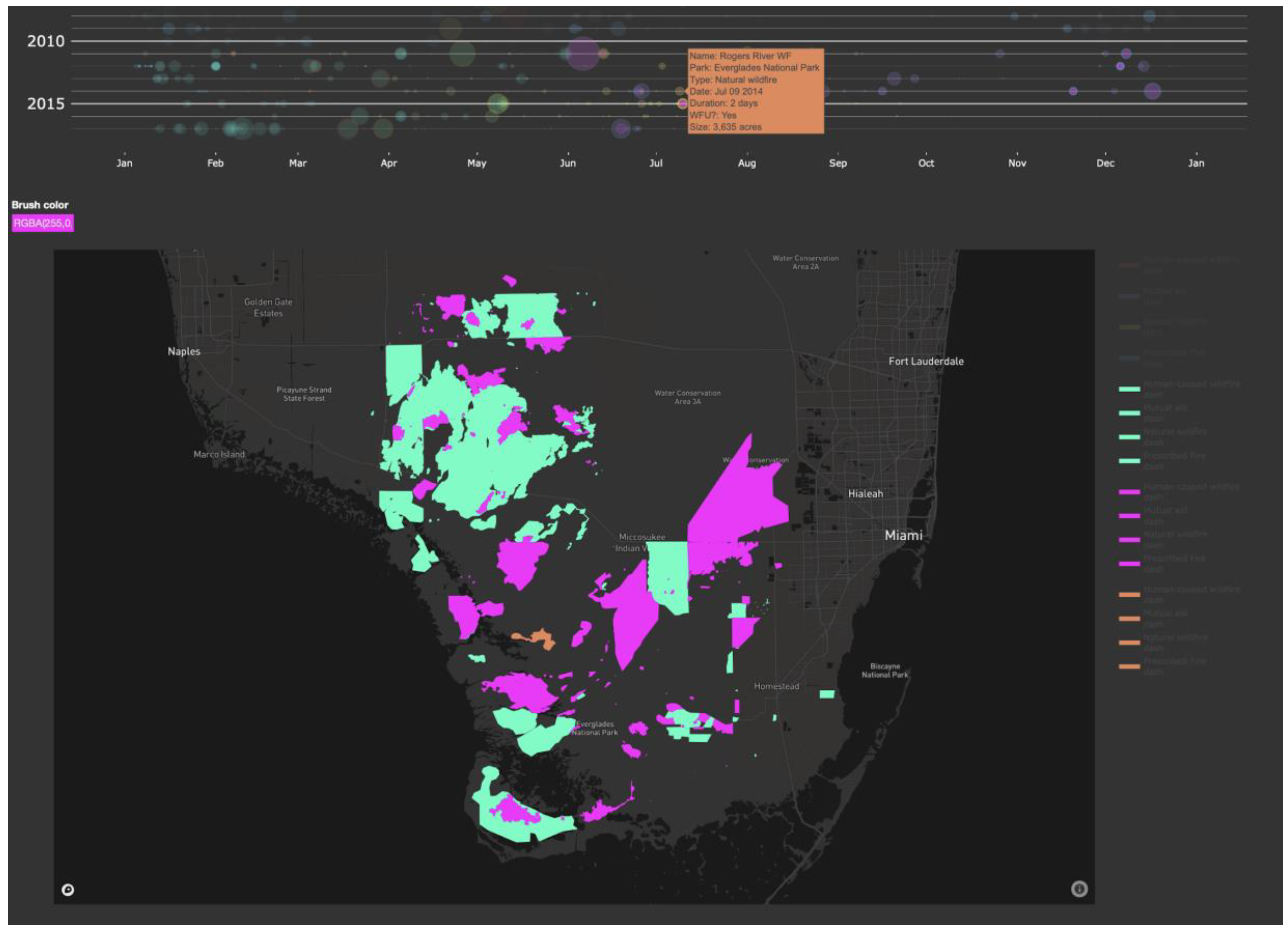
As an illustrative example of the interaction between the visualization showing the fire size and seasonality with the map of the burn perimeters (Figure 4), we examined the spatial footprint of fires that occurred 2010–2018. We selected and displayed the fires that occurred in the first half of the season (January through June 2010–2018) in one color and the fires that occurred in the second half of the year (July through December 2010–2018) in a second color (Figure 8). One trend that can be seen through this partitioning of the data is that there were more fires in Big Cypress National Preserve and near roads in the first half of the year, while there were more wildfires in the backcountry of the Everglades in the second half of the year.
4. Discussion
In this study, we described the motivation, design, and implementation of a fire history visualization that depicts when, where, and how fires occur across a landscape. The tool we created fills the gap between highly detailed interactive incident management tools [22] and long-term fire history maps and statistics that obscure interannual variability and trends [18,19,21,36]. We piloted the visualization on Big Cypress National Preserve and Everglades National Parks, demonstrating the tool’s ability to provide a navigable interface between the temporal and spatial components of fire history in a region with a dynamic fire regime, close proximity to population centers, substantial tourism, and frequent fuel treatments.
The implementation of this visualization in South Florida’s National Parks demonstrates its utility in exploring and communicating spatial and temporal patterns of fire history. Local fire managers confirm that the patterns displayed in the visualization align with what they see on the ground. However, these patterns are not clearly discernible in the database management systems and visualization tools currently used to communicate fire history on public lands [18]. For example, fire managers in Everglades and Big Cypress have reported seeing natural wildfires occurring earlier and earlier each year due to climatic shifts and management strategies. However, communicating these patterns to stakeholders using available data would require a comparison of hundreds of dates through sorting and filtering tabular data, or visually comparing layered fire perimeters. Using VISTAFiRe, this pattern is apparent with one click (Figure 5). This type of interaction allows users to more efficiently and effectively explore complex datasets that involve both tabular and spatial representations [35], which helps fire managers to communicate these patterns in an engaging and concrete manner to those that do not work in fire management or GIS fields. For example, a farm owner living east of the Everglades may be interested in when and where human-caused wildfires have historically occurred near park borders. They can use the application to understand past patterns, which can help them prepare for and help prevent fires that may impact their land. Scientific and practitioner knowledge systems related to fire management are growing, with greater emphasis on information sharing and reaching broader audiences [37].
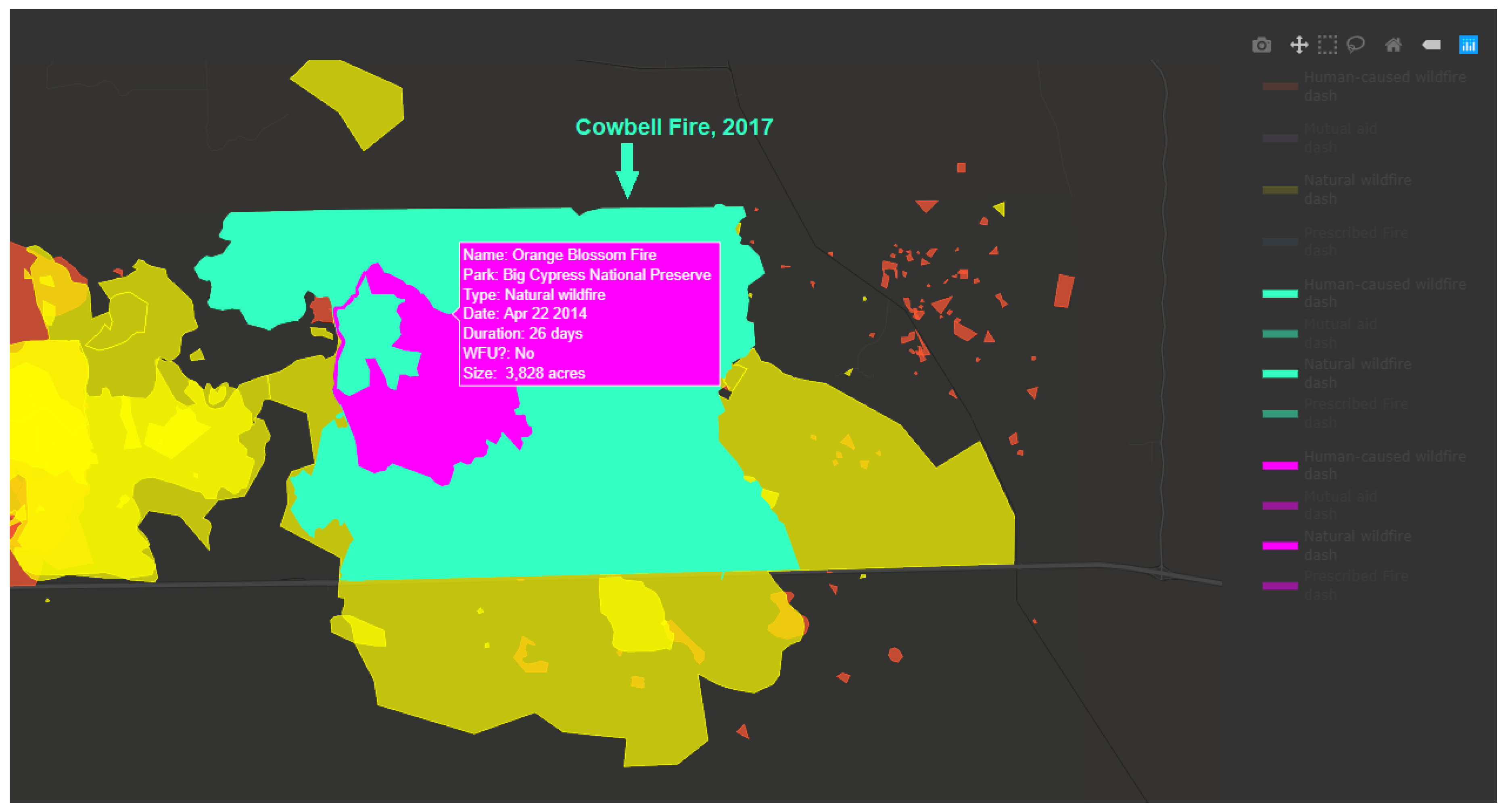
Visualizing fire history in an interactive context can serve as a catalyst for further research. Fire managers and research scientists can examine trends discerned from the visualization in further detail with other research tools, such as field surveys, remotely sensed imagery, and quantitative analysis. Further, clear visualizations have utility in supporting communication across scientific disciplines, which is critical to moving landscape ecology research forward. For example, managers can target field surveys where fire return intervals appear to fall outside of normal expectations, as in the case of the Cowbell Fire (2017) and the Orange Blossom Fire (2014), two natural wildfires that burned the same area within three years (Figure 9). In addition, understanding past fire patterns and deployments of fuel treatments can help managers shape decisions, such as the timing and location of prescribed fires. With VISTAFiRe, managers can pinpoint areas that have not been burned recently. This type of decision support is increasingly important as the shifting of the natural fire season may warrant a smaller burn window, an effect that may be exaggerated as the climate changes [1].
In addition, the examination of data in both spatial and temporal contexts allows managers to see holes and errors in the dataset. As we created the visualization, we encountered several instances where fire coordinates were incorrect, a significant fire was misclassified, or where data attributes were missing, errors that were not previously apparent in the tabular data. We worked with NPS officials to compare the data to other forms of fire records, and iteratively improved the accuracy of multiple datasets. This illustrates how the process of visualizing spatiotemporal data builds engagement and understanding among stakeholders that drives improved communication.
The visualization was created using entirely open-source tools. The source code is available for free public use on GitHub at https://github.com/ncsu-landchangelab/vistafire. Currently, the code is designed for use with the data used in our pilot analysis. However, with data cleaning and preparation, as detailed in the VISTAFiRe code, it can be implemented on data from any tabular and spatial database of fire information by a user with basic knowledge of base R. The open-source availability of the source code allows for customization of the tool for a variety of applications. Interested stakeholders or members of the public can use the code available to either recreate the entire webpage or extract specific charts or maps for targeted uses, alter the look and feel of the tool, or add functionality that suits specific applications.
The visualization can evolve further with enhanced filtering and selection functionality. Allowing users to filter by year or fire size may be helpful in exploring patterns in the main fire history chart; however, it may negatively affect the page’s response time. An expansion of this tool could feature the entire fire footprint database of national park fire history and allow users to explore trends among different national parks. Additionally, the tool is not limited to protected areas within the United States. The basic concept and available code are generalizable to disturbance regime data for any landscape. While the tool is currently somewhat limited by input data size as all data is loaded into the browser when the page is initialized [35], expansion of the tool is possible with simplification of the dataset (e.g., display only fires of a certain size or ignition source) or scale-dependent rendering.
VISTAFiRe provides a new avenue for the National Park Service to communicate with stakeholders with little GIS expertise as an alternative to static or digital maps. Since its deployment, NPS has used the tool to highlight fire history trends, such as the timing of natural wildfires, the location of human-caused wildfires, and how trends vary by fire management unit. They have leveraged VISTAFiRe’s visualizations in communications to national offices to advocate for increased funding and resources for fire management. This access to customizable visualizations is increasingly important as changing water levels, climate change, and human development shift fire patterns. VISTAFiRe can assist NPS in devising general fire management strategies in response to these changing conditions by targeting areas for prescribed burning or visually identifying deviations in fire return intervals. Additionally, VISTAFiRe can help guide future research plans, such as targeted vegetation studies or aerial surveys, which can help fire managers maximize park resilience to future uncertainties.
Questions, such as how many acres burned and when, can still be answered by searching in databases or adding up numbers in a spreadsheet. However, the goal of a visualization tool is to provide more than answers to straightforward data-driven queries [38]. VISTAFiRe’s value lies in its ability to reflect a big-picture sense of fire history that is greater than the sum of its individual fires and their characteristics. Sparking insight about the comprehensive dynamic picture of local fire regimes can guide management decisions and public communication pertinent to ecological function and human safety.
Supplementary Materials
The VISTAFiRe tool is available at ncsu-landchangelab.github.io/vistafire-southflorida.html. Full documentation is available at github.com/ncsu-landchangelab/vistafire.
Author Contributions
Conceptualization, Nicole C. Inglis and Jelena Vukomanovic; Data curation, Nicole C. Inglis; Funding acquisition, Jelena Vukomanovic; Investigation, Nicole C. Inglis and Jelena Vukomanovic; Resources, Jelena Vukomanovic; Software, Nicole C. Inglis; Supervision, Jelena Vukomanovic; Visualization, Nicole C. Inglis; Writing—original draft, Nicole C. Inglis; Writing—review & editing, Nicole C. Inglis and Jelena Vukomanovic. All authors have read and agreed to the published version of the manuscript.
Funding
This research was supported by the USDI National Park Service (award P17AC01439).
Acknowledgments
We thank Justin Shedd of the Region 1 Fire Management Office of the National Park Service for constructive suggestions and assistance with the development of the geovisualization tool. Fire and natural resource managers at Big Cypress National Preserve and Everglades National Park provided feedback on early versions of the visualization. We thank Dr. Laura Tateosian for her feedback on early versions of the visualization.
Conflicts of Interest
The authors declare no conflict of interest.
References
- Mitchell, R.J.; Liu, Y.; O’Brien, J.J.; Elliott, K.J.; Starr, G.; Miniat, C.; Hiers, J.K. Future climate and fire interactions in the southeastern region of the United States. For. Ecol. Manag. 2014, 327, 316–326. [Google Scholar] [CrossRef]
- Beckage, B.; Platt, W.J.; Slocum, M.G.; Panko, B. Influence of the El Nino Southern Oscillation on fire regimes in the Florida Everglades. Ecology 2003, 84, 3124–3130. [Google Scholar] [CrossRef]
- Peterson, D.L.; Halofsky, J.E.; Johnson, M.C. Managing and Adapting to Changing Fire Regimes in a Warmer Climate. In Ecology of Biological Invasions of North America and Hawaii; Springer Science and Business Media LLC: Berlin/Heidelberg, Germany, 2010; pp. 249–267. [Google Scholar]
- Moritz, M.A.; Batllori, E.; Bradstock, R.; Gill, A.M.; Handmer, J.; Hessburg, P.F.; Leonard, J.; McCaffrey, S.; Odion, D.C.; Schoennagel, T.; et al. Learning to coexist with wildfire. Nature 2014, 515, 58–66. [Google Scholar] [CrossRef] [PubMed]
- Steelman, T.A.; Burke, C. Is Wildfire Policy in the United States Sustainable? SSRN Electron. J. 2007, 105, 67–72. [Google Scholar] [CrossRef]
- Keeley, J.; Syphard, A. Climate Change and Future Fire Regimes: Examples from California. Geoscience 2016, 6, 37. [Google Scholar] [CrossRef] [Green Version]
- Gimmi, U.; Schmidt, S.L.; Hawbaker, T.J.; Alcantara, C.; Gafvert, U.; Radeloff, V.C. Increasing development in the surroundings of U.S. National Park Service holdings jeopardizes park effectiveness. J. Environ. Manag. 2011, 92, 229–239. [Google Scholar] [CrossRef] [PubMed]
- Vukomanovic, J.; Singh, K.K.; Vogler, J.B.; Meentemeyer, R.K. Protection status and proximity to public-private boundaries influence land use intensification near U.S. parks and protected areas. Conserv. Sci. Pract. 2020, 2, 190. [Google Scholar] [CrossRef]
- Syphard, A.; Radeloff, V.C.; Keeley, J.; Hawbaker, T.J.; Clayton, M.K.; Stewart, S.I.; Hammer, R.B. Human Influence on California Fire Regimes. Ecol. Appl. 2007, 17, 1388–1402. [Google Scholar] [CrossRef] [PubMed]
- Schoennagel, T.; Nelson, C.R.; Theobald, D.M.; Carnwath, G.C.; Chapman, T.B. Implementation of National Fire Plan treatments near the wildland–urban interface in the western United States. Proc. Natl. Acad. Sci. USA 2009, 106, 10706–10711. [Google Scholar] [CrossRef] [PubMed] [Green Version]
- North, M.P.; Stephens, S.L.; Collins, B.M.; Agee, J.K.; Aplet, G.; Franklin, J.F.; Fulé, P.Z. Reform forest fire management. Science 2015, 349, 1280–1281. [Google Scholar] [CrossRef] [PubMed]
- Eick, S.G.; Wills, G.J. High interaction graphics. Eur. J. Oper. Res. 1995, 81, 445–459. [Google Scholar] [CrossRef] [Green Version]
- Swetnam, T.W.; Allen, C.D.; Betancourt, J.L. Applied historical ecology: Using the past to manage for the future. Ecol. Appl. 1999, 9, 1189–1206. [Google Scholar] [CrossRef]
- Wittkuhn, R.S.; Hamilton, T. Using Fire History Data to Map Temporal Sequences of Fire Return Intervals and Seasons. Fire Ecol. 2010, 6, 97–114. [Google Scholar] [CrossRef]
- Short, K.C. A spatial database of wildfires in the United States, 1992-2011. Earth Syst. Sci. Data 2014, 6, 1–27. [Google Scholar] [CrossRef] [Green Version]
- Morgan, P.; Hardy, C.C.; Swetnam, T.W.; Rollins, M.G.; Long, D.G. Mapping fire regimes across time and space: Understanding coarse and fine-scale fire patterns. Int. J. Wildland Fire 2001, 10, 329. [Google Scholar] [CrossRef] [Green Version]
- Gomov, M.; Crnovrsanin, T.; Dasu, K.; Ma, K.-L. An Interactive System for Exploring Historical Fire Data. In Proceedings of the 2019 IEEE Pacific Visualization Symposium (PacificVis), Bangkok, Thailand, 23–26 April 2019; pp. 277–281. [Google Scholar]
- National Park Service. Yellowstone National Park Fire Management. Available online: https://www.nps.gov/yell/learn/management/fire-management.htm (accessed on 12 December 2019).
- Rocky Mountain National Park Fire History. Available online: https://www.nps.gov/romo/learn/fire-history.htm (accessed on 12 December 2019).
- U.S. Forest Service. Fire History Polygons for Northern Rockies-1889 2003. Vector Digital Data. Available online: https://fs.usda.gov/Internet/FSE_DOCUMENTS/fsp5_030609.zip (accessed on 3 March 2020).
- National Park Service. GIS Data Services Directory. Wildland Fire Events and Fuels Treatments. Available online: https://mapservices.nps.gov/arcgis/rest/services/WildlandFire/WildlandFire/MapServer (accessed on 14 January 2019).
- National Wildfire Coordinating Group. InciWeb. Available online: https://inciweb.nwcg.gov/ (accessed on 10 March 2020).
- Schmidt, K.M.; Menakis, J.P.; Hardy, C.C.; Hann, W.J.; Bunnell, D.L. Development of Coarse-Scale Spatial Data for Wildland Fire and Fuel Management; USDA Forest Service: Fort Collins, CO, USA, 2002; 87.
- Hardy, C.C.; Schmidt, K.M.; Menakis, J.P.; Sampson, R.N. Spatial data for national fire planning and fuel management. Int. J. Wildland Fire 2001, 10, 353. [Google Scholar] [CrossRef]
- Hamilton, T.; Wittkuhn, R.S.; Carpenter, C. Creation of a fire history database for southwestern Australia: Giving old maps new life in a Geographic Information System. Conserv. Sci. West. Aust. 2009, 7, 429–450. [Google Scholar]
- Ma, K.-L.; Liao, I.; Frazier, J.; Hauser, H.; Kostis, H.-N. Scientific storytelling using visualization. IEEE Eng. Med. Boil. Mag. 2011, 32, 12–19. [Google Scholar] [CrossRef]
- R Core Team. R: A language and environment for statistical computing. In R Foundation for Statistical Computing; R Core Team: Vienna, Austria, 2019; Available online: https://www.R-project.org/ (accessed on 3 March 2020).
- Wickham, H. Ggplot2: Elegant Graphics for Data Analysis; Springer: New York, NY, USA, 2016. [Google Scholar]
- Aldhous, P. How a Booming Population and Climate Change Made California’s Wildfires Worse than Ever. Buzzfeed News, 28 July 2018. [Google Scholar]
- Sievert, C. Plotly for R. 2018. Available online: https://plotly-r.com (accessed on 3 March 2020).
- Cheng, J.; Karambelkar, B.; Xie, Y. Leaflet: Create Interactive Web Maps with the JavaScript ’Leaflet’ Library. R Package Version 2.0.3. 2019. Available online: https://CRAN.R-project.org/package=leaflet (accessed on 3 March 2020).
- Dang, G.; North, C.; Shneiderman, B. Proceedings of the International Conference on Information Visualization, London, UK, 25–27 July 2001; pp. 757–764.
- Andrienko, G.; Andrienko, N. Interactive maps for visual data exploration. Int. J. Geogr. Inf. Sci. 1999, 13, 355–374. [Google Scholar] [CrossRef]
- Persson, D.; Gartner, G.; Buchroithner, M.F. Towards a Typology of Interactivity Functions for Visual Map Exploration. In GIS for Health and the Environment; Springer Science and Business Media LLC: Berlin/Heidelberg, Germany, 2007; pp. 275–292. [Google Scholar]
- Cheng, J. Crosstalk: Inter-Widget Interactivity for HTML Widgets. R Package Version 1.0.0. 2016. Available online: https://rdrr.io/cran/crosstalk/(accessed on 3 March 2020).
- National Interagency Fire Center. Fire statistics. Available online: https://www.nifc.gov/fireInfo/fireInfo_statistics.html (accessed on 3 March 2020).
- Vukomanovic, J.; Steelman, T. A Systematic Review of Relationships Between Mountain Wildfire and Ecosystem Services. Landsc. Ecol. 2019, 34, 1179–1194. [Google Scholar] [CrossRef]
- Stasko, J. Value-driven evaluation of visualizations. In Proceedings of the Fifth Workshop on Beyond Time and Errors Novel Evaluation Methods for Visualizatio -BELIV ’14; Association for Computing Machinery (ACM): New York, NY, USA, 2014; pp. 46–53. [Google Scholar]
Figure 1.
The workflow, packages, and libraries used in creation of the visualization dashboard, from tabular data to the final website. The code for this process is available on github.com/ncsu-land-change-lab/vistafire (see supplementary material).
Figure 1.
The workflow, packages, and libraries used in creation of the visualization dashboard, from tabular data to the final website. The code for this process is available on github.com/ncsu-land-change-lab/vistafire (see supplementary material).

Figure 2.
Big Cypress National Preserve and Everglades National Park experience frequent, low intensity wildfires that burn prairie grasses and pine forests in remote backcountry and near populated wildland-urban interface. Map portrays the number of prescribed fires and wildfires since 1980.
Figure 2.
Big Cypress National Preserve and Everglades National Park experience frequent, low intensity wildfires that burn prairie grasses and pine forests in remote backcountry and near populated wildland-urban interface. Map portrays the number of prescribed fires and wildfires since 1980.

Figure 3.
The fire history chart is at the center of the visualization dashboard. This chart represents the seasonal variability in natural (yellow), human-caused (red), prescribed (blue), and mutual aid (purple) fire regimes. When users hover over a specific fire, pop-up boxes (e.g., in red) display detailed information about selected individual fires.

Figure 4.
Everglades National Park and Big Cypress National Preserve fire history data, 1980-2017, depicting natural (yellow), human-caused (red), prescribed (blue), and mutual aid (purple) fires. The size of each point on the chart (top) corresponds to the fire’s size. An interactive map (bottom) displays corresponding fire perimeters.

Figure 5.
Natural wildfires (A) and human-caused wildfire occurrences (B) in Big Cypress National Preserve and Everglades National Park between 1980 and 2017. The size of each point corresponds to the size of the fire.
Figure 5.
Natural wildfires (A) and human-caused wildfire occurrences (B) in Big Cypress National Preserve and Everglades National Park between 1980 and 2017. The size of each point corresponds to the size of the fire.

Figure 6.
Average weekly fire occurrence (A) and acres burned (B) of human-caused wildfires (red) and natural wildfires (yellow) in Everglades National Park and Big Cypress National Preserve, 1980 to 2017. These two charts are linked to the primary visualization and display the fire sources highlighted by the user in the main visualization dashboard (Figure 3).

Figure 7.
Prescribed fire history in Everglades National Park and Big Cypress National Preserve, 1980 to 2017. The size of each point corresponds to the size of the fire.
Figure 7.
Prescribed fire history in Everglades National Park and Big Cypress National Preserve, 1980 to 2017. The size of each point corresponds to the size of the fire.

Figure 8.
Fire perimeters in Everglades National Park and Big Cypress National Preserve, highlighted using the brush tool on the fire history chart (top). Here, fires occurring between January and June (2010–2017) are highlighted using the turquoise brush color, while fires occurring between June and December (2010–2017) are highlighted in purple. Selecting a single fire on the map (e.g., in orange) will highlight that fire’s point and hover text in the fire history chart.

Figure 9.
Fire perimeters of the 2014 Orange Blossom fire (pink) and 2017 Cowbell fire (turquoise) in Big Cypress National Preserve. These two fires, which burned some of the same area within a short fire return interval, exemplify how VISTAFiRe users can zoom, highlight and hover to visualize the details of specific fire events, which can identify avenues of future research and target field studies.

© 2020 by the authors. Licensee MDPI, Basel, Switzerland. This article is an open access article distributed under the terms and conditions of the Creative Commons Attribution (CC BY) license (http://creativecommons.org/licenses/by/4.0/).
Share and Cite
MDPI and ACS Style
Inglis, N.C.; Vukomanovic, J. Visualizing When, Where, and How Fires Happen in U.S. Parks and Protected Areas. ISPRS Int. J. Geo-Inf. 2020, 9, 333. https://0-doi-org.brum.beds.ac.uk/10.3390/ijgi9050333
AMA Style
Inglis NC, Vukomanovic J. Visualizing When, Where, and How Fires Happen in U.S. Parks and Protected Areas. ISPRS International Journal of Geo-Information. 2020; 9(5):333. https://0-doi-org.brum.beds.ac.uk/10.3390/ijgi9050333
Chicago/Turabian StyleInglis, Nicole C., and Jelena Vukomanovic. 2020. "Visualizing When, Where, and How Fires Happen in U.S. Parks and Protected Areas" ISPRS International Journal of Geo-Information 9, no. 5: 333. https://0-doi-org.brum.beds.ac.uk/10.3390/ijgi9050333
Note that from the first issue of 2016, this journal uses article numbers instead of page numbers. See further details here.