2.1. Literature Review
Studies of the analysis of the movement of pedestrians are most frequently conducted with the use of global navigation satellite systems (GNSSs), such as global positioning system (GPS) [
18]. They may be carried out by means of GPS receivers, but recently also smartphones with the built-in GPS modules or the more precise localization system for outdoor pedestrians with smartphones called APT (accurate outdoor pedestrian tracking) ([
19]). The increasingly expanded monitoring network with public webcams also enables research related to pedestrian traffic and congestion in the streets [
6,
20] or pedestrian movement simulation and visualization [
21] based on video recordings. The usage of GPS technology releases researchers from the necessity to continuously monitor and disturb the ’freedom’ of action of participants, as the execution of individual activities takes place more naturally, thus improving the quality of data obtained. Direct observation may affect the behavior of pedestrians [
1], which results from “the nature of human behavior when being observed and tendencies to react differently” ([
1], p. 276 after [
22]). GPS receivers record the location of pedestrians in space and time in a quasi-continuous way. Track points are recorded by receivers automatically in accordance with the specified time interval. The higher the sampling rate, the better the documentation of the movement of pedestrians. However, a larger amount of data is also connected with a longer processing time and more difficult analysis. Movement tracks are the result of recording the tracks of pedestrians. According to Parent et al. [
23] (p. 3), “Segments of the object’s movement track that are of interest for a given application” are called trajectories. Trajectory of movement “is a sequence of positions in a two-dimensional (2D) geographic environment with time stamps” that allows one to represent the path of a moving object [
24] (p. 86). Apart from advantages, GPS also has limitations connected with variable quality of the received signal, dependent on external conditions, affecting quality of localization record and translating into the picture on visualizations.
Raw data obtained from GPS constitute only a record of the geometry of the track movement. To gain some information about behavior patterns, measures need to be applied that allow one to analyze the phenomenon visually. A map, understood in this research as a form of visualization, is the key element on which one can present spatial behavior. It is the most basic, fundamental graphic solution that enables one to mark the trajectory of the movement of pedestrians in a broader spatial context. However, that solution has its limitations and sometimes it fails to provide exhaustive answers to questions connected with analyzed features of the behavior of pedestrians, hence the need to apply other methods of cartographic visualization that make it possible to follow various aspects of the behavior of research participants and analyze them from various perspectives. Mapping techniques are of considerable importance for the conveyance of information about the dynamics of behavior in urban space and the considerable possibilities of presenting the penetration of geographical space by pedestrians at a specific point and time.
The overview of literature leads to the conclusion that both interactive and classic static cartographic visualizations or animated maps may be helpful in the analysis of the behavior of pedestrians [
25,
26]. Inasmuch as interactive solutions prove highly useful during exploratory analysis of large databases, static visualizations turn out to be extremely helpful when communicating the results of such an analysis to the wide audience, a fact resulting from the nature of both types of visualizations (‘MacEachren’s cube’ [
27]). If both solutions consist of sets of visualizations, it is important to design visualizations in such a way that they can be linked to one another. In interactive solutions this link is literal, that is, highlighting an element on one visualization leads to the respective element on another visualization being marked. In static solutions, a graphic link between pieces of information presented on various visualizations becomes of great significance, providing their mutual complementarity [
16]. The very concept of complementary visualizations derives “from a professional practice of architects and urban planners, who use complementary visualizations to envision, think, innovate, communicate, disseminate and document complex knowledge” [
28] (p. 137). Burkhard [
28] (p. 137) defined complementary visualizations as “the use of at least two visual representations that complement each other to augment knowledge-intense processes”. Complementary visualizations can also be used purposely to reduce complexity [
29].
The opportunity to use complementary visualizations enables one to look at the same problem from multiple perspectives [
30]. In our study, the multiperspective cartographic visualization is taken to mean a set of separate (but mutually linked) cartographic presentations, each of which made use of a different mapping technique and different means of graphical expression. Each one of these visualizations may be analyzed separately, however, the comprehensive cognition thereof, according to various perspectives of perceiving human behavior in the geographical-temporal context, may significantly increase the effectiveness of the analysis of spatial behavior.
In our publication, we want to demonstrate that cartographic visualizations can simplify the perception of the behavior of pedestrians in the city and the use of complementary visualizations makes it easier to analyze specificity of the behavior. The set of static mapping methods proposed by us constitutes a sui generis documental (because it is both complete and permanent) record of behavioral-geographical information. The most important objectives when elaborating visualizations include capturing the dependence between the intentions of pedestrians and the distance actually covered thereby, and a comparison of the geometry of routes and times for numerous pedestrians, who have the same starting and finish point. Methods of cartographic visualization used in this study to present the spatial behavior of pedestrians include the following: map with non-symbolized trajectories, understood by us as a cartographic visualization saved in a digital landscape model (DLM), topographic map with trajectories, schematic map, route graph, route miniatures, and space–time cube with trajectories (space–time paths). The methods of cartographic visualization used to deal with the problem of pedestrian trajectories can have an analytical or synthesizing nature. Most studies of that kind examine many observations (hundreds or thousands of samples). In such cases, it is important to reach for advanced methods like V-Analytics by Andrienko & Andrienko (
http://geoanalytics.net/V-Analytics/) supporting data analysis. V-Analytics enables to produce maps by aggregation of input lines, which is important and can be indispensable by big samples of trajectories. Flow maps give one the opportunity to have a more synthesizing image of the most frequented pedestrian routes. In our study, we focused on a relatively small group of people, with the ability to compare their trajectories, but still being possible to analyze them separately (with the only one exception in the form of map with non-symbolized trajectories). It was the key to choosing the set of presentation methods. This is the reason we used the schematic map with parallel presentation of people trajectories instead of the more common flow map.
In order to achieve the objective set forward above, an experiment concerning the spatial behavior of pedestrians, whose assumptions and course will be presented first and foremost, was conducted. Then, we will discuss the transformation of the source data from GPS and the way they were subsequently processed and visualized. We will demonstrate the proposed methods of cartographic visualization and discuss their advantages and disadvantages. In the summary of the research, we will analyze to what extent specific methods of visualization answer questions about examined features and which of them prove the most effective when displaying those features. We will also present a path that allows one to link pieces of information from six methods of visualization with one another.
2.2. Purpose, Basic Assumptions, Participants, and Place of Experiment
To collect spatio-temporal data documenting the behavior of pedestrians in urban space, indispensable to create a set of complementary visualizations helpful in the analysis of that behavior, we conducted a field experiment in the city center of Poznań, Poland. A group of 30 people was invited to take part in the experiment. The participants comprised a homogenous group, consisting of geography students with an average age of 22 years—16 women (53%) and 14 men (47%). All participants were master students, who confirmed that they have lived in Poznań for at least three years (after bachelor study level) and know the city center well. Confirmation of knowledge of the city center was a prerequisite for participating in research. Participants were not remunerated for taking part in the research and participated in it voluntarily and without coercion. The experiment was accompanied by a short survey, before which it was explained to the respondents how their data would be used and their privacy would be protected, and all respondents gave their consent. The aim of the experiment was also explained to the participants beforehand.
The aim of the task for experiment participants was to move from point A to point B, taking a freely chosen route, whose course depended entirely on participants and their choices. Both points are characteristic and all participants knew their location, as they constitute places significant to every city. The main railway station (an important communication point where many visitors begin their tour around the city) was the starting point, while the town hall building (located on the Old Market Square, the heart of the city, a frequent meeting spot for locals, and one of the must-see sights for tourists) served as the finish point. The straight-line distance between those two points is 1.5 km, whereas the shortest distance indicated by Google Maps at that time is 2 km, and it is possible to cover it on foot in 25 min.
Each participant attended the experiment separately, covering the distance on their own, and received the following task: Please, walk from the main train station to the town hall, using a freely selected route. Time intervals between consecutive participants were arranged in such a way as to prevent them from meeting on the route. The course of the route of each participant was recorded by means of the tourist GPS receiver (GPS60csx Garmin) with position accuracy of approximately 3 m. Aside from signal reception conditions and parameters of the receiver that may significantly affect position accuracy in the recording, time intervals between automatic recording of pace, track points, and changes in walking speed were important parameters for data accuracy (sampling rate). In our research, the GPS receiver recorded current position of the participant in urban space every 15 s (which was the default value set in many receivers of that type). Participants were not permitted to use GPS receivers for navigation, however, they were allowed to use mobile navigation apps in their smartphones. They made use of their smartphones, for they were able to operate them intuitively, which was one of the assumptions of the experiment.
2.3. The Course of the Experiment
The field experiment was coordinated by two research assistants. The first research assistant was standing next to the starting point nearby the way out of the main railway station. His responsibility was to explain the task in detail to the participant and to prepare the device for recording the route. The assistant was also supposed to properly attach the GPS receiver to the participant’s arm by means of a special band, which kept the antenna of the receiver at shoulder height. The aim of that was to set the receiver so that its position towards the participant was fixed, as that boosted the quality of the signal sent to the receiver from the satellite. During the research conducted, temporal signal loss occurred most frequently in underpasses and inside the buildings, such as shopping centers, which often make it possible to move from one street to another, thus becoming a part of the city communication corridors.
The second research assistant was waiting at the finish point at the town hall for successively arriving participants. His task was to save in the memory of the device an active track recorded automatically by the GPS receiver. He also interviewed the participant about the route, for example, asking about the motivation of the participant when selecting the route. At the finish point, the following question was asked: What influenced you when selecting a route leading to the finish point? Out of five possible answers, select the one that describes the most important reason for you: interesting objects/situations, route length, habits, traffic lights, and the map in your smartphone.
2.4. Transformation and Categorization of the Data Obtained
GPS tracks obtained during field work were downloaded to a computer and imported into geoinformation software. Such raw data, that is, “data as captured from the device [without any processing], may be used as such for further analysis or be transformed into other kinds of representation of movement” [
23] (p.2), as we did in the research. GPX (the GPS Exchange Format) files components were converted to shapefiles and, in the ”semantic enrichment process” [
24], every route received annotations, that is, attribute data (first name of the participant, numeric code of pedestrian, motivation for selecting a specific route, length of the track, and walking time). Changing the coordinate system from the default WGS 84, where GPS data were recorded, to projected coordinate system was a significant measure. It made it possible for the data to be presented in the system without any distance distortions and position could be determined on the basis of coordinates in the more friendly and intuitive metric system instead of decimal degrees. It was vital for the opportunity to determine the distance on the basis of some of the prepared visualizations.
The data required also the so-called trajectory data cleaning by removing GPS errors, which is a very important stage in the development of correct trajectories [
23]. First and foremost, it was necessary to delete parts of the recording from the beginning and the end of the route, on which the assistant was talking to the participant and the receiver was handed over when already/still recording. Then, random GPS errors, connected with signal loss or obvious position misrecord, resulting from the weak signal sent by satellites, had to be removed.
The Web Map Service along with some fragments of an orthophotomap and a topographic map, displayed in a geoinformation app as a base map and Google Maps with the Street View service, were extremely helpful in the process of analysis and recreation of routes [
31]. After trajectory data cleaning, track length and track time were calculated for each track on the basis of feature geometry and time stamps. Next, each participant was assigned a code from 01 to 30. That order corresponded to the time taken to cover the distance—from the shortest (21 min and 30 s) to the longest (39 min), which made a difference of 17 min and 30 s. Discrepancies in the trajectory length of the movement of pedestrians were smaller and reached 450 m.
2.5. Assumptions Adopted in the Process of Designing Complementary, Multiperspective Cartographic Visualizations
The data obtained during the field experiment were used for creating a set of complementary visualizations. Maintaining cohesion in graphic and cartographic link between numerous methods of visualization was the key element of that process. A simple scale bar with a meter unit for cartometric visualizations or a scale bar described as ‘not scalable’ became a cartographic and mathematical element. Color and text markings, assigned to the routes of specific research participants, constituted graphic and descriptive elements that made it possible to correlate all the visualizations. Color is often the first distinguishing feature used for identification and may override differences in shape [
32], hence that visual variable was chosen to distinguish between participants. The large number of participants, much bigger than the number of colors that can be easily distinguished by a person without color blindness, was a fundamental technical problem. The problem of distinguishable colors is important for public transportation maps, where each line must be shown with a clearly different color [
32]. Rougeux [
33] made an interactive application “Global Subway Spectrum. An exploration of colors used for lines in every rapid transit system” (
https://www.c82.net/spectrum/). The application makes it possible to explore the colors used on subway maps in cities all over the world. Having analyzed the colors most frequently used on subway maps in various cities, Trubetskoy [
34,
35] made a “List of 20 Simple Distinct Colors” (
https://sashat.me/2017/01/11/list-of-20-simple-distinct-colors/), which he used in his Roman Roads project—“A subway-style diagram of the major Roman roads, based on the Empire of ca. 125 AD” (
https://sashat.me/2017/06/03/roman-roads-index/).
In the search for 26 colors necessary for the research connected with coding the alphabet with colors, Green-Armytage [
32] took into consideration, among others, Kelly’s study [
36] with “the set of 22 colors of maximum contrast”, but also the set of colors used in practice on the maps of tram lines, subways and suburban railways in such cities as Gothenburg, Tokyo, Paris, or London and the color zones system connected with universal color language (UCL), which was the base for selected colors in that study. In the discussions and conclusions from the conducted research, Green-Arymtage [
32] state that the answer to the question, how many colors can be successfully used, may not be definitive owing to the number of “different contexts in which color coding is used” (p. 22), but he indicates that, “for practical purposes, the 26 colors of the alphabet can be regarded as a provisional limit” (p. 22) and that “the system would surely break down much beyond that number” (p. 20).
In our study, to make pedestrians trajectories distinguishable, we adopted a set of colors, visible in
Table 1, presented by Green-Armytage (code PG-A) in the study connected with color coding alphabet (8 of 26 colors) and by Trubetskoy (code ST) in Roman Road project (19 of 20 colors), as well as four individually selected colors (code “own”) for marking 30 routes.
Similarity of routes constituted a basis for assigning colors to research participants. The main objective was to make colors of similar characteristic denote routes that had common stretches of a significant distance, considering first navigation decisions of pedestrians. The choice of, for instance, an underpass that enabled one to get into the other side of the street was such a decision. To make a clear-cut identification of the routes possible, each color received a numeric code consistent with the number of the participant (numbers from 01 to 30,
Table 1). The same solution was applied on geological maps, on which a great number of geological features of rocks was distinguished by means of colors, as well as letter and numeric codes [
32]. To suggestively present the starting and finish point, common for all participants, yellow circles with a black arrow or square were used, known for START and STOP buttons.
Colors were also employed in the research for distinguishing the motivation that participants had for selecting a specific route. The following colors and letters indicated the motivation of individual participants for the method of movement used to reach the finish point: red—shortest distance/route (D), blue—habits (H); yellow—interesting objects/situations (I); purple—street signaling/traffic lights (T); and green—the map in the smartphone (M).
The basis for creating visualizations is the appropriate obtainment of data and the classification of spatial and attribute data [
37]. Each set of geographical data may be presented in many different ways, using various techniques [
38]. To render visualizations complementary and to make it possible to examine chosen features from various perspectives, it was necessary to select pieces of information and graphic elements in such a way so that each feature could be demonstrated on at least two visualizations. In the following paragraphs, we will present and discuss individual visualizations, focusing specifically on the features they demonstrate, as well as their potential and limitations.
2.6. Set of Elaborated Cartographic Visualizations
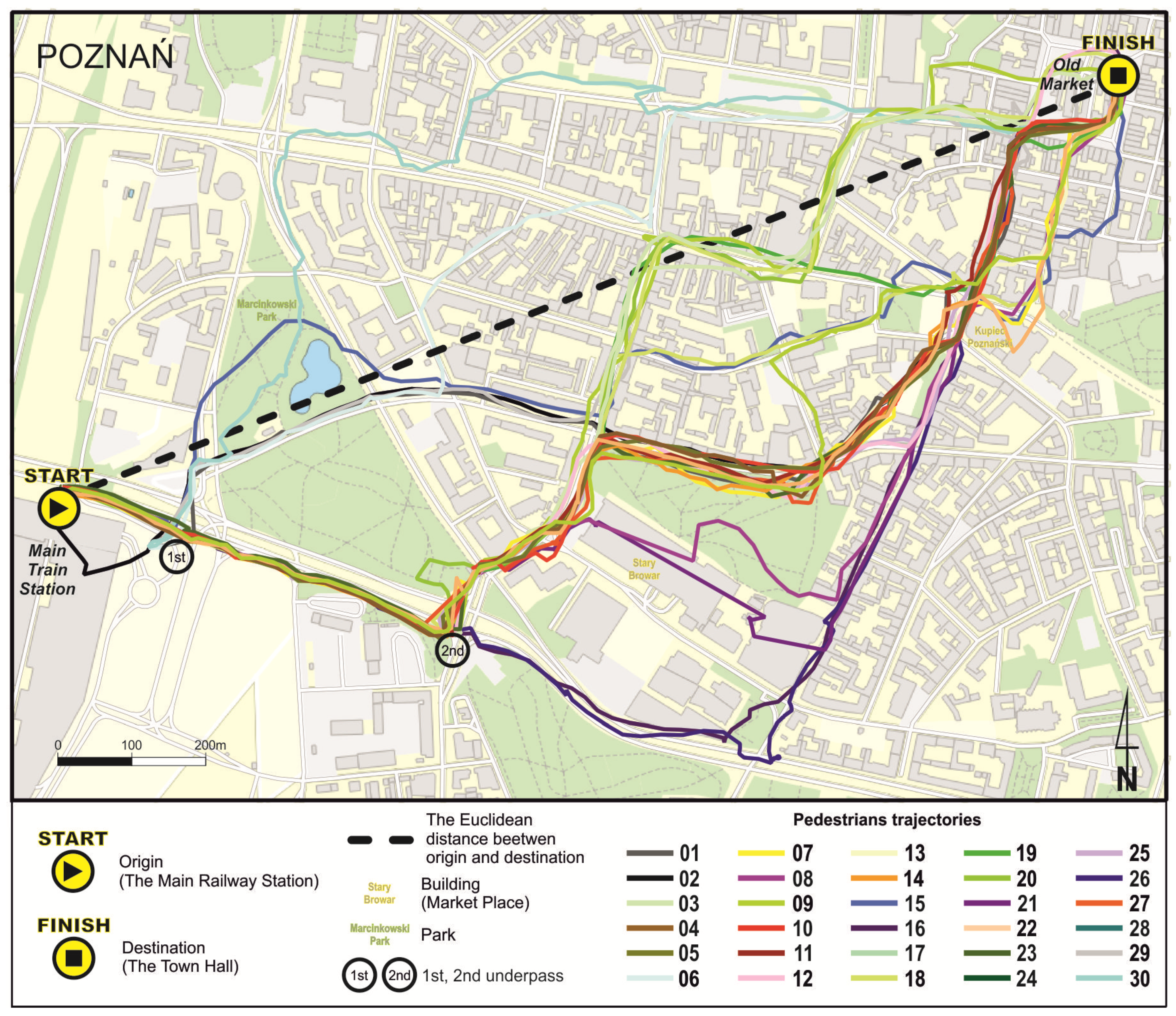
A map with non-symbolized trajectories (
Figure 1) is the only visualization on which color was not employed to distinguish 30 specific tracks, hence it is not possible to analyze individual tracks on the basis of this visualization. Raw movement routes are visible as black lines presented in the spatial context, that is, on the background of the network of squares with a side length 100 m and streets with visible names. Although, thanks to including street names, it is possible to determine streets that were frequented more often, it is not possible to provide a specific number of people owing to overlapping and crossing trajectories. This method of presentation refers to Golledge’s [
39] work and is considered in the present article as a simple, ’raw’ view, without cartographic editing, which forms the basis for creating successive visualizations of spatial behavior.
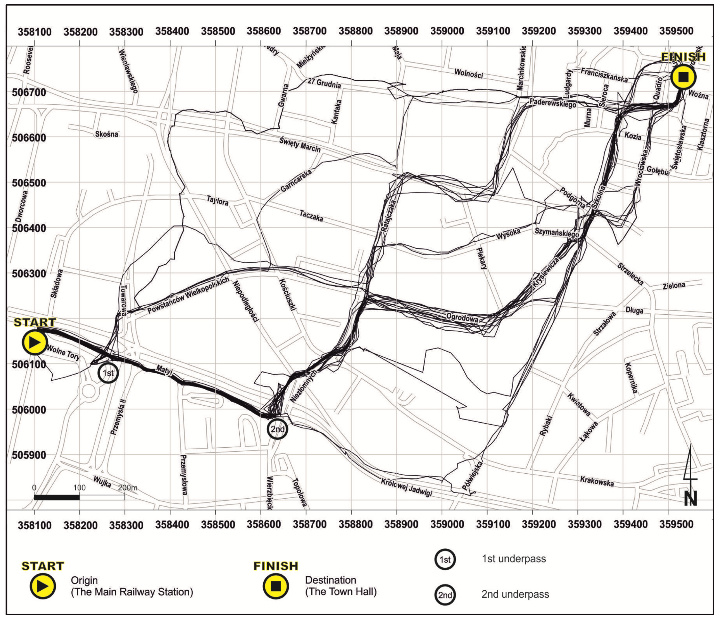
A map on
Figure 2 enables one to follow the trajectory of the movement of pedestrians on a traditional, topographical map. Streets, buildings, green areas, and water reservoirs create spatial context and make it possible to simply recreate the route. Cartometric properties of a topographic map with trajectories also facilitate estimating the distance. Presented trajectories of movement faithfully reflect the routes recorded by GPS. The fact that tracks overlap in street sections selected by many pedestrians is the greatest flaw of this form, as that significantly hampers identifying and following individual routes, despite their being marked with separate colors. Variable power of the signal reaching the GPS receiver and the level of generalization of base map elements make specific routes not fully geometrically consistent with base content. Paradoxically, weaker signal and location errors, although they affect the geometry of the routes recorded, contribute to better route visibility owing to their larger dispersion. The great number of colors, necessary because of the number of routes demonstrated, makes some of them merge with base content, despite highly bright colors used in there. The more tracks recorded, the less effective that presentation method becomes. Additionally, a black dashed line is used to mark the Euclidean distance on the map as a graphic element of the visualization’s complementarity with the next method of route miniatures.
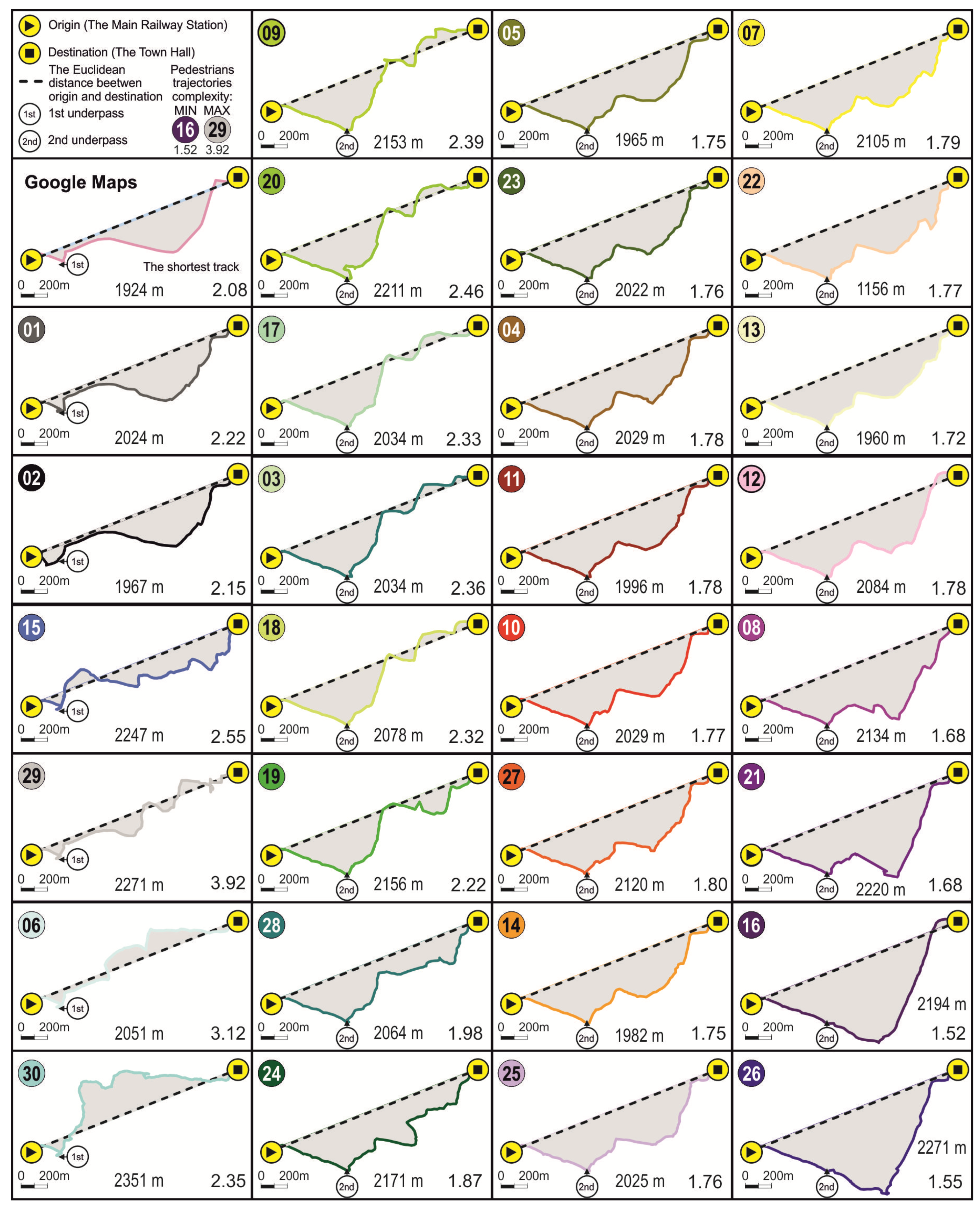
Route miniatures (
Figure 3) demonstrate the actual geometry of routes best of all the visualization methods presented in this article. Each trajectory is presented in the separate rectangular box, all of them being maintained in the same scale, owing to which their shapes are comparable. Each miniature consists of three elements: a color-marked route with the participant’s code, the line of the Euclidean distance between the starting and the finish point, and the surface area lying between them and marked in grey. The level of complexity of each route owing to the number and frequency of direction changes may be evaluated visually thanks to the Euclidean distance, which constitutes a point of reference for each route, making every deviation clearly visible (compare
Figure 2). Moreover, thanks to that method, one can also, at a rough estimate, draw conclusions about track length. Complexity of tracks was also specified mathematically and determined numerically on the basis of the trajectory shape factor. It is the quotient of the circumference of an area defined by the route line and the Euclidean distance connecting the starting and the finish point, as well as the circumference of a circle of the surface area identical with the surface area of the defined area, that allow researchers to rank 30 routes according to their complexity, assigning them values ranging between 3.92 to 1.52. Values of the coefficient are situated in the right bottom corner of each box on
Figure 3. The shortest possible route, calculated on the basis of Google Maps, is presented in the ‘Google’ box. Arranging routes according to their courses and similarity of shapes is also important. The first column consists of routes on which pedestrians used the first underpass nearby the railway station. The second, third, and fourth columns present routes of participants that used the second underpass.
Small size of boxes that may limit visibility of miniatures is a disadvantage of that solution [
25], especially when presenting more routes.
The analysis of
Figure 4 makes it possible to draw a conclusion that simplified geometry is predominant, with the pedestrian maintaining one direction to the finish point, with 3–5 changes in each direction, coinciding with the course of the shortest route marked out in the Google Maps application. Two routes (01 and 02) had a course similar to the shortest Google route, with route 01 being the most similar. The routes of all pedestrians who used the first underpass are demonstrated in the first column. Other miniatures present the routes of those participants who went further and used the second underpass. The third column consists of routes of identical course, with the only exception being the route in the last line, which differs slightly, similarly to four routes from the last column.
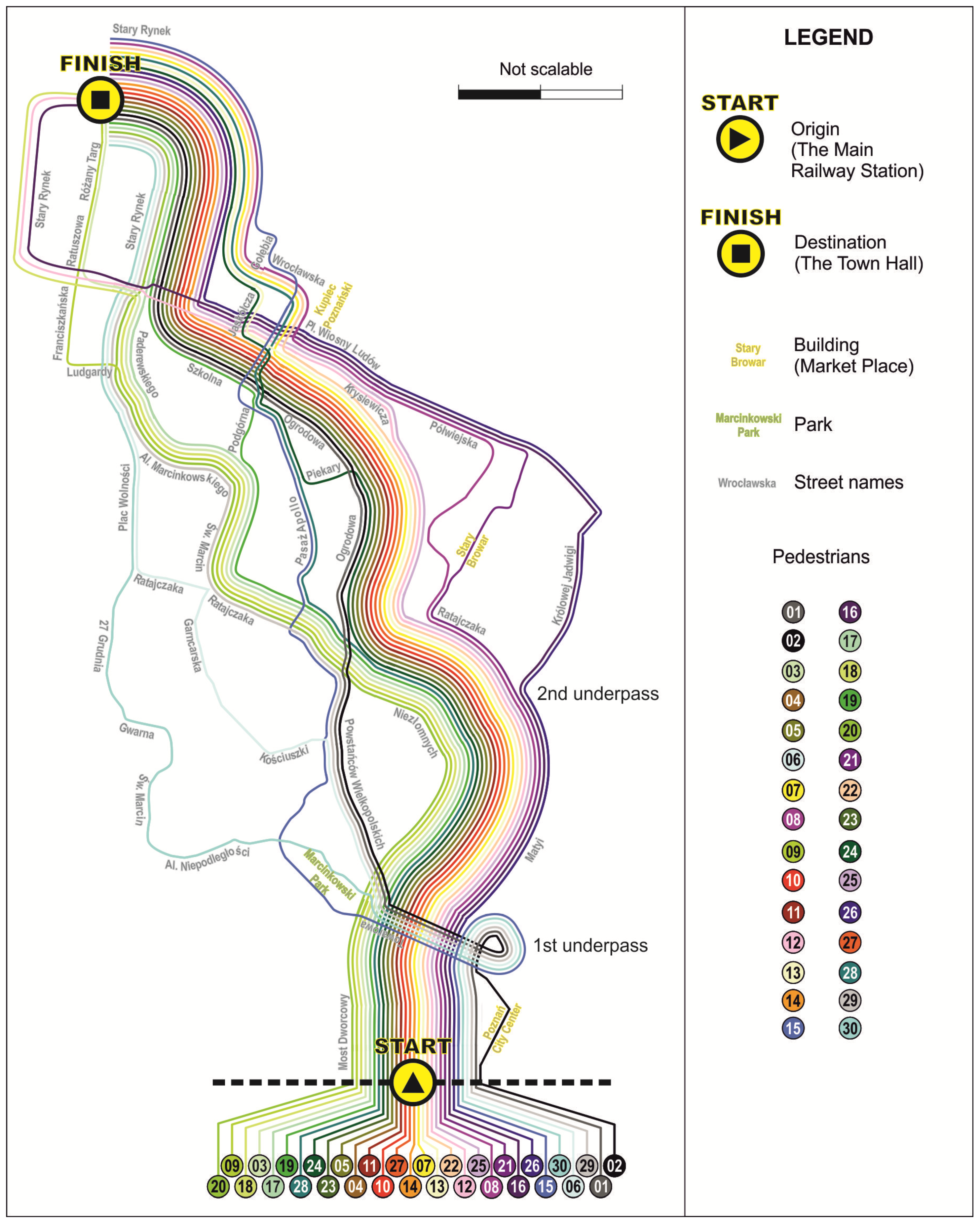
A schematic map of routes (
Figure 4) is based upon a design idea similar to a subway map, while this solution imitates the topographic course of routes more faithfully than visualizations of that type. The geometry of routes is significantly generalized and distorted, presented in a simplified and schematic way. What results from that fact is that it does not maintain actual distances, hence the ‘not scalable’ note next to the scale. Presenting sections of streets on which routes overlap is the most significant objective of that visualization. Routes are traced out as parallel lines, thus making all the routes well visible, and the number of crossings is reduced to the minimum. Lines in
Figure 4 are adjusted according to colors and the route order, taking the similarity of their courses into consideration. It is precisely the arrangement of routes in that visualization that decides upon colors assigned to individual participants on all the complementary visualizations presented in this publication. Thanks to this visualization, it is possible to easily determine what street sections were frequented most often and by which participants, just by counting colorful lines. The orientation of this visualization towards cardinal points is purposely altered from the regular northern to the one oriented to the final destination that participants were supposed to arrive. Thus, routes are presented from the point of view of pedestrians arriving at their destination in such a way that, at the bottom of the visualization, there is a starting point and the finish point is situated at the top of it.
The fact that one can follow the routes of all pedestrians and analyze them both individually (elementary questions [
40]) and in the context of the entire group (synoptic questions [
40]) is a great strength of this presentation, compared with the topographic map with trajectories. It can be easily established what street sections are frequented most often and at what stage routes become common for many participants, with the opportunity to identify each one of them. The lack of cartometric property, manifesting itself in the distortion of proportions and making it impossible to estimate the distance, is a flaw of this method. However, the spatial context is maintained thanks to the topology of routes and names of streets used to describe groups of lines. Considering the manner in which the route is reflected, one may draw a conclusion that this visualization resembles a cognitive map the most, that is, it fails to present inaccurate distances that we tend to roughly estimate, instead showing places of more significant alterations and changes of the movement direction that we remember and are capable of recreating much more precisely.
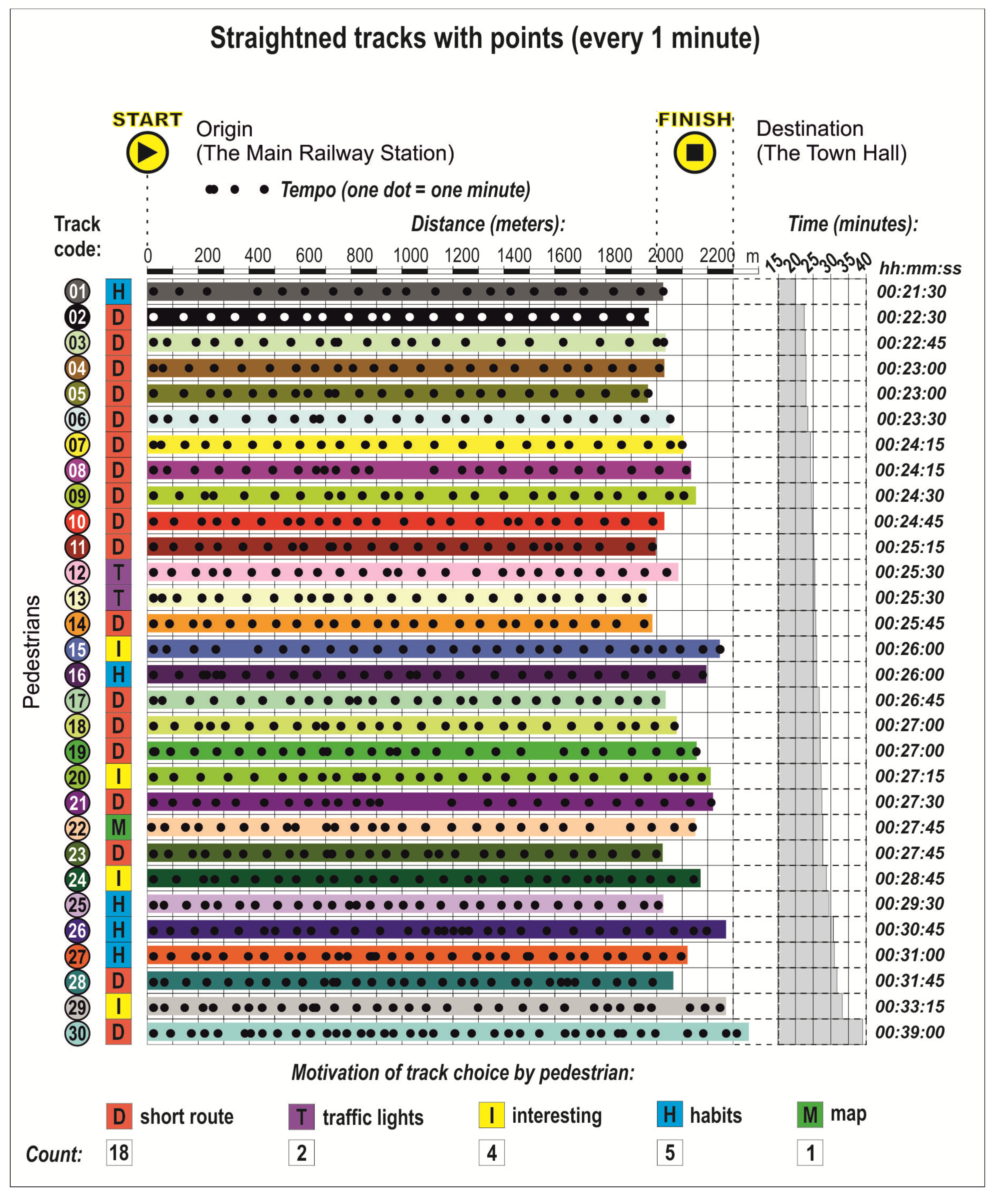
A route graph (
Figure 5) is an example of a graphic solution in which trajectories are synchronized to facilitate the comparative analysis. The idea of a time graph or a ‘route graph’ was presented and described in the article by Andrienko & Andrienko [
25] (p. 9) as a way to solve the problem of “visual clutter and overlapping of lines” in the case of “representing multiple trajectories”. In this method, each trajectory is represented by a horizontal (or vertical) bar. In the case of our visualization, the horizontal position and length of the bar correspond to the starting point and the length of the bar to the length of the trajectory. Hence, each bar is one ’straightened’ trajectory with the starting point on a common left base. The lengths of bars allow us to observe the coincident value of the length of covered distances, for all of them fall in the range of 1960–2351 m. As Andrienko & Andrienko [
25] (p. 9) hold, “the vertical dimension of the display is used to arrange the bars, which can be sorted based on one or more attributes of the trajectories”. In this case, trajectories are sorted out according to time. The time required to pass from the starting point to the finish point is more diverse, especially if we take extreme values into consideration. On this visualization, one can clearly see that the distance covered does not directly impact the walking time. Thanks to the distribution of track points, we may indicate stopping places, and the variability or regularity of walking speed (the closer dots are to one other, the slower the speed). Owing to the size of dots in individual rows, it is possible to place track points every one minute, which allows us to point out only longer stops during the walk. However, “trajectories can be gapped by missing or bad GPS-signal” [
41] (p. 26); therefore, places where the loss of signal occurred do not have track points. This method included an important feature, namely the motivation that participants had when selecting a route. It was marked with colorful squares with black letters. The research on decisive factors that influence motivation when selecting a route proved that distance is the most important thing, while factors like “safety, visual attractions or the level of congestion” (p. 4) are less important ([
42] after [
43]). The results of our research confirm the significance of distance when choosing a route. The shortest distance was the dominant factor, indicated by 18 participants, habits ranked second (5), and attractiveness of the route ranked third (interesting things to see on the way were mentioned by four participants). Only two people claimed that favorable traffic lights on pedestrian crossings were the most relevant factor and one person was motivated by a map on a smartphone.
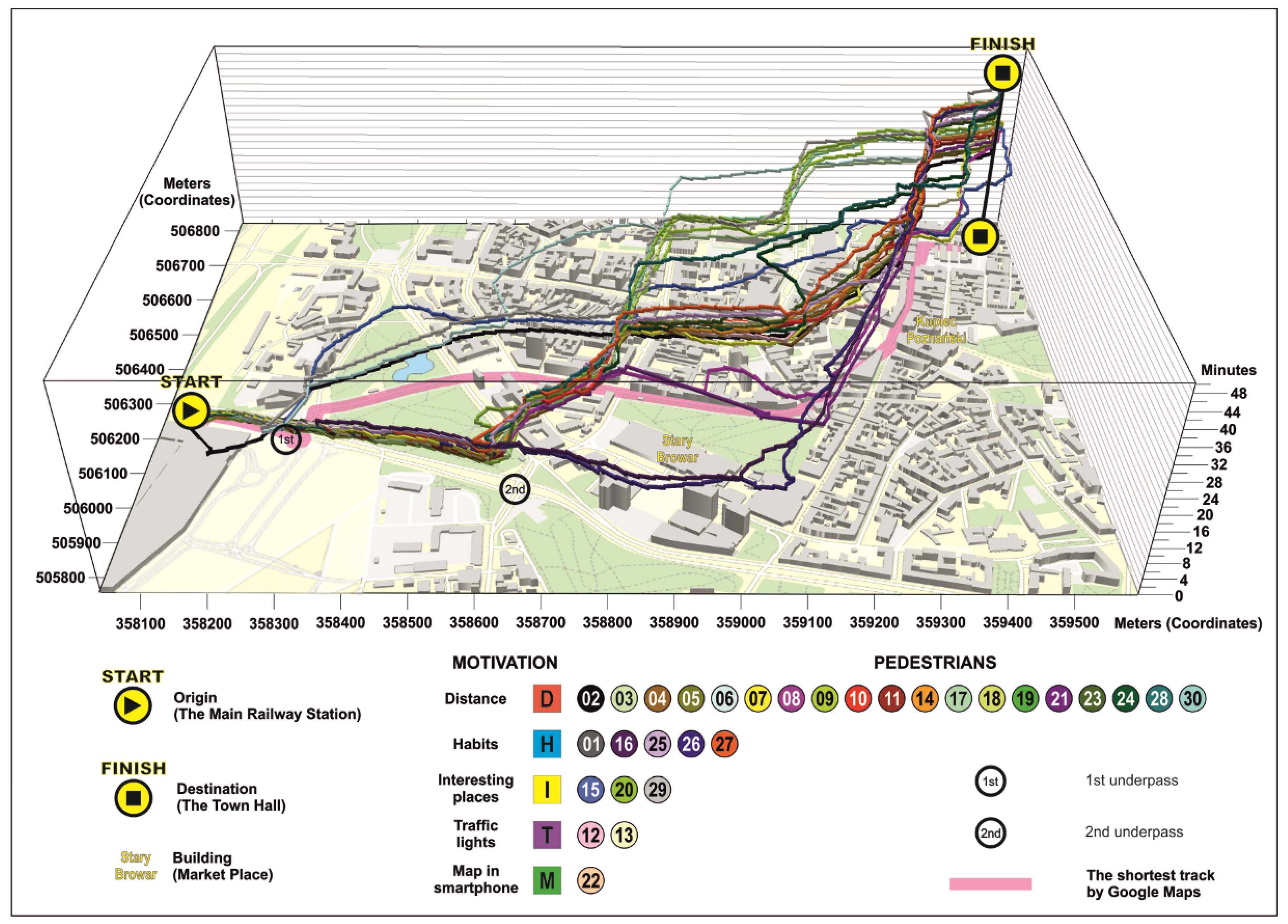
A space–time cube (STC) with trajectories (
Figure 6) derives from time geography created by Hägerstrand [
30], “who introduced a space-time model which included features such as a Space-Time-Path, and a Space-Time-Prism” [
44] (p. 189). In this method, trajectories of movement are presented in the form of a perspective view. The 2.5-dimensional space (a pseudo 3D view) enables one to present the position of the pedestrian in space and time, but the opportunity to read this piece of information accurately in the case of static visualizations is significantly limited [
26,
30]. The reading of spatial behavior from the STC is very effective when using a monitor, when one can manipulate the angle and height of observation, as well as rotate and zoom in. Among the disadvantages, we should mention the necessity to analyze the visualization from multiple views at different angles. At the same time, using a perspective view greatly hampers the estimation of the distance.
At the bottom of the STC, some elements of a topographic map can be seen. Buildings are presented in the form of solid figures (City GML Level of Detail 1). Their shape and variable height, created on the basis of the number of floors, reflect actual space dominants, which are a frequent orientation element when selecting a route. This method enables the user to have a bird’s eye view (or convergent perspective) on space visualization. The orientation of STC is northern as a reference to the topographic map with trajectories.
Figure 6 contains one selected image, which best corresponds with the map from
Figure 2, for it retains a northern orientation. The visually attractive image requires the appropriate method of interpreting features for one route and the entire set of routes, as routes ’rise’ upwards with each minute.


