Numbers on Thematic Maps: Helpful Simplicity or Too Raw to Be Useful for Map Reading?


Department of Geoinformatics, Cartography and Remote Sensing, Faculty of Geography and Regional Studies, University of Warsaw, Krakowskie Przedmiescie 30, 00-927 Warsaw, Poland
*
Author to whom correspondence should be addressed.
ISPRS Int. J. Geo-Inf. 2020, 9(7), 415; https://0-doi-org.brum.beds.ac.uk/10.3390/ijgi9070415
Submission received: 29 May 2020
/
Revised: 18 June 2020
/
Accepted: 26 June 2020
/
Published: 28 June 2020
Abstract
:As the development of small-scale thematic cartography continues, there is a growing interest in simple graphic solutions, e.g., in the form of numerical values presented on maps to replace or complement well-established quantitative cartographic methods of presentation. Numbers on maps are used as an independent form of data presentation or function as a supplement to the cartographic presentation, becoming a legend placed directly on the map. Despite the frequent use of numbers on maps, this relatively simple form of presentation has not been extensively empirically evaluated. This article presents the results of an empirical study aimed at comparing the usability of numbers on maps for the presentation of quantitative information to frequently used proportional symbols, for simple map-reading tasks. The study showed that the use of numbers on single-variable and two-variable maps results in a greater number of correct answers and also often an improved response time compared to the use of proportional symbols. Interestingly, the introduction of different sizes of numbers did not significantly affect their usability. Thus, it has been proven that—for some tasks—map users accept this bare-bones version of data presentation, often demonstrating a higher level of preference for it than for proportional symbols.
1. Introduction
In recent years, the use of small-scale thematic maps has become common in the print and on-line media. As they are meant to be used to obtain information quickly, they should draw the eye and encourage the user to undertake in-depth analyses of the issues being presented. This type of presentation needs to be effective, attractive, and eye-grabbing. Quickly readable maps are foremost informative, visually attractive, and simple—both in terms of their content and their graphic form, which has to be understandable to users who do not have any cartographic training [1]. This simplicity and accessibility for various users are the reasons why such maps are often designed in a different way to traditional thematic cartography with its strong graphic foundation. It is common to present quantitative data on maps with the limited use of visual variables in the form of numbers. Such maps are significantly simplified in terms of their visual complexity, but it is not clear to what extent such an approach is favourable and preferred by users. User studies are a common approach to verifying the usability of and possible challenges with maps (e.g., [2,3,4]) and geovisualisations [5,6]. However, despite their frequent use, quantitative thematic maps have not been a common subject of extensive empirical research [7].
Cartography is meant to depict the spatial distribution of a given phenomenon in an effective way, allowing map users to analyse its content at detailed and/or general levels of map reading. The cartographer who makes the map and the user who analyses it are related with the following issues: a cartographer decides how (using cartographic methods and graphic variables) to present what (information to be shown) to whom (user with his/her knowledge and abilities), and must consider whether it is effective (if the information is retrievable) [8]. This form of information presentation is significantly different to the statistical table, which is meant to allow for a quick reading of a specific value of a given phenomenon, or a quick comparison of values, but is not useful for making any inferences concerning spatial relations or drawing general conclusions. Aside from the spatial aspect, another important difference between maps and statistical tables is the fact that maps use graphics that have been described and defined by Bertin [9] as visual variables. Quantitative data are coded using selected visual variables (e.g., size, lightness). Numerical values concerning the phenomena presented on the map are then included in the map’s legend, which provides an explanation of how the selected visual variables are used. In addition to the above-mentioned traditional solutions, numbers are also employed on maps as a cartographic technique. Quantitative data are shown on a map directly in the form of numbers, which significantly reduces use of visual variables.
The broad availability of statistical data and the great variety of their possible ways of presentation results in a tendency to overload maps with excessive detail by showing a lot of information on a single map, often in the form of numerical values. One of the additional reasons for the popularity of this method of data presentation is time. Hence, numbers on maps are applied in presentations that have to be prepared and reach their audience fast; for example, recently, numbers have frequently been observable on maps presenting information regarding the COVID-19 topic [10,11,12]. On this kind of map, there is no need for data processing, symbolisation, or graphic optimisation. Information is provided to map users with a high level of detail, creating the risk that the amount of detail may sometimes be too high. This article presents the results of empirical research that compared the usability of numbers on maps with other popular information presentation methods (map types). Usability was assessed both in the context of maps on which numbers appeared alone and maps on which numbers repeated information that was also represented using a different method.
2. Numbers on Maps as an Approach for Cartographic Presentation
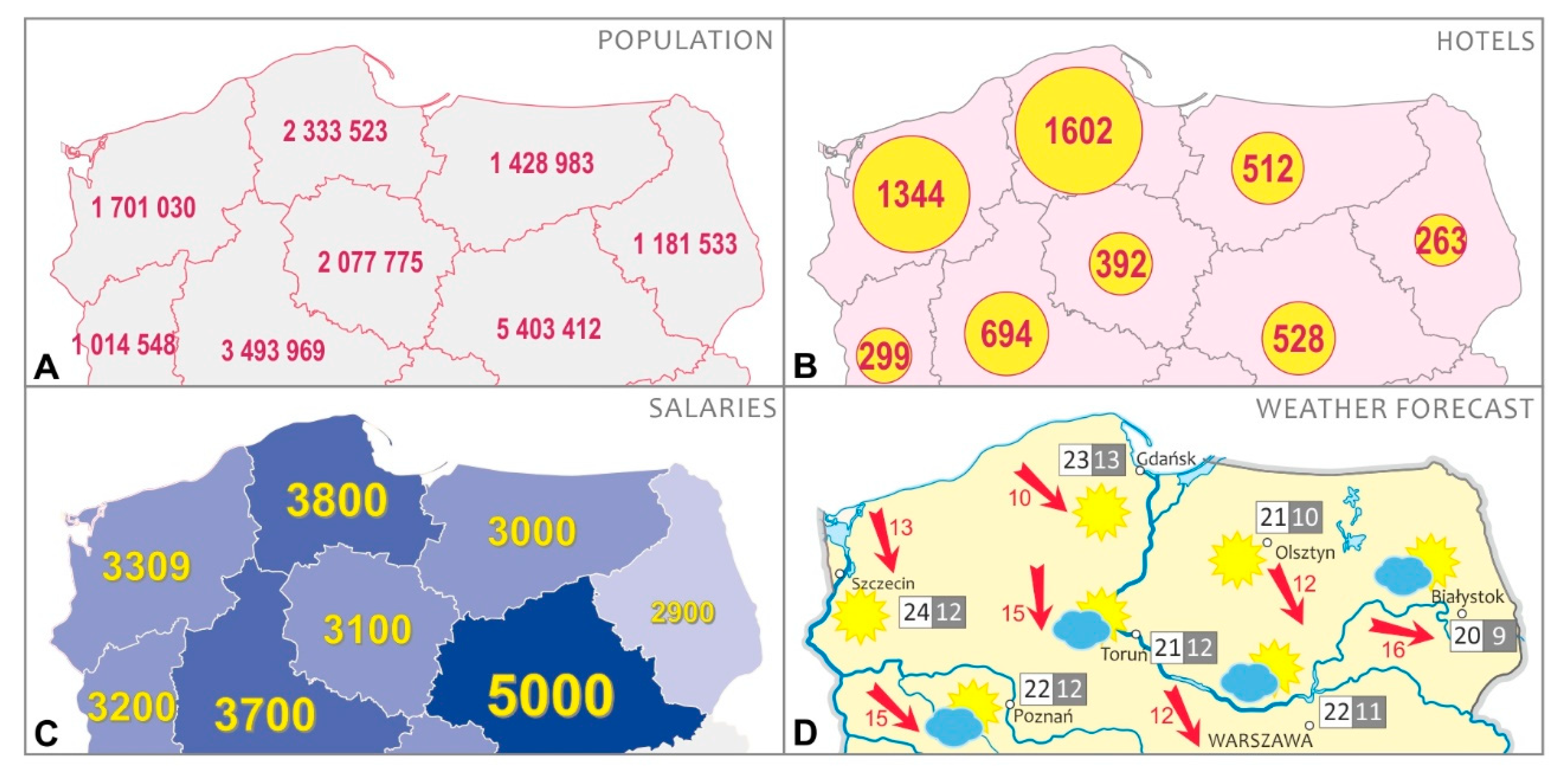
Although numbers are used quite often on maps, they have infrequently been the subject of research and have only rarely been included in classifications along with other methods of cartographic presentation [13]. Most often, they thought to be inefficient solutions, as statistical tables distributed over a geographical space, and as some form of a preparatory stage for the map-making process [14,15], i.e., a draft map intended for the person who develops the final version. However, the frequent use of numbers on maps as a final version of data presentation (Figure 1) means these opinions should be verified, especially in the context of the numbers’ usability. The question as to whether numbers on maps, which in their form often resemble statistical tables, have similar utility to that of well-established and generally accepted cartographic presentation methods is an interesting issue for further analysis.
2.1. The Functions of Numbers on Maps
The readability of numbers on maps may be improved when they meet certain requirements. It is advised that they consist of not too many digits and that they sometimes bee intentionally reduced [13]. Furthermore, it is not recommended to include decimal parts, which may hamper the readability of a map. It is advised to use a simple typeface for such numbers and a clearly visible colour that highlights them against the map’s background, making them very legible. Due to the diverse shapes of numbers, they normally draw the attention, which is why they should not be used in excess. A map with more than one phenomenon presented in the form of numbers in all reference fields (e.g., in different colours) might become difficult to interpret.
Numbers on maps perform a similar role to proportional symbols, i.e., in each unit, they present the individual value of the phenomenon at a given point or in a given area. If the numbers presented in the same way throughout the map do not differ from each other in their graphic forms, then such numbers are referred to as even-sized numbers (Figure 1A). Such numbers may appear on the map alone (Figure 1A) or supplement another method—for example, proportional symbols that repeat the information presented with this method. In such a case, numbers on the map fulfil the role of the map’s legend [16] (Figure 1B). The values of a given phenomenon can be read on the basis of the numbers placed directly on the map without the need for a traditional map legend.
Visual variables can be used for numbers on a map, as well as for other map labels [17,18]. Quantitative characteristics are usually presented using size and lightness variables [9]. The diversification of the size of the numbers on a map, which is dependent on the value of the phenomenon, allows so-called proportional numbers to be created (Figure 1C) [13], so that the map user may notice high values presented in the biggest font size more quickly and only afterwards register the smaller ones corresponding to lower data values. Proportional numbers can also complement a different form of presentation used on the same map (Figure 1C), one acting as a graphic-based legend. Numbers, both proportional and even-sized, may be used on a multi-variable map to present data different to those presented on the same map with the help of other methods (Figure 1D). Simple presentations (single-variable maps) (Figure 1A) are easier to understand than complex maps [19], but these maps are meant to perform different functions. However, complex maps (Figure 1D) are a clue for a user that the combination of two or more phenomena on one map is not accidental, and when they interpret the map, they should draw conclusions based on the analysis of all of the presented information [20].
2.2. Numbers on Maps as a Form of Content Redundancy
When the same data are presented on a map, not only as numbers but also using another cartographic method (e.g., proportional symbols as in Figure 1B or a choropleth map as in Figure 1C), these methods constitute redundancy. Redundancy is understood as “the unnecessary use of more than one word or phrase meaning the same thing” [21]. However, despite the fact that redundancy create additional visual load, it can also have a positive impact on the usability of the map [22,23,24].
Redundancy results in a map when more than one method is used to present the same data, i.e., when different visual variables—for example, size and lightness—are used to facilitate the user’s understanding of the presented content [9,25,26]. On the other hand, in geovisualisation, redundancy can be implemented within the framework of coordinated and multiple views in which the same data are presented in separate windows using different visualisation methods, e.g., maps, tables, or proportional symbols [27]. Multiple views show data with different visualisation methods, since each of them provides a different perspective [28] to facilitate an understanding of the spatially referenced data [29]. Map makers understand that using various methods of presentation can be helpful to a map user. When there are many methods of information presentation to choose from, the user will opt for the one that they find most convenient [30]. In addition, repeating the same data functions as a type of emphasis, highlighting the importance of the presented information [31].
The use of redundancy to improve maps has been the subject of research. For example, there have been studies verifying the interpretation of geographical phenomena on the basis of text alone, on the basis of text supplemented with a map, and only on the basis of a map with short text comments placed directly on the maps [32]. The presentation combining the map and text at the same time was effective for lower-level learning, although such a multi-component form of presentation required more attention from users. Research focused on the use of redundancy to facilitate the reading of animated maps has shown that a simultaneous use of size and colour variables significantly improves the usability of maps by limiting the change blindness effect [33]. It has also been shown that a cartographic presentation in which the scale of the phenomenon is represented by the size of symbols is more effective if it is further enhanced by adding a lightness variable, resulting in respondents reading information more quickly and with greater accuracy [22]. This improvement results from the fact that lightness is, next to size, the variable most easily read among visual variables [34,35,36,37]. Maps for fast reading, such as maps presenting weather forecasts [38], have also been studied, and it has been shown that an effective map should emphasise the thematic information constituting the main focus of the map.
The above-mentioned research shows that repeating information by means of applying various graphic solutions makes it easier to read and interpret. However, caution should be taken, as neither redundancy nor other graphic solutions should be used in excess. When a map’s visual appearance becomes too complex, its efficiency may be reduced [39]. An attempt was made to identify the limits of the usability of redundancy, i.e., the point beyond which it ceases to be helpful and becomes a burden in the context of map reading. The analysis included different forms of city and town labels: varying sizes of symbols, different sizes of names, and names written in bold or only in capital letters. The study showed that marking cities with one variable made the information quite difficult to understand for map users. The results obtained using two or three variables were similar, but better than those achieved with just one variable. The introduction of a fourth variable did not bring any improvements [22].
It is therefore worth more deeply evaluating the usability of numbers as a cartographic data presentation method. Because of the multitude of possible ways of using this presentation method, the following study evaluated numbers in several contexts. The purpose of the study was to answer the following questions (RQ):
- RQ 1: Are numbers used as an independent method on a single-variable map just as effective as traditional methods of cartographic presentation?
- RQ 2: Is it useful to use numbers on a map to repeat information already presented on the map using other visual variables?
- RQ 3: Are numbers useful as one of the elements on a multi-variable map?
We decided to limit the scope of the study to an analysis of the usability of this data presentation method for simple map-reading operations. We believe that it is worth starting the research from basic operations and subsequently expanding the scope of the research to include more complex contexts of using maps, including map interpretations, as well as decision-making, and problem-solving processes.
3. Materials and Methods
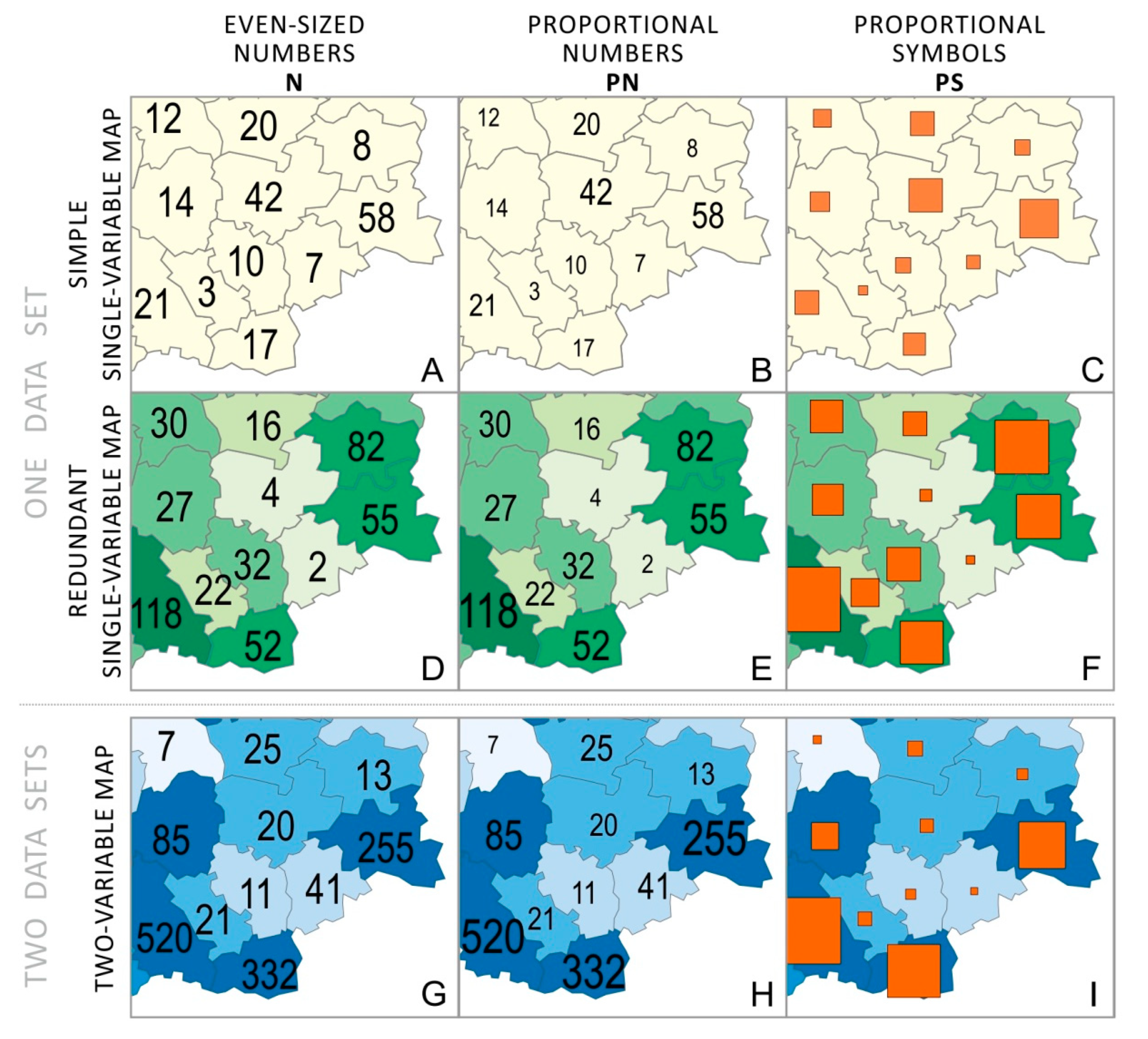
The aim of the study was to compare the usability of three different methods of cartographic presentation: even-sized numbers, i.e., numbers whose sizes do not change in relation to the value of the presented phenomenon (later abbreviated as “N”; Figure 2A,D,G); proportional numbers, i.e., numbers whose sizes change with an increase in the value of the phenomenon (later abbreviated as “PN”; Figure 2B,E,H); and the traditional presentation method, i.e., proportional symbols, in which each value of the phenomenon corresponds to a square of a different size (later abbreviated as “PS”; Figure 2C,F,I).
The assessment was based on the measurement of the percentage of correct answers, the time needed to solve the task, a self-assessment of the task’s difficulty, and the study participant’s opinions on the most helpful method of data presentation. These metrics are often used in empirical cartography research as usability performance metrics [19]. The study used a simple form of numbers: two- and three-digit numbers expressed in a sans serif typeface.
3.1. Study Material
Twenty-seven maps were prepared for the study, which showed a fictitious area consisting of 35 reference fields of similar size. Three map versions were prepared for each of the nine tasks (T1–T9), which employed different cartographic presentation methods and showed different amounts of information (one or two data sets) (Figure 3):
- A map with only numbers or proportional symbols expressing quantitative information (numbers or proportional symbols employed as an independent cartographic presentation method, a simple map showing one phenomenon—simple single-variable map;
- A map with numbers or proportional symbols that duplicate the information presented on a choropleth map (a map showing one phenomenon—redundant single-variable map);
- A map with numbers or proportional symbols presented on a choropleth base map, with each method showing a different phenomenon (two-variable map).
The maps presented issues related to tourism. The number of accommodation facilities (T1 and T4), the length of cycle paths (T2 and T5), and the number of taxis (T3 and T6) were presented in subsequent tasks on single-variable maps and redundant single-variable maps. Additional thematically relevant relative data were added to two-variable maps: the occupancy rate (T7), the length of cycle paths per 1000 people (T8), and the number of taxis per 10,000 people (T9).
3.2. Participants
The study was carried out in 20 Polish high schools. A total of 580 students voluntarily took part in the study. The participants were aged between 16 and 20 (M = 17.74, SD = 0.922). By proportion, 57% of the participants were women and 43% were men. About 65% of the respondents declared that they used maps at least once a month, and 40% of the users reported that they used maps once a week or more often.
3.3. Methods, Tasks, and Procedures
Users were surveyed with the help of desktop computers with internet access. The task and the map that participants used to solve the task were displayed on a computer screen (Figure 3). In the upper-right corner of the map window, there was a toolbar with drawing tools that users could use to respond to the tasks by selecting answers on the map.
The participants were divided into three groups, each solving different study variants. The groups were similar in size: Group 1 had 199 participants (34.3% of all the study participants); Group 2, 194 people (32.4%); and Group 3, 187 (32.2%). Depending on the group, the proportion of women ranged from 55.6% to 57.2%, and that of men, from 42.8% to 44.4%.
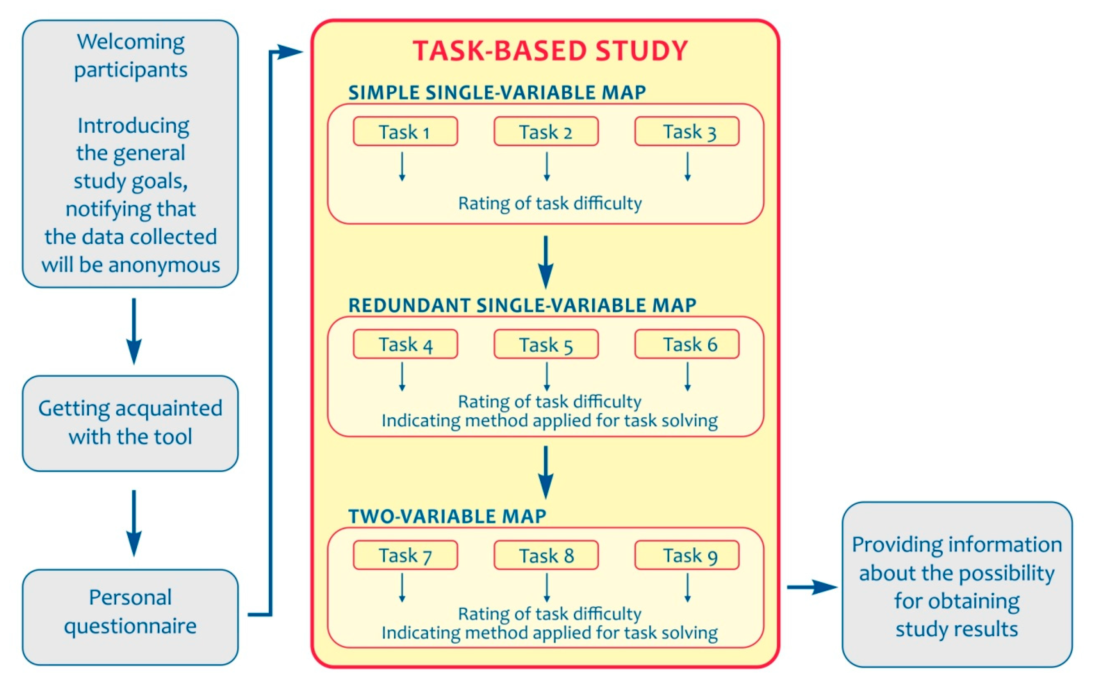
The study was preceded by a brief instruction session in which the study participants were informed that they were anonymously taking part in a study concerning thematic maps (Figure 4). They were asked to work independently. They were told how to mark their answers, that providing an answer was a condition for moving on to the next page, and that it was not possible to later return to a task already solved. After the instruction session, the study began. The first part consisted of a personal questionnaire with questions about the participants’ gender, age, and frequency of map use. Once they had completed the questionnaire, the participants proceeded to the main part of the study.
Each participant solved nine tasks (Table 1), which were divided into three parts (T1–T3, T4–T6, and T7–T9) in accordance with the type of map used. In a given set of tasks, each user solved one task with one of the three tested presentation methods (N—even-sized numbers, PN—proportional numbers, or PS—proportional symbols).
The first three tasks (T1–T3) consisted of reading and interpreting a simple map (simple single-variable map) in which one phenomenon was presented using even-sized numbers (N), proportional numbers (PN), or proportional symbols (PS). The second group of tasks (T4–T6) consisted of reading maps that employed the above-mentioned three methods of data presentation but, additionally, used choropleth mapping to represent the same phenomenon in classes, which led to the creation of redundancy (redundant single-variable map). In the last three tasks (T7–T9), choropleth mapping and one of the analysed methods (N, PN, or PS) were simultaneously used to show two different, albeit interrelated, variables (two-variable map). These tasks required users to be able to link information they had acquired from a complex map.
The tasks (Table 2) referred to basic map reading operations, i.e., reading values or comparing values with each other. The tasks did not require complex analysis or problem-solving operations. In each task, the participants provided answers based on the displayed map. The majority (eight of nine) of the tasks were open (Table 2). In the open tasks, the respondents were asked to read and enter a specific numerical value, to read a map and rank the values of a given presented phenomenon, and indicate the areas specified in the task using the drawing tools.
After solving each task, the participants were asked to rate the difficulty of that task on a 5-point Likert scale, from very easy to very difficult. In tasks T4–T9, with two cartographic presentation methods used simultaneously, they were also asked to indicate which presentation method they had found most helpful in solving the task. That is, they indicated whether they used numbers and proportional symbols or the choropleth map, or both of these cartographic presentation methods at the same time.
3.4. Data Analysis
Chi-square and Cramér’s V (Cramér’s V is a number between 0 and 1 that indicates how strongly two categorical variables are associated [40]) tests were used for statistical inference to determine the percentage of correct answers, assess the level of difficulty of the questions, and establish which method proved to be the most helpful in solving tasks. Quantitative data concerning the response time were analysed using the Kolmogorov–Smirnov test and the Kruskal–Wallis test with Bonferroni correction. The analyses were carried out with use of the SPSS software.
4. Results
4.1. Comparing the Effectiveness of Presentation Methods
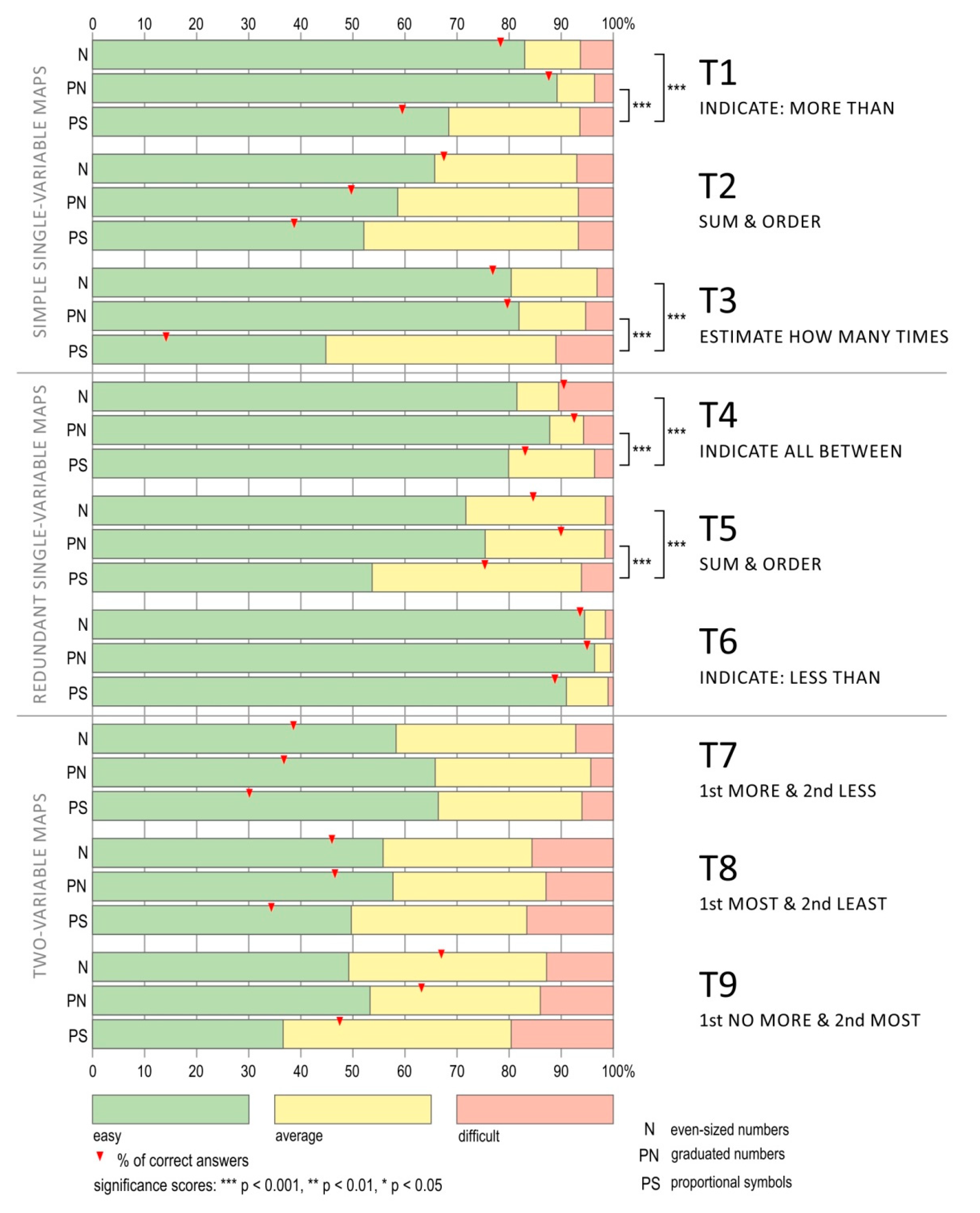
Different mean percentages of correct answers for different types of questions were noted (Figure 5). The easiest tasks were those using maps with redundancy (T4–T6). In their case, the mean percentage of correct answers was M = 88.7% (SD = 4.2). Tasks (T1–T3), which employed single-variable maps (without redundancy), proved to be more difficult, with M = 61.3% (SD = 20.7). Meanwhile, the tasks that used complex maps presenting two different phenomena (T7–T9) were the most difficult for the study participants; M = 45.3% (SD = 7.75).
For each of the questions, the participants using proportional symbols had the lowest percentage of correct answers. There were statistically significant differences between the percentages of correct answers recorded for participants working with proportional symbols and those who used both types of numbers in the case of most tasks (except T6 and T7) (Table 3).
In two tasks (T1 and T2), there were also significant differences recorded between the two tested types of numbers; in the case of T1, the percentage of correct answers was higher among the participants using proportional numbers, while in the case of T2, the opposite was true; the use of even-sized numbers resulted in a higher percentage of correct answers.
Tasks T1 and T3 had similar percentages of correct answers (Figure 5). In task T1 (indicate more than…), the highest percentage of correct answers was obtained for proportional numbers (87.6%), but the level of correct answers for even-sized numbers was also very high (75.3%). The users of maps with proportional symbols (59.4% of correct answers) did statistically significantly worse than those study participants who worked with proportional numbers (Cramér’s V = 0.321, p < 0.001) and even-sized ones (Cramér’s V = 0.206, p < 0.001). In addition, proportional numbers proved to be more effective than even-sized numbers (Cramér’s V = 0.123, p < 0.05). The users who were asked to estimate the value of the phenomenon in the T3 task (estimate how many times) had similar difficulties with proportional symbols. In the case of the maps with proportional symbols, the percentage of correct answers reached only 14.1%. Meanwhile, the users of maps with proportional numbers achieved 79.7% correct answers, and the participants using maps with even-sized numbers, 76.8%. There were statistically significant differences in the percentage of correct answers noted for the T3 task between the users of maps with proportional numbers and those of maps with proportional symbols (T3: Cramér’s V = 0.658, p < 0.001), and between the users of maps with even-sized numbers and those of maps with proportional symbols (T3: Cramér’s V = 0.630, p < 0.001).
Task T2 was slightly different and required users to sum up the values of a given phenomenon and put them in order. There were statistically significant differences recorded for all the pairs of methods that were compared, i.e., between maps with even-sized numbers and proportional symbols (T2: Cramér’s V = 0.288, p < 0.001), between maps with proportional numbers and proportional symbols (T2: Cramér’s V = 0.112, p < 0.05), and even between maps with both types of numbers (T2: Cramér’s V = 0.179, p < 0.001). The task turned out to be the most challenging for the users of the maps with proportional symbols. The requirement to estimate the value of the phenomenon based on the constantly changing size of the proportional symbols meant that they achieved the lowest percentage of correct answers (38.7%). For proportional numbers, the percentage of correct answers was 49.7%, and for even-sized numbers, it was 67.4%.
In the tasks with redundancy, the study participants were asked to indicate values from a specific range (T4 and T6) and to order the values of a given phenomenon (T5). In solving these tasks, the participants could not only search for numbers or observe circles of similar size but also make deductions based on the background, which indicated one specific degree of lightness, defined in the choropleth map legend as one class. The percentage of correct answers was very high: for both types of numbers, it was over 90%, and it was over 80% for proportional symbols. In this group of tasks, the differences between the methods in the individual pairs of compared techniques were less pronounced. Differences in the percentages of correct answers were statistically significant only between proportional numbers and proportional symbols, and between even-sized numbers and proportional symbols in tasks T4 and T5 (PN-PS: T4—Cramér’s V = 0.145, p < 0.01; T5—Cramér’s V = 0.190, p < 0.001; N-PS: T4—Cramér’s V = 0.108, p < 0.05; T5—Cramér’s V = 0.114, p < 0.05).
Out of all the tasks using maps that employed different methods to show two different phenomena (T7–T9), statistically significant differences between pairs of methods were recorded in only two tasks: T8 and T9. In both cases, the study participants using maps with numbers gave more correct answers than those who used maps with proportional symbols. The differences in the percentages of correct answers achieved on the basis of maps with numbers and maps with proportional symbols in task T8 amounted to about 15% (in the case of even-sized numbers and proportional symbols, T8: Cramér’s V = 0.128, p < 0.05; and in the case of maps with proportional numbers and proportional symbols, T8: Cramér’s V = 0.135, p < 0.01) and in T9, the differences were as high as 20% (in the case of even-sized numbers and proportional symbols, T8: Cramér’s V = 0.213, p < 0.001; and in the case of maps with proportional numbers and proportional symbols, T8: Cramér’s V = 0.170, p < 0.001).
In the majority of cases, the highest percentages of correct answers were obtained for proportional numbers (tasks T1, T3, T5, T6, and T8). Statistically significant differences between even-sized and proportional numbers were observed in only two tasks (in T1, a higher percentage of correct answers for proportional numbers: Cramér’s V = 0.123, p < 0.05; in T2, a higher percentage of correct answers for even-sized numbers: Cramér’s V = 0.179, p < 0.001). The percentage of correct answers to questions requiring the use of proportional symbols did not exceed the results obtained from the use of maps with numbers in any of the nine analysed tasks (Figure 5).
4.2. Comparing the Answer Times
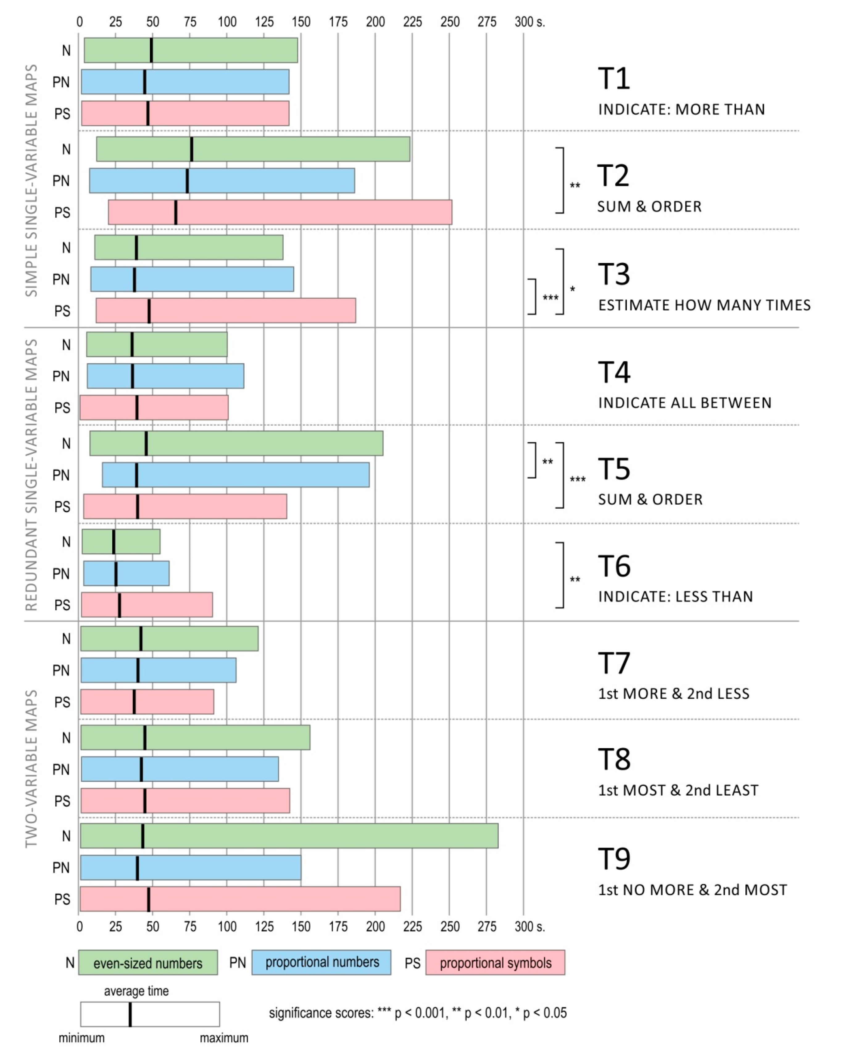
The average task completion times (for all provided answers, both correct and incorrect) obtained for individual tasks were similar and exceeded 50 s for only one task (Figure 6).
The shortest mean task completion time was obtained for T6 (M = 25.58 s, SD = 11.04). The task whose completion took the longest amount of time was T2 (M = 71.75 s, SD = 35.08). Its time-consuming nature is highlighted by the fact that the next-longest task completion time, for T1, was much shorter (M = 47.67 s, SD = 23.81). T5 (sum and order task), similar to T2 but involving redundancy, displayed a similar pattern (i.e., M = 41.63 s, SD = 22.42), with the longest task completion times recorded for all tasks involving redundancy. Just as in the case of the percentage of correct answers, the best results were recorded for the above-mentioned tasks with redundancy (T4–T6), which proved to be both the easiest and quickest to solve (T4: M = 37.38 s, SD = 16.07; T5: M = 41.63 s, SD = 22.42; T6: M = 25.58 s, SD = 11.04).
An analysis of the task completion times indicates that tasks T8 and T9, the ones that employed two-variable maps, proved to be most time-consuming (T8: M = 44.00 s, SD = 27.31; T9: M = 43.45 s, SD = 33.16). The third task out of this task series (T7) did not require as much time to solve (M = 39.95 s, SD = 20.86).
Unlike in the case of the correct answer percentages, significant differences between the presentation methods used on the maps and the time needed to solve the tasks were statistically significant in only four tasks (T2, T3, T5, and T6) (Table 4). Furthermore, the analysis of the response times did not indicate a clear disadvantage in using proportional symbols, as was the case indicated in the analysis of correct answers. The mean task completion time for T3 and T6 was longer for the users of maps with proportional symbols (T3: M = 47.66 s, SD = 25.38; T6: M = 27.72 s, SD = 12.91) than for the users of maps with numbers. However, the study participants working with proportional symbols responded statistically faster when solving tasks T2 and T5 (T2: M = 65.64 s, SD = 32.01; T5: M = 39.91 s, SD = 23.18) than those who worked with even-sized numbers (T2: M = 76.36 s, SD = 36.47; T5: M = 45.71 s, SD = 22.54) (Figure 6). Interestingly, introducing proportional numbers improved the result, allowing almost the same mean task completion time for T5 (M = 39.23 s, SD = 20.94) as for the users of maps with proportional symbols. Furthermore, in T5, there were also statistically significant differences between the response times of the study participants working with maps with different types of numbers (Kruskal–Wallis H = 51.748, p = 0.01). However, this was the only task in which such a difference was recorded.
4.3. Method Choice and Assessment of the Map’s Difficulty
In tasks T4–T9, there were two presentation methods applied in the maps. In each case, the proportional symbols or numbers were accompanied by a choropleth map presenting either the same (T4–T6) or a different phenomenon (T7–T9).
After solving each task, the respondents were asked to indicate which method helped them figure out the correct answer. They could indicate that they used mainly numbers or proportional symbols when solving the task (depending on the map they had at their disposal for a given task). They could also indicate if the choropleth map was the most helpful or point to a combination of proportional symbols, numbers, and the choropleth map (Figure 7).
The statistical analysis (Table 5) showed that in all the tasks that involved the use of maps with redundancy (T4–T6), there were significant differences in the methods preferred by the users of the various tested presentation forms (T4: Cramér’s V = 0.377, p < 0.001; T5: Cramér’s V = 0.148, p < 0.001; T6: Cramér’s V = 0.291, p < 0.001). However, there were no such significant differences in the case of the tasks involving two-variable maps (T7–T9).
In tasks T4 and T6, there were clear differences between the users of maps with proportional symbols and maps with numbers. The participants who used the maps with proportional symbols and that were asked to identify reference fields belonging to the same class (T4) or the fields where the value of the phenomenon was less than … (T6) preferred to use the map’s choropleth background (T4: 79.9% of the participants; T6: 76.5% of the participants). The proportion of people who stated that they used proportional symbols to solve the task was very small (T4: 6.7% of the participants; T6: 4.8% of the participants).
The responses of the participants who used maps with numbers were different. In the case of the T4 task, they chose all three possible answers with a similar frequency, while in the case of T6, they expressed a preference for interpreting the map with the help of the choropleth map or both solutions at the same time; while the option of using only numbers was the least popular answer. In the case of the T5 task, the participants preferred to solve the task using proportional symbols or numbers, without additionally referencing the choropleth map; 60% of all the users in the group of users working with the map with numbers preferred this approach. Among all the users who solved the T5 task with a proportional symbols map, 43% of the participants chose their answers using only proportional symbols.
Two-variable maps required the study participants to analyse both methods of presentation at the same time to be able to successfully complete tasks T7–T9. The participants indicated a preference for these methods, and in each task, such answers accounted for about 70% of all responses. No statistically significant differences were observed between the presentation methods (T7: V = 0.088, p = 0.061; T8: V = 0.083, p = 0.089; T9: V = 0.061, p = 0.358).
After solving each task, the study participants were asked to assess its level of difficulty on a 5-point scale. For the sake of clarity, the answers have been analysed in three categories: easy (i.e., summing values up was “very easy” and “easy”), medium, and difficult (i.e., “difficult” and “very difficult” together) (Figure 8). The percentage of respondents who found the tasks to be very easy or easy was between 36.6% (proportional symbols in T9) and 96.4% (proportional numbers in T6).
In almost all the tasks (except for T7), maps with proportional symbols were considered to be very easy or easy by the smallest number of respondents. The study participants definitely seemed to consider the tasks that involved maps with numbers to be significantly easier. The tasks involving proportional numbers were most rarely considered difficult.
In the case of four tasks (T1, T3, T4, and T5), the differences in the assessment of the difficulty of the tasks involving proportional symbols and numbers were so clear that they were reflected by statistical significance (Table 6). These differences in assessment were always to the detriment of proportional symbols, which were considered to be more difficult. Statistical analysis did not show significant differences in the assessment of the difficulty of tasks in which even-sized and proportional numbers were used.
It is also worth noting that the assessment of the difficulty of individual tasks did not always match the percentage of correct answers received in response to those tasks. There were tasks that had a higher percentage of correct answers (T4–T6) than the percentage of study participants who found them easy. On the other hand, more than half the study participants found tasks T7 and T8 easy, but the percentage of correct answers was definitely lower.
5. Discussion
Numbers on maps were analysed in comparison with a well-established, commonly used method of data presentation, which has been frequently evaluated empirically, i.e., proportional symbols [42,43,44,45]. Furthermore, the study incorporated an additional visual variable—lightness—through the use of the commonly used and often studied choropleth mapping [46,47,48,49]. All the analyses were conducted in relation to simple map reading operations.
RQ 1:
Are numbers used as an independent method on a single-variable map just as effective as traditional methods of cartographic presentation?
Numbers on maps have proved to be useful and effective for simple operations concerning map reading. This was consistently reflected in the higher percentages of correct answers achieved by the study participants who were working with numbers, compared to those who used proportional systems. Importantly, the higher percentages of correct answers achieved by the participants who were working with proportional and even-sized numbers were not linked to any negative side-effects related to task completion time. A higher number of correct answers was achieved in a similar length of time to that spent by the study participants working with proportional symbols. However, one should bear in mind that the types of tasks analysed were limited to relatively simple operations.
In the case of T1 (indicate more than…), better results were definitely obtained for numbers than for proportional symbols. The reason for this is the difficulty in comparing the sizes of the proportional symbols that represent the values of the phenomenon, especially in the case of a continuous variation in proportional symbols [50,51,52]. In fact, a more in-depth analysis of the incorrect answers revealed that mistakes were caused by difficulties in estimating and comparing the sizes of proportional symbols representing similar values of a given phenomenon. The study participants were often unable to decide which proportional symbols were only slightly larger than the value indicated in the task content. This confirms that proportional symbols [23,50,52,53] present a disadvantage in the context of comparing figures with similar areas. The same factor affected the assessment of the difficulty of the task: the task was more difficult for users of the maps with proportional symbols than for the participants using the maps with numbers. It turned out that the numbers allowed the task to be carried out with a much greater level of accuracy and, interestingly, with similar speed. It was assumed that the lack of visual variables (in the case of the even-sized numbers), and thus limited visible representation of the general distribution of the phenomenon, would necessitate more time for reading individual numbers and comparing them with the reference value. However, the study results indicate that the users of the maps with numbers were able to complete the task with similar task completion times, higher levels of efficiency, and less effort than the map users working with proportional symbols.
A more complex comparison operation, consisting of providing the ratios of values between units (T2), also showed worse results for maps with proportional symbols, which was demonstrated across all indicators. Therefore, the present study indicates that the comparison operation—which is one of the basic operations performed during map reading, included in many map-use taxonomies [54,55,56,57,58,59,60,61] and used in many empirical studies in the field of map reading (e.g., [28,62])—can be better performed using maps with numbers, i.e., when the use of visual variables and traditional presentation methods is limited. In addition, in tasks in which a summation operation is required (thus, an action more favourable to numbers on maps than proportional symbols), the incorporation of visual elements into the presentation of numbers (a size variable in proportional numbers) reduced the usability of this method. The participants who solved tasks using the maps with proportional numbers did significantly worse and found the task a bit more difficult. This effect can be most likely attributed to the introduction of a size variable, which makes larger objects more easily noticeable, while smaller objects become more difficult to find.
Consequently, the results indicate that there are cases in which the inclusion of numbers on maps may be a solution that is competitive with or even better than traditional methods, in regard to cartographic presentation. There are situations in which users prefer raw data that can be used quickly for simple operations, resulting in the same level of effectiveness and speed as using traditional methods.
RQ 2:
Is it useful to use numbers on a map to repeat information already presented in the map using other visual variables?
Numbers on maps can also supplement other presentation methods and refer to the same phenomenon already presented in a more traditional way—for example, by means of a choropleth map. In such cases, numbers repeat the conveyed information and may function as a map legend, replacing the traditional form, which means that the map’s users do not have to consult the legend as often. After all, the numbers describe and explain the phenomenon directly on the map, which results in the creation of redundancy.
This procedure proved to be beneficial and to lead to better results in terms of usability metrics (correct answers, task completion time, and difficulty level assessment) than in the case of the duplication of information shown on a choropleth map with the help of proportional symbols. The study participants stated that when solving the tasks, they based their answers on numerical descriptions, choropleth maps, and also on both of these methods of presentation simultaneously. In turn, when data were duplicated with the help of proportional symbols, users indicated strongly that it was more convenient for them to use only the choropleth component to solve the tasks. When the values of a given phenomenon were presented using different degrees of brightness, they were easier to interpret for participants than proportional symbols, which required painstaking attempts at estimating the phenomenon’s value on the basis of the symbol sizes. Only in T5, a task that required adding values (clustering), did the participants avoid using the choropleth-based presentation, because a lightness variable is more difficult to use [35] in operations of this type and can even be a hindrance by replacing individual values of the phenomenon with classes. In this case, the graphic variable of size works differently, translating the values to make them easier to understand.
Using redundancy for maps with numbers, therefore, leads to positive effects, which confirms previous conclusions and research results [22,23,24,33]. When information is reinforced with numbers, it facilitates map reading, as long as the visual form of these numbers remains simple, properly contrasted with other presentation methods used on the map, and not overwhelming.
RQ 3:
Are numbers useful as one of the elements on a multi-variable map?
The use of numbers on a map that presents several phenomena does not seem to improve the usability of the map as clearly as in the case of previously analysed research questions, compared with maps with proportional symbols on the choropleth background. A comparison of the results achieved by the study participants using numbers on two-variable maps with proportional symbols shows that the task completion times and the perceived levels of difficulty of the tasks did not differ significantly. The only metric, although important, that the participants who used both types of numbers did better at when compared to those working with proportional symbols was the percentage of correct answers for two out of the three tested tasks (T8 and T9). Therefore, it can be noted that in the tested tasks, the users of maps with numbers obtained results that were no worse than those achieved by the participants working with traditional supplements to choropleth maps, i.e., proportional symbols. This indicates that solutions exist that are equally effective as, and sometimes even more effective than, the commonly adopted ones. It is therefore worth considering a further expansion of the accepted catalogue of traditional cartographic solutions.
6. Conclusions
Empirical research in cartography is often focused on analysing the reception of new visual, methodological, and technological solutions in their social and educational contexts [63,64,65,66,67]. The aim of the study described in this article was to examine numbers on maps that convey quantitative information; a fairly popular means of presentation that remains relatively poorly described in cartographic literature [13,14,15]. Although they have attracted little attention from cartographers, practitioners, including non-professional map makers, use them quite often. They most likely owe their popularity to the fact that the process of map making with numbers is relatively simple. Numbers do not require complicated editorial measures such as the determination of choropleth classes or the size of proportional symbols that represent the values of a given phenomenon.
The presented results of the conducted study, from the testing of the usability of numbers on maps in three contexts, indicate that numbers can constitute a helpful way to present data. The results of this study suggest that numbers are the right solution when creating simple maps meant to be read at a detailed level. Certainly, it is worthwhile to continue research on numbers on more complex maps, both in terms of form and content [51,52,53,54,55,56,57,58,59,62]. Perhaps, in such cases, numbers on maps will prove to be more of a hindrance than a help to map users. Therefore, assessment should be extended to include more complex cognitive operations, including problem-solving and decision-making processes. In addition, the study compared numbers on maps with proportional symbols, which, despite their popularity and undisputed advantages, have some limitations, such as users finding it difficult to estimate the size of surface symbols [50,51,52]. It is worth comparing the effectiveness of numbers on maps with other methods of data presentation—for example, choropleth mapping, isopleths, etc.
It will be worth testing visual variables application to numbers on maps in future research. The modification of numbers by introducing the variable of size did not affect the results obtained for each type of tested task. This was a bit surprising, because the initial assumption was that the addition of a size variable would allow large objects to be noticed more quickly and that small ones would only be noticed later. This is what happens with descriptions on maps, and numbers seem to share a lot of their features. Considering the presented study results, it can be assumed that introducing modifications to numbers on maps, whether in the form of size or lightness (e.g., [18]), may be treated as voluntary for the tested operations.
Numbers on maps do not always constitute a presentation of only the pre-graphic stage of map development, and, in some contexts, they can make a map readable and efficient. The study results indicate that cartographers can effectively use a broader range of data presentation methods than is commonly adopted, even if such approaches result in a very restricted use of visual variables and a bare-bones form of a map. After all, in some cases in the world of maps, it may also turn out that less is more.
Author Contributions
Conceptualisation, methodology, validation, formal analysis, investigation, and resources: Jolanta Korycka-Skorupa and Izabela Małgorzata Gołębiowska; data curation: Jolanta Korycka-Skorupa; writing—original draft preparation, review, and editing: Jolanta Korycka-Skorupa and Izabela Małgorzata Gołębiowska; visualisation: Jolanta Korycka-Skorupa; supervision: Izabela Małgorzata Gołębiowska; project administration and funding acquisition: Jolanta Korycka-Skorupa and Izabela Małgorzata Gołębiowska. All authors have read and agreed to the published version of the manuscript.
Funding
This research was funded by the National Science Centre, Poland, grant number UMO-2016/23/B/HS6/03846, “Evaluation of cartographic presentation methods in the context of map perception and effectiveness of visual transmission”.
Acknowledgments
We would like to thank all the students who participated in this study for their time and efforts. Moreover, we express our thanks to EMPREK Team colleagues Izabela Karsznia, Katarzyna Słomska, Tomasz Nowacki, Tomasz Panecki, and Wojciech Pokojski for their help at the data collection stage. Finally, we want to show our sincere gratitude and appreciation for Tomasz Nowacki for his useful ideas and fruitful discussions during the concept development, and elaboration of maps and tasks.
Conflicts of Interest
The authors declare no conflict of interest.
References
- Monmonier, M. Maps with the News: The Development of American Journalistic Cartography; The University of Chicago Press: Chicago, IL, USA; London, UK, 1989. [Google Scholar]
- Lin, Y.; Xue, C.; Niu, Y.; Zhou, X.; Zhu, Y. The Effects of Length and Orientation on Numerical Representation in Flow Maps. ISPRS Int. J. Geo-Inf. 2020, 9, 219. [Google Scholar] [CrossRef] [Green Version]
- Popelka, S.; Vondráková, A.; Hujnakova, P. Eye-Tracking Evaluation of Weather Web Maps. ISPRS Int. J. Geo-Inf. 2019, 8, 256. [Google Scholar] [CrossRef] [Green Version]
- Stachoň, Z.; Sasinka, C.; Cenek, J.; Angsüsser, S.; Kubíček, P.; Štěrba, Z.; Bilíková, M. Effect of Size, Shape and Map Background in Cartographic Visualization: Experimental Study on Czech and Chinese Populations. ISPRS Int. J. Geo-Inf. 2018, 7, 427. [Google Scholar] [CrossRef] [Green Version]
- Popelka, S.; Herman, L.; Řezník, T.; Pařilová, M.; Jedlička, K.; Bouchal, J.; Kepka, M.; Charvát, K. User Evaluation of Map-Based Visual Analytic Tools. ISPRS Int. J. Geo-Inf. 2019, 8, 363. [Google Scholar] [CrossRef] [Green Version]
- Herman, L.; Juřík, V.; Stachoň, Z.; Vrbík, D.; Russnák, J.; Řezník, T. Evaluation of User Performance in Interactive and Static 3D Maps. ISPRS Int. J. Geo-Inf. 2018, 7, 415. [Google Scholar] [CrossRef] [Green Version]
- Słomska, K. Types of maps used as a stimulus in cartographical empirical research. Misc. Geogr. 2018, 22, 157–171. [Google Scholar] [CrossRef] [Green Version]
- Kraak, M.-J.; Brown, A. Web Cartography: Developments and Prospects; Taylor & Francis: London, UK, 2001. [Google Scholar]
- Bertin, J. Semiology of Graphics: Diagrams, Networks, Maps; University of Wisconsin: Madison, WI, USA, 1983. [Google Scholar]
- Gutiérrez, P. Coronavirus world map: Which countries have the most Covid-19 cases and deaths? The Guardian. Available online: https://www.theguardian.com/world/2020/jun/16/coronavirus-world-map-which-countries-have-the-most-covid-19-cases-and-deaths (accessed on 16 June 2020).
- Lyons, P.J. Coronavirus Briefing: What happened today? New York Times. Available online: https://www.nytimes.com/2020/03/03/briefing/coronavirus-briefing-what-happened-today.html (accessed on 16 June 2020).
- Salo, J. Chinese SWAT team practices takedown of ‘coronavirus patient’ with net. New York Post. Available online: https://nypost.com/2020/02/27/chinese-swat-team-practices-takedown-of-coronavirus-patient-with-net/ (accessed on 16 June 2020).
- Brewer, C.; Campbell, A.J. Beyond Graduated Circles: Varied Point Symbols for Representing Quantitative Data on Maps. Cartogr. Perspect. 1998, 29, 6–25. [Google Scholar] [CrossRef]
- Hsu, M.-L. The Cartographer’s Conceptual Process and Thematic Symbolization. Am. Cartogr. 1979, 6, 117–127. [Google Scholar] [CrossRef]
- Jenks, G.F. Contemporary Statistical Maps—Evidence of Spatial and Graphic Ignorance. Am. Cartogr. 1976, 3, 11–19. [Google Scholar] [CrossRef]
- Dykes, J.; Wood, J.; Slingsby, A. Rethinking Map Legends with Visualization. IEEE Trans. Vis. Comput. Graph. 2010, 16, 890–899. [Google Scholar] [CrossRef] [Green Version]
- Deeb, R.; Ooms, K.; De Maeyer, P. Typography in the Eyes of Bertin, Gender and Expertise Variation. Cartogr. J. 2012, 49, 176–185. [Google Scholar] [CrossRef] [Green Version]
- Brath, R.; Banissi, E. Bertin’s forgotten typographic variables and new typographic visualization. Cartogr. Geogr. Inf. Sci. 2018, 46, 119–139. [Google Scholar] [CrossRef] [Green Version]
- Çötekin, A.; Heil, B.; Garlandini, S.; Fabrikant, S.I. Evaluating the Effectiveness of Interactive Map Interface Designs: A Case Study Integrating Usability Metrics with Eye-Movement Analysis. Cartogr. Geogr. Inf. Sci. 2009, 36, 5–17. [Google Scholar] [CrossRef]
- Korycka-Skorupa, J.; Nowacki, T. Cartographic presentation—From simple to complex map. Misc. Geogr. 2019, 23, 16–22. [Google Scholar] [CrossRef] [Green Version]
- Cambridge Dictionary. Available online: https://dictionary.cambridge.org/dictionary/english/redundancy (accessed on 25 May 2020).
- Shortridge, B.G.; Welch, R.B. The Effect of Stimulus Redundancy on the Discrimination of Town Size on Maps. Am. Cartogr. 1982, 9, 69–78. [Google Scholar] [CrossRef]
- Dobson, M. Visual information processing and cartographic communication: The utility of redundant stimulus dimensions. In Graphic Communication and Design in Contemporary Cartography; Taylor, D., Ed.; John Wiley & Sons: Chichester, UK, 1983; pp. 149–176. [Google Scholar]
- Brewer, C.A. A Transition in Improving Maps: The ColorBrewer Example. Cartogr. Geogr. Inf. Sci. 2003, 30, 159–162. [Google Scholar] [CrossRef]
- Cauvin, C.; Escobar, F.; Serradj, A. Thematic Cartography and Transformations; John Wiley & Sons: New York, NY, USA, 2013. [Google Scholar]
- Moles, A.A. Theorie de l’informationet message cartographique. Sci. Enseign. Sci. 1964, 5, 11–16. [Google Scholar]
- Andrienko, N.; Andrienko, G. Intelligent Support for Geographic Data Analysis and Decision Making in the Web. J. Geogr. Inf. Decis. Anal. 2001, 5, 115–128. [Google Scholar]
- Koua, E.L.; MacEachren, A.; Kraak, M.-J. Evaluating the usability of visualization methods in an exploratory geovisualization environment. Int. J. Geogr. Inf. Sci. 2006, 20, 425–448. [Google Scholar] [CrossRef]
- Roberts, J.C. State of the Art: Coordinated & Multiple Views in Exploratory Visualization. In Proceedings of the Fifth International Conference on Coordinated and Multiple Views in Exploratory Visualization (CMV 2007); Institute of Electrical and Electronics Engineers (IEEE): Piscataway, NJ, USA, 2007; pp. 61–71. [Google Scholar]
- Golebiowska, I.; Opach, T.; Rød, J.K. For your eyes only? Evaluating a coordinated and multiple views tool with a map, a parallel coordinated plot and a table using an eye-tracking approach. Int. J. Geogr. Inf. Sci. 2016, 31, 237–252. [Google Scholar] [CrossRef] [Green Version]
- Dent, B.D.; Torguson, J.S.; Hodler, T.W. Cartography: Thematic Map Design, 6th ed.; McGraw-Hill Higher Education: New York, NY, USA, 2009. [Google Scholar]
- Morrison, J.; Watson, G.S.; Morrison, G. Exploring the redundancy effect in print-based instruction containing representations. Br. J. Educ. Technol. 2014, 46, 423–436. [Google Scholar] [CrossRef]
- Cybulski, P.; Medyńska-Gulij, B. Cartographic Redundancy in Reducing Change Blindness in Detecting Extreme Values in Spatio-Temporal Maps. ISPRS Int. J. Geo-Inf. 2018, 7, 8. [Google Scholar] [CrossRef] [Green Version]
- Slocum, T.A.; McMaster, R.B.; Kessler, F.C.; Howard, H.H. Elements of cartographic design. In Thematic Cartography and Geographic Visualization, 2nd ed.; Pearson Prentice Hall: New York, NY, USA, 2005; pp. 199–228. [Google Scholar]
- MacEachren, A. How maps work. Representation, Visualization, and Design; The Guilford Press: New York, NY, USA, 1995. [Google Scholar]
- Roth, R. Visual Variables; Wiley: Hoboken, NJ, USA, 2017; pp. 1–11. [Google Scholar]
- White, T. Symbolization and the Visual Variables. The Geographic Information Science & Technology Body of Knowledge. Available online: https://gistbok.ucgis.org/bok-topics/symbolization-and-visual-variables (accessed on 16 June 2020).
- Fairbairn, D.; Niroumand-Jadidi, M. Influential Visual Design Parameters on TV Weather Maps. Cartogr. J. 2013, 50, 311–323. [Google Scholar] [CrossRef] [Green Version]
- MacEachren, A.M. The Role of Complexity and Symbolization Method in Thematic Map Effectiveness. Ann. Assoc. Am. Geogr. 1982, 72, 495–513. [Google Scholar] [CrossRef]
- Van den Berg, R.G. Cramér’s V – What and Why? SPSS Tutorials Website. Available online: https://www.spss-tutorials.com/cramers-v-what-and-why/ (accessed on 16 June 2020).
- Van den Berg, R.G. What Does “Statistical Significance” Mean? SPSS Tutorials Website. Available online: https://www.spss-tutorials.com/statistical-significance/ (accessed on 16 June 2020).
- Chang, K.-T. Data Differentiation and Cartographic Symbolization. Cartogr. Int. J. Geogr. Inf. Geovis. 1976, 13, 60–68. [Google Scholar] [CrossRef]
- Meihoefer, H.-J. The visual perception of the circle in thematic maps. Experimental results. Cartogr. Int. J. Geogr. Inf. Geovis. 1973, 10, 63–84. [Google Scholar] [CrossRef] [Green Version]
- Flannery, J.J. The relative effectiveness of some common graduated point symbols in the presentation of quantitative data. Cartogr. Int. J. Geogr. Inf. Geovis. 1971, 8, 96–109. [Google Scholar] [CrossRef]
- Adamiak, C.; Szyda, B.; Dubownik, A.; Álvarez, D.G. Airbnb Offer in Spain—Spatial Analysis of the Pattern and Determinants of Its Distribution. ISPRS Int. J. Geo-Inf. 2019, 8, 155. [Google Scholar] [CrossRef] [Green Version]
- Schiewe, J. Empirical Studies on the Visual Perception of Spatial Patterns in Choropleth Maps. KN J. Cartogr. Geogr. Inf. 2019, 69, 217–228. [Google Scholar] [CrossRef] [Green Version]
- Chang, K.-T. Visual Aspects of Class Intervals in Choroplethic Mapping. Cartogr. J. 1978, 15, 42–48. [Google Scholar] [CrossRef]
- Jenks, G.F.; Caspall, F.C. Error on choroplethic maps: Definition, measurement, reduction. Ann. Assoc. Am. Geogr. 1971, 61, 217–244. [Google Scholar] [CrossRef]
- Han, S.; Rey, S.; Knaap, E.; Kang, W.; Wolf, L.J. Adaptive Choropleth Mapper: An Open-Source Web-Based Tool for Synchronous Exploration of Multiple Variables at Multiple Spatial Extents. ISPRS Int. J. Geo-Inf. 2019, 8, 509. [Google Scholar] [CrossRef] [Green Version]
- Cox, C.W. Anchor Effects and the Estimation of Graduated Circles and Squares. Am. Cartogr. 1976, 3, 65–74. [Google Scholar] [CrossRef]
- Chang, K.-T. Visual estimation of graduated circles. Cartogr. Int. J. Geogr. Inf. Geovis. 1977, 14, 130–138. [Google Scholar] [CrossRef]
- Chang, K.-T. Circle Size Judgment and Map Design. Am. Cartogr. 1980, 7, 155–162. [Google Scholar] [CrossRef]
- Opach, T.; Korycka-Skorupa, J.; Karsznia, I.; Nowacki, T.; Golebiowska, I.; Rød, J.K. Visual clutter reduction in zoomable proportional point symbol maps. Cartogr. Geogr. Inf. Sci. 2018, 46, 347–367. [Google Scholar] [CrossRef]
- Havelková, L.; Hanus, M. Map skills in education: A systematic review of terminology, methodology, and influencing factors. Rev. Int. Geogr. Educ. Online 2019, 9, 361–401. [Google Scholar]
- Kimerling, A.J.; Buckley, A.R.; Muehrcke, P.C.; Muehrcke, J.O. Map Use: Reading and Analysis; ESRI Press Academic: Redlands, CA, USA, 2009. [Google Scholar]
- Michaelidou, E.C.; Nakos, B.P.; Filippakopoulou, V.P. The Ability of Elementary School Children to Analyse General Reference and Thematic Maps. Cartogr. Int. J. Geogr. Inf. Geovis. 2004, 39, 65–88. [Google Scholar] [CrossRef] [Green Version]
- Ooms, K.; De Maeyer, P.; Fack, V.; Van Assche, E.; Witlox, F. Interpreting maps through the eyes of expert and novice users. Int. J. Geogr. Inf. Sci. 2012, 26, 1773–1788. [Google Scholar] [CrossRef]
- Çötekin, A.; Brychtová, A.; Griffin, A.L.; Robinson, A.C.; Imhof, M.; Pettit, C. Perceptual complexity of soil-landscape maps: A user evaluation of color organization in legend designs using eye tracking. Int. J. Digit. Earth 2016, 10, 1–22. [Google Scholar] [CrossRef]
- Çötekin, A.; Fabrikant, S.I.; Lacayo, M.; Lacayo-Emery, M. Exploring the efficiency of users’ visual analytics strategies based on sequence analysis of eye movement recordings. Int. J. Geogr. Inf. Sci. 2010, 24, 1559–1575. [Google Scholar] [CrossRef]
- Dong, W.; Wang, S.; Chen, Y.; Meng, L. Using Eye Tracking to Evaluate the Usability of Flow Maps. ISPRS Int. J. Geo-Inf. 2018, 7, 281. [Google Scholar] [CrossRef] [Green Version]
- Burian, J.; Popelka, S.; Beitlova, M. Evaluation of the Cartographical Quality of Urban Plans by Eye-Tracking. ISPRS Int. J. Geo-Inf. 2018, 7, 192. [Google Scholar] [CrossRef] [Green Version]
- Roth, R. Cartographic Interaction Primitives: Framework and Synthesis. Cartogr. J. 2012, 49, 376–395. [Google Scholar] [CrossRef]
- Clarke, K.; Johnson, J.M.; Trainor, T. Contemporary American cartographic research: A review and prospective. Cartogr. Geogr. Inf. Sci. 2019, 46, 196–209. [Google Scholar] [CrossRef]
- Havelková, L.; Golebiowska, I. What Went Wrong for Bad Solvers during Thematic Map Analysis? Lessons Learned from an Eye-Tracking Study. ISPRS Int. J. Geo-Inf. 2019, 9, 9. [Google Scholar] [CrossRef] [Green Version]
- Roth, R.; Çötekin, A.; Delazari, L.; Filho, H.F.; Griffin, A.L.; Hall, A.; Korpi, J.; Lokka, I.; Mendonça, A.L.D.A.; Ooms, K.; et al. User studies in cartography: Opportunities for empirical research on interactive maps and visualizations. Int. J. Cartogr. 2017, 3, 61–89. [Google Scholar] [CrossRef]
- Sun, H.; Li, Z. Effectiveness of Cartogram for the Representation of Spatial Data. Cartogr. J. 2010, 47, 12–21. [Google Scholar] [CrossRef]
- Cybulski, P. Spatial distance and cartographic background complexity in graduated point symbol map-reading task. Cartogr. Geogr. Inf. Sci. 2020, 47, 244–260. [Google Scholar] [CrossRef]
Figure 1.
Examples of the use of numbers on small-scale thematic maps: (A) even-sized numbers on a map showing the values of a given phenomenon (single-variable), (B) even-sized numbers with proportional symbols (content redundancy), (C) proportional numbers with a choropleth map (content redundancy), and (D) presentation of temperature and wind speed on a weather map (multi-variable map).

Figure 2.
Fragments of map types used in the study. A–C: Simple single-variable maps presenting one data set by: (A) even-sized numbers, later abbreviated as “N”, (B) proportional numbers “PN”, (C) proportional symbols “PS”. D–F: (D) Redundant single-variable maps also presenting one-data set by choropleth map and also by: even-sized numbers “N”, (E) proportional numbers “PN”, (F) proportional symbols “PS”. G–I: (G) Two-variable maps presenting two data sets using choropleth map and: even-sized numbers “N”, (H) proportional numbers “PN”, (I) proportional symbols “PS”.

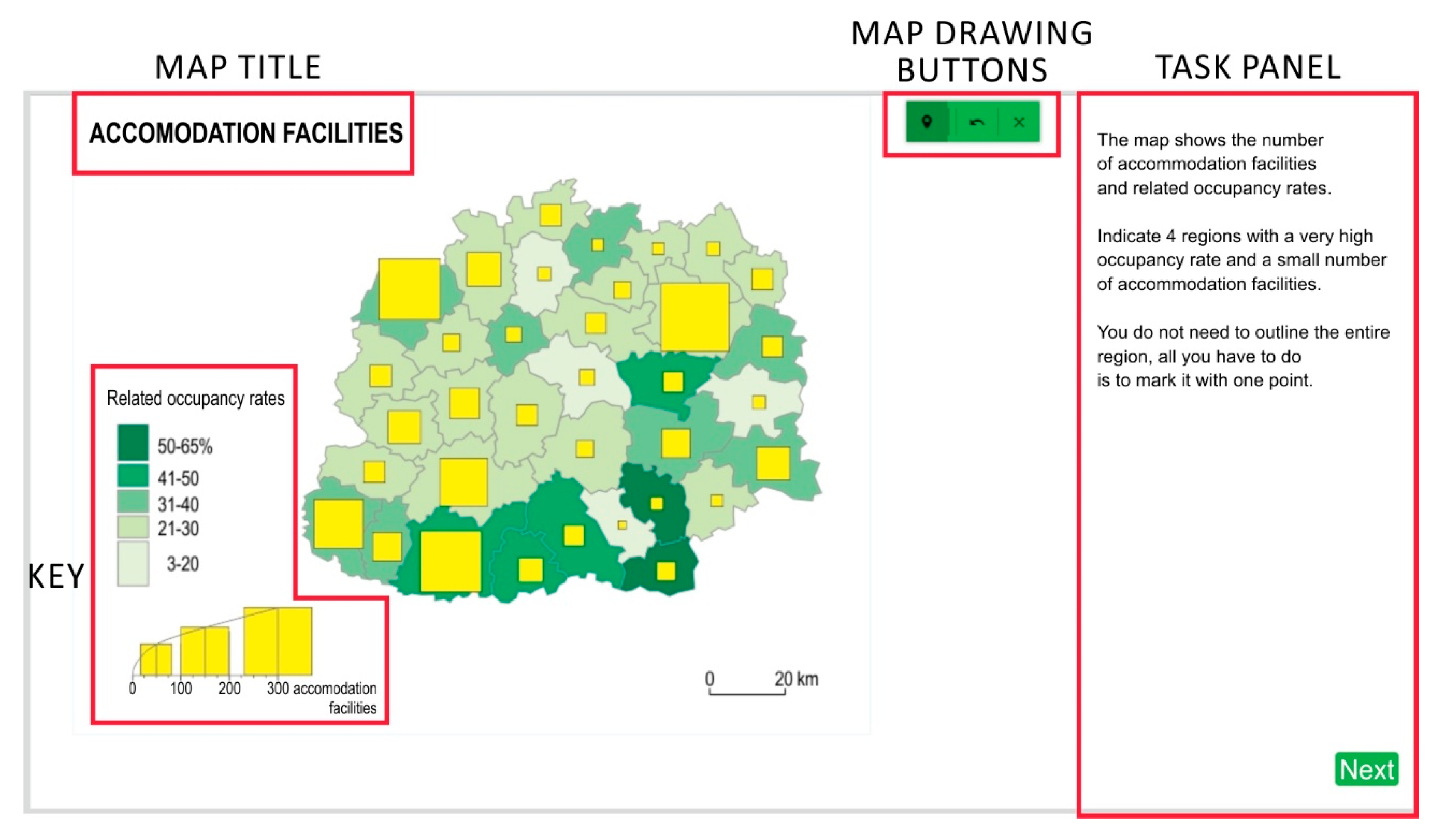
Figure 3.
The main window of the application used by the study participants. The map title and legend were on the left side of the window, while the buttons with tools for identifying points and drawing polygons were in the upper right corner of the map window. On the right was a task panel in which the participants provided their answers.

Figure 4.
Study procedure.

Figure 5.
The proportion of correct answers, taking into account the data presentation methods used on maps in tasks T1–T9.
Figure 5.
The proportion of correct answers, taking into account the data presentation methods used on maps in tasks T1–T9.
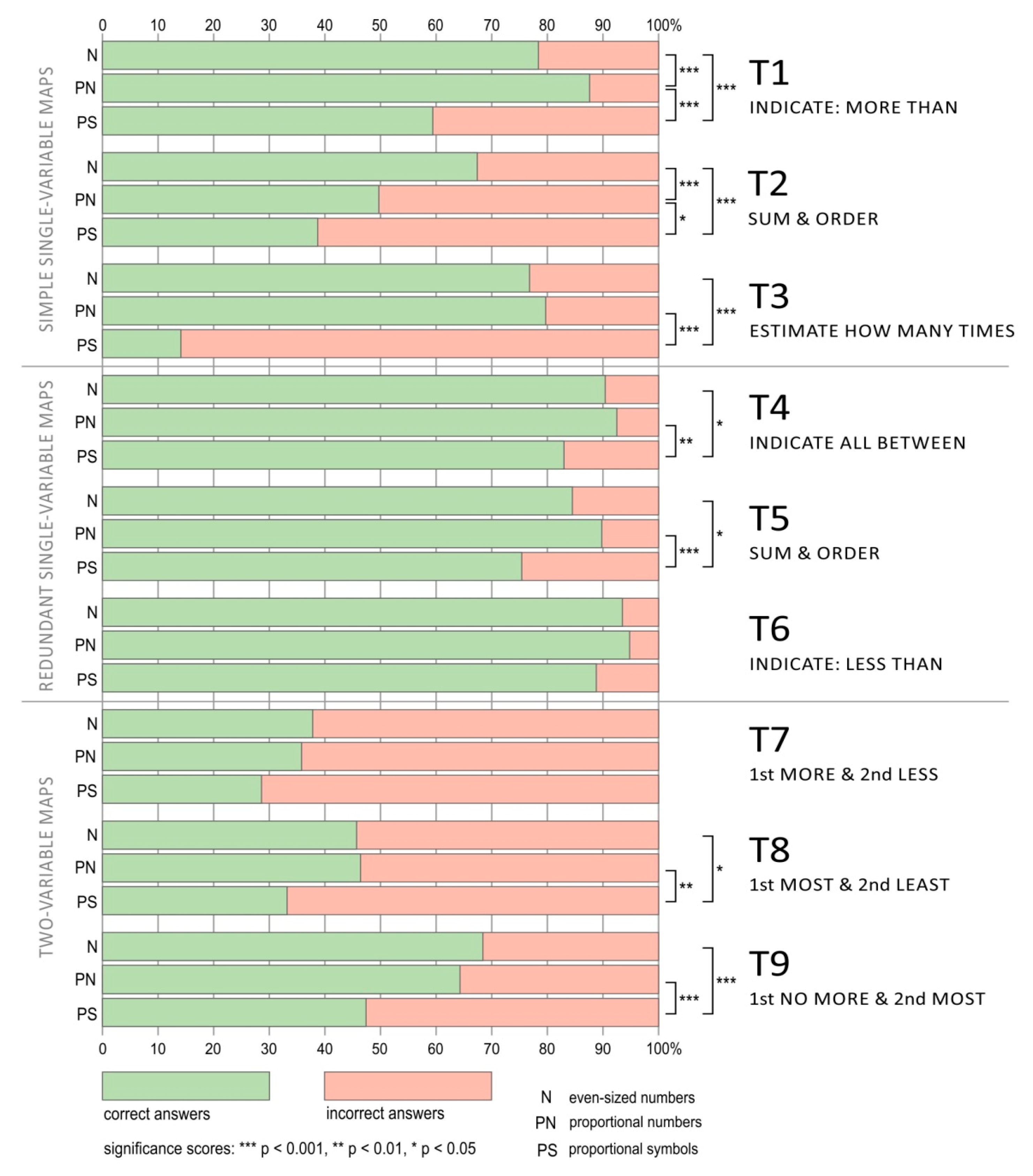
Figure 6.
Minimal, mean (black line), and maximum time needed for users to solve tasks T1–T9.

Figure 7.
Comparison of the methods declared to be the most helpful in answering the individual tasks.
Figure 7.
Comparison of the methods declared to be the most helpful in answering the individual tasks.
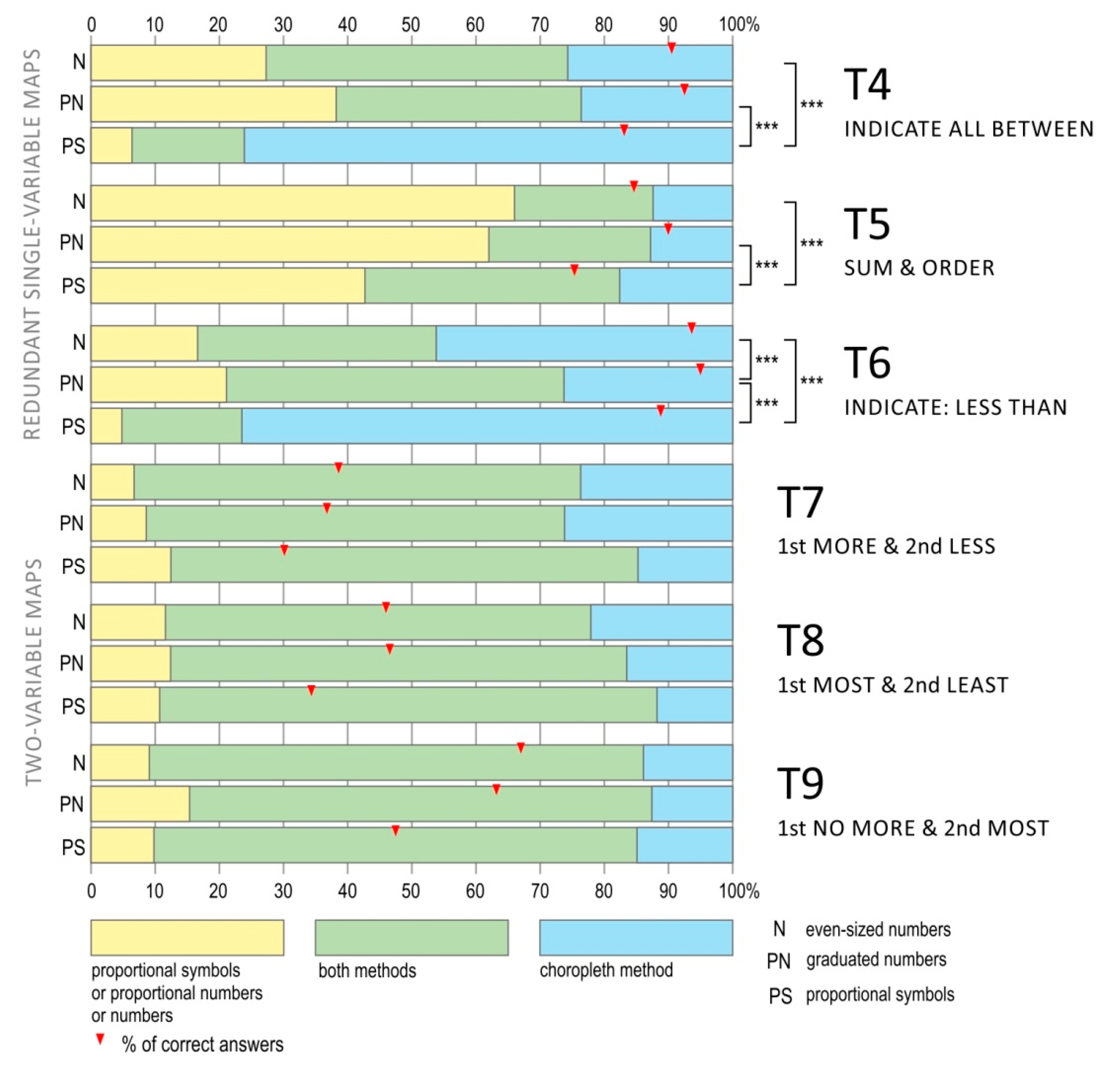
Figure 8.
Assessment of the tasks’ difficulty levels.


Table 1.
Study design. Each user solved nine tasks, three from each set of tasks.
| Task | Group 1 | Group 2 | Group 3 | Maps and Methods |
|---|---|---|---|---|
| T1 | N | PN | PS | SIMPLE SINGLE-VARIABLE MAP 1 data set presented by N/PN/PS |
| T2 | PN | PS | N | |
| T3 | PS | N | PN | |
| T4 | PN | PS | N | REDUNDANT SINGLE-VARIABLE MAP 1 data set presented by N/PN/PS and by choropleth map |
| T5 | PS | N | PN | |
| T6 | N | PN | PS | |
| T7 | PS | N | PN | TWO-VARIABLE MAP 2 data sets: 1st data set presented by N/PN/PS, 2nd data set presented by a choropleth map |
| T8 | N | PN | PS | |
| T9 | PN | PS | N |
N—even-sized numbers, PN—proportional numbers, PS—proportional symbols.
Table 2.
Content of the tasks, the type of map used, and the method for providing answers.
| Type of Map | Task Number | Task | Possible Answer |
|---|---|---|---|
| SIMPLE SINGLE-VARIABLE MAP | T1: INDICATE MORE THAN | A region that offers accommodation in 66 accommodation facilities has been marked on the map. Use the tools in the green bar to indicate all regions that have more accommodation facilities. | Open question |
| SIMPLE SINGLE-VARIABLE MAP | T2: SUM & ORDER | There are three areas (marked A, B, and C) indicated on the map that present the length of cycle paths. Each of the areas consists of three regions. Order these areas in terms of the length of their cycle paths, starting with the one in which the path length is shortest. | Open question |
| SIMPLE SINGLE-VARIABLE MAP | T3: ESTIMATE HOW MANY TIMES | The map shows the number of registered taxis. Estimate how many times there are more taxis in region A than in region B. | Open question |
| REDUNDANT SINGLE-VARIABLE MAP | T4: INDICATE ALL BETWEEN | The map shows the number of accommodation facilities. Use the tools in the green bar to indicate all regions with between 40 and 99 accommodation facilities. | Open question |
| REDUNDANT SINGLE-VARIABLE MAP | T5: SUM & ORDER | The map shows the length of cycle paths in individual regions. Three areas (A, B, and C) have also been marked. Choose the area where the length of the cycle paths is shortest. | A, B, C |
| REDUNDANT SINGLE-VARIABLE MAP | T6: INDICATE LESS THAN | The map shows the number of registered taxis. Indicate all the regions in which the number of registered vehicles does not exceed 10. | Open question |
| TWO-VARIABLE MAP | T7: 1st MORE & 2nd LESS | The map shows the number of accommodation facilities and related occupancy rates. Indicate 4 regions with a very high occupancy rate and a small number of accommodation facilities. | Open question |
| TWO-VARIABLE MAP | T8: 1st MOST & 2nd LEAST | The map shows the length of cycle paths and their congestion, i.e., how many kilometers of cycle paths there are per 1000 people. From the regions with the lowest congestion rates, choose the region in which the most cycle paths were built. | Open question |
| TWO-VARIABLE MAP | T9: 1st NO MORE & 2nd MOST | The map shows the number of registered taxis and their availability expressed as the number of taxis per 10,000 people. On the map, out of all regions in which the number of taxis do not exceed 500, choose 2 with the highest number of taxis per 10,000 people. | Open question |
Table 3.
Methods and the correctness of answers.
| Map Type | Task | Cramér’s V | p 1 | Pairwise Comparison | Cramér’s V | p |
|---|---|---|---|---|---|---|
| SIMPLE SINGLE-VARIABLE MAP | T1 | 0.271 | 0.000 *** | N—PN PN—PS N—PS | 0.123 0.321 0.206 | 0.050 * 0.000 *** 0.000 *** |
| T2 | 0.235 | 0.000 *** | N—PN PN—PS N—PS | 0.179 0.112 0.288 | 0.000 *** 0.050 * 0.000 *** | |
| T3 | 0.614 | 0.000 *** | N—PN PN—PS N—PS | 0.035 0.658 0.630 | 0.497 0.000 *** 0.000 *** | |
| REDUNDANT SINGLE-VARIABLE MAP | T4 | 0.129 | 0.010 ** | N—PN PN—PS N—PS | 0.037 0.145 0.108 | 0.463 0.010 ** 0.050 * |
| T5 | 0.160 | 0.001 *** | N—PN PN—PS N—PS | 0.079 0.190 0.114 | 0.122 0.000 *** 0.050 * | |
| T6 | 0.097 | 0.064 | - | - | - | |
| TWO-VARIABLE MAP | T7 | 0.085 | 0.138 | - | - | - |
| T8 | 0.122 | 0.050 * | N—PN PN—PS N—PS | 0.007 0.135 0.128 | 0.895 0.010 ** 0.050 * | |
| T9 | 0.185 | 0.000 *** | N—PN PN—PS N—PS | 0.044 0.170 0.213 | 0.391 0.001 *** 0.000 *** |
1 p—statistical significance, the probability of finding a given deviation from the null hypothesis, or a more extreme one, in a sample [41]. Significance scores: *** p < 0.001, ** p < 0.01, * p < 0.05.
Table 4.
Participants’ response times dealing with three types of presentation methods.
| Map Type | Task | Kruskal–Wallis H | p | Method | M (s) | SD | Post Hoc Groups | Bonfe-Rroni Post Hoc | p |
|---|---|---|---|---|---|---|---|---|---|
| SIMPLE SINGLE-VARIABLE MAP | T1 | 0.515 | 0.773 | N PN PS | 49.19 46.87 46.88 | 23.23 24.57 23.66 | - | - | - |
| T2 | 9.794 | 0.010 ** | N PN PS | 76.36 73.39 65.64 | 36.47 35.92 32.01 | N—PN PN—PS N—PS | 16.071 36.231 52.302 | 1.000 0.096 0.007 ** | |
| T3 | 9.862 | 0.000 *** | N PN PS | 40.88 37.79 47.66 | 20.30 20.47 25.38 | N—PN PN—PS N—PS | 30.409 −75.428 −45.019 | 0.230 0.000 *** 0.023 * | |
| REDUNDANT SINGLE-VARIABLE MAP | T4 | 4.254 | 0.119 | N PN PS | 36.19 36.44 39.48 | 15.20 14.25 18.36 | - | - | - |
| T5 | 17.049 | 0.000 *** | N PN PS | 45.71 39.23 39.91 | 22.54 20.94 23.18 | N—PN PN—PS N—PS | 51.748 2.169 61.917 | 0.010 ** 1.000 0.001 *** | |
| T6 | 11.439 | 0.010 ** | N PN PS | 23.82 25.32 27.72 | 9.77 9.95 12.91 | N—PN PN—PS N—PS | −22.512 −34.884 −57.396 | 0.549 0.127 0.010 ** | |
| TWO-VARIABLE MAP | T7 | 4.408 | 0.110 | N PN PS | 42.16 40.16 37.61 | 21.38 21.71 19.34 | - | - | - |
| T8 | 0.618 | 0.734 | N PN PS | 44.81 42.39 44.81 | 27.01 25.32 29.58 | - | - | - | |
| T9 | 3.029 | 0.220 | N PN PS | 43.38 39.78 47.28 | 36.02 26.03 36.41 | - | - | - |
Significance scores: *** p < 0.001, ** p < 0.01, * p < 0.05.
Table 5.
Preferences towards methods of presentation.
| Map Type | Task | Cramér’s V | p | Pairwise Comparison | Cramér’s V | p |
|---|---|---|---|---|---|---|
| REDUNDANT SINGLE-VARIABLE MAP | T4 | 0.377 | 0.000 *** | N—PN PN—PS N—PS | 0.117 0.568 0.533 | 0.072 0.000 *** 0.000 *** |
| T5 | 0.148 | 0.000 *** | N—PN PN—PS N—PS | 0.044 0.194 0.114 | 0.690 0.001 *** 0.000 *** | |
| T6 | 0.291 | 0.000 *** | - | 0.208 0.504 0.315 | 0.000 *** 0.010 ** 0.050 * | |
| TWO-VARIABLE MAP | T7 | 0.088 | 0.061 | - | - | - |
| T8 | 0.083 | 0.089 | - | - | - | |
| T9 | 0.061 | 0.358 | - | - | - |
Significance scores: *** p < 0.001, ** p < 0.01, * p < 0.05.
Table 6.
Method and the task’s difficulty level.
| Map Type | Task | Cramér’s V | p | Pairwise Comparison | Cramér’s V | p |
|---|---|---|---|---|---|---|
| SIMPLE SINGLE-VARIABLE MAP | T1 | 0.216 | 0.000 *** | N—PN PN—PS N—PS | 0.123 0.321 0.206 | 0.050 * 0.000 *** 0.000 *** |
| T2 | 0.100 | 0.168 | - | - | - | |
| T3 | 0.282 | 0.000 *** | N—PN PN—PS N—PS | 0.117 0.568 0.533 | 0.072 0.000 *** 0.000 *** | |
| REDUNDANT SINGLE-VARIABLE MAP | T4 | 0.175 | 0.010 *** | N—PN PN—PS N—PS | 0.117 0.568 0.533 | 0.072 0.000 *** 0.000 *** |
| T5 | 0.187 | 0.000 *** | N—PN PN—PS N—PS | 0.044 0.194 0.114 | 0.690 0.001 *** 0.000 *** | |
| T6 | 0.091 | 0.300 | - | - | - | |
| TWO-VARIABLE MAP | T7 | 0.080 | 0.500 | - | - | - |
| T8 | 0.110 | 0.082 | - | - | - | |
| T9 | 0.108 | 0.098 | - | - | - |
Significance scores: *** p < 0.001, ** p < 0.01, * p < 0.05.
© 2020 by the authors. Licensee MDPI, Basel, Switzerland. This article is an open access article distributed under the terms and conditions of the Creative Commons Attribution (CC BY) license (http://creativecommons.org/licenses/by/4.0/).
Share and Cite
MDPI and ACS Style
Korycka-Skorupa, J.; Gołębiowska, I.M. Numbers on Thematic Maps: Helpful Simplicity or Too Raw to Be Useful for Map Reading? ISPRS Int. J. Geo-Inf. 2020, 9, 415. https://0-doi-org.brum.beds.ac.uk/10.3390/ijgi9070415
AMA Style
Korycka-Skorupa J, Gołębiowska IM. Numbers on Thematic Maps: Helpful Simplicity or Too Raw to Be Useful for Map Reading? ISPRS International Journal of Geo-Information. 2020; 9(7):415. https://0-doi-org.brum.beds.ac.uk/10.3390/ijgi9070415
Chicago/Turabian StyleKorycka-Skorupa, Jolanta, and Izabela Małgorzata Gołębiowska. 2020. "Numbers on Thematic Maps: Helpful Simplicity or Too Raw to Be Useful for Map Reading?" ISPRS International Journal of Geo-Information 9, no. 7: 415. https://0-doi-org.brum.beds.ac.uk/10.3390/ijgi9070415
Note that from the first issue of 2016, this journal uses article numbers instead of page numbers. See further details here.