Research on the Colors of Military Symbols in Digital Situation Maps Based on Event-Related Potential Technology


Abstract
:
1. Introduction
2. Related Work
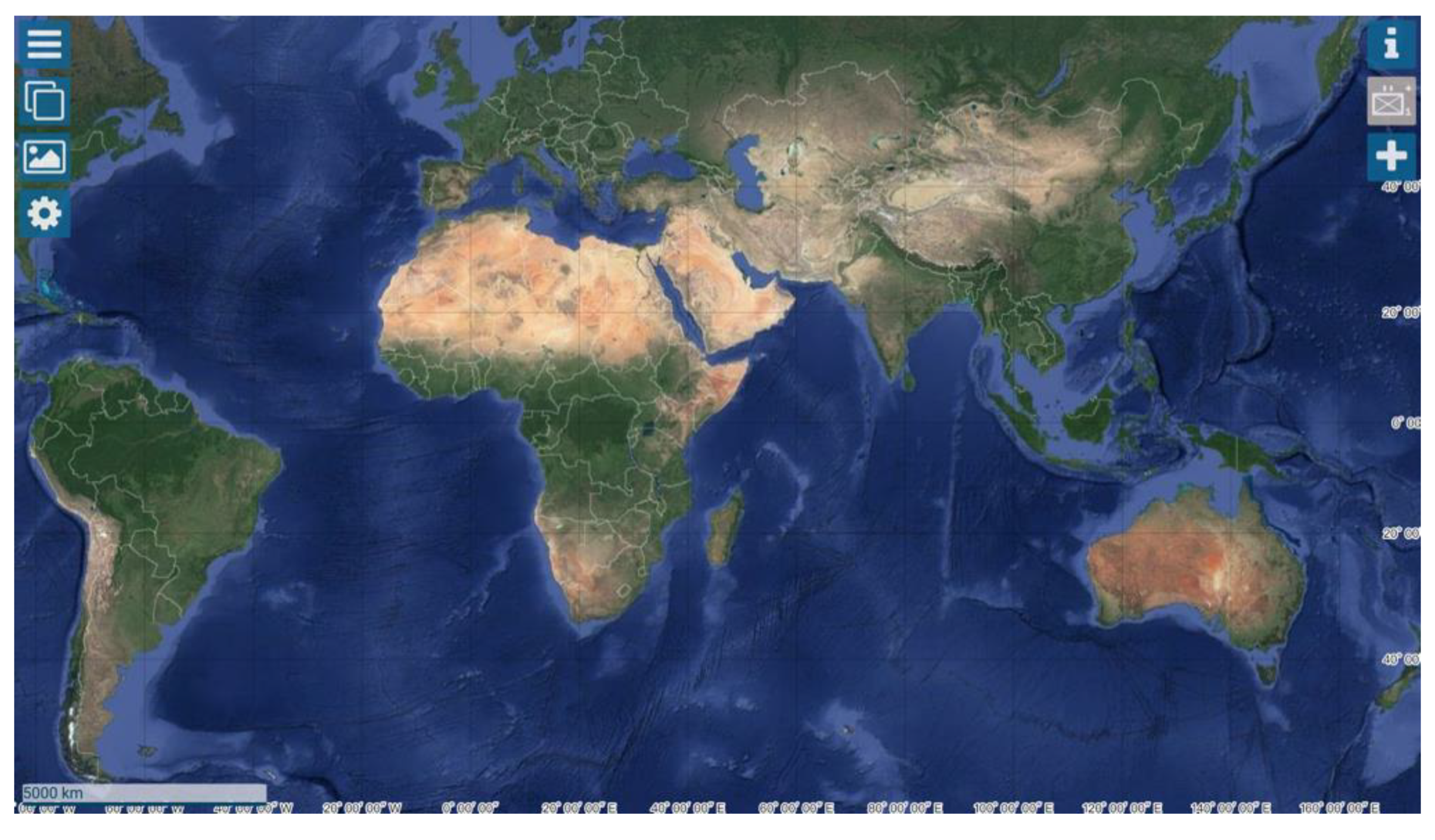
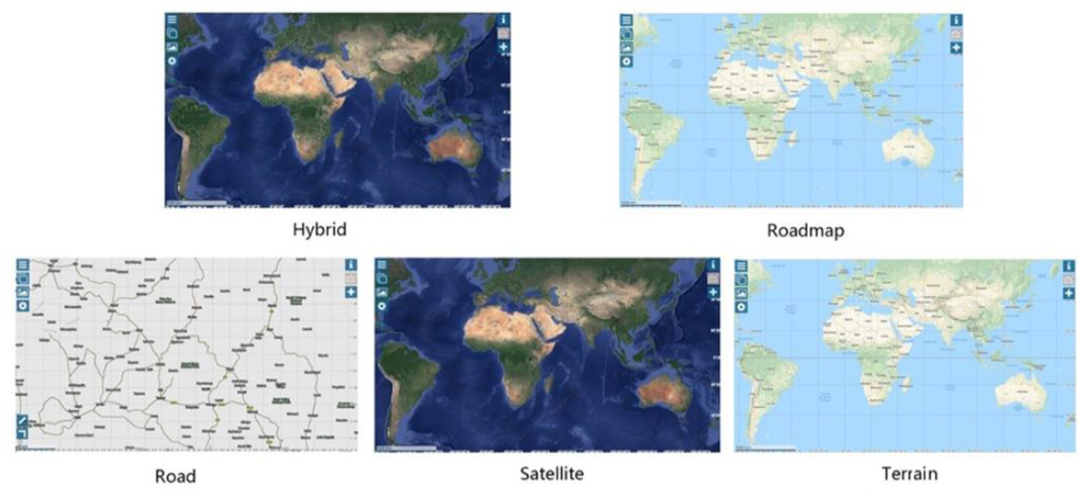
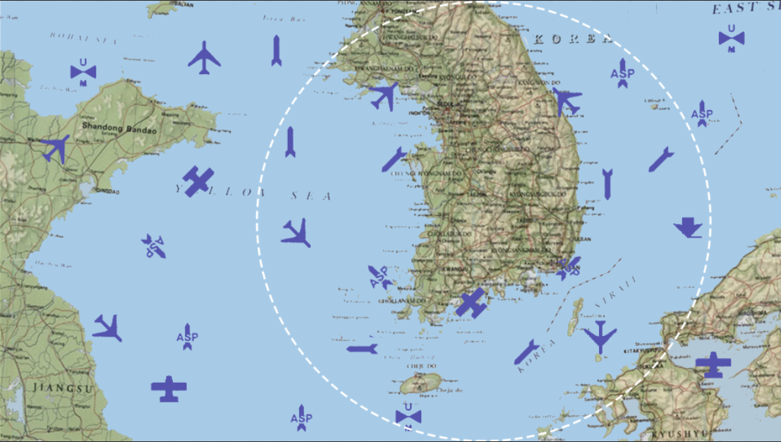
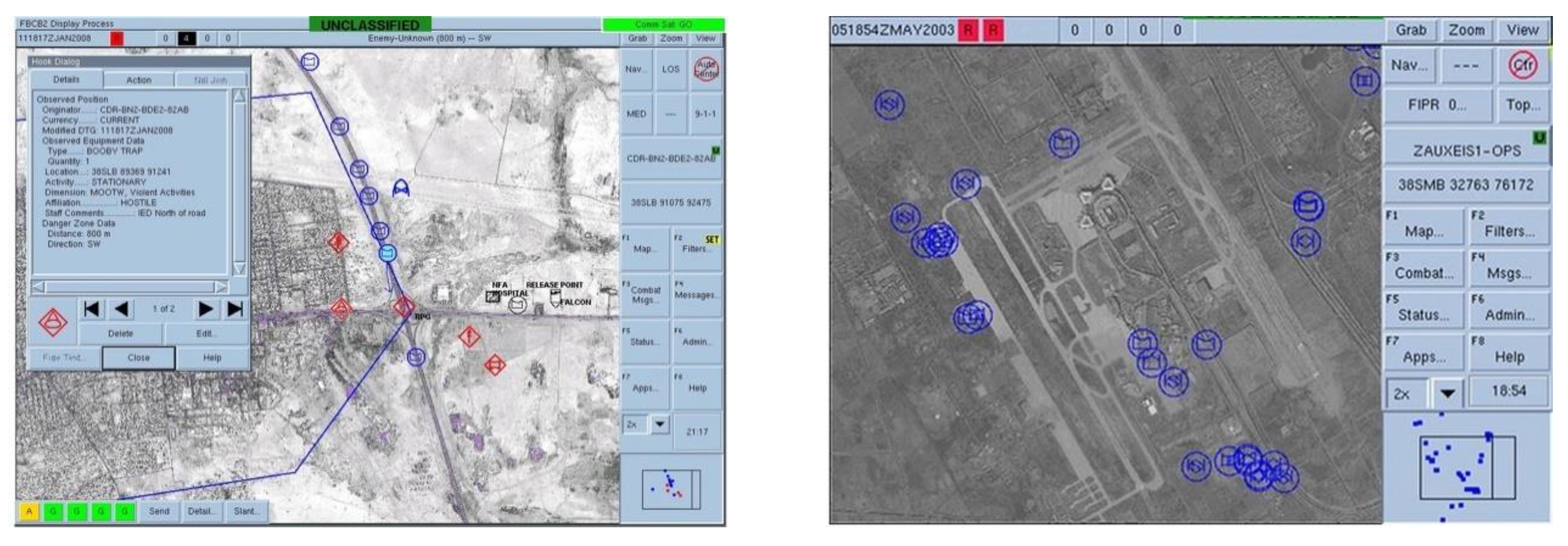
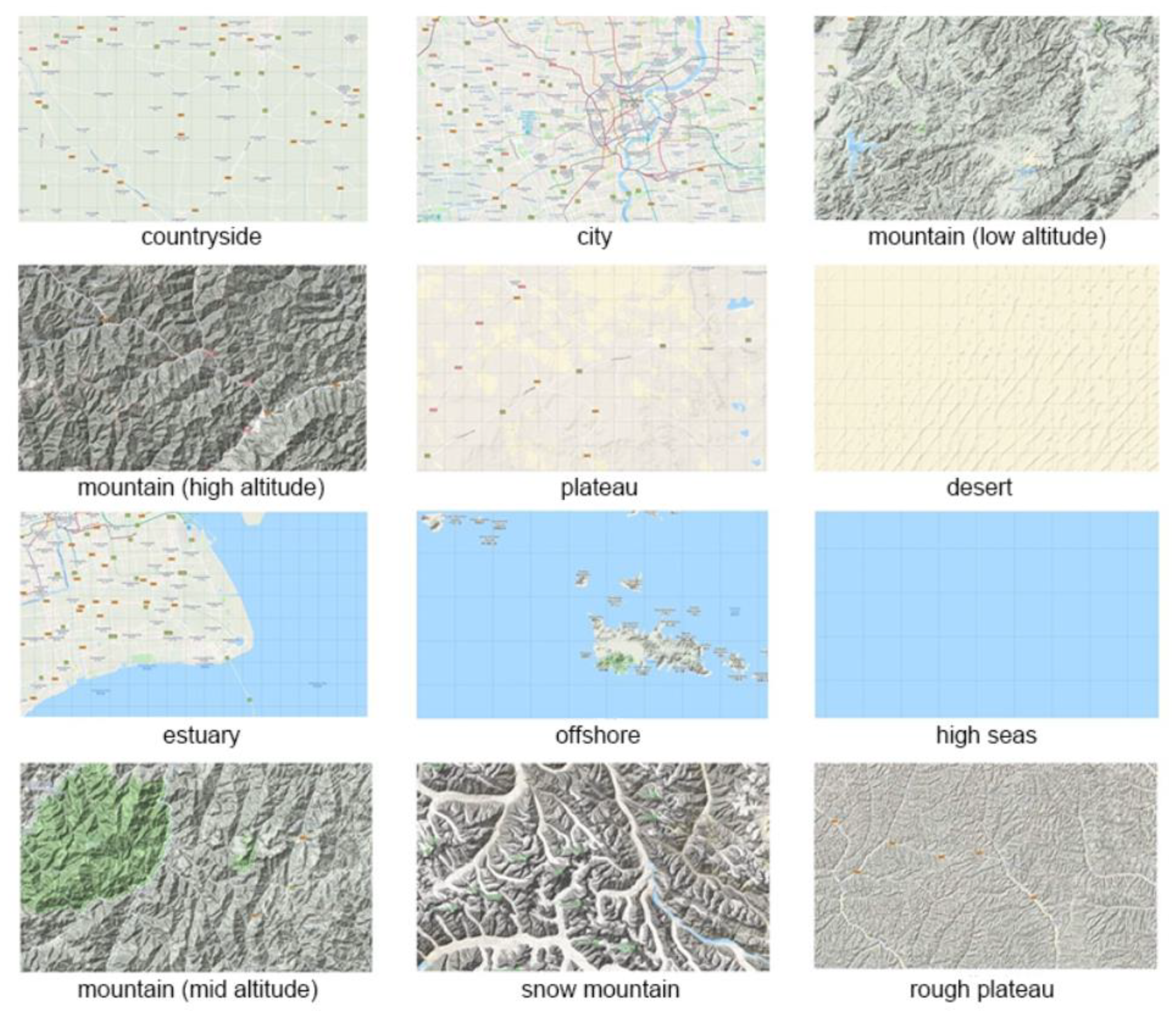
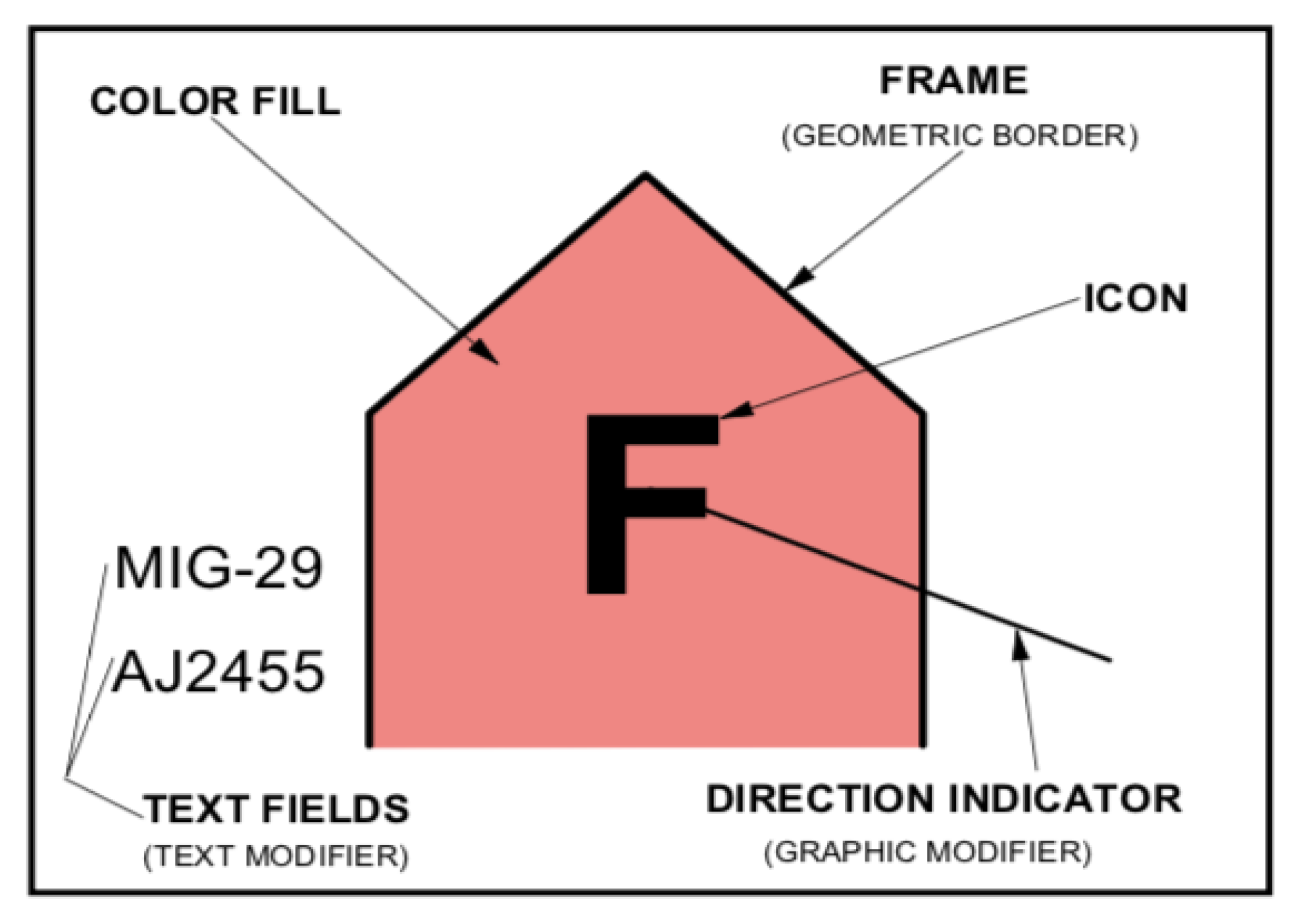
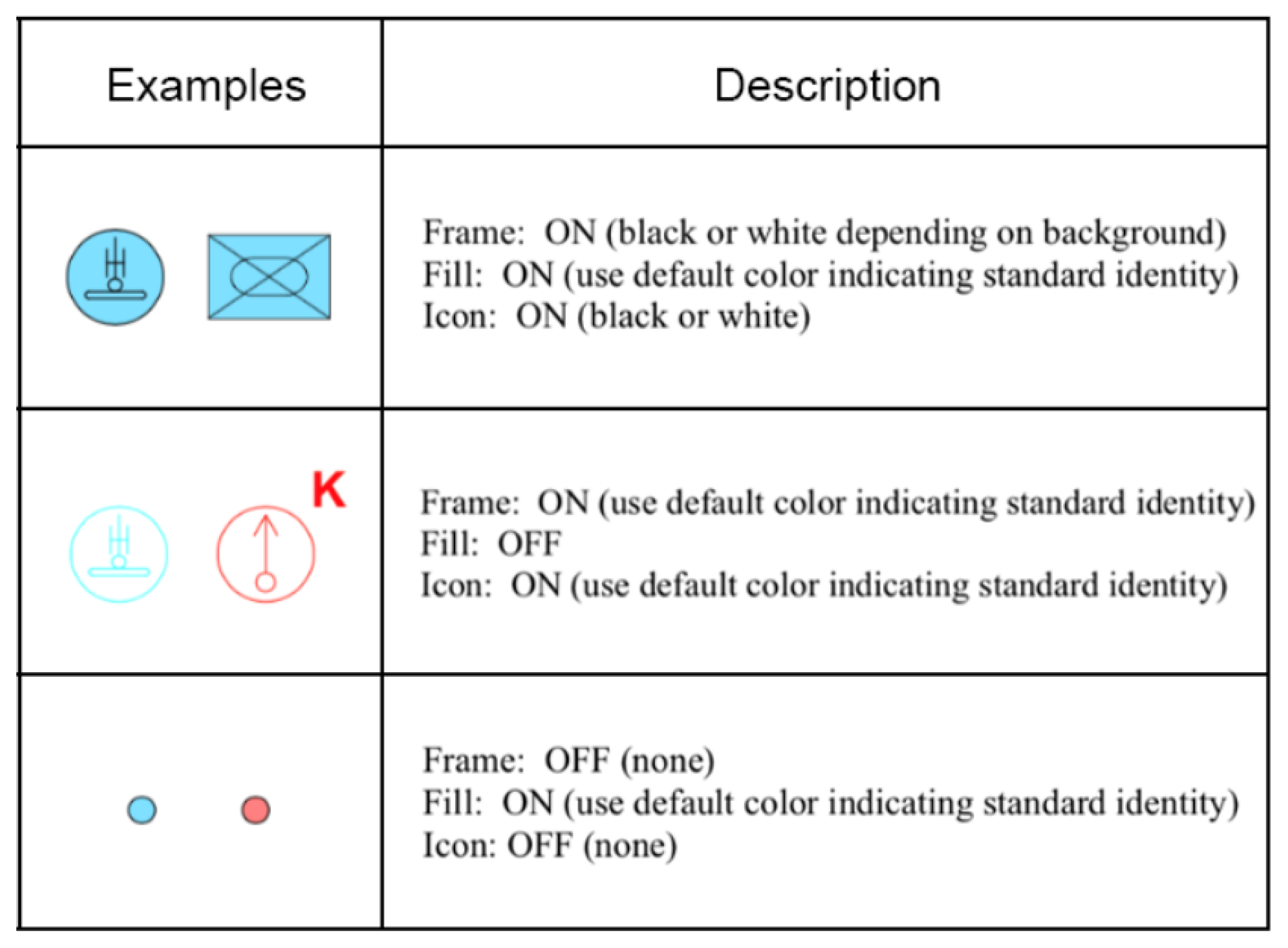
2.1. Situation Maps
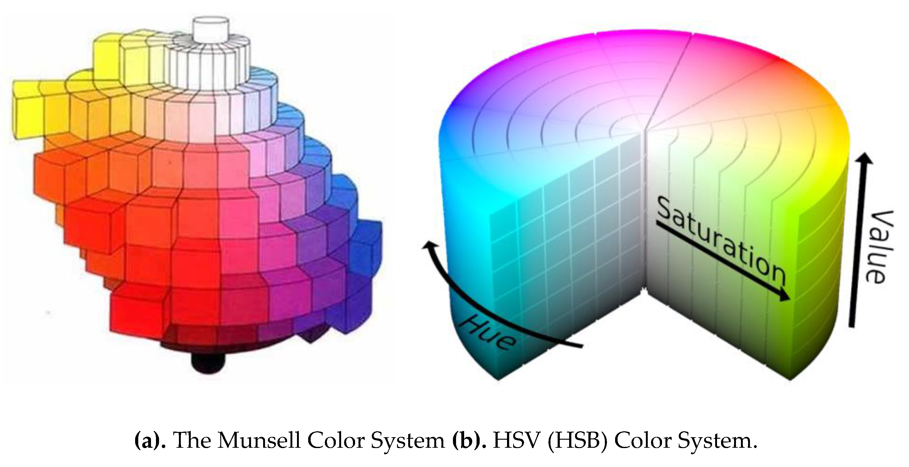
2.2. Color Heories
2.3. EEG Technology
3. Methodology
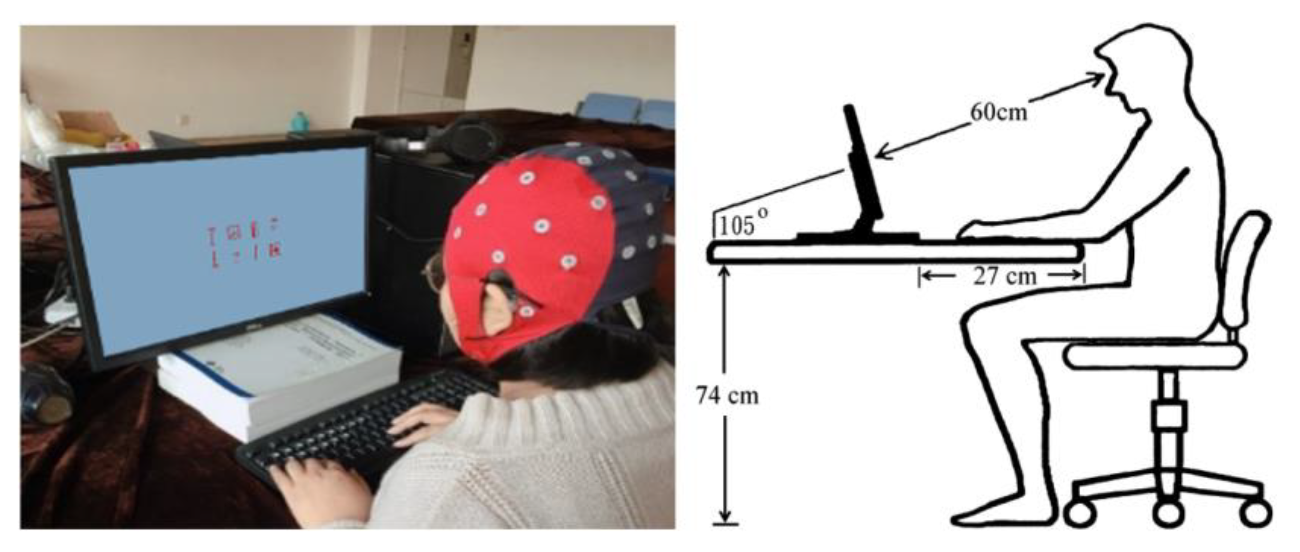
3.1. Equipment and Subjects
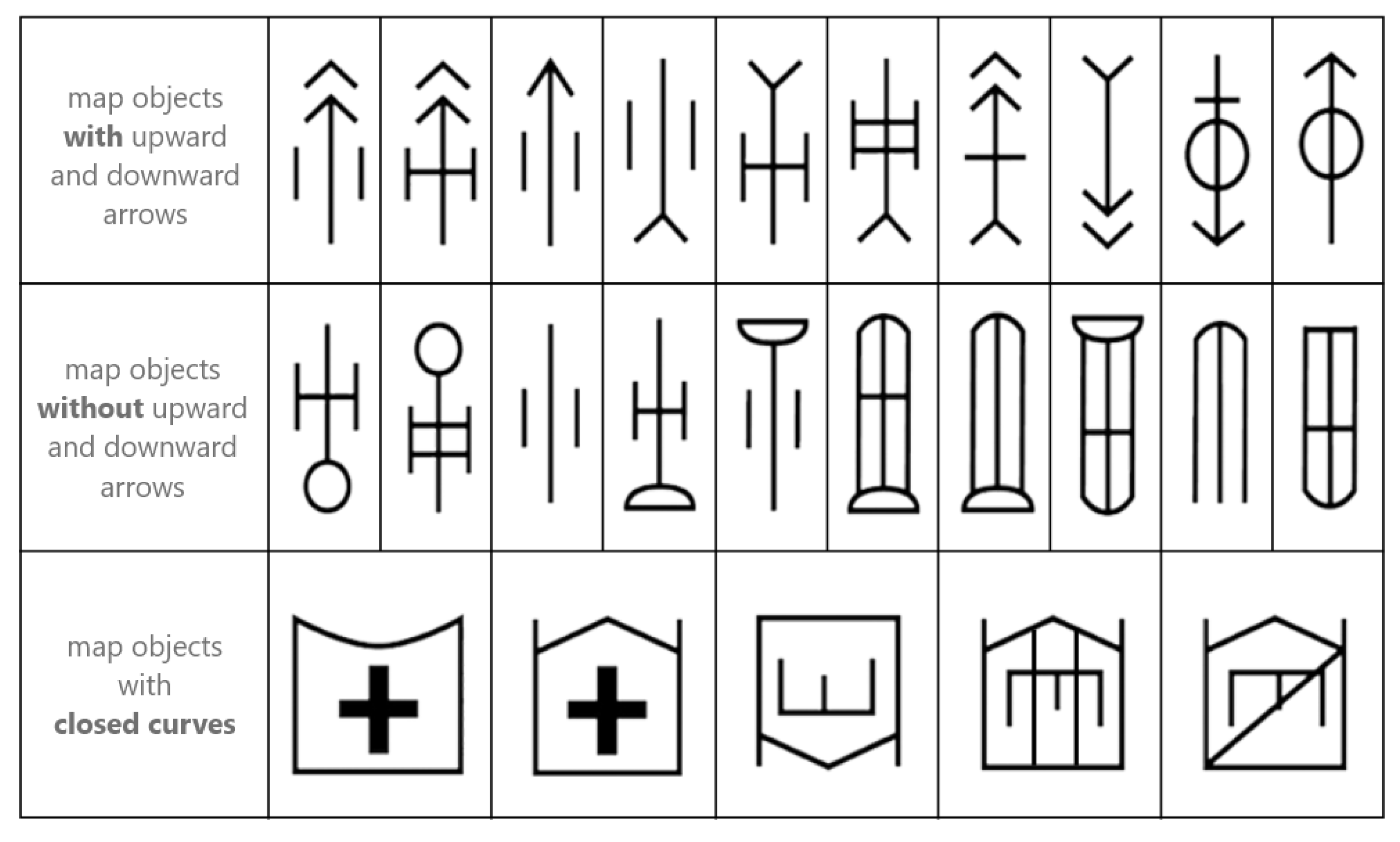
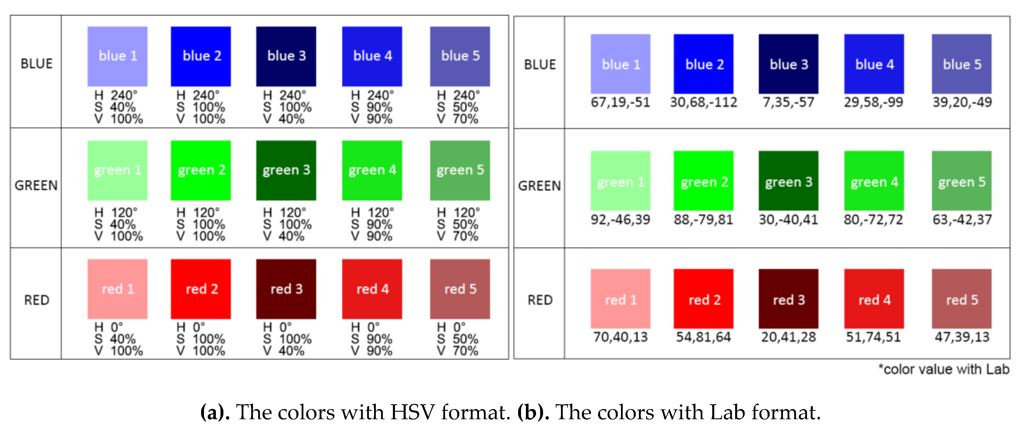
3.2. Experiment Materials
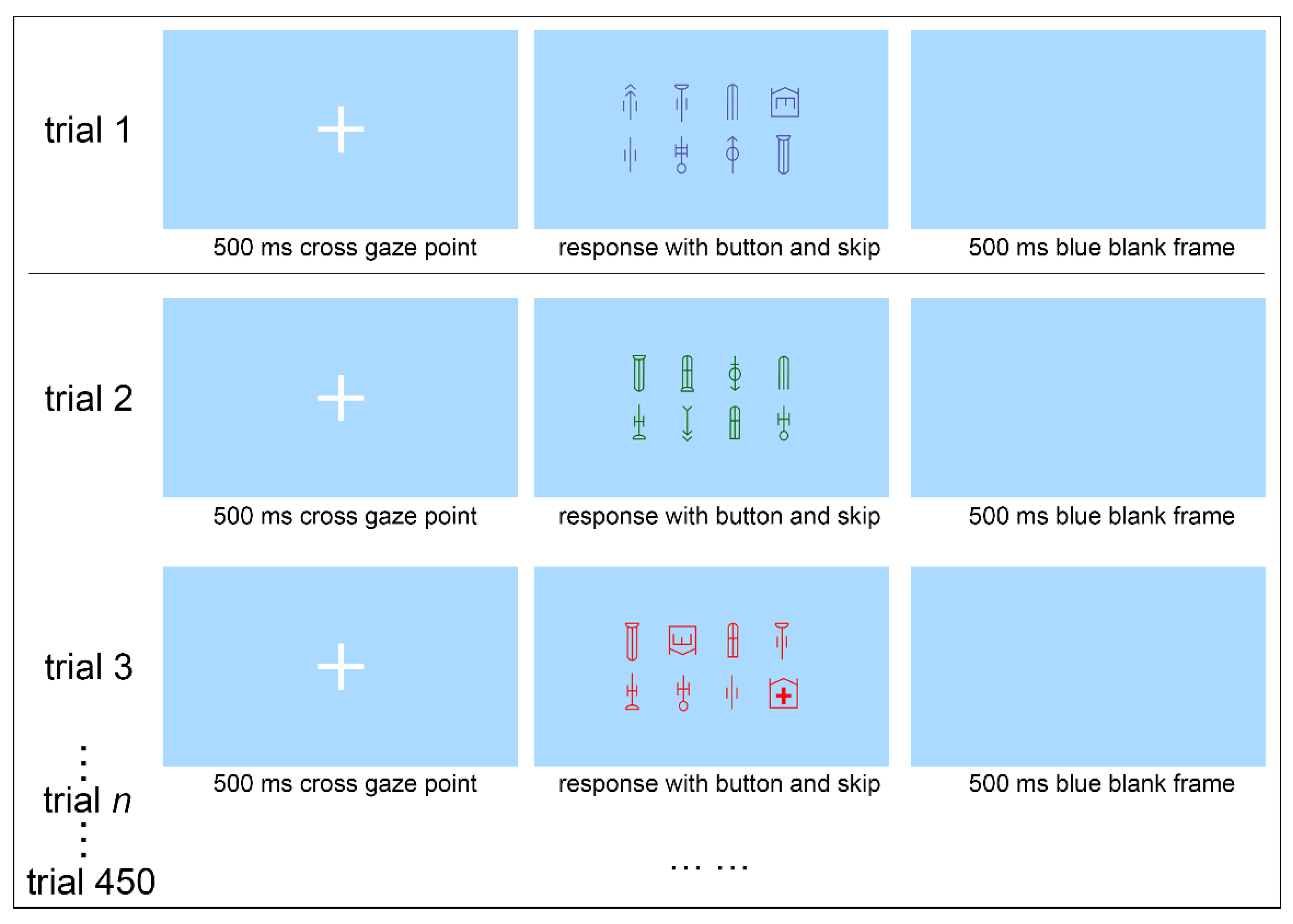
3.3. Experimental Process
3.4. Hypothesis
- Military symbols that induce P300 with a large amplitude and a long latency occupy more cognitive resources, while P300 with a small amplitude and a short latency occupy less cognitive resources.
- Military symbols with high Value have poor color recognition, and their performance are lower than the average level. Military symbols with low Chroma and medium Value are more recognizable and have better performance.
4. Results and Data Analysis
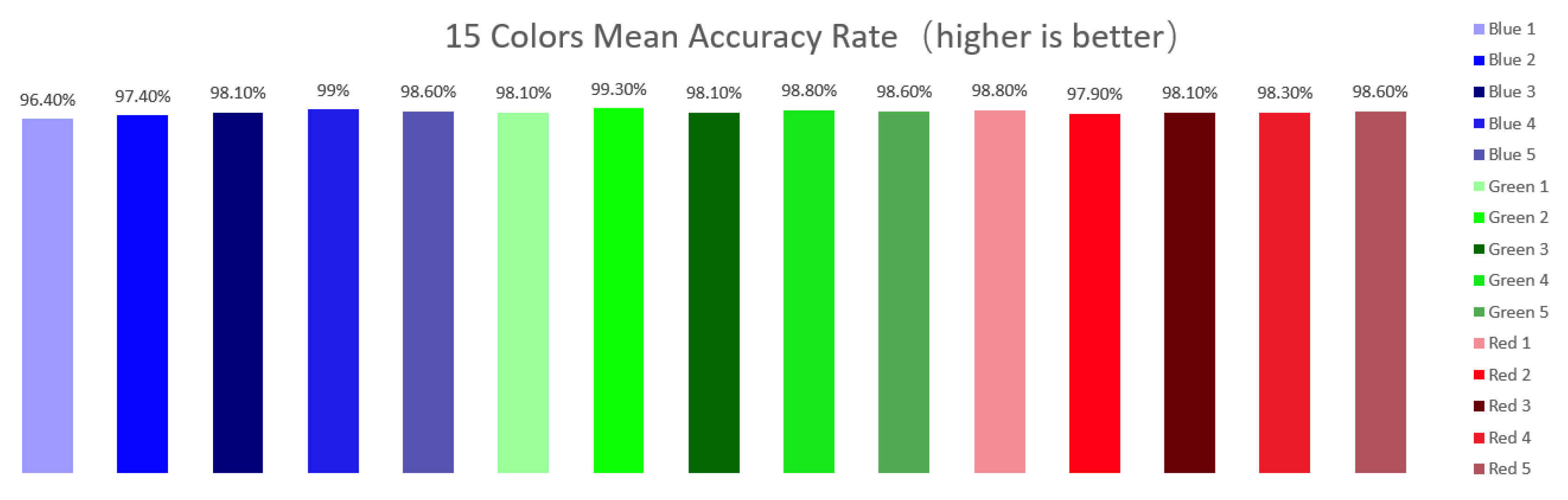
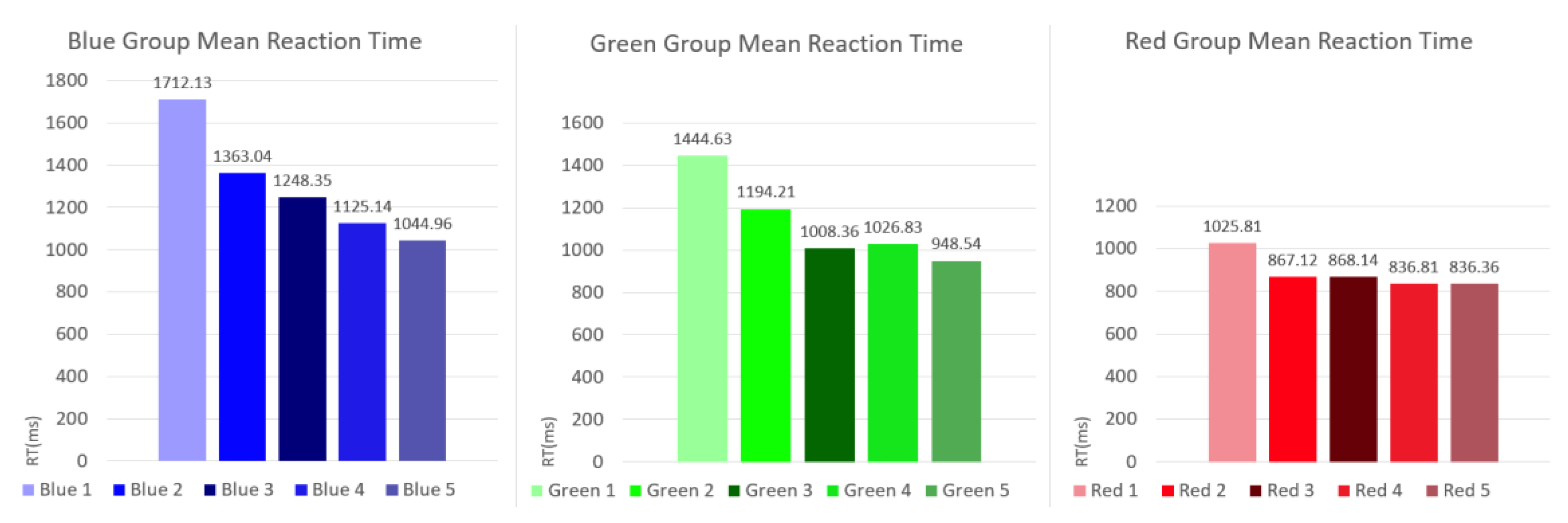
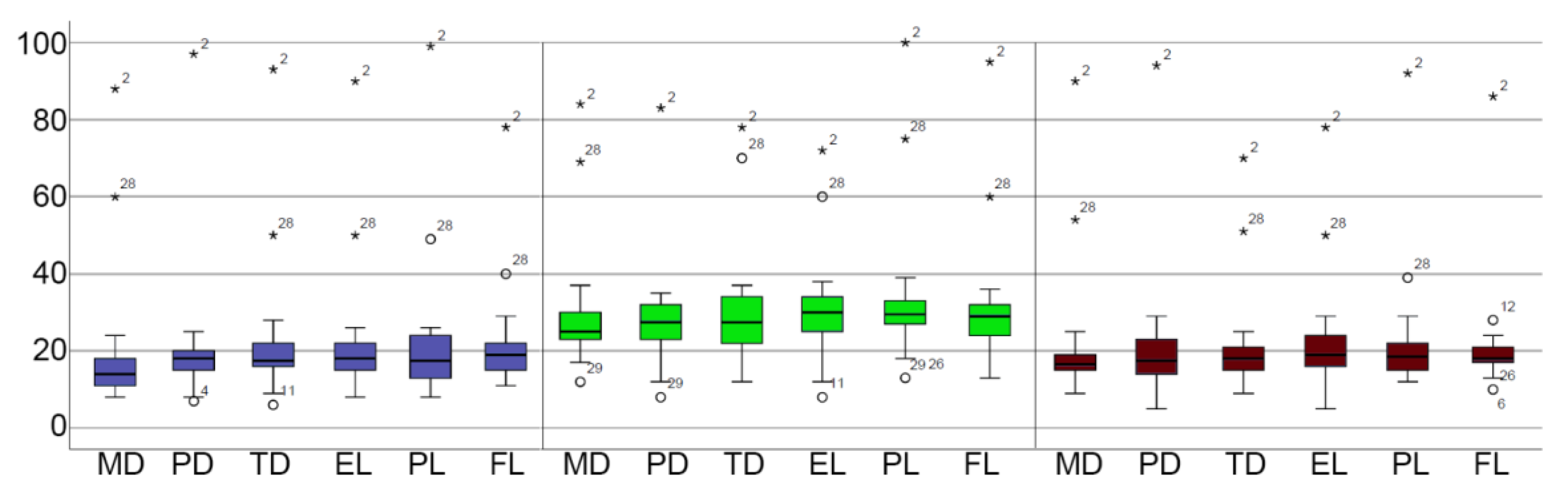
4.1. Behavioral Data
4.2. EEG Data
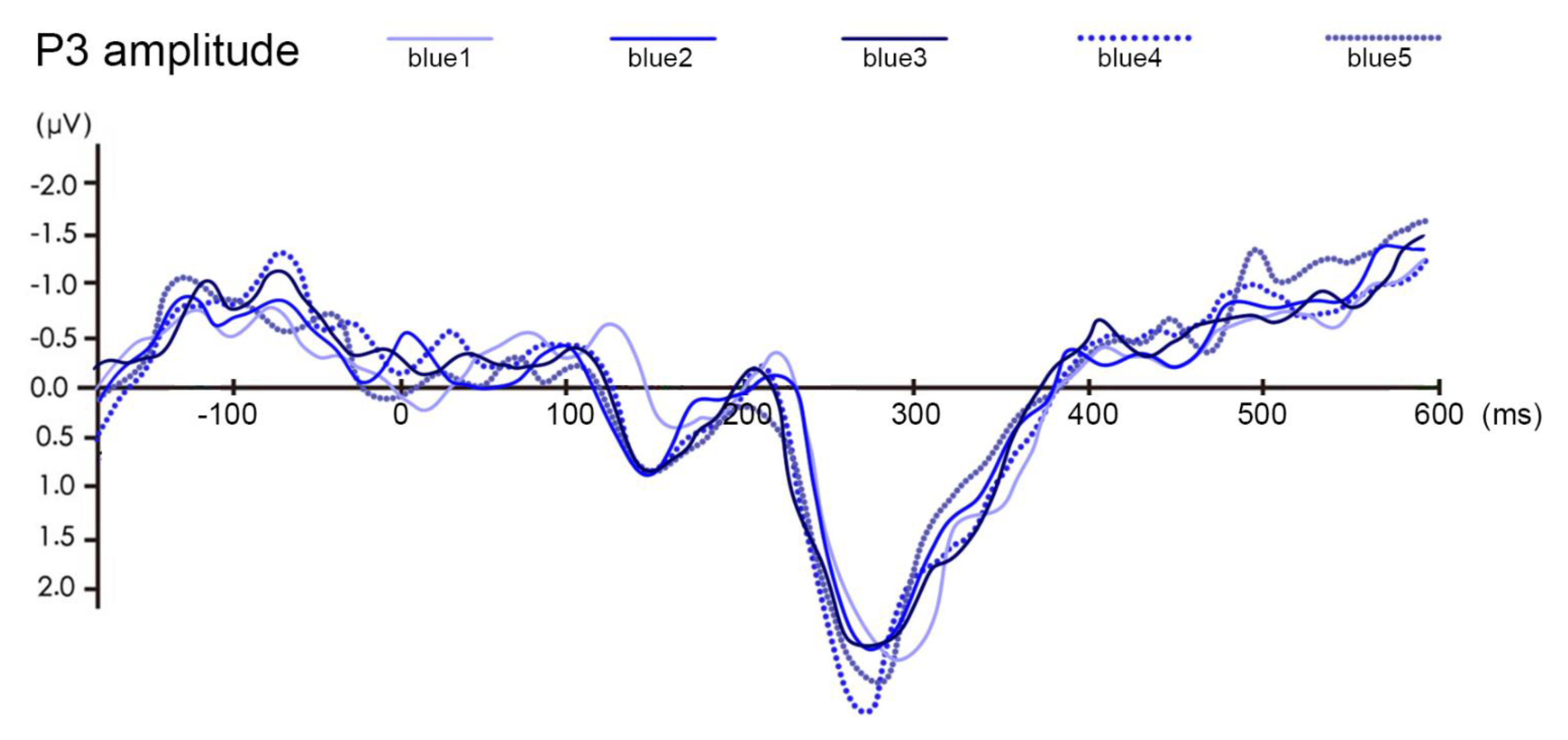
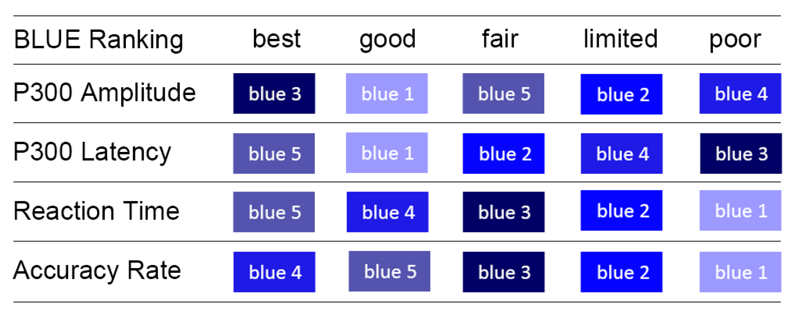
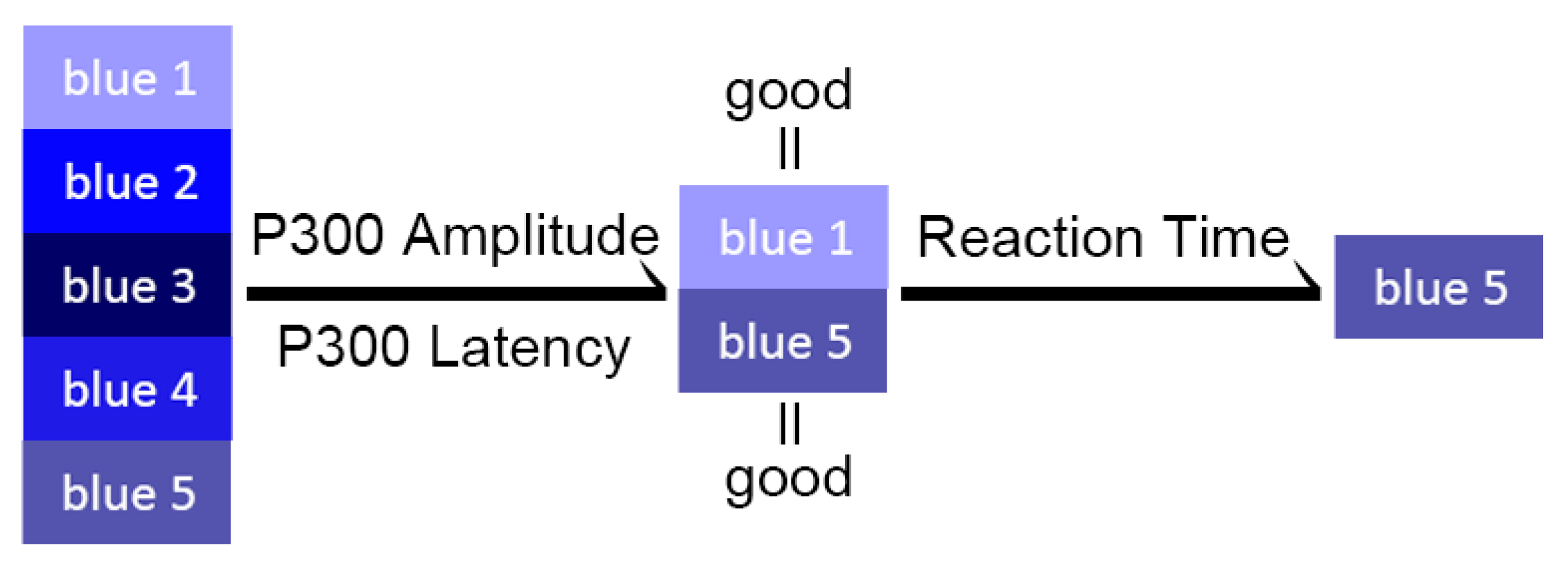
4.2.1. Blue Series
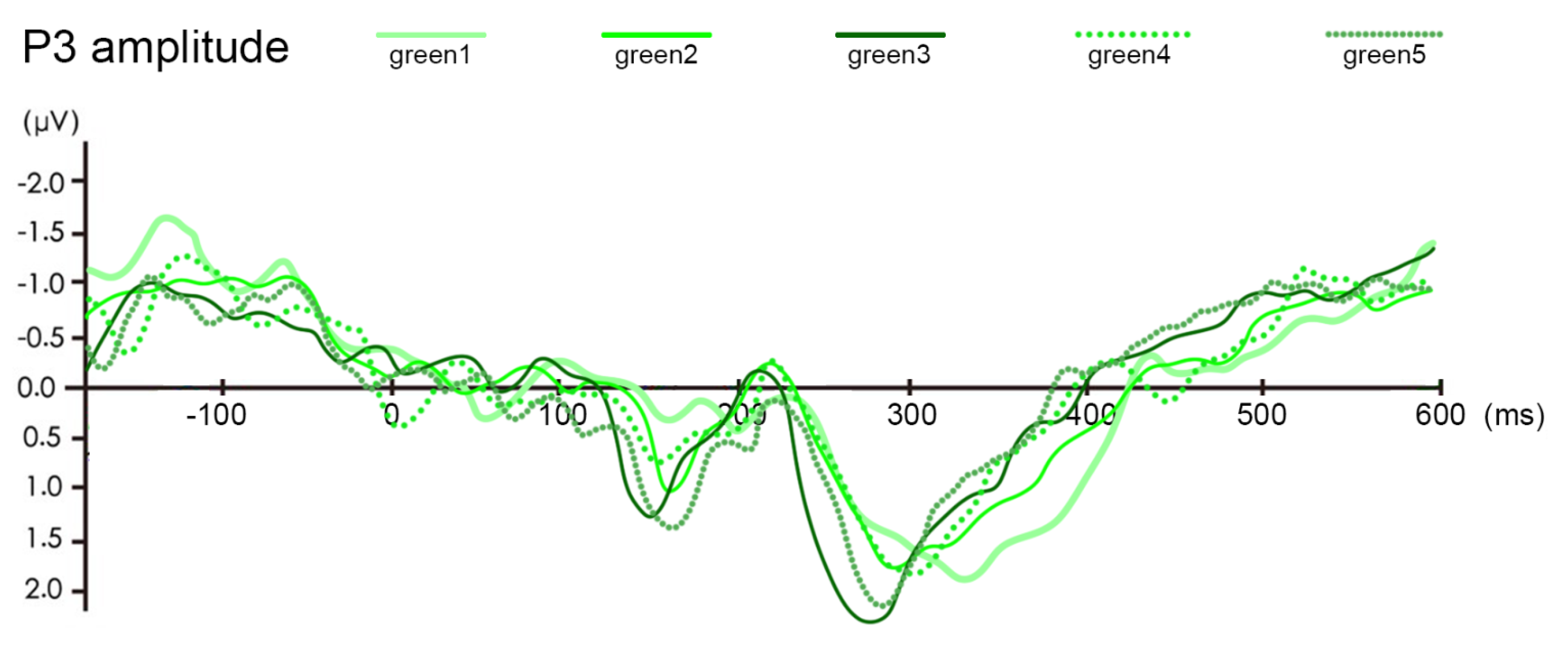
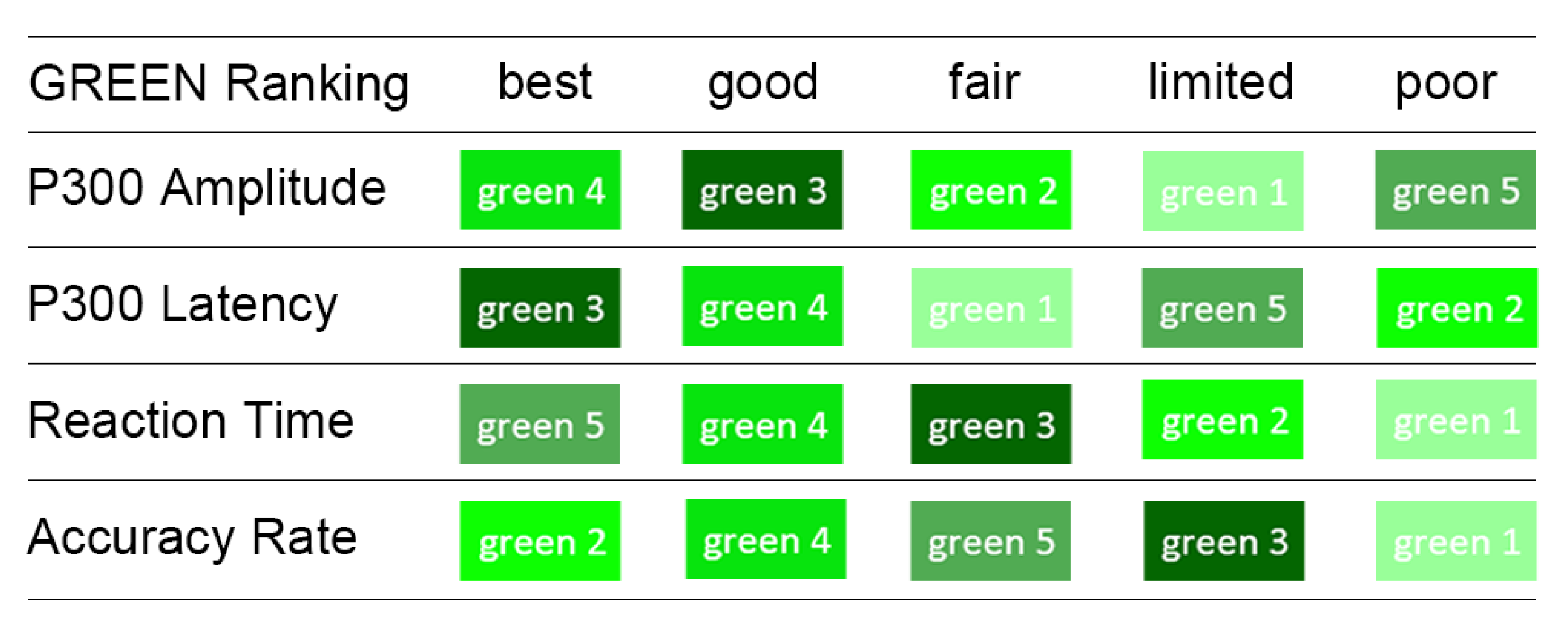
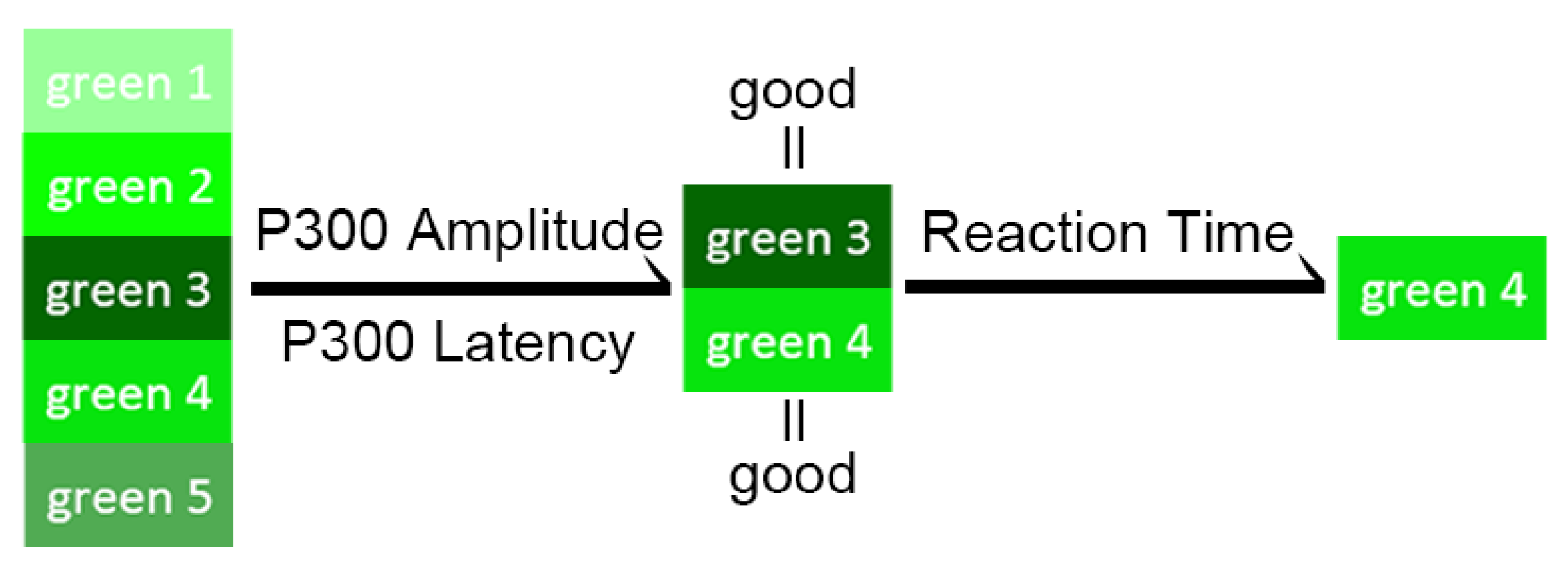
4.2.2. Green Series
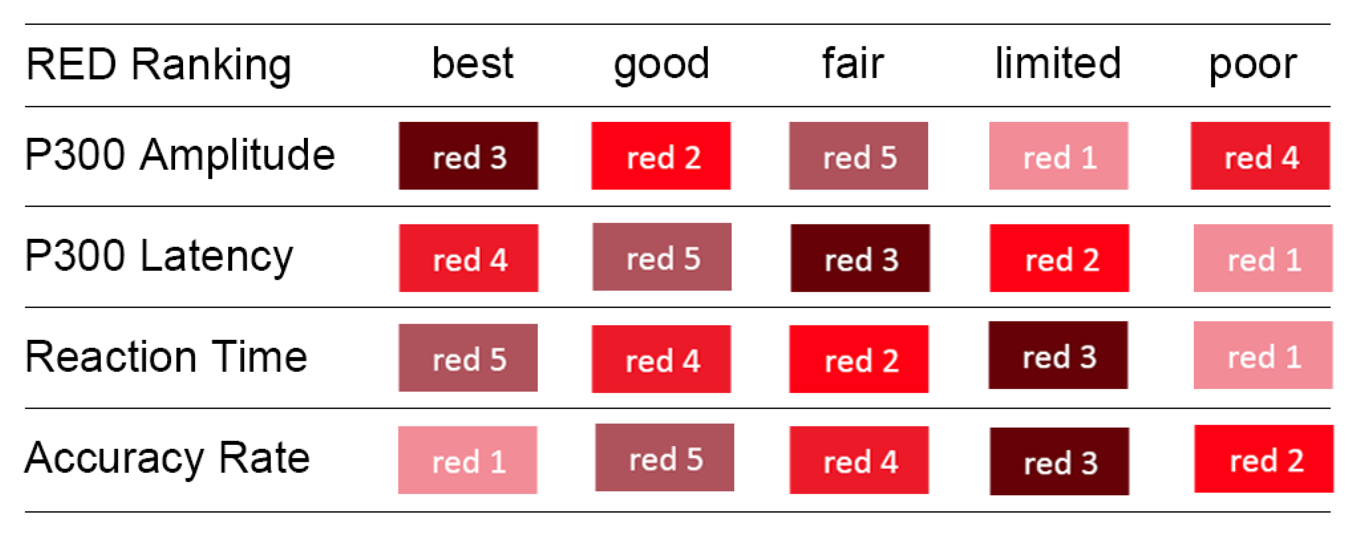
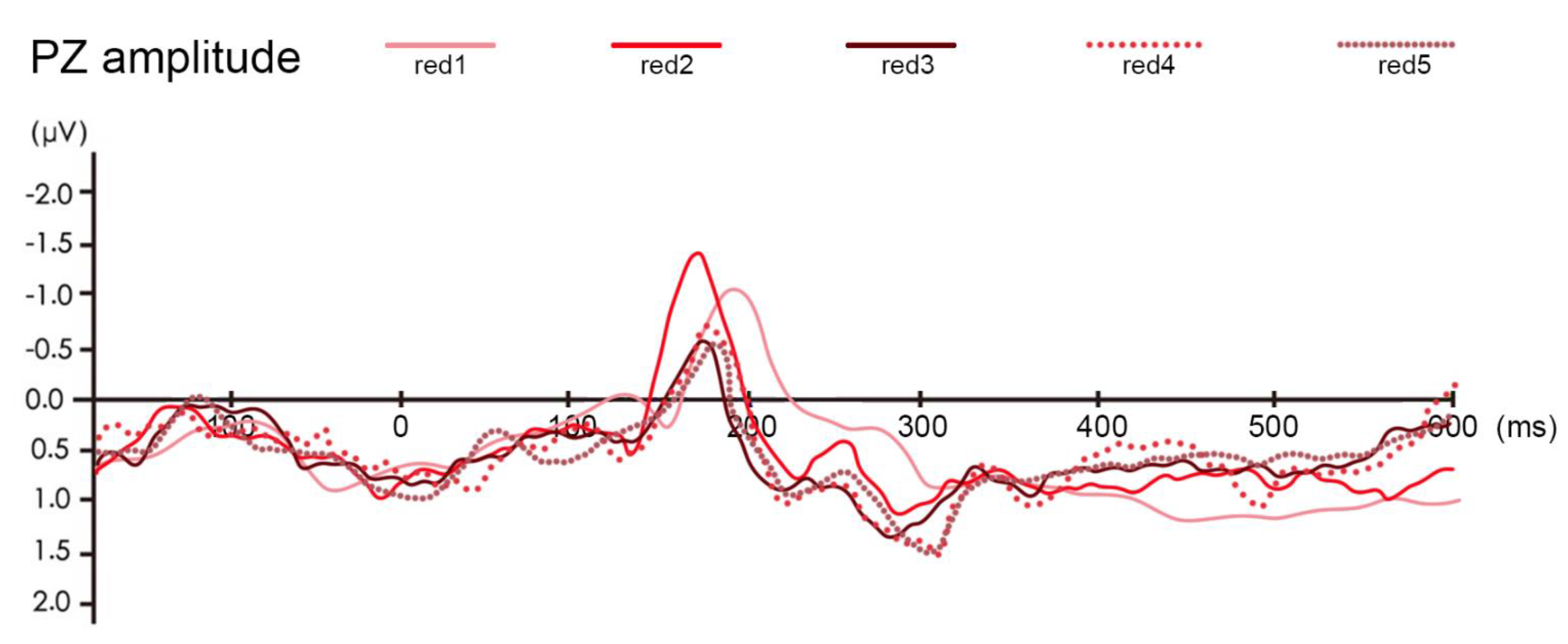
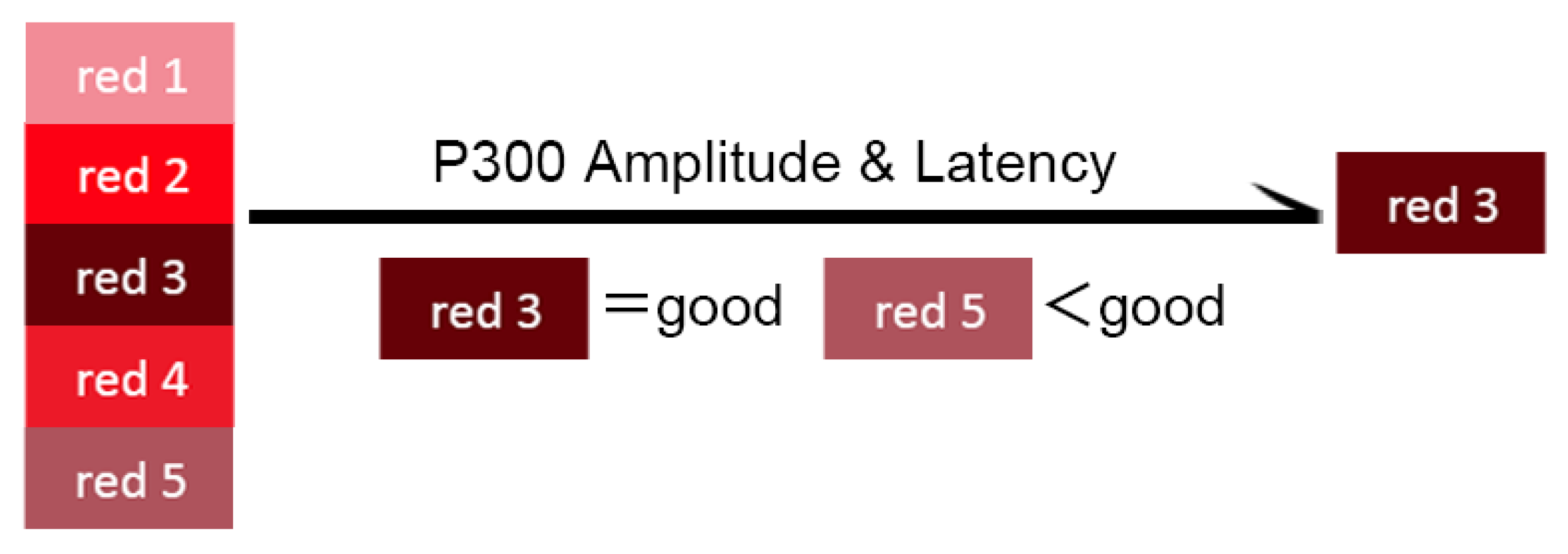
4.2.3. Red Series
5. Discussion
5.1. Behavior Experiment
5.2. P300
5.3. Color Sorting and Selecting Method
6. Verification Experiment Based on the NASA-TLX Scale
7. Conclusions
8. Future Work
Author Contributions
Funding
Acknowledgments
Conflicts of Interest
References
- Jiang, J.J.; Wang, Y.Q.; Zhang, L.; Wu, D.Q.; Li, M.; Xie, T.; Li, P.C.; Dai, L.C.; Li, P.Y.; Shi, X.Y.; et al. A cognitive reliability model research for complex digital human-computer interface of industrial system. Saf. Sci. 2018, 108, 196–202. [Google Scholar] [CrossRef]
- Ulf Ahlstrom, L.A. Color Usability on Air Traffic Control Displays. Hum. Factors Ergon. Soc. Annu. Meet. Proc. 2005, 49. [Google Scholar] [CrossRef] [Green Version]
- Chiang, Y.Y.; Leyk, S.; Nazari, N.H.; Moghaddam, S.; Tan, T.X. Assessing the impact of graphical quality on automatic text recognition in digital maps. Comput. Geosci. 2016, 93, 21–35. [Google Scholar] [CrossRef]
- Li, L.; Hasegawa, K.; Nii, I.; Tanaka, S. Fused Transparent Visualization of Point Cloud Data and Background Photographic Image for Tangible Cultural Heritage Assets. ISPRS Int. Geo-Inf. 2019, 8, 343. [Google Scholar] [CrossRef] [Green Version]
- Boulhic, L.; Bignon, A.; Silone, F.; Morineau, T.; Rechard, J.; Bouillon, J.-F. Effects of color codes used on marine supervision HMI on mental workload and information retrieval: Experimentations with novices and experts. Int. J. Ind. Ergon. 2018, 67, 180–191. [Google Scholar] [CrossRef]
- Yang, C.N. The Study and Application of Flat Design Style Interface Based on Color Psychological Effect. Xi’an Polytechnic University. 2016. Available online: http://kns.cnki.net/kns/detail/detail.aspx?FileName=1016094262.nh&DbName=CMFD2016. (accessed on 16 May 2020).
- Sun, W.T.M.R.J.; Qin, S.Y.; Ai, X.; Xu, J.Y.; Hou, Y.P.; Zhang, G.Y. Application of Color Matching Method Based on Image Derivation In APP Interface Design. Microcomput. Appl. 2017, 33, 22–25. [Google Scholar]
- Tian, J.; Peng, K.; Jia, F.; Xia, Q. The Concept of Symbol-morpheme and its Application in Map Symbols Design. In Proceedings of the 2013 21st International Conference on Geoinformatics, Kai Feng, China, 20–22 June 2013. [Google Scholar]
- Scholz, R.W.; Lu, Y.M. Uncertainty in Geographic Data on Bivariate Maps: An Examination of Visualization Preference and Decision Making. ISPRS Int. Geo-Inf. 2014, 3, 1180–1197. [Google Scholar] [CrossRef]
- Akcay, O.; Avsar, E.O.; Inalpulat, M.; Genc, L.; Cam, A. Assessment of Segmentation Parameters for Object-Based Land Cover Classification Using Color-Infrared Imagery. ISPRS Int. Geo-Inf. 2018, 7, 424. [Google Scholar] [CrossRef] [Green Version]
- Shive, J.; Francis, G. Choosing Colors for Map Display Icons Using Models of Visual Search. Hum. Factors 2013, 55, 373–396. [Google Scholar] [CrossRef]
- Skopeliti, A.; Stamou, L. Online Map Services: Contemporary Cartography or a New Cartographic Culture? ISPRS Int. Geo-Inf. 2019, 8, 215. [Google Scholar] [CrossRef] [Green Version]
- Li, W.; Chen, Y.; Qian, L.; Liu, X. Personalized Map Symbol Design Mechanism Based on Linguistics. Acta Geod. Cartogr. Sin. 2015, 44, 323–329. [Google Scholar]
- Tian, J.; Jia, F.; Xia, Q.; Wu, J. Design Method of the Semantic-driven Hierarchical Map Symbols. J. Geo-Inf. Sci. 2012, 14, 736–743. [Google Scholar] [CrossRef]
- Ooms, K.; De Maeyer, P.; Fack, V. Analysing Eye Movement Patterns To Improve Map Design. In Proceedings of the AutoCarto 2010, Cartography and Geographic Information Society (CaGIS), Orlando, FL, USA, 15–18 November 2010; Volume 38. [Google Scholar]
- Coeltekin, A.; Brychtova, A.; Griffin, A.L.; Robinson, A.C.; Imhof, M.; Pettit, C. Perceptual complexity of soil-landscape maps: A user evaluation of color organization in legend designs using eye tracking. Int. J. Digit. Earth 2017, 10, 560–581. [Google Scholar] [CrossRef]
- Liu, X.; Chen, Y. Frame Design for Point-shaped Map Symbol Based on Eye Movement Experiment. J. Geomat. Sci. Technol. 2016, 33, 644–649. [Google Scholar]
- Babiloni, F.; Babiloni, C.; Carducci, F.; Fattorini, L.; Anello, C.; Onorati, P.; Urbano, A. High resolution EEG: A new model-dependent spatial deblurring method using a realistically-shaped MR-constructed subject’s head model. Electroencephalogr. Clin. Neurophysiol. 1997, 102, 69–80. [Google Scholar] [CrossRef]
- Rahm, B.; Kaiser, J.; Unterrainer, J.M.; Simon, J.; Bledowski, C. fMRI characterization of visual working memory recognition. Neuroimage 2014, 90, 413–422. [Google Scholar] [CrossRef]
- Perri, R.L.; Berchicci, M.; Bianco, V.; Quinzi, F.; Spinelli, D.; Di Russo, F. Perceptual load in decision making: The role of anterior insula and visual areas. An ERP study. Neuropsychologia 2019, 129, 65–71. [Google Scholar] [CrossRef]
- Kutas, M.; McCarthy, G.; Donchin, E. Augmenting Mental Chronometry—P300 As A Measure of Stimulus Evaluation Time. Science 1977, 197, 792–795. [Google Scholar] [CrossRef]
- Niu, Y.F.; Xue, C.Q.; Zhou, X.Z.; Zhou, L.; Xie, Y.; Wang, H.Y.; Tang, W.Z.; Wu, W.Y.; Guo, Q.; Jin, T. Which is more prominent for fighter pilots under different flight task difficulties: Visual alert or verbal alert? Int. J. Ind. Ergon. 2019, 72, 146–157. [Google Scholar] [CrossRef]
- Gao, T.T. Data Visualization Cognitive Load Research Based on ERP/EEG Mobile Terminal; Donghua University: Shanghai, China, 2018. [Google Scholar]
- Niu, Y.; Xue, C.; Li, X.; Li, J.; Wang, H.; Jin, T. Icon memory research under different time pressures and icon quantities based on event-related potential. J. Southeast Univ. 2014, 30, 45–50. [Google Scholar]
- Chen, W.W.W.; Fang, Z. Study of personality characters, psychological health state and auditory P300 on pilots. Clin. Electroencephalol. 1997, 06, 226–228. [Google Scholar]
- Zhang, J.L. Analysis on Mental Stress of Pilots with Different Personality in Simulated Flight; Medical school of Chinese PLA: Shanghai, China, 2013. [Google Scholar]
- Jin, T.; Xue, C.; Wang, H.; Niu, Y. Research on evaluating methods of situation awareness of digital graphical interfaces. Chin. J. Eng. Des. 2014, 21, 87–91. [Google Scholar]
- Yeh, Y.-Y.; Lee, D.-S.; Ko, Y.-H. Color combination and exposure time on legibility and EEG response of icon presented on visual display terminal. Displays 2013, 34, 33–38. [Google Scholar] [CrossRef]
- Zhao, Z.G.L.J.L.; Wang, K. The Concept, Structure and Efficiency of Battlefield Situation Assessment. J. CAE 2010, 5, 226–230. [Google Scholar]
- Yuan, K.S.Z.R.Q.; Wang, Y.J.; Lu, B.Y. Study on Fundamental Conceptions and Subject System of the Modern Map and Cartography. Geo-Inf. Sci. 2007, 9, 100–108. [Google Scholar]
- Liu, L.Y.Y.F.; Ma, Y.R. The construction of Bohai marine reserve from the perspective of ecological civilization. Dong Yue Trib. 2013, 34, 33–35. [Google Scholar]
- DoD(USA). MIL-STD-2525C, Common Warfighting Symbology. In Interface Standard; DOD: Washington, DC, USA, 2008. [Google Scholar]
- Ma, S.H.Y.Z. Application of color in ergonomics. Sci. Technol. Inf. 2009, 24, 70. [Google Scholar]
- QI Yong, X.Y.-f. Research on the Application of Munsell Color System in LED Image Display. Adv. Disp. 2012, 140, 171–175. [Google Scholar]
- Jimenez, R.; Redondo, B.; Molina, R.; Angel Martinez-Domingo, M.; Hernandez-Andres, J.; Vera, J. Short-term effects of text-background color combinations on the dynamics of the accommodative response. Vis. Res. 2020, 166, 33–42. [Google Scholar] [CrossRef]
- Prasad, D.K.; Wenhe, L. Metrics and statistics of frequency of occurrence of metamerism in consumer cameras for natural scenes. J. Opt. Soc. Am. A-Opt. Image Sci. Vis. 2015, 32, 1390–1402. [Google Scholar] [CrossRef]
- Ikeda, M.; Yaguchi, H.; Sagawa, K. Brightness Luminous-Efficiency Functions for 2-Degree and 10-Degree Fields. J. Opt. Soc. Am. 1982, 72, 1660–1665. [Google Scholar] [CrossRef] [PubMed] [Green Version]
- Trezona, P.W. Derivation of the 1964 CIE 10 degrees XYZ colour-matching functions and their applicability in photometry. Color Res. Appl. 2001, 26, 67–75. [Google Scholar] [CrossRef]
- Wei, J.H.L.Y.J. The Theory and Technology of Event-Related Potentials; Science Press: Beijing, China, 2010; pp. 52–55. [Google Scholar]
- Clifford, A.; Holmes, A.; Davies, I.R.L.; Franklin, A. Color categories affect pre-attentive color perception. Biol. Psychol. 2010, 85, 275–282. [Google Scholar] [CrossRef] [PubMed] [Green Version]
- Oxner, M.; Rosentreter, E.T.; Hayward, W.G.; Corballis, P.M. Prediction errors in surface segmentation are reflected in the visual mismatch negativity, independently of task and surface features. J. Vis. 2019, 19. [Google Scholar] [CrossRef] [PubMed] [Green Version]
- Wiens Stefan, v.B.E. Szychowska Malina, Eklund Rasmus. Visual Perceptual Load Does Not Affect the Frequency Mismatch Negativity. Front. Psychol. 2019, 10, 1970. [Google Scholar] [CrossRef] [Green Version]
- Male, A.G.; O’Shea, R.P.; Schroger, E.; Muller, D.; Roeber, U.; Widmann, A. The quest for the genuine visual mismatch negativity (vMMN): Event-related potential indications of deviance detection for low-level visual features. Psychophysiology 2020. [Google Scholar] [CrossRef] [Green Version]
- Delogu, F.; Brouwer, H.; Crocker, M.W. Event-related potentials index lexical retrieval (N400) and integration (P600) during language comprehension. Brain Cogn. 2019, 135. [Google Scholar] [CrossRef]
- Liu, B.; Wu, G.; Meng, X.; Dang, J. Correlation Between Prime Duration and Semantic Priming Effect: Evidence From N400 Effect. Neuroscience 2013, 238, 319–326. [Google Scholar] [CrossRef]
- Rama, P.; Sirri, L.; Serres, J. Development of lexical-semantic language system: N400 priming effect for spoken words in 18-and 24-month old children. Brain Lang. 2013, 125, 1–10. [Google Scholar] [CrossRef]
- Proverbio, A.M.; Riva, F. RP and N400 ERP components reflect semantic violations in visual processing of human actions. Neurosci. Lett. 2009, 459, 142–146. [Google Scholar] [CrossRef] [Green Version]
- Morrison, C.; Taler, V. ERP measures of the effects of age and bilingualism on working memory performance. Neuropsychologia 2020, 143, 107468. [Google Scholar] [CrossRef] [PubMed]
- Han, T.; Xiu, L.C.; Yu, G.M. The impact of media situation on people’s memory effect—An ERP study. Comput. Hum. Behav. 2020, 104. [Google Scholar] [CrossRef]
- Berti, S.; Haycock, B.; Adler, J.; Keshavarz, B. Early cortical processing of vection-inducing visual stimulation as measured by event-related brain potentials (ERP). Displays 2019, 58, 56–65. [Google Scholar] [CrossRef]
- Liu, Q.A.; Li, H.; Jennifer, L.C.; Teeter, C.; Tao, W.D.; Zhang, Q.L.; Sun, H.J. Language suppression effects on the categorical perception of colour as evidenced through ERPs. Biol. Psychol. 2010, 85, 45–52. [Google Scholar] [CrossRef]
- Martin, F.M.D.; Hauk, O.; Pulvermuller, F. Category specificity in the processing of color-related and form-related words: An ERP study. Neuroimage 2006, 29, 29–37. [Google Scholar] [CrossRef] [PubMed]
- Picton, T.W.; Bentin, S.; Berg, P.; Donchin, E.; Hillyard, S.A.; Johnson, R.; Miller, G.A.; Ritter, W.; Ruchkin, D.S.; Rugg, M.D.; et al. Guidelines for using human event-related potentials to study cognition: Recording standards and publication criteria. Psychophysiology 2000, 37, 127–152. [Google Scholar] [CrossRef]
- Ragain, J.C.; Johnson, W.M. Color acceptance of direct dental restorative materials by human observers. Color. Res. Appl. 2000, 25, 278–285. [Google Scholar] [CrossRef]
- Craig, J.M.P. Restorative Dental Materials, 11th ed.; Mosby: St. Louis, MO, USA, 2002; pp. 38–42. [Google Scholar]
- Wee, A.G.; Lindsey, D.T.; Kuo, S.L.; Johnston, W.M. Color accuracy of commercial digital cameras for use in dentistry. Dent. Mater. 2006, 22, 553–559. [Google Scholar] [CrossRef]
- McLaren, K. Development of Cie 1976 (Lab) Uniform Color Space And Color-Difference Formula. J. Soc. Dye. Colour. 1976, 92, 338–341. [Google Scholar] [CrossRef]
- Liu, L.L.; Wang, X.H.; Li, J. The establishment of uniform color space based on LCD monitor. Optik 2017, 139, 338–346. [Google Scholar] [CrossRef]
- Martinez-Domingo, M.A.; Melgosa, M.; Okajima, K.; Medina, V.J.; Collado-Montero, F.J. Spectral Image Processing for Museum Lighting Using CIE LED Illuminants. Sensors 2019, 19, 5400. [Google Scholar] [CrossRef] [PubMed] [Green Version]
- Chen, M.; Fadel, G.; Xue, C.Q.; Wang, H.Y.; Mata, I.; Chen, Y.F. Evaluating the cognitive process of color affordance and attractiveness based on the ERP. Int. J. Interact. Des. Manuf. 2017, 11, 471–479. [Google Scholar] [CrossRef]
- Hasan, R.A.; Reza, F.; Begum, T. Gender Influences on Colour processing: An event related potential (ERP) study. Bangladesh J. Med Sci. 2018, 17, 612–618. [Google Scholar] [CrossRef]
- Kramer, A.F.; Wickens, C.D.; Donchin, E. An Analysis of The Processing Requirements of A Complex Perceptual-Motor Task. Hum. Factors 1983, 25, 597–621. [Google Scholar] [CrossRef] [PubMed]
- Polich, J. Task-Difficulty, Probability, and Inter-Stimulus Interval as Determinants Of P300 from Auditory-Stimuli. Electroencephalogr. Clin. Neurophysiol. 1987, 68, 311–320. [Google Scholar] [CrossRef]
- Polich, J. Updating p300: An integrative theory of P3a and P3b. Clin. Neurophysiol. 2007, 118, 2128–2148. [Google Scholar] [CrossRef] [Green Version]
- Shou, G.F.; Ding, L.; IEEE. Neural Markers for Immediate Performance Accuracy in a Stroop Color-word Matching Task: An Event-related Potentials Analysis. In Proceedings of the 2014 36th Annual International Conference of the IEEE Engineering in Medicine and Biology Society, Chicago, IL, USA, 26–30 August 2014; pp. 6222–6225. [Google Scholar]
- Andrew, A.; Fingelkurts, A.A.F. Operational Architectonics of the Human Brain Biopotential Field: Towards Solving the Mind-Brain Problem. Brain Mind 2001, 2, 261–296. [Google Scholar]
- Wicke, J.D.; Lindsley, D.B.; Donchin, E. Visual Evoked Potentials as Function of Flash Luminance + Duration. Science 1964, 146, 83. [Google Scholar] [CrossRef]
- Ecker, U.K.H.; Zimmer, H.D.; Groh-Bordin, C. The influence of object and background color manipulations on the electrophysiological indices of recognition memory. Brain Res. 2007, 1185, 221–230. [Google Scholar] [CrossRef]
- Gan, T.; Fang, W.; Ge, L.Z. Colours’ Impact on Morality: Evidence from Event-related Potentials. Sci. Rep. 2016, 6. [Google Scholar] [CrossRef] [Green Version]
- Fuller, T.E.; Garabedian, P.M.; Lemonias, D.P.; Joyce, E.; Schnipper, J.L.; Harry, E.M.; Bates, D.W.; Dalal, A.K.; Benneyan, J.C. Assessing the cognitive and work load of an inpatient safety dashboard in the context of opioid management. Appl. Ergon. 2020, 85. [Google Scholar] [CrossRef] [PubMed]


| D | VA= 20 arc | VA= 30 arc | VA= 40 arc |
|---|---|---|---|
| 15 | 0.087 in. (2.21 mm) | 0.131 in. (3.33 mm) | 0.175 in. (4.45 mm) |
| 20 | 0.116 in. (2.95 mm) | 0.175 in. (4.45 mm) | 0.233 in. (5.92 mm) |
| 25 | 0.145 in. (3.68 mm) | 0.218 in. (5.54 mm) | 0.291 in. (7.40 mm) |
| 30 | 0.175 in. (4.45 mm) | 0.262 in. (6.65 mm) | 0.349 in. (8.87 mm) |
| 35 | 0.204 in. (5.18 mm) | 0.305 in. (7.76 mm) | 0.407 in. (10.34 mm) |
| 40 | 0.233 in. (5.92 mm) | 0.349 in. (8.87 mm) | 0.465 in. (11.82 mm) |
© 2020 by the authors. Licensee MDPI, Basel, Switzerland. This article is an open access article distributed under the terms and conditions of the Creative Commons Attribution (CC BY) license (http://creativecommons.org/licenses/by/4.0/).
Share and Cite
Niu, Y.; Ma, G.; Xue, W.; Xue, C.; Zhou, T.; Gao, Y.; Zuo, H.; Jin, T. Research on the Colors of Military Symbols in Digital Situation Maps Based on Event-Related Potential Technology. ISPRS Int. J. Geo-Inf. 2020, 9, 420. https://0-doi-org.brum.beds.ac.uk/10.3390/ijgi9070420
Niu Y, Ma G, Xue W, Xue C, Zhou T, Gao Y, Zuo H, Jin T. Research on the Colors of Military Symbols in Digital Situation Maps Based on Event-Related Potential Technology. ISPRS International Journal of Geo-Information. 2020; 9(7):420. https://0-doi-org.brum.beds.ac.uk/10.3390/ijgi9070420
Chicago/Turabian StyleNiu, Yafeng, Guorui Ma, Wei Xue, Chengqi Xue, Tianyu Zhou, Yue Gao, Hongrui Zuo, and Tao Jin. 2020. "Research on the Colors of Military Symbols in Digital Situation Maps Based on Event-Related Potential Technology" ISPRS International Journal of Geo-Information 9, no. 7: 420. https://0-doi-org.brum.beds.ac.uk/10.3390/ijgi9070420