
GXP: Analyze and Plot Plant Omics Data in Web Browsers

 , , , , , , ,
Abstract
:
1. Introduction
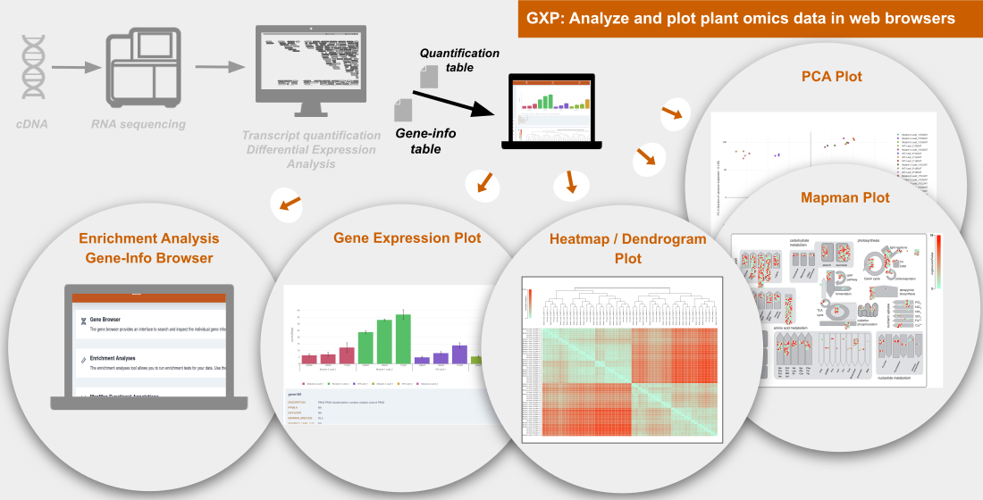
2. Results
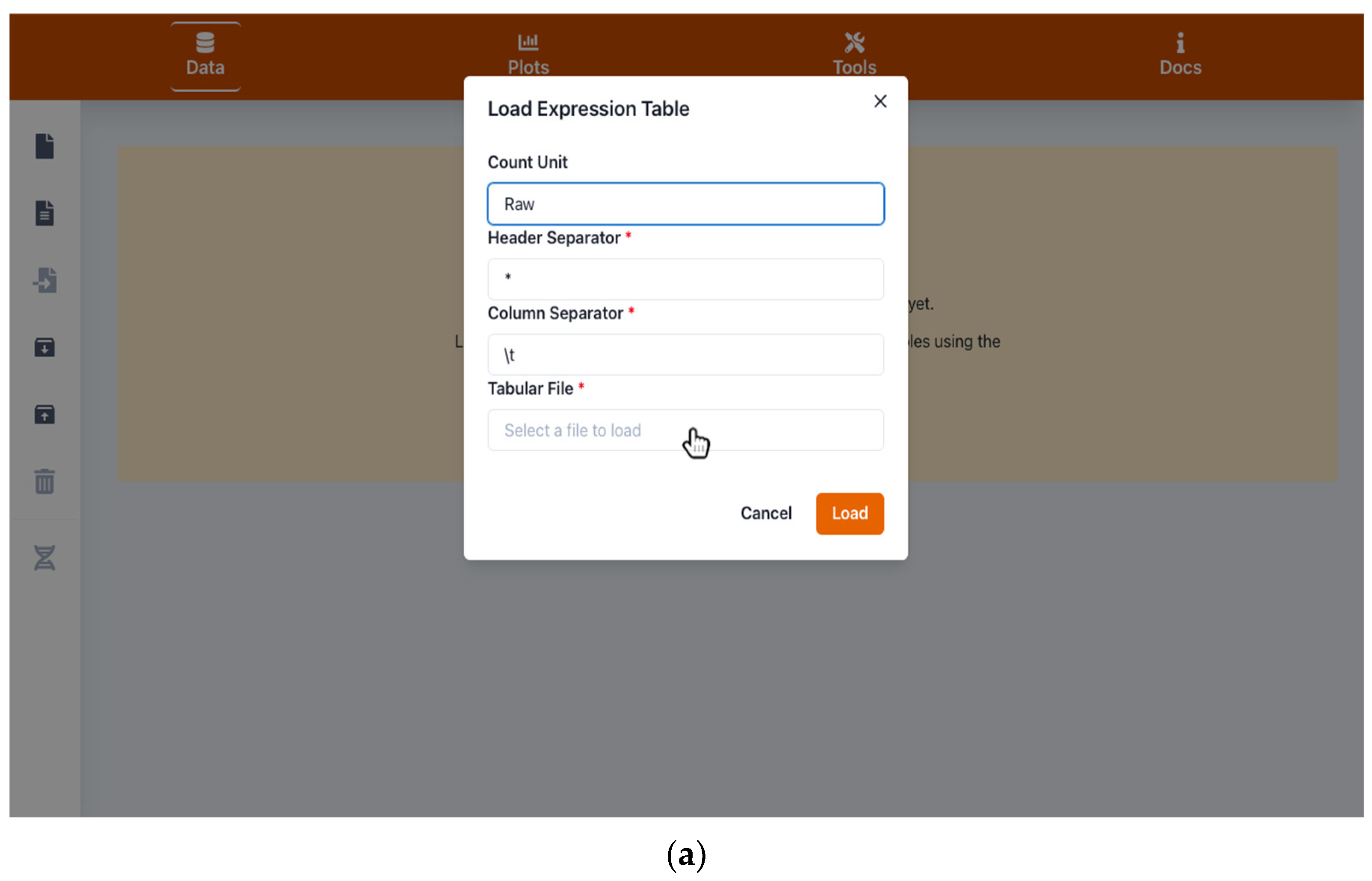
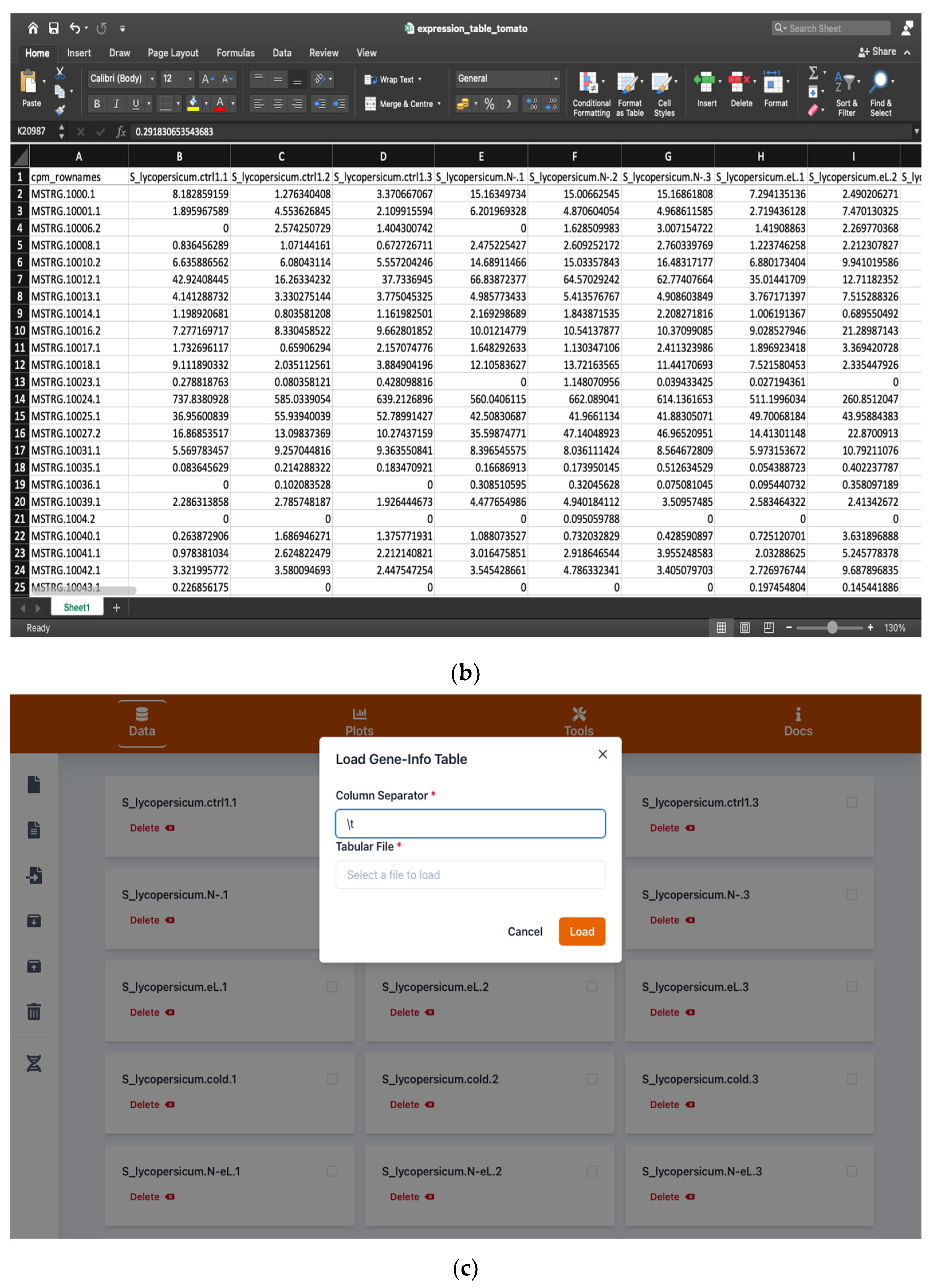
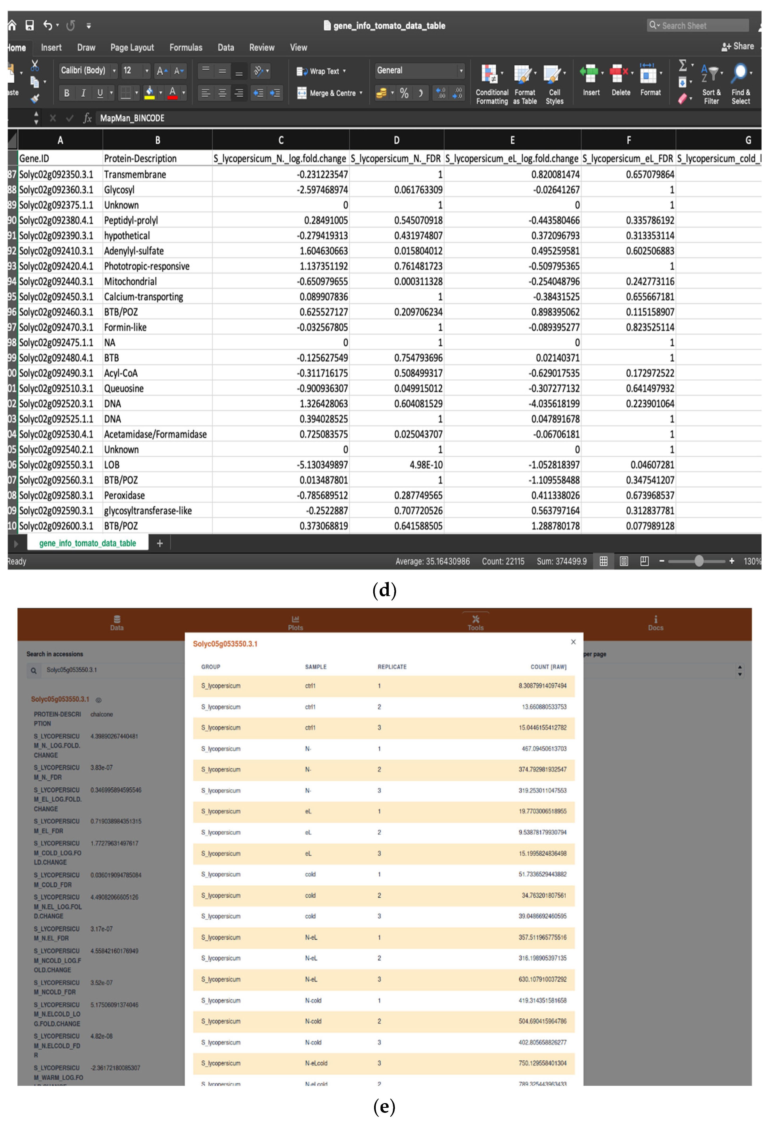
2.1. Handling Input and Output Data
2.1.1. Browsing and Searching Gene Information
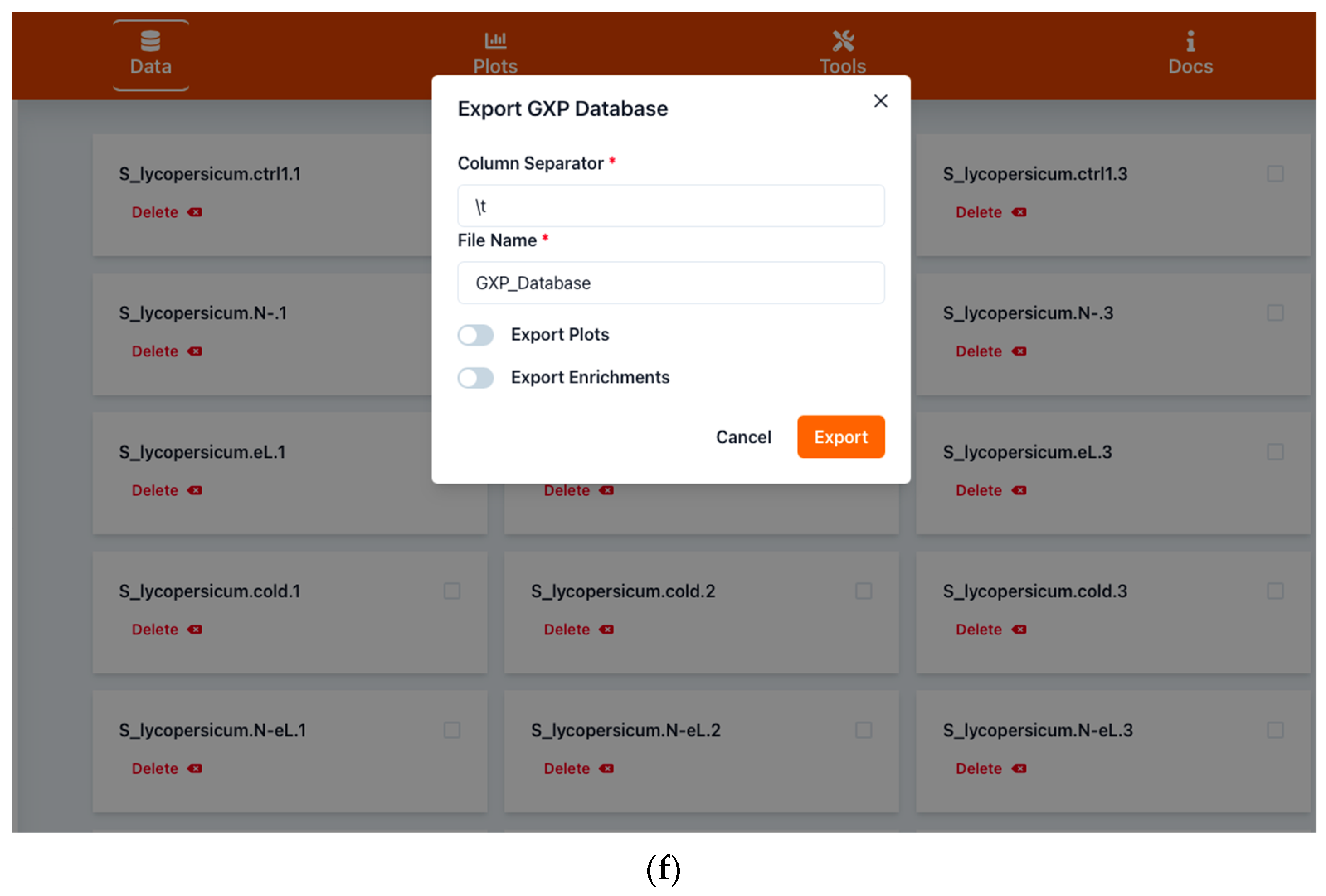
2.1.2. Saving Work and Exporting Data
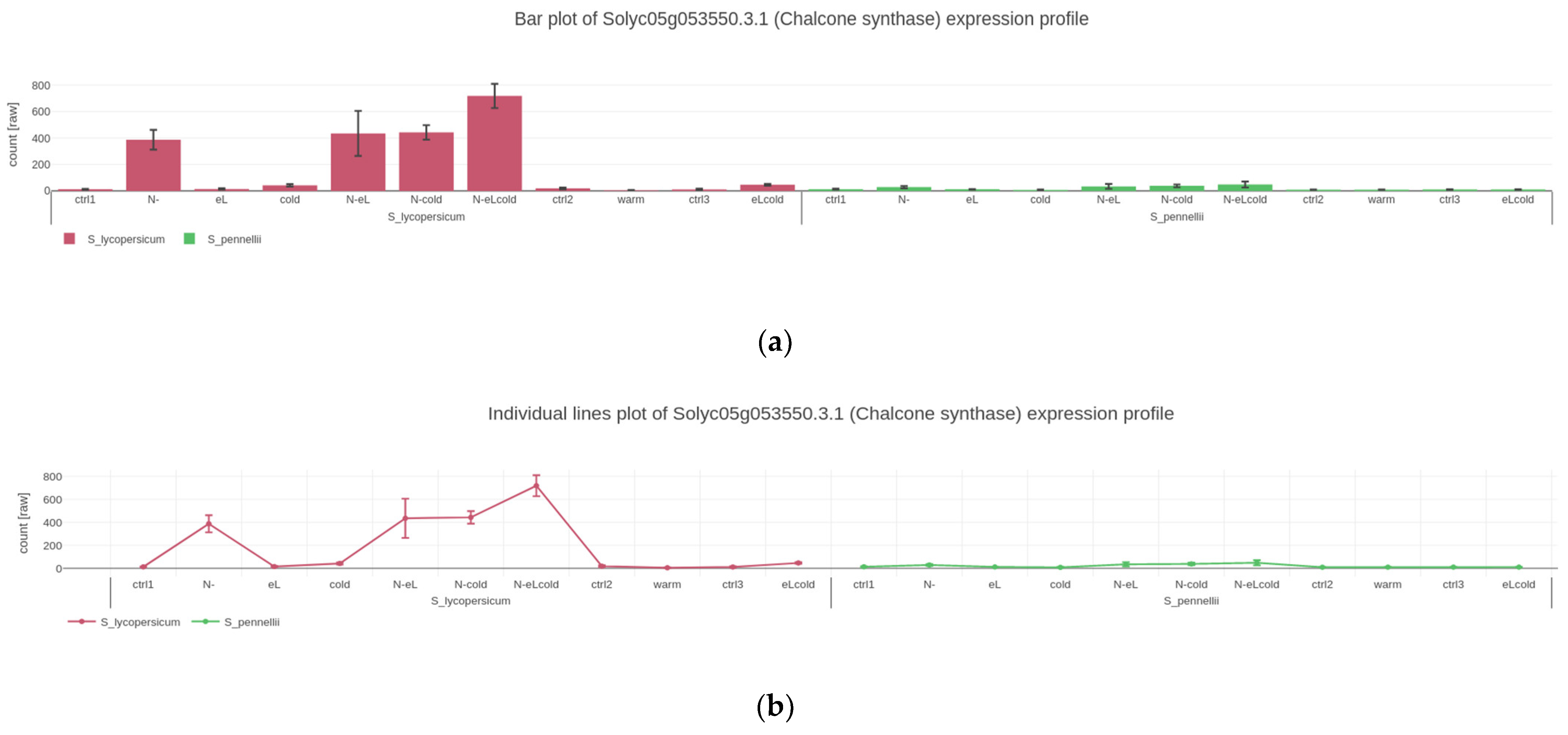
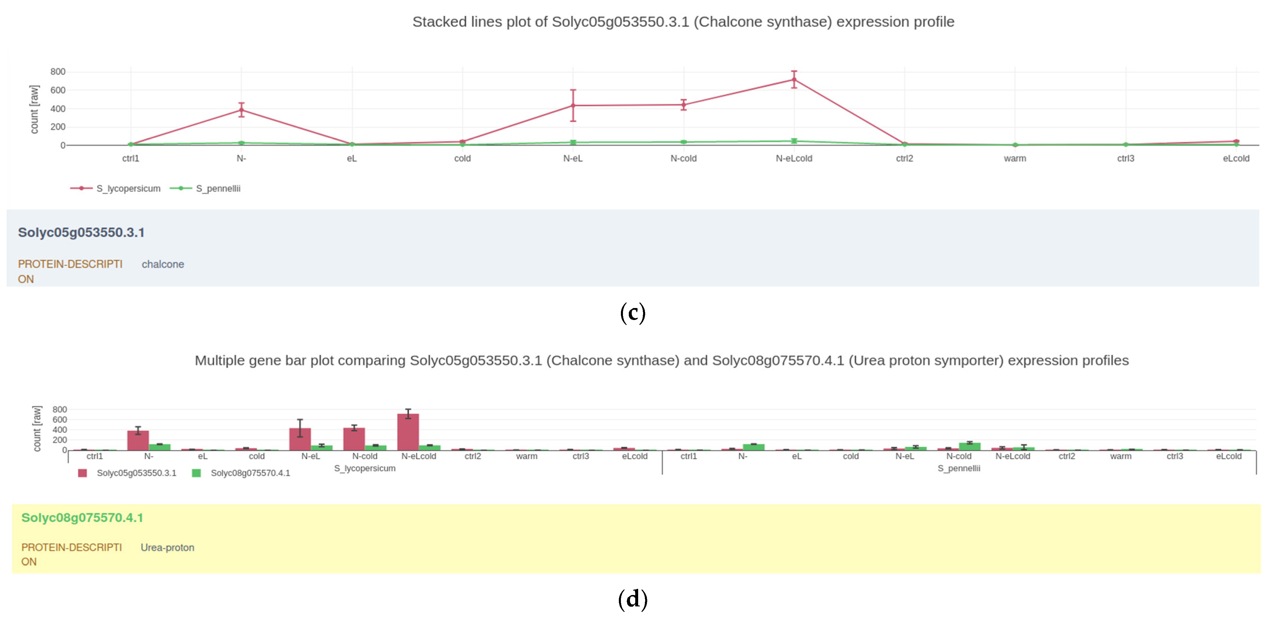
2.2. Visualizing Quantitative Data
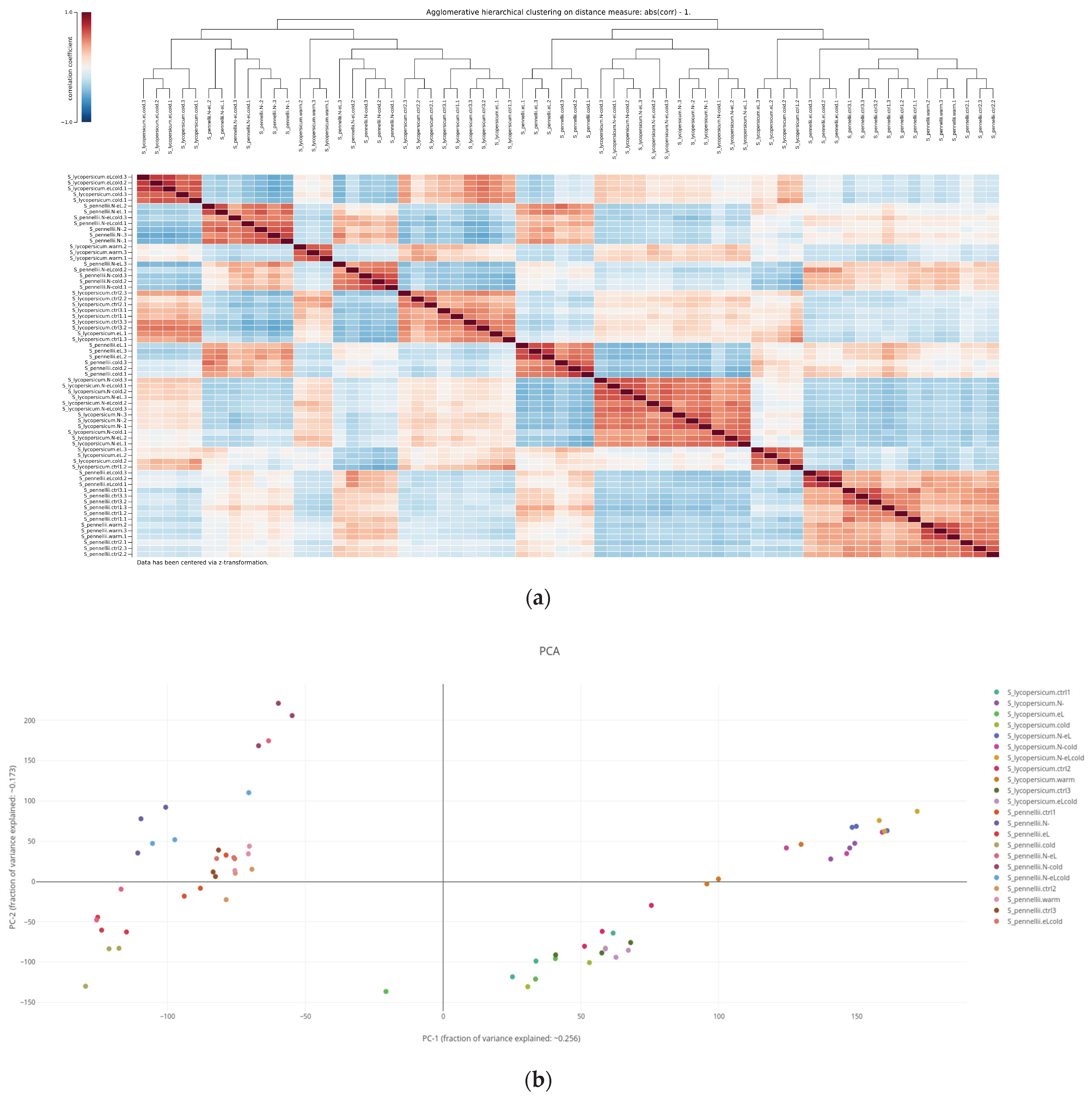
2.3. Assessing Similarity of Biological Replicates Based on Either Gene Expression or Quantified Metabolites
2.3.1. Hierarchical Cluster Analysis
2.3.2. Principal Component Analysis
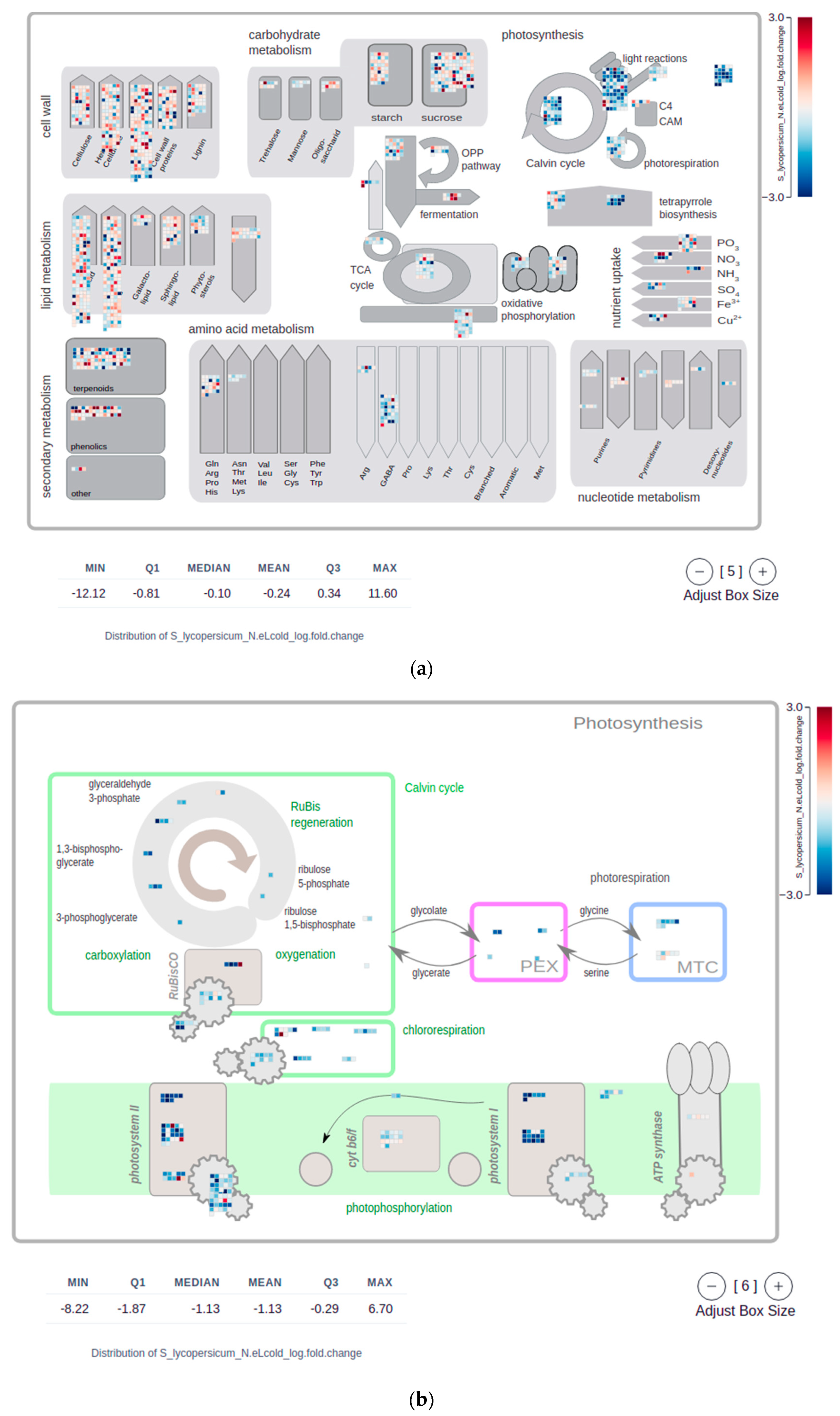
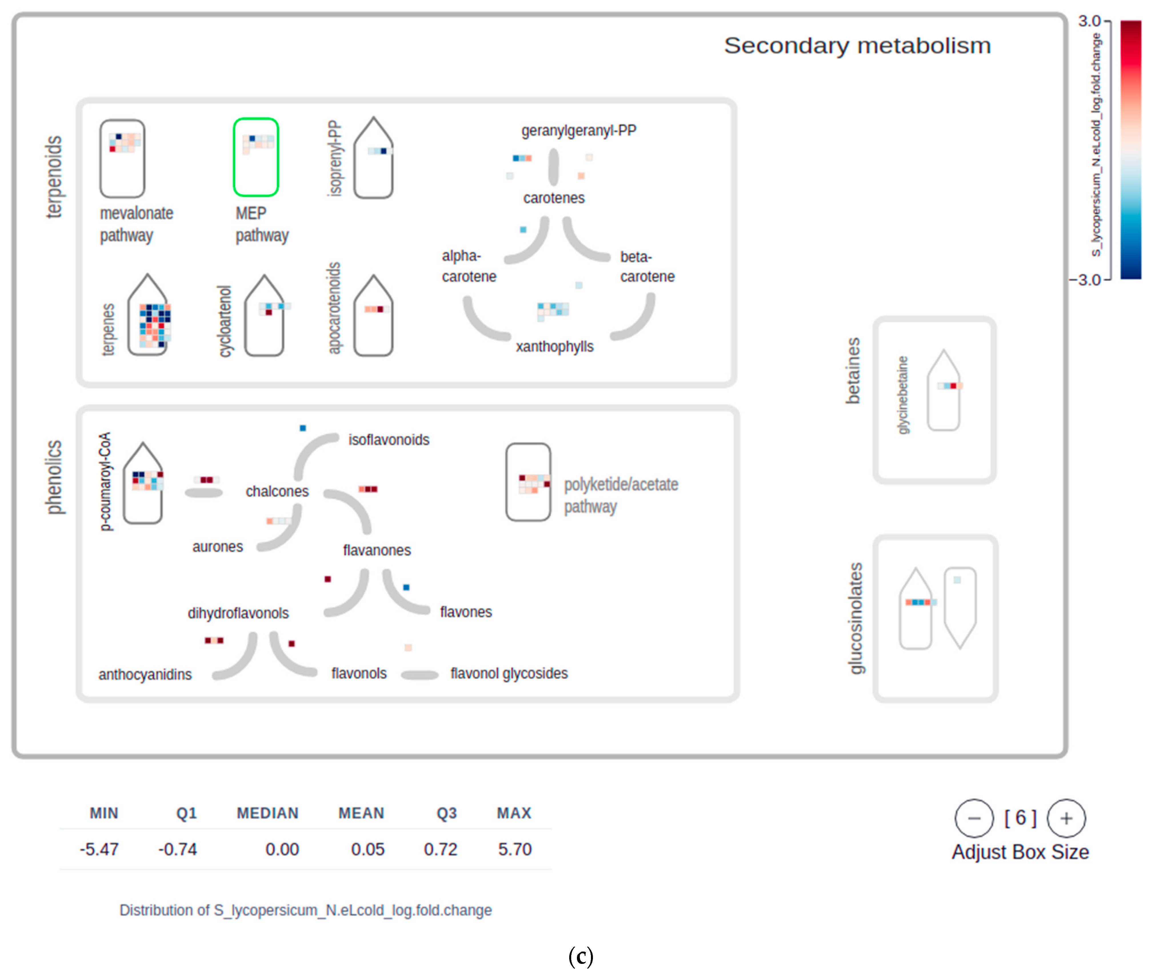
2.4. Mapman Web Browser Plots
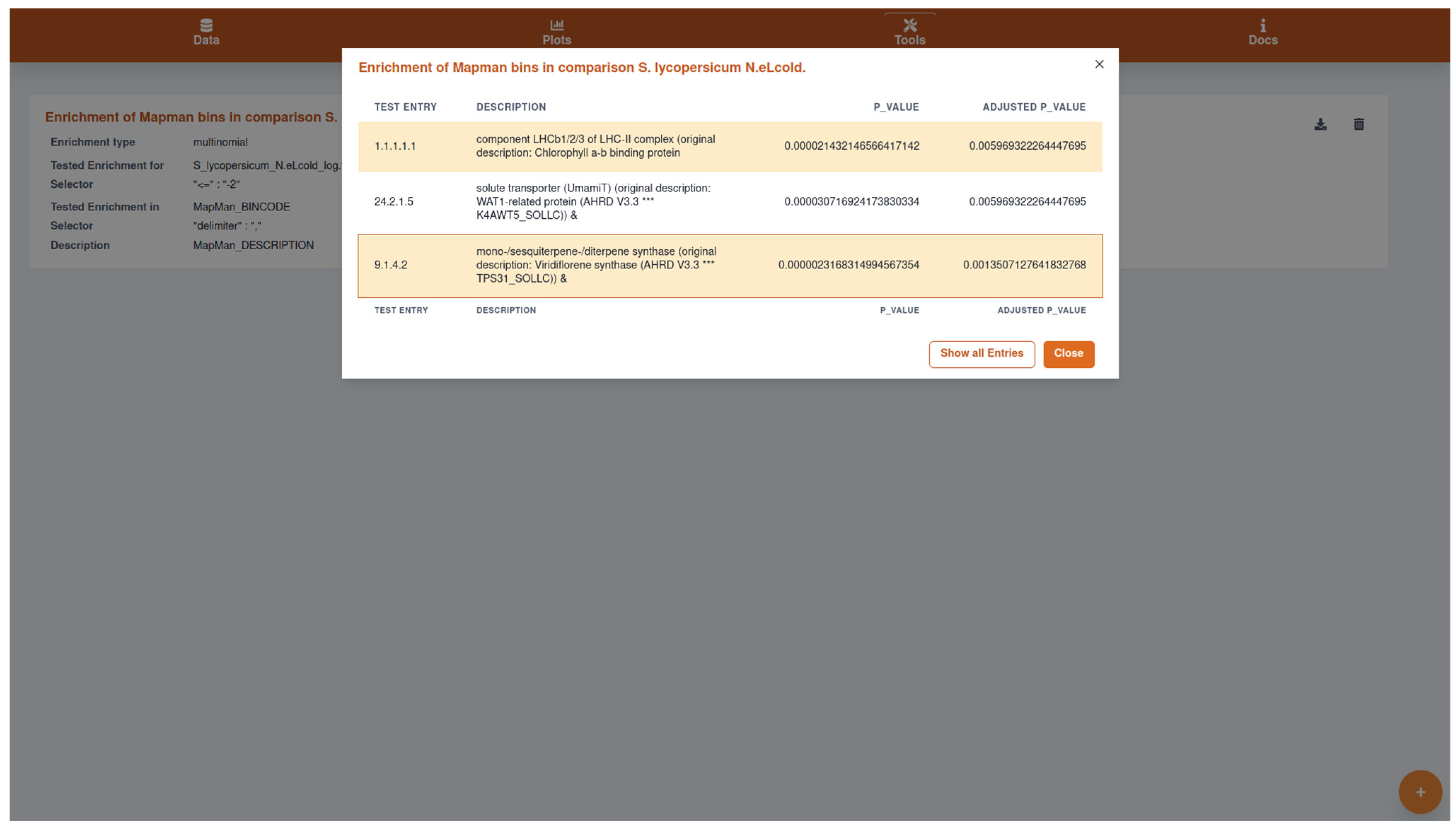
2.5. Overrepresentation (Enrichment) Analysis
2.6. Usage of GXP to Publish Data along with Plots and Analysis Results
3. Discussion
4. Materials and Methods
4.1. Input and Output Data
4.2. Gene Expression Plots
4.3. Hierarchical Cluster Analysis
4.4. Principal Component Analysis (PCA)
4.5. MapMan Visualizations
4.6. Overrepresentation Analysis
4.7. Example Dataset
4.8. Automated Software Tests Ensure Correctness of Implemented Analyses
Supplementary Materials
Author Contributions
Funding
Institutional Review Board Statement
Informed Consent Statement
Data Availability Statement
Conflicts of Interest
References
- Bolger, M.; Schwacke, R.; Usadel, B. MapMan Visualization of RNA-Seq Data Using Mercator4 Functional Annotations. Methods Mol. Biol. 2021, 2354, 195–212. [Google Scholar] [PubMed]
- Usadel, B.; Poree, F.; Nagel, A.; Lohse, M.; Czedik-Eysenberg, A.; Stitt, M. A guide to using MapMan to visualize and compare Omics data in plants: A case study in the crop species, Maize. Plant Cell Environ. 2009, 32, 1211–1229. [Google Scholar] [CrossRef] [PubMed]
- Lohse, M.; Nagel, A.; Herter, T.; May, P.; Schroda, M.; Zrenner, R.; Tohge, T.; Fernie, A.R.; Stitt, M.; Usadel, B. Mercator: A fast and simple web server for genome scale functional annotation of plant sequence data. Plant Cell Environ. 2014, 37, 1250–1258. [Google Scholar] [CrossRef] [PubMed] [Green Version]
- The InterPro Consortium; Mulder, N.J.; Apweiler, R.; Attwood, T.; Bairoch, A.; Bateman, A.; Binns, D.; Biswas, M.; Bradley, P.; Bork, P.; et al. InterPro: An integrated documentation resource for protein families, domains and functional sites. Brief. Bioinform. 2002, 3, 225–235. [Google Scholar] [CrossRef] [Green Version]
- Ashburner, M.; Ball, C.A.; Blake, J.A.; Botstein, D.; Butler, H.; Cherry, J.M.; Davis, A.P.; Dolinski, K.; Dwight, S.S.; Eppig, J.T.; et al. Gene ontology: Tool for the unification of biology. The Gene Ontology Consortium. Nat Genet. 2000, 25, 25–29. [Google Scholar] [CrossRef] [Green Version]
- Pimentel, H.; Bray, N.L.; Puente, S.; Melsted, P.; Pachter, L. Differential analysis of RNA-seq incorporating quantification uncertainty. Nat. Methods 2017, 14, 687–690. [Google Scholar] [CrossRef]
- Su, W.; Sun, J.; Shimizu, K.; Kadota, K. TCC-GUI: A Shiny-based application for differential expression analysis of RNA-Seq count data. BMC Res. Notes 2019, 12, 133. [Google Scholar] [CrossRef]
- Choi, K.; Ratner, N. iGEAK: An interactive gene expression analysis kit for seamless workflow using the R/shiny platform. BMC Genom. 2019, 20, 177. [Google Scholar] [CrossRef] [Green Version]
- Sundararajan, Z.; Knoll, R.; Hombach, P.; Becker, M.; Schultze, J.L.; Ulas, T. Shiny-Seq: Advanced guided transcriptome analysis. BMC Res. Notes 2019, 12, 432. [Google Scholar] [CrossRef] [Green Version]
- Marini, F.; Binder, H. pcaExplorer: An R/Bioconductor package for interacting with RNA-seq principal components. BMC Bioinform. 2019, 20, 331. [Google Scholar] [CrossRef] [Green Version]
- Wang, S.; Zhang, Y.; Hu, C.; Zhang, N.; Gribskov, M.; Yang, H. Shiny-DEG: A Web Application to Analyze and Visualize Differentially Expressed Genes in RNA-seq. Interdiscip Sci. 2020, 12, 349–354. [Google Scholar] [CrossRef]
- Reyes, A.L.P.; Silva, T.C.; Coetzee, S.G.; Plummer, J.T.; Davis, B.D.; Chen, S.; Hazelett, D.J.; Lawrenson, K.; Berman, B.P.; Gayther, S.A.; et al. GENAVi: A shiny web application for gene expression normalization, analysis and visualization. BMC Genom. 2019, 20, 745. [Google Scholar] [CrossRef]
- Haering, M.; Habermann, B.H. RNfuzzyApp: An R shiny RNA-seq data analysis app for visualisation, differential expression analysis, time-series clustering and enrichment analysis. F1000Research 2021, 10, 654. [Google Scholar] [CrossRef]
- Kim, S.C.; Yu, D.; Cho, S.B. COEX-Seq: Convert a Variety of Measurements of Gene Expression in RNA-Seq. Genom. Inform. 2018, 16, e36. [Google Scholar] [CrossRef] [Green Version]
- Zhang, C.; Fan, C.; Gan, J.; Zhu, P.; Kong, L.; Li, C. iSeq: Web-Based RNA-seq Data Analysis and Visualization. Methods Mol. Biol. 2018, 1754, 167–181. [Google Scholar]
- Li, R.; Hu, K.; Liu, H.; Green, M.R.; Zhu, L.J. OneStopRNAseq: A Web Application for Comprehensive and Efficient Analyses of RNA-Seq Data. Genes 2020, 11, 1165. [Google Scholar] [CrossRef]
- Hoek, A.; Maibach, K.; Özmen, E.; Vazquez-Armendariz, A.I.; Mengel, J.P.; Hain, T.; Herold, S.; Goesmann, A. WASP: A versatile, web-accessible single cell RNA-Seq processing platform. BMC Genom. 2021, 22, 195. [Google Scholar] [CrossRef]
- Harshbarger, J.; Kratz, A.; Carninci, P. DEIVA: A web application for interactive visual analysis of differential gene expression profiles. BMC Genom. 2017, 18, 47. [Google Scholar] [CrossRef] [Green Version]
- Nelson, J.W.; Sklenar, J.; Barnes, A.P.; Minnier, J. The START App: A web-based RNAseq analysis and visualization resource. Bioinformatics 2017, 33, 447–449. [Google Scholar] [CrossRef]
- Li, Y.; Andrade, J. DEApp: An interactive web interface for differential expression analysis of next generation sequence data. Source Code Biol. Med. 2017, 12, 2. [Google Scholar] [CrossRef] [Green Version]
- Russo, F.; Angelini, C. RNASeqGUI: A GUI for analysing RNA-Seq data. Bioinformatics 2014, 30, 2514–2516. [Google Scholar] [CrossRef] [Green Version]
- Bray, N.L.; Pimentel, H.; Melsted, P.; Pachter, L. Near-Optimal probabilistic RNA-seq quantification. Nat Biotechnol. 2016, 34, 525–527. [Google Scholar] [CrossRef]
- Langmead, B.; Trapnell, C.; Pop, M.; Salzberg, S.L. Ultrafast and memory-efficient alignment of short DNA sequences to the human genome. Genome Biol. 2009, 10, R25. [Google Scholar] [CrossRef] [Green Version]
- Kim, D.; Langmead, B.; Salzberg, S.L. HISAT: A fast spliced aligner with low memory requirements. Nat. Methods 2015, 12, 357–360. [Google Scholar] [CrossRef] [Green Version]
- Patro, R.; Duggal, G.; Love, M.I.; Irizarry, R.A.; Kingsford, C. Salmon provides fast and bias-aware quantification of transcript expression. Nat. Methods 2017, 14, 417–419. [Google Scholar] [CrossRef] [Green Version]
- Howe, E.; Holton, K.; Nair, S.; Schlauch, D.; Sinha, R.; Quackenbush, J. MeV: MultiExperiment Viewer. In Biomed. Informatics for Cancer Research; Springer: Berlin/Heidelberg, Germany, 2010; pp. 267–277. [Google Scholar] [CrossRef]
- Howe, E.; Holton, K.; Nair, S.; Schlauch, D.; Sinha, R.; Quackenbush, J. WebMeV: MultiExperiment Viewer. Available online: https://webmev.tm4.org/#/about (accessed on 11 January 2022).
- Su, S.; Law, C.W.; Ah-Cann, C.; Asselin-Labat, M.-L.; Blewitt, M.E.; Ritchie, M.E. Glimma: Interactive graphics for gene expression analysis. Bioinformatics 2017, 33, 2050–2052. [Google Scholar] [CrossRef] [Green Version]
- R Core Team. R: A Language and Environment for Statistical Computing. R Foundation for Statistical Computing. 2021. Available online: https://www.R-project.org/ (accessed on 11 January 2022).
- R Studio Inc. Easy Web Applications in R. 2013. Available online: https://www.rstudio.com/shiny/ (accessed on 11 January 2022).
- Hadizadeh Esfahani, A.; Maß, J.; Hallab, A.; Schuldt, B.M.; Nevarez, D.; Usadel, B.; Ott, M.C.; Buer, B.; Schuppert, A. Plant PhysioSpace: A robust tool to compare stress response across plant species. Plant Physiol. 2021, 187, 1795–1811. [Google Scholar] [CrossRef]
- Hernández-De-Diego, R.; Tarazona, S.; Martínez-Mira, C.; Balzano-Nogueira, L.; Furió-Tarí, P.; Pappas, G.J., Jr.; Conesa, A. PaintOmics 3: A web resource for the pathway analysis and visualization of multi-omics data. Nucleic Acids Res. 2018, 46, W503–W509. [Google Scholar] [CrossRef] [PubMed] [Green Version]
- Naithani, S.; Gupta, P.; Preece, J.; D’Eustachio, P.; Elser, J.L.; Garg, P.; Dikeman, D.A.; Kiff, J.; Cook, J.; Olson, A.; et al. Plant Reactome: A knowledgebase and resource for comparative pathway analysis. Nucleic Acids Res. 2020, 48, D1093–D1103. [Google Scholar] [CrossRef] [PubMed]
- Waese, J.; Fan, J.; Pasha, A.; Yu, H.; Fucile, G.; Shi, R.; Cumming, M.; Kelley, L.A.; Sternberg, M.J.; Krishnakumar, V.; et al. ePlant: Visualizing and Exploring Multiple Levels of Data for Hypothesis Generation in Plant Biology. Plant Cell. 2017, 29, 1806–1821. [Google Scholar] [CrossRef] [PubMed]
- Julkowska, M.M.; Saade, S.; Agarwal, G.; Gao, G.; Pailles, Y.; Morton, M.; Awlia, M.; Tester, M. MVApp—Multivariate Analysis Application for Streamlined Data Analysis and Curation. Plant Physiol. 2019, 180, 1261–1276. [Google Scholar] [CrossRef] [Green Version]
- Schwacke, R.; Soto, G.Y.P.; Krause, K.; Bolger, A.M.; Arsova, B.; Hallab, A.; Gruden, K.; Stitt, M.; Bolger, M.; Usadel, B. MapMan4: A Refined Protein Classification and Annotation Framework Applicable to Multi-Omics Data Analysis. Mol. Plant 2019, 12, 879–892. [Google Scholar] [CrossRef]
- Goto, M.K.A. KEGG: Kyoto Encyclopedia of Genes and Genomes. Nucleic Acids Res. 2000, 28, 27–30. [Google Scholar]
- Reimer, J.J.; Thiele, B.; Biermann, R.T.; Junker-Frohn, L.V.; Wiese-Klinkenberg, A.; Usadel, B.; Wormit, A. Tomato leaves under stress: A comparison of stress response to mild abiotic stress between a cultivated and a wild tomato species. Plant Mol. Biol. 2021, 107, 177–206. [Google Scholar] [CrossRef]
- Thimm, O.; Bläsing, O.; Gibon, Y.; Nagel, A.; Meyer, S.; Krüger, P.; Selbig, J.; Müller, L.A.; Rhee, S.Y.; Stitt, M. MAPMAN: A user-driven tool to display genomics data sets onto diagrams of metabolic pathways and other biological processes. Plant J. 2004, 37, 914–939. [Google Scholar] [CrossRef]
- Usadel, B. MapManJS—Pure Web Implementations of MapMan. 2018. Available online: https://github.com/usadellab/MapManJS (accessed on 11 January 2022).
- Lohse, M.; Bolger, A.M.; Nagel, A.; Fernie, A.R.; Lunn, J.E.; Stitt, M.; Usadel, B. RobiNA: A user-friendly, integrated software solution for RNA-Seq-based transcriptomics. Nucleic Acids Res. 2012, 40, W622–W627. [Google Scholar] [CrossRef]
- Fisher, R.A. On the Interpretation of χ2 from Contingency Tables, and the Calculation of P. J. R. Stat. Soc. 1922, 85, 87. [Google Scholar] [CrossRef]
- The Gnu Scientific Library Team. Gnu Scientific Library 2.0; Samurai Media Limited: Surrey, UK, 2015. [Google Scholar]
- Bolger, A.M.; Lohse, M.; Usadel, B. Trimmomatic: A flexible trimmer for Illumina sequence data. Bioinformatics 2014, 30, 2114–2120. [Google Scholar] [CrossRef] [Green Version]
- Pertea, M.; Pertea, G.M.; Antonescu, C.M.; Chang, T.-C.; Mendell, J.T.; Salzberg, S.L. StringTie enables improved reconstruction of a transcriptome from RNA-seq reads. Nat. Biotechnol. 2015, 33, 290–295. [Google Scholar] [CrossRef] [Green Version]
- Pertea, M.; Kim, D.; Pertea, G.M.; Leek, J.T.; Salzberg, S.L. Transcript-level expression analysis of RNA-seq experiments with HISAT, StringTie and Ballgown. Nat. Protoc. 2016, 11, 1650–1667. [Google Scholar] [CrossRef]
- Ritchie, M.E.; Phipson, B.; Wu, D.; Hu, Y.; Law, C.W.; Shi, W.; Smyth, G.K. limma powers differential expression analyses for RNA-sequencing and microarray studies. Nucleic Acids Res. 2015, 43, e47. [Google Scholar] [CrossRef]
- Robinson, M.D.; McCarthy, D.J.; Smyth, G.K. edgeR: A Bioconductor package for differential expression analysis of digital gene expression data. Bioinformatics 2010, 26, 139–140. [Google Scholar] [CrossRef] [Green Version]
- Soneson, C.; Love, M.I.; Robinson, M.D. Differential analyses for RNA-seq: Transcript-level estimates improve gene-level inferences. F1000Research 2015, 4, 1521. [Google Scholar] [CrossRef]


Publisher’s Note: MDPI stays neutral with regard to jurisdictional claims in published maps and institutional affiliations. |
© 2022 by the authors. Licensee MDPI, Basel, Switzerland. This article is an open access article distributed under the terms and conditions of the Creative Commons Attribution (CC BY) license (https://creativecommons.org/licenses/by/4.0/).
Share and Cite
Eiteneuer, C.; Velasco, D.; Atemia, J.; Wang, D.; Schwacke, R.; Wahl, V.; Schrader, A.; Reimer, J.J.; Fahrner, S.; Pieruschka, R.; et al. GXP: Analyze and Plot Plant Omics Data in Web Browsers. Plants 2022, 11, 745. https://0-doi-org.brum.beds.ac.uk/10.3390/plants11060745
Eiteneuer C, Velasco D, Atemia J, Wang D, Schwacke R, Wahl V, Schrader A, Reimer JJ, Fahrner S, Pieruschka R, et al. GXP: Analyze and Plot Plant Omics Data in Web Browsers. Plants. 2022; 11(6):745. https://0-doi-org.brum.beds.ac.uk/10.3390/plants11060745
Chicago/Turabian StyleEiteneuer, Constantin, David Velasco, Joseph Atemia, Dan Wang, Rainer Schwacke, Vanessa Wahl, Andrea Schrader, Julia J. Reimer, Sven Fahrner, Roland Pieruschka, and et al. 2022. "GXP: Analyze and Plot Plant Omics Data in Web Browsers" Plants 11, no. 6: 745. https://0-doi-org.brum.beds.ac.uk/10.3390/plants11060745