Visual Analytics for Dimension Reduction and Cluster Analysis of High Dimensional Electronic Health Records


Abstract
:1. Introduction
2. Background
2.1. Visual Analytics
2.2. Dimension Reduction (DR)
2.3. Cluster Analysis
2.4. Healthcare Stakeholders
3. Related Work
3.1. DR-Based Visual Analytics Systems
3.2. CA-Based Visual Analytics Systems
3.3. DR and CA-Based Visual Analytics Systems
3.4. EHR-Based Visual Analytics Systems
4. Methods
4.1. Design Process and Participants
4.2. Task Analysis and Design Criteria
4.2.1. Displaying an Overview of the Data
4.2.2. Allowing Iteration over DR Techniques
4.2.3. Allowing Iteration over CA Techniques
4.2.4. Facilitating Reasoning about DR and CA
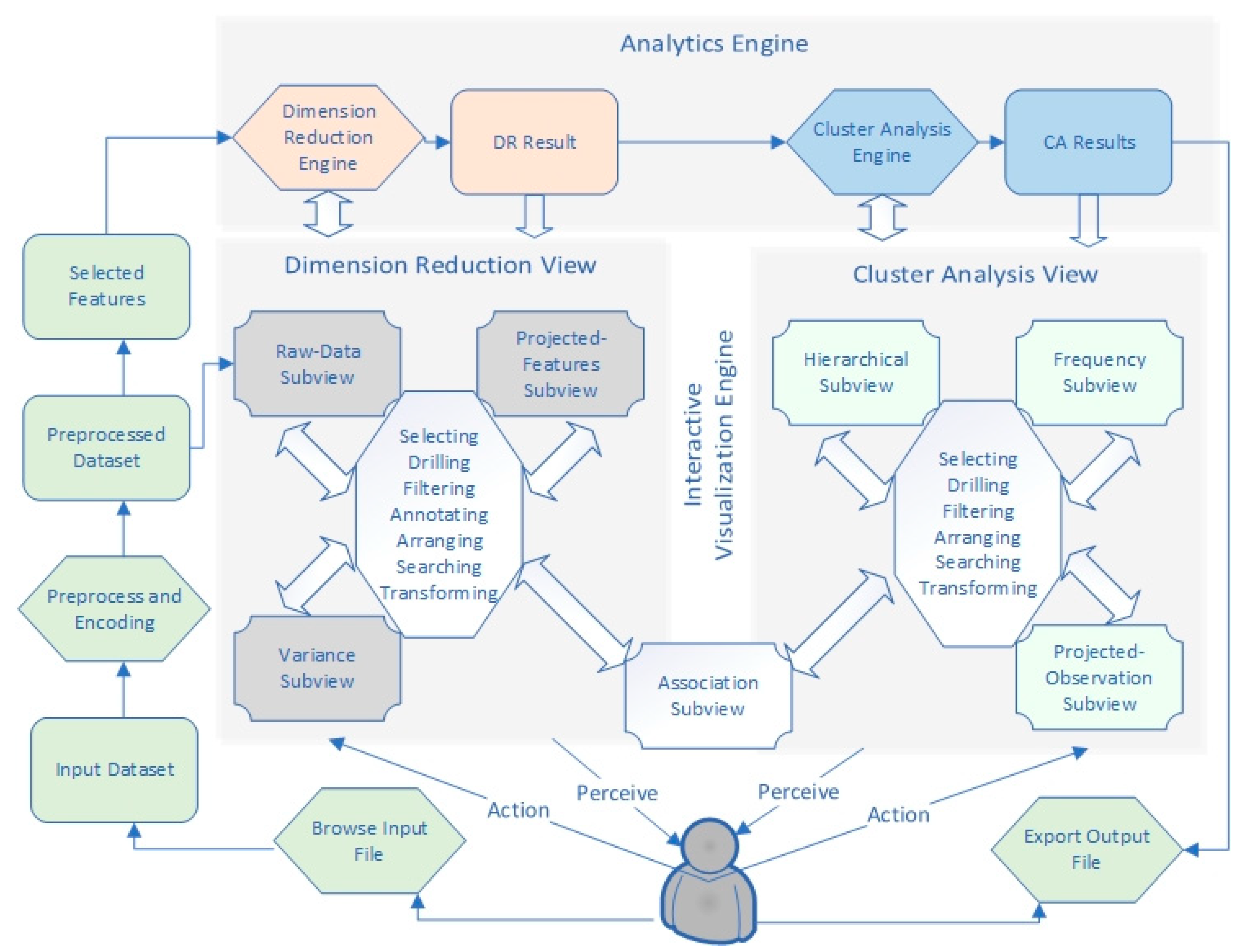
4.3. Workflow
4.4. Encoding and Preprocessing
4.5. Analytics Engine
4.5.1. DR Engine
4.5.2. CA Engine
4.6. Interactive Visualization Engine
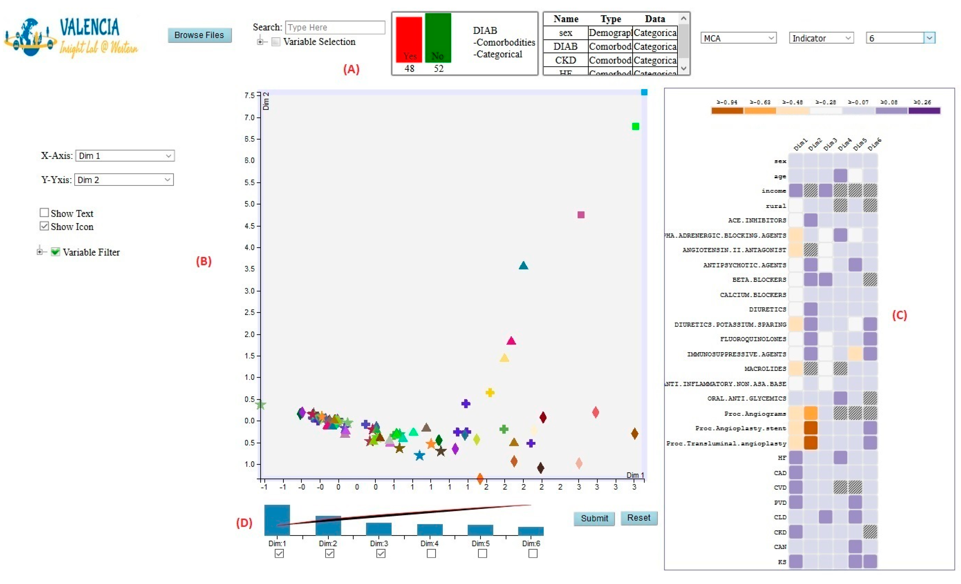
4.6.1. DR View
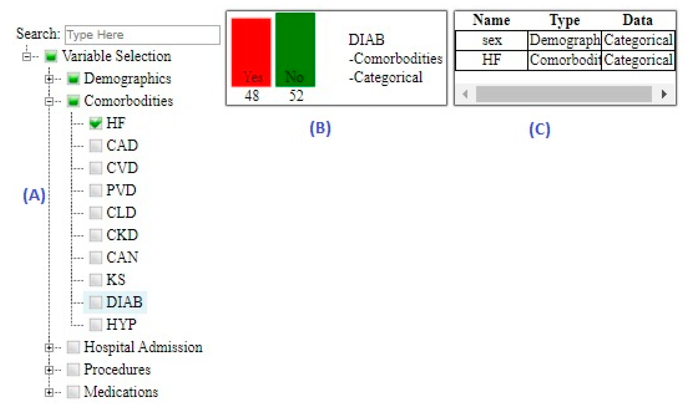
Raw-Data Subview
Projected-Features Subview
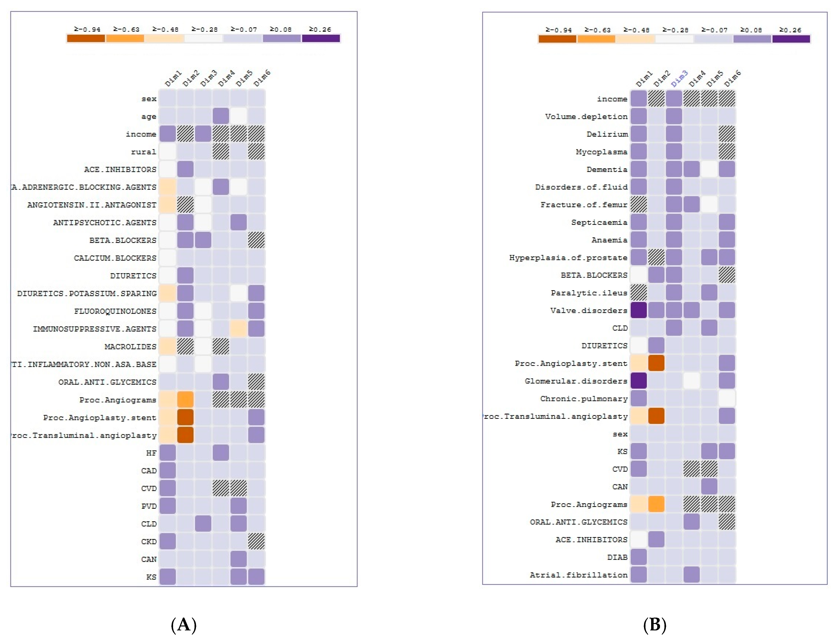
Association Subview
Variance Subview
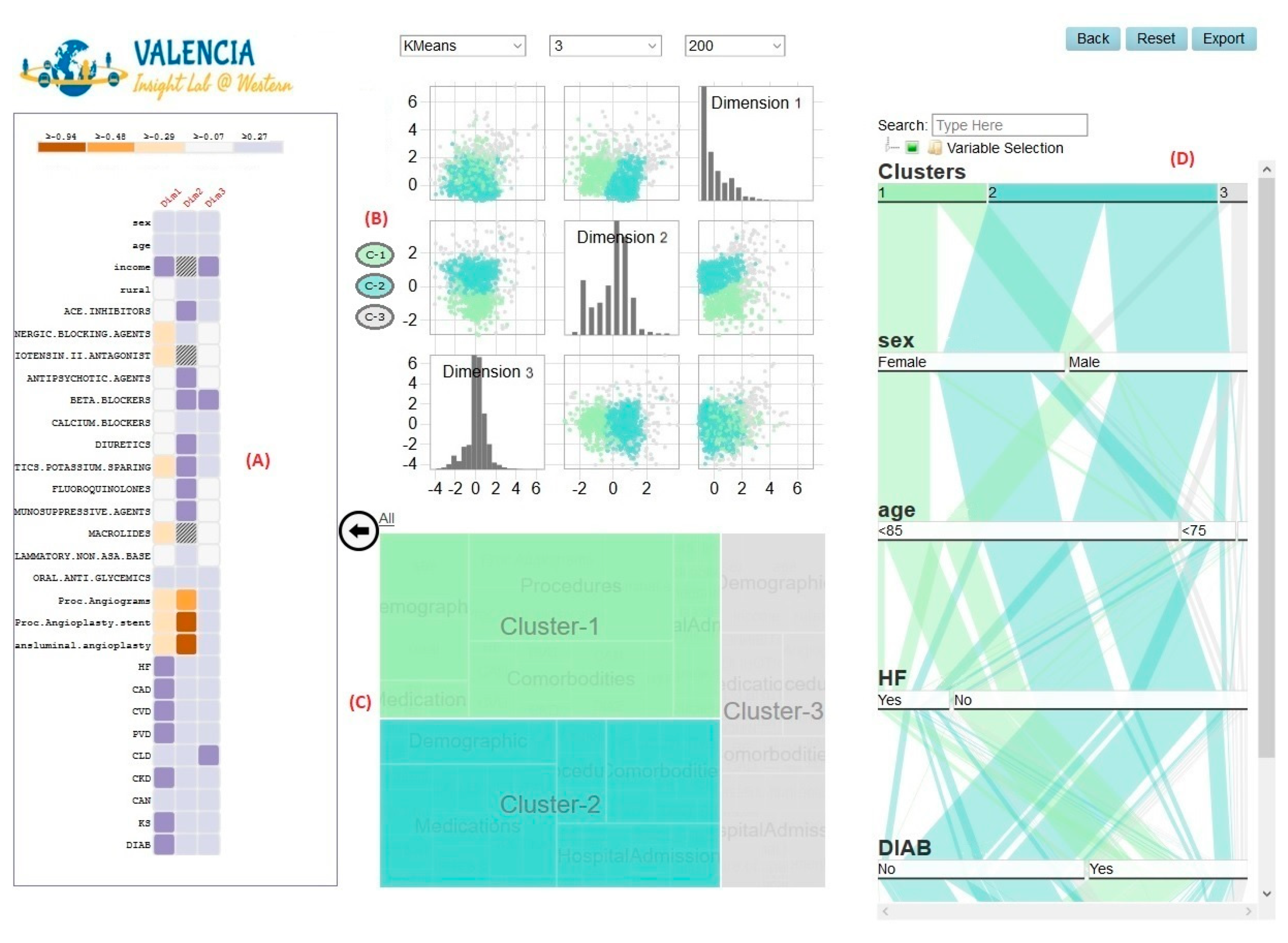
4.6.2. CA View
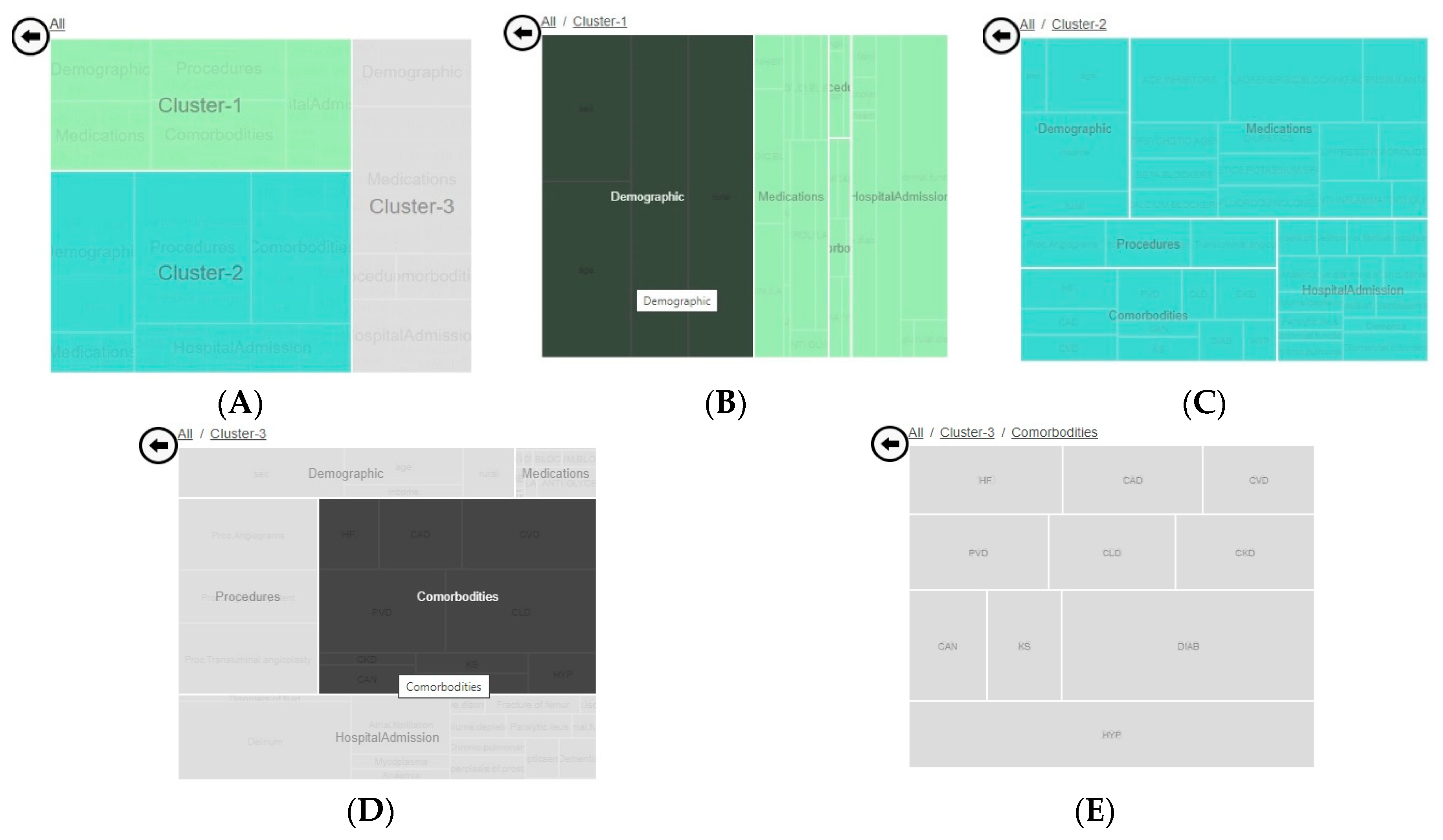
Hierarchical Subview
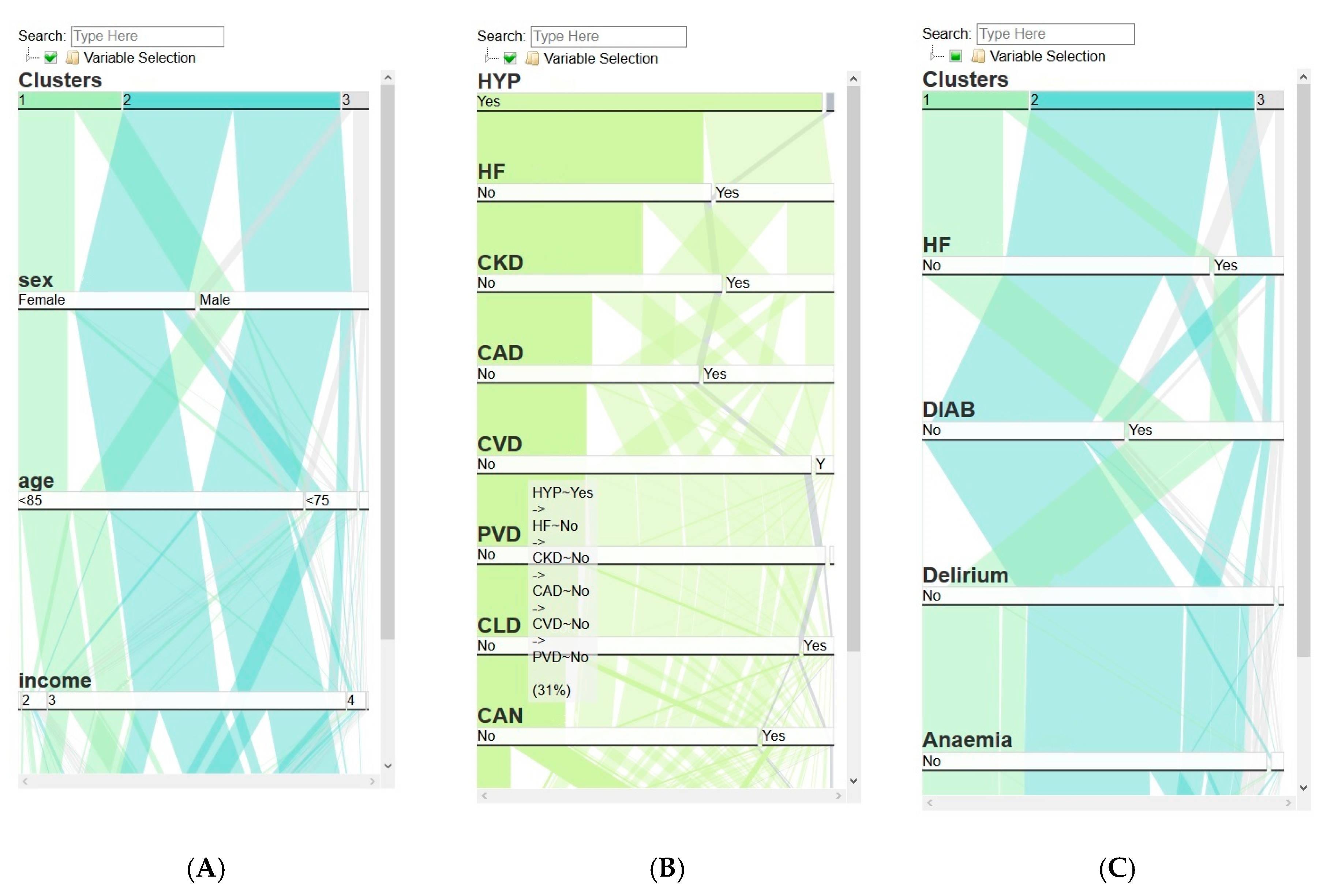
Frequency Subview
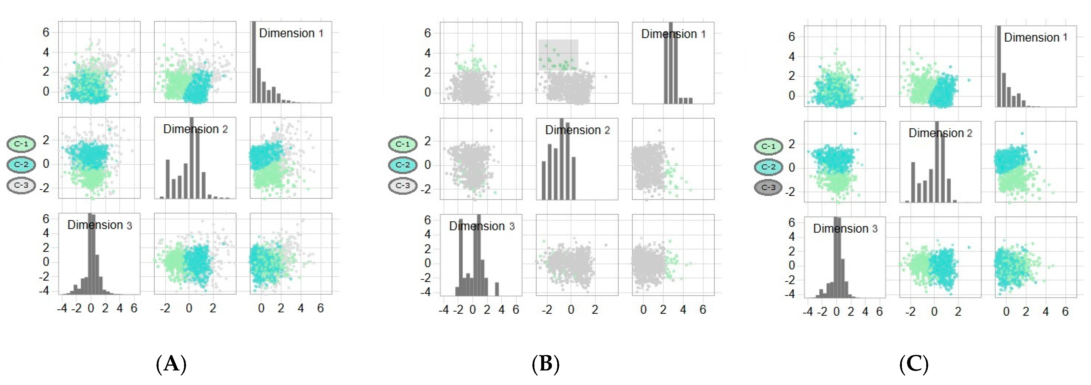
Projected-Observations Subview
4.7. Implementation Details
5. Usage Scenario
5.1. Data Sources
5.2. Cohort Creation
5.3. Cohort Description
5.4. Case Study
6. Conclusions
Author Contributions
Funding
Acknowledgments
Conflicts of Interest
References
- Caban, J.J.; Gotz, D. Visual analytics in healthcare-opportunities and research challenges. J. Am. Med. Inform. Assoc. 2015, 22, 260–262. [Google Scholar] [CrossRef] [PubMed] [Green Version]
- Murdoch, T.B.; Detsky, A.S. The inevitable application of big data to health care. Jama J. Am. Med. Assoc. 2013, 309, 1351–1352. [Google Scholar] [CrossRef] [PubMed]
- Cowie, M.R.; Blomster, J.I.; Curtis, L.H.; Duclaux, S.; Ford, I.; Fritz, F.; Goldman, S.; Janmohamed, S.; Kreuzer, J.; Leenay, M.; et al. Electronic health records to facilitate clinical research. Clin. Res. Cardiol. 2017, 106, 1–9. [Google Scholar] [CrossRef] [PubMed] [Green Version]
- Kamal, N. Big Data and Visual Analytics in Health and Medicine: From Pipe Dream to Reality. J. Health Med. Inform. 2014, 5. [Google Scholar] [CrossRef]
- Rind, A.; Wagner, M.; Aigner, W. Towards a Structural Framework for Explicit Domain Knowledge in Visual Analytics. In Proceedings of the 2019 IEEE Workshop on Visual Analytics in Healthcare (VAHC), Vancouver, BC, Canada, 20–20 October 2019; pp. 33–40. [Google Scholar] [CrossRef] [Green Version]
- Marlin, B.M.; Kale, D.C.; Khemani, R.G.; Wetzel, R.C. Unsupervised pattern discovery in electronic health care data using probabilistic clustering models. In Proceedings of the 2nd ACM SIGHIT Symposium on International Health Informatics—IHI ’12, Miami, FL, USA, 28–30 January 2012; ACM Press: Miami, FL, USA, 2012; p. 389. [Google Scholar]
- Wetzel, R.C. The virtual pediatric intensive care unit: Practice in the new millennium. Pediatric Clin. 2001, 48, 795–814. [Google Scholar]
- Haraty, R.A.; Dimishkieh, M.; Masud, M. An Enhanced k-Means Clustering Algorithm for Pattern Discovery in Healthcare Data. Int. J. Distrib. Sens. Netw. 2015, 11, 615740. [Google Scholar] [CrossRef]
- Khalid, S.; Judge, A.; Pinedo-Villanueva, R. An Unsupervised Learning Model for Pattern Recognition in Routinely Collected Healthcare Data. In Proceedings of the 11th International Joint Conference on Biomedical Engineering Systems and Technologies, Funchal, Portugal, 19–21 January 2018; SCITEPRESS—Science and Technology Publications: Funchal, Portugal, 2018; pp. 266–273. [Google Scholar]
- Liao, M.; Li, Y.; Kianifard, F.; Obi, E.; Arcona, S. Cluster analysis and its application to healthcare claims data: A study of end-stage renal disease patients who initiated hemodialysis. BMC Nephrol. 2016, 17, 25. [Google Scholar] [CrossRef] [Green Version]
- Foguet-Boreu, Q.; Violán, C.; Rodriguez-Blanco, T.; Roso-Llorach, A.; Pons-Vigués, M.; Pujol-Ribera, E.; Cossio Gil, Y.; Valderas, J.M. Multimorbidity Patterns in Elderly Primary Health Care Patients in a South Mediterranean European Region: A Cluster Analysis. PLoS ONE 2015, 10, 0141155. [Google Scholar] [CrossRef] [Green Version]
- Estiri, H.; Klann, J.G.; Murphy, S.N. A clustering approach for detecting implausible observation values in electronic health records data. BMC Med. Inform. Decis. Mak. 2019, 19, 142. [Google Scholar] [CrossRef] [Green Version]
- Dilts, D.; Khamalah, J.; Plotkin, A. Using cluster analysis for medical resource decision making. Med. Decis. Mak. 1995, 15, 333–346. [Google Scholar] [CrossRef]
- McLachlan, G.J. Cluster analysis and related techniques in medical research. Stat. Methods Med. Res. 1992, 1, 27–48. [Google Scholar] [CrossRef] [PubMed]
- Doust, D.; Walsh, Z. Data Mining Clustering: A Healthcare Application. In Proceedings of the Mediterranean Conference on Information Systems (MCIS), Limassol, Cyprus, 3–5 September 2011. [Google Scholar]
- Ruan, T.; Lei, L.; Zhou, Y.; Zhai, J.; Zhang, L.; He, P.; Gao, J. Representation learning for clinical time series prediction tasks in electronic health records. BMC Med. Inform. Decis. Mak. 2019, 19, 259. [Google Scholar] [CrossRef] [PubMed]
- Adachi, S. Rigid geometry solves “curse of dimensionality” effects in clustering methods: An application to omics data. PLoS ONE 2017, 12. [Google Scholar] [CrossRef] [Green Version]
- Ronan, T.; Qi, Z.; Naegle, K.M. Avoiding common pitfalls when clustering biological data. Sci. Signal 2016, 9, re6. [Google Scholar] [CrossRef] [PubMed] [Green Version]
- Mitsuhiro, M.; Yadohisa, H. Reduced k-means clustering with MCA in a low-dimensional space. Comput. Stat. 2015, 30, 463–475. [Google Scholar] [CrossRef]
- Siwek, K.; Osowski, S.; Markiewicz, T.; Korytkowski, J. Analysis of medical data using dimensionality reduction techniques. Przegląd Elektrotechniczny 2013, 89, 279–281. [Google Scholar]
- Wilke, C.O. Fundamentals of Data Visualization: A Primer on Making Informative and Compelling Figures, 1st ed.; O’Reilly Media: Sebastopol, CA, USA, 2019; ISBN 978-1-4920-3108-6. [Google Scholar]
- Wenskovitch, J.; Crandell, I.; Ramakrishnan, N.; House, L.; Leman, S.; North, C. Towards a Systematic Combination of Dimension Reduction and Clustering in Visual Analytics. IEEE Trans. Vis. Comput. Graph. 2018, 24, 131–141. [Google Scholar] [CrossRef]
- Sembiring, R.W.; Zain, J.M.; Embong, A. Dimension Reduction of Health Data Clustering. arXiv, 2011; arXiv:1110.3569. [Google Scholar]
- Demiralp, Ç. Clustrophile: A tool for visual clustering analysis. arXiv, 2017; arXiv:1710.02173. [Google Scholar]
- Halpern, Y.; Horng, S.; Nathanson, L.A.; Shapiro, N.I.; Sontag, D. A comparison of dimensionality reduction techniques for unstructured clinical text. In Proceedings of the Icml 2012 Workshop on Clinical Data Analysis, Edinburgh, UK, 30 June–1 July 2012; Volume 6. [Google Scholar]
- Yoo, I.; Alafaireet, P.; Marinov, M.; Pena-Hernandez, K.; Gopidi, R.; Chang, J.F.; Hua, L. Data mining in healthcare and biomedicine: A survey of the literature. J. Med. Syst. 2012, 36, 2431–2448. [Google Scholar] [CrossRef]
- Keim, D.A.; Mansmann, F.; Thomas, J. Visual analytics: How much visualization and how much analytics? Sigkdd Explor. Newsl. 2010, 11, 5–8. [Google Scholar] [CrossRef]
- Cook, K.A.; Thomas, J.J. Illuminating the Path: The Research and Development Agenda for Visual Analytics; Pacific Northwest National Lab (PNNL): Richland, WA, USA, 2005.
- Sedig, K.; Parsons, P. Interaction design for complex cognitive activities with visual representations: A pattern-based approach. AIS Trans. Hum.-Comput. Interact. 2013, 5, 84–133. [Google Scholar] [CrossRef] [Green Version]
- Rind, A.; Aigner, W.; Miksch, S.; Wiltner, S.; Pohl, M.; Turic, T.; Drexler, F. Visual exploration of time-oriented patient data for chronic diseases: Design study and evaluation. In Symposium of the Austrian HCI and Usability Engineering Group; Springer: Berlin/Heidelberg, Germany, 2011; pp. 301–320. [Google Scholar]
- Aimone, A.M.; Perumal, N.; Cole, D.C. A systematic review of the application and utility of geographical information systems for exploring disease-disease relationships in paediatric global health research: The case of anaemia and malaria. Int. J. Health Geogr. 2013, 12. [Google Scholar] [CrossRef] [PubMed] [Green Version]
- Faisal, S.; Blandford, A.; Potts, H.W. Making sense of personal health information: Challenges for information visualization. Health Inform. J. 2013, 19, 198–217. [Google Scholar] [CrossRef] [PubMed] [Green Version]
- Kosara, R.; Miksch, S. Visualization methods for data analysis and planning in medical applications. Int. J. Med. Inform. 2002, 68, 141–153. [Google Scholar] [CrossRef]
- Lavado, R.; Hayrapetyan, S.; Kharazyan, S. Expansion of the Benifits Package: The Experience of Armenia; World Bank: Washington, DC, USA, 2018; pp. 1–36. [Google Scholar]
- Simpao, A.F.; Ahumada, L.M.; Desai, B.R.; Bonafide, C.P.; Galvez, J.A.; Rehman, M.A.; Jawad, A.F.; Palma, K.L.; Shelov, E.D. Optimization of drug-drug interaction alert rules in a pediatric hospital’s electronic health record system using a visual analytics dashboard. J. Am. Med. Inform. Assoc. 2015, 22, 361–369. [Google Scholar] [CrossRef] [Green Version]
- Saffer, J.D.; Burnett, V.L.; Chen, G.; van der Spek, P. Visual analytics in the pharmaceutical industry. IEEE Comput. Graph. Appl. 2004, 24, 10–15. [Google Scholar] [CrossRef]
- Parsons, P.; Sedig, K.; Mercer, R.E.; Khordad, M.; Knoll, J.; Rogan, P. Visual analytics for supporting evidence-based interpretation of molecular cytogenomic findings. In Proceedings of the 2015 Workshop on Visual Analytics in Healthcare; Association for Computing Machinery: Chicago, IL, USA, 2015; pp. 1–8. [Google Scholar]
- Ola, O.; Sedig, K. The challenge of big data in public health: An opportunity for visual analytics. Online J. Public Health Inform. 2014, 5, 223. [Google Scholar] [CrossRef] [Green Version]
- Choo, J.; Lee, H.; Liu, Z.; Stasko, J.; Park, H. An interactive visual testbed system for dimension reduction and clustering of large-scale high-dimensional data. In Visualization and Data Analysis 2013; International Society for Optics and Photonics: Washington, DC, USA, 2013; Volume 8654, p. 865402. [Google Scholar]
- Wise, J.A. The ecological approach to text visualization. J. Am. Soc. Inf. Sci. 1999, 50, 1224–1233. [Google Scholar] [CrossRef]
- Stasko, J.; Görg, C.; Liu, Z. Jigsaw: Supporting Investigative Analysis through Interactive Visualization. Inf. Vis. 2008, 7, 118–132. [Google Scholar] [CrossRef] [Green Version]
- Klimov, D.; Shknevsky, A.; Shahar, Y. Exploration of patterns predicting renal damage in patients with diabetes type II using a visual temporal analysis laboratory. J. Am. Med. Inform. Assoc. 2015, 22, 275–289. [Google Scholar] [CrossRef] [PubMed] [Green Version]
- Ninkov, A.; Sedig, K. VINCENT: A visual analytics system for investigating the online vaccine debate. Online J. Public Health Inform. 2019, 11, e5. [Google Scholar] [CrossRef] [PubMed] [Green Version]
- Thomas, J.J.; Cook, K.A. A visual analytics agenda. IEEE Comput. Graph. Appl. 2006, 26, 10–13. [Google Scholar] [CrossRef] [PubMed]
- Cui, W. Visual Analytics: A Comprehensive Overview. IEEE Access 2019, 7, 81555–81573. [Google Scholar] [CrossRef]
- Jeong, D.H.; Ji, S.Y.; Suma, E.A.; Yu, B.; Chang, R. Designing a collaborative visual analytics system to support users’ continuous analytical processes. Hum. Cent. Comput. Inf. Sci. 2015, 5. [Google Scholar] [CrossRef] [Green Version]
- Parsons, P.; Sedig, K. Distribution of information processing while performing complex cognitive activities with visualization tools. In Handbook of Human Centric Visualization; Springer: New York, NY, USA, 2014; pp. 693–715. ISBN 978-1-46-147485-2. [Google Scholar]
- Sears, A.; Jacko, J.A. The Human-Computer Interaction Handbook: Fundamentals, Evolving Technologies and Emerging Applications, 2nd ed.; CRC Press: Boca Raton, FL, USA, 2007; ISBN 978-1-41-061586-2. [Google Scholar]
- Sedig, K.; Parsons, P. Design of visualizations for human-information interaction: A pattern-based framework. Synth. Lect. Vis. 2016, 4, 1–185. [Google Scholar] [CrossRef]
- Green, T.M.; Maciejewski, R. A role for reasoning in visual analytics. In Proceedings of the Annual Hawaii International Conference on System Sciences, Wailea, HI, USA, 7–10 January 2013; pp. 1495–1504. [Google Scholar]
- Han, J.; Kamber, M.; Pei, J. Data Mining: Concepts and Techniques, 3rd ed.; The Morgan Kaufmann Series in Data Management Systems; Elsevier: Amsterdam, The Netherlands, 2011. [Google Scholar]
- Kusiak, A. Feature transformation methods in data mining. IEEE Trans. Electron. Packag. Manuf. 2001, 24, 214–221. [Google Scholar] [CrossRef]
- Han, J.; Kamber, M. Data Mining: Concepts and Techniques; Elsevier: Amsterdam, The Netherlands, 2011. [Google Scholar]
- Agrawal, R.; Swami, A.; Imielinski, T. Database Mining: A Performance Perspective. IEEE Trans. Knowl. Data Eng. 1993, 5, 914–925. [Google Scholar] [CrossRef] [Green Version]
- Sahu, H.; Shrma, S.; Gondhalakar, S. A Brief Overview on Data Mining Survey. Int. J. Comput. Technol. Electron. Eng. (IJCTEE) 2008, 1, 114–121. [Google Scholar]
- Keim, D.A.; Mansmann, F.; Schneidewind, J.; Thomas, J.; Ziegler, H. Visual Analytics: Scope and Challenges. In Visual Data Mining: Theory, Techniques and Tools for Visual Analytics; Simoff, S.J., Böhlen, M.H., Mazeika, A., Eds.; Springer: Berlin/Heidelberg, Germany, 2008; pp. 76–90. ISBN 978-3-540-71080-6. [Google Scholar]
- Kehrer, J.; Hauser, H. Visualization and visual analysis of multifaceted scientific data: A survey. IEEE Trans. Vis. Comput. Graph. 2013, 19, 495–513. [Google Scholar] [CrossRef]
- Sorzano, C.O.S.; Vargas, J.; Montano, A.P. A survey of dimensionality reduction techniques. arXiv, 2014; arXiv:1403.2877. [Google Scholar]
- Geng, X.; Zhan, D.-C.; Zhou, Z.-H. Supervised nonlinear dimensionality reduction for visualization and classification. IEEE Trans. Syst. ManCybern. Part B (Cybern.) 2005, 35, 1098–1107. [Google Scholar] [CrossRef] [PubMed] [Green Version]
- Fujiwara, T.; Chou, J.-K.; Shilpika; Xu, P.; Ren, L.; Ma, K.-L. An Incremental Dimensionality Reduction Method for Visualizing Streaming Multidimensional Data. IEEE Trans. Vis. Comput. Graph. 2020, 26, 418–428. [Google Scholar] [CrossRef] [PubMed] [Green Version]
- Cook, D.; Swayne, D.F.; Buja, A. Interactive and Dynamic Graphics for Data Analysis: With R and GGobi; Springer Science & Business Media: New York, NY, USA, 2007. [Google Scholar]
- Hege, H.C.; Hotz, I.; Muntzner, T. iPCA: An Interactive System for PCA-Based Visual Analytics. Available online: https://viscenter.uncc.edu/sites/viscenter.uncc.edu/files/CVC-UNCC-09-05_0.pdf (accessed on 11 May 2020).
- Cunningham, P. Dimension Reduction. In Machine Learning Techniques for Multimedia: Case Studies on Organization and Retrieval; Cord, M., Cunningham, P., Eds.; Cognitive Technologies; Springer: Berlin/Heidelberg, Germany, 2008; pp. 91–112. ISBN 978-3-54-075171-7. [Google Scholar]
- Yan, J.; Zhang, B.; Liu, N.; Yan, S.; Cheng, Q.; Fan, W.; Yang, Q.; Xi, W.; Chen, Z. Effective and efficient dimensionality reduction for large-scale and streaming data preprocessing. IEEE Trans. Knowl. Data Eng. 2006, 18, 320–333. [Google Scholar] [CrossRef]
- Obaid, H.S.; Dheyab, S.A.; Sabry, S.S. The Impact of Data Pre-Processing Techniques and Dimensionality Reduction on the Accuracy of Machine Learning. In Proceedings of the 2019 9th Annual Information Technology, Electromechanical Engineering and Microelectronics Conference (IEMECON), Jaipur, India, 13–15 March 2019; pp. 279–283. [Google Scholar]
- Kameshwaran, K.; Malarvizhi, K. Survey on Clustering Techniques in Data Mining. Int. J. Comput. Sci. Inf. Technol. 2014, 5, 2272–2276. [Google Scholar]
- Davis, E. What is a health care contract? Health Values 2019, 4, 82–86, 89. [Google Scholar]
- Soyiri, I.N.; Reidpath, D.D. An overview of health forecasting. Environ. Health Prev Med. 2013, 18, 1–9. [Google Scholar] [CrossRef] [Green Version]
- SAS Enterprise BI Server. Available online: https://www.sas.com/en_ca/software/enterprise-bi-server.html (accessed on 19 February 2020).
- Weka 3—Data Mining with Open Source Machine Learning Software in Java. Available online: https://www.cs.waikato.ac.nz/ml/weka/courses.html (accessed on 12 March 2020).
- Asimov, D. The grand tour: A tool for viewing multidimensional data. SIAM J. Sci. Stat. Comput. 1985, 6, 128–143. [Google Scholar] [CrossRef]
- Cavallo, M.; Demiralp, Ç. A Visual Interaction Framework for Dimensionality Reduction Based Data Exploration. In Proceedings of the 2018 CHI Conference on Human Factors in Computing Systems, Montreal QC, Canada, 21–26 April 2018; Association for Computing Machinery: Montreal, QC, Canada, 2018; pp. 1–13. [Google Scholar]
- Ali, M.; Jones, M.W.; Xie, X.; Williams, M. TimeCluster: Dimension reduction applied to temporal data for visual analytics. Vis Comput 2019, 35, 1013–1026. [Google Scholar] [CrossRef] [Green Version]
- Seo, J.; Shneiderman, B. Interactively Exploring Hierarchical Clustering Results. In The Craft of Information Visualization; Elsevier: Amsterdam, The Netherlands, 2003; pp. 334–340. ISBN 978-1-55-860915-0. [Google Scholar]
- Lex, A.; Streit, M.; Partl, C.; Kashofer, K.; Schmalstieg, D. Comparative Analysis of Multidimensional, Quantitative Data. IEEE Trans. Vis. Comput. Graph. 2010, 16, 1027–1035. [Google Scholar] [CrossRef]
- Nam, E.J.; Han, Y.; Mueller, K.; Zelenyuk, A.; Imre, D. ClusterSculptor: A Visual Analytics Tool for High-Dimensional Data. In Proceedings of the 2007 IEEE Symposium on Visual Analytics Science and Technology, Sacramento, CA, USA, 30 October–1 November 2007; pp. 75–82. [Google Scholar]
- Ding, H.; Wang, C.; Huang, K.; Machiraju, R. iGPSe: A visual analytic system for integrative genomic based cancer patient stratification. BMC Bioinform. 2014, 15, 203. [Google Scholar] [CrossRef] [PubMed] [Green Version]
- Zhou, J.; Konecni, S.; Grinstein, G. Visually comparing multiple partitions of data with applications to clustering. In Visualization and Data Analysis 2009; International Society for Optics and Photonics: Orlando, FL, USA, 2009; Volume 7243, p. 72430J. [Google Scholar]
- L’Yi, S.; Ko, B.; Shin, D.; Cho, Y.-J.; Lee, J.; Kim, B.; Seo, J. XCluSim: A visual analytics tool for interactively comparing multiple clustering results of bioinformatics data. BMC Bioinform. 2015, 16, S5. [Google Scholar]
- Perer, A.; Sun, J. MatrixFlow: Temporal network visual analytics to track symptom evolution during disease progression. AMIA Annu. Symp. Proc. 2012, 2012, 716–725. [Google Scholar] [PubMed]
- Heer, J.; Perer, A. Orion: A system for modeling, transformation and visualization of multidimensional heterogeneous networks. Inf. Vis. 2014, 13, 111–133. [Google Scholar] [CrossRef]
- Mane, K.K.; Bizon, C.; Schmitt, C.; Owen, P.; Burchett, B.; Pietrobon, R.; Gersing, K. VisualDecisionLinc: A visual analytics approach for comparative effectiveness-based clinical decision support in psychiatry. J. Biomed. Inform. 2012, 45, 101–106. [Google Scholar] [CrossRef] [Green Version]
- Perer, A.; Wang, F.; Hu, J. Mining and exploring care pathways from electronic medical records with visual analytics. J. Biomed. Inform. 2015, 56, 369–378. [Google Scholar] [CrossRef] [Green Version]
- Baytas, I.M.; Lin, K.; Wang, F.; Jain, A.K.; Zhou, J. PhenoTree: Interactive Visual Analytics for Hierarchical Phenotyping from Large-Scale Electronic Health Records. IEEE Trans. Multimed. 2016, 18, 2257–2270. [Google Scholar] [CrossRef]
- Abdullah, S.S.; Rostamzadeh, N.; Sedig, K.; Garg, A.X.; McArthur, E. Multiple Regression Analysis and Frequent Itemset Mining of Electronic Medical Records: A Visual Analytics Approach Using VISA_M3R3. Data 2020, 5, 33. [Google Scholar] [CrossRef] [Green Version]
- Varga, M.; Varga, C. Visual Analytics: Data, Analytical and Reasoning Provenance. In Building Trust in Information. Springer: Cham, Switzerland, 2016; pp. 141–150. [Google Scholar]
- Leighton, J.P. (Ed.) Defining and Describing Reason. In The Nature of Reasoning; Cambridge University Press: Cambridge, UK, 2004; pp. 3–11. ISBN 0-521-81090-6. [Google Scholar]
- Arabie, P. Cluster analysis in marketing research. Adv. Methods Mark. Res. 1994, 160–189. [Google Scholar]
- De Soete, G.; Carroll, J.D. K-means clustering in a low-dimensional Euclidean space. In New Approaches in Classification and Data Analysis; Springer: Berlin/Heidelberg, Germany, 1994; pp. 212–219. [Google Scholar]
- Vichi, M.; Kiers, H.A. Factorial k-means analysis for two-way data. Comput. Stat. Data Anal. 2001, 37, 49–64. [Google Scholar] [CrossRef]
- Timmerman, M.E.; Ceulemans, E.; Kiers, H.A.; Vichi, M. Factorial and reduced K-means reconsidered. Comput. Stat. Data Anal. 2010, 54, 1858–1871. [Google Scholar] [CrossRef]
- Rocci, R.; Gattone, S.A.; Vichi, M. A new dimension reduction method: Factor discriminant k-means. J. Classif. 2011, 28, 210–226. [Google Scholar] [CrossRef]
- Hirschfeld, H.O. A Connection between Correlation and Contingency. Math. Proc. Camb. Philos. Soc. 1935, 31, 520–524. [Google Scholar] [CrossRef]
- Torgerson, W.S. Theory and Methods of Scaling; Wiley: Oxford, UK, 1958. [Google Scholar]
- Hotelling, H. Analysis of a complex of statistical variables into principal components. J. Educ. Psychol. 1933, 24, 417–441. [Google Scholar] [CrossRef]
- Pearson, K., LIII. On lines and planes of closest fit to systems of points in space. Lond. Edinb. Dublin Philos. Mag. J. Sci. 1901, 2, 559–572. [Google Scholar] [CrossRef] [Green Version]
- Greenacre, M.; Blasius, J. Multiple Correspondence Analysis and Related Methods; CRC press: Boca Raton, FL, USA, 2006. [Google Scholar]
- Escofier, B.; Pagès, J. Multiple factor analysis (AFMULT package). Comput. Stat. Data Anal. 1994, 18, 121–140. [Google Scholar] [CrossRef]
- Van der Maaten, L.; Hinton, G. Visualizing Data using t-SNE. J. Mach. Learn. Res. 2008, 9, 2579–2605. [Google Scholar]
- Shepard, R.N. The analysis of proximities: Multidimensional scaling with an unknown distance function. II. Psychometrika 1962, 27, 219–246. [Google Scholar] [CrossRef]
- Kruskal, J.B. Nonmetric multidimensional scaling: A numerical method. Psychometrika 1964, 29, 115–129. [Google Scholar] [CrossRef]
- Leeuw, J.D. Multivariate Analysis with Optimal Scaling. In Proceedings of the International Conference on Advances in Multivariate Statistical Analysis, Calcutta, India; Indian Statistical Institute: Calcutta, Indian, 1988; pp. 127–160. [Google Scholar]
- Gifi, A. Nonlinear Multivariate Analysis; Wiley: Hoboken, NJ, USA, 1990. [Google Scholar]
- Abdi, H.; Williams, L.J. Principal component analysis. Wiley Interdiscip. Rev. Comput. Stat. 2010, 2, 433–459. [Google Scholar] [CrossRef]
- Hartigan, J.A.; Wong, M.A. Algorithm AS 136: A K-Means Clustering Algorithm. J. R. Stat. Soc. Ser. C (Appl. Stat.) 1979, 28, 100–108. [Google Scholar] [CrossRef]
- Jain, A.K. Data clustering: 50 years beyond K-means. Pattern Recognit. Lett. 2010, 31, 651–666. [Google Scholar] [CrossRef]
- Nielsen, F. Hierarchical Clustering. In Introduction to HPC with MPI for Data Science; Nielsen, F., Ed.; Undergraduate Topics in Computer Science; Springer International Publishing: Cham, Switzerland, 2016; pp. 195–211. ISBN 978-3-31-921903-5. [Google Scholar]
- Rokach, L.; Maimon, O. Clustering Methods. In Data Mining and Knowledge Discovery Handbook; Maimon, O., Rokach, L., Eds.; Springer: Boston, MA, USA, 2005; pp. 321–352. ISBN 978-0-38-725465-4. [Google Scholar]
- Ester, M.; Kriegel, H.-P.; Sander, J.; Xu, X. A density-based algorithm for discovering clusters in large spatial databases with noise. Kdd 1996, 96, 226–231. [Google Scholar]
- Fraley, C.; Raftery, A.E. Model-Based Clustering, Discriminant Analysis, and Density Estimation. J. Am. Stat. Assoc. 2002, 97, 611–631. [Google Scholar] [CrossRef]
- Feldman, R.; Sanger, J. The Text Mining Handbook: Advanced Approaches in Analyzing Unstructured Data; Cambridge University Press: Cambridge, UK, 2007; ISBN 978-0-52-183657-9. [Google Scholar]
- Kosara, R. Turning a table into a tree: Growing parallel sets into a purposeful project. In Beautiful Visualization: Looking at Data through the Eyes of Experts; Steele, J., Iliinsky, N., Eds.; O’Reilly: Sebastopol, CA, USA, 2010; pp. 193–204. [Google Scholar]
- Levy, A.R.; O’Brien, B.J.; Sellors, C.; Grootendorst, P.; Willison, D. Coding accuracy of administrative drug claims in the Ontario Drug Benefit database. Can. J. Clin. Pharmacol. 2003, 10, 67–71. [Google Scholar]


| Require: Raw dataset with cluster labels | (1) | |
| compute the number of features in each group in number_of_groupfeatures [] | (2) | |
| compute max_groupfeatures = maximum value in number_of_groupfeatures [] | (3) | |
| compute frequency of each feature in the dataset | (4) | |
| divide the dataset based on each cluster | (5) | |
| for each cluster C in the dataset | (6) | |
| for each feature F in the dataset | (7) | |
| compute relative frequencies of feature F in cluster C | (8) | |
| feature_weight = (relative frequencies/frequency [F]) × 100 | (9) | |
| adjusted_feature_weight [C,F] = (max_groupfeatures/number_of_groupfeatures [F]) × feature_weight | (10) | |
| return adjusted_feature_weight [][] | (11) | |
| Group | Shape |
|---|---|
| Demographics | + (Plus) |
| Comorbidities | ★ (Star) |
| Hospital admission codes | ▲ (Triangle) |
| Procedures | ■ (Rectangle) |
| Medications | ♦ (Diamond) |
© 2020 by the authors. Licensee MDPI, Basel, Switzerland. This article is an open access article distributed under the terms and conditions of the Creative Commons Attribution (CC BY) license (http://creativecommons.org/licenses/by/4.0/).
Share and Cite
Abdullah, S.S.; Rostamzadeh, N.; Sedig, K.; Garg, A.X.; McArthur, E. Visual Analytics for Dimension Reduction and Cluster Analysis of High Dimensional Electronic Health Records. Informatics 2020, 7, 17. https://0-doi-org.brum.beds.ac.uk/10.3390/informatics7020017
Abdullah SS, Rostamzadeh N, Sedig K, Garg AX, McArthur E. Visual Analytics for Dimension Reduction and Cluster Analysis of High Dimensional Electronic Health Records. Informatics. 2020; 7(2):17. https://0-doi-org.brum.beds.ac.uk/10.3390/informatics7020017
Chicago/Turabian StyleAbdullah, Sheikh S., Neda Rostamzadeh, Kamran Sedig, Amit X. Garg, and Eric McArthur. 2020. "Visual Analytics for Dimension Reduction and Cluster Analysis of High Dimensional Electronic Health Records" Informatics 7, no. 2: 17. https://0-doi-org.brum.beds.ac.uk/10.3390/informatics7020017