Explainable AI Framework for Multivariate Hydrochemical Time Series


1
Databionics Research Group, Department of Mathematics and Computer Science, University of Marburg, 35043 Marburg, Germany
2
Department of Hematology, Oncology and Immunology, University of Marburg, 35043 Marburg, Germany
3
Institute for Landscape Ecology and Resources Management (ILR), Research Centre for BioSystems, Land Use and Nutrition (iFZ), Justus Liebig University Giessen, Heinrich-Buff-Ring 26, 35392 Gießen, Germany
4
Centre for International Development and Environmental Research (ZEU), Justus Liebig University Giessen, Senckenbergstrasse 3, 35390 Giessen, Germany
*
Author to whom correspondence should be addressed.
Mach. Learn. Knowl. Extr. 2021, 3(1), 170-204; https://0-doi-org.brum.beds.ac.uk/10.3390/make3010009
Submission received: 30 December 2020
/
Revised: 26 January 2021
/
Accepted: 27 January 2021
/
Published: 4 February 2021
Abstract
:The understanding of water quality and its underlying processes is important for the protection of aquatic environments. With the rare opportunity of access to a domain expert, an explainable AI (XAI) framework is proposed that is applicable to multivariate time series. The XAI provides explanations that are interpretable by domain experts. In three steps, it combines a data-driven choice of a distance measure with supervised decision trees guided by projection-based clustering. The multivariate time series consists of water quality measurements, including nitrate, electrical conductivity, and twelve other environmental parameters. The relationships between water quality and the environmental parameters are investigated by identifying similar days within a cluster and dissimilar days between clusters. The framework, called DDS-XAI, does not depend on prior knowledge about data structure, and its explanations are tendentially contrastive. The relationships in the data can be visualized by a topographic map representing high-dimensional structures. Two state of the art XAIs called eUD3.5 and iterative mistake minimization (IMM) were unable to provide meaningful and relevant explanations from the three multivariate time series data. The DDS-XAI framework can be swiftly applied to new data. Open-source code in R for all steps of the XAI framework is provided and the steps are structured application-oriented.
1. Introduction
Human activities modify the global nitrogen cycle, particularly through agriculture. These practices have unintended consequences; for example, terrestrial nitrate losses to streams and estuaries can impact aquatic life [1]. A greater understanding of the variability in water quality and its underlying processes can improve the evaluation of the state of water bodies and lead to better recommendations for appropriate and efficient management practices [2].
Accordingly, the objective here is to describe the water quality in terms of nitrate (NO3) and electrical conductivity (EC) in the Schwingbach catchment (Germany) using environmental variables typically related to chemical water quality. Electrical conductivity is a measure that reflects water quality as a whole because it indicates the number of ions dissolved in the water. NO3 in water bodies is partially responsible for the phenomenon of eutrophication [3]. Eutrophication occurs when an excess of nutrients (including NO3) leads to the uncontrollable growth of aquatic plant life, followed by the depletion of the dissolved oxygen [3,4]. For decades, water quality has mainly been measured through manual grab sampling of water samples and subsequent chemical analysis in the laboratory. Due to limited resources, high-resolution measurements in the order of days, hours, or even minutes were not available for a long time. With the advancement of deployable, in situ measuring techniques, such as UV spectrometry, a new era of field monitoring has been established [5]. However, we still lack reproducible open-source code based methodological approaches that can analyze the resulting large datasets and are simultaneously interpretable by domain experts [6,7].
Miller et al., 2017 argued that most AI researchers are building explainable AIs (XAIs) for themselves [8] rather than for the intended domain expert. Hence, resulting rules are often not straightforward to understand or even meaningful for the domain expert. Therefore, we have focused on deriving simple but comprehensible rules for domain experts i.e., understandable for non-AI experts outside the XAI community. Thus, our DDS-XAI framework is introduced using a dataset from the Schwingbach catchment for which a domain expert will interpret the explanations that the XAI provides. In consequence, the proposed XAI framework’s goal is to provide meaningful and relevant explanations to a domain expert based on the given data. An essential property of explanations should be that they are contrastive [9]. This means that a domain expert would not only ask why an event happened but also why that event happened rather than an alternative [9]. It follows that interesting features describing water bodies should be distinguishable for the explanations describing these water bodies to be relevant. This work proposed using class-wise mirrored-density plots (MD plots) [10] to investigate if generated explanations are tendentially contrastive in interesting features (see Section 2.3.3 for details).
This work demonstrates an XAI concept relying on distance-based data structures (DDS) using three hydrochemical time series datasets. The main contributions are as follows
- An open-source and application-oriented XAI framework through swiftly accessible and combinable modules is provided
- Every module can be evaluated and verified separately using robust methods
- From a domain expert’s perspective, the DDS-XAI provides more meaningful and relevant explanations than comparable XAIs
- Evaluation criteria of explainability are derived from well-founded principles: Grice’s maxims [11]
The DDS-XAI is a flexible framework because it enables the user to change the module’s specific method and still build the DDS-XAI and evaluate it. For example, the swarm projection method of the projection-based clustering can be replaced by non-linear projection methods if the number of cases rises. The projection method allows specifying the distance metric. The modules are combined in a sophisticated manner to detect meaningful relationships in data, which makes it a comprehensive new tool for interpretable machine learning or so-called explainable AI systems [12]. This work’s main contribution is an XAI system that exploits distance-based data structures in time series with a solely data-driven approach. In this context, data-driven means that no explicit or implicit assumptions about the existence and type of structures in the data is made. Induction of decision trees is performed by distance-based structures in the data that are independently verified.
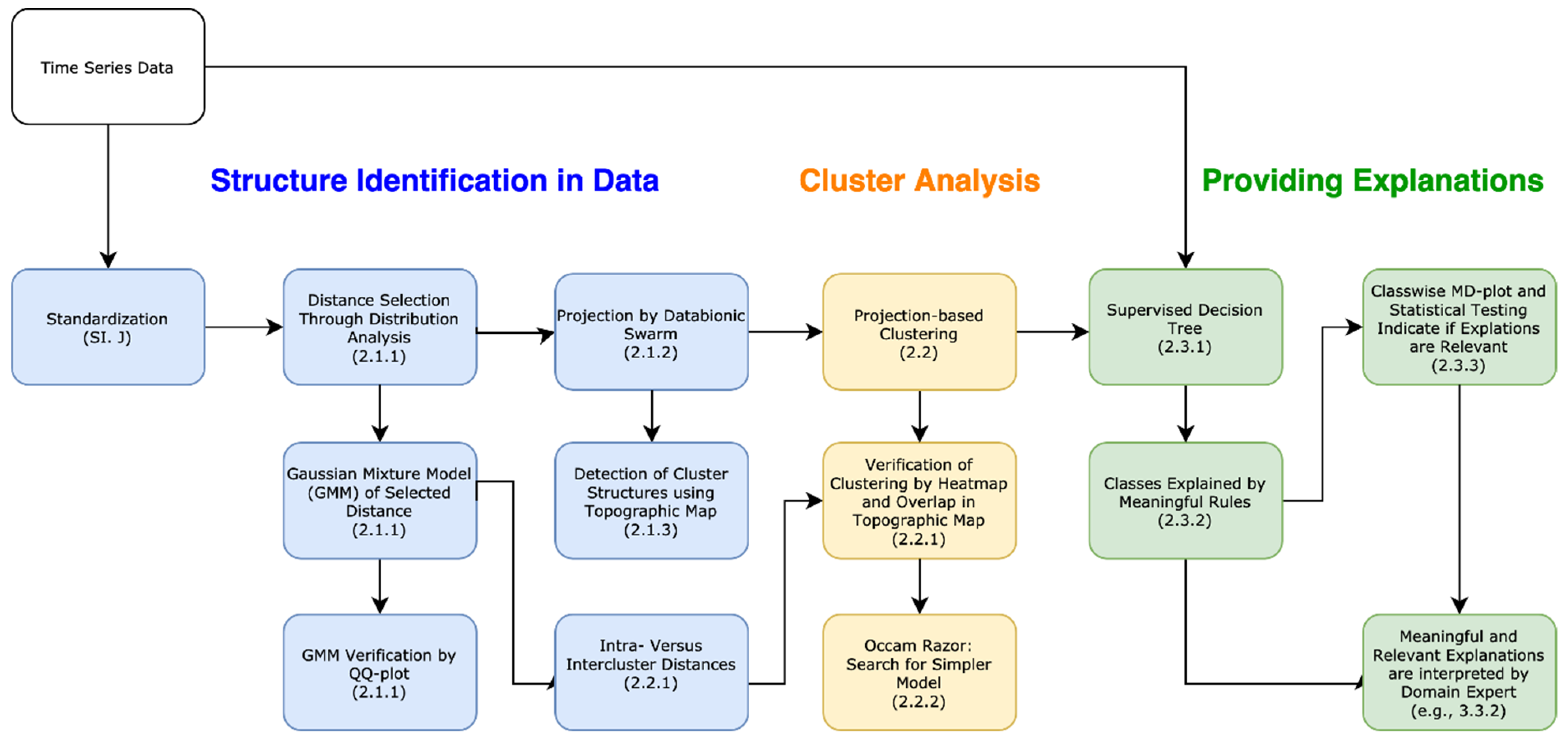
Overall, this work shows for three datasets how to search for days with similar behavior by using a transparent and open-source framework, which is explained in Figure 1. The results explain similar environmental, and in particular water quality, situations, although NO3 stream concentrations “integrate” many processes varying in space and in time [13]. Finally, relevant and meaningful explanations could be used to predict future NO3 and EC values.
Related Works
There are two approaches for the explanation of machine learning systems: prediction, interpretation, and justification, which is used to explain sub-symbolic ML systems (see [14]), and intrinsic interpretable approaches called symbolic ML systems (see [15]), which are explained through reasoning [16]. Recently sub-symbolic ML systems were introduced in [17,18] for which interpretation and justification can be performed with local interpretable model-agnostic explanation (LIME) [19] or its generalization SHapley Additive exPlanations (SHAP) [20]. For example, LIME approximates any classifier or regressor locally with an interpretable model. In the sense of the latter, explanation represents a distinct approach to extract information from the learned model [21]. Typical interpretable ML systems consist of combinations of neural networks and rule-based expert systems [22,23], classification based on predictive association rules [24], Bayesian networks with rule mining [25], hybrids of clustering and fuzzy classification [26] or neuro-fuzzy classification [27], non-iterative ANN-based XAIs [28,29], rule lists [30], interpretable decision sets [31] or decision tables [32], decision tree clustering [33,34] or clustering combined with generative models [35]. The two most recent XAI approaches are the unsupervised decision tree clustering eUD3.5 [36] and a hybrid of k-means clustering and a top-down decision tree [37]. These two unsupervised approaches are the two most similar and current approaches to our proposed XAI framework and will be used as a baseline for comparison.
Loyola-González et al. presented the eUD3.5 algorithm, which uses a split criterion based on the silhouette index [36]. The silhouette index compares every object of a cluster to its homogeneity within a cluster with the heterogeneity to other clusters [38]. In eUD3.5, a node is split only if it’s possible descendants have a better split criterion than the best split criterion found so far. This leads to a decision tree which is based on the cluster structures. A cluster is associated with the class having the most members in the cluster. In eUD3.5, 100 different trees are generated, their performance is evaluated, and the best performing tree is kept. The user can specify the number of desired leaf nodes (stop criterion). If the algorithm produces more leaf nodes than specified by the user, then leaf nodes are combined using k-means. The authors claimed this to have similar performance to k-means and better performance than other conventional decision tree clustering algorithms [36].
Dasgupta et al. used a hybrid of k-means with a decision tree called iterative mistake minimization algorithm (IMM) [37]. The k-means method provides the labels and cluster centers with which the decision tree is built top-down using binary splits in which each node of the tree is associated with a portion of the input data [37]. If this portion of input data contains more than one cluster center, then it is split so that the fewest points are separated from its cluster center: the optimal split is found by searching over all pairs using dynamic programming. The IMM algorithm terminates at a leaf node whenever all points have the same label resulting in a number of leaves equal to the number of clusters [37]. Dasgupta et al. did not provide any source code in their work [25]. Therefore, in the first part of the IMM algorithm [25], the k-means clustering is used through the toolbox published in [39]. Then, feature importance in a k-means clustering is measured using the algorithm provided in the R package “FeatureImpCluster” available on CRAN [40]. The importance per feature is measured by the misclassification rate relative to the baseline cluster assignment due to a random permutation of feature values [40].
2. XAI Framework
Contrary to the approaches introduced above, in which an obscure global objective function is optimized, this work uses the topographic map visualization [41] with projecti-based clustering [42] to validate if the data contains any or no structures based on clusters. Outliers can be interactively marked in the visualization [43] after the automated clustering process in the case that they are not recognized sufficiently in the automatic clustering process [43]. The clustering itself is confined in one module of the XAI framework presented in Figure 1.
There are three main steps in Figure 1. First, structures in the data are identified (blue). Next, the cluster analysis is performed (orange). In the third step, explanations (green) are provided using the labels of the clustering and the multivariate time series data. Each step has several modules that are connected to each other and colored similar to the step. Arrows outline the connections between the modules.
In the first step (I), the time series data are aggregated appropriately (e.g., daily) and then standardized. In step II, various available distance metrics are applied to the data, and the distributions of the distances are investigated for multimodality. If a distance distribution is multimodal, the framework uses the distance metric out of which the distribution resulted. Otherwise, the Euclidean metric has to be used. The distance distribution can be modeled by a Gaussian mixture and exploited in the second step for the evaluation of cluster analysis.
The cluster analysis in step II is composed of three modules. This visualization of the topographic map enables the user to choose the number of clusters and the setting of the one Boolean parameter. The number of clusters can be set as the number of visible valleys in the topographic map. The clustering can be further evaluated by the model of the distance distribution (last arrow between steps I and II), because using the Gaussian mixture model of step I hypothesizes that the intracluster distances of the clustering should be smaller than the Bayesian boundary defined by the Gaussian mixture. The clustering can be validated by the topographic map [42]. Additionally, it is preferable to search for linear models and to validate the clustering externally (e.g., by a heatmap).
After validation in step II, the labels of step II’s resulting clustering are used in supervised decision trees in step III for the training of the un-preprocessed but aggregated data. Then, meaningful explanations are defined by paths in the decision tree. Class-wise distribution analysis and statistical testing of interesting features are performed to assure that explanations are relevant to the domain expert. In the last module, a domain expert interprets relevant and meaningful explanations (c.f. [8]). The analytic procedure details can be found in the methods sections, which are organized according to these three steps, as illustrated in the titles in Figure 1. The result sections are organized the same way. The R packages used in this work are summarized in Appendix I (Appendix I: Used R Packages Table A6).
2.1. Step I: Identification of Structures in the Data
The dataset of 2013/2014 contains 32,196 data points, while those from 2015 and 2016 contain 35,040 and 35,136 data points, respectively. Each dataset comes with the same 14 variables with names and units defined in Table 1. Further details about the data collection are described in Appendix J: Collection and Preprocessing of Multivariate Time Series Data. Missing data were imputed (see Appendix J). Data were standardized and de-correlated as described in Appendix J because distance measures are sensitive to correlations and the differences of variances of features.
2.1.1. Distance Selection
Usually, partitioning and hierarchical clustering algorithms require a distance metric because they seek to find groups of similar objects [44] (i.e., objects with small distances between them). Often, the user cannot manually change the distance metric (c.f. 54 common algorithms listed in [45]), resulting in the implicit application of the Euclidean metric if not otherwise specified. In contrast, projection-based clustering has the advantage that a specific distance metric can be selected by the user, which is then used in the dimensionality reduction and clustering part of the algorithm. However, the critical choice of a distance metric remains undiscussed in prior work.
We propose that a user selects a distance metric based on the multimodality of the specific dataset’s distance distribution. Detailed mathematical definitions are found in Appendix F: Definitions for Distance Distributions. The motivation is that intra-cluster distances should be smaller than inter-cluster distances, and the threshold between the two types of distances can be defined by a Bayesian boundary, which can be computed using a Gaussian mixture.
Several metrics were investigated using the R package ‘parallelDist’ and the mirrored-density plot (MD-plot) function [10] in the R package ‘DataVisualizations’. Multimodality was visibly most evident in the probability density distribution of the Hellinger point distance measure in the case of the given dataset. Hence, the probability density distribution of the selected distance is modeled with a Gaussian mixture model and verified visually with QQplot as described in [46] with the R package ‘AdaptGauss’. The Bayesian boundary of two modes with the highest weights separates the intra-cluster distances from the inter-cluster distances.
2.1.2. Projection
The swarm-based projection method of the Databionic swarm (DBS) algorithm is used to project the distance matrix of data into a two-dimensional plane [47,48]. Similar to the nonlinear and focusing projection methods of emergent self-organizing maps (ESOM) [49], curvilinear component analysis (CCA) [50], t-distributed stochastic neighbor embedding (t-SNE) [51], or neighbor retrieval visualizer (NerV) [52], the dimensionality reduction by the swarm first adapts to global structures. As time progresses, structure preservation shifts from global optimization to the preservation of local neighborhoods. This learning phase requires an annealing scheme and usually require parameters to be set. However, by exploiting concepts of self-organization and emergence, swarm intelligence, and game theory, this projection method is parameter-free [47,48]. The intelligent agents of the swarm, called DataBots [53], operate on a toroid grid, where positions are coded into polar coordinates to allow for the precise definition of their movement, neighborhood function, and annealing scheme.
In contrast to other focusing projection methods (e.g., [51,52,54]), the size of the grid and the annealing scheme are data-driven. During the learning phase, each agent moves across the grid or stays in its current position in the search for the most potent scent. The equation (c.f. Equation (5) in [55]) that mathematically defines the scent uses information stored in the distance matrix (c.f. definition in Appendix F). Hence, agents search for other agents carrying data with the most similar features to themselves with a data-driven decreasing search radius [55]. Every agent’s movement is modeled using a game-theory approach, and the radius decreases only if a Nash equilibrium is found [54,56]. Contrary to ant-based clustering algorithms, DataBots do not move data. Instead, each DataBot possesses a scent, defined by one high-dimensional data point.
2.1.3. Structure Visualization by Topographic Map
Projection points near to each other are not necessarily near in the high-dimensional space (vice versa for faraway points), but in planar projections of data, these errors are unavoidable (c.f. Johnson-Lindenstrauss Lemma [57]). Hence, the topographic map identifies structures in data based on a projection. First, the generalized U-matrix [47,58] is calculated on this projection using emergence through an unsupervised artificial neural network called a simplified (because parameter-free) emergent self-organizing map [41]. The topographic map with hypsometric tints is a visualization approach for the generalized U-matrix (see [59] for alternative approaches), which can be vividly described as a virtual 3D landscape with a specific color scale chosen with an algorithm defining the contour lines [59]. The topographic map addresses the central problem in clustering, i.e., the correct estimation of the number of clusters. It allows the assessment of the number of clusters by inspecting the 3D landscape.
The topographic maps correspond to high-dimensional distance and density structures. Hypsometric tints are surface colors that represent ranges of elevation. The contour lines are combined with a specific color scale. The specific color scale is chosen to display various valleys, ridges, and basins: blue colors indicate small distances (sea level), green and brown colors indicate middle distances (low hills), and shades of white colors indicate vast distances (high mountains covered with snow and ice). Valleys and basins represent clusters, and the watersheds of hills and mountains represent the borders between clusters. In this 3D landscape, the visualization borders are cyclically connected with a periodicity.
2.2. Step II: Cluster Analysis with Projection-Based Clustering (PBC)
The definition of a cluster remains a matter of ongoing discussion [60,61]. Therefore, the justification for an appropriate choice for any one of the over fifty currently available open-source clustering algorithms [45] is proposed using data-driven criteria of Gaussian mixture models of distances, topographic maps, heatmaps, and Occam’s razor (in the following Section 2.1.1, Section 2.1.3, Section 2.2.1, and Section 2.2.2). Additionally, a benchmarking of 34 clustering algorithms revealed for a large variety of distance and density-based cluster structures that projection-based clustering (PBC) is an appropriate choice [42]. Therefore, in step II, projection-based clustering is applied, which involves setting one Boolean parameter (details in [42]).
2.2.1. Verification of a Clustering
Clustering is verified by one internal approach and two external methods, the topographic map serves as an internal quality measure of a clustering. Additionally, the choice of the Boolean parameter of compact versus connected can be evaluated using the clustering in step II through the topographic map as specified in Figure 1: If a cluster is either divided into separate valleys, or several clusters lie in the same valley of the topographic map, the compact (or connected) clustering approach is not appropriate for the data. An extensive discussion of this behavior can be found in [42]. Additionally, the clustering can be improved further using an interactive interface (c.f. provided in the R package ‘ProjectionBasedClustering’) [43].
Externally, the clustering can be evaluated with heatmaps and the Bayesian boundary computed in Section 2.1.1.
A heatmap visualizes the homogeneity of clusters and the heterogeneity of intercluster distances if the clustering is appropriate [62,63,64]. Furthermore, the clustering is valid if, in the topographic map, mountains do not partition clusters indicated by colored points of the same color and colored regions of points [42].
The Bayesian boundary is computed using a Gaussian mixture model and it provides a data-driven hypothesis about the similarity of data points (i.e., days in the example of this work). In this sense, days that a cluster analysis partitions to the same cluster are similar if their intra-cluster distances are lower than the Bayesian boundary.
2.2.2. Occam’s Razor
Ockham’s razor states that if two models are applicable, the less complex one should be used [65]. Therefore, the authors suggest investigating whether simpler models can represent the structures in data and provide meaningful and relevant explanations. A simpler projection approach assuming linear cluster structures and a simpler clustering [39] approach assuming spherical cluster structures is applied to the data. Moreover, spherical cluster structures are tested with the silhouette plot using the R package ‘DataVisualizations’.
2.3. Step III: Providing Meaningful and Relevant Explanations
Explainability should follow the Grice maxims of quality, relevance, manner, and quantity [11], for the usage of decision trees in this work. They are summarized into meaningful and relevant explanations that are interpretable by a domain expert [8].
2.3.1. Decision Trees for Identified Structures in Data
The conventional usage of decision trees is usually supervised, requiring a prior classification (e.g., [66]) but, alternatively, can also be unsupervised using split evaluation criteria that do not require a prior classification (e.g., [34]). Supervised decision trees are, for example, the classification and regression tree (CART) [67] or globally optimal classification and regression trees [68]. Here, we propose a third approach by using the clustering labels provided by cluster analysis in step III instead of a prior classification. Contrary to common usage, the decision tree is exploited here to explain the identified structures in data. The supervised decision trees are computed using the labels and unprocessed or back-transformed data. Exemplary, the R package “rpart” and the package “evtree” are applied. If the number of leaves exceeds the Miller optimum, further pruning can be specified in the open-source libraries.
The maxim of quality states that only well-supported facts and no false descriptions should be reported. Quality will be measured by the accuracy of supervised decision trees representing the clustering.
2.3.2. Extracting Meaningful Explanations
The maxim of manner suggests being brief and orderly and avoiding obscurity and ambiguity [11]. For the explanation to be in an appropriate manner, the standardization has to be either back-transformed to provide measurement in the international system of units or unprocessed data has to be used. The maxim of quantity states that neither too much nor too few explanations should be presented [11]. This work specifies the statement in the sense that the number of explanations should follow the Miller optimum of four to seven [69,70]. Then, explanations are meaningful to a domain expert (c.f. discussion [8]).
However, decision tree algorithms do not aim at meaningful explanations [62,71]. Therefore a transformation of the decision tree into rules is necessary. Here, rules are extracted from the decision tree by following each path from the root to the leaf. The number of rules measures the property of meaningfulness.
2.3.3. Evaluating the Relevance of Explanations
The maxim of relevance requires that only rules relevant to the expert are listed. Typically, explanations are especially relevant if they are tendentially contrastive (c.f. [9]).
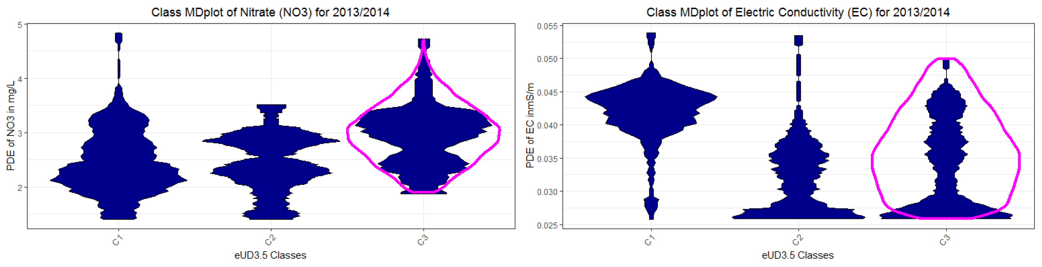
Suppose an explanation based on a clustering of the data is relevant (i.e., reveals to the domain expert relevant high-dimensional structures for similar days). In that case, the classes defined by such explanations should contain samples of different environmental states and be based on different processes. The property of relevance is qualitatively evaluated by class mirrored-density plots class (MD plots) [10]. Additionally, statistical testing of class-wise distributions of features can be performed to ensure that the classes defined by rules are tendentially contrastive and, in consequence, relevant.
The mirrored-density plot (MD-plot) introduced in [10] visualizes a density estimation in a similar way to the violin plot [63]. The MD-plot uses for density estimation the Pareto density estimation (PDE) approach [64]. It can be shown that comparable methods have difficulties in visualizing the probability density function in the case of uniform, multimodal, skewed, and clipped data if the density estimation parameters remain in a default setting [10]. In contrast, the MD plot is particularly designed to discover interesting structures in continuous features and can outperform conventional methods [10]. The MD plot does not require any adjustments in density estimation parameters, which makes the usage compelling for non-experts. The class MD-plot is available in the R package ‘DataVisualizations’. The class MD plot visualizes the density of each class of an interesting feature separately and is used to show the relationship of the clusters of the XAI systems to NO3 and EC concentrations.
3. Results
An overview of the analysis is provided in Figure 1. For clarity, the rest of this chapter is subdivided into four sections, of which the first three are based on Figure 1. The first section consists of the selection of an appropriate distance metric, extracting the first hypothesis from the distribution of distances (Section 3.1), and providing the topographic map. However, the projected points in the topographic map are already colored by the clustering of the second step. The second section presents the projection-based cluster analysis method and validates the clustering (Section 3.2). The third section presents and evaluates explanations (Section 3.3). The results focus on the first hydrochemical time series data of 2013–2014. The DDS-XAI’s explanations of subsequent datasets of the years 2015 and 2016 are presented in Appendix K: DDS-XAI Results of 2015 and 2016 data. The fourth section compares the DDS-XAI to the two most similar approaches of eUD3.5 and IMM based on all three datasets (Section 3.4).
3.1. Step I: Structure Identification
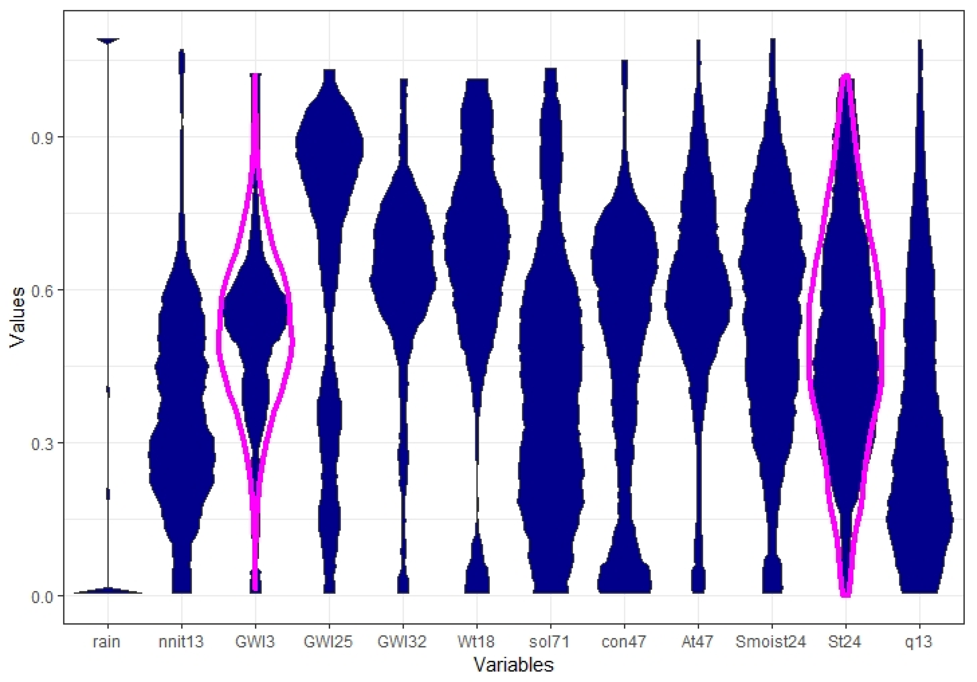
In Appendix A (Appendix A: Features after Preprocessing), the probability density distributions of the 12 finally selected and preprocessed variables are visualized with mirrored-density plots [10] (described also Section 2.3.3 Step III). Appendix A shows the result of an appropriate standardization of features resulting in similar variances.
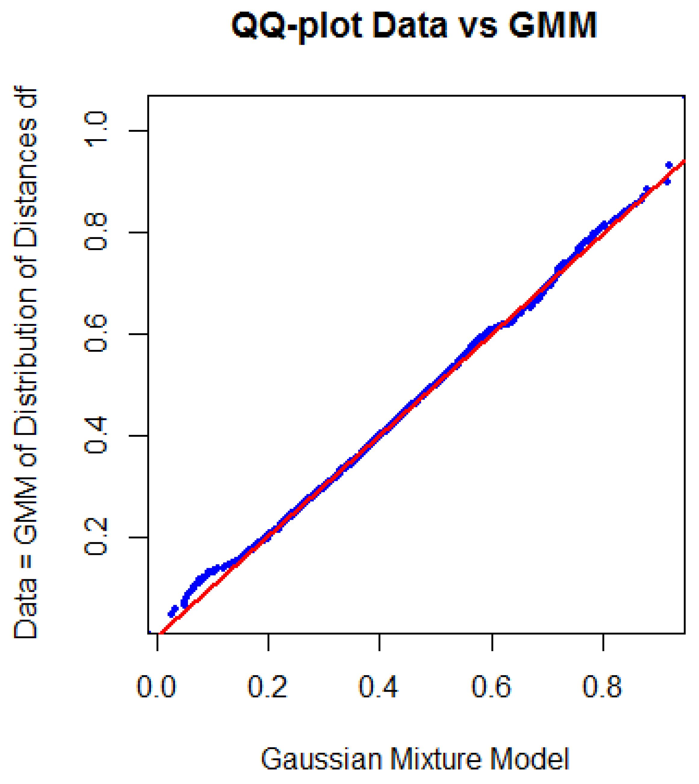
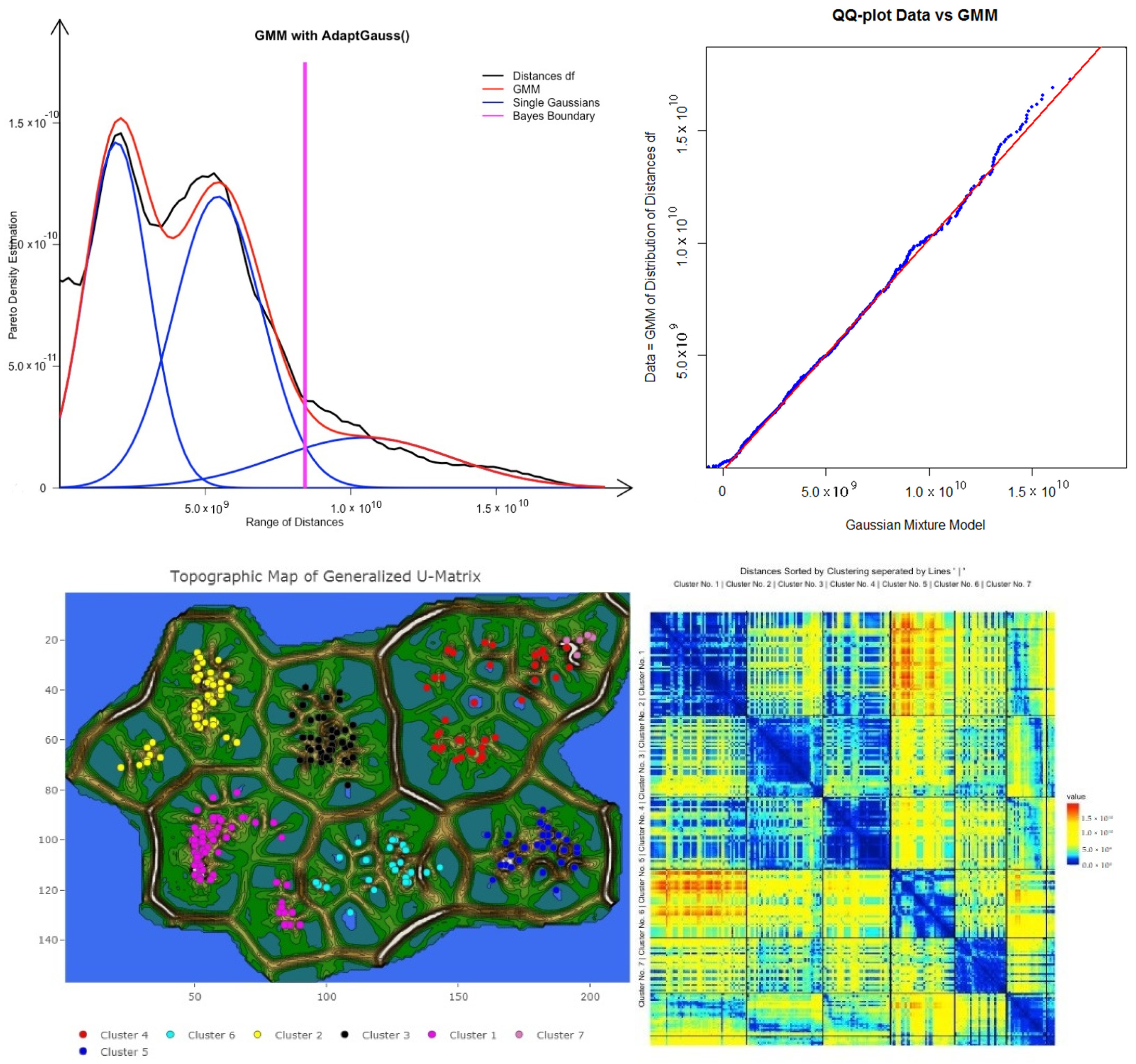
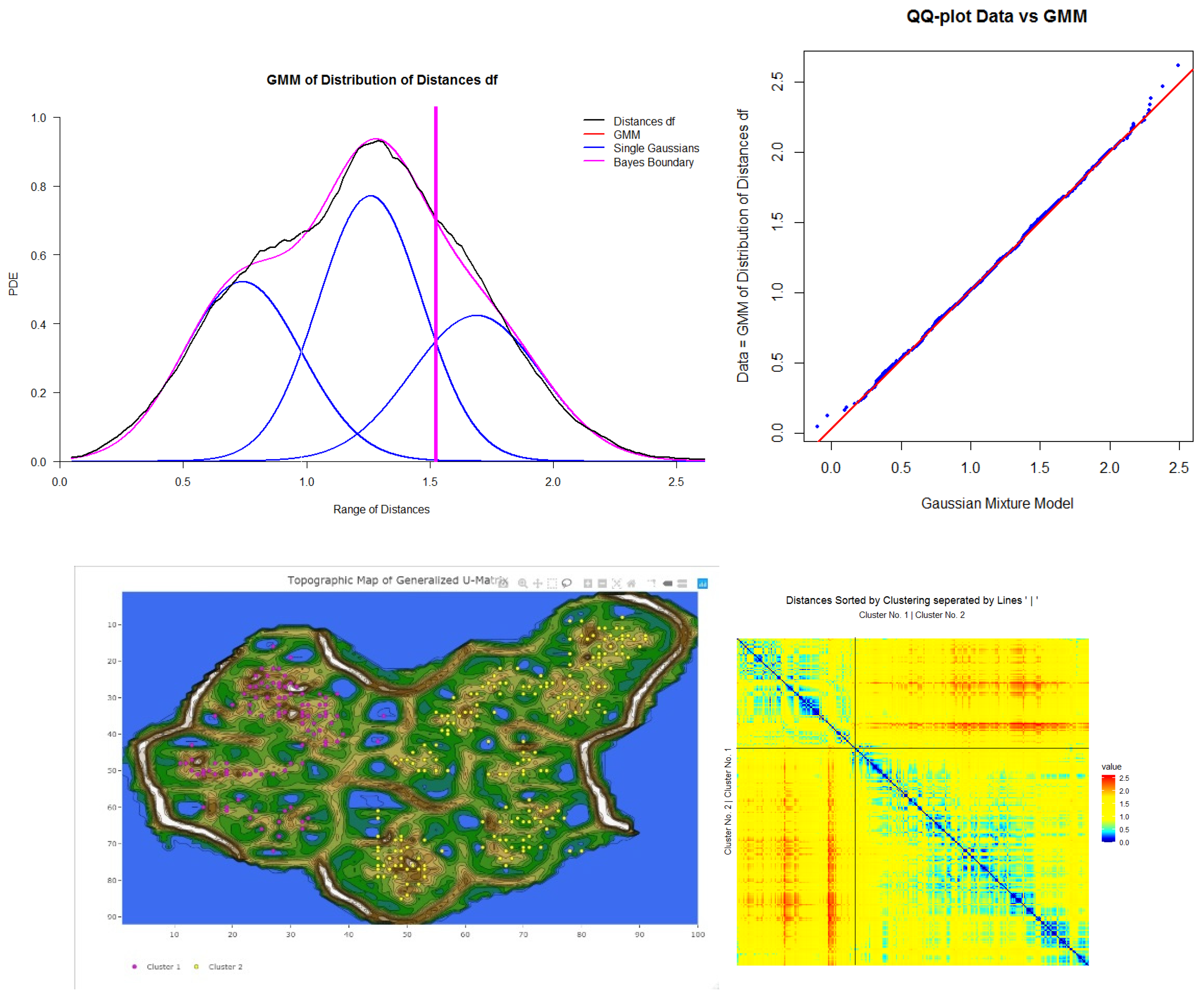
As an example, Figure 2 presents the probability density estimation (PDE) [64] of the distance feature df of the Hellinger point distance matrix of the preprocessed data of 2013/2014 in black and its Gaussian mixture model (GMM) in red. Specific definitions can be found in Appendix F: Definitions for Distance Distributions. The Hellinger point distance [72] in the R package ‘parallelDist’ was chosen for cluster analysis because the distribution of distances is statistically not unimodal according to Hartigan’s dip test [73] (with p(D = 0.006385, N = 61425) < 0.001). The distance distribution can be modeled through the Gaussian mixture model (GMM) using the expectation-maximization (EM) algorithm [74]. The distance distribution and GMM are visualized in Figure 2. The quantile-quantile plot (QQ-plot) verifies the GMM in Figure 3. This serves as an indication of the existence of high inter-cluster distances (distances between different clusters) and outlier distances as well as small intra-cluster distances (distances within each cluster), meaning that a distance-based cluster structure can be found. The Bayesian boundary of the GMM in Figure 2 is 0.39. For the 2015 dataset, a Minkowski distance is selected (Appendix K: DDS-XAI Results of 2015 and 2016 data, Figure A10 top), and for the 2016 dataset, the Euclidean distance is selected (Appendix K, Figure A11 top).
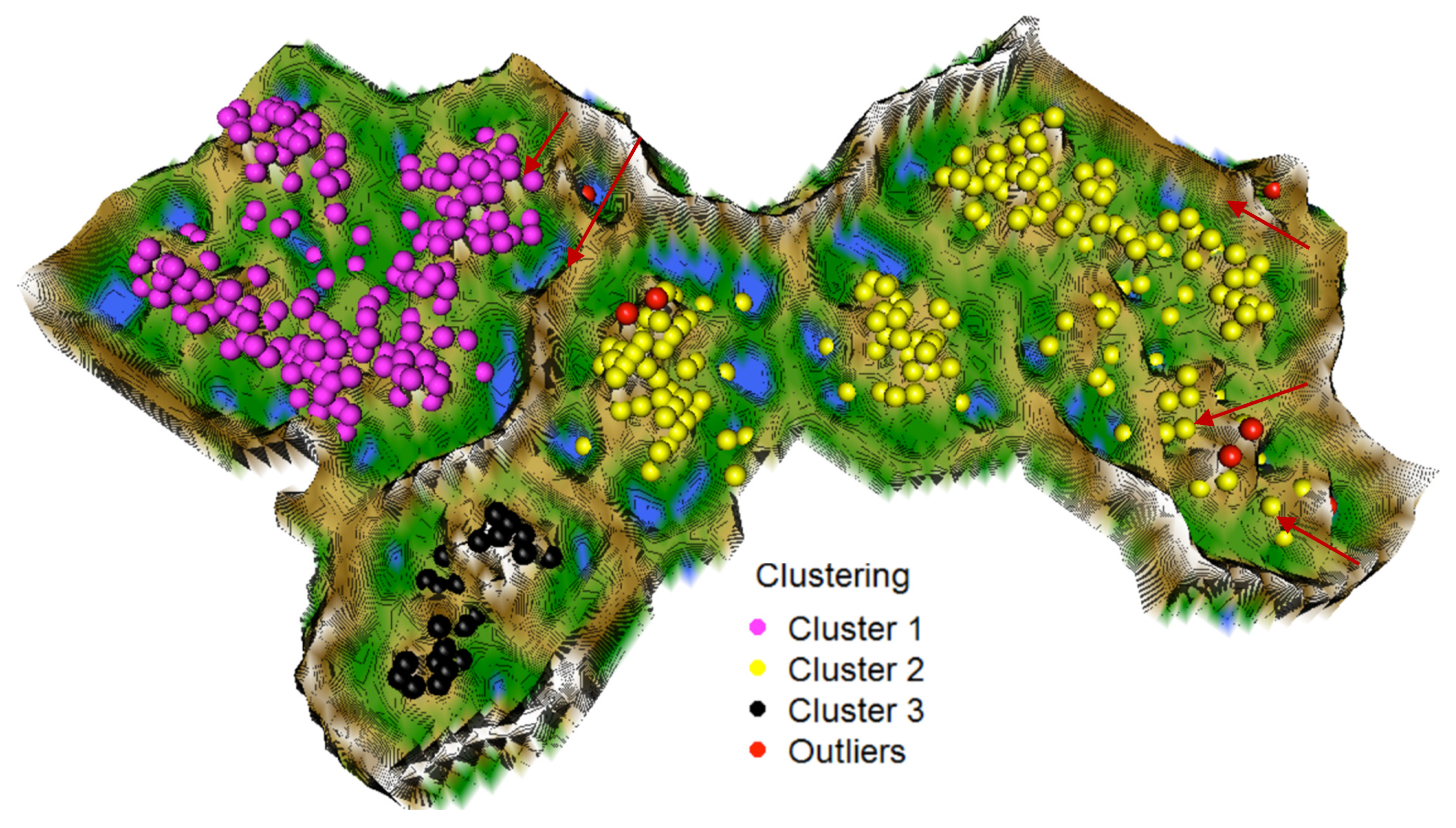
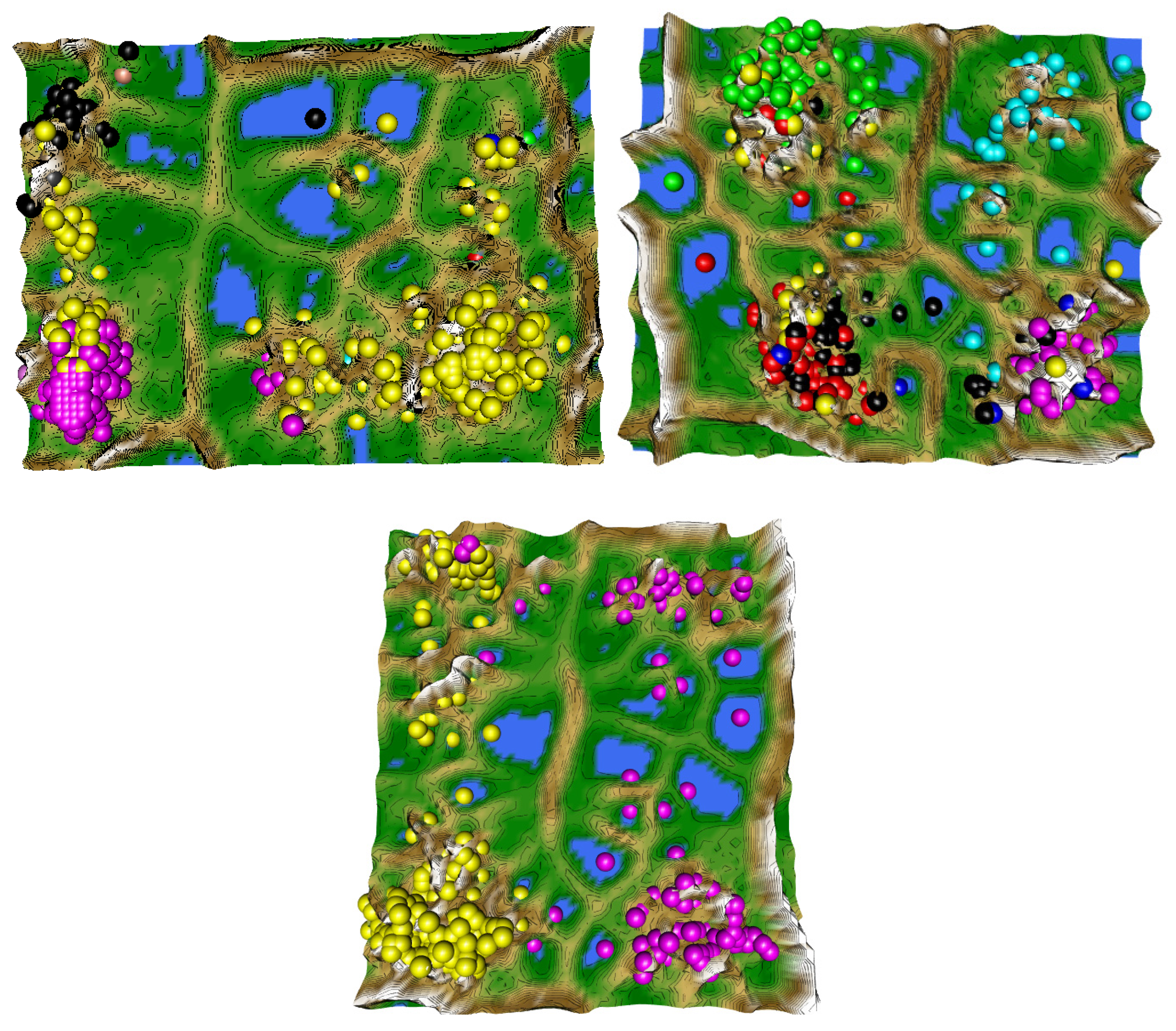
Next, the topographic map of high-dimensional structures evaluates the clustering of the 2013/2014 data by indicating which points are in the high-dimensional space far away (brown/white hills) or near (blue seas, green grassland). The topographic map with hypsometric tints generated with the R package ‘GeneralizedUmatrix’ is toroidal, meaning that the grid’s borders are cyclically connected with a periodicity defined by the size of the grid of the projection method. In Figure 4, a cutout island of the topographic map is shown. Every point symbolizes a day. The high-dimensional distances of the low-dimensional projected points are visualized. The topographic map shows three valleys and basins indicating clusters and watersheds of hills and mountains shown by borderlines between clusters. Thus, the number of clusters is equal to the number of valleys. Without the cluster analysis providing the labels, all projected points would have the same color.
For the 2015 dataset, seven clusters can be identified in Appendix K (Figure A10, bottom), and for the 2016 dataset, only two clusters are depicted in the topographic map shown in Appendix K (Figure A11 bottom).
3.2. Step II: Cluster Analysis
The clustering labels are hereafter visualized as the colors of the projected points. In addition to the two main clusters (magenta and yellow points) and one outlier cluster (black points), seven outliers can be identified as volcanoes or within the valleys indicated by red arrows in Figure 4. Next, the authors generated distance-based heatmaps in order to verify the clusterings. The heatmap for the 2013/2014 distances and clustering shows intra- versus inter-cluster distances ordered by each cluster in Figure 5. Heatmaps of 2015 and 2016 data are presented in Appendix K, Figure A10 and Figure A11. Blue colors symbolize small distances, and yellow and red colors represent large distances. The heatmap depicts clusters’ homogeneity because the pattern of blue and teal colors is present for intra-cluster distances and yellow to the red color pattern for inter-cluster distances. The median intra-cluster distances of clusters 1, 2, and 3 are 0.24, 0.36, and 0.31, respectively and are below the Bayes boundary of the GMM in Figure 2 of 0.39 for the 2013/2014 data. The average inter-cluster distance is 0.48 and above the Bayesian boundary of 0.39. Similar results are obtained for the 2015 and 2016 data. These results indicate that the intra-cluster distances are smaller than the inter-cluster distances for all three datasets. This means that days within each cluster are evidently more similar to one another than days between clusters in each of the three datasets.
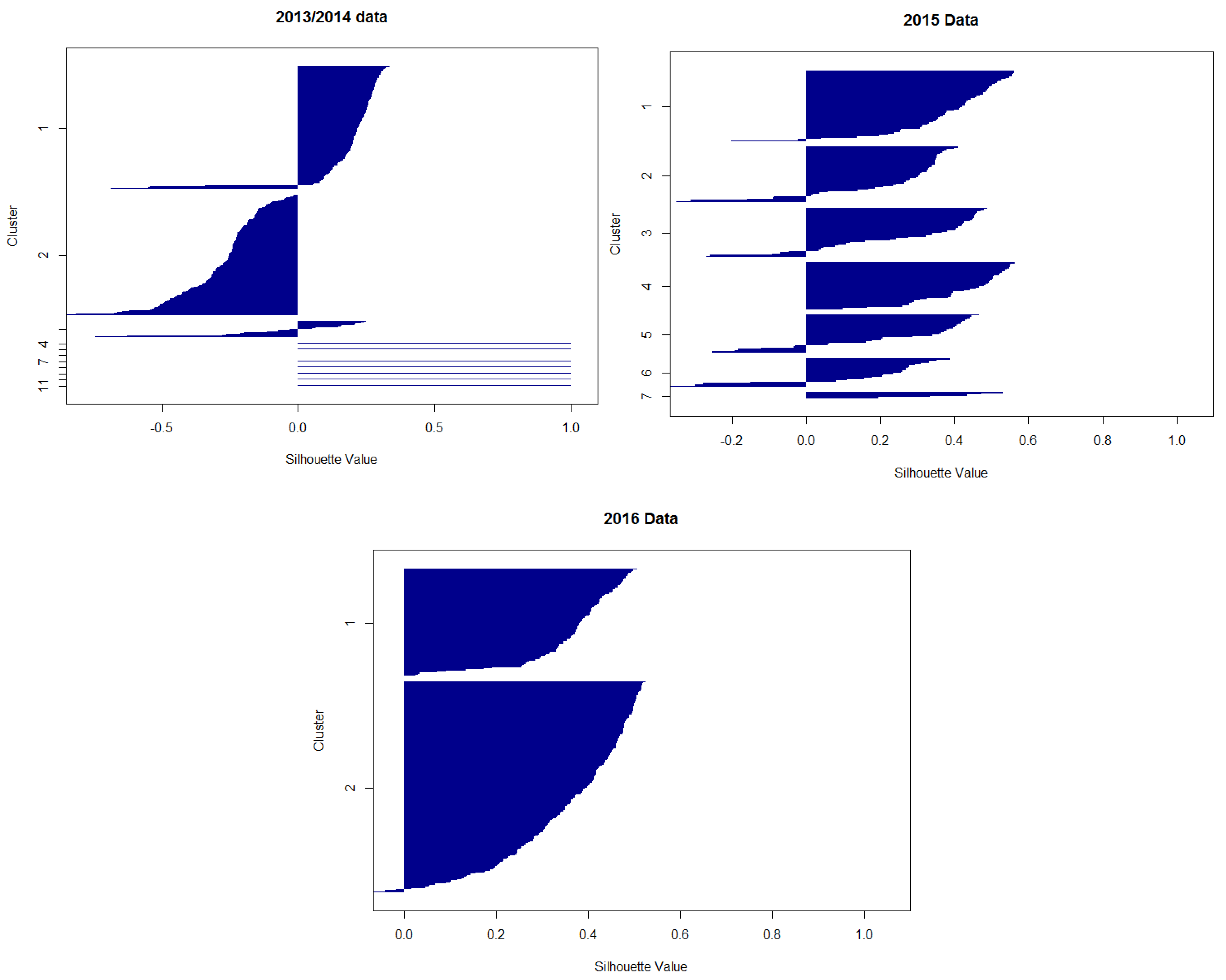
To check for a possibility of a simpler model, a linear projection by the method projection pursuit [75] using a clusterability index of variance and ratio (c.f. [76]) is applied on the 2013/2014, 2015, and 2016 datasets. The linear projections do not reveal clear structures, even if the generalized U-matrix is applied to visualize high-dimensional distance structures in the two-dimensional space (Appendix G: Linear Models, Figure A4). Therefore, it can be assumed that the structures of these three datasets cannot be separated linearly, motivating the usage of more complex and elaborate methods. Silhouette plots (Appendix D: Silhouette Plots, Figure A2) of the 2013/2014, 2015, and 2016 data indicate inappropriate values for this clustering procedure if a spherical cluster structure is assumed. The clustering of the 2013/2014 data can be reproduced with an accuracy of 86% using hierarchical clustering as described by Ward [77] if the seven outliers are disregarded, because the method is sensitive to outliers [78].
3.3. Step III: Providing Explanations
For the explanation of the clustering as described in step II, non-standardized features have to be used because the system should explain the clustering to the domain expert and not the data scientist [8]. The clusters of the 2013/2014 dataset are explained by applying the evtree [68] and CART algorithm [67,79]. The evtree decision tree is shown in Figure 6a, and the CART decision tree for the data is visualized in Figure 6b. Both decision trees agree on the same feature sets and relations for each cluster except for cluster three, for which Rain < 0.2 is not required to differentiate from cluster one and two in evtree, although that makes cluster 3 less meaningful. The boundaries vary slightly between CART and evtree. None of the outliers could be explained by either evtree or CART. CART has a lower error and improves the meaningfulness of cluster three. CART provides a decision tree presented in Figure 6b that reproduces the clustering with an accuracy of 96.5%. Therefore, the rules are extracted from the CART tree instead of the evtree by following a path from the root to the leaf. For example, rule R1 explains cluster one of Figure 4 (magenta). The combination of rules and clusters describes the classes which could predict future NO3 and EC values (Table 2). The description of class 2 gains more detail if maximum likelihood plots of rain and water temperature (Wt18) are used (Appendix E: Distinction of Class 2 and 2 in Regard to Rain and Water Temperature, Figure A3). Decision trees with 89% accuracy for the 2015 and 2016 dataset are shown in Appendix K, Figure A9.
3.3.1. Evaluating the Relevance of DDS-XAI’s Explanations
Next, we investigate the NO3 and EC probability density distributions per class. In the previous section, the clusters were explained by rules to define classes. The class-dependent MD-plots of Figure 7a,b show that the classes depend on normal or high NO3 levels (Figure 7a) as well as on low, intermediate, or high conductivity levels (Figure 7b) because the distributions of classes differ significantly from one another, with the exception of NO3 classes 2 and 3. It is confirmed by Kolmogorov–Smirnov tests (Appendix C: Kolmogorov-Smirnov tests of clusters) that the classes differ significantly from each other in the NO3 and EC distributions, except for class 2 versus class 3 in NO3. However, class 2 and class 3 also differ significantly from each other in the variables of rain and Wt18 (water temperature) in Appendix E, Figure A3. For the second and third dataset, the class-dependent MD-plots in Appendix K, Figure A7 (2015 data), and Figure A8 (2016 data) show distinct NO3 and EC levels depending on the class defined in Table A7 and Table A8 (Appendix K), with the exception of outliers and one class for EC. In sum, the results show that the explanations are comprehensible and relevant to the domain expert.
3.3.2. Interpreting Explanations
We acquired relevant and meaningful explanations by the DDS-XAI framework proposed in this work. As a proof of principle, the domain expert is able to interpret the explanation of the first dataset of 2013/2014 in Table 2 as follows: while water temperature governs the biological turnover of nitrogen compounds in the stream water, hydrological variables such a groundwater level determine how and whether terrestrial NO3 pools are connected to the stream system by activating flow pathways. Furthermore, the rainfall–runoff generation processes either concentrate or dilute the stream NO3 concentration, according to the difference in NO3 concentration in the stream and in the “new water” added to the stream system.
In the search for days with similar behavior, days with normal and high NO3 were identified. In 321 out of 343 days, the NO3 concentrations were normal (in the average range of (1, 3.5) mg/L). On such days, the concentrations of electric conductivity (EC) were either high (in the average range of 0.034–0.055 mS/m) or intermediate to low (in the average range of 0.25–0.045 mS/m). Normal NO3 and higher EC occurred on dry days with increased stream water temperature and higher groundwater levels. From a data-driven perspective, these days were highly similar to one another (c.f. cluster 1 in Figure 4 and Figure 5). The explanation for normal NO3 with low to normal EC concentrations is more complex and described by “duality”: they likely had an intermediate stream water temperature (6.1 °C < WT18 < 12.5 °C) with either dry days (average rain < 0.15 mm) and low groundwater levels (<1.28 m) or rainy days with high groundwater levels (see Appendix E).
Simultaneously, high NO3 concentrations (in the average range of (3, 5.5) mg/L) and very low EC concentrations (in the average range of (0.025, 0.028) mS/m) occurred only if the stream water temperature was low on dry days. In particular, stream water temperature influences the activities of living organisms. The groundwater level (or head, in m) is the primary factor driving discharge in the Schwingbach catchment, while rainfall intensity triggers discharge and affects the leaching of nutrients [80].
3.4. Comparison of DDS-XAI with eUD3.5 and IMM
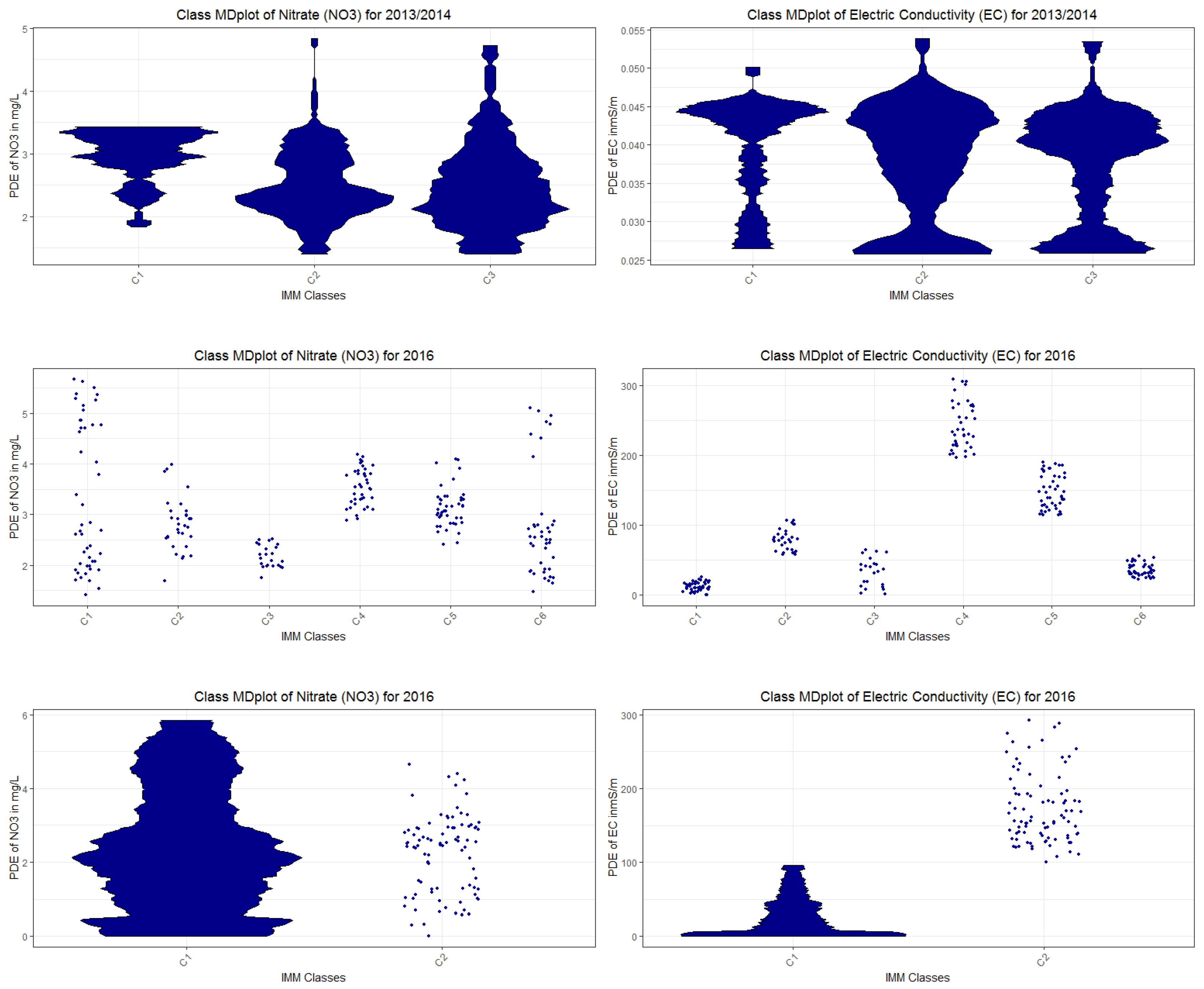
Applying the eUD3.5 algorithm [36] to the unprocessed 2013/2014, 2015, and 2016 data identified in each case three clusters and resulted in 541, 503, and 552 rules that are required to explain various overlaps in the data points of the three clusters. The seven outliers for the 2013/2014 data and five outliers for the 2015 data identified in our analysis were disregarded before using eUD3.5. In comparison, the DDS-XAI framework proposed a streamlined solution with five, seven, and four rules. Furthermore, the class MDplots for nitrate do not show different states of water bodies for eUD3.5 in Appendix H: Class MDplots of eUD3.5 and k-means, Figure A5, except for one class of intermediate NO3 concentrations in 2016 (Appendix H, Figure A5, left bottom) and one high state of electric conductivity in 2013/2014 (Appendix H, Figure A5).
We further compared our DDS-XAI results with those of the k-means part of the IMM algorithm combined with a measure of feature importance for the clustering because Dasgupta et al. did not provide any source code in their work [37]. Therefore, the first part of the IMM algorithm [37], the k-means clustering [39], was performed with the unprocessed data of 2013/2014, 2015, and 2016 as no other information by Dasgupta et al. was available. The seven outliers for the 2013/2014 data and the five outliers for the 2015 data identified in our analysis were disregarded from the data for this k-mean clustering. Measuring the feature importance for the clustering [40] indicates that it is based mainly on sol71 in each dataset, leading to the assumption that the second part of the IMM algorithm, the decision tree, would favor this feature strongly to explain the clusters. For all three datasets, the k-means clustering was compared to the projection-based clustering, for which the contingency tables are presented in Appendix B: Comparison to the K-means clustering approach, Table A1, Table A2 and Table A3. The contingency tables do not show an overlap of clusters between projection-based clustering and the first part of the IMM algorithm, k-means. Additionally, the class MDplots are presented in Appendix H, Figure A6 for all three datasets, which do not show different states of water bodies with the exception of EC in 2015 and 2016, meaning that IMM’s explanation is significantly less relevant to the domain expert.
The results are summarized in Table 3. The table shows that the IMM and eUD3.5 cover the data slightly better since the DDS-XAI is not able to explain the clustering exactly. However, the IMM and eUD3.5 results are not meaningful to the domain expert because the number of explanations is either primarily based on only one feature or the amount of explanations is too high to be comprehensible for a domain expert. Furthermore, the clusterings of IMM and eUD3.5 would largely not result in distinct water bodies, contrary to DDS-XAI, resulting in irrelevant explanations. It follows that the explanations of eUD3.65 and IMM are neither meaningful nor relevant to the domain expert.
4. Discussion
Conventional XAIs try to argue for explainability in various ways. For example, numerous axioms can be postulated, and then it is proved that the proposed XAI best satisfies these axioms (e.g., [81]), or diverse evaluation metrics for explainability are used (e.g., [48]). The reason for this considerable variety lies in the fact that explainability is rather complex to define [82]. We follow the view of Arrieta et al., that “explainability” is associated with the notion of explanation as an interface between humans and a decision-maker [machine] that is, at the same time, both an accurate proxy of the decision-maker [machine] and comprehensible to humans” [83,84]. In this sense, explainability is evaluated here by building on Grice’s maxims of logic and conversation. According to Grice’s maxims, our AI is an XAI and outperforms comparable approaches. DDS-XAI framework is applied to hydrochemical time series. However, the framework could be applicable to other datasets.
In the DDS-XAI, the selection of a suitable distance measure per dataset in combination with cluster analysis enables guides supervised decision trees. For three datasets, explanations are extracted from these clustering-guided decision trees. It is assumed that cluster analysis is valid if intra-cluster distances are smaller (more similar to each other) than inter-cluster distances. As a parameter-free clustering algorithm, projection-based clustering was chosen. It enables the evaluation of the clustering with a topographic map in addition to the conventional heatmap. Projection-based clustering [42] with the projection of the Databionic swarm [55] is a flexible and robust clustering framework that has the ability to separate complex distance-based structures. The existence of structures in data defining clusters and the number of clusters can be estimated prior to the clustering by the visualization of the topographic map. Such structures were identified by low intra-cluster distances and high inter-cluster distances of Gaussian mixture models of the distance distributions and verified by the heatmaps and topographic maps for each dataset separately. Simpler linear models (Appendix G, Figure A4) or spherical cluster structures were inappropriate (Appendix D, Figure A3, Appendix B, Table A1, Table A2 and Table A3) for all three datasets. It follows that most conventional approaches for clustering listed in [85] or recent XAIs [36,37] would be not appropriate to detect meaningful and relevant structures in data. Statistical testing indicates that the distributions of interesting variables differ between classes (Appendix C and Appendix E) for the 2013/2014 dataset. Further results imply that the explanations for all three clusterings were meaningful because brief rules were extracted by applying decision trees. Overall, it can be deduced that this dataset contains linearly non-separable distance based on non-spherical cluster structures that are meaningful and relevant to the domain expert.
The major difference between other XAIs and the approach followed here is that comparable approaches use unsupervised decision trees, whereas this work uses decision trees based on a clustering that is performed independently. This has two main advantages.
First, in Thrun and Ultsch, it was shown that k-means can only grasp spherical cluster structures, which is a severe restriction [42]. Moreover, the silhouette plot is only useful in the case of spherical or ellipsoidal structures [38,86]. As a consequence eUD3.5 will prefer hyper ellipsoidal cluster structures and IMM will only work well on spherical cluster structures because it is based on k-means. The DDS-XAI presented here outperforms k-means because it can find a large variety of cluster s [42]. Additionally, clustering algorithms may return meaningless results in the absence of natural clusters [87,88,89] in contrast to PBC, which will clearly indicate that no cluster structures exist [42,55]. Moreover, PBC is able to discover small classes [42], whereas UD3.5 is not [36] (p. 52381).
Second, the compared approaches of eUD3.5 and IMM are limited to either use transformed data simultaneously providing no meaningful explanations to the domain expert, or to use non-transformed data. If unprocessed data measured with the international system of units is used, the results show that comparable XAI would not provide meaningful explanations. In eUD3.5, many rules are presented for each cluster which do not cover the clusters well enough. IMM weights one feature significantly more than all other features combined. Moreover, neither IMM nor eUD3.5 provide a clustering that is relevant to the domain expert because. Most of the class-wise distributions of NO3 and EC do not differ (see. Appendix H, Figure A5 and Figure A6 for details). Hence, these classes do not define different states of water bodies.
In summary, explanations are relevant and meaningful in our work, whereas for eUD3.5 and IMM, the explanations are neither relevant nor meaningful.
5. Conclusions
No prior knowledge usable for a cluster analysis was available for the environmental and water quality data used here. Therefore, an XAI system relying on verifiable projection-based clustering was used. Explanations were provided in a three-step approach of “structure identification in data” followed by cluster analysis, for which explanations were provided using unprocessed data.
Explanations were provided by rules through a combination of supervised decision trees that are trained on the labels of the clustering of preprocessed data. Contrary to other XAI approaches, the explanations of the XAI framework proposed here were meaningful. They explained relevant content in a human-understandable way. The explanations suggest that the stream water quality data regarding NO3 and EC can be described by a combination of one variable related to biological processes (water temperature) and two variables related to hydrological processes (rain and groundwater level). Our XAI provided explicit ranges of values and could enable future prediction of stream water quality. One other XAI (eUD3.5) failed to extract relevant and meaningful rules. Another XAI (IMM) failed because it focuses on specific cluster structures and features, hence relies on prior knowledge about data structure.
The XAI framework presented here allows for unbiased detection of explainable structures in high dimensionality datasets. Such datasets become more and more available, not only in hydrochemistry but also in other environmental disciplines due to the technical innovation in monitoring equipment. Our explainable AI provides a unique possibility to search for unknown structures and can provide meaningful and relevant explanations because it does not rely on prior knowledge about any particular structure in the data.
Author Contributions
L.B. devised the project and collected the data. M.C.T. wrote the manuscript with major support from L.B. regarding all non-data science aspects. M.C.T. designed the model and the computational framework and analyzed the data. A.U. supervised the project, checked calculations and programs and contributed and revised the manuscript. All authors discussed the results and contributed to the final manuscript. All authors have read and agreed to the published version of the manuscript.
Funding
This research received no external funding.
Institutional Review Board Statement
Not applicable.
Informed Consent Statement
Not applicable.
Data Availability Statement
The raw data is available on GitHub: https://github.com/Mthrun/ExplainableAI4TimeSeries2020/tree/master/90RawData. Aggregated data is available at https://github.com/Mthrun/ExplainableAI4TimeSeries2020/tree/master/09Originale. The exact version of the model used to produce the results used in this paper is archived on Zenodo: DOI: 10.5281/zenodo.4498241 under GPL license. The specific application of the functions mentioned in Code availability to the analyzed data is available in https://github.com/Mthrun/ExplainableAI4TimeSeries2020/tree/master/08AnalyseProgramme.
Acknowledgments
We thank Alice Aubert for fruitful discussions regarding the interpretation of the results and Hamza Tayyab for compiling the C# Source code of eUD3.5 XAI and applying it to the multivariate time series data.
Conflicts of Interest
The authors declare no conflict of interest.
Appendix A. Features after Preprocessing
Variables were preprocessed such that metric distances can be used because the range of every feature is approximately between zero and one. The distribution of the features is shown by the MD-plot [10] (described also Section 2.3.3 Step III for definition) in Figure A1. This preprocessed dataset of 2013/2014 is used for PBC [42]. The complete aggregated dataset of 2013/2014 consisted of 343 days. The mirrored-density plots (MD-plots) show that the range of a variable is approximately between zero and one because the robust normalization approach uses 1% and 99% quantiles instead of maxima and minima, thus allowing outliers to lie below zero or above one.
Figure A1.
The distribution of variables of the 2013/2014 data after preprocessing is visualized using mirrored-density plots of the hydrology dataset. The magenta overlay marks features that are statistically not skewed or multimodal. The mirrored-density plot (MD-plot) was generated using the R package ‘DataVisualizations’.

Appendix B. Comparison to the K-Means Clustering Approach
For the 2013/2014, 2015, and 2016 datasets, the clustering can be reproduced with an accuracy of 42%, 52%, and 54%, using the k-means algorithm [39] if the outliers are disregarded. The contingency tables are presented below (Table A1, Table A2 and Table A3).

Table A1.
Contingency table of projection-based clustering of the 2013/2014 versus k-means published in [39] and integrated in FCPS [45].
| PBC/k-Means | 1 | 2 | 3 | RowSum | RowPercentage |
|---|---|---|---|---|---|
| 1 | 24 | 77 | 61 | 162 | 47.23 |
| 2 | 28 | 65 | 66 | 159 | 46.36 |
| 3 | 0 | 8 | 14 | 22 | 6.41 |
| ColumnSum | 52 | 150 | 141 | 343 | 0 |
| ColPercentage | 15.16 | 43.73 | 41.11 | 0 | 100 |
Table A2.
Contingency table of projection-based clustering of the 2015 versus k-means published in [39] and integrated in FCPS [45].
| PBC/k-Means | 1 | 2 | 3 | 4 | 5 | 6 | RowSum | RowPercentage |
|---|---|---|---|---|---|---|---|---|
| 1 | 0 | 0 | 3 | 4 | 19 | 30 | 56 | 24.45 |
| 2 | 32 | 0 | 12 | 0 | 0 | 0 | 44 | 19.21 |
| 3 | 0 | 0 | 10 | 26 | 3 | 3 | 39 | 17.03 |
| 4 | 10 | 22 | 4 | 1 | 0 | 0 | 37 | 16.16 |
| 5 | 30 | 0 | 0 | 0 | 0 | 0 | 30 | 13.10 |
| 6 | 10 | 1 | 4 | 5 | 3 | 2 | 23 | 10.04 |
| ColumnSum | 82 | 23 | 33 | 36 | 19 | 36 | 229 | 0 |
| ColPercentage | 35.81 | 10.04 | 14.41 | 15.72 | 8.3 | 15.72 | 0 | 100 |
Appendix C. Kolmogorov-Smirnov Tests of Clusters
Table A4 and Table A5 compare the clustering achieved for conductivity and NO3 for the 2013/2014 data. The clusters should contain samples of different natures and are based on different processes. Given this assumption, it is valid to statistically test whether the NO3 and EC distributions significantly differ between clusters. The Kolmogorov–Smirnov test (KS test) is a nonparametric two-sample test of the null hypothesis that two variables are drawn from the same continuous distribution [90]. For the first three clusters, the NO3 and EC distributions significantly differ among clusters. The number of days per cluster were too small for the 2015 and 2016 data to use statistical testing.
Table A4.
Kolmogorov–Smirnov (KS) test with test statistic (D) and p-value (p) for conductivity for the first three clusters.
Table A4.
Kolmogorov–Smirnov (KS) test with test statistic (D) and p-value (p) for conductivity for the first three clusters.
| Cluster No. (Sample Size) | C2 (159) | C3 (22) |
|---|---|---|
| C1 (162) | D = 0.13429, p = 0.11 | D = 0.74074, p < 0.001 |
| C2 (159) | D = 0.84906, p < 0.001 |
Table A5.
KS test with test statistic (D) and p-value (p) for NO3 for the first three clusters.
| Cluster No. (Sample Size) | C2 (159) | C3 (22) |
|---|---|---|
| C1 (162) | D = 0.50769, p < 0.001 | D = 0.98765, p < 0.001 |
| C2 (159) | D = 0.83019, p < 0.001 |
Appendix D. Silhouette Plots
The silhouette plot of projection-based clustering clustering of the three datasets is presented in Figure A2 and demonstrates an inappropriate clustering w.r.t. spherical cluster structures because values below 0.25 mean no (spherical) structures and below 0.5 lead to the assumption that the (spherical) structure is weak and could be disregarded [38].
Figure A2.
Silhouette plot of projection-based clustering of the 2013/2014, 2015, and 2016 data shows low values for the three main clusters, indicating inappropriate clustering with regard to expected spherical structures. The silhouette plot was generated using the R package ‘DataVisualizations’.
Figure A2.
Silhouette plot of projection-based clustering of the 2013/2014, 2015, and 2016 data shows low values for the three main clusters, indicating inappropriate clustering with regard to expected spherical structures. The silhouette plot was generated using the R package ‘DataVisualizations’.
Appendix E. Distinction of Classes 1 and 2 in Regard to Rain and Water Temperature
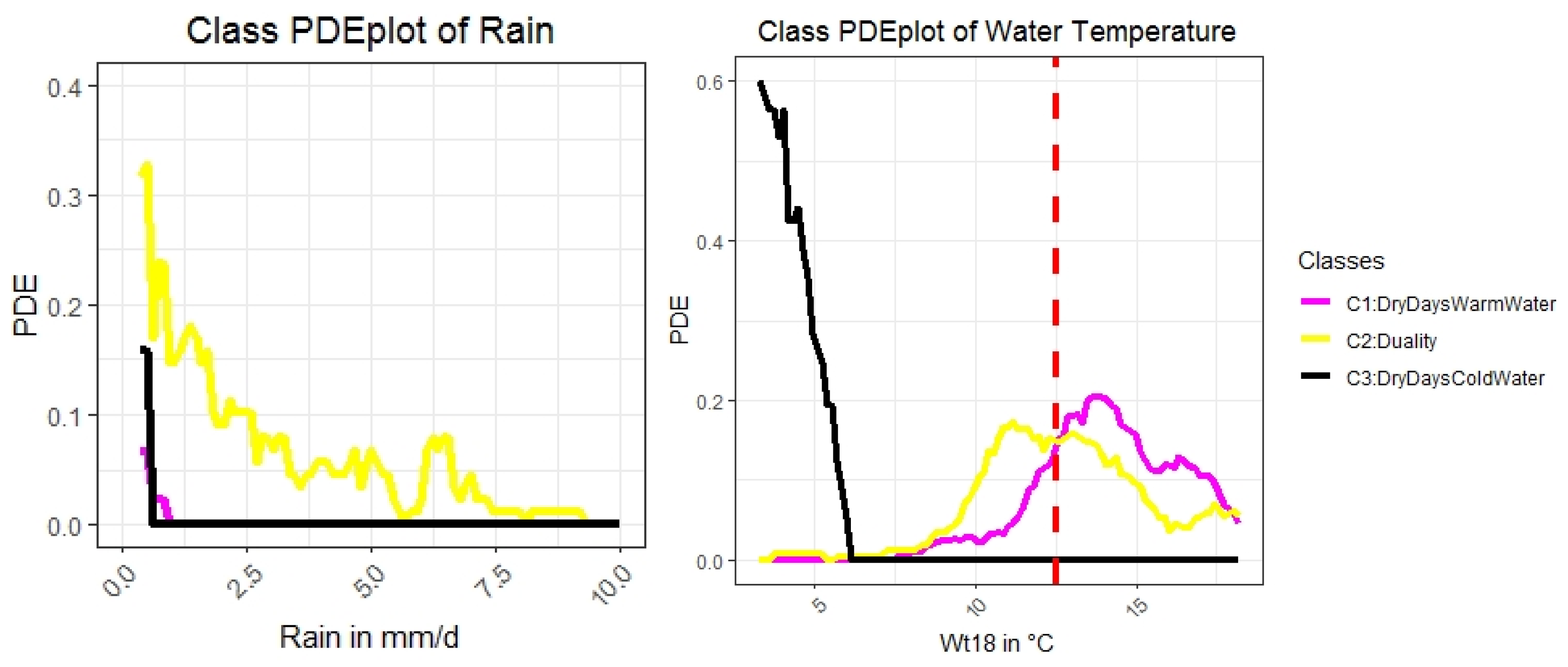
Using the Kolmogorov–Smirnov test (KS test), which is a nonparametric two-sample test of the null hypothesis that two variables are drawn from the same continuous distribution [90], Class 1 significantly differs from Class 2 in the variable Wt18 (water temperature) with p < (162,159, D = 0.31982) < 0.001 and in the variable rain with p < (162,159, D = 0.70498) < 0.001. This is visualized in the class-wise maximum-likelihood plots of Figure A3. Moreover, Figure A3 (right) shows that the water temperature in Class 2 is more likely to be lower than that in Class 1 and less likely to be lower than that in Class 3.
Figure A3.
Class wise estimation of the probability density function using PDE allows for a more precise definition of Class 2 of the 2013/2014 data, “Duality”, because the plot shows that in Class 2, there are also rainy days with colder water than in Class 3. The red and dashed line in the right plot marks a temperature of 12.5 °C. Classes are colored similarly to the clusters in Figure 4.

Appendix F. Definitions for Distance Distributions
Let I be a finite subset of N high-dimensional points in a metric space with a distance function d(l,j), then the matrix is called a distance matrix of I (c.f. [91]) with each entry as being the distance between two high-dimensional points of data. The distance matrix satisfies four conditions, meaning that the diagonal entries are all zero (, positive (), symmetric and for any l,j (triangle inequality). Using the definition above, we define the distance feature as the upper (or lower) triangle of the symmetric distance matrix ().
Given a finite dataset I of N cases, each described by d features, the Euclidean distance is defined as which can be modified to the Hellinger point distance with c.f. ([72,92,93]). For details regarding the Hellinger point distance and the application to the data, we refer to the function parallelDist::parallelDist (R package “parallelDist” on CRAN) [94] and the provided source code.
Appendix G. Linear Models
In Figure A4, the generalized U-matrix is applied to the three linear projections to visualize high-dimensional distance structures in the two-dimensional space of the 2013/2014, 2015, and 2016 data. No structures are visible on the topographic maps.
Figure A4.
Toroidal topographic map of a projection pursuit approach by [75] of the 2013/2014 (top left), 2015 (top right), and 2016 (bottom) datasets. The linear projections do not reveal a linear structure, even if the generalized U-matrix is used to visualize high-dimensional distances of the two-dimensional projection [58]. This visualization was generated using the R package “GeneralizedUmatrix” and the projection and clustering using “FCPS”.

Appendix H. Class MDplots of eUD3.5 and k-Means
Exemplary for the 2013/2014 data class-wise MD plots are presented for eUD3.5 and k-means in Figure A5 and Figure A6. Similar results can be derived for the 2015 and 2016 data.
Figure A5.
Class-wise mirrored-density plot (MD-plot) of the three datasets of 2013/2014, 2015, and 2016 classes defined 541, 503, and 552 rules, respectively, by eUD3.5 with regard to nitrate NO3 (left) and electrical conductivity EC (right). Seven outliers identified in PBC in 2013/2014 were priorly disregarded. In the case of nitrate, no clear differences between the distributions of the classes are visible, except for 2016. There is one high to intermediate classes of EC and classes of low to intermediate EC in 2013/2014. The MD-plot was generated using the R package ‘DataVisualizations’.

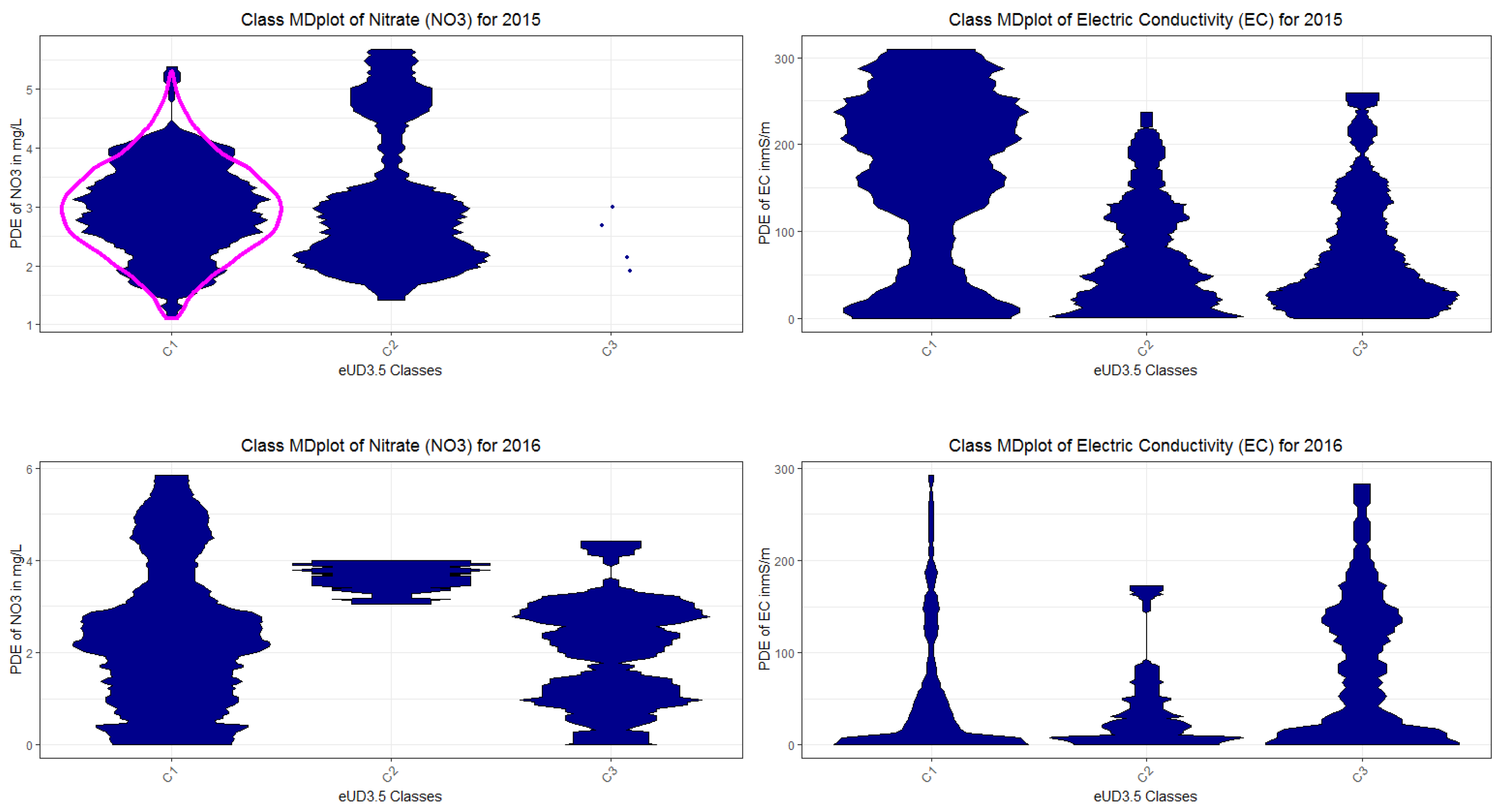
Figure A6.
Class-wise mirrored-density plot (MD-plot) of the three classes defined by the clustering part of IMM with regard to nitrate NO3 (left) and electrical conductivity EC (right). Seven outliers identified in PBC were priorly disregarded in the data of 2013/2014. No clear differences between the distributions of the classes are visible in 2013/2014 data. In the 2015 and 2016 data, different states of EC are visible (middle and bottom right). The MD-plot was generated using the R package ‘DataVisualizations’.

Appendix I. Used R Packages
Table A6.
The following R packages available on CRAN are used in this work.
| Name of Packag | Usage | Reference | Accessibility |
|---|---|---|---|
| ABCanalysis | Computed ABCanalysis for outlier detection | [95] | https://CRAN.R-project.org/package=ABCanalysis |
| DataVisualizations | Mirrored density plot (MD plot), density estimation, heatmap | [96] | https://CRAN.R-project.org/package=DataVisualizations |
| FCPS | 54 alternative clustering algorithms for specific cluster structures | [45] | https://CRAN.R-project.org/package=FCPS |
| DatabionicSwarm | Projection algorithm that finds a large variety of cluster structures and can cluster data as a special of Projection-based clustering. | [55,97] | https://CRAN.R-project.org/package=DatabionicSwarm |
| parallelDist | Distance computation for many distance metrics | [94] | https://CRAN.R-project.org/package=parallelDist |
| AdaptGauss | Gaussian Mixture Modelling (GMM), QQ plot for GMM | [46] | https://CRAN.R-project.org/package=AdaptGauss |
| rpart | Supervised Decision Tree | [79] | https://CRAN.R-project.org/package=rpart |
| evtree | Supervised Decision Tree | [68] | https://CRAN.R-project.org/package=evtree |
| GeneralizedUmatrix | Provides the topographic map, enables to visualize any projection method with it | [58] | https://CRAN.R-project.org/package=GeneralizedUmatrix |
| ProjectionBased Clustering | Provides projection-based clustering, interactive interfaces for cutting tiled topographic map into islands and for interactive clustering | [42,43] | https://CRAN.R-project.org/package=ProjectionBasedClustering |
| FeatureImpCluster | “Implements a novel approach for measuring feature importance in k-means clustering” | [40] | https://CRAN.R-project.org/package=FeatureImpCluster |
Appendix J. Collection and Preprocessing of Multivariate Time Series Data
The first dataset used in this work was collected in 2013/2014 in the Schwingbach Environmental Observatory (SEO) in central Germany. The mixed developed landscape is mainly characterized by agricultural land use (44%) and forests (48%). The Schwingbach is a small headwater stream draining the landscape. An in situ hyperspectral UV-spectrometer (ProPS, Trios, Rastede, Germany, wavelength range 200–360 nm, path length 5 mm, solar panel supplied) was used to measure absorption spectra every 15 min at the gauging station of the catchment’s outlet. Prior to measurements, air blasts (5 s) were blown on the lens to prevent the optics from biofouling. Wavelength spectra at 200–220 nm were utilized for the calculation of nitrate concentration, following calibration with local stream water matrix (see [6] for further details). All other variables used in this XAI approach (Table 1) were also monitored at the same high-frequency or aggregated to 15 min intervals.
Discharge and stream water temperature was recorded by pressure transducers (Diver DCX, Schlumberger Water Services, ON, Canada) at two gauging stations at the outlet (q13) and upstream (q18) of the first-order stream of the Vollnkirchener Bach. Groundwater depths in three piezometers were measured with similar pressure transducers. The piezometers were located in different positions along the Schwingbach. GWl3 was measured in the lowland close to the outlet of the stream, GWl25 was recorded at a hillslope, and GWl32 upstream in the riparian zone. Electromagnetic induction sensor (5TE) attached to EM50 data loggers (Decagon, Labcell LTD, Alton, UK) installed at 0.1 m depth in the riparian zone were used to gauge soil moisture and soil temperature. All meteorological data were collected at a climate station 4 km from the outlet (Campbell Scientific Inc., CR1000 data logger, Loughborough, UK). Further technical information on the SEO, the analytical procedures applied, the coding of abbreviations, and the experimental design, in general, are outlined in detail by [6,7,91].
Data gaps due to technical problems and data quality control reduced the available data coverage to two growing seasons (5 March 2013 to 24 September 2013, N = 15,475 measurements; 27 April 2014 to 23 October 2014, N = 16,721 measurements). In Table 1, abbreviations and Appendix units of all variables are provided. The 2013/2014 data was published earlier by Aubert et al. [6]. However, Aubert et al. used a high-frequency temporal analysis. In comparison, this work focuses on the average daily measures for each variable, resulting in a low-frequency analysis. Prior clustering was performed on the 2013/2014 data aggregated by sum instead of mean [47,98], resulting in a clustering that proved to be unfeasible to the domain expert ([55], SI B), not only due to the fact of the unusable aggregation but also since knowledge acquisition was performed on preprocessed data which proved to be problematic.
Four percent of the data are missing. For each day, the measurements were aggregated by the mean of all available measurements for that day. Then, missing values (i.e., days) were interpolated using the seven-nearest-neighbors approach. Distance measures are sensitive to the variance in the distribution of features. For example, the Euclidean metric weights feature more if they have values above 1. Therefore, the variance of features is usually standardized before a cluster analysis is performed.
The variables q13 and q18 were log-transformed. All variables, with the exception of rainfall, were normalized to values between zero and one through a robust normalization procedure [99] improved by [47]. Correlating variables have to be detected before further data evaluation; otherwise, these variables will be over-weighted in assessing the following distance matrices. The discharges correlated linearly with each other (r = 0.95, p(S = 347,270, N = 351) < 0.001), and q13 were therefore excluded from the analysis. The air temperatures Wt13 and Wt18 also correlated linearly (r = 0.99, p(S = 18,386, N = 351) < 0.001); hence, Wt13 was removed as well.
The outliers in the rainfall variable were detected via ABC analysis [95]. ABC analysis is a method used to compute precise limits to acquire subsets in skewed distributions by exploiting the mathematical properties pertaining to the distribution. The data containing positive values are divided into three disjoint subsets, A, B, and C, with subset A comprising very profitable values, i.e., the largest data values (“the important few”). Subset B contains values for which the yield equals the effort required to obtain it, and subset C contains the non-profitable values, i.e., the smallest datasets (“the trivial many”). The R package is called ‘ABCanalysis’ and available on CRAN. Then, the rain was normalized with respect to the minimum value in group A. All other points in group A were capped by defining the upper bound for rainfall.
The second dataset used in this work was collected in 2015 in the Schwingbach Environmental Observatory (SEO) in central Germany as described above. In this dataset, N = 35,040 measurements are provided. Due to technical problems, data gaps reduced the number of available days after aggregation for NO3 to 234 days. Then, preprocessing was performed as described above.
The third dataset used in this work was also collected in the SEO but in 2016 containing N = 35,136 measurements. Similarly, data gaps result from technical problems, reducing the number of available days after aggregation for NO3 to 291 days. Thereafter, preprocessing was performed as described above.
Appendix K. DDS-XAI Results of 2015 and 2016 Data
Table A7.
Explanations based on rules derived from the decision tree for 2015 data with an accuracy of 89%. Abbreviations: rainfall intensity (rain), water temperature (Wt18) and water level at point 25 (GWl25). All values are expressed as percentages. For units of measurement, please see Table 1. The color names of the projected points of Figure A10 are mapped to the rules of this table.
| Rule No. Color | Class No. | No. of Days | Explanations | Short Description of Class for Subsequent Plots |
|---|---|---|---|---|
| R1 magenta | 1 | 55 | Wt18 >= 13.1 and rain < 3 =>Warm stream water without heavy rain intensity | WarmWater WithoutHeavyRain |
| R4, yellow | 2 | 39 | Wt18 < 13.1 and Wt18 ≥ 5.8 and GWl25 ≥ 1.8 and rain < 2.3 =>Intermediate stream water temperature and rain intensity with higher ground water levels | LightRain MildWater AtHighLevel |
| R3 black | 3 | 27 | GWl25 ≥ 1.8 and Wt18 < 5.8 => High ground water levels with cold water | ColdWaterAtHighLevel |
| R7 red | 4 | 37 | Wt18 < 13.1 and GWl25 < 1.3 => Low ground water levels with decreasing water temperature | CoolerWater AtLowLevel |
| R6 blue | 5 | 30 | Wt18 < 13.1 and GWl25 >= 1.3 and GWl25 < 1.8 => intermediate ground water level with decreasing water temperature | CoolerWater AtIntermediateLevel |
| R2 and R8 teal | 6 | 21 | Wt18 ≥ 13.1 and rain ≥ 3 OR Wt18 < 13.1 and Wt18 ≥ 5. and GWl25 ≥ 1.8 and rain ≥ 2.3 => high rain intensity with either warm water with or intermediate water temperature and high ground water levels | HighRainIntensityAt HighLevel |
| - | Unclassified | 5 | Excluded, because cannot be explained with decision trees | Outliers |
Table A8.
Explanations based on rules derived from the decision tree for 2016 data with an accuracy of 89%. Abbreviations: rainfall intensity (rain), water temperature (Wt18) and water level at point 25 (GWl25). All values are expressed as percentages. For units of measurement, please see Table 1. The color names of the projected points of Figure A11 are mapped to the rules of this table.
| Rule No. Color | Class No. | No. of Days | Explanations | Short Description of Class for Subsequent Plots |
|---|---|---|---|---|
| R1 and R2 magenta | 1 | 94 | GWl25 < 1.1 or GWl25< 1.7 and Wt18 < 8.7 => low stream water temperature temperature with lower groundwater levels | ColdWaterAtLowerLevel |
| R4, yellow | 2 | 165 | GWl25 ≥ 1.1 and Wt18 > 8.7 => Intermediate stream water temperature with high groundwater level | WarmWaterAtHigherLevel |
| R3 | 90% in 2 10% in 1 | 32 | GWl25 > 1.7 and Wt18 < 8.7 | IncorrectlyClassified |
Figure A7.
DDS-XAI’s explanations of 2015 data are relevant to the domain expert because they explain distinct water bodies based on the NO3 and electrical conductivity (EC) level. The exception are the outliers and the class high rain intensity at high level (of ground water) which has in EC a large variance. PDE could not be estimated due to low number of days.
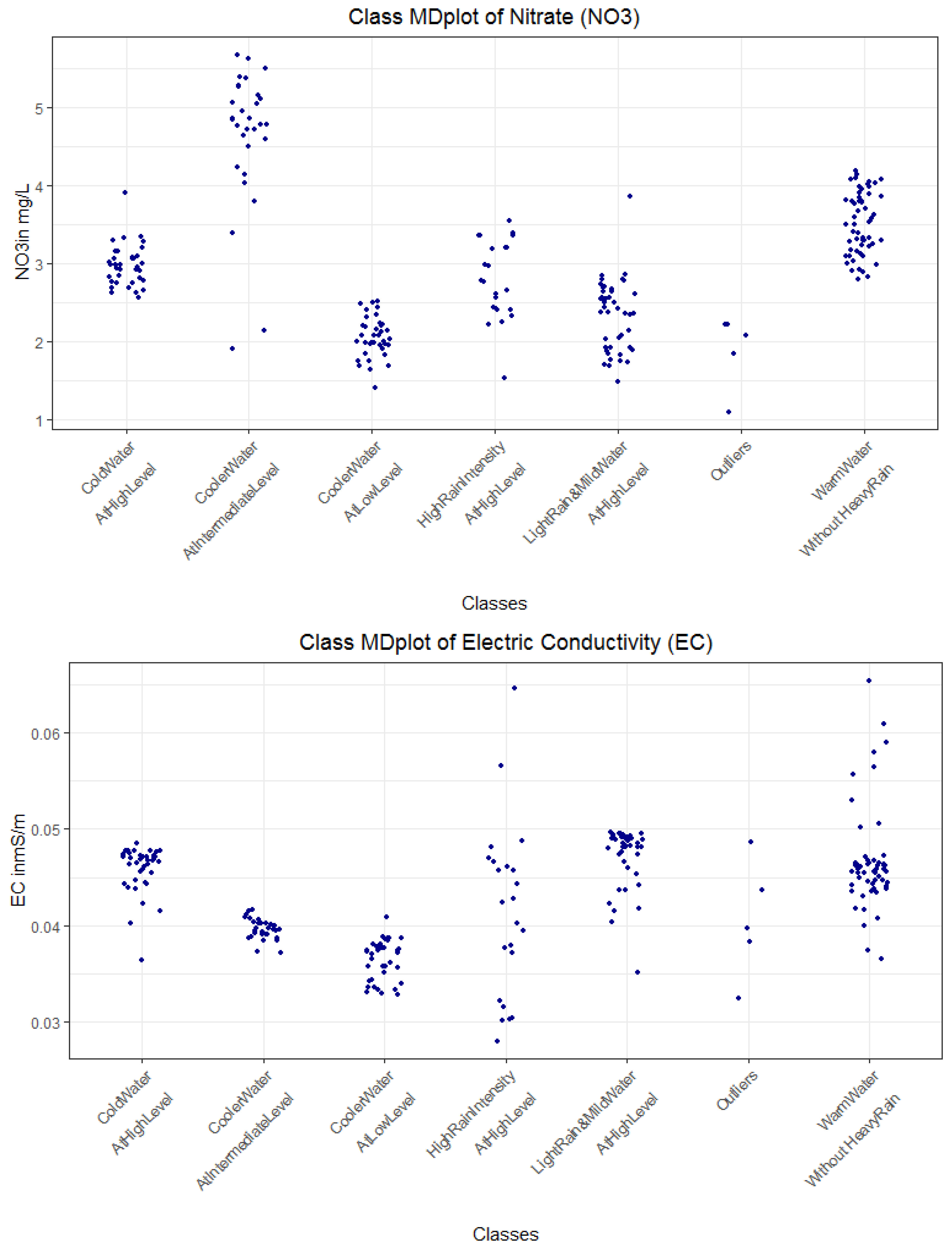
Figure A8.
DDS-XAI’s Explanations of 2016 data are relevant to the domain expert because they explain distinct water bodies based on the NO3 and EC level. PDE could not be estimated for left class due to low number of days.
Figure A8.
DDS-XAI’s Explanations of 2016 data are relevant to the domain expert because they explain distinct water bodies based on the NO3 and EC level. PDE could not be estimated for left class due to low number of days.
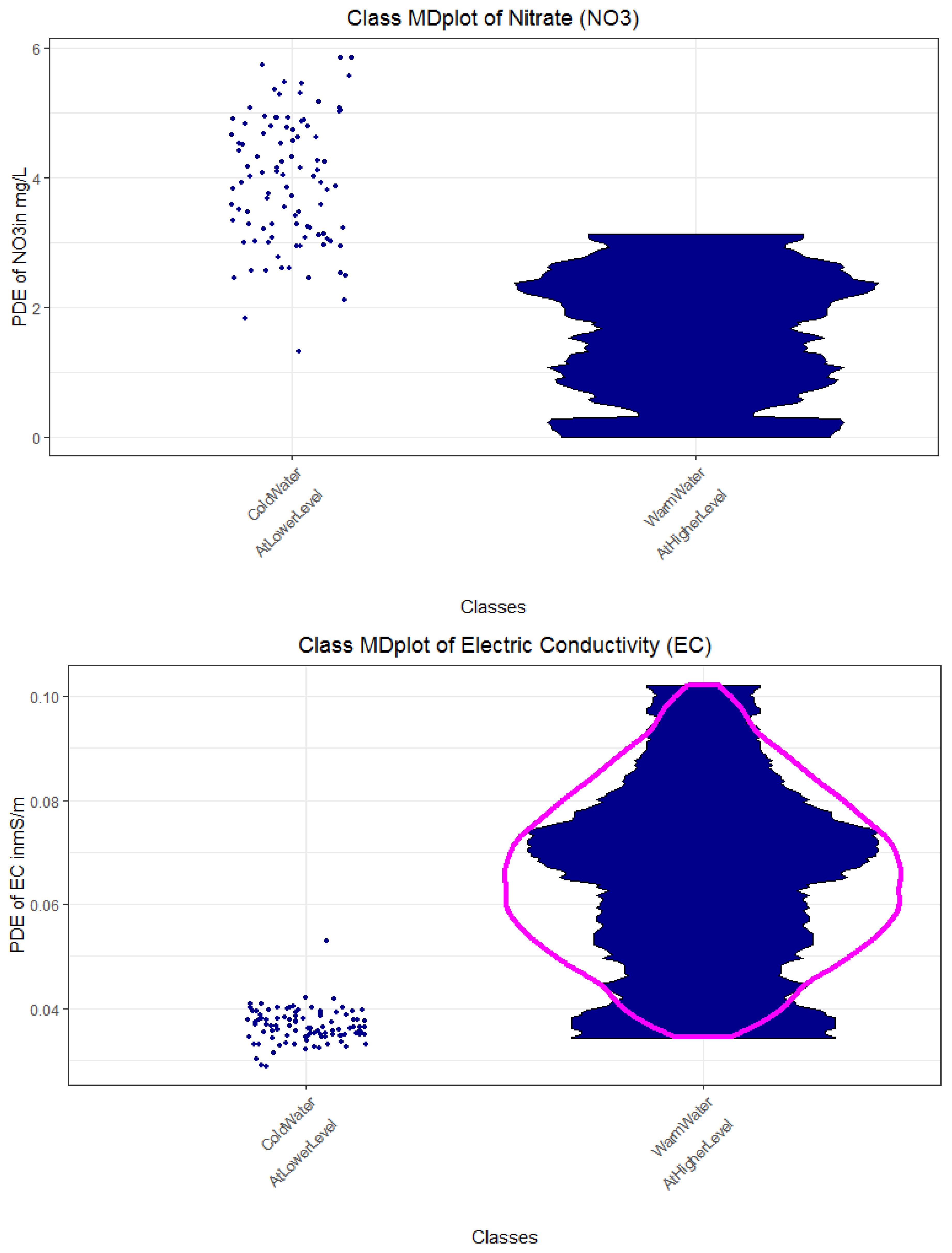
Figure A9.
Decision trees of 2015 data (top) and 2016 bottom used to derive the rules in Table A7 and Table A8. Rules are numbered from left to right.
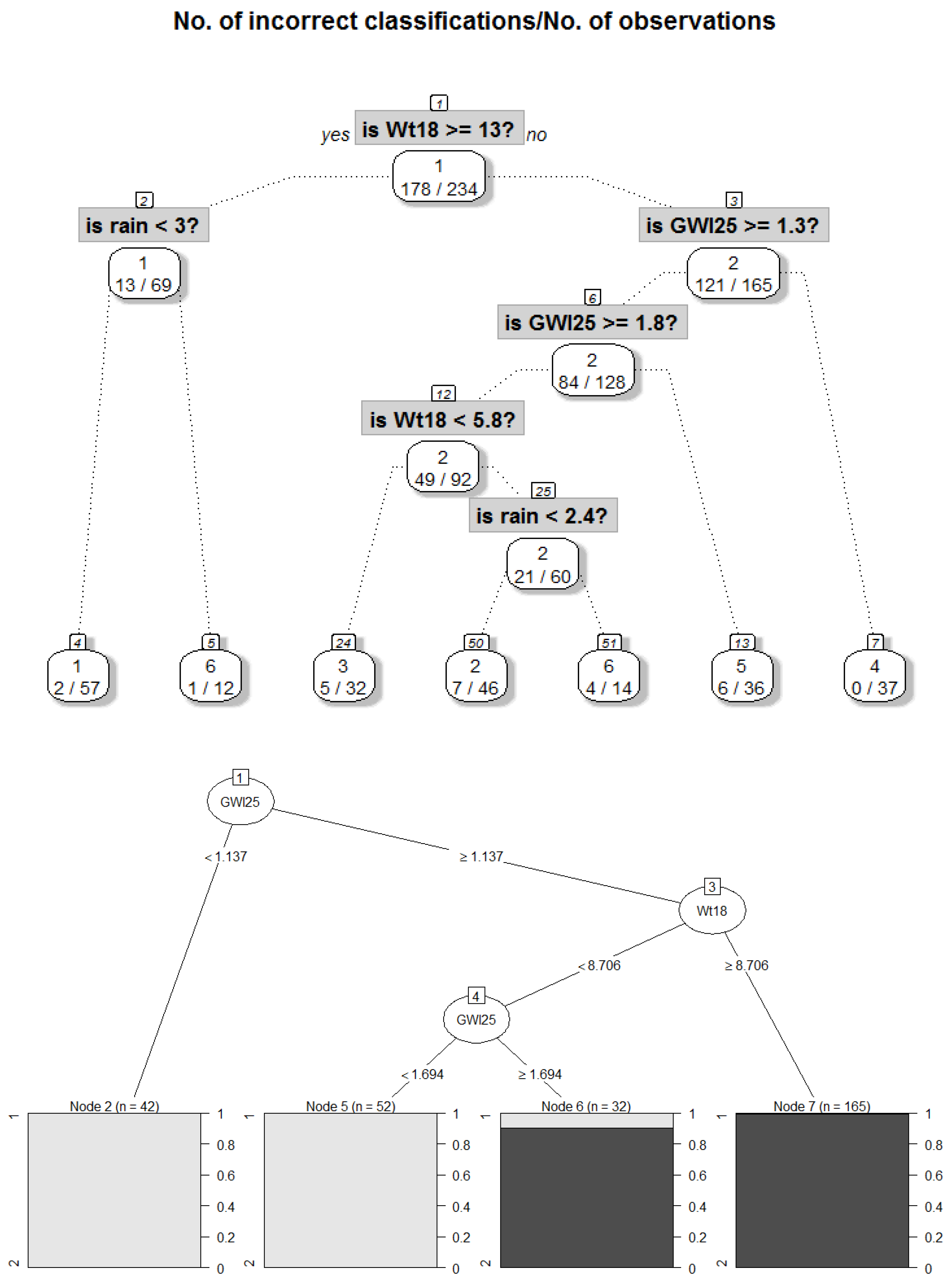
Figure A10.
Gaussian mixture model of the Minkowski distance with p = 0.1 and QQplot is shown at the top, and a topographic map of the projection-based clustering and heatmap of distances is shown at the bottom for the 2015 dataset.
Figure A10.
Gaussian mixture model of the Minkowski distance with p = 0.1 and QQplot is shown at the top, and a topographic map of the projection-based clustering and heatmap of distances is shown at the bottom for the 2015 dataset.

Figure A11.
Gaussian mixture model of the Euclidean distance and QQplot is shown in the top, topographic map of the projection-based clustering and heatmap of distances is shown at the bottom for the 2016 dataset.
Figure A11.
Gaussian mixture model of the Euclidean distance and QQplot is shown in the top, topographic map of the projection-based clustering and heatmap of distances is shown at the bottom for the 2016 dataset.

References
- Durand, P.; Breuer, L.; Johnes, P.J. Nitrogen processes in aquatic ecosystems. In European Nitrogen Assessment (ENA); Sutton, M.A., Howard, C.M., Erisman, J.W., Billen, G., Bleeker, A., Grennfelt, P., van Grinsven, H., Grizzeti, B., Eds.; Cambridge University Press: Cambridge, UK, 2011; Chapter 7; pp. 126–146. [Google Scholar]
- Cirmo, C.P.; McDonnell, J.J. Linking the hydrologic and biogeochemical controls of nitrogen transport in near-stream zones of temperate-forested catchments: A review. J. Hydrol. 1997, 199, 88–120. [Google Scholar] [CrossRef]
- Diaz, R.J. Overview of hypoxia around the world. J. Environ. Qual. 2001, 30, 275–281. [Google Scholar] [CrossRef] [PubMed]
- Howarth, R.W.; Billen, G.; Swaney, D.; Townsend, A.; Jaworski, N.; Lajtha, K.; Downing, J.A.; Elmgren, R.; Caraco, N.; Jordan, T. Regional nitrogen budgets and riverine N & P fluxes for the drainages to the North Atlantic Ocean: Natural and human influences. In Nitrogen Cycling in the North Atlantic Ocean and Its Watersheds; Springer: Berlin, Germany, 1996; pp. 75–139. [Google Scholar]
- Rode, M.; Wade, A.J.; Cohen, M.J.; Hensley, R.T.; Bowes, M.J.; Kirchner, J.W.; Arhonditsis, G.B.; Jordan, P.; Kronvang, B.; Halliday, S.J.; et al. Sensors in the stream: The high-frequency wave of the present. Environ. Sci. Technol. 2016, 50, 19. [Google Scholar] [CrossRef] [Green Version]
- Aubert, A.H.; Thrun, M.C.; Breuer, L.; Ultsch, A. Knowledge discovery from high-frequency stream nitrate concentrations: Hydrology and biology contributions. Sci. Rep. 2016, 6. [Google Scholar] [CrossRef] [Green Version]
- Aubert, A.H.; Breuer, L. New seasonal shift in in-stream diurnal nitrate cycles identified by mining high-frequency data. PLoS ONE 2016, 11, e0153138. [Google Scholar] [CrossRef] [PubMed] [Green Version]
- Miller, T.; Howe, P.; Sonenberg, L. Explainable AI: Beware of inmates running the asylum. In Proceedings of the International Joint Conference on Artificial Intelligence, Workshop on Explainable AI (XAI), Melbourne, Australia, 19–25 August 2017; pp. 36–42. [Google Scholar]
- Miller, T. Explanation in artificial intelligence: Insights from the social sciences. Artif. Intell. 2019, 267, 1–38. [Google Scholar] [CrossRef]
- Thrun, M.C.; Gehlert, T.; Ultsch, A. Analyzing the Fine Structure of Distributions. PLoS ONE 2020, 15, e0238835. [Google Scholar] [CrossRef]
- Grice, H.P. Logic and conversation. In Speech Acts; Brill: Leiden, The Netherlands, 1975; pp. 41–58. [Google Scholar]
- Adadi, A.; Berrada, M. Peeking inside the black-box: A survey on Explainable Artificial Intelligence (XAI). IEEE Access 2018, 6, 52138–52160. [Google Scholar] [CrossRef]
- Pellerin, B.A.; Downing, B.D.; Kendall, C.; Dahlgren, R.A.; Kraus, T.E.; Saraceno, J.; Spencer, R.G.; Bergamaschi, B.A. Assessing the sources and magnitude of diurnal nitrate variability in the San Joaquin River (California) with an in situ optical nitrate sensor and dual nitrate isotopes. Freshw. Biol. 2009, 54, 376–387. [Google Scholar] [CrossRef]
- Ultsch, A. The integration of connectionist models with knowledge-based systems: Hybrid systems. In Proceedings of the 1998 IEEE International Conference on Systems, Man, and Cybernetics, San Diego, CA, USA, 14 October 1998; pp. 1530–1535. [Google Scholar]
- Ultsch, A.; Korus, D. Integration of neural networks and knowledge-based systems. In Proceedings of the IEEE International Conference on Neural Networks, Perth, Australia, 27 November–1 December 1995. [Google Scholar]
- Biran, O.; Cotton, C. Explanation and justification in machine learning: A survey. In Proceedings of the IJCAI-17 Workshop on Explainable AI (XAI), Melbourne, Australia, 19–21 August 2017; pp. 8–13. [Google Scholar]
- Le, N.Q.K.; Do, D.T.; Chiu, F.-Y.; Yapp, E.K.Y.; Yeh, H.-Y.; Chen, C.-Y. XGBoost improves classification of MGMT promoter methylation status in IDH1 wildtype glioblastoma. J. Pers. Med. 2020, 10, 128. [Google Scholar] [CrossRef]
- Do, D.T.; Le, T.Q.T.; Le, N.Q.K. Using deep neural networks and biological subwords to detect protein S-sulfenylation sites. Brief. Bioinform. 2020. [Google Scholar] [CrossRef]
- Ribeiro, M.T.; Singh, S.; Guestrin, C. “Why should I trust you?” Explaining the predictions of any classifier. In Proceedings of the 22nd ACM SIGKDD International Conference on Knowledge Discovery and Data Mining, San Francisco, CA, USA, 13–17 August 2016; pp. 1135–1144. [Google Scholar]
- Lundberg, S.M.; Lee, S.-I. A unified approach to interpreting model predictions. In Proceedings of the Annual Conference on Neural Information Processing Systems, Long Beach, CA, USA, 4–9 December 2017; pp. 4765–4774. [Google Scholar]
- Lipton, Z.C. The mythos of model interpretability. Queue 2018, 16, 31–57. [Google Scholar] [CrossRef]
- Ultsch, A.; Halmans, G.; Mantyk, R. CONKAT: A connectionist knowledge acquisition tool. In Proceedings of the 24th Annual Hawaii International Conference on System Sciences, Kauai, HI, USA, 8–11 January 1991; pp. 507–513. [Google Scholar]
- Ultsch, A.; Korus, D.; Kleine, T. Integration of neural networks and knowledge-based systems in medicine. In Proceedings of the Conference on Artificial Intelligence in Medicine in Europe, Pavia, Italy, 25–28 June 1995; pp. 425–426. [Google Scholar]
- Yoon, J.; Kim, D.-W. Classification based on predictive association rules of incomplete data. IEICE Trans. Inf. Syst. 2012, 95, 1531–1535. [Google Scholar] [CrossRef] [Green Version]
- Letham, B.; Rudin, C.; McCormick, T.H.; Madigan, D. An interpretable stroke prediction model using rules and Bayesian analysis. In Proceedings of the 27th AAAI Conference on Artificial Intelligence, Bellevue, WA, USA, 14–18 July 2013. [Google Scholar]
- Riid, A.; Sarv, M. Determination of regional variants in the versification of estonian folksongs using an interpretable fuzzy rule-based classifier. In Proceedings of the 8th Conference of the European Society for Fuzzy Logic and Technology (EUSFLAT-13), Milan, Italy, 11–13 September 2013. [Google Scholar]
- Nauck, D.; Kruse, R. Obtaining interpretable fuzzy classification rules from medical data. Artif. Intell. Med. 1999, 16, 149–169. [Google Scholar] [CrossRef]
- Izonin, I.; Tkachenko, R.; Kryvinska, N.; Tkachenko, P. Multiple Linear Regression based on Coefficients Identification using Non-Iterative SGTM Neural-Like Structure. In Proceedings of the International Work-Conference on Artificial Neural Networks, Gran Canaria, Spain, 12–14 June 2019; pp. 467–479. [Google Scholar]
- Tkachenko, R.; Izonin, I. Model and principles for the implementation of neural-like structures based on geometric data transformations. In Proceedings of the International Conference on Computer Science, Engineering and Education Applications, Kiev, Ukraine, 18–20 January 2018; pp. 578–587. [Google Scholar]
- Larus-Stone, N.; Angelino, E.; Alabi, D.; Seltzer, M.; Kaxiras, V.; Saligrama, A.; Rudin, C. Systems optimizations for learning certifiably optimal rule lists. In Proceedings of the SysML Conference, Stanford, CA, USA, 15–16 February 2018; p. 16. [Google Scholar]
- Lakkaraju, H.; Bach, S.H.; Leskovec, J. Interpretable decision sets: A joint framework for description and prediction. In Proceedings of the 22nd ACM SIGKDD International Conference on Knowledge Discovery and Data Mining, San Francisco, CA, USA, 13–17 August 2016; pp. 1675–1684. [Google Scholar]
- Hewett, R.; Leuchner, J. The power of second-order decision tables. In Proceedings of the 2002 SIAM International Conference on Data Mining, Chicago, IL, USA, 11–13 April 2002; pp. 384–399. [Google Scholar]
- Blockeel, H.; De Raedt, L.; Ramon, J. Top-down induction of clustering trees. In Proceedings of the 15th International Conference (ICML), San Francisco, CA, USA, 24–27 July 1998; pp. 55–63. [Google Scholar]
- Basak, J.; Krishnapuram, R. Interpretable hierarchical clustering by constructing an unsupervised decision tree. IEEE Trans. Knowl. Data Eng. 2005, 17, 121–132. [Google Scholar] [CrossRef]
- Kim, B.; Shah, J.A.; Doshi-Velez, F. Mind the gap: A generative approach to interpretable feature selection and extraction. In Proceedings of the Conference on Advances in Neural Information Processing Systems, Montreal, QC, Canada, 7–12 December 2015; pp. 2260–2268. [Google Scholar]
- Loyola-González, O.; Gutierrez-Rodríguez, A.E.; Medina-Pérez, M.A.; Monroy, R.; Martínez-Trinidad, J.F.; Carrasco-Ochoa, J.A.; García-Borroto, M. An Explainable Artificial Intelligence Model for Clustering Numerical Databases. IEEE Access 2020, 8, 52370–52384. [Google Scholar] [CrossRef]
- Dasgupta, S.; Frost, N.; Moshkovitz, M.; Rashtchian, C. Explainable k-Means and k-Medians Clustering. In Proceedings of the 37th International Conference on Machine Learning, Vienna, Austria, 12–18 July 2020. [Google Scholar]
- Rousseeuw, P.J. Silhouettes: A graphical aid to the interpretation and validation of cluster analysis. J. Comput. Appl. Math. 1987, 20, 53–65. [Google Scholar] [CrossRef] [Green Version]
- Leisch, F. A toolbox for k-centroids cluster analysis. Comput. Stat. Data 2006, 51, 526–544. [Google Scholar] [CrossRef]
- Pfaffel, O. FeatureImpCluster: Feature Importance for Partitional Clustering. Available online: cran.r-project.org (accessed on 4 February 2021).
- Thrun, M.C.; Ultsch, A. Uncovering High-Dimensional Structures of Projections from Dimensionality Reduction Methods. MethodsX 2020, 7, 101093. [Google Scholar] [CrossRef]
- Thrun, M.C.; Ultsch, A. Using Projection based Clustering to Find Distance and Density based Clusters in High-Dimensional Data. J. Classif. 2020. [Google Scholar] [CrossRef]
- Thrun, M.C.; Pape, F.; Ultsch, A. Interactive Machine Learning Tool for Clustering in Visual Analytics. In Proceedings of the 7th IEEE International Conference on Data Science and Advanced Analytics (DSAA 2020), Sydney, Australia, 6–9 October 2020; pp. 672–680. [Google Scholar]
- Bouveyron, C.; Hammer, B.; Villmann, T. Recent developments in clustering algorithms. In Proceedings of the European Symposium on Artificial Neural Networks, Bruges, Belgium, 25–27 April 2012. [Google Scholar]
- Thrun, M.C.; Stier, Q. Fundamental Clustering Algorithms Suite. SoftwareX 2021, 13, 100642. [Google Scholar] [CrossRef]
- Ultsch, A.; Thrun, M.C.; Hansen-Goos, O.; Lötsch, J. Identification of Molecular Fingerprints in Human Heat Pain Thresholds by Use of an Interactive Mixture Model R Toolbox (AdaptGauss). Int. J. Mol. Sci. 2015, 16, 25897–25911. [Google Scholar] [CrossRef]
- Thrun, M.C. Projection Based Clustering Through Self-Organization and Swarm Intelligence; Ultsch, A., Hüllermeier, E., Eds.; Springer: Berlin, Germany, 2018. [Google Scholar]
- Setzu, M.; Guidotty, R.; Mionreale, A.; Turini, F.; Pedreschie, D.; Gianotti, F. GLocalX—From local to Global Explanations of Black Box AI Models. Artif. Intell. 2021, 103457. [Google Scholar] [CrossRef]
- Ultsch, A. Data mining and knowledge discovery with emergent self-organizing feature maps for multivariate time series. In Kohonen Maps, 1st ed.; Oja, E., Kaski, S., Eds.; Elsevier: Amsterdam, The Netherlands, 1999; pp. 33–46. [Google Scholar]
- Demartines, P.; Hérault, J. CCA: ”Curvilinear component analysis”. In Proceedings of the 15 Colloque sur le Traitement du Signal et des Images, Juan-Les-Pins, France, 18–21 September 1995. [Google Scholar]
- Van der Maaten, L.; Hinton, G. Visualizing Data using t-SNE. J. Mach. Learn. Res. 2008, 9, 2579–2605. [Google Scholar]
- Venna, J.; Peltonen, J.; Nybo, K.; Aidos, H.; Kaski, S. Information retrieval perspective to nonlinear dimensionality reduction for data visualization. J. Mach. Learn. Res. 2010, 11, 451–490. [Google Scholar]
- Ultsch, A. Clustering with DataBots. In Proceedings of the International Conference on Advances in Intelligent Systems: Theory and Applications (AISTA), Canberra, Australia, 2–4 February 2000; pp. 99–104. [Google Scholar]
- Nash, J.F. Equilibrium points in n-person games. Proc. Natl. Acad. Sci. USA 1950, 36, 48–49. [Google Scholar] [CrossRef] [PubMed] [Green Version]
- Thrun, M.C.; Ultsch, A. Swarm Intelligence for Self-Organized Clustering. Artif. Intell. 2021, 290, 103237. [Google Scholar] [CrossRef]
- Nash, J.F. Non-cooperative games. Ann. Math. 1951, 54, 286–295. [Google Scholar] [CrossRef]
- Johnson, W.B.; Lindenstrauss, J. Extensions of Lipschitz mappings into a Hilbert space. Contemp. Math. 1984, 26, 189–206. [Google Scholar]
- Ultsch, A.; Thrun, M.C. Credible Visualizations for Planar Projections. In Proceedings of the 12th International Workshop on Self-Organizing Maps and Learning Vector Quantization, Clustering and Data Visualization (WSOM), Nany, France, 28–30 June 2017; pp. 1–5. [Google Scholar]
- Thrun, M.C.; Lerch, F.; Lötsch, J.; Ultsch, A. Visualization and 3D Printing of Multivariate Data of Biomarkers. In Proceedings of the International Conference in Central Europe on Computer Graphics, Visualization and Computer Vision (WSCG), Plzen, Czech Republic, 30 May–3 June 2016; pp. 7–16. [Google Scholar]
- Bonner, R.E. On Some Clustering Technique. IBM J. Res. Dev. 1964, 8, 22–32. [Google Scholar] [CrossRef]
- Hennig, C.; Meila, M.; Murtagh, F.; Rocci, R. Handbook of Cluster Analysis; Chapman&Hall/CRC Press: New York, NY, USA, 2015; p. 730. [Google Scholar]
- Mörchen, F.; Ultsch, A. Efficient mining of understandable patterns from multivariate interval time series. Data Min. Knowl. Disc. 2007, 15, 181–215. [Google Scholar] [CrossRef]
- Hintze, J.L.; Nelson, R.D. Violin plots: A box plot-density trace synergism. Am. Stat. 1998, 52, 181–184. [Google Scholar]
- Ultsch, A. Pareto density estimation: A density estimation for knowledge discovery. In Innovations in Classification, Data Science, and Information Systems; Baier, D., Werrnecke, K.D., Eds.; Springer: Berlin, Germany, 2005; Volume 27, pp. 91–100. [Google Scholar]
- Sober, E. Let’s Razor Ockham’s Razor. In Explanation and Its Limits; Knowles, D., Ed.; Cambridge University Press: Cambridge, UK, 1991; pp. 73–94. [Google Scholar]
- Breiman, L. Random forests. Mach Learn 2001, 45, 5–32. [Google Scholar] [CrossRef] [Green Version]
- Breiman, L.; Friedman, J.; Stone, C.J.; Olshen, R.A. Classification and Regression Trees; CRC Press: Boca Raton, FL, USA, 1984. [Google Scholar]
- Grubinger, T.; Zeileis, A.; Pfeiffer, K.-P. Evtree: Evolutionary learning of globally optimal classification and regression trees in R. J. Stat. Softw. 2014, 61, 1–29. [Google Scholar] [CrossRef] [Green Version]
- Miller, G.A. The magical number seven, plus or minus two: Some limits on our capacity for processing information. Psychol. Rev. 1956, 63, 81. [Google Scholar] [CrossRef] [PubMed] [Green Version]
- Cowan, N. The magical number 4 in short-term memory: A reconsideration of mental storage capacity. Behav. Brain Sci. 2001, 24, 87–114. [Google Scholar] [CrossRef] [PubMed] [Green Version]
- Mörchen, F.; Ultsch, A.; Hoos, O. Extracting interpretable muscle activation patterns with time series knowledge mining. Int. J. Knowl. Based Intell. Eng. Syst. 2005, 9, 197–208. [Google Scholar] [CrossRef] [Green Version]
- Rao, C. Use of Hellinger distance in graphical displays. Multivariate statistics and matrices in statistics. In Proceedings of the 5th Tartu Conference, Pühajärve, Estonia, 23–28 May 1995; pp. 143–161. [Google Scholar]
- Hartigan, J.A.; Hartigan, P.M. The dip test of unimodality. Ann. Stat. 1985, 13, 70–84. [Google Scholar] [CrossRef]
- Dempster, A.P.; Laird, N.M.; Rubin, D.B. Maximum likelihood from incomplete data via the EM algorithm. J. R. Stat. Soc. Ser. B 1977, 39, 1–22. [Google Scholar]
- Hofmeyr, D.; Pavlidis, N. Maximum clusterability divisive clustering. In Proceedings of the 2015 IEEE Symposium Series on Computational Intelligence, Cape Town, South Africa, 7–10 December 2015; pp. 780–786. [Google Scholar]
- Steinley, D.; Brusco, M.J.; Henson, R. Principal cluster axes: A projection pursuit index for the preservation of cluster structures in the presence of data reduction. Multivar. Behav. Res. 2012, 47, 463–492. [Google Scholar] [CrossRef]
- Ward, J.H., Jr. Hierarchical grouping to optimize an objective function. J. Am. Stat. Assoc. 1963, 58, 236–244. [Google Scholar] [CrossRef]
- Everitt, B.S.; Landau, S.; Leese, M.; Stahl, D. Hierarchical clustering. In Cluster Analysis, 5th ed.; Wiley: Hoboken, NJ, USA, 2011; pp. 71–110. [Google Scholar]
- Therneau, T.; Atkinson, B.; Ripley, B.; Ripley, M.B. Package ‘Rpart’. Available online: https://cran.r-project.org/web/packages/rpart/rpart.pdf (accessed on 20 April 2016).
- Orlowski, N.; Lauer, F.; Kraft, P.; Frede, H.-G.; Breuer, L. Linking spatial patterns of groundwater table dynamics and streamflow generation processes in a small developed catchment. Water 2014, 6, 3085–3117. [Google Scholar] [CrossRef] [Green Version]
- Sundararajan, M.; Taly, A.; Yan, Q. Axiomatic attribution for deep networks. In Proceedings of the International Conference on Machine Learning, Sydney, Australia, 6–11 August 2017; pp. 3319–3328. [Google Scholar]
- Mittelstadt, B.; Russell, C.; Wachter, S. Explaining explanations in AI. In Proceedings of the Conference on Fairness, Accountability, and Transparency, Atlanta, GA, USA, 29–31 January 2019; pp. 279–288. [Google Scholar]
- Guidotti, R.; Monreale, A.; Ruggieri, S.; Turini, F.; Giannotti, F.; Pedreschi, D. A survey of methods for explaining black box models. ACM Comput. Surv. 2018, 51, 1–42. [Google Scholar] [CrossRef] [Green Version]
- Arrieta, A.B.; Díaz-Rodríguez, N.; Del Ser, J.; Bennetot, A.; Tabik, S.; Barbado, A.; García, S.; Gil-López, S.; Molina, D.; Benjamins, R. Explainable Artificial Intelligence (XAI): Concepts, taxonomies, opportunities and challenges toward responsible AI. Inf. Fusion 2020, 58, 82–115. [Google Scholar] [CrossRef] [Green Version]
- Aghabozorgi, S.; Shirkhorshidi, A.S.; Wah, T.Y. Time-series clustering–A decade review. Inf. Syst. 2015, 53, 16–38. [Google Scholar] [CrossRef]
- Herrmann, L. Swarm-Organized Topographic Mapping. Ph.D. Thesis, Philipps-Universität Marburg, Marburg, Germany, 2011. [Google Scholar]
- Handl, J.; Knowles, J.; Kell, D.B. Computational cluster validation in post-genomic data analysis. Bioinformatics 2005, 21, 3201–3212. [Google Scholar] [CrossRef] [Green Version]
- Jain, A.K.; Dubes, R.C. Algorithms for Clustering Data; Prentice Hall College Div: Englewood Cliffs, NJ, USA, 1988. [Google Scholar]
- Cormack, R.M. A review of classification. J. R. Stat. Soc. Ser. A 1971, 134, 321–367. [Google Scholar] [CrossRef]
- Conover, W.J. Practical Nonparametric Statistics; John Wiley & Sons: New York, NY, USA, 1971. [Google Scholar]
- Neumaier, A. Combinatorial Configurations in Terms of Distances; University of Vienna: Vienna, Austria, 1981. [Google Scholar]
- Legendre, P.; Gallagher, E.D. Ecologically meaningful transformations for ordination of species data. Oecologia 2001, 129, 271–280. [Google Scholar] [CrossRef]
- Conde, A.; Domínguez, J. Scaling the chord and Hellinger distances in the range [0, 1]: An option to consider. J. Asia Pac. Biodivers. 2018, 11, 161–166. [Google Scholar] [CrossRef]
- Eckert, A. ParallelDist: Parallel Distance Matrix Computation Using Multiple Threads, 0.2.4. Available online: https://cran.r-project.org/web/packages/parallelDist/parallelDist.pdf (accessed on 4 February 2021).
- Ultsch, A.; Lötsch, J. Computed ABC Analysis for Rational Selection of Most Informative Variables in Multivariate Data. PLoS ONE 2015, 10, e0129767. [Google Scholar] [CrossRef] [PubMed] [Green Version]
- Thrun, M.C.; Ultsch, A. Effects of the payout system of income taxes to municipalities in Germany. In Proceedings of the 12th Professor Aleksander Zelias International Conference on Modelling and Forecasting of Socio-Economic Phenomena, Cracow, Poland, 8–11 May 2018; pp. 533–542. [Google Scholar]
- Thrun, M.C.; Ultsch, A. Swarm Intelligence for Self-Organized Clustering (Extended Abstract). In Proceedings of the 29th International Joint Conference on Artificial Intelligence (IJCAI), Yokohama, Japan, 7–15 January 2021; pp. 5125–5129. [Google Scholar]
- Thrun, M.C.; Breuer, L.; Ultsch, A. Knowledge discovery from low-frequency stream nitrate concentrations: Hydrology and biology contributions. In Proceedings of the European Conference on Data Analysis (ECDA), Paderborn, Germany, 4–6 July 2018; pp. 46–47. [Google Scholar]
- Milligan, G.W.; Cooper, M.C. A study of standardization of variables in cluster analysis. J. Classif. 1988, 5, 181–204. [Google Scholar] [CrossRef]
Figure 1.
Framework of the DDS-XAI for multivariate time series without implicit assumptions about structures in data (data-driven). The framework has the three main steps of the identification of structures in data, cluster analysis, and providing explanations. Each step has several modules explained in the methods section.

Figure 2.
Distribution analysis of the distances using a Gaussian mixture model (GMM) using the R package ‘AdaptGauss ‘. The black line indicates the estimated distribution of the distance feature df (defined in Appendix F). The distribution of the distances drawn by the AdaptGauss package is estimated using Pareto density estimation (PDE). The blue line depicts the single Gaussian distributions (“modes”) of the model, and the red line the overall model, i.e., the superposition of single Gaussians to a mixture. The Bayesian boundary in magenta separates the first mode from the second mode and the third mode, leading to the hypothesis that the first mode should consist of intra-cluster distances if clustering is performed. PDE = Pareto density estimation (Ultsch, 2005).
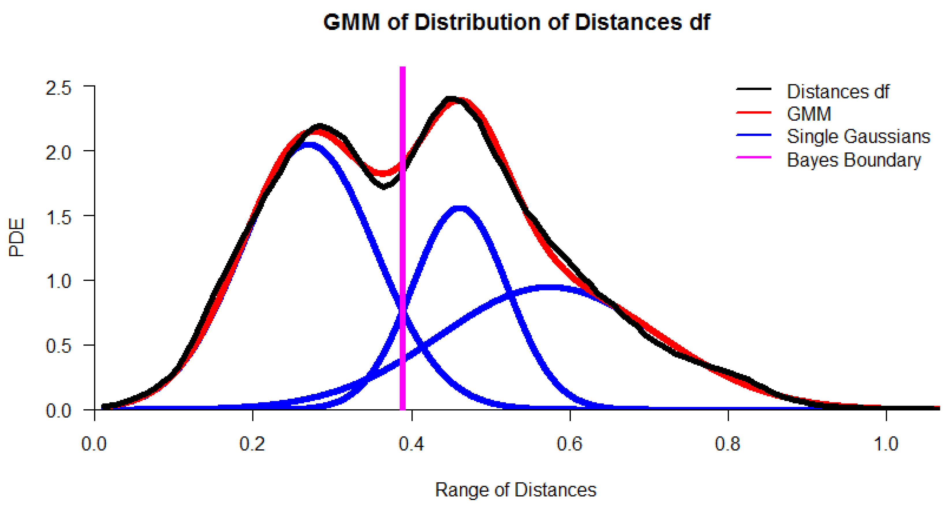
Figure 3.
Quantile-quantile plot (QQ plot) visualizes a good match between the distance and the GMM through a straight line. The plot is generated using the R package ‘AdaptGauss’.
Figure 3.
Quantile-quantile plot (QQ plot) visualizes a good match between the distance and the GMM through a straight line. The plot is generated using the R package ‘AdaptGauss’.

Figure 4.
In the topographic map of high-dimensional structures, every point symbolizes a day and is colored by the independently performed clustering. The labels of projection-based clustering define the color of the points. Clusters lie in valleys. The topographic map shows two main clusters (magenta and yellow points), a smaller cluster (black points). In addition, seven single outliers (marked in red and by red arrows) in the hydrology dataset are disregarded before comparable XAIs are applied. Visualization of high-dimensional structures in data is generated using the R package “GeneralizedUmatrix”.

Figure 5.
The four clusters have distinctive distances, as shown by the heatmap. The black lines divide the distances between the data points belonging to a cluster. The outliers are summarized in cluster 4. There are small distances within each cluster and large distances between the clusters. The heatmap was generated with the R package ‘DataVisualizations’.
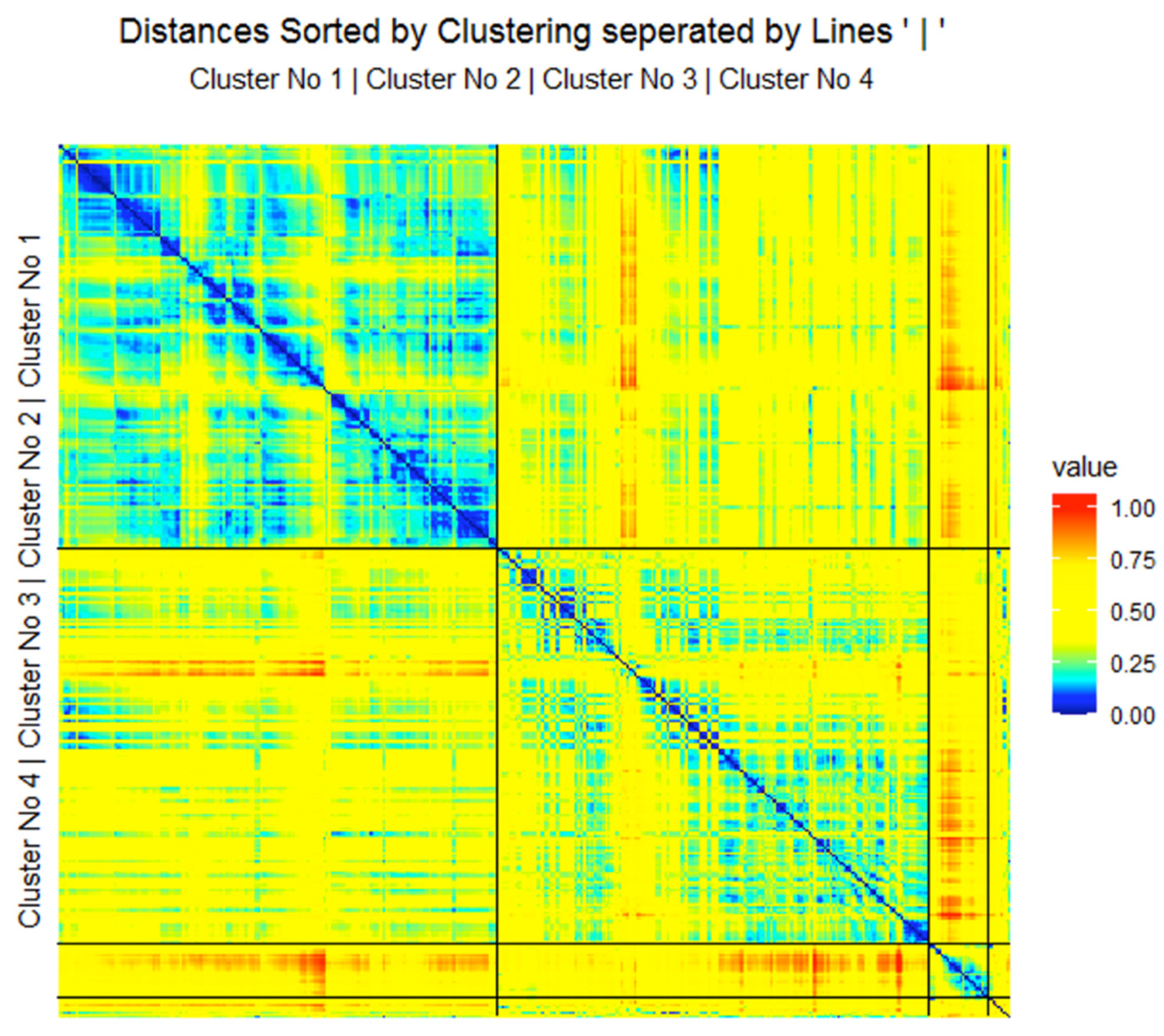
Figure 6.
(a) Globally optimal classification and regression trees (evtree) analysis visualizes a decision tree for the 2013/2014 dataset using the labels of the three clusters identified by projection-based clustering. The error of class 1 is 15%, that of class 2 is 6.4%, and that of class 3 is 8.3%. Outliers are summarized in class 4. The rules are quite similar to (b) but have a higher error. The tree was generated using the R package’ evtree. (b) Classification and regression tree (CART) analysis visualizes a decision tree for the 2013/2014 dataset using the labels of the three clusters identified by projection-based clustering. Applying the algorithm to the labels of the clustering in combination with the dataset results in 12 misclassified points (3.5% of daily observations). Eight outlier points are in class 4, for which nodes can be derived. The leaves are identified with rule numbers used in Table 2 and colors of Figure 4. This error is lower than in (a). For units of measurements and abbreviations, please see Table 1. The tree was generated using the R package ‘rpart’.
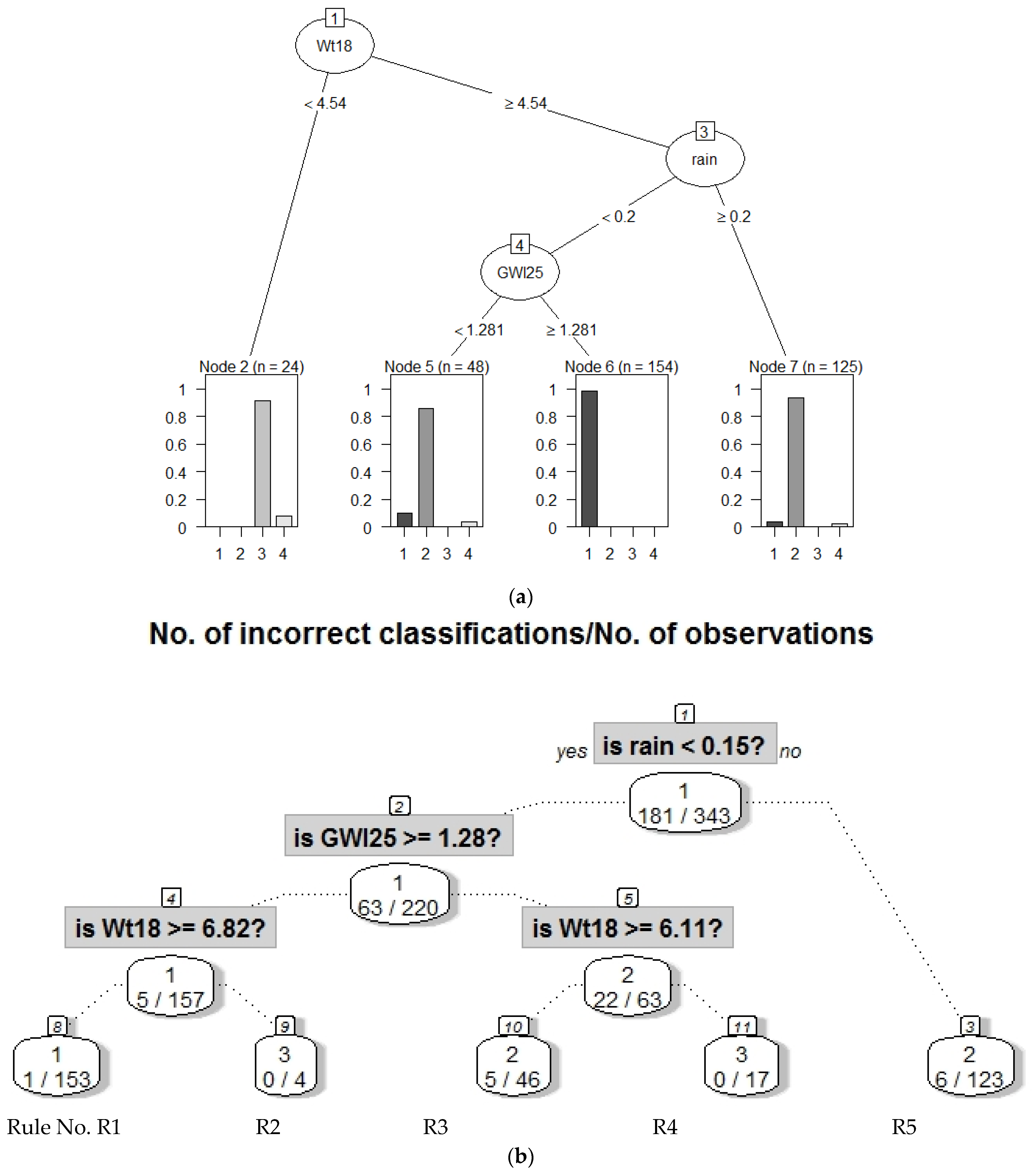
Figure 7.
(a) Class-wise mirrored-density plot (MD-plot) of the three explained classes with regard to NO3 and the outliers. There are two low to intermediate classes of N concentrations and one class of high N concentrations. Classes are colored similar to the clusters in Figure 4. The MD-plot was generated using the R package ‘DataVisualizations’. (b) Class-wise mirrored-density plots (MD-plot) of the three explained classes with regard to electrical conductivity C. There is a class of high concentration, a class of low to intermediate concentration, and a class of low C concentrations. Classes are colored similarly to the clusters in Figure 4. The MD plot was generated using the R package ‘DataVisualizations’.
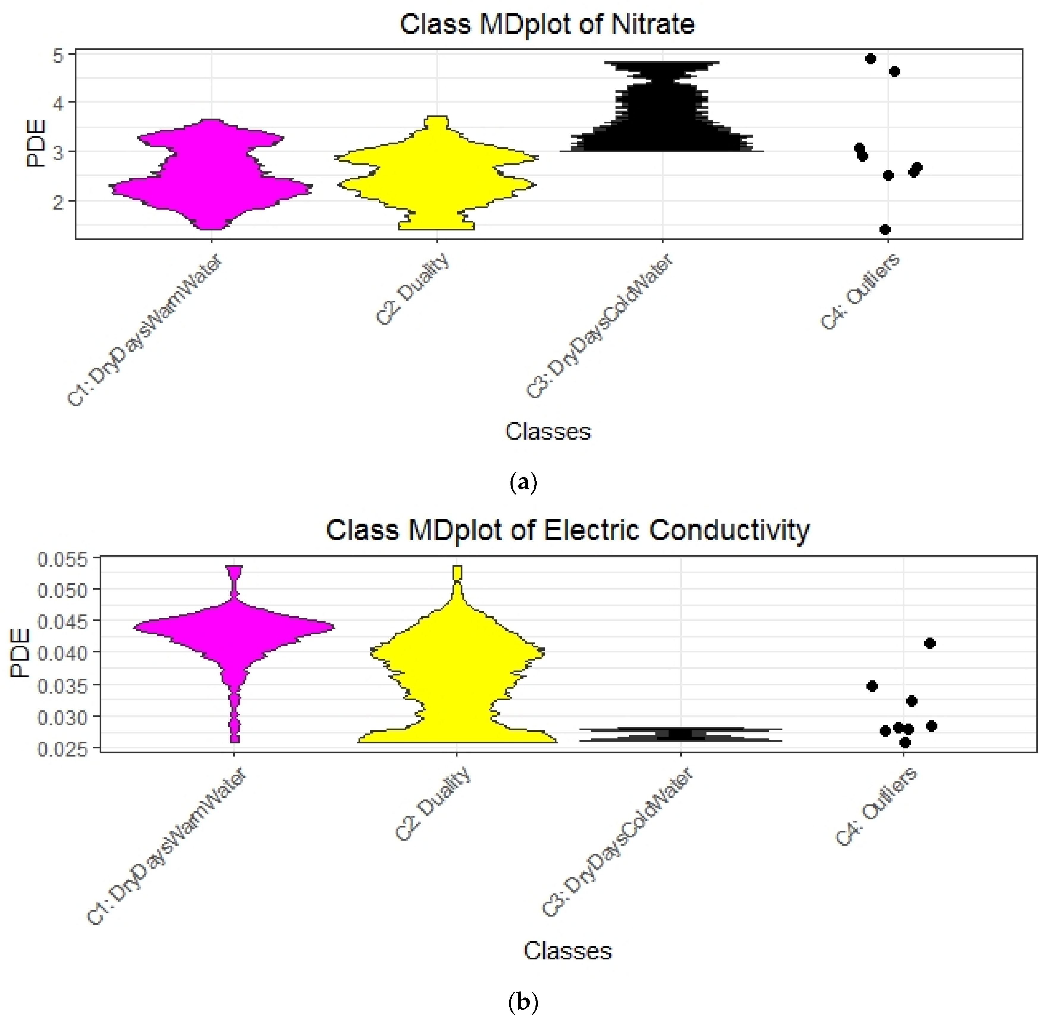
Table 1.
Measured environmental variables with abbreviations and units. The probability density distributions of the transformed dataset are visualized in the supplementary section.
Table 1.
Measured environmental variables with abbreviations and units. The probability density distributions of the transformed dataset are visualized in the supplementary section.
| Variable | Abbreviation | International System of Units |
|---|---|---|
| Soil temperature | St24 | °C |
| Groundwater level 3 = lowland, 25 = hill slope, 32= upstream in riparian zone | GWl3 GWl25 GWl32 | m |
| Soil moisture | Smoist24 | m³/m³ |
| Rainfall | rain | mm/d |
| Discharge | q13 q18 | L/s |
| Electric conductivity (EC) | Con47 | mS/m |
| Solar radiation | Sol71 | W/m2 |
| Air temperature | At47 | °C |
| Streamwater temperature | Wt18 Wt13 | °C |
| Nitrate (NO3) | nnit13 | mg/L |
Table 2.
Explanations based on rules derived from the decision tree of Figure 6b for the 2013/2014 dataset. Abbreviations: rainfall intensity (rain), water temperature (Wt18),) and water level at point 25 (GWl25). All values are expressed as percentages. For units of measurement, please see Table 1. Class 2 R5 is extended by Appendix E, Figure A3. The color names of the projected points of Figure 4 are mapped to the rules of this table. Please see Table A7 and Table A8 in Appendix K for 2015 and 2016 data.
| Rule No. Color | Class No. | No. of Days | Explanations | Short Description of Class for Subsequent Plots |
|---|---|---|---|---|
| R1 magenta | 1 | 162 | rain < 0.15 and GWl25 ≥ 1.28 and Wt18 ≥ 6.86 => Dry days, increased stream water temperature and groundwater levels | DryDaysWarmWater |
| R3 and R5, Figure A3 yellow | 2 | 159 | rain < 0.15 and GWl25 < 1.28 and Wt18 ≥ 6.11 or rain ≥ 0.15 and Wt18 ≥ 6.11 => Intermediate stream water temperature with either dry days and low groundwater levels or rainy days with a high level of water | Duality |
| R2 and R4 black | 3 | 22 | rain < 0.15 and GWl25 ≥ 1.28 and Wt18 < 6.86 or rain < 0.15 and GWl25 < 1.28 and Wt18 < 6.11 => Dry days with colder stream water and variable groundwater levels | DryDaysColdWater |
| - | Unclassified | 7 | Excluded, because cannot be explained with decision trees | Outliers |
Table 3.
Comparison of algorithms. Data coverage is the overlap between the clustering and the explanations generated by the clustering measured through accuracy. (*) For called iterative mistake minimization (IMM), the number of explanations can only be estimated based on the feature importance. Explanations are relevant if they can distinct water bodies (see MD-plots).
| Method | Data Coverage | Number of Explanations | Year of Data |
|---|---|---|---|
| IMM | 98 | 1 * | 2013/2014 |
| 98 | 1 * | 2015 | |
| 100 | 1 * | 2016 | |
| eUD3.5 | 98 | 541 | 2013/2014 |
| 98 | 503 | 2015 | |
| 100 | 552 | 2016 | |
| DDS-XAI | 96.5% | 5 | 2013/2014 |
| 89% | 7 | 2015 | |
| 89% | 4 | 2016 |
Publisher’s Note: MDPI stays neutral with regard to jurisdictional claims in published maps and institutional affiliations. |
© 2021 by the authors. Licensee MDPI, Basel, Switzerland. This article is an open access article distributed under the terms and conditions of the Creative Commons Attribution (CC BY) license (http://creativecommons.org/licenses/by/4.0/).
Share and Cite
MDPI and ACS Style
Thrun, M.C.; Ultsch, A.; Breuer, L. Explainable AI Framework for Multivariate Hydrochemical Time Series. Mach. Learn. Knowl. Extr. 2021, 3, 170-204. https://0-doi-org.brum.beds.ac.uk/10.3390/make3010009
AMA Style
Thrun MC, Ultsch A, Breuer L. Explainable AI Framework for Multivariate Hydrochemical Time Series. Machine Learning and Knowledge Extraction. 2021; 3(1):170-204. https://0-doi-org.brum.beds.ac.uk/10.3390/make3010009
Chicago/Turabian StyleThrun, Michael C., Alfred Ultsch, and Lutz Breuer. 2021. "Explainable AI Framework for Multivariate Hydrochemical Time Series" Machine Learning and Knowledge Extraction 3, no. 1: 170-204. https://0-doi-org.brum.beds.ac.uk/10.3390/make3010009