
Emotions Evoked by Geometric Patterns


Department of Machine and Product Design, Faculty of Mechanical Engineering, Budapest University of Technology and Economics, Műegyetem Rkp. 3, H-1111 Budapest, Hungary
J 2021, 4(3), 376-393; https://0-doi-org.brum.beds.ac.uk/10.3390/j4030029
Submission received: 18 May 2021
/
Revised: 10 June 2021
/
Accepted: 18 June 2021
/
Published: 21 July 2021
(This article belongs to the Section Engineering)
Abstract
:Many studies have shown that the appearance of products has a great impact on consumers. In addition to functionality, aesthetics is of paramount importance in many branches of product design. Visual appearance includes, among other things, the colour, shape, and pattern of the product. The effect of shapes and colours is often studied, but not much data are available on the emotional impact of patterns. This study specifically examines the impact of geometric patterns, which may be of help in the work of product designers. Interviews and questionnaires based on a newly introduced method revealed, for instance, that the basic geometry that makes up geometric patterns and the way the pattern is arranged fundamentally influence the effect of the pattern on consumers.
1. Introduction
Experimentation with colours and shapes and their effect on humans has a long history. Humans are influenced by the physical appearance of products and brands, which evokes various emotions (and which is of crucial importance since 93% of buyers place visual appearance above other factors when shopping [1]), while on the other hand individual factors also need to be considered, including individual experiences and motivations. A huge proportion of the information processed by humans is visual.
First of all, why do colours, shapes and patterns influence humans? Vision is a complex phenomenon, as it has optical, physiological, and psychological aspects. The visual system is composed of three parts, the optical system of the eye, which is responsible for optical imaging; the neural network, linking the eye to the brain, where the physiological processes and the “mathematical” operations take place; and finally, the cortex, which analyses, recognizes, and associates the pictures [2]. Following these processes and after further processing their results, the recognized colours and shapes impress and influence both emotions and senses.
Colours, shapes, patterns affect our nervous system in different ways, but this only becomes evident when one’s feelings changes for the better or for worse. In the area of colours alone, certain colours are perceived as warm colours (red, orange, and yellow) while others are cold colours (blue, green and violet). Warm colours are applied for space dilatation and for a calming effect. Cold colours are used to signify cooler, more massive products (for example: frozen and aqueous products) [3]. Similarly to colours, forms (and presumably patterns) have an impact on people’s emotions.
The goal of this research is to examine the connection between appearance and emotions in order to help product designers during the design process. The assumption is that, with the help of the results of this study, designers will be able to create more aesthetically pleasing designs with the focus on geometries, shapes, and patterns on the surface of a product. The attributes of appearance perceived by consumers (modernity, simplicity, unity, etc.) have physical properties (such as colour, shape, texture, contrast, symmetry) [4].
This research will focus on geometric patterns because studies in the literature have shown that, while many industries are aware of using patterns as an aesthetic feature on a product, only a few of them (for instance, the textile industry [5]) consciously use patterns based on their effect on human emotions. For example, in the fields of interior decoration [6], jewellery patterns [7], package design [8], textiles, and the clothing industry [9] researchers have used patterns on products although they do not directly connect them to emotions.
In order to understand human behaviour, different technologies and techniques allow researchers to perceive emotions. For example, with a depth camera, it is possible to display the interview participant’s face frame-by-frame, which helps researchers to analyze the current emotion at various points during an interview [10]. Although facial expression recognition is developing in this field [11], emotions can also be measured by heart rate and breathing [12], or by physical changes [13,14]. In this stage of the study, focus group interviews and questionnaire methodology provide the information set, after which a new evaluation technique is applied to convert the data into a numerical value. In this initial phase, only monochrome appearances are applied for patterns during the pattern development process. Later, the examination of colours will be part of the research.
2. The Influence of Psychology and Sociology on Design Principles
Forms are known to have a significant impact on our emotions. This section will outline their role, from symbols, through design psychology, to the shapes and lines used.
2.1. Symbols and Cultural Memory
In general, communication across generations is facilitated, besides the common language, by several persistent features including tradition, culture, or community knowledge. The Swiss psychologist and psychiatrist Carl Gustav Jung (1875–1961), who founded analytical psychology, believed that these important elements are symbols. This symbolic mentality, topology and drawn symbols are indispensable tools for humanity [15,16].
Carl Gustav Jung is one of the most significant figures in depth psychology besides Sigmund Freud, and the exploration of the collective unconscious and the world of archetypes are among the fields connected with his name. Jung conducted research for more than 50 years into archetypes [17], which are intuitions, senses, images and symbols which are charged with intense energy appearing in dreams, fantasies, and in life in general.
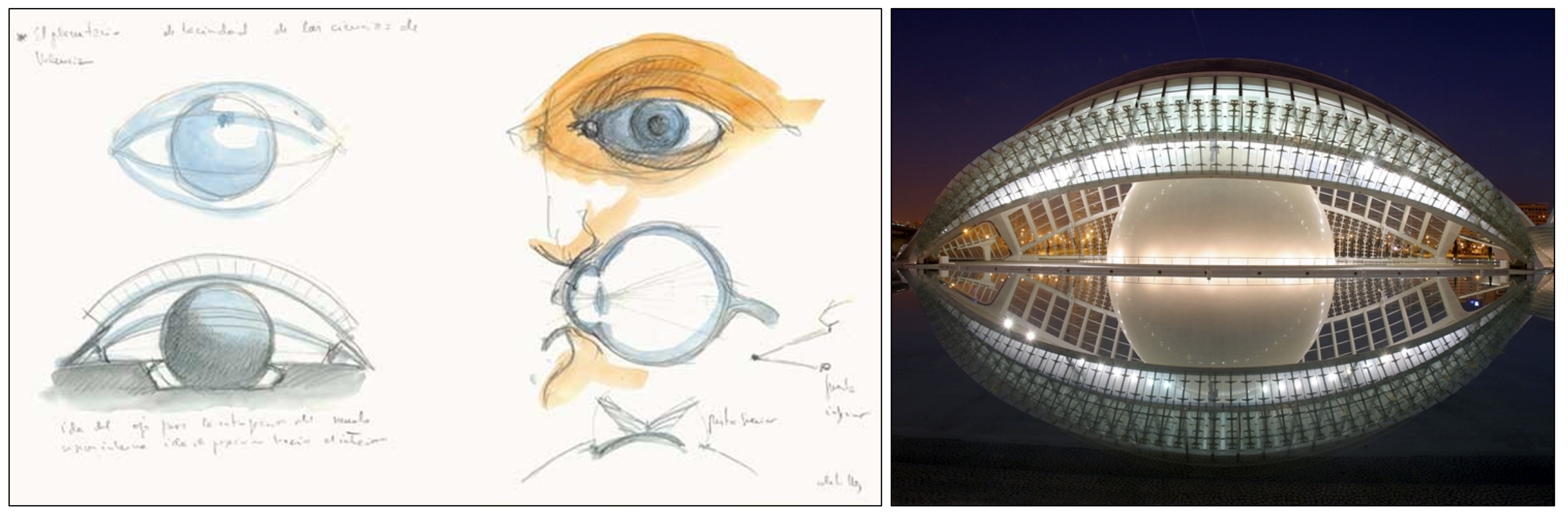
All functional products or buildings may have—or constitute—the form of an arch. Finding such an original form may be a keystone of the success of a product, for instance, when Steve Jobs first demonstrated the Apple product called the iPad it could clearly be seen as the successor of the slate. Another illustrative example is a building called L’Hemisfèric in Valencia, which was designed by the Spanish architect, sculptor, and structural engineer Santiago Calatrava Valls (Figure 1).
The appeal to fundamentals is apparent in the material choices of products, logo designs, etc., all of which demonstrate and justify the conscious use of symbols.
2.2. Psychology and Design
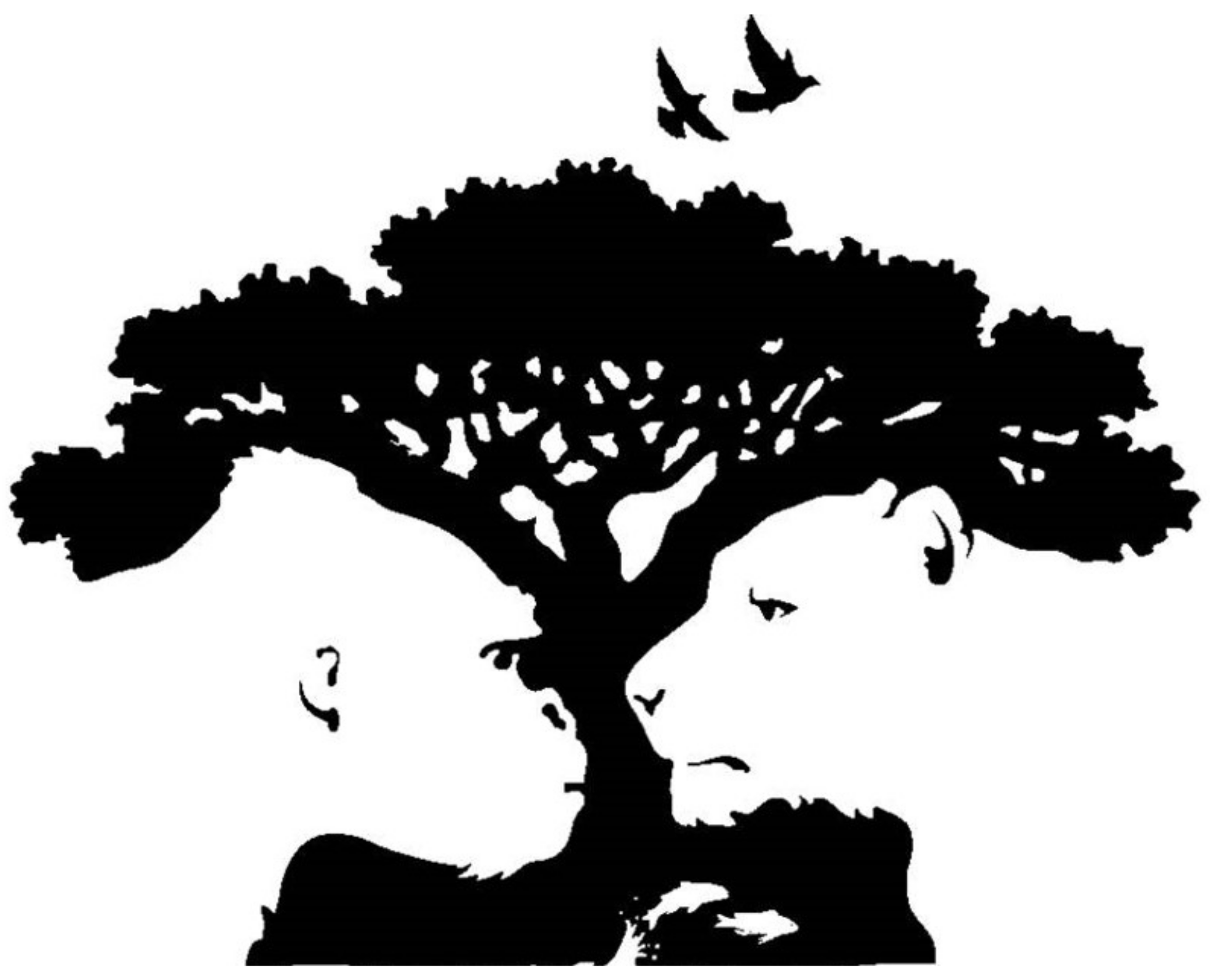
Historically, the first psychophysical model that described the organisation of objects in a viewed image was Gestalt Theory (in German, the “Gestalt” of an object means all the perceivable information about this object). Gestalt Theory emphasizes that a product (the “entire”) is more than the sum of its parts [20]. Figure 2 introduces an example of Gestalt shift, where initially only one image is perceived, then the brain recognises the second picture and stores it. The next time the picture is viewed, the person will see both pictures from the start. This phenomenon also occurs in relation to intellectual and emotional perceptions.
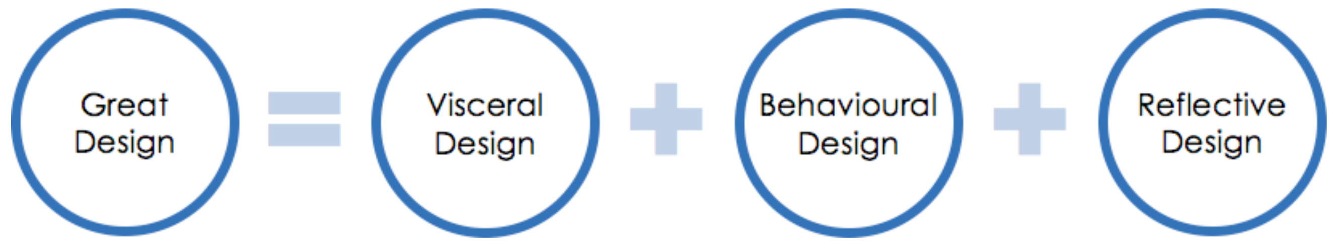
Moreover, this approach is also important from the point of view of design. Donald Norman identifies three components in the theory he introduced in his book “Emotional Design” [22] in which he researches the meaning of beauty; hence, a great part of his research deals with products. His conclusion is that a product needs not only to be functional but to have an appealing design, and the feelings this evokes can be enough to ensure the success of the product, or in other words, what is beautiful is often useful, and what is useful is often beautiful [22,23]. In his theory, he breaks emotions into three components (Figure 3). As a consequence, a great design evokes emotions, helps one to act, and shows what you are.
- The basic layer of emotions evoked by an object, according to Norman, is the Visceral level. This includes the appearance, material, sound, etc. of the object. The number of preferences hard wired into the brain is huge. For example, most people like bright colours and symmetry, but do not like loud noises or extreme temperatures. This level can be expressed in many ways in design.
- The middle level in the model is the Behavioural level. This affects people’s reactions and is usually connected to the environment, products, or the person. This level is concerned with functionality, which is influenced by efficiency.
- The third level is the Reflective level. This level is strongly influenced by self-image, satisfaction and the meaning of things. This level is becoming increasingly important.
Most objects are perceived on all three levels, thus a good designer should deal with all three levels.
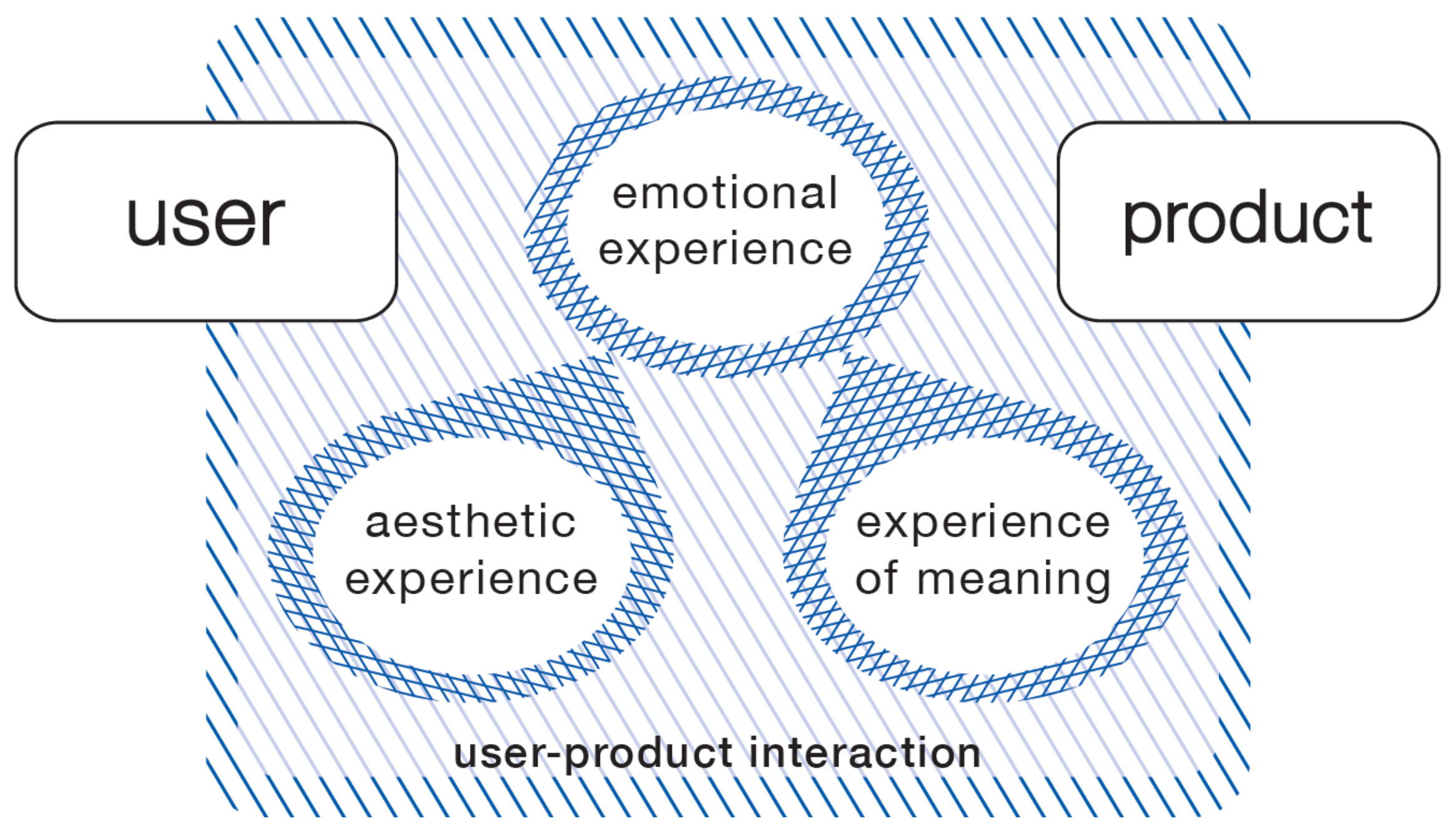
Another approach that discussed the interaction between user and product is Desmet and Hekkert’s framework for product experience [24], which can be seen in Figure 4. The three components of this model are:
- The aesthetic experience, which involves all our senses about the product (e.g., it looked beautiful, smelled nice, sounded pleasant, felt good to the touch);
- The experience of meaning, which is the meaning we attach to products (e.g., characteristics, personal or symbolic meanings like luxury, elegance, or robustness);
- The emotional experience, that is, the feelings, emotions elicited by the product (e.g., frustration by a complex user interface, disappointment by the limited memory capacity of a product).
2.3. Mood Effect of the Lines and Geometries
Forms and shapes have a great influence on the subconscious mind. Artists and designers use geometric elements in order to achieve the transmission of appropriate messages and moods, an effort which started when the cave paintings appeared. Researchers have found similar results connected to the meaning of basic geometries such as squares, triangles, and circles [26,27] (Table 1).
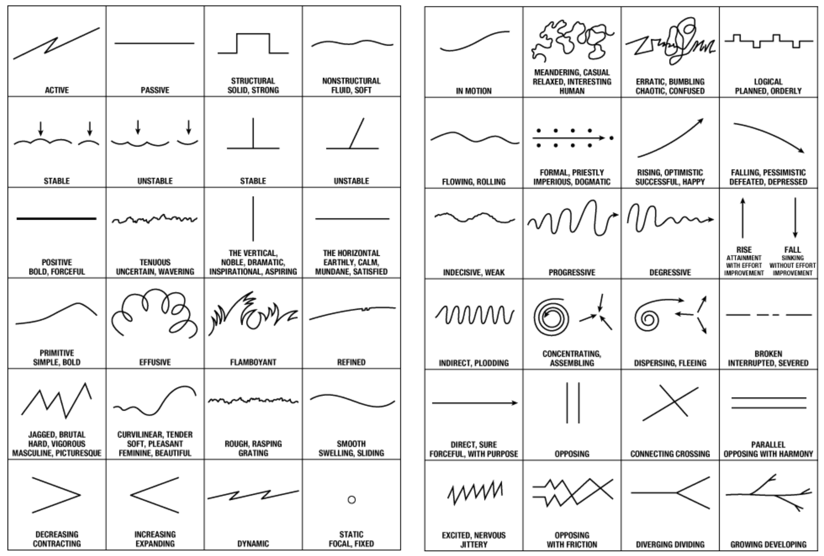
Lines can express various feelings and moods based on their movement, and this has been analysed in many fields where it is relevant, for instance, in typography [28], in the visual arts [29,30] and architecture [31]. Figure 5 presents these kinds of geometric elements as a collection from Landscape Architecture by John Ormsbee Simonds, that contains 48 Mood Lines [31].
This collection is the most complete, and has also been validated by the designer Rikard Rodin [32] with plenty of examples in the field of movie posters, paintings, photographs, game layouts and products. An example can be seen in Figure 6. Examining the presentations and posters of action films, a line can be identified associated with active feelings, common to all the images.
Some examples of the different moods these lines convey include: Horizontal mood lines convey a sense of peace, calm and relaxation, whereas vertical mood lines have masculine characteristics, for instance dynamism and emergence; moreover, they suggest stability and durability, so may also be associated with strength and simplicity. On the other hand, diagonal or bias mood lines seem to be more dynamic and exciting, because they suggest movement and activity or may cause uncertainty. While some mood lines are masculine in nature and are associated with will power and mentality, curved mood lines suggest femininity, softness, lightness and happiness, and they affect our emotions.
During the process of seeing, the detection of the image occurs by evaluating optical components, for example, hue, fullness, texture, shape, size etc. A balance must be found between complementary components, otherwise it may cause tiredness in the viewer. In everyday actions such as walking, swimming or hammering, rhythm can help the work and may even give a feeling of joy.
Based on the examples and facts presented above, it can be concluded that although people’s motivations and experiences may differ from each other, a particular product, shape, or pattern may have a similar effect on them. This should be kept in mind during the pattern creation process.
3. Primary Research—Understand Human Behaviour
No research has been conducted on the emotional impact of geometric patterns so far, so surveying them was one of the key tasks of this research. To understand this aspect of human behaviour, first of all, focus group interviews, and after that, questionnaire techniques were used.
3.1. Focus Group Interview
The focus group technique is a type of qualitative research, where the participants are engaged in a guided conversation on a topic. The key question of this examination was the reactions caused by certain patterns. In this research stage, two focus groups were involved, and the results of these sessions were used as the basis for the survey.
The patterns were printed in 3D to help its evaluation. These prototypes allowed the patterns to be presented much more easily and the interviewees could discuss it effectively and creatively.
3.1.1. Creating Patterns
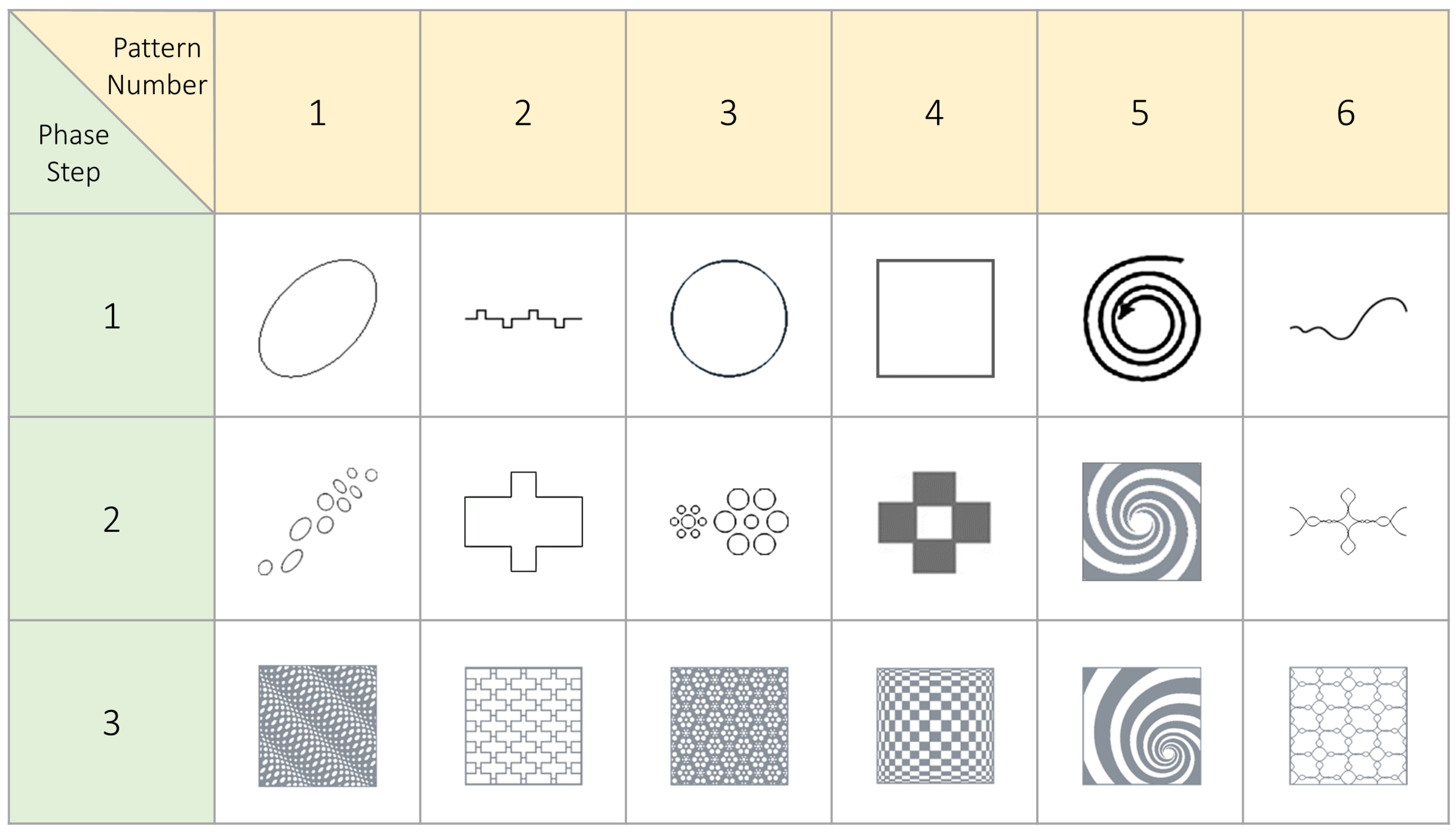
Patterns are basically created by the (re-) arrangement and transformation (for instance, multiplications, rotation) of basic geometric elements. In this project, the patterns were deliberately chosen to elicit sharply different impressions of different shapes. A total of six patterns were created, each of which will be presented along with the three- phases of their development (Figure 7).
In patterns 2, 5 and 6, the base of the patterns was chosen from among the mood lines of Simonds. Different geometrical transformations were made to these patterns in order to design the final pattern. In patterns 1, 3, and 4, the above-mentioned mood lines can be recognized in the general appearance of each pattern. In order to create the patterns, different topologies and structures were applied. During the background research, the process of seeing, the methods for creating feelings, and the details of achieving a given effect were examined. This research suggested the idea of analysing cognition through optical illusions. In addition to that, examining confusing phenomena is both interesting and entertaining, and these aspects proved to be a vital component of the efficient analysis of the connections between design and psychology.
First Pattern
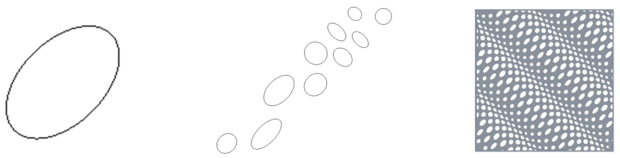
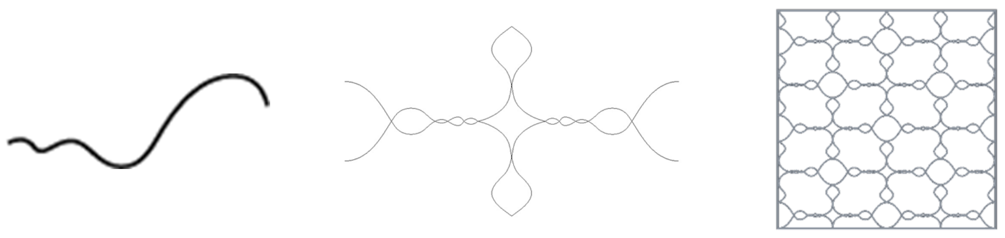
There are three main types of optical illusions have: optical illusions in the literal sense, physiological illusions, and cognitive illusions. Within cognitive illusions, the area of depth and motion detection was studied, and the essence of this is that the viewers will see an image in three dimensions even if the light is projected on the retina in two dimensions [33]. For the ridge pattern, undulation was chosen which symbolizes rhythm. Related expressions are smooth, swelling, and sliding (Figure 5).
Several examples demonstrate the theory that the alternation of bigger and smaller pattern groups evokes the notion of rhythm. The base for the pattern is made of ellipses, because psychological studies have shown that people find round, rounded, or curved-cornered polygons more sympathetic than rectangular geometry. The basic ellipse, the base for the regular shape, and the final pattern can be seen in Figure 8.
The basic elements of the pattern were repeated several times, keeping the same distances and then it was reproduced in perpendicular directions.
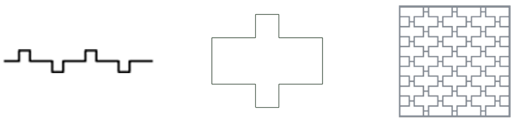
Second Pattern
Third Pattern
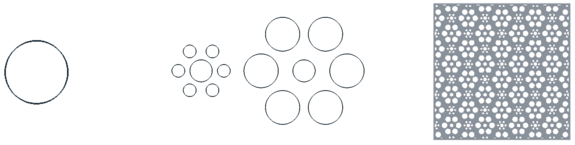
Hermann Ebbinghaus, an experimental psychologist who studied learning and memory patterns, inspired the third pattern. He himself created the illusion named after him. Circles were used for the repeating basic elements [34].
In the Ebbinghaus illusion, the phenomenon of relative size perception can be examined. The two internal circles are of the same size, but most people see the first (the circle on the left) as larger than the second one (on the right). The reason is that smaller circles surround the circle on the left while large circles surround the circle on the right (Figure 10).
Fourth Pattern
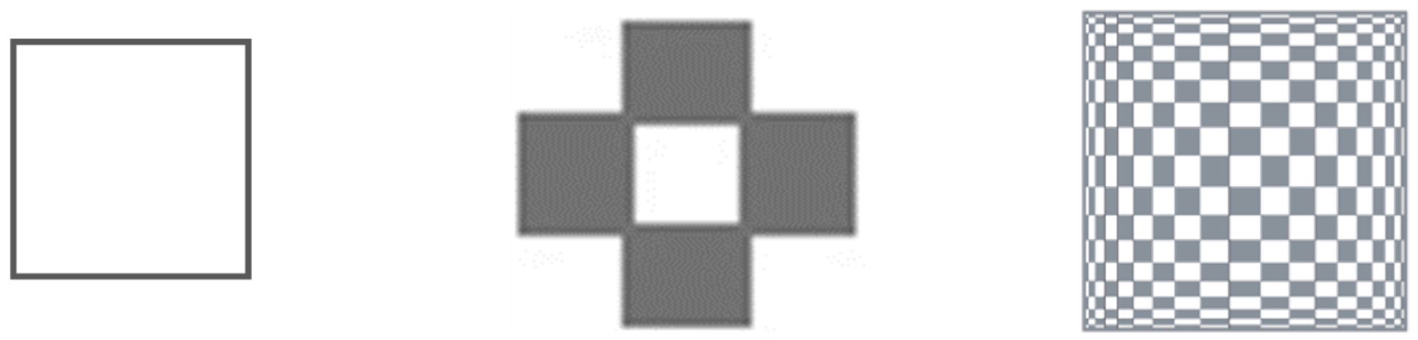
This is an example of optical art, which influences the human feeling of space and spatial approach. The laws of geometry and mathematics affect this. This genre, known as Op-Art, uses basic geometric shapes and distributes them according to a pre-conceived plan. Squares were used and arranged in a variable density perspective, starting from the middle of the image. The dimensions of the rectangles change gradually and symmetrically (Figure 11).
Fifth Pattern
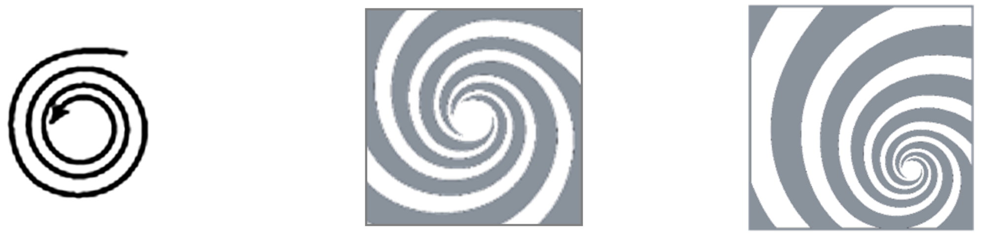
The fifth pattern (Figure 12) is characterized by a spiral that has connotations of concentration and focus. However, this pattern has a different appearance because this is the only pattern that is asymmetrical. This element of the research was a chance to find out whether people see something beautiful only if it is symmetric and proportional (as other studies have claimed [35]). Furthermore, it was suggested that the asymmetry could cause creativity and interest.
Sixth Pattern
3.1.2. The Interview Structure
At the beginning of the interview, the members of the focus group provided demographic data and were asked a few basic questions concerning their age, gender, educational attainment, occupation, favourite colour, favourite product, and basic sentiment.
After gathering this information, some technical issues were taken into consideration, for example, the reason for this study, time management, confidentiality and voice recording.
Before the main task, a brainstorming assignment helped the members to understand what exactly the issue was. The main task was based on design team work, in which the groups completed a task involving six questions about the pattern. These questions focused on the related words, products, patterns, spaces, colours, touch and emotions that they felt. Finally, the evaluation and collation of information was carried out.
In total, 22 people (10 women and 12 men) participated in the interviews. The subjects’ age ranged from 22 to 36 (M = 26 years, SD = 3.53). They were predominantly university graduates or still students. In terms of their occupation, almost all were in employment, in positions such as HR manager, graphic artist, and financial analyst. They mainly worked in the technical and financial fields, and some also had experience in product design. The most common favourite colours given were purple, green, and blue. The respondents’ favourite products include mainly computer equipment, entertainment products, food, and electronics products. Their mood was mostly positive.
3.1.3. Results of Focus Groups Interviews
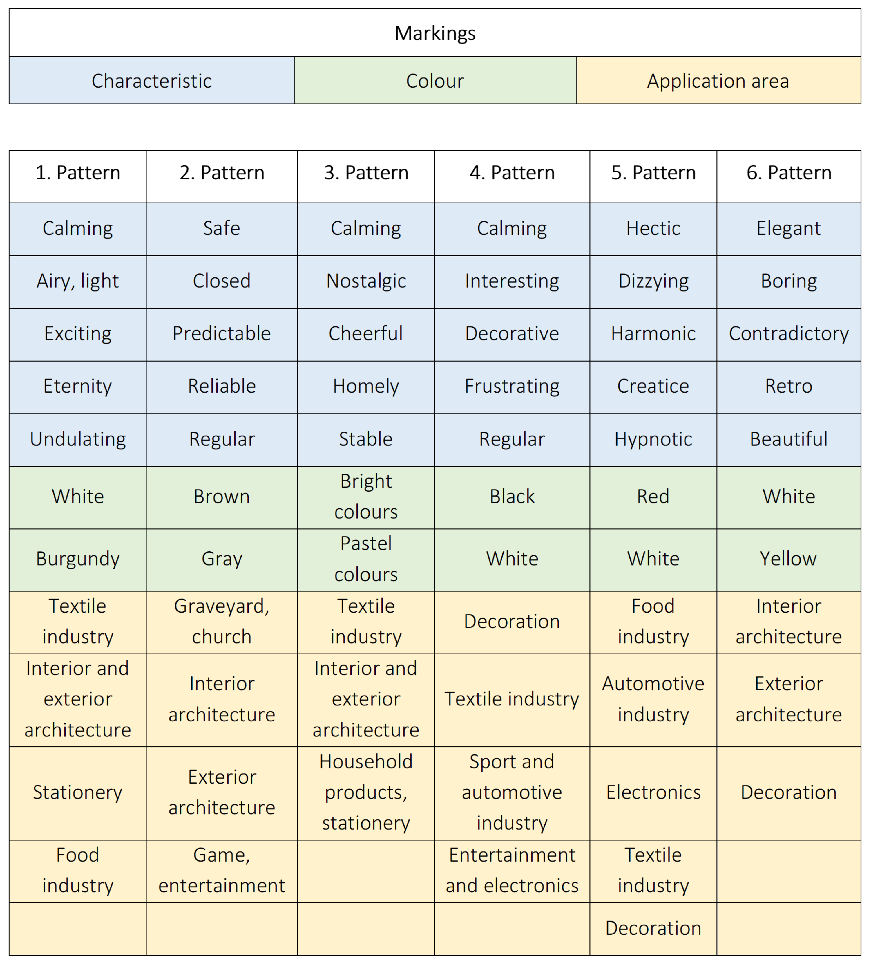
The keywords about each of the patterns are summarised in Table 2. The results about the patterns are described in detail separately below the table.
First pattern: The feelings and effects indicated about this pattern correspond well with the depth and movement illusions it was supposed to create, while the fluctuating feeling—indicated by the rhythmic spread of the pattern—was also mentioned multiple times. The elliptical base of the pattern produced a pleasant and calming effect—as had been planned in advance. The fluctuating feeling led to a number of associations being made with water—waterfall, water drop, foam etc. Areas connected to the patterns were all based on its character, so the porosity was cited as a function in many cases. Considering the possible colours, the brighter shades were dominant.
Second pattern: The base-geometry was meant to evoke a logical, planned, arranged feeling, although manipulating it allowed a significantly different effect to be achieved. Many of the participants associated it with claustrophobic or secure feelings, or mentioned similar products in connection with it, like fences, bars, and rails. Given the obvious similarities with the cross symbol, churches or even cemeteries were also frequently mentioned. As for colours, various shades of brown were suggested the most often.
Third pattern: The illusion of circles was not mentioned, only the shape of a flower or the sun—both consisting of the base circles—and their effects. The feelings it evoked were all positive ones, such as calmness, home and nostalgia. The areas and products which respondents suggested were also mainly connected to one’s home and household, like goods based on paper and textile. Bright and “happy” colours were the most frequently mentioned.
Fourth pattern: Feelings associated with space and mathematics were elicited by the base of the pattern, although the areas of application suggested were typically more “hectic” areas such as show business and sport. Interestingly, the colours which respondents associated with this pattern were all strongly contrasting, such as black and white.
Fifth pattern: The asymmetric helix-shape was meant to be an exception among the other symmetric patterns. It was clearly the most creative example and also the one that provided the most information. It even caused minor arguments, because multiple teams wanted to analyse this pattern. The words most frequently used about it by the respondents were movement, dizziness, harmony, wind, universe and variants on these themes. Of the most common words related to feelings included brilliant, spiritual and developing. The participants mentioned many different areas, mainly concerning contrast and bright colours.
Sixth pattern: Given its soft, pleasant, feminine base-geometry, the sixth pattern delivered the expected effect in most cases—the participants would mostly use it in decoration and architecture—although, it was also the most controversial pattern. Most of participants considered it to be elegant and artistic. However, a significant portion of the participants found it unpleasant and boring. With regard to colours, mainly very dark or very bright shades were mentioned.
3.2. Questionnaire
Quantitative research techniques include the survey, which should contain major questions directly related to the research topic, along with additional questions on related subjects, because these can obtain information and identify possible biases.
The questionnaires were based on the three main phases of pattern preparation. The questionnaire was divided into three parts. The questions in the first part concerned the basic geometry, e.g., square, circle, etc., while in the second part they focussed on the geometry of the repeating unit, and in the third part the finished pattern was the subject of the questions. Six types of questionnaires were created.
In order to incorporate the results of the interviews into the questionnaire, the evoked feelings, characteristics, colours, and areas of application most frequently mentioned for each pattern during the interviews were collected. In total, five characteristics (feelings, emotions, moods), two colours, and five application areas were asked about in the survey questions (Figure 14). The participants were required to sort the areas of application of the patterns, while their opinions about characteristics and colours were elicited separately. For example, for Pattern 1, the first question was, “How calming is the geometry/pattern?” The answers could be: “Not at all”, “Not really”, “Mostly” and “Completely”.
A total of 534 people (108 women, 426 men) participated in the survey. The participants were primarily students of the Faculty of Mechanical Engineering. A survey of the basic preferences of the respondents revealed that blue was the most popular colour when asked about their favourite colours, followed by green, then black and red, and finally yellowish, brownish, and white. Among their favourite products, technical products are the most popular, followed by excise goods and food. Among the technical products, phones, laptops, and other electronic items predominated.
The subjects’ responses (“Not at all”, “Not really”, “Mostly” and “Completely”) were quantified. Similarly to the method used for the ergonomic evaluation of products (importance–satisfaction chart) [36], the values were weighted. The following values were added to the answers, since on a scale from “Not at all” and “Completely”, this is an easy division, and it is also straightforward to represent:
- Not at all—0 point
- Not really—1 point
- Mostly—2 points
- Completely—3 points
The subsequent calculation aims to represent the results in a coordinate system, where X, Y, and Z-axes denote the characteristics of the three subsamples about one pattern. The values of the axes can be interpreted up to a maximum of 3, where 3 denotes the terms “Completely” and 0 denotes the terms “Not at all”.
The coordinates are defined as follows:
Weighted value: The sum of the products of the answers and the corresponding points. In the example of Table 3:
Average = coordinate: Dividing the weighted value by the number of respondents produces the average, which will denote the coordinate point of the given axis. In the example in Table 3:
Based on the same idea, it will be possible to add a coordinate to each question. In these, three answers to the same question define a node (X, Y, Z) since pattern creation involves three phases.
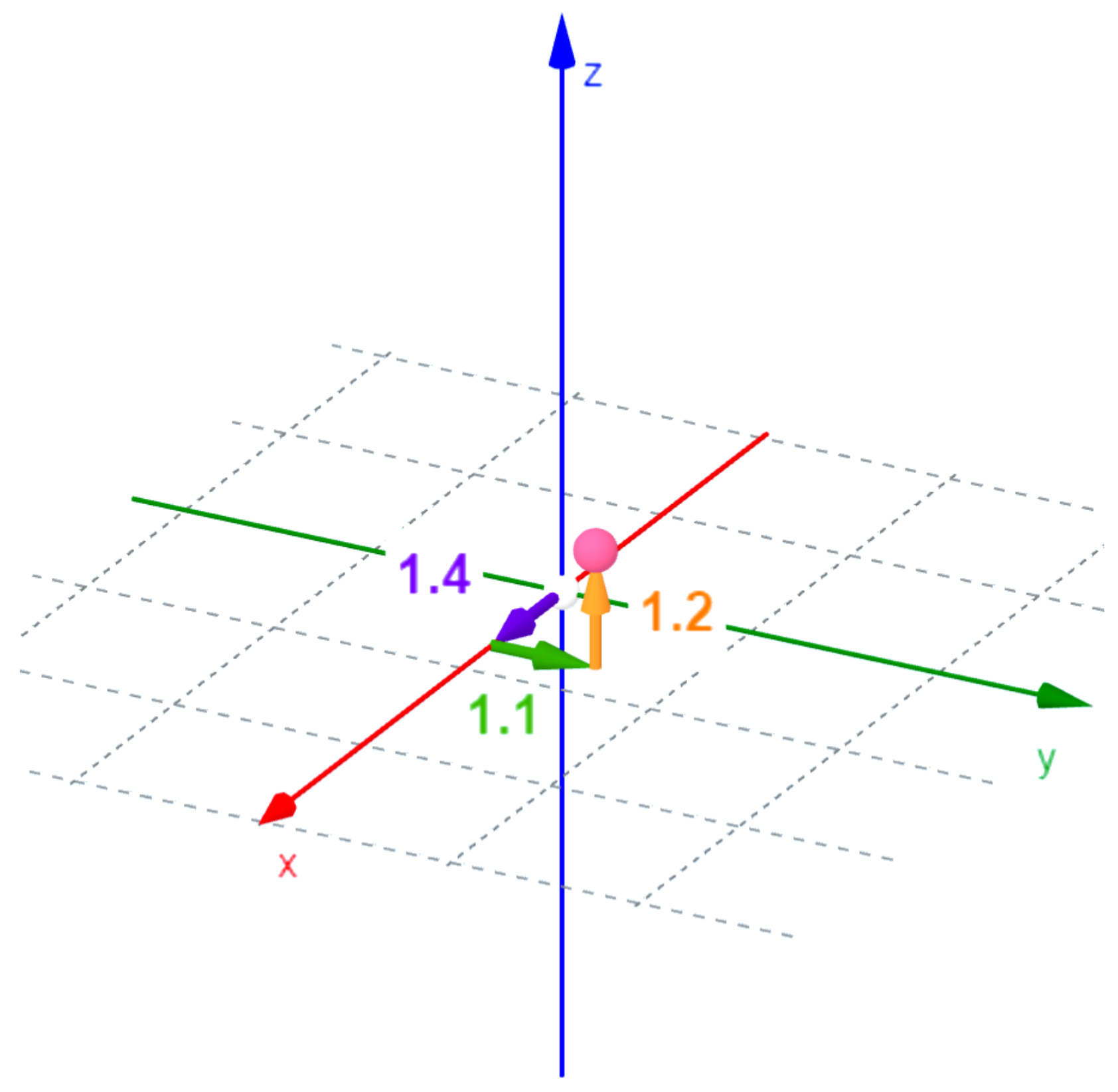
The X coordinate belongs to phase 1 of the pattern creation, to the basic geometry, the Y coordinate to phase 2, which is mostly the repeating element, and the Z coordinate belongs to the finished pattern (Table 4).
Based on the tables above (Table 3 and Table 4), in the first pattern, the answer to the question, “How calming is the pattern?” node (1.4,1.1,1.2) can be associated (Figure 15). A pattern has seven nodes.
If the steps described above are applied to all six patterns, the resulting coordinates can be summarized in a node table. Based on the data, several conclusions can be drawn, but one of the most interesting is obtained when examining the highest values.
Table 5 shows the part of the summarized node table relating to the third pattern. The numbers in bold—and their columns—indicate which sub-pattern the responders consider the property (Column 1) to be most characteristic of.
Based on the results, it can be assumed that the characteristics can be derived from the step (sub-pattern or pattern) to which the highest values are associated. This means that when, for example, participants in a focus group interview found the third pattern calming, they did not know that the reason for this was that the pattern was made up of circles. They merely felt that way. However, it can be seen that when examined separately, the circle represents the most calming feeling, and although the calming effect decreased as the pattern was altered, it was still felt in the end result. Hence, the characteristics that had the highest values in the first column of the values, i.e., in the first phase of pattern generation (basic geometry), are derived from that geometry. In each case, the evoked feelings above can be seen to diminish during the process of transformation but they remain present throughout. For the phases in the second, and especially the third column, it can be concluded that the way the pattern is made gives it the property.
For example, observing the undulating property of the first pattern (Table 6), it is clear that since the pattern creation was aimed at portraying the undulating character, the values also increase during the pattern development process. Based on these, it can be postulated that the properties of a pattern (except for colours) can come from two sources: on the one hand from the characteristics of the basic geometry, and on the other hand from the way the pattern is made.
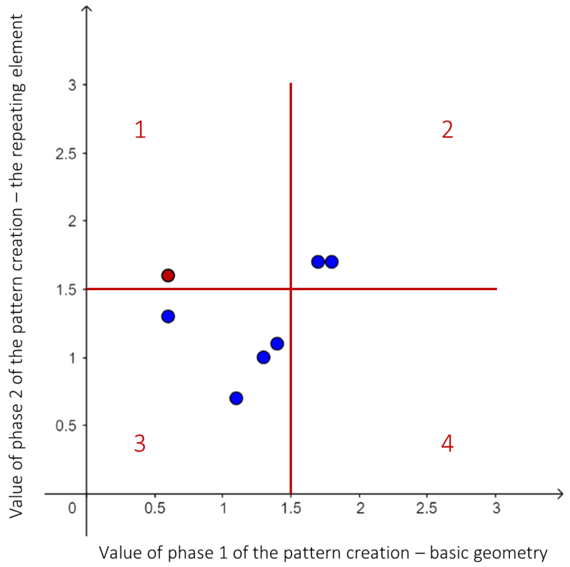
Visually displaying the points can further help in drawing conclusions. For more straightforward transparency, the first pattern points are shown in a 2D view, i.e., by showing two axes (Figure 16). The points located on the 1 slope of line starting from point (0;0) would be the ones for which the average opinion and feeling of the survey participants would not have changed with the modification of the pattern. The environment of this line is characterized by a slight change in the respondents’ opinion regarding the modification of the pattern, more precisely, areas 2 and 3 of the parts of the diagram divided towards 4, cover it. However, in this way, the factors that may be most influenced by modifying a given pattern can also be distinguished. These factors are included in the questions for nodes in areas 1 and 4, marked with a uniform colour scheme. In the diagram, the points on the boundary lines and on areas 1 and 4 were also marked in red. The conclusions about the examination of the diagrams are presented in the next section.
4. Results and Discussion
Patterns have a similar effect on people. The results of the focus group interview and questionnaire both support the view that although the people’s motivations and experiences may differ from each other, nevertheless patterns can have a similar effect on them.
The effect of geometric patterns is fundamentally influenced by the basic geometry and arrangement of the pattern. Another conclusion that can be drawn about the research presented above is that, in most cases, the features and moods evoked by the basic geometry are not entirely equal with the properties attributed to the final patterns. It is thus possible to obtain very different results when using the same base, if the repetition is re-applied in different directions (for example in a slanted instead of a horizontal direction). This makes the design process much more complicated, because not only the base, but also the ways of developing the patterns and their individual effects need to be reviewed and characterised.
The following fields are most suitable for industrial applications of patterns for their aesthetic appeal: the textile industry, the automotive industry, interior architecture, art and ornaments, cladding and building materials, and in the construction industry. Another result is that the patterns could be imagined in very similar areas. As has been seen in the development of the patterns, there are very different theories behind their creation, so I assume this is not a consequence of the similarity of the patterns, but because the geometric pattern itself is a regular structure, it could be best utilized in certain industries. The most frequently mentioned areas of application are: the textile industry, the automotive industry, interior architecture, art and ornaments, cladding and building materials and in the construction industry.
The colours and textures of the patterns have an enormous effect. Analysing the responses of the research subjects about colours and texture, it is evident that the properties of the printed prototypes greatly influenced the participants. This was to be expected, but the extent of it may be surprising. This opens up a new aspect of the research, as in the future, it will require a strong emphasis to be placed on colour and tactile perception.
Asymmetry and optical illusions can evoke creativity and generate more interest. Using optical illusions proved to very effective, and generated positive feelings in the users. Furthermore, employing asymmetry also provided interesting results. It had clearly positive effects on the users in contrast to the assumptions (for example [35]) found during the background research, that people only perceive something as beautiful if they recognise symmetry and proportionality.
A new method for object evaluation has been developed. Gestalt Theory emphasizes that a product (the “entire”) is more than the sum of its parts [20]. Based on this theory, when evaluating a pattern, or any design object, it is very informative to know the effect of the parts of this. In Section 3.2, a new method for this was introduced, which follows these steps:
- According to some method (e.g., the direction of development), divide the examined object into three parts.
- Formulate questions that will be asked about each of the three parts.
- Formulate possible answers.
- To quantify the answers, assign a weight to them.
- Multiply the weights by the number of responses received and add them together.
- Divide this by the total number of respondents.
- Evaluate the obtained coordinates (x, y, z).
5. Conclusions
The appearance of products has a great impact on consumers, thus the product designer should pay attention to its attributes. While products may have many design properties, this study dealt specifically with geometric patterns.
The arrangement of the basic geometry of a pattern can be different, and the research results have shown that—besides the basic geometry—this has an impact on the final design, thus the methods of the arrangement of patterns should be analysed. This research has presented six types of pattern creation methods with the purpose of producing different impressions, and by means of focus group interviews and a questionnaire survey, the initial hypothesis of which emotion would be evoked was tested. In order to examine the effect of the arrangement process, a new evaluation method was presented that allows the tester to quantify the results, which is both a novel methodology and meets the requirements of Gestalt principles. Geometric patterns are regular structures in general that can be built up from replications of simple elements. This design feature can be used as a decorative element of a product or on the product’s surface design, etc. This research suggests that patterns can contribute most effectively in the following industries: textile, automotive, sport, food, entertainment, electronics industry, interior, exterior design, decoration, and stationery. In addition to this, the tests have shown that, besides symmetrical arrangements, asymmetrical patterns can also evoke creativity and positive feelings.
In future research, the colours and the tactile of the patterns will be measured and combined with the results of this study.
Funding
The research reported in this paper and carried out at BME has been supported by the NRDI Fund (TKP2020 NC, Grant No. BME-NCS) based on the charter of bolster issued by the NRDI Office under the auspices of the Ministry for Innovation and Technology.
Institutional Review Board Statement
The study was conducted according to the guidelines of the Declaration of Helsinki. Ethical review and approval were waived for this study, since the anonymous nature of the survey does not allow the tracing of sensitive personal data.
Informed Consent Statement
Informed consent was obtained from all subjects involved in the study.
Data Availability Statement
The data presented in this study are available on request from the corresponding author.
Acknowledgments
The research reported in this paper and carried out at BME has been supported by the NRDI Fund (TKP2020 NC, Grant No. BME-NCS) based on the charter of bolster issued by the NRDI Office under the auspices of the Ministry for Innovation and Technology.
Conflicts of Interest
The author declares no conflict of interest.
References
- Kissmetrics. How Do Colors Affect User Choices and Purchases? 2010. Available online: https://neilpatel.com/wp-content/uploads/2010/08/colorpurchases-lrg.png (accessed on 18 May 2021).
- Wenzel, K. Optikai Illuziók—A Látás Kutatás; Nemzetközi Fényszimpózium: Eger, Hungary, 2005. [Google Scholar]
- Viola, N. A szíNek Hatása az újságírásban és a Reklámokban; ELTE BTK Müvészetelméleti és Médiakutatási Intézet: Budapest, Hungary, 2008. [Google Scholar]
- Blijlevens, J.; Creusen, M.E.; Schoormans, J.P. How consumers perceive product appearance: The identification of three product appearance attributes. Int. J. Des. 2009, 3, 27–35. [Google Scholar]
- Kim, N.Y.; Shin, Y.; Kim, E.Y. Emotion-based textile indexing using neural networks. In Proceedings of the International Conference on Human-Computer Interaction, Beijing, China, 22–27 July 2007; pp. 349–357. [Google Scholar]
- Saito, S.; Hiyama, A.; Tanikawa, T.; Hirose, M. Indoor marker-based localization using coded seamless pattern for interior decoration. In Proceedings of the 2007 IEEE Virtual Reality Conference, Charlotte, NC, USA, 10–14 March 2007; pp. 67–74. [Google Scholar]
- Gulati, V. Rapid tooling for producing stretch-formed jewelry. Int. J. Comput. Appl. 2011, 975, 8887. [Google Scholar]
- Auttarapong, D. Package design expert system based on relation between packaging and perception of customer. Procedia Eng. 2012, 32, 307–314. [Google Scholar] [CrossRef] [Green Version]
- Rödel, H.; Schenk, A.; Herzberg, C.; Krzywinski, S. Links between design, pattern development and fabric behaviours for clothes and technical textiles. Int. J. Cloth. Sci. Technol. 2001. [Google Scholar] [CrossRef]
- Violante, M.G.; Marcolin, F.; Vezzetti, E.; Ulrich, L.; Billia, G.; Di Grazia, L. 3D Facial Expression Recognition for Defining Users’ Inner Requirements—An Emotional Design Case Study. Appl. Sci. 2019, 9, 2218. [Google Scholar] [CrossRef] [Green Version]
- Chen, Z.; Huang, D.; Wang, Y.; Chen, L. Fast and light manifold cnn based 3D facial expression recognition across pose variations. In Proceedings of the 26th ACM International Conference on Multimedia, Seoul, Korea, 22–26 October 2018; pp. 229–238. [Google Scholar]
- Conner-Simons, A.; Gordon, R. Detecting Emotions with Wireless Signals. MIT News. 2016. Available online: https://news.mit.edu/2016/detectingemotions-with-wireless-signals-0920 (accessed on 18 May 2021).
- Nummenmaa, L.; Glerean, E.; Hari, R.; Hietanen, J.K. Bodily maps of emotions. Proc. Natl. Acad. Sci. USA 2014, 111, 646–651. [Google Scholar] [CrossRef] [Green Version]
- Khazan, O. Mapping How Emotions Manifest in the Body; The Atlantic: Boston, MA, USA, 2013. [Google Scholar]
- Jung, C.G.; Von Franz, M.L.; Henderson, J.L.; Jaffé, A.; Jacobi, J. Man and His Symbols; Anchor Press: New York, NY, USA, 1964; Volume 5183. [Google Scholar]
- Hoppál, M.; Jankovics, M. Jelképtár; Helikon kiadó: Budapest, Hungary, 2010. [Google Scholar]
- Antalfai, M. Személyiség és Archetípusok Jung Analitikus Pszichológiájában; Vázlatok a Személyiségről; Új Mandátum Könyvkiadó: Budapest, Hungary, 2007; pp. 166–190. [Google Scholar]
- Tola, A.; Vokshi, A. Santiago Calatrava, City of Arts and Science: The Similarity of the Elements. In Proceedings of the UBT International Conference, Durres, Albania, 27–29 October 2013; Volume 3, pp. 32–42. [Google Scholar]
- Polat, C. Inspiration point in design: The example of basic design class assignments. In Proceedings of the SHS Web of Conferences, Athens, Greece, 4–7 June 2016; Volume 26, p. 01084. [Google Scholar]
- Csépe, V.; Győri, M.; Ragó, A. Általános Pszichológia: Észlelés és Figyelem; Osiris: Budapest, Hungary, 2007; Volume 1. [Google Scholar]
- Nicotra, J. Performance: Gestalt Theory for Visual Design; University of Idaho’s ENGL 318: Moscow, Russia, 2016. [Google Scholar]
- Norman, D.A. Emotional Design: Why We Love (or Hate) Everyday Things; Basic Civitas Books: New York, NY, USA, 2004. [Google Scholar]
- Kozik, P.; Tateosian, L.G.; Healey, C.G.; Enns, J.T. Impressionism-Inspired Data Visualizations Are Both Functional and Liked. Psychol. Aesthetics Creat. Arts 2019, 13, 266. [Google Scholar] [CrossRef] [Green Version]
- Desmet, P.; Hekkert, P. Framework of product experience. Int. J. Des. 2007, 1, 57–66. [Google Scholar]
- Jaramillo, S.J.; Pohlmeyer, A.; Desmet, P. Positive Design Reference Guide; Delft University of Technology: Delft, The Netherlands, 2015. [Google Scholar]
- Fogelström, E. Investigation of Shapes and Colours as Elements of Character Design; Uppsala Universitet: Uppsala, Sweden, 2013. [Google Scholar]
- Frutiger, A. Signs and Symbols: Their Design and Meaning; Van Nostrand Reinhold: New York, NY, USA, 1989. [Google Scholar]
- Hyndman, S. How Typography Impacts Your Mood. Noteworthy. 2019. Available online: https://blog.usejournal.com/how-typography-impactsyour-mood-5bbc3386de03 (accessed on 18 May 2021).
- District, H.H.S. LINE. In Hendrick Hudson School District; Hendrick Hudson Central School District: Montrose, NY, USA, 2019. [Google Scholar]
- Barnett, J. Elements of Art Line Shape Form Space Value Color Texture. Noteworthy. 2016. Available online: https://slideplayer.com/slide/6627321/ (accessed on 18 May 2021).
- Starke, B.W.; Simonds, J.O. Landscape Architecture: A Manual of Environmental Planning and Design; McGraw-Hill Education: New York, NY, USA, 2013. [Google Scholar]
- Rodin, R. Mood Lines: Setting the Tone of Your Design. ZevenDesign. 2015. Available online: https://zevendesign.com/mood-lines-givingdesigns-attitude/ (accessed on 18 May 2021).
- Nagy, S.Z. Performance: Vizuális IllúZiók Csoportosítása. 2012. Available online: https://slideplayer.hu/slide/1878992/ (accessed on 18 May 2021).
- Encyclopedia, N.W. Ebbinghaus Illusion. 2013. Available online: https://www.newworldencyclopedia.org/entry/Ebbinghaus_illusion (accessed on 18 May 2021).
- Kepes, G.; Horváth, K. A Látás Nyelve; Gondolat: Budapest, Hungary, 1979. [Google Scholar]
- Hercegfi, K.; Izsó, L. Ergonómia; Typotex Kiadó: Budapest, Hungary, 2007. [Google Scholar]
Short Biography of Author
 | Laura Trautmann Laura Trautmann was born in Budapest, Hungary, and attended to courses at Budapest University of Technology and Economics where accomplished her studies of Product Management in the framework of BSc in Engineering Management program in 2015 and completed master’s degree program in Industrial Design Engineering in 2017. Currently, she is a Ph.D. student in the same institution, and her topic is handling human factors in engineering design projects. Her e-mail address is: [email protected] and her Web-page can be found at http://gt3.bme.hu/ (accessed on 16 July 2021). |

Figure 2.
Gestalt Theory [21].
Figure 2.
Gestalt Theory [21].

Figure 3.
Components of great design based on Donald Norman’s book [22].
Figure 3.
Components of great design based on Donald Norman’s book [22].


Figure 6.
Example of the application of mood lines on movie posters [32].
Figure 6.
Example of the application of mood lines on movie posters [32].

Figure 7.
Development of patterns.

Figure 8.
Evolution of the first pattern.

Figure 9.
Evolution of the second pattern.

Figure 10.
Evolution of the third pattern.

Figure 11.
Evolution of the fourth pattern.

Figure 12.
Evolution of the fifth pattern.

Figure 13.
Evolution of the sixth pattern.

Figure 14.
Focus group interview—Significant characteristics, colours, application areas.

Figure 15.
(1.4,1.1,1.2) node.

Figure 16.
Split chart—x and y coordinates of the first pattern.


Table 1.
Meaning of shapes.
| Square | Stability, trust, honesty, order, conformity, security, equality, masculinity, maturity, balance, stubbornness |
| Triangle | Action, aggression, energy, sneakiness, conflict, tension, masculinity, force |
| Circle | Completeness, gracefulness, playfulness, comforting, unity, protection, childlike, innocence, youth, femininity |
Table 2.
Keywords related to the patterns, from focus group interviews.
| Pattern 1 | Wave, wallpaper, recurrence, foam, sea, dress, tablecloth, soft, bubble, comforting, lace, carpet, white |
| Pattern 2 | Angular, cross, lawn grid, wall, maze, fence, cemetery, security, church, black, brown |
| Pattern 3 | Tablecloth, flower, dress, tile, calmness, skirt, wallpaper, positive, linzer tarts, white, pastel |
| Pattern 4 | Chessboard, tv, math booklet, tile, soccer ball, shoes, black and white |
| Pattern 5 | Cream, lollipop, ice cream, motion, drain, wave, dizziness, helicopter, whirlwind, hypnosis, video card, snail, washing machine, white, red |
| Pattern 6 | Fence, church, window, wrought iron fence, decoration, wallpaper, candlestick, wall, window grille, white |
Table 3.
Quantification (first pattern—first question—x coordinate).
| Point | Possible Answers | How Calming Is the Pattern? |
|---|---|---|
| 0 | Not at all | 12 |
| 1 | Not really | 21 |
| 2 | Mostly | 29 |
| 3 | Completely | 4 |
| All respondents | 66 | |
| Weighted value | 91 | |
| Average = X coordinate | 1.4 |
Table 4.
Specify a node (first pattern—first question—y and z coordinates).
| Point | Possible Answers | How Calming Is the Pattern? |
|---|---|---|
| 0 | Not at all | 17 |
| 1 | Not really | 28 |
| 2 | Mostly | 18 |
| 3 | Completely | 3 |
| All respondents | 66 | |
| Weighted value | 73 | |
| Average = Y coordinate | 1.1 | |
| Point | Possible answers | How calming Is the pattern? |
| 0 | Not at all | 21 |
| 1 | Not really | 17 |
| 2 | Mostly | 20 |
| 3 | Completely | 8 |
| All respondents | 66 | |
| Weighted value | 81 | |
| Average = Z coordinate | 1.2 |
Table 5.
Third pattern—node table.
 |  |  | |
|---|---|---|---|
| How calming is it? | 1.7 | 1.3 | 1.2 |
| How nostalgic is it? | 0.9 | 1 | 1.8 |
| How cheerful is it? | 2.4 | 1.7 | 1.5 |
| How homely is it? | 1.7 | 1.3 | 1.5 |
| How stable is it? | 2.5 | 1.4 | 1.5 |
| How suitable are the bright colours to it? | 1.1 | 2.1 | 1.8 |
| How suitable are the pastel colours to it? | 1.9 | 1.6 | 1.9 |
The highest values in rows are bold.
Table 6.
First pattern—node table.
 |  |  | |
|---|---|---|---|
| How calming is it? | 1.4 | 1.1 | 1.2 |
| How airy, light is it? | 1.8 | 1.7 | 1.4 |
| How exciting is it? | 0.6 | 1.6 | 2 |
| How much do you remind for eternity? | 1.1 | 0.7 | 0.9 |
| How undulating is it? | 0.6 | 1.3 | 2.8 |
| How suitable is the white colour to it? | 1.7 | 1.7 | 1.5 |
| How suitable is the burgundy colour to it? | 1.3 | 1 | 1.5 |
The highest values in rows are bold.
Publisher’s Note: MDPI stays neutral with regard to jurisdictional claims in published maps and institutional affiliations. |
© 2021 by the author. Licensee MDPI, Basel, Switzerland. This article is an open access article distributed under the terms and conditions of the Creative Commons Attribution (CC BY) license (https://creativecommons.org/licenses/by/4.0/).
Share and Cite
MDPI and ACS Style
Trautmann, L. Emotions Evoked by Geometric Patterns. J 2021, 4, 376-393. https://0-doi-org.brum.beds.ac.uk/10.3390/j4030029
AMA Style
Trautmann L. Emotions Evoked by Geometric Patterns. J. 2021; 4(3):376-393. https://0-doi-org.brum.beds.ac.uk/10.3390/j4030029
Chicago/Turabian StyleTrautmann, Laura. 2021. "Emotions Evoked by Geometric Patterns" J 4, no. 3: 376-393. https://0-doi-org.brum.beds.ac.uk/10.3390/j4030029