The Equity Curve and Its Relation to Future Stock Returns

Asset Management and Pension Economics, Frankfurt School of Finance & Management, Frankfurt School, 32-34 Adickesallee, Germany
J. Risk Financial Manag. 2020, 13(2), 19; https://0-doi-org.brum.beds.ac.uk/10.3390/jrfm13020019
Submission received: 17 December 2019
/
Revised: 13 January 2020
/
Accepted: 14 January 2020
/
Published: 21 January 2020
(This article belongs to the Special Issue Modern Portfolio Theory)
Abstract
:Using option prices, a new method for estimating the term structure of expected stock returns (equity curve) is proposed. We analyse how the equity curve relates to future stock returns and obtain three main results. First, a higher level of the equity curve is associated with higher future stock returns. Second, a positive slope is followed by future realized returns which are lower in the short term (1 month) than in the long term (1 quarter or 1 year). Third, a steeper slope (either positive or negative) is associated with a larger absolute difference between short-term and long-term returns. Therefore, the equity curve is consistent with theoretical predictions. We also analyse an investment strategy that uses the slope of the equity curve to determine the allocation to stocks. This strategy earns an outperformance of up to 200 basis points per annum.
1. Introduction
The expected return of stocks is one of the most important numbers in financial theory and investment practice. Several valuation ratios have been used as a proxy to measure the expected stock return. For example, a high (low) dividend yield forecasts high (low) future stock returns.1 While the level of the expected stock return is the core of many studies, the term structure of expected stock returns has received considerably lower attention. Some theoretical approaches have addressed the term structure of expected stock returns (e.g., Lettau and Wachter 2011; Croce et al. 2015). In practice, however, large information providers like Bloomberg do not offer such a tool. This may seem surprising, since the term structure of interest rates is observed by investors and academics alike. For example, the term spread in interest rates is widely used to forecast future economic activity in the US and other countries (e.g., Estrella and Hardouvelis 1991; Estrella and Mishkin 1998; Rudebusch and Williams 2009).
One potential reason for not considering the term structure of expected stock returns (henceforth, equity curve) is that it is not directly observable. In this paper, we fill this gap and propose a method which explicitly derives the equity curve. The proposed equity curve is purely forward looking, since is based on option prices. We provide a detailed descriptive analysis of the equity curve in the US and investigate how it is related to future stock returns of the S&P 500. We find that the forecasting characteristics of the equity curve are largely consistent with rational expectations, which implies that information from option prices is a valuable source to predict future stock returns.
Our proposed method transforms option prices into expected returns in two steps. First, a risk-neutral probability density function (PDF) for future stock prices is obtained from option prices. This step has been applied since the 1970s (e.g., Cox and Ross 1976a, 1976b). In the second step, the risk-neutral PDF is transformed into a real (risk-adjusted) PDF. This step requires the specification of investor preferences (e.g., Ait-Sahalia and Lo 2000; Ross 2015). We assume an investor with power utility and thereby follow Kang and Kim (2006) in our empirical implementation. While the risk-adjusted PDF has been used to estimate risk preferences of the marginal investor in the option market (Jackwerth 2000; Bliss and Panigirtzoglou 2004; Kang et al. 2014), it has not been applied to directly estimate the equity curve.
We apply the approach to estimate the equity curve for the US stock market from 1997 to 2017 and obtain the following results. First, the slope of the equity curve is different in recession periods (downward sloping) and non-recession periods (flat or upward sloping). This pattern is consistent with the model of Hasler and Marfè (2016). Second, a higher level of the equity curve is associated with a higher future stock return. This observation follows directly from rational expectations and should be a main characteristic for any estimator of expected returns (e.g., Fama and Bliss 1987). Third, also consistent with rational expectations, the slope of the equity curve is related to the evolution of future stock returns. If the slope is positive (negative), short-term future stock returns are lower (higher) than long-term stock returns. Finally, a steeper slope (either positive or negative) is associated with a larger difference between the short-term and long-term future stock returns. Thus, the shape of the equity curve (i.e., level, slope, steepness) potentially forecasts future stock returns at different horizons consistent with rational expectations.
Given the forecasting characteristics of the equity curve, an investor may also use this information to time the decisions when to invest in the stock market. If the slope is positive it may pay off to wait for a stock investment because expected returns in the future are higher than today. If the curve is downward sloping, delaying a stock investment may not be value enhancing since long-term expected returns are lower short-term ones. We analyse an investment strategy, which allocates wealth to stocks depending on the slope of the equity curve. A steep slope implies a higher stock exposure, while a flat or negative slope leads to a lower equity weight. We show that such an investment strategy outperforms a constant allocation by up to 200 basis points per year.
Recent literature has analysed an alternative specification of the term structure of stock return which considers returns from dividend strips (see Van Binsbergen and Koijen (2017) for a recent review). However, this line of research is conceptually different from the equity curve proposed in this paper because dividend strips (like zero bonds) provide a claim on dividends of a particular year paid by the index constituents (Brennan 1998). Therefore, the dividend strip summarizes the expected return of single dividends (i.e., dividend payments accruing over one year), while the equity curve is the expected return of the index (i.e., dividend claims for all future years). Although conceptually different, the equity curve and the dividend strip curve share some economic characteristics. For example, Van Binsbergen et al. (2013) find that this dividend strip curve is pro-cyclical, it is downward sloping in bad times and almost flat in good times. Likewise, the equity curve we derive is downward sloping on average and pro-cyclical. The dividend strip curve has also some forecasting power to the future returns of dividend strips, bit its relation to index returns has not been investigated. Since the market for index related products is larger than that for dividend strip products (e.g., index futures or exchange traded funds on the S&P 500 are more liquid than dividend strips on the S&P 500), from the investors perspective the equity may be more relevant than the dividend strip curve.
2. Methodology
2.1. The Term Structure of Expected Stock Returns Derived from Option Prices
The derivation of the equity curve (i.e., expected returns for different time horizons) uses option prices with different maturities. Depending on the maturity of the option, the distribution of future stock prices at different points in time is derived in two steps. In the first step, a risk-neutral PDF is calculated. We estimate the risk-neutral PDF with the option price model of Black and Scholes. This step has been applied since the 1970s (e.g., Cox and Ross 1976a, 1976b). Second, the risk-neutral PDF must be risk-adjusted in order to obtain “real” probabilities. Therefore, an assumption on investor preferences is required (e.g., Ross 2015). Let be the real PDF of a stock price in T with information at time t. Then is the corresponding risk-neutral PDF obtained in the first step. denotes the preferences over consumption. Ait-Sahalia and Lo (2000) have shown that in equilibrium, the two PDFs are related to each other, as follows:
In the case of power utility preferences,
where RA is the coefficient of risk aversion, Kang and Kim (2006) show that the risk-neutral PDF can be transformed into a real PDF as follows:
From Equation (3), the expected stock price at different points in time can be easily obtained. To compute the expected return, expected dividends between t and t+T have to be considered. Let represent the present value at time, t, of expected dividends between t and T. According to the put/call parity of European stock options (Stoll 1969), this term is . Thereby, is the present value at time, t, of exercise price, X, of an option with maturity, T. Defining , a number smaller but close to one, we can make use of Equation (3) and the present value of dividends to calculate the option-implied return (OIR)—a measure for the expected rate of return between t and t+T—as:
Equation (4) provides the framework with which we derive the equity curve at time t by employing option prices with different maturities T. In the following, we use the terms expected return and OIR interchangeably.
2.2. Hypotheses Derived from the Shape of the Equity Curve
The shape of the equity curve has implications for the future stock return. We derive the underlying hypotheses from the main characteristics of the equity curve, its level and its slope. A principal component analysis reveals that changes in the level and the slope explain approximately 97% of the dynamics of the equity curve.2 This observation parallels the factors describing the term structure of interest rates (e.g., Litterman and Scheinkman 1991; Novosyolov and Satchkov 2008).
To derive hypotheses from the level and the slope of the equity curve, we use Campbell and Shiller’s (1988) decomposition framework. The difference between the realized and expected return is
where is the expected return and is the expected cash flow, both over the period from t+τ to t+τ+1. is news (i.e., change in expectations) in cash flows and is news in expected returns (i.e., discount rates) between t and t+1. is a linearisation parameter. See Campbell and Shiller (1988) for details. If we observe realisations and expectations over a long sample period, rational expectations for equity returns imply that on average the expected return is an unbiased predictor of the future realized return, i.e., . If the expected return estimator in Equation (4) captures rational expectations, a higher expected return should coincide with a higher realized return. We analyse this relation in the following hypothesis:
LEVEL Hypothesis:
A higher (lower) level of the equity curve is associated with a higher (lower) future stock returns.
Thus, if investors buy stocks at times with high expected returns, they should also realize a high return. We can also use the decomposition of Campbell and Shiller to derive a hypothesis for the difference between the return over the next period and a period further into the future. Thereby, we consider an investor who makes a timing decision about when to invest in the stock market. For simplicity, we compare the return one period ahead, , and two periods ahead, . Then, the difference is expected to be positive (negative) on average, if the difference between the forward expected one-period stock return and the expected one-period stock return, , is positive (negative) assuming rational expectations (i.e., the news terms should average to zero over the sample period). This difference implies the following SLOPE hypothesis:
SLOPE Hypothesis.
If the equity curve is upwardly (downwardly) sloping, then stock returns in the near future should be lower (higher) than in the distant future.
The SLOPE can have implications for investors when investing in the stock market. If an investor observes an upwardly sloping equity curve and the SLOPE hypothesis holds, it could pay off to wait for a stock investment, compared to investing immediately since one can expect higher returns in the distant future than in the near future. In addition, it follows directly from Equation (6) and the assumption of rational expectations that if the slope of the equity curve is steeper (either positively or negatively), then the difference between stock returns in the near and distant future should be larger:
STEEPNESS Hypothesis.
A steeper (either negative or positive) slope of the equity curve is associated with a larger difference between short-term and long-term returns.
After testing these hypotheses, we further analyse whether information from the equity curve could potentially be exploited by investment strategies which adjust the allocation to equities based on the shape of the equity curve. The hypotheses and investment strategies are investigated in Section 3.
2.3. Limitations of the Approach
Before presenting empirical results in the following section, it is important to discuss the potential limitations of the OIR approach to derive the equity curve outlined above. These limitations can be characterized by: (i) assumptions on the preference function, which are necessary in order to transform a risk-neutral PDF into a real PDF using Equation (3), and (ii) empirical issues, such as data restrictions. The first limitation arises from the assumption on the utility function. We apply a power utility function with a RA coefficient of 2. We argue that this specification results in an average real OIR which equals the long-term realized real return in the US quite well. The median one year expected equity return is approximately 8.55% in the sample period (specified below). Subtracting the average one year inflation rate of 2.12% in the sample period yields a real one year equity return of 6.43%, which is about the real return of the US stock market over the last century (e.g., Dimson et al. 2004). If we consider alternative RA coefficients (), then we obtain risk premiums which are difficult to justify empirically. A risk aversion coefficient RA = 1 yields a median real return of 4.52%, RA = 5 yields 11.52%, and RA = 10 yields 20.45%. Although these alternative assumptions on the risk-aversion parameter yield real returns below and above the historical average, the main implications are robust to those alternatives.3
The second limitation refers to option data, which, in practice, are available only for a limited set of maturities and a limited set of exercise prices, denoted by . Our primary goal is to analyse the shape of the yield curve and its implications for future stock returns. We limit the measurement of the equity curve by using a maximum option maturity of two years to ensure that options are traded liquidly. Data providers, such as Bloomberg, deliver prices of options with maturities up to ten years but the two year limit is not a critical assumption for the upper bound. Using longer maturities would not change the conclusions presented in the remainder of this paper. We next measure the slope of the equity curve as the difference between the OIR obtained from options with a 2 year maturity and a 1 month maturity (base case). We then analyse alternative definitions of the slope by varying both the upper and the lower time horizon. Furthermore, the continuous approach described above must be discretized, since exercise prices are not available on a continuum. Once the discretisation is done, the OIR defined in equation (4) can be solved numerically. In particular, we observe option prices for different strike prices between K = 30% (minimum) to 300% (maximum) of the current spot price. Between the minimum and maximum, we calculate a spline function of the Black-Scholes implied volatilities of (observable) option prices. Dumas et al. (1998) show that ad hoc smoothed Black and Scholes (1973) implies volatility curves across exercise prices are an appropriate approach for describing the empirically observed implied volatilities. Next, we discretize this range into k = 10,000 steps of length d (the results are rather insensitive to a finer grid) and use the spline values for all grid points. We further set the implied volatility of options with an exercise price below the minimum to the implied volatility at the minimum exercise price. For options with a higher exercise price than the maximum, we set the implied volatility to the implied volatility at the maximum. This approach follows the literature for modelling the implied volatility surface of option prices (e.g., Rosenberg and Engle 2002). What is important for the present study is that the results do not change materially with the specific definition of slope (see the sensitivity analysis in Section 3.6) and the specifications of the numerical solutions.
3. Empirical Results
3.1. Data and Patterns of the Equity Curve
We analyse the LEVEL, SLOPE, and STEEPNESS hypotheses using the US stock market. Our sample covers the period from 1997 to 2017. We use daily prices of the S&P 500 index and Black/Scholes volatilities of S&P 500 index options (European style) obtained from Bloomberg and OptionMetrics (provided by Wharton Research Data Services). Bloomberg started the collection of implied volatilities on the S&P 500 in 2008. For values before that date, we use those provided by OptionMetrics. The empirical implementation of the OIR approach employs options with maturities of one, three, six, nine, twelve, eighteen, and twenty-four months. Yields of US Treasuries are used as a proxy for the risk-free rate of return, which is necessary in order to transform implied volatilities into option prices. The yields are obtained from the Federal Reserve Economic Data (FRED) database. We set the risk-aversion parameter in Equation (2) to .
3.2. Descriptive Analysis
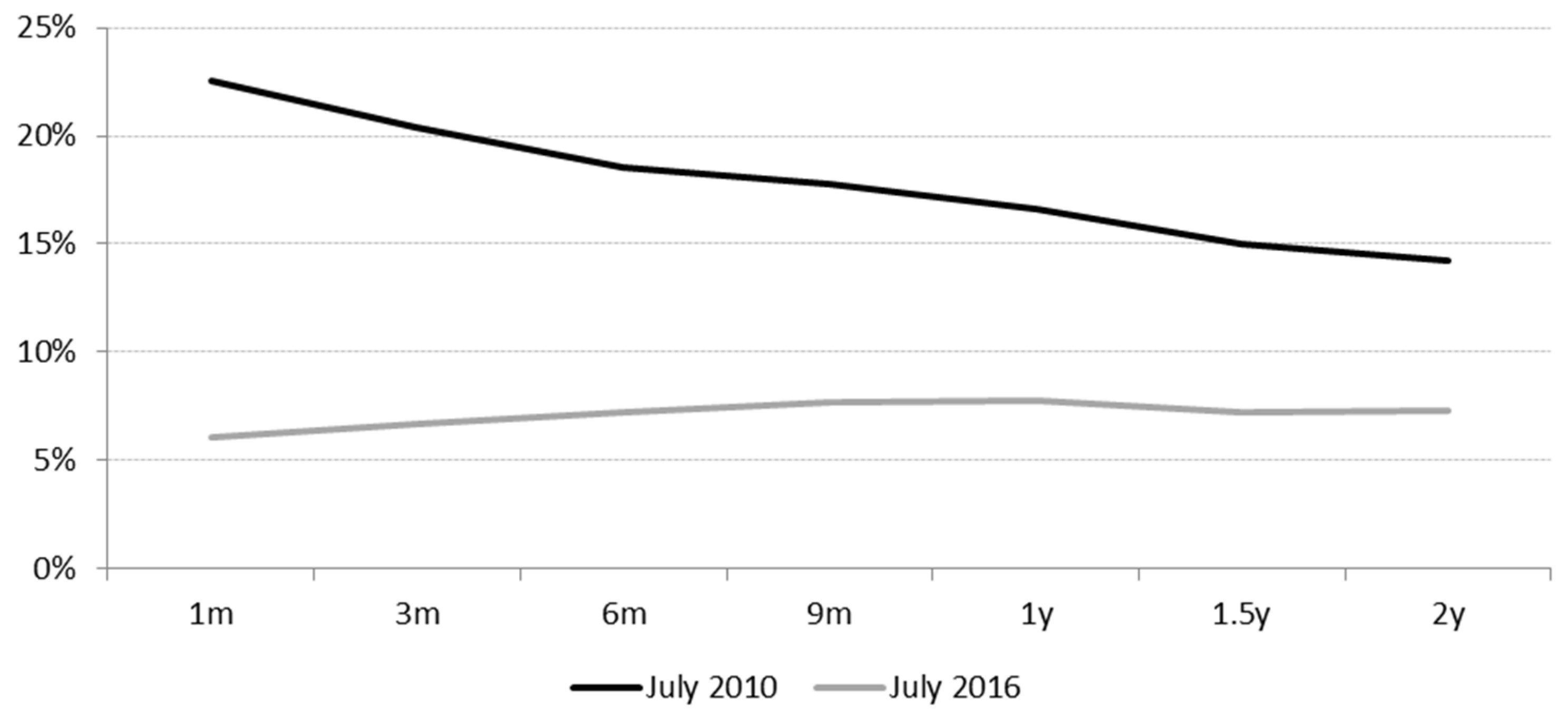
Figure 1 exemplarily presents the US equity curve for two days. The first day, 1 July 2010, represents the equity term structure in the aftermath of the financial crisis of 2008/09. The slope is negative, and the level is rather high. The second day, 1 July 2016, displays an equity term structure with a positive slope and a level substantially lower than it was in 2010. The latter day is an example of a typical “normal” equity curve, while the July 2010 curve characterises a “crisis” equity curve.
With respect to the economic cycle, Table 1 presents summary statistics of the equity curve in recession and non-recession periods. Panel A shows that in recessions the median equity curve is downward sloping, the slope (difference between the OIR with T = 24 months and T = 1 month) is smaller than −6%. In contrast, the slope is less negative for the non-recession period which equals to −1.79%. Also, the 5th and 95th percentiles of the OIR difference show that the term structure of the OIR is much steeper in recessions than in non-recessions, i.e., the equity curve is pro-cyclical. These characteristics are consistent with Hasler and Marfè (2016). They present a theoretical model which implies an equity curve that is downward sloping in bad economic times and flat in normal times. The main channel for the negative slope of the equity curve in recession is a “disaster risk”. Disasters refer to the possibility of large drops in fundamentals (such as dividends) in the short term. In the long-term, fundamentals recover to a pre-disaster level. This makes short-term dividend claims in recessions riskier than long-term claims. Next to its negative slope, the equity curve has a larger variation in recession periods than outside recessions. For example, the standard deviation of the daily 1 months OIR is 17.45% (Panel A) in recessions and only a third of this in non-recession periods (6.45%, Panel B).
3.3. The Level of the Equity Term Structure and Subsequent Stock Returns
We analysed the LEVEL hypothesis at three different points of the equity curve—at T = 1 month, 1 quarter and 1 year. The hypothesis was analysed using a simple sorting approach. We sorted all days in the sample period according to the size of the OIR for a 1 month, 1 quarter and 1 year horizon which characterizes the level of the equity curve. Based on this sort, we formed the bottom (top) 5th, 10th, and 25th percentiles of trading days. The corresponding percentiles are displayed in Table 2, Panel A. For example, looking at the 1 month OIR, 5% of trading days have an OIR of less than 4.54% and 5% of trading days have an OIR of more than 27.94%. For convenience, OIR for all horizons are annualized. For each of these six percentiles, we calculated the corresponding future returns for a 1 month, 1 quarter, and 1 year period (median and mean). If the LEVEL hypothesis holds, the trading days with the lowest (highest) OIR should be followed by low (high) future stock returns. Table 2 (Panels B and C) shows that the expected relationship holds approximately with the data. Looking at the 1 month ahead return, the median annualized return is 32.20% for the HIGH 5th percentile days, while it is just 11.79% for the LOW 5th percentile days. The difference (20.41%) is significantly larger than zero at the 1% level and corresponds rather well with the difference in OIR (23.40%). For all differences, we calculate the significance level by computing a bootstrapped p-value to capture the problem of overlapping periods. If we look at the mean (Panel C) return, the difference is somewhat smaller (14.49%) but still significant. Similar results are obtained for alternative horizons (1 quarter, 1 year) and alternative percentiles. Only the 25th percentile median (mean) difference for a time horizon of 1 year does not yield the expected positive difference. That is, using the OIR for a longer forecasting period seems to distinguish between periods of high realized returns (when the expectations are high) and low realized returns (when expectations are low) less effectively than for shorter horizons. A potential reason why realized returns over a longer horizon may deviate (on average) from the expected returns is that over a longer period, it is more likely that unexpected news will affect markets. Since the difference (realized return minus expected return) equals cash-flow news minus discount rate news (see Equation (5)), a longer time period tends to increase the likelihood of unexpected news.
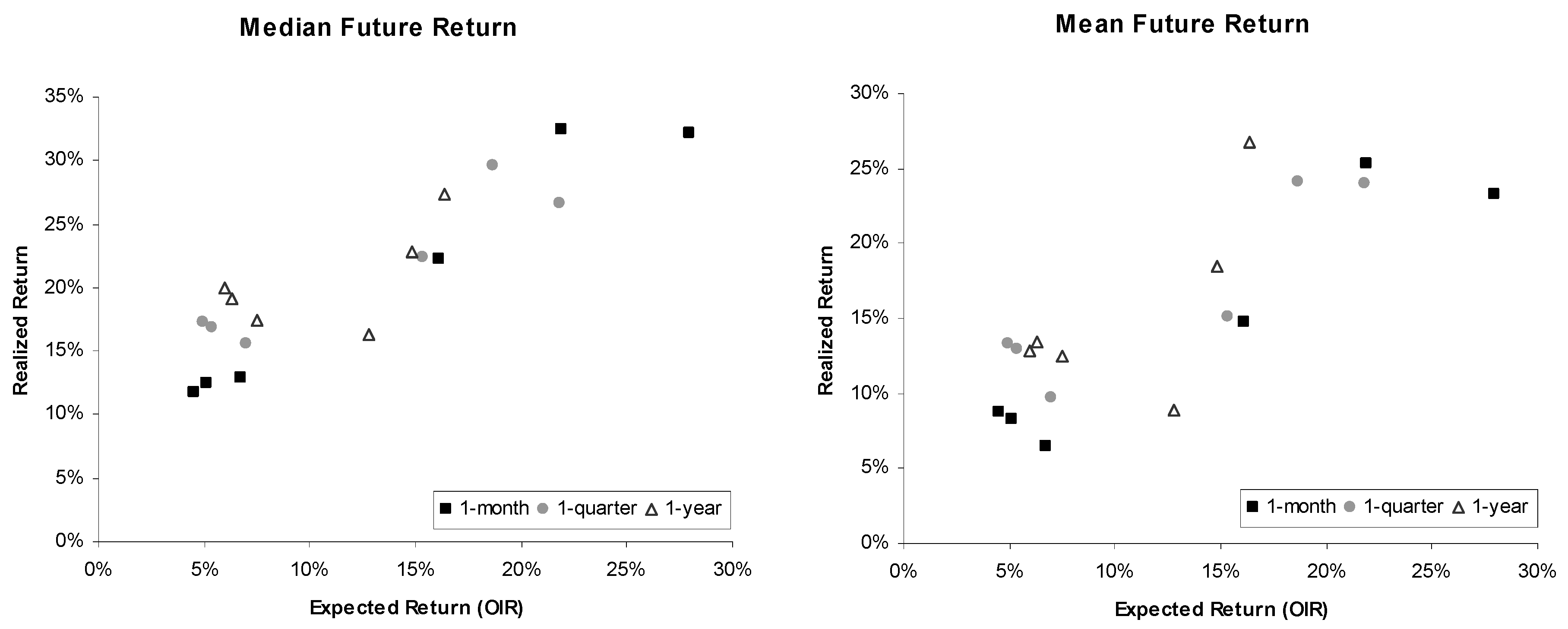
Figure 2 illustrates the relation between annualized expected returns over 1 month, 1 quarter, and 1 year and realized future returns over the corresponding time horizon (median and mean of the various pth percentiles). The figure shows a positive relationship between expected and realized returns. High expected returns (high OIRs) tend to be followed by high realized returns and vice versa. In sum, the equity curve based on OIRs and future returns seem to be largely consistent with the LEVEL hypothesis. This hypothesis was derived by assuming rational expectations which would be represented in Figure 2 by a bisecting line.
3.4. The Slope of the Equity Term Structure and Subsequent Stock Returns
We now turn to the slope of the equity curve and analyse the implications. The SLOPE and STEEPNESS hypotheses were analysed with the same sorting approach as before. First, we ranked all trading days in the sample period from the most negative slope to the most positive slope. Then, trading days were allocated into percentiles, with 5%, 10%, and, 25% of the lowest and highest slopes. For each trading day, we calculated the subsequent return (over 1 month, 1 quarter, and 1 year). Finally, for each percentile separately, we calculated the mean and median subsequent return for each horizon and annualised this return. If the SLOPE hypothesis holds, then days with a negative slope should be followed by higher short-term returns and lower long-term returns. Also, days with an upward sloping term structure should be followed by a low short-term return and a high long-term return. To analyse the SLOPE hypothesis, we need to specify how we measure the slope of the equity curve. In our base case definition, the slope is the difference between the OIR obtained from options with a 2 year maturity and a 1 month maturity. Results obtained from alternative definitions of the slope are similar to the base case (see the sensitivity analysis in Section 3.6 for details).
Table 3 summarizes the results of this exercise. Looking, for example, at the median return in the LOW 5th percentile (all trading days with the most negative slopes—that is, below −16.26%—see first row), the annualized return over the following month is 37.6%. Over the following quarter (year), the annualized return decreased to 30.2% (25.2%), which is consistent with the SLOPE hypothesis, i.e., returns further into the future are lower than near term returns. On the other hand, looking at trading days with the most positive slopes (HIGH 5th percentile, slope above 2.16%), the annualized return increased with a longer time horizon. That is, the median annualized returned is increasing from about 10% (over the following month) to 21.1% (over the following year). Accordingly, looking at the difference between the 1 month return and the annualized 1 year return (last row in each Panel) yields a positive value for all percentiles in the LOW percentiles. Thus, the negative slope of the equity curve reflects expectations in stock returns that are consistent with future realized returns. Also, positive slopes in the HIGH percentiles coincides with future stock returns that are smaller in the near term and larger in the long term. Therefore, the SLOPE hypothesis is supported by the data and the equity curve can predict the course of the future stock prices. Accordingly, an investor who wants to time the stock market can use the slope of the equity curve as follows: If the slope is negative short-term stock returns are higher than long-term returns, and she should invest immediately. However, when observing a positive slope, the short-term return is lower than the long-term return and it could pay off to wait for a stock market investment. We analyse such a timing strategy in the following Section 3.5. Considering that the slope is particularly negative in recession periods and flat or positive in non-recession periods, one can interpret this forecasting pattern as if option prices (from which the equity curve is derived) rationally predicts the course of the economic cycle.
The STEEPNESS hypothesis also receives support from the results displayed in Table 3. This hypothesis implies that a steeper slope (either negative or positive) should result in a larger difference between the 1 month and 1 year annualized return, which is also shown in the last row of each Panel. Moving from the LOW 25th percentile to the LOW 5th percentile (i.e., corresponding slope-quantiles become more negative and change from −5.99% to −16.26%; see first row), the 1 month minus 1 year return difference increase from 4.6% to 12.4% (see last row in Panel A). Moving from the HIGH 25th percentile to the HIGH 5th percentile (corresponding slopes become more positive), the annualized 1 month minus 1 year return difference decreases from −6.0% to −11.2%. The same support is obtained for this hypothesis if the mean (instead of median) annualized return is considered (Panel B).
How should we interpret the findings of the finding of the LEVEL, SLOPE and STEEPNESS hypothesis? If we compare a stock market investment with a car ride, the equity curve can be characterized as some kind of navigation system and control panel. Thereby, the level of the equity curve characterizes the speed (i.e., future returns are either high or low). The slope gives an indication whether the speed is accelerating or decelerating (i.e., long-term returns are higher/lower than short-term returns). Finally, the steepness of the equity curve shows how fast the acceleration/deceleration is (i.e., difference between long-term and short-term return is larger/smaller). These indicators then may help the investor when to invest in the stock market and/or whether she should increase/decrease her equity exposure.
In the last three columns, we additionally report the return difference between the 5% (10%, 25%) bucket with the most negative slopes (LOW) and the most positive slopes (HIGH). This difference is, in most cases, positive and economically large. For example, when looking in Panel A at the median annualized 1 month return of the LOW and HIGH 5th percentiles, this difference equals 27.61% = 37.58% − 9.97% and is associated with a p-value of less than 1%. Looking at the 10% or 25% buckets, the differences between the HIGH percentiles and LOW percentiles are considerably lower (15.60% and 9.62%) but still highly significant. The corresponding bootstrapped p-values are, in both cases, less than 1%. Thus, the SLOPE also has a predictive ability for the future stock returns. A negative slope predicts high future returns, while a positive slope forecasts low future returns. Comparing the predictive ability of the slope with that of the level (see Table 2), the forecasting ability is at least as good as that of the level of the equity curve. This observation further supports the idea that the slope is a potential candidate for a conditional variable to explain over-/under-weight stocks. We analyse an investment strategy based on the slope in the following section.
3.5. Investment Strategies
Thus far, we have analysed how the slope of the equity term structure relates to the future returns for the US stock market. We found that the slope is able to forecast the course of future stock returns. In this section, we analyse further its forecasting ability from an investor’s perspective. Since a negative slope predicts high short-term returns and a positive slope forecasts low short-term returns, we consider an investment strategy which overweighs (under-weighs) stocks when the slope is negative (positive). We over-/under-weigh stocks relative to a 100%-stocks-all-the-time benchmark (hereafter, STATIC). Table 4 displays how the strategy deviates from a 100% stock investment conditional on the slope. For example, if the investor observes a slope in the LOW 5th percentile, she invests 175% in stocks. The overweight 75% portion is financed by a credit in the short-term, risk-free rate of return. If the slope is in the HIGH 5th percentile, the investor invests just 25% in stocks, and the remaining 75% of wealth is invested in the short-term, risk-free rate of return. This approach ensures that, over time, the average stock investment is 100%, as in STATIC. It should be noted that the sizes of the over-/under-weights are chosen arbitrarily as an exemplary investment strategy. Table 4 presents the annualized compound return of the TIMING strategy with that of the STATIC strategy in the fourth-to-the-last (TIMING) and last columns (STATIC) of the performance columns. To formally evaluate whether or not the TIMING strategy is able to outperform the STATIC strategy (i.e., in the market), we run the Treynor/Mazuy (Treynor and Mazuy 1966) regression:
If the TIMING strategy outperforms the STATIC strategy, the timing parameter c should be significantly greater than zero. Table 4 summarizes the results of various investment strategies.
The TIMING strategy (1) delivers an annualised compound return of 15.6%, outperforming the STATIC strategy by 2.9%. The parameter c of the TM regression thereby suggests that timing ability is highly significant (c = 0.86 with a t-value of 10.40). To analyse how over-weights or under-weights contribute to the timing ability, we change the allocations of stocks in rows (2) to (5). Remember, however, that these strategies do not have an average weight of 100% in stocks, which should be considered when the following numbers are interpreted. Strategy (2) overweighs stocks on just negative slope days, strategy (3) under-weighs stocks just on positive slope days, and strategies (4) and (5) overweigh stocks on the most negative slope days. We find that most of the outperformance and timing ability stems from a slope in the LOW percentile (i.e., the slope is particularly negative when the short-term expected return is particularly large compared to the long-term expected return). If a trading day is in the LOW 5th percentile and the allocation to stocks is 175% (strategy (4)), the annualised return is 14.7%. On the other hand, if the slope is in the HIGH percentiles (i.e., the slope is positive as in strategy (3)), the contribution to the excess return is just about 0.5% per year. Furthermore, the timing parameter c of the TM regression is the lowest (0.06) and least significant. The general conclusion is that a large part of the predictability can be attributed to those days when the slope is in the LOW 5th percentile or LOW 10th percentile (see strategies (4) and (5)). Economically, days with a large negative slope display higher short-term uncertainties relative to long-term uncertainties. From the perspective of the Hasler and Marfè (2016) model these uncertainties could be related to substantial risks in fundamentals such as dividends in the short term which, however, diminish in the long term (i.e., fundamentals are mean-reverting). Thus, an investor using the slope as a timing instrument may profit from particular high-risk premiums in the short term which reduce in the long term.
The investment strategy underlying Table 4 adjusts the allocation to stocks on a daily basis (reallocation period = 1 day). This may incur substantial transaction costs (TC). Although trading costs may be rather low if the investment strategy is implemented with S&P 500 future contracts or exchange traded funds, we analyse the cost issue in more detail. Assuming a transaction cost of 1 basis point per round trip (this is a conservative estimate since, for example, the Vanguard S&P 500 ETF (Exchange Traded Fund) has a bid-ask spread of 0.2 basis points; see (Vanguard 2018)), the TIMING strategy’s (1) excess return of 2.9% would be reduced by 0.9%-points (see Table 5) to 2.0% (OP after TC). If we extend the reallocation period to 2, 3, and 10 days, transaction costs could be lowered substantially. For example, using a biweekly reallocation period (last row), transaction costs drop to just 9 basis points (see Table 5). Simultaneously, however, the return of the strategy is also reduced since the slope signal can be less often exploited. As a result, the outperformance after TC is 1.5%. In sum, the information from the slope of the equity curve can be transformed into investment strategies which earn a return in excess to the S&P 500 return. The order of this outperformance is between 1.5% and 2.0% per annum. Thereby, for all analysed reallocation periods, the timing parameter c of a TM regression is statistically positive, supporting the predictive power of the equity curve slope.
3.6. Alternative Definitions of the Slope of the Equity Curve
Table 6 presents alternative definitions of the slope in addition to the base case (2 years minus 1 month OIR). We vary the lower bound to 3 months, 6 months, and 1 year (holding the upper bound of 2 years constant). Also, we vary the upper bound to 3 months, 6 months, and 1 year (holding the lower bound of 1 month constant). For each slope definition, we display the difference between the annualised 1 year return and the 1 month return in Panel A to check whether our results support the SLOPE hypothesis and whether the slope retains its features for an investment strategy. First, all differences are negative for HIGH percentiles and positive for LOW percentiles, indicating that the slope is related to the course of future returns, as predicted by the SLOPE hypothesis. Accordingly, the difference between the LOW and HIGH percentiles (third-to-last column in Panel A) is positive for all slope definitions. Thus, measuring the slope of the equity does not depend on the base case. It seems that the slope can be measured on any part of the equity curve.
Panel B presents the performance of trading strategies using the alternative definitions of the slope. All strategies use the weights of strategy (1), as defined in Table 4. In general, the timing ability remains statistically significant (t-values of all estimates of c are above 7), and the boost in performance is between 100 and more than 200 basis points per year. Although all statistics point at a substantial timing ability, slope definitions that use the shorter end of the term structure (3 m–1 m or 6 m–1 m) seem to be particular profitable. Excess returns are more than 230 basis points above the return of the STATIC strategy, and the timing parameter c is estimated as the largest among all strategies. In sum, the relation of the equity curve to future stock returns is rather robust to the definition used to measure its slope.
4. Conclusions
This paper has proposed a new method to derive the term structure of expected stock returns. Using option prices, a forward-looking term structure was derived, which we call the “equity curve”. We described how the shape of the equity curve has empirically evolved and analysed its predictive power for future stock returns. Three main results have emerged from the analysis of the US stock market over the period between 1997 and 2017. First, a higher level of the equity curve is associated with higher future stock returns. Second, the slope of the equity curve is also related to future stock returns in a theoretically expected manner. A positive slope (i.e., short-term expected stock returns are lower than long-term returns) is followed by future realised returns which are lower in the short term (1 month) than in the long term (1 quarter or 1 year). Third, a steeper slope (either positive or negative) is associated with a larger absolute difference between short-term and long-term returns. Thereby, the method used to derive the equity curve from option prices has economically and statistically reasonable properties.
An investor can use the predictive characteristics of the equity curve to manage the stock exposure of an investment strategy. We analysed a strategy which uses the slope of the equity curve to determine the stock exposure, i.e., a positive slope implies an underweight and a negative slope implies an overweight in the stock market. Such an investment strategy is able to outperform a full investment in equities between 100 basis points and more than 200 basis points per annum (after transaction costs). Most of this outperformance can be attributed to those time periods in which the equity curve was particularly negative. These periods are mainly observed in recessions. Our analysis further suggests that the shape of the equity curve varies with the economic cycle. In particular, the slope is negative in recession periods, while it is less negative or even positive in non-recession periods.
In sum, the equity curve contains valuable information for an investor who has to decide how much of his wealth should be allocated to stocks. The equity curve does not only predict the next period’s stock return, but also the course of future stock returns. Therefore, considering the shape of the equity curve in an investor’s asset allocation process could be a profitable approach. In addition, the shape of the equity curve is also a useful measure for business cycle risk. Since the yield curve is also used to forecast the business cycle, it might be interesting to relate the equity curve to the yield curve. However, this is beyond the scope of this article and left for future research.
Funding
This research received no external funding.
Conflicts of Interest
The authors declare no conflict of interest.
Appendix A. Principal Component of Changes in the Equity Term Structure (Footnote 2)
To analyse the dynamics in the equity term structure, we perform a principal component analysis (PCA) of daily changes in the equity term structure. PCA is a widely used method for describing the behaviour of the term structure of interest rates (e.g., Litterman and Scheinkman 1991; Novosyolov and Satchkov 2008). Most studies find that up to three factors (commonly referred to as shift, twist, and butterfly) describe approximately 99% of the covariance matrix of interest changes. Therefore, we define the daily change in the expected return for a fixed forecast horizon T as:
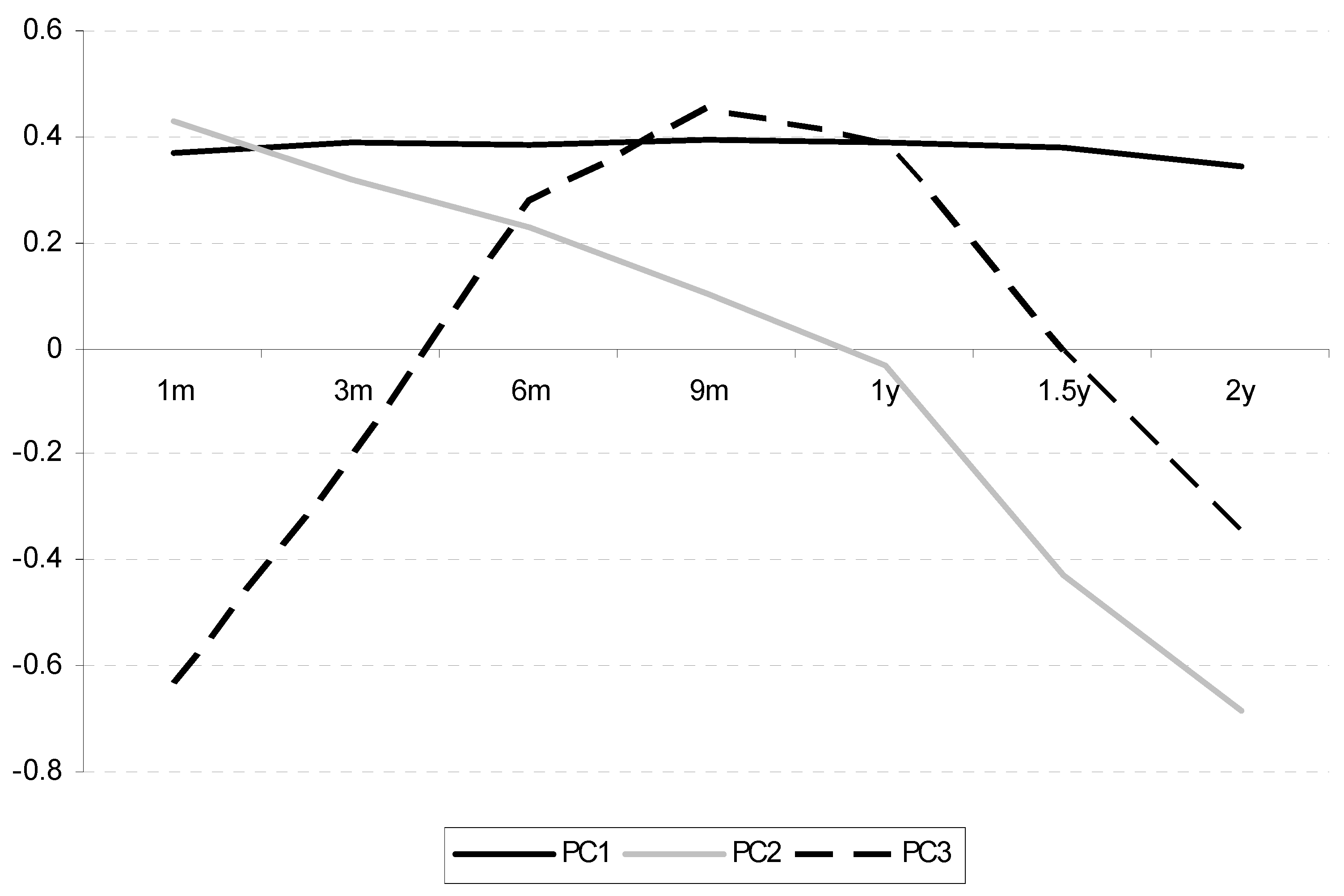
We then set T equal to 1, 3, 6, 9, 12, 18, and 24 months since option prices up to two years are rather liquid. Table A1 shows the result of this analysis. The first principal component (PC1) explains 87% of the variability in the daily changes in the equity term structure. The loadings are similar for each maturity. Thus, PC1 can be characterized as a shift in the term structure. The second principle component (PC2) explains 7% of the variance, and loadings fall monotonically with a higher maturity. This factor represents a change in the slope of the equity term structure. Thereby, PC2 and the variable SLOPE used in the previous subsection measure a similar characteristic: the movement in the equity term structure which represents a systematic factor. The third principle component (PC3) displays low loadings for short-term and long-term maturities and high loadings for medium-term horizons. However, this factor explains just 2% of the total variability in the daily changes of the equity term structure. Thereby, the equity term structure displays a factor structure similar to that of interest rates (shift, twist, and butterfly).

Table A1.
Results from a principal component analysis of changes in expected stock returns.
| Loadings | Explained Variance | Cumulative | |||||||
|---|---|---|---|---|---|---|---|---|---|
| 1 m | 3 m | 6 m | 9 m | 1 y | 1.5 y | 2 y | |||
| PC1 | 0.368 | 0.389 | 0.386 | 0.392 | 0.388 | 0.377 | 0.344 | 87% | 87% |
| PC2 | 0.427 | 0.318 | 0.230 | 0.103 | −0.034 | −0.431 | −0.683 | 7% | 94% |
| PC3 | −0.633 | −0.208 | 0.277 | 0.453 | 0.392 | −0.007 | −0.347 | 3% | 97% |
| PC4 | 0.215 | −0.063 | −0.615 | −0.135 | 0.672 | 0.176 | −0.266 | 2% | 98% |
| PC5 | 0.058 | −0.078 | −0.155 | 0.250 | 0.272 | −0.783 | 0.466 | 1% | 99% |
| PC6 | 0.202 | −0.199 | −0.425 | 0.737 | −0.401 | 0.166 | −0.083 | 1% | 100% |
| PC7 | −0.436 | 0.809 | −0.372 | 0.083 | −0.093 | −0.034 | 0.018 | 0% | 100% |
The principal component analysis delivers results which are similar to those for the interest rates of government bonds. Figure A1 displays the loadings of PC1, PC2, and PC3 on each return horizon and the shift (PC1), twist (PC2), and butterfly (PC3) structures known from the interest rate analysis.
Figure A1.
Loadings of the first three principal components.

What is important for our study is that PC2 (twist) is related to the SLOPE of the equity curve.
Appendix B. Alternative Risk Aversion Coefficients (Footnote 3)
Using option prices to derive the term structure of expected stock returns requires the specification of investor preferences. The base case specification assumes an investor who has a power utility with RA = 2. Table A2 presents the results of using alternative risk aversion parameters for RA in the set {1,5,10}. In general, the results remain rather stable. Panel A shows that the median 1 month-ahead return is conditional on various percentiles of the slope. Independently of the specific risk aversion parameter, a steep and negative slope (TOP percentiles) is followed by high returns. For example, looking at the 5th percentile of the slope distribution, the US stock market delivers, on average, a positive (as predicted) difference between the annualized 1 month return and one year return between 11.38% (RA = 5) and 15.45% (RA = 10). Also, the difference between the TOP and BOTTOM conditional median returns of each percentile are positive, and this difference is significantly different from zero (see third-to-last column). Thus, alternative specifications of the risk aversion parameter RA are consistent with previous results. That is, a negative slope is followed by higher stock returns in the short run than in the long run, and a steeper slope is associated with a higher return difference. Panel B summarizes the results of the investment strategy (1), as defined in Table 4 in the main text. As expected, the TIMING investment strategies deliver an excess return of up to 200 basis points per year compared to a STATIC investment strategy, the timing coefficient c is estimated as being between 0.83 and 0.91, and all associated t-statistics exceed 10. In sum, changing the risk aversion coefficient RA has no substantial effect on the success of the TIMING strategy.
Table A2.
Results from using different risk aversion coefficients.
| Panel A: Predictive Ability | |||||||||
|---|---|---|---|---|---|---|---|---|---|
| Slope | LOW Percentiles | HIGH Percentiles | LOW Minus HIGH | ||||||
| 5th | 10th | 25th | 25th | 10th | 5th | 5th | 10th | 25th | |
| RA = 1 | 15.45% ** | 9.39% ** | 6.21% *** | −0.44% * | −0.05% | −4.64% ** | 20.08% *** | 9.43% *** | 6.65% *** |
| RA = 2 | 12.38% ** | 5.72% ** | 4.57% *** | −6.00% *** | −8.46% *** | −11.17% ** | 23.55% *** | 14.18% *** | 10.58% *** |
| RA = 5 | 11.38% ** | 6.59% ** | 2.45% ** | −5.53% *** | −7.74% *** | −8.99% ** | 20.36% *** | 14.33% *** | 7.97% *** |
| RA = 10 | 14.53% ** | 8.91% ** | 0.60% * | −4.28% *** | −4.75% *** | −0.91% * | 15.44% *** | 13.66% *** | 4.87% ** |
| Panel B: Investment Strategy | |||||||||
| Slope | TIMING | STATIC | TC | OP after TC | c | c(t-stat) | |||
| RA = 1 | 15.15% | 12.68% | 0.80% | 1.67% | 0.901 | 10.609 | |||
| RA = 2 | 15.58% | 12.68% | 0.90% | 2.00% | 0.907 | 11.013 | |||
| RA = 5 | 15.39% | 12.68% | 0.94% | 1.76% | 0.832 | 10.400 | |||
| RA = 10 | 14.81% | 12.68% | 0.79% | 1.34% | 0.877 | 10.667 | |||
*, ** and *** denotes significance at the 10%, 5% and 1% significance level and refers to Panel A.
References
- Ait-Sahalia, Yacine, and Andrew W. Lo. 2000. Nonparametric risk management and implied risk aversion. Journal of Econometrics 94: 9–51. [Google Scholar] [CrossRef] [Green Version]
- Black, Fischer, and Myron Scholes. 1973. The pricing of options and corporate liability. Journal of Political Economy 81: 637–54. [Google Scholar] [CrossRef] [Green Version]
- Bliss, Robert R., and Nikolaos Panigirtzoglou. 2004. Option implied risk aversion estimates. Journal of Finance 59: 407–46. [Google Scholar] [CrossRef]
- Brennan, Michael J. 1998. Stripping the S&P 500 index. Financial Analysts Journal 54: 12–22. [Google Scholar]
- Campbell, John Y., and Robert J. Shiller. 1988. Stock prices, earnings, and expected dividends. Journal of Finance 43: 661–76. [Google Scholar] [CrossRef]
- Cox, John C., and Stephen A. Ross. 1976a. A survey of some new results in financial option pricing theory. Journal of Finance 31: 383–402. [Google Scholar] [CrossRef]
- Cox, John C., and Stephen A. Ross. 1976b. The valuation of options for alternative stochastic processes. Journal of Financial Economics 3: 145–66. [Google Scholar] [CrossRef]
- Croce, Mariano M., Martin Lettau, and Sydney C. Ludvigson. 2015. Investor information, long-run risk, and the term structure of equity. Review of Financial Studies 28: 706–42. [Google Scholar] [CrossRef]
- Dimson, Elroy, Paul Marsh, and Mike Staunton. 2004. Irrational optimism. Financial Analyst Journal, 15–25. [Google Scholar] [CrossRef]
- Dumas, Bernanrd, Jeff Fleming, and Robert E. Whaley. 1998. Implied volatility functions: Empirical tests. Journal of Finance 53: 2059–106. [Google Scholar] [CrossRef] [Green Version]
- Estrella, Arturo, and Frederic S. Mishkin. 1998. Predicting U.S. recessions: Financial variables as leading indicators. Review of Economic Statistics 80: 45–61. [Google Scholar] [CrossRef]
- Estrella, Arturo, and Gikas Hardouvelis. 1991. The term structure as a predictor of real economic activity. Journal of Finance 46: 555–76. [Google Scholar] [CrossRef]
- Fama, Eugene F., and Robert R. Bliss. 1987. The information in long-maturity forward rates. American Economic Review 77: 680–92. [Google Scholar]
- Hasler, Michael, and Roberto Marfè. 2016. Disaster recovery and the term structure of dividend strips. Journal of Financial Economics 122: 116–34. [Google Scholar] [CrossRef]
- Jackwerth, Jens C. 2000. Recovering risk aversion from option prices and realized returns. Review of Financial Studies 13: 433–51. [Google Scholar] [CrossRef]
- Kang, Byung K., and Tong S. Kim. 2006. Option-implied risk preferences: An extension to wider classes of utility functions. Journal of Financial Markets 9: 180–98. [Google Scholar] [CrossRef]
- Kang, Byung K., Tong S. Kim, and Hyo S. Lee. 2014. Option-implied preference with model uncertainty. Journal of Futures Markets 34: 498–515. [Google Scholar] [CrossRef]
- Lettau, Martin, and Jessica A. Wachter. 2011. The term structures of equity and interest rates. Journal of Financial Economics 101: 90–113. [Google Scholar] [CrossRef] [Green Version]
- Litterman, Robert, and José Scheinkman. 1991. Common factors affecting bond returns. Journal of Fixed Income 1: 54–61. [Google Scholar] [CrossRef]
- Novosyolov, Arcady, and Daniel Satchkov. 2008. Global term structure modelling using principal component analysis. Journal of Asset Management 9: 49–60. [Google Scholar] [CrossRef]
- Rosenberg, Joshua V., and Robert F. Engle. 2002. Empirical pricing kernels. Journal of Financial Economics 64: 341–72. [Google Scholar] [CrossRef] [Green Version]
- Ross, Stephen. 2015. The recovery theorem. Journal of Finance 70: 615–48. [Google Scholar] [CrossRef] [Green Version]
- Rudebusch, Glenn D., and John C. Williams. 2009. Forecasting recessions: The puzzle of the enduring power of the yield curve. Journal of Business and Economic Statistics 27: 492–503. [Google Scholar] [CrossRef] [Green Version]
- Stoll, Hans R. 1969. The relation between put and call option prices. Journal of Finance 25: 801–24. [Google Scholar] [CrossRef]
- Treynor, Jack, and Kay Mazuy. 1966. Can mutual funds outguess the market? Harvard Business Review 44: 131–36. [Google Scholar]
- Van Binsbergen, Jules H., and Ralph S. Koijen. 2017. The term structure of returns: Facts and theory. Journal of Financial Economics 124: 1–21. [Google Scholar] [CrossRef] [Green Version]
- Van Binsbergen, Jules H., Hueskes Wouter, Ralph S. Koijen, and Evert B. Vrugt. 2013. Equity yields. Journal of Financial Economics 110: 503–19. [Google Scholar] [CrossRef]
- Vanguard. 2018. Available online: https://advisors.vanguard.com/web/cf/fas-investmentproducts/0968/overview (accessed on 18 April 2018).
- Welch, Ivo, and Amit Goyal. 2008. A comprehensive look at the empirical performance of equity premium prediction. Review of Financial Studies 21: 1455–508. [Google Scholar] [CrossRef]
| 1 | Welch and Goyal (2008) analyse various ratios to forecast future stock returns using a predictive regression approach. They find that the predictive ability of many ratios is low. However, academics and practitioners alike use ratios to measure expected returns. |
| 2 | Results are shown in Appendix A. |
| 3 | Results are shown in Appendix B. |
Figure 1.
The US equity curve for two days, a typical “normal” curve (July 2016) and a typical “crisis” curve (July 2010).
Figure 1.
The US equity curve for two days, a typical “normal” curve (July 2016) and a typical “crisis” curve (July 2010).

Figure 2.
Relation between the expected return (OIR) and realized return over various horizons.

Table 1.
Summary statistics.
| 1 m | 3 m | 6 m | 9 m | 12 m | 18 m | 24 m | Slope 24 m–1 m | |
|---|---|---|---|---|---|---|---|---|
| Panel A: Recession periods | ||||||||
| Median | 18.65% | 16.53% | 14.61% | 13.79% | 13.30% | 12.79% | 12.48% | −6.17% |
| 5th percentile | 11.52% | 11.64% | 11.23% | 10.27% | 9.45% | 8.14% | 7.39% | −4.12% |
| 95th percentile | 64.46% | 47.72% | 36.64% | 30.81% | 27.86% | 23.43% | 21.51% | −42.95% |
| Standard dev. | 17.45% | 11.35% | 8.33% | 6.97% | 6.20% | 5.10% | 4.75% | |
| Panel B: Non-recession periods | ||||||||
| Median | 9.47% | 9.34% | 9.48% | 9.39% | 9.03% | 8.18% | 7.68% | −1.79% |
| 5th percentile | 4.49% | 4.87% | 5.42% | 5.83% | 5.97% | 6.04% | 5.85% | 1.36% |
| 95th percentile | 23.32% | 19.67% | 17.91% | 16.55% | 15.33% | 13.50% | 12.57% | −10.75% |
| Standard dev. | 6.45% | 5.06% | 4.18% | 3.54% | 3.08% | 2.46% | 2.15% | |
Table 2.
Results from tests of the LEVEL hypothesis.
| LOW Percentiles | HIGH Percentiles | HIGH Minus LOW | |||||||
|---|---|---|---|---|---|---|---|---|---|
| 5th | 10th | 25th | 25th | 10th | 5th | 5th | 10th | 25th | |
| Panel A: pth percentile of OIR | |||||||||
| 1 month | 4.54% | 5.08% | 6.70% | 16.12% | 21.90% | 27.94% | 23.40% | 16.82% | 9.42% |
| 1 quarter | 4.93% | 5.40% | 6.98% | 15.33% | 18.68% | 21.86% | 16.92% | 13.28% | 8.34% |
| 1 year | 6.00% | 6.30% | 7.48% | 12.76% | 14.86% | 16.33% | 10.33% | 8.56% | 5.27% |
| Panel B: Median future return conditional on the pth percentile | |||||||||
| 1 month | 11.79% | 12.53% | 12.95% | 22.20% | 32.49% | 32.20% | 20.41% *** | 19.96% *** | 9.25% *** |
| 1 quarter | 17.35% | 16.92% | 15.56% | 22.32% | 29.66% | 26.58% | 9.23% *** | 12.74% *** | 6.76% ** |
| 1 year | 19.95% | 19.19% | 17.47% | 16.33% | 22.88% | 27.28% | 7.33% *** | 3.69% * | −1.14% |
| Panel C: Mean future return conditional on the pth percentile | |||||||||
| 1 month | 8.78% | 8.25% | 6.51% | 14.72% | 25.38% | 23.27% | 14.49% *** | 17.13% *** | 8.21% *** |
| 1 quarter | 13.37% | 12.97% | 9.77% | 15.11% | 24.10% | 23.97% | 10.60% *** | 11.13% *** | 5.34% * |
| 1 year | 12.88% | 13.49% | 12.50% | 8.89% | 18.54% | 26.80% | 13.92% *** | 5.06% * | −3.60% |
*, ** and *** denotes significance at the 10%, 5% and 1% significance level and refers to the differences in Panels B and C.
Table 3.
Results from tests of the SLOPE and STEEPNESS hypothesis.
| LOW Percentiles | HIGH Percentiles | LOW Minus HIGH | |||||||
|---|---|---|---|---|---|---|---|---|---|
| 5th | 10th | 25th | 25th | 10th | 5th | 5th | 10th | 25th | |
| SLOPE | −16.26% | −10.98% | −5.99% | 0.53% | 1.82% | 2.16% | |||
| Panel A: Median future return conditional on the pth percentile | |||||||||
| 1 month | 37.58% | 27.46% | 22.68% | 13.06% | 11.87% | 9.97% | 27.61% *** | 15.60% *** | 9.62% *** |
| 1 quarter | 30.15% | 26.50% | 22.66% | 16.42% | 16.02% | 13.78% | 16.38% *** | 10.48% *** | 6.24% ** |
| 1 year | 25.20% | 21.74% | 18.11% | 19.06% | 20.32% | 21.14% | 4.06% ** | 1.42% | −0.96% |
| 1 month–1 year | 12.38% ** | 5.72% ** | 4.57% *** | −6.00% *** | −8.46% *** | −11.17% ** | 23.55% *** | 14.18% *** | 10.58% *** |
| Panel B: Mean future return conditional on the pth percentile | |||||||||
| 1 month | 29.59% | 19.50% | 14.20% | 5.64% | 6.79% | 4.82% | 24.77% *** | 12.71% *** | 8.56% *** |
| 1 quarter | 25.30% | 20.56% | 15.91% | 9.19% | 8.67% | 6.43% | 18.87% *** | 11.88% *** | 6.72% *** |
| 1 year | 24.42% | 17.85% | 11.47% | 12.42% | 14.00% | 14.40% | 10.02% ** | 3.85% * | −0.95% |
| 1 month–1 year | 5.17% ** | 1.65% * | 2.73% ** | −6.78% *** | −7.21% *** | −9.57% *** | 14.75% *** | 8.86% *** | 9.51% *** |
*, ** and *** denotes significance at the 10%, 5% and 1% significance level.
Table 4.
Results from investment strategies (weights in stocks are displayed in the first six columns) which uses the slope of the equity curve to over-/under-weigh stocks.
Table 4.
Results from investment strategies (weights in stocks are displayed in the first six columns) which uses the slope of the equity curve to over-/under-weigh stocks.
| LOW Percentiles | HIGH Percentiles | Ann. Performance | TM Regression | |||||||
|---|---|---|---|---|---|---|---|---|---|---|
| 5th | 10th | 25th | 25th | 10th | 5th | TIMING | STATIC | c | c(t-stat) | |
| SLOPE | −16.26% | −10.98% | −5.99% | 0.53% | 1.82% | 2.16% | ||||
| (1) | 175% | 150% | 125% | 75% | 50% | 25% | 15.58% | 12.68% | 0.86 | 10.44 |
| (2) | 175% | 150% | 125% | 100% | 100% | 100% | 15.18% | 12.68% | 0.80 | 10.81 |
| (3) | 100% | 100% | 100% | 75% | 50% | 25% | 13.08% | 12.68% | 0.06 | 2.56 |
| (4) | 175% | 100% | 100% | 100% | 100% | 100% | 14.71% | 12.68% | 0.95 | 11.88 |
| (5) | 175% | 150% | 100% | 100% | 100% | 100% | 15.68% | 12.68% | 0.89 | 11.23 |
Table 5.
Investment strategy and transaction costs.
| Reallocation Period | TIMING | STATIC | TC | OP after TC | c | c(t-stat) |
|---|---|---|---|---|---|---|
| 1 | 15.58% | 12.68% | 0.90% | 2.00% | 0.907 | 11.013 |
| 2 | 15.38% | 12.69% | 0.45% | 2.25% | 0.871 | 12.094 |
| 3 | 14.64% | 12.68% | 0.28% | 1.68% | 1.163 | 13.712 |
| 4 | 14.65% | 12.69% | 0.21% | 1.75% | 0.687 | 8.764 |
| 5 | 14.25% | 12.70% | 0.17% | 1.38% | 0.923 | 11.996 |
| 6 | 14.69% | 12.68% | 0.14% | 1.87% | 0.697 | 7.257 |
| 7 | 14.69% | 12.68% | 0.13% | 1.88% | 0.656 | 6.527 |
| 8 | 14.78% | 12.68% | 0.11% | 1.99% | 0.759 | 7.860 |
| 9 | 14.78% | 12.69% | 0.09% | 2.00% | 0.703 | 6.027 |
| 10 | 14.37% | 12.77% | 0.09% | 1.51% | 0.611 | 6.205 |
Table 6.
Results from using different definitions of the slope of the equity curve.
| Panel A: Predictive Ability | |||||||||
|---|---|---|---|---|---|---|---|---|---|
| SLOPE | LOW Percentiles | HIGH Percentiles | LOW Minus HIGH | ||||||
| 5th | 10th | 25th | 25th | 10th | 5th | 5th | 10th | 25th | |
| 2 y–1 m | 12.38% ** | 5.72% ** | 4.57% *** | −6.00% *** | −8.46% *** | −11.17% ** | 23.55% *** | 14.18% *** | 10.58% *** |
| 2 y–3 m | 14.53% *** | 9.75% *** | 2.40% ** | −4.96% *** | −7.79% *** | −9.37% *** | 23.90% *** | 17.54% *** | 7.36% *** |
| 2 y–6 m | 9.35% *** | 9.23% *** | 4.32% *** | −4.28% *** | −6.56% *** | −8.35% * | 17.70% *** | 15.79% *** | 8.60% *** |
| 2 y–1 y | 9.94% ** | 5.42% *** | 0.53% *** | −3.01% *** | −5.99% *** | −11.76% *** | 21.70% *** | 11.41% *** | 3.54% *** |
| 3 m–1 m | 10.60% * | 4.91% ** | 6.52% *** | −4.26% *** | −3.45% *** | 2.60% | 8.00% ** | 8.36% *** | 10.78% *** |
| 6 m–1 m | 16.53% * | 4.64% ** | 6.50% *** | −5.85% *** | −9.19% *** | −9.99% *** | 26.52% *** | 13.83% *** | 12.35% *** |
| 1 y–1 m | 14.63% ** | 4.10% ** | 4.28% *** | −6.71% *** | −8.57% ** | −10.53% *** | 25.16% *** | 12.68% *** | 10.99% *** |
| Panel B: Investment Strategy | |||||||||
| SLOPE | TIMING | STATIC | TC | OP after TC | c | c(t-stat) | |||
| 2 y–1 m | 15.58% | 12.68% | 0.90% | 2.00% | 0.907 | 11.013 | |||
| 2 y–3 m | 15.14% | 12.68% | 0.70% | 1.76% | 0.736 | 9.098 | |||
| 2 y–6 m | 14.70% | 12.68% | 0.62% | 1.39% | 0.661 | 8.082 | |||
| 2 y–1 y | 14.32% | 12.68% | 0.58% | 1.06% | 0.617 | 7.609 | |||
| 3 m–1 m | 16.37% | 12.68% | 1.31% | 2.38% | 0.957 | 10.929 | |||
| 6 m–1 m | 16.05% | 12.68% | 1.18% | 2.19% | 0.927 | 10.844 | |||
| 1 y–1 m | 15.44% | 12.68% | 1.01% | 1.75% | 0.925 | 11.120 | |||
*, ** and *** denotes significance at the 10%, 5% and 1% significance level and refers to Panel A.
© 2020 by the author. Licensee MDPI, Basel, Switzerland. This article is an open access article distributed under the terms and conditions of the Creative Commons Attribution (CC BY) license (http://creativecommons.org/licenses/by/4.0/).
Share and Cite
MDPI and ACS Style
Stotz, O. The Equity Curve and Its Relation to Future Stock Returns. J. Risk Financial Manag. 2020, 13, 19. https://0-doi-org.brum.beds.ac.uk/10.3390/jrfm13020019
AMA Style
Stotz O. The Equity Curve and Its Relation to Future Stock Returns. Journal of Risk and Financial Management. 2020; 13(2):19. https://0-doi-org.brum.beds.ac.uk/10.3390/jrfm13020019
Chicago/Turabian StyleStotz, Olaf. 2020. "The Equity Curve and Its Relation to Future Stock Returns" Journal of Risk and Financial Management 13, no. 2: 19. https://0-doi-org.brum.beds.ac.uk/10.3390/jrfm13020019