How Integrated are Regional Green Equity Markets? Evidence from a Cross-Quantilogram Approach

Department of Economics, School of Business, University of Central Oklahoma, 100 N University Dr, Box 103, Edmond, OK 73034, USA
J. Risk Financial Manag. 2021, 14(1), 39; https://0-doi-org.brum.beds.ac.uk/10.3390/jrfm14010039
Submission received: 16 December 2020
/
Revised: 13 January 2021
/
Accepted: 14 January 2021
/
Published: 17 January 2021
(This article belongs to the Special Issue Green and Sustainable Finance)
Abstract
:Rising concerns over climate change have increased investors’ and policymakers’ interests in environmentally friendly investments, which have led to the rapid expansion of the green equity market recently. Previous studies have focused on analyzing the green equity market at the aggregate level, thereby overlooking the heterogeneity across green equity sub-sectors. This paper contributes to the literature by investigating how interdependence between green equity markets and other financial assets varies across regions, market conditions, and investment horizons. To this end, the paper employs the recently developed cross-quantilogram framework, which measures the cross-quantile dependence across time series without any moment condition requirement. The results show that within the green equity market, movements in the U.S. market can predict movements in the Asian and European markets during all market conditions. In contrast, the Asian and European green equity markets only predict movements in the U.S. market during bearish periods. The paper also finds that regional green equity markets respond differently to movements in other financial assets, such as energy commodity and general stock returns. In addition, the interdependence among regional green equity and other assets varies across market conditions and investment horizons. These results have important implications for environmentally friendly investors and policymakers.
1. Introduction
The transition towards a low-carbon economy requires a substantial level of financial flows to environmentally friendly sectors. Climate Finance Leadership Initiative (2019) estimates that clean energy investments need to increase by a factor of six by 2050 compared to the 2015 level in order to keep global warming within the 1.5 °C limit. To close this financing gap, a potential channel is to increase investors’ interests in environmentally friendly financial markets. Since 2004, this market has experienced substantial growth. According to Bloomberg New Energy Finance (2019), annual new investments in renewable energy have grown from 45.28 billion USD in 2004 to 288.48 billion USD in 2018. However, these investments have not been equally divided across regions. Between 2004 and 2014, Europe was the leading destination of new clean energy investments. However, since 2014, Asia has accounted for the largest share of new clean energy investments (Figure 1).
The rapid expansion of the green equity market highlights the relevance of understanding how each sub-sector of this market responds to movements in other financial markets. This would allow investors to identify the appropriate diversification strategies for different types of green equity. From a policy perspective, studying the heterogeneous behavior of green equity sub-sectors is also relevant to design private incentives to increase the financial flows towards low-carbon activity. This, in turn, will help achieve the goals established by the Paris Climate Agreement. Therefore, the objective of this paper is to investigate the heterogeneous interdependence of regional green equity markets among themselves and with other financial markets. Specifically, this paper seeks to answer the following questions. First, how integrated are regional green equity markets under normal and extreme market conditions? Second, how do the relationships between green equity and other asset classes vary across regions, market conditions and investment horizons? Third, what are the implications of these regional variations for investors and policymakers?
This paper contributes to the literature in several ways. First, this paper is the first empirical study to examine the relationship between green equity and other assets at the regional levels. Previous studies on green financial markets have been conducted at an aggregate level. Specifically, most research has employed one composite index to measure the performance of the global green financial market.1 Such an approach could mask the heterogeneity within the green equity market, which is important for portfolio diversification and risk management. Second, to the author’s knowledge, no study to date has explored the internal dependence between sub-sectors of the green equity market and the external dependence between these sub-sectors and other financial assets. As the green equity market has expanded in both scope and size in recent years, it is essential to explore each green equity sub-sector’s heterogeneous behavior. This will be helpful for environmentally friendly investors to identify sector-specific diversification strategies.
Methodologically, this study separates the green equity market into three regions, specifically the U.S., Europe and Asia. Next, the NASDAQ OMX Green Economy U.S., Europe and Asia stock indexes are used as proxies for the financial performance of regional green equity markets. Next, the cross-quantilogram (CQ) framework of Han et al. (2016) is employed to identify the dependence between green equity markets and other assets. Compared to other approaches, this technique measures the directional predictability from one time series to another across quantiles of each variable’s distribution. Thus, it allows the quantification of directional spillovers among financial assets across a wide range of market conditions (bearish, normal, bullish). Second, this approach accommodates very long lags, therefore, it is able to quantify the strength of directional spillovers across investment horizons. Finally, the CQs are based on quantile hits and thus do not depend on any moment condition. Therefore, it can accommodate time series with heavy tails, a characteristic commonly found in financial data. In summary, the CQ approach allows the simultaneous quantification of the strength, direction, and duration of spillovers across time series. This is in line with the objective of the paper, which is to study the heterogeneous interdependence between green equity markets and other assets across regions, market conditions and investment horizons.
The empirical evidence suggests heterogeneous integration among the green equity markets and other assets across regions, market conditions and time horizons. Within the green equity market, the U.S. is the dominant shock transmitter while Asia is the dominant shock receiver. This suggests the significant role of the U.S. green equity market in determining the overall green equity market performance. Regarding the dependence between green equity and other asset classes, this paper finds that the energy commodity market and the overall stock market exhibit more significant influences on the Asian green equity market than on other regional green equity markets. These results confirm the relevance of studying the green equity market at a disaggregate level. Specifically, investors will need to adjust their risk management and diversification strategies for their green equity investments in different regions. Finally, the empirical results provide useful insights for policymakers who are interested in increasing financial investments in low-carbon economic activities.
2. Related Literature
Extensive literature has focused on documenting the relationship between renewable energy stock and other asset classes, such as fossil fuel prices and general stock prices.2 This literature employs a diverse set of empirical approaches. Using VAR-based models, Henriques and Sadorsky (2008); Kumar et al. (2012); Managi and Okimoto (2013) find a negative impact of oil price on clean energy stock returns. Bohl et al. (2015); Bondia et al. (2016) employ asset pricing models to analyze the impact of oil prices, technology stock prices, and interest rates on clean energy stock. Other studies employ dynamic conditional correlation models to study the time-varying relationship between clean energy stock and other financial markets. For example, Sadorsky (2012) examines the time-varying relationship between clean energy stock, technology stock and oil prices and finds that clean energy stock is under larger influences from technology stock than oil prices. Ahmad et al. (2018) document a negative dependence between clean energy stock, bond prices and market uncertainties. This paper also documents a positive dependence between clean energy stock, oil prices and carbon prices. Elie et al. (2019) assess the role of gold and crude oil as safe havens for clean energy stock indexes and find that gold and crude oil are at most weak safe havens for clean energy stock. Xia et al. (2019) and Pham (2019) apply variance decomposition to a VAR model of renewable energy stock and fossil fuel prices and find a varying impact of fossil fuel prices on renewable energy stock. Song et al. (2019) analyze the linkage between renewable energy stock prices, fossil fuel prices, and investor sentiment. Kocaarslan and Soytas (2019) assess the role of U.S. dollar reserve currency on the crude oil–clean energy relationship. Kyritsis and Serletis (2019) find an insignificant and asymmetric relationship between crude oil prices and renewable energy stock. Dutta et al. (2020) study the hedging effectiveness of commodity volatility indexes and clean energy stocks and find a negative correlation between commodity volatilities and clean energy stock. Several other studies use time-frequency-based approaches to study how the oil price–clean energy stock relationship changes across frequencies. Using wavelet analyses, Reboredo et al. (2017) find evidence of causality from renewable energy stock to oil prices across all time horizons and mixed evidence of causality in the opposite direction. Ferrer et al. (2018) applies spectral decomposition to a VAR model and find that the dependence between clean energy stock and other financial assets is stronger in the short run than in the long run. Nasreen et al. (2020) use wavelets to study the spillovers between oil prices and clean energy and technology stocks.
The studies discussed above mostly rely on empirical methods that capture the average dependence between environmentally friendly stock and other assets in the middle of the return distributions, i.e., when these markets are in normal conditions. Few studies have attempted to document the tail dependence between clean energy stock and asset prices. For example, Reboredo (2015) uses copulas to analyze the systemic risk and tail dependence between oil and renewable energy stock prices. Uddin et al. (2019) study the cross-quantile dependence between clean energy stock and oil price, aggregate stock price, exchange rate, and gold price. Dawar et al. (2020) employ quantile regressions and find decreasing dependence between clean energy stock returns and crude oil returns. Yahya et al. (2020) study the cross-quantile dependence between clean energy stock and non-ferrous metal prices and find a time-varying and asymmetric dependence between these variables.
In this rich literature, no consensus has been reached on the relationship between the renewable energy stock market and other financial markets. One possible explanation is that most previous studies have focused on analyzing this nexus at the aggregate level by using stock indexes that represent the global green equity market. By doing this, the literature has overlooked the heterogeneous behavior of each green equity sub-sector. This paper contributes to the literature by analyzing how the interdependence between green equity markets and other financial assets varies across regions, market conditions, and investment horizons.
3. Data and Preliminary Analyses
3.1. Data Sources
To investigate the heterogeneous interdependence between regional green equity and other assets, the data set in this study includes regional green equity indexes, energy commodity indexes, general and technology stock indexes, and uncertainty indexes. The sample period is from 10 November 2010 to 08 July 2019 and all the data are collected from Bloomberg Terminal. The sample period is chosen based on the availability of data.
First, stock indexes from the NASDAQ OMX Green Economy Index Family are used to measure regional green equity markets’ financial performance. Specifically, this paper considers the NASDAQ OMX Green Economy U.S. Index (GEUS), the NASDAQ OMX Green Economy Europe Index (GEEU) and the NASDAQ OMX Green Economy Asia Index (GEASIA) as proxies for the performance of the U.S., European and Asian green equity markets. These indexes include companies domiciled in the U.S., Europe and Asia across the spectrum of industries closely related to the economic model around sustainable development.
In addition to the regional green equity indexes, the data set includes indexes to track other financial assets’ performance. Specifically, this paper focuses on the energy commodity market, the general stock market, and the technology stock market. While the relationship between these markets and the global green equity market has been documented in the literature, previous studies have not explored how this relationship varies across regional green equity markets. In this paper, the energy commodity market is proxied by the S&P GSCI Energy, Crude Oil and Natural Gas Indexes. These indexes track the performance of the global energy commodity market, thereby providing a common benchmark to compare the dependence structure between the regional green equity and energy commodity markets. The general stock market is proxied by the S&P Global BMI Index, which includes more than 11,000 stocks from developed and developing countries. The technology stock market is proxied by the NYSE Arca Tech 100 (PSE) Index.
3.2. Preliminary Analyses
Figure 2 plots the daily values of the variables described above. All three regional green equity indexes experience a decline during the oil price collapse of 2014–2016, however, the GEUS and GEEU indexes seem to recover more quickly than the GEASIA index. The S&P GSCI Energy index co-moves with the S&P GSCI Oil index, where both indexes exhibit a sharp decline during the oil price collapse of 2014–2016. The S&P GSCI Natural Gas index reaches its minimums in 2012 and 2016, while peaking in 2015. Higher production output and lower demand due to warmer temperatures are the main reasons for low natural gas prices in 2012 and 2016, while extreme cold weather explains the spike in natural gas prices in 2015 U.S. Energy Information Administration (2013, 2017). The PSE and S&P Global BMI indexes co-move, and both indexes experience a decline between June 2015 and June 2016. This period corresponds to the 2015–2016 stock market selloff, where stock prices decline globally.
In subsequent analyses, the author employs daily returns, which are obtained by log-differencing the index values. Table 1 provides the summary statistics of the index returns. Among the three regional green equity indexes, the GEUS index experiences the highest average returns, while the GEASIA market experiences the lowest average returns during the sample period. All three energy commodity indexes experience negative average returns during the sampling period, potentially because of the 2014–2016 oil price collapse and the lower natural gas prices in response to lower demand, as explained above. Compared to the green equity and stock market indexes, the energy commodity indexes have higher standard deviations, which is expected because of the large movements in the oil and natural gas markets during our sample period (Figure 2). All series have negative skewness, except for the uncertainty measures (i.e., the VIX, OVX, and EPU indexes). All variables have kurtosis greater than 4, which implies fatter tails than a normal distribution. The Ljung–Box statistics on the returns and squared returns suggest that all series experience serial correlation and volatility clustering and the Jarque–Bera tests indicate that the series do not follow a normal distribution. Finally, the ADF unit root tests indicate that all return series are stationary.
4. Empirical Methodology
To examine the interdependence between regional green equity markets and other financial assets, this paper employs the cross-quantilogram (CQ) approach by Han et al. (2016). Compared to other methods for directional spillovers, the CQ has several advantages. First, this technique measures the directional predictability from one time series to another across quantiles of each variable’s distribution. Thus, it allows quantifying directional spillovers among financial assets across a wide range of market conditions (bearish, normal, bullish). Second, compared to traditional regression-type models, this approach accommodates very long lags. Therefore, it can quantify the strength of directional spillovers across the short-, medium- and long-term investment horizons. Finally, the CQs are based on quantile hits and thus do not depend on any moment condition. Therefore, it can accommodate time series with heavy tails, a characteristic commonly found in financial data. The key requirement for the CQ method is that the variables are stationary. This section provides an overview of the CQ method.
Let be stationary time series, where index i represents stock returns and t represents time (). Let and be the distribution and density functions of . Let be the corresponding quantile function for .
The cross-quantilogram between two events and , where k denotes the lag length (), for a pair of and is defined as:
where is the quantile-hit process. The cross-quantilogram captures serial dependence between two series at different quantile levels and is invariant to any strictly monotonic transformation applied to both series, such as the logarithmic transformation. In the case of two events, and , indicates no cross dependence or directional predictability from event to event .
To test the null hypothesis against the alternative hypothesis that for some k, Han et al. (2016) suggests the following Ljung–Box type test statistic:
where is the sample cross-quantilogram, which is given as:
where () denote the estimated quantile function for each time series.
Han et al. (2016) proposes using the stationary bootstrap procedure to approximate the null distribution of the cross-quantilograms and the Q-statistic above, while avoiding any dependence on the nuisance parameters of the asymptotic distribution. The stationary bootstrap is a block bootstrap method with blocks of random lengths. Let be a sequence of iid random variables, which are drawn from a discrete uniform distribution on and which are independent of the original data and . is a sequence of iid random block lengths with a geometric distribution. Let be the blocks of length starting with the th pair of observations, where . The stationary bootstrap procedure generates the boostrap samples , which are then used to estimate the conditional quantile function . The cross-quantilogram based on the bootstrapped resample is:
In this paper, we consider 1000 bootstrapped estimates of to construct the confidence intervals for the test statistic in Equation (2).
To control for the effect of other variables on the cross-quantile relationship between two time series, Han et al. (2016) proposes the partial cross-quantilogram (PCQ). Let be an vector for of control variables. The correlation matrix of the quantile hit process and its inverse matrix are defined as:
where be an vector of the quantile hit process. For , let and be the -th element of and . Note that the cross-quantilogram is . The partial cross-quantilogram is defined as:
can be regarded as the cross-quantilogram dependence between and conditional on the control variables z.
To capture the entire dependence structure between the markets across a wide range of market conditions and investment horizons, this paper estimates the cross-quantilograms for 11 quantiles ()3 and 4 lag lengths: daily (), weekly (), monthly () and quarterly ().4 Thus, for each pair of variables, this paper estimates cross-quantilograms, and the statistical significance of each cross-quantilogram is estimated using 1000 stationary bootstraps.
5. Empirical Results
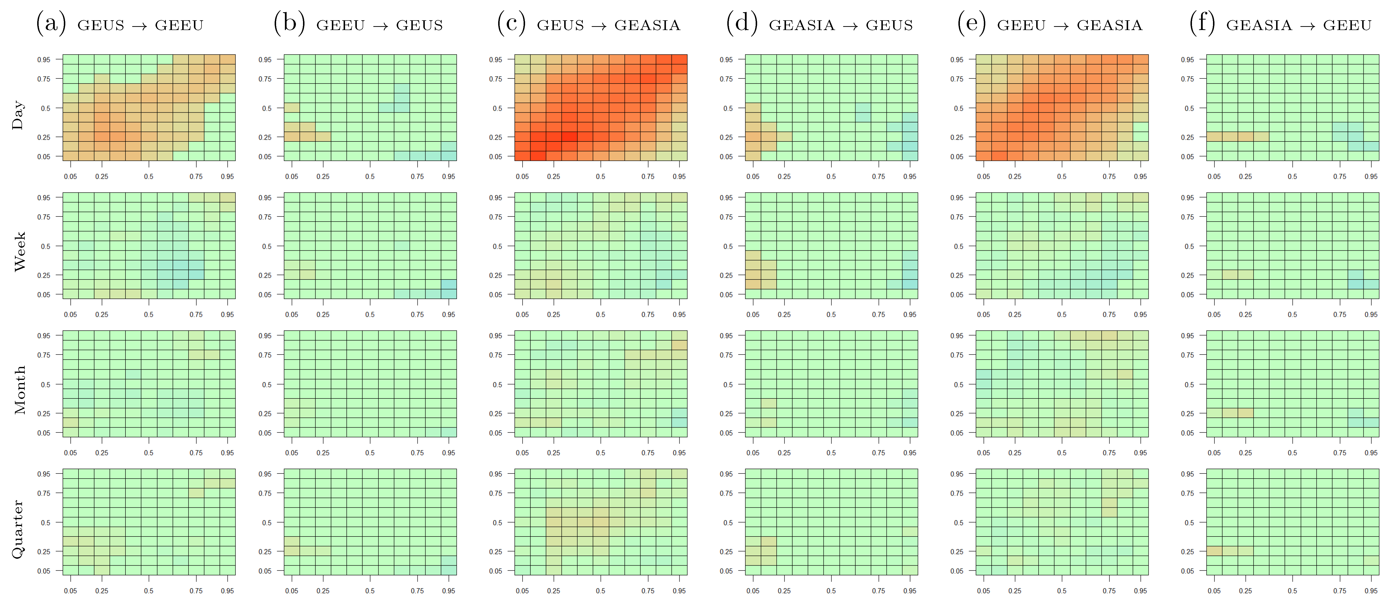
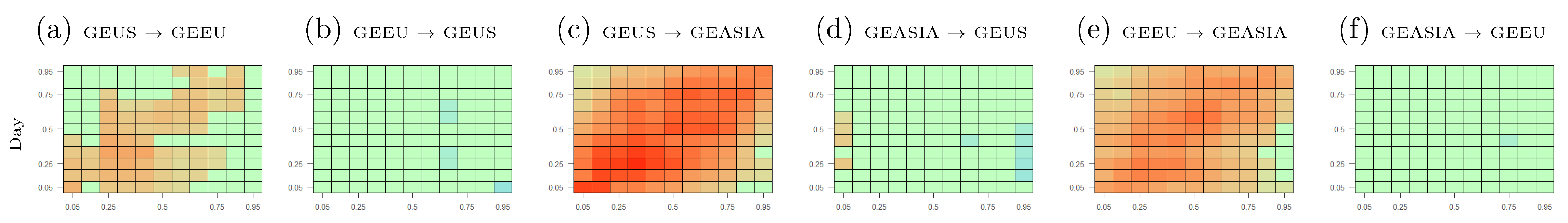
This section presents the empirical results. Section 5.1 discusses the interdependence among regional green equity markets. Section 5.2 and Section 5.3 present the interdependence between regional green equity markets and other assets, specifically energy commodity and general stock markets. As indicated in Section 4, this paper estimates 484 cross-quantilograms for each pair of variables to capture the entire dependence structure between the markets. Therefore, the author presents the cross-quantilograms using heat maps. The x- and y-axes of the heat maps correspond to a specific quantile in each variable’s distributions. The color of each cell in the heat maps indicates the value of the cross-quantilogram for a given lag length and pair of quantiles. Specifically, an orange cell indicates a positive cross-quantilogram, while a blue cell indicates a negative cross-quantilogram. Bolder colors mean that the cross-quantilograms are closer to 1 in absolute values, which indicates a stronger spillover between the variables. Any statistically insignificant cross-quantilogram is set to 0 and is indicated by the color green on the heat maps. The numerical values of the cross-quantilograms for selected pairs of quantiles are presented in Appendix A.
5.1. Cross-Quantile Dependence Among Green Equity Markets
5.1.1. Main Results
This section discusses the cross-quantile dependence among the U.S., European and Asian green equity markets. Figure 3 displays the heat maps among regional green equity markets. Each column of the figure presents the cross-quantilogram directional predictability for a pair of variables. For example, the column “GEUS → GEEU” (column (a)) captures the cross-quantilograms from the GEUS to GEEU index. The lag lengths considered in the heat maps are indicated on the left-hand side of the figures. In addition to the heat maps, the numerical cross-quantilogram values between the assets for selected pairs of quantiles are presented in Table A1 of Appendix A. Overall, Figure 3 indicates heterogeneous integration among regional green equity markets across the time horizons.
Row 1 of Figure 3 summarizes the cross-quantilograms among regional green equity markets at the short-run investment horizon (). The heat maps from the GEUS to the GEEU and GEASIA indexes are mostly orange and tend to be darker across the secondary diagonals.5 Thus, the U.S. green equity market’s movements can predict movements in the European and Asian green equity markets the following day. Specifically, a bearish (bullish) movement in the U.S. green equity market leads to a bearish (bullish) movement in the European and Asian green equity markets the following day. This indicates the significance of the U.S. market in the overall green equity market. Specifically, high returns in the U.S. green equity market send a positive signal to investors, which encourages them to expand their environmentally friendly investments to other regions.
Another finding from row 1 of Figure 3 is that the cross-quantilogram heat maps from the GEEU and GEASIA indexes to the GEUS index are orange at the lower-left corners. This indicates that low returns in the GEEU and GEASIA indexes significantly cause low returns in the GEUS index the following day. No evidence of spillovers from the GEEU and GEASIA indexes to the GEUS index is found at the median and higher quantiles, since other segments of the heat maps are predominantly green. This suggests that within the green equity market, busts are bi-directional. In other words, a downward movement in one region tends to lead to a downward movement in all other regions the following day. In contrast, booms are unidirectional. Specifically, a boom in the U.S. green equity market leads to a boom in other regional green equity markets the following day. However, a boom in other regional green equity markets does not necessarily lead to a boom in the U.S. green equity market in the future.
Figure 3 indicates that the Asian green equity market is the main receiver of shocks from other markets. Specifically, directional spillovers from both the GEUS and GEEU indexes to the GEASIA index are positive and significant across all the quantiles, as indicated by the orange colors in Figure 3c,e. Thus, a boom (bust) in the U.S. and European green equity markets is likely associated with a boom (bust) in the Asian green equity market the following day. However, the Asian green equity market exhibits a negligible impact on its U.S. and European counterparts, as indicated by the heat map’s green colors in Figure 3d,f. A possible explanation is that compared to other green equity markets, Asian green equity is relatively new, therefore, they are likely to be under significant influences from other markets.
Finally, the directional spillovers among the green equity indexes become smaller and less statistically significant as the lag length increases. This is indicated by the green color’s dominance in the heat maps for the weekly, monthly, and quarterly lags. In other words, regional integration within the green equity universe dissipates over time. Thus, a portfolio that combines green equity investments from various regions may provide diversification benefits in the long run.
The Table A1 in Appendix A presents the numerical cross-quantilogram values of selected cells in the heat maps of Figure 3. Specifically, this table presents the cross-quantilogram values at lag 1 when the markets’ returns are in the same quantiles.6 Thus, the information in Table A1 corresponds to the cells across the secondary diagonal of the heat maps at lag 1. According to the table, the cross-quantilograms are the largest from the GEUS and GEEU indexes to the GEASIA index, followed by the cross-quantilograms from the GEUS to GEEU index. In contrast, most of the cross-quantilograms in the opposite directions are close to 0 and statistically insignificant. The findings from Table A1 are consistent with the conclusions from Figure 3.
5.1.2. Robustness Analyses
This section discusses the robustness tests of the results in Section 5.1.1. The results of these robustness tests are presented in Appendix D.
First, following Jeong et al. (2012), quantile Granger causality tests are conducted to further explore the cross-quantile dependence between regional green equity markets.7 Figure A6 reports the test statistics of the quantile Granger causality tests among the U.S., European and Asian green equity markets. The red and blue lines in each figure represent the critical values at the 5% and 10% significance levels. Across all the quantiles, the U.S. green equity returns Granger-cause the European and Asian green equity returns. In addition, the European green equity returns Granger-cause the Asian green equity returns. In contrast, there is no evidence of Granger causality from the Asian green equity market to the U.S. and European green equity markets. Finally, the European green equity returns do not Granger cause the U.S. green equity returns. Overall, Granger causality from the U.S. green equity market to other regional green equity markets is significant, while Granger causality in the opposite directions is not statistically significant. These results are consistent with the cross-quantilogram empirical evidence in Section 5.1.1.
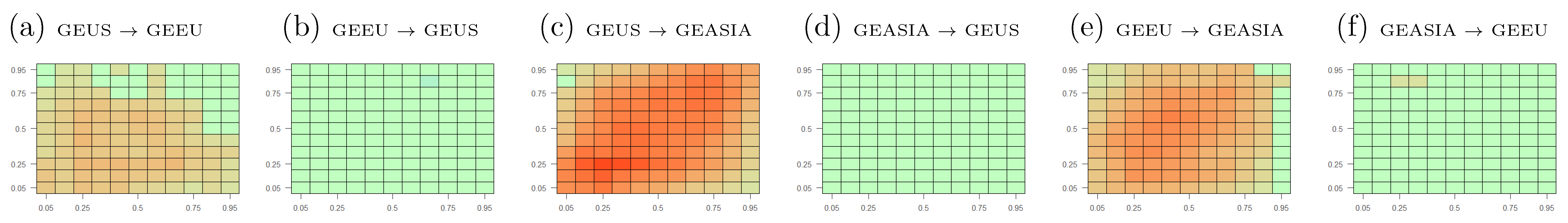
Second, the author estimates the cross-quantilograms between the standardized returns of the regional green equity markets. The first step of this robustness analysis is to obtain the standardized residuals of a best-fit GARCH(1,1) model applied to each variable.8 The second step calculates the cross-quantilograms between the standardized residuals. By estimating the cross-quantilogram between the GARCH-standardized residuals, this robustness analysis allows for the discovery of interdependence across the markets, while controlling for serial correlations within each variable. Figure A7 displays the results for lag .9 Overall, the cross quantilograms in this figure are in line with the results in Section 5.1.1.
Third, to account for the impact of general market conditions on the cross-quantilogram estimations, several control variables are incorporated, specifically, the VIX index (a proxy for stock market uncertainty), the OVX index (a proxy for energy market uncertainty) and the EPU index (a proxy for economic policy uncertainty). This robustness analysis is based on the partial cross-quantilogram technique explained in Section 4. Figure A8 and Figure A9 display the results for lag . Overall, the inclusion of these control variables does not qualitatively change the dependence structure among regional green equity markets. Note that these results do not imply that the VIX, OVX and EPU indexes do not influence the green equity market. They only indicate that these control variables carry little information on the dependence structure among the regional green equity markets.
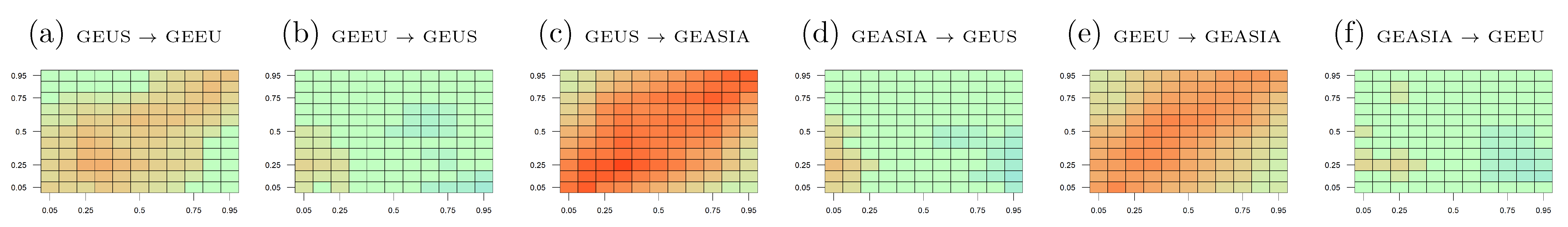
Fourth, the author employs alternative proxies for the regional green equity markets. Specifically, Figure A11 presents the cross-quantilograms among the NASDAQ OMX Clean Energy Focused U.S. (CLNUS), Europe (CLNEU) and Asia (CLNASIA) indexes. In contrast to the Green Economy indexes used in the main analysis, the NASDAQ OMX Clean Energy Focused indexes track the performance of environmentally friendly firms only in the energy sector. Overall, the results from Figure A11 are consistent with the main findings in Section 5.1.1.
Fifth, the author studies how the cross-quantilograms vary over time. To this end, the author estimates the cross-quantilograms for three sub-periods: before, during and after the 2014–2016 oil price collapse. Figure A12, Figure A13 and Figure A14 show that the cross-quantilograms across these sub-periods are consistent with the main results in Figure 3. Finally, a recursive estimation of the cross-quantilograms is conducted to examine how directional spillovers change over time. Following Uddin et al. (2019), this study uses a recursive window of 252 days (roughly a trading year) to estimate the time-varying cross-quantilograms. As the previous empirical evidence indicates that directional spillovers are the most significant at lag 1 and weaken at longer time horizons, only the recursive cross-quantilograms for lag 1 are presented in Appendix D. Figure A15 presents the results, where the first, second and third rows show the recursive CQs when both return distributions are at the 5%, 50% and 95% quantiles. The horizontal axis represents the starting year of the recursive window. The blue lines are time-varying cross quantilograms in the recursive subsamples. The red lines indicate the 95% confidence interval for the no-predictability null hypothesis, which is derived from 1000 bootstrap iterations of the cross-quantilogram estimates. Overall, these figures show time-varying directional spillovers across the regional green equity markets. However, the sub-period and recursive estimates are consistent with the main findings in Section 5.1.1. Specifically, directional spillovers are larger from the GEUS to the GEEU and GEASIA indexes and from the GEEU to the GEASIA index than in the opposite directions.
Section 5.2 and Section 5.3 discuss the cross-quantile dependence between regional green equity markets and other asset classes, specifically the energy commodity and general stock markets. These assets have been found in several previous studies to strongly influence the green equity market. In contrast to the previous literature that treats the global green equity market as one composite market, this paper investigates the regional variations in the relationship between green equity markets and other asset classes across all parts of the return distributions. Thus, this offers a more comprehensive picture of the interdependence between green equity and other markets across market conditions and time horizons.
5.2. Cross-Quantile Dependence between Regional Green Equity Markets and Energy Commodity Markets
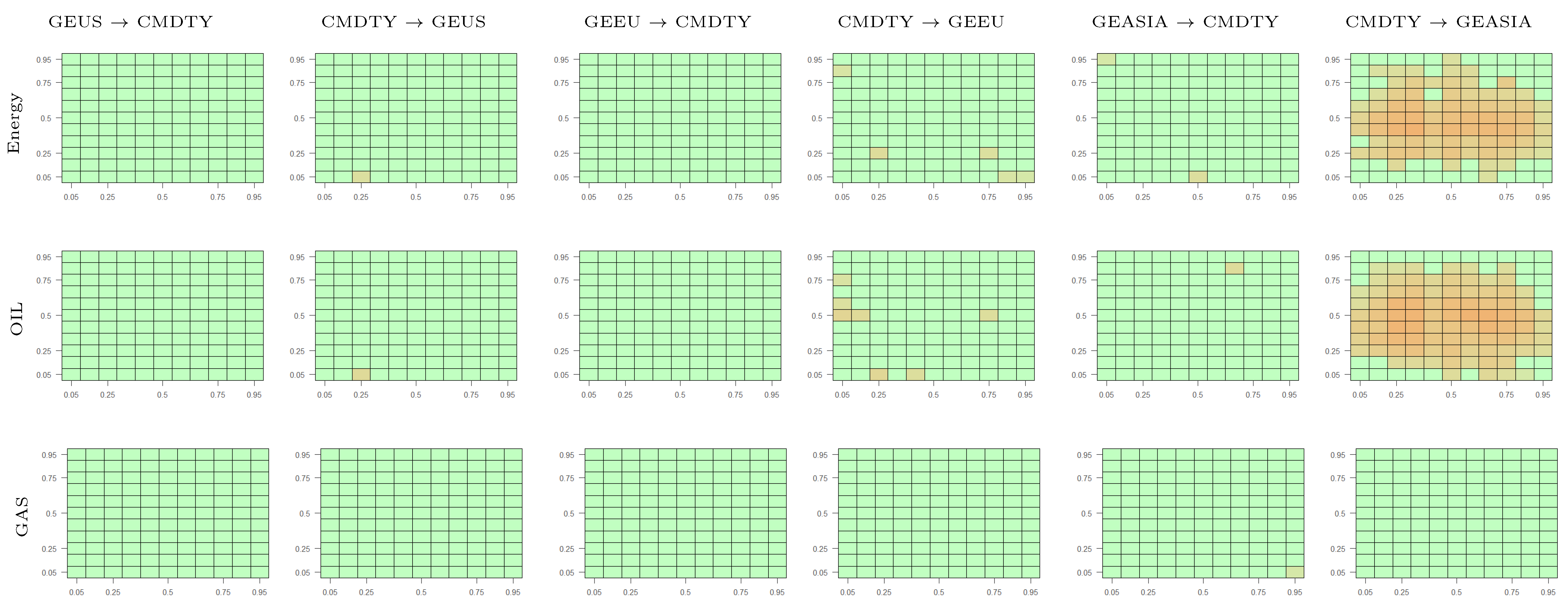
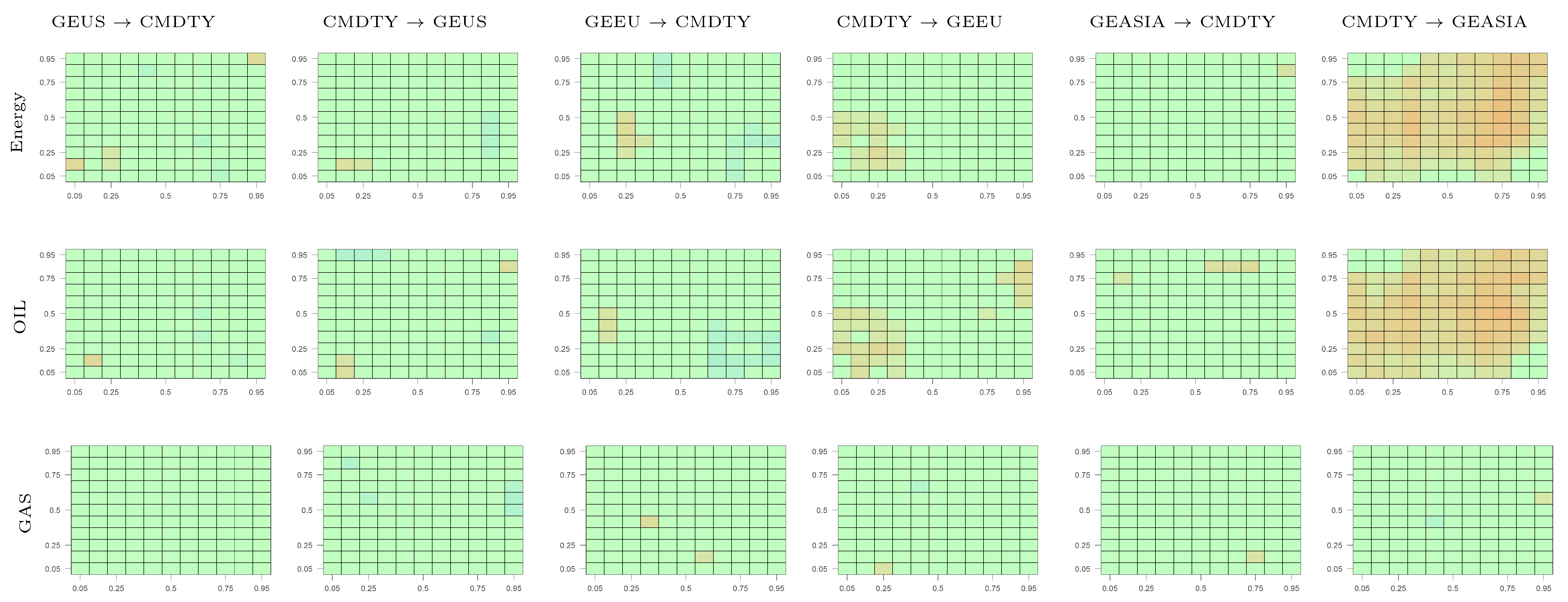
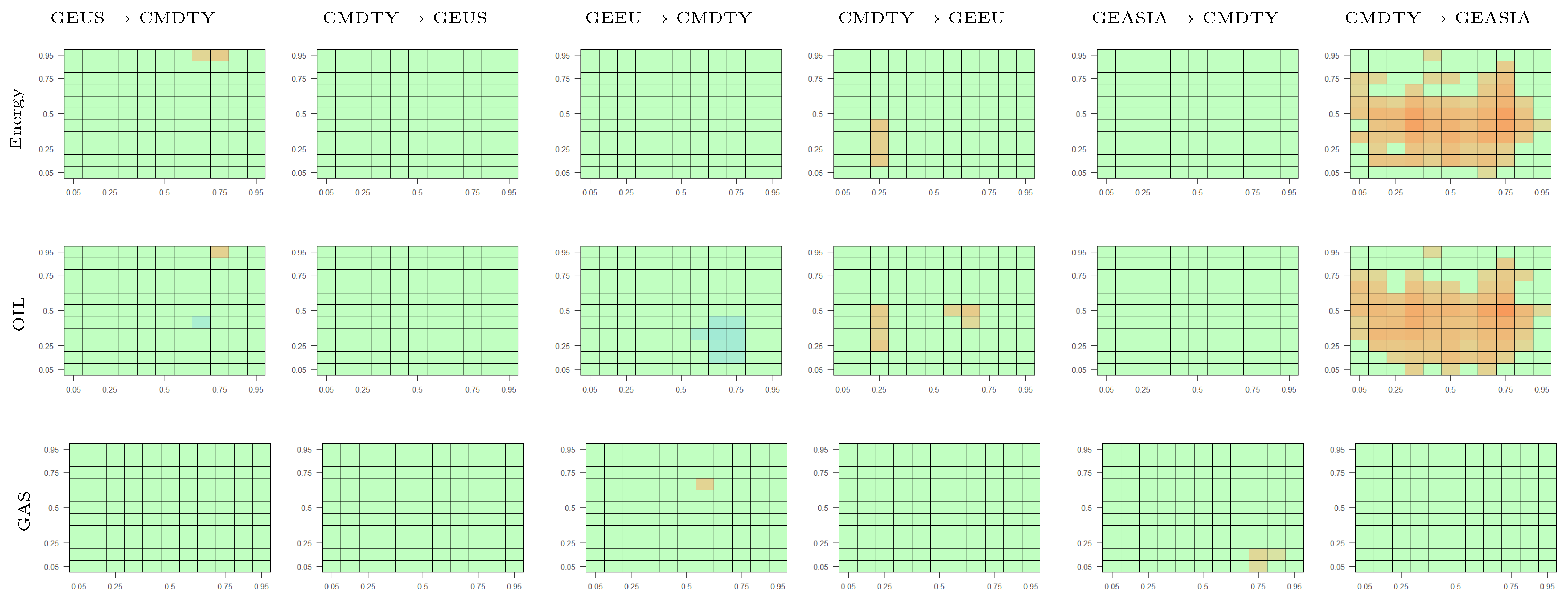
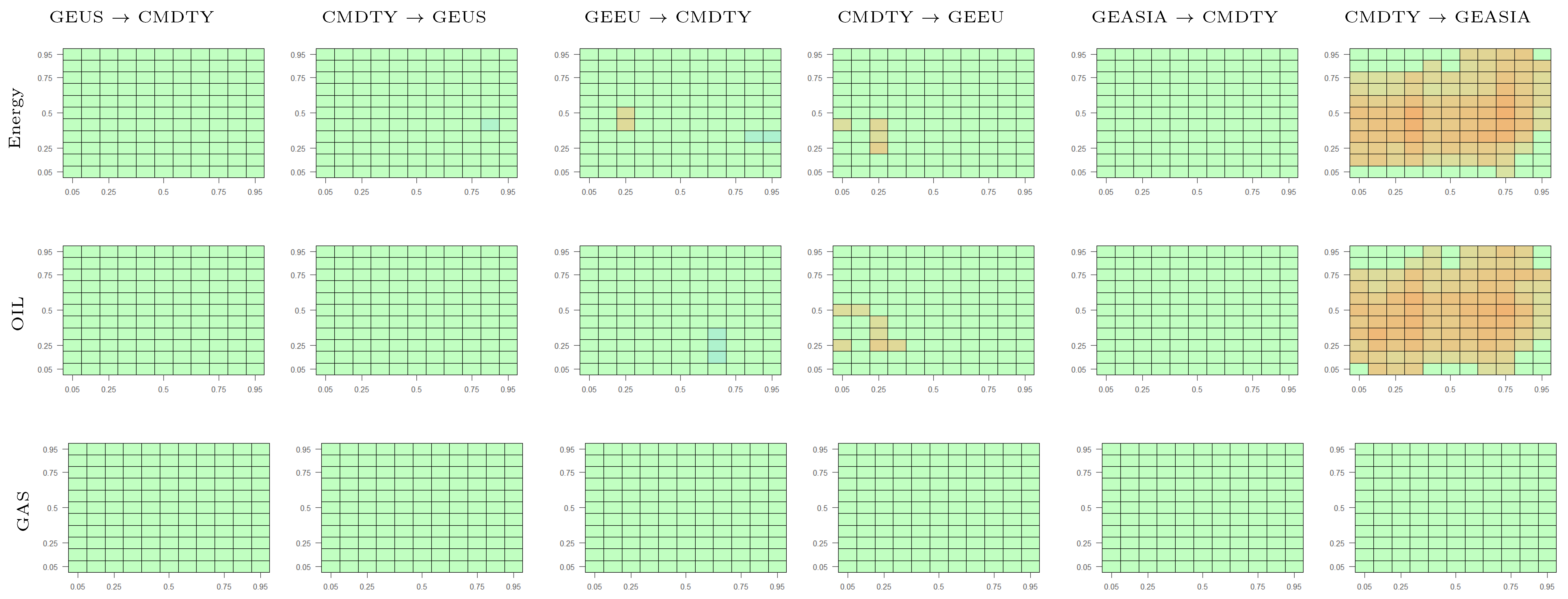
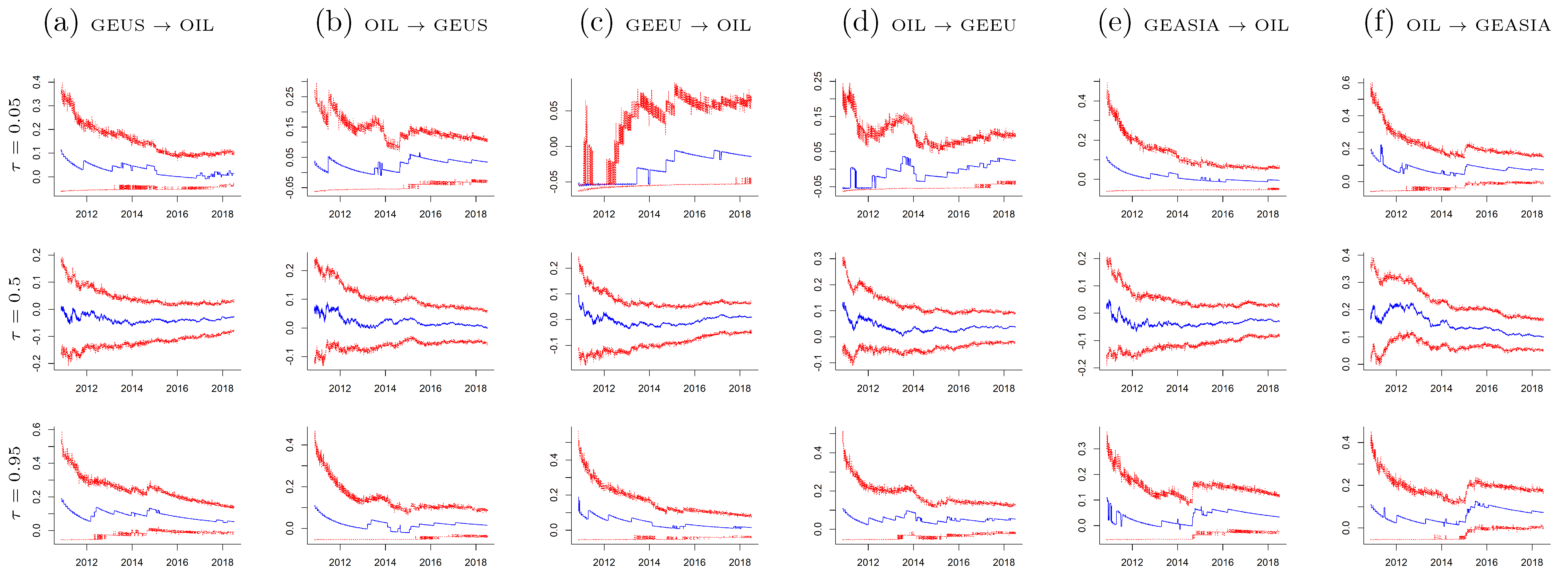
This section discusses the cross-quantile dependence between regional green equity markets and the energy commodity market. In this paper, the author considers three alternative indexes to measure the performance of the energy commodity market, specifically the S&P GSCI Energy index (a proxy for the overall energy commodity market), the S&P GSCI Crude Oil index (a proxy for the oil commodity market), the S&P GSCI Natural Gas index (a proxy for the natural gas commodity market).10 Figure 4 displays the results. Note that this figure only displays the cross-quantilograms for lag . The reason is that, consistent with the findings in Section 5.1, the cross-quantile interdependence between regional green equity markets and the energy commodity market becomes weaker at longer lags. Therefore, the author will discuss the empirical results for lag and leave the results for other lags in Appendix B.
Row 1 of Figure 4 presents the cross-quantilograms between regional green equity and energy commodity markets.11 First, the heat maps for the GEUS and GEEU indexes (columns (a–d)) are mostly green. This indicates insignificant interdependence between the energy commodity market and the U.S. and European green equity markets. On the other hand, the energy commodity market exhibits a strong positive influence on the Asian green equity market across all the quantiles for lag 1. This is indicated by the dominance of orange cells in the heat map in column (f). Thus, a boom (bust) in the energy commodity market leads to a boom (bust) in the Asian green equity market the following day. However, the dependence between energy commodity and Asian green equity becomes insignificant as the lag length increases. Overall, these results imply a strong dependence of the Asian green equity market on the energy commodity market in the short run. One possible explanation is that compared to the Asian market, the U.S. and European green equity markets are more established. As a result, investors in the U.S. and European markets have started to decouple the green equity market from the energy commodity market, therefore, their green equity investment decisions are not significantly affected by changes in energy commodity returns (Ferrer et al. 2018). In contrast, green investments in Asia have only gained attention in recent years.12 Since the Asian green equity market’s behavior is not as well understood as its U.S. and European counterparts, investors’ decisions to invest in this market are more likely to be influenced by the performance of alternative investment options. Since the data set in this paper contains more recent periods, the above results provide evidence about the nexus between energy commodity and green equity across the regions in recent years.
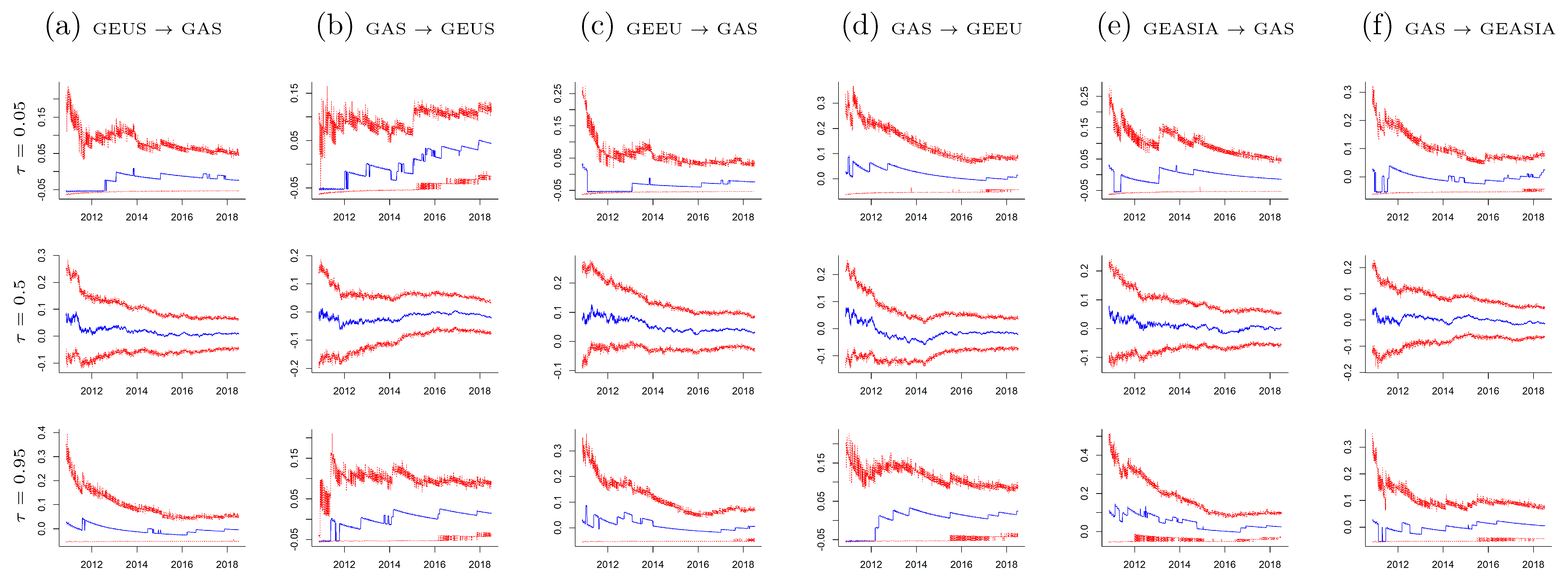
Rows 2 and 3 of Figure 4 present the cross-quantilograms between the regional green equity markets and two subsectors of the energy commodity market: the crude oil commodity market (Row 2) and the natural gas commodity market (Row 3). First, in line with the findings on the interdependence between regional green equity and energy commodity markets, the empirical results show that the Asian green equity market co-moves with the oil commodity market. At the same time, there is no significant interdependence between the oil commodity market and the U.S. and European green equity markets. Second, there is no evidence for a significant interdependence between the regional green equity markets and the natural gas commodity market, as the heat maps for the natural gas market are statistically insignificant across all lags. Overall, these results are consistent with the findings of a weakening relationship between energy commodity markets and clean energy stock prices in several previous studies (Ahmad 2017; Henriques and Sadorsky 2008; Sadorsky 2012).
To validate the above findings, the author employs similar empirical procedures as in Section 5.1.2 and the results of these robustness analyses are in Appendix E. Specifically, the following robustness tests are conducted: (i) quantile Granger causality tests (Figure A16); (ii) cross-quantilograms with GARCH-standardized residuals (Figure A17); (iii) cross-quantilograms with control variables for general market conditions (Figure A18, Figure A19 and Figure A20); (iv) cross quantilograms using the NASDAQ Clean Energy Focused indexes as alternative proxies for regional green equity markets (Figure A21); and (v) sub-period and recursive cross-quantilograms (Figure A22, Figure A23, Figure A24, Figure A25, Figure A26 and Figure A27). Overall, these robustness analyses yield consistent conclusions with the main findings. However, the recursive cross-quantilograms indicate increasing dependence between the natural gas commodity and the U.S. green equity markets, particularly at the 0.05 and 0.95 quantiles (Figure A27a,b). This reflects the increasing importance of natural gas in the U.S. after the shale gas revolution in the early 2000s.
5.3. Cross-Quantile Dependence between Regional Green Equity Markets and the Stock Market
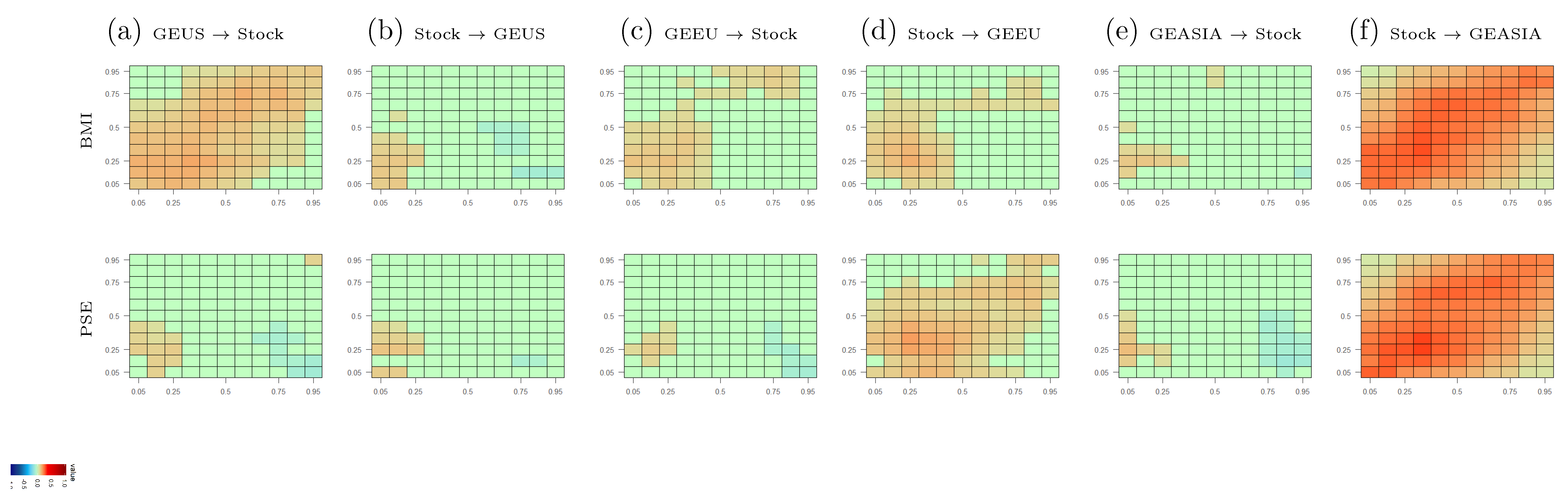
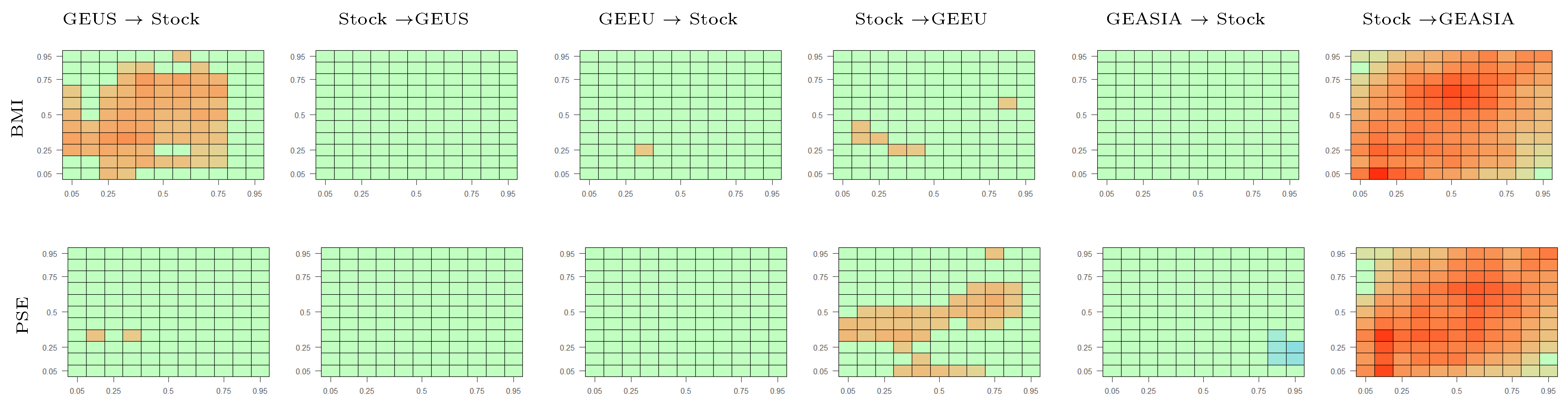
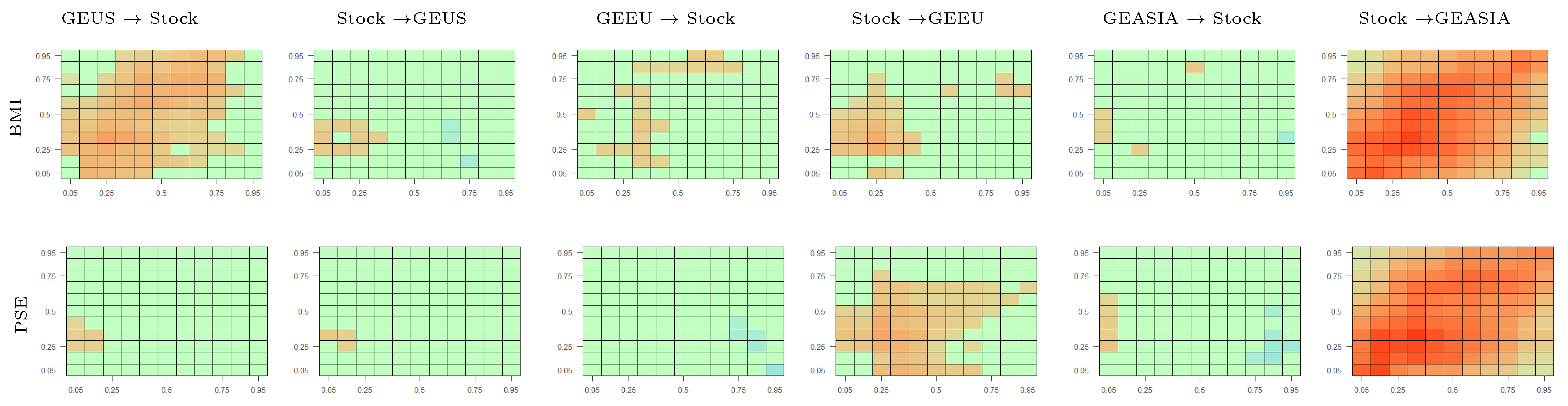
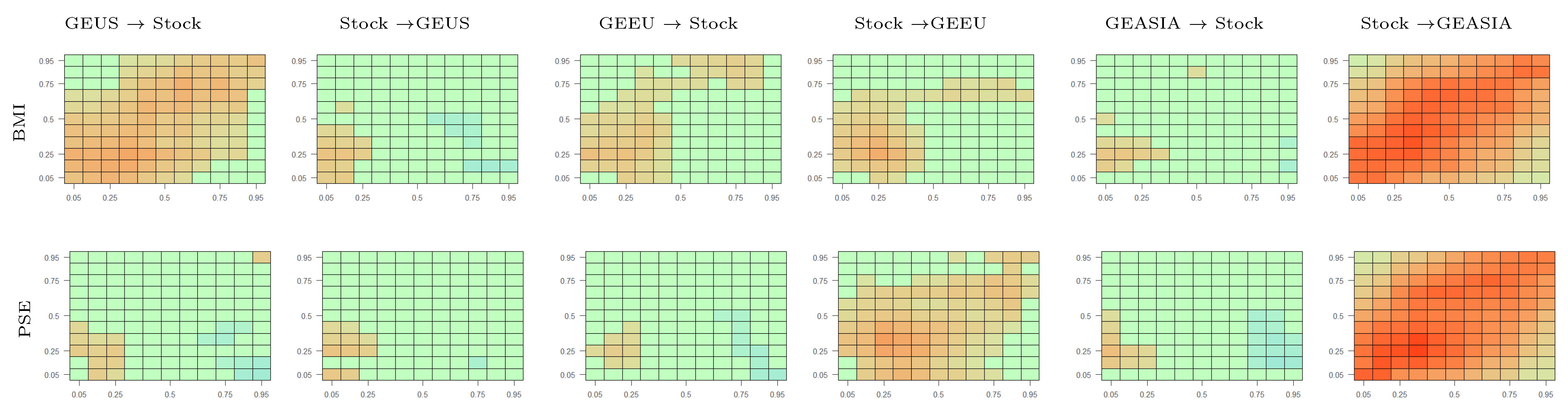
This section discusses the cross-quantile dependence between regional green equity and other stock markets, specifically the general global stock market (proxied by the S&P Global BMI index) and the technology stock market (proxied by the NYSE Arca 100 (PSE) index).13 Figure 5 displays the results. Consistent with the findings in previous sections, the interdependence between regional green equity and other stock markets dissipates at longer lags, therefore, the author focuses on presenting the results for lag and leaves the heat maps for other lags in Appendix B. The numerical values of the cross-quantilograms for selected quantiles are presented in Table A5 and Table A6 in the Online Appendix. The empirical findings suggest heterogeneous interdependence between regional green equity and other stock markets.
Figure 5a,c,e in row 1 show the cross-quantilograms between regional green equity and general stock markets. First, the heat maps from the GEUS to BMI index (column (a)) are mostly orange. Thus, in the short-run investment horizon (), movements in the U.S. green equity market can predict movements in the general stock market. This is due to the importance of the U.S. stock market in the global stock market. Since the GEUS index consists of firms domiciled in the U.S., it has a significant impact on the global stock market. Similar conclusions can be made for the cross-quantile dependence, from the European green equity market to the general stock market (column (c)). However, compared to the U.S. green equity market, the European green equity market exhibits a weaker impact on the general stock market. In addition, the heat maps from the GEASIA to the BMI index (column (e)) are mostly green, except at the lower-left corner. Thus, low returns in the Asian green equity market can predict low returns in the general stock market, however, high Asian green equity returns do not predict high general stock returns.
Figure 5b,d,f in row 1 present the cross-quantilograms from the general stock market to green equity markets. The heat map from the BMI index to the GEUS index (column (b)) is mostly green, except at the extremely low quantiles. Thus, low returns in the general stock market lead to low returns in the U.S. green equity market. However, no significant spillover from the general stock market is found at the median and upper quantiles. Similarly, the general stock market has the strongest predictive power over the European green equity market at the lower quantiles, as orange cells are more concentrated at the lower-left corner of the “Stock → GEEU” heat map (column (d)). On the contrary, movements in the general stock market can predict movements in the Asian green equity market across all market conditions, as shown by the dominance of orange cells in column (f).
Row 2 of Figure 5 presents the CQ heat maps between regional green equity markets and the technology stock market, a class of equity investment that is highly correlated with green equity in the literature (for example, Sadorsky (2012), Managi and Okimoto (2013), Reboredo (2015), Bondia et al. (2016)). The heat maps between the U.S. green equity market and technology stock market are only statistically significant at the bottom-left corners (columns (a,b)). Thus, low returns in the technology stock market can predict low returns in U.S. green equity market and vice versa. However, this interdependence does not hold during periods of high or normal returns. In contrast, technology stock can predict European and Asian green equity across all market conditions, as the heat maps in columns (d,f) are predominantly orange. A possible explanation for the varying dependence of the regional green equity markets on the technology stock market relies on the heterogeneity in green financing activity across the regions. According to Bloomberg Energy Finance, in recent years, Asia has grown to be the leading region in renewable energy finance, followed by Europe and the U.S. (Bloomberg New Energy Finance 2019). Thus, together with the fact that Asian green equity is a relatively new segment of the global green equity market, it is more vulnerable to the technology stock market’s movements. In contrast, more developed regions such as Europe and the U.S. have lost their role as the main destination of new energy finance, therefore, they are less integrated with the technology stock market (Bloomberg New Energy Finance 2019). Since the data set in this paper starts from November 2010, it is able to capture these recent trends in the nexus between green equity and technology stock markets. The empirical evidence also suggests that the dependence structure between the green equity and technology stock markets persists for a more extended period than between the green equity and energy commodity markets (Figure A1, Figure A2, Figure A3, Figure A4 and Figure A5). These results are consistent with the previous findings of a stronger correlation between green equity and technology stock than between green equity and energy commodities in the literature (Bondia et al. 2016; Managi and Okimoto 2013; Reboredo 2015; Sadorsky 2012).
In summary, the above empirical evidence suggests the significant exposure of the Asian green equity market to movements in the global stock market. In addition, there exists a higher degree of connectedness between green equity and general stock markets during periods of extremely low returns. Finally, the interdependence between regional green equity and general stock markets becomes weaker in the long run. These conclusions are still valid under the following robustness tests: (i) the quantile Granger causality tests (Figure A28), (ii) the cross-quantilograms with GARCH-standardized returns (Figure A29), (iii) the partial cross-quantilograms with the OVX, VIX and EPU indexes (Figure A30, Figure A31 and Figure A32), (iv) cross quantilograms using the NASDAQ Clean Energy Focused indexes as alternative proxies for regional green equity markets (Figure A33); and (v) sub-period and recursive cross-quantilograms (Figure A34, Figure A35, Figure A36, Figure A37 and Figure A38).
6. Discussion and Conclusions
Concerns over climate change have sparked substantial interests among policymakers and investors in environmentally friendly financial instruments. As the green financial market expands in its scope and size, heterogeneity in the performance of sub-segments in this market will emerge, which has important implications for policymakers and investors. Yet, most studies so far have treated the global green equity market as one composite market. This paper studies how the interdependence among green equity and other assets varies across regions, market conditions, and investment horizons, thereby providing new insights into the green equity market’s behavior.
The empirical results indicate that the dependence between regional green equity, energy commodity and general stock markets is the most significant in the short-term horizon and dissipates over the medium- and long-term horizons. This suggests fast processing of information among these markets, as most shocks are transmitted in the short run. These results are consistent with several recent papers that document the short-lived nature of connectedness among various financial markets. For example, Lau et al. (2017) and Tiwari et al. (2018) find larger connectedness across precious metals and several financial assets in the short term than in the long term. Similar results are obtained in Ferrer et al. (2018), who focus on the relationship between several financial assets and renewable energy stocks.
Second, within the green equity market, the U.S. is the dominant shock transmitter. In other words, other regional green equity markets are significantly affected by movements in the U.S. market. The Asian green equity market is the dominant shock receiver, since it is influenced by movements in both the U.S. and European markets. These results suggest the significant role of the U.S. green equity market in determining the overall green equity market’s financial performance. Thus, closely monitoring movements in the U.S. green equity market allows investors to forecast movements in other regional green equity markets. In addition, since the dependence between these regional markets becomes weaker as the time horizon increases, a portfolio that combines green equity from different regions can provide diversification benefits in the long run. To the author’s knowledge, this is the first empirical paper that examines the dependence between sub-sectors of the global green equity market. Previous studies on green equity performance rely on aggregate stock indexes to represent the global green equity market, therefore, they may overlook the connectedness within the green equity market. As the green equity market has experienced substantial growth in recent years, it is essential to understand the connections between sub-sectors of this market.
Third, this paper finds insignificant dependence between the U.S. and European green equity markets and the energy commodity market. In contrast, the energy commodity market exhibits a significant influence on the Asian green equity market. This finding adds to the diverse empirical evidence on the green equity-energy commodity interrelationship. Several studies find a statistically significant impact of energy commodity prices on green equity returns, for example, Kumar et al. (2012); Managi and Okimoto (2013); Nasreen et al. (2020). However, other studies find evidence for the decoupling of clean energy and fossil fuel markets, for example, Dawar et al. (2020); Kyritsis and Serletis (2019); Ferrer et al. (2018). The lack of consensus in the literature could be due to the use of a global green equity index, which masks the heterogeneous behavior among sub-sectors of the green equity market. The empirical evidence in this paper suggests that the interdependence between green equity and energy commodity markets depends on the regions, market conditions and investment horizons. This finding has several implications. First, since the U.S. and European green equity markets do not exhibit significant interdependence with the energy commodity market, a portfolio that combines energy commodities with U.S. and European green equity may provide diversification benefits. However, a portfolio of energy commodity and Asian green equity does not provide such benefits, as there is significant interdependence between these markets. As for the policy implications, this paper suggests that policy to protect green equity against crude oil price movements may not increase financial flows towards green equity sectors in the U.S. and Europe, thanks to the decoupling of green equity from energy commodity in these regions. On the contrary, policymakers should be aware that downward energy price movements could lead to extreme downward movements in the Asian green equity markets, thereby discouraging private green investment incentives in this region.
Fourth, regional green equity markets exhibit heterogeneous interdependence with the general and technology stock markets. Among the regional green equity market, the U.S. green equity market has the strongest predictive power over movements in the general stock market across all market conditions. At the same time, movements in the Asian green equity market can predict movements in the general stock market only during periods of low returns. In turn, the general stock market can predict movements in the Asian green equity market across all market conditions, but its predictive power over the European and U.S. green equity markets is mostly concentrated during periods of low returns. In short, the results of this paper indicate higher interdependence between green equity and other stock markets during periods of low returns. This is in line with the stylized fact of higher contagion among financial markets during turbulent times. Finally, the technology stock market is the most connected to the Asian and European green equity markets. This is because Asia and Europe have accounted for the majority of new clean energy investments in recent years. Since the data set in this paper covers more recent periods, it is able to capture the recent dynamics of the green equity market. Overall, the empirical evidence shows strong interdependence between green equity and other stock markets, which is in line with the findings in the previous literature (for example, Ahmad (2017); Sadorsky (2012); Uddin et al. (2019)). However, while most previous studies have used one single stock index for the global green equity market, this paper adds to the literature by considering the heterogeneous interdependence between green equity and other stock markets across regions, market conditions and time horizons. The empirical results show that policies to promote green investments should reduce the contagious effect of the aggregate stock market during periods of low returns, especially in the Asian green equity market.
In summary, this paper finds a heterogeneous interrelationship between green equity and other assets across regions, which highlights the importance of investigating the environmentally friendly financial market at a disaggregate level. Future research could further investigate the green equity market’s heterogeneous characteristics by considering its relationship with a broader range of financial assets. Moreover, the use of firm-level data could further unravel the heterogeneity in the green equity market, which could have important implications for policymakers and investors. In addition, studies that address the behavior of green equity markets during turbulent periods, especially during the COVID-19 pandemic, would be beneficial for promoting green investments in the future.
Funding
This research received no external funding.
Data Availability Statement
Restrictions apply to the availability of these data. Data was obtained from Bloomberg Terminal and are available from the authors with the permission of Bloomberg.
Acknowledgments
The author is thankful for the editor and three anonymous referees for their valuable comments and feedback.
Conflicts of Interest
The author declares no conflict of interest.
Appendix A. Numerical Cross-Quantilogram Values
This section presents the numerical values of the cross-quantilogram heat maps in Section 5. The inclusion of the numerical cross-quantilogram values for all cells in the heat maps is impractical. Therefore, this section only presents the cross-quantilogram values when they are most likely to be statistically significant, that is, when lag and when the markets are in the same quantiles (). Table A1 presents the cross-quantilograms among regional green equity markets. Each cell of the table presents the cross-quantilograms and their 99% confidence interval (in brackets). The 99% confidence intervals are obtained from 1000 stationary bootstraps. Table A2, Table A3 and Table A4 present the cross-quantilograms between each regional green equity market and the energy commodity markets. Table A5 and Table A6 present the cross-quantilograms between the regional green equity markets and the stock market.

Table A1.
Numerical cross-quantilogram values among regional green equity markets for and .
| Quantiles | GEUS→GEEU | GEEU→GEUS | GEUS→GEASIA | GEASIA→GEUS | GEEU→GEASIA | GEASIA→GEEU |
|---|---|---|---|---|---|---|
| (a) | (b) | (c) | (d) | (e) | (f) | |
| 0.05 | 0.10 [0.01, 0.25] | 0.06 [−0.01, 0.13] | 0.10 [0.01, 0.23] | 0.08 [−0.01, 0.20] | 0.20 [0.10, 0.31] | 0.04 [−0.02, 0.15] |
| 0.1 | 0.11 [0.04, 0.20] | 0.06 [0.00, 0.12] | 0.29 [0.22, 0.36] | 0.08 [0.03, 0.16] | 0.20 [0.12, 0.28] | 0.05 [0.00, 0.12] |
| 0.2 | 0.16 [0.10, 0.22] | 0.07 [0.00, 0.12] | 0.29 [0.23, 0.36] | 0.06 [−0.01, 0.13] | 0.21 [0.15, 0.29] | 0.09 [0.02, 0.13] |
| 0.3 | 0.14 [0.08, 0.20] | 0.02 [−0.04, 0.07] | 0.27 [0.22, 0.33] | 0.02 [−0.04, 0.07] | 0.22 [0.16, 0.28] | 0.02 [−0.04, 0.08] |
| 0.4 | 0.10 [0.04, 0.16] | −0.01 [−0.06, 0.05] | 0.25 [0.19, 0.31] | −0.03 [−0.09, 0.02] | 0.21 [0.15, 0.27] | −0.01 [−0.06, 0.04] |
| 0.5 | 0.10 [0.04, 0.16] | −0.05 [−0.11, 0.00] | 0.24 [0.18, 0.29] | −0.04 [−0.09, 0.02] | 0.20 [0.15, 0.25] | −0.02 [−0.08, 0.03] |
| 0.6 | 0.11 [0.04, 0.17] | −0.05 [−0.11, 0.01] | 0.24 [0.19, 0.29] | −0.03 [−0.08, 0.02] | 0.21 [0.15, 0.27] | −0.03 [−0.08, 0.03] |
| 0.7 | 0.10 [0.04, 0.15] | −0.06 [−0.11, −0.01] | 0.24 [0.18, 0.29] | −0.02 [−0.07, 0.04] | 0.19 [0.13, 0.25] | −0.02 [−0.07, 0.04] |
| 0.8 | 0.10 [0.03, 0.17] | −0.01 [−0.07, 0.04] | 0.27 [0.21, 0.33] | 0.00 [−0.05, 0.06] | 0.19 [0.13, 0.25] | 0.02 [−0.04, 0.07] |
| 0.9 | 0.12 [0.05, 0.18] | 0.01 [−0.04, 0.06] | 0.25 [0.17, 0.33] | 0.02 [−0.04, 0.09] | 0.17 [0.10, 0.25] | 0.01 [−0.04, 0.08] |
| 0.95 | 0.11 [0.02, 0.19] | 0.05 [0.00, 0.13] | 0.27 [0.15, 0.36] | 0.04 [−0.02, 0.10] | 0.17 [0.06, 0.29] | 0.02 [−0.03, 0.09] |
This table presents the cross-quantilogram values and their 99% confidence interval (in brackets) for directional predictability among regional green equity markets when and when the markets are in the same quantiles. The values in this table correspond to the diagonal elements of the heat maps in Row 1 of Figure 3.
Table A2.
Numerical cross-quantilogram values between regional green equity and energy commodity markets for and .
Table A2.
Numerical cross-quantilogram values between regional green equity and energy commodity markets for and .
| Quantiles | GEUS→Energy | Energy→GEUS | GEEU→Energy | Energy→GEEU | GEASIA→Energy | Energy→GEASIA |
|---|---|---|---|---|---|---|
| (a) | (b) | (c) | (d) | (e) | (f) | |
| 0.05 | 0.04 [−0.03, 0.11] | 0.02 [−0.04, 0.10] | 0.00 [−0.05, 0.06] | 0.01 [−0.04, 0.07] | 0.00 [−0.04, 0.06] | 0.05 [−0.02, 0.15] |
| 0.1 | 0.05 [−0.02, 0.13] | 0.06 [−0.01, 0.14] | 0.01 [−0.04, 0.06] | 0.05 [0.00, 0.12] | 0.02 [−0.03, 0.09] | 0.10 [0.04, 0.17] |
| 0.2 | 0.05 [0.00, 0.12] | 0.03 [−0.03, 0.09] | 0.05 [−0.01, 0.11] | 0.08 [0.02, 0.15] | 0.02 [−0.04, 0.07] | 0.08 [0.03, 0.15] |
| 0.3 | 0.03 [−0.03, 0.09] | 0.03 [−0.02, 0.10] | 0.04 [−0.01, 0.10] | 0.03 [−0.02, 0.09] | 0.00 [−0.05, 0.06] | 0.13 [0.06, 0.18] |
| 0.4 | 0.01 [−0.05, 0.06] | 0.02 [−0.03, 0.08] | 0.02 [−0.05, 0.06] | 0.04 [−0.01, 0.10] | −0.02 [−0.09, 0.04] | 0.10 [0.04, 0.16] |
| 0.5 | −0.01 [−0.06, 0.05] | 0.00 [−0.06, 0.05] | 0.02 [−0.04, 0.08] | 0.04 [−0.02, 0.08] | −0.02 [−0.07, 0.03] | 0.10 [0.05, 0.16] |
| 0.6 | 0.00 [−0.06, 0.05] | −0.02 [−0.07, 0.04] | 0.00 [−0.06, 0.07] | 0.01 [−0.05, 0.07] | 0.00 [−0.06, 0.05] | 0.10 [0.04, 0.16] |
| 0.7 | −0.02 [−0.07, 0.03] | −0.02 [−0.07, 0.03] | −0.03 [−0.08, 0.03] | 0.01 [−0.05, 0.07] | 0.00 [−0.07, 0.05] | 0.08 [0.03, 0.14] |
| 0.8 | 0.00 [−0.06, 0.07] | 0.00 [−0.06, 0.06] | −0.01 [−0.06, 0.04] | 0.01 [−0.04, 0.07] | 0.00 [−0.04, 0.07] | 0.11 [0.04, 0.17] |
| 0.9 | 0.00 [−0.06, 0.07] | 0.02 [−0.04, 0.08] | 0.01 [−0.04, 0.07] | 0.03 [−0.03, 0.10] | 0.04 [−0.02, 0.10] | 0.09 [0.02, 0.16] |
| 0.95 | 0.06 [0.00, 0.16] | 0.02 [−0.03, 0.11] | 0.01 [−0.04, 0.08] | 0.05 [−0.01, 0.12] | 0.05 [−0.02, 0.13] | 0.08 [0.01, 0.18] |
This table presents the cross-quantilogram values and their 99% confidence interval (in brackets) for directional predictability between regional green equity and energy commodity markets when and when the markets are in the same quantiles. The values in this table correspond to the diagonal elements of the heat maps in Row 1 of Figure 4.
Table A3.
Numerical cross-quantilogram values between regional green equity and oil commodity markets for and .
Table A3.
Numerical cross-quantilogram values between regional green equity and oil commodity markets for and .
| Quantiles | GEUS→OIL | OIL→GEUS | GEEU→OIL | OIL→GEEU | GEASIA→OIL | OIL→GEASIA |
|---|---|---|---|---|---|---|
| (a) | (b) | (c) | (d) | (e) | (f) | |
| 0.05 | 0.01 [−0.03, 0.09] | 0.03 [−0.03, 0.11] | −0.01 [−0.04, 0.05] | 0.02 [−0.03, 0.09] | 0.00 [−0.04, 0.06] | 0.07 [0.00, 0.15] |
| 0.1 | 0.06 [0.01, 0.14] | 0.05 [−0.02, 0.11] | 0.02 [−0.05, 0.07] | 0.06 [−0.01, 0.13] | 0.03 [−0.03, 0.08] | 0.09 [0.01, 0.16] |
| 0.2 | 0.03 [−0.03, 0.09] | 0.04 [−0.01, 0.10] | 0.03 [−0.04, 0.08] | 0.09 [0.02, 0.14] | 0.01 [−0.05, 0.07] | 0.10 [0.05, 0.16] |
| 0.3 | 0.01 [−0.04, 0.07] | 0.03 [−0.02, 0.09] | 0.02 [−0.04, 0.08] | 0.05 [−0.01, 0.11] | 0.00 [−0.05, 0.06] | 0.13 [0.07, 0.19] |
| 0.4 | −0.01 [−0.07, 0.05] | 0.01 [−0.04, 0.07] | 0.01 [−0.05, 0.06] | 0.04 [−0.01, 0.10] | −0.03 [−0.08, 0.03] | 0.10 [0.05, 0.16] |
| 0.5 | −0.03 [−0.09, 0.03] | 0.00 [−0.06, 0.05] | 0.01 [−0.04, 0.07] | 0.04 [−0.02, 0.09] | −0.03 [−0.08, 0.03] | 0.10 [0.06, 0.17] |
| 0.6 | 0.00 [−0.07, 0.05] | −0.02 [−0.07, 0.04] | −0.01 [−0.07, 0.04] | 0.03 [−0.03, 0.08] | 0.00 [−0.05, 0.05] | 0.11 [0.06, 0.17] |
| 0.7 | −0.04 [−0.09, 0.02] | −0.01 [−0.06, 0.04] | −0.04 [−0.09, 0.02] | 0.03 [−0.03, 0.10] | 0.00 [−0.05, 0.07] | 0.11 [0.06, 0.16] |
| 0.8 | 0.01 [−0.05, 0.07] | 0.02 [−0.04, 0.08] | 0.00 [−0.06, 0.05] | 0.04 [−0.02, 0.10] | 0.02 [−0.03, 0.07] | 0.11 [0.05, 0.17] |
| 0.9 | 0.01 [−0.04, 0.08] | 0.03 [−0.02, 0.10] | 0.01 [−0.04, 0.07] | 0.05 [−0.02, 0.11] | 0.04 [−0.01, 0.11] | 0.08 [0.02, 0.15] |
| 0.95 | 0.05 [−0.01, 0.15] | 0.01 [−0.03, 0.09] | 0.01 [−0.04, 0.08] | 0.05 [−0.02, 0.12] | 0.03 [−0.02, 0.12] | 0.07 [0.01, 0.17] |
This table presents the cross-quantilogram values and their 99% confidence interval (in brackets) for directional predictability between regional green equity and oil commodity markets when and when the markets are in the same quantiles. The values in this table correspond to the diagonal elements of the heat maps in Row 2 of Figure 4.
Table A4.
Numerical cross-quantilogram values between regional green equity and gas commodity markets for and .
Table A4.
Numerical cross-quantilogram values between regional green equity and gas commodity markets for and .
| Quantiles | GEUS→GAS | GAS→GEUS | GEEU→GAS | GAS→GEEU | GEASIA→GAS | GAS→GEASIA |
|---|---|---|---|---|---|---|
| (a) | (b) | (c) | (d) | (e) | (f) | |
| 0.05 | −0.02 [−0.05, 0.05] | 0.04 [−0.02, 0.12] | −0.02 [−0.05, 0.04] | 0.01 [−0.04, 0.08] | −0.01 [−0.05, 0.05] | 0.02 [−0.04, 0.09] |
| 0.1 | 0.04 [−0.02, 0.10] | 0.02 [−0.04, 0.08] | 0.01 [−0.04, 0.07] | 0.02 [−0.04, 0.09] | 0.02 [−0.04, 0.07] | 0.03 [−0.03, 0.09] |
| 0.2 | 0.01 [−0.05, 0.07] | 0.00 [−0.05, 0.06] | 0.02 [−0.03, 0.08] | 0.03 [−0.02, 0.08] | 0.01 [−0.04, 0.07] | 0.02 [−0.03, 0.08] |
| 0.3 | −0.01 [−0.06, 0.04] | 0.02 [−0.04, 0.07] | 0.03 [−0.02, 0.10] | 0.01 [−0.04, 0.07] | −0.01 [−0.06, 0.05] | 0.01 [−0.04, 0.06] |
| 0.4 | −0.03 [−0.08, 0.03] | 0.00 [−0.06, 0.06] | 0.03 [−0.02, 0.09] | −0.03 [−0.08, 0.04] | −0.02 [−0.07, 0.03] | −0.05 [−0.10, 0.01] |
| 0.5 | 0.01 [−0.04, 0.06] | −0.02 [−0.08, 0.03] | 0.03 [−0.03, 0.08] | −0.02 [−0.08, 0.03] | 0.00 [−0.05, 0.05] | −0.01 [−0.06, 0.04] |
| 0.6 | 0.01 [−0.05, 0.06] | −0.03 [−0.09, 0.03] | 0.03 [−0.03, 0.08] | −0.02 [−0.08, 0.04] | 0.00 [−0.05, 0.06] | −0.02 [−0.06, 0.05] |
| 0.7 | 0.01 [−0.05, 0.06] | −0.04 [−0.09, 0.02] | 0.02 [−0.04, 0.08] | −0.02 [−0.08, 0.03] | 0.02 [−0.02, 0.08] | −0.01 [−0.06, 0.05] |
| 0.8 | 0.01 [−0.04, 0.06] | −0.02 [−0.07, 0.04] | 0.00 [−0.06, 0.06] | 0.00 [−0.05, 0.05] | 0.00 [−0.05, 0.07] | 0.01 [−0.04, 0.06] |
| 0.9 | −0.02 [−0.07, 0.03] | 0.00 [−0.05, 0.06] | 0.01 [−0.04, 0.07] | 0.00 [−0.05, 0.06] | 0.04 [−0.02, 0.11] | 0.01 [−0.05, 0.07] |
| 0.95 | 0.00 [−0.05, 0.05] | 0.01 [−0.04, 0.08] | 0.01 [−0.05, 0.07] | 0.02 [−0.03, 0.08] | 0.02 [−0.03, 0.09] | 0.01 [−0.04, 0.07] |
This table presents the cross-quantilogram values and their 99% confidence interval (in brackets) for directional predictability between regional green equity and gas commodity markets when and when the markets are in the same quantiles. The values in this table correspond to the diagonal elements of the heat maps in Row 3 of Figure 4.
Table A5.
Numerical cross-quantilogram values between regional green equity and general stock markets for and .
Table A5.
Numerical cross-quantilogram values between regional green equity and general stock markets for and .
| Quantiles | GEUS→BMI | BMI→GEUS | GEEU→BMI | BMI→GEEU | GEASIA→BMI | BMI→GEASIA |
|---|---|---|---|---|---|---|
| (a) | (b) | (c) | (d) | (e) | (f) | |
| 0.05 | 0.10 [0.03, 0.21] | 0.09 [0.01, 0.18] | 0.05 [−0.01, 0.13] | 0.08 [−0.01, 0.21] | 0.06 [−0.01, 0.17] | 0.24 [0.13, 0.37] |
| 0.1 | 0.14 [0.07, 0.20] | 0.09 [0.02, 0.16] | 0.09 [0.01, 0.14] | 0.09 [0.02, 0.16] | 0.07 [0.01, 0.14] | 0.25 [0.17, 0.33] |
| 0.2 | 0.14 [0.08, 0.21] | 0.09 [0.01, 0.14] | 0.11 [0.05, 0.18] | 0.15 [0.08, 0.21] | 0.09 [0.03, 0.16] | 0.26 [0.20, 0.34] |
| 0.3 | 0.14 [0.08, 0.19] | 0.04 [−0.02, 0.10] | 0.10 [0.04, 0.15] | 0.10 [0.04, 0.15] | 0.06 [−0.01, 0.12] | 0.29 [0.21, 0.34] |
| 0.4 | 0.12 [0.07, 0.17] | 0.00 [−0.05, 0.06] | 0.08 [0.02, 0.14] | 0.06 [0.00, 0.12] | 0.00 [−0.05, 0.06] | 0.26 [0.21, 0.32] |
| 0.5 | 0.10 [0.05, 0.17] | −0.04 [−0.10, 0.01] | 0.04 [−0.02, 0.11] | 0.05 [−0.02, 0.11] | 0.00 [−0.06, 0.05] | 0.24 [0.19, 0.30] |
| 0.6 | 0.13 [0.06, 0.17] | −0.05 [−0.10, 0.01] | 0.03 [−0.02, 0.09] | 0.05 [0.00, 0.11] | 0.00 [−0.05, 0.06] | 0.24 [0.18, 0.30] |
| 0.7 | 0.11 [0.07, 0.17] | −0.02 [−0.08, 0.02] | 0.04 [−0.01, 0.09] | 0.07 [0.02, 0.13] | 0.01 [−0.04, 0.07] | 0.24 [0.18, 0.30] |
| 0.8 | 0.13 [0.06, 0.19] | −0.01 [−0.06, 0.04] | 0.07 [0.01, 0.13] | 0.07 [0.01, 0.11] | 0.02 [−0.03, 0.08] | 0.24 [0.18, 0.30] |
| 0.9 | 0.09 [0.03, 0.16] | 0.01 [−0.03, 0.08] | 0.08 [0.01, 0.15] | 0.07 [0.00, 0.13] | 0.02 [−0.04, 0.08] | 0.24 [0.15, 0.33] |
| 0.95 | 0.10 [0.02, 0.20] | 0.03 [−0.02, 0.11] | 0.08 [0.01, 0.16] | 0.04 [−0.01, 0.10] | 0.04 [−0.02, 0.11] | 0.20 [0.10, 0.33] |
This table presents the cross-quantilogram values and their 99% confidence interval (in brackets) for directional predictability between regional green equity and general stock markets when and when the markets are in the same quantiles. The values in this table correspond to the diagonal elements of the heat maps in Row 1 of Figure 5.
Table A6.
Numerical cross-quantilogram values between regional green equity and technology stock markets for and .
Table A6.
Numerical cross-quantilogram values between regional green equity and technology stock markets for and .
| Quantiles | GEUS→PSE | PSE→GEUS | GEEU→PSE | PSE→GEEU | GEASIA→PSE | PSE→GEASIA |
|---|---|---|---|---|---|---|
| (a) | (b) | (c) | (d) | (e) | (f) | |
| 0.05 | 0.06 [0.00, 0.15] | 0.09 [0.01, 0.20] | 0.02 [−0.03, 0.09] | 0.08 [0.00, 0.18] | 0.08 [0.00, 0.17] | 0.27 [0.17, 0.38] |
| 0.1 | 0.09 [0.02, 0.15] | 0.07 [0.01, 0.15] | 0.07 [0.01, 0.13] | 0.08 [0.01, 0.17] | 0.07 [0.00, 0.14] | 0.27 [0.21, 0.36] |
| 0.2 | 0.09 [0.01, 0.15] | 0.09 [0.02, 0.14] | 0.08 [0.02, 0.13] | 0.16 [0.10, 0.22] | 0.07 [0.02, 0.14] | 0.28 [0.21, 0.35] |
| 0.3 | 0.03 [−0.02, 0.09] | 0.04 [−0.01, 0.10] | 0.03 [−0.03, 0.08] | 0.16 [0.09, 0.21] | 0.03 [−0.03, 0.09] | 0.30 [0.23, 0.35] |
| 0.4 | −0.01 [−0.08, 0.05] | −0.01 [−0.06, 0.05] | 0.01 [−0.04, 0.06] | 0.12 [0.06, 0.18] | −0.01 [−0.06, 0.05] | 0.25 [0.19, 0.30] |
| 0.5 | −0.04 [−0.09, 0.02] | −0.02 [−0.07, 0.04] | −0.02 [−0.08, 0.04] | 0.10 [0.03, 0.15] | −0.02 [−0.08, 0.03] | 0.23 [0.17, 0.28] |
| 0.6 | −0.04 [−0.10, 0.01] | −0.03 [−0.08, 0.03] | −0.04 [−0.09, 0.02] | 0.08 [0.03, 0.14] | −0.02 [−0.07, 0.04] | 0.22 [0.17, 0.28] |
| 0.7 | 0.00 [−0.06, 0.05] | −0.03 [−0.08, 0.03] | −0.02 [−0.08, 0.03] | 0.10 [0.05, 0.17] | −0.01 [−0.07, 0.05] | 0.25 [0.19, 0.30] |
| 0.8 | 0.01 [−0.04, 0.08] | 0.01 [−0.05, 0.06] | 0.00 [−0.06, 0.05] | 0.11 [0.04, 0.17] | −0.02 [−0.06, 0.05] | 0.24 [0.18, 0.31] |
| 0.9 | 0.02 [−0.03, 0.09] | 0.03 [−0.03, 0.10] | 0.02 [−0.04, 0.07] | 0.08 [0.02, 0.16] | 0.02 [−0.04, 0.08] | 0.23 [0.15, 0.31] |
| 0.95 | 0.08 [0.00, 0.18] | 0.07 [−0.01, 0.16] | 0.05 [−0.01, 0.12] | 0.09 [0.01, 0.17] | 0.02 [−0.03, 0.09] | 0.22 [0.12, 0.33] |
This table presents the cross-quantilogram values and their 99% confidence interval (in brackets) for directional predictability between regional green equity and technology stock markets when and when the markets are in the same quantiles. The values in this table correspond to the diagonal elements of the heat maps in Row 2 of Figure 5.
Appendix B. Cross-Quantile Dependence between Regional Green Equity and Other Assets at Alternative Lags
This section presents the cross-quantilograms between regional green equity and other assets, specifically energy commodity and stock markets, for lags 1 (daily), 5 (weekly), 22 (monthly) and 66 (quarterly). The figures in this section complement the discussion in Section 5.2 and Section 5.3. The heat maps below follow the same color scale as the heat maps in Section 5. Overall, these figures indicate weakening interdependence between the markets as the lag length increases.
Figure A1.
Cross-quantilogram heat maps between regional green equity markets and energy commodity market. Note: This figure reports the cross-quantilogram between the markets (Market 1 → Market 2), where → indicates the direction of predictability. The heat maps are separated for four time horizons: daily (), weekly (), monthly (), quarterly (). In each heat map, the vertical axis represents the return quantiles of Market 2, while the horizontal axis represents return quantiles of Market 1. The color scale at the bottom indicates the numerical values of the heat map colors.

Figure A2.
Cross-quantilogram heat maps between regional green equity markets and oil commodity market. Note: This figure reports the cross-quantilogram between the markets (Market 1 → Market 2), where → indicates the direction of predictability. The heat maps are separated for four time horizons: daily (), weekly (), monthly (), quarterly (). In each heat map, the vertical axis represents the return quantiles of Market 2, while the horizontal axis represents return quantiles of Market 1. The color scale at the bottom indicates the numerical values of the heat map colors.

Figure A3.
Cross-quantilogram heat maps between regional green equity markets and natural gas commodity market. Note: This figure reports the cross-quantilogram between the markets (Market 1 → Market 2), where → indicates the direction of predictability. The heat maps are separated for four time horizons: daily (), weekly (), monthly (), quarterly (). In each heat map, the vertical axis represents the return quantiles of Market 2, while the horizontal axis represents return quantiles of Market 1. The color scale at the bottom indicates the numerical values of the heat map colors.

Figure A4.
Cross-quantilogram heat maps between regional green equity markets and general stock market. Note: This figure reports the cross-quantilogram between the markets (Market 1 → Market 2), where → indicates the direction of predictability. The heat maps are separated for four time horizons: daily (), weekly (), monthly (), quarterly (). In each heat map, the vertical axis represents the return quantiles of Market 2, while the horizontal axis represents return quantiles of Market 1. The color scale at the bottom indicates the numerical values of the heat map colors.

Figure A5.
Cross-quantilogram heat maps between regional green equity markets and technology stock market. Note: This figure reports the cross-quantilogram between the markets (Market 1 → Market 2), where → indicates the direction of predictability. The heat maps are separated for four time horizons: daily (), weekly (), monthly (), quarterly (). In each heat map, the vertical axis represents the return quantiles of Market 2, while the horizontal axis represents return quantiles of Market 1. The color scale at the bottom indicates the numerical values of the heat map colors.

Appendix C. Granger Causality Tests in Quantiles
To further validate the main empirical results, this paper employs the non-parametric quantile Granger causality tests by Jeong et al. (2012). Specifically, does not Granger-cause in the th quantile with respect to if
Granger-causes in the th quantile with respect to if
where is the th conditional quantile of given ·. Let ; and and be the conditional distribution of given ·. Then the hypotheses in Equations (A1) and (A2) can be stated as:
To test the above hypotheses, Jeong et al. (2012) uses the distance measure , where denotes the marginal density function of and is the regression error which is given as:
where is an indicator function. is the conditional quantile of given , which is estimated using the nonparametric kernel method:
where is the Nadaraya–Watson kernal estimator of with the kernel function of . Following Jeong et al. (2012), we use the least squares cross validation to choose the optimal bandwidth and employ the Gaussian kernel for . The optimal lag length p is selected based on the Bayesian information criterion (BIC).
Appendix D. Robustness Analyses: Cross-Quantile Dependence Among Green Equity Markets
This section summarizes the robustness analyses of the results in Section 5.1. Specifically, the following robustness tests are employed:
- 1.
- Quantile Granger causality tests: Figure A6. The x-axis indicates the quantiles and the y-axis indicates the test statistics for a specific pair of assets. For example, the top-left graph in Figure A6 is named “GEUS-GEEU”, which captures the quantile Granger causality test of whether the GEUS returns Granger cause the GEEU returns. The red and blue lines in each graph correspond to the critical values at the 95% and 99% confidence levels.
- 2.
- Cross-quantilograms with GARCH-standardized residuals: Figure A7
- 3.
- Cross-quantilograms after controlling for market uncertainties (proxied by the OVX, VIX and EPU indexes): Figure A8, Figure A9 and Figure A10
- 4.
- Cross-quantilograms among regional clean energy markets: Figure A11
- 5.
- Cross-quantilograms before, during and after the 2014–2016 oil price collapse: Figure A12, Figure A13 and Figure A14
- 6.
- Recursive cross-quantilograms: Figure A15
The optimal lag length of the quantile Granger causality tests is selected based on the Bayesian information criteria. For the cross-quantilograms (Figure A7, Figure A8, Figure A9, Figure A10, Figure A11, Figure A12, Figure A13, Figure A14 and Figure A15), this section only presents the results for lag (the daily time horizon).14 The results for other lags will be available upon request. The heat maps in this section follow the same color scale as the heat maps in Section 5. Overall, these robustness analyses are consistent with the results in Section 5.1.
Figure A6.
Non-parametric quantile Granger causality tests among regional green equity markets. Note: This figure summarizes the quantile Granger causality test statistics. The x-axis indicates the quantiles and the y-axis indicates the test statistics for a specific pair of assets. For example, the top-left graph is named “GEUS-GEEU”, which captures the quantile Granger causality test of whether the GEUS returns Granger-cause the GEEU returns. The red and blue lines in each graph correspond to the critical values at the 95% and 99% confidence levels.

Figure A7.
Cross-quantilogram heat maps among regional green equity markets with GARCH-standardized residuals. Note: This figure reports the cross-quantilogram between regional green equity markets (Market 1 → Market 2) using GARCH standardized residuals. “→” indicates the direction of predictability. The heat maps are plotted for lag 1 () and have the same color scales as in Figure A1. In each heat map, the vertical axis represents the return quantiles of Market 2, while the horizontal axis represents return quantiles of Market 1.

Figure A8.
Cross-quantilograms among regional green equity markets after controlling for OVX. Note: This figure reports the cross-quantilogram between regional green equity markets (Market 1 → Market 2) after controlling for oil market volatility. “→” indicates the direction of predictability. The heat maps are plotted for lag 1 () and have the same color scales as in Figure A1. In each heat map, the vertical axis represents the return quantiles of Market 2, while the horizontal axis represents return quantiles of Market 1.

Figure A9.
Cross-quantilograms among regional green equity markets after controlling for VIX. Note: This figure reports the cross-quantilogram between regional green equity markets (Market 1 → Market 2) after controlling for stock market volatility. “→” indicates the direction of predictability. The heat maps are plotted for lag 1 () and have the same color scales as in Figure A1. In each heat map, the vertical axis represents the return quantiles of Market 2, while the horizontal axis represents return quantiles of Market 1.

Figure A10.
Cross-quantilograms among regional green equity markets after controlling for EPU. Note: This figure reports the cross-quantilogram between regional green equity markets (Market 1 → Market 2) after controlling for economic policy uncertainty. “→” indicates the direction of predictability. The heat maps are plotted for lag 1 () and have the same color scales as in Figure A1. In each heat map, the vertical axis represents the return quantiles of Market 2, while the horizontal axis represents return quantiles of Market 1.

Figure A11.
Cross-quantilograms among regional clean energy markets. Note: This figure reports the cross-quantilogram between the regional clean energy markets (Market 1 → Market 2). “→” indicates the direction of predictability. The heat maps are plotted for lag 1 () and have the same color scales as in Figure A1. In each heat map, the vertical axis represents the return quantiles of Market 2, while the horizontal axis represents return quantiles of Market 1.

Figure A12.
Cross-quantilograms among regional green equity markets before the oil price collapse. Note: This figure reports the cross-quantilogram between the markets (Market 1 → Market 2) before the oil price collapse. “→” indicates the direction of predictability. The heat maps are plotted for lag 1 () and have the same color scales as in Figure A1. In each heat map, the vertical axis represents the return quantiles of Market 2, while the horizontal axis represents return quantiles of Market 1.

Figure A13.
Cross-quantilograms among regional green equity markets during the oil price collapse. Note: This figure reports the cross-quantilogram between the markets (Market 1 → Market 2) during the oil price collapse. “→” indicates the direction of predictability. The heat maps are plotted for lag 1 () and have the same color scales as in Figure A1. In each heat map, the vertical axis represents the return quantiles of Market 2, while the horizontal axis represents return quantiles of Market 1.

Figure A14.
Cross-quantilograms among regional green equity markets after the oil price collapse. Note: This figure reports the cross-quantilogram between the markets (Market 1 → Market 2) after the oil price collapse. “→” indicates the direction of predictability. The heat maps are plotted for lag 1 () and have the same color scales as in Figure A1. In each heat map, the vertical axis represents the return quantiles of Market 2, while the horizontal axis represents return quantiles of Market 1.

Figure A15.
Recursive cross-quantilograms among regional green equity markets. Note: This figure reports the recursive cross-quantilogram between the markets (Market 1 → Market 2) when both are at the 5%, 50% and 95% quantiles. “→” indicates the direction of predictability. The blue lines indicate the cross-quantilogram values and the red lines indicate the 95% confidence intervals, which is obtained from 1000 bootstrap iterations.

Appendix E. Robustness Analyses: Cross-Quantile Dependence between Regional Green Equity Markets and Energy Commodity Markets
This section summarizes the robustness analyses of the results in Section 5.2. Specifically, the following robustness tests are employed:
- 1.
- Quantile Granger causality tests: Figure A16.
- 2.
- Cross-quantilograms with GARCH-standardized residuals: Figure A17
- 3.
- Cross-quantilograms after controlling for market uncertainties (proxied by the OVX, VIX and EPU indexes): Figure A18, Figure A19 and Figure A20
- 4.
- Cross-quantilograms among regional clean energy markets: Figure A21
- 5.
- Cross-quantilograms before, during and after the 2014-2016 oil price collapse: Figure A22, Figure A23 and Figure A24
- 6.
The optimal lag length of the quantile Granger causality tests is selected based on the Bayesian information criteria. For the cross-quantilograms (Figure A17, Figure A18, Figure A19, Figure A20, Figure A21, Figure A22, Figure A23, Figure A24 and Figure A25), this section only presents the results for lag (the daily time horizon).15 The results for other lags will be available upon request. The heat maps in this section follow the same color scale as the heat maps in Section 5. Overall, these robustness analyses are consistent with the results in Section 5.2.
Figure A16.
Non-parametric Granger causality tests in quantiles between regional green equity and energy commodity markets. Note: This figure summarizes the quantile Granger causality test statistics. The x-axis indicates the quantiles and the y-axis indicates the test statistics for a specific pair of assets. For example, the top-left graph is named “GEUS-Energy”, which captures the quantile Granger causality test of whether the GEUS returns Granger-cause the energy returns. The red and blue lines in each graph correspond to the critical values at the 95% and 99% confidence levels.

Figure A17.
Cross-quantilograms between regional green equity and energy commodity markets with GARCH standardized residuals. Note: This figure reports the cross-quantilogram between the regional green equity markets and the energy, crude oil and natural gas commodity markets using GARCH standardized residuals. “→” in the column titles indicates the direction of predictability, while the row titles indicate the commodity in consideration. The heat maps are plotted for lag 1 () and have the same color scales as in Figure A1.

Figure A18.
Cross-quantilograms between regional green equity and energy commodity markets after controlling for OVX. Note: This figure reports the cross-quantilogram between the regional green equity markets and the energy, crude oil and natural gas commodity markets after controlling for oil market volatility. “→” in the column titles indicates the direction of predictability, while the row titles indicate the commodity in consideration. The heat maps are plotted for lag 1 () and have the same color scales as in Figure A1.

Figure A19.
Cross-quantilograms between regional green equity and energy commodity markets after controlling for VIX. Note: This figure reports the cross-quantilogram between the regional green equity markets and the energy, crude oil and natural gas commodity markets after controlling for stock market volatility. “→” in the column titles indicates the direction of predictability, while the row titles indicate the commodity in consideration. The heat maps are plotted for lag 1 () and have the same color scales as in Figure A1.

Figure A20.
Cross-quantilograms between regional green equity and energy commodity markets after controlling for EPU. Note: This figure reports the cross-quantilogram between the regional green equity markets and the energy, crude oil and natural gas commodity markets after controlling for economic policy uncertainty. “→” in the column titles indicates the direction of predictability, while the row titles indicate the commodity in consideration. The heat maps are plotted for lag 1 () and have the same color scales as in Figure A1.

Figure A21.
Cross-quantilograms between regional clean energy and energy commodity markets. Note: This figure reports the cross-quantilogram between the regional clean energy markets and the energy, crude oil and natural gas commodity markets. “→” in the column titles indicates the direction of predictability, while the row titles indicate the commodity in consideration. The heat maps are plotted for lag 1 () and have the same color scales as in Figure A1.

Figure A22.
Cross-quantilograms between regional green equity and energy commodity markets before the oil price collapse. Note: This figure reports the cross-quantilogram between the regional green equity markets and the energy, crude oil and natural gas commodity markets before the oil price collapse. “→” in the column titles indicates the direction of predictability, while the row titles indicate the commodity in consideration. The heat maps are plotted for lag 1 () and have the same color scales as in Figure A1.

Figure A23.
Cross-quantilograms between regional green equity and energy commodity markets during the oil price collapse. Note: This figure reports the cross-quantilogram between the regional green equity markets and the energy, crude oil and natural gas commodity markets during the oil price collapse. “→” in the column titles indicates the direction of predictability, while the row titles indicate the commodity in consideration. The heat maps are plotted for lag 1 () and have the same color scales as in Figure A1.

Figure A24.
Cross-quantilograms between regional green equity and energy commodity markets after the oil price collapse. Note: This figure reports the cross-quantilogram between the regional green equity markets and the energy, crude oil and natural gas commodity markets after the oil price collapse. “→” in the column titles indicates the direction of predictability, while the row titles indicate the commodity in consideration. The heat maps are plotted for lag 1 () and have the same color scales as in Figure A1.

Figure A25.
Recursive cross-quantilograms between regional green equity markets and energy commodity market. Note: This figure reports the recursive cross-quantilogram between the markets (Market 1 → Market 2) when both are at the 5%, 50% and 95% quantiles. “→” indicates the direction of predictability. The blue lines indicate the cross-quantilogram values and the red lines indicate the 95% confidence intervals, which is obtained from 1000 bootstrap iterations.

Figure A26.
Recursive cross-quantilograms between regional green equity markets and oil commodity market. Note: This figure reports the recursive cross-quantilogram between the markets (Market 1 → Market 2) when both are at the 5%, 50% and 95% quantiles. “→” indicates the direction of predictability. The blue lines indicate the cross-quantilogram values and the red lines indicate the 95% confidence intervals, which is obtained from 1000 bootstrap iterations.

Figure A27.
Recursive cross-quantilograms between regional green equity markets and natural gas commodity market. Note: This figure reports the recursive cross-quantilogram between the markets (Market 1 → Market 2) when both are at the 5%, 50% and 95% quantiles. “→” indicates the direction of predictability. The blue lines indicate the cross-quantilogram values and the red lines indicate the 95% confidence intervals, which are obtained from 1000 bootstrap iterations.

Appendix F. Robustness Analyses: Cross-Quantile Dependence between Regional Green Equity Markets and the Stock Market
This section summarizes the robustness analyses of the results in Section 5.3. Specifically, the following robustness tests are employed:
- 1.
- Quantile Granger causality tests: Figure A28.
- 2.
- Cross-quantilograms with GARCH-standardized residuals: Figure A29
- 3.
- Cross-quantilograms after controlling for market uncertainties (proxied by the OVX, VIX and EPU indexes): Figure A30, Figure A31 and Figure A32
- 4.
- Cross-quantilograms among regional clean stock markets: Figure A33
- 5.
- Cross-quantilograms before, during and after the 2014–2016 oil price collapse: Figure A34, Figure A35 and Figure A36
- 6.
- Recursive cross-quantilograms: Figure A37 and Figure A38
The optimal lag length of the quantile Granger causality tests is selected based on the Bayesian information criteria. For the cross-quantilograms (Figure A29, Figure A30, Figure A31, Figure A32, Figure A33, Figure A34, Figure A35, Figure A36 and Figure A37), this section only presents the results for lag (the daily time horizon).16 The results for other lags will be available upon request. The heat maps in this section follow the same color scale as the heat maps in Section 5. Overall, these robustness analyses are consistent with the results in Section 5.3.
Figure A28.
Non-parametric Granger causality tests in quantiles between regional green equity and other stock markets. Note: This figure summarizes the quantile Granger causality test statistics. The x-axis indicates the quantiles and the y-axis indicates the test statistics for a specific pair of assets. For example, the top-left graph is named “GEUS-BMI”, which captures the quantile Granger causality test of whether the GEUS returns Granger-cause the BMI returns. The red and blue lines in each graph correspond to the critical values at the 95% and 99% confidence levels.

Figure A29.
Cross-quantilograms between regional green equity and other stock markets with GARCH standardized residuals. Note: This figure reports the cross-quantilogram between the regional green equity markets and the BMI and PSE stock indexes using GARCH standardized residuals. “→” in the column titles indicates the direction of predictability, while the row titles indicate the stock index in consideration. The heat maps are plotted for lag 1 () and have the same color scales as in Figure A1.

Figure A30.
Cross-quantilograms between regional green equity and other stock markets after controlling for OVX. Note: This figure reports the cross-quantilogram between the regional green equity markets and the BMI and PSE indexes after controlling for oil market volatility. “→” in the column titles indicates the direction of predictability, while the row titles indicate the stock index in consideration. The heat maps are plotted for lag 1 () and have the same color scales as in Figure A1.

Figure A31.
Cross-quantilograms between regional green equity and other stock markets after controlling for VIX. Note: This figure reports the cross-quantilogram between the regional green equity markets and the BMI and PSE indexes after controlling for stock market volatility. “→” in the column titles indicates the direction of predictability, while the row titles indicate the stock index in consideration. The heat maps are plotted for lag 1 () and have the same color scales as in Figure A1.

Figure A32.
Cross-quantilograms between regional green equity and other stock markets after controlling for EPU. Note: This figure reports the cross-quantilogram between the regional green equity markets and the BMI and PSE indexes after controlling for economic policy uncertainty. “→” in the column titles indicates the direction of predictability, while the row titles indicate the stock index in consideration. The heat maps are plotted for lag 1 () and have the same color scales as in Figure A1.

Figure A33.
Cross-quantilograms between regional clean energy and other stock markets. Note: This figure reports the cross-quantilogram between the regional clean energy markets and the BMI and PSE indexes. “→” in the column titles indicates the direction of predictability, while the row titles indicate the stock index in consideration. The heat maps are plotted for lag 1 () and have the same color scales as in Figure A1.

Figure A34.
Cross-quantilograms between regional green equity and other stock markets before the oil price collapse. Note: This figure reports the cross-quantilogram between the regional green equity markets and the BMI and PSE indexes before the oil price collapse. “→” in the column titles indicates the direction of predictability, while the row titles indicate the stock index in consideration. The heat maps are plotted for lag 1 () and have the same color scales as in Figure A1.

Figure A35.
Cross-quantilograms between regional green equity and other stock markets during the oil price collapse. Note: This figure reports the cross-quantilogram between the regional green equity markets and the BMI and PSE indexes during the oil price collapse. “→” in the column titles indicates the direction of predictability, while the row titles indicate the stock index in consideration. The heat maps are plotted for lag 1 () and have the same color scales as in Figure A1.

Figure A36.
Cross-quantilograms between regional green equity and other stock markets after the oil price collapse. Note: This figure reports the cross-quantilogram between the regional green equity markets and the BMI and PSE indexes after the oil price collapse. “→” in the column titles indicates the direction of predictability, while the row titles indicate the stock index in consideration. The heat maps are plotted for lag 1 () and have the same color scales as in Figure A1.

Figure A37.
Recursive cross-quantilograms between regional green equity markets and the general stock market. Note: This figure reports the recursive cross-quantilogram between the markets (Market 1 → Market 2) when both are at the 5%, 50% and 95% quantiles. “→” indicates the direction of predictability. The blue lines indicate the cross-quantilogram values and the red lines indicate the 95% confidence intervals, which is obtained from 1000 bootstrap iterations.

Figure A38.
Recursive cross-quantilograms between regional green equity markets and the technology stock market. Note: This figure reports the recursive cross-quantilogram between the markets (Market 1 → Market 2) when both are at the 5%, 50% and 95% quantiles. “→” indicates the direction of predictability. The blue lines indicate the cross-quantilogram values and the red lines indicate the 95% confidence intervals, which is obtained from 1000 bootstrap iterations.

References
- Ahmad, Wasim. 2017. On the dynamic dependence and investment performance of crude oil and clean energy stocks. Research in International Business and Finance 42: 376–89. [Google Scholar] [CrossRef]
- Ahmad, Wasim, Perry Sadorsky, and A. Sharma. 2018. Optimal hedge ratios for clean energy equities. Economic Modelling 72: 278–95. [Google Scholar] [CrossRef]
- Arouri, Mohamed, Sabri Boubaker, and Duc Khuong Nguyen. 2013. Emerging Markets and the Global Economy: A Handbook. Cambridge: Academic Press. [Google Scholar]
- Bloomberg New Energy Finance. 2019. Global Trends in Clean Energy Investment. Available online: https://about.bnef.com/clean-energy-investment/ (accessed on 1 December 2020).
- Bohl, Martin T., Philipp Kaufmann, and Pierre L. Siklos. 2015. What drove the mid-2000s explosiveness in alternative energy stock prices? Evidence from US, European and global indices. International Review of Financial Analysis 40: 194–206. [Google Scholar] [CrossRef]
- Bondia, Ripsy, Sajal Ghosh, and Kakali Kanjilal. 2016. International crude oil prices and the stock prices of clean energy and technology companies: Evidence from non-linear cointegration tests with unknown structural breaks. Energy 101: 558–65. [Google Scholar] [CrossRef]
- Boubaker, Sabri, and Jamel Jouini. 2014. Linkages between emerging and developed equity markets: Empirical evidence in the PMG framework. The North American Journal of Economics and Finance 29: 322–35. [Google Scholar] [CrossRef]
- Bouri, Elie, Jalkh Naji, Apunam Dutta, and Gazi Salah Uddin. 2019. Gold and crude oil as safe-haven assets for clean energy stock indices: Blended copulas approach. Energy 178: 544–53. [Google Scholar]
- Climate Finance Leadership Initiative. 2019. Financing the Low-Carbon Future: A Private Sector View on Mobilizing Climate Finance. Available online: https://data.bloomberglp.com/company/sites/55/2019/09/Financing-the-Low-Carbon-Future_CFLI-Full-Report_September-2019.pdf (accessed on 1 December 2020).
- Dawar, Ishaan, Anupam Dutta, Elie Bouri, and Tareq Saeed. 2020. Crude oil prices and clean energy stock indices: Lagged and asymmetric effects with quantile regression. Renewable Energy 163: 288–99. [Google Scholar] [CrossRef]
- Dutta, Apunam, Elie Bouri, Debojyoti Das, and David Roubaud. 2020. Assessment and optimization of clean energy equity risks and commodity price volatility indexes: Implications for sustainability. Journal of Cleaner Production 243: 118669. [Google Scholar] [CrossRef]
- Ferrer, Roman, Syed Jawad Hussain Shahzad, Raquel López, and Francisco Jareño. 2018. Time and frequency dynamics of connectedness between renewable energy stocks and crude oil prices. Energy Economics 76: 1–20. [Google Scholar] [CrossRef]
- Han, Heejoon, Oliver Linton, Tatsushi Oka, and Yoon-Jae Whang. 2016. The cross-quantilogram: Measuring quantile dependence and testing directional predictability between time series. Journal of Econometrics 193: 251–70. [Google Scholar] [CrossRef] [Green Version]
- Henriques, Irene, and Perry Sadorsky. 2008. Oil prices and the stock prices of alternative energy companies. Energy Economics 30: 998–1010. [Google Scholar] [CrossRef]
- Jeong, Kiho, Wolfgang K. Härdle, and Song Song. 2012. A consistent nonparametric test for causality in quantile. Econometric Theory 28: 861–87. [Google Scholar] [CrossRef] [Green Version]
- Kocaarslan, Baris, and Ugur Soytas. 2019. Dynamic correlations between oil prices and the stock prices of clean energy and technology firms: The role of reserve currency (US dollar). Energy Economics 84: 104502. [Google Scholar] [CrossRef]
- Kumar, Surender, Shunsuke Managi, and Akimi Matsuda. 2012. Stock prices of clean energy firms, oil and carbon markets: A vector autoregressive analysis. Energy Economics 34: 215–26. [Google Scholar] [CrossRef]
- Kyritsis, Evangelos, and Apostolos Serletis. 2019. Oil prices and the renewable energy sector. The Energy Journal 40. [Google Scholar] [CrossRef]
- Lau, Marco Chi Keung, Samuel A. Vigne, Shixuan Wang, and Larisa Yarovaya. 2017. Return spillovers between white precious metal ETFs: The role of oil, gold, and global equity. International Review of Financial Analysis 52: 316–32. [Google Scholar] [CrossRef] [Green Version]
- Managi, Shunsuke, and Tatsuyoshi Okimoto. 2013. Does the price of oil interact with clean energy prices in the stock market? Japan and the World Economy 27: 1–9. [Google Scholar] [CrossRef] [Green Version]
- Nasreen, Samia, Aviral Kumar Tiwari, Juncal Cuñado Eizaguirre, and Mark E. Wohar. 2020. Dynamic connectedness between oil prices and stock returns of clean energy and technology companies. Journal of Cleaner Production 260: 121015. [Google Scholar] [CrossRef]
- Pham, Linh. 2019. Do all clean energy stocks respond homogeneously to oil price? Energy Economics 81: 355–79. [Google Scholar] [CrossRef]
- Reboredo, Juan Carlos. 2015. Is there dependence and systemic risk between oil and renewable energy stock prices? Energy Economics 48: 32–45. [Google Scholar] [CrossRef]
- Reboredo, Juan Carlos, Miguel A. Rivera-Castro, and Andrea Ugolini. 2017. Wavelet-based test of co-movement and causality between oil and renewable energy stock prices. Energy Economics 61: 241–52. [Google Scholar] [CrossRef]
- Sadorsky, Perry. 2012. Correlations and volatility spillovers between oil prices and the stock prices of clean energy and technology companies. Energy Economics 34: 248–55. [Google Scholar] [CrossRef]
- Slimane, Faten Ben, Sabri Boubaker, and Jamel Jouini. 2020. Does the Euro–Mediterranean partnership contribute to regional integration? Journal of Policy Modeling 42: 328–48. [Google Scholar] [CrossRef]
- Song, Yingjie, Qiang Ji, Ya-Juan Du, and Jiang-Bo Geng. 2019. The dynamic dependence of fossil energy, investor sentiment and renewable energy stock markets. Energy Economics 84: 104564. [Google Scholar] [CrossRef]
- Tiwari, Aviral Kumar, Juncal Cunado, Rangan Gupta, and Mark E. Wohar. 2018. Volatility spillovers across global asset classes: Evidence from time and frequency domains. The Quarterly Review of Economics and Finance 70: 194–202. [Google Scholar] [CrossRef]
- Uddin, Gazi Salah, Md Lutfur Rahman, Axel Hedström, and Ali Ahmed. 2019. Cross-quantilogram-based correlation and dependence between renewable energy stock and other asset classes. Energy Economics 80: 743–59. [Google Scholar] [CrossRef]
- U.S. Energy Information Administration. 2013. 2012 Brief: Average Wholesale Natural Gas Prices Fell 31% in 2012. Available online: https://www.eia.gov/todayinenergy/detail.php?id=9490 (accessed on 1 December 2020).
- U.S. Energy Information Administration. 2017. Natural Gas Prices in 2016 were the Lowest in Nearly 20 Years. Available online: https://www.eia.gov/todayinenergy/detail.php?id=29552 (accessed on 1 December 2020).
- Xia, Tongshui, Qiang Ji, Dayong Zhang, and Jinhong Han. 2019. Asymmetric and extreme influence of energy price changes on renewable energy stock performance. Journal of Cleaner Production 241: 118338. [Google Scholar] [CrossRef]
- Yahya, Muhammad, Sajal Ghosh, Kakali Kanjilal, Anupam Dutta, and Gazi Salah Uddin. 2020. Evaluation of cross-quantile dependence and causality between non-ferrous metals and clean energy indexes. Energy 202: 117777. [Google Scholar] [CrossRef]
| 1. | |
| 2. | This literature belongs to the broader literature on financial market integration (see, for example, Arouri et al. (2013); Boubaker and Jouini (2014); Slimane et al. (2020)). |
| 3. | These quantiles capture various conditions in each market. Specifically, the lower quantiles capture an extreme downward movement, while the upper quantiles indicate an extreme upward movement. |
| 4. | These lags capture the dependence between the markets across the short-run, medium-run and long-run investment horizons. The choice of these lag lengths is consistent with the previous literature (e.g., Ferrer et al. (2018); Uddin et al. (2019)). |
| 5. | The secondary diagonal refers to the diagonal that runs from the top-right corner to the bottom-left corner of the heat maps. |
| 6. | As seen in Figure 3, the cross-quantilograms are most likely to be significant for lag 1 when the markets’ returns are in the same quantiles. The cross-quantilogram values for other combinations of quantiles and lags are available upon request. |
| 7. | |
| 8. | A number of GARCH(1,1) models with various conditional distribution assumptions are employed to select the best GARCH model for each variable. The best-fit GARCH(1,1) model for each variable is selected based on the Bayesian information criteria. Then, the standardized returns are obtained from the standardized residuals of each GARCH model. Details on the results of these GARCH(1,1) processes are available upon request. |
| 9. | The author only presents the cross-quantilograms of the robustness analyses for lag 1 to conserve space. Moreover, as indicated in Section 5.1, the cross-quantilograms are the most significant at lag 1. The cross-quantilograms for other lag lengths are similar to the main results in Figure 3 and are available upon request. |
| 10. | An alternative proxy for the oil market is the WTI crude oil prices, the Brent crude oil prices, and the NYMEX continuos contract crude oil future prices. An alternative proxy for the natural gas market includes the Henry Hub natural gas prices or the NYMEX continuous contract natural gas future prices. The author finds that the correlations between these alternative measures of the oil and natural gas markets are more than 0.90. Thus, this paper relies on the S&P GSCI Crude Oil and Natural Gas indexes, because the global scope of these indexes provides a common benchmark to study the heterogeneous dependence structure between green equity and energy commodity across regions. |
| 11. | Table A2 presents the numerical values of the cross-quantilograms between regional green equity and energy commodity markets for selected pairs of quantiles. |
| 12. | According to Bloomberg New Energy Finance (2019), the U.S. and Europe are the dominant destinations of green investments before 2014, while green investments in Asia only became more popular after 2014. |
| 13. | |
| 14. | As indicated in the main results (Section 5), the interdependence between the markets are the most significant at lag 1 and dissipates at longer lags. |
| 15. | As indicated in the main results (Section 5), the interdependence between the markets are the most significant at lag 1 and dissipates at longer lags. |
| 16. | As indicated in the main results (Section 5), the interdependence between the markets are the most significant at lag 1 and dissipates at longer lags. |
Figure 1.
New clean energy investments (Billion USD), 2004–2018. This figure presents the annual new clean energy investment across regions between 2004 and 2018. Source: Bloomberg.
Figure 1.
New clean energy investments (Billion USD), 2004–2018. This figure presents the annual new clean energy investment across regions between 2004 and 2018. Source: Bloomberg.

Figure 2.
Time series plot of daily index values. The figure plots the daily closing prices of the indexes under study. GEUS, GEEU and GEASIA stand for the NASDAQ OMX Green Economy U.S., Europe and Asia indexes. Energy, OIL and GAS stand for the S&P GSCI Energy Commodity, Crude Oil and Natural Gas indexes. PSE and BMI stand for the NYSE Arca Tech 100 and the S&P Global BMI indexes.

Figure 3.
Cross-quantilogram heat maps among regional green equity markets. Note: This figure reports the cross-quantilogram between the markets (Market 1 → Market 2), where → indicates the direction of predictability. The heat maps are separated for four time horizons: daily (), weekly (), monthly (), quarterly (). In each heat map, the vertical axis represents the return quantiles of Market 2, while the horizontal axis represents return quantiles of Market 1. The color scale at the bottom indicates the numerical values of the heat map colors.

Figure 4.
Cross-quantilograms between regional green equity and energy commodity markets. Note: This figure reports the cross-quantilogram between the markets (Market 1 → Market 2), where → indicates the direction of predictability. In each heat map, the vertical axis represents the return quantiles of Market 2, while the horizontal axis represents return quantiles of Market 1. The color scale at the bottom indicates the numerical values of the heat map colors. Row 1 presents the heat maps between regional green equity and energy commodity markets. Row 2 presents the heat maps between regional green equity and crude oil commodity markets. Row 3 presents the heat maps between regional green equity and natural gas commodity markets. The lag length is for all the heat maps in this figure. The heat maps for other lag lengths are in Appendix B.

Figure 5.
Cross-quantilograms between regional green equity and other stock markets. Note: This figure reports the cross-quantilogram between the markets (Market 1 → Market 2), where → indicates the direction of predictability. In each heat map, the vertical axis represents the return quantiles of Market 2, while the horizontal axis represents return quantiles of Market 1. The color scale at the bottom indicates the numerical values of the heat map colors. Row 1 presents the heat maps between regional green equity and general stock markets (proxied by the BMI index). Row 2 presents the heat maps between regional green equity and technology stock markets (proxied by the PSE index). The lag length is for all the heat maps in this figure. The heat maps for other lag lengths are in Appendix B.

Table 1.
Summary statistics.
| Mean | Median | Max | Min | Std.Dev. | Skewness | Kurtosis | Jarque-Bera | ADF | Q(30) | Obs. | ||
|---|---|---|---|---|---|---|---|---|---|---|---|---|
| Green equity: | ||||||||||||
| GEUS | 0.035 | 0.088 | 6.553 | −7.396 | 1.047 | −0.369 * | 7.605 * | 1975.0 * | −14.477 * | 60.0 * | 2025.0 * | 2179 |
| GEEU | 0.013 | 0.059 | 5.647 | −8.884 | 1.175 | −0.470 * | 7.783 * | 2157.4 * | −15.107 * | 68.3 * | 1513.9 * | 2179 |
| GEASIA | −0.001 | 0.036 | 4.728 | −10.058 | 0.988 | −0.811 * | 10.331 * | 5117.6 * | −12.672 * | 41.84 | 78.5 * | 2179 |
| Energy commodity: | ||||||||||||
| Energy | −0.017 | 0.060 | 8.850 | −9.347 | 1.717 | −0.122 * | 5.966 * | 804.1 * | −13.557 * | 42.96 | 814.1 * | 2179 |
| OIL | −0.019 | 0.067 | 10.150 | −10.796 | 2.034 | −0.0745 | 5.775 * | 701.1 * | −13.545 * | 50.6 * | 955.1 * | 2179 |
| GAS | −0.026 | −0.025 | 16.643 | −19.183 | 2.574 | −0.07454 | 6.447 * | 1080.7 * | −14.501 * | 61.3 * | 798.6 * | 2179 |
| Stock market: | ||||||||||||
| PSE | 0.054 | 0.091 | 7.415 | −6.686 | 1.087 | −0.389 * | 7.353 * | 1775.6 * | −14.723 * | 46.2 * | 978.1 * | 2179 |
| BMI | 0.023 | 0.058 | 4.041 | −5.433 | 0.795 | −0.644 * | 7.823 * | 2262.4 * | −14.781 * | 117.3 * | 1536.9 * | 2179 |
| Uncertainty variables: | ||||||||||||
| VIX | −0.013 | −0.490 | 76.825 | −31.414 | 7.744 | 1.140 * | 10.331 * | 5351.5 * | −16.736 * | 53.8 * | 131.5 * | 2179 |
| OVX | 0.005 | −0.356 | 42.497 | −43.991 | 4.914 | 0.951 * | 13.236 * | 9840.8 * | −14.829 * | 50.5 * | 222.1 * | 2179 |
| EPU | −0.014 | −1.292 | 321.562 | −314.833 | 50.983 | 0.08598 | 5.580 * | 606.9 * | −20.740 * | 424.8 * | 254.1 * | 2179 |
This table provides summary statistics of the variables. GEUS, GEEU and GEASIA stand for the NASDAQ OMX Green Economy U.S., Europe and Asia indexes. Energy, OIL and GAS stand for the S&P GSCI Energy Commodity, Crude Oil and Natural Gas indexes. PSE and BMI stand for the NYSE Arca Tech 100 and the S&P Global BMI indexes. * indicates a 5% significance level.
Publisher’s Note: MDPI stays neutral with regard to jurisdictional claims in published maps and institutional affiliations. |
© 2021 by the author. Licensee MDPI, Basel, Switzerland. This article is an open access article distributed under the terms and conditions of the Creative Commons Attribution (CC BY) license (http://creativecommons.org/licenses/by/4.0/).
Share and Cite
MDPI and ACS Style
Pham, L. How Integrated are Regional Green Equity Markets? Evidence from a Cross-Quantilogram Approach. J. Risk Financial Manag. 2021, 14, 39. https://0-doi-org.brum.beds.ac.uk/10.3390/jrfm14010039
AMA Style
Pham L. How Integrated are Regional Green Equity Markets? Evidence from a Cross-Quantilogram Approach. Journal of Risk and Financial Management. 2021; 14(1):39. https://0-doi-org.brum.beds.ac.uk/10.3390/jrfm14010039
Chicago/Turabian StylePham, Linh. 2021. "How Integrated are Regional Green Equity Markets? Evidence from a Cross-Quantilogram Approach" Journal of Risk and Financial Management 14, no. 1: 39. https://0-doi-org.brum.beds.ac.uk/10.3390/jrfm14010039