1. Introduction
In the face of global sustainability challenges, the United Nations has proposed 17 sustainable development goals, calling upon all countries to act to protect the planet while promoting economic prosperity. In examining these goals, we see that most are directly or indirectly linked to economic development. The economy involves a complicated input–output process with multiple sectors and a circular network structure. Even in relation to environmental goals, such as addressing climate change, how to realize major changes in the structure of the economy remains a challenge [
1]. Therefore, research and practice from many disciplines, such as energy, resources, the environment, ecology, society, and engineering, are increasingly closely related to the economic structure.
The input–output model is a suitable method for analyzing complex network data structures. It originated from the field of economics, but gradually began to be used in the field of embodied energy [
2,
3,
4,
5], embodied carbon [
6,
7,
8,
9], and embodied water [
10,
11,
12]. The economic input–output table has become necessary statistical data for many countries during the study of the economy; it has also become the basis for in-depth analyses of economic structures in the field of economics [
13]. However, for a large economy, a list of inputs and outputs could involve tens of thousands of data points given the number of sectors. For researchers without an economics background, it is difficult to understand the complex mechanism and detailed information of such complex tables. Therefore, more user-friendly presentation and analysis methods of an input–output table, and especially visualization, are required for further study. Data visualization also enables researchers and decision makers to visualize the analytics, so that they can grasp difficult concepts or identify new patterns [
14].
In the visualization of complex network data, the Sankey diagram is popular. It originated from the energy field and has spread into other fields (see
Section 2). However, applications in the field of economics are relatively scarce. The purpose of this study is to develop a standardized method of mapping and analysis of economic monetary flows using the Sankey diagram, the so-called monetary allocation Sankey diagram. We designed a mapping structure of the monetary allocation Sankey diagram according to the general structure of the economic monetary input–output table to establish the data correspondence nexus between the table and the diagram. Based on this methodology, we selected China as a case study to demonstrate the usage method of monetary allocation Sankey diagrams. In the case study, we mapped the monetary allocation Sankey diagrams (three sectors and twenty-seven sectors, respectively) of China in 2018 (the latest published data). Moreover, we mapped the monetary allocation Sankey diagram for 27 specific final commodities.
The main contributions of this paper are as follows. This study develops a methodology of mapping a monetary allocation Sankey diagram. It realizes the visualization of a complex monetary input–output table and is helpful for rapid communication (see
Section 6). The width and color of the flows can help researchers depict the characteristics of the economy system intuitively. Furthermore, the direction of the arrow indicates the direction of flow, so it can intuitively display the forward and backward links of each flow; hence, we can trace the whole input–output process of each product or service. Similar visualization methods are seldom found in the published literature.
The following section provides a literature review of data visualization and Sankey diagrams. We conclude that the essence of the energy Sankey diagram and the monetary input–output table is similar, so we attempt to use a Sankey diagram to visualize the monetary input–output table. In
Section 3, we introduce the structure of the monetary input–output table and the mathematical relationships between the data. Next, we construct a general structure of the monetary allocation Sankey diagram according to the energy Sankey diagram and establish the corresponding relationship between the data in the input–output table and the values of the flows in the monetary allocation Sankey diagram. In
Section 4, we present and discuss the monetary allocation Sankey diagram for China (three sectors and twenty-seven sectors, respectively), and also the monetary allocation Sankey diagram for specific final commodities, whose construction is adopted as a sample for introduction; the other 26 commodities can be found in
Appendix A. In
Section 5, we demonstrate the application of the monetary allocation Sankey diagram to research on total energy consumption control in China. After that, we present some scholars’ evaluations of the monetary allocation Sankey diagram in
Section 6. Finally, conclusions are provided in
Section 7.
3. Methodology
In this section, we first introduce the structure of the monetary input–output table and the mathematical relationship among the data of the input–output table in
Section 3.1. In
Section 3.2, we construct the general structure of a monetary allocation Sankey diagram. We further establish the corresponding relationship between the data in an input–output table and the values of the flows in a monetary allocation Sankey diagram. In
Section 3.3, we introduce the monetary allocation Sankey diagram for a specific final commodity, this helps us to understand the contribution of a specific final commodity to the value-added of each economic sector. Moreover, we can trace the main supply chain of the specific final commodity. In the last part of the methodology, we introduce the data input of this research.
3.1. Input–Output Table Introduction
The input–output table shows the correlations between the inputs and outputs of the products in an economy using an organized array of detailed economic statistics from the national accounts. The input–output relationships among the data are the most important features of an input–output table.
Input–output tables display combinations of balanced rows and columns. They show the allocation of products in rows (outputs), and the value-added and raw materials in columns (inputs). One economic sector purchases products from other economic sectors, such as raw materials, fuel, etc., and then processes them (adding value, including labor and capital) to produce goods and services. They sell (output) these goods and services to other economic sectors as raw materials for production.
Table 1 shows a general monetary input–output table. In this table, intersectoral exchanges of goods and services are represented by the shaded portion and
xij terms. The
xij terms represent intermediate consumption by sector
i to sector
j. The final demand column denotes the allocation of products that were provided to the end-use consumer, including (1) the final consumption expenditure (represented by
ci), (2) the gross capital formation (represented by
gi), and (3) the net exports (exports minus imports, represented by
ei −
imi). The value-added row (represented by
vi) accounts for the nonmaterial inputs to production, including remuneration to workers, net production tax, depreciation of fixed assets, and operating surplus.
Two simple alternative methods can be used to sum up all the elements in an input–output table. The first is summing across the total outlays row:
where
in which end-use can be defined as follows:
The second method is adding up the contents of the gross output column. The total gross output throughout the economy
xj is found as follows:
The gross output (or total outlay)
x can be calculated through the following equation:
We further derived the relationship between
f and
v, as
f =
v, which is also known as the gross domestic product (GDP) of a region:
where
f is the gross domestic product, which is the total spent on consumption and investment goods, total government purchases, and the total value of net exports from the economy. More information about the input–output table and the input–output method can be found in Miller and Blair [
46].
3.2. Visualization of the Monetary Input–Output Table: Constructing a General Structure for a Monetary Allocation Sankey Diagram
Several structures can be constructed to display a monetary input–output table in the form of a Sankey diagram. The specific structure of the monetary allocation Sankey diagram is determined based on the purpose of the research. In this study, we aimed to visualize the data of the input–output table to enable noneconomic researchers and policymakers to visualize the presented analytics, so that they can grasp the difficult concepts of the input–output table and understand the complex nexus among the economic sectors. Hence, in this study, we constructed a monetary allocation Sankey diagram based on the general structure of the monetary input–output table to illustrate the interrelationships among the data.
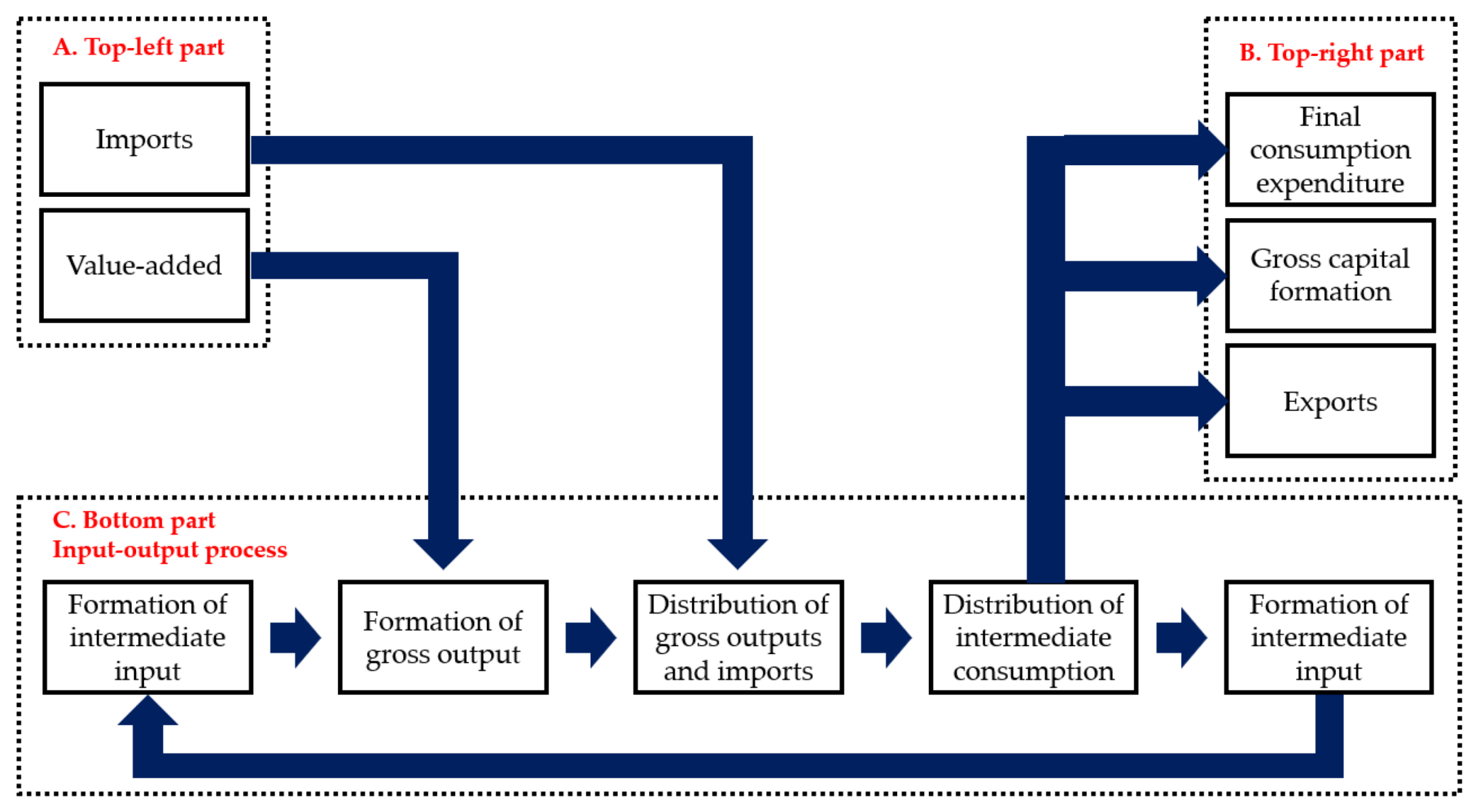
First, we constructed a schematic diagram of the monetary allocation Sankey diagram based on the general structure of a monetary input–output table, as shown in
Figure 1.
This schematic diagram is divided into three parts: (1) the top left part of the diagram, (2) the top right part of the diagram, and (3) the bottom part of the diagram, called the input–output process. We divided the input–output process into four parts: (1) formation of gross output, (2) distribution of gross outputs and imports, (3) distribution of intermediate consumption, and (4) formation of intermediate input. Based on this schematic diagram, we further constructed the general structure of the monetary allocation Sankey diagram with detailed flow information, as illustrated in
Figure 2. The detailed monetary flows in both parts were determined as described below.
The top left part includes two groups of flows: value-added flows (vj) and imports flows (imi). These flows begin from the sources and flow into the input–output process, which is located at the bottom part of the diagram. The input–output process depicts the input–output relationships of each sector. The left part of the input–output process depicts the output formation of sector i, which is the sum of the input j flow (inputj) and the value-added j flow (vj). After that, the output of sector i (xi) diversifies into two flows: the end-use flow (ui) and the intermediate consumption flow (xi,ic). The end-use flow from sector i (fi) leaves the input–output process and flows into the top right part. The intermediate consumption flow from sector i (xi,ic) diversifies into several flows (xij) and further flows into sector j as intermediate consumption. The intermediate consumption flows that flow from sector i to sector j, gather again, and form the intermediate input of sector j (inputj), and flow back to the left part of the input–output process for the formation of the output (xi). The end-use flow from sector i (ui) from the input–output process flows into the top right part. ui diversifies into three flows: the final consumption expenditure flow (ci), the gross capital formation flow (gi), and the exports flow (ei). ci, gi, and ei further gather and form the total of the final consumption expenditure flow (c), gross capital formation (g), and the total exports (e).
In a monetary allocation Sankey diagram, we distinguish between the concepts of “final demand” and “end-use” to illustrate the import flows and exports flows. Final demand is the sum of the final consumption expenditure, the gross capital formation, and the net exports; the end-use is the sum of the final consumption expenditure, the gross capital formation, and the exports. Therefore, the sum of the flows at the top right part is called the end-use.
Although the general structure of the monetary allocation Sankey diagram can be constructed or designed in many patterns, we suggest the use of the pattern in
Figure 2. The imports and value-added are the sources of all the flows; all the flows start from here and flow into the system. Hence, we located them in the top left part of the diagram. The top right part is the end point of the flows, and all the flows gather here to form the end-use. The total value of the top right part equals the top left part. Both values in the top left part and the top right part are important indicators in a macroeconomic analysis; hence, we located them in the top right part of the diagram. The parallel location of the top left part and the top right part provide the information more intuitively. The input–output process is the connection between the top left part and the top right part. Normally, the values of the total intermediate input (or total intermediate consumption) are greater than the total of the value-added products and imports, which should occupy more space in the diagram. As a result, we located the input–output process at the bottom of the diagram.
The monetary allocation Sankey diagram is the direct visualization of the input–output table, showing the monetary flows in the economic sector, which helps us to understand the input–output table. However, the diagram cannot reflect the nexus between the final demand of a specific economic sector (the so-called specific final commodity) and the value-added of each economic sector. Hence, we further applied the monetary allocation Sankey diagram to a specific sector, as outlined in
Section 3.3.
3.3. Monetary Allocation Sankey Diagram for a Specific Sector
To understand the nexus between the specific final commodity and the value-added of each sector, or the contribution of a specific final commodity to the value-added of an economic sector, we can map the monetary allocation Sankey diagram for a specific final commodity. Before this, we need to determine the relationship between them. Although these introductions can be found in input–output method-related reference books, we present the major information in
Section 3.3.1. After that, in
Section 3.3.2 we establish an input–output table for specific final commodities, and the data will be inputted into the monetary allocation Sankey diagram for a specific final commodity.
3.3.1. Introduction of Input–Output Method
In this section, we first introduce the basic aspects of input–output theory, including the definition of the direct input coefficient, and we derive the Leontief inverse matrix. Based on the input–output theory, the nexus among the elements in
Table 1 can be expressed as follows:
We further defined the direct input coefficient
aij through Equation (8):
Equation (7) can be modified into Equation (9), and further expressed in the form of a matrix in Equation (10):
We adjusted Equation (10) to form Equation (11), which clarifies the dependence of each of the gross outputs on the values of each of the final demands:
where
In the Leontief inverse matrix L, L, and lij indicate that the total of product i should be produced and be the intermediate consumption of direct consumption to produce one unit of product j; lij is also understood as the gross output of product i for producing one unit of product j.
As a result, the connection between the final demand (
F) and the gross output (
X) can be expressed as in Equation (13):
The Leontief inverse matrix is the base in the input–output analysis, as it establishes the connection between the final demand and the gross output. More information about the input–output table and the input–output method can be obtained from Miller and Blair [
46].
3.3.2. The Establishment of an Input–Output Table for a Specific Final Commodity
In
Section 3.3.1, we derived the mathematical nexus between various final commodities and the gross output of various sectors. To understand the specific contribution of one final commodity to the value-added of each economic sector, we need to artificially designate a product, assign value to the product, and construct an input–output table belonging to the final commodity.
We first determine the value of the final demand of the specific sector. According to the input–output method, when producing one unit of product
j as the final demand, the value of the total gross outputs of all the economic sectors
i is the value in the
jth column (
lij) of the Leontief inverse matrix. Hence, it is better to set the final demand of the specific sectors as one unit. However, the value of one unit is quite small, which may cause inconveniences when forming the specific input–output table and mapping the monetary allocation Sankey diagram, as the values in the table and diagram will be very small and contain a decimal point. As a result, we decided to set the value of the final demand of the specific sector to 10,000. Equation (14) denotes the final demand of product
i, which is worth USD 10,000.
According to the input–output method, we calculated the gross outputs of all the economic sectors using Equation (15):
After that, we further calculated
xij in the specific input–output table using Equation (16):
where
aij is the direct input coefficient.
Using Equations (14)–(16), we calculated the necessary elements in the specific monetary input–output table and formed a table to describe the input–output process when producing USD 10,000 of product
i as the final demand. We further used the method mentioned in
Section 3.2 to map the monetary allocation Sankey diagram for a specific commodity to illustrate the nexus between the final demand of that specific sector and the value-added of each economic sector.
In addition, exports and imports are part of the final use. Therefore, we can use this method to analyze the impact of changes in commodity exports and imports on the value-added of various economic sectors.
3.4. Data Source
The monetary input–output table for China in 2018 [
47] was adopted as the main data source in this study. This is the latest monetary input–output table released by the National Bureau of Statistics of China as of 17 October 2021.
We reclassified the sectors in the tables into three sectors, as shown in
Table A1. This reclassification is a simplification that enabled the introduction and discussion of the monetary allocation Sankey diagram, and it matches the classification of the sectors in the energy balance table.
4. Results
4.1. The Monetary Allocation Sankey Diagram of China in 2018
We present the visualization results of China’s monetary input–output table in
Figure 3 and
Figure 4, respectively.
Figure 3 shows the monetary allocation Sankey diagram involving three economic sectors, while
Figure 4 shows the monetary allocation Sankey diagram involving 27 economic sectors. It should be noted that
Figure 3 and
Figure 4 are both the visualization results of China’s monetary input–output table in 2018, but we have divided the economic sectors according to different needs. It should also be noted that researchers can classify relevant economic sectors according to their own research purposes. Our classification here is only for reference. Considering that the difference between
Figure 3 and
Figure 4 is only reflected in the resolution of the economic sectors (the classification of economic sectors), in order not to burden readers, we only use
Figure 4 as a case study for the introduction and demonstration of the use of a monetary allocation Sankey diagram.
In
Figure 4, first, let us look at the top left corner of the diagram. There are two main flows. One is the value-added flow of various local economic sectors, and the other is the value of imported commodities. These two flows are the sources of all flows in this Sankey diagram.
Value-added, also known as initial input, refers to the value created by economic sectors in the production process, and can also be understood as the value of the output in the production process exceeding the intermediate input in this process. In the input–output process, the value-added of each economic sector is combined with the intermediate input of the economic sector to form the gross output of the economic sector. The so-called intermediate input refers to the value of the raw materials that are input to the economic sector in the production process. It can also be understood as the cost of the raw materials, and the gross output is the total value of the products of the economic sector. It is also understood that the gross output of each economic sector is equal to the sum of the cost of raw materials (intermediate inputs) in the production process of the economic sector and the value-added (profit, tax, salary, etc.) created by the economic sector.
After that, the commodities produced by various local economic sectors and imported commodities merge to form a commodity supply flow. The commodity in this flow can be used to meet the consumption needs in the entire economic system, including intermediate consumption and final use. Intermediate consumption refers to the consumption of commodities that need to be used as raw materials to be input into various economic sectors for production. After the convergence of the intermediate consumption of various economic sectors, it becomes the intermediate input (that is, the raw material) of a specific economic sector. The final use refers to those commodities that are no longer used as raw materials and put into the production process; they are the flows that leave the Sankey diagram—i.e., they are the sink of the monetary allocation Sankey diagram.
The features of each stage in
Figure 4 are summarized as follows: (1) Value-added: other service sectors, agricultural products, wholesale and retail, accommodation and catering, construction, and transport, storage, and post were the major contributors to the gross value-added. (2) Imports: computer, communications, and electronic equipment; chemical products; machinery; crude oil, natural gas, and other gases; metallic ores were the major imports. (3) Gross outputs: the major gross outputs were other service sectors, construction, chemical product metal ingots, and agricultural products. (4) End-use: the major end-uses in China were other service sectors; construction; computers, communications, and electronic equipment; machinery; vehicles and transportation. (5) Final consumption expenditure: the major final consumption expenditures of China were other service sectors; food and tobacco; wholesale and retail, and accommodation and catering; agricultural products; clothing and costumes. (6) Gross capital formation: the major gross capital formation was construction, machinery, vehicle and transportation, other service sectors, and electrical machinery. (7) Exports: the major exports were computers, communications, and electronic equipment; other service sectors; electrical machinery; chemical products; textiles.
From these monetary allocation Sankey diagrams (
Figure 3 and
Figure 4), we can clearly observe the input–output relationships of various economic sectors in an economy. When the commodity consumption (final use) of specific economic sector changes, it is not only that economic sector that is affected, but also other economic sectors that provide raw materials for that economic sector. Although this feature is not clearly reflected in
Figure 3, if we increase the resolution of the economic sectors, as shown in
Figure 4, we can clearly observe the connections between the various economic sectors. For example, the process of food production requires the input of agricultural products, and the process of producing agricultural products requires the input of chemical fertilizers, and the production of chemical fertilizers requires the input of a large amount of energy. For another example, as one of China’s important economic lifelines, the construction sector not only provides people with houses, but also provides a large amount of infrastructure to the society. If we look back at the economic flow of the construction industry from its final use, we can observe that, to complete these construction projects, a lot of steel (metals) and cement (nonmetallic mineral products) are required as inputs. To make steel requires metal mines and a large amount of coke. Similarly, to make cement requires nonmetallic mines and a large amount of coal. We will illustrate and explain this in detail in the next section.
The visualization of the monetary input–output table can help researchers to quickly recognize the characteristics of the economic system, and it is also convenient for presenting the situation to an audience. However, it also has disadvantages. When we look at the monetary flow of construction products, we can only make reasonable but vague explanations based on the monetary allocation Sankey diagram. Therefore, we also try to give a solution for this problem. We can further map a specific monetary allocation Sankey diagram that only involves a specific commodity for final use, the so-called final commodity. In this way, we can clearly analyze how the demand for final commodities affects the entire economic system. We will introduce this in the next section.
4.2. The Monetary Allocation Sankey Diagram of China in 2018 of a Specific Final Commodity
According to the method described in
Section 3.3, we first calculated the Leontief inverse matrix of China’s economic input–output table in 2018, and then artificially assigned the value of a specific final commodity (set to USD 10,000). Through the input–output method, a new input–output table can be created. The value shown in that input–output table is the economic flow generated in the entire economic system to generate the specific final commodity. Based on this new input–output table, we mapped the monetary allocation Sankey diagram of a specific final commodity. We mainly used construction goods as an example to demonstrate the use of this type of monetary allocation Sankey diagram. The monetary allocation Sankey diagram of other final commodities (26 types) can be seen in
Appendix A.
In
Figure 5, we show a monetary allocation Sankey diagram for construction in 2018. In this diagram, the value of final commodities (construction worth USD 10,000) is the start of the diagram. Hence, we traced the flows back to the value-added from the final commodities.
On the final use side, there was a flow of construction worth USD 10,000 for final use. The gross output of the construction sector was not USD 10,000 because the construction sector also produces some construction for intermediate consumption (USD 403), so the gross output of the construction sector was USD 10,403.
Next, we looked at the gross output of the construction sector. It consists of the intermediate input (raw materials input, USD 7875) of construction production and the value-added of the construction sector (USD 2528). Looking back at the intermediate inputs of the construction sector, we observed that they are mainly cement (nonmetallic mineral products) and steel (metals). We can also trace the intermediate input of cement and steel on the right side of the diagram. So, we know that the production of cement drives the mining of nonmetallic resources, and the production of metals drives the mining of metals.
It is important to note that our retrospective analysis followed the most prominent flow in the Sankey Diagram. We did not focus on the side branches that were separate from the prominent flow. From this, we also realize that the advantage of a Sankey diagram is that it allows us to grasp the overall picture of the system in a short time and grasp the upstream and downstream relationships between various stages. As for the details of the side branches, they are not so prominent in the Sankey diagram. However, we cannot completely ignore minor flows because they may form a prominent flow after they are brought together, especially when we trace all flows back to the value-added of each.
By comparing the value-added of various economic sectors, we determined the value-added that the construction, via final commodities, can contribute to each economic sector. Among them, the construction industry (25.3%) is the highest, followed by other service industries (18.7%) and wholesale, retail, accommodation, and catering (8.3%), and finally the cement industry (7.2%) and steel industry (5.7%). When we conduct a retrospective analysis (observing the significant flows), other service industries and the transportation, storage, and postal industries form insignificant side branches. As they converge to the value-added, they become significant. It can also be explained that, for some economic sectors, although they are not located in the main supply chain, they provide goods and services for several economic sectors. Hence, they may have higher value-added than other sectors.
Due to the constraints of the conservation of funds (see
Section 3.1), the value of the final commodity must be equal to the sum of the value-added of the various economic sectors used to support the production of the final commodity. The support includes direct support and indirect support. For example, the steel sector and the cement sector directly support the production of construction, thereby creating value-added; the mining of metallic and nonmetallic minerals indirectly supports construction and creates value-added, too. In addition, other economic sectors, including other services, transportation, storage and postal services, power generation sectors, etc., also indirectly support construction. Therefore, through a monetary allocation Sankey diagram, we can also intuitively observe the supporting role of various economic sectors on construction as a final commodity. From the perspective of final use, this means the impact of the consumption of construction on the value-added of various economic sectors.
In addition, considering that exports and imports are part of the final use, therefore, through these 27 monetary allocation Sankey diagrams (for specific final commodity) that we have mapped, we can also clearly observe the impact of changes in exports and imports of 27 commodities on the value-added of various economic sectors.
5. Applications of Monetary Allocation Sankey Diagrams: Total Energy Consumption Control in China
As a visualization of the monetary input–output table, the monetary allocation Sankey diagram can help a presenter and an audience to establish efficient communication, so that the audience can understand the information that the presenter wants to present in a short time. We believe that the application of the monetary allocation Sankey diagram is wide. To further illustrate the application of a monetary allocation Sankey diagram in real scientific research or presentation scenarios, we plumb our past research work to illustrate how the monetary allocation Sankey diagram assists us in the study of total energy consumption control in China. Of course, this is just one of many application scenarios; we also used it in other projects and research.
5.1. Background
For a long time, to ensure energy security, reduce pollution, control greenhouse gas emissions, etc., total energy consumption control has been a concern of the Chinese government. In this context, our research team has carried out a lot of research work and gradually developed a methodology to discuss the total energy consumption control issue.
The key to the methodology is to first use the energy allocation analysis method to determine the primary energy consumption responsibility of each end-use sector, and map this result in the form of a Sankey diagram, which we call an energy allocation Sankey diagram. Through the energy allocation Sankey diagram, we can describe the energy supply chain of China, including the entire process of energy: from the supply stage through the conversion stage to the final consumption stage. Therefore, when we introduce the whole picture of China’s energy system to an audience, the energy allocation Sankey diagram is an indispensable tool. With the help of the energy allocation Sankey Diagram, we can effectively show the characteristics of China’s energy system to an audience, especially the upstream and downstream relationship between energy supply, energy conversion, and energy consumption.
Before we used energy allocation Sankey diagrams, we could only use histograms or pie charts to describe the amount or percentage of supply, conversion, and consumption of energy, but not the upstream and downstream relationships among them. There is, therefore, an advantage to the Sankey Diagram in describing this kind of data group with upstream and downstream relationships. To further illustrate this issue, we present an energy allocation Sankey diagram of China in
Figure 6. This Sankey diagram is mapped by the authors and published annually. The mapping methodology and data input of this Sankey diagram can be found in our previous research [
19].
First, we must explain the structure of this energy allocation Sankey diagram. This diagram is divided into three stages from left to right, namely the energy supply stage, the energy conversion stage, and the end-use energy consumption stage. In terms of energy types, it includes raw coal, crude oil, natural gas, several coal products, several oil products, heat, and electricity (including renewable energy electricity and nuclear power). From the stage perspective, in the energy supply stage, in addition to the production of raw coal, crude oil, natural gas, renewable energy power, and nuclear power, it also includes the import of energy; in the energy conversion stage, it involves the production of coal products, oil products, LNG, heat, and electricity; in the end-use consumption stage, it is divided into two major categories, namely, energy consumption in economic sectors and energy consumption in households. In the energy consumption of economic sectors, 28 economic sectors are further subdivided.
Through this Sankey diagram, we can clearly observe that the production of steel (ferrous metal ingots, 17.3%), chemicals (13%), and cement (nonmetallic products, 7%) accounted for 37.7% of China’s energy consumption in 2019. Without using other analysis tools, we can give qualitative analysis results intuitively—that is, the key to controlling China’s total energy consumption is to control those economic sectors with high energy consumption, including the production of steel, chemicals, and cement. Even if we use quantitative calculation methods, such as the Logarithmic Mean Divisia Index (LMDI) decomposition method, our conclusions are similar (see [
19]), including adjusting the economic structure and reducing the proportion of these energy-intensive economic sectors in the economic structure. In any case, if we want to control the total energy consumption, we should reduce the production of steel, chemicals, and cement.
5.2. Questions and Problems
Although our research results have been recognized by peers and published in corresponding academic journals, we are still not satisfied with them. The key question is whether we can get rid of the constraints of economics and control the total energy consumption only by reducing the consumption of steel, chemicals, cement, etc., without any negative impact on the country’s economic development.
China’s economy is still in a stage of rapid development; its industrialization, urbanization, and motorization process has not yet been completed, and a large amount of infrastructure still needs to be built to meet the country’s development needs. Steel and cement are raw materials required for infrastructure construction, while the application of chemicals is more extensive, including the manufacturing of fertilizers, pesticides, and various daily necessities. If we take a more radical approach (especially restricting production) to control the total energy consumption of these economic sectors, it will inevitably have an impact on the economic development of the entire country, leading to other more serious social problems.
5.3. Solutions
We have been looking for suitable ways to express our doubts for a long time. Although we have been engaged in energy policy-related research for a long time, most of the research is on “physical issues”, such as energy supply, energy conversion, and energy consumption, with knowledge based on thermodynamics. As for the link with economics, although we have been involved in it, no in-depth analysis has been carried out. In many interdisciplinary meetings, seminars, or discussions involving energy and economics, we learned about the input–output method. We know that it may be an effective tool to solve our problem, but we cannot use it flexibly because of the lack of relevant knowledge.
The input–output process has similarities to the mapping process of the energy allocation Sankey diagram—that is, in a Sankey diagram, each flow is the output of the upstream flow and the input of the downstream flow. Based on this idea, we designed and mapped the monetary allocation Sankey diagram; the word “allocation” also originated from the energy allocation Sankey diagram. Then, with the help of a monetary allocation Sankey diagram, we were able to take our analysis of the issue of total energy consumption control a step forward.
5.4. Results
Next, we will briefly introduce the application of a monetary allocation Sankey diagram to the issue of total energy consumption control in China.
Through the energy allocation Sankey diagram, we already know that the production of steel, chemicals, and cement is a main consumer of energy. Then, combining with a monetary allocation Sankey diagram, we can observe the allocation process of the gross output of these three economic sectors (steel, chemicals, and cement) in the entire economic system. In this way, we can understand the role of steel, chemicals, and cement in the entire economic system.
Most steel, chemicals, and cement are used in intermediate consumption and as input in other economic sectors, so they can be understood as the raw material input for producing other commodities. Among them, steel is mainly an input for the construction industry; other major uses include mechanical equipment, transportation equipment, and electrical equipment. Chemical products are mainly used in the construction industry, and other major uses include other service industries and agriculture. Cement is mainly used in the construction industry. Then, we further observed that a lot of the gross output of the construction industry—mechanical equipment, transportation equipment, and electrical equipment—is for final use. The construction industry is mainly for the formation of fixed capital. In addition, mechanical equipment, transportation equipment, and electrical equipment are used for export.
Hence, we can be sure that, although the production of steel, chemicals, and cement consumes a lot of energy, most of these products are not intended for final use but are used as raw materials to produce other commodities, especially construction, mechanical equipment, transportation equipment, and electrical equipment—the final commodities that people need. Therefore, if we need to control the total energy consumption, we should start with those final commodities, especially construction.
Controlling the consumption of construction (including infrastructure) can effectively reduce the consumption of steel, cement, and chemicals, and can effectively control total energy consumption. However, from the monetary allocation Sankey diagram, we should notice that the final use of construction accounted for 23% of GDP of China in 2018 (whereas the value-added of construction only accounted for 7.1%); if the consumption of construction is too tightly regulated, it will inevitably have a significant impact on China’s economic development. This shows that the control of total energy consumption is not only an energy issue, but also an economic issue. If we only control the total energy consumption from the perspective of energy (the energy allocation Sankey diagram), including restricting the production of steel, chemicals, and cement, it will inevitably have an impact on downstream economic sectors. Therefore, it is necessary for us to further introduce an economic perspective (a monetary allocation Sankey diagram) to assist us in our analysis and give a more comprehensive understanding of the issue of total energy consumption control. Moreover, the domestic consumption and export of mechanical equipment, transportation equipment, and electrical equipment are also key commodities for the total energy consumption control issue and have a significant impact on economic development.
6. Feedback from Audiences about the Monetary Allocation Sankey Diagram
Since we designed and mapped the monetary allocation Sankey diagram of China, we have often used it as an auxiliary tool to support our research, especially those energy issues related to economic growth and the adjustment of the economic structure. To examine the interaction and communication effects of the monetary allocation Sankey diagram, our team has demonstrated our research results to scholars and government officials from the fields of energy, environment, economy, humanities, and social sciences, etc., on many occasions. These demonstrations include public presentations, closed-door meetings of research projects, and private exchanges.
The list of the demonstrations of the monetary allocation Sankey diagram can be seen in
Table 2. In accordance with the reviewers’ suggestions, we also quote some scholars’ and government officials’ evaluations of our work to illustrate the necessity and practicability of the research. The practical demonstration results showed that, compared with the conventional introduction and presentation methods of a monetary input–output table, the monetary allocation Sankey diagram has the following advantages:
It can show the whole picture of the monetary input–output table, including all the data involved. The width of the flows varies with the value of the data, and different types of flows are distinguished by different colors. Moreover, the direction of the arrow indicates the direction of flows, so it can intuitively display the forward and backward links of each flow; hence, we can understand the formation and usage of the flows. These advantages enable researchers to grasp the core characteristics of the input–output table at a glance. In addition, they also help researchers to communicate with an audience.
It occupies less display space or fewer slides, as it integrates all the data into a picture. Although it contains a huge amount of data, it can still present the major flows and proportion rate.
Dr. Linwei Ma, an associate professor of the Department of Energy and Power Engineering of Tsinghua University, the corresponding author of this article, and the first author’s doctoral supervisor, has long been engaged in macro-energy systems analysis and energy strategy research.
“Although this research has little theoretical significance, it has important application significance. We have been engaged in energy policy research for a long time, but we only have an engineering background. There is a lack of understanding of economics. In fact, many scholars with an economics background are engaged in similar research. They study energy based on economics, and we study economics based on energy engineering. Although we have been advocating interdisciplinary research, many years have passed and the gap between disciplines still exists. One of the key problems is that scholars having different backgrounds lack a common academic language. This is why we learned the mapping skill of an energy allocation Sankey diagram from Professor Julian Allwood, to visually show the full picture of the energy system to scholars with non-energy backgrounds, so that they can easily understand our research. I believe that the monetary allocation Sankey diagram can also play a similar role. It can be used as a common academic language to convey the views of economists to scholars with non-economic backgrounds. More importantly, current energy policy-related issues are no longer simply energy issues, but an energy–economy coupling problem. Therefore, the coupled application of the energy allocation Sankey diagram and the monetary allocation Sankey diagram will enable policy makers to understand the complex relationship between energy and the economy as a basis for formulating energy policies.”
- 2.
Dr. Xi Zhang
Dr. Xi Zhang, Director of Statistics Accounting Department in National Center for Climate Change Strategy and International Cooperation, China. Dr. Zhang is the second author of this article; he graduated from the Department of Energy and Power Engineering of Tsinghua University and was an early adopter of input–output methods in the department. For a long time, Dr. Zhang has been conducting research on China’s energy issues based on input–output methods and providing policymakers with a basis for decision making. Dr. Zhang has a deep knowledge of input–output methods and has sharply criticized the research of the first author of this article, guiding him to modify the corresponding issues.
“This is very interesting research. If I could have seen this monetary allocation Sankey diagram when I was learning input–output methods, I think I would have been able to understand the network relationship and balance relationship of the input–output table more quickly. The input–output method is not difficult to learn; there is no need to learn esoteric mathematical theories, and the design of the input–output table is very exquisite. It is easy for beginners to think that it is a difficult method. I have communicated with many colleagues and they have the same view as me. The input–output method is a theory that is not difficult, but it is easy to shut out beginners. I don’t know why, but it is the case. When I see this monetary allocation Sankey diagram, I think the answer to my previous question is that beginners lack an understanding of the overall picture of the economic system. Even though economic activities take place around us, we are unable to make the economic system into a miniature model for our observation. Nowadays, the monetary allocation Sankey diagram can be used as a miniature model of the economic system, as an introduction for beginners coming to the input–output method.”
- 3.
Dr. Kexi Pan
Dr. Kexi Pan, associate professor at the School of Social Development and Public Policy of Fudan University and a well-known coal expert in China, has been engaged in research into China’s coal supply chain for a long time, and has calculated data on China’s coal supply and demand. Dr. Pan is also an expert in the field of Sankey diagrams. He has designed and drawn a variety of energy Sankey diagrams, especially coal Sankey diagrams, and has provided them as part of policy recommendations to policymakers for reference. In May 2020, we had an online meeting to discuss the design and mapping of the Sankey diagram. Dr. Pan gave an evaluation of our monetary allocation Sankey diagram.
“A Sankey diagram is indeed a good visualization tool, especially for describing systems that have upstream and downstream relationships. From my experience, normally, when we present to policy makers, we only need to display the energy Sankey diagram as an introduction to the energy system. Everyone can understand it instantly, which saves a lot of introduction time and increases the discussion time. This research work is useful. Although we have been engaged in energy supply chain research, we have also found that a good policy recommendation should be the result of the joint efforts of multiple disciplines. Therefore, we are gradually strengthening our grasp of economics knowledge. The monetary allocation Sankey diagram can serve as the basis for our study.”
- 4.
Dr. Dan Gao
Dr. Dan Gao, associate professor in the School of Energy, Power and Mechanical Engineering, North China Electric Power University. He has been engaged in research on China’s energy policy for a long time and has participated in the research and drafting of major energy-related consulting projects of the Chinese Academy of Engineering, including the “Energy Production and Consumption Revolution” series project. In April 2018, we had a closed-door meeting with Dr. Gao about the energy production and consumption revolution. We used the Sankey diagram to support our research views, and Dr. Gao provided his evaluation.
“Currently, many Chinese scholars are engaged in research related to energy production and consumption revolutions. Among them, a relatively big controversy is that total energy consumption control should start from the production side of the commodity or the consumption side of the commodity. At present, most of the control measures are controlled from the production of commodities, such as controlling the production of steel and cement. However, at the same time, many of our local governments are encouraging real estate developers to build more malls and houses. This is a contradictory phenomenon. In the view of many local governments, total energy consumption control is an energy matter, economic development is an economic matter, and there is no relationship between them. Now, by combining the energy allocation Sankey diagram and the monetary allocation Sankey diagram, we can explain to them the logical relationship between energy and the economy, and help them make appropriate decisions.”
- 5.
Dr. Quan Bai
Dr. Bai is a researcher at the Energy Research Institute of the National Development and Reform Commission of China. He has been engaged in macro-energy system analysis and energy policy research for a long time. In May 2020, Dr. Bai participated in the PhD defense meeting of the first author of this article as a committee member and evaluated the monetary allocation Sankey diagram.
“This research visually demonstrates the problems with China’s energy transition. Although there are corresponding models that can be used to reveal the impact of changes in final consumption on energy consumption in various economic sectors, this model is mainly based on the input–output model. As you said, the concept of the input–output method is complicated. It is difficult for audiences without an economics background to understand in a short period of time. Therefore, I think the monetary allocation Sankey diagram will most likely become an auxiliary tool commonly used by scholars when introducing something related to input–output tables. In addition, your research also has a guiding role in China’s response to climate change issues.”
- 6.
Professor Liqun Zhang
Professor Liqun Zhang is a researcher of the Macroeconomic Research Department of the Development Research Center of the State Council. He has long been engaged in macroeconomic analysis and economic development strategy and planning research. We met Professor Zhang in Yuncheng City, Shanxi Province, China in July 2018 in a conference held by the local government. At the meeting, Professor Zhang expressed his views on China’s economic development, which aroused our interest. Therefore, after the meeting, we specially invited Professor Zhang to conduct a discussion, hoping that he could assist in evaluating our research, as he is a well-known economist in China.
“I often give lectures to local government officers about the macroeconomics situation and medium and long-term economic development plans. Local government officers seldom care about the macroeconomic operations; they care only about local development. For them, infrastructure construction and real estate investment are undoubtedly the best routes to local economic development. This has also promoted the development of those industries that the central government wanted to control, including steel, cement, etc. Therefore, the monetary allocation Sankey diagram intuitively illustrates the relationship between final consumption, total capital formation, exports, and the value-added of various economic sectors. Moreover, I also observe the contribution of construction as final use to the value-added of various economic sectors. From the diagram, I can also clearly see the contribution of construction products to the GDP of the entire country, and through the Sankey diagram of specific commodity, I can see the contribution of each construction product to the value-added of each economic sector.”
Considering that Professor Zhang is a well-known economist in China, we asked him to assist us in checking and reviewing the monetary allocation Sankey diagram. Professor Zhang said,
“The design of this Sankey diagram is very standardized, and it is designed completely in accordance with the basic structure of the input–output table. The stage settings in the diagram are also very reasonable, fully demonstrating the input and output between the various stages. In terms of the visual results of the input–output table, I think it is excellent; there are no theoretical and logical errors.”
- 7.
Mr. Lai Chee Hui
Mr. Lai Chee Hui is a research officer from River Engineering and Urban Drainage Research Centre in Universiti Sains Malaysia. The first author of this article knew him in Malaysia. He is an expert in water resources management in Malaysia. Since his research topics are similar to ours, we often have academic discussions on policy issues. At the invitation of Mr. Lai, we introduced him to our research work on Sankey diagrams, including monetary allocation Sankey diagrams, in August 2017. Mr. Lai affirmed our contributions to the research on monetary allocation Sankey diagrams.
“We have long provided policy recommendations on water resources to the Malaysian government and the Penang state government. But when we are communicating with officials, they often do not understand the full picture of the water resources flows; we need to spend a lot of time introducing it. As a result, we have to reduce our time reporting on the research results in order to increase the discussion time. Therefore, if we can summarize Malaysia’s water resources into a Sankey diagram, it will very likely solve this problem. In addition, although I haven’t used input–output methods before, I know that input–output methods are also used in some studies involving water footprints, but that type of article is not easy to understand for researchers without a background in economics, like me. If researchers can use the monetary allocation Sankey diagram to show the overall picture of the economic system before using the input–output method for related research, it will be easier for us to understand their works.”
- 8.
Anonymous officer from the Development and Reform Commission of the capital city of a province
Anonymous, an officer from the Development and Reform Commission of a capital city of a province in China, is in charge of the city’s greenhouse gas emission reduction issues. In December 2019, we visited the city to have a closed-door meeting with them. We showed them some of our past research results. The official is interested in our research.
“I believe that, with these Sankey diagrams, the communication and collaboration efficiency between officials from different government departments will be greatly improved. When we are discussing greenhouse gas reduction, we often need to listen to opinions from several departments, like economic departments, the energy department, and the environmental department. However, everyone speaks based on their own position, leading to poor meeting quality. It is difficult for authorities to make assessments based on the reports of these officials. I sincerely hope that you can assist us in mapping energy allocation Sankey diagrams and monetary allocation Sankey diagrams of our province and our city. We are willing to provide all the data that you need for your research.”
- 9.
Anonymous, director of the strategic planning department of a state-owned enterprise
Anonymous, director of the strategic planning department of a state-owned enterprise in the energy sector in China. In December 2019, we went to the enterprise’s headquarters for a closed-door meeting with their team and showed them our research results. The director is interested in our research.
“Our job is to formulate the company’s development strategy plan and report to the board of directors. One of the most important steps is to introduce the current overall economic situation in China, including changes in value-added and final use. Although we know that there is a relationship between them, including changes in the amount of final use will change the value-added of various economic sectors, we lack a tool to illustrate all of this. We can only use simple histograms and pie charts to present them, instead of linking them together to form a perfect storyline. Therefore, your research is very inspiring to us. In addition, I also agree with what you said, that the Sankey diagram is indeed a tool that can reflect the relationship between upstream and downstream.”
7. Conclusions
A more user-friendly presentation and analysis method for the economic input–output table is developed in this study. Referring to the applications of the Sankey diagram in energy system studies, we visualized the economic monetary input–output table by mapping it into a monetary allocation Sankey diagram. We first designed the mapping structure of the monetary allocation Sankey diagram according to the general structure of an economic monetary input–output table to establish the data correspondence nexus between the table and the diagram. Secondly, we proposed a method for mapping the monetary allocation Sankey diagram for specific final commodities to illustrate the physical significance of the Leontief inverse matrix and to understand the monetary flows when producing USD 10,000 of commodity from that sector. At the end of the study, we selected China as a case study to demonstrate the practical use of monetary allocation Sankey diagrams. We mapped the monetary allocation Sankey diagram of China (three sectors and twenty-seven sectors, respectively), and the monetary allocation Sankey diagram of specific final commodities (27 commodities). We carefully conveyed the mapping results of monetary allocation Sankey diagram and explained how to use it. In order to further explain how the monetary allocation Sankey diagram assists our research, we combined our actual experience to demonstrate the practical application of the monetary allocation Sankey diagram to the issue of total energy consumption control in China.
The results show that the monetary allocation Sankey diagram is an effective, efficient, and elegant communication tool that can be used to explain detailed economics. Compared with conventional introduction and presentation methods of monetary input–output tables, the monetary allocation Sankey diagram can show the whole picture of the monetary input–output table, including all the data involved in the input–output table. At the same time, the width of the flows varies with the value of the data, and different types of flows are distinguished by different colors. Moreover, the direction of the arrow indicates the direction of flows, so it can intuitively display the forward and backward links of each flow; hence, we can understand the formation of the flows and the usage of the flows. These advantages enable researchers to grasp the core characteristics of the input–output table at a glance. In addition, they help researchers to communicate with an audience. Moreover, the input–output table takes up less display space or fewer slides, as it integrates all the data in one picture. Although it contains a huge amount of data, it can still present the major flows and proportion rate clearly. In addition, we have quoted some scholars’ evaluations of the monetary allocation Sankey diagram.
In the face of global sustainability challenges, the research and practice of many disciplines, such as energy, resources, environment, ecology, sociology, and engineering are increasingly closely related to economic development. The input–output model has become a popular method in these cross-disciplinary studies. A monetary allocation Sankey diagram may be a user-friendly presentation and analysis method for researchers to introduce the economic situation of a region, as it enables researchers and decision makers to see the analytics presented visually, so they can grasp difficult concepts or identify new patterns. Furthermore, they can understand the results of the input–output analysis more easily.
Our research has some limitations. Firstly, the general structure of the monetary allocation Sankey diagram is not unique; we designed the structure based on a multidisciplinary perspective and combined it with our previous research experience. Secondly, we classified the economic sectors into several groups according to the purpose of our presentation. If the classification is too simple, the display will be less meaningful; if the classification is too complex, it may cause audience confusion and prevent the quick grasping of the concepts. Third, although the visualization of the input–output table allows people to have a miniature model to observe the economic system, for audiences who are not familiar with economics, they still need to rely on the presenter’s report to help them understand the diagram, including marking the corresponding arrow or number on the diagram, and using a pointer to guide when presenting.
The Sankey diagram is a visualization tool, and its function is as an auxiliary tool, so that presenters can more efficiently present their views to an audience when introducing research results. In the previous demonstration process, we mainly relied on the energy allocation Sankey diagram to show the audience the whole picture of China’s energy system and used the monetary allocation Sankey diagram to show the whole picture of China’s economic system. As for those less conspicuous side branches, we generally do not introduce them. It is a pity that there is no way to highlight those inconspicuous side branches (insignificant flows) in a Sankey diagram. However, we also need to note that the Sankey diagram is a visualization tool; its role is to attract the attention of an audience to achieve the purpose of communication. If we need to analyze inconspicuous flows, such as energy consumption control in the agricultural sector, a Sankey diagram may not be a good auxiliary tool. In addition, although these streams may seem inconspicuous, they are always present in the original data and can still be viewed at any time when needed.
It should be noted that the authors are all from the Department of Energy and Power Engineering. Although we have some insights into economics, due to the lack of a deeper understanding of economics and input–output methods, we cannot judge whether our research is useful for scholars who specialize in input–output method research. In addition, due to the limitations of disciplines and the authors’ own abilities, it is indeed difficult for the authors to discuss economic issues. This also shows that, when facing a practical problem (such as climate change and total energy consumption control), scholars from multiple disciplines often need to work together to give a satisfactory answer to the problem. Therefore, as scholars with an energy background, we have been exploring tools that can promote interdisciplinary research.
At present, the energy allocation Sankey diagram and the monetary allocation Sankey diagram we draw are independent, and there is no linkage relationship between them. We can only use these two Sankey diagrams at the same time to illustrate the relationship between energy consumption and economic development. Therefore, our next step is to design a Sankey diagram that can fully combine the advantages of these two types of Sankey diagrams. We hope that the primary energy consumption responsibilities of various economic sectors in the energy allocation Sankey diagram can be further allocated to various final commodities based on the economic flows in the monetary allocation Sankey diagram. In this way, we can fully track the whole process of energy since its supply, through energy conversion and end-use consumption, and finally embodied into various final commodities in a Sankey diagram. From this, we can also observe more directly the impact of changes in the number of final commodities on energy consumption. Even so, its core question is whether it can rely on the conservation of energy and the conservation of monetary to connect them closely together in mathematics.


 ,
, 


