
Perception of Color in Architecture and Urban Space

Faculty of Architecture, Wrocław University of Science and Technology, ul. Bolesława Prusa 53/55, 50-317 Wrocław, Poland
Buildings 2023, 13(8), 2000; https://0-doi-org.brum.beds.ac.uk/10.3390/buildings13082000
Submission received: 17 July 2023
/
Revised: 28 July 2023
/
Accepted: 3 August 2023
/
Published: 5 August 2023
(This article belongs to the Special Issue New European Bauhaus (NEB) in Architecture, Construction and Urbanism)
Abstract
:The various colors and color combinations in an urban environment are perceived and experienced individually. The article indicates the important role of color in shaping architecture and urban space. The paper discusses the theories of color harmony as an aesthetic principle in architectural design. The results of the research have proven the significant role of color as an element of the composition of urban space affecting the observer. This translates into the importance of color in architectural design, taking into account the difficulty and ambiguity in predicting color aesthetics; the impact of color on humans; and its cognitive, emotional and behavioral effects. The information and conclusions obtained as a result of the literature studies and the results of the survey gave the basis for determining various color strategies in shaping architecture and the effects that we can achieve in urban space thanks to a well-thought-out, conscious use of colors. The research findings also indicate that it is necessary to supplement architectural education programs with broadly understood knowledge about color and its impact on humans. The implemented activities are a response to current ideas and directions in designing and teaching architectural design outlined and suggested as part of the New European Bauhaus initiative.
1. Introduction
Color has always played an important role in human evolution, and the phenomenon of color has been intriguing people since ancient times. Philosophers, artists and scientists have attempted to classify this phenomenon into a cohesive system. Color was studied in the context of various aspects, as required by its multiple nature. The multiplicity and diversity of approaches continue to this day—the science of color is divided among different disciplines [1]. At present, color science is a broad field of study that includes color in the natural environment, built environments and socio-cultural environments. Among color researchers, we can find: color designers, color consultants, architects, urban planners, landscape architects, interior designers, artists, graphic designers, lighting designers, art and architecture historians, psychologists, sociologists, ecologists, philosophers, scientists, educators, and other professionals with a particular interest in color as an environmental design tool in indoor and outdoor spaces. Part of this field of research is the study of the effects of color on human emotions, cognition and behavior, as well as a deeper understanding of the meaning of color throughout the design process. Research and development in the use of color in environmental design is predicted to increasingly rely on the interaction between scientists and designers [2].
Color is one of the basic elements of visual perception. The environment and its colors are perceived by man, and his brain processes and evaluates the observed information on an objective and subjective basis. Psychological, communicative, and informational impact are aspects of our perceptual assessment processes. Therefore, the goals of color design in architectural space are not reduced solely to aesthetics and decoration [3]. Color has been recognized as important for human needs, not only in the context of decorative or aesthetic values but also to meet the broadly understood human expectations in relation to the architectural and urban environment. Color has a significant impact on the psyche of people—colors can completely change a person’s mood because the brain reacts differently to individual colors. It also affects human emotions, health, well-being, human aura or energy; therefore, it can be helpful in therapy and treatment. Furthermore, color seems to be extremely important in everyday human life and closely related to many life activities, needs and interests of a person. It plays an essential role in daily items and industrial design [4]. The significance of color in everyday life makes it a very important tool for non-verbal communication between people and the environment [5].
Eighty percent of all the sensations we receive through our senses are visual sensations. We perceive colors first. Color is also a characteristic feature of architecture and urban space that attracts the human eye. We notice the color of the building earlier than its shape [5]. Color is an extremely evocative medium with the power to elicit immediate and clear reactions from the observer; hence, it is a language of symbols in both the natural and man-made worlds. Its use in architecture and the built environment radically affects the perception of space and architectural form [6]. The colors experienced perceptually in architecture convey its materiality, spatial context, functional and utilitarian context, cultural context, symbolism, and emotional impact [7]. Color, as a physical property of any surface in the environment, and its attributes (hue, brightness and saturation) are universally the same. However, their meaning may be different in different contexts. Surface colors affect our perception and understanding of a wide range of artifacts—architectural objects and their interiors, works of art, urban spaces and their components, etc. Color, as a surface feature, contributes significantly to the experience of these artifacts. Architects, designers and also users have an intuitive connection with various types of spaces and can decide on their colors [8].
Currently, in the face of a significant degree of urban structure complexity, the role of color as a means and tool for shaping their image is increasing. The color scheme determines the aesthetic values of the urban space composition and emphasizes its functional and utilitarian content [9]. The combinations and diffusion of color environments, corresponding to the diverse functions of individual elements of urban spaces, are conducive to intensifying aesthetic, emotional, synesthetic, associative and symbolic experiences. Color is an important feature of architecture and urban space configuration and the well-being of its users, but considering color choices is a complicated issue because color preferences seem to depend on personal characteristics and psychophysical structure [10]. The highly individual character of the color is emphasized. Almost every generalization made about color can be refuted in practice. We cannot successfully predict people’s reactions to the same color because each person’s experience is different [6]. Critics in architectural reviews often describe color decisions as “difficult” to discuss and evaluate rationally, as they result from personal views that are subjective and unreliable [7,11]. Therefore, predicting the appearance; impact; and cognitive, emotional and behavioral effects that a color will have in a completed architectural space is actually not a simple task [6].
However, in both schools of architecture and urban design, as well as in design studios, color is rarely the subject of serious research and observation. Color often comes at the end of the design process, and the rationale behind the choice of color is almost never questioned. Color is considered secondary to the form and structure of the building [7]. Architectural education rarely focuses on color and its effects. Color is often considered an afterthought, or rather the domain of the interior designer, rejected by modernists at the beginning of the century along with other forms of decoration [6]. Indifference in color preferences for the built environment is no exception in the literature. As one of the reasons, researchers point to people’s unconscious experience of the physical environment and low awareness of the influence of colors [10].
The variation in architectural coloration throughout history, however, suggests an ongoing human fascination with color and a natural process of rediscovering color in architecture and the built environment [6]. Maybe the New European Bauhaus, in its new ideas, will give colors a chance in the search for “beauty” in architecture and urban space since the appreciation of the role of color in architecture is one of the great missed opportunities of the “old” Bauhaus. While the school seemed open to discussing color theories, the overarching goal was color reduction and restraint, with the implication that color was accidental rather than fundamental to the built environment, reserved for art and theory, and too feminine for the power of architecture. On the other hand, Bauhaus teacher Johannes Itten said that: Only those who love color are admitted to its beauty and immanent presence. It affords utility to all, but unveils its deeper mysteries only to its devotees [12]. The importance of color in architecture and urban planning was addressed by the city architect of Wrocław in the years 1909–1924, Max Berg, who argued that the use of color is in accordance with nature: On a foggy, gray day or night, we can see what our life would look like (without colors). (…) Color is not only decoration, color affects the human soul in various ways (…), through the harmony of colors we participate in joyful revelations, we feel emotions that lead to inner elevation and spiritualization, which makes us deeply more perfect and better. (…) It is worth appreciating the influence of color on the human psyche. Serenity and joy of life give a man strength, energy to work, therefore also color, increasing the willingness to act, can prove its servile role. (…) It is the color that triggers the real impact of architecture, color gives the building values appealing to the senses. (…) We should start raising and educating people who are sensitive to color, because a person endowed with such sensitivity is certainly a person with a joyful disposition [13].
Colors are perceived and experienced by people individually in a cognitive, emotional and behavioral context. Therefore, planning color aesthetics in architecture and urban space and predicting its effects is difficult and ambiguous. Color harmony has been considered one of the principles in architectural design. Specifying other color rules and strategies can also help with color decisions. Certain negligence in the field of color design of architecture, resulting in the disharmony surrounding us in urban spaces and the lack of spatial order, gave rise to the need to check how students of the last year of architectural studies perceive color in the urban context. The main aim of the research was to examine the role of color in the composition of urban space as an element affecting observers. Another goal was to explore how color can support architecture and urban space and what effects can be achieved through the intended use of color.
2. Methodology
In order to achieve the research goals, it was necessary to analyze various color compositions presenting the use of color in architecture and urban space. For this purpose, a survey was used as a research method. The following questions in the questionnaire included photos showing architecture in various urban contexts. In each photo, a selected color or group of colors, sometimes combined with patterns, is in some way dominant, distinctive or simply more eye-catching. Pairs of expressions describing opposite feelings appear next to the pictures. Students were asked to mark on a 5-point scale whether the colors of the architecture visible in the photo shots fit harmoniously into the surroundings, integrate with it, or rather disturb it as an intruder.
The survey was preceded by familiarizing students with the issue of ergonomic color and lighting design in architecture. As part of the lecture on ergonomics, students gained knowledge about the phenomenon of color, color perception, color psychology, visual ergonomics and color ergonomics, color wheel, color systems and reference colors, the impact of colors on humans, and the principles of creating color palettes. Students were acquainted with the principles of shaping harmonious color compositions during the earlier Interior Design course.
The results of the survey were the basis for assessing the preparation of graduates of the Faculty of Architecture for architectural design as future architects, being aware of decisions regarding color choices, resulting in harmonious compositions, integrated surroundings and spatial order, and thus beauty all around us.
A professional in the field of architecture and urban design should bring to the project not only specialist, technical and engineering knowledge but also a very diverse “sensitivity to beauty”, which consists of wide awareness and sensitive visual perception, including color perception.
The information and conclusions obtained in the literature research and the results of the survey gave the basis for determining various color strategies in shaping architecture and the effects that we can achieve in urban space thanks to the thoughtful, conscious use of color.
3. Literature Review and Theoretical Framework
3.1. Theories of Color Perception and Color Impact
Empirical observations and scientific research prove that the human reaction to the surroundings in the architectural environment is largely based on the sensory perception of color. These studies confirm that the human reaction to color is total—both psychological and physiological effects of color can be observed [3]. The scheme of the spatial experience of colors is compiled not only by biological reactions to color stimuli but also by the expected activity developed in a particular space, symbolism, associations, personal factors, trends, fashion and style. Color preferences reflect people’s cumulative emotional responses to objects or environmental events and situations strongly associated with particular colors [10].
Color is the basic unit of visual information. Research and analysis of the perception and influence of color can be used to solve many specific problems in the practice of architectural and urban design. Psychological research shows that color not only gives people the impression of warmth and cold but also affects their perception of distance. Various colors have different effects on our consciousness. Among them, colors that appear convex are called advancing colors, and colors that appear concave are receding colors. In-depth research into the ergonomics of color may provide clearer guidance on the use of color in architectural and urban design in the future [14,15].
Color affects our visual perception, causing different impressions. It makes objects seem heavier or lighter to us, moving forward or receding. It makes interiors seem warmer or cooler, calmer or more dynamic, and even sounds seem quieter or louder. We know that color can be used decoratively and symbolically based on cross-cultural customs and practices. The color is also part of the nature survival kit, realizing the functions of camouflage, attraction, protection and warning. There are many theories about color as a means and tool in solving problems in architecture and interior design, and some of them have been scientifically proven [16,17].
On the basis of research, colors have been classified and systematized in various ways, taking into account their psychophysiological effects. The division into “warm” and “cold” colors is the most widespread. Colors such as red, orange and yellow are perceived as exciting and stimulating in addition to their warmth, while colors such as blue, turquoise and green are perceived as calming and relaxing in addition to their coolness. In short, people generally perceive cold colors as soothing and warm colors as energizing [5]. We can also refer to Goethe’s Theory of Colors. Based on his observations of nature, he described red and yellow colors as sunny, warm and active. On the other hand, he defined the blue and violet colors as cold, passive night [18]. These theories are strongly supported by most of the published research findings on color in perceptual and cognitive contexts. There is no doubt that induction of visual warmth by exposure to red light or red paint is deliberately used in a variety of contexts. Men and women of all cultures and ages consistently appreciate this apparent warmth, which can have direct design implications. Architects not only design buildings but also create spaces with specific characteristics, atmosphere and mood [16,17].
3.2. Nature and Colors
Because we are part of nature and we learn from nature, our color preferences are partly influenced by the appearance of colors in nature. Many researchers suggest that color preferences are innate. With the help of mirror neurons, people are constantly reflecting on their surroundings. Therefore, people and their physical environment are constantly interacting with each other. The way color appears in nature can also influence color perception and color preferences in the built environment [19].
In designing color in architecture, we should try to learn more from nature (Figure 1). John Ruskin, an English art theoretician and critic, who closely associated aesthetics with ethics, wrote about the reference to nature in the colors of architecture. His research and work, including his reflections on color, had a profound influence on artists and designers of the Victorian era and also on modern architecture pioneers. He spoke of architecture as an organic entity and encouraged the use of color through the observation of nature. In his book “The Seven Lamps of Architecture”, in the chapter “The Lamp of Beauty”, he wrote: And if, as we looked to Nature for instruction respecting form, we look to her also to learn the management of color, we shall, perhaps, find that this sacrifice of intricacy is for other causes expedient. (…) First, then, I think that in making this reference we are to consider our building as a kind of organized creature; in coloring which we must look to the single and separately organized creatures of Nature, not to her landscape combinations. Our building, if it is well composed, is one thing, and is to be colored as Nature would color one thing—a shell, a flower, or an animal; not as she colors groups of things [20].
Architecture researchers analyze color manifestations in contemporary architectural solutions in line with the trend of eco-architecture, both in terms of traditional technologies and new eco-technologies, with an indication of new, experimental solutions and unique, completely new colors resulting from them. Together with the idea of an organic city and introducing nature into cities, the urban landscape can be transformed into environmentally friendly eco-structures of various scales and colors. The color appearing on the facades can be a changeable element that evolves over time, creating the image of an architectural object [21].
Changes in the color scheme of the facility, resulting from organic materials and natural cycles, reflect the relationship between architecture and biology. The changeable, colorful image of the object is caused by processes such as plant vegetation cycles, photosynthesis, biodegradation and rainwater absorption. Creating unique color solutions for images of objects can result from recycled construction and finishing materials (e.g., brick, wood, copper) or new experimental technologies (e.g., hemp concrete). In addition to the time factor, an important element in the process of changing the color of materials is the impact of environmental factors, including the nature of natural lighting. We can use unique color solutions in architecture: facades made of hemp concrete; algae panels; and vertical gardens, green walls and green roofs. Unlimited color compositions are created by plants and their species, color, size, texture and form. We can shape and combine them in various ways. We can obtain the effect of one or multi-colored surfaces that cyclically change their appearance depending on the vegetation cycle of plant species. More or less colorful patterns can be the result of combining plants with materials such as stone, wood or ceramics. Designing based on native and traditional materials and their colors and textures affects the local, regional character of architecture and its harmonious relationship with the landscape [21].
3.3. Sociocultural and Environmental Aspects of Color Perception
In different spaces, it can be observed that colors are used according to cultural standards, patterns and customs. The Netherlands has its typical brown pubs. Sweden has its wooden huts and barns, which are often painted the typical falun red. Greece has its white buildings with blue roofs. Certain social and cultural phenomena can influence color preferences for a particular physical environment. Not surprisingly, many researchers have found that color preferences depend on culture. In addition to culture, time is a factor in color preferences. Trends in preferred colors change over time, and the uses of colors in architecture also change [19].
Within the same culture and time, different attitudes and perceptions of colors can be observed depending on the context: in a neighborhood with bright Victorian facades, pink front doors might be acceptable, while the same pink color is not acceptable in suburban areas. With regard to color preferences, the relationship between the color of building facades and the environment is more important than the color itself. Color perception depends not only on the overall image of the space but also on variables such as changing daylight. Therefore, the same colors are perceived differently in different environmental and climatic conditions. In sunlight, all colors appear more chromatic. The influence of context varies with color and light [19].
The meanings and effects of colors are environmental context sensitive. In different circumstances, the same color can have a surprising or even opposite meaning. Color effects vary greatly depending on their attributes, such as hue, saturation and brightness. The differences in the three color parameters make it possible to distinguish and identify an object in space [9]. Each of the color attributes can affect perception. Factors such as view distance and angle, type and amount of ambient light, the presence of other colors in the immediate background, and the general environment also have a significant impact on color perception.
Scientific evidence shows that personal characteristics such as age; gender; ethnicity; culture; and the type of work, knowledge and experience also influence the perception of color [15]. While color is sometimes classified within the aesthetic field, it is more than just aesthetics. Color conveys important information, meanings and messages. Color can affect people’s behavior and action [15].
3.4. Color Interest in Contemporary Architecture
Do the theories of color find their reference and application in architectural design? Do the universal principles of color harmony apply to architecture and urban space? Is the choice of colors treated by architects rather intuitively? To answer these questions, it is worth following the universal principles of color harmony and color combinations. Recognizing the ability to use color among students and practitioners of architecture is particularly important for architectural education [5].
There is a theory in design that people respect and care for what they find beautiful and pleasing. Pleasure and satisfaction from visual sensations are usually related and result from the amount of stimuli that a person can receive from the object of perception [22]. Until recently, colors as visual experiences were not popular and welcome in architecture. Modern architecture has taught us that the use of colors, especially artificial ones, expresses a lack of good taste [23]. On the other hand, the phenomenon of using colors in contemporary architecture has its roots in the modernist movement and has evolved along with technological progress and development, especially in material technology. Studies of the colors of architecture in the early 20th century show that, apart from the “white architecture” trend commonly associated with modernism, other tendencies were also present in that period. The colors of the facades of the buildings were the result of natural materials, such as stone and brick, as well as the use of paints and plasters dyed in the mass, allowing for multi-colored, often contrasting color combinations. The sources of interest in multicolored compositions in the architecture of the first half of the 20th century were painting trends—impressionism and especially expressionism. The main propagators of the bold use of color on facades were German architects: Bruno Taut, Ernst May and Otto Häsler. The following words were included in their manifesto supported by thirty-six designers: We, the undersigned here (…), do not want to build and see colorless houses anymore. (…) Paint is not more expensive than plastic decorations, but the color expresses the joy of life [13].
Color is a deeply emotional topic. For most of us, it is also a very personal experience. Each person has a unique, conscious or unconscious reaction to color, which is developed internally through experiences, associations and sensations. The lack or insufficiency of this interaction, resulting from the experience of architecture devoid of colors and their power, is one of the reasons why a significant part of contemporary architecture and urban spaces is not satisfactory and, at the same time, is not fully appreciated by users. Is it possible to revive color in architecture based on general color theory and general aesthetic principles? What is an effective way to use color in the design of architecture and urban spaces?
Discussions about aesthetics in architecture usually focus on form, material, size and composition. Opinions that a good architectural design should be monochromatic are also not accidental. Color decisions usually come after all other steps in the design process [23]. The secondary nature of color in architecture can be an expression of modernity, fashion, style, tastes or the result of movements that call for the honest and true use of natural materials with their natural color tones (modernism, brutalism, etc.). The use of natural, material colors found in concrete, glass and metal, celebrating chromaticism-free minimalism, has dominated architectural thinking since Le Corbusier [23]. A distinctive, controversial, short-lived trend toward colorful architecture emerged in the 1980s. However, the use of poor-quality facade cladding that was not resistant to sunlight and other weather conditions, as well as inharmonious color compositions, did not bring much good to urban spaces. On the contrary, it aroused great fear of colorful architecture, especially on a large scale. Since then, color, apart from achromatic white, black and shades of gray, has been conspicuously absent from architecture and urban space. It was limited to the details.
Architects often say that colors fascinate them, but they cannot use them too boldly. They do not want to discourage potential investors, who often impose their own color preferences. Clients show no interest in strong colors, and in the architectural community, colorful designs are often considered kitschy. That is why many designers, in order to avoid confrontation with customer expectations and ostracism in their industry, ultimately decide on safe achromatic solutions. They choose the colorlessness that makes our cities monotonous, sad and boring [5].
Taking into account contemporary ecological trends in architecture and biophilia, we try to design in harmony with nature, talking about sustainable architecture. However, nature is not monochromatic; it is rich in colors, shades and tones. The play of monochromatic forms, or even the play of light and shadow, is certainly not the only way for a successful architectural composition and the only means of expression in contemporary architecture. People see, feel and appreciate colors, so a thoughtful introduction of colors to architecture, which is the environment of human life, seems to be absolutely justified [23].
Furthermore, color can become the most significant, distinctive and noticeable feature of a building, a group of buildings or an urban space. The power of colors is determined by their hues, saturation, brightness, arrangement, proportions, types of contrasts, etc. Sometimes one color can have a significant influence, and sometimes we need a successful combination of many colors. Therefore, it is important to discuss the principles, examples and possibilities of using colors in architecture to ensure their conscious and responsible selection and design in the future.
3.5. Color Harmony as a Principle in Architectural Design
Shaping harmonious color compositions is still a rather poor field, requiring exploration, analysis and experience, which could lead to the development of certain rules and guidelines helpful in designing good colors in architecture. The difficulty of predicting the actual appearance, impact and effects of color in a completed architectural space may be one of the reasons why the role of color in architectural design is often neglected. The general task of designing architectural colors is to reconcile the function of color (indicative, symbolic, aesthetic) with the functions of space and its elements [6]. In the subsequent phases of the design process, the architect must face the following questions: How can color support the functions of the space? Which color composition will harmonize best with the surroundings? What will be the reaction of the observer/user? The designer’s answers to these questions may be based on a combination of previous experience, generalizations, design evaluation, or guesswork. They can also be based on certain clear guidelines resulting from specific rules of color harmony.
The so-called “laws of color harmony” have intrigued artists, scientists and researchers from various fields for a long time. Some of them, such as Isaac Newton, searched for the causes of colors. Others, such as Johann Wolfgang von Goethe, were more focused on color effects. From the beginning of the 18th century, a dynamic search for a comprehensive system of color order and color harmony is visible. We can find interesting attempts to visually organize colors—from simple circles to multi-layered pyramids and spheres, and also from logical systems to those based on human feelings and emotions. Numerous color charts and tables appear in the history of art and science. In general, the history of color theory tries to find the laws of harmony and aesthetics in color schemes. However, after years of discussion and dilemmas, nothing can be considered an absolute right. Nevertheless, we can discuss the guidelines, principles and main assumptions on which the “harmony of colors” is based. The relationship between shades, as well as their brightness and saturation, are of the greatest importance [22,23]. A balanced relationship between complementary colors is taken as the first rule of color harmony. Color harmony is the effect of combining two or more colors in such a way that they are perceived and felt together as one pleasant experience. This harmony is full, continuous, natural and intuitive. Each color is felt naturally in relation to the others—none of them stand out from the rest. Harmony in the composition is created by the relationship between colors, not individual colors [22].
John Ruskin writes in the chapter “The Lamp of Truth” of his book “The Seven Lamps of Architecture” about the harmony of colors in architecture: The true colors of architecture are those of natural stone, and I would fain see these taken advantage of to the full. Every variety of hue, from pale yellow to purple, passing through orange, red, and brown, is entirely at our command; nearly every kind of green and gray is also attainable: and with these, and pure white, what harmonies might we not achieve? Of stained and variegated stone, the quantity is unlimited, the kinds innumerable; where brighter colors are required, let glass, and gold protected by glass, be used in mosaic—a kind of work as durable as the solid stone, and incapable of losing its lustre by time—and let the painter’s work be reserved for the shadowed loggia and inner chamber [20]. He writes about architecture that its color should be as constant as its form. I cannot, therefore, consider architecture as in any wise perfect without color. Farther, as I have above noticed, I think the colors of architecture should be those of natural stones; partly because more durable, but also because more perfect and graceful [20]. And in the chapter “The Lamp of Beauty”, he writes: in all cases it is a safe rule to simplify color when form is rich, and vice versâ [20].
Max Berg, the city architect of pre-war Wrocław, commented on the color design in the following way: The color composition should always respect a certain guiding principle, the illustration of which can be found in all perfect realizations. (…) At least one of the primary colors should play a dominant role. (…) Small areas should be covered with colors of the greatest intensity, while large areas should be harmonized with the surroundings through the value of brightness [13].
When analyzing the use of colors in architectural design, it should be noted that harmony is perceived as more pleasant than chaos or dissonance. Harmony is associated with beauty, which is not only a short-lived experience but has the power of repeated attraction [24]. However, harmony is not necessarily more interesting, intriguing or delightful. Design concepts can also use dissonant and even disturbing color combinations. Therefore, a more purposeful and comprehensive term in design is “color effects” and not just “color harmony”. Before choosing and combining colors in the project, we should know what goal we want to achieve. It can be the need to ensure high visibility or accentuation, the intention to emphasize elegance, prestige and luxury. It can also be a desire to introduce an element of surprise, a suggestion to evoke associations or delight [22,23]. Regardless of the purpose and intended effect, the universal principles of color harmony can be considered timeless and useful as a starting point. All elements of the color combinations and compositions; color characteristics and parameters, such as hue, saturation and brightness; and other factors, such as placement, proportions, spacing, contrasts and accents, should be taken into account because they contribute to a harmonious effect [22,23].
3.6. The Effects of Color in Architecture and Urban Space
In addition to functional and aesthetic tasks, colors in architecture and urban space should meet the impression and emotional needs of users and provide appropriate mental stimuli and feelings, primarily conducive to satisfaction and well-being. Various types of architecture were examined, taking into account color in terms of its impact on different mental states of a person. Mental tension (excessive emotional agitation associated with a strong feeling of unpleasantness) may be caused by the introduction of contrasting colors and strongly emphasized corner forms, the use of large scales and extreme contrasts, and unstatic or unbalanced composition. The feeling of relaxation (slight arousal combined with a feeling of great pleasure) can be induced by avoiding strong contrasts while introducing soft, flowing forms; soft light; and related colors, maintaining order in the environment and using small and understandable scale elements [25].
Color in architecture evokes direct perceptual responses in humans, such as visual impressions. At the same time, it can cause side effects of behavior, such as increased emotional reactions that regulate activity. We can discuss the stimulating aspect of color in the environment [25]. Despite differences in individual color perception, some reactions to color shades are common to all people. As it was mentioned earlier, science indicates various ways in which color affects a person—cold and warm colors (cooling and warming), near and far (approaching and distancing), and light and heavy (giving lightness and heaviness) [9]. Many of these characteristic, typical associations can be used in composing urban spaces. Because warm colors tend to move closer in space, while cool colors recede, a space surrounded by warm-colored facades appears smaller, while a similar space surrounded by cool-colored facades appears larger [26]. Based on the effects of colors, it is possible to regulate and organize the climate and atmosphere of urban spaces in a planned, purposeful and consistent way—evoking a state of satisfaction, delight, happiness, joy, relaxation, calm, etc. It is possible to direct color effects in urban space in order to evoke specific feelings, impressions or emotional associations of the observer and to create color compositions that favor various moods. Color compositions can be adequate to the function and purpose of a given space—work, rest, recreation, fun, entertainment, celebrations and holidays. Colors can also determine the ease of adaptation of the user in a specific environment. Color can harmoniously introduce space, simplify orientation, communication and reaching the destination. It can also cause chaos and confusion. Thanks to its strong psychophysical impact, color significantly affects the assessment of spatial composition—both in a positive and negative sense. Therefore, architectural color solutions cannot be related only to individual, separate objects but should harmoniously integrate the entire spatial environment. We can discuss a certain organic correlation of shapes and colors. Color as an element of the urban space composition should complement the form in the mutual relations of space and buildings, taking into account shapes, scale, proportions, divisions and textures [9].
Urban space is worth analyzing from the level of passers-by. Although open space is usually the most eye-catching, pedestrians also notice various color accents—vibrating, patterned floors of squares and streets; benches; lanterns; hydrants; signboards; and many other small elements that create a unique atmosphere of the place. Curiosity and interest of passers-by are aroused by everything that stands out in space. People need contrasts and accents that make the street not seem endless, boring and tiring. The extraordinary art of designing urban space is the ability to enhance the diversity and liveliness of the street by using the colors of exhibitions, advertisements and small architecture that appeal to the imagination of observers, and the real mastery is the ability to match the colors of buildings and small space components [27].
A specific urban space can be considered compositionally as a single structure or a system of structures. These structures may resemble large-scale interiors with more or less defined delimiting and separating partitions—walls, ceilings and floors. Building facades, frontages, walls, fences and dense rows of trees create partitions in urban space. Surfaces of various types covering squares, streets and other paved or unpaved pedestrian, driving and green areas can be defined as floors. Ceilings and vaults in urban space are not only the sky and clouds but also the crowns of tall trees, roofs, cornice lines, installation and lighting structures, etc. Elements of small architecture, such as monuments, fountains, sculptures, benches, lamps, plant arrangements and pots, are complementary. The colors of each object in this complex structure of the urban interior build the entire composition and affect its users [9]. The character of the urban space is also created by materials, textures and details. The type of materials from which a specific color is derived, the type of surface finish (glossy or matte, smooth or rough, reflective or absorbent), patterns, perforations and openwork, as well as the transparency of materials translate into lighting effects—light penetration and the play of light and shadow. The dynamics and variability of color compositions depend on natural and artificial light, season of the year, time of day and weather conditions. The light changes the color of the sky, air and all architectural elements. The image of urban space, apart from the color of “permanent” objects, is also influenced by the colors of variable and dynamic components. Advertisements, neon signs, posters, information and road signs, moving vehicles, people and their clothes, plants changing during the year, rain, snow, and wind—all these elements affect the final color perception of architecture and urban space [9,26].
Venturi, Scott Brown and Izenour wrote about Las Vegas signs that use various means of communication and persuasion—words, images and sculptures. Signs send visual messages and cues to visitors day and night. The same signboard is a multi-colored sculpture in full sun, a dark silhouette against the light and a light source at night. It rotates during the day and turns into a play of lights at night [28].
Color and its perception affect the imagery and readability of cities. Color, in addition to shape and composition, can facilitate the creation of perfectly recognizable, well-organized, useful mental images of the environment. It can also be called readability or visibility in a broad sense, when objects can not only be noticed but are perceived by the senses clearly, deeply and intensely [29]. Readability encourages exploration, indicating where we are and where we are going [30].
The interplay of color with other environmental characteristics contributes to the problem of evaluating and predicting the appearance and psychological effects of color in architectural and urban design. Color in an architectural context is perceived within the parameters of space, time, movement and changes in the environment. The colorful image of space is created by separately perceived views and their coherent whole. Color impressions are the result of the complexity of various elements:
- -
- Arrangement and interaction of surfaces, solids and structures;
- -
- Properties of materials (surface finish, texture, pattern, structure, transparency, permeability, absorption, reflection, etc.) affecting their color appearance;
- -
- Lighting conditions, light quality and variability;
- -
- Viewpoint and movement of the observer [6].
As a means of artistic expression in architecture, color can also introduce a visual quality to urban space based solely on the aesthetic composition of colors, without entering into their semantic meanings, which are dependent on multiple interpretations of the observer:
- -
- Color can affect the perception of the visual properties of forms, articulation and details in architecture;
- -
- Color can be used to signal and describe the function of a building;
- -
- Colors can be arranged/matched considering their value and beauty in themselves [31].
These strategies should complement each other. The most interesting color combinations effectively combine them. A strategic color system is essential to understand, analyze and create colorful architecture. It can also be helpful to use color as an easy solution to various architectural problems. However, color in architecture and urban space should not be treated purely synthetically and aesthetically. Colors are associated with important ethical, symbolic and cultural meanings and values [31]. Therefore, including them in architecture may be a response to the idea of holistic and inclusive design promoted by the New European Bauhaus.
4. Overview of the Survey
As part of the study, a survey was conducted among final-year students at the Faculty of Architecture to check their perception of color in an urban context. The survey was carried out in the period from February 2022 to March 2023 and covered two successive years of students. The questionnaire questions present photographic views of architecture in various urban contexts. On each of them, a selected color or group of colors, sometimes combined with patterns, is in some way dominant, distinctive or simply more eye-catching. Below the photos, there are pairs of terms describing opposite feelings. Students were asked to assess and mark on a 5-point scale whether the specific color scheme in each photo fits harmoniously into the environment, integrates with it or rather disturbs it as an intruder.
The survey was preceded by familiarizing students with the issue of ergonomic color and lighting design in architecture. As part of the lecture on Ergonomics, students gained knowledge about the phenomenon of color, color perception, color psychology, visual ergonomics and color ergonomics, color wheel, color systems and reference colors, the impact of colors on humans, and the principles of creating color palettes. Students were acquainted with the principles of shaping harmonious color compositions during the earlier Interior Design course.
The results of the survey were the basis for assessing the preparation of graduates of the Faculty of Architecture for architectural design as future architects, being aware of decisions regarding color choices, resulting in harmonious compositions, integrated surroundings and spatial order, and thus beauty all around us.
The survey was entitled: Color in architecture and urban space. The questions were preceded by the following introduction: Different colors and color combinations in an urban environment are perceived and experienced individually. They evoke different impressions and different kinds of emotional reactions. Feelings of confusion, stress or depression can result from the use of obscure visual patterns and disharmonious color schemes, while harmonious and contextual combinations of patterns and colors can stimulate positive emotions and eliminate visual disturbances. In architecture, color is expressed in materials, textures and lighting, not just in paint. This fact creates a new dialectic between form, space, structure and light. Psychological experiences on real urban scales may not be adequately reflected by architectural designs and color palette plans because environmental conditions are dynamic. Color perception depends on many factors—season, time of day, weather conditions, natural and artificial lighting. It also depends on the context of the environment. In part, the perception of color may also depend on the mood of the observer. Below, there are photo shots of architecture in various urban contexts. On each of them, the selected color or group of colors, sometimes combined with patterns, is in some way dominant, distinctive or simply more focusing. Please mark on a 5-point scale whether a given color and design harmonize with the surroundings, integrates with it, or rather disturbs it and becomes an intruder.
5. Results and Discussion
The questions of the survey were answered by 88 respondents—students. Students assessed 18 photographic shots showing architecture in various urban contexts, various locations, at different seasons and times of day, in various weather conditions, and in various natural and artificial lighting. The characteristic color or group of colors that were assessed resulted from the finish of the facade—the color of the plaster, cladding, paint or roofing. Sometimes, it was a natural feature of the material used in architecture. Sometimes, the color covered a larger surface; sometimes, it was a characteristic detail, such as an accent. Sometimes, it was smooth and undisturbed, or, on the contrary, it was associated with patterns, ornament and articulation. The assessed architecture includes both contemporary and historic buildings, more or less known, with various purposes and functions (residential, hotel, office, museum, gallery, exhibition, show and sports, recreation and entertainment, commercial, educational and sacral). In some photos, the verified colors were part of small elements complementing the urban space, part of small architecture. Important information is also the fact that the photos in the survey were not described (the location was not indicated). Therefore, the perceptions, observations and assessments of students regarding the color scheme could also be related to their previous experiences and knowledge of specific examples of architecture (the opinions were not necessarily based only on the visual, impression perception and sense of aesthetics and beauty). Students marked their grades on a scale from 1 to 5, where 1 means “harmonious and integrating” and 5 means “intrusive and disturbing” (Figure 2). Table 1 shows the assessed photo shots in order from 1 to 18 and a summary of the evaluation results on graphs.
5.1. Color Composition Perceived as Very Harmonious
In picture 17, which the students chose as one of the most harmonious color compositions, we can see a characteristic color red, appearing in the window recesses and sills of brick buildings that are part of Nikiszowiec, the historic working-class housing estate in Katowice, the capital of Upper Silesia, a region located in the south of Poland. Nikiszowiec was built in the years 1908–1919 as a workers’ housing estate for miners of the nearby mine “Wieczorek”. Currently, it is a unique and fully preserved example of a historic patronage estate. It consists of a complex of nine brick residential blocks with various architectural details. The distinguishing element of the buildings is the red color mentioned earlier. Miners brought red paint from the mine (in the mine, tunnels and corridors were marked red) to paint window reveals and window sills in order to protect them from dirt (painted ones were easier to keep clean). For this reason, the red color has become a distinctive feature of the estate. It makes it recognizable and makes it a “symbol” of the city and region/area. Nikiszowiec is a place under conservation care (as a historical monument) and is protected due to its historical and cultural values. The red color appears here as a historical and cultural value in architecture and urban space. Students appreciated this value together with the harmonious color composition resulting from the combination of a distinctive red color with a natural red shade of brick, which was a traditional, local material and commonly used in Upper Silesia at that time. This is an example of using the color tone resulting from the nature of the building material.
The students also appreciated the color composition in the urban space presented in picture 10. It shows a commercial passage located in the center of Washington, between 9th and 11th Streets NW. It is a visitor-friendly public space, surrounded by shop windows of luxury boutiques of world-famous designers, restaurants, cafes and museums, complemented by greenery, fountains and small architecture. The eye is drawn to the weaves of characteristic colors visible on ethereal, semi-transparent textile ribbons/voiles suspended above the passage. Delicate, pastel colors interpenetrate with warm light, which is provided by countless small bulbs. An ephemeral color and light installation suspended in the space between the buildings creates a more human scale of the passage. Its lightness, translucency and illumination make the passage space still open, not overwhelmed by anything. Colors based on pastel shades of pink, turquoise and orange are perceived as very subtle and pleasant both for the eyes and for the spirit. The composition, supplemented with lamps and lighting of exhibitions, creates a gentle, almost festive mood in the space. The positively assessed color composition is here an element that complements the urban space. In addition to functional and aesthetic tasks, it meets the emotional expectations of users and promotes satisfaction and well-being.
Students also admitted the color charm of the late Victorian row houses located in San Francisco’s Haight-Ashbury district (photo 11). They were rebuilt after 1906, after the cataclysms of the earthquake and fire, thanks to which we can still admire the colorful decorative facades. They are probably the most famous examples of Victorian and Edwardian architecture in San Francisco (besides “The Painted Ladies” and row houses in Alamo Square). Details in the form of Victorian turrets; bay windows; sculpted window and door frames; intricate cornices; rustication; and, above all, lively, pastel colors are associated with the identity of the place, its history and culture. Awareness of San Francisco’s aesthetic heritage has influenced the development of a number of guidelines to preserve it and include it in future projects. Even at present, experts in Victorian and Edwardian architecture care about its protection and conservation, supporting the adaptation of historic buildings to modern lifestyles and preserving and respecting their unique features and past [30,32]. The impressive color composition of Victorian buildings and their details, evaluated very positively by students, appear here as a historical and cultural value in architecture.
The students found the colors of the buildings harmoniously fitting into the spatial context in image 6, showing the high-rise Encore and Wynn hotels in Las Vegas—shiny buildings covered with glass resembling copper sheets. Mirror glass curtain walls are segmented with a radius so wide they appear as one smooth curve. Both hotels are almost identical and set at an intriguing angle to each other. The facade insulated glass is dark brown and coated with a high-performance Low-E coating. The building’s color is chameleon-like, sometimes almost black, sometimes glowing rich bronze or copper. This is likely due to the moderately reflective nature of the Low-E coating. As the sky and weather change, the glass also changes, but subtly. The cream-colored cover panels create elegant horizontal lines on every second floor. All other mullion lines are dark to blend with the glass [33]. In the photo, the warm brownish colors of the modern architecture of Encore and Wynn harmonize with both the grays of the cloudy sky and the beige of the classic architecture of the Palazzo hotel in the background. The color, appreciated by students, in addition to the shape, size and uniqueness of the two complementary buildings, is one of the features that distinguish them in the Las Vegas space, making them recognizable and memorable and making them a point of reference (as a landmark). Colors resulting from the applied facade technology, causing its variability under the influence of light and weather conditions, also become a means of the interactive design of architecture and urban space.
5.2. Color Composition Perceived as Harmonious
Photo 4, showing a fragment of the Walt Disney World Resort in Orlando, Florida, was also highly rated in terms of colors harmonizing with the surroundings. The characteristic architecture of the Swan and Dolphin Hotels matches the fairy-tale image of Disneyland. The buildings complement Florida’s tropical landscape. On the exterior walls of the main structures, we can see hand-painted murals in colors that represent the lush greenery of Florida. While most Disney World hotels simulate actual places from the past or far away, these two are based on a pop image—a composition of distinctive colors, ornaments and forms of superscale creatures that gave the hotels their names. The buildings of the hotels represent the colorful architecture of fairy tales, cartoons, comics and animated films, the so-called “entertainment architecture” characteristic of theme parks, amusement parks and shopping malls [34]. The combination of saturated, complementary colors becomes an element of entertainment and fun in architecture. The colors enrich the decorative forms, details and general style of the objects, emphasizing the scenographic nature of the entire composition.
In the group of pictures showing color compositions, which were recognized by the students as harmoniously referring to the environment context, there was also photo 5. It shows the intriguing facade of the Data Center office building located at 45 Parliament Street in Toronto, Canada. The two-tone “layered” facade alludes to the rich local context of clay brick architecture in the historic Distillery District through its reddish textured surface. Different combinations of flat, smooth and ribbed ceramic “baguette” panels cover the glass base, creating a multi-colored, patterned, dynamic puzzle. The facades have been designed to pay homage to the old computer technology of “punched cards” with their images. They refer to the designs of “machines for comparing ideas” by Semen Korsakov from the 1830s. He was known for his early involvement in information technology, including the ability to use machines to search, store and process data and “enhance natural intelligence”. A contemporary interpretation of the project that meets the current needs of the building, in the form of a modern version of the terracotta facade, pays tribute to both the surrounding historic buildings and contemporary architecture using brick as the facade material [35]. The color, positively assessed by students, appears here as a historical and cultural value in architecture. At the same time, it indicates and supports the function of the building, symbolically describing and emphasizing its purpose.
Another image perceived by students as a harmonious color composition is photo 8, which shows the building of the enclosed amusement park in Las Vegas—Adventuredome Indoor Theme Park. The grand facility, with many entertainment attractions, is covered by a large glass dome. The cover of the dome is made of insulating glass tinted pink and is based on a structure in the form of a turquoise–pink spatial frame (to limit the structural pillars inside the dome). The iridescent sheen of pink fits well with the matte white of the dominant block of the neighboring Circus Circus hotel, with which the Adventuredome Indoor Theme Park forms a functional whole. The shot also includes greenery typical of Las Vegas and colorful advertisements on the fence, completing the whole composition. The color scheme, closely related to the function of the building, was positively assessed by students and recognized as consistent with the idea of entertainment architecture and theme parks. The context of the place played an important role in the evaluation of color composition.
The students also appreciated picture 12, showing a combination of colors with a dominant shade of orange, which complements the upper part of the Angel City apartment building located in Przedmieście Oławskie in Wrocław. The expressive orange color is strongly marked here. It dominates and stands out against the background of neutral white and gray historical and modern buildings. However, the students assessed this color composition as harmonious. Although the color itself is quite aggressive, it complements the color scheme of the building on the principle of saturation contrast—the opposite of a saturated color (orange) to subdued, smoky colors (white and grey). In this case, we can also discuss the temperature contrast of warm orange and cold shades of white and gray. In the assessed shot, the characteristic orange color goes well with the autumn, rusty-golden colors of the trees in the foreground, which could also have influenced the positive perception and evaluation of students.
Another image, which, according to the students’ opinion, shows a harmonious color composition, is photo 18. Here we can see a fragment of the oldest part of Wrocław, which is Ostrów Tumski—a group of islands with beautiful, historic architecture, mainly sacral, dating back to the Middle Ages. In the complex, we can find the colors of reddish bricks on the facades of historical buildings, including the high cathedral of St. John the Baptist and yellowish plaster on other facades. The composition is complemented by the green patina on the copper roofs and soaring towers of the churches, which gives them distinction, sublimity and dignity, and the red ceramic tiles on the other roofs of the buildings. Against the background of the image, the white color of the archdiocesan library architecture stands out quite strongly. The object was built in 2012/2020 on the site of the former Alumant of the Diocese of Wrocław—a dormitory for seminarians, which was destroyed at the end of World War II. On the basis of the available historical materials, while maintaining the shape, proportions, facade articulation and architectural detail typical of the Baroque city palace, the building was rebuilt using the principle of anastylosis. Light architectural concrete in shades of cool white was used on the library facades, while the roofing was covered with pearl-colored tiles. The bright, luminous colors of the building, strongly distinguishing it from the surrounding buildings, suggest that it is a completely new building, not a restored monument [36]. The discussed color composition complements and exposes the historic urban space on the basis of the new building’s whiteness as an accent. The bright color on one element accentuates and enhances the leading reddish colors of the historical buildings in a harmonious way. However, we can also discuss brightness contrast (white reduces the brightness of other colors and darkens them optically) and temperature contrast (cold white against warm reds and yellows). The landscape and weather conditions are favorable for the colors of the architecture, which harmonizes both with the color of the cloudy sky and the silver-grey water of the river. The library, sometimes called a “mirage building”, can also provide sensations, arousing strong controversy and extreme emotions in some observers through the illusion of a “white ghost”. In addition, the entire color scheme meets the aesthetic and spiritual expectations of passers-by, emphasizing the historical, religious and cultural value of a very important place.
5.3. Color Composition Perceived as Disharmonious
The students recognized picture 1 as a disharmonious color composition. It shows the modern building of The International Spy Museum surrounded by older buildings at L’Enfant Plaza, a major shopping and transportation hub in Washington, D.C. The architectural design concept for the museum uses spy themes of revealed and hidden secrets, emphasizing the idea of “hidden in plain sight”. The mystery and intrigue of the exhibits are hidden behind the most visible element of the building: a dark box of black metal divided by bright red ribs. The slanted walls of the black box are finished with metal louvre panels in anthracite gray. The slanting red columns are an architectural use of the building’s exposed steel construction, which is a masterpiece in terms of steelwork. A structured curtain wall resembling a pleated glass veil is suspended at the front of the exposition space and screens the atrium, lobby and communication zone. Sintered glass panels reduce glare and reflections while subtly revealing the movement dynamics of museum visitors. Behind this veil is a clear, both in form and color, facade of a black box contrasted with bright red divisions. This part of the building definitely overlooks the street and strongly interferes with the public space, interrupting the building line. Dynamic, high-contrast, aggressive color composition, characteristic of high-tech architecture, presents a striking color element in the relatively sedate Washington streetscape while creating a “landmark” in this part of the city [37]. In the case of this photo, the critical assessment of the students strongly indicated the imposing, disturbing and interfering color scheme of the building, which, combined with its form, became an intruder in the urban space. The psychological effect of the color by causing mental tension (excessive emotional stimulation, associated with a strong feeling of unpleasantness) in this case may be the result of the combination of extremely contrasting colors and strongly emphasized forms (especially corner ones—slanted and sharp); the large scale of the building; and the non-static, dynamic composition.
Another disharmonious and disturbing color composition was noticed by students in photo 13. The color that catches the eye in the urban space in this shot is the red paint covering the wall of a modern multi-family residential building Nowa Manufaktura in Wrocław. The facility complements the compact development in the vicinity of a strategic communication point for the city, around which we can find historically and stylistically diverse buildings. Red is the third color added to the contrasting combination of dark, almost black graphite and white. The dominance of the building’s color over the neighborhood of historic tenement houses is also due to its scale and height. The color composition of this urban space is complemented by yellow and coral accents. However, the deep red color on the almost smooth plane of the wall stands out strongly against the smaller scale of neighboring buildings decorated with fine articulation and details. Red becomes too intrusive and undesirable. Students negatively assessed the color dissonance of this composition, resulting primarily from the dominance of red and the extreme color contrast of black, white and red. The controversial color scheme adds heaviness to the building, at the same time intensifying the stylistic chaos of the urban space, which requires harmonization. Here we can also discuss the influence of color on the human psyche—causing mental tension, anxiety, irritability, feeling overwhelmed and emotional arousal causing discomfort.
The dissonant color composition, in the students’ opinion, is also presented in shot 14. In this view, the facade of the building of the Faculty of Mathematics and Computer Science of the University of Wrocław, located at the Grunwaldzki Bridge in Wrocław, stands out the most. It is a realization from the years 1966–1972—one of the examples of post-war modernist architecture. Intense red color can be treated here as the so-called “cry for color”, which in the architecture of modernism manifested itself in the use of highly saturated, bright color combinations. At that time, color was intended to counteract uniformity; introduce individualism; ensure easier identification of the place; and create a friendly, natural environment. The expressive colors of that period were influenced not only by architects’ manifestos but also by modern paint production technologies, which allowed for the selection of new, intense shades [13]. The low grade of students, in this case, may be the result of insufficient knowledge about the socio-economic conditions that accompanied the development of architecture in the post-war period. But the red color was probably perceived here as too different from the blue of the paint covering the hanging steel structure of the Grunwaldzki Bridge and too contrasting with the white facade of the neighboring tall residential building—another characteristic example of Wrocław modernism. Weather conditions, such as cloudy sky and lack of sunlight, additionally emphasize the expressiveness of red. In these circumstances, the color seems even more dominant and, contrary to expectations, does not have a positive effect on the observer’s psyche (it would be desirable that the bright red color adds positive energy, cheerfulness and joy in a depressing and sad winter landscape). On the contrary, the red color of architecture is perceived as irritating, unnatural and “out of place”.
5.4. Controversial Color Composition
The lack of unanimity among students can be noticed in the perception and assessment of the color composition harmony visible in photo 2. This is a shot facing the corner of Franklin Street and Bush Street in San Francisco’s Cathedral Hill neighborhood, overlooking a red residential–office building. The intense, glossy red of the facade cladding stands out strongly against the background of subdued surroundings. In addition, it is emphasized by a contrasting black and white detail and the characteristic form and arrangement of windows. It is impossible to pass by this building indifferently, which proves its definitely dominant spatial role. Disagreement in recognizing it as an object co-creating a harmonious architectural composition in urban space results from the fact that its aesthetics can be perceived positively, especially in terms of shape, scale, proportions, and divisions, while its power and strength resulting from the intensity of the red color can be overwhelming, therefore controversial and even unacceptable. The influence of red on the human psyche is not unambiguous. The impressiveness of red combined with the slightly exaggerated architecture of the building may cause some discomfort to the observer but rather does not cause irritation or anxiety. We can even discuss a positive effect that adds energy. In a way, the location of such a color dominant at the corner of the building quarter organizes the space and, through strong extreme contrast with the surroundings, emphasizes the architectural image of the neighborhood. Certainly, it is an object that stands out in the space of this part of the city, causing recognition and memorability and is suitable for use as a reference point (landmark).
Image 3 also turned out to be controversial and non-obvious in the perception of the color composition harmony in the urban space. The shot shows the surprisingly colorful modern architecture of the Sharp Center for Design, part of OCAD University (Ontario College of Art And Design) in Toronto, Canada’s oldest and largest educational institution teaching art and design. The facility was built on a small plot in the city center, in a dense area that brings together the most important artistic, educational, commercial and residential institutions. The uniqueness of the building’s architecture in the form of slanting columns enabling a long-span structure is that it uses and enlivens the public space under the suspended university building. This solution provides new possibilities and great flexibility for designers working in condensed urban environments. The superstructure, in the form of a rectangular “table” covered with black and white pixelated “Dalmatian dog skin”, hangs 26 m above the ground, resting on 12 colorful slanted legs. Five of them are black. The black color was intended to give the pillars (legs) a “slimming” look. The optical illusion is further enhanced at night when the black legs, being less visible, seem to disappear. The effect is to emphasize the dynamism of the building’s composition [38]. The multicolor, graphic and visual contrast of the building emphasizes, supports and describes the purpose of the building, referring to both the educational function as well as the art and design purpose. In addition, we can find associations of pillars with colored pencils, which emphasizes the educational and artistic analogy. The discrepancy in the assessment of this color composition as harmonizing with the surroundings may rather result from its expressiveness and the use of diverse, vivid colors against the background of a subdued neighborhood. The introduction of extreme color contrasts and a combination of colors that emphasizes the dynamism of the body and form of the building, at the same time, intensifies the stylistic diversity of the urban space, which could also have contributed to the lack of unanimity in the students’ assessment.
The pink color of the facade of the building visible in photo 9 caused a clear controversy among students. Located in Beverly Hills, Los Angeles, the facility is a dog rescue and adoption home. This shot was deliberately, slightly provocatively and perversely included in the survey to check how students generally perceive this controversial color in architectural design. The pink color appears here in a clearly “candy” shade and in a “sugar” version, covering the entire facade of the building, including details such as window frames, window sills, cornices and plinths, and also appearing in the form of signboards and neon light signs. Although an extremely negative reaction could be expected, students’ opinions in this case were strongly divided. The pink color may partly result from the purpose of the building—the owner’s dream was to create a “palace for puppies” with glamorous interiors. The facility is also equipped with a catering section in the form of a small cafe and outdoor tables, chairs and umbrellas in an intense blue color that match the pink of the building’s facade. Although for some observers, this type of architecture and such colors may balance on the verge of kitsch, it can be said that it emphasizes the character of the building and, in its own way, fits into the context of the place. The characteristic color makes the object stand out from the neighborhood, makes the space recognizable and memorable, and can be used as a reference point (landmark). However, we cannot evaluate this example positively as a color harmonizing with the surroundings, as well as a good color composition in architecture and urban space. An infantile image suggesting a children’s world of fun and fairy tales could rather work in the architecture of a theme park.
5.5. Controversial Color Composition Perceived More Positively
Differing opinions, but directed towards a positive assessment, were caused by the color composition in the urban space visible in photo 7. The shot is directed at the Ryerson University Student Learning Center building located in downtown Toronto. It is an iconic educational building and the symbolic “front door” of the Toronto Metropolitan University Campus—a world-class place of learning for the academic community. The patterned milky gray facades of the building are made of digitally printed sintered glass, which accompanies the solid and minimalist aesthetics of the gray concrete structure. Although glass is usually perceived as transparent, delicate and light, here it evokes the opposing impression of solidity and mass. Variable facade patterns regulate heat transfer to the interior of the building, control glare and model the quality of light entering the interior—from “cloudy” through “partly cloudy” to “sunny”. The glass facade solution diversifies the lighting conditions and allows students a different experience each time they visit the interior of the building, increasing their interest in natural lighting. The glass pane shows “lace” graphics all over its surface. Patterns create a dynamic sheen that enhances the building’s “jewel” image. A milky surface with an irregular, fine pattern in shades of white and smoky light gray is juxtaposed with an opalescence coating of intense blue Prismatic Blue, which we see in the entrance area. The Prismatic Blue coating evokes a molecular crystal lattice that can be seen under a microscope, adding multidimensionality to a complex surface. The blue color of the ceiling penetrates the interior giving a coherent look. Fluoropolymer resin in the composition of the coating ensures its durability and resistance to weather conditions and fading. It also makes it possible to obtain vivid, intense colors, which results in the depth of color and gloss of the blue surface of the building. The pearl finish of the building shimmers and reflects different shades of color depending on the direction of the sunlight [39]. The eye-catching blue color clearly marks the entrance to the facility, making it legible in the vibrant, diverse and colorful old part of the city. Strong blue accentuates the sharpness and dynamism of the corner and affects the perception of the building’s geometry. The different evaluations are probably due to the expressiveness of the building emphasized by the color scheme, which makes it stand out against the background of the surroundings. It is also impossible to unambiguously assess its solid shape, which dominates the neighborhood. Despite its glass facades and the uniformity of colors covering large surfaces, the building gives the impression of massiveness. This means that we cannot indisputably consider the color scheme of the building as co-creating a harmonious composition in the urban space. The color scheme, which emphasizes the dynamism of the body and form of the building, at the same time enhances the stylistic diversity of the urban space, which could also have contributed to the lack of unanimity in the students’ assessment. Certainly, color, in addition to the shape and size of the building, is one of the features that distinguish it in Toronto, making it recognizable, memorable and suitable for use as a landmark. Cool colors; contrasting colors; strongly emphasized forms, including corner ones (cutting, slanted, sharp); the large scale of the building; and non-static, dynamic color composition can affect the human psyche. Colors combined with the facade technology causing its variability under the influence of light and weather conditions becomes a means of interactive design of architecture and urban space.
Image 15 was also not unanimously assessed by the students as a harmonious color composition in the urban space, although their opinion was more oriented towards a positive evaluation. This is the only night shot included in the survey. It presents a very well-known Polish architectural object with the function of a sports and entertainment hall located in Katowice in Upper Silesia. The popular “Spodek” was created in the years 1964–1971 as a groundbreaking, in terms of form and structure, architectural and construction achievement. The original and characteristic shape of the building, reminiscent of a “flying saucer”, combined with the then innovative tension-strut structure, made the building recognizable against the background of the Katowice skyline. The building is one of the architectural icons of the city, but also an object recognizable all over the world due to the rich history of entertainment, sports, exhibition, fairs, conferences and congress events. Currently, the Spodek Sports and Entertainment Arena, together with cultural and entertainment facilities: the MCK International Congress Centre, the new seat of the National Polish Radio Symphony Orchestra, and the new Silesian Museum form the Katowice Culture Zone located in the revitalized area of the former “Katowice” coal mine. All these buildings are architectural gems, many times awarded in competitions for their unique design. In 2011, “Spodek” was renovated. The facade was plated with new scales, which were made of painted aluminum in light pearl gray. The new concept of object illumination was designed to give dynamism to the “cosmic” form of the object through controlled lighting. Sequences of smoothly changing different lighting colors have been introduced [40]. The photo included in the survey shows one of the many lighting colors in which we can see Spodek at night—purple. The purple color of the building’s lighting captured in the photo most likely influenced the students’ assessment. Violet is generally a difficult color to use in design—it requires searching for the right shade and careful matching with other colors. However, regardless of the color of the light, the designers did not take into account the appropriate arrangement, shape and intensity of light, which causes the object’s shape to lose its materiality. Illumination should subtly emphasize the architecture, structure and details of the building. Its strategic location in the city center, on the main communication route, was also overlooked. Intense lighting and strong color can dazzle and distract drivers, creating a safety hazard. The building is visible from many sides and long distances and is an important point of the city, which is why it strongly interferes with the panorama of Katowice. For this reason, its current lighting and color solution does not provide a harmonious complement to the urban space. On the contrary, the bright color and intensity of the lighting can affect the light pollution of the city. Perhaps not all students took these factors into account in their assessment.
5.6. Controversial Color Composition Perceived More Negatively
Another important part of the urban space in the center of Katowice, visible in photo 16, was assessed by students in the survey. Also, in this case, the opinions regarding the harmony of the color composition differed greatly. However, the vast majority of students found it disharmonious. The dominant color in the shot is blue, which appears on the facade of Galeria Skarbek (formerly Skarbek department store), built in the early 1970s and modernized in 2019. It is one of the examples of Katowice’s post-war modernism in architecture. The distinguishing element of the building’s facade is strip horizontal divisions. The stripes on the facade, which creates a fine pattern of gray and silver scales, move forward, while the smooth blue stripes are set back. The whole creates a spatial, interesting color composition that changes under the influence of light. The effect was enhanced when, during the renovation, a characteristic detail made using pressed sheet metal was replaced with composite scales, interestingly opalescent and shimmering. Skarbek’s blue facade is not alone; the blue color also appears as the patina of the metal sheet on the turret in the foreground of the shot and on the playground floor located on the market square between the buildings. However, the students did not appreciate the combination of blue with the subdued red of the roofs, facade bricks and fragments of the pavement, and the whole range of gray appearing in the surroundings. Perhaps the low score is due to the fact that the photo was taken in the winter, lacking green trees that could properly harmonize this space. The morning light cooled the atmosphere of the city, further emphasizing the effect of the cold blue. Even the red shades present in the shot became cooler, whiter, and more subdued. Picture 16 is an example confirming that the perception of colors in architecture and urban space can be significantly affected by the season of the year and the time of day, which are related to the perception and feeling of color temperature. Despite the varied evaluations of students, it is a good example of color harmony in architecture and urban space.
6. Color Strategies in the Design of Architecture and Urban Space
The conclusions from the literature research and the results of the survey gave the basis for determining various color strategies in shaping architecture and the effects that we can achieve in urban space thanks to the thoughtful, conscious use of colors. Colors in architecture and urban spaces can be used to perform utility tasks—they can support the purpose of space, the functions of its individual elements, and buildings. Color can effectively indicate, describe and emphasize the purpose of a building. Colors can also have symbolic, cultural, artistic and aesthetic meanings. Specific color schemes can also be planned with the emotional needs of users in mind. Various combinations and penetrations of color environments corresponding to various functions, messages and atmospheres of individual urban spaces also affect its enlivening and intensify specific emotional and aesthetic experiences. Individual impressions caused by colors can be weakened or strengthened—this is related to the knowledge, experience and sensitivity of the observers. Color can emphasize the value and importance of a specific space by distinguishing and highlighting its characteristic features.
We can list several distinct meanings of color, taking into account their strategic role in shaping architecture and urban space:
- -
- Color as a historical and cultural value in architecture and urban space;
- -
- Color as a feature and element of a “landmark” in urban space;
- -
- Color as an element of entertainment, fun and jokes;
- -
- Color as a means and a tool in the interactive design of architecture and urban space;
- -
- Color as an effect of the revitalization of architecture and urban space;
- -
- Color as a means of artistic, symbolic and ideological expression in urban space;
- -
- Color as an element of the composition of urban space, complementing the form in the mutual relations of space and buildings, taking into account shapes, scale, proportions, divisions and textures.
6.1. Color as a Historical and Cultural Value in Architecture and Urban Space
Color is often a distinguishing and characteristic feature of certain urban areas, e.g., historical ones, which have survived intact to this day or have been restored to their original state respecting their history and culture. A specific color often results from the materials that were used to build architectural objects—traditional, local and often the most easily available and cheapest, currently appreciated for their historical value or for craft, manufacture or handmade production. The color characteristic of a unique building makes it recognizable and often makes it a “symbol” of a city or region/area. Such places are usually under conservation care and are protected due to their historical and cultural values.
6.2. Color as a Feature and Element of a “Landmark” in Urban Space
Color, in addition to shape, size, unusualness, etc., is one of the distinguishing features of the environment (natural and man-made), causing recognition and remembering. Color in architecture can be a reference point for more people in urban spaces. It may be the basic determinant of environmental knowledge on which spatial orientation and navigation are based. “Landmarks” are extremely helpful in assessing distances and directions for people not very familiar with the environment. On the other hand, for regular visitors or residents, they are “anchor-points” in the individual cognitive map, which allows them to maintain a sense of identity, identification with the place and a sense of the purpose of living in their own environment [25].
6.3. Color as an Element of Entertainment, Fun and Joke
Color is often a compositional element of urban areas with a specific function—recreational, entertainment, festive, associated with fun, humor and joke. In such spaces, colors appear in combination with characteristic stylistic forms and details. Colors are helpful in creating scenographic architecture with fairy-tale or film elements. It is often a stylized, colorful world balancing on the edge of kitsch, created with the awareness of the specific needs and expectations of users. A world that, with the help of certain scenes, images, symbols and characters, takes users to other places or to another time. The stylization of the space, supported by a magical, mysterious, moody atmosphere, is intended to evoke positive emotions and associations and encourage a return to childhood.
6.4. Color as a Means and a Tool in the Interactive Design of Architecture and Urban Space
Modern technologies provide the possibility of dynamic composition of public spaces using color, light and colored light. The use of media facade technology, LED screens, 3D mapping and the use of dynamic color and light in urban space changes its visual perception. Transformability, dynamism and changeability are the features of modern building facades, which become large-format multimedia, interactive “cinema” screens. Technologies provide a wide range of illumination, animation and variable combinations of color graphics and text. The image of a modern city, under the influence of the media, becomes more and more interactive, cinematic and colorful. Virtual space is increasingly penetrating the real urban environment—the boundaries between what is real and what is virtual are increasingly blurred. The medialization of architecture through interactive design enables an active relationship between the space and its users. The whole is complemented and enriched by additional elements—sounds, weather conditions, and natural and artificial light, but also factors related to characteristic periods of the year, such as holidays, for example, Christmas decorations.
6.5. Color as an Effect of Revitalization of Architecture and Urban Space
Revitalization of neglected urban spaces by renovating the facades of buildings and giving them a new color is often sufficient and, at the same time, the easiest, fastest and cheapest way to improve their visual quality. It is also one of the most effective ways to revive downtown areas. The modernization of the facade can be combined with the renovation or replacement of city floors and surfaces as well as the revitalization of the surroundings through its aesthetic development—the introduction of various assumptions of greenery, small architecture and lighting. Such activities improve, complement and enrich the colors of architecture and urban space.
6.6. Color as a Means of Artistic, Symbolic and Ideological Expression in Urban Space
Color can give urban space a positive aesthetic value, making neglected and degraded spaces (e.g., post-industrial) more attractive by improving their spatial and visual quality. In this case, color can be a means of artistic expression in urban space and can perform not only aesthetic functions but also symbolic, informative and communication functions. It can also be used to express certain ideological content. An example can be urban art murals decorating neglected spaces that require thorough revitalization. Color can be a temporary measure that makes space more attractive and affects the psyche and emotions of users and observers.
6.7. Color as an Element of the Composition of Urban Space, Complementing the Form in the Mutual Relations of Space and Buildings, Taking into Account Shapes, Scale, Proportions, Divisions and Textures
The appropriate selection of colors for individual elements is extremely important for the composition of individual urban structures and for the entire space.
The effects that we can obtain thanks to the thoughtful, conscious use of color are as below:
- -
- Increasing the degree of readability and informativeness of urban space;
- -
- Support for the visual differentiation of the functional separateness of individual urban interiors that make up the overall urban space;
- -
- Giving a positive aesthetic value to the space;
- -
- Giving symbolic value to space;
- -
- Providing visual contrast or integration of urban structures;
- -
- Increasing or decreasing the homogeneity of architecture and urban structure;
- -
- Visually distinguishing or merging a group of buildings;
- -
- Making neglected and degraded spaces more attractive;
- -
- Harmonious inclusion of buildings in the landscape, ensuring cohesion, integration and spatial camouflage;
- -
- Improving the overall spatial quality of buildings and cities.
Color treatments that we can use to achieve the above goals are as follows:
- -
- Distinguishing, emphasizing or enhancing an object or group of objects;
- -
- Highlighting a form or combination of forms;
- -
- Emphasizing rhythms and divisions;
- -
- Emphasizing elements important for a given composition;
- -
- Visually merging or splitting the structure;
- -
- A visual change in the size or proportions of space;
- -
- Counteracting monotony through a compositional variety or intentional, skillful distribution of accents;
- -
- Giving a dynamic character to the composition;
- -
- Bonding or integrating illegible forms of space into a clearly recognizable whole in order to facilitate spatial perception (visual integration can be made by the color of the frontage forming a distinct wall of a specific urban interior or a uniform color of the floor/urban surface);
- -
- Matching colors in the composition of forms, materials, textures, patterns, etc., to achieve visual harmony and order instead of uniformity or diversity instead of chaos;
- -
- Obtaining the effect of surprise, optical illusion and spatial camouflage through appropriate color manipulation (e.g., introducing unexpected color accents);
- -
- Introduction of color contrasts (saturation contrast, tonal contrast, brightness contrast, temperature contrast and quantity contrast).
7. Conclusions
Color as an element of architecture plays an important role in shaping the composition of urban space affecting users and observers. For this reason, color schemes should be carefully considered in the building design process. Due to the difficulty and ambiguity in predicting color aesthetics resulting from the individual perception and experience of colors by humans, it is necessary to create certain color rules and strategies on which architects could base their decisions regarding color choices. The effects that we can achieve in urban space thanks to the thoughtful, conscious use of color result from the impact of color on people in the cognitive, emotional and behavioral context. A professional in the field of designing architecture and its colors should bring to the project not only knowledge about the aesthetic shaping of harmonious color compositions but also a very diverse sensitivity to beauty, which consists of wide awareness and sensitive visual perception. The designer should be sensitive not only to all visual stimuli related to architecture—color, light, form and space, but should also be aware of the design context, history, cultural identity and socio-economic conditions. Significant in the selection of color is the experience in ergonomic color design, taking into account the psychophysiological requirements of man and his general well-being. For this reason, it is necessary to supplement architectural education programs with knowledge about color and its effect on humans and to develop among students, as future architects, a broadly understood sensitivity to beauty. In addition to lectures and discussions about color in design classes, academics should encourage students to observe nature as the most important form of teaching about colors and aesthetics. Photographing nature and architecture is also a good educational strategy as it stimulates students to reflect and consider the importance of color in architectural and urban design. Further exploration of color issues is desirable in the context of design. Probably one of the least known and analyzed factors of the proper selection of color in architecture and urban space is its role in ensuring visual efficiency and comfort [41]. This is especially troublesome for people whose color perception is impaired. The planned research is to concern aspects related to readability colors and chromatic contrasts in order to solve perception problems. By introducing this knowledge into design practice and applying the principles of inclusive design and ergonomics, we can improve the quality of life of people with visual impairments, especially the elderly, and ensure safe use of urban spaces and easy reading of visual information. Color in contemporary architecture can also be of great importance in the face of ongoing climate change. Taking into account the ability of colors to absorb and reflect solar radiation, it is worth examining the effect of the color of building facades on the surface temperature of external walls, air temperature in their surroundings and daylighting of interiors [42,43]. The knowledge gained in this area can bring many environmental and economic benefits.
Funding
This research received no external funding.
Data Availability Statement
No applicable.
Acknowledgments
The author would like to express sincere thanks to everyone who contributed to this work, and in particular, the students who took part in the survey.
Conflicts of Interest
The author declares no conflict of interest.
References
- Rzepińska, M. Historia Koloru w Dziejach Malarstwa Europejskiego; Wydawnictwo Arkady: Warsaw, Poland, 1989; p. 8. [Google Scholar]
- Caivano, J.L. Research on Color in Architecture and Environmental Design: Brief History, Current Developments, and Possible Future. Color Res. Appl. 2006, 31, 350–363. [Google Scholar] [CrossRef]
- Mahnke, F.H. Color in Architecture—More Than Just Decoration. 2015. Available online: http://archinect.com/features/article/53292622/color-in-architecturemore-than-just-decoration (accessed on 5 November 2021).
- Radwan, A. Color in Architecture is it Just an Aesthetic Value or a True Human Need? Int. J. Eng. Res. Technol. (IJERT) 2015, 4, 523–533. [Google Scholar] [CrossRef]
- Thurmann-Moe, D. Kolorowa Rewolucja. Architektura. Wnętrza. Moda; Wydawnictwo Agora: Warsaw, Poland, 2017. [Google Scholar]
- Linton, H. Color in Architecture. Design Methods for Buildings, Interiors, and Urban Spaces; McGraw-Hill Companies: New York, NY, USA, 1999. [Google Scholar]
- Minah, G. Colour as idea: The Conceptual Basis for Using Colour in Architecture and Urban Design. Colour Des. Creat. 2008, 2, 1–9. Available online: https://www.aic-color.org/resources/Documents/jaic_v2_02.pdf (accessed on 11 November 2021).
- Ulusoy, B.; Olguntürk, N.; Aslanoglu, R. Colour semantics in residential interior architecture on different interior types. Color Res. Appl. 2020, 45, 941–952. [Google Scholar] [CrossRef]
- Tarajko-Kowalska, J. Kolor w miejskiej przestrzeni publicznej. Tech. Trans.=Czas. Tech. 2010, 3-A, 243–251. Available online: https://repozytorium.biblos.pk.edu.pl/resources/32957 (accessed on 6 September 2022).
- Serra, J.; Manav, B.; Gouaich, Y. Assessing architectural color preference after Le Corbusier’s 1931 Salubra keyboards: A cross cultural analysis. Front. Archit. Res. 2021, 10, 502–515. [Google Scholar] [CrossRef]
- Ulusoy, B.; Olguntürk, N.; Aslanoglu, R. Pairing colours in residential architecture for different interior types. Color Res. Appl. 2021, 46, 1079–1090. [Google Scholar] [CrossRef]
- Ogundehin, M. Appreciating the Role of Colour in Architecture Is A Great Missed Opportunity of the Bauhaus. 29 November. Available online: https://www.dezeen.com/2018/11/29/bauhaus-100-colour-michelle-ogundehin/ (accessed on 7 June 2023).
- Białobocka, K. Kolorystyka Architektury Przedwojennego Wrocławia a Farby KEIM, Renowacje i Zabytki, Artykuły Techniczne, 2/2015. Available online: https://renowacjeizabytki.pl/artykuly-techniczne/Kolorystyka-architektury-przedwojennego-Wroclawia-a-farby-KEIM,3605 (accessed on 21 June 2023).
- Ni, C.; Wang, L. Application of Ergonomics Theory Based on Color Perception Theory in Business Design. In Proceedings of the E3S Web of Conferences, International Conference on Environment and Water Resources Engineering (EWRE 2020), Nanjing, China, 11–13 September 2020; Volume 179, p. 02053. [Google Scholar] [CrossRef]
- Heidari–Moghadam, R.; Mortezapour, A.; Mosaferchi, S.; Dianat, I. Colour and ergonomics: On the selection of a “colour of the year”. Color Res. Appl. 2019, 44, 1042–1044. [Google Scholar] [CrossRef]
- Mikellides, B. The effect of colour in the built environment—The scientific evidence. Bluepr. Oxf. 2016, 344, 96–98, 101–102, 104. Available online: https://0-www-proquest-com.brum.beds.ac.uk/trade-journals/effect-colour-built-environmentscientific/docview/1767691047/se-2?accountid=46407 (accessed on 25 May 2022).
- Jaglarz, A. Perception and illusion in interior design. In Universal Access in Human-Computer Interaction. Context Diversity. UAHCI 2011, Lecture Notes in Computer Science; Stephanidis, C., Ed.; Springer: Berlin/Heidelberg, Germany, 2011; Volume 6767, pp. 358–364. [Google Scholar] [CrossRef]
- Zeugner, G. Barwa i Człowiek; Wydawnictwo Arkady: Warsaw, Poland, 1965. [Google Scholar]
- van der Voordt, T.; Bakker, I.; de Boon, J. Color preferences for four different types of spaces. Facilities 2017, 35, 155–169. [Google Scholar] [CrossRef] [Green Version]
- Ruskin, J. The Seven Lamps of Architecture; Smith, Elder & Co.: London, UK, 1849; pp. 55, 132–133. [Google Scholar]
- Cisek, E.; Gacek, M. Color in eco-architecture as a representation of natural processes. Architectus 2022, 2, 81–93. [Google Scholar] [CrossRef]
- Holtzschue, L. Understanding Color: An Introduction for Designers, 5th ed.; Wiley: Hoboken, NJ, USA, 2017. [Google Scholar]
- Jevremović, L.; Turnśek, B.; Stanojević, A.; Jordanović, M.; Vasić, M. Use of color in architecture–industrial architecture perspective. Facta Univ. Ser. Archit. Civ. Eng. 2020, 18, 49–63. [Google Scholar] [CrossRef]
- Stec, B. Refleksja o kiczu architektonicznym. Iluzja czy namiastka szczęścia? Załącznik Kult. 2016, 3, 194–205. [Google Scholar] [CrossRef]
- Bańka, A. Architektura Psychologicznej Przestrzeni Życia. Behawioralne Podstawy Projektowania; Stowarzyszenie Psychologia i Architektura: Poznań, Poland, 2016. [Google Scholar] [CrossRef] [Green Version]
- Carmona, M.; Tiesdell, S.; Heath, T.; Oc, T. Public Places—Urban Spaces. The Dimension of Urban Design; Routledge Taylor & Francis Group: New York, NY, USA, 2010. [Google Scholar]
- Jacobs, J. Wielkie Małe Plany; Fundamenty, Fundacja Centrum Architektury: Warsaw, Poland, 2017; pp. 133–134, 140–141. [Google Scholar]
- Venturi, R.; Brown, D.S.; Izenour, S. Uczyć się od Las Vegas. Zapomniana Symbolika Formy Architektonicznej; Wydawnictwo Karakter: Kraków, Poland, 2013. [Google Scholar]
- Lynch, K. Obraz Miasta; Wydawnictwo Archivolta Michał Stępień: Kraków, Poland, 2011. [Google Scholar]
- Ford, L. Time and Place in San Francisco: Some thoughts for the Urban Wanderer. Yearb.–Assoc. Pac. Coast Geogr. 2009, 71, 231–248. [Google Scholar] [CrossRef]
- Serra Lluch, J. Three color strategies in architectural composition. Color Res. Appl. 2013, 38, 238–250. [Google Scholar] [CrossRef]
- Hohenadel, K. What Is Victorian Architecture? Updated on 2 April 2022. Available online: https://www.thespruce.com/victorian-architecture-4769162 (accessed on 20 May 2023).
- Meshulam, M. Wynning in Glass Vegas, Chicago Window Expert, Nobody Knows More About Windows and Glass. Available online: https://chicagowindowexpert.com/wynn-hotel/ (accessed on 22 May 2023).
- Klein, N.M. Seven Minutes: The Life and Death of the American Animated Cartoon; Verso: London, UK; New York, NY, USA, 1993. [Google Scholar]
- 45 Parliament Street Data Centre. Available online: https://worldarchitecture.org/architecture-projects/henep/45-parliament-street-data-centre-project-pages.html (accessed on 6 June 2023).
- Materiały Biblioteki Papieskiego Wydziału Teologicznego we Wrocławiu. Available online: https://biblioteka.pwt.wroc.pl/o-bibliotece/siedziba (accessed on 14 June 2023).
- Robins, M. Hide in Plain Sight. Powerful Slopped Columns, Folded Metal Panel Skin, and a Pleated Glass Veil Comprise the International Spy Museum, 1 February 2022, MA Metal Architecture, Articles, Features. Available online: https://www.metalarchitecture.com/articles/hide-in-plain-sight, (accessed on 14 June 2023).
- Ontario College of Art & Design. Will Alsop—All Design. The Plan, Magazine 2004, The Plan 007, 11.01.2010. Available online: https://www.theplan.it/eng/magazine/2004/the-plan-007/ontario-college-of-art-a-design (accessed on 26 June 2023).
- Ryerson University Student Learning Centre. Available online: https://archello.com/project/ryerson-university-student-learning-centre (accessed on 27 June 2023).
- Dynamiczne Oświetlenie LED katowickiego “Spodka”, Koninlijke Philips Electronics N.V., February 2013. Available online: https://www.assets.signify.com/is/content/PhilipsConsumer/PDFDownloads/Poland/CALI20150707_001-UPD-pl_PL-Spodek_Katowice_07_05_2015.pdf (accessed on 5 July 2023).
- Pinheiro, C.; da Silva, F.M. Colour, vision and ergonomics. Work 2012, 41, 5590–5593. [Google Scholar] [CrossRef] [PubMed]
- Pasek, J. The Influence of Colour Solution of the ETICS Surface on its Thermal Exposition. Adv. Eng. Forum 2014, 12, 88–92. [Google Scholar] [CrossRef] [Green Version]
- Pasek, J.; Bosova, D. Impact of Facade Colouring on Temperature and Light Conditions of Buildings, Housing Estates, and Environment. Adv. Mater. Res. 2014, 899, 135–138. [Google Scholar] [CrossRef]
Figure 1.
The National Museum in Wrocław in early autumn (Photo by Anna Jaglarz).

Figure 2.
Diagram of the scale from 1 to 5 on which students marked their grades.


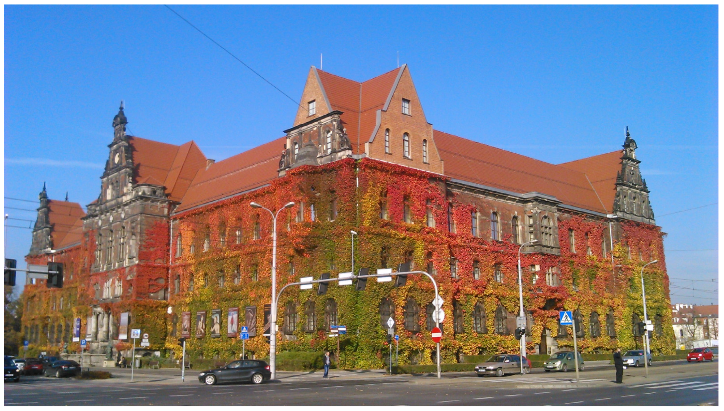
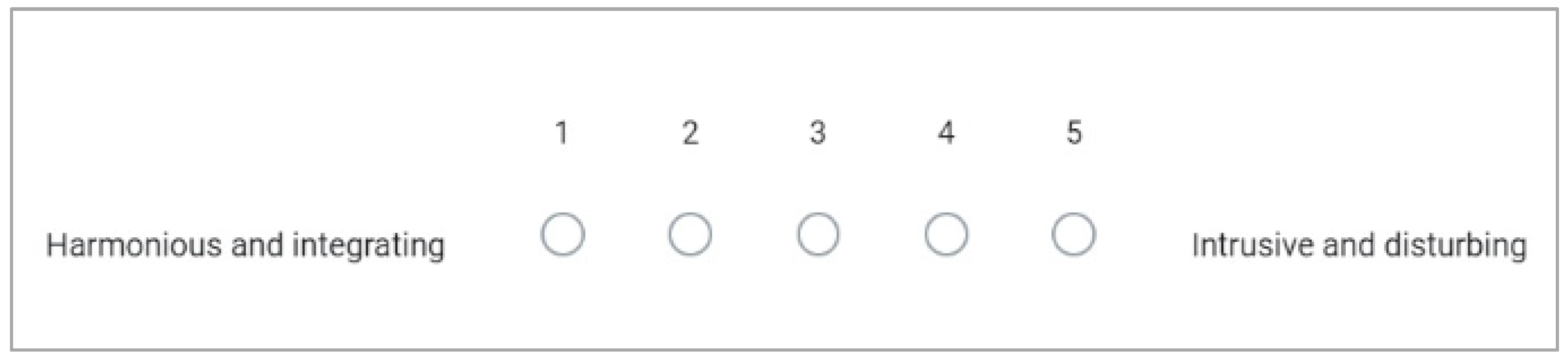
Table 1.
Presentation of pictures and evaluation results (all images by Anna Jaglarz).
| No. | Picture | Evaluation Results |
|---|---|---|
| 1. |  |  |
| 2. |  |  |
| 3. |  |  |
| 4. |  |  |
| 5. |  |  |
| 6. |  |  |
| 7. |  |  |
| 8. |  |  |
| 9. |  |  |
| 10. |  |  |
| 11. |  |  |
| 12. |  |  |
| 13. |  |  |
| 14. |  |  |
| 15. |  |  |
| 16. |  |  |
| 17. |  |  |
| 18. |  |  |
Disclaimer/Publisher’s Note: The statements, opinions and data contained in all publications are solely those of the individual author(s) and contributor(s) and not of MDPI and/or the editor(s). MDPI and/or the editor(s) disclaim responsibility for any injury to people or property resulting from any ideas, methods, instructions or products referred to in the content. |
© 2023 by the author. Licensee MDPI, Basel, Switzerland. This article is an open access article distributed under the terms and conditions of the Creative Commons Attribution (CC BY) license (https://creativecommons.org/licenses/by/4.0/).
Share and Cite
MDPI and ACS Style
Jaglarz, A. Perception of Color in Architecture and Urban Space. Buildings 2023, 13, 2000. https://0-doi-org.brum.beds.ac.uk/10.3390/buildings13082000
AMA Style
Jaglarz A. Perception of Color in Architecture and Urban Space. Buildings. 2023; 13(8):2000. https://0-doi-org.brum.beds.ac.uk/10.3390/buildings13082000
Chicago/Turabian StyleJaglarz, Anna. 2023. "Perception of Color in Architecture and Urban Space" Buildings 13, no. 8: 2000. https://0-doi-org.brum.beds.ac.uk/10.3390/buildings13082000
Note that from the first issue of 2016, this journal uses article numbers instead of page numbers. See further details here.