Article

Quantitative and Qualitative Comparison of 2D and 3D Projection Techniques for High-Dimensional Data

1
Department of Information and Computing Science, Utrecht University, 3584 CS Utrecht, The Netherlands
2
Bernoulli Institute, University of Groningen, 9712 CP Groningen, The Netherlands
3
Department of Computing, Xi’an Jiaotong-Liverpool University, Suzhou 215123, China
4
Institute for Mathematics and Statistics, University of São Paulo, São Paulo 01000-000, Brazil
*
Author to whom correspondence should be addressed.
These authors contributed equally to this work.
Submission received: 9 May 2021 / Revised: 27 May 2021 / Accepted: 28 May 2021 / Published: 3 June 2021
(This article belongs to the Special Issue Trends and Opportunities in Visualization and Visual Analytics)

Abstract

:
Projections are well-known techniques that help the visual exploration of high-dimensional data by creating depictions thereof in a low-dimensional space. While projections that target the 2D space have been studied in detail both quantitatively and qualitatively, 3D projections are far less well understood, with authors arguing both for and against the added-value of a third visual dimension. We fill this gap by first presenting a quantitative study that compares 2D and 3D projections along a rich selection of datasets, projection techniques, and quality metrics. To refine these insights, we conduct a qualitative study that compares the preference of users in exploring high-dimensional data using 2D vs. 3D projections, both without and with visual explanations. Our quantitative and qualitative findings indicate that, in general, 3D projections bring only limited added-value atop of the one provided by their 2D counterparts. However, certain 3D projection techniques can show more structure than their 2D counterparts, and can stimulate users to further exploration. All our datasets, source code, and measurements are made public for ease of replication and extension.

1. Introduction

Visual exploration of high-dimensional datasets is a key component of modern data science pipelines, with many applications spanning disciplines as diverse as social sciences, medicine, biology, and the exact sciences [1,2,3,4]. In the last decades, many visualization methods have been proposed for high-dimensional data, such as parallel coordinates [5], table lensing [6,7], and scatterplot matrices [8]. Dimensionality reduction (DR) methods, also known as projections, occupy a particular place in this palette of methods, as they are able to handle datasets having both very large number of samples (also called observations or data points) and dimensions (also called attributes or variables). Tens of projection methods have been proposed by the information visualization (infovis) and machine learning (ML) communities [9,10,11], such as the by now famous t-SNE [12] technique.
Choosing a suitable projection technique for a given context (application, task, or dataset) is critical since, even for the same dataset, different techniques yield different visualizations, thus leading to potentially different insights and courses of action in the underlying problem solving. This issue, well recognized in the infovis and ML communities, has been mainly addressed by surveys that compare projection techniques from various perspectives, including type of algorithm used [10,13], types of errors generated [9,14], and types of tasks addressed [1,3]. The most recent survey in this area [15] aimed to provide fine-grained quantitative evidence to help practitioners choose suitable projections by comparing 44 techniques over 18 datasets from the perspective of 7 quality metrics. The study outlined that, from the perspective of such metrics, most algorithms fare relatively similarly, after one optimizes for their various hyperparameters.
All above work in comparing projection techniques considered only two-dimensional variants thereof, which reduce the high-dimensional data to 2D scatterplots. While 2D projections are the most common in practice, 3D projections have also been proposed [16,17,18]. Some researchers argue for their added value in terms of better capturing the structure of high-dimensional data [16,17,19]. Other researchers argue that 3D projections are challenging to use given the need to choose suitable viewpoints and the presence of clutter and occlusion [20,21]. However, 3D projections have been far less studied in the infovis literature—to our knowledge, no quantitative studies have measured 3D projections as Espadoto et al. [15] did for 2D projections.
The effectiveness of projections in explaining data structure can be increased by explanatory tools that annotate the scatterplots to highlight the perceived patterns in terms of the underlying data dimensions, as introduced by Da Silva [22]. While such tools have been shown to add value when analyzing 2D projections [23,24], whether and how much they support 3D projections has, to our knowledge, not been studied.
In this paper, we aim to shed more light on how 3D projections fare when compared to their 2D counterparts by the following contributions:
  • We run a quantitative study that compares 29 projection techniques, run to create both 2D and 3D scatterplots, from the perspective of 3 quality metrics over 8 high-dimensional datasets. We compare the computed quality metrics of the respective 2D and 3D scatterplots to gauge the added-value of the third dimension;
  • We perform a qualitative user study that compares the resulting 2D and 3D projection scatterplots, augmented with the visual explanation proposed by Da Silva [22], from the perspective of explaining projection patterns by the data dimensions;
  • Our two studies show that, in general, 3D projections have roughly the same quality (measured by metrics and user feedback) as compared to their 2D counterparts, while they require more effort to analyze. However, we also found that, in some cases, 3D projections—when augmented by visual explanations—can show more data structure; and they can motivate users to explore the data more than 2D projections do.
This paper is structured as follows. Section 2 introduces several notations and discusses related work on evaluating 2D and 3D projections. Section 3 presents our first contribution, the quantitative comparison of 2D and 3D projections. Section 4 presents our qualitative study of the same projections, augmented by visual explanations. Section 5 discusses the main findings and limitations of our study. We conclude by outlining directions of future work (Section 6).

2. Related Work

2.1. Preliminaries

We start by introducing some key concepts and notations, useful for explaining related work as well as our contribution. Let x = ( x 1 , , x n ) , x i R , 1 i n be a n-dimensional (nD) real-valued sample, and let D = { x i } , 1 i N be a dataset of N samples. Let x j = ( x 1 j , , x N j ) , 1 j n be the j t h dimension of D. Thus, D can be seen as a table with N rows (samples) and n columns (dimensions). A projection technique is a function
P : R n R q ,
where q n . In our work, we consider q { 2 , 3 } and denote the corresponding projection functions by P 2 , respectively P 3 . The projection P ( x ) of a sample x D is a qD point. Projecting an entire dataset D yields a qD scatterplot, denoted as P ( D ) . The projection function P is also influenced by so-called hyperparameters which are typically fine-tuned by the user to optimize for specific quality metrics (discussed below).
The quality of a projection technique P can be gauged by several metrics defined as
M : { ( D , P ( D ) ) } R + .
A metric M measures how well the projection P ( D ) captures specific properties of the dataset D, the underlying idea being that a good projection will keep similar points in D close to each other in P ( D ) . We detail the specific metrics used in our work in Section 3.3.

2.2. Evaluating Projections

Since Principal Component Analysis (PCA) [25,26] was first proposed, tens of different projection techniques have been developed, offering many options to data scientists, but also the added challenge in choosing a suitable technique for their goals. To guide this choice, several surveys of projection techniques have been performed. We organize these surveys from the perspective of their goal, as follows.
Technique-centric surveys: These works aim to compare projection methods from the viewpoint of the cost function used to create P ( D ) from D and the algorithms used to optimize this cost. Fodor [27] presented the first such survey that we are aware of, which organizes 12 projection techniques in a taxonomy based on their respective cost functions. Sorzano et al. [10] discussed 30 such techniques with a focus on optimization heuristics and cost functions. Cunningham et al. [28] refined the work of Sorzano et al. with a focus on linear projections. Conversely, Yin [13] performed a survey for nonlinear projections. Engel et al. [29] proposed a taxonomy covering nine projections from the viewpoint of out-of-sample ability and computational complexity. Bunte et al. [30] proposed a theoretical framework to unify nine existing projection techniques from the perspective of how similarity is computed and which error metric a projection minimizes. Finally, Xie et al. [31] surveyed 27 variants of the Random Projection (RP) method [32], aiming to provide a literature guide to this subclass of techniques.
Task-centric surveys: These surveys categorize projection techniques based on the visual exploration tasks that these support. Buja et al. [33] and Hoffman et al. [1] compared projections from an interaction perspective. Kehrer et al. [3] compared projections with other visualization algorithms from the perspective of visual exploration of multidimensional, multi-source, and multi-type data. A similar comparison of projections with other visualization algorithms was performed by Liu et al. [2]. Nonato and Aupetit [9] surveyed the use of 28 projections in visual analytics (VA) tasks, and categorized these based on the type of errors that they produce and their effect on the performed tasks.
Quantitative surveys: These works compare projections by measuring various quality metrics (M, Equation (2)) on different datasets. Gisbrecht et al. [34] evaluated 10 projection techniques on 3 synthetic datasets from the perspective of one quality metric as well as computational complexity. Maaten et al. [11] evaluated 14 projection techniques from the perspective of three quality metrics, out-of-sample ability, and computational complexity. More recently, Espadoto et al. [15] presented the most comprehensive, to our knowledge, quantitative evaluation of projections, which included 44 techniques evaluated against 7 quality metrics over 18 datasets. For each technique, grid-search was used to derive optimal hyperparameter values. We use the work of Espadoto et al. as a model and inspiration for our comparison of 2D with 3D projections (see Section 3).
The above surveys provide a wealth of information helping practitioners in understanding how different projection techniques operate and how to choose a suitable one for a given problem context. However, they largely omit 3D projections.

2.3. Three-Dimensional Projections

Technically, most existing projection techniques can be used equally easily to create a 2D or a 3D projection. Using a 3D projection would be likely advantageous, since there are more dimensions ( q = 3 ) which can capture the structure of the high-dimensional data. Yet, the literature on 3D projections is far less rich than on their 2D counterparts.
A first challenge for 3D projections is finding a good viewpoint to explore them from—an inherent problem for any 3D scatterplot, produced by projections or not. This can be done by using multiple 2D views linked by interaction [35] or by smoothly animating transitions between 2D scatterplot views [36,37]. More specific for 3D projections, Coimbra et al. [17] proposed a tool to aid users in choosing suitable viewpoints for a 3D projection and interpreting the spread of points along the screen’s X, Y, and depth axes.
A second, more fundamental, challenge is to show why, what for, and how much 3D projections are better than 2D projections. There is evidence both for and against 3D projections [38]. For visualizing text data, 2D projections were found easier to use and interact with than 3D projections [20,21]. Sedlmair et al. [18] empirically found 2D and 3D projections equally effective at visual cluster separation tasks. 2D projections were found to work better for tasks related to inter-sample distance assessment and searching specific sample structures [39,40]. On the other hand, Jolliffe [19] argued that 3D projections are better at encoding data structure for datasets with intrinsic dimensionality exceeding three. Other arguments in favor of 3D scatterplots (as opposed to their 2D counterparts) are better showing variations in sample density [37] and decrease of information loss [41]. Yuan et al. [42] also showed how specific sampling methods can be used to decrease the amount of occlusion in 3D scatterplots while retaining the patterns these visually encode. 3D scatterplots allow one to easier select specific structures, e.g., point clusters for further investigation than corresponding 2D scatterplots, as the third dimension allows more space for getting these structures separated from each other [43]. A survey of use-cases where 3D scatterplots are preferable to 2D ones was given by Sanftmann and Weiskopf [44]. The well-known TensorFlow [45] embedding tool features both 2D and 3D projections using UMAP, PCA, and t-SNE, but uses 3D as default view.
Closest to our work, Poco et al. [16] compared 2D and 3D projections computed using the LSP technique [46]. Their quantitative comparison (by a single quality metric) showed higher accuracy for the 3D projection; the qualitative comparison (done by user studies) showed increased user confidence and satisfaction. Similarly, Coimbra et al. [17] argued for the added value of 3D vs. 2D projections. However, both papers only studied one projection technique, and used a single quality metric. Generalizing their findings for more 3D projections needs more evaluations—a task we approach in this paper.

2.4. Explaining Projections

Whether 2D or 3D, ‘raw’ projections that show only the scatterplot P ( D ) are of little use. Hence, several techniques aim to enrich such scatterplots with additional information to help users understand the visual structures they contain. The simplest explanation color codes points in P ( D ) by the value of a dimension x j or, for image data, a thumbnail representing each sample point [47]. While simple to implement, understanding how several such dimensions explain the plot requires the use of small multiples or manually cycling through color-coding all dimensions. Biplot axes [48,49] and axis legends [17,50] explain the projection’s global structure in terms of the dataset dimensions. Local projection errors [51,52,53] explain how well visual patterns in P ( D ) encode the structure of the corresponding data in D.
Besides projection errors, local explanations also aim to explain what, in the data, is common to groups of close points in P ( D ) , such as the contribution and variance of each dimension x j [22]; correlation of two dimensions x j and x k , local dimensionality [23]; and salient values common to point clusters [54], to mention only the most common such techniques. They key added value of such techniques is that they explicitly annotate visual structures in the projection P ( D ) with information from D, thereby making it directly visible what these structures mean data-wise. To our knowledge, such local explanations, most notably the ones in [22,23], have not been used so far for 3D projections. Related to our research question, we would like to find out whether 3D projections would fare better than their 2D counterparts when supported by such explanations.

3. Quantitative Study

As explained in Section 2, there is currently very little quantitative evidence on how 3D projections perform, in terms of quality metrics, as compared to their 2D counterpart. We address this problem by designing and evaluating a benchmark, similarly to the earlier one proposed by Espadoto et al. [15] for 2D projections, which we will next refer to as the ‘2D benchmark’ for simplicity. Constructing the benchmark involves selecting a number of datasets (Section 3.1), projection techniques (Section 3.2), and quality metrics to compute (Section 3.3). We describe these next, also outlining important aspects where we differ from the 2D benchmark.

3.1. Datasets

To compare 3D vs. 2D projections, we first selected a number of 8 datasets. Table 1 lists their details, including their sparsity ratio γ n = 1 u n N , γ n [ 0 , 1 ] , where u is the number of non-zero data values; and intrinsic dimensionality ρ n [ 0 , n ] , defined as the number of principal components (of the total n), computed by PCA, needed to explain 95% of the data variance [15]. More information about these datasets is available in the Section 5 Availability. These metrics can be interpreted as follows: The sparsity ratio is typically quite high for text word-vectors (the data is sparse), and quite low for table data having a small number of dimensions (the data is dense). If a dataset is sparser, its points are closer in the nD space [55,56], and as a consequence projection techniques have more challenges to identify and separate point-clusters in the projection space. The intrinsic dimensionality intuitively tells how many dimensions we actually need to represent the data. Datasets having an intrinsic dimensionality equal to, or close to, q are far easier to project to qD, as their structure can be ‘unfolded’ to be mapped to the qD space. This was recognized early on by algorithms such as Isomap [57] which explicitly exploited the (low-dimensional) manifold-like structure of the data when constructing the projection. Conversely, datasets having a high intrinsic dimensionality are far more challenging to project.
The metric values in Table 1 show that our selected datasets cover quite different characteristics, in line with those selected in the 2D benchmark. Using more datasets is definitely desirable. However, this would be too expensive, given that we aim next to project each of them by several techniques, both in 2D and 3D, and compute several quality metrics for each combination.
In additional contrast to the 2D benchmark, we selected datasets which are known, from earlier studies, to exhibit discernible structure in terms of clusters of samples. This will be important for our qualitative study (Section 4) in which we aimed to compare how easy such structure is perceived in 2D, respectively 3D, projections. Indeed, selecting some arbitrary dataset that would not have any clear structure would make the qualitative comparison of 2D vs. 3D projections useless. Secondly, we selected on purpose 7 of the 8 datasets as being relatively low-dimensional (up to 30 dimensions): If 3D projections would not prove better than 2D ones, even for such datasets, then the challenge would be even harder for higher-dimensional ones. The eight dataset (Reuters) was taken as a control sample, to gauge how our results would extrapolate for data having high (intrinsic) dimensionality.

3.2. Projections

From the 44 projection techniques present in the 2D benchmark, we selected those which could compute, out-of-the-box, both 2D and 3D projections, yielding a total of 29 projection techniques for our evaluation. We excluded techniques which are not open source. Table 2 lists, for these, whether they are (non)linear, accept samples or sample-pair distances as input, project local neighborhoods differently or work globally the same for the entire dataset, their computational complexity, whether they have out-of-sample quality, whether they are deterministic or stochastic, and the public source of their implementation (for replication purposes). Complexity is a function of the number of dimensions n, number of samples N, number of iterations i (for iterative methods), and number of weights w (for deep learning methods). As Table 2 shows, the selected projections cover a wide spectrum of methods.

3.3. Metrics

Table 3 lists the projection quality metrics we used, which are the most common ones used in the projection literature to gauge the quality of dimensionality reduction [11,15]. All metrics range in [ 0 , 1 ] (0 = minimal quality, 1 = maximal quality). These metrics are explained below.
Trustworthiness M t : Measures the fraction of close points in D that are also close in P ( D ) [88], being the inverse of the false neighbors metric in [53]. M t tells how much one can trust that clusters in a projection represent actual data patterns. In its definition (Table 3), U i ( K ) is the set of points that are among the K nearest neighbors of point i in R q but not among the K nearest neighbors of point i in R n ; and r ( i , j ) is the rank of the point j in the ordered set of nearest neighbors of i in R q . We use K = 7 , in line with [11,15,89];
Continuity M c : Measures the fraction of close points in P ( D ) that are also close in D [88]. It is the inverse of the missing neighbors metric in [53]. In its definition (Table 3), V i ( K ) is the set of points that are among the K nearest neighbors of point i in R n but not among the K nearest neighbors in R q ; and r ^ ( i , j ) is the rank of the R n point j in the ordered set of nearest neighbors of i in R n . As for M t , we chose K = 7 .
Shepard diagram correlation M S : In a scatterplot of the point-pair distances in P ( D ) vs. the corresponding distances in D – the Shepard diagram S – points close to a diagonal indicate good distance preservation [90]. Points below, respectively above, the diagonal tell distance ranges for which false neighbors, respectively missing neighbors, occur. We measured distance preservation by the Spearman rank correlation M S of the Shepard diagram. A value of M S = 1 indicates a perfect (positive) distance correlation.
We did not consider additional projection quality metrics in the literature such as metrics which cannot be (easily) aggregated to a single scalar value per scatterplot, e.g., the projection precision score [52], stretching and compression [51,91], average local error [53], and the co-ranking matrix [92], since we want next to compare hundreds of such scatterplots. We also did not consider metrics which do not make sense for all types of projection, e.g., normalized stress [90]; and metrics which require labeled data, e.g., neighborhood hit [46] and the Class Consistency Measure (CCM) [93,94].

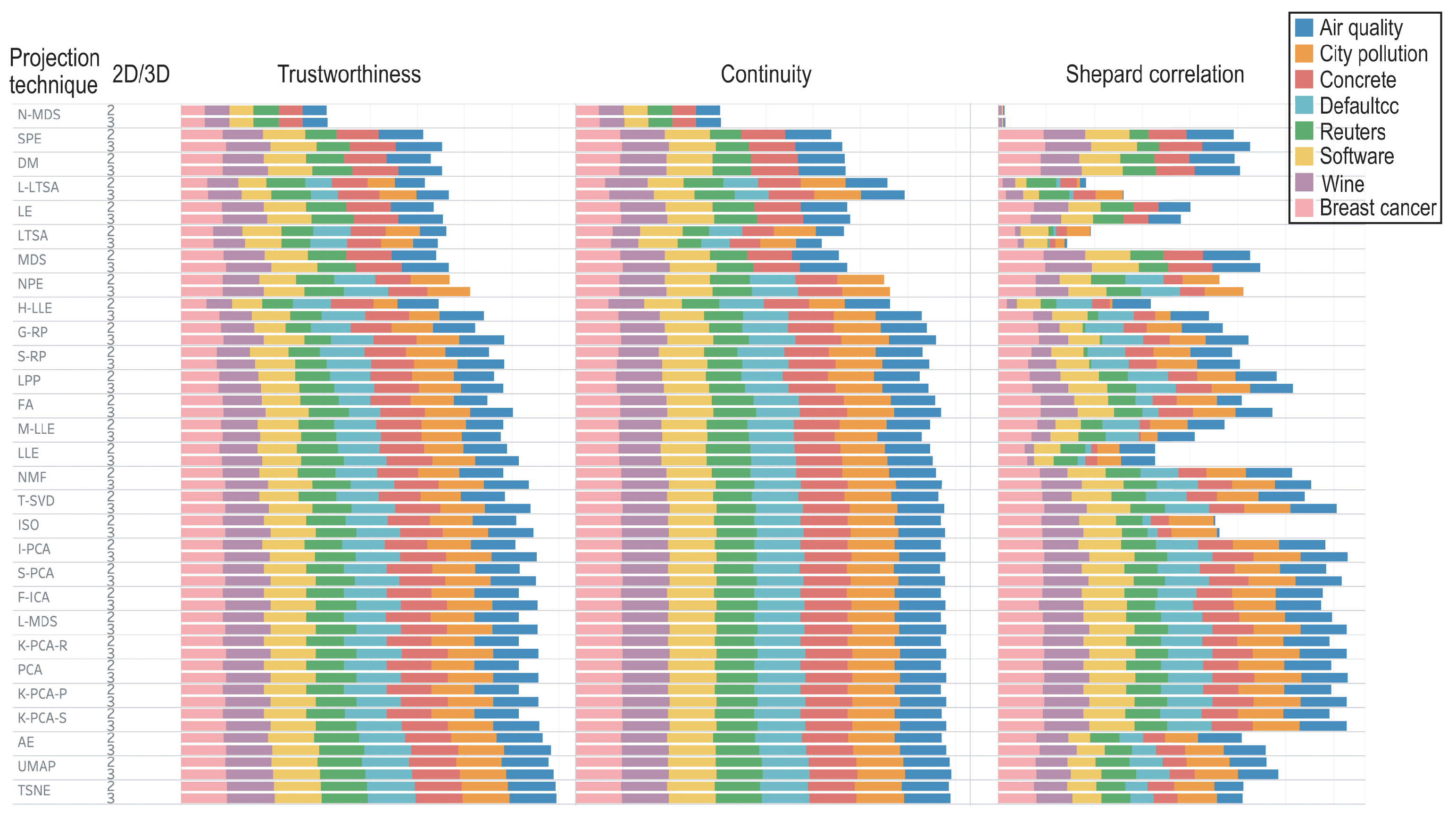
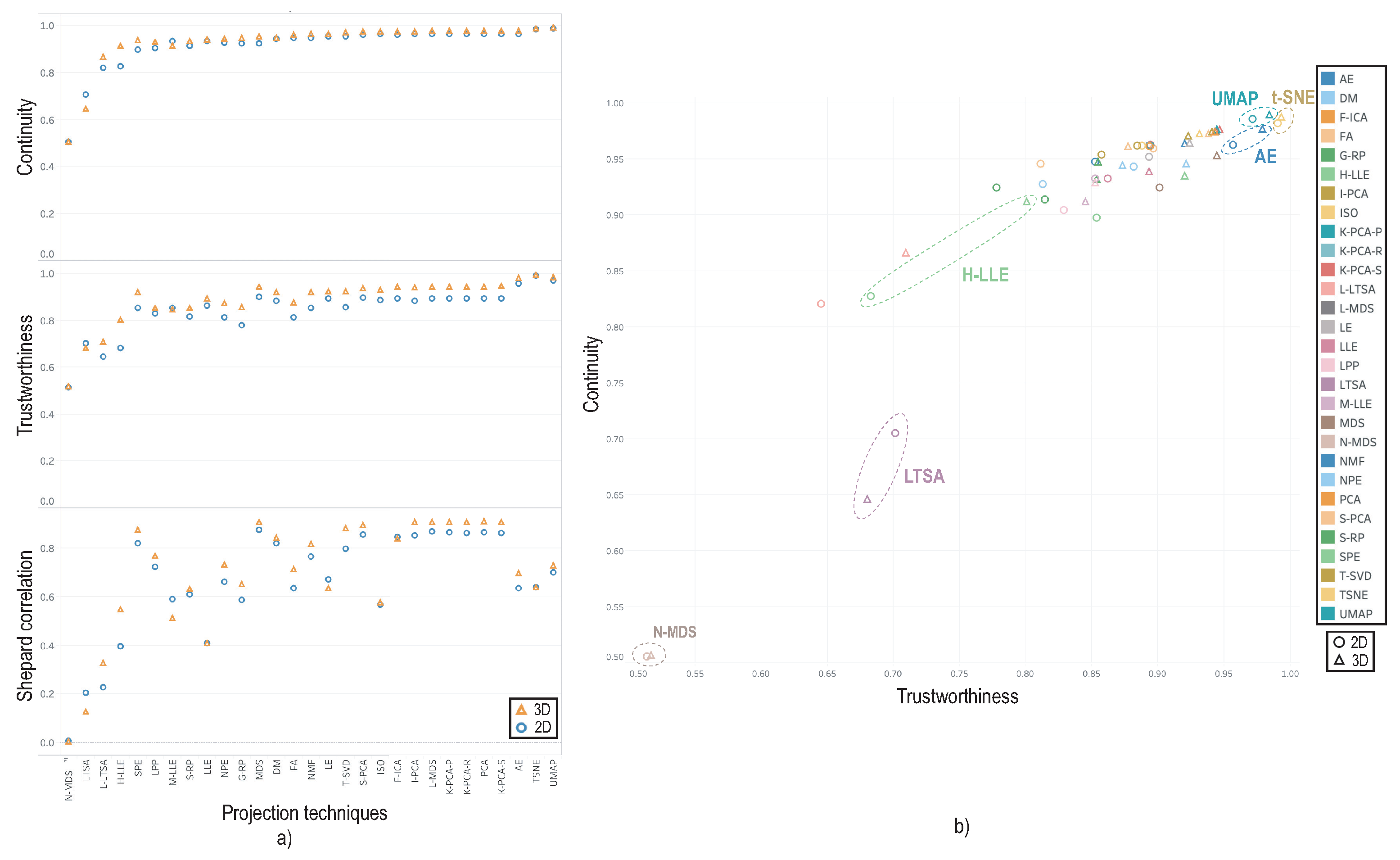
3.4. Evaluation Results

We evaluated all 29 projection techniques, for their 2D and 3D variants on our 8 datasets using the 3 quality metrics in Section 3.3. Projection hyperparameters were set to the optimal defaults found in [15]. We next analyzed the computed quality metrics from several perspectives.
Figure 1 shows the three quality metrics (Section 3.3) per dataset, projection technique, and 2D vs. 3D projection variant, sorted ascendingly on trustworthiness per technique, for ease of examination. The metric values for City pollution (DM, SPE, MDS, N-MDS, and LE projections), Air quality (NPE projection), and Defaultcc (DM, SPE, MDS, N-MDS, and LE projections) are missing, as these techniques failed executing on the respective datasets. Overall, from Figure 1, we see a globally small variation across techniques—which is fully in line with the results of [15]. More interestingly, the 3D techniques scored almost always better but only marginally compared to their 2D counterparts. All these findings do not seem to depend on the dataset. These observations strongly suggest that 3D projections consistently bring some, but marginal, increase of quality vs. their 2D counterparts, regardless of the technique, dataset, and metric being used.
Figure 2 refines these insights. Image (a) shows the averages trustworthiness, continuity, and Shepard correlation, for each 2D projection technique (circles), respectively 3D technique (triangles). Continuity is slightly higher for 3D techniques—on average, 0.02 over all projection techniques. Trustworthiness shows the same trend—3D techniques are 0.05 more trustworthy than 2D ones on average. While Shepard correlation varies more per technique, 3D projections still score slightly better than 2D ones, 0.03 more on average. Image (b) merges the trustworthiness and continuity plots in image (a) showing a positive correlation of the two metrics over all projections. We placed the origin of this plot at 0.5 × 0.5 , since none of the two metrics is below this value. Globally, we see that N-MDS scores poorest, followed by LTSA. The best scoring techniques are t-SNE, UMAP, and AE. For these, however, the quality gain given by 3D projections is negligible. The technique showing the largest gain between 2D and 3D is H-LLE, where 3D adds about 12% in trustworthiness and 8% in continuity, respectively. The stacked bars for H-LLE in Figure 1 show us that this gain is independent on the dataset. Hence, for H-LLE, the use of a third dimension brings some significant added value.
Summarizing the above, we see that the use of a third dimension brings only minimal increase of quality metrics for all projections being studied, over all studied datasets, except H-LLE, whose 3D variant scores about 10% higher quality than its 2D variant.

4. Qualitative Study

The analysis in Section 3 showed that 3D projections do not come with significant higher quality metrics than their 2D counterparts. However, we cannot say, based solely on this, that they do not have added value. Indeed, the quality metrics used in Section 3 capture only a fraction of the expressive nature of a projection. Many other quality metrics exist, for example those used to capture the visual separation of clusters in projections [18,95,96]. For labeled data, the so-called Class Consistency Measure (CCM) [93,94] was shown to model well the way humans visually separate same-label clusters in a projection [97]. However, computing such cluster-separation metrics assumes one to project labeled data and also that the respective data contains well-separated same-label point groups. This is not always the case for datasets which are explored using projections, as also noted in [15]. Moreover, the actual way users would perceive the added value (or lack thereof) of 3D projections cannot be fully captured by metrics such as the ones mentioned above.
We further gathered insight in how 2D and 3D projections differ, by a three-part qualitative study, in a bottom-up fashion—starting from an easy task and proceeding with more complex ones—as follows.

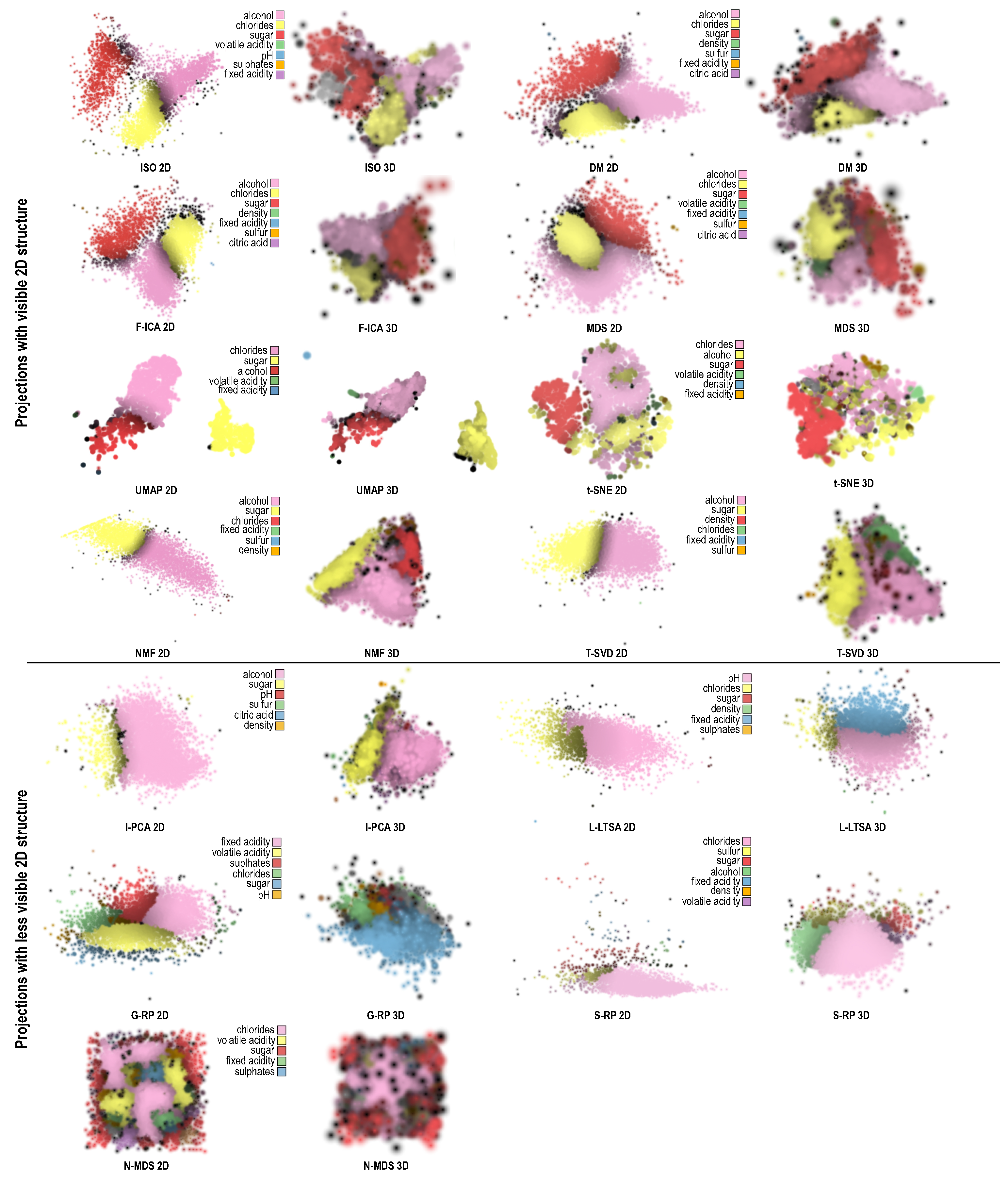
4.1. Identifying Visual Structure

We first considered the task of using the projection to find any apparent data structure depicted therein. For this, we looked at whether the projection is separated into distinct clusters, since this is one of the main use-cases behind visual exploration of projections [9,16,18]. Note that we did not consider labels in this task, but rather only whether the projection captures the ‘modes’ of the underlying data distribution. More precisely, we aimed to see whether 3D projections reveal better such existing separation—if present in the data—than their 2D counterparts. For this, we created scatterplots of all the 8 datasets in Table 1 projected in 2D and 3D by all the 29 projection techniques in Table 2. Next, we visually compared the corresponding 2D and 3D projection plots. In all plots, we colored points based on the ID of the corresponding high-dimensional points using a heat colormap. This allowed us to see whether different plots place points close to each other in similar ways—if so, they will exhibit similar color gradients. Note that this should not be confused with the typical color-by-attribute-value mode used in exploring projections, whose aim is different, i.e., to explain patterns in a projection by data values. Next, we interactively rotated the 3D plots aiming to find the view which best conveys separated clusters. Finally, we aligned this view (by means of manual rotation around the view axis and viewport scaling) to best match the corresponding 2D projection, for visual comparison purposes.
Figure 3 shows the results of this evaluation for the Wine dataset, with 2D projections always to the left of their 3D counterparts for the same technique. Results for H-LLE, LTSA, and M-LLE are omitted since these projections create a very large amount of point overlap, making their visual exploration useless (both in 2D and 3D). Similar results to Figure 3 for all studied datasets are in the Section 5 Availability, including videos showing the 3D projections from multiple viewpoints. These images convey us several interesting insights, as follows.
Data patterns: The vast majority of projections show that the Wine dataset is roughly split into two clusters (red-purple, respectively yellow points in Figure 3. This is in line with other works that studied this dataset [17,22,23]. As a baseline, this tells us that our study is properly set up to next explore the other projections.
2D vs. 3D projections: In almost all the cases, the 3D projections show the same patterns as their 2D counterparts. The exceptions are I-PCA, NMF, and (partly) T-SVD. For these techniques, the 2D plots do not show any data structure, whereas the 3D plots show a clear separation of the two underlying data clusters. Separately, we see that ‘good’ projection techniques work equally well in 2D and 3D to create visual structure—or equally poorly. For the latter case, we have N-MDS, L-LTSA, LLE, LPP, NPE, and S-RP. These techniques are not able to identify any visually salient patterns in the data, neither in the 2D nor in the 3D case.
Projection quality: As explained in the beginning of this section, quality metrics are not to be used as a sole mean to assess whether a projection is useful in conveying data patterns. Figure 3 confirms that: We see a large variation in the ability of projections to find data patterns, ranging from very strong cluster separation (T-SNE and UMAP) to almost no structure (N-MDS, NPE). This is only partly reflected by the metric values (Figure 1): While the techniques that score poorly in finding visual structure (N-MDS, L-LTSA, LLE, LPP, NPE, and S-RP) also have some of the lowest quality metrics, AE scores third-highest metric-wise, but arguably shows a poorer visual separation of data structures than MDS which has the 7th lowest metric values.
Summarizing the above, we found that 3D projections produce roughly the same visual patterns as their 2D counterparts, these patterns depending far more on the projection technique being used than on the dimensionality of the output scatterplot (2D or 3D). Also, producing the same informative views cost more time for the 3D projections, since a suitable viewpoint must be found by interactive rotation, whereas the 2D projections required no user interaction.

4.2. Explaining Visual Structure

Our first evaluation (Section 4.1) showed that 3D projections seem, overall, to be able to generate similar amounts of visual structure to their 2D counterparts. However, by itself, this does not directly tell us that 3D and 2D projections are equally effective in understanding data structure. Indeed, visual structures in a projection need explanations to be further understood and interpreted by users (Section 2.4). Without these, a ‘raw’ projection, even when showing some visual structure, is of little use. We next studied how the variance-based explanation of projections of Da Silva et al. [22,23] augments the added-value of 3D vs. 2D projections. This explanation colors projected points P ( x i ) by the identity of the dimension x j which has the least variance over a small neighborhood around P ( x i ) . Color brightness encodes the explanation confidence, i.e., how much of the total variance (over all n dimensions) in a neighborhood in P ( D ) is explained by the color-coded dimension there. Among other projection explanations (Section 2.4), we selected this one since it works generically for any projection technique, acts locally per projection neighborhood (so, can handle both local and global projection techniques), is fast and simple to compute, and is easy to introduce to users. We implemented this explanation for 3D projections by extending the earlier work [22] that considered 2D projections only. We next applied the explanation to all our 2D and 3D projections computed as outlined in Section 3.
Figure 4 shows a selected subset of 2D and 3D projections for the Wine dataset (for space reasons; all results are in the Section 5 Availability) color-coded by the Da Silva explanation. Points are rendered with blended splats, following [22]. Legends indicate the data dimensions color-coded in the explanations. Since we wanted to test how the Da Silva explanation helps understanding visual structure, we separated projections in those found (Section 4.1) to exhibit a clear visual structure in 2D (Figure 4 top half), respectively those which showed such structure far less clearly (Figure 4 bottom half).
A first analysis of Figure 4 shows that, for the top projections, the patterns visible in the 3D projections are quite similar to those shown by their 2D counterparts. For instance, UMAP (2D) separates the data into two clusters. The color-based explanation further splits the larger left cluster into wines that are similar mainly because of chlorides (pink), respectively alcohol (red). The smaller right cluster is nearly completely explained as wines having similar sugar content, apart from a few points at the bottom which are wines having similar alcohol percentages. The 3D projection created by UMAP tells us essentially the same story. The same situation occurs for FA, where the 2D and 3D projections are both split into essentially three zones explained by alcohol (pink), sugar (yellow), and chlorides (red). This suggests that 3D projections do not help gaining more, or different, insights as compared to their 2D counterparts.
However, comparing the 2D and 3D projections in Figure 4 has a problem: Different colormaps are used to encode the same dimensions for the same dataset. For example, the 2D Isomap projection of the Wine dataset in Figure 4 (top left) uses pink, yellow, red, and green to encode alcohol, chlorides, sugar, and volatile acidity, respectively. The 3D Isomap projection of the same dataset uses pink, yellow, and green for the same dimensions, but allocates green to sulfur. This is inherent to how the Da Silva algorithm [22] works: Each projected point is assigned a dimension that best explains the neighborhood around it; next, for each dimension 1 j n of the dataset, the number of projected points e j that choose dimension j as best is computed. Finally, the values e j are sorted descendingly and the first C dimensions that emerge from this sort are mapped to a categorical colormap of C = 8 colors. This way, colors are allocated to those dimensions which can explain the most projected points. Since 2D and 3D projections (of the same dataset) have different structures, their top-voted C dimensions can differ, leading to the same dimension being mapped to different colors and/or the same color allocated to different dimensions.
To remove this confusion, we redid in Figure 5 the plots in Figure 4 using the same dimension-to-color mapping for each pair of 2D and 3D projections created by the same technique. For this, we ran the Da Silva algorithm once, e.g., when explaining the 2D projection, and saved the dimension-to-color mapping it produces. Then, we ran the algorithm for the 3D projection. If this run selected dimensions already assigned to colors in the first run, then we used the colors assigned the first time; if new dimensions are mapped to colors (by the second run), then we allocated colors not used by the first run.
Looking at Figure 5, the difference between the top projections (found earlier to exhibit visible structure in 2D) and the bottom ones (found earlier to have less visible 2D structure) becomes now clearer: For the top projections, we see nearly the same explanations for the 2D and 3D variants of the same technique; there is little added value apparent in using a 3D projection instead of a 2D one, the structures shown by the 3D variant were already visible in the 2D variant. For the bottom projections, the situation is slightly more nuanced. 2D and 3D projections often show the same main explanation patterns, see e.g., the yellow (left) and pink (right) clusters present in both the 2D and 3D I-PCA variants (Figure 5, bottom). The 3D projections often introduce additional explanations which were not easily visible in the 2D variants, see e.g., the blue fixed acidity cluster for L-LTSA (3D) or the green and red clusters for alcohol and sugar respectively for S-RP (3D). In the extreme case of N-MDS, which had an extremely poor explanation in 2D, using a 3D projection does not improve the situation at all. To conclude, this analysis tells that 3D projections, even when explained (by the Da Silva method), do not bring significant extra value as compared to their 2D counterparts.

4.3. Expert Evaluation

To gain more insights in how explained 3D projections compare to their 2D counterparts, we performed an user evaluation, detailed next.
Participants: We asked four data scientists to take part in our study. All were familiar with dimensionality reduction, and with the Da Silva technique, and worked in information visualization for 2, 3, 9, and 13 years, respectively. They were instructed first in how to use a visualization tool that allows examining the 2D or 3D projections via zoom, pan, rotation, and brushing points to see their attributes. They were also offered videos showing the respective projections visualized in the tool, for convenience. We precomputed all projections ourselves so that all users would see the same results and would not be bothered with tweaking projection-algorithm parameters.
Data: We computed 2D and 3D projections for the first 7 datasets in Table 1 using all 29 techniques in Table 2. We did not use the Reuters dataset since this is very high dimensional (1000 dimensions) and thus not suitable for the Da Silva explanatory technique. Also, 11 dataset-technique combinations failed to compute (see Section 3.4). Hence, a total of 7 × 29 11 = 192 projection-pairs were offered for investigation to the users.
Tasks: As outlined earlier, the main use-case behind the Da Silva explanatory technique and its variants is to allow users to visually ‘partition’ a projection into different zones, each being explained by a different dimension. Note that such zones need not be separated by whitespace, i.e., they can be different, and usually are a superset of, the visual clusters that projections are typically used to find. For example, the UMAP (2D or 3D) projections in Figure 5 show, each, two visual clusters (red-pink and yellow), but three zones (red, pink, and yellow). Given this use-case, we next asked the users to study the provided 2D-3D projection pairs by comparing them side by side, and to note down how they would rank the variants, using four classes:
  • the 2D and 3D variants are equally good and informative;
  • the 2D variant is clearly preferred;
  • the 3D variantis clearly preferred;
  • both variants are equally poor (hard to understand, thus useless).
For classes 2 and 3 above, we also asked the users to note down why they preferred one variant against the other and save screenshots of the respective variants. We also asked the users to write down, at the end of the study, any global comments they had concerning the use of 2D vs. 3D explained projections. There was no hard time limit imposed for the study—the users could stop when they wanted.
Results: From the projection-pairs offered to study, 43 were marked in class 4, i.e., hard to understand and further useless. From the remaining ones, about 80% were marked in class 1 (2D and 3D variants address the task equally well). The remaining 20% was roughly evenly split into class 2 (2D variant clearly preferred) and class 3 (3D variant clearly preferred). We did not find correlations between these classes and the projection methods and/or the datasets. We found, however, more interesting facts when reading the comments given by the users to their rankings. We list the most salient findings next—see also Figure 6 for user-made screenshots supporting these findings.
Perceived advantages of 3D projections
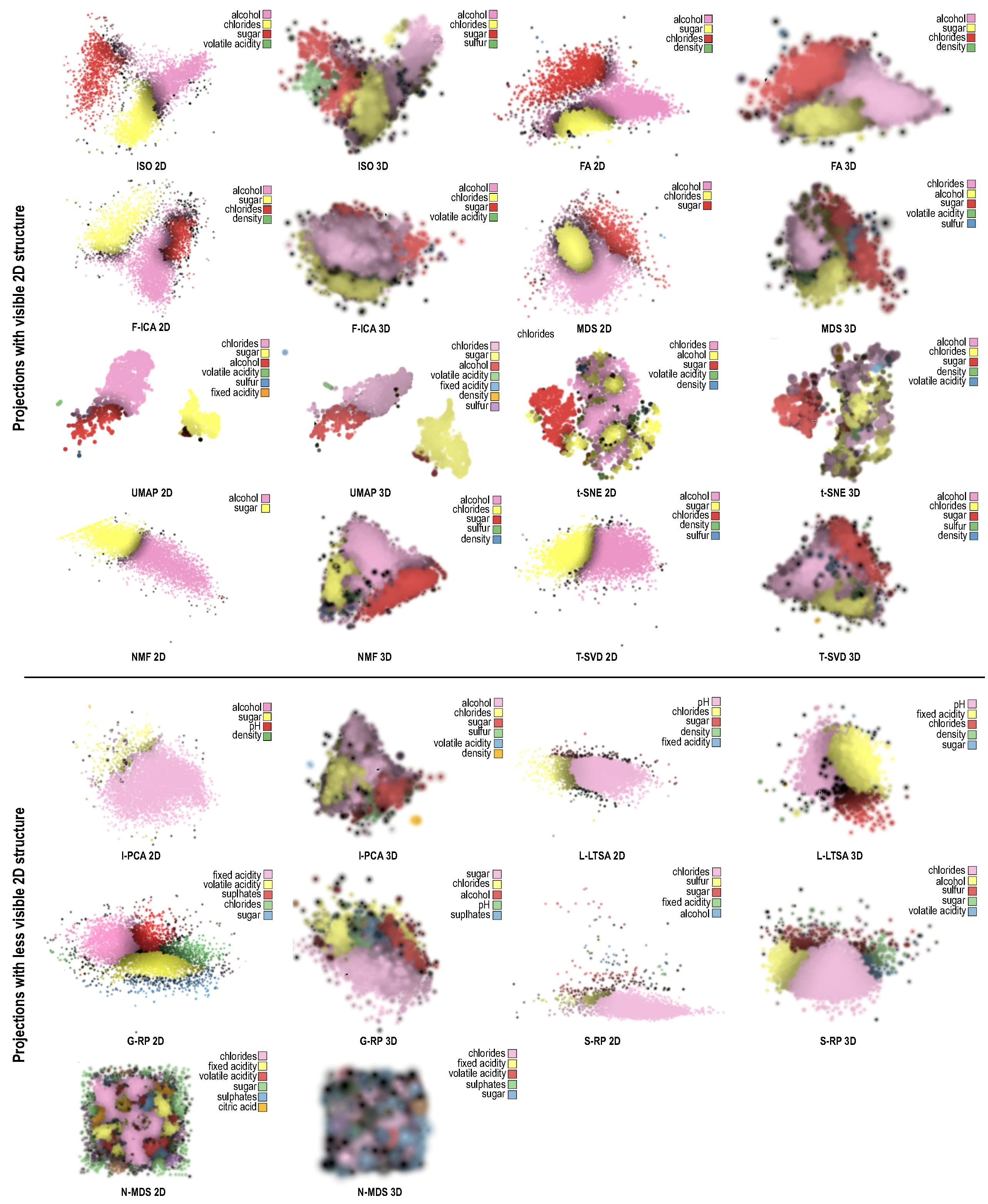
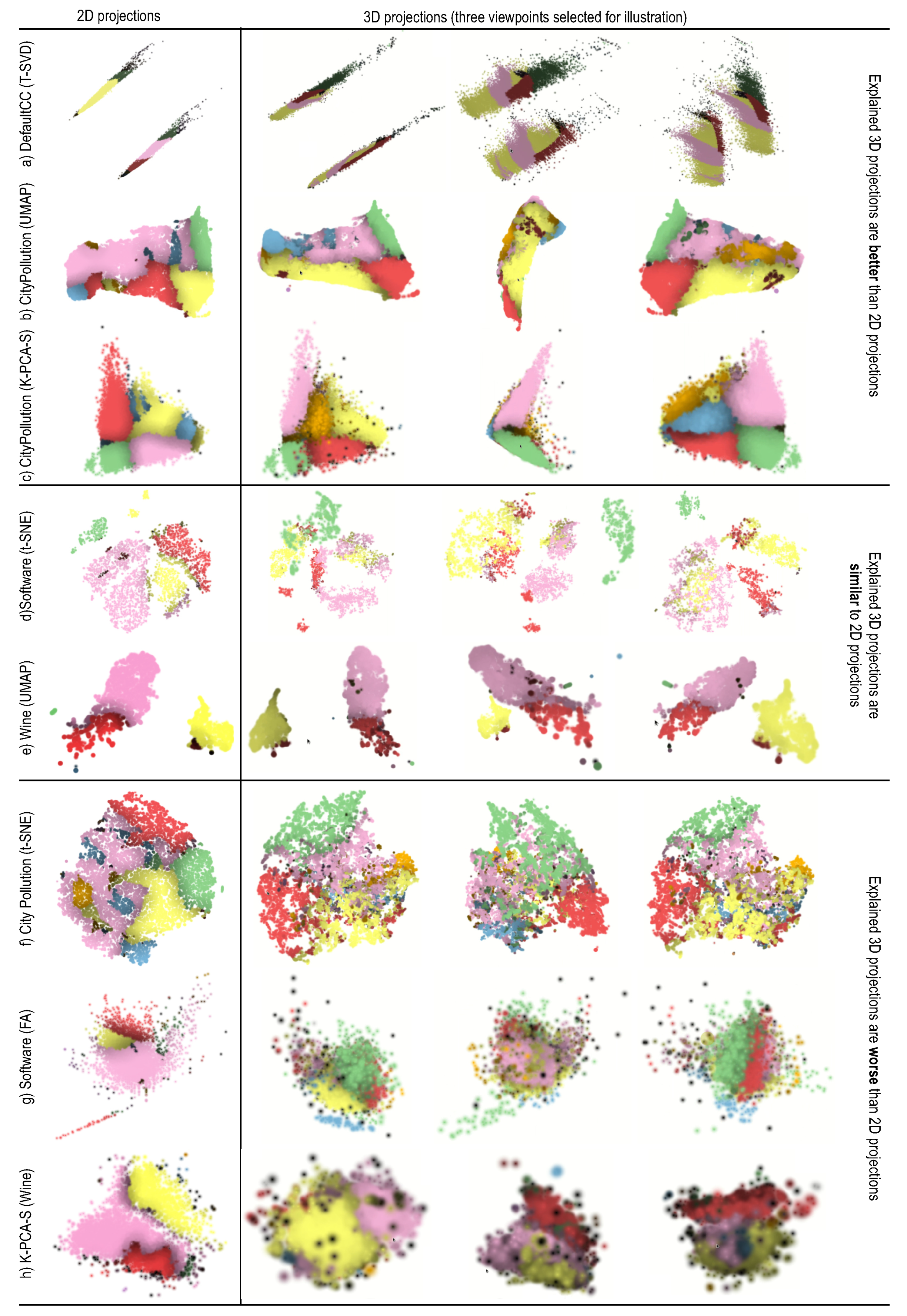
  • 3D projections spread the points over a larger space, so can show more complex patterns. Figure 6a shows an example: the 2D T-SVD projection essentially creates two narrow bands along which little structure is visible. The 3D variant creates two plane-like structures that can show more explanation details. The 3D dimension also increases the chance that more variables will be involved in the explanation, which is good, since the explanation becomes more fine-grained. Figure 6b,c show this for CityPollution projected with UMAP and K-PCA-S: In both cases, the 2D projection cannot really show the orange cluster (points similar due to the S O 2 dimension). This is because points are too tightly packed in 2D, so there is no room to ‘spread out’ this dimension. In 3D, the projections yield a similar (triangular-shape) surface to the 2D case. Yet, the additional spatial dimension allows spreading out points above the surface, so the orange cluster becomes visible. Also, the third dimension gives more chance for visual cluster separation as compared to 2D projections.
  • 3D projections were found to give the user a sense of control in terms of selecting which are interesting views. While no ideal viewpoint can be found in general, different viewpoints could be used to show different parts of the data in turn, one by one. This allows further finding and exploring structures (one by one) which would otherwise be occluded, and have no chance to show up, in a 2D projection—see e.g., the three viewpoints for Figure 6b,c; only in two of these is the orange cluster visible. Overall, 3D projections were found more versatile than 2D ones, being able to tell different stories about the data, depending on the chosen viewpoint.
Perceived advantages of 2D projections
  • One user remarked that the key advantage of 2D projections was their ease of use. No interaction is required to examine them, while one can get lost or frustrated in the process of zooming, panning, and viewpoint rotation for 3D projections. As such, this user noted that, in about 80% of the class-1 cases (2D found similar to 3D), this ignored the interaction effort. If this effort were to be considered, then those cases should be marked as class 2 (the 2D variant is preferred). Quoting from this user: “Both 2D and 3D are fine. Yet, I prefer 2D because it gives very clear results without further interaction needed”. Figure 6d,e show two such cases. The visible clusters and their explanations are very similar in 2D and 3D, so, for these cases, the 3D variant does not add any perceived value.
  • Some projection techniques, in particular t-SNE, were consistently found to create clearer explanations in 2D than in 3D—something already visible in Figure 4 and Figure 5. This is an important observation, since t-SNE is known as a very high-quality projection. Such quality would, thus, be lost if using the 3D variant. Figure 6f shows this. The 3D t-SNE projection actually spreads points on a ball-like surface, with some points also being placed inside. It is very hard, even with interaction, to find out which points are close together on the same ‘side’ of the surface.
  • 2D projections were definitely preferred in the cases where the nature of the data would create densely-packed clusters. These would map to close groups of points in the 2D projection (which are fine). In 3D, however, this would create a densely packed ‘hairball’ of regions explained by the different variables (Figure 6h). Occlusion would then prevent the user from discovering interesting structures and/or explanations inside such a 3D structure.
  • Outliers were also found easier to spot with 2D projections. They would appear as points separated by large amounts of whitespace from the high-density ‘core’ of the projection. In 3D, however, outliers could appear in front or behind the high-density core, and thus be hard to spot (Figure 6h).

5. Discussion

We discuss several points concerning our findings and methodology, as follows.
Quantitative results: The comparison of 2D vs. 3D projection quality metrics discussed in Section 3 are, to our knowledge, the first study of its kind in projection literature. Overall, our results show that t-SNE, UMAP, AE reach the best metric values for 3D projections, similar to the results found earlier for projections [15]. Our main novelty is to show that, metric-wise, 3D projections are only marginally better than their 2D counterparts—a fact which, to our knowledge, was never quantified by quality metrics.
Pattern identification: Our first qualitative study (Section 4.1) showed that 3D projections do not bring significant added value over their 2D counterparts in terms of finding data structures. 3D projections either show the same structure type, or otherwise do not show any structure at all, similar to their 2D counterparts. Our findings match those in [18]—but generalize them, since we explored 29, as opposed to just 4, projection techniques (PCA, Robust PCA, MDS, and t-SNE) used in [18]; also, we used optimal parameter presets for the studied techniques, something not considered in [18]. Our subsequent qualitative study (Section 4.2 and Section 4.3) showed that, when augmented with the Da Silva explanation, 3D projections can, in some cases, show more insights in the data than their 2D counterparts, e.g., they partition the dataset into more zones explained by more data dimensions. However, in most cases, the patterns shown by 3D projections are very similar to the 2D ones; and 3D projections introduce additional challenges such as occlusion and additional user effort for exploration.
Choice of projection techniques: An important point must be made concerning the choice of studied projection techniques and the presented findings. Clearly, not all techniques are equally good for projecting any dataset. Espadoto et al. [15] have extensively documented this, by benchmarking 44 such techniques against 19 datasets for 2D projections. Their results showed only small variations of the projection quality, measured by 7 quality metrics. As such, the question of why certain projection techniques are better than others cannot be gauged simply by quality metrics, as already argued in Section 4. A separate question is how projection techniques perform with respect to other dataset traits, beyond intrinsic dimensionality and sparsity (see Section 3.1). For instance, the distribution of samples in a dataset can be an important trait that characterizes the quality of a projection technique. We do not examine this aspect in this paper for the following reasons:
  • The question “which projection technique is the best for a given dataset type” is not in our scope. Rather, as explained in Section 1 and next in the paper, our research question is how can visual explanations and/or 3D projections bring added value. These questions do not focus on comparing projection techniques against each other, but the same techniques against their instances with or without visual explanations, and with or without a third dimension;
  • Comparing ‘raw’ projection techniques against each other has been done in detail in [15]. As said earlier, we aim here not to compare raw techniques, but techniques with (or without) the additions of a third dimension and/or visual explanations;
  • It is inherently hard to link the performance of projection techniques to the ‘nature’ of a given dataset. We did this by using the so-called dataset traits (dimensionality, intrinsic dimensionality, and sparsity) outlined in Section 3.1. Of course, additional traits can be defined, such as the nature of the distribution that characterizes the samples in a dataset. However, doing this is far from trivial: There are, to our knowledge, no established ‘classes’ of cannonical distributions for nD datasets. The goal of characterizing how projection techniques cope with various such distributions is definitely an interesting topic to study, but one out of the scope of our paper which focuses on comparing 2D vs. 3D projections, with vs. without visual explanations.
Availability: All our experimental results, including snapshots of the 2D projections, videos of exploring the 3D projections, are available online [98]. The source code of the visualization tool that implements the variance-based projection explanations, written in Rust using OpenGL, is publicly available at [99].
Limitations: As any evaluation work in visualization, ours has several limitations. We only explored 8 (real-world) datasets, and considered only relatively simple tasks such as cluster separation identification. However, we argue that, if even for such simple datasets and tasks 3D projections cannot show a clear added-value vs. their 2D counterparts, then this becomes even harder for more complex situations. We believe that refining our findings with more specific (types of) datasets and tasks is a promising direction for future work, which would either highlight use-cases where 3D projections are really superior to 2D ones, or conclude even more firmly that the addition of a third dimension does not bring added value.
A more important limitation regards our expert evaluation (Section 4.3), which involved only four experts and a general task of ranking projections in terms of being more or less informative. It can be certainly argued that defining more precise tasks, e.g., finding a specific subset of data points which are similar due to a given condition on the data attributes, and measuring the task accuracy and completion time, is needed to refine our insights. However, we also argue that our preliminary evaluation presented here is valuable in a formative sense. Indeed, it allowed us to discover several specific cases where certain 3D projection techniques produce more visual structures of interest than their 2D counterparts (see Figure 6). We aim to further refine these insights by a formal evaluation which involves techniques and tasks that can exploit the perceived advantage of 3D projections.

6. Conclusions

We presented a multi-faceted comparison of 2D and 3D dimensionality-reduction methods, or projections, for the purpose of finding patterns in high-dimensional data, with the aim of finding added-value (or the lack thereof) for using the third dimension in the scatterplots used to explore such data. As a benchmark, we used 29 projection algorithms and 8 datasets. Our first facet—a quantitative study of three quality metrics—showed consistent, but marginal, added value of the 3D projections. Our second facet—a study in finding visual patterns depicted in the projection—showed that 2D and 3D projections fare almost identically. Our third facet added visual explanations (in terms of attribute variance) to the compared 2D and 3D projections, and showed that both have roughly the same ability in showing very similar patterns. Finally, we executed a user evaluation to elicit additional findings on how 2D and 3D projections compare. We found that, overall, both projection types are found equally insightful, but the 3D ones generate additional challenges and effort.
Summarizing the above, there is little consistent evidence that 3D projections would structurally add value to high-dimensional data exploration atop what 2D projections can do. Still, our study also highlighted several cases where the third dimension does make a difference—in showing more visual structure, more detailed explanations, or engaging users in the data exploration. We aim to refine these findings in several directions. First, we want to test more explanatory tools on both 2D and 3D projections to see whether some of them can further leverage the third dimension. Secondly, we want to refine the analysis of the cases where 3D projections were found to be better than 2D ones, and thereby develop specialized projection-and-exploration methods that can bring extra value atop what standard 2D projections can deliver. Finally, and in support of both these future work directions, we aim to design more fine-grained controlled experiments where more users than in the current study are given specific quantifiable tasks to execute using 2D and 3D projections in order to compare more precisely their advantages and limitations.

Author Contributions

Conceptualization, methodology, visualization, writing: all authors; software: G.v.S.; validation, investigation, Z.T., X.Z., E.D., L.Y.; resources, data curation, Z.T., G.v.S.; supervision, A.T. All authors have read and agreed to the published version of the manuscript.

Funding

Z. Tian was supported by the China Scholarship grant number 201906080046.

Institutional Review Board Statement

Not applicable.

Informed Consent Statement

Not applicable.

Data Availability Statement

The datasets and study results are openly available at [98]. The source code of the visual explanation tool is also openly available at [99].

Conflicts of Interest

The authors declare no conflict of interest.

References

  1. Hoffman, P.; Grinstein, G. A survey of visualizations for high-dimensional data mining. Inf. Vis. Data Min. Knowl. Discov. 2002, 104, 47–82. [Google Scholar]
  2. Liu, S.; Maljovec, D.; Wang, B.; Bremer, P.T.; Pascucci, V. Visualizing High-Dimensional Data: Advances in the Past Decade. IEEE TVCG 2015, 23, 1249–1268. [Google Scholar] [CrossRef] [PubMed]
  3. Kehrer, J.; Hauser, H. Visualization and Visual Analysis of Multifaceted Scientific Data: A Survey. IEEE TVCG 2013, 19, 495–513. [Google Scholar] [CrossRef]
  4. Tang, J.; Liu, J.; Zhang, M.; Mei, Q. Visualizing Large-scale and High-dimensional Data. In Proceedings of the WWW, Montreal, QC, Canada, 11–15 April 2016; pp. 287–297. [Google Scholar]
  5. Inselberg, A.; Dimsdale, B. Parallel coordinates: A tool for visualizing multi-dimensional geometry. In Proceedings of the IEEE VIS, San Francisco, CA, USA, 23–26 October 1990; pp. 361–378. [Google Scholar]
  6. Rao, R.; Card, S.K. The Table Lens: Merging graphical and symbolic representations in an interactive focus+context visualization for tabular information. Proceedings of the ACM SIGCHI conference on Human factors in computing systems; ACM: New York, NY, USA, 1994; pp. 318–322. [Google Scholar]
  7. Telea, A.C. Combining Extended Table Lens and Treemap Techniques for Visualizing Tabular Data. Proceedings of the Eighth Joint Eurographics/IEEE VGTC conference on Visualization; ACM: New York, NY, USA, 2006; pp. 120–127. [Google Scholar]
  8. Becker, R.; Cleveland, W.; Shyu, M. The visual design and control of trellis display. J. Comput. Graph. Stat. 1996, 5, 123–155. [Google Scholar]
  9. Nonato, L.; Aupetit, M. Multidimensional Projection for Visual Analytics: Linking Techniques with Distortions, Tasks, and Layout Enrichment. IEEE TVCG 2018. [Google Scholar] [CrossRef]
  10. Sorzano, C.; Vargas, J.; Pascual-Montano, A. A survey of dimensionality reduction techniques. arXiv 2014, arXiv:1403.2877. [Google Scholar]
  11. van der Maaten, L.; Postma, E. Dimensionality Reduction: A Comparative Review; Technical Report, Tech. Report TiCC TR 2009-005; Tilburg University: Tilburg, The Netherlands, 2009. [Google Scholar]
  12. van der Maaten, L.; Hinton, G.E. Visualizing data using t-SNE. JMLR 2008, 9, 2579–2605. [Google Scholar]
  13. Yin, H. Nonlinear Dimensionality Reduction and Data Visualization: A Review. Int. J. Autom. Comput. 2007, 4, 294–303. [Google Scholar] [CrossRef]
  14. Heulot, N.; Fekete, J.D.; Aupetit, M. Visualizing Dimensionality Reduction Artifacts: An Evaluation. arXiv 2017, arXiv:1705.05283v1. [Google Scholar]
  15. Espadoto, M.; Martins, R.; Kerren, A.; Hirata, N.; Telea, A. Toward a Quantitative Survey of Dimension Reduction Techniques. IEEE TVCG 2019, 27, 2153–2173. [Google Scholar] [CrossRef]
  16. Poco, J.; Etemadpour, R.; Paulovich, F.V.; Long, T.; Rosenthal, P.; Oliveira, M.C.F.; Linsen, L.; Minghim, R. A framework for exploring multidimensional data with 3D projections. Comput. Graph Forum 2011, 30, 1111–1120. [Google Scholar] [CrossRef]
  17. Coimbra, D.; Martins, R.; Neves, T.; Telea, A.; Paulovich, F. Explaining three-dimensional dimensionality reduction plots. Inf. Vis. 2016, 15, 154–172. [Google Scholar] [CrossRef] [Green Version]
  18. Sedlmair, M.; Munzner, T.; Tory, M. Empirical guidance on scatterplot and dimension reduction technique choices. IEEE TVCG 2013, 19, 2634–2643. [Google Scholar] [CrossRef] [Green Version]
  19. Jolliffe, I.T. Principal Component Analysis; Springer: Berlin/Heidelberg, Germany, 2002. [Google Scholar]
  20. Newby, G. Empirical study of a 3D visualization for information retrieval tasks. J. Intell. Inf. Syst. 2002, 18, 31–53. [Google Scholar] [CrossRef]
  21. Westerman, S.; Collins, J.; Cribbin, T. Browsing a document collection represented in two- and three- dimensional virtual information space. Int. J. Hum. Comput. Stud. 2005, 62, 713–736. [Google Scholar] [CrossRef]
  22. da Silva, R.; Rauber, P.; Martins, R.; Minghim, R.; Telea, A.C. Attribute-based Visual Explanation of Multidimensional Projections. In Proceedings of the EuroVA, Cagliari, Sardinia, 25–26 May 2015. [Google Scholar]
  23. van Driel, D.; Zhai, X.; Tian, Z.; Telea, A. Enhanced Attribute-Based Explanations of Multidimensional Projections; The Eurographics Association: Lyon, France, 2020. [Google Scholar]
  24. Tian, Z.; Zhai, X.; van Driel, D.; van Steenpaal, G.; Espadoto, M.; Telea, A. Using Multiple Attribute-Based Explanations of Multidimensional Projections to Explore High-Dimensional Data. Comput. Graph. 2021. [Google Scholar] [CrossRef]
  25. Pearson, K. On lines and planes of closest fit to systems of points in space. Philos. Mag. 1901, 2, 559–572. [Google Scholar] [CrossRef] [Green Version]
  26. Hotelling, H. Analysis of a Complex of Statistical Variables Into Principal Components. J. Edu. Pysiol. 1933, 24, 417–441. [Google Scholar]
  27. Fodor, I.K. A Survey of Dimension Reduction Techniques; Technical Report, Tech. Report UCRL-ID-148494; US Dept. of Energy, Lawrence Livermore National Labs: Livermore, CA, USA, 2002.
  28. Cunningham, J.; Ghahramani, Z. Linear Dimensionality Reduction: Survey, Insights, and Generalizations. JMLR 2015, 16, 2859–2900. [Google Scholar]
  29. Engel, D.; Hüttenberger, L.; Hamann, B. A Survey of Dimension Reduction Methods for High-dimensional Data Analysis and Visualization. In Proceedings of the IRTG Workshop, Freiburg, Germany, 8–9 November 2012; Schloss Dagstuhl–Leibniz-Zentrum fuer Informatik: Wadern, Germany, 2012; Volume 27, pp. 135–149. [Google Scholar]
  30. Bunte, K.; Biehl, M.; Hammer, B. A general framework for dimensionality reducing data visualization mapping. Neural Comput. 2012, 24, 771–804. [Google Scholar] [CrossRef] [Green Version]
  31. Xie, H.; Li, J.; Xue, H. A survey of dimensionality reduction techniques based on random projection. arXiv 2017, arXiv:1706.04371. [Google Scholar]
  32. Dasgupta, S. Experiments with Random Projection. In Proceedings of the UAI. Morgan Kaufmann, Stanford, CA, USA, 30 June–3 July 2000; pp. 143–151. [Google Scholar]
  33. Buja, A.; Cook, D.; Swayne, D.F. Interactive High-Dimensional Data Visualization. J. Comput. Graph. Stat. 1996, 5, 78–99. [Google Scholar]
  34. Gisbrecht, A.; Hammer, B. Data visualization by nonlinear dimensionality reduction. Wires Data Min. Knowl. Discov. 2015, 5, 51–73. [Google Scholar] [CrossRef]
  35. Piringer, H.; Kosara, R.; Hauser, H. Interactive F+C visualization with linked 2D/3D scatterplots. Proceedings of the International Conference on Coordinated and Multiple Views in Exploratory Visulization; IEEE: Piscataway, NJ, USA, 2014; pp. 49–60. [Google Scholar]
  36. Elmqvist, N.; Dragicevic, P.; Fekete, J.D. Rolling the dice: multidimensional visual exploration using scatter- plot matrix navigation. IEEE TVCG 2008, 14, 1141–1148. [Google Scholar] [CrossRef] [Green Version]
  37. Sanftmann, H.; Weiskopf, D. Illuminated 3D scatterplots. Comput. Graph Forum 2009, 28, 642–651. [Google Scholar] [CrossRef]
  38. Tavanti, M.; Lind, M. 2D vs. 3D, implications on spatial memory. In Proceedings of the IEEE InfoVis, San Diego, CA, USA, 22–23 October 2001; pp. 139–145. [Google Scholar]
  39. Westerman, S.; Cribbin, T. Mapping semantic information in virtual space: Dimensions, variance and individual differences. Int. J. Hum. Comput. Stud. 2000, 53, 765–787. [Google Scholar] [CrossRef]
  40. Fabrikant, S.I. Spatial Metaphors for Browsing Large Data Archives. Ph.D. Thesis, University of Colorado Boulder, Boulder, CO, USA, 2000. [Google Scholar]
  41. Chan, Y.; Correa, C.; Ma, K.L. Regression cube: A technique for multidimensional visual exploration and interactive pattern finding. ACM Trans. Interact. Intell. Syst. 2014, 4. [Google Scholar] [CrossRef]
  42. Yuan, J.; Xiang, S.; Xia, J.; Yu, L.; Liu, S. Evaluation of Sampling Methods for Scatterplots. IEEE TVCG 2021, 27, 1720–1730. [Google Scholar] [CrossRef]
  43. Yu, L.; Efstathiou, K.; Isenberg, P.; Isenberg, T. Efficient Structure-Aware Selection Techniques for 3D Point Cloud Visualizations with 2DOF Input. IEEE TVCG 2012, 18, 2245–2254. [Google Scholar]
  44. Sanftmann, H.; Weiskopf, D. 3D scatterplot navigation. IEEE TVCG 2012, 18, 1969–1978. [Google Scholar] [CrossRef] [PubMed]
  45. TensorFlow. Embedding Projector Tool. 2021. Available online: https://projector.tensorflow.org (accessed on 31 May 2021).
  46. Paulovich, F.V.; Nonato, L.G.; Minghim, R.; Levkowitz, H. Least square projection: A fast high-precision multidimensional projection technique and its application to document mapping. IEEE TVCG 2008, 14, 564–575. [Google Scholar] [CrossRef]
  47. Eler, D.; Nakazaki, M.; Paulovich, F.; Santos, D.; Andery, G.; Oliveira, M.; Neto, J.; Minghim, R. Visual analysis of image collections. Vis. Comput. 2009, 25, 677–792. [Google Scholar] [CrossRef]
  48. Greenacre, M. Biplots in Practice; Fundacion BBVA: Bilbao, Spain, 2010. [Google Scholar]
  49. Gower, J.; Lubbe, S.; Roux, N. Understanding Biplots; Wiley: Hoboken, NJ, USA, 2011. [Google Scholar]
  50. Broeksema, B.; Baudel, T.; Telea, A. Visual Analysis of Multidimensional Categorical Datasets. Comput. Graph. Forum 2013, 32, 158–169. [Google Scholar] [CrossRef] [Green Version]
  51. Aupetit, M. Visualizing distortions and recovering topology in continuous projection techniques. Neurocomputing 2007, 10, 1304–1330. [Google Scholar] [CrossRef]
  52. Schreck, T.; von Landesberger, T.; Bremm, S. Techniques for precision-based visual analysis of projected data. Inf. Vis. 2010, 9, 181–193. [Google Scholar] [CrossRef] [Green Version]
  53. Martins, R.; Coimbra, D.; Minghim, R.; Telea, A.C. Visual analysis of dimensionality reduction quality for parameterized projections. Comput. Graph. 2014, 41, 26–42. [Google Scholar] [CrossRef]
  54. Paulovich, F.V.; Toledo, F.; Telles, G.; Minghim, R.; Nonato, L.G. Semantic Wordification of Document Collections. Comput. Fraphics Forum 2012, 31, 1145–1153. [Google Scholar] [CrossRef]
  55. Bellman, R. Dynamic Programming; Princeton University Press: Princeton, NJ, USA, 1957. [Google Scholar]
  56. Beyer, K.; Goldstein, J.; Ramakrishnan, R.; Shaft, U. When is “nearest neighbor” meaningful? In Proceedings of the International Conference on Database Theory, Jerusalem, Israel, 10–12 January 1999; pp. 217–235. [Google Scholar]
  57. Tenenbaum, J.B.; De Silva, V.; Langford, J.C. A global geometric framework for nonlinear dimensionality reduction. Science 2000, 290, 2319–2323. [Google Scholar] [CrossRef] [PubMed]
  58. Vito, S.D.; Massera, E.; Piga, M.; Martinotto, L.; Francia, G.D. On field calibration of an electronic nose for benzene estimation in an urban pollution monitoring scenario. Sens. Actuators B Chem. 2008, 129, 750–757. Available online: https://archive.ics.uci.edu/ml/datasets/Air+Quality (accessed on 31 May 2021). [CrossRef]
  59. Wisconsin Breast Cancer Dataset. 2021. Available online: https://archive.ics.uci.edu/ml/datasets/Breast+Cancer+Wisconsin+(Diagnostic) (accessed on 31 May 2021).
  60. Zhang, S.; Guo, B.; Dong, A.; He, J.; Xu, Z.; Chen, S. Cautionary Tales on Air-Quality Improvement in Beijing. Proc. R. Soc. A 2017, 473, 20170457. Available online: https://archive.ics.uci.edu/ml/datasets/Beijing+Multi-Site+Air-Quality+Data (accessed on 31 May 2021). [CrossRef] [Green Version]
  61. Concrete Compressive Strength Dataset. 2021. Available online: https://archive.ics.uci.edu/ml/datasets/concrete+compressive+strength (accessed on 31 May 2021).
  62. Default of Credit Card Clients Dataset. 2021. Available online: https://archive.ics.uci.edu/ml/datasets/default+of+credit+card+clients (accessed on 31 May 2021).
  63. Meirelles, P.; Santos, C.; Miranda, J.; Kon, F.; Terceiro, A.; Chavez, C. A study of the relationships between source code metrics and attractiveness in free software projects. In Proceedings of the Brazilian Symposium on Software Engineering (SBES), Sao Carlos, Brazil, 17–21 September 2010; pp. 11–20. [Google Scholar]
  64. Wine Dataset. 2021. Available online: https://archive.ics.uci.edu/ml/datasets/wine+quality (accessed on 31 May 2021).
  65. Reuters Dataset. 2021. Available online: https://keras.io/api/datasets/reuters (accessed on 31 May 2021).
  66. Hinton, G.E.; Salakhutdinov, R.R. Reducing the dimensionality of data with neural networks. Science 2006, 313, 504–507. [Google Scholar] [CrossRef] [Green Version]
  67. Coifman, R.R.; Lafon, S. Diffusion maps. Appl. Comput. Harmon. Anal. 2006, 21, 5–30. [Google Scholar] [CrossRef] [Green Version]
  68. Jolliffe, I.T. Principal component analysis and factor analysis. In Principal Component Analysis; Springer: Berlin/Heidelberg, Germany, 1986; pp. 115–128. [Google Scholar]
  69. Hyvarinen, A. Fast ICA for noisy data using Gaussian moments. In Proceedings of the IEEE ISCAS, Orlando, FL, USA, 30 May–2 June 1999; Volume 5, pp. 57–61. [Google Scholar]
  70. Donoho, D.L.; Grimes, C. Hessian eigenmaps: Locally linear embedding techniques for high-dimensional data. Proc. Natl. Acad. Sci. USA 2003, 100, 5591–5596. [Google Scholar] [CrossRef] [Green Version]
  71. Ross, D.A.; Lim, J.; Lin, R.S.; Yang, M.H. Incremental learning for robust visual tracking. Int. J. Comput. Vis. 2008, 77, 125–141. [Google Scholar] [CrossRef]
  72. Schölkopf, B.; Smola, A.; Müller, K.R. Kernel principal component analysis. In Proceedings of the ICANN, Lausanne, Switzerland, 8–10 October 1997; pp. 583–588. [Google Scholar]
  73. Belkin, M.; Niyogi, P. Laplacian Eigenmaps and Spectral Techniques for Embedding and Clustering; MIT Press: Cambridge, CA, USA, 2002; pp. 585–591. [Google Scholar]
  74. Roweis, S.T.; Saul, L.K. Nonlinear dimensionality reduction by locally linear embedding. Science 2000, 290, 2323–2326. [Google Scholar] [CrossRef] [Green Version]
  75. Zhang, T.; Yang, J.; Zhao, D.; Ge, X. Linear local tangent space alignment and application to face recognition. Neurocomputing 2007, 70, 1547–1553. [Google Scholar] [CrossRef]
  76. De Silva, V.; Tenenbaum, J.B. Sparse Multidimensional Scaling Using Landmark Points; Technical Report; Stanford University: Stanford, CA, USA, 2004. [Google Scholar]
  77. He, X.; Niyogi, P. Locality preserving projections. In Proceedings of the NIPS, Vancouver, BC, Canada, 3–8 December 2004; pp. 153–160. [Google Scholar]
  78. Zhang, Z.; Zha, H. Principal manifolds and nonlinear dimensionality reduction via tangent space alignment. SIAM J. Sci. Comput. 2004, 26, 313–338. [Google Scholar] [CrossRef] [Green Version]
  79. Torgerson, W.S. Theory and Methods of Scaling; Wiley: Hoboken, NJ, USA, 1958. [Google Scholar]
  80. Zhang, Z.; Wang, J. MLLE: Modified locally linear embedding using multiple weights. In Proceedings of the NIPS, Kitakyushu, Japan, 13–16 November 2007; pp. 1593–1600. [Google Scholar]
  81. Kruskal, J.B. Multidimensional scaling by optimizing goodness of fit to a nonmetric hypothesis. Psychometrika 1964, 29, 1–27. [Google Scholar] [CrossRef]
  82. Lee, D.D.; Seung, H.S. Algorithms for non-negative matrix factorization. In Proceedings of the NIPS, Vancouver, BC, Canada, 3–8 December 2001; pp. 556–562. [Google Scholar]
  83. He, X.; Cai, D.; Yan, S.; Zhang, H. Neighborhood preserving embedding. In Proceedings of the IEEE ICCV, Beijing, China, 17–21 October 2005; pp. 1208–1213. [Google Scholar]
  84. Zou, H.; Hastie, T.; Tibshirani, R. Sparse principal component analysis. J. Comput. Graph. Stat. 2006, 15, 265–286. [Google Scholar] [CrossRef] [Green Version]
  85. Agrafiotis, D.K. Stochastic proximity embedding. J. Comput. Chem. 2003, 24, 1215–1221. [Google Scholar] [CrossRef]
  86. Halko, N.; Martinsson, P.G.; Tropp, J.A. Finding structure with randomness: Stochastic algorithms for constructing approximate matrix decompositions. arXiv 2009, arXiv:0909.4061. [Google Scholar] [CrossRef]
  87. McInnes, L.; Healy, J.; Melville, J. UMAP: Uniform Manifold Approximation and Projection for Dimension Reduction. arXiv 2018, arXiv:1802.03426v2. [Google Scholar]
  88. Venna, J.; Kaski, S. Visualizing gene interaction graphs with local multidimensional scaling. In Proceedings of the ESANN, Bruges, Belgium, 26–28 April 2006; pp. 557–562. [Google Scholar]
  89. Martins, R.; Minghim, R.; Telea, A.C. Explaining neighborhood preservation for multidimensional projections. In Proceedings of the CGVC, Eurographics, London, UK, 16–17 September 2015; pp. 121–128. [Google Scholar]
  90. Joia, P.; Coimbra, D.; Cuminato, J.A.; Paulovich, F.V.; Nonato, L.G. Local affine multidimensional projection. IEEE TVCG 2011, 17, 2563–2571. [Google Scholar] [CrossRef] [PubMed]
  91. Lespinats, S.; Aupetit, M. CheckViz: Sanity check and topological clues for linear and Nonlinear mappings. Comput. Graph. Forum 2011, 30, 113–125. [Google Scholar] [CrossRef]
  92. Lee, J.A.; Verleysen, M. Quality assessment of dimensionality reduction: Rank-based criteria. Neurocomputing 2009, 72, 1431–1443. [Google Scholar] [CrossRef]
  93. Sips, M.; Neubert, B.; Lewis, J.; Hanrahan, P. Selecting good views of high-dimensional data using class consistency. Comput. Graph Forum 2009, 28, 831–838. [Google Scholar] [CrossRef]
  94. Tatu, A.; Bak, P.; Bertini, E.; Keim, D.; Schneidewind, J. Visual quality metrics and human perception: An initial study on 2D projections of large multidimensional data. In Proceedings of the AVI, ACM, Roma, Italy, 26–28 May 2010; pp. 49–56. [Google Scholar]
  95. Albuquerque, G.; Eisemann, M.; Magnor, M. Perception-based visual quality measures. In Proceedings of the IEEE VAST, Providence, RI, USA, 23–28 October 2011; pp. 11–18. [Google Scholar]
  96. Motta, R.; Minghim, R.; Lopes, A.; Oliveira, M. Graph-based measures to assist user assessment of multidimensional projections. Neurocomputing 2015, 150, 583–598. [Google Scholar] [CrossRef]
  97. Sedlmair, M.; Aupetit, M. Data-driven Evaluation of Visual Quality Measures. Comput. Graph Forum 2015, 34, 545–559. [Google Scholar] [CrossRef]
  98. Comparing 2D and 3D Explained Projections—Evaluation Datasets, Metrics, and Results. 2021. Available online: https://tianzonglin.github.io/project-compare (accessed on 31 May 2021).
  99. Explanatory Visualization Tool for 2D and 3D Projections. 2021. Available online: https://git.science.uu.nl/vig/mscprojects/Pointctl (accessed on 31 May 2021).
Figure 1. Quality metrics per projection technique (rows), dataset (colors), and projection dimension (2D vs. 3D, second column), sorted ascendingly on technique trustworthiness.
Information 12 00239 g001
Figure 2. (a) Continuity, trustworthiness, and Shepard correlation, averaged for all datasets, for 2D and 3D projections. (b) Correlation of trustworthiness vs. continuity, averaged per projection over all datasets, for 2D and 3D projections.
Information 12 00239 g002
Figure 3. Visual comparison of 2D vs. 3D projections for the task of identifying separated data clusters, Wine dataset (Section 4).
Information 12 00239 g003
Figure 4. Comparison of 2D and 3D projections explained by dimension variance, Wine dataset. Dimension-to-color mapping is computed per individual projection (Section 4.2).
Information 12 00239 g004
Figure 5. Comparison of 2D and 3D projections, Wine dataset. Same as Figure 4, but using the same dimension-to-color mapping for 2D and 3D projections created by the same technique.
Information 12 00239 g005
Figure 6. Selected examples from user evaluation showing how variance-explained 3D projections can be better than, similar to, or worse than, 2D projections (Section 4.3).
Information 12 00239 g006
Table 1. Selected datasets for evaluation and their trait values (Section 3.1).
DatasetTypeSamples NDimensions nIntrinsic Dimensionality ρ n Sparsity γ n
Air quality [58]tables93571350.1372
Breast cancer [59]tables56930100.0059
City pollution [60]tables32,6811060.0052
Concrete [61]tables1030860.1773
DefaultCC [62]tables30,0002380.1070
Software [63]tables67731270.0818
Wine [64]tables64971180.0023
Reuters [65]text843210006960.9488
Table 2. Selected projection techniques for evaluation and their characteristics (Section 3.2).
ProjectionlinearityInputNeighborhoodComplexityOut-of-SampleDeterministicImplementation
AE [66]nonlinearsamplesglobal O ( i N w ) yesnoKeras
DM [67]nonlinearsampleslocal O ( N 3 ) noyesTapkee
FA [68]linearsamplesglobal O ( n 3 ) yesyesscikit-learn
F-ICA [69]linearsamplesglobal O ( n 3 ) yesyesscikit-learn
G-RP [32]nonlinearsamplesglobal O ( N n 3 ) yesnoscikit-learn
H-LLE [70]nonlinearsampleslocal O ( N 3 ) yesnoscikit-learn
I-PCA [71]linearsamplesglobal O ( n 3 ) yesnoscikit-learn
ISO [57]nonlinearsampleslocal O ( N 3 ) yesyesscikit-learn
K-PCA-P [72]nonlinearsamplesglobal O ( N 3 ) yesnoscikit-learn
K-PCA-R [72]nonlinearsamplesglobal O ( N 3 ) yesnoscikit-learn
K-PCA-S [72]nonlinearsamplesglobal O ( N 3 ) yesnoscikit-learn
LE [73]nonlineardistanceslocal O ( N 3 ) nonoscikit-learn
LLE [74]nonlinearsampleslocal O ( N 3 ) yesnoscikit-learn
L-LTSA [75]linearsampleslocal O ( N 3 ) nonoTapkee
L-MDS [76]nonlineardistancesglobal O ( N 3 ) nonoTapkee
LPP [77]linearsamplesglobal O ( N 3 ) yesyesTapkee
LTSA [78]nonlinearsampleslocal O ( N 3 ) yesnoscikit-learn
MDS [79]nonlineardistancesglobal O ( N 3 ) nonoscikit-learn
M-LLE [80]nonlinearsampleslocal O ( N 3 ) yesnoscikit-learn
N-MDS [81]nonlinearsamplesglobal O ( i N 2 ) nonoscikit-learn
NMF [82]linearsamplesglobal O ( n 2 ) yesnoscikit-learn
NPE [83]nonlinearsampleslocal O ( N 3 ) yesnoTapkee
PCA [68]linearsamplesglobal O ( n 3 ) yesyesscikit-learn
S-PCA [84]linearsamplesglobal O ( N 3 ) yesyesscikit-learn
SPE [85]nonlinearsamplesglobal O ( N 2 ) nonoTapkee
S-RP [32]nonlinearsamplesglobal O ( N n 3 ) yesnoscikit-learn
T-SNE [12]nonlineardistanceslocal O ( i N 2 ) nonoMulticore TSNE
T-SVD [86]linearsamplesglobal O ( N 2 ) yesnoscikit-learn
UMAP [87]nonlineardistanceslocal O ( i N 2 ) yesnoumap-learn
Table 3. Projection quality metrics used in our quantitative evaluation (Section 3.3).
MetricDefinition
Trustworthiness ( M t ) 1 2 N K ( 2 n 3 K 1 ) i = 1 N j U i ( K ) ( r ( i , j ) K )
Continuity ( M c ) 1 2 N K ( 2 n 3 K 1 ) i = 1 N j V i ( K ) ( r ^ ( i , j ) K )
Shepard diagram (S) { ( x i x j , P ( x i ) P ( x j ) ) } , 1 i N , i j
Shepard goodness ( M S )Spearman rank correlation of S
Publisher’s Note: MDPI stays neutral with regard to jurisdictional claims in published maps and institutional affiliations.

