
Cluster Appearance Glyphs: A Methodology for Illustrating High-Dimensional Data Patterns in 2-D Data Layouts


Visual Analytics and Imaging Lab, Computer Science Department, Stony Brook University, Stony Brook, NY 11794, USA
*
Author to whom correspondence should be addressed.
Information 2022, 13(1), 3; https://0-doi-org.brum.beds.ac.uk/10.3390/info13010003
Submission received: 8 November 2021
/
Revised: 17 December 2021
/
Accepted: 20 December 2021
/
Published: 23 December 2021
(This article belongs to the Special Issue Trends and Opportunities in Visualization and Visual Analytics)
Abstract
:Two-dimensional space embeddings such as Multi-Dimensional Scaling (MDS) are a popular means to gain insight into high-dimensional data relationships. However, in all but the simplest cases these embeddings suffer from significant distortions, which can lead to misinterpretations of the high-dimensional data. These distortions occur both at the global inter-cluster and the local intra-cluster levels. The former leads to misinterpretation of the distances between the various N-D cluster populations, while the latter hampers the appreciation of their individual shapes and composition, which we call cluster appearance. The distortion of cluster appearance incurred in the 2-D embedding is unavoidable since such low-dimensional embeddings always come at the loss of some of the intra-cluster variance. In this paper, we propose techniques to overcome these limitations by conveying the N-D cluster appearance via a framework inspired by illustrative design. Here we make use of Scagnostics which offers a set of intuitive feature descriptors to describe the appearance of 2-D scatterplots. We extend the Scagnostics analysis to N-D and then devise and test via crowd-sourced user studies a set of parameterizable texture patterns that map to the various Scagnostics descriptors. Finally, we embed these N-D Scagnostics-informed texture patterns into shapes derived from N-D statistics to yield what we call Cluster Appearance Glyphs. We demonstrate our framework with a dataset acquired to analyze program execution times in file systems.
1. Introduction
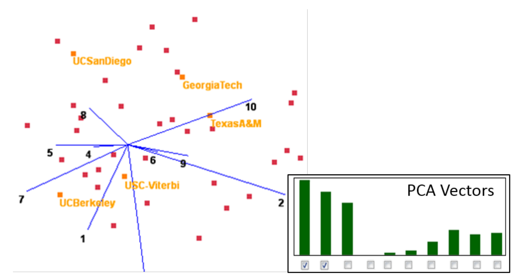
The late Jim Cray [1] described data-driven science as the evolution from hypotheses to patterns, and the most interesting and useful data patterns involve many more than just two variables. They are High-dimensional (N-D), as opposed to bivariate. Unfortunately, High-dimensional patterns are fragile structures that do not always survive the mapping from N-D space to the 2-D (or even 3-D) space in which the human visual system operates and can visualize them. Let us demonstrate this by way of a simple example, using a 10-D dataset composed of a set of colleges with salient attributes such as US-News score, tuition, athletics, housing quality, etc. Figure 1 shows a High-dimensional scatterplot (a biplot) of this college dataset. Focusing on dimension 10, tuition, in the upper-right portion of the figure, we observe that, while USC-Viterbi is an expensive school, it ends up located to the left of the cheaper Texas A&M. This is a well-known phenomenon because biplots use the two most dominant Principal Component (PCA) vectors as a basis and project both data and dimension vectors into it. However, as the PCA bar chart shows, there are in fact three significant PCA vectors, and some less significant ones. The visualization only coveys the variance of the two major PCA vectors; the remaining unexplained variance leads to this distortion. These types of distortions occur with any projective N-D to 2-D mapping, linear or non-linear, in all but the most trivial cases. They affect individual point-pair relations as well as overall cluster appearance, such as density, composition, shape, and organization.
Thus, since we cannot observe these patterns directly in 2-D, we require the help of an “agent” that ventures into N-D space, observes the patterns there and then visually explains them to us in our native 2-D space. For this to work, we first need a sufficiently expressive vocabulary that can capture the appearance of the patterns to be conveyed. An attractive framework for this purpose is Scagnostics, first informally proposed by John and Paul Tukey [2]. More recently, Wilkinson et al. [3] used graph-theoretic measures to define specific Scagnostics metrics such as density, skewed, clumpy, striated, stringy, straight, and others to gauge cluster appearance. These metrics operate on a bounded continuous scale which can be optionally binned into discrete levels.
Wilkinson et al. employed three graphical representations: minimum spanning tree (MST), alpha hulls and convex hulls, but they only used them for 2-D analyses. Since then Fu [4] extended Scagnostics to 3-D and Dang et al. [5] used 2-D Scagnostics to encode High-dimensional time-series. We have opted to only analyze rotation- and dimension-invariant properties, as only those can be reliably ported from N-D to 2-D. The Scagnostics appearance metrics fitting this focus are those that gauge cluster composition, such as skewed, clumpy, and striated. All of these require MST analysis, which, in contrast to alpha and convex hull algorithms, is relatively easy to extend from 2 to D to N-D. Finally, to assess cluster shape while retaining dimension-number invariance, we evaluate a set of statistical measures—variance, skew and kurtosis—along each dimension in N-D space.
Now when it comes to the visualization of these metrics it is important to realize that the mapping of a metric tuple to a 2-D scatterplot is not bijective; there are many 2-D scatterplots which, when analyzed, will evaluate to the same tuple configuration. This is mainly because the metrics do not fully characterize the scatterplot’s appearance, i.e., the set of metrics is not complete. A solution is illustrative stylization, i.e., design a dedicated rendition of the property to be conveyed, one that elicits the same semantic response in the viewer than the real-world property, the scatterplot. An important added benefit to this stylization scheme is that the viewer can then also easily distinguish a real projective N-D/2-D mapping from an analyzed one.
Scatterplots are essentially texture patterns, and so we have devised three sets of illustrative texture patterns, each of which is dedicated to one of the three Scagnostics measures we have adopted, and each of which is parameterized by feature strength. Mapping this texture into the 2-D contour derived from the statistical N-D shape analysis then yields what we call a Cluster Appearance Glyph.
While our method can be used within cluster analysis, it does not provide any clustering capabilities [6,7] on its own. Rather, it expects a cluster membership tag for each data point, either obtained via prior cluster analysis or classification. Our method then analyzes each such cluster and determines its corresponding cluster appearance glyph. Next it computes a suitable 2-D layout by a cascaded mapping of all data points—using Linear Discriminant Analysis (LDA) and then Multi Dimensional Scaling (MDS). Then it anchors each glyph at the center of its corresponding 2-D-mapped cluster. Here the appearance textures of the glyphs are able to compensate for LDA’s loss of cluster detail. Finally, since the overall layout might lead to overlapping glyphs that undermine readability, we perform a final optimization step that removes these overlaps.
Our research makes the following contributions:
- We introduce a set of measures gleaned from Scagnostics that can holistically characterize the point distribution of data clusters in N-D space.
- For this purpose we extend a subset of Scagnostics measures from 2-D to N-D, specifically, the striated, clumpy, and skew metrics.
- We introduce the concept of Cluster Appearance Glyph, a family of illustrative textures that can graphically encode the three scagnostics measures assessed in N-D.
- We introduce a set of graphical enhancements for our cluster appearance glyphs, designed to encode additional statistics assessed from the N-D clusters.
- We introduce a cascaded LDA-MDS N-to-2D mapping strategy, devised to preserve global cluster relations while keeping sufficient space for glyph placement.
- We validate and refine our various design choices via a series of user studies.
Our paper is structured as follows. Section 2 presents related work. Section 3 and Section 4 discuss the 2-D mapping and theoretical underpinnings. Section 5 covers appearance aspects of this work. Section 6 describes our cluster appearance glyphs. Section 7, Section 8, Section 9 and Section 10 discuss outcomes of user studies and present results. Section 11 ends with conclusions.
2. Related Work
Research on the visualization of high-dimensional (N-D) data has largely used traditional visual variables in the spirit of Bertin [8]. One may distinguish these methods by the strategy they use to overcome the problems that arise from the limited dimensions available for display. Pixel based techniques [9] create an matrix of scatterplots called SPLOMs [10] in which each coordinate pairing is displayed. Linkable scatterplots [11] have been designed to improve the data comprehensibility of SPLOMs. On the other hand, Multi-Dimensional Scaling (MDS) [12], Linear Discriminant Analysis (LDA) [13], neural embeddings [14] and others have been employed to “flatten” the N-D space into 2-D, while all suffer from distortions in this flattening process, LDA is particularly noteworthy since it seeks to maximize the inter-cluster distances, spacing the clusters well apart, but in the process it shrinks the intra-cluster distances. This transforms all projected clusters to similar small blobs of points, although they might have very different appearances in N-D. We add this appearance back in via our glyphs.
More recent embedding techniques are t-SNE [15] and UMAP [16]. Both group points into the embedding according to probabilistic neighborhood relations in N-D, while neither is designed to preserve shape and appearance of local structures, UMAP excels over t-SNE for its ability to better maintain global structure. However, it often leads to a decomposition of clusters into smaller groups, while UMAP can also be run in supervised mode and so be incentivized to better observe classified clusters, it may still produce some stray noise. We chose LDA over t-SNE and UMAP since it is explicitly designed to linearly maximize the separation between the class-tagged clusters. So this fits our goal perfectly. However, LDA also has shortcomings. First, as mentioned above, LDA does not preserve local structure. However, we can tolerate this since we provide the local structure with our appearance glyphs. Second, the dimensionality of LDA’s embedding is determined by the number of classes. We chose MDS (over t-SNE and UMAP) to reduce the dimensionality to 2 as the remaining dimensionality is low and will not require the complex and time intensive mechanism of the more advanced algorithms.
Star Coordinates [17] and RadViz [18] flatten the axes of the N-D space into 2-D where an N-D point reduces to a 2-D point whose coordinates are given by the average coordinate value in the multi-spoke radial coordinate system. These systems, however, fall victim to similar distortion problems than biplots. Conversely, the method of Parallel Coordinates (PC) [19] reduces an N-D data point to a piece-wise linear curve, while the emerging ensemble of lines can reveal data patterns, it often occurs that a pattern of interest is fully or partially occluded by other data patterns and the recognition of patterns is also sensitive to axes ordering.
Since Scagnostics represents a scatterplot as a vector of 9 appearance-based numerical scores, a collection of scatterplots forms a 9-D dataset. This can facilitate an effective summarization of a possibly massive number of bivariate scatterplots, while the original paper used a SPLOM to visualize this dataset, Dang and Wilkinson have used a similarity-based 2-D embedding [20]. Jo and Seo [21] found that the Scagnostics measures, while human-interpretable, are not predictive in how humans perceive the similarity of two scatterplots. They propose the low-dimensional latent vector of a trained auto-encoder neural network as a better “disentangled” representation in which each vector component expresses one perceptual dimension, while we could use this type of analysis as well, it would require a large dataset of N-D patterns which would be expensive to train a neural network with. For this reason, we prefer the computational Scagnostics approach.
Glyphs have a long history in data visualization and several surveys [22,23,24] are available that provide an overview. According to Ward [22] they are “graphical entities that convey one or more data values via attributes such as shape, size, color, and position”. They can be fairly simple or consist of intricate designs that capture information on several attributes of a High-dimensional dataset. They are typically placed independently throughout the canvas to indicate local data relationships. Our glyph uses texture and optionally encodes additional information into the boundary.
3. N-D to 2-D Data Mapping
Our aim is to achieve a 2-D embedding that can preserve the global (inter-cluster) distances. In addition, we would also like the clusters to be well spaced apart to create a sufficient empty space for our glyphs. On the other hand, we are less interested in preserving the intra-cluster distances because we will use our glyph representation to convey these visually.
3.1. LDA
We find that LDA is especially well posed for this purpose. It projects the data from N-D space into an optimal lower dimensional space by maximizing the ratio of between-cluster variance and within-cluster variance. This guarantees maximal separability of clusters. Following the notation of Choo et al. [25], we define a dimension-reducing linear transformation as:
Assuming m is the dimensionality of the original data space, maps an m-dimensional data vector x in to a vector z in l-dimensional space (). We shall call this reduced dimensional space intermediate space, as typically . Let us assume we have k classified clusters. We follow the general LDA strategy, the approach of Choo et al. then maximizes and minimizes in the reduced dimensional space, where and is the between-cluster data scatter matrix and the within-cluster data scatter matrix, respectively. Hence, this yields the desired embedding where the k clusters are optimally spaced apart, at the expense of compressing the data points inside the clusters. The two optimizations are simultaneously satisfied and can be approximated in a single form as:
The solution, , is a matrix in which the columns are the leading generalized eigen-vectors u of the generalized eigenvalue problem:
The final step is to project the m-dimensional data vectors onto the l-dimensional space. This space has dimensionality and so does not produce the desired 2-D layout as yet. Choo et al. offer two strategies for this. Their first method, called Rank-2 LDA [25], chooses the two dimensions with the largest leading generalized eigenvalues, while the second method [13] allows users to select the two dimensions via an interactive framework that uses a parallel coordinated display with bivariate scatterplots for each axis pair. We shall refer to this second more general method as Selected-2 LDA.
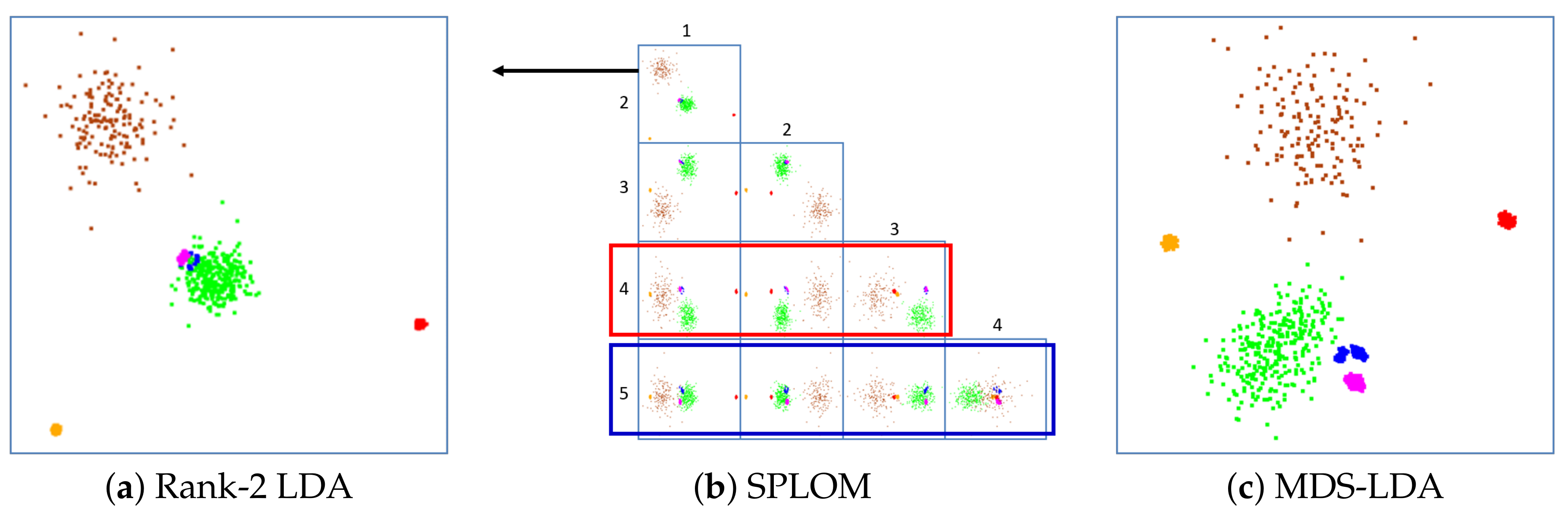
3.2. Layout Problems with Rank-2 and Selected-2 LDA
Figure 2a shows a scatterplot obtained by Rank-2 LDA with an artificial Gaussian dataset, consisting of six well-separated clusters in 30-D space that are composed of 200, 200, 300, 360, 450 and 150 points, respectively. Figure 2a shows that the clustering is well preserved by Rank-2 LDA. However, three clusters—magenta, blue and green—are overplotted. Figure 2b visualizes all possible sets for Selected-2 LDA using a SPLOM. We observe that if we use the fourth dimension (scatterplots within the red box), the green cluster is no longer mixed, but the blue and magenta clusters still are. On the other hand, if we use the fifth dimension (blue box), the blue and magenta clusters are separated, but they both mix with the green cluster. Hence, the Selected-2 LDA method [13] can indeed reduce the overplotting problem but cannot totally eliminate it.
3.3. MDS-LDA
To improve the overplotting problem, we propose the MDS-LDA approach. It is motivated by the fact that even though MDS can be problematic when the number of dimensions is high, it does quite well when it is not. LDA, on the other hand, does a fine job to go from N-D to -D but simple 2-D projection techniques are unable to go further down to 2-D. So, our proposed approach is to combine the best of both worlds and introduce what we call MDS-LDA. Instead of selecting two eigen-dimensions, MDS-LDA performs MDS on the points in -D intermediate space. As Figure 2c shows, this avoids the overplotting problem and renders all clusters well separated.
3.4. Limits of Embedding N-D Cluster Structures in 2-D
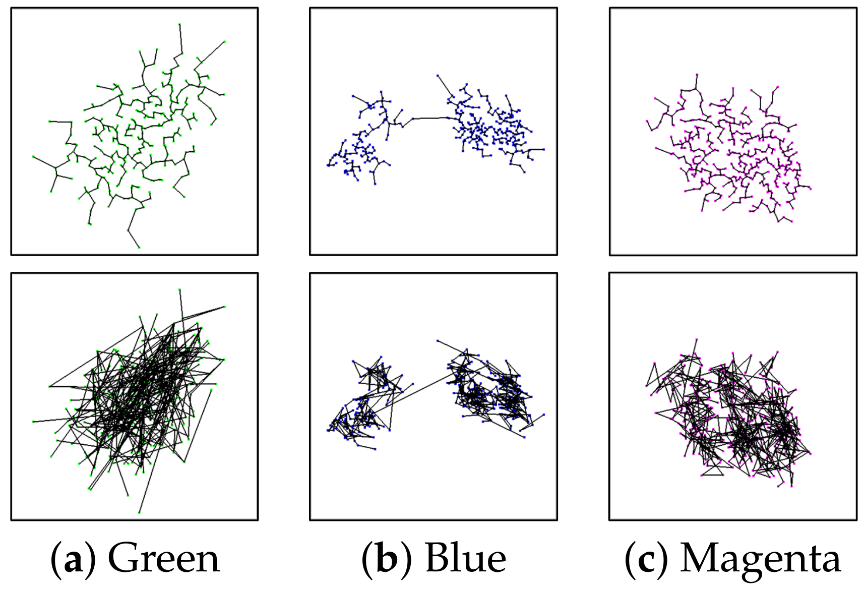
As argued in the introduction, cluster patterns (intra-cluster distances) are typically not well-preserved when mapping them from N-D to 2-D. It is easy to demonstrate that the N-D patterns are not preserved in the 2-D projection by inspecting the MSTs generated using both N-D and 2-D distance. Figure 3 shows the three clusters in the MDS-LDA plot with a 2-D distance-based MST on the top and an N-D distance-based MST in the bottom. In all three clusters, the two MSTs look dissimilar. This dissimilarity demonstrates that distortion is introduced by the dimension reduction and causes a change in the N-D patterns when projected to 2-D.
To overcome this limitation, we analyze meaningful N-D cluster structures from the N-D space and visualize them. In following sections, we describe how we achieve it.
4. Appearance Analysis and Classification
In this section, we explained the meaningful N-D cluster structures we found and how we measure it.
4.1. Scagnostics Metrics
The human visual system works best with 2-D or 3-D plots. Thus, scatterplot matrices (SPLOMs) are very effective for the visualization of N-D data. However, as the number of variables p increases, a SPLOM loses its effectiveness due to information overload. It is simply impractical for a user to search for patterns in plots (cells) for larger values of p.
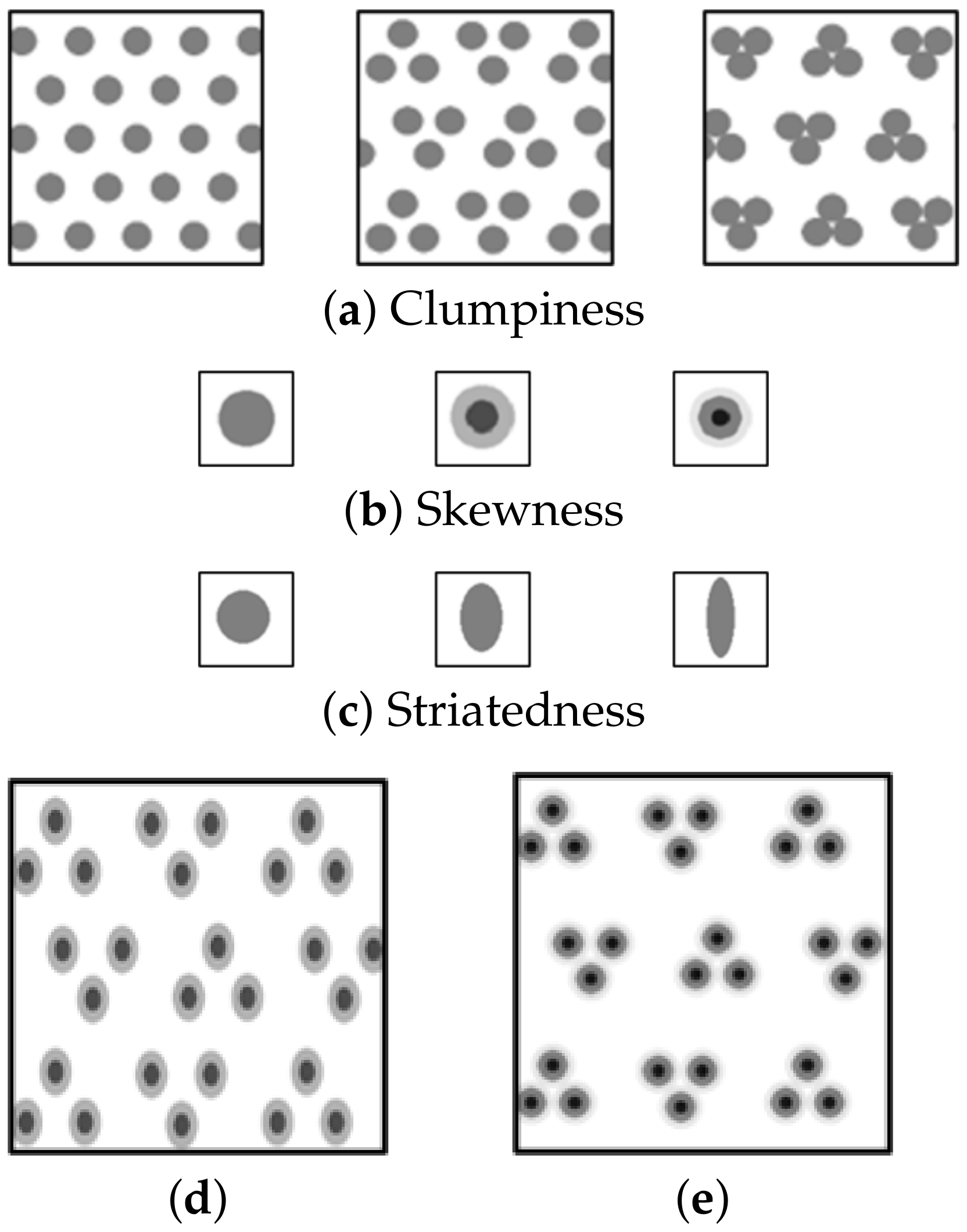
To overcome this problem, John and Paul Tukey [2] proposed a wide variety of Scagnostics indices to judge the usefulness of a scatterplot display and so reduced the O() visual task to an O() one, where k is a small number of distribution-related measures of 2-D scatter points (Scagnostics indices). Wilkinson et al. [3] use graph-theoretic metrics to calculate the Scagnostics measures. The method extended the scope of the original idea and also improved the computational efficiency by using graph-theoretic metrics based on Delaunay triangulation. They describe three geometric graphs—convex hull, alpha hull and minimum spanning tree (MST)—on which the Scagnostics metrics are computed. We only use skew, clumpy and striated as our per-cluster descriptive Scagnostics. The values of all three metrics are within the range 0 (low) to 1 (high). They are described as follows.
Skew: A point distribution is skewed when the distribution of edge lengths in the MST is not uniform. The skew metric is computed based on the ratio of quantiles of the edge lengths as:
where , , and are the 90th, 50th and 10th percentile of MST edge lengths, respectively.
Clumpy: This measure looks for the existence of sub-clusters in a cluster. It is based on the RUNT statistic [26] where the runt size of a dendrogram node is the smaller of the number of leaves of each of the two subtrees joined at that node [3]. A runt size () is associated with each edge () in the MST. The metric is high for clusters with small between-point distances inside clusters relative to distances of connecting-edges between clusters. It is computed:
where j indexes edges in the MST and k indexes edges in each runt set derived from an edge indexed by j.
Striated: It gauges if there are points that lie on parallel lines by investigating the angles between connecting MST edges. As the value goes to 0, the cluster points form an increasingly fuzzy distribution. It is computed by summing angles over all adjacent edges:
where be the set of all vertices of degree 2 in V.
4.2. Extending Graph-Theoretic Scagnostics to N-D
Wilkinson et al. [3] defined their metrics only for 2-D. Here we describe an extension to N-D, for skew, clumpy and striated. This can let us gauge the appearance of each cluster in N-D space and use it to overcome the embedding limitation. This is promising since these measures extract the density/distribution patterns succinctly, and since all of the three metrics are rotation and dimension-invariant they can be reliably ported from N-D to 2-D. All three metrics are also based on the MST which scales well to N-D, although the Euclidean distance must now be calculated in N-D space which is more expensive. Further, while striated can be extended to parallel hyperplanes and hyperlines, we consider only parallel lines due to computational efficiency and interestingness of the pattern. Since the three metrics are all based on the MST, the formulas for the 2-D case can be used without change.
4.3. Demonstrating the Embedding Limits with Scagnostics Metrics
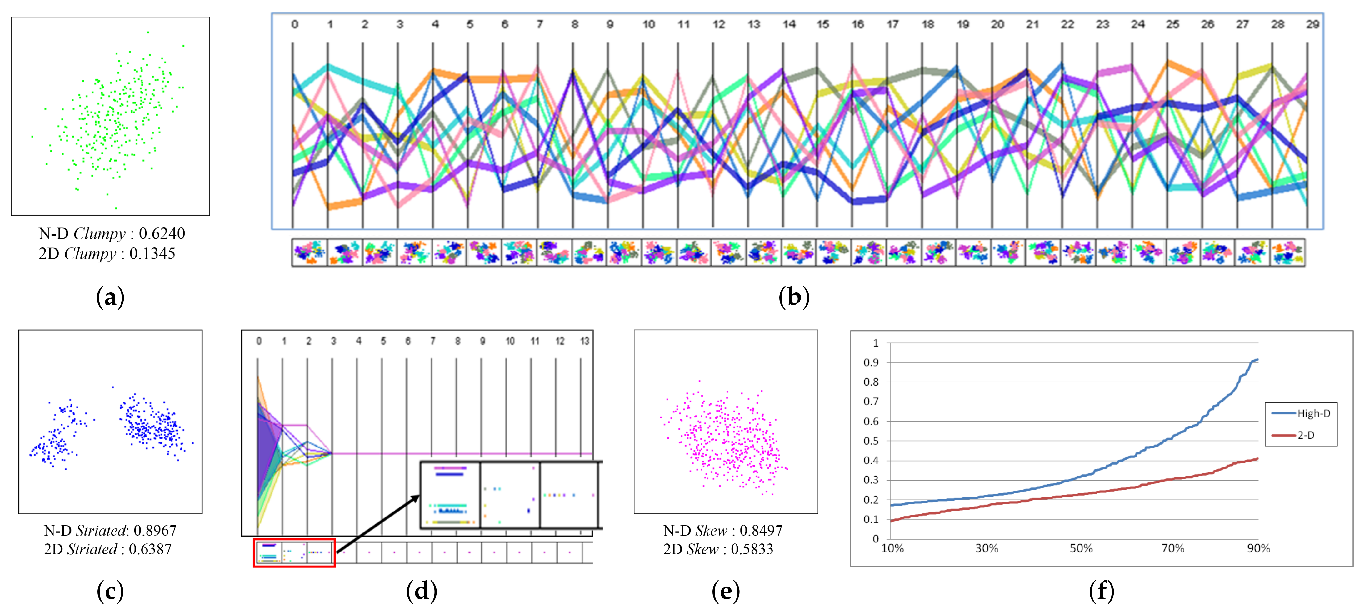
With these Scagnostics measures, we can also demonstrate the embedding limitation, while we have not tested all embedding algorithms in existence, we selected two representative ones—one linear and one non-linear. For our study we synthesized a 30-D dataset, consisting of 6 well-separated Gaussian clusters composed of 200, 200, 300, 360, 450 and 150 points, respectively. For each of the 6 clusters we computed all three N-D Scagnostics metrics. We distinguish between three levels: low (0–0.3), mid (0.3–0.7), and high (0.7–1). We chose the low-mid-high bracketing since these levels appear frequently in many real-word settings.
Figure 5 shows our results for three of these six clusters—colored green, blue and magenta. We synthesized the green cluster (Figure 5a) to have 10 sub-clusters. The parallel coordinates display (PCD) in Figure 5b visualizes the centers of these 10 sub-clusters, and the panels below each axis pair show the respective bivariate scatterplots. We can observe that the sub-clusters appear moderately well separated in N-D space and are also fairly well distinguished in the scatterplots. However, no sub-cluster is observed in the zoomed MDS-LDA plot (Figure 5a), and this is confirmed by the very low value of 0.1345 of the associated 2-D clumpy metric. The N-D clumpy metric on the other hand evaluates to 0.6240 (mid). Evidently the clumpy pattern in N-D space is not preserved well in the 2-D mapping.
The blue cluster in Figure 5c was synthesized to have 9 parallel lines in N-D. To make these N-D parallel lines easy to recognize, only three of the 30 dimensions in the blue cluster are used for creating the pattern. The 9 parallel lines can be seen in both the PCD and the 2-D scatterplots below (Figure 5d). The N-D striated metric has a value of 0.8967 (high). However, the distribution of the blue cluster in the zoomed MDS-LDA 2-D plot (Figure 5c) exhibits the striated pattern only in a fuzzy manner—the distinct parallel lines have vanished—and accordingly its value is 0.6387 (mid). We conclude that the striated pattern in N-D space is also not preserved well in 2-D space.
Finally, the magenta cluster (Figure 5e) has a skewed point distribution in N-D space. The amount of skew can be gauged in a plot of the distribution of the ratio of edge lengths to max edge length in the MST (see Figure 5f). The steeper the graph’s slope, the more skewed and non-uniform the distribution is. Clearly, the N-D graph is steeper than the 2-D one. Accordingly, the N-D skew metric evaluates to 0.8497 (high), while this metric evaluates to only 0.5833 (mid) for the zoomed 2-D plot (Figure 5e) where we only recognize a rather moderate level of skew. Thus, evidently, the N-D skew pattern is also not preserved well in the 2-D embedding.
5. Textures
In the previous section we found that the projection from N-D to 2-D fairly could not preserve the N-D Scagnostics metrics in the 2-D. In order to visualize this appearance information better, we propose to synthesize a texture pattern specifically designed to convey the overall nature of the distributional cluster appearance. One of our initial motivations in this research was that when a sufficient degree of artistic abstraction was applied, a viewer would be reminded of the patterns a scatterplot can reveal, but focus on the kinds of patterns the texture patterns could actually convey. The viewer would not mistake it for an actual scatterplot and so not try to ’over-analyze’ it. All we essentially aim for is to convey a ’feel’ for the nature of the underlying data. We believe that this is justified (1) by the concept of Scagnostics itself, and (2) by the fact that data are typically collected at some level of uncertainty, and so the abstraction we produce will not lead to misinformation (if done well).
5.1. Crowd-Sourced Texture Design
Our goal is hence to generate a texture for each combination (at some granularity) of our chosen Scagnostics metrics—skew, clumpy, striated—which can subsequently form the basis for artistic abstraction. However, the equations given to compute these metrics are not invertible, i.e., we cannot reverse-engineer the metrics for the purpose of generating a texture that evaluates to a desired (skew, clumpy, striated) tuple. Exhaustive search is also infeasible; assuming a texture of size 642 this would require 24,096 images to be evaluated, with just two states (white/black) per pixel.
To narrow the search space we developed a procedural approach that decomposes the texture generation process into three sequential stages, addressing each parameter in turn, with some overlapping influence. This has the additional advantage that the generated textures are more intuitive in their mapping to the metrics, that is, users who view these textures can mentally decompose the three metrics and draw independent inferences. This is important since in our experiments we have come across many textures that fit the metrics well but were not intuitive at all. Through a series of user studies we found a suitable set of textures that convey the skew, clumpy, and striated metrics in an effective and reliable manner.
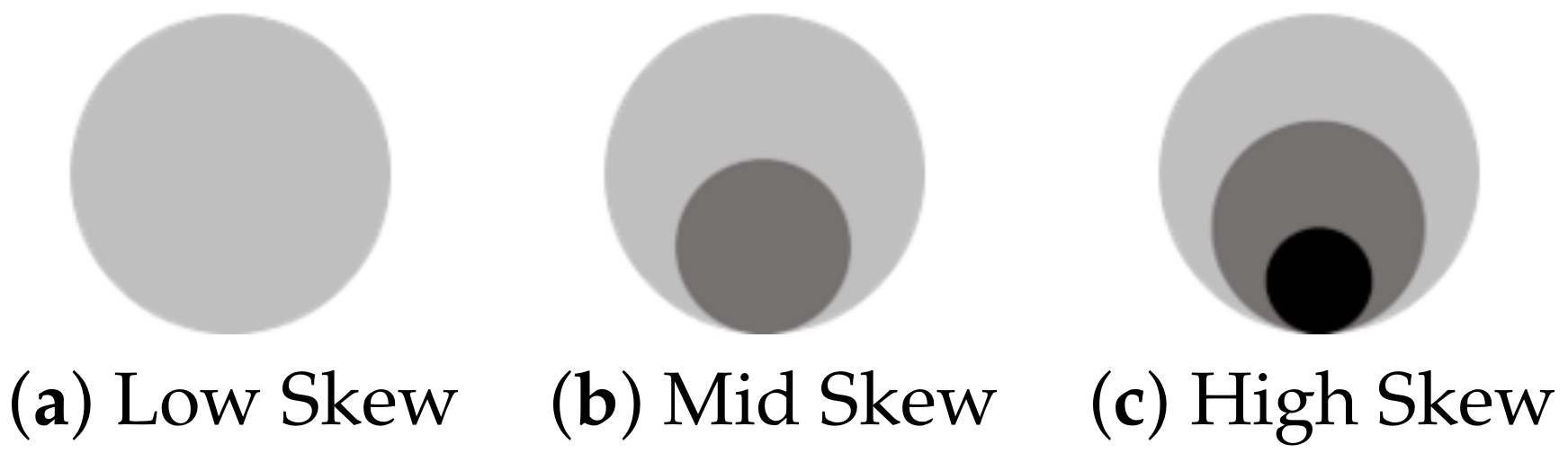
As mentioned, we bin the metric values into three levels: low, mid, and high. As part of pre-processing, the system procedurally generates a set of 27 repeating textures: the three Scagnostics metrics with three levels each (low, medium, high). In each texture, a set of points is abstracted as a triad of blobs which communicate all three metrics. The clumpy value is communicated by varying the space between the blobs in a triad, in which a small inter-blob distance indicates high clumpiness and greater distances indicate lower clumpiness (Figure 6a). The skew value is shown as one, two, or three concentric rings that represent, respectively, low, medium and high skew (Figure 6b). The striated value is visualized by stretching the blobs, where a circular blob indicates a low striated value and an elongated blob indicates a high striated value (Figure 6c). Figure 6d,e show two examples of synthesized textures that combine these three metrics.
5.2. Effectiveness Texture
We conducted both formative and summative user studies during this research to determine the most effective collection of textures that can produce understandable, unambiguous illustrations so that the features highlighted in the N-D space are easily comprehensible to the user. This goal raises few obvious questions: (1) Does our method bring any advantage over using traditional scatter plots? (2) If it does, does the set of our textures provide an acceptable level of understandability? To find answers to questions along these lines and justify our texture generation framework, we performed several user evaluations through the Amazon Mechanical Turk platform. No specific knowledge of visualization, data science, machine learning and the like was required to take up a job and participate in the study. All participants were Mechanical Turk Master Workers and none of the results needed to be discarded due to poor or inconsistent outcomes.
In the following we present each individual study: the questions, the results and the findings.
User study 1: Does texture-based illustration increase understandability over scatterplots?
We tested each of the Scagnostics metrics (skew, clumpy, striated) independently. For a given metric (say, clumpy) each subject first went through a qualification phase where the subject was presented with a short introduction that explained the concept of the metric and was then given an idea of how this metric could be represented by a texture. In the study, we had 60 subjects and each subject was presented with six questions, three of two types each. In the first type, the test subject chose between two randomly generated 2-D scatter plots, and in the second type the subject chose between two textures. In both types of questions, the subject was asked questions such as “Which plot/texture is more clumpy?” The subject had option of picking either image or choosing “Not Sure”. This testing procedure was carried out for all three properties and for different sets of textures generated. Since we have statistics about the accuracy of each subject for both scatter-plots and textures, we performed paired, one-tailed t-tests, where the null hypothesis in all tests was “Introduction of textures provides no significant improvement in user perception of the metric”. The results of the first user study are given in Table 1. We see that, generally speaking, textures can provide a statistically significant improvement of understandability over scatter plots when tested independently.
User study 2: Does the presence of one property have an impact on the understandability of the other?
In the second major study we tested the textures for cross interference. Here again, we tested for all three metrics and had 180 subjects for each metric. For a given metric we first trained a subject with a short qualification test that involved only the metric under consideration. In the study, a subject was presented with pairs of textured illustration where one metric level varied and other metrics might or might not be changed. The subject was instructed to complete a task like “Select the clumpier texture”. Table 2 shows the study’s summary data where the percentage indicates the accuracy rate of the test subjects in picking the correct texture. We can infer that the presence of other metrics has some impact on the understandability of a given metric, but within a tolerable limit. Thus, we conclude that cross-effects are minimal and do not notably impact understandability.
6. Cluster Appearance Glyphs
In this section, we describe how we represent each cluster by a glyph. The glyph boundary is derived from statistical analysis in N-D and its interior is filled with the calculated appearance texture. Each glyph is placed at the center of the MDS-LDA projected cluster, and its boundary is modified by three metrics derived in N-D for each dimension: standard deviation (SD), kurtosis, and skew.
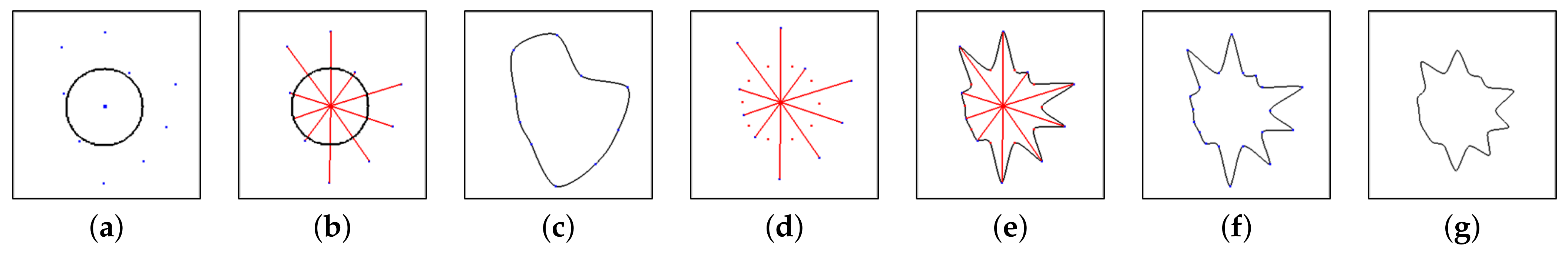
Boundary shape: If a cluster has similar SDs across all dimensions, the N-D shape of the cluster can be considered homogeneous, otherwise it is heterogeneous. Figure 7 illustrates the design process of the glyph boundary shape. Figure 7a shows 10 boundary points of the glyph to visualize a 10-D cluster. Each point corresponds to a dimension in clockwise order. It has an inner circle to secure an area for the appearance texture. The radius of the inner circle (in black) represents a global minimum SD along all dimensions of all clusters. Figure 7b shows how the boundary points are computed. The length of a red line represents the magnitude of the SD in the corresponding dimension and is normalized by a global maximum SD along all dimensions of all clusters. The boundary is created by connecting the boundary points. Since this list of points often yields a rather noisy boundary we smooth the set of points by applying an interpolating cubic spline that loses no information (Figure 7c). As seen, the SDs have variation—some of them are close to the minimum SD but some of them are much larger than it. However, due to the similar magnitude of SDs in the 2nd–5th and 6th–8th dimensions, it is difficult to notice the variation of SDs, i.e., the heterogeneous shape. We found that the heterogeneous shape is hard to recognize when there are consecutive dimensions with similar SDs. Therefore, intermediate points (red points in Figure 7d) are inserted between the boundary points to minimize the influence of such consecutive dimensions. These intermediate points are computed by a local minimum SD along the SDs of all dimensions of the cluster. Figure 7e shows that the boundary including the intermediate points visualizes the heterogeneous shape much better. Figure 7f,g show two different cases by setting different lengths for the global maximum SD, but the same length for the global minimum SD. The boundary is generated with a shorter length for the global maximum SD in Figure 7g. Our system allows the circle radius and the length for the global maximum and minimum SD be controlled interactively.
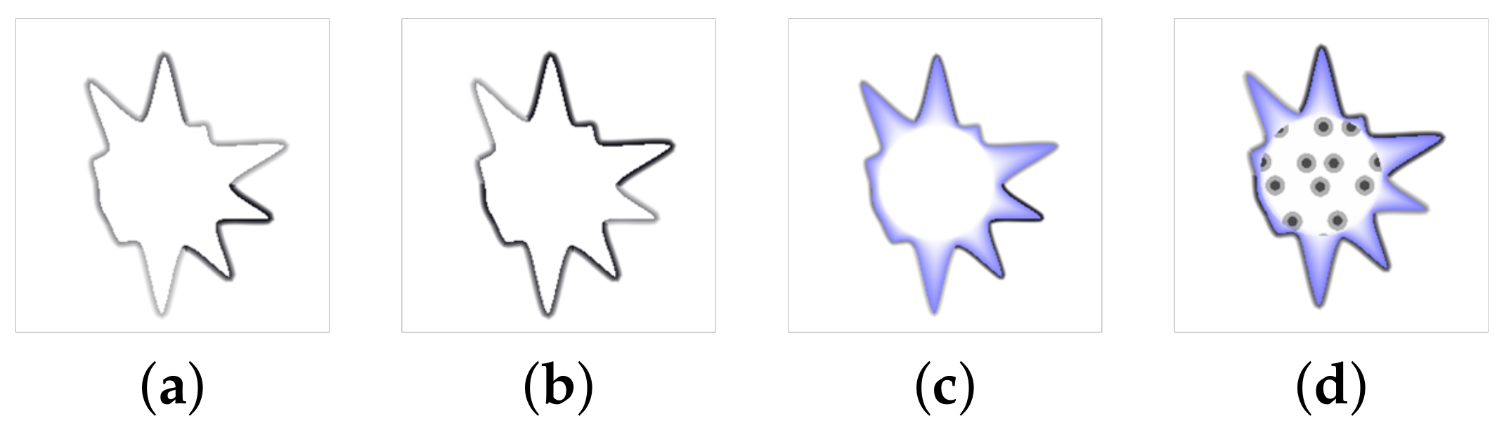
Boundary line appearance: We vary the intensity of the boundary line to visualize the 1D statistics of the dimensions in the N-D space. Two metrics—kurtosis and skew—are considered. This skew metric is different from the skew metric used for texture generation, and to avoid confusion we shall refer to it as asymmetry. A stronger intensity indicates a higher value of the metric. The asymmetry metric is a measure of asymmetry of the probability distribution of a random variable. The value can be positive, negative or 0. A positive value means a longer right-hand side tail of the distribution, where most of the values lie to the left side of the mean. A negative value means the opposite. When the metric is 0 then the values are relatively distributed evenly on both sides of the mean. It is given by the following equation:
where is the third moment about the mean is the standard deviation. In our visualization, the sign of the value is not considered. The variation of the asymmetry metric along the dimensions is shown in Figure 8a. Even if several dimensions have a similar SD, their distribution can be diverse like Figure 8a. Next, the kurtosis metric is a measure of the shape of the probability distribution. The metric estimates whether the distribution is peaked or flat relative to a normal distribution. A high kurtosis has a distinct peak around the mean, declines rapidly, and has heavy tails. A low kurtosis indicates a flat distribution near the mean rather than a sharp peak, Thus, a uniform distribution is the extreme case of low kurtosis. The value is computed as follows:
where is the fourth moment about the mean . The minus 3 can be defined as a correction to make the kurtosis value of the normal distribution 0. Then the intensity of the boundary when varied by the kurtosis metric visualizes how sharp peaked and heavy tailed a dimension’s distribution is. Figure 8b shows this kurtosis-based boundary. This visualization allows a comparison between different dimensions for both metrics.
Boundary area appearance: With the boundary visualization, an inner shadow is chosen to identify clusters by its color and represent overall distribution. Since the inner circle is generated by the global minimum SD and the intermediate points are generated by the local minimum SD, the thickness of the shadow indicates the difference between the global and local minimum SD. If the cluster has a thick shadow, its minimum SD is larger than the global minimum SD. To secure shadow space for clusters with no differences between them, we define a minimum thickness. Figure 8c shows the shadow along with boundaries.
Appearance Texture placement:Figure 8d shows how the synthesized Scagnostics texture (here mid clumpy, mid skew and low striated) is mapped to the cluster glyph. The texture is shown only in the inner circle area. If we were to extend the texture outwards, the blobs near the boundary could make the boundary look darker and interfere with the boundary color. As explained in Section 5, in the texture the clumpy metric can be estimated by distances between blobs of a triad. Thus, at least one triad of blobs should be shown in the glyph by placing them in the middle of the inner circle. The details inside the texture can be zoomed in by modifying the texture size.
7. Overlap Avoidance
The MDS-LDA layout does not inherently prevent overlap of glyphs. However, prevention of overlap is crucial because the glyph visualizes cluster details using all of its parts. So after layout we run an overlap removal algorithm originally devised by Gansner and Hu [27] which we have modified somewhat as detailed further below. The algorithm utilizes a proximity stress model that seeks to preserve the initial layout as much as possible. The algorithm sets up a rigid “scaffolding” structure in order to maintain relative positions of points while they move around. This scaffolding structure can be created by Delaunay triangulation (DT) and is used to determine if there is any overlap between nodes connected by DT edges. To ensure smooth convergence to a solution, the algorithm operates in an iterative fashion and only adjusts nodes by small increments.
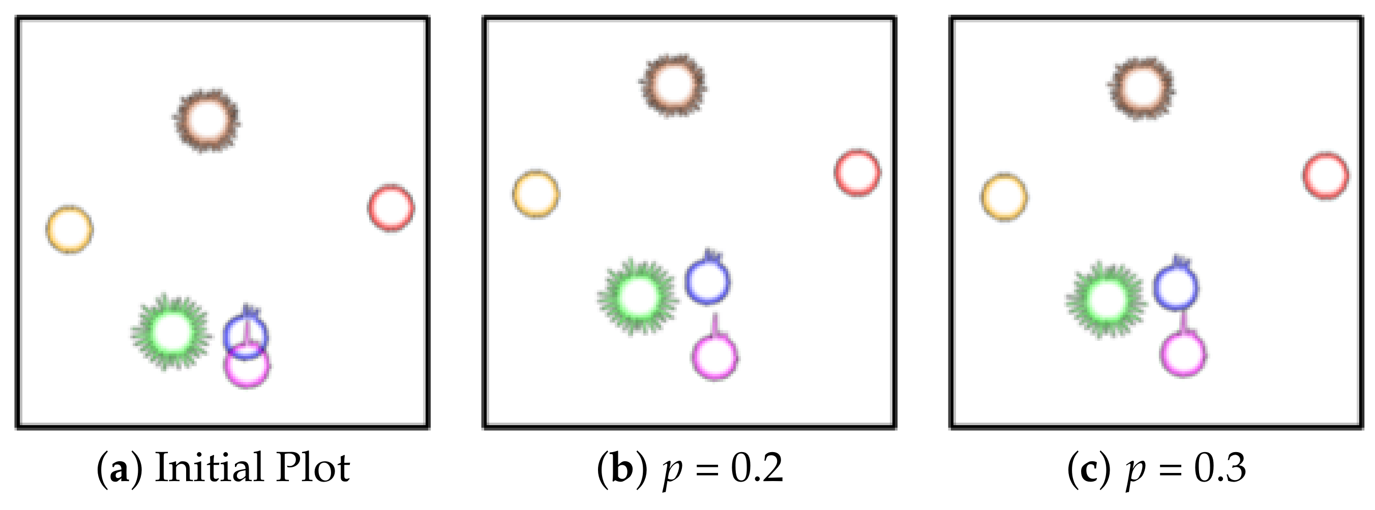
We modified the algorithm by Gansner and Hu in the following way. Their original scheme uses a bounding box for a node to check for overlaps. If we used a bounding box, however, it may detect “fake” overlaps which actually do not exist because our primitives are largely circular. So, by substituting the half width and half height of a node (cluster) with the radius of the glyph, i.e., the local maximum radius, we can alleviate the problem. Furthermore, since a glyph is generated by different radii according to the SDs, using the maximum radius may still give rise to fake overlaps. We thus provide a slider interface by which users can control how much partial overlap is allowed, called the permitted overlap ratiop. If , the radius can be substituted with when computing the overlap factor. By allowing for interactivity in the iterative overlap algorithm, users can control the variation of the layout. By observing the intermediate results from each iteration, users can decide if another iteration is needed or not and so run less risk of destroying the initial layout significantly. Figure 9 shows how our improved method reduces the overlaps according to p.
8. User Study
Our glyph design makes use of multiple visual encodings to represent the appearance of high-dimensional clusters. Each visual encoding enables a user to gauge the level of each measures. However, combining multiple encodings into a glyph introduces the possibility of interference among encodings. We conducted a user study to investigate which encodings and their combinations at different levels, if any, affect the interpretation of a particular measure. In addition, we compare the user’s accuracy when using our glyph design versus a baseline design.
8.1. Data and Users
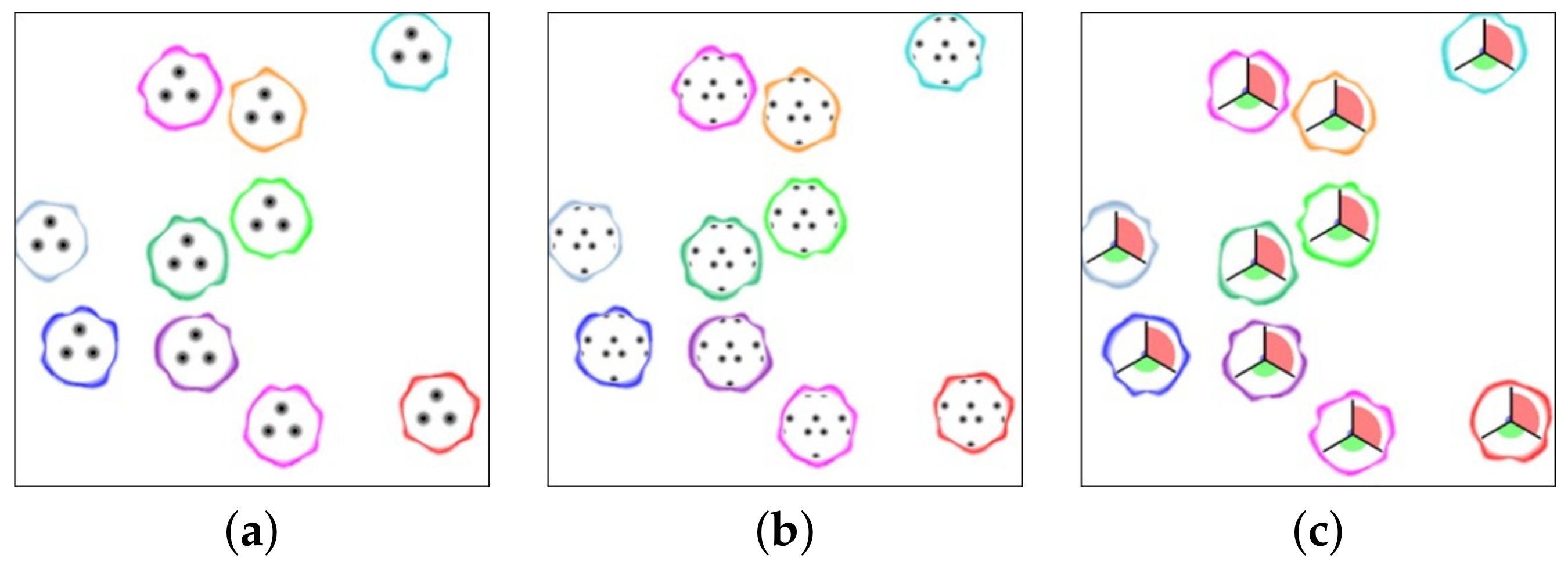
The goal of this study was to test if visual encodings interfere with one another. We generated 216 images that show all possible combinations of measures communicated with our glyph encoding. Each image had multiple glyphs organized in a fixed layout across all images. Some examples of this design are shown in Figure 10a,b. The glyphs represent different levels of the encoded measures, i.e., striatedness (low, mid, high), skewness (low, mid, high), clumpiness (low, mid, high), boundary (present or absent), boundary metric (shown or hidden), texture (periodic or non-periodic). The set of images generated contained all possible combinations of the levels for each measure, and so each image represented a unique combination of the encoded parameters.
In addition to these images, we generated another 108 images that show all possible combinations of measures communicated with a baseline design (pie glyph). Some example of this design is shown in Figure 10c. The design is based on a circular bar chart, variations of which have been used in other glyphs as well [28,29]. Here we have three bars that encode different levels of the Scagnostics measures, i.e., striatedness (low, mid, high), skewness (low, mid, high), clumpiness (low, mid, high). Additionally, we use the same boundary encoding.
We recruited a total of 45 participants for the study. We used Amazon Mechanical Turk (AMT) to recruit the participants; all were anonymous and no data was collected about them. We only allowed AMT Masters to participate in the study; these people are workers who have been consistently completing tasks on AMT with a high degree of satisfaction. The AMT participants were compensated with an hourly pay of $6.
8.2. Procedure
The study was designed such that each participant had to evaluate only one of three Scagnostics measures—clumpiness, skewness or striatedness—using our glyph design and the baseline design. Thus, our group of 45 participants was split into three subgroups of 15 participants, one for each measure. Participants first went through a short training phase. They were shown examples of glyphs (our design and the baseline design) representing different levels of the measure they would be evaluating. They were then given 2 practice questions—one for our design and one for the baseline design. Once participants were ready, they proceeded to the main study.
Each participant was required to complete 16 study questions—a group of 8 with our glyph design followed by a group of 8 with the baseline design. In each question the participant was shown a randomly selected glyph and was asked to report the level of a measure (clumpiness, skewness or striatedness). The participant was allowed to select one of three levels (low, mid, or high) as a response. The images for each question were selected randomly without repetition from our pool of images. The images were shown at their original size, i.e., they were not resized according to the browser size.
8.3. Results
We collected a total of 720 responses through the study and analyzed them in two ways. First, we analyzed the results from the questions that employed our textures to investigate what factors (visual encodings) affected a user’s response. Second, we compared the users’ accuracy when using our glyph design versus the baseline design. These are discussed as follows.
8.3.1. Glyph Encoding Effects
We analyzed data collected with ordinal regression. Ordinal regression is used to predict an ordinal dependent variable (DV) given one or more independent variables (IV) [30]. It can also identify interactions between IVs that can be used to predict the DV. Interaction effects occur when the impact of one IV on an outcome is not the same at all levels of a second explanatory IV. The results of ordinal regression tell us which of our IVs (if any) have a statistically significant effect on our DV.
In our study, we asked users to report the level (low, mid, or high) of a Scagnostics measure—clumpiness, skewness or striatedness—given a glyph image. We now want to test which measure encoded in the glyph influenced the participants’ responses. Thus, we treat the reported value (the user’s response) as our dependent variable. The other values communicated by the glyph encodings—striatedness (low, mid, high), skewness (low, mid, high), clumpiness (low, mid, high), boundary (present or absent), boundary metric (shown or hidden), texture (periodic or non-periodic)—are treated as the independent variables. Ordinal regression then informs us which independent variables (encodings) affect the dependent variables (participants’ response).
Ordinal regression reports the effect of IVs or their combinations as a log odds ratio of a change in the value of an IV (In the Appendix A.1, Table A1—rows 1 to 5) or interaction of two or more IVs (In the Appendix A.1, Table A1—rows 6 onward) causing a change in the DV. It should be noted that the odds ratios reported for interactions between IVs must be combined with the odds ratios of the individual IVs to arrive at the final odds ratio for the interaction effect at different levels. Arriving at a conclusion based on the results is a rather involved process thus we show the reported log odds and the calculations for interaction effects in Appendix A.2. We discuss the results and conclusions for each Scagnostics measure as follows.
Clumpiness: We first investigate the responses in which users gauged the clumpiness level for a given image. The ordinal regression model informed us that changes in clumpiness levels, striatedness levels, and the texture type had a significant (p < 0.05) impact on the user response. We also observe an interaction effect between texture type and striatedness levels.
First the model informed us two significant effects of individual IVs. One is that changes in clumpiness from a lower to a higher level causes the user to select a higher clumpiness values as responses. The reported odds ratio for the behavior is 27.94 (e3.33), i.e., when the clumpiness level increases the user is more likely to pick the higher level of clumpiness as expected by a factor of 27.94 as compared to picking the lower clumpiness level. The other is negative log odds ratios for the striatedness and texture encodings. This indicates that increases in striatedness levels (odds ratio e−0.89 = 0.41) and changes in texture type (odds ratio e−1.29 = 0.27) cause the user to pick lower values of clumpiness as compared to picking the actual value. However, we did not observe any significant effects caused by changing other IVs such as the value of skewness, boundary presence or boundary type.
On further investigation, we also found a significant two-way interaction effect of an encoding of the texture and the striatedness. As described above the interaction effects inform us that the odds of users making mistakes when the clumpiness increases vary for different textures and different levels of striatedness. After computing the log odds (shown in Appendix A.2.1) for the different levels of striatedness across both texture types we observe that as the striatedness increases, the users are likely to pick lower values of clumpiness with the periodic textures (log odds decrease with increasing striatedness) while they are likely to pick higher values of clumpiness with the non-periodic textures as expected (log odds increase with increasing striatedness).
Thus, we conclude that our design for the clumpiness in general works reasonably well as overall users tend to pick higher levels of the clumpiness as the clumpiness increases. Additionally, based on the interaction effect, the non-periodic texture is preferable as the periodic texture interacted with the striatedness levels caused the users to select wrong clumpiness levels.
Striatedness: Just as with clumpiness, not many encodings affected the user’s ability to read striatedness levels with our glyph design. Our ordinal regression model found that both the striatedness and clumpiness levels had an impact on the user’s response for the striatedness. The model informed us that as the striatedness encoding value increases, the user will likely select a higher striatedness value (odds ratio e1.21 = 3.35) as expected. However, the log odds ratio for the clumpiness encoding is negative (odds ratio e−1.57 = 0.21) which indicates that as the clumpiness value increases, the user is likely to pick lower striatedness values compared to the likelihood of picking the actual value.
We also found a significant two-way interaction effect between clumpiness and striatedness. Upon further investigation by combining the odds ratios for their main effects and interaction effects (shown in Appendix A.2.2) we found that at the mid and high levels of clumpiness, as striatedness increases the users were likely to pick higher levels of striatedness as expected. However, at the lowest level of clumpiness, users were likely to make mistakes—i.e., picking lower levels of the striatedness when the striatedness increases (decreasing odds ratios).
Thus, we conclude that in general the results indicate the striatedness encoding works well except at the combination of extreme low levels of clumpiness and extreme high levels of striatedness where the users tended to underestimate the striatedness level. This is possibly related to the display size of the texture itself as it tends to be small and difficult to read. We believe performance can be improved by increasing texture size.
Skewness: Unlike clumpiness and striatedness, the users’ ability to gauge skewness levels appeared to be affected by multiple encodings. Our ordinal regression model informed us that clumpiness, skewness, striatedness, and the boundary metric all had an impact on the user responses when they were asked to report the displayed skewness level. Our model also reported a large number of interaction effects (reported in Appendix A.1), while we do not go into the details of each effect, the large number of effects lead us to conclude that the skewness encoding in its current form is problematic as its readability is influenced by multiple other factors. We believe that this is due to the fact that as clumpiness and striatedness increase, the points get smaller and thinner making it difficult to read the different gray levels that represent the skewness. In order to address this issue we chose to redesign the skewness encoding as reported in Section 9.
8.3.2. Performance Versus the Baseline Design
To analyze the users’ performance using both designs (our design and base design with pie chart), we used the z-score tests to compare the accuracy results. The users’ accuracy for gauging each Scagnostics measure with both designs is shown in 1st and 2nd rows of Table 3. Here we observe that when gauging the level of clumpiness, our design outperforms the baseline design by a significant margin of 12.5% (z = 2.1214, p = 0.034). When evaluating striatedness, the difference of 2.5% accuracy between the two designs is not significant (z = 0.4028, p = 0.689). However, users performed significantly worse when evaluating the skewness (z = −3.1023, p = 0.002). This also aligns with the ordinal regression analysis in Section 8.3.1.
9. Redesign and Test
Based on the results of the user study, we learned that our design to represent the skewness was problematic. The users often made mistakes when judging the skewness. The main issue with the representation is that as the skewness increases, so does the number of concentric rings inside blobs. Issues mainly occurred as the striatedness increased and blobs got thinner—i.e., when making it difficult for users to distinguish the number of the concentric rings. To address this issue, we made a minor modification to the representation of the skewness. We offset the center of the concentric rings to the bottom, as shown Figure 11. This allows for each concentric ring or arc to occupy a larger continuous area so that it can make it easier for the user to distinguish the number of concentric rings and in turn more accurately determine the level of the skewness.
To validate our design we re-tested the user performance using the new design. We recruited 9 participants that were grad students at our university. Each participant evaluated 9 images for each Scagnostics measure—Clumpiness, Skewness, and Striatedness. This resulted in 91 trials per Scagnostics measure. We computed the participant’s accuracy when gauging each of the three Scagnostics measures (Table 3 bottom row) and performed a multinomial test (3 possibilities low, medium, or high having a probability of 0.33) to compute the significance. We found that the performance of the participants with the new design greatly improved. Participants were accurate 86.42% (p < 0.01) of the time when gauging clumpiness, 98.76% (p< 0.01) of the time when gauging skewness, and 83.95% (p< 0.01) of the time when gauging striatedness. The results show that improved representation for skewness greatly increases accuracy while reading that measure.
10. Case Study
We now turn to a case study. The scenario is file system analysis and we had access to two real life datasets acquired from the systems group at our university. Each dataset has 1400 data points, and each such data point characterizes an instance of one of 28 file system operations (such as ALLOCATE, DELETE, RELEASE, WRITE, etc.) as a 33-D vector. Each vector is a time-series of 33 time-steps, and a value gauges the amount of consumption of some system resource, such as memory bandwidth. Due to its domain of origin we call this dataset the OS (Operating System) dataset.
Our collaborators collected 50 observations for each operation over time. This yields a cluster for each such operation which we identify by a dedicated color in the plots. The capability of our cluster appearance glyphs to highlight cluster heterogeneity and appearance turned out to be highly useful to our collaborators. They could recognize noteworthy operation-specific variations, anomalies and similarities within a file system and compare them with the behavior in a different file system. Their relative locations in the MDS-plot enabled an assessment on the similarity of different operations. The following discussion highlights some observations.
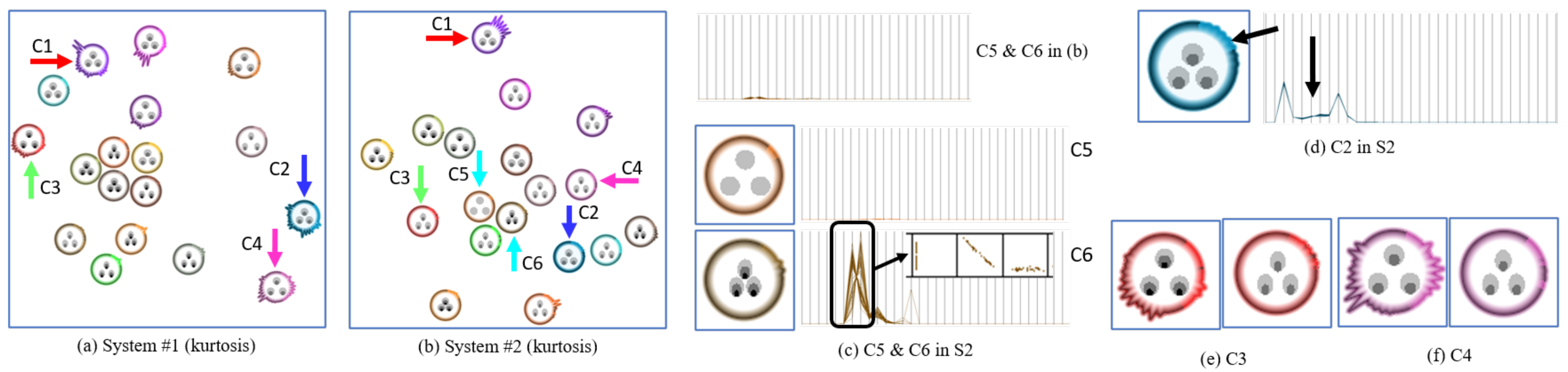
Figure 12a shows an OS dataset collected from file system 1 (S1) and Figure 12b shows a second OS dataset collected from a different file system (S2). Our visualization helps the analyst to assess (1) how the various file system operations relate to each other, and also (2) how heterogeneous each individual operation is and where.
For example, in S1, from the (boundary) shape of their glyphs we learn that the PERMISSION operation C1, RELEASE operation C2, ALLOC_NODE operation C3 and TRUNCATE operation C4 have an unusually large heterogeneous distribution shape in the 33-D space. Being alerted to this fact, our collaborators would then engage into a detailed shape comparison between the clusters to find the specific reasons for these variations.
Next, Figure 12c present two clusters—READPAGE operation C5 and WRITE_INODE operation C6 in S2. When we look at the two clusters in S2, their shapes are very similar, which means their distribution is relatively similar and this can be verified by the parallel coordinates display provided at the top of Figure 12c. However, their textures are very dissimilar. To analyze this in closer detail, we extract only the two clusters and re-normalize them. The re-normalized values are shown in the two parallel coordinates displays in the middle and bottom of Figure 12c. The parallel coordinates display of C5 shows a low clumpy, skew and striated pattern similar to the pattern stylized in the texture. Unlike C5, the texture of C6 shows a high clumpy, high skew and mid striated pattern. This pattern can also be observed with the parallel coordinates display of C6. Specifically, in the zoomed scatterplots of the dimensions within the black box, we can find distinct sub-clusters and a skewed distribution of points. Since points within the cluster have almost the same values in other dimensions, we can ignore them here. We note that this kind of information might not be noticeable in the point-based distribution and even in the parallel coordinates until rescaling them. Analysts might not suspect that the two clusters have different patterns. However, by visualizing these patterns with the texture, they can easily and quickly recognize the different behavior of these clusters.
Figure 12a,b visualize the kurtosis metric in the boundary. The kurtosis helps in recognizing the one-dimensional distributions. In Figure 12d, the dimensions pointed to by a black arrow have a lower kurtosis value than others despite the homogeneous shape, i.e., similar SD. In order to explain what this means, we provide a parallel coordinates display (Figure 12d). We see that these dimensions have a relatively wide distribution. However, it is not easy to recognize the difference even in the parallel coordinates, especially with other clusters. However, by visualizing the kurtosis in the glyph, we can readily assess these clusters.
Our framework generates abstract and concise visualizations of the clusters. Therefore, comparison between two datasets can be easily made. For example, the cluster C1 has a different shape in S2. It has a wider type of distribution in the first few dimensions in S2. However, in S1, the last few dimensions have wider distributions. Likewise, C2 has a homogeneous shape in the S2, while C2 has the heterogeneous shapes in S1. From these observations, we know that the PERMISSION operation C1 and RELEASE operation C2 have very different behaviors in the two file systems. This comparison between systems is useful to characterize the file system. In addition, by comparing the textures of the operations in both systems, differences in their 33-D pattern can also be observed. For example, the ALLOC_INODE operation C3 has low-clumpy, high-skew and low-striated pattern in S1 (see left glyph in Figure 12e). However, the same operation has different pattern in S2 i.e., it is clumpier, less skewed and more striated (see right glyph in Figure 12e). Likewise, the TRUNCATE operation C4 also has different patterns in both systems, i.e., it is clumpier and more striated in S2 (see Figure 12f). From this difference regarding the clumpy metric, analysts might suspect that the operation, in S2, has distinct sub-patterns within it while it has very consistent behavior pattern in S1. So, by exploring both datasets side by side, we quickly find which operations feature different patterns in the two file systems.
Our framework allows users to adjust the visualization to zoom into detail. Users can increase the size of the texture and choose a cluster to obtain more details about the cluster such as the real value of the Scagnostics metric, cluster id etc.
11. Conclusions
We have presented a framework for pre-classified data that addresses the fact that low-dimensional (2-D) space embedding of high-dimensional data suffers from significant suppression of important cluster detail. Using three perceptually and statistically motivated metrics we have empirically shown that the mapping can alter these detail patterns by as much as 70%. The detail lost can lead to misinterpretation of cluster information. For example, a cluster could be composed of a number of distinct sub-cluster populations in high-dimensional space, but this circumstance would not be apparent in an LDA- or MDS-generated 2-D data layout. Hence, the analyst might conclude that the population of interest is fairly distributed when it is really not. Since no 2-D-embedding algorithm exists that is distortion-free, our approach tackles the problem from a novel angle, namely to use techniques borrowed from illustrative design to convey these N-D data facts to the analyst. In our framework, each data cluster is represented as an information primitive, Cluster Appearance Glyph, which encodes several statistical cluster assessments as a texture and a boundary.
Many of the system aspects were developed with domain experts in the loop. In future work, we plan to combine our system with a clustering interface in which users could check the results of the clustering directly using our cluster appearance glyphs. Further, we would also like to address issues with scalability when the number of dimensions is large. Data with very high-dimensions will exhaust the radial capacity of the glyphs and new illustration techniques will have to be devised that use multi-scale representations to deal with the challenges imposed by large numbers of clusters and high dimensionality. Finally, the current framework uses the same criteria to categorize the level of the Scagnostics metrics in both dimensions—N-D and 2-D. We did not conduct a formal perception study on what people perceive as low, mid, and high. It is worth future study.
Author Contributions
Conceptualization and visualization: J.H.L. and K.M.; software, resources and data curation: J.H.L.; methodology, validation, investigation and writing: all authors; supervision: K.M. All authors have read and agreed to the published version of the manuscript.
Funding
This work was partly supported by NSF grants IIS-1117132 and IIS-1527200.
Institutional Review Board Statement
An IRB exempt determination letter is on file.
Informed Consent Statement
Not applicable.
Data Availability Statement
Restrictions apply to the availability of the OS data. The data were obtained from the Filesystems and Storage Lab, Stony Brook University and are available with the permission of the Filesystems and Storage lab, Stony Brook University.
Acknowledgments
We thank Nafees Ahmed, Puripant Ruchikachorn, Zhiyuan Zhang and Kevin McDonnell for contributions to earlier versions of this manuscript.
Conflicts of Interest
The authors declare no conflict of interest.
Appendix A
Appendix A.1. Ordinal Regression Results Table
Here we report the significant (p < 0.05) results of the ordinal regression analysis. Table A1 below shows the analysis of the results of our user study. The table lists the dependent variables and interactions between them (rows) for each of the independent variables (columns). It shows the computed log odds of a dependent variable affecting the independent variable. Empty cells indicate that there was either no effect or the effect was not significant (p > 0.05). We also include the raw results as navigable HTML files for each measure in supplementary material.

Table A1.
Users’ performance.
| Encoded Measure and Interactions | Measure Tested | ||
|---|---|---|---|
| Clummpiness | Skewness | Striatedness | |
| Clumpiness | 3.33 | 3.17 | −1.57 |
| Skewness | - | 3.036 | - |
| Striatedness | −0.89 | 5.47 | 1.21 |
| Texture | −1.29 | - | - |
| Boundary | - | - | - |
| Boundary Metric | - | 4.56 | - |
| Texture ×Striatedness | 1.46 | - | - |
| Boundary ×Striatedness | - | −4.73 | - |
| Boundary Metric × Clumpiness | - | −3.92 | - |
| Boundary Metric × Skewness | - | −3.93 | - |
| Boundary Metric × Striatedness | - | −4.07 | - |
| Boundary Metric × Texture | - | 3.42 | - |
| Clumpiness × Skewness | - | −1.85 | - |
| Clumpiness × Striatedness | - | −3.39 | 1.12 |
| Boundary × Boundary Metric × Skewness | - | 3.09 | - |
| Boundary × Boundary Metric × Striatedness | - | 3.55 | - |
| Texture × Boundary × Boundary Metric | - | −4.62 | - |
| Boundary × Clumpiness × Striatedness | - | 2.26 | - |
| Boundary Metric × Clumpiness × Skewness | - | 2.22 | - |
| Boundary Metric × Clumpiness × Striatedness | - | 2.53 | - |
| Clumpiness × Skewness × Striatedness | - | 1.35 | - |
Appendix A.2. Interaction Effects
In order to understand the interaction effects between two attribute levels we must use the log odds reported for the interaction of the attributes along with the log odds for the independent effect of those attributes to compute the log odds for every level of the interacting attributes. We then use the computed log odds to arrive at a conclusion. These calculations are reported as follows.
Appendix A.2.1. Clumpiness
We observed an interaction between texture and striatedness influencing the user when he/she was determining the clumpiness level. We report the log odds for each level of the interaction in Table A2. The interaction log odds and the equation used to compute this table are as follows.
Interaction log odds of Texture & Striatedness:
Log Odds (Periodic × Striatedness): 0 (reference level)
Log Odds (Non-Periodic × Striatedness): 1.463
Equation to compute log odds at different levels of Striatedness and Texture:
Log Odds Texture + (Striatedness Level × Log Odds Striatedness) + (Striatedness Level × Log Odds Interaction)
Table A2.
Interaction log odds of Texture & Striatedness.
| Texture Type | Striatedness Levels | ||
|---|---|---|---|
| 0 | 1 | 2 | |
| Periodic | 0 | −0.892 | −2.676 |
| Non-Periodic | −1.29 | −0.719 | 0.423 |
Appendix A.2.2. Striatedness
We observed an interaction between clumpiness and striatedness influencing the user when he/she was determining the striatedness level. We report the log odds for each level of the interaction in Table A3. The interaction log odds and the equation used to compute this table are as follows.
Interaction Log odds of Clumpiness & Striatedness
Log Odds (Clumpiness = 0 × Striatedness): 0 (reference level)
Log Odds (Clumpiness = 1 × Striatedness): 1.12
Log Odds (Clumpiness = 2 × Striatedness): 2.24
Equation to compute log odds at different levels of Striatedness and Texture:
Log Odds Clumpiness + (Striatedness Level × Log Odds Striatedness) + (Striatedness Level × Log Odds Interaction)
Table A3.
Interaction Log odds of Clumpiness & Striatedness.
| Clumpiness Levels | Striatedness Levels | ||
|---|---|---|---|
| 0 | 1 | 2 | |
| 0 | 0 | −0.892 | −3.138 |
| 1 | 1.21 | 0.754 | 0.303 |
| 2 | 2.42 | 3.077 | 3.744 |
Appendix A.2.3. Skewness
As reported in Table A1, there are a large number of interaction effects in the case of skewness. Additionally, the ordinal regression model fails the goodness of fit and test of parallel lines thus indicating that it is unreliable. This leads us to believe that our representation for skewness needed improvement as discussed in the paper.
References
- Hey, T.; Tansley, S.; Tolle, K. The Fourth Paradigm: Data-Intensive Scientific Discovery; Microsoft Research: Redmond, WA, USA, 2009; Volume 1. [Google Scholar]
- Tukey, J.W.; Tukey, P.A. Computer graphics and exploratory data analysis: An introduction. In Proceedings of the 6th Annual Conference and Exposition: Of the National Computer Graphics Association, Dallas, TX, USA, 14–18 April 1985; pp. 773–785. [Google Scholar]
- Wilkinson, L.; Anand, A.; Grossman, R. Graph-theoretic scagnostics. In IEEE Symposium on Information Visualization; IEEE Computer Society: Washington, DC, USA, 2005; pp. 157–164. [Google Scholar]
- Fu, L. Implementation of Three-Dimensional Scagnostics. Master’s Thesis, University of Waterloo, Department of Mathematics, Waterloo, ON, Canada, 2009. [Google Scholar]
- Dang, T.N.; Anand, A.; Wilkinson, L. Timeseer: Scagnostics for high-dimensional time series. IEEE Trans. Vis. Comput. Graph. 2012, 19, 470–483. [Google Scholar] [CrossRef] [PubMed]
- Kriegel, H.P.; Kröger, P.; Zimek, A. Clustering high-dimensional data: A survey on subspace clustering, pattern-based clustering, and correlation clustering. ACM Trans. Knowl. Discov. Data (TKDD) 2009, 3, 1–58. [Google Scholar] [CrossRef]
- Nam, E.J.; Han, Y.; Mueller, K.; Zelenyuk, A.; Imre, D. Clustersculptor: A visual analytics tool for high-dimensional data. In Proceedings of the 2007 IEEE Symposium Visual Analytics Science and Technology, Sacramento, CA, USA, 30 October–1 November 2007; pp. 75–82. [Google Scholar]
- Bertin, J. Sémiologie Graphique: Les Diagrammes-Les réseaux-Les Cartes; Technical Report; Gauthier-VillarsMouton & Cie: Paris, France, 1973. [Google Scholar]
- Keim, D.A. Designing pixel-oriented visualization techniques: Theory and applications. IEEE Trans. Vis. Comput. Graph. 2000, 6, 59–78. [Google Scholar] [CrossRef] [Green Version]
- Hartigan, J.A. Printer graphics for clustering. J. Stat. Comput. Simul. 1975, 4, 187–213. [Google Scholar] [CrossRef]
- Nguyen, Q.; Simoff, S.; Qian, Y.; Huang, M. Deep Exploration of Multidimensional Data with Linkable Scatterplots. In Proceedings of the 9th International Symposium on Visual Information Communication and Interaction, Dallas, TX, USA, 24–26 September 2016; pp. 43–50. [Google Scholar]
- Kreuseler, M.; Schumann, H. A flexible approach for visual data mining. IEEE Trans. Vis. Comput. Graph. 2002, 8, 39–51. [Google Scholar] [CrossRef]
- Choo, J.; Lee, H.; Kihm, J.; Park, H. iVisClassifier: An interactive visual analytics system for classification based on supervised dimension reduction. In Proceedings of the IEEE VAST, Salt Lake City, UT, USA, 25–26 October 2010; pp. 27–34. [Google Scholar]
- Hinton, G.; Salakhutdinov, R. Reducing the dimensionality of data with neural networks. Science 2006, 313, 504–507. [Google Scholar] [CrossRef] [PubMed] [Green Version]
- Van der Maaten, L.; Hinton, G. Visualizing data using t-SNE. J. Mach. Learn. Res. 2008, 9, 2579–2605. [Google Scholar]
- McInnes, L.; Healy, J.; Melville, J. Umap: Uniform manifold approximation and projection for dimension reduction. arXiv 2018, arXiv:1802.03426. [Google Scholar]
- Kandogan, E. Visualizing multi-dimensional clusters, trends, and outliers using star coordinates. In Proceedings of the ACM SIGKDD, San Francisco, CA, USA, 26–29 August 2001; pp. 107–116. [Google Scholar]
- Ankerst, M.; Keim, D.A.; Kriegel, H.P. Circle segments: A technique for visually exploring large multidimensional data sets. In Proceedings of the IEEE Visualization, San Francisco, CA, USA, 27 October–1 November 1996. [Google Scholar]
- Inselberg, A.; Dimsdale, B. Parallel coordinates: A tool for visualizing multi-dimensional geometry. In Proceedings of the IEEE Visualization, San Francisco, CA, USA, 23–26 October 1990; pp. 361–378. [Google Scholar]
- Dang, T.N.; Wilkinson, L. Scagexplorer: Exploring scatterplots by their features. In Proceedings of the 2014 IEEE Pacific Visualization Symposium, Yokohama, Japan, 4–7 March 2014; IEEE: Hoboken, NJ, US, 2014; pp. 73–80. [Google Scholar]
- Jo, J.; Seo, J. Disentangled Representation of Data Distributions in Scatterplots. In Proceedings of the IEEE Visualization, Vancouver, BC, Canada, 20–25 October 2019; pp. 136–140. [Google Scholar]
- Ward, M.O. A taxonomy of glyph placement strategies for multidimensional data visualization. Inf. Vis. 2002, 1, 194–210. [Google Scholar] [CrossRef]
- Borgo, R.; Kehrer, J.; Chung, D.; Maguire, E.; Laramee, R.; Hauser, H.; Ward, M.; Chen, M. Glyph-based Visualization: Foundations, Design Guidelines, Techniques and Applications. In Proceedings of the Eurographics State of the Art Reports, EG STARs, Vienna, Austria, 3–7 May 2013; pp. 39–63. [Google Scholar]
- Ropinski, T.; Oeltze, S.; Preim, B. Survey of glyph-based visualization techniques for spatial multivariate medical data. Comput. Graph. 2011, 35, 392–401. [Google Scholar] [CrossRef] [Green Version]
- Choo, J.; Bohn, S.; Park, H. Two-stage framework for visualization of clustered high dimensional data. In Proceedings of the IEEE VAST, Atlantic City, NJ, USA, 12–13 October 2009; pp. 67–74. [Google Scholar]
- Hartigan, J.A.; Mohanty, S. The runt test for multimodality. J. Classif. 1992, 9, 63–70. [Google Scholar] [CrossRef]
- Gansner, E.R.; Hu, Y. Efficient node overlap removal using a proximity stress model. In International Symposium on Graph Drawing; Springer: Berlin/Heidelberg, Germany, 2008; pp. 206–217. [Google Scholar]
- Krause, J.; Perer, A.; Bertini, E. INFUSE: Interactive feature selection for predictive modeling of high dimensional data. IEEE Trans. Vis. Comput. Graph. 2014, 20, 1614–1623. [Google Scholar] [CrossRef] [PubMed]
- Kovacevic, N.; Wampfler, R.; Solenthaler, B.; Gross, M.; Günther, T. Glyph-Based Visualization of Affective States. In Proceedings of the EuroVis 2020—22nd EG/VGTC Conference on Visualization Norrköping, Sweden, 25–29 May 2020; EuroVis: Short Papers; Eurographics Association: Goslar, Germany, 2020. [Google Scholar]
- Ordinal Regression—Laerd Statistics. Available online: https://statistics.laerd.com/spss-tutorials/ordinal-regression-using-spss-statistics.php (accessed on 4 December 2020).
Figure 1.
High-dimensional scatterplot, college dataset.

Figure 2.
Artificial dataset with 6 Gaussian clusters originally in 30-D space gives rise to a 5-D LDA embedding. (a) Rank-2 LDA. Three clusters—the green, blue and magenta clusters—are overplotted. (b) 5-D SPLOM. The top scatterplot is Rank-2 LDA (a). None of the scatterplot projections can successfully isolate all clusters, (c) MDS-LDA. We observe that all clusters are now well separated.

Figure 3.
Scatterplots obtained by MDS-LDA with 2-D distance-based MST (top row) and N-D distance-based MST (bottom row).
Figure 3.
Scatterplots obtained by MDS-LDA with 2-D distance-based MST (top row) and N-D distance-based MST (bottom row).

Figure 4.
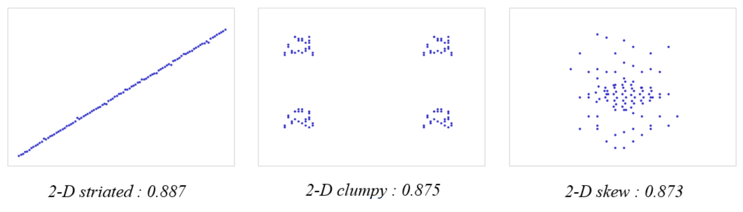
2-D example scatterplots for each metric we have encoded. For each of them we chose a high value level for better illustration of their real-world graphical appearance.
Figure 4.
2-D example scatterplots for each metric we have encoded. For each of them we chose a high value level for better illustration of their real-world graphical appearance.

Figure 5.
Three clusters of the Gaussian dataset. (a) MDS-LDA of the green cluster with N-D and 2-D clumpy values. The green cluster is composed of 10 sub-clusters. (b) The green cluster in parallel coordinates display (PCD). The 10 sub-cluster centers shown in different colors. The clusters themselves are well distinguishable in the bivariate scatterplots below. (c) MDS-LDA of the blue cluster with N-D and 2-D striated values. It has 9 sub-clusters which run along parallel lines. (d) Partial PCD of ranges of the sub-clusters shown in different colors and the first 3 zoomed scatterplots of adjacent dimensions. (e) MDS-LDA of the magenta cluster with N-D and 2-D skew values. (f) Distribution of edge lengths in the 2-D MST and N-D MST. The vertical axis indicates the ratio of edge length to the longest edge length.

Figure 6.
Textures; low, mid, and high level (from left to right); other metrics are similar except for the displayed metric in the left label; (a–c) sample textures for conveying Scagnostics metrics. (d,e) two synthesized textures—mid clumpy, skew and striated (d), high clumpy and skew, and low striated (e).

Figure 7.
Glyph generation of a 10-D cluster. (a) Boundary points representing each dimension. (b) Visualization of variances of dimensions (red lines from the center). (c) Boundary generated by points in (a). (d) Insertion of intermediate points with length of local minimum standard deviation (SD) from the center between every pair of the initial boundary points. (e,f) Boundary generated by points in (d)—it visualizes the heterogeneous shape much better. (g) Boundary generated by smaller maximum radius.

Figure 8.
Asymmetry/Kurtosis visualization. (a,b) Boundary visualizing the variation of the asymmetry/kurtosis metric along the dimensions. (c) Boundary (a) with color emphasis. (d) Boundary (a) with texture.
Figure 8.
Asymmetry/Kurtosis visualization. (a,b) Boundary visualizing the variation of the asymmetry/kurtosis metric along the dimensions. (c) Boundary (a) with color emphasis. (d) Boundary (a) with texture.

Figure 9.
Overlap removal according to permitted overlap ratio p.

Figure 10.
Examples of our texture glyph used in our user study (a) periodic, (b) non-periodic, (c) the baseline pie glyph.
Figure 10.
Examples of our texture glyph used in our user study (a) periodic, (b) non-periodic, (c) the baseline pie glyph.

Figure 11.
The redesigned texture to represent skewness.

Figure 12.
Cluster visualization with two OS datasets from System #1 (S1) and System #2 (S2). (a) S1 data with kurtosis metric (b) S2 data with kurtosis metric (c) Cluster C5 and C6 in S2 with parallel coordinates display (d) Cluster C2 in S2 with parallel coordinates display (e,f) Cluster C3 and C4 (left: S1, right: S2). The color corresponds to the cluster. See Supplement for larger versions of the images.

Table 1.
Results from user study 1. Entries are read as RIGHT/TOTAL (% Correct).
| Plot | Texture | Connect | |
|---|---|---|---|
| Clumpy | 164/180 (91%) | 173/180 (96%) | Better than scatterplots with 95% significance |
| Skew | 101/108 (91%) | 102/108 (96%) | As good as scatterplots with 95% significance |
| Striated | 134/180 (91%) | 169/180 (96%) | Better than scatterplots with 95% significance |
Table 2.
Results from user study 2. Entries are read as RIGHT/TOTAL (% Correct).
| Changing Clumpy | Changing Skew | Changing Striated | Others Constant | |
|---|---|---|---|---|
| Clumpy | X | 232/255 (90.98%) | 341/365 (93.42%) | 113/117 (96.58%) |
| Skew | 196/225 (87.11%) | X | 213/246 (86.59) | 130/150 (86.67) |
| Striated | 207/228 (90.79%) | 231/247 (93.52%) | X | 135/150 (90.00%) |
Table 3.
Users’ performance.
| Glyph Design | Accuracy | ||
|---|---|---|---|
| Clummpiness | Skewness | Striatedness | |
| Pie (Baseline) | 64.17% | 62.5% | 65% |
| Texture | 76.67% | 42.5% | 62.5% |
| Texture (Redesign) | 86.42% | 98.76% | 83.95% |
Publisher’s Note: MDPI stays neutral with regard to jurisdictional claims in published maps and institutional affiliations. |
© 2021 by the authors. Licensee MDPI, Basel, Switzerland. This article is an open access article distributed under the terms and conditions of the Creative Commons Attribution (CC BY) license (https://creativecommons.org/licenses/by/4.0/).
Share and Cite
MDPI and ACS Style
Lee, J.H.; Coelho, D.; Mueller, K. Cluster Appearance Glyphs: A Methodology for Illustrating High-Dimensional Data Patterns in 2-D Data Layouts. Information 2022, 13, 3. https://0-doi-org.brum.beds.ac.uk/10.3390/info13010003
AMA Style
Lee JH, Coelho D, Mueller K. Cluster Appearance Glyphs: A Methodology for Illustrating High-Dimensional Data Patterns in 2-D Data Layouts. Information. 2022; 13(1):3. https://0-doi-org.brum.beds.ac.uk/10.3390/info13010003
Chicago/Turabian StyleLee, Jenny Hyunjung, Darius Coelho, and Klaus Mueller. 2022. "Cluster Appearance Glyphs: A Methodology for Illustrating High-Dimensional Data Patterns in 2-D Data Layouts" Information 13, no. 1: 3. https://0-doi-org.brum.beds.ac.uk/10.3390/info13010003
Note that from the first issue of 2016, this journal uses article numbers instead of page numbers. See further details here.