
Visual Analytics for Predicting Disease Outcomes Using Laboratory Test Results
by
 ,
,
Neda Rostamzadeh
1,2, 
Sheikh S. Abdullah
1,2 ,
,
Kamran Sedig
1,*,
Amit X. Garg
2,3 and
Eric McArthur
2 1
Insight Lab, Western University, London, ON N6A 3K7, Canada
2
ICES, London, ON N6A 3K7, Canada
3
Department of Medicine, Epidemiology, and Biostatistics, Western University, London, ON N6A 3K7, Canada
*
Author to whom correspondence should be addressed.
Informatics 2022, 9(1), 17; https://0-doi-org.brum.beds.ac.uk/10.3390/informatics9010017
Submission received: 20 December 2021
/
Revised: 19 February 2022
/
Accepted: 21 February 2022
/
Published: 25 February 2022
(This article belongs to the Special Issue Feature Papers: Health Informatics)
Abstract
:Laboratory tests play an essential role in the early and accurate diagnosis of diseases. In this paper, we propose SUNRISE, a visual analytics system that allows the user to interactively explore the relationships between laboratory test results and a disease outcome. SUNRISE integrates frequent itemset mining (i.e., Eclat algorithm) with extreme gradient boosting (XGBoost) to develop more specialized and accurate prediction models. It also includes interactive visualizations to allow the user to interact with the model and track the decision process. SUNRISE helps the user probe the prediction model by generating input examples and observing how the model responds. Furthermore, it improves the user’s confidence in the generated predictions and provides them the means to validate the model’s response by illustrating the underlying working mechanism of the prediction models through visualization representations. SUNRISE offers a balanced distribution of processing load through the seamless integration of analytical methods with interactive visual representations to support the user’s cognitive tasks. We demonstrate the usefulness of SUNRISE through a usage scenario of exploring the association between laboratory test results and acute kidney injury, using large provincial healthcare databases from Ontario, Canada.
1. Introduction
Accurate and early clinical diagnoses play an important role in the successful treatment of diseases. Every disease stems from or causes changes at a molecular and cellular level, and some of these changes can be detected through changes in urine and blood parameter values [1]. Patterns within laboratory test results may contain additional information relevant to patient care that are not detected or appreciated by even the most experienced physicians [2,3]. Laboratories typically report test results as individual categorical and numerical values, but some individual results, particularly when studied in isolation, may have limited clinical value. Physicians often integrate several individual tests from a patient and interpret them in the context of medical knowledge and experience to use them for disease diagnosis and management. Furthermore, patients might have many individual tests, spanning years. There is a higher chance of overlooking important patterns in the increasing numbers of parameters that laboratories measure. While the manual approach to test interpretation is the routine procedure in most cases, data analytics offers the potential to improve the laboratory tests’ diagnostic value [4]. Several studies have been conducted to develop risk prediction models using laboratory test data, and some of these models were developed using data analytics techniques [5,6,7,8,9,10,11,12,13,14,15,16,17,18,19]. These studies rely solely on performance metrics, such as high accuracy scores, to assess model performance. Furthermore, due to their unclear working mechanisms and their incomprehensible functions, the analytics techniques used in these studies are often treated by users as black boxes. Therefore, the question arises whether the user can trust these analytics techniques or not, especially in medical settings, where the model makes a critical decision about patients [20,21]. One way to increase the model’s interpretability is by getting the user involved in the analytics process through an integrated approach called visual analytics [22,23].
Visual Analytics (VA) is an emerging research discipline that integrates data analytics and interactive visualizations [22,24]. It has the potential to enhance the user’s confidence in the prediction results by improving their understanding of the modeling process and output [25,26,27]. VA is capable of illustrating the model’s rationale, presenting the prediction result, and providing the user with the means to validate the model’s response. In addition, VA allows the user to access, modify, and restructure the displayed data as well as guide the data analytics techniques. This, in turn, sets off internal computational reactions that result in further analytical processes. VA aims to make the best possible use of the massive amounts of data stored in electronic health records (EHRs) by combining the strength of analytical processes, the user’s visual perception, and analysis capabilities of the model [28,29,30,31]. It enhances the user’s ability to accomplish data-driven tasks by allowing them to analyze EHRs in ways that would be difficult to do otherwise [32,33].
The goal of this paper is to show how VA systems can be developed systematically to create disease prediction models using laboratory test result data. To this end, we present a novel proof-of-concept system called SUNRISE (viSUal aNalytics for exploring the association between laboRatory test results and a dIsease outcome using xgbooSt and Eclat). SUNRISE allows healthcare providers to examine associations between different groups of laboratory test results and a specific disease by tweaking the test values and inspecting how the predictive model responds. It aims to support the user to go beyond judging predictive models based on their performance measures. Instead of just relying on the evaluation metrics, SUNRISE helps the user better understand how predictions are generated by illustrating their underlying working mechanisms. While several VA systems have been developed for other areas in healthcare [30,31,34,35,36,37,38,39,40,41,42,43,44,45,46], SUNRISE is novel in that it incorporates the extreme gradient boosting technique (i.e., XGBoost), frequent itemset mining (i.e., Eclat algorithm), visualization, and human-data interaction in an integrated manner. We demonstrate the usefulness of SUNRISE through a case study of exploring associations between laboratory test results and acute kidney injury (AKI) using large provincial healthcare databases from Ontario, Canada stored at ICES (ICES is an independent, non-profit, world-leading research organization that uses population-based health and social data to produce knowledge on a broad range of healthcare issues).
The rest of this paper is organized as follows. In Section 2, we provide a summary of the conceptual background that is required to understand the design of SUNRISE. In Section 3, we explain the methods used for the design of SUNRISE by providing a description of its structure and modules. In Section 4, we present a usage scenario of SUNRISE to demonstrate the potential utility of the system. In Section 5, we discuss the usefulness and limitations of the proposed VA system. Finally, Section 6 concludes the paper.
2. Background
This section presents the necessary concepts for understanding the design of SUNRISE. First, we describe the components of visual analytics. Afterwards, we briefly describe the machine learning techniques used in this paper.
2.1. Visual Analytics
Visual analytics is a multidisciplinary field that helps the user gain insights from data via integration of analytics techniques and interactive visualization with human judgment [47]. It can support the execution of data-driven cognitive tasks such as sense-making, knowledge discovery, and decision-making, to name a few [32,48,49]. The primary challenge these tasks present is that the user needs to rapidly analyze, interpret, compare, and contrast large amounts of information. VAs are capable of providing cognitive and computational assistance to the user in performing these cognitive tasks by combining machine learning techniques, analytical processes, visualizations, and various interaction mechanisms [50,51]. In summary, VA is composed of two integrated modules: an analytics module and an interactive visualization module [49,52].
The analytics module combines machine learning with data processing techniques to reduce the cognitive load of the user when performing data-intensive tasks [33,51,53,54,55]. The analytics module is technology-independent, and it includes the use of processing techniques and data mining algorithms that best fit the needs of a domain. This module is composed of three primary steps: pre-processing, transformation, and analysis [56,57]. In the pre-processing step, the raw data retrieved from multiple sources gets pre-processed. This includes tasks such as cleaning, integration, fusion, and synthesis [57]. Then, the pre-processed data gets transformed into forms that are more appropriate for analysis. Examples of tasks that can be integrated into this stage are feature construction, normalization, aggregation, and discretization [57]. Finally, different data mining algorithms and machine learning techniques are applied to discover useful, unknown patterns from the data in the analysis stage. Despite all the benefits, most of these computational techniques are treated as black-box models and not developed with interpretability constraints. VA can provide the user with the underlying working mechanisms of these models to make them more trustworthy, informative, and easier to understand through interactive visualization.
Interactive visualization in VA involves mapping processed and derived data from the analytics module to visual structures [49,52]. It allows the user to interactively control and validate the analytical processes towards better interpretability and performance. It provides the user with new analytical possibilities that can be utilized in an iterative manner [58]. In the context of VA, these iterations can be regarded as discourses between the user and the VA. This back-and-forth communication supports the user by distributing the processing load between the user and the VA system during their analysis and exploration of the data [49,59,60].
2.2. Machine Learning Techniques
In this section, we provide a brief overview of the machine learning techniques used in this paper.
2.2.1. Frequent Itemset Mining (Eclat)
Frequent itemset mining, which was first introduced by Agrawal and Srikant [61], is a task of discovering features that frequently appear together in a database. Although frequent itemset mining was initially proposed to find groups of items that frequently co-occur in transactions made by customers, it is now viewed as a general mining task that can be applied in many other domains, such as image classification [62], bioinformatics [63], network traffic analysis [64,65], customer reviews analysis [66], activity monitoring [67], and disease prediction [68,69], to name just a few.
The frequent itemset mining can be formally defined as follows. Let I be a set of items where I = . A transactional database includes a set of transactions where every transaction is a set of items () that can be identified by a unique transaction identifier (TID). An itemset is a collection of items, and it can be characterized by a notion called support value (. Support is defined as the ratio of the number of transactions in that contain and the total number of transactions in . It shows the frequency of appearance of an itemset in the database. An itemset is considered frequent if its support value is higher, or equal to, the smallest minimum support threshold ( that is defined by the user. The task of frequent itemset mining consists of extracting all frequent itemsets from database , given a minimum support threshold. Several techniques have been proposed to address this task. One of the most common frequent itemset mining techniques is the Eclat algorithm.
Eclat [70] is a depth-first search approach that uses a vertical database format. A vertical database format represents the list of transactions where each item appears (i.e., or for itemset ). The main benefit of this format is that it makes it possible to obtain the of an itemset by simply intersecting the of its included items without requiring a full scan of the dataset. The main idea of Eclat is to utilize the intersections to obtain the support value of an itemset by using the property that = . This algorithm first, scans the dataset to obtain all frequent itemsets with items, and then, it generates all candidate itemsets that include items from frequent —itemsets. In the next step, it gets all frequent —itemsets by leaving out all the non-frequent itemsets. It repeats these steps until no other candidate itemset can be generated.
2.2.2. Extreme Gradient Boosting
Extreme Gradient Boosting (i.e., XGBoost) belongs to a class of learning algorithms that aim to create a strong classifier by combining many “weak” classifiers—namely boosting techniques [71]. XgBoost is chosen due to its scalability, excellent performance, and efficient training speed [72,73,74]. This technique is an enhancement of the gradient boosting decision tree, and it is used for both regression and classification problems [75].
The idea of XGBoost is to build decision trees sequentially such that each subsequent tree seeks to reduce the residuals of the previous trees. At each iteration, the tree that grows next in the sequence learns from its predecessors by fitting a new model to the last predicted residuals and then minimizing the loss when adding the latest prediction. XGBoost adds an additional custom regularization to the loss function to establish the objective function.
is the loss function that measures how well the model fits the training data, and represents the regularization term that measures the model’s complexity.
For a training data set with n samples, the model is given by a function of the sum of K tress:
where is the independent variable, is the predicted value corresponding to the dependent variable , represents the tree structure, and F is the collection of all possible trees. When the model is additive, we can write the prediction value at iteration using the following equation:
Then, the objective function at iteration can be defined as:
where n represents the number of samples. Chen et al. [71] define the regularization term using the following equation:
where is the minimum loss reduction required to make a further split to a terminal node in the tree, is the number of terminal nodes in the tree, is the regularization parameter, and represents the vector of scores on terminal nodes.
We can re-write the objective function as:
At each iteration, a tree that optimizes the objective function defined in Equation (6) is created. In order to optimize this function, the second-order Taylor expansion of the loss function is taken.
where and are the first and second derivatives of the loss function. By solving this equation, the optimal values for (weights for a given tree structure) can be calculated as:
where and can be defined as:
where represents all the samples assigned to the -th terminal node of the tree.
Now that we have a way to learn the weights for a given tree structure, the next step is to learn the structure of the tree. A set of candidate splits are proposed for each split, and the one that minimizes the loss function is selected. This is the criterion that we seek to minimize to find the optimal split in the tree, and it can be defined as:
Equivalently, we seek the split that maximizes the gain:
Given an input data, each tree will identify a root-to-leaf path (i.e., decision path) accordingly, which results in the prediction generated by each tree. If we assume the decision path is composed of non-leaf nodes , the path can be represented as:
where is the feature at the node , is the corresponding threshold that is used to split node into two child nodes, and represents the boolean condition on each node [76]. The final prediction is the weighted sum of the predictions for each individual tree.
3. Materials and Methods
In this section, we explain the methods used to design SUNRISE. In Section 3.1, we describe the design process and participants. Then, in Section 3.2, we briefly explain how the overall system works. Section 3.3 and Section 3.4 describe the analytics and interactive visualization modules of SUNRISE, respectively.
3.1. Design Process and Participants
We adopted a participatory design approach in the development of SUNRISE. The participatory design approach helps with a better understanding of EHR-driven tasks from the perspective of the healthcare providers. It helps generate design solutions, collect feedback iteratively, and thus, it is conducive to the continuous improvement of our proposed VA system such that it can meet the needs and expectations of the healthcare providers [77,78,79]. Participatory design is an iterative group effort that requires all the stakeholders (e.g., end-users, partners, or customers) to work together to ensure the end product meets their needs and expectations [80]. Several computer scientists, data scientists, an epidemiologist, and a clinician-scientist were involved in the conceptualization, design, and evaluation of SUNRISE. It is critical to enhance the communication between all the members of the design team since healthcare experts might have a limited understanding of the technical background of the analytical processes, and medical terms might not be very comprehensible to the members of the team with a technical background. In light of this, we asked healthcare providers to provide us with their feedback on different design decisions and performed formative evaluations at every level of the design process. In our collaboration with healthcare providers, we discovered that they want SUNRISE to enable them to perform two essential tasks: (1) to examine the relationship between different groups of laboratory test results and the disease and (2) to investigate the prediction result and track the decision path to determine how reliable the prediction is, based on their domain knowledge.
3.2. Workflow
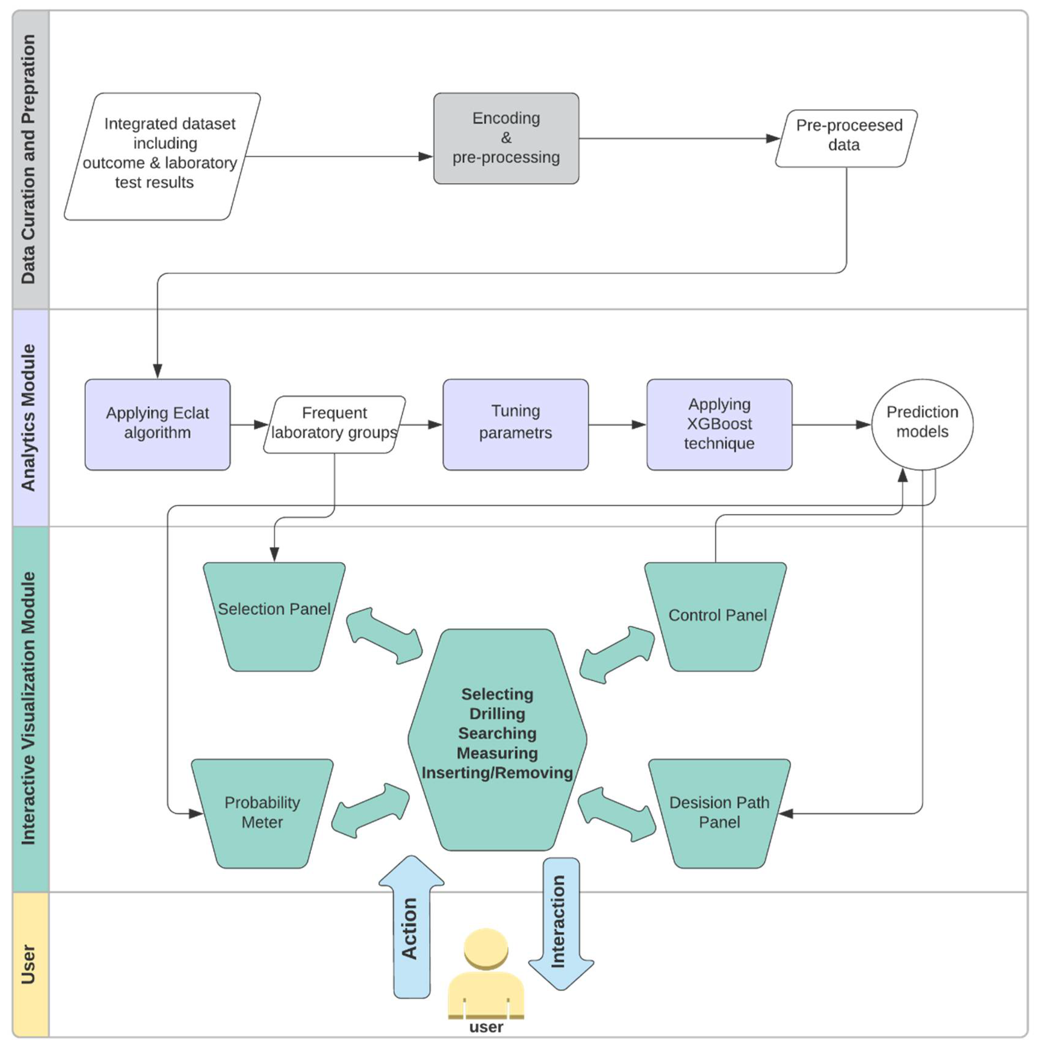
As shown in Figure 1, SUNRISE has two components: the Analytics module and the Interactive Visualization module. The Analytics module utilizes Eclat and XGBoost to generate prediction models. The Interactive Visualization module encodes the data items generated by the Analytics module to four main sub-visualizations: (1) selection panel, (2) control panel, (3) probability meter, and (4) decision path panel. These sub-visualizations support multiple interactions to assist the user in achieving their tasks. These interactions include selecting, drilling, searching, measuring, and inserting/removing (for a list of possible interactions, see [81]).
The basic workflow of SUNRISE is as follows. First, we create an integrated dataset from different databases. Next, features in the laboratory test data are encoded and transformed into appropriate forms for analysis. In the next step, we apply the Eclat algorithm to the pre-processed dataset to obtain the frequent laboratory groups (i.e., frequent combinations of laboratory tests). For each laboratory group, we then create a subset of data with all the tests included in the group. In each subset, we only include rows where all the tests in the group are available. We then split each subset into train, validation, and test sets. We use the validation set to adjust the tuning parameters. Then, the XGBoost technique is applied to each subset with its corresponding tuning parameters. We develop four sub-visualizations in the Interactive Visualization module to allow the user to examine associations between laboratory groups and the outcome. The user can choose multiple laboratory tests using the selection control panel based on the result of the Eclat algorithm. When the user selects a test from the selection panel, the system then inserts a slider, associated with the selected test, in the input control panel. The user can probe the prediction models by creating input examples with their desired values using the input control panel. Upon clicking the “submit” button, SUNRISE passes the input (i.e., the chosen laboratory group and selected test values) to the Analytics module. The Analytics module uses the XGBoost model, corresponding to the chosen laboratory group, to predict the patient outcome and returns the results to the probability meter and the decision path panel. Finally, the user is able to observe the final prediction outcome and track the decision process that leads to the outcome to gain a deeper insight into the working mechanism of the prediction model.
3.3. Analytics Module
The Analytics module of SUNRISE generates prediction models using laboratory test data stored in EHRs by integrating the XGBoost techniques with Eclat. In this section, we describe how these techniques are combined to build the prediction models.
First, we create an integrated dataset from different databases. This dataset includes laboratory test data and the outcome for every patient. For a laboratory test, a patient might have multiple values from different times. Therefore, a sequence of laboratory test results can be formed. In order to represent this sequence for each patient, we use the average result. The outcome is considered positive if the patient develops the disease, and it is considered negative otherwise. If there is a large number of laboratory tests available, we cannot consider every possible combination of these tests because of limited memory and computational resources. Therefore, we use a frequent itemset mining technique to obtain the most frequent combinations and make the computations manageable. In order to generate more specialized prediction models, we use the Eclat algorithm to obtain frequent combinations of laboratory tests. Eclat is a fast algorithm that reduces memory requirements due to the use of the depth-first search technique. We use the “arules” library to implement the Eclat algorithm with a specified minimum support to create several laboratory groups (i.e., frequent itemsets) from laboratory tests included in the dataset. Then, for each group, we create a subset of data with all the laboratory tests that were included in the group. In order to get more accurate predictions, we only include rows where all the laboratory variables in the group are available in each subset. This approach allows us to deal with a more specialized model based on the available laboratory tests in the prediction phase rather than a generalized model using the whole dataset.
In the next stage, we apply the XGBoost technique to each group. For each laboratory group, we split its corresponding subset into train, validation, and test sets to generate the prediction model. We use 80% of patients for training the model, 10% for validation and 10% for testing. The validation set is used to tune the hyperparameters, when building the XGBoost model, to avoid overfitting and to control the "bias-variance" trade-off. We adjust the complexity of the model by modifying values of the tuning parameters maximum tree depth (max_depth) and minimum leaf weight (min_child_weight). Minimum leaf weight is the minimum weight that is required to generate a new node in the tree. Generation of children that correspond to fewer samples can be achieved by selecting a smaller value for this parameter, which allows for creation of more complex trees that are more likely to overfit. Maximum tree depth is defined as the maximum number of nodes that are allowed from the root of the tree to its farthest leaf. A large value for this parameter makes models more complex by letting the algorithm create more nodes. However, as we go deeper in the tree, splits become less relevant, thus causing the model to overfit. Another approach to avoid overfitting is to add randomness to make the model more robust to noise. Randomness is tuned by setting the sub-sampling rate (i.e., subsample parameter) at each sequential tree. Another parameter that can get adjusted is the model’s learning rate (i.e., eta), which determines the contribution of each tree to the overall model. A low learning rate should result in better performance, but it will increase the computational cost. The final XGBoost model is a linear combination of all individual decision trees in the series, along with their contributions to the model, weighted by the learning rate. In order to detect the best combination of parameters for each laboratory group, we use the random search approach, which is shown to have higher efficiency compared to a manual search and grid trials when given the same computation time. Another advantage of random search is that, as opposed to the manual search, results obtained through random search are reproducible [82]. We use the combination of parameters with the best performance on the validation set to train the final model for each laboratory group.
We use the XGBoost library in R to implement XGBoost and use the area under the receiver operating characteristic curve (i.e., AUROC) [83,84] to measure the performance of all the models and choose the best combination of tuning parameters. A ROC curve shows the trade-off between specificity and sensitivity across different decision thresholds (i.e., threshold that is used for interpreting probabilities to class labels). Sensitivity measures how often a model classifies a patient as “at-risk” correctly. On the other hand, specificity is the capacity of a model to classify a patient as “risk-free” correctly [85].
3.4. Interactive Visualization Module
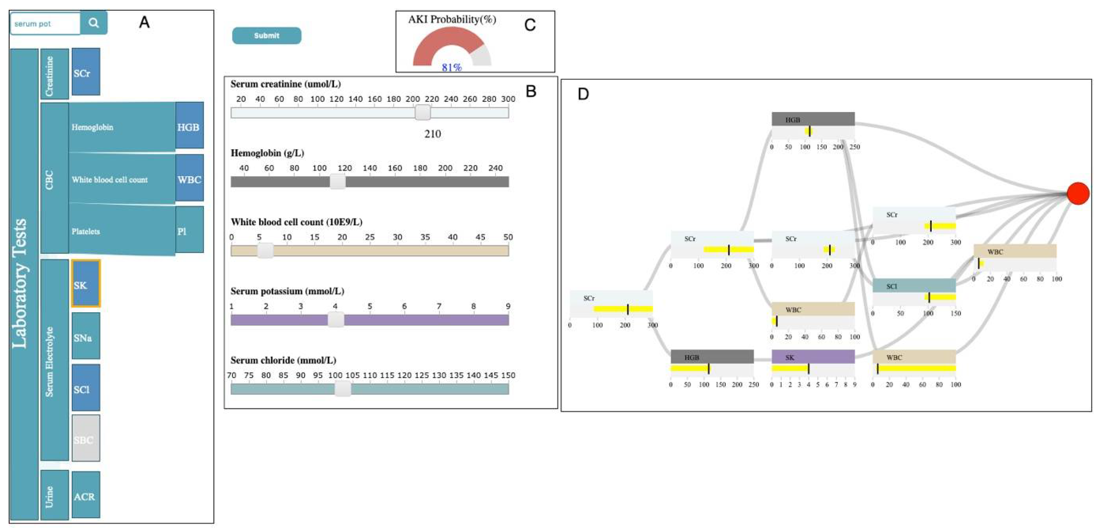
The Interactive Visualization module is composed of four main sub-visualizations: the selection panel, control panel, probability meter, and decision path panel (Figure 2). In this section, we describe how data items that are generated in the Analytics module are mapped into visual representations to allow healthcare providers to accomplish their tasks.
3.4.1. Selection Panel
The selection panel displays the hierarchical structure of the laboratory data, using horizontally stacked rectangles ordered from left to right (Figure 2A). The first rectangle to the left (i.e., root) that represents the laboratory tests takes the entire height. Each child node is placed to the right of its parent with the height proportional to the percentage it consumes, relative to its siblings.
The selection panel utilizes the result of the Eclat algorithm from the Analytics module to allow the user to select their desired group of laboratory tests. The user can choose a test by clicking on its corresponding rectangle in the selection panel. This action changes the color of the selected rectangle from green to blue. When a test is selected, all the other rectangles, corresponding to tests that are not in any laboratory group with the selected test, become un-clickable and greyed out. The user can also insert/remove a slider corresponding to a test in the control panel by clicking/unclicking the rectangle corresponding to that test in the selection panel. We will describe the control panel in more detail in the next section.
The selection panel allows the user to observe the full name of laboratory tests that belong to a category by clicking on the rectangle corresponding to that category. In addition, when the user hovers the mouse over any of the rectangles, a tooltip with information regarding the test shows up. The selection panel is supported by a search bar. If the user enters the name of a specific laboratory test in the search bar, the border of the rectangle, corresponding to the specified test, becomes orange.
3.4.2. Control Panel
The control panel includes sliders corresponding to the laboratory tests that the user has chosen in the selection panel (Figure 2B). It allows the user to probe the prediction models by creating input examples with their desired values and observe the output the model generates. When the user selects a test from the selection panel, the system inserts a slider, associated with the selected test, in the input control panel. Each slider is composed of a label including the full name and unit of measurement of its corresponding test, a horizontal axis with a linear scale representing the possible values of its associated test, and a rectangular handle that allows the user to change the values of the test. This panel allows the user to interactively tweak the values of the selected tests and see how the predictive model responds. The user can hover the mouse over the handle to observe the chosen value in any of the sliders.
When the user clicks on the “submit” button, after selecting multiple tests from the selection panel and choosing the values of each test using their corresponding sliders, the system passes the information regarding the chosen laboratory group and selected test values to the Analytics module. The Analytics module uses the corresponding XGBoost prediction model that is associated with the selected group to predict the outcome and returns the results to the probability meter and the decision path panel.
3.4.3. Probability Meter
The probability meter is a radial gauge chart with a circular arc that shows the probability of developing the outcome (Figure 2C). This probability is the outcome prediction after the system feeds the input (i.e., chosen laboratory group and laboratory test values) to its corresponding XGBoost model. The value inside the arc represents the probability. If the probability is less than 50 percent, then the shading of the arc is green; otherwise, it is red.
3.4.4. Decision Path Panel
The Decision Path Panel allows the user to audit the decision process of a prediction outcome to make sure its corresponding XGBoost model works appropriately when given an input (i.e., chosen laboratory group and laboratory test values) (Figure 2D). The final prediction outcome in the XGBoost model is the additive sum of all the interim predictions from each individual tree, where these interim predictions have unique decision paths. Therefore, summarizing the structure of all the decision paths that lead to the final prediction can deepen the understanding of the working mechanism of the model. Thus, this panel is designed to help the user audit the decision paths by summarizing the critical ranges of the laboratory tests involved in the chosen laboratory group and providing the detailed information of the decision paths layer by layer.
In order to reveal the structure and properties of the decision paths that lead to the final prediction, we first summarize the features (i.e., laboratory tests included in the chosen group) at the layer level. A feature may occur multiple times at each layer of all the decision paths (Equation (13)) for an input data point of with features of Q = . In each layer of all the decision paths, for each feature , we merge the ranges on to , where , and where .
We represent these summarized features using feature nodes. Each feature node summarizes the feature ranges for each laboratory test in each layer using a horizontal bar chart. The x-axis uses a linear scale to represent the possible values of the laboratory test associated with the feature node. The vertical bar represents the laboratory test value of the current input. The color of the feature node is identical to the color of its corresponding laboratory test slider in the input control panel. The user can hover the mouse over the feature node to observe the summarized ranges associated with the node.
We create a decision path flow by connecting the feature nodes from different layers using ribbons. The tooltip of a ribbon displays the pair of feature nodes that are connected by the hovered ribbon. This allows the user to examine the order of the features that appeared in the decision paths—very critical in measuring the importance of each feature. In the decision path panel, each column represents a layer where the right side represents higher layer depth. This supports the user in understanding how the ranges from each feature evolve from the root layer to the terminal node (i.e., leaf). We append a circle to the decision path flow to encode the leaf that represents the final prediction outcome. If the probability of developing the outcome for the input data point is less than 50 percent, then the color of the circle is green; otherwise, it is red (i.e., similar to the probability meter). The tooltip of the circle displays the probability of the outcome for the given input.
4. Usage Scenario
In this section, we demonstrate how SUNRISE can assist healthcare experts in studying associations between laboratory test results and acute kidney injury (AKI) using the data stored at ICES.
4.1. Data Description
We used a data cut that contained nine laboratory test results and the outcome of AKI for 229,620 patients, which were obtained from three health administrative databases (as shown in Table A1) from ICES. These datasets were linked using unique, encoded identifiers that were derived from patient health card numbers and were analyzed at ICES. We obtained outpatient albumin/creatinine ratio (ACr), serum creatinine (SCr), serum sodium (SNa), serum potassium (SK), serum bicarbonate (SBC), serum chloride (SCl), hemoglobin (HGB), white blood cell count (WBC), and platelets (Pl) measurements from the Dynacare medical laboratories, which represents around one third of outpatient laboratory results for Ontarians. A 365 days lookback window was used to obtain the outpatient laboratory test data. Hospital admission codes and emergency department visits were identified from the National Ambulatory Care Reporting System (ED visits) and the Canadian Institute for Health Information Discharge Abstract Database (hospitalizations). ICD-10 (i.e., International Classification of Diseases, post-2002) codes were used to identify the incidence of AKI from ED visit and hospital admission data. The cohort included senior patients, aged 65 years or older, who visited the emergency department (ED) or were admitted to hospital between 1 April 2014 and 31 March 2016. The hospital admission date or ED visit date served as the index date. If an individual had multiple hospital admissions or ED visits, the first incident was selected.
4.2. Outcome
AKI was the outcome variable for all the prediction models in this case study [80,82,83,85,86,87]. AKI is defined as a sudden deterioration of the kidney function in a short period of time [87,88]. The management and diagnosis of AKI can be a challenging task because of its complex etiology and pathophysiology. In the process of AKI diagnosis, the available information is complemented by additional data, which is obtained from patients’ medical history and different diagnostic tests, including laboratory tests. Laboratory tests play a crucial role in the detection and diagnosis of AKI. The incidence of AKI was captured using the National Ambulatory Care Reporting System and Canadian Institute for Health Information Discharge Abstract Database, based on the ICD-10 (International Classification of Diseases–Tenth Revision) diagnostic codes (i.e., “N17”). If an individual had multiple episodes of AKI, the first episode was selected. Positive cases were the ones in which AKI was acquired during the index date (i.e., 6743), and negative cases were those when AKI was never developed (i.e., 222,877).
4.3. Case Study
First, the features in the laboratory test data are encoded and transformed into appropriate forms for analysis. For instance, if there is more than one result for a test on a patient, the average result is used. Thus, we created nine variables for each laboratory test reported in the past year prior to the index date for each patient. Then, we apply Eclat with the minimum support of 0.05 to obtain the most frequent combinations of laboratory tests. At this stage, a total of 263 laboratory groups (i.e., frequent itemsets) were created from nine laboratory tests, as shown in Table A2. Next, we create a subset of data for each group only, including the rows where all the tests in the group are available.
Generally, in most of the laboratory groups the prevalence of AKI was lower than 2.5 percent, which led to an imbalanced class ratio. This issue can severely reduce the prediction performance, as most classifiers are developed to maximize the total number of correct predictions, and thus are more sensitive to the majority class. Therefore, if the imbalance issue is not addressed properly, then the classification result can be biased towards the majority class, leading to poor performance on the prediction of AKI. The misclassification of AKI, including false positive and false negative cases affects the choice of treatment and prognosis, which consequently might increase the overuse of clinical resources and the risk of deterioration in patient’s condition. To address this issue, we set the weight of positive class (i.e., scale-pos_weigth) parameter in the XGBoost models using the following equation:
After adjusting tuning parameters for each subset, we applied XGBoost with 100 trees and its corresponding tuning parameters, as well as scale-pos-weight parameter to each subset (Table A1). Thus, we created 263 XGBoost prediction models in total.
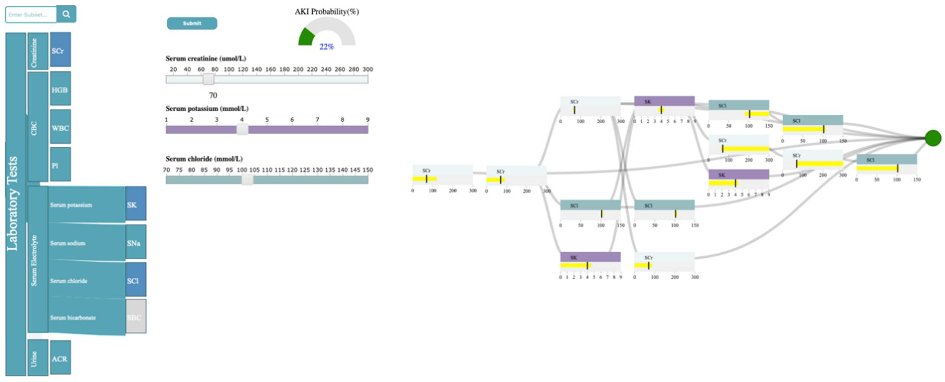
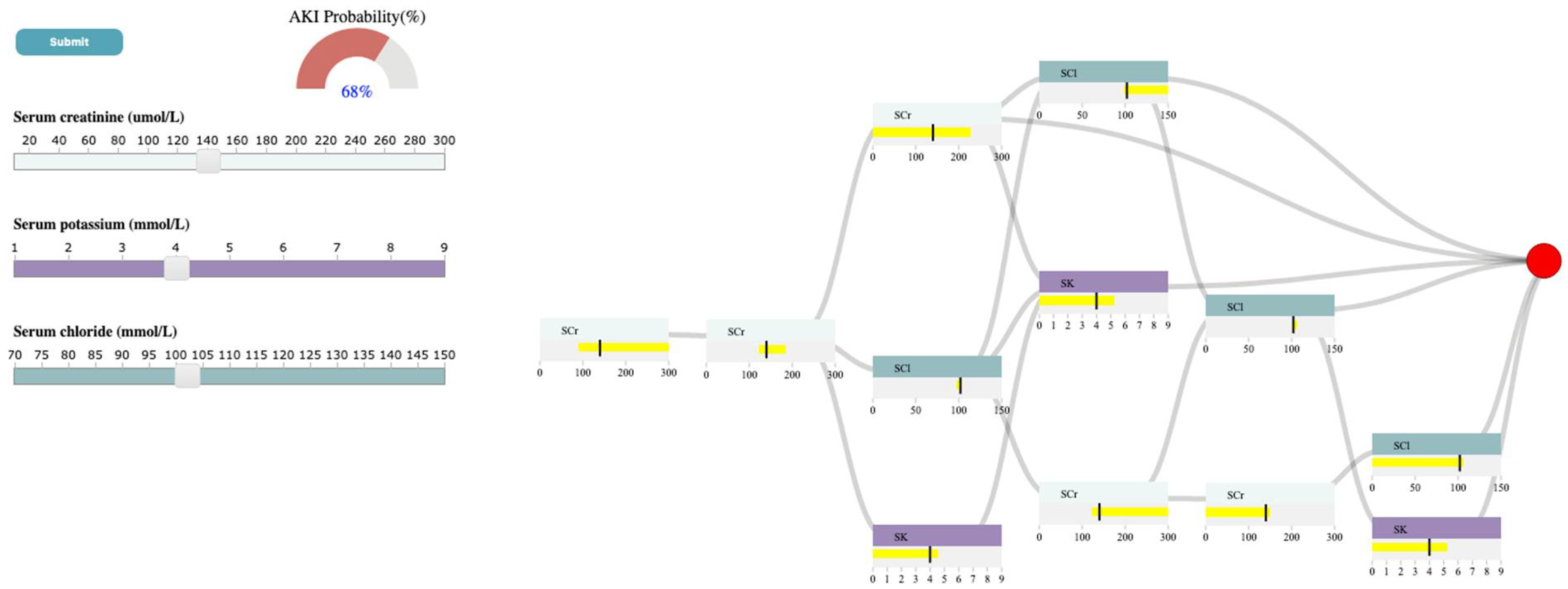
As shown in Figure 3, the laboratory tests are classified into four categories: Creatinine, Complete Blood Count (CBC), Serum electrolyte, and Urine. Creatinine refers to SCr. CBC is composed of HGB, WBC, and Pl. Serum electrolyte contains SNa, SK, SBC, and SCl, and Urine includes ACR. Now, let’s assume the user is interested in exploring the relationship between SCr, SK, SCl, and AKI. The user can first select the rectangle corresponding to serum electrolytes to open it up and observe the full laboratory names included in that group and then select the rectangles corresponding to SCr, SK, and SCl in the selection panel. Upon selection, the system inserts a slider corresponding to the chosen test in the control panel. The system allows the user to probe the prediction model by generating input examples for their chosen tests using sliders in the control panel. As shown in Figure 3, the user has selected the SCr value of 70 umol/L, SK of 4 mmol/L, and SCl of 102 mmol/L through corresponding sliders. Upon submission, the analytics module uses the XGBoost model, generated with the subset of data, including SCr, SK, and SCl, to predict AKI with the input values and returns the result to the probability meter and the decision path panel. The probability meter in Figure 3 shows that the probability of developing AKI, for a patient with the chosen values for SCr, SK, and SCl, is 22 percent.
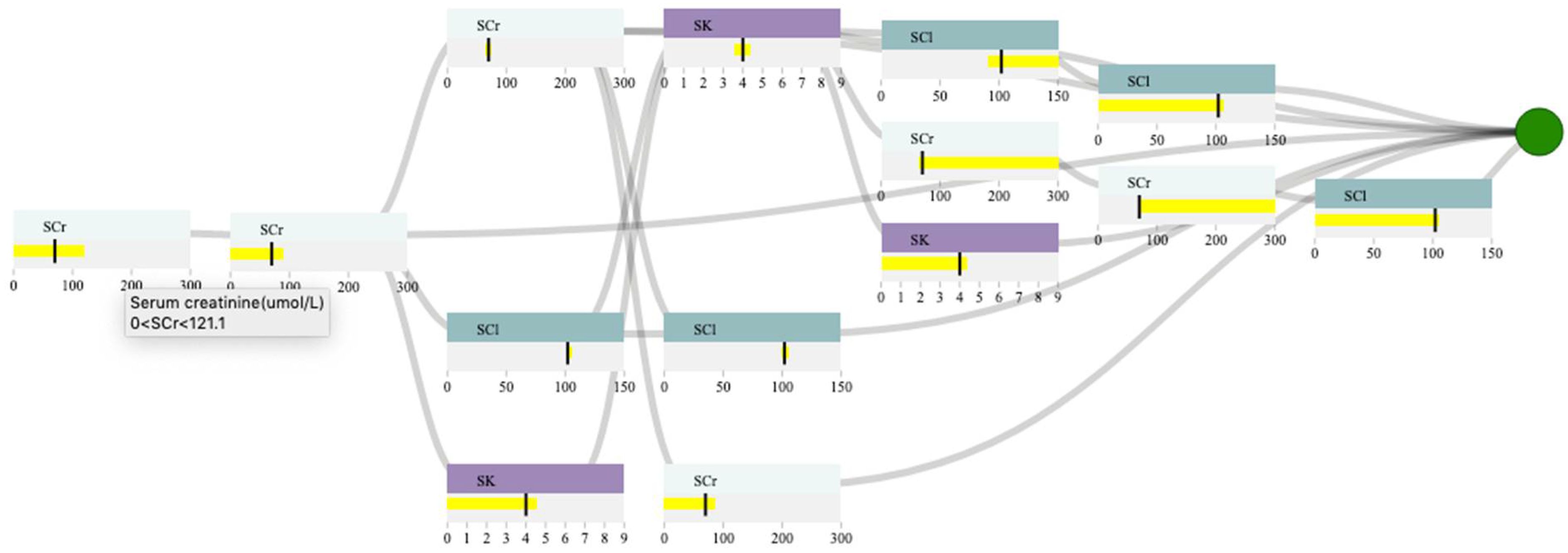
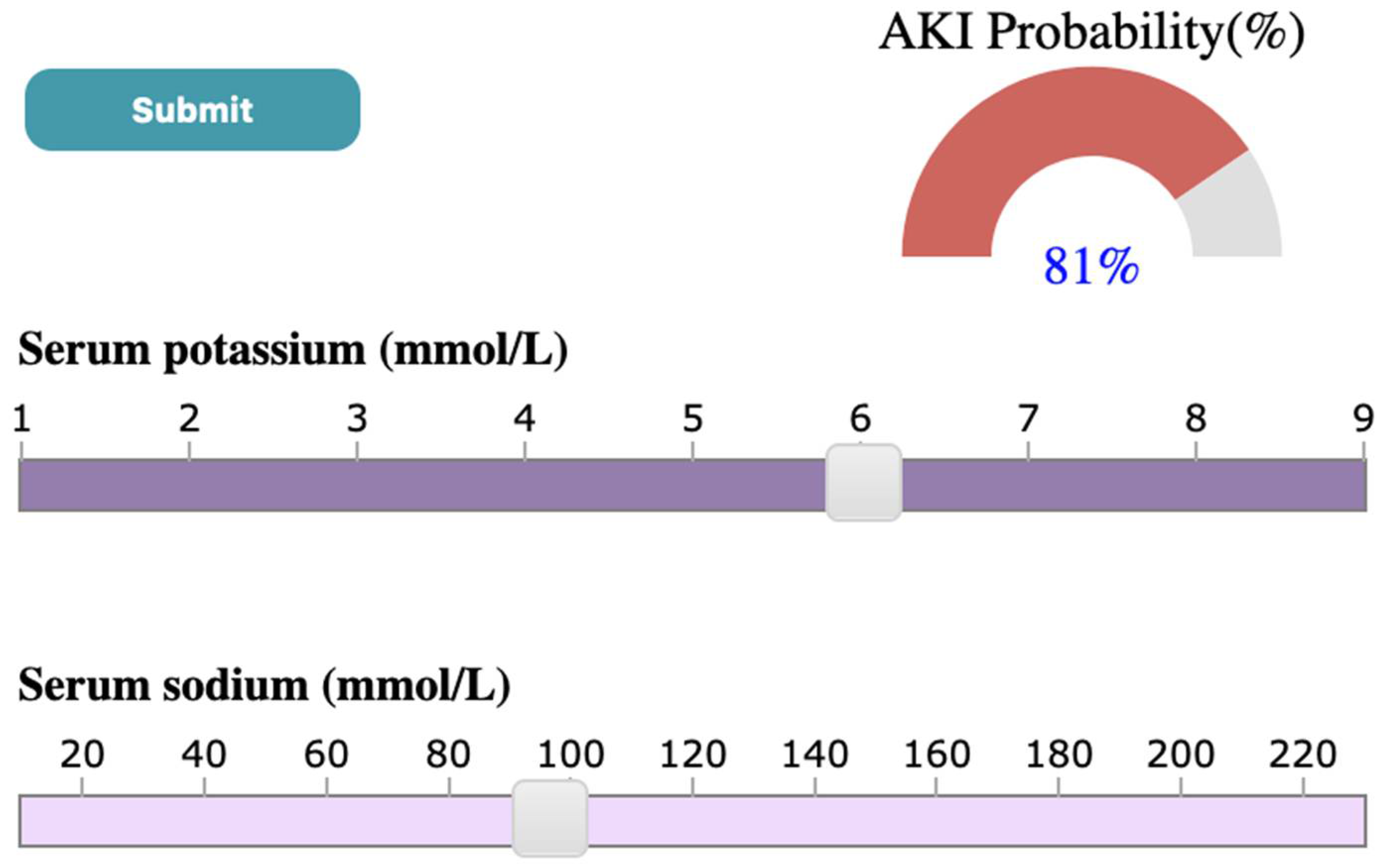
To ensure that the prediction is reliable, the user examines the decision path panel to check the result (Figure 4). As shown in 4, the user can observe that SCr is the only feature that appears in the first and second layers. Since we expect features near the root of the path to be more important than features near the leaves, SCr has higher importance than SCl, and SK when predicting AKI, given the input. If the user hovers the mouse over the SCr feature node in the root layer, they can see the split threshold for that specific node (i.e., SCr > 121.1 umol/L). This information can guide the user to observe how the probability of developing AKI changes if they increase the SCr from 70 to 140 (i.e., a value greater than 121.1 umol/L for SCr). Figure 5 shows that the AKI probability is risen to 68 percent by increasing the SCr value. The user, then, might be curious to explore the association between SK, SCl, and AKI. In this case, they can click on SCr rectangle in the selection panel to remove its corresponding slider from the control panel. Let’s assume the user wants to observe how the changes in SK level would affect the probability of AKI. If the user increases SK to 6 mmol/L (high potassium level), the probability of AKI becomes 80 percent (Figure 6). The user can then observe the feature ranges and the path that led to this probability. For instance, they can observe that the split points for SK are around 4.7 to 5.1 mmol/L, which suggests that this range is critical when using SK in predicting AKI. They can also observe that SK and SCl have similar importance in AKI prediction based on the order they appear on the decision path.
5. Discussion and Limitations
The purpose of this paper is to: (1) show how VA systems can be designed to examine relationships between laboratory test results and a specific disease outcome and (2) study the structure and the working mechanism of the risk prediction models. To accomplish these tasks, we have reported the development of SUNRISE, a VA system designed to support healthcare providers. SUNRISE incorporates two main components: an analytics module and an interactive visualization module. The analytics module integrates a frequent itemset mining technique (i.e., Eclat) with XGBoost to develop risk prediction models. The interactive visualization module then maps the data items generated by the analytics module to four main sub-visualizations—namely, the selection panel, control panel, probability meter, and the decision path panel. SUNRISE is unique in how it integrates XGBoost with Eclat to develop prediction models, and it allows the user to interact with the model and audit the decision process through multiple interactive sub-visualizations. SUNRISE provides a balanced distribution of processing load by seamless integration of computational techniques (i.e., frequent itemset mining and XGBoost in the analytics module) with interactive visual representations (i.e., sub-visualizations in the interactive visualization module) to support the user’s cognitive tasks. It provides the user with the means to probe the prediction model by creating input instances and observing the model’s output. Furthermore, it allows the user to examine how a particular input example’s risk might change if it had different values. Finally, SUNRISE helps the user gain deeper insight into the underlying working mechanism of the model, increasing their confidence in the generated predictions.
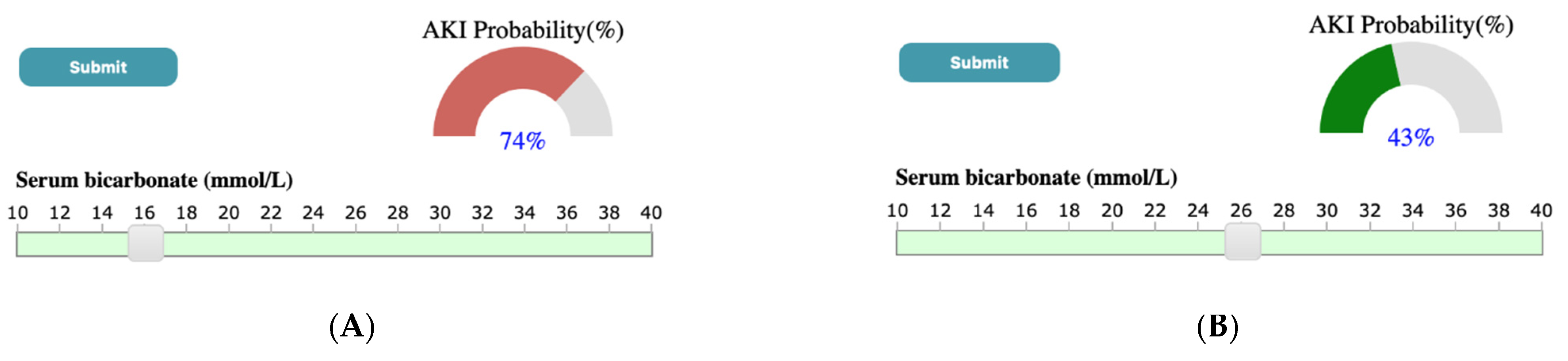
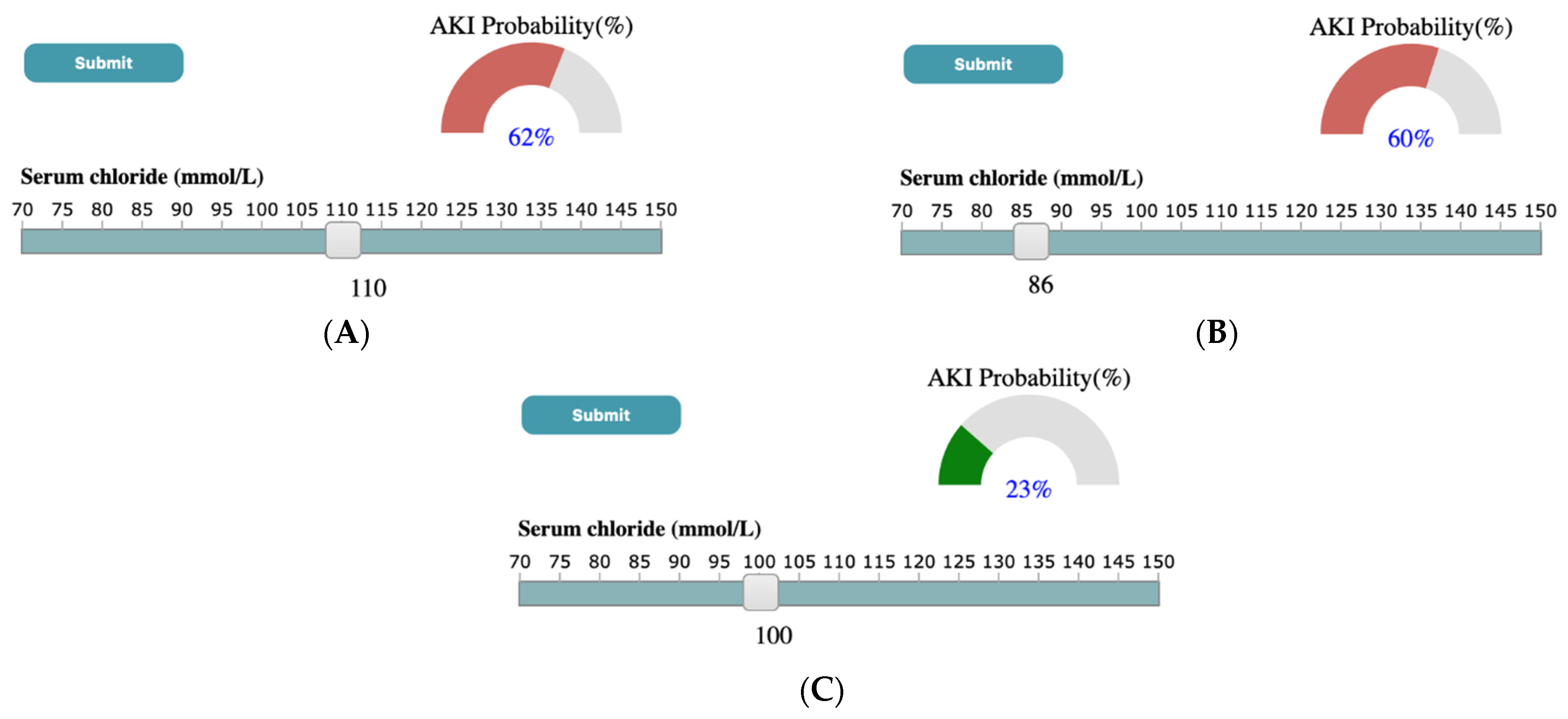
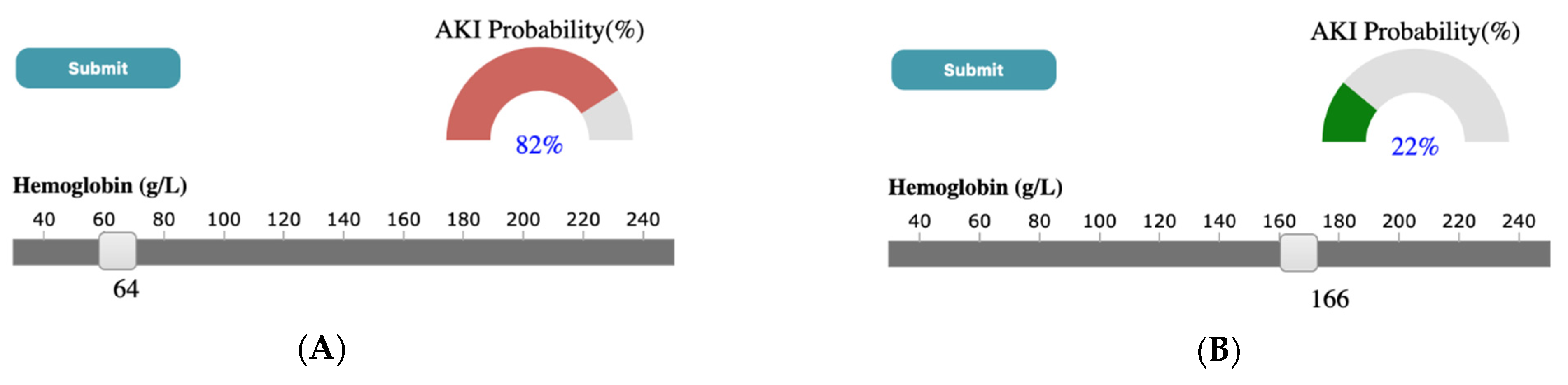
Through a case study using the ICES-KDT dataset, we have shown that outputs generated by SUNRISE are consistent with what has been found in the literature. For instance, Chen et al. [89] has shown that higher serum potassium and lower levels of serum sodium were more likely to lead to the development of AKI. A similar output is observed in results generated by our system. As shown in Figure 7, in the case study presented in the paper, if the user selects SK value of 6 mmol/L and SNa of 96 mmol/L through corresponding sliders, upon submission, the probability meter shows the probability of developing AKI for a patient with the high value of SK, and low levels of SNa is 81 percent. Another example can be seen in Figure 8, where a low serum bicarbonate level (16 mmol/L) is shown to be significantly associated with the development of AKI (74%) while a normal serum bicarbonate level (26 mmol/L) is less likely to progress to AKI (43%). A similar association has been shown by Lim et al. [90], where patients who have low serum bicarbonate levels are estimated to develop AKI 1.57 times the patients with normal bicarbonate levels. According to the study done by Oh et al. [91], the incidence of AKI was significantly higher for patients with high and low serum Chloride levels compared to patients with normal chloride levels. As shown in Figure 9, a similar conclusion can be reached using SUNRISE. When the user selects a high chloride level of 110 mmol/L (Figure 9A) or a low chloride level of 86 mmol/L (Figure 9B), the probability of development of AKI is 62% and 60% consecutively, which are significantly higher than the probability of developing AKI (23%) with normal chloride levels (Figure 9C). Several studies have shown the association between lower hemoglobin, which is frequent in hospitalized patients, and AKI [92,93]. A similar outcome is generated using our tool. As shown in Figure 10, a low hemoglobin level (64 g/L) is shown to be significantly associated with the development of AKI (82%), while a normal hemoglobin level (166 g/L) is less likely to progress to AKI (22%). In addition to these examples, there are many other hypotheses that can be generated from the results of the system. Although most of them are aligned with theories from medical literatures, some of them have not been studied yet. This is especially true for combinations of different test results and their associations with the outcome. SUNRISE can be used by domain experts to identify such hypotheses, which can further be verified through formal clinical studies. It is important to note that the system can be used with any dataset with laboratory test results to interactively explore the relationships between test results and an outcome. The accuracy of generated hypotheses depends on the quality of data that has been used to train the models.
In terms of generalizability, SUNRISE is designed in a modular way to make sure new data sources and data types can be incorporated easily. SUNRISE can be used to study other healthcare problems, such as exploring the association between medication dosage and diabetes. Although SUNRISE focuses on making XGBoost interpretable, we can apply a similar approach to other tree-based ensemble techniques such as Random forest. Random forest uses several decision trees and generates a final prediction model by aggregating the output of all internal trees. Unlike XGBoost, decision trees in Random forest are trained independently. One potential enhancement to support Random forest is to summarize the paths based on whether they generate positive predictions or negative ones and then let the user compare them in the same view.
One of the primary considerations in the design of SUNRISE is scalability. To make the control and decision path panels less cluttered (because of the user’s limited visual capacity when the number of laboratory tests increases), we restrict the maximum number of tests that can get inserted into the control panel by adjusting the minimum support parameter of Eclat.
This research has several limitations. The first limitation is that, although we used a participatory design approach, and medical researchers have assessed SUNRISE and found it valuable, we did not conduct any usability studies to assess SUNRISE’s performance and the efficiency of its interaction mechanisms. Second, the decision path panel sometimes does not function properly if the number of layers in the XGBoost trees gets higher due to screen space limitations and computational resources. Third, as we use curves to link the feature cells from different layers in the decision path panel, these curves might have overlapping problems. Another limitation is that the prediction models might be prone to overfitting because a small validation set might lead to an unstable model at a particular hyperparameter set. This will result in validation error measurements that are overoptimistic. Additionally, large variations in the dataset may drive the input vector to the model outside the probability density functions of the training data. Thus, the system may show inaccurate results in low probability density function areas. Finally, we aggregated laboratory test results for a patient by taking the average of their test results in the past 365 days before the index date. As such, we might have lost vital information regarding laboratory tests. To address this issue, in future versions, we plan to offer the user different aggregation functions, such as the trend of change (i.e., increase/decrease) in tests over a certain period of time.
6. Conclusions
The overall goal of this paper is to show how VA systems can be designed systematically in order to support the investigation of various clinical problems. To achieve this, we report the development of SUNRISE and demonstrate how it can be employed to assist healthcare providers explore associations between laboratory test results and a disease outcome. SUNRISE’s novelty and usefulness stems from its design, as it incorporates frequent itemset mining, XGBoost, visualization, and human-data interaction in an integrated manner to support complex EHR-driven tasks. We illustrate SUNRISE’s value and usefulness through a usage scenario of investigating and exploring the relationship between laboratory test results and AKI using the data stored at ICES. We demonstrate how it can help clinicians and researchers at ICES probe the AKI risk prediction models by hypothesizing input examples and observing the model’s output. Researchers can also audit the decision process to verify the reliability of the prediction models. Finally, the design concepts employed in SUNRISE are generalizable. These concepts can be utilized to systematically design any VA system whose purpose is to support clinical tasks involving investigation and analysis of EHR data using XGBoost and frequent itemset mining.
Author Contributions
Conceptualization, N.R., S.S.A., K.S., A.X.G. and E.M.; methodology, N.R., S.S.A. and K.S.; software, N.R., S.S.A.; validation, N.R., S.S.A., K.S., A.X.G. and E.M.; data curation, N.R., S.S.A. and E.M.; writing—original draft preparation, N.R. and S.S.A.; writing—review and editing, N.R., S.S.A., K.S., A.X.G. and E.M.; visualization, N.R., S.S.A. and K.S.; supervision, K.S. and A.X.G. All authors have read and agreed to the published version of the manuscript.
Funding
This research received no external funding.
Institutional Review Board Statement
Projects that use data collected by ICES under Section 45 of Ontario’s Personal Health Information Protection Act (PHIPA), and use no other data, are exempt from research ethics board review. The use of the data in this project is authorised under Section 45 and approved by ICES’ Privacy and Legal Office.
Informed Consent Statement
ICES is a prescribed entity under PHIPA. Section 45 of PHIPA authorises ICES to collect personal health information, without consent, for the purpose of analysis or compiling statistical information with respect to the management of, evaluation or monitoring of, the allocation of resources to or planning for all or part of the health system.
Data Availability Statement
The study dataset is held securely in coded form at ICES. While legal data sharing agreements between ICES and data providers (e.g., healthcare organizations and government) prohibit ICES from making the dataset publicly available, access might be granted to those who meet prespecified criteria for confidential access, available at www.ices.on.ca/DAS (email [email protected]). The full dataset creation plan and underlying analytic code are available from the authors upon request, understanding that the computer programs might rely upon coding templates or macros that are unique to ICES and are therefore either inaccessible or require modification.
Conflicts of Interest
The authors declare no conflict of interest.
Appendix A

Table A1.
List of databases held at ICES (an independent, non-profit, world-leading research organization that uses population-based health and social data to produce knowledge on a broad range of healthcare issues).
Table A1.
List of databases held at ICES (an independent, non-profit, world-leading research organization that uses population-based health and social data to produce knowledge on a broad range of healthcare issues).
| Data Source | Description | Study Purpose |
|---|---|---|
| Canadian Institute for Health Information Discharge Abstract Database and National Ambulatory Care Reporting System | The Canadian Institute for Health Information Discharge Abstract Database and the National Ambulatory Care Reporting System collect diagnostic and procedural variables for inpatient stays and ED visits, respectively. Diagnostic and inpatient procedural coding uses the 10th version of the Canadian Modified International Classification of Disease system 10th Revision (after 2002). | Cohort creation, description, exposure, and outcome estimation |
| Dynacare (formerly known as Gamma-Dynacare Medical Laboratories) | Database that contains all outpatient laboratory test results from all Dynacare laboratory locations across Ontario since 2002. Dynacare is one of the three largest laboratory providers in Ontario and contains records on over 59 million tests each year. | Outpatient laboratory tests |
Table A2.
Laboratory groups created by Eclat algorithm and their corresponding XGBoost tuning parameters and AUROC.
Table A2.
Laboratory groups created by Eclat algorithm and their corresponding XGBoost tuning parameters and AUROC.
| Group | Laboratory Tests in the Group | AUROC | Max_Depth | Eta | Subsample | Min_Child_Weigth | Gamma |
|---|---|---|---|---|---|---|---|
| 1 | SBC,SCr,SK,SNa | 0.78 | 9 | 0.08 | 0.84 | 0 | 3 |
| 2 | SBC,SCr,SNa | 0.77 | 8 | 0.03 | 0.96 | 10 | 2 |
| 3 | SBC,SK,SNa | 0.66 | 3 | 0.18 | 0.72 | 7 | 4 |
| 4 | SBC,SCr,SK | 0.76 | 7 | 0.07 | 0.97 | 10 | 2 |
| 5 | SBC,SCr | 0.76 | 9 | 0.05 | 0.91 | 5 | 5 |
| 6 | SBC,SK | 0.61 | 3 | 0.29 | 0.96 | 0 | 5 |
| 7 | SBC,SNa | 0.66 | 6 | 0.18 | 0.77 | 0 | 3 |
| 8 | ACr,HGB,Pl,SCl,SCr,SK,SNa,WBC | 0.81 | 7 | 0.16 | 0.99 | 5 | 3 |
| 9 | ACr,Pl,SCl,SCr,SK,SNa,WBC | 0.82 | 8 | 0.12 | 0.75 | 6 | 0 |
| 10 | ACr,HGB,Pl,SCl,SK,SNa,WBC | 0.76 | 3 | 0.27 | 0.72 | 4 | 3 |
| 11 | ACr,HGB,Pl,SCl,SCr,SK,SNa | 0.81 | 10 | 0.29 | 0.82 | 4 | 0 |
| 12 | ACr,Pl,SCl,SCr,SK,SNa | 0.81 | 8 | 0.20 | 0.79 | 0 | 2 |
| 13 | ACr,HGB,Pl,SCl,SK,SNa | 0.75 | 3 | 0.25 | 0.95 | 8 | 2 |
| 14 | ACr,Pl,SCl,SK,SNa,WBC | 0.75 | 4 | 0.30 | 0.74 | 1 | 5 |
| 15 | ACr,HGB,SCl,SCr,SK,SNa,WBC | 0.81 | 7 | 0.27 | 0.76 | 4 | 0 |
| 16 | ACr,SCl,SCr,SK,SNa,WBC | 0.81 | 6 | 0.21 | 0.82 | 9 | 0 |
| 17 | ACr,HGB,SCl,SK,SNa,WBC | 0.77 | 3 | 0.28 | 0.83 | 3 | 2 |
| 18 | ACr,HGB,SCl,SCr,SK,SNa | 0.81 | 9 | 0.28 | 0.95 | 0 | 2 |
| 19 | ACr,SCl,SCr,SK,SNa | 0.80 | 7 | 0.21 | 0.86 | 7 | 0 |
| 20 | ACr,HGB,SCl,SK,SNa | 0.75 | 3 | 0.29 | 0.96 | 0 | 5 |
| 21 | ACr,SCl,SK,SNa,WBC | 0.76 | 10 | 0.22 | 0.94 | 5 | 3 |
| 22 | ACr,Pl,SCl,SK,SNa | 0.74 | 7 | 0.23 | 0.77 | 2 | 5 |
| 23 | ACr,HGB,Pl,SCl,SCr,SNa,WBC | 0.81 | 8 | 0.27 | 0.86 | 3 | 4 |
| 24 | ACr,Pl,SCl,SCr,SNa,WBC | 0.81 | 10 | 0.27 | 0.72 | 0 | 1 |
| 25 | ACr,HGB,Pl,SCl,SNa,WBC | 0.76 | 9 | 0.19 | 0.93 | 7 | 4 |
| 26 | ACr,HGB,Pl,SCl,SCr,SNa | 0.81 | 7 | 0.27 | 0.95 | 1 | 2 |
| 27 | ACr,Pl,SCl,SCr,SNa | 0.80 | 7 | 0.28 | 0.73 | 5 | 4 |
| 28 | ACr,HGB,Pl,SCl,SNa | 0.74 | 3 | 0.28 | 0.71 | 7 | 3 |
| 29 | ACr,Pl,SCl,SNa,WBC | 0.74 | 10 | 0.08 | 0.92 | 5 | 3 |
| 30 | ACr,HGB,SCl,SCr,SNa,WBC | 0.81 | 10 | 0.27 | 0.91 | 6 | 5 |
| 31 | ACr,SCl,SCr,SNa,WBC | 0.81 | 6 | 0.17 | 0.75 | 9 | 2 |
| 32 | ACr,HGB,SCl,SNa,WBC | 0.77 | 4 | 0.26 | 0.77 | 6 | 3 |
| 33 | ACr,HGB,SCl,SCr,SNa | 0.80 | 9 | 0.27 | 0.98 | 5 | 2 |
| 34 | ACr,SCl,SCr,SNa | 0.80 | 9 | 0.03 | 0.71 | 2 | 0 |
| 35 | ACr,HGB,SCl,SNa | 0.75 | 4 | 0.30 | 0.74 | 1 | 5 |
| 36 | ACr,SCl,SNa,WBC | 0.74 | 6 | 0.22 | 0.81 | 3 | 4 |
| 37 | ACr,Pl,SCl,SNa | 0.72 | 3 | 0.26 | 0.70 | 0 | 2 |
| 38 | ACr,SCl,SK,SNa | 0.73 | 5 | 0.28 | 0.82 | 9 | 5 |
| 39 | ACr,HGB,Pl,SCl,SCr,SK,WBC | 0.81 | 9 | 0.11 | 0.98 | 3 | 5 |
| 40 | ACr,Pl,SCl,SCr,SK,WBC | 0.81 | 6 | 0.23 | 0.70 | 9 | 4 |
| 41 | ACr,HGB,Pl,SCl,SK,WBC | 0.78 | 6 | 0.29 | 0.76 | 3 | 4 |
| 42 | ACr,HGB,Pl,SCl,SCr,SK | 0.81 | 10 | 0.19 | 0.73 | 0 | 3 |
| 43 | ACr,Pl,SCl,SCr,SK | 0.8 | 5 | 0.29 | 0.75 | 3 | 0 |
| 44 | ACr,HGB,Pl,SCl,SK | 0.75 | 3 | 0.28 | 0.71 | 7 | 3 |
| 45 | ACr,Pl,SCl,SK,WBC | 0.75 | 3 | 0.27 | 0.92 | 0 | 1 |
| 46 | ACr,HGB,SCl,SCr,SK,WBC | 0.80 | 10 | 0.28 | 0.93 | 7 | 4 |
| 47 | ACr,SCl,SCr,SK,WBC | 0.80 | 7 | 0.29 | 0.83 | 3 | 0 |
| 48 | ACr,HGB,SCl,SK,WBC | 0.76 | 3 | 0.29 | 1.00 | 6 | 0 |
| 49 | ACr,HGB,SCl,SCr,SK | 0.81 | 9 | 0.27 | 0.94 | 9 | 1 |
| 50 | ACr,SCl,SCr,SK | 0.79 | 5 | 0.29 | 0.75 | 3 | 0 |
| 51 | ACr,HGB,SCl,SK | 0.75 | 3 | 0.27 | 0.86 | 7 | 1 |
| 52 | ACr,SCl,SK,WBC | 0.75 | 8 | 0.23 | 0.70 | 8 | 1 |
| 53 | ACr,Pl,SCl,SK | 0.74 | 4 | 0.30 | 0.74 | 1 | 5 |
| 54 | ACr,HGB,Pl,SCl,SCr,WBC | 0.81 | 10 | 0.25 | 0.99 | 9 | 0 |
| 55 | ACr,Pl,SCl,SCr,WBC | 0.8 | 8 | 0.23 | 0.83 | 1 | 4 |
| 56 | ACr,HGB,Pl,SCl,WBC | 0.77 | 4 | 0.29 | 0.93 | 4 | 3 |
| 57 | ACr,HGB,Pl,SCl,SCr | 0.80 | 9 | 0.21 | 0.93 | 3 | 1 |
| 58 | ACr,Pl,SCl,SCr | 0.79 | 9 | 0.28 | 0.72 | 1 | 2 |
| 59 | ACr,HGB,Pl,SCl | 0.75 | 3 | 0.28 | 0.76 | 8 | 1 |
| 60 | ACr,Pl,SCl,WBC | 0.74 | 5 | 0.28 | 0.96 | 5 | 2 |
| 61 | ACr,HGB,SCl,SCr,WBC | 0.80 | 7 | 0.27 | 0.77 | 4 | 3 |
| 62 | ACr,SCl,SCr,WBC | 0.80 | 5 | 0.26 | 0.81 | 2 | 4 |
| 63 | ACr,HGB,SCl,WBC | 0.76 | 3 | 0.27 | 0.90 | 6 | 1 |
| 64 | ACr,HGB,SCl,SCr | 0.80 | 10 | 0.19 | 0.73 | 0 | 3 |
| 65 | ACr,SCl,SCr | 0.80 | 8 | 0.30 | 0.99 | 4 | 3 |
| 66 | ACr,HGB,SCl | 0.74 | 3 | 0.22 | 0.83 | 8 | 2 |
| 67 | ACr,SCl,WBC | 0.73 | 5 | 0.29 | 0.73 | 4 | 2 |
| 68 | ACr,Pl,SCl | 0.73 | 6 | 0.22 | 0.89 | 8 | 5 |
| 69 | ACr,SCl,SK | 0.73 | 3 | 0.28 | 0.76 | 8 | 1 |
| 70 | ACr,SCl,SNa | 0.72 | 7 | 0.29 | 0.72 | 2 | 5 |
| 71 | ACr,HGB,Pl,SCr,SK,SNa,WBC | 0.83 | 6 | 0.29 | 0.91 | 2 | 0 |
| 72 | ACr,Pl,SCr,SK,SNa,WBC | 0.82 | 5 | 0.29 | 0.95 | 1 | 4 |
| 73 | ACr,HGB,Pl,SK,SNa,WBC | 0.77 | 4 | 0.29 | 0.77 | 6 | 0 |
| 74 | ACr,HGB,Pl,SCr,SK,SNa | 0.82 | 10 | 0.19 | 0.95 | 1 | 5 |
| 75 | ACr,Pl,SCr,SK,SNa | 0.82 | 6 | 0.25 | 0.76 | 5 | 5 |
| 76 | ACr,HGB,Pl,SK,SNa | 0.74 | 5 | 0.15 | 0.84 | 3 | 1 |
| 77 | ACr,Pl,SK,SNa,WBC | 0.75 | 5 | 0.24 | 0.92 | 6 | 4 |
| 78 | ACr,HGB,SCr,SK,SNa,WBC | 0.83 | 9 | 0.17 | 0.72 | 5 | 2 |
| 79 | ACr,SCr,SK,SNa,WBC | 0.83 | 10 | 0.18 | 0.76 | 5 | 5 |
| 80 | ACr,HGB,SK,SNa,WBC | 0.76 | 8 | 0.08 | 0.73 | 5 | 5 |
| 81 | ACr,HGB,SCr,SK,SNa | 0.81 | 4 | 0.28 | 0.92 | 2 | 2 |
| 82 | ACr,SCr,SK,SNa | 0.8 | 4 | 0.27 | 0.73 | 1 | 3 |
| 83 | ACr,HGB,SK,SNa | 0.75 | 4 | 0.23 | 0.95 | 7 | 0 |
| 84 | ACr,SK,SNa,WBC | 0.75 | 5 | 0.17 | 0.96 | 9 | 0 |
| 85 | ACr,Pl,SK,SNa | 0.72 | 4 | 0.20 | 0.78 | 0 | 4 |
| 86 | ACr,HGB,Pl,SCr,SNa,WBC | 0.82 | 7 | 0.28 | 0.93 | 2 | 4 |
| 87 | ACr,Pl,SCr,SNa,WBC | 0.83 | 7 | 0.27 | 0.77 | 4 | 3 |
| 88 | ACr,HGB,Pl,SNa,WBC | 0.76 | 3 | 0.28 | 0.99 | 0 | 1 |
| 89 | ACr,HGB,Pl,SCr,SNa | 0.82 | 10 | 0.19 | 0.89 | 4 | 5 |
| 90 | ACr,Pl,SCr,SNa | 0.81 | 3 | 0.22 | 0.82 | 8 | 0 |
| 91 | ACr,HGB,Pl,SNa | 0.74 | 3 | 0.10 | 0.86 | 3 | 4 |
| 92 | ACr,Pl,SNa,WBC | 0.74 | 6 | 0.29 | 0.79 | 9 | 5 |
| 93 | ACr,HGB,SCr,SNa,WBC | 0.82 | 9 | 0.28 | 0.95 | 10 | 4 |
| 94 | ACr,SCr,SNa,WBC | 0.83 | 8 | 0.14 | 0.71 | 10 | 1 |
| 95 | ACr,HGB,SNa,WBC | 0.76 | 4 | 0.17 | 0.77 | 6 | 4 |
| 96 | ACr,HGB,SCr,SNa | 0.82 | 7 | 0.28 | 0.93 | 2 | 4 |
| 97 | ACr,SCr,SNa | 0.81 | 3 | 0.30 | 0.99 | 9 | 5 |
| 98 | ACr,HGB,SNa | 0.74 | 4 | 0.04 | 0.73 | 1 | 4 |
| 99 | ACr,SNa,WBC | 0.74 | 5 | 0.22 | 0.80 | 1 | 3 |
| 100 | ACr,Pl,SNa | 0.71 | 3 | 0.27 | 0.90 | 6 | 1 |
| 101 | ACr,SK,SNa | 0.71 | 5 | 0.29 | 0.89 | 10 | 5 |
| 102 | ACr,HGB,Pl,SCr,SK,WBC | 0.83 | 10 | 0.21 | 0.83 | 9 | 2 |
| 103 | ACr,Pl,SCr,SK,WBC | 0.83 | 9 | 0.19 | 0.89 | 3 | 5 |
| 104 | ACr,HGB,Pl,SK,WBC | 0.77 | 7 | 0.23 | 0.77 | 2 | 5 |
| 105 | ACr,HGB,Pl,SCr,SK | 0.82 | 5 | 0.18 | 1.00 | 2 | 4 |
| 106 | ACr,Pl,SCr,SK | 0.82 | 5 | 0.21 | 0.72 | 6 | 3 |
| 107 | ACr,HGB,Pl,SK | 0.75 | 5 | 0.09 | 0.93 | 5 | 4 |
| 108 | ACr,Pl,SK,WBC | 0.75 | 3 | 0.28 | 0.99 | 0 | 1 |
| 109 | ACr,HGB,SCr,SK,WBC | 0.83 | 6 | 0.21 | 0.80 | 1 | 4 |
| 110 | ACr,SCr,SK,WBC | 0.83 | 5 | 0.24 | 0.76 | 1 | 4 |
| 111 | ACr,HGB,SK,WBC | 0.77 | 3 | 0.28 | 0.76 | 8 | 1 |
| 112 | ACr,HGB,SCr,SK | 0.82 | 10 | 0.19 | 0.95 | 1 | 5 |
| 113 | ACr,SCr,SK | 0.81 | 3 | 0.28 | 0.93 | 8 | 1 |
| 114 | ACr,HGB,SK | 0.74 | 4 | 0.03 | 0.83 | 9 | 5 |
| 115 | ACr,SK,WBC | 0.75 | 9 | 0.18 | 0.83 | 10 | 4 |
| 116 | ACr,Pl,SK | 0.72 | 5 | 0.24 | 0.92 | 6 | 4 |
| 117 | ACr,HGB,Pl,SCr,WBC | 0.82 | 8 | 0.25 | 0.81 | 6 | 3 |
| 118 | ACr,Pl,SCr,WBC | 0.82 | 10 | 0.28 | 0.94 | 6 | 4 |
| 119 | ACr,HGB,Pl,WBC | 0.76 | 7 | 0.28 | 0.73 | 5 | 4 |
| 120 | ACr,HGB,Pl,SCr | 0.82 | 10 | 0.19 | 0.81 | 4 | 4 |
| 121 | ACr,Pl,SCr | 0.81 | 3 | 0.28 | 0.83 | 3 | 2 |
| 122 | ACr,HGB,Pl | 0.74 | 4 | 0.20 | 0.72 | 10 | 4 |
| 123 | ACr,Pl,WBC | 0.73 | 5 | 0.25 | 0.89 | 0 | 2 |
| 124 | ACr,HGB,SCr,WBC | 0.81 | 4 | 0.28 | 0.92 | 2 | 2 |
| 125 | ACr,SCr,WBC | 0.82 | 7 | 0.29 | 0.72 | 2 | 5 |
| 126 | ACr,HGB,WBC | 0.75 | 4 | 0.15 | 0.75 | 9 | 5 |
| 127 | ACr,HGB,SCr | 0.82 | 5 | 0.28 | 0.72 | 10 | 1 |
| 128 | ACr,SCr | 0.81 | 4 | 0.26 | 0.77 | 6 | 3 |
| 129 | ACr,HGB | 0.74 | 8 | 0.13 | 0.72 | 0 | 5 |
| 130 | ACr,WBC | 0.73 | 7 | 0.27 | 0.87 | 8 | 4 |
| 131 | ACr,Pl | 0.71 | 3 | 0.29 | 0.81 | 5 | 2 |
| 132 | ACr,SK | 0.7 | 3 | 0.29 | 0.96 | 0 | 5 |
| 133 | ACr,SNa | 0.7 | 8 | 0.22 | 0.76 | 7 | 3 |
| 134 | ACr,SCl | 0.72 | 7 | 0.15 | 0.82 | 5 | 5 |
| 135 | HGB,Pl,SCl,SCr,SK,SNa,WBC | 0.80 | 6 | 0.29 | 0.76 | 3 | 4 |
| 136 | Pl,SCl,SCr,SK,SNa,WBC | 0.79 | 3 | 0.29 | 0.74 | 8 | 2 |
| 137 | HGB,Pl,SCl,SK,SNa,WBC | 0.74 | 9 | 0.28 | 0.79 | 5 | 5 |
| 138 | HGB,Pl,SCl,SCr,SK,SNa | 0.80 | 5 | 0.28 | 0.82 | 9 | 5 |
| 139 | Pl,SCl,SCr,SK,SNa | 0.79 | 5 | 0.23 | 0.72 | 7 | 5 |
| 140 | HGB,Pl,SCl,SK,SNa | 0.72 | 8 | 0.13 | 0.72 | 0 | 5 |
| 141 | Pl,SCl,SK,SNa,WBC | 0.66 | 8 | 0.27 | 0.95 | 1 | 5 |
| 142 | HGB,SCl,SCr,SK,SNa,WBC | 0.80 | 5 | 0.28 | 0.82 | 9 | 5 |
| 143 | SCl,SCr,SK,SNa,WBC | 0.78 | 5 | 0.17 | 0.73 | 0 | 3 |
| 144 | HGB,SCl,SK,SNa,WBC | 0.72 | 3 | 0.26 | 0.70 | 0 | 2 |
| 145 | HGB,SCl,SCr,SK,SNa | 0.80 | 7 | 0.20 | 0.78 | 7 | 4 |
| 146 | SCl,SCr,SK,SNa | 0.78 | 5 | 0.28 | 0.82 | 9 | 5 |
| 147 | HGB,SCl,SK,SNa | 0.71 | 7 | 0.27 | 0.81 | 3 | 5 |
| 148 | SCl,SK,SNa,WBC | 0.65 | 8 | 0.26 | 0.78 | 1 | 5 |
| 149 | Pl,SCl,SK,SNa | 0.65 | 9 | 0.22 | 0.95 | 8 | 3 |
| 150 | HGB,Pl,SCl,SCr,SNa,WBC | 0.80 | 9 | 0.15 | 0.75 | 10 | 5 |
| 151 | Pl,SCl,SCr,SNa,WBC | 0.78 | 6 | 0.20 | 0.93 | 4 | 3 |
| 152 | HGB,Pl,SCl,SNa,WBC | 0.73 | 5 | 0.27 | 0.88 | 3 | 0 |
| 153 | HGB,Pl,SCl,SCr,SNa | 0.79 | 4 | 0.26 | 0.72 | 0 | 3 |
| 154 | Pl,SCl,SCr,SNa | 0.78 | 4 | 0.25 | 0.81 | 4 | 4 |
| 155 | HGB,Pl,SCl,SNa | 0.71 | 7 | 0.13 | 0.75 | 5 | 2 |
| 156 | Pl,SCl,SNa,WBC | 0.65 | 7 | 0.26 | 0.84 | 0 | 3 |
| 157 | HGB,SCl,SCr,SNa,WBC | 0.8 | 5 | 0.13 | 0.92 | 3 | 1 |
| 158 | SCl,SCr,SNa,WBC | 0.78 | 4 | 0.27 | 0.83 | 10 | 4 |
| 159 | HGB,SCl,SNa,WBC | 0.72 | 5 | 0.29 | 0.89 | 10 | 5 |
| 160 | HGB,SCl,SCr,SNa | 0.79 | 5 | 0.14 | 0.74 | 8 | 4 |
| 161 | SCl,SCr,SNa | 0.78 | 9 | 0.28 | 0.79 | 5 | 5 |
| 162 | HGB,SCl,SNa | 0.70 | 10 | 0.23 | 0.78 | 5 | 5 |
| 163 | SCl,SNa,WBC | 0.65 | 8 | 0.26 | 0.78 | 1 | 5 |
| 164 | Pl,SCl,SNa | 0.63 | 10 | 0.19 | 0.95 | 1 | 5 |
| 165 | SCl,SK,SNa | 0.64 | 6 | 0.27 | 0.87 | 1 | 1 |
| 166 | HGB,Pl,SCl,SCr,SK,WBC | 0.81 | 9 | 0.28 | 0.79 | 5 | 5 |
| 167 | Pl,SCl,SCr,SK,WBC | 0.79 | 6 | 0.29 | 0.79 | 9 | 5 |
| 168 | HGB,Pl,SCl,SK,WBC | 0.73 | 4 | 0.23 | 0.95 | 7 | 0 |
| 169 | HGB,Pl,SCl,SCr,SK | 0.80 | 7 | 0.28 | 0.93 | 2 | 4 |
| 170 | Pl,SCl,SCr,SK | 0.78 | 5 | 0.25 | 0.97 | 6 | 0 |
| 171 | HGB,Pl,SCl,SK | 0.71 | 6 | 0.13 | 0.81 | 7 | 4 |
| 172 | Pl,SCl,SK,WBC | 0.66 | 6 | 0.29 | 0.76 | 3 | 4 |
| 173 | HGB,SCl,SCr,SK,WBC | 0.80 | 5 | 0.19 | 0.79 | 6 | 4 |
| 174 | SCl,SCr,SK,WBC | 0.79 | 4 | 0.25 | 0.77 | 7 | 4 |
| 175 | HGB,SCl,SK,WBC | 0.72 | 3 | 0.24 | 0.71 | 9 | 2 |
| 176 | HGB,SCl,SCr,SK | 0.80 | 5 | 0.18 | 0.76 | 3 | 2 |
| 177 | SCl,SCr,SK | 0.78 | 7 | 0.16 | 0.74 | 6 | 5 |
| 178 | HGB,SCl,SK | 0.71 | 9 | 0.29 | 0.85 | 10 | 3 |
| 179 | SCl,SK,WBC | 0.64 | 7 | 0.26 | 0.73 | 0 | 2 |
| 180 | Pl,SCl,SK | 0.63 | 5 | 0.28 | 0.92 | 4 | 3 |
| 181 | HGB,Pl,SCl,SCr,WBC | 0.80 | 7 | 0.05 | 0.75 | 2 | 5 |
| 182 | Pl,SCl,SCr,WBC | 0.78 | 5 | 0.23 | 0.77 | 8 | 2 |
| 183 | HGB,Pl,SCl,WBC | 0.73 | 3 | 0.27 | 0.85 | 5 | 0 |
| 184 | HGB,Pl,SCl,SCr | 0.79 | 5 | 0.27 | 0.88 | 3 | 0 |
| 185 | Pl,SCl,SCr | 0.78 | 6 | 0.15 | 0.76 | 7 | 0 |
| 186 | HGB,Pl,SCl | 0.70 | 7 | 0.18 | 0.88 | 7 | 5 |
| 187 | Pl,SCl,WBC | 0.64 | 9 | 0.22 | 0.81 | 1 | 4 |
| 188 | HGB,SCl,SCr,WBC | 0.8 | 3 | 0.28 | 0.71 | 7 | 3 |
| 189 | SCl,SCr,WBC | 0.78 | 6 | 0.08 | 0.72 | 7 | 5 |
| 190 | HGB,SCl,WBC | 0.71 | 3 | 0.28 | 0.94 | 6 | 0 |
| 191 | HGB,SCl,SCr | 0.80 | 4 | 0.25 | 0.77 | 7 | 4 |
| 192 | SCl,SCr | 0.78 | 3 | 0.23 | 0.84 | 0 | 0 |
| 193 | HGB,SCl | 0.70 | 5 | 0.29 | 0.75 | 3 | 0 |
| 194 | SCl,WBC | 0.62 | 9 | 0.28 | 0.84 | 9 | 5 |
| 195 | Pl,SCl | 0.6 | 8 | 0.30 | 0.82 | 4 | 0 |
| 196 | SCl,SK | 0.61 | 9 | 0.28 | 0.95 | 10 | 4 |
| 197 | SCl,SNa | 0.64 | 9 | 0.23 | 0.87 | 8 | 1 |
| 198 | HGB,Pl,SCr,SK,SNa,WBC | 0.8 | 7 | 0.22 | 0.97 | 1 | 5 |
| 199 | Pl,SCr,SK,SNa,WBC | 0.8 | 4 | 0.29 | 0.77 | 6 | 0 |
| 200 | HGB,Pl,SK,SNa,WBC | 0.73 | 8 | 0.13 | 0.72 | 0 | 5 |
| 201 | HGB,Pl,SCr,SK,SNa | 0.80 | 5 | 0.27 | 0.89 | 5 | 5 |
| 202 | Pl,SCr,SK,SNa | 0.79 | 8 | 0.06 | 0.71 | 0 | 4 |
| 203 | HGB,Pl,SK,SNa | 0.69 | 7 | 0.29 | 0.72 | 2 | 5 |
| 204 | Pl,SK,SNa,WBC | 0.66 | 5 | 0.27 | 0.85 | 0 | 5 |
| 205 | HGB,SCr,SK,SNa,WBC | 0.80 | 5 | 0.20 | 0.74 | 3 | 4 |
| 206 | SCr,SK,SNa,WBC | 0.79 | 4 | 0.20 | 0.78 | 0 | 4 |
| 207 | HGB,SK,SNa,WBC | 0.71 | 7 | 0.29 | 0.72 | 2 | 5 |
| 208 | HGB,SCr,SK,SNa | 0.80 | 5 | 0.29 | 0.89 | 10 | 5 |
| 209 | SCr,SK,SNa | 0.79 | 6 | 0.22 | 0.81 | 3 | 4 |
| 210 | HGB,SK,SNa | 0.69 | 9 | 0.26 | 0.77 | 7 | 5 |
| 211 | SK,SNa,WBC | 0.64 | 5 | 0.28 | 0.92 | 4 | 3 |
| 212 | Pl,SK,SNa | 0.64 | 6 | 0.29 | 0.99 | 2 | 3 |
| 213 | HGB,Pl,SCr,SNa,WBC | 0.80 | 3 | 0.29 | 0.81 | 5 | 2 |
| 214 | Pl,SCr,SNa,WBC | 0.79 | 3 | 0.29 | 0.81 | 5 | 2 |
| 215 | HGB,Pl,SNa,WBC | 0.71 | 5 | 0.26 | 0.85 | 6 | 2 |
| 216 | HGB,Pl,SCr,SNa | 0.80 | 4 | 0.26 | 0.72 | 0 | 3 |
| 217 | Pl,SCr,SNa | 0.79 | 5 | 0.19 | 0.79 | 6 | 4 |
| 218 | HGB,Pl,SNa | 0.69 | 7 | 0.21 | 0.73 | 4 | 4 |
| 219 | Pl,SNa,WBC | 0.64 | 4 | 0.29 | 0.77 | 6 | 0 |
| 220 | HGB,SCr,SNa,WBC | 0.80 | 6 | 0.16 | 0.88 | 3 | 5 |
| 221 | SCr,SNa,WBC | 0.79 | 4 | 0.30 | 0.77 | 5 | 2 |
| 222 | HGB,SNa,WBC | 0.70 | 7 | 0.16 | 0.74 | 6 | 5 |
| 223 | HGB,SCr,SNa | 0.79 | 4 | 0.20 | 0.86 | 3 | 5 |
| 224 | SCr,SNa | 0.79 | 3 | 0.17 | 0.73 | 9 | 3 |
| 225 | HGB,SNa | 0.68 | 8 | 0.26 | 0.78 | 1 | 5 |
| 226 | SNa,WBC | 0.61 | 9 | 0.30 | 0.75 | 10 | 3 |
| 227 | Pl,SNa | 0.61 | 9 | 0.19 | 0.95 | 7 | 4 |
| 228 | SK,SNa | 0.63 | 5 | 0.28 | 0.92 | 4 | 3 |
| 229 | HGB,Pl,SCr,SK,WBC | 0.80 | 9 | 0.10 | 0.82 | 4 | 5 |
| 230 | Pl,SCr,SK,WBC | 0.80 | 4 | 0.20 | 0.72 | 10 | 4 |
| 231 | HGB,Pl,SK,WBC | 0.72 | 7 | 0.26 | 0.84 | 0 | 3 |
| 232 | HGB,Pl,SCr,SK | 0.80 | 5 | 0.25 | 0.97 | 6 | 0 |
| 233 | Pl,SCr,SK | 0.79 | 8 | 0.21 | 0.96 | 6 | 5 |
| 234 | HGB,Pl,SK | 0.69 | 9 | 0.16 | 0.95 | 10 | 5 |
| 235 | Pl,SK,WBC | 0.66 | 5 | 0.17 | 0.78 | 3 | 4 |
| 236 | HGB,SCr,SK,WBC | 0.80 | 7 | 0.11 | 0.78 | 0 | 2 |
| 237 | SCr,SK,WBC | 0.79 | 5 | 0.25 | 0.89 | 0 | 2 |
| 238 | HGB,SK,WBC | 0.70 | 5 | 0.29 | 0.95 | 1 | 4 |
| 239 | HGB,SCr,SK | 0.80 | 6 | 0.29 | 0.76 | 3 | 4 |
| 240 | SCr,SK | 0.79 | 6 | 0.08 | 0.79 | 8 | 3 |
| 241 | HGB,SK | 0.68 | 8 | 0.28 | 0.92 | 4 | 0 |
| 242 | SK,WBC | 0.64 | 9 | 0.11 | 0.74 | 10 | 5 |
| 243 | Pl,SK | 0.63 | 9 | 0.20 | 0.89 | 2 | 5 |
| 244 | HGB,Pl,SCr,WBC | 0.8 | 5 | 0.23 | 0.77 | 8 | 2 |
| 245 | Pl,SCr,WBC | 0.79 | 4 | 0.18 | 0.71 | 8 | 5 |
| 246 | HGB,Pl,WBC | 0.71 | 4 | 0.20 | 0.86 | 3 | 5 |
| 247 | HGB,Pl,SCr | 0.79 | 3 | 0.02 | 0.70 | 2 | 2 |
| 248 | Pl,SCr | 0.79 | 5 | 0.18 | 0.99 | 4 | 5 |
| 249 | HGB,Pl | 0.68 | 7 | 0.19 | 0.72 | 8 | 2 |
| 250 | Pl,WBC | 0.63 | 3 | 0.20 | 0.75 | 1 | 0 |
| 251 | HGB,SCr,WBC | 0.8 | 4 | 0.23 | 0.95 | 7 | 0 |
| 252 | SCr,WBC | 0.79 | 4 | 0.26 | 0.77 | 6 | 3 |
| 253 | HGB,WBC | 0.70 | 5 | 0.05 | 0.89 | 10 | 1 |
| 254 | HGB,SCr | 0.79 | 7 | 0.03 | 0.99 | 8 | 5 |
| 255 | SCr | 0.79 | 10 | 0.21 | 0.97 | 8 | 4 |
| 256 | HGB | 0.67 | 8 | 0.27 | 0.77 | 0 | 0 |
| 257 | WBC | 0.60 | 8 | 0.23 | 0.70 | 8 | 1 |
| 258 | Pl | 0.56 | 8 | 0.29 | 0.97 | 3 | 2 |
| 259 | SK | 0.62 | 9 | 0.26 | 0.70 | 1 | 0 |
| 260 | SNa | 0.59 | 6 | 0.13 | 0.86 | 0 | 0 |
| 261 | SCl | 0.60 | 10 | 0.05 | 0.80 | 10 | 4 |
| 262 | ACr | 0.70 | 5 | 0.16 | 0.87 | 3 | 3 |
| 263 | SBC | 0.62 | 3 | 0.14 | 0.91 | 10 | 4 |
References
- Gunčar, G.; Kukar, M.; Notar, M.; Brvar, M.; Černelč, P.; Notar, M.; Notar, M. An Application of Machine Learning to Haematological Diagnosis. Sci. Rep. 2018, 8, 1–12. [Google Scholar] [CrossRef] [PubMed]
- Badrick, T. Evidence-Based Laboratory Medicine. Clin. Biochem. Rev. 2013, 34, 43. [Google Scholar] [PubMed]
- Cabitza, F.; Banfi, G. Machine Learning in Laboratory Medicine: Waiting for the Flood? Clin. Chem. Lab. Med. (CCLM) 2018, 56, 516–524. [Google Scholar] [CrossRef]
- Louis, D.N.; Gerber, G.K.; Baron, J.M.; Bry, L.; Dighe, A.S.; Getz, G.; Higgins, J.M.; Kuo, F.C.; Lane, W.J.; Michaelson, J.S.; et al. Computational Pathology: An Emerging Definition. Arch. Pathol. Lab. Med. 2014, 138, 1133–1138. [Google Scholar] [CrossRef]
- Demirci, F.; Akan, P.; Kume, T.; Sisman, A.R.; Erbayraktar, Z.; Sevinc, S. Artificial Neural Network Approach in Laboratory Test Reporting: Learning Algorithms. Am. J. Clin. Pathol. 2016, 146, 227–237. [Google Scholar] [CrossRef] [PubMed] [Green Version]
- Diri, B.; Albayrak, S. Visualization and Analysis of Classifiers Performance in Multi-Class Medical Data. Expert Syst. Appl. 2008, 34, 628–634. [Google Scholar] [CrossRef]
- Lin, C.; Karlson, E.W.; Canhao, H.; Miller, T.A.; Dligach, D.; Chen, P.J.; Perez, R.N.G.; Shen, Y.; Weinblatt, M.E.; Shadick, N.A. Automatic Prediction of Rheumatoid Arthritis Disease Activity from the Electronic Medical Records. PLoS ONE 2013, 8, e69932. [Google Scholar] [CrossRef]
- Liu, K.E.; Lo, C.-L.; Hu, Y.-H. Improvement of Adequate Use of Warfarin for the Elderly Using Decision Tree-Based Approaches. Methods Inf. Med. 2014, 53, 47–53. [Google Scholar] [CrossRef]
- Razavian, N.; Blecker, S.; Schmidt, A.M.; Smith-McLallen, A.; Nigam, S.; Sontag, D. Population-Level Prediction of Type 2 Diabetes from Claims Data and Analysis of Risk Factors. Big Data 2015, 3, 277–287. [Google Scholar] [CrossRef] [Green Version]
- Putin, E.; Mamoshina, P.; Aliper, A.; Korzinkin, M.; Moskalev, A.; Kolosov, A.; Ostrovskiy, A.; Cantor, C.; Vijg, J.; Zhavoronkov, A. Deep Biomarkers of Human Aging: Application of Deep Neural Networks to Biomarker Development. Aging 2016, 8, 1021–1030. [Google Scholar] [CrossRef] [Green Version]
- Yuan, C.; Ming, C.; Chengjin, H. UrineCART, a Machine Learning Method for Establishment of Review Rules Based on UF-1000i Flow Cytometry and Dipstick or Reflectance Photometer. Clin. Chem. Lab. Med. (CCLM) 2012, 50, 2155–2161. [Google Scholar] [CrossRef] [PubMed]
- Goldstein, B.A.; Navar, A.M.; Carter, R.E. Moving beyond Regression Techniques in Cardiovascular Risk Prediction: Applying Machine Learning to Address Analytic Challenges. Eur. Heart J. 2017, 38, 1805–1814. [Google Scholar] [CrossRef] [PubMed] [Green Version]
- Surinova, S.; Choi, M.; Tao, S.; Schüffler, P.J.; Chang, C.-Y.; Clough, T.; Vysloužil, K.; Khoylou, M.; Srovnal, J.; Liu, Y. Prediction of Colorectal Cancer Diagnosis Based on Circulating Plasma Proteins. EMBO Mol. Med. 2015, 7, 1166–1178. [Google Scholar] [CrossRef] [PubMed]
- Richardson, A.; Signor, B.M.; Lidbury, B.A.; Badrick, T. Clinical Chemistry in Higher Dimensions: Machine-Learning and Enhanced Prediction from Routine Clinical Chemistry Data. Clin. Biochem. 2016, 49, 1213–1220. [Google Scholar] [CrossRef] [Green Version]
- Somnay, Y.R.; Craven, M.; McCoy, K.L.; Carty, S.E.; Wang, T.S.; Greenberg, C.C.; Schneider, D.F. Improving Diagnostic Recognition of Primary Hyperparathyroidism with Machine Learning. Surgery 2017, 161, 1113–1121. [Google Scholar] [CrossRef] [Green Version]
- Nelson, D.W.; Rudehill, A.; MacCallum, R.M.; Holst, A.; Wanecek, M.; Weitzberg, E.; Bellander, B.-M. Multivariate Outcome Prediction in Traumatic Brain Injury with Focus on Laboratory Values. J. Neurotrauma 2012, 29, 2613–2624. [Google Scholar] [CrossRef]
- Kumar, Y.; Sahoo, G. Prediction of Different Types of Liver Diseases Using Rule Based Classification Model. Technol. Health Care 2013, 21, 417–432. [Google Scholar] [CrossRef]
- Lu, W.; Ng, R. Automated Analysis of Public Health Laboratory Test Results. AMIA Jt Summits Transl. Sci. 2020, 2020, 393–402. [Google Scholar]
- Yang, H.S.; Hou, Y.; Vasovic, L.V.; Steel, P.; Chadburn, A.; Racine-Brzostek, S.E.; Velu, P.; Cushing, M.M.; Loda, M.; Kaushal, R.; et al. Routine Laboratory Blood Tests Predict SARS-CoV-2 Infection Using Machine Learning. Clin. Chem. 2020, 66, 1396–1404. [Google Scholar] [CrossRef]
- Han, J.; Kamber, M.; Pei, J. Data Mining Concepts and Techniques Third Edition. In The Morgan Kaufmann Series in Data Management Systems; Elsevier: Amsterdam, The Netherlands, 2011; pp. 83–124. [Google Scholar]
- Krause, J.; Perer, A.; Bertini, E. Using Visual Analytics to Interpret Predictive Machine Learning Models. arXiv 2016, arXiv:1606.05685. [Google Scholar]
- Keim, D.A.; Mansmann, F.; Thomas, J. Visual Analytics: How Much Visualization and How Much Analytics? SIGKDD Explor. Newsl. 2010, 11, 5. [Google Scholar] [CrossRef]
- Kehrer, J.; Hauser, H. Visualization and Visual Analysis of Multifaceted Scientific Data: A Survey. IEEE Trans. Vis. Comput. Graph. 2013, 19, 495–513. [Google Scholar] [CrossRef]
- Ola, O.; Sedig, K. Discourse with Visual Health Data: Design of Human-Data Interaction. Multimodal Technol. Interact. 2018, 2, 10. [Google Scholar] [CrossRef] [Green Version]
- Munzner, T. Visualization Analysis and Design; CRC Press: Boca Raton, FL, USA, 2014; ISBN 978-1-4987-5971-7. [Google Scholar]
- Treisman, A. Preattentive Processing in Vision. Comput. Vis. Graph. Image Processing 1985, 31, 156–177. [Google Scholar] [CrossRef]
- Ware, C. Information Visualization: Perception for Design; Morgan Kaufmann: Burlington, MA, USA, 2019; ISBN 978-0-12-812876-3. [Google Scholar]
- Simpao, A.F.; Ahumada, L.M.; Gálvez, J.A.; Rehman, M.A. A Review of Analytics and Clinical Informatics in Health Care. J. Med. Syst. 2014, 38, 45. [Google Scholar] [CrossRef] [PubMed]
- Saffer, J.D.; Burnett, V.L.; Chen, G.; van der Spek, P. Visual Analytics in the Pharmaceutical Industry. IEEE Comput. Graph. Appl. 2004, 24, 10–15. [Google Scholar] [CrossRef] [PubMed]
- Abdullah, S.S.; Rostamzadeh, N.; Sedig, K.; Garg, A.X.; McArthur, E. Multiple Regression Analysis and Frequent Itemset Mining of Electronic Medical Records: A Visual Analytics Approach Using VISA_M3R3. Data 2020, 5, 33. [Google Scholar] [CrossRef] [Green Version]
- Abdullah, S.S.; Rostamzadeh, N.; Sedig, K.; Garg, A.X.; McArthur, E. Visual Analytics for Dimension Reduction and Cluster Analysis of High Dimensional Electronic Health Records. Informatics 2020, 7, 17. [Google Scholar] [CrossRef]
- Parsons, P.; Sedig, K.; Mercer, R.; Khordad, M.; Knoll, J.; Rogan, P. Visual Analytics for Supporting Evidence-Based Interpretation of Molecular Cytogenomic Findings. In VAHC ’15: Proceedings of the 2015 Workshop on Visual Analytics in Healthcare; Association for Computing Machinery: New York, NY, USA, 2015. [Google Scholar]
- Ola, O.; Sedig, K. The Challenge of Big Data in Public Health: An Opportunity for Visual Analytics. Online J. Public Health Inform. 2014, 5, 223. [Google Scholar] [CrossRef] [Green Version]
- Baytas, I.M.; Lin, K.; Wang, F.; Jain, A.K.; Zhou, J. PhenoTree: Interactive Visual Analytics for Hierarchical Phenotyping From Large-Scale Electronic Health Records. IEEE Trans. Multimed. 2016, 18, 2257–2270. [Google Scholar] [CrossRef]
- Perer, A.; Sun, J. MatrixFlow: Temporal Network Visual Analytics to Track Symptom Evolution during Disease Progression. AMIA Annu. Symp Proc. 2012, 2012, 716–725. [Google Scholar] [PubMed]
- Ninkov, A.; Sedig, K. VINCENT: A Visual Analytics System for Investigating the Online Vaccine Debate. Online J. Public Health Inform. 2019, 11, e5. [Google Scholar] [CrossRef] [PubMed] [Green Version]
- Perer, A.; Wang, F.; Hu, J. Mining and Exploring Care Pathways from Electronic Medical Records with Visual Analytics. J. Biomed. Inform. 2015, 56, 369–378. [Google Scholar] [CrossRef] [Green Version]
- Klimov, D.; Shknevsky, A.; Shahar, Y. Exploration of Patterns Predicting Renal Damage in Patients with Diabetes Type II Using a Visual Temporal Analysis Laboratory. J. Am. Med. Inform. Assoc. 2015, 22, 275–289. [Google Scholar] [CrossRef] [PubMed] [Green Version]
- Mane, K.K.; Bizon, C.; Schmitt, C.; Owen, P.; Burchett, B.; Pietrobon, R.; Gersing, K. VisualDecisionLinc: A Visual Analytics Approach for Comparative Effectiveness-Based Clinical Decision Support in Psychiatry. J. Biomed. Inform. 2012, 45, 101–106. [Google Scholar] [CrossRef] [PubMed] [Green Version]
- Gotz, D.H.; Sun, J.; Cao, N. Multifaceted Visual Analytics for Healthcare Applications. IBM J. Res. Dev. 2012, 56, 1–6. [Google Scholar] [CrossRef]
- Mittelstädt, S.; Hao, M.C.; Dayal, U.; Hsu, M.C.; Terdiman, J.; Keim, D.A. Advanced Visual Analytics Interfaces for Adverse Drug Event Detection. In Proceedings of the Workshop on Advanced Visual Interfaces AVI; Association for Computing Machinery: New York, NY, USA, 2014; pp. 237–244. [Google Scholar]
- Basole, R.C.; Braunstein, M.L.; Kumar, V.; Park, H.; Kahng, M.; Chau, D.H.; Tamersoy, A.; Hirsh, D.A.; Serban, N.; Bost, J.; et al. Understanding Variations in Pediatric Asthma Care Processes in the Emergency Department Using Visual Analytics. J. Am. Med. Inform. Assoc. 2015, 22, 318–323. [Google Scholar] [CrossRef] [Green Version]
- Rostamzadeh, N.; Abdullah, S.S.; Sedig, K. Visual Analytics for Electronic Health Records: A Review. Informatics 2021, 8, 12. [Google Scholar] [CrossRef]
- Abdullah, S. Visual Analytics of Electronic Health Records with a Focus on Acute Kidney Injury. Ph.D. Thesis, The University of Western Ontario, London, UK, 2020. [Google Scholar]
- Abdullah, S.S.; Rostamzadeh, N.; Sedig, K.; Lizotte, D.J.; Garg, A.X.; McArthur, E. Machine Learning for Identifying Medication-Associated Acute Kidney Injury. Informatics 2020, 7, 18. [Google Scholar] [CrossRef]
- Rostamzadeh, N.; Abdullah, S.S.; Sedig, K.; Garg, A.X.; McArthur, E. VERONICA: Visual Analytics for Identifying Feature Groups in Disease Classification. Information 2021, 12, 344. [Google Scholar] [CrossRef]
- Thomas, J.J.; Cook, K.A. Illuminating the Path: The Research and Development Agenda for Visual Analytics; Pacific Northwest National Lab.(PNNL): Richland, WA, USA, 2005. [Google Scholar]
- Endert, A.; Hossain, M.S.; Ramakrishnan, N.; North, C.; Fiaux, P.; Andrews, C. The Human Is the Loop: New Directions for Visual Analytics. J. Intell. Inf. Syst. 2014, 43, 411–435. [Google Scholar] [CrossRef]
- Sedig, K.; Parsons, P. Design of Visualizations for Human-Information Interaction: A Pattern-Based Framework. Synth. Lect. Vis. 2016, 4, 1–185. [Google Scholar] [CrossRef] [Green Version]
- Angulo, D.A.; Schneider, C.; Oliver, J.H.; Charpak, N.; Hernandez, J.T. A Multi-Facetted Visual Analytics Tool for Exploratory Analysis of Human Brain and Function Datasets. Front. Neuroinform. 2016, 10. [Google Scholar] [CrossRef] [PubMed]
- Zhao, K.; Ward, M.; Rundensteiner, E.; Higgins, H. MaVis: Machine Learning Aided Multi-Model Framework for Time Series Visual Analytics. Electron. Imaging 2016, 2016, 1–10. [Google Scholar] [CrossRef] [Green Version]
- Sedig, K.; Parsons, P.; Babanski, A. Towards a Characterization of Interactivity in Visual Analytics. J. Multimed. Processing Technol. 2012, 3, 12–28. [Google Scholar]
- Didandeh, A.; Sedig, K. Externalization of Data Analytics Models. In Proceedings of the Human Interface and the Management of Information: Information, Design and Interaction; Yamamoto, S., Ed.; Springer International Publishing: Cham, Switzerland, 2016; pp. 103–114. [Google Scholar]
- Keim, D.A.; Munzner, T.; Rossi, F.; Verleysen, M. Bridging Information Visualization with Machine Learning (Dagstuhl Seminar 15101). Dagstuhl Rep. 2015, 5, 1–27. [Google Scholar] [CrossRef]
- Yu, Y.; Long, J.; Liu, F.; Cai, Z. Machine Learning Combining with Visualization for Intrusion Detection: A Survey. In Proceedings of the Modeling Decisions for Artificial Intelligence; Torra, V., Narukawa, Y., Navarro-Arribas, G., Yañez, C., Eds.; Springer International Publishing: Cham, Switzerland, 2016; pp. 239–249. [Google Scholar]
- Jeong, D.H.; Ji, S.Y.; Suma, E.A.; Yu, B.; Chang, R. Designing a Collaborative Visual Analytics System to Support Users’ Continuous Analytical Processes. Hum. Cent. Comput. Inf. Sci. 2015, 5, 5. [Google Scholar] [CrossRef] [Green Version]
- Han, J.; Kamber, M. Data Mining: Concepts and Techniques; Elsevier: Amsterdam, The Netherlands, 2011. [Google Scholar]
- Rostamzadeh, N.; Abdullah, S.S.; Sedig, K. Data-Driven Activities Involving Electronic Health Records: An Activity and Task Analysis Framework for Interactive Visualization Tools. Multimodal Technol. Interact. 2020, 4, 7. [Google Scholar] [CrossRef] [Green Version]
- Salomon, G. Distributed Cognitions: Psychological and Educational Considerations; Cambridge University Press: Cambrige, UK, 1997; ISBN 978-0-521-57423-5. [Google Scholar]
- Liu, Z.; Nersessian, N.; Stasko, J. Distributed Cognition as a Theoretical Framework for Information Visualization. IEEE Trans. Vis. Comput. Graph. 2008, 14, 1173–1180. [Google Scholar] [CrossRef] [Green Version]
- Agrawal, R.; Srikant, R. Fast Algorithms for Mining Association Rules in Large Databases. In Proceedings of the 20th International Conference on Very Large Data Bases, San Francisco, CA, USA, 12–15 September 1994; Morgan Kaufmann Publishers Inc.: San Francisco, CA, USA, 1994; pp. 487–499. [Google Scholar]
- Fernando, B.; Fromont, E.; Tuytelaars, T. Effective Use of Frequent Itemset Mining for Image Classification. In European Conference on Computer Vision; Fitzgibbon, A., Lazebnik, S., Perona, P., Sato, Y., Schmid, C., Eds.; Springer: Berlin/Heidelberg, Germany, 2012; pp. 214–227. [Google Scholar]
- Naulaerts, S.; Meysman, P.; Bittremieux, W.; Vu, T.N.; Vanden Berghe, W.; Goethals, B.; Laukens, K. A Primer to Frequent Itemset Mining for Bioinformatics. Brief. Bioinform. 2015, 16, 216–231. [Google Scholar] [CrossRef] [Green Version]
- Brauckhoff, D.; Dimitropoulos, X.; Wagner, A.; Salamatian, K. Anomaly Extraction in Backbone Networks Using Association Rules. IEEE/ACM Trans. Netw. 2012, 20, 1788–1799. [Google Scholar] [CrossRef] [Green Version]
- Glatz, E.; Mavromatidis, S.; Ager, B.; Dimitropoulos, X. Visualizing Big Network Traffic Data Using Frequent Pattern Mining and Hypergraphs. Computing 2014, 96, 27–38. [Google Scholar] [CrossRef] [Green Version]
- Mukherjee, A.; Liu, B.; Glance, N. Spotting Fake Reviewer Groups in Consumer Reviews. In Proceedings of the 21st International Conference on World Wide Web; Association for Computing Machinery: New York, NY, USA, 2012; pp. 191–200. [Google Scholar]
- Liu, Y.; Zhao, Y.; Chen, L.; Pei, J.; Han, J. Mining Frequent Trajectory Patterns for Activity Monitoring Using Radio Frequency Tag Arrays. IEEE Trans. Parallel Distrib. Syst. 2012, 23, 2138–2149. [Google Scholar] [CrossRef] [Green Version]
- Ordonez, C. Association Rule Discovery with the Train and Test Approach for Heart Disease Prediction. IEEE Trans. Inf. Technol. Biomed. 2006, 10, 334–343. [Google Scholar] [CrossRef]
- Ilayaraja, M.; Meyyappan, T. Efficient Data Mining Method to Predict the Risk of Heart Diseases Through Frequent Itemsets. Proc. Comput. Sci. 2015, 70, 586–592. [Google Scholar] [CrossRef] [Green Version]
- Zaki, M.J. Scalable Algorithms for Association Mining. IEEE Trans. Knowl. Data Eng. 2000, 12, 372–390. [Google Scholar] [CrossRef] [Green Version]
- Chen, T.; Guestrin, C. XGBoost: A Scalable Tree Boosting System. In Proceedings of the 22nd ACM SIGKDD International Conference on Knowledge Discovery and Data Mining; ACM: San Francisco, CA, USA, 2016; pp. 785–794. [Google Scholar] [CrossRef] [Green Version]
- Pavlyshenko, B.M. Linear, Machine Learning and Probabilistic Approaches for Time Series Analysis. In Proceedings of the 2016 IEEE First International Conference on Data Stream Mining and Processing (DSMP); Institute of Electrical and Electronics Engineers (IEEE): Piscataway, NJ, USA, 2016; pp. 377–381. [Google Scholar]
- Tamayo, D.; Silburt, A.; Valencia, D.; Menou, K.; Ali-Dib, M.; Petrovich, C.; Huang, C.X.; Rein, H.; van Laerhoven, C.; Paradise, A.; et al. A machine learns to predict the stability of tightly packed planetary systems. Astrophys. J. Lett. 2016, 832, L22. [Google Scholar] [CrossRef] [Green Version]
- Möller, A.; Ruhlmann-Kleider, V.; Leloup, C.; Neveu, J.; Palanque-Delabrouille, N.; Rich, J.; Carlberg, R.; Lidman, C.; Pritchet, C. Photometric Classification of Type Ia Supernovae in the SuperNova Legacy Survey with Supervised Learning. J. Cosmol. Astropart. Phys. 2016, 2016, 008. [Google Scholar] [CrossRef] [Green Version]
- Friedman, J.H. Stochastic Gradient Boosting. Comput. Stat. Data Anal. 2002, 38, 367–378. [Google Scholar] [CrossRef]
- Zhao, X.; Wu, Y.; Lee, D.L.; Cui, W. IForest: Interpreting Random Forests via Visual Analytics. IEEE Trans. Vis. Comput. Graph. 2019, 25, 407–416. [Google Scholar] [CrossRef]
- Hettinger, A.Z.; Roth, E.M.; Bisantz, A.M. Cognitive Engineering and Health Informatics: Applications and Intersections. J. Biomed. Inform. 2017, 67, 21–33. [Google Scholar] [CrossRef] [PubMed]
- Benyon, D. Designing Interactive Systems: A Comprehensive Guide to HCI, UX and Interaction Design, 3rd ed.; Pearson: London, UK, 2013; ISBN 978-1-4479-2011-3. [Google Scholar]
- Sedig, K.; Naimi, A.; Haggerty, N. Aligning information technologies with evidencebased health-care activities: A design and evaluation framework. Hum. Technol. 2017, 13, 180–215. [Google Scholar] [CrossRef] [Green Version]
- Leighton, J.P. Defining and Describing Reason. In The Nature of Reasoning; Cambridge University Press: Cambrige, UK, 2004; pp. 3–11. ISBN 0-521-81090-6. [Google Scholar]
- Sedig, K.; Parsons, P. Interaction Design for Complex Cognitive Activities with Visual Representations: A Pattern-Based Approach. AIS Trans. Hum. Comput. Interact. 2013, 5, 84–133. [Google Scholar] [CrossRef] [Green Version]
- Bergstra, J.; Bengio, Y. Random Search for Hyper-Parameter Optimization. J. Mach. Learn. Res. 2012, 13, 281–305. [Google Scholar]
- Ferri, C.; Hernández-Orallo, J.; Modroiu, R. An Experimental Comparison of Performance Measures for Classification. Pattern Recognit. Lett. 2009, 30, 27–38. [Google Scholar] [CrossRef]
- Garcıa, V.; Sánchez, J.S.; Mollineda, R.A. On the Suitability of Numerical Performance Measures for Class Imbalance Problems. In Proceedings of the 1st International Conference on Pattern Recognition Applications and Methods; SciTePress—Science and and Technology Publications: Setubal, Portugalia, 2012; pp. 310–313. [Google Scholar]
- Parikh, R.; Mathai, A.; Parikh, S.; Chandra Sekhar, G.; Thomas, R. Understanding and Using Sensitivity, Specificity and Predictive Values. Indian J. Ophthalmol. 2008, 56, 45–50. [Google Scholar] [CrossRef] [PubMed]
- Waikar, S.S.; Curhan, G.C.; Wald, R.; McCarthy, E.P.; Chertow, G.M. Declining Mortality in Patients with Acute Renal Failure, 1988 to 2002. JASN 2006, 17, 1143–1150. [Google Scholar] [CrossRef] [Green Version]
- Liangos, O.; Wald, R.; O’Bell, J.W.; Price, L.; Pereira, B.J.; Jaber, B.L. Epidemiology and Outcomes of Acute Renal Failure in Hospitalized Patients: A National Survey. CJASN 2006, 1, 43–51. [Google Scholar] [CrossRef] [Green Version]
- Waikar, S.S.; Curhan, G.C.; Ayanian, J.Z.; Chertow, G.M. Race and Mortality after Acute Renal Failure. J. Am. Soc. Nephrol. 2007, 18, 2740–2748. [Google Scholar] [CrossRef]
- Chen, D.-N.; Du, J.; Xie, Y.; Li, M.; Wang, R.-L.; Tian, R. Relationship between Early Serum Sodium and Potassium Levels and AKI Severity and Prognosis in Oliguric AKI Patients. Int. Urol. Nephrol. 2021, 53, 1171–1187. [Google Scholar] [CrossRef]
- Lim, S.Y.; Park, Y.; Chin, H.J.; Na, K.Y.; Chae, D.-W.; Kim, S. Short-Term and Long-Term Effects of Low Serum Bicarbonate Level at Admission in Hospitalised Patients. Sci. Rep. 2019, 9, 2798. [Google Scholar] [CrossRef]
- Oh, H.J.; Kim, S.; Park, J.T.; Kim, S.-J.; Han, S.H.; Yoo, T.-H.; Ryu, D.-R.; Kang, S.-W.; Chung, Y.E. Baseline Chloride Levels Are Associated with the Incidence of Contrast-Associated Acute Kidney Injury. Sci. Rep. 2017, 7, 17431. [Google Scholar] [CrossRef] [PubMed] [Green Version]
- Du Cheyron, D.; Parienti, J.-J.; Fekih-Hassen, M.; Daubin, C.; Charbonneau, P. Impact of Anemia on Outcome in Critically Ill Patients with Severe Acute Renal Failure. Intensive Care Med. 2005, 31, 1529–1536. [Google Scholar] [CrossRef] [PubMed]
- Gameiro, J.; Lopes, J.A. Complete Blood Count in Acute Kidney Injury Prediction: A Narrative Review. Ann. Intensive Care 2019, 9, 87. [Google Scholar] [CrossRef] [PubMed] [Green Version]
Figure 1.
The workflow diagram of SUNRISE.

Figure 2.
SUNRISE includes four main sub-visualizations: Selection Panel (A), Control Panel (B), Probability meter (C), and Decision Path Panel (D).
Figure 2.
SUNRISE includes four main sub-visualizations: Selection Panel (A), Control Panel (B), Probability meter (C), and Decision Path Panel (D).

Figure 3.
Shows how the probability meter and the decision path panel, updated upon submission, with the user input of SCr value of 70 umol/L, SK of 4 mmol/L, and SCl of 102 mmol/L.
Figure 3.
Shows how the probability meter and the decision path panel, updated upon submission, with the user input of SCr value of 70 umol/L, SK of 4 mmol/L, and SCl of 102 mmol/L.

Figure 4.
Shows how the decision path panel can help the user to ensure the reliability of the results.
Figure 4.
Shows how the decision path panel can help the user to ensure the reliability of the results.

Figure 5.
Shows how the system gets updated when the user increases the value of SCr from 70 to 140 (umol/L).
Figure 5.
Shows how the system gets updated when the user increases the value of SCr from 70 to 140 (umol/L).

Figure 6.
Shows how the system gets updated when the user removes SCr from the control panel and increases the value of SK to 6 (mmol/L).
Figure 6.
Shows how the system gets updated when the user removes SCr from the control panel and increases the value of SK to 6 (mmol/L).

Figure 7.
Shows the association between serum potassium, serum sodium, and AKI.

Figure 8.
(A) Shows how a low serum bicarbonate level is associated with the development of AKI while (B) demonstrates how a normal serum bicarbonate value is less likely to progress to AKI.
Figure 8.
(A) Shows how a low serum bicarbonate level is associated with the development of AKI while (B) demonstrates how a normal serum bicarbonate value is less likely to progress to AKI.

Figure 9.
(A,B) Demonstrate the incidence of AKI is higher for patients with high and low values of serum chloride respectively while (C) shows patients with normal chloride values are less likely to progress to AKI.
Figure 9.
(A,B) Demonstrate the incidence of AKI is higher for patients with high and low values of serum chloride respectively while (C) shows patients with normal chloride values are less likely to progress to AKI.

Figure 10.
(A) Shows how a low hemoglobin level is associated with the development of AKI while (B) demonstrates how a normal hemoglobin value is less likely to progress to AKI.
Figure 10.
(A) Shows how a low hemoglobin level is associated with the development of AKI while (B) demonstrates how a normal hemoglobin value is less likely to progress to AKI.

Publisher’s Note: MDPI stays neutral with regard to jurisdictional claims in published maps and institutional affiliations. |
© 2022 by the authors. Licensee MDPI, Basel, Switzerland. This article is an open access article distributed under the terms and conditions of the Creative Commons Attribution (CC BY) license (https://creativecommons.org/licenses/by/4.0/).
Share and Cite
MDPI and ACS Style
Rostamzadeh, N.; Abdullah, S.S.; Sedig, K.; Garg, A.X.; McArthur, E. Visual Analytics for Predicting Disease Outcomes Using Laboratory Test Results. Informatics 2022, 9, 17. https://0-doi-org.brum.beds.ac.uk/10.3390/informatics9010017
AMA Style
Rostamzadeh N, Abdullah SS, Sedig K, Garg AX, McArthur E. Visual Analytics for Predicting Disease Outcomes Using Laboratory Test Results. Informatics. 2022; 9(1):17. https://0-doi-org.brum.beds.ac.uk/10.3390/informatics9010017
Chicago/Turabian StyleRostamzadeh, Neda, Sheikh S. Abdullah, Kamran Sedig, Amit X. Garg, and Eric McArthur. 2022. "Visual Analytics for Predicting Disease Outcomes Using Laboratory Test Results" Informatics 9, no. 1: 17. https://0-doi-org.brum.beds.ac.uk/10.3390/informatics9010017
Note that from the first issue of 2016, this journal uses article numbers instead of page numbers. See further details here.