
SBGTool v2.0: An Empirical Study on a Similarity-Based Grouping Tool for Students’ Learning Outcomes †


Department of Computer Science and Media Technology, Linnaeus University, 351 95 Växjö, Sweden
*
Author to whom correspondence should be addressed.
†
This paper is an extended version of “Mohseni, Z.; Martins, R.M.; Masiello, I. SBGTool: Similarity-Based Grouping Tool for Students’ Learning Outcomes. In Proceedings of the 2021 Swedish Workshop on Data Science (SweDS), Växjö, Sweden, 2–3 December 2021”.
Data 2022, 7(7), 98; https://0-doi-org.brum.beds.ac.uk/10.3390/data7070098
Submission received: 10 June 2022
/
Revised: 14 July 2022
/
Accepted: 14 July 2022
/
Published: 18 July 2022
(This article belongs to the Special Issue Selected Papers from the Ninth Swedish Workshop on Data Science (SweDS21))
Abstract
:Visual learning analytics (VLA) tools and technologies enable the meaningful exchange of information between educational data and teachers. This allows teachers to create meaningful groups of students based on possible collaboration and productive discussions. VLA tools also allow a better understanding of students’ educational demands. Finding similar samples in huge educational datasets, however, involves the use of effective similarity measures that represent the teacher’s purpose. In this study, we conducted a user study and improved our web-based similarity-based grouping VLA tool, (SBGTool) to help teachers categorize students into groups based on their similar learning outcomes and activities. SBGTool v2.0 differs from SBGTool due to design changes made in response to teacher suggestions, the addition of sorting options to the dashboard table, the addition of a dropdown component to group the students into classrooms, and improvement in some visualizations. To counteract color blindness, we have also considered a number of color palettes. By applying SBGTool v2.0, teachers may compare the outcomes of individual students inside a classroom, determine which subjects are the most and least difficult over the period of a week or an academic year, identify the numbers of correct and incorrect responses for the most difficult and easiest subjects, categorize students into various groups based on their learning outcomes, discover the week with the most interactions for examining students’ engagement, and find the relationship between students’ activity and study success. We used 10,000 random samples from the EdNet dataset, a large-scale hierarchical educational dataset consisting of student–system interactions from multiple platforms at the university level, collected over a two-year period, to illustrate the tool’s efficacy. Finally, we provide the outcomes of the user study that evaluated the tool’s effectiveness. The results revealed that even with limited training, the participants were able to complete the required analysis tasks. Additionally, the participants’ feedback showed that the SBGTool v2.0 gained a good level of support for the given tasks, and it had the potential to assist teachers in enhancing collaborative learning in their classrooms.
1. Introduction
In a classroom, students interact and discuss directly with teachers and with each other, allowing them to gain an understanding of their performance. However, in a digital environment, students may struggle to determine if their work is on par with that of their peers or whether it meets the teacher’s expectations. Establishing groups that allow students to engage in constructive conversations, reflect on their approaches to the subject of study, and move into deeper learning is an issue that teachers face in physical and digital classrooms [1]. Since each student may participate in many activities over long periods of time, datasets that record such activities are usually high-dimensional, large, and complex.
Learning analytics (LA) has evolved to help in the interpretation of educational data [2]. Siemens et al. [3] (p. 1) define LA as “the measurement, collection, analysis and reporting of data about learners and their contexts, for purposes of understanding and optimizing learning and the environments in which it occurs”. To help teachers interpret LA more effectively, data can be visualized in dashboards by visual learning analytics (VLA) tools. Those are defined by Schwendimann et al. [4] (p. 8) as “a single display that aggregates different indicators about learner(s), learning process(es), and/or learning context(s) into one or multiple visualizations”. Therefore, VLA can be used to obtain a graphical understanding of what a teacher or a student can do to improve motivation, self-direction, learning effectiveness, student performance, and teacher engagement [5].
In this research, we improved the SBGTool, a similarity-based grouping VLA tool that we presented earlier [6], by conducting a user study to learn more about teachers’ demands with such a pedagogical tool. This improvement includes adding sorting options to the dashboard table, adding a dropdown component to group students into classrooms, improving some visualizations, and considering several color palettes to support color blindness. We also evaluated the effectiveness of the proposed tool. Performance level in this tool is defined by the percentage of correct answers to different subjects, which varies for each student. The tool is meant to support analysts (e.g., teachers) in grouping students in meaningful ways to possibly support collaborative learning, that is, by performance levels and by activity level. The activity level is defined by the total number of answers to all subjects per student.
The research questions that drive our work are formulated as follows: (1) How can we categorize students into various groups based on their learning outcomes? (2) How can we find the most difficult and easiest subjects among all the others? (3) How can we compare individual students’ learning activities? In our data, the activity of each student reflects the number of questions she/he answers within a given subject, and the total numbers of correct and incorrect answers for each student in different subjects is indicated in the student’s learning outcome. In our previous publication [6], we have determined that by using the SBGTool, teachers may obtain a comprehensive summary of the students’ activities and the number of correct/incorrect responses for the entire year (on a weekly basis). They may filter the features and extract detailed information about one student, a certain week, a subject, a student answer, and a result. Additionally, they could find the most difficult and easiest subjects with the fewest and most correct responses, respectively. This analysis workflow may help the teacher to achieve meaningful decision-making in terms of pedagogical interventions.
The rest of the paper is organized as follows: Section 2 describes the related work in this field. Section 3 describes the dataset and preprocessing of the data. Section 4 and Section 5, respectively, present the design of the SBGTool v2.0 and a use case on how a teacher could quickly gain information about the students’ learning activities, group students in different performance levels, and compare two individual students’ learning achievements. Section 6 provides a user study and a discussion on the result, and Section 7 describes our conclusions.
2. Related Work
VLA is an active research area, with tools being proposed to aid teachers’ and students’ decision-making about learning processes by considering diverse approaches, datasets, and scenarios. Ez-zaouia et al. [7], for instance, developed the EMODA dashboard based on a postprocessing (offline) approach that allows the teacher to track and comprehend the emotions of students throughout an online learning session. The purpose is to better understand how emotions change during the synchronous learning session. In [8], Govaerts et al. established the Student Activity Meter (SAM), a visualization tool for awareness and self-reflection for teachers and students to assist in evaluating how much time and resources students spend on learning activities. On the other hand, He et al. [9] proposed LearnerVis based on their offered engagement calendar matrix model to let users view the temporal characteristics of the learning process and examine how students schedule their multicourse activities in an online learning environment. Mohseni et al. [10] developed the SAVis tool by interpreting the visualization of machine learning (ML) algorithms to enable teachers to explore students’ learning and activities by interacting with various visualizations of student data.
Publications such as [11] have emphasized the development of tools to generate meaningful groups for students’ activities, i.e., groups that will allow students to participate in productive discussions, allowing them to reflect on their approaches to the problem and justify and evaluate their answers, and ultimately lead to deeper learning. However, relatively little attention has been paid to the grouping issue by the VLA community. Studies such as [12,13] have looked at the relevance of forming groups based on an ontological description of the learning goals and collaborative environment. In this study, instead, we group students based on their performance levels and activity levels.
In [14], Ochoa utilized several models to cluster the students and the planned semester with other similar students and/or semesters in the historical dataset in their proposed VLA tool. The author wanted to estimate the probability of students failing one course in an academic semester. The risk was calculated using the previous frequency of similar students failing at least one course in similar semesters. Gutiérreza et al. [15] described the overall design and implementation of a learning analytics dashboard for advisers (LADA). The scope is to assist academic advisers in their decision-making process that aids students in the definition of their career/life goals. In addition, advisers can aid the development of an educational plan to achieve these goals through comparative and predictive analyses. LADA used multilevel clustering, specified with adaptive specificity levels, to predict “chance of success” following the methodology given by Ochoa [14] for the prediction of the academic risk of failing a course. The number of mildly/severely failed courses is used to determine students’ similarity. While [14,15] worked on a similarity-based group approach, their main objective was to predict students’ performance. In our study, instead, we are interested in providing the teacher with a multidimensional perspective of the students’ similar learning outcomes and activities. This allows for an exploratory approach that can go beyond simple performance prediction, the kind of task that is better suited for visual analytics tools than for automated, ML-based ones.
Gutierrez-Santos et al. [16] described a computer-based grouping tool that assists secondary school math teachers in grouping their students for collaborative activities based on their diverse approaches to an exploratory learning task. The research is carried out in a microworld for the development of algebraic ways of thinking. The proposed tool enables teachers to quickly form groups for collaborative activities, increasing the likelihood of meaningful discussions by combining students with very different perspectives, e.g., low similarity. The mentioned work is based on information about the collaboration context, and it groups students based on their own interactions with an exploratory learning environment to support exploratory learning of algebraic generalization. In contrast to our approach, they focus on the strategies of the students, while our study focuses on students’ activity in terms of the numbers of correct and incorrect answers, which is a general concept in many educational datasets and can be expanded for other educational scenarios. Moreover, since we use a visual analytics approach to support the teachers in the exploration of similarities (instead of giving them automatic recommendations), our approach is inherently interpretable, tackling not only how to form the groups, but also the question of what these groups have in common (or not).
Kazemitabar et al. [17] presented an online, asynchronous learning environment called Helping Others with Argumentation and Reasoning Dashboard (HOWARD), including two interfaces for both students and teachers. The teacher interface included a VLA tool designed to make it easier to keep track of group activities. On the dashboard interface for teachers, each group is represented by four visualizations lined together in a row that give teachers access to information on group participation and progress, the latest activities of group members, and the interaction trends between group members in the discussion space. Despite the fact that the visualizations in [17] are based on group activities and are comparable to the work we have done to divide students into different classrooms, they did not take into account any methods to group the students based on their learning outcomes.
3. Dataset and Preprocessing
Intelligent tutoring systems (ITSs) can improve students’ learning activities by providing a personalized curriculum that addresses the individual needs of every student [18]. EdNet (https://github.com/riiid/ednet, accessed on 13 July 2022) [19] is a public large-scale hierarchical educational dataset containing 131,417,236 interactions from 784,309 students from South Korea, collected over a period of two years by Santa (Riiid TUTOR (https://aitutorsanta.com, accessed on 13 July 2022)). Santa is a multiplatform, self-study solution with an artificial intelligence (AI) tutoring system that helps students prepare for the Test of English for International Communication (TOEIC) exam. Since the EdNet dataset is large, complex, and heterogeneous, it can be difficult and challenging for teachers/students to interpret the data. SBGTool was designed and developed precisely with such a scenario in mind: to further aid teachers in grouping students with similar activities, keep track of the activities of the groups, and compare students’ achievements.
The student actions contained in the EdNet dataset are divided into four levels of abstraction: KT1, KT2, KT3, and KT4. In this paper, we use the KT1 dataset and question information table. KT1 contains the students’ question-solving logs, as well as the time spent by the student in solving a given problem (elapsed time). In addition, the question information table contains information on the correct answer to each multiple-choice question with four answer choices, as well as the subject number (or question part). The subject number is the assigned part of the lecture, which is a single integer from 1 to 7. The data preprocessing phase included cleaning, instance selection, normalization, transformation, feature extraction, and selection [20]. Because each student’s interactions are recorded in a single CSV file, the first step in preprocessing data was to merge them into a single data frame and add a column to show the students’ IDs. The student answer durations to the multiple-choice questions in the dataset were between 0 and 851 min (around 14 h). This indicates that many students started answering a question but never finished it, generating some noisy data. Figure 1 illustrates the distribution of answer duration for around 14 million random samples. As can be seen, almost all students take between 0 and 5 min to answer questions. To reflect this, a filter for answer duration was applied, and it considered the duration between 0 and 5 min. We also applied a filter to questions with less than 100 answers in general, keeping only questions with a significant amount of activity. The students’ answers to the questions were then analyzed to identify similarities and differences among answers.
For the analysis performed in this study, to improve performance and avoid the overload of users in the dashboard, 10,000 random samples were selected from the dataset. We believe this should be a representative sample of the whole dataset. Because the EdNet dataset does not contain information on the students’ school or classroom, we separated the students’ IDs in the 10,000 random samples into eight classrooms, allowing teachers to choose a class name from a list and focus on the students inside that class. Each sample (or row) of the final dataset presented in Table 1 contained various features such as student ID, date, date week, month, day, hour, question ID, subject number, user answer, correct answer, result, answer duration, and class. The proposed SBGTool v2.0 can read data in CSV format; therefore, it is possible that other learning management systems using the same data format can also be used. Translation of data format would also increase the possibility to use our solution.
4. Overall Design of SBGTool v2.0
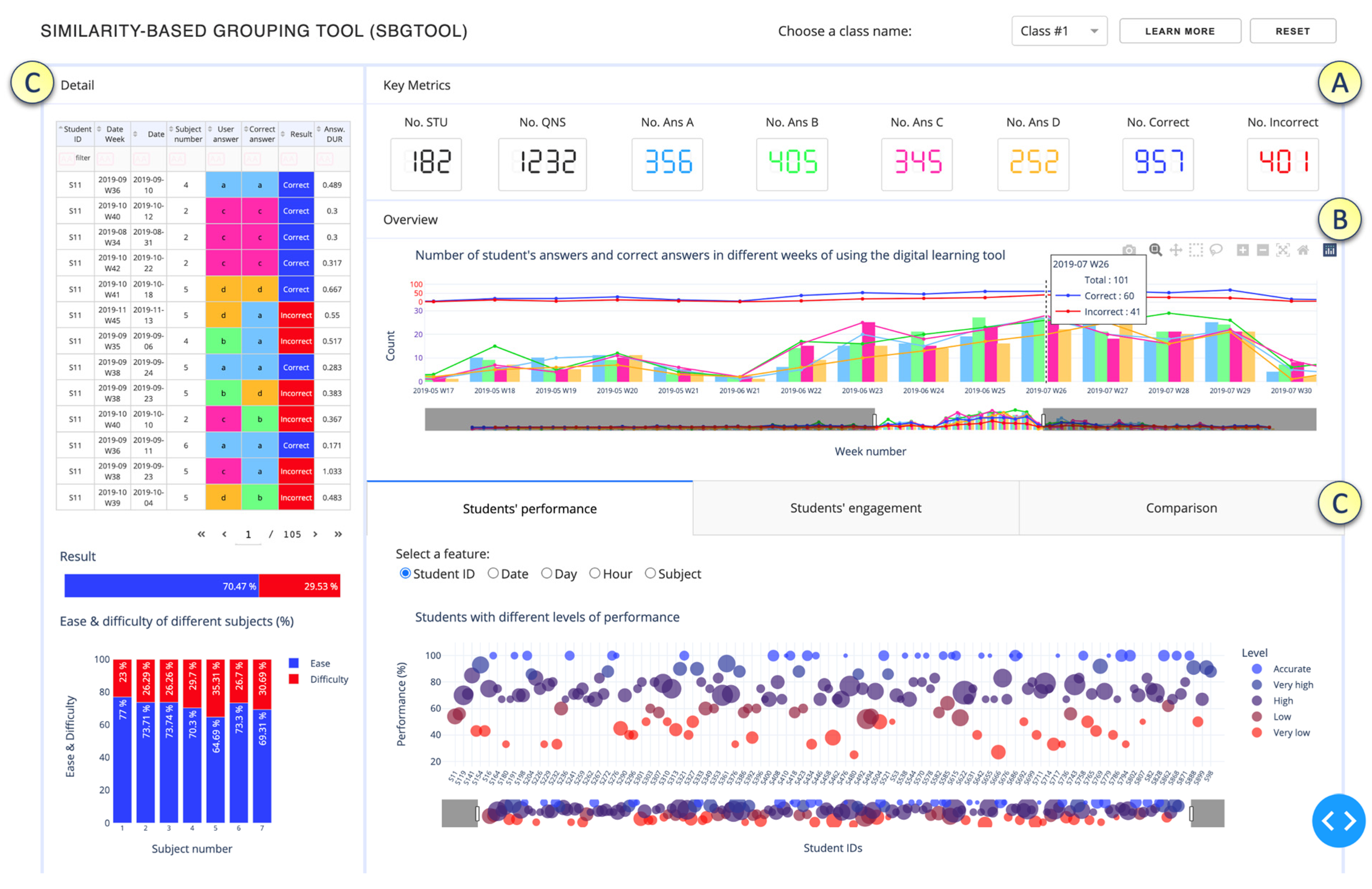
In this section, we describe the design of the SBGTool v2.0. The proposed tool is interactive, and the views are coordinated and interconnected, which allows much deeper interactions than simply a set of graphs generated in Excel. Interactive, coordinated views allow for the testing of hypotheses and multilevel exploration of complex data [21]. As can be seen in Figure 2, we employed a strategy of increasing details, starting from Key Metrics, followed by Overview and finally Detail. These three levels follow Shneiderman’s mantra [22], “overview first, zoom and filter, then details on demand”, which drives visual information-seeking behavior and interface design. The most important global information about the dataset is displayed in the Key Metrics section (Figure 2A), which includes the total numbers of correct and incorrect answers, number of students, questions, and number of answers in the four answer choices (A, B, C, D).
To make it easier to recognize key metrics in different visualizations, we used the following colors: ● dark blue for correct answer, ● red for incorrect answer, ● light blue for option A, ● green for option B, ● pink for option C, and ● orange for option D. Since color blindness affects about 1 in every 20 people, we chose colors that are appropriate for people who are colorblind (Figure 3) [23]. We utilized the possibility of choosing the color of the website [23] to examine what our chosen color palette would seem like to colorblind viewers. The colors in the leftmost column of Figure 3 are the “true” colors, which are shown in the remaining three columns as they would seem to someone with protanopia, deuteranopia, or tritanopia, i.e., color blindness or less sensitivity to red, green, or blue-yellow light, respectively [23].
The Overview section of SBGTool v2.0 (Figure 2B) includes a view that displays the total numbers of correct and incorrect answers, the total number of students’ answers for the four answer choices, and the total number of correct answers for the four answer choices over time. This view is an overlay of grouped bar and line charts. By selecting a point (week) in the overview, all the key metrics and visualizations in the Detail section (Figure 2C) of SBGTool v2.0 are updated accordingly. In addition, a range slider on the overview enables the teacher to limit the x-axis value within a given range (minimum and maximum values). By moving the mouse in the overview and looking at the number of students’ answers and correct answers (in the four answer choices for multiple-choice questions in a given week), the teachers can determine how near the students’ learning activities were to a correct response. In order to focus on the students’ activity inside a classroom, a class name should be selected from the dropdown component on the top right side of the tool. To reload the entire selected 10,000 samples, the “reset” button on the tool’s top right side can be pressed. Likewise, the “learn more” button next to the “reset” button may be used to obtain a general description of the tool that has been developed.
SBGTool v2.0 allows the user to interact with each visualization individually and drill down to more detailed levels of information. Brushing, zooming, and filtering are all supported by the majority of the visualizations. The main purpose of brushing is to emphasize brushed data elements in the various tool views. The user can obtain more information by picking a portion of each graphic and zooming in. The user can also filter the view by clicking on the legend (square or circle) in the right half of each display.
The Detail section of the proposed tool (Figure 2C) includes a table and two bar charts on the left-hand side, as well as three tabs with specific visualizations to aid in the discovery of insight about various subjects, students’ groups with similar activities in terms of the number of correct answers, number of student interactions, number of interactions in different features, and the difference between students’ learning activities.
Teachers can obtain thorough information on students’ activities and the time they set aside to answer a question by glancing at the table shown in Figure 2C. In addition, they can filter and sort the table according to the student ID, date week, date, subject number, user answer, correct answer, result, and answer duration, to have more focused information. The first bar chart shown in Figure 2C on the left-hand side depicts the overall percentages of correct and incorrect responses. As can be seen in the bar chart presented in Figure 2C, the percentages of correct and incorrect answers for students in class 1 are 70.47% and 29.53%, respectively. The second bar chart on the left-hand side of the tool with multicategory axis type presents the percentages of difficulty and ease in seven subjects. For example, as seen in this bar chart, the percentages of difficulty and ease in subject 1 are 23% and 77%, respectively. By comparing these percentages to those in other subjects, we can determine the most difficult and easiest subjects. In order to determine the percentage of difficulty in different subjects, we use Equation (1) where and are the numbers of correct and incorrect answers, respectively, in each subject. Equation (1) is based on the difficulty index [24] which allows us to calculate the proportion of students who correctly answered the questions belonging to a subject.
Figure 4 displays the “Students’ performance” tab which contains a scatter plot and selections (radio buttons) for rendering a set of features in the scatter plot. By selecting the student ID from the checkbox list, the performance levels are shown (Figure 4a). To define the percentage of performance, we apply Equation (2) where and are the numbers of correct and incorrect answers, respectively, for each student.
For the color scale, we considered five levels of performance, in increasing order: “Very low”, “Low”, “High, “Very high”, and “Accurate”. We used the proportion of performance to group the students into these different levels of performance. For color blindness, we chose the color palette presented in Figure 5 where the colors in the leftmost column are the “true” colors, which are shown in the remaining three columns as they would seem to someone with protanopia, deuteranopia, or tritanopia. Students with a performance of 100% are in the ‘Accurate” level, students with a performance of 86% to 99% are in the “Very high” level, students with a performance of 66% to 85% are in the “High” level, students with a performance of 51% to 65% are in the “Low” level, students with a performance of 1% to 50% are in the “Very low” level. According to the performance levels, we considered “Accurate” and “Very high” levels as high-performing, “High” as average-performing, and “Low” and “Very low” as low-performing.
Teachers can use the visualizations in Figure 4b–d to determine the total number of interactions (the total numbers of correct and incorrect answers) and the numbers of correct and incorrect answers for each date, day, and hour.
The numbers of correct and incorrect answers and the total number of interactions for each subject are shown in Figure 4e. Since the x-axis of the view in the Overview section represents the weekly activity, the visualizations in this tab allow teachers to dig deeper into the numbers of correct and incorrect answers for each feature. The “Students’ engagement” tab shown in Figure 6 displays the students’ activity levels. Because the heatmap is arranged from left to right, teachers can quickly identify students who have similar numbers of activities in each of the four answer choices, as well as those who have the most and least interactions with the digital learning material. Students with the most interactions are represented by navy blue, while those with the fewest interactions are represented by light blue. Figure 7 illustrates the “Comparison” tab that includes two dropdown components and two Sankey diagrams. A Sankey diagram can be thought of as a flow diagram in which the width of arrows is proportional to the flow quantity. In these diagrams, we visualize the contributions to a flow by designating “Student ID” as a source; “Result” as a target; and “Date Week”, “Subject number”, and “Student answer” as flow volume. Using this tab enables a teacher to compare the students’ learning outcomes by choosing their IDs from the dropdown components.
5. Use Case
In this section, we address the research questions and describe how a user (in this hypothetical example a teacher) may utilize SBGTool v2.0 to group students in different performance levels, compare two individual students’ outcomes, and gain insights into the students’ learning activities by providing an explanation of the various visualizations of SBGTool v2.0.
Figure 8 depicts an example use case of the proposed tool. Choosing a class name from the dropdown component on the top right side of the tool and selecting a week from the grouped bar and line charts allow teachers to focus on a specific week (e.g., the exam week) that is relevant for the analysis of a classroom. For this use case, we choose class 1 and select week 27 of 2019 in the Overview section.
By selecting the week, all the key metrics and visualizations in the detail section have been updated. The information for the selected week has been displayed in the table on the tool’s left-hand side. As can be seen in Figure 8a, 55 students out of 182 students shown in Figure 3 participated in some learning activities in that time period, and they answered 90 questions out of the 1232 questions in week 27. During this week, the total numbers of correct and incorrect answers were 62 and 28, respectively, for a total of 90. The answers to the multiple-choice questions were A (20), B (25), C (20), and D (25). The percentages of ease of different subjects presented in the bar chart on the left-hand side of Figure 8a were 66.67%, 41.67%, 93.75%, 64.29%, 70.59%, 66.67%, and 70% in different subject numbers from 1 to 7, respectively. As can be seen in Figure 8a, the bar chart is filtered by the ease category, and the second subject had the lowest percentage of ease, indicating that the most difficult questions were in this subject (since the students had the most incorrect answers).
As previously stated, we divide the performance into five levels, ranging from “Accurate” to “Very low”. To showcase the investigation of specific students, here we choose student IDs S119 and S622. Since the percentage of performance for student ID S119 was 80% percent, he/she was placed in the “High” level category as an average-performing student. He/she responded to a total of five questions in week 27, 2019. We sorted the table based on student IDs, and as can be seen in Figure 8a, he/she had four correct answers and one incorrect answer. By glancing at the scatter plot, teachers can easily categorize students into five groups based on their similar learning outcomes. In addition, teachers can obtain more particular information about the subject, the numbers of correct and incorrect answers, and the answer durations by filtering and sorting the table.
Figure 8b depicts a heatmap displaying the students’ activity levels. Since S119 and S622 had the most interactions with the digital learning material as well as similar activity levels in week 27, their activity levels were placed on the left side of the heatmap. As can be seen in Figure 8b, two of the students’ answers for both student IDs S119 and S622, belonged to option C. We filtered the table by student ID (in this case S622) and sorted it by answer duration (in this case ascending) to obtain more information about the minimum and maximum answer durations, subjects with the highest and lowest numbers of wrong answers, date of activity, and user answer to the questions belong to each subject.
A comparison of student IDs S119 and S622 is shown in Figure 8c. In week 27, both S119 and S622 answered five questions. The diagrams presented in Figure 8c show that S119 and S622 had the same performance since both had four right answers and one wrong answer. S119 had more difficulties in subject 6, having one incorrect answer, while S622 had more difficulties in subject 7, having one incorrect answer. By looking at these Sankey diagrams, teachers can identify the subject and the week in which students engaged in more activities and compare the learning outcomes of the students.
6. User Study and Discussion
6.1. User Study
We conducted a user study, in addition to the use case stated above, to obtain evidence on the effectiveness of SBGTool. Therefore, the user study’s goals were to determine how long it took to complete a number of tasks with SBGTool and to obtain users’ feedback while using SBGTool. We formulated two research questions:
- RQ1: What will the average amount of time spent on completing tasks tell us about the users?
- RQ2: Does the SBGTool provide support needed by the users to complete a number of tasks?
Our main target population was people with teaching experience in higher education. Through relevant email lists and contacts at two Swedish universities, we were able to reach 20 volunteers. Figure 9 shows the demographic information of the participants. One of the participants did not complete the ICE-T evaluation form (see below), so the total number of participants for the evaluation form was 19 (14 male, 4 female, and 1 unknown).
We used the ICE-T methodology to run our study. The ICE-T methodology makes use of an evaluation form emphasizing the importance of visualizations and their interactivity. It consists of four main high-level components, which are the pillars of the Wall et al. [25] approach: Insight, Confidence, Essence, and Time (ICE-T). Insight is the ability of a visualization to spur and identify insights and/or insightful questions about the data. Confidence is the ability of a visualization to generate confidence, knowledge, and trust in the data, domain, and context. Essence is the ability of a visualization to convey the overall essence of the data. Time is the ability of a visualization to minimize the amount of time it takes to answer a range of questions about data. The mid-level guidelines are represented by two to three subquestions in each of the four main components. Following that, each of these mid-level guidelines contains one to three low-level heuristics, resulting in a total of 21 heuristics. Heuristics are quick and cognitively affordable strategies that agents/users employ to make decisions [26]. In the ICE-T evaluation form, evaluators can give a 7-point Likert scale rating for each heuristic, or the “Not Applicable” response [25].
The study was performed online via Zoom while the participants and the researcher sat in distant, quiet rooms. Every participant used the same computer (first authors’ computer) with the same SBGTool installation, controlled remotely via the Zoom video-conference software. The data collection was divided into five main steps, with each participant taking part independently. The participants were first shown a video instruction that described the SBGTool, its main components and visualizations, the purpose of developing such a VLA tool, and the types of activities that may be done with it. In the second step, after watching the video, the participants were given remote control to later interact with the SBGTool, and they had a set timeframe to ask questions. In the third step, the participants used the SBGTool to complete a set of eight specific tasks. The tasks were given to the participants via Zoom. They were also asked to answer questions related to seven defined tasks. Participants were additionally asked to let the researcher know when each task was finished so that we could keep track of the task completion times. In the fourth step, the researcher had a short conversation about the tool, where the participants expressed their comments, attitudes, or feelings about it. Finally, in the fifth step, the participants filled out a feedback form based on the ICE-T methodology [25].
6.2. Results and Discussion
For each task, the participants were asked one or several questions. Correct answers to the questions demonstrated that the participants could “read” the visualizations in the SBGTool. In Task 1, participants were asked to evaluate the bar chart on the lower left-hand side of the tool presented in Figure 2 and find the most difficult and easiest subjects for class 2. Nineteen out of twenty participants correctly identified the subjects. In Task 2, the assignment was to analyze the data in the “grouped bar and line charts” in the overview and determine the week that had the highest number of interactions for examining the students’ activities. The question related to this task was successfully answered by all participants. For Task 3, participants had to find the number of students’ correct and incorrect answers in class 2 using key metrics. Nineteen out of twenty participants answered correctly.
Task 4 consisted of two questions regarding the “Students’ performance” tab presented in Figure 8a: Q.1: What are the first two students with the most answers, and in which performance level were they placed? Q.2: Which date, hour, and subject have the most student interactions? The second question in task 4 was answered correctly by all participants. Because the scatter plot shown in Figure 10 from our previous work [6] was small and the circles representing the students’ activity overlapped, finding the top two students with the most answers was difficult for the participants, yet 16 out of 20 participants gave the correct answer. This result led us to redesign, after all participants had used the SBGTool, the first tab’s layout to address the scatter plot overlap issue and free up space by deleting the pie chart that displayed the percentages of correct and incorrect answers from the previous version of the tool. The first bar chart on the left-hand side of the tool shows the same data as the pie chart (Figure 10).
In Task 5, participants were asked to compare the outcomes of two students with the student IDs S1239 and S1231, considering the “Comparison” tab presented in Figure 8c, and find the student who performed better. Nineteen out of twenty participants correctly identified the better performing student.
For Task 6, participants were asked to filter the visualizations of the SBGTool by selecting week 27, 2019, from “grouped bar and line charts” in the overview; compare the outcomes of two students with the student IDs S1239 and S1231 in this week; and find the better performing student. All participants successfully responded to this question.
Task 7 included three questions. The assignment was to find “the maximum answer duration for two students with the student IDs S1239 and S1231 in week 27, 2019”, “most difficult and easiest subjects for class 2 in week 27, 2019”, and “the number of correct and incorrect answers for the most difficult and easiest subjects”. The mentioned questions were correctly answered by 19, 20, and 19 out of 20 participants, respectively.
Finally, in Task 8, participants were asked to find the student in class 2 who had the most interactions with the tool in week 27, 2019, while using the “Students’ engagement” tab. This question was successfully answered by all participants.
Figure 11 provides a summary of the data gathered during the user study, including the participants’ answers to all questions/tasks, distribution of completion time, and task completion time for 20 participants.
One early observation was that the participants’ responses were nearly identical and that they all were able to successfully solve the majority of the tasks. Tasks 1, 3, 5, 7 (Q.1), and 7 (Q.3) each had one incorrect answer, while task 4 (Q.1), being the most challenging question, had four incorrect responses (Figure 11a). Another observation was that most of the tasks required about the same amount of time to complete (Figure 11b).
Tasks 4 and 7 required extra time because there were two and three questions in each task, respectively (Figure 11b). Figure 11c illustrates a broad overview of task completion time for the 20 participants, the mean value and the standard deviation for each task, as and whether each user allocated the same amount of time to complete tasks/questions. To respond to RQ1, we found no meaningful differences in the time users needed to complete the tasks in general, but they clearly needed more time for tasks that included more questions. This implies that the visualizations in SBGTool are easily interpreted. The outcomes of the ICE-T experiment are summarized in the next section.
Although numerous developed VLA tools with various objectives are available, there is a shortage of similarity-based grouping tools that group students with similar learning outcomes. As we discussed in the section on related work, [16] explained a computer-based grouping tool that aids teachers in grouping the students for collaborative activities based on their varied approaches to an exploratory learning task. However, it focused on the strategies of the students, whereas our study focuses on students’ activity in terms of the numbers of correct and incorrect answers, which is a general concept in many educational datasets and can be used to improve learning outcomes.
6.3. ICE-T Results and Discussion
We used the ICE-T methodology and questionnaire to collect and compare structured user feedback, as described in Section 6.1, to complement the data from the tasks themselves. As previously stated, 19 of the 20 participants completed the ICE-T questionnaire. Figure 12 shows the percentage for each of the 7-point Likert scale and “Not Applicable” response in ICE-T feedback for all 21 heuristics (Figure A1 in Appendix A). As can be seen in Figure 12, most of the participants choose “Strongly Agree”, “Agree”, and “Somewhat Agree” for the heuristics belonging to Insight, Time, and Essence components. Since the Confidence component’s last heuristic, which is “if there were data issues like unexpected, duplicate, missing, or invalid data, the visualization would highlight those issues” was not clear for most of the participants, “Not Applicable” received the largest percentage of responses. The observation shows that the proposed tool provides a good level of support.
Figure 13 shows the overall ICE-T feedback and participants’ scores for all 21 heuristics in the four main high-level components.
In Figure 13, the larger the number, the better, with dark blue representing good results. One statistical analysis is included with the raw data: two-tailed 95% confidence intervals (CIs) for each participant (t* = 2.1; n = 19). Because of the small sample size and the data distribution’s non-normality, we used a nonparametric test. According to a quick visual assessment of Figure 13, the SBGTool has good scores in three ICE-T components, Insight, Time, and Essence, as all cells are blue-colored. This finding indicates that while employing the tool reduced the time it took to answer a variety of data questions, it also assisted participants in identifying insightful data questions and conveying the data’s overall essence.
Although the lowest score for the Confidence component is 4, this value is still more than average. Because there are no “cream”-colored cells in the Confidence component, the participants were very confident in their results when using the tool. The ICE-T authors consider that a value above 5 represents a mature tool [25]. These findings, together with statistical analysis, demonstrate that the SBGTool provides sufficient support to the user to analyze and solve tasks; therefore, visualizations in SBGTool can be considered to be good as supporting users wanting to analyze the data to group students by learning outcomes and activities, which answers RQ2.
7. Conclusions
In this article, we introduced SBGTool v2.0, which is the improved version of SBGTool, a novel web-based VLA tool for grouping students who have similar learning outcomes. SBGTool v2.0 differs from SBGTool in that it has been improved in terms of design by taking teacher suggestions into account, adding sorting options to the dashboard table, updating several visualizations, adding a dropdown component to group students into classrooms, and applying a number of color palettes to support color blindness. The SBGTool v2.0 can assist teachers with grouping efficiently by providing multiple visualizations in an interactive platform. Teachers can use the suggested VLA tools to compare groups of students with similar learning activities, as well as individual students; find the most difficult and easiest subjects; explore and understand students’ learning outcomes; find the relationship between students’ activity and success; and maximize the collaborative learning potential in their classroom. This is the main contribution of our research to VLA tool development, making SBGTool v2.0 a unique grouping tool. In order to show what can be done with the proposed tool, we presented a use case with a real-world dataset. In addition, to learn teachers’ demands with such a pedagogical tool and assess the effectiveness of the proposed tool, we conducted a user study with the proposed tool. The results revealed that even with limited training, the participants were able to complete the required analysis tasks, and their feedback showed that SBGTool v2.0 provided a good level of support for the given tasks. In our future work, we intend to conduct design-based research in primary and secondary education and develop a dashboard for teachers to monitor students’ progress and support decision-making by using parts of the SBGTool v2.0.
Author Contributions
Conceptualization, Z.M., R.M.M. and I.M.; methodology, Z.M. and R.M.M.; software, Z.M.; validation, R.M.M. and I.M.; formal analysis, Z.M.; investigation, Z.M.; resources, Z.M. and R.M.M.; data curation, Z.M. and R.M.M.; writing—original draft preparation, Z.M.; writing—review and editing, Z.M., R.M.M. and I.M.; visualization, Z.M.; supervision, R.M.M. and I.M.; project administration, I.M. All authors have read and agreed to the published version of the manuscript.
Funding
This research received no external funding.
Informed Consent Statement
Informed consent was obtained from all subjects involved in the study.
Data Availability Statement
Not applicable.
Conflicts of Interest
The authors declare no conflict of interest.
Appendix A
Figure A1.
Twenty-one heuristics in ICE-T questionnaire.

References
- Blakelock, J.; Smith, T.E. Distance learning: From multiple snapshots, a composite portrait. Comput. Compos. 2006, 23, 139–161. [Google Scholar] [CrossRef]
- Aruvee, M.; Ljalikova, A.; Vahter, E.; Prieto, L.; Poom-Valickis, K. Learning analytics to informand guide teachers as designers of educational interventions. In Proceedings of the International Conference on Education and Learning Technologies, Palma, Spain, 2–4 July 2018. [Google Scholar]
- Siemens, G.; Baker, R.S.J.d. Learning analytics and educational data mining: Towards communication and collaboration. In Proceedings of the LAK ’12: 2nd International Conference on Learning Analytics and Knowledge, Vancouver, BC, Canada, 29 April–2 May 2012; pp. 252–254. [Google Scholar]
- Schwendimann, B.A.; Rodríguez-Triana, M.J.; Vozniuk, A.; Prieto, L.P.; Boroujeni, M.S.; Holzer, A.; Gillet, D.; Dillenbourg, P. Perceiving learning at a glance: A systematic literature review of learning dashboard research. IEEE Trans. Learn. Technol. 2016, 10, 30–41. [Google Scholar] [CrossRef]
- Verbert, K.; Ochoa, X.; Croon, D.; Dourado, R.A.; Laet, T.D. Learning analytics dashboards: The past, the present and the future. In Proceedings of the LAK20: Tenth International Conference on Learning Analytics and Knowledge, Frankfurt, Germany, 23–27 March 2020; pp. 35–40. [Google Scholar]
- Mohseni, Z.; Martins, R.M.; Masiello, I. SBGTool: Similarity-Based Grouping Tool for Students’ Learning Outcomes. In Proceedings of the 2021 Swedish Workshop on Data Science (SweDS), Växjö, Sweden, 2–3 December 2021. [Google Scholar]
- Ez-zaouia, M.; Lavoué, E. EMODA: A Tutor Oriented Multimodal and Contextual Emotional Dashboard. In Proceedings of the LAK’ 17: Seventh International Learning Analytics and Knowledge Conference, Vancouver, BC, Canada, 13–17 March 2017; pp. 429–438. [Google Scholar]
- Govaerts, S.; Verbert, K.; Duval, E.; Pardo, A. The student activity meter for awareness and self-reflection. In Proceedings of the CHI ‘12 Extended Abstracts on Human Factors in Computing Systems, Austin, TX, USA, 5–10 May 2012; pp. 869–884. [Google Scholar]
- He, H.; Dong, B.; Zheng, Q.; Di, D.; Lin, Y. Visual Analysis of the Time Management of Learning Multiple Courses in Online Learning Environment. In Proceedings of the 2019 IEEE Visualization Conference (VIS), Vancouver, BC, Canada, 20–25 October 2019. [Google Scholar]
- Mohseni, Z.; Martins, R.M.; Masiello, I. SAVis: A Learning Analytics Dashboard with Interactive Visualization and Machine Learning. In Proceedings of the CEUR Workshop Proceedings, Nordic Learning Analytics (Summer) Institute 2021, KTH Royal Institute of Technology, Stockholm, Sweden, 23 August 2021. [Google Scholar]
- Kirschner, P.A. Three Worlds of CSCL: Can We Support CSCL? Open Universiteit Nederland: Heerlen, The Netherlands, 2002. [Google Scholar]
- Inaba, A.; Supnithi, T.; Ikeda, M.; Mizoguchi, R.; Toyoda, J. Theoretical justification of ‘opportunistic group formation’ with ontological engineering. In Proceedings of the Fifth International Conference of Intelligence Tutoring System, Montreal, QC, Canada, 19–23 June 2000; pp. 282–291. [Google Scholar]
- Ounnas, A.; Davis, H.C.; Millard, D.E. Towards Semantic Group Formation. In Proceedings of the Seventh IEEE International Conference on Advanced Learning Technologies (ICALT 2007), Niigata, Japan, 18–20 July 2007; pp. 825–827. [Google Scholar]
- Ochoa, X. Visualizing Uncertainty in the Prediction of Academic Risk. In Proceedings of the CEUR Workshop Proceedings, 1st International Workshop on Visual Aspects of Learning Analytics, Poughkeepsie, NY, USA, 16–20 March 2015; pp. 4–10. [Google Scholar]
- Gutiérreza, F.; Seippa, K.; Ochoab, X.; Chiluizac, K.; Laeta, T.D.; Verberta, K. LADA: A learning analytics dashboard for academic advising. Comput. Hum. Behav. 2020, 107, 105826. [Google Scholar] [CrossRef]
- Gutierrez-Santos, S.; Mavrikis, M.; Geraniou, E.; Poulovassilis, A. Similarity-Based Grouping to Support Teachers on Collaborative Activities in an Exploratory Mathematical Microworld. IEEE Trans. Emerg. Top. Comput. 2017, 5, 56–68. [Google Scholar] [CrossRef] [Green Version]
- Kazemitabar, M.A.; Bodnar, S.; Hogaboam, P.; Chen, Y.; Sarmiento, J.P.; Lajoie, S.P.; Chan, L. Creating instructor dashboards to foster collaborative learning in on-line medical problem-based learning situations. In International Conference on Learning and Collaboration Technologies; Springer: Berlin/Heidelberg, Germany, 2016; pp. 36–47. [Google Scholar]
- Kim, B.; Suh, H.; Heo, J.; Choi, Y. AI-Driven Interface Design for Intelligent Tutoring System Improves Student Engagement. In Proceedings of the Woodstock ’18: ACM Symposium on Neural Gaze Detection, Woodstock, NY, USA, 3–5 June 2018; ACM: New York, NY, USA, 2018. [Google Scholar]
- Choi, Y.; Lee, Y.; Shin, D.; Cho, J.; Park, S.; Lee, S.; Baek, J.; Bae, C.; Kim, B.; Heo, J. EdNet: A Large-Scale Hierarchical Dataset in Education. In Proceedings of the International Conference on Artificial Intelligence in Education, AIED 2020, Morocco, 6–10 July 2020; pp. 69–73. [Google Scholar]
- Hand, D.J.; Mannila, H.; Smyth, P. Principles of Data Mining; The MIT Press: Cambridge, MA, USA, 2001. [Google Scholar]
- Roberts, J.C. State of the Art: Coordinated & Multiple Views in Exploratory Visualization. In Proceedings of the Fifth International Conference on Coordinated and Multiple Views in Exploratory Visualization (CMV 2007), Zurich, Switzerland, 2 July 2007; pp. 61–71. [Google Scholar]
- Shneiderman, B. The eyes have it: A task by data type taxonomy for information visualizations. In Proceedings of the 1996 IEEE Symposium on Visual Languages, Boulder, CO, USA, 3–6 September 1996. [Google Scholar]
- Nichols, D. Coloring for Colorblindness. Available online: https://davidmathlogic.com/colorblind/#%23648DF9-%23785EF0-%23E21F7F-%23F7833C-%23FFBA21-%2376EA74 (accessed on 10 June 2022).
- Hingorjo, M.R.; Jaleel, F. Analysis of One-Best MCQs: The Difficulty Index, Discrimination Index and Distractor Efficiency. J. Pak. Med. Assoc. 2012, 62, 142–147. [Google Scholar] [PubMed]
- Wall, E.; Agnihotri, M.; Matzen, L.; Divis, K.; Haass, M.; Endert, A.; Stasko, J. A heuristic approach to value-driven evaluation of visualizations. IEEE Trans. Vis. Comput. Graph. 2019, 25, 491–500. [Google Scholar] [CrossRef]
- Kahneman, D.; Slovic, S.P.; Solvic, P.; Tversky, A. Judgment under Uncertainty: Heuristics and Biases; Cambridge University Press: Cambridge, UK, 1982. [Google Scholar]
Figure 1.
Distribution of answer duration.

Figure 2.
Overview of tabs and components of SBGTool v2.0. (A) Key Metrics section, (B) Overview section, (C) Detail section presented in 2 parts of the tool.
Figure 2.
Overview of tabs and components of SBGTool v2.0. (A) Key Metrics section, (B) Overview section, (C) Detail section presented in 2 parts of the tool.

Figure 3.
Chosen color palette for color blindness. Reprinted/adapted with permission from Ref. [23]. Copyright 2022, David Nichols.
Figure 3.
Chosen color palette for color blindness. Reprinted/adapted with permission from Ref. [23]. Copyright 2022, David Nichols.

Figure 4.
“Students’ performance” tab with different checkbox items: (a) student ID; (b) date; (c) day; (d) hour; (e) subject.
Figure 4.
“Students’ performance” tab with different checkbox items: (a) student ID; (b) date; (c) day; (d) hour; (e) subject.


Figure 5.
Chosen colors for the five levels of performance in the scatter plot. Reprinted/adapted with permission from Ref. [23]. Copyright 2022, David Nichols.
Figure 5.
Chosen colors for the five levels of performance in the scatter plot. Reprinted/adapted with permission from Ref. [23]. Copyright 2022, David Nichols.

Figure 6.
“Students’ engagement” tab.

Figure 7.
“Comparison” tab.

Figure 8.
Use case on SBGTool v2.0 by selecting week 27 from the grouped bar and line charts and focusing on: (a) first tab; (b) second tab; (c) third tab.
Figure 8.
Use case on SBGTool v2.0 by selecting week 27 from the grouped bar and line charts and focusing on: (a) first tab; (b) second tab; (c) third tab.


Figure 9.
Demographic information about the participants of the user study: (a) gender distribution; (b) completed education; (c) age distribution.
Figure 9.
Demographic information about the participants of the user study: (a) gender distribution; (b) completed education; (c) age distribution.

Figure 10.
Detail: similarity levels + extra information tab with different checkbox items [6].
Figure 10.
Detail: similarity levels + extra information tab with different checkbox items [6].

Figure 11.
Results of the user study: (a) Participants’ answers to all the questions/tasks; (b) task completion time in seconds as group; (c) task completion time in seconds for 20 participants.
Figure 11.
Results of the user study: (a) Participants’ answers to all the questions/tasks; (b) task completion time in seconds as group; (c) task completion time in seconds for 20 participants.

Figure 12.
Percentage for each of the 7-point Likert scale and “Not Applicable” responses in ICE-T feedback for all 21 heuristics.
Figure 12.
Percentage for each of the 7-point Likert scale and “Not Applicable” responses in ICE-T feedback for all 21 heuristics.

Figure 13.
Overall ICE-T feedback and participants’ scores for all 21 heuristics in four main high-level components.
Figure 13.
Overall ICE-T feedback and participants’ scores for all 21 heuristics in four main high-level components.


Table 1.
A sample of the final dataset after merging and preprocessing the data.
| Student ID | Date | Date Week | Month | Day | Hour | Question ID | Subject Number | User Answer | Correct Answer | Result | Answer Duration | Class | |
|---|---|---|---|---|---|---|---|---|---|---|---|---|---|
| 0 | S4 | 13 October 2019 | 2019-10 W40 | 10 | 13 | 10 | 11315 | 4 | c | d | Incorrect | 0.600 | Class #1 |
| 1 | S4 | 15 September 2019 | 2019-09 W36 | 9 | 15 | 17 | 11839 | 6 | a | a | Correct | 0.458 | Class #1 |
| 2 | S4 | 15 September 2019 | 2019-09 W36 | 9 | 15 | 17 | 11840 | 6 | c | c | Correct | 0.458 | Class #1 |
| 3 | S4 | 15 September 2019 | 2019-09 W36 | 9 | 15 | 17 | 11703 | 6 | a | a | Correct | 0.467 | Class #1 |
| 4 | S4 | 15 September 2019 | 2019-09 W36 | 9 | 15 | 17 | 11706 | 6 | d | d | Correct | 0.467 | Class #1 |
Publisher’s Note: MDPI stays neutral with regard to jurisdictional claims in published maps and institutional affiliations. |
© 2022 by the authors. Licensee MDPI, Basel, Switzerland. This article is an open access article distributed under the terms and conditions of the Creative Commons Attribution (CC BY) license (https://creativecommons.org/licenses/by/4.0/).
Share and Cite
MDPI and ACS Style
Mohseni, Z.; Martins, R.M.; Masiello, I. SBGTool v2.0: An Empirical Study on a Similarity-Based Grouping Tool for Students’ Learning Outcomes. Data 2022, 7, 98. https://0-doi-org.brum.beds.ac.uk/10.3390/data7070098
AMA Style
Mohseni Z, Martins RM, Masiello I. SBGTool v2.0: An Empirical Study on a Similarity-Based Grouping Tool for Students’ Learning Outcomes. Data. 2022; 7(7):98. https://0-doi-org.brum.beds.ac.uk/10.3390/data7070098
Chicago/Turabian StyleMohseni, Zeynab (Artemis), Rafael M. Martins, and Italo Masiello. 2022. "SBGTool v2.0: An Empirical Study on a Similarity-Based Grouping Tool for Students’ Learning Outcomes" Data 7, no. 7: 98. https://0-doi-org.brum.beds.ac.uk/10.3390/data7070098