Article

Combined Web-Based Visualisation of 3D Point Clouds and Acoustic Descriptors: An Interdisciplinary Challenge

1
UMR CNRS/MC 3495 MAP, 31, Chemin Joseph Aiguier, 13402 Marseille, France
2
PRISM Laboratory, UMR Aix Marseille University/CNRS/MC 7061 PRISM, 31, Chemin Joseph Aiguier, 13402 Marseille, France
*
Author to whom correspondence should be addressed.
Submission received: 1 November 2022 / Revised: 14 November 2022 / Accepted: 28 November 2022 / Published: 1 December 2022
(This article belongs to the Special Issue 3D Virtual Reconstruction and Visualization of Complex Architectures)

Abstract

:
This paper presents an online application—called 3D integrator—enabling visual cross-examinations of architectural and acoustic data on web browsers and explains the rationale behind its development. The tool consists of a series of overlays developed over the Potree 3D point cloud renderer. It is used to display visually, in an interactive environment, the 3D point clouds resulting from a survey protocol tailored to the specific needs of the corpus under scrutiny—15 small-scale edifices often referred to as “minor heritage assets”—and to the research’s overall ambition, reasoning on architectural and acoustic features at an interdisciplinary level. One of the tool’s distinctive features is to project abstract information (acoustic descriptors) in a “close to real” 3D space (point clouds), hence merging scientific visualisation and information visualisation practices. The paper first shortly sums up the particularities of the survey protocol and discusses the implementation of the analytical add-ons that have been introduced (visual trace of the survey protocol itself, volume calculation, and exploratory 3D representation of acoustic descriptors). It then focuses on use cases that illustrate what the approach helps to observe concerning the interiors of edifices when capturing and co-examining dimensional and acoustic features.

1. Introduction

This paper reports on the development of a web-based 3D data visualisation tool based on the Potree library [1] and aimed at helping actors coinvestigate the architectural and acoustic features of small-scale heritage architecture. The tool, called 3D integrator, exploits the results of a specific data acquisition protocol through which metric, visual, and acoustic data are collected. Its distinguishing trait is the representation in the 3D space of a set of acoustic descriptors (quantitative data resulting from Room Impulse Responses analyses). The tool’s overall design can be summed up as follows.
A 3D point cloud (resulting from a photogrammetric process) acts as a spatial background for various analytical overlays. In that sense, it somehow plays the same role as cartographic layers in leaflet-powered web-based cartographic interfaces. Overlays are then added that use the spatial context to position and correlate data: metric, visual, and acoustic data are “projected” inside that spatial background.
The approach was developed in response to a specific set of constraints (small-scale architecture, remote sites, lightweight, low-cost solutions, reproducibility and reusability of outputs, etc.) that are detailed in [2]. It was applied to 15 rural chapels in south-eastern France, with an objective to support reproducibility (from acquisition to post-processing stages), as well as comparative analyses (see Supplementary Materials section for further details on the corpus).
This study covers four major issues raised in the heritage studies community:
  • From the operational point of view, it questions the integration of visualisation practices and promotes a vision of sensemaking in large 3D datasets through the use of visualisation paradigms that complement scientific visualisation approaches per se.
  • From an interdisciplinary point of view, it questions the way 3D environments can be adapted to the analysis of acoustic datasets, where parameters such as time and frequency play a central role.
  • From the societal point of view, it provides feedback on approaches intended to be frugal. Methods, protocols, and tools are adapted to small-scale buildings, left aside from major sources of funding, encouraging us to reflect on the utility and added value of our results for local communities.
  • Finally, from a methodological point of view, it places the notion of comparability and reproducibility at the heart of the research.
In Section 2, we position the development with regard to related research works and briefly present the data acquisition protocol. In Section 3, the development of the prototype itself is detailed (including in terms of services expected) along with information about the acoustic descriptors that have been computed and about their interpretation.
Section 4 illustrates use cases, the results obtained, and comments on their relevance and limitations. It focuses on what is probably the most original service provided by the 3D integrator: helping the actors involved (architects and acousticians) to cross-examine data sets and acoustic behaviours of comparable, small-scale architectural interiors. Finally, Section 5 summarises the objectives and strategy of this research and pinpoints remaining open issues. Two Appendix A and Appendix B complement the paper, one that proposes a visual overview of the components combined in the 3D integrator and one that comments on how the 3D integrator supports classical dimensional feature extraction tasks.

2. Background and Strategy

The combination of 3D imaging and acoustic measurements in terms of sensing techniques has already been explored in recent works in various contexts [3,4] and, more significantly, for different purposes. Focusing on the architectural and/or heritage application fields, the literature reveals three major lines of research. The first is Structural Health Monitoring (SHM), where sensing techniques are combined to improve the understanding of mechanical behaviour and deformations at the structural level [5,6]. The second is related to the conservation and restoration field [7,8], where the materiality of architectural elements is investigated using prospective techniques such as ground-penetrating radar (GPR) or sonic/ultrasonic tomography. Finally, the third, and the one that is the most related to the study we present, considers ‘spatiality’ in a perceptual perspective where three-dimensional reality-based modelling joins auralisation methods and prospects [9,10,11].
The acoustic data post-processing chain the experiment builds on is further commented on in Section 3.5. As far as metric and visual data are concerned, the 3D Integrator prototype builds on top of the Potree 3D point cloud renderer for web browsers [1]—a well-established solution (see, for instance, [12]). The input data results from an ad-hoc survey protocol based on the use of a 360 panoramic camera (technology discussed in [13]) and on the mh acoustics em32 Eigenmike 3D microphone [14]—a spherical array of 32 microphones relevant for sound field analysis [15,16].
The strategy adopted is to introduce a series of overlays on top of Potree. These overlays are used to trigger user actions and to project abstract information in the 3D space. One of the main originalities of the research lies probably in the effort made to bring together two sub-disciplines of the data visualisation community:
  • Scientific visualisation, where what is primarily seen relates to and represents visually a physical “thing” [17].
  • Information visualisation (InfoVis), where one deals with abstract information and produces graphics aimed at information-seeking tasks [18]. In that sub-discipline, 3D shapes are mostly visual metaphors (see examples in [19]).
In the prototype we present, two “3D metaphors” are used to convey abstract information (quantitative acoustic data, namely C50 clarity and PWD descriptors). These metaphors do not resemble ‘real’ acoustic sources, but their position and the graphic coding used are directly correlated to the spatial and temporal acoustic behaviour of ‘real’ spaces.
The development of the prototype and the functions it is intended to perform are closely related to a specific, interdisciplinary survey protocol developed jointly by architects and acousticians. Detailed in [2], it combines existing techniques and can be summed up as follows:
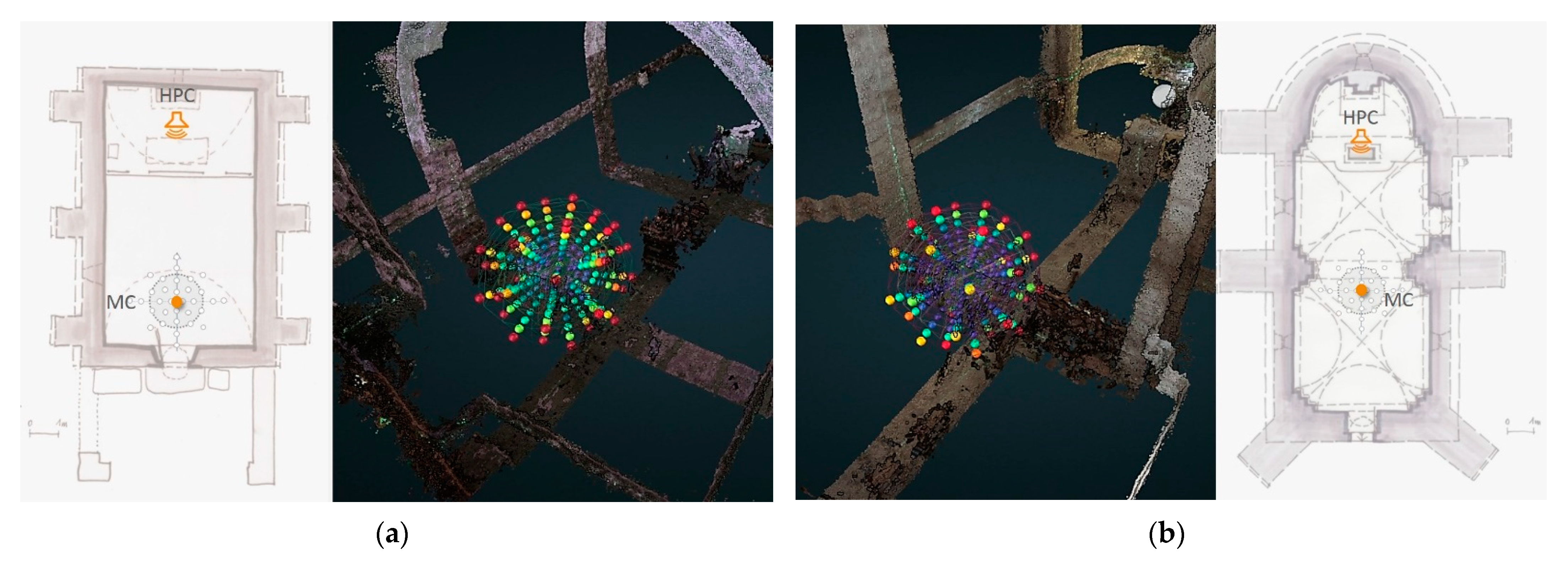
  • Two self-levelling laser levels are used to project laser beams onto the building surfaces (Figure 1a).
  • A systematic spatial grid comprising three speakers and four microphones (Figure 1b) is positioned with respect to the primary function of the chapels (celebrant vs. listener opposition).
  • Intersections of the laser beams on surfaces and positions of the eight grid components are registered using a laser-rangefinder that outputs point-to-point distances.
  • The acoustic survey consists of the recording on each of the four microphone positions of a sine wave (sweep) emitted from each of the speakers (iterated several times to spot and eliminate outliers).
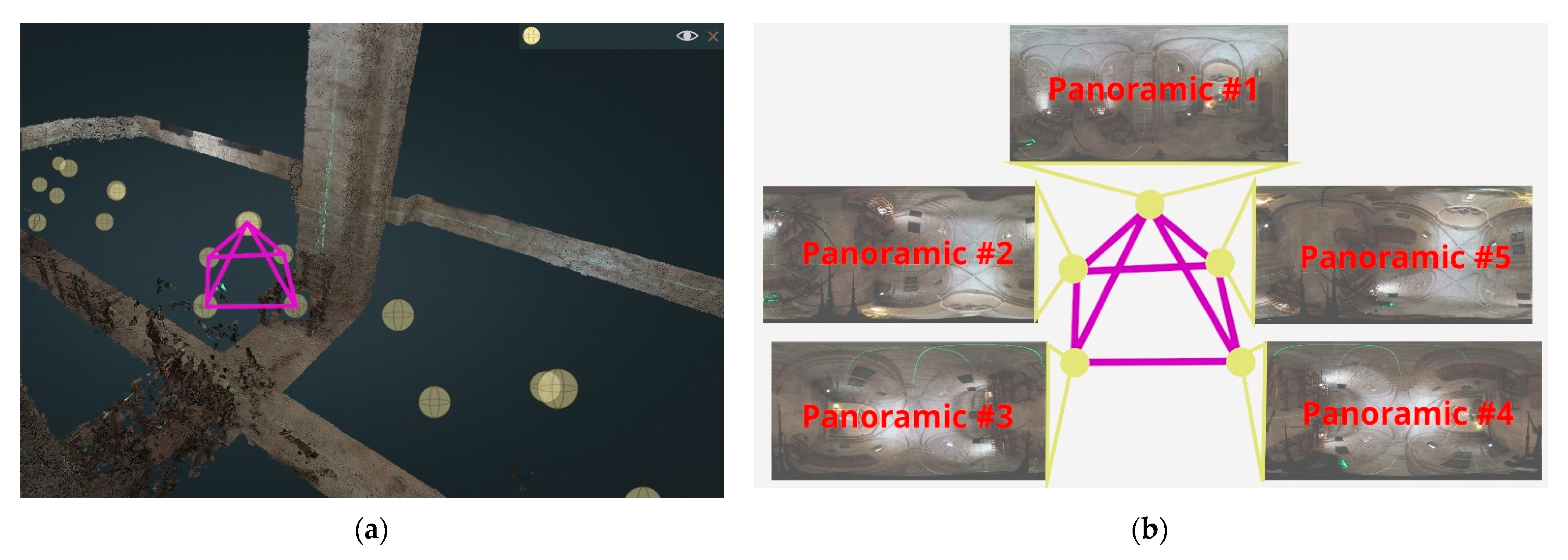
  • The photogrammetric acquisition is carried out with a 360 panoramic camera (pyramidal sequence in each position).
The 3D Integrator aggregates heterogeneous outputs from the survey stage and the post-processing chain: oriented stitched panoramas, XYZ coordinates of the spatial grid (DXF files), 3D point clouds, room impulse responses, auralisations calculated for the 4 points recording points (MA, MC, MD, and MG), and quantitative acoustic descriptors.
The pyramidal data acquisition protocol (see Figure 2) consists of an overlapping block of 5 images for each tripod position (instead of a single one). This results in faster coverage of the surveyed space and thereby speeds up data acquisition and improves (densifies) the panoramic camera network. The shooting sequence was simplified by using a rotating arm tripod connected to a panoramic head. This protocol also aims at improving accuracy: the lens axis is successively directed towards all coplanar surfaces (floor/ceiling, longitudinal/transversal walls) in order to optimise the unstitched images.
An evaluation of the data quality and comparison with terrestrial laser scanning as reference (TLS) has been performed and is provided in [20]. Our results are consistent with previous works assessing the potential of fisheye and spherical photogrammetry for architectural interiors and narrow spaces. It is a fast and efficient solution for coarse 3D reconstruction, in line with our objectives.

3. Components of the Prototype

As already mentioned, the 3D integrator is basically an enhanced Potree interface, adding services to its native 3D point cloud visualisation and manipulation tools. A drop-down list (Figure 3, top bar) allows users to select one of the 15 chapels. Fifteen specific add-ons have been developed: they are accessible via the left-hand side menu (Figure 3, left). Some of these add-ons require additional user configuration (e.g., selection of the emission/reception points). In such cases, an additional sub-menu opens in the right-hand part of the user interface when the tool is selected (Figure 3, right).
The Potree renderer is used to display a complete point cloud but also allows users to display sub-clouds. These sub-clouds are slices calculated externally and then integrated into the application. Their purpose is to improve data readability (avoiding visual occlusions when the entire 3D cloud is loaded). Most of the figures in this article represent such sub-clouds.

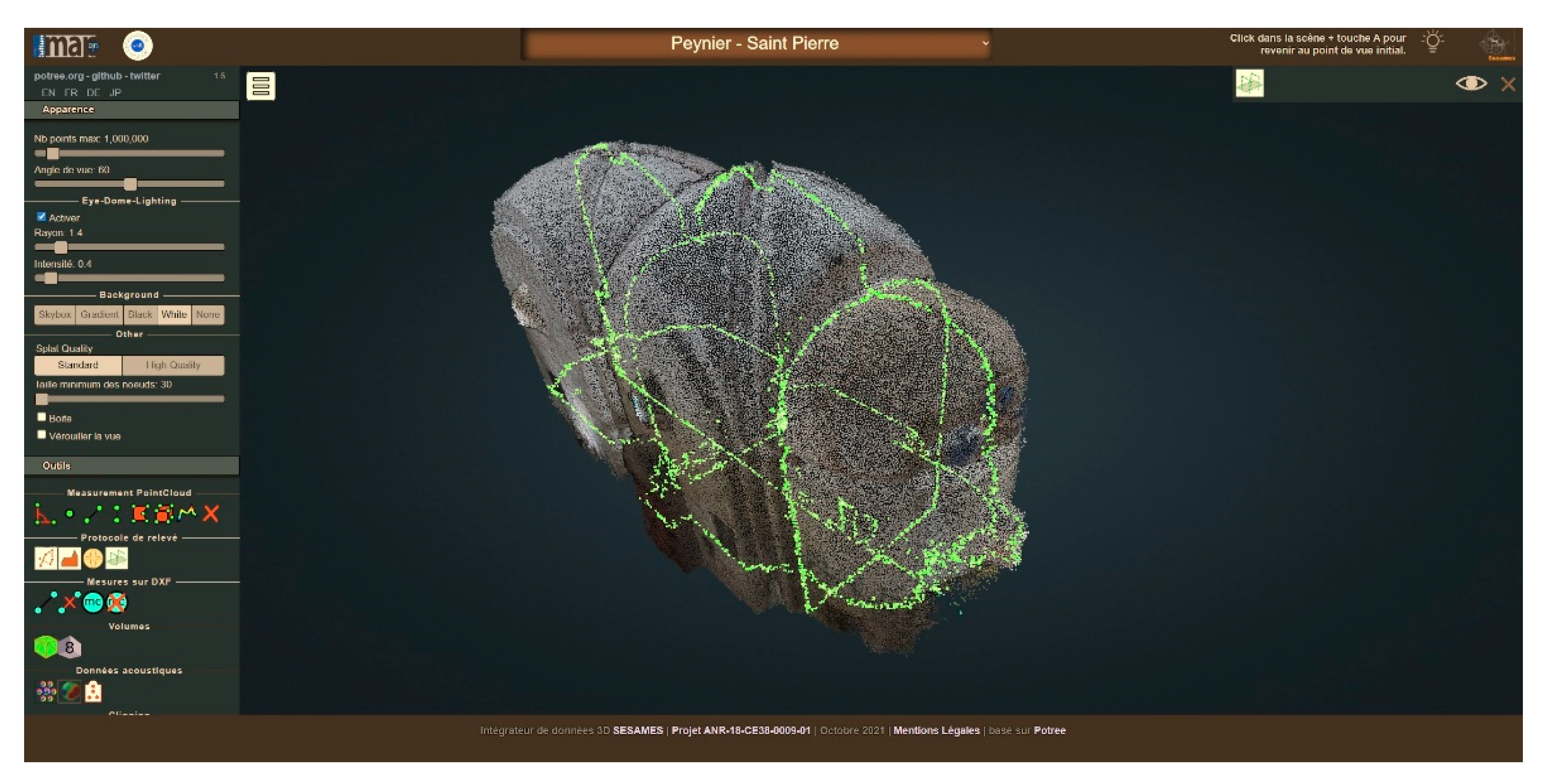
3.1. Visualisation of the Survey’s Raw Outputs

The first additional modules that we have introduced a focus on viewing the data resulting from the survey protocol. This includes the DXF input data acquired with the laser rangefinder (represented as polylines, cf. Figure 4) and thumbnail images associated with each DXF point (images automatically captured by the rangefinder camera). This input acts as a control point for scaling and orientation of the model during the photogrammetric reconstruction. The data resulting from the survey protocol also include the panoramas acquired from the 360 camera.
They are materialised in the 3D integrator by spheres positioned according to the aforementioned pyramidal data acquisition protocol (Figure 2). Clicks on the spheres are made possible thanks to the ray-tracing method—detection of the alignment of the mouse pointer with the spheres. They give access to online immersive panoramas that include auralisations—simulations of how the same soundtrack would be perceived if played in the different chapels (general public end product useful for local communities).

3.2. Measurements and Naming (DXF Points)

Other add-ons allow users to manipulate the survey data. The first one provides users with means to perform on-the-fly measurements on the DXF points (Potree’s native tools only allow the calculation of distances on the point clouds). The module enables an on-the-fly display of the distance between two points (Figure 5a). Distances can be calculated in sequences or separately. Resulting measurements can be saved locally or online in JSON format and can be re-used outside the integrator or re-loaded into it via the corresponding sub-menu. Another add-on allows the naming of DXF points (Figure 5b).
The necessity of this module arises from the fact that the points in the DXF files do not have names and, therefore, cannot be identified and unambiguously associated with the measurement grid when displayed in the 3D integrator. A given point can be both named and renamed using the same sub-menu. Point names and coordinates can be saved in JSON format so that they can be displayed again in the integrator.

3.3. Visualisation of the Laser Beams

As mentioned earlier, the survey protocol is based on the use of two self-levelling laser levels that project green beams onto the building surfaces. The intersections of these beams are exploited as control points in the photogrammetric processing step.
Within the integrator, the laser beams are visually materialised as green-coloured sub-clouds (Figure 6). To this end, we use the dense point cloud and then cut it on the X, Y, and Z axes—according to the positions of the laser levels. We thereby retain only a “thin green slice” of the point cloud, materialising the trace of the laser levels’ beams.
The data displayed through the 3D integrator act as a representation of the multimodal data acquisition protocol itself operated in situ. In that sense, the integrator displays the raw data and helps with the interpretation of the processed data, but it is also a means to keep a trace of the instrumental setup and of the survey strategy applied (and adapted) for each chapel. This is also expressed by the choice of surveying the space with the instruments installed on measurement points whilst the laser beams are turned on instead of prioritising a clean and faultless 3D reconstruction of the indoor space.

3.4. Volume Calculation

In order to calculate and visualise the approximate volumes of the interiors to establish a possible architectural volume-sound relationship across the entire corpus, two add-ons have been developed: voxel-based volume estimation and the convex hull method.

3.4.1. Voxel-Based Volume Estimation

This first solution allows a representation (on-the-fly calculation) of the approximate volumes of the chapels by voxel-based segmentation of the dense point cloud—the level of segmentation is configurable (Figure 7). We proceed as follows: after calculating the bounding box of the point cloud, we cut it into voxels on the X, Y, and Z axes, into as many parts as chosen using the sub-menu. This process may be relatively long because, for example, cutting the bounding box into 24 parts (i.e., 24 ∗ 24 ∗ 24) gives 13,824 voxels to be checked.
The first step consists of processing the voxels composing the surface of the point cloud. For each voxel, we check whether points of the point cloud are present inside the cloud. If so, we record the coordinates of the voxel processed and assign to it the value 1.
Using that data, recorded in a table, we can define minimum and maximum X, Y, and Z values for each axis—in other words, the minimum/maximum values for the boundaries of the interior space. We thus obtain the first table with a dimension that corresponds to the number of processed voxels, with values 0 for voxels without points or not yet processed and values 1 for those containing points.
Once this is performed, the interior voxels are processed (i.e., those contained in the point cloud). We browse the set of voxels that do not have a value of 1 and, based on the minimum and maximum values calculated previously, run two tests for each axis (i.e., six tests—X min, X max, Y min, Y max, Z min, and Z max) to determine whether the voxels processed are within these limits. If this is the case, we indicate with index 2 that the voxel being processed is inside; otherwise, we leave the index value at 0. We thus obtain a second table with all the voxels, their coordinates, and an index value (0,1,2), which allows us to know their status (external, surface, or internal). The table can then be used as input for the visualisation of the volumes. A sub-menu with sliders allows users to manipulate this volume after calculation.

3.4.2. Convex Hull Method Volume Estimation

The second solution allows the representation of the approximate volume of each interior by modelling the point clouds’ convex hull. It proposes another view of the approximate volume. This alternative solution does not require any particular algorithm; it relies on a function named ConvexHull already existing in the ThreeJS library. Again, this function requires a dense point cloud for a correct calculation of the convex envelope.

3.5. Acoustic Descriptors

The prototype aims to represent quantitative acoustic data. However, raw acoustic data could not be represented directly due to the high quantity of information contained in the signal. Indeed, the diverse aspects of the acoustic signal (the evolution of the energy according to time, frequency and space) make it difficult to interpret the results. That is why acousticians use specific descriptors that provide information about different aspects of the signal properties. In the field of room acoustics, a large number of acoustic descriptors are described in the scientific literature [21]. Most of them were computed in the present work and can be grouped into four categories:
  • Energy descriptors: Strength Factor, Lateral Strength, Root Mean Square (RMS);
  • Reverberation descriptors: Reverberation Time, Early Decay Time, Central Time, Bass Ratio, Trebble Ratio, Frequency barycenter, Schroeder frequency;
  • Intelligibility descriptors: Direct-to-Reverberant Ratio, Clarity (C50 and C80), Speech Transmission Index;
  • Spatial descriptors: Inter-Aural Cross-correlation Coefficient, Lateral Fraction.
Most of these descriptors were computed through several frequency bands. The bandwidth was one octave centered on the frequencies 125 Hz, 250 Hz, 500 Hz, 1 kHz, 2 kHz, 4 kHz, and 8 kHz. These descriptors were either computed from a combination of the 32 microphones of the EM32 using a specific paradigm (Higher Order Ambisonics [22]) or directly for each of the 32 microphones.
In this paper, we first present the C50 Clarity descriptor, calculated directly on the 32 microphones as a first step to display the data. Then, the RMS energy descriptor obtained through a Plane Wave Decomposition (PWD) based on a combination of the 32 microphones is presented. This approach makes it possible to compute spatialised energy maps. These energy maps allow to spatially visualise a captured sound field that, combined with a visualisation of the room, facilitates the understanding of the acoustic phenomena with respect to the environment. Note that the PWD approach could have been applied to any of the acoustic descriptors. We here chose to focus on the signal energy, which is the simplest descriptor in terms of interpretability.

3.5.1. C50 Computation

The C50 clarity descriptor is obtained from the following equation:
C 50 = 10 · log ( t = 0 0.05 I R ( t ) 2 t = 0.05 L I R ( t ) 2 )                   [ d B ]
where IR(t) is the room impulse response measured between the loudspeaker and the microphone, t is the time, and L is the length of the impulse response.
This descriptor corresponds to the ratio between the direct sound (energy received during the first 50 ms) and the reverberation (energy received after 50 ms). The direct sound is composed by the direct path between the loudspeaker and the microphone and some of the early reflexions on the wall (the number depends on the geometry of the room). This descriptor is related to a perceptual notion of speech clarity: the higher the C50 value, the higher the speech intelligibility.
The C50 value is influenced by two parameters: the reverberation time of the room (the higher the reverberation, the lower the C50) and the source-receiver distance (the higher the distance, the lower the C50).
In the case of the measurements with the 32 different microphones of the EM32, the architecture and the source distance is almost the same for the 32 microphones. One can therefore expect that C50 should be the same for all the 32 capsules. However, due to the scattering caused by the spherical shape of the EM32, the sound could be attenuated on the opposite side of the microphone. Due to the small radius of the EM32 (4 cm), this scattering effect occurs mainly for high frequencies.

3.5.2. RMS Computation through PWD

The RMS value is obtained from the following equation:
R M S = 1 ( L 2 L 1 ) t = L 1 L 2 I R ( t ) 2
With L1 and L2 temporal bounds of the computation. As opposed to the C50 descriptor, the RMS value was computed via a beamfoming process that decomposes the signal into planewaves (PWD) by considering the 32 microphones as a whole. The beamforming process behind the computation of PWD is not detailed in this article, but the information can be found here [23]. To compute the PWD, the sound field from the 32 microphones is decomposed on spherical harmonics, which form an orthogonal spatial basis. Then, a combination of the coefficients projected on this basis enables to observe of the sound field according to a specific direction. Here, we chose to mesh azimuths between −180° and +180° and elevations between −90° and +90° with a step of 5° for both dimensions, which leads to 2664 signals. The computation was realised using Matlab with the Spherical-Array Processing Toolbox [24]. The RMS values are then calculated on each signal.
Because of the importance of the temporal behaviour of the acoustic data, we chose to compute the RMS values on different time frames of the PWD signal. These time frames were defined arbitrarily, but we chose the shortest time frames for the beginning of the room impulse response. Because of the quantity of data, it was not conceivable to compute a higher number of time frames. Nineteen time frames were computed as follows:
  • 6 time frames of length 5 ms from t = 0 s to t = 30 ms;
  • 6 time frames of length 10 ms from t = 30 ms to t = 90 ms;
  • 6 time frames of length 20 ms from t = 90 ms to t = 210 ms;
  • 1 time frame from t = 210 ms to the end of the impulse response (the length of the time frame depends on the length of the impulse response).
  • The time t = 0 is defined as the time of the arrival of the direct sound.

3.6. Visualisation of Acoustic Descriptors

Two different add-ons have been developed in order to project the acoustic descriptors in the 3D space. Their values are represented using abstract visual metaphors. The first one displays information on the C50 clarity descriptor; the other represents values of a descriptor calculated using the “plane wave decomposition” method mapped visually as a sort-of 3D energy map.

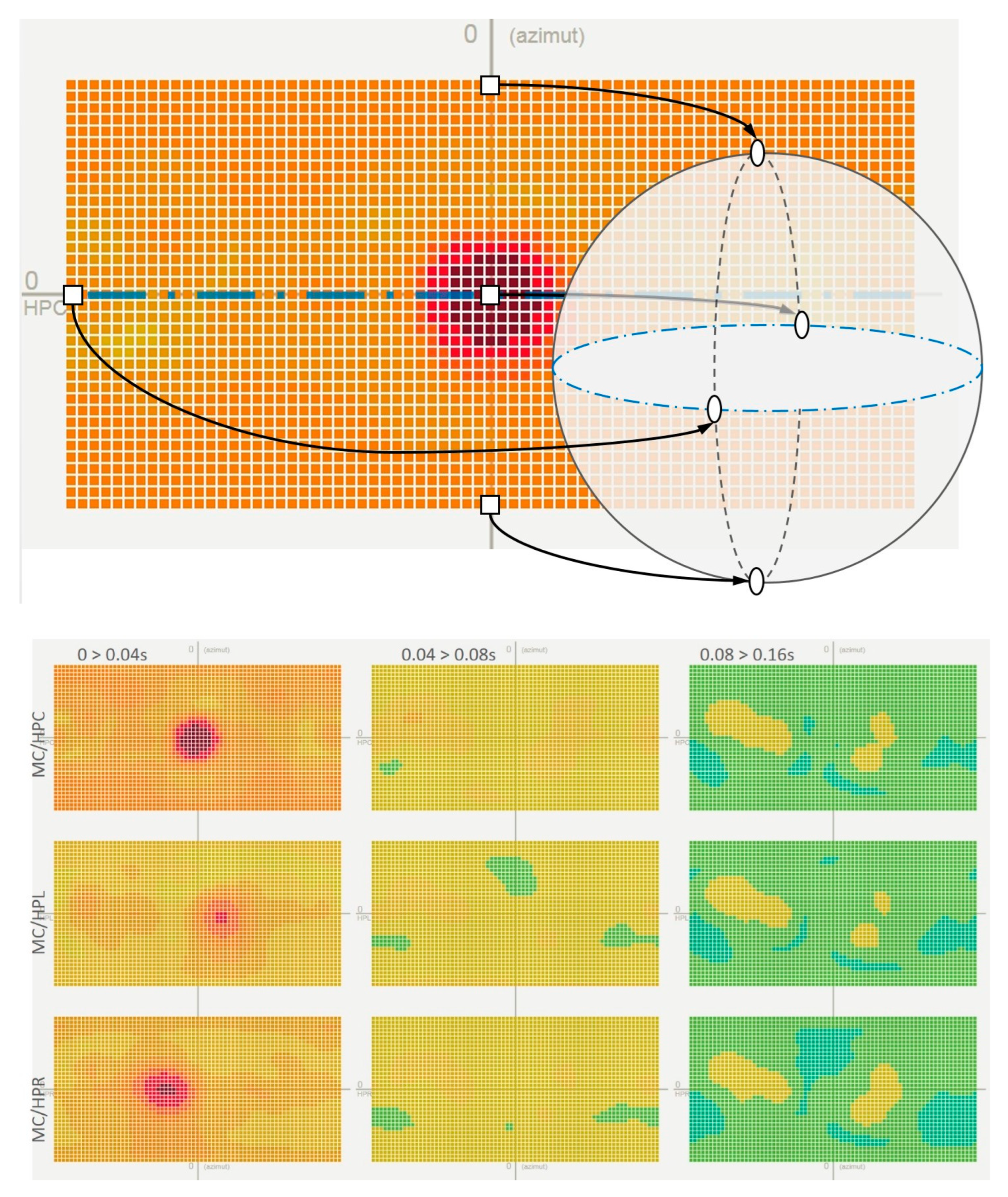
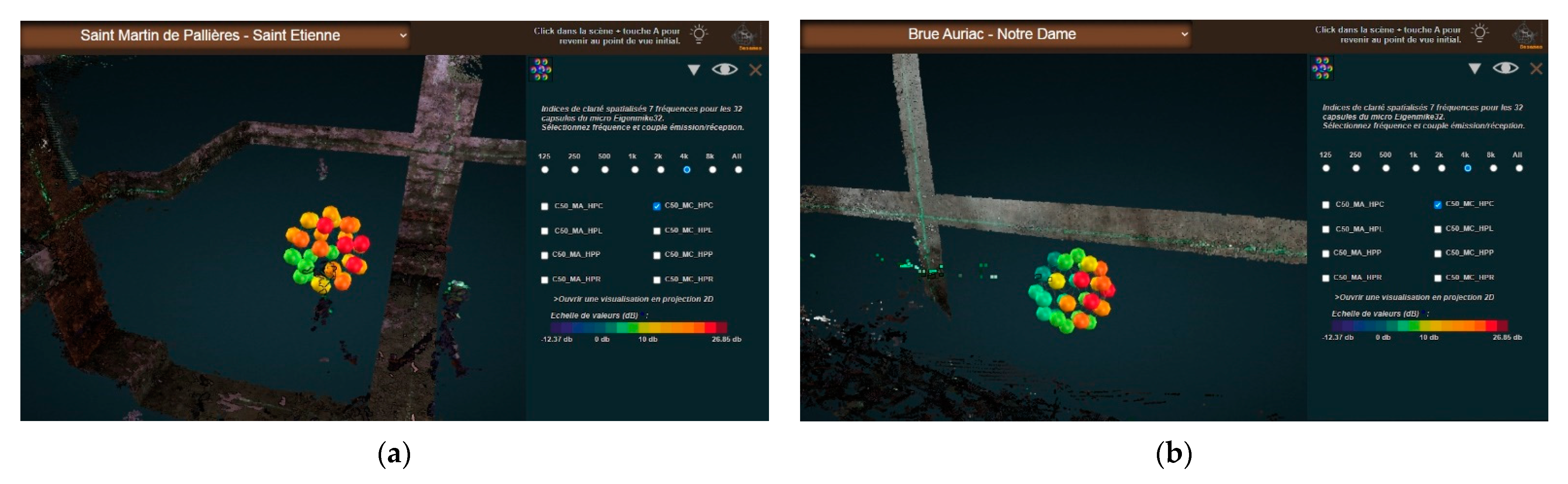
3.6.1. Visualisation of the 32-Channel C50 Clarity Descriptor

This descriptor (early/late impulse response ratio) is visualised for each frequency (125 Hz, 250 Hz, 500 Hz, 1kHz, 2kHz, 4kHz, and 8kHz) and for each transmitter–receiver pair (Figure 8).
For each chapel, the creation of the visual metaphor begins with the reading of the MA and MC positions of the Eigenmike em32 microphone. Then, for all the acoustic data read from the eight files representing the eight transmitter-receiver pairs, a calculation of the minimum and maximum values of the C50 clarity descriptor is performed, followed by a calculation of the spherical coordinates. The values of the C50 descriptor are displayed according to a colour code for each position of the capsules. For each metaphor, a white sphere representing the emission point (the position of the emitting loudspeaker) is also represented.
These metaphors can then be manipulated thanks to the sub-menu visible in Figure 9, on the right, allowing one to choose the frequency band to be displayed or to see all the frequencies at the same time as well as the choice of the transmitter-receiver pair (left, right or middle emission point). A coloured bar provides the scale of acoustic values represented in these metaphors.

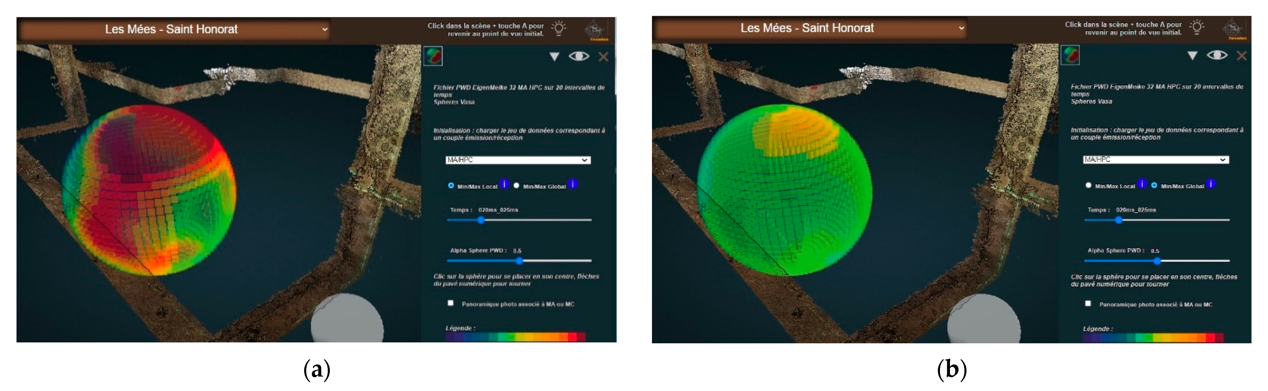
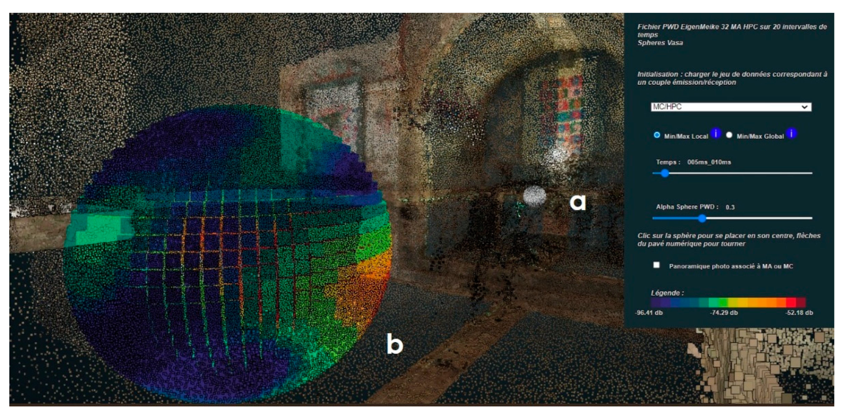
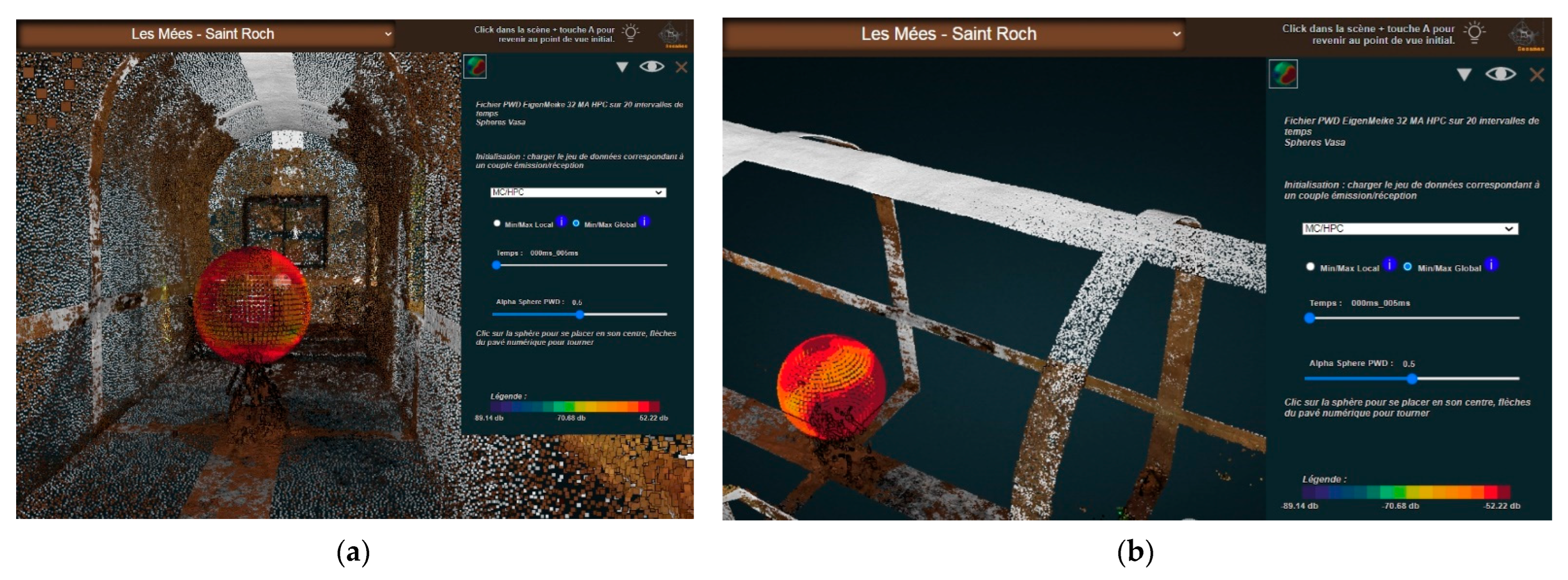
3.6.2. Visualisation of the PWD Descriptor

This descriptor (cartography of energy calculated with the “Plane Wave Decomposition” method) is represented by spherical heat maps. This visualisation allows us to see the distribution of the data over 360 degrees, using a colour scale that helps the analysts localise trends and exceptions of the distribution of energy in space. However, when talking about acoustic data, temporal aspects play a major role and should be taken into account. The tool allows users to interactively display nineteen time frames (i.e., nineteen successive maps) per transmission-reception pair and to switch between transmission-reception pairs. Shortly said, this is used to better understand how this energy descriptor moves and decreases in space and time. Figure 9 shows the PWD visualisation for two time frames, in N.D de Bethléem chapel (top line) and St. Patrice Chapel (bottom line). It illustrates clear resemblances in the energy diffusion pattern for the first time frame (left column) and clear differences later on, for the ninth time frame, at a moment when the architecture’s impact is significant.
The data are contained in nineteen files, representing the nineteen time intervals or time frames, each file having a matrix of 37 rows (vertical angular division) by 72 columns (horizontal angular division), i.e., a total of 404,928 values.
Minimum and maximum values are then calculated ‘globally’—that is, including all time intervals—or ‘locally’, that is, only on a selected time interval (Figure 10).
As can be seen in Figure 10, corresponding to the fifth of the nineteen time frames, at this point, the values have already decreased significantly—what remains is only a light orange capping. Experience shows the global scale mode is more efficient when analysing the decrease patterns, whereas the local scale mode is more efficient when analysing patterns of movement.
The colour scales are pre-established and allow each value to be tinted by transposing it into a wavelength within a given range bounded by the maximum and minimum values previously calculated. Then, according to the position of these values in the matrix, they are assigned to specific locations in space (using spherical coordinates). All these operations allow the ‘spherical heat map’ to be represented as a sphere of coloured sprites, each sprite representing a value in the matrix. A time slider allows navigation through the full set of time frames.
Again, as with the clarity descriptor visualisation, the emission point is represented as a white sphere (Figure 11).

4. Results and Interpretation

The 3D integrator prototype is used to extract general dimensions that serve for comparative analyses, as well as to extract specific dimensional features called segments, exploited for the visualisation and sonification of the ‘rhythmicity’ of the interiors (i.e., alternation of shapes and sizes along cross-sections). However, these use scenarios will not be detailed in the core of this paper due to their limited length—they are commented on in Appendix B. We try to focus on the distinguishing feature of our research: the ambition to represent in 3D space a set of acoustic descriptors (quantitative data resulting from Room Impulse Responses analyses).
In this section, we explore what understanding of the interiors of edifices can be gained by combining the study of dimensional and acoustic features. We begin with a brief comment on the expression ‘visual metaphor’ used repeatedly within this article. Next, we discuss the advantages and drawbacks of 3D visualisations, listing the services they provide, as well as their limitations that may affect our ability to analyse the data. We then present 2D visualisations exploiting the same data sets as the 3D visual metaphors designed so as to provide a complementary analytical service and explain their making and use. From this point on, we focus on the sense behind the C50 and PWD acoustic descriptors—in other words, what we expect them to reveal about the architectural interiors’ behaviours. For each of them, we present use cases, either exploiting the 3D visual metaphors or the 2D solutions, through which the potential added value of the overall approach can be discussed. However, a selection of use cases of situations when things work out for the best does not necessarily help weigh such an approach’s impact and transferability. We, therefore, do conclude the section with comments on the limitations of the approach in terms of spatio-acoustic analysis, what remains to be conducted, and what can be improved and developed in the future.

4.1. On Visual Metaphors

In addition to enabling the extraction of dimensional features, the 3D integrator has the particularity of projecting acoustic descriptor values into the 3D space. These values are mapped to two novel visual metaphors, respectively, named Allium 32 (C50 clarity descriptor) and Vasa sphere (PWD descriptor).
Our use of the term visual metaphor here is open to discussion. W. Kienreich [18] defines it as using a form of representation based on a real-world equivalent to display information. A typical example of a visual metaphor is the “information landscape” proposed by V. Sabol [25] to allow users to visually locate groups of thematically related documents grouped to form “hills” within an artificial landscape.
The two visualisations we propose are not, strictly speaking, equivalents of a real object, that is, the Eigenmike em32 spherical microphone, but on the other hand, both visualisations are positioned in the 3D space at the exact point of the recording, and their spherical shape evokes that of the microphone. It is important to note that both visualisations display the values of acoustic descriptors. They do not contain position ‘raw data’ in the 3D space but the result of a post-processing of the impulse response.

4.2. On the Need to Complement the 3D Visualisations

The Allium 32 visualisation builds on the geometry of the microphone (32 channels) and provides quantitative information by frequency (or all frequencies combined) for eight transmitter-receiver pairs. By navigating around the visual metaphor in the 3D space, the user can observe the variations in value for each sector and each frequency.
However, this opportunity of establishing a link in space between the descriptor value and the architecture comes at a price: the user can only observe one side at a time and cannot see all the values at once. This is, therefore, a major shift away from one of the golden rules of good visualisation as coined by E.R. Tufte [26]: enforce comparisons within the eyespan. The effects of occlusion and the cognitive impact of the user’s need to find his way in the 3D space are among the most important reasons why InfoVis solutions make little use of the ‘third dimension’.
The visual metaphor displayed in the 3D Integrator is therefore complemented with a 2D visualisation using the same descriptor values but allowing the whole set of values to be observed simultaneously (Figure 12).
Said briefly, what is lost in terms of spatiality with this 2D visualisation is gained in terms of completeness and term-by-term basis for comparison. Figure 13 illustrates some of the benefits of this visualisation—for example, detecting patterns and exceptions while having all values within the eyespan. In the illustrated case, the values for the 8K frequency show a dissymmetry pattern both at the “equator” level and on the bottom capsules. (Saint Pierre Chapel, Peynier, surveyed on 11 December 2019).
The PWD Vasa Sphere visualisation translates the 2664 values calculated for the PWD descriptor (one value every five degrees) into the form of a sphere made up of small coloured surfaces (sprites), and this is for each transmitter-receiver pair.
In this case, the values do not correspond to a frequency but to an instant: for each transmitter-receiver pair in each building, we create 19 tables (each containing 2664 values). This visualisation is provided with a time slider that allows users to browse through these time-framed descriptor values. The intervals between individual time frames have increasingly growing durations to maximise the readability of phenomena (significant events appear much closer to each other at the beginning than at the end of the sequence).
However, visual formalisms equipped with a temporal navigation tool in the form of a time-slider certainly provide an additional service, but not for free. The user can only observe one moment at a time and cannot see all the values simultaneously.
The 3D Vasa Sphere visualisation is therefore complemented by a 2D formalism called eGrid. This visualisation uses the same descriptor values but allows the user to observe all the values at once in the form of visual grids corresponding to the tables of values (Figure 14).

4.3. The C50 Clarity Descriptor Visualisations: Use Cases and Interpretation

Given that in our survey protocol, the emission/reception points are systematically at the same distance from one another in all interiors, differences in clarity can be attributed to the architecture. Knowing this, one can, for instance, use the visualisations to check if expected patterns are duly visible and, if not, to what element of the architectural layout unexpected behaviour could be attributed. Figure 15 shows, for instance, values of the C50 descriptor in position MC that differ significantly in two aspects: the range of the values themselves (greater differences in b) and the geometric distribution of high values.
The 2D visualisation is efficient in reading, for example, symmetry and dissymmetry patterns, as all values are in front of the eyes. In the case below (Figure 16), clarity values for microphone position MA are symmetric (as the architecture is), whereas in position MC, a clear dissymmetry pattern appears that can be seen to correspond to what is today a sort of niche but was the chancel of the original chapel. However, differences in colour (and in value) are small, perhaps not that significant, and therefore one should be careful not to jump to quick conclusions. Yet, such dissymmetry patterns have been observed repeatedly on different interiors and always in relation to some architectural pattern.
The impact of the interiors’ volumes or their type of covering can also be observed (Figure 17). More precisely, differences in spatial patterns between interiors are observable, with, for instance, as shown below, a small, vaulted, low-ceilinged interior exhibiting high clarity values on the visualisation cap. With that observation in mind, the analyst can then track such behaviours elsewhere.

4.4. The PWD Descriptor Visualisations: Use Cases and Interpretation

The PWD technique is usually used for sound scene analysis, such as soundscapes, to detect and locate sound pollution or so-called sound events [27]. Here, an alternative usage was made to localise specificities of the sound propagation inside the chapels. This kind of usage has already been performed in a previous study [16]. What can be said at this stage is that the 3D visualisation, thanks to its time slider, allows the user to perform a fine-grain analysis of how the acoustic signal emitted in the four emitting points interacts with the architecture. Figure 18 illustrates some of the observations that can be made for various time frames for one emission/reception tuple and on one interior.
In some cases, the impact of specific architectural features is clearly visible, as in the example shown in Figure 19: a barrel-vaulted, empty interior where reflexions from the ceiling are visible in the very first time frame, along with the direct emission to reception diffusion pattern.
The 3D Vasa Sphere visualisation does support analytic tasks, but it has intrinsic limitations. The 2D eGrid visualisation (Figure 13) can be used to read the data on all time frames and all emission/reception tuples concerning a given interior. This can be useful, for instance, to spot dissymmetry patterns or anomalies in the energy decrease patterns, but it can also be used to compare the behaviour of different interiors across the collection of buildings, as illustrated in Figure 20.
Figure 20a (left column) shows two cases with strong similarities in the spatial pattern of energy diffusion—both buildings devoid of any furniture (top, St. Roch chapel, Les Mées, Bottom, Templars chapel, Bras). In the right column, the two cases diverge significantly in terms of contrasts and geometry (top, St. Etienne chapel, St. Martin de Pallières, Bottom, St. Roch chapel, La Verdière). Here, three factors interfere: the layout and volume of the furniture, the proportions, and the distance between MC and the back wall—significantly shorter than for the two other cases.
Figure 20b (left column) shows two cases with noticeable similarities in the spatial pattern of energy diffusion—i.e., “reflexions on the walls”, although with lower values for the top one—i.e., more green parts, and a small blue part (Notre-Dame d’Astors Chapel, Peyrolles, Prieuré Notre-Dame, Brue-Auriac). The right-hand column shows two divergent spatial patterns, with specific reflexion motives on the ceiling and floor. Top, the long green stripe in the upper part of the visualisation reflects a specific behaviour of the ceiling in comparison to other surfaces (St. Honorat Chapel, Les Mées). Bottom, both the ceiling and the floor show reflexion patterns competing with these of walls—which is not surprising given that this edifice has aisles (Notre-Dame de la Salette Chapel, Tourves).
The design and the computation of the PWD descriptor could be enhanced in many ways. Firstly, similarly to the C50 descriptors, it could be computed using frequency bands. This could make it easier to isolate specific behaviours (for example, the furniture inside the chapels can modify mainly high frequencies). Secondly, the PWD technique could also be used in combination with descriptors others than RMS (presented in Section 3.5), such as the C50 descriptor. Finally, the computation of the acoustic descriptors could be implemented directly inside the 3D integrator so that the user could choose the visualisation parameters (personalise the time frame, frequency band, etc.).

4.5. Limitations and Future Works

As noted by Nishimura [28], an InfoVis solution “is meant at generating new insights and ideas that are the seeds of theories, but it does it by using human perception as a very fast filter: if vision perceives some pattern, there might be a pattern in the data that reveals a structure”. This is precisely the service offered by the solutions we have presented: they act as an exploratory aid, helping actors to gain insights into the data. Yet, these insights should not be confused with simple, direct, and conclusive causal relations—they often act as question marks requiring further analysis.
This is why we consider the results as basically a promising proof-of-concept demonstration. A number of improvements to the existing visualisations could be thought of, and to start with, the implementation of a multi-view interface allowing users to browse more comfortably between the various visualisations, and thus fully implement the “trial and error approach” promoted in [29].
Other limitations or future works can be quoted, such as:
  • Only two out of the dozen acoustic descriptors resulting from the acquisition campaigns have been visualised: there is clearly room for future work here.
  • Existing solutions prove relatively efficient when trying to identify patterns for this or that interior, but the comparison of behaviours across interiors is not supported enough. Two visual solutions have been implemented that allow a global reading of collections, contrasts, and resemblances. Yet more can be conducted to enhance comparative analyses, and this is a key point as far as our research programme is concerned. The work we have conducted has helped us pinpoint families of patterns (intensity, geometric distribution, variation, consistency patterns) that we intend to re-examine using other visual solutions.
Still, speaking about limitations, the visualisations rely on a paradigm—the projection of acoustic data in 3D space in relation to the position of the reception point—that may somehow limit the capacity of an analyst to intellectually connect what is read in the visual metaphors with specific architectural features.
Concerning this point, a lead recently explored consists of enhancing data fusion capability—in our case, fusion of the geometric and acoustic descriptors that can be co-acquired thanks to our specific survey protocol. The idea is to merge textures from the 3D model with the acoustic features, both represented by the mean of spherical texture mapping (Figure 21).
This will allow overlaying visual and geometric information (e.g., albedo, depth, normals, ambiant occlusion), providing the eGrid a spatially enhanced readability as a way to verify the correlation of data. It should be said that this potential cross-correlation of multimodal data was anticipated during the definition of the data acquisition protocol and by choice of the panoramic-based instrumentation since the sensor (camera or microphone) positions were systematically recorded also with a potential data fusion in mind.
Finally, it is important to stress that the overall approach is limited by significant self-imposed operational constraints: light instrumentation (remote sites with accessibility problems, poor funding), a fast contact-free survey protocol (3 h as a maximum, all included), no power supply in situ, a setup that should be reproduced identically across the whole collection (comparability issue), congested interiors, varying lighting conditions, varying architectural layouts adapted to the analysis of divergent compositional patterns, etc. The genericity and reproducibility of the approach are proven, but they should be read in light of the above-mentioned self-imposed constraints.

5. Conclusions

This research is conducted by a multidisciplinary team pulling together architects and acousticians on a quite specific corpus, the impact of which proved prominent. Indeed, the 3D integrator has not been designed as (and is not) a general-purpose 3D point cloud visualisation platform. Our approach is not intended to instrument 3D point cloud analysis per se (issues such as segmentation and classification, see, for instance [30]) but focuses on enabling a better understanding of multimodal data sets, with the primary motivation of trying to enhance their intelligibility.
It is also important to stress that the tool has not been designed in order to promote and instrument acoustic simulations per se—this is a different issue that was not addressed in the context of this research. Briefly speaking, its role is to help actors reason on the correlation of an acoustic behaviour with architectural features. It plays the role of an InfoVis solution, where the visualisation of data sets acts as food for thought in trial-and-error processes aimed at a fine-grain interpretation of the data.
Several visual solutions have been designed and implemented to help explore and cross-examine the datasets inside the 3D integrator (3D visual metaphors) or as 2D formalisms. They build on the key benefit of a systematic survey protocol jointly developed by architects and acousticians and prioritising reproducibility and comparability.
A number of open issues (in terms of methods or technology) can be discussed in the light of this experiment, such as limitations of a 3D visualisation in terms of information readability and navigability, the challenges of enhancing comparisons inside 3D settings, scalability, response time, export formats, etc. The usage scenarios tested up to now show that the development is promising—feeds interdisciplinary discussions on practical cases, but also that the attractiveness of a 3D tool should not distract analysts from digging into their data in many other ways.
In conclusion, it should be remembered that the objective of this work is not to produce fine-grain architectural and acoustic diagnoses prior to heavy transformation or rehabilitation projects. Such an objective would require much greater resources, including in the data collection phase, as illustrated by the literature on the subject, for example, in [31]. Our approach is, above all, a frugal one, adapted to the specific socio-economic context of our corpus. Beyond its scientific objectives of characterisation and comparison, it allows us to move towards an assessment of the reusability of buildings, enabling local actors to better understand what new uses would be adapted to these places without major transformations. This societal aspect of the work presented in this article is in progress. It is based on the implementation of perception tests by the project’s acoustician partners.

Supplementary Materials

A compilation of plans and sections corresponding to the corpus of fifteen chapels can be downloaded at: https://halshs.archives-ouvertes.fr/halshs-0307025 (accessed on 27 November 2022) [32]. A Proportion as ratios comparative analysis can be downloaded at: http://www.map.cnrs.fr/BlackWhite/Recher/SESAMES_Proportions_ordered.pdf (accessed on 27 November 2022).

Author Contributions

Conceptualisation, all co-authors; methodology, all co-authors; software L.B. and J.-Y.B.; formal analysis, A.V., S.F., A.P., L.B., J.-Y.B. and I.D.; investigation, A.V., S.F., S.Y., A.P., L.B., J.-Y.B. and I.D.; resources, A.P. and I.D.; data curation, A.V. and J.-Y.B.; writing—original draft preparation, L.B., A.P., A.V. and J.-Y.B.; writing—review and editing, A.V., S.Y., A.P., L.B., J.-Y.B. and I.D.; visualisation, A.P., L.B., I.D. and J.-Y.B.; supervision, R.K.-M. and J.-Y.B.; project administration, R.K.-M. and J.-Y.B.; funding acquisition, J.-Y.B. All authors have read and agreed to the published version of the manuscript.

Funding

This research was funded by the ANR, the project-based funding agency for research in France, under the id ANR-18-CE38-0009-01.

Data Availability Statement

Given the amount and variety of the data sets mentioned in this study, some are made available only on request from the corresponding author. However, a large number of resources are available from the following entry points: The 3D integrator http://anr-sesames.map.cnrs.fr/viewer_ply_dxf/SESAMES_Integrateur/programmes/SESAMES_Integrateur.html (accessed on 27 November 2022); MEMORIA IS (documentation of research processes): http://memoria-dev.gamsau.archi.fr/is/analyse.php?viz = 3&v = 3 (accessed on 27 November 2022); The project’s open documents repository: http://anr-sesames.map.cnrs.fr/do.html (accessed on 27 November 2022).

Acknowledgments

The project team wishes to express its gratitude to the local actors—local authorities and their technical services, associations, and members of the clergy—who allowed it access to the buildings studied and thus enabled it to carry out this work.

Conflicts of Interest

The authors declare no conflict of interest.

Appendix A. Overview of the Components Combined in the 3D Integrator

Heritage 05 00197 i001

Appendix B. Extraction of Dimensional Features

The 3D integrator is developed in the context of a research programme, a major objective of which is to compare (formally and acoustically) buildings that are supposedly somehow “similar” (in terms of the original function, general architecture, and scale). Obviously, significant dimensions (length, width, height, overall, and in parts) are among the variables that need to be correlated. To do this, a systematic dimensional analysis grid was established cf. [32,33]. It identifies for each building the dimensions to be extracted on three axes. The simple case illustrated below (Figure A1) gives an idea of the different analysis filters used to extract the dimensional characteristics: distinction nave/chancel, characteristics specific to each bay, each transverse arch, data related to the covering, etc.
Figure A1. An illustration of some of the predefined “significant dimensions,” the values of which can be extracted using the 3D Integrator (St. Honorat chapel, Les Mées).
Heritage 05 00197 g0a1
The 3D integrator displays previously oriented and scaled point clouds: it can therefore be used to directly extract the dimensional characteristics corresponding to the systematic dimensional analysis grid (on the three X,Y,Z axes). This extraction is manual: picking of points in the 3D scene, possible export to JSON format. The benefit of this approach is that it allows the user to adapt the measurement according to the quality of the point cloud and with regard to the position of disruptive elements (furniture typically). It obviously also introduces a degree of uncertainty in the extraction. The development of an automated or semi-automated procedure for extracting these dimensions is part of the project’s prospects, but the difficulties to be expected should not be underestimated: the interiors of the buildings studied are, in some cases, very congested (rood screen, high altar, baptismal font, pulpit, bas-relief, and of course, paintings or ex-votos). Accordingly, this indeed is a research line, but it goes far beyond the objectives we set ourselves in developing the 3D integrator.
For each building, 50 dimensions (on average) were extracted using the 3D integrator’s functionalities. Some of these dimensions correspond to distances measured in situ “traditionally”, using a Leica A8 rangefinder. This allows a qualitative (and rough) assessment of the reliability of the dimensional characteristic extracted from the integrator. The quality of the measurement is impacted by the user’s picking, the granularity of the measurement allowed by the integrator (1cm), the differences in density and quality within a point cloud and between point clouds, but above all by factors related to the measurement itself and its post-processing, upstream of the integrator, a point commented in [20].
Of the 15 buildings concerned, the discrepancies between the measurements extracted via the 3D integrator and the control data taken in situ with rangefinder are in the worst cases (poorly defined cloud) of up to 3% (3 centimetres per metre) and are generally between 0.5 and 1% (from 0.5 to 1 centimetre per metre).
This result is compatible with the objective of the development: to provide a lightweight method of extracting dimensional characteristics for comparative analysis in an architectural study. It would naturally not be compatible with metrological monitoring of buildings.
The dimensional features extracted thanks to the 3D integrator were used at this stage for two separate studies, the first focusing on the notion of proportion [34], the second on that of “contour”. In this second study, we reinterpret a generic model that we had developed in another context to analyse moulded architectural elements [35]. In a nutshell, this model aims at representing cross-sections in the form of sequences of segments, segments that are associated with qualitative features (type of material, for example). This codification is intended to highlight the rhythms of an architectural profile, a recurrence of patterns, etc.
This model is based on two essential notions: control points (starting and ending points of the segments) which generally correspond to breaks in continuity in the geometry of the form (e.g., angle), and segments which characterise a path (between their two control points) and are most often associated with a single support object (a wall, a vault, etc.). “What happens” between the two control points is documented in several ways, typically the geometry of the segment, name, material, etc.
In the framework of the SESAMES project, the original formalism is no longer applied to moulded architectural elements (capitals, arches, architraves, …) but to the overall plan (contour) of a building in which bays, double arches, apses, … alternate (Figure A2).
Figure A2. Top, the original formalism: a visual mapping of segments forming a 2D contour (here, in the case of a beam—each column of the left graphic corresponds to a given segment on the real object. Bottom, reinterpretation of the original formalism in the case of horizontal sections: control points between segments forming a contour—numbers correspond to control points (Saint Pierre Chapel, Peynier).
Heritage 05 00197 g0a2
The 3D integrator is used here to extract control points for each segment based on the green trace left in the 3D point cloud by the laser beams projected by the self-levelling laser levels (hence ensuring horizontality and verticality). Once each segment has been identified and documented (dimensions and qualitative indicators), it is possible to transfer the values of each segment in the form of a ‘sound’ and, in fine, to propose a ‘sonification’ of the contour, in other words, a sound mapping of the architectural information. This exploratory work is carried out by a research laboratory partner of the project, the PRISM research unit, which is developing complementary sonification strategies using the data extracted via the 3D integrator (an experiment that falls outside the scope of this article).

References

  1. Schütz, M. Potree: Rendering Large Point Clouds in Web Browsers. Ph.D. Thesis, Vienna University of Technology, Vienna, Austria, 2016. [Google Scholar]
  2. Blaise, J.Y.; Dudek, I.; Pamart, A.; Bergerot, L.; Vidal, A.; Fargeot, S.; Aramaki, M.; Ystad, S.; Kronland-Martinet, M. Space & sound characterisation of small-scale architectural heritage: An interdisciplinary, lightweight workflow. In Proceedings of the International Conference on Metrology for Archaeology and Cultural Heritage, Virtual Conference, 22–24 October 2020; Available online: https://halshs.archives-ouvertes.fr/halshs-02981084 (accessed on 27 November 2022).
  3. Henwood, R.; Pell, S.; Straub, K. Combining Acoustic Scanner Data with In-Pit Mapping Data to Aid in Determining Endwall Stability: A Case Study from an Operating Coal Mine in Australia. McElroy Bryan Geological Services. Available online: https://mbgs.com.au/wp-content/uploads/2022/03/Combining-acoustic-scanner-data-with-in-pit-mapping-data-to-aid-in-determining-endwall-stability-a-case-study-from-an-operating-coal-mine-in-Australia.pdf (accessed on 27 November 2022).
  4. Chemisky, B.; Nocerino, E.; Menna, F.; Nawaf, M.M.; Drap, P. A portable opto-acoustic survey solution for mapping of underwater targets. Int. Arch. Photogramm. Remote Sens. Spatial Inf. Sci. 2021, XLIII-B2-2021, 651–658. [Google Scholar] [CrossRef]
  5. Ceravolo, R.; Pistone, G.; Fragonara, L.Z.; Massetto, S.; Abbiati, G. Vibration-Based Monitoring and Diagnosis of Cultural Heritage: A Methodological Discussion in Three Examples. Int. J. Archit. Herit. 2016, 10, 375–395. [Google Scholar] [CrossRef] [Green Version]
  6. Pallarés, F.J.; Betti, M.; Bartoli, G.; Pallarés, L. Structural Health Monitoring (SHM) and Nondestructive Testing (NDT) of Slender Masonry Structures: A Practical Review. Constr. Build. Mater. 2021, 297, 123768. [Google Scholar] [CrossRef]
  7. Aparicio Secanellas, S.; Liébana Gallego, J.C.; Anaya Catalán, G.; Martín Navarro, R.; Ortega Heras, J.; García Izquierdo, M.Á.; González Hernández, M.; Anaya Velayos, J.J. An Ultrasonic Tomography System for the Inspection of Columns in Architectural Heritage. Sensors 2022, 22, 6646. [Google Scholar] [CrossRef]
  8. Fais, S.; Casula, G.; Cuccuru, F.; Ligas, P.; Bianchi, M.G. An Innovative Methodology for the Non-Destructive Diagnosis of Architectural Elements of Ancient Historical Buildings. Sci. Rep. 2018, 8, 4334. [Google Scholar] [CrossRef] [Green Version]
  9. Dokmanić, I.; Parhizkar, R.; Walther, A.; Lu, Y.M.; Vetterli, M. Acoustic Echoes Reveal Room Shape. Proc. Natl. Acad. Sci. USA 2013, 110, 12186–12191. [Google Scholar] [CrossRef] [PubMed] [Green Version]
  10. Bertocci, S.; Lumini, A.; Cioli, F. Digital Survey and 3D Modeling to Support the Auralization and Virtualization Processes of Three European Theater Halls: Berlin Konzerthaus, Lviv Opera House, and Teatro Del Maggio Musicale in Florence. A Methodological Framework. In Proceedings of the 2nd Symposium: The Acoustics of Ancient Theatres, Verona, Italy, 6–8 July 2022; Available online: https://flore.unifi.it/retrieve/e398c382-5f94-179a-e053-3705fe0a4cff/sat_170.pdf (accessed on 27 November 2022).
  11. Lavagna, L.; Shtrepi, L.; Farina, A.; Bevilacqua, A.; Astolfi, A. Virtual Reality inside the Greek-Roman Theatre of Tyndaris: Comparison between Existing Conditions and Original Architectural Features. In Proceedings of the 2nd Symposium: The Acoustics of Ancient Theatres, Verona, Italy, 6–8 July 2022; p. 3. [Google Scholar]
  12. Thivet, M.; Verriez, Q.; Vurpillot, D. Aspectus: A flexible collaborative tool for 3D data exploitation in the field of archaeology and cultural heritage. In Situ 2019, 39. [Google Scholar] [CrossRef]
  13. Barazzetti, L.; Previtali, M.; Roncoroni, F. Can we use low-cost 360 degree cameras to create accurate 3d models? In Proceedings of the ISPRS TC II Mid-term Symposium “Towards Photogrammetry 2020”, Riva del Garda, Italy, 4–7 June 2018; pp. 69–75. [Google Scholar] [CrossRef]
  14. MH Acoustics. em32 Eigenmike Microphone Array Releasenotes (v17.0)—Notes for Setting Up and Using the MH Acoustics em32 Eigenmike Microphone Array; MH Acoustics: Summit, NJ, USA, 2013. [Google Scholar]
  15. Binelli, M.; Venturi, A.; Amendola, A.; Farina, A. Experimental Analysis of Spatial Properties of the Sound Field Inside a Car Employing a Spherical Microphone Array, May 2011. In Proceedings of the 130th AES Conference, London, UK, 13–16 May 2011. [Google Scholar]
  16. Farina, A.; Amendola, A.; Capra, A.; Varani, C. Spatial analysis of room impulse responses captured with a 32-capsule microphone array. In Proceedings of the 130th Audio Engineering Society Convention, London, UK, 13–16 May 2011. [Google Scholar]
  17. Spence, R. Information Visualization; Addison Wesley: Harlow, UK, 2001. [Google Scholar]
  18. Kienreich, W. Information and knowledge visualisation: An oblique view. MIA J. 2006. [Google Scholar]
  19. Aigner, W.; Miksch, S.; Schumann, H.; Tominski, C. Visualization of Time-Oriented Data; Human-Computer Interaction Series; Springer: London, UK, 2011. [Google Scholar]
  20. Blaise, J.Y.; Dudek, I.; Pamart, A.; Bergerot, L.; Vidal, A.; Fargeot, S.; Aramaki, M.; Ystad, S.; Kronland-Martinet, M. Acquisition & integration of spatial and acoustic features: A workflow tailored to small-scale heritage architecture. Acta IMEKO 2022, 11, 1–14. Available online: http://0-doi-org.brum.beds.ac.uk/10.21014/acta_imeko.v11i2.1082 (accessed on 27 November 2022).
  21. Cerdá, S.; Giménez, A.; Romero, J.; Cibrián, R.; Miralles, J. Room acoustical parameters: A factor analysis approach. Appl. Acoust. 2009, 70, 97–109. [Google Scholar] [CrossRef]
  22. Daniel, J. Représentation de Champs Acoustiques, Application à la Transmission et à la Reproduction de scènes Sonores Complexes dans un Contexte Multimédia. Ph.D. Thesis, University of Paris VI, Paris, France, 2000. [Google Scholar]
  23. Alon, D.L.; Rafaely, B. Spatial decomposition by spherical array processing. In Para-Metric Time-Frequency Domain Spatial Audio; Wiley Online Library: New York, NY, USA, 2017; pp. 25–48. [Google Scholar] [CrossRef]
  24. Politis, A. Microphone Array Processing for Parametric Spatial Audio Techniques. Ph.D. Thesis, Department of Signal Processing and Acoustics, Aalto University, Espoo, Finland, 2016. [Google Scholar]
  25. Sabol, V. (TU Graz, Graz, Austria) Visual Analysis of Relatedness in Dynamically Changing Repositories. Coupling Visualization with Machine Processing for Gaining Insights into Massive Data. 2012. Available online: http://www.gamsau.map.cnrs.fr/modys/abstracts/Sabol.pdf (accessed on 27 November 2022).
  26. Tufte, E.R. Visual Explanations; Graphics Press: Cheshire, CT, USA, 2001. [Google Scholar]
  27. Adavanne, S.; Politis, A.; Virtanen, T. A Multi-room Reverberant Dataset for Sound Event Localization and Detection. In Proceedings of the Detection and Classification of Acoustic Scenes and Events 2019 Workshop (DCASE2019), New York University, New York, NY, USA, 25–26 October 2019; pp. 10–14. [Google Scholar] [CrossRef]
  28. Fekete, J.D.; Van Wijk, J.; Stasko, J.T.; North, C. The Value of Information Visualization. Information Visualization: Human-Centered Issues and Perspectives; Lecture Notes in Computer Science; Springer: Berlin, Germany, 2008; pp. 1–18. ISBN 978-3-540-70955-8. [Google Scholar]
  29. Nishimura, K.; Hirose, M. The Study of Past Working History Visualization for Supporting Trial and Error Approach in Data Mining. In Human Interface and the Management of Information. Methods, Techniques and Tools in Information Design. Human Interface 2007; Lecture Notes in Computer, Science; Smith, M.J., Salvendy, G., Eds.; Springer: Berlin/Heidelberg, Germany, 2007; Volume 4557. [Google Scholar] [CrossRef]
  30. Grilli, E.; Menna, F.; Remondino, F. A review of point clouds segmentation and classification algorithms. ISPRS Arch. 2017, XLII-2/W3, 339–344. [Google Scholar] [CrossRef] [Green Version]
  31. Kearney, G.; Daffern, H.; Cairns, P.; Hunt, A.; Lee, B.; Cooper, J.; Tsagkarakis, P.; Rudzki, T.; Johnston, D. Measuring the Acoustical Properties of the BBC Maida Vale Recording Studios for Virtual Reality. Acoustics 2022, 4, 783–799. [Google Scholar] [CrossRef]
  32. Accès Cartographique au Corpus d’étude du Projet SESAMES. 15 Chapelles Rurales en Région PACA. Schémas de Plan et de Section. Available online: https://halshs.archives-ouvertes.fr/halshs-03070251 (accessed on 27 November 2022).
  33. Grille D’analyse Dimensionnelle Systématique—Corpus Chapelles Rurales. Available online: http://anr-sesames.map.cnrs.fr/docs/Sesames_dimensionsGrid.pdf (accessed on 27 November 2022).
  34. Cohen, M.A. Conclusion: Ten Principles for the Study of Proportional Systems in the History of Architecture. Archit. Hist. 2014, 2, 7. [Google Scholar]
  35. Blaise, J.Y.; Dudek, I. Identifying and Visualizing Universal Features for Architectural Mouldings. IJCISIM Int. J. Comput. Inf. Syst. Ind. Manag. Appl. 2012, 4, 130–143. [Google Scholar]
Figure 1. (A) The Eigenmike em32 microphone, (B), aligned vertically on the protocol’s spatial grid using laser beams emitted by self-levelling laser levels (a), and an intersection of laser beams used for the scaling step (c). (b) Illustration of the protocol’s spatial grid, with names given to emitting and recording points (Chapelle N.D de Bethléem, Bras, longitudinal section).
Heritage 05 00197 g001
Figure 2. (a) Illustration of the pyramidal data acquisition protocol (shown in purple): view of the spheres (in yellow) corresponding to each of the five positions of the 360 camera. (b) Each sphere gives access to online panoramas corresponding to the camera position.
Heritage 05 00197 g002
Figure 3. Overview of the enhanced interface with selection menu, institutional information, tools, and sub menus (Saint Pierre Chapel, Peynier, survey date 11 December 2019). Specific add-ons include: (1) DXF Paths, (2) DXF Images, (3) Panoramics and pyramidal protocol, (4) Laser beams, (5) Measurements on DXF, (6) Suppression of measures on DXF, (7) Points naming, (8) Suppression of point names, (9) Point cloud convex Hull, (10) Volume calculation, (11) Acoustics data by 32-channel C50 clarity descriptor, (12) Acoustics data by PWD descriptor, (13) Microphones point-of-views, (14) Saving DXF measures, and (15) Saving DXF point naming.
Heritage 05 00197 g003
Figure 4. (a) Visualisation of the three polylines corresponding to the three DXF files: acoustic devices (red), scaling of the model (green), and direct measurements (blue). (b) Thumbnail images corresponding to each measurement recorded with the rangefinder positioned in the 3D space.
Heritage 05 00197 g004
Figure 5. (a) Example of measurements made on the DXF data; (b) example of naming of DXF points in progress.
Heritage 05 00197 g005
Figure 6. Visualisation of the laser levels’ beams, forming four intersecting planes (Saint Pierre Chapel, Peynier, survey date 11 December 2019).
Heritage 05 00197 g006
Figure 7. This representation was obtained by creating a bounding box around the whole cloud, then by cutting it on the 3 axes, in a predetermined number of cuts, here 24, then by eliminating all the voxels which are outside of the point cloud. A distinction is made between the surface voxels and those of the interior. The present example illustrates the manipulation of this voxel division via a menu on the X, Y, and Z axes (right part, submenu). In purple, the surface voxels; in yellow, the interior voxels. The current user manipulation is performed on the X axis.
Heritage 05 00197 g007
Figure 8. Visualisation of the 32-channel C50 clarity descriptor for the left emission point (white sphere in (a). Concentric coloured spheres convey three pieces of information: quantitative value (colour), angular position, and frequency. Unsurprisingly high values occur closer to the emitting point, with (b) an outlier.
Heritage 05 00197 g008
Figure 9. Visualisation of the PWD descriptor for a sound emitted on the axis of N.D de Bethléem chapel (top images, survey date 11 September 2019) and for St. Patrice Chapel (bottom images, survey date 22 January 2020). (a) From 0 to 0.05 s; (b) from 0.05 to 0.06 s. Note the evolution of the pattern over time and the dissymmetry patterns (high values in dark red).
Heritage 05 00197 g009
Figure 10. User-side selection of the min./max. values for the same instant (0.02 to 0.025 s). The option selected in (a) is local min. and max. values—the colour scale is readjusted from instant to instant so as to stretch contrasts. This helps users to spot patterns easily, but in return, it means that the “dark red” changes value from instant to instant. In (b), the option “global min. and max. values” was selected—the colour scale remains the same across all time frames (St. Honorat chapel, Les Mées, survey date 23 January 2020).
Heritage 05 00197 g010
Figure 11. (a) The emission point is represented by a white sphere, and (b) a spherical heat map represents the values of the PWD descriptor for the reception point (St. Honorat chapel, Les Mées, survey date 23 January 2020).
Heritage 05 00197 g011
Figure 12. The Allium 32 2D visualisation. (a) Illustration of the principle. Each dark circle corresponds to one of the 32 capsules of the Eigenmike en32 microphone and is projected onto a flat surface. The inner area, highlighted by the grey background, corresponds to capsules above the “equator” of the microphone. (b) The SVG-based implementation. Each visualisation corresponds to a given recording/emitting tuple—here, the microphone is in the MC position, the emitting point in the centre of the chancel). Six tuples are available for each edifice. Values of the C50 clarity descriptor values are calculated for seven frequencies (from 125 Hz to 8 kHz) and for each of the 32 capsules.
Heritage 05 00197 g012
Figure 13. (a) Values of the C50 clarity descriptor are mapped into a colour scale. The position of the coloured sectors corresponds to the frequency (clockwise, from 125 Hz to 8 kHz) and the colours reflect the descriptor values. (b) User-side interactions allow filtering of the data so as to highlight values for one specific frequency (8 kHz here).
Heritage 05 00197 g013
Figure 14. Top, principle of the visualisation: each little square correspond to 1 of the 2664 values calculated (the visualisation is a projection of a “sphere” into a grid ranging from 180 to −180—horizontally and from 90 to −90—vertically. Bottom, a partial view of the eGrid visualisation (only three time frames are shown, three columns). Data for reception point MA (closest to the chancel). Each line corresponds to an emission/reception point—from top to bottom, central point HPC, middle left point HPL, bottom right point HPR. The colour scale has been calculated by merging data for all time frames and tuples. The intensity of the decrease from time frame to time frame (left to right) can be discerned. Patterns of dissymmetry may also be distinguished. Please note here in the left column (earliest time frame) dissimilarities between the HPL and HPR energy maps.
Heritage 05 00197 g014
Figure 15. Clarity values for the MC/HPC tuple, showing all frequencies. Note in (a) high values (dark red) distributed all around the visual metaphor, in a first analysis attributed to the position of the microphone (very close to the entrance wall of the chapel, the smallest building in the collection (Saint Etienne Chapel, Sainte-Martin de Pallières, survey date 22 November 2019). By contrast, in (b), values on the rear side of the visual metaphor (yellow and green) show significant differences with those of the front side (dark red): the microphone, in this bigger building, is placed halfway between the entrance and the chancel (Saint Pierre Chapel, Peynier, survey date 11 December 2019).
Heritage 05 00197 g015
Figure 16. (a) Clarity values for the MA/HPC, (b) for MC/HPC tuples, showing frequency 8 kHz (Saint Probace Chapel, Tourves, survey date 25 February 2020). Whereas in (a), hardly any difference is seen between the left and right sides, in (b), differences do appear. Another observation can be made on the value scales, with more contrasts when the microphone is closer to the emitting point.
Heritage 05 00197 g016
Figure 17. Impact (on first analysis) of the volume and spatial configuration of interiors on the spatial distribution of the max. and min. values of the clarity descriptor (MC/HPC tuples, frequency 4 kHz). In (a) the smallest interior across the collection (Saint Etienne Chapel, Sainte-Martin de Pallières, survey date 22 November 2019), in (b) a narrow interior but however one of the highest (Prieuré Notre-Dame, Brue-Auriac, survey date 22 November 2019).
Heritage 05 00197 g017
Figure 18. Screenshots of the PWD Vasa Sphere visualisation—values of the PWD descriptor—corresponding to the same emission/reception tuple, MC/HPC, but for successive time frames (Saint Pierre Chapel, Peynier, survey date 11 December 2019). The colour scale mode here is a “local scale”—for each time frame, the maximum of energy (regardless of its actual value) is coloured as a dark red element, and the minimum as a dark blue element. (a) First time frame (from 0 to 0.005 s, a view facing the back of the room, with the chancel at our back): what is read is clearly the directionality of the acoustic signal’s energy, emitted perpendicularly from the dark red zone, from the chancel. (b) Second time frame (from 0.005 to 0.01 s)—the energy maximum seems to ‘split’ into two symmetrical patterns. (c) Third time frame (from 0.01 to 0.015 s)—a dissymmetry pattern appears as the maximum of energy moves towards the back of the room, which can be attributed to a dissymetry of the chapel (the left zone of the maxima is smaller, and this is where a niche and a side entrance door are located). (d) Fifth time frame (from 0.02 to 0.025 s)—at this point, the values tend to even out. The maxima are spread over a large part of the Vasa Sphere. (e) Seventh time frame (from 0.03 to 0.04 s)—what is readable now is the energy reflected from the back wall, with a pattern of directionality that is also observed in other interiors. It delivers information on the signal return time—the screen capture is made here facing the chancel, in contrast to time frame 1. (f) A view of the chapel’s interior, from point MC, towards the chancel.
Heritage 05 00197 g018
Figure 19. (a) A “tunnel-like” architectural volume: St. Roch Chapel (survey date 23 January 2020), (b) Visualisation of the PWD descriptor values for the first time frame (from 0 to 0.005 s). Note that the colour of the “cap” of the visual metaphor is the same as the colour of the part of the sphere that faces the emission point, a pattern found only in this specific type of architectural setting (barrel vault and simple volume).
Heritage 05 00197 g019
Figure 20. Using the eGrid visualisation to facilitate comparative analyses across the collection of interiors. (a) Comparison of four relatively similar buildings (small and barrel-vaulted), MC/HPC tuple, first time frame. (b) Comparison of four other buildings, MC/HPC tuple, third time frame.
Heritage 05 00197 g020
Figure 21. Schematic workflow of a possible data fusion scenario exploiting geometric attributes from the photogrammetric-based 3D model and the acoustic descriptors of the eGrid visualisation both represented as spherical mapping.
Heritage 05 00197 g021
Publisher’s Note: MDPI stays neutral with regard to jurisdictional claims in published maps and institutional affiliations.

