

A Study of the Emotional Impact of Interior Lighting Color in Rural Bed and Breakfast Space Design


1
Institute of Cultural Resources and Industries, Nanchang University, Nanchang 330031, China
2
Architecture and Design College, Nanchang University, Nanchang 330031, China
3
College of City Construction, Jiangxi Normal University, Nanchang 330022, China
*
Author to whom correspondence should be addressed.
Buildings 2023, 13(10), 2537; https://0-doi-org.brum.beds.ac.uk/10.3390/buildings13102537
Submission received: 3 September 2023
/
Revised: 28 September 2023
/
Accepted: 28 September 2023
/
Published: 7 October 2023
(This article belongs to the Special Issue Lighting in Buildings)
Abstract
:In architectural spaces, the ambiance created by lighting plays a significant role in influencing people’s emotions, often relying on the use of color and light. However, previous research has primarily focused on urban architectural spaces, with relatively less attention given to rural environments, especially the interior spaces of rural accommodation. The objective of this study is to investigate the impact of colored lighting within rural accommodation interiors on people’s emotions and visual perceptions. Additionally, the study aims to establish an emotional dimension model to map the experimental results onto eight basic emotions, utilizing the PAD model for quantitative analysis. To achieve this goal, the researchers recruited 90 participants and divided them into six groups, each experiencing different combinations of indoor lighting scenes with varying colors. Participants evaluated their emotions and visual perceptions. The study results indicate that the combination of cool and warm white light with colored light significantly influences the arousal level of participants but has a relatively lower impact on pleasure levels, dominance and relaxation levels. In comparing the emotions experienced after exposure to cool and warm white light followed by colored light, warm white light elicited more positive emotions. Furthermore, colored light following cool white light diminished the sense of warmth in light, while yellow–blue light enhanced visual comfort and blue–red light increased attraction. Overall, the effect of colored lighting in rural accommodation interior spaces on improving negative emotions was relatively weak. Conversely, the combination of warm white light with blue–yellow or green–yellow light had a more significant effect on enhancing visual perceptions and reducing participants’ anxiety. This research provides valuable insights and references for designing the lighting ambiance in rural accommodation interiors and lighting design, with the potential to enhance the spatial experience of rural accommodations.
1. Introduction
The service sector has always been an important component of countries’ economies, reaching 61 percent of employment in China and 73 percent in the nonagricultural sector. The improvement in service products and service quality has become particularly important in the tourism industry, in a service model that is oriented toward customer value and providing differentiated benefits to consumers [1]. The quality of a company’s environment is defined as the ability to meet customer expectations, and customer satisfaction is considered an important predictor of trends in these behaviors. Factors such as physical space and environmental ambience affect consumer emotions, and managers must make decisions and adjustments in response to consumer preferences, especially in the area of interior landscaping, where there are a number of key elements that can be used to change the overall ambience and quality of the indoor environment without higher costs [2].
In this context, immersive experiential services have become a new craze that is growing rapidly around the world [3]. Immersive light and shadow space combines and matches light and shadow and space, which can present the audience with a multisensory experience and lead to a more novel consumption experience [4]. Then, in the development of rural tourism, helping people to experience more new feelings and introducing the rural landscape, village culture and other experiences into the rural lodging space have also become key in the development of rural tourism.
In this study, we aim to explore the effect of interior light color on customer mood perception and customer satisfaction to determine if they can change with light color. The study further explores the important role of color in the design of physical environments by differentiating customers’ overall mood and sense of experience through the color of light. It is worth noting that color influences almost every aspect of human productive life [5]; therefore, the accurate and rational use of color in physical environment design will play a positive role in the emotional impact and mood perception of consumers, thus meeting the different expectations of customers to ensure that they continue to contribute to the economy and to achieve sustainable development [6].
Color and light give color to the appearance of a product, object or environmental space and play an important role in the emotional impression and mood of the audience. Color in indoor environments is one of the most important factors influencing the psychology of people in the environment and guides their behavior through this psychological effect. In scholarly research, color psychology plays an important role in product packaging, retail environments and online marketing. Chung-En Yu analyzed the color composition in travel-related photos on Instagram and found that color is a complex information structure that can function in different dimensions. The findings suggest that blue has a universal meaning and that people seldom feel negative emotions about this color; blue conveys credibility, high quality, relaxation, tranquility, coolness and cheerfulness. The presence of orange and yellow positively predicts the number of “likes” for cityscape photographs; similarly, orange and red contribute to user-commenting behavior [7]. Li Lan investigated the effects of light levels and color temperatures on mood and creativity and found that participants were exposed to bright light in the presence of a brightly lit room and that participants expressed higher positive emotions and performed better in flexibility, fluency and originality measures in a verbal creativity task under brighter light [8]. Wen P’s research focuses on the impact of different correlated color temperatures (CCTs) in bedrooms on adolescents. Through experimental comparisons involving the Pittsburgh Sleep Quality Index (PSQI), serum melatonin levels and proteinuria, the results indicate that, compared to the high correlated color temperature (CCT) lighting group, individuals exposed to low correlated color temperature (CCT) light directly before bedtime exhibited better sleep quality (p < 0.05). They also experienced reduced daytime sleepiness and slightly less fatigue the following morning [9]. Giorgia Chinazzo investigated the perceptual and physiological responses of people to indoor environments in virtual reality under the interplay of temperature and color and found that daylight color significantly affected thermal perception, while temperature had no significant effect on visual perception. Workspace acceptability was affected by color and temperature, with orange daylight producing warmer thermal perceptions at comfortable temperatures; warm-colored glass should be used with caution in warm environments [10]. Iason Konstantzos investigated the effects of illuminance, luminance ratios and correlated color temperatures on performance in different ways, concluding that task completion improves with higher illuminance and ranges as well as color temperatures. Spectral tuning of red or blue wavelengths also showed positive effects [11]. Luisa M. Martinez found that interactions between shop and product colors significantly affected product attractiveness and willingness to buy [12]. Zhang, R found significant reductions in sleep quality and sleep duration in dynamic lighting, but no significant differences were observed in mental stress, productivity, visual comfort or perceived naturalness [13].
Despite the wealth of research on interior spatial lighting design, we believe that one of the most important factors in interior lighting design is the sense of space and atmosphere. However, research on spatial lighting related to ambience is still relatively limited. Lighting is one of the key factors in lighting design for interior spaces in the sense of ambience. A study on bed and breakfast spaces found that light environmental factors are important in creating ambience, but emphasized that lighting is an artistic element that can have an impact on the human psyche [14]. However, no research has been performed on the impact of using color and light in combination and examining the interaction of the two on the perceived quality of interior spaces and customer satisfaction.
In addition, most of the research on indoor light color is found in public spaces such as hotels, and almost no research has been performed on indoor light color in B&B spaces in rural environments. However, there is a great difference between hotel room spaces and B&B spaces in terms of space and management style. Yusuf Günaydın compared the operational efficiencies of smart hotels and countryside B&Bs and found that there is a gap in the operational rates of the two, with B&Bs being more affected by the seasons [15]. Chun-Chu Chen conducted a study on hotels and B&Bs regarding guests’ well-being and found that staying in a hotel or B&B can alleviate negative perceptions of work problems [16]. Li, Bin evaluated the perceived value of B&B guests and found that activities contributed the most to the perceived value of the guests, followed by interactions, which could not be realized in hotels [17]. MiRan Kim conducted a study on the effects of in-hotel environmental quality on guests and found that two important factors affecting customer satisfaction are thermal comfort and IAQ (indoor air quality) [18]. Hui Yu et al. conducted a study on the application of perception theory to the design of hotel interiors and summarized the ways in which three factors influence the design of hotel interiors, showing that visual perception, spatiotemporal perception and logical perception were effective [19]. This shows that visual perception has an enormous impact on human mental activity, and customers perceive emotions differently in hotels and B&Bs because of the unique activities and interactivity of B&Bs. Katsiaryna Siamionava conducted a study on color emotions within hotel spaces, and the results showed that red hotel rooms were the most effective in awakening the emotions of the participants, but the participants preferred to stay in blue rooms [20]. Ziwen Geng’s study found that the lamp illumination, wall color and decorative style in hotel lobbies had a significant effect on visual comfort [21]. This also lays the foundation for the experimental settings and research logic of the interior lighting design in this study, which is based on rural B&Bs, and provides valuable references for future work.
In summary, given the importance of color and light theory in this area, the aim of this study was to determine whether there are differences in the effects of different light colors on emotional and visual perceptions of rural B&B spaces. To achieve this goal, we investigated the effects of different light colors by conducting repeated experiments under six different combinations of ambient light, dealing with the concepts of emotional perception, visual perception and anxiety, and describing the relevant theoretical background. In the research methodology section, we explain the experimental design and analyze and discuss the results of the experiments, leading to various suggestions on how to improve the lighting environment in B&B spaces more effectively. The aim of this study is to fill an important gap in the use of color and light in B&B lighting design to determine whether the effect of light color on emotional perception and visual perception varies according to the type of light color. By examining the effects of different light colors, we will explore whether it is possible to achieve quality enhancement through light–color differentiation at a very low cost and provide guidance and recommendations for improving the lighting environment in B&B spaces.
2. Literature Review
2.1. Rural Lodging Spaces
Villages in different countries around the world face a number of common rural problems, including aging populations, rural poverty, the need for rural modernization and industry transformation and the inadequacy of the infrastructure and educational and medical resources. To promote the development of rural areas, countries around the world have implemented a series of rural revitalization measures according to their own actual situation, and the rural tourism service industry has come into being, with B&Bs as an indispensable part of the rural tourism industry, gaining popularity among audiences. After China’s reform and opening up, there was an enormous gap and imbalance between urban and rural areas in terms of survival and development environment. Since the introduction of the No. 1 document of the Central Government in 2021, the national practice of “comprehensively promoting rural revitalization” has been in effect; the rural revitalization industry is in full swing [22].
Japan was in a stage of rapid industrialization and urbanization in the 1970s and 1980s, and the country’s one-sided focus on the development of urban industry and commerce caused rural development to lag behind [23]. To revitalize the countryside, Japan launched a nationwide village-building movement that was based on the countryside, self-reliance and future directions. Under the strong advocacy and support of the government, each region, according to its own actual situation and local conditions, cultivated a rural development model rich in local characteristics, gaining a world-famous reputation and echoing the “one village, one product” view [24]. In this process, as an important part of the sustainability of the rural tourism industry, B&Bs can greatly promote local economic development, increase employment opportunities and improve the living conditions of local residents; thus, the Japanese government has given many subsidies and invested in the development of rural B&Bs, focusing on the creation of farmhouse experience B&Bs that can present an experience of local customs and local conditions [25].
Germany’s rural revitalization is more like a long-term social practice, adopting a gradual governance model [26], in which the government regulates and guides rural reforms through the adjustment of laws and regulations at the institutional level and gradually pushes the countryside toward development and prosperity [27]. In Germany, the concept of sustainable development is integrated into village renewal and practice, and old local houses are transformed to ensure the comfort and safety of rural B&Bs and to maintain the rural environment and regional specificity [28]. At the same time, German countryside B&Bs are mainly located in traditional buildings in rural areas, which greatly protect and inherit the local traditional culture and architectural style, and their unique characteristics also attract a large amount of the urban population to experience and enjoy them [29,30,31,32].
Switzerland has an enhanced rural tourism by virtue of its unique and beautiful ecological environment, and the Swiss government attaches great importance to the beautification of the natural environment and the improvement in rural infrastructure, focusing on the development of rural tourism [33]. Swiss folk lodgings focus on an immersive idyllic style experience, and local customs are preserved and cultivated in this transformation process [34]. Swiss folk music, the Alps, Swiss wrestling and other customs and features attract a large number of tourists to stay for a long time, and the local bed and breakfast industry produces an enormous revenue, driving the development of the local economy [35].
2.2. The Significance of the Study of Lighting Colors in Indoor Spaces
Color and light are two important attributes in environmental spaces that can be used in the design and transformation of interior spaces to improve human visual perception, mood and performance. When people enter an interior space, they are most concerned with the color of the light, choosing cool white and warm white lights of the same color, or for some more adventurous people, experimenting with multicolored lighting. Lighting color can potentially affect the mood of the occupants. Chromotherapy and color therapy are also modalities in the field of medical healing, where color and light can be used to correct physical ailments. Rikard Küller and Seifeddin Gaafar Ballal, among others, conducted a study on the psycho-emotional effects of light and color in indoor work environments and found that the light and color of the workplace itself affect the workers’ mood; when the lighting was too dim, the workers were at their lowest point, when the lighting was just right, their mood improved and reached its highest level, and when it became too bright, the mood declined again [36]. Jiyoung Oh carried out a study on how changing environmental chromaticity affects heart rate variability (HRV) and stress, and it was concluded that the higher the chromaticity in the high-value condition, the more positive the mood of the stress was, and the lower the chromaticity, the more negative the stress mood [37]. Tsuyoshi Moriyama found that traditional indoor lighting only consists of white light, that the industry standard for the optimal use of lighting is to adjust it on the basis of color temperature and that lighting used in everyday life had been extended to allow for the use of full-color illumination; however, the aforementioned standard had not yet taken into account the effects of colored lighting on the human body. Therefore, Moriyama et al. studied the effects of colored lighting conditions on human cognitive abilities and found that most elderly people showed greater improvements in emotional cognition under different colored lighting conditions [38]. Na Yu studied the effects of correlated color temperature (CCT) in museums on visitors’ perceptions and preferences in museum exhibitions and found that the correlated color temperature (CCT) correlated significantly with eye movements, heart rate variability (HRV) and a number of perceptual dimensions [39]. The correlation was significant [39]. Tiina Rosenqvist found that the main function of human color vision is to enhance the manifestation of some relevant abilities and that vision can be adapted to and interpreted by the brain for a wide variety of color perception phenomena [40]. Xin Zhang, in an attempt to change the dull and rigid atmosphere of some interiors, combined spatial principles, colors and visual illusion design techniques to devise an esthetic visual illusion program. Thus, the psychological effects of the experimenters were collected, and the results showed that 90% of the experimenters had the psychological sensation of the same color, and the color and visual illusion experiments were verified through successful applications in graphic, indoor and medical practices [41]. Hui Xiao investigated the effects of environmental lighting regulation on human physiological responses and psychological activities and found that an increase in nocturnal illuminance and correlated color temperature (CCT) was positively correlated with melatonin suppression, thus influencing circadian responses and psychological activities. At the same time, a high correlated color temperature (CCT) favors the stimulation of positive emotions; a high illuminance is positively correlated with subjective alertness during the day, increasing positive emotions in the morning and decreasing them in the afternoon [42]. Yingying Zhu study investigated the impact of indoor illuminance and correlated color temperature (CCT) on healthy adults’ cognitive performance, subjective mood, and alertness during daytime office hours and differences in time-of-day effects, The results demonstrated the slowest responses in inhibition, working memory, and recognition of facial expression tasks in the low “warm” lighting [43].
2.3. The Effect of White Light in Space on Emotions
Both positive and negative emotions can be boosted by bright light, with warm white tones or warm lighting helping us to achieve deeper levels of relaxation and feel more comfortable [44]. One study showed that ambient lighting was more effective at calming anxious older adults than neutral atmospheres [45]. Lighting clearly attracts people’s attention; in a study by Eugene W. Sucov and Lyle H. Taylor, when people had to cross a path, they tended to choose a path that was brighter, with a greater sense of light, over one that was dimly lit [46]. Cooler shades of white light can help improve visual clarity at work [47], and a study conducted by B. Plitnick showed that blue light stimulates the brain more than any other light, with participants in the study rating themselves as “less sleepy”, with faster reaction times and fewer lapses in concentration during performance tests [48]. Natural white light, on the other hand, can be a mood booster, as it can help people feel more energized, alert and motivated, as it increases the body’s serotonin levels [49]. According to Liberman J in his book Light: The Future of Medicine, “Most people prefer daylight environments because sunlight consists of a balanced spectrum of colors with a slight peak of energy in the blue–green region of the visible spectrum” [50]. In Lighting: Design and Analysis, Robbins C states that exposure to natural light improves mood, boosts morale and reduces fatigue. It reduces symptoms of depression and improves our sense of well-being [51]. One of the important indicators of lighting quality is the correlated color temperature, and in general, studies on the effect of correlated color temperature (CCT) have shown that a high correlated color temperature (CCT) (cool colored light) reduces positive moods compared to a low correlated color temperature (CCT) (warm colored light) with the same illuminance [52]. A study by Nguyen, T.K.L. found that white LED lighting of different wavelengths also had an effect on the growth and quality of lettuce in a vertical farming system [53]. Seong Jae Kim investigated whether white light could positively affect sleep and cognition in patients with mild-to-moderate Alzheimer’s disease and found that blue-rich white light had a significantly better effect on the Pittsburgh Sleep Quality Index, as well as a better improvement in the effect on the total sleep time [54]. Kyungah Choi pointed out that blue-rich LED lights are a simple and effective potential countermeasure to the problem of college students being drowsy and dozing off in class, especially in indoor spaces in schools with low daylight [55]. The research article examined whether young children can associate colors with emotions and whether there are any changes in development, and found that white was the most popular color in bedrooms [56]. Wang, J examined the effects of white light breathing with light cool and warm colors on their role as mood regulators for users, and found that over a 5 s cycle, breathing light significantly reduced EDA values and heart rates in people experiencing extreme emotions, thereby reducing tension, while the color temperature had little to no effect on the effectiveness of the breathing light intervention [57]. Seung Hyun Cha, Ph. D investigated whether, in immersive virtual environments (IVEs), the indoor coloring scheme affected mood, task performance and heart rate, and found that significantly fewer mistakes were made in white immersive spaces [58]. The above study proves that white light has a greater impact on emotion perception in people’s daily lives and the rational use of white light can soothe people’s emotions. In addition, different color temperatures of white light CCT have also been the focus of researchers, with most focusing on the effects of cool white light and warm white light on people’s emotional perception.
2.4. Emotional Responses to Colored Light in Spaces
Color and light conditions in urban architectural spaces have a certain impact on people’s emotions and bodies, and one of the criteria for good architectural spaces is the selection of appropriate space colors and lighting conditions. Xing Xie studied the impact of colored lights on individuals’ emotions and concluded that red light reduces feelings of calmness, relaxation, stability and pleasantness and raises feelings of irritation and tension; blue light reduces feelings of relaxation and stability and increases feelings of stimulation; green light reduces feelings of pleasantness; and yellow light reduces feelings of stimulation. At the same time, this study suggests that the interaction between artifact type and illumination has a correlation with the perception of visual objects [59]. The brain is an electrochemical machine that is affected by all the frequencies it experiences, which are generated by light, sound and color. Information enters the amygdala, which is a key area for emotion regulation, and is then processed into the emotional body for interpretive responses. With this in mind, Judy Theodorson explored human responses to colored lighting in spaces using light emitting diodes (LEDs) with the aim of understanding preferences and emotional responses, showing that stimuli from monochromatic lighting (red, blue and green) conferred a unique subjective impression of the spatial environment and that when mixed-color illumination was introduced, warm colors were preferred, with red lighting consistently felt to be the most energizing [60].
However, interior color psychology is much more complex than the meaning of color. This is because there are several color attributes that can also evoke specific emotions and feelings in occupants. Some of the most common color or tone attributes that should be considered when creating an interior design palette include hue, shade, tone, value, saturation and chroma. Reham Sanad found that interior design students responded to all bright greens less than oranges in four different interior color schemes. Red is responsible for evoking negative emotional views, including anger, tension, exhaustion, etc. Blue can be effectively used to design interior spaces for people experiencing negative emotions to stimulate and enhance their emotional feelings [61]. Jiarong Xie’s office study of Biophilic Design and Blue Lighting found that blue-illuminated spaces led to lowered ratings in most perceived attributes [62]. H Lee, PhD, by examining the emotional impact of colored lighting on races with different cultural gaps, found that there was a significant effect of different races on the perception of light color but not on arousal, and that Asians were significantly less pleasant in red and purple lighting than all other colors and tended to feel happier than Caucasians, who were more unpleasant [63]. Ashwini Sunil Nair studied the effect of light colors in the built environment on the behavior of children with autism using many neutral tones, and pastel shades proved to be autism-friendly with a sedative and soothing effect, whereas bright, bold and strong colors resulted in behavioral changes in children with autism, who are prone to be sensitive to light [64]. Ahmadreza Khalili used augmented reality to simulate various environments based on different light and color parameters and found that neutral colors were more attractive than others in two-color spaces [65].
2.5. Knowledge Gaps and Potential Contributions of Current Research
It is worth noting that most research experiments used computer modeling to simulate the impact of the lighting environment on the audience’s emotional perception and did not carry out research validation and experimental analyses in real situations. Thus, the real emotional perception was not be precise or strong, and the experimental results had a certain reduced degree of accuracy. In addition, most of the studies did not take white light and daylight as the reference baseline, and the experimental results could not reflect the emotional changes of people entering a room in normal conditions. Therefore, most of the current lighting experiments are not designed with the current mainstream design trends in mind, for example, the experimental environment is not based on the real feelings of people, most experimental rooms are not set up with windows and the outdoor environment and the effect of the color of the light after entering the room on mood are not considered. For example, an LED strip light has a wider scope of application, as current home interior environments can produce a sense of atmosphere via the light sources, but current lighting experiments do not take strip lights into account.
This experiment is based on the real environment to observe people’s spatial perception of indoor environments with different color light combinations of cold and warm white light in a green and ecological mountain environment. This study adopts an LED light source, uses the emotional dimension model for analysis, makes reference to a large number of rural lodging interior space layouts and design styles, selects the most typical lodging space that is in line with the current design era as the experimental sample space and selects a lodging space with windows as experimental study space. The emotional impacts of different colored atmospheres produced by the combination of spotlights, chandeliers and linear lamps on the experimental participants are studied and the effect of different colors on the mood of the experimenters is studied. To enhance the effect of color on the ambience, we added floor-to-ceiling music rhythm lights at the bedside in the laboratory so that the overall ambience of the room could be better experienced. At the same time, we measured the effect of both natural light and light on human mood and found that a lit indoor environment generally has a positive effect on human mood enhancement. In indoor lighting color design, color and lighting are the two main elements affecting the atmosphere and mood. In the context of interior lighting color design, color and illumination are two key elements that influence ambiance and emotions. This study involved 90 participants and observed the visual perception and emotional effects of individuals under different lighting color atmospheres after exposure to cool and warm white light. A quantitative analysis was conducted to determine the optimal color combinations for white lighting in interior spaces, including the lobby, corridors and guest rooms of rural accommodation. The study revealed that the optimal model can effectively enhance customer satisfaction and positively influence customer emotions by altering the lighting color within rural accommodation spaces. Additionally, this leads to an improvement in consumer satisfaction while significantly reducing the costs incurred by businesses to enhance space quality. This reduction in costs allows businesses to allocate funds to other physical expenses. Moreover, it provides designers with a reliable theory on lighting color, aiding them in elevating their design expertise to create higher-quality and more comfortable spaces for consumers.
3. Methodology and Experiments
3.1. Experimental Flow Design
The research experiment took into account the male-to-female sex ratio of the volunteers participating in the experiment, and the number of male and female participants in each group was reasonably allocated and they were allowed to randomly enter the experimental space, with one person in each group entering the experience at the same time. Then, they took part in the warm white light and different in-space color light tests in the same order after the others in the same group had completed the cool white light and different in-space color light tests. At the same time, the participants did not know beforehand that the color of the light in the space would change. To study the emotional perception of the B&B in a special environment, the external environmental factors were controlled to the greatest extent possible, and each experimental participant started the experiment after spending two hours outdoors.
In addition, the same service standards were provided by the same attendants each time during the waiting experiment. To minimize other stressors, we recruited participants who did not have work or urgent tasks to attend to, particularly work tasks on the same day or the next day, thus reducing the impact of work factors on experiential satisfaction. Notably, subjects were not informed of the stimuli to which they were exposed, and groups participated in multiple light color experiments at the same time, which were conducted in the evening, so there were no daylight effects. In the first experiment, we conducted daylight experiments with 90 control and 90 experimental subjects. The daylight environment experiment was conducted in six experimental rooms without lights on when the curtains were open, and no additional light was needed. We used a Sekonic C700R spectrometer to measure the natural light environment. The experiment was conducted on a partly cloudy day with clear intervals. The spectrometer measurements indicated that the correlated color temperature (CCT) of the current natural light conditions was 6500 K, as shown in Figure 1 on a relative spectral distribution chart.
The purpose of using a control group during this experimental phase was to determine if the individuals in the experimental and control groups were similar. After the daylight experiment phase, the subjects filled out the SAM scale. A t test was used to determine the emotional similarity between the experimental and control groups, and after the SAM scale was completed, the lights were switched on (in the original lodging space), and the experimental and control groups were allowed to continue to fill out the SAM scale to observe the changes in emotional values between lit and unlit states. According to the results of the experiment, the mood values of the control group and the experimental group after the daylight experiment were p = 0.448, T = −0.024, and the difference between the data of the two groups was statistically significant. Recording these data as a baseline to continue to compare the emotional values under the condition of having lights, it was found that the emotional values in the B&B space under the state of lights on all increased (p = 0.376, T = 0.151) compared with the state of no lights, so the next step of the light color experiment could be carried out.
In the next phase, the experimental group of 90 subjects entered the main test room. The subjects entered the white light environment and stayed for five minutes, after which the light was turned off for two minutes to adjust the color of the light, and the subjects stayed in the colored light environment for an additional 15 min, after which they filled out the SAM measurement chart, the STAI scale, and the visual assessment scale (shown in Figure 2). The original scales used in the survey were in English, and the experimental scales were translated into the native language of the country. In addition, the quality assessment scale and satisfaction scale used in the survey were applied in related studies to ensure the validity of the experiment. At the same time, to prevent nonresponse bias, there was no guidance or interaction with the volunteers beyond the basic explanation of the survey, and the survey questions were derived from the validated original scales.
3.1.1. Experimental Environment
Based on the above experimental research objectives, 12 different experimental scenarios were constructed: Scene 1 (warm white light to blue–red light), Scene 2 (cold white light to blue–red light), Scene 3 (cold white light to blue–green light), Scene 4 (warm white light to blue–green light), Scene 5 (warm white light to blue–yellow light), Scene 6 (cold white light to blue–yellow light), Scene 7 (warm white light to red–green light), Scene 8 (cold white light to red–green light), Scene 9 (warm white light to red–yellow light), Scene 10 (cool white light to red–yellow light), Scene 11 (warm white light to green–yellow light) and Scene 12 (cool white light to green–yellow light), as shown in Figure 3.
Based on the data of 120 B&B samples, we selected the most typical B&B space for the experiment. According to the survey, most tourists choose a B&B price in the range of RMB 150–350, and the research location was chosen to be Meiling Intermountain B&B in Nanchang City. Six B&B rooms were selected for the experiment, and to ensure the accuracy of the experimental results, we chose six rooms on the same side of the house with the same north–south orientation as the laboratory, with spatial dimensions of 6.2 M L × 5.4 M W × 3.7 M H, and the layout of the facilities in the rooms was kept the same. To reduce the interference of colored light from the color of the walls and ceilings in the interior space of the B&B, the walls and ceilings were painted white, and the floors were a uniform original wood color. All rooms contained windows measuring 2 M L × 1.65 H and these were fitted with light-colored double sunshades and window screens. To reduce the influence of factors other than the experimental layout, such as plants, odor or sound, the experimental rooms were all ventilated for 5 h in advance to ensure that the room was free of odor. Prior to the experiment, notice was given to prohibit any noise-producing activities within 300 M, including the use of high-pitched broadcast speakers and other noise-polluting activities. The experiment was conducted during daylight hours, with an equivalent background noise level that did not exceed 60 dB. There were no plants placed inside the room. The room temperature was set to a comfortable 25 °C for human occupancy, with a humidity level of 56% and an air flow velocity of 0.15 M/s. The furniture in the room included a 1.5 m × 1.8 m double bed, two 50 cm wide × 40 cm deep × 60 cm high nightstands placed by the sides of the bed, and a 26-inch 4 k LCD wall-mounted TV. The specific floor plan is depicted in Figure 4.
According to “Architectural Lighting Design Standard GB50034” [66], the bedroom lighting should be placed at a height of 0.75 m in a horizontal plane, the illuminance should be between 75–150 lx, the CRI ≥ 80 and PstLM (flicker index) should be no greater than 1. Therefore, the internal lighting of the experimental environment was selected to have the same power as the original B&B’s chandelier and spotlight, and a colorful light bar was introduced. The characteristics of the experimental light sources were as follows: LED spotlight (cold and warm white light) lamp body size 150 × 50 mm, 10 W, CRI ≥ 80, beam angle 40°, 220 V/50 Hz, 800 LM, cold white light spotlight 5300 K, warm white light 3000 K; headboard chandelier (cold and warm white light), lamp body diameter 6 cm, 30 cm high, CRI ≥ 90, 12 W, 220 V/50 Hz, 1000 LM, irradiation area 4 m2, cold white light 6000 K, warm white light 6500 K; LED strip (color), 2 M long, 12 W, 220 V/50 Hz, luminous flux 163 LM, LED bead wavelength 620 nm, luminous intensity 130 mcd, light-emitting angle 120°; LED linear floor lamp (color) 1.2 M high, 1200 LM, 220 V/50 Hz, 12 W; and LED linear floor lamp (color) 1.2 M high, 1200 LM, 220 V/50 Hz, 12 W. 50 Hz, 12 W, CRI ≥ 90. The selected parameters for the light sources are shown in Table 1, and the light source spectral distribution curve is depicted in Figure 5.
At the same time, the experimental scenario alternated between two colored light sources; for example, in the indoor space, if one fixture was colored blue, the other fixture was colored red. Meanwhile, the relative spectral profiles of the six ambient lights were measured using a Sekonic C700R spectrometer, as shown in Figure 6.
3.1.2. Participants in the Experiment
The study was a voluntary experimental study in which all participants provided written informed consent. The study participants included 180 volunteers recruited in Nanchang City, Jiangxi Province, including 90 in the experimental group and 90 in the control group. The grouping is shown in Table 2. The mean age of the study participants was 39.2 years old, with an SD = 20.8. According to the MEQ questionnaire, none of the experimental participants had dusk-type or morning-type vision and no eye disease, and all participants had normal or corrected-to-normal vision (wearing glasses or contact lenses). In addition, the Ichihara test was administered to participants to determine that they were not color blind. In addition, a pre-GHO questionnaire was administered to the experimental participants, and it was found that the participants were in good general health, were free of neurological, cardiovascular, autoimmune and pulmonary disorders, were not alcohol or drug abusers, did not consume alcohol or drugs that interfere with sleep in the week prior to the test and received adequate and good-quality sleep for several days prior to the test.
3.1.3. Mood Measurement Questionnaire
The self-report questionnaire used the SAM scale. The Manikin (SAM) scale is a dimensional observational model proposed by Mehrabian and Russell in 1994, which suggests that “emotions have three dimensions: complex level, activation and dominance”.
The three emotion dimensions correspond to the PAD dimensionality measurement model, which is a dimensional observation model and one of the main models of emotion dimensionality theory. P stands for pleasure level (pleasure–displeasure), which represents the positive and negative characteristics of an individual’s emotional state, i.e., the degree of emotional positivity or negativity and the degree of liking or disliking, and this dimension embodies the essence of emotion. A stands for arousal level (arousal–nonarousal), which represents the level of neurophysiological activation, alertness, and the degree of vigilance of an individual’s emotions. The neurophysiological activation level, alertness, is related to the degree of activation of organismic energy linked to the emotional state. D stands for dominance (dominance–submissiveness), which indicates the individual’s state of control over the situation and other people. The SAM scale uses a pictorial form to depict the dimensions of PAD and provides a 9-point scale, with the pleasure level from unhappy (sad expression) to happy (smiling expression); the arousal level from lethargic (eyes closed) to excited (eyes open); and dominance varies from small to large and represents feelings of being uncontrolled to feelings of self-control. The PAD model allows for the numerical values of emotions to be transformed into a discrete model of the six basic moods, making it easier for the reader to understand the participant’s mood changes. In addition, when conducting the PAD emotion measurements, an option was added to assess the participant’s relaxation level (Relaxed) based on the practicality and specificity of the experimental setup, as shown in Figure 7.
The subjects’ degree of anxiety was measured using the STAI questionnaire, a commonly used measure of trait and state anxiety. It has 20 items for assessing trait anxiety and 20 items for assessing state anxiety, with a higher total score indicating a more severe degree of anxiety, as shown in Figure 8. In addition, a visual assessment questionnaire was designed based on the actual situation of the rural B&B space to evaluate 9 items to measure customer satisfaction with the rural B&B space.
3.2. Analysis of Experimental Data
Data were analyzed using the R statistical language (version 4.1.3; R Core Team, 2022) on Windows 11 × 64. For the analysis of mood level, the following steps were performed.
The raw data obtained from the SAM scale were first analyzed, and Kolmogorov–Smirnov analysis was performed as a means of verifying whether the mood data were normally distributed. If the analysis resulted in p > 0.05, the data were nonnormally distributed, and when both sets of data (cool white light + colored light and warm white light + colored light) were normally distributed, a paired t test was performed; otherwise, a paired Wilcoxon signed rank test was performed.
Second, according to the results output from the T test or Wilcoxon signed rank test, it was concluded whether the difference between the two groups was statistically significant (p < 0.05). The study analyzed the four emotion results independently, and the significant changes in the data for each emotion can be visualized using a box-and-line diagram. The data after the output of the results were categorized into eight basic emotions according to the PAD model (shown in Figure 9), and we could observe the changes in the participants’ emotions toward the color of light. If there were results in the emotion data that were statistically significant, the data were selected for grouping according to the PAD model using the KNN method to obtain the eight basic emotions and compare them.
Finally, for the anxiety and visual assessment scales, we presented the mean ± standard deviation as an estimate of the degree of anxiety for color (red–blue, blue–green, blue–yellow, red–green, red–yellow, green–yellow) and the correlated color temperature (warm white and cold white light) on emotions in the R statistical language (version 4.1.3; R Core Team, 2022), as well as for the nine subscales of the Visual Assessment of participants’ emotional perception of the spatial quality of the experimental environment.
4. Results
4.1. Analysis of the PAD Sentiment Model
4.1.1. Pleasure Level Analysis
To show the results of the data analysis more clearly, we used box-and-line and swarm plots for data visualization. As seen in Figure 10, the average levels of cool white light + color light and warm white light + color light were almost the same in all groups, with lower values of pleasure in cool white light but less variation in mood values across colors after exposure to cool white light, making the data more reliable. In terms of overall pleasure level ratings, cool white light showed lower scores, but there was no statistically significant difference (p = 0.196), d = −1.3. There was a significant difference between male and female moods in warm white light and cool white light, with females having higher mood ratings for warm white light and males having higher mood ratings for cool white light, but males did not have as high a pleasure level rating for cool white light as the females did for warm white light. There was no significant difference between the two values in Group 1. The p value for Group 2 was 0.007, indicating that the effect of blue and yellow light after exposure to cold and warm white light on the pleasure level showed a positive correlation, but the values for warm white light were more variable and the data were more dispersed. The values of red and green light under cold and warm white light are more evenly distributed and do not have much effect on the pleasure level. The mean values of red and yellow light after exposure to cool white light were more disparate compared to after exposure to warm white light, but both mood scores were generally lower. The mean values of the green and yellow light state moods after exposure to cold and warm white light remained almost the same, but the green and yellow light moods after exposure to warm white light were more variable and the values were more dispersed.
4.1.2. Arousal Level Analysis
The results of the research experiment showed that the excitement level compared to the pleasure level increased, especially after warm white light exposure, and the light color mood change increased; the difference was statistically significant (p = 0.008), with an effect size of d = 0.73. Women had higher numerical ratings of mood for warm white light. Group 1 (warm and cold white light + blue–red light) was not statistically significant, effect size = 0.674, but exposure to blue–red light after cold white light had a greater effect on mood, arousal level values changed more, the mean value after exposure to cold white light was less than warm white light, and mood excitement ratings were more stable in the warm white light state. For group 2 (cold and warm white light + blue–green), as seen in Figure 11, exposure to blue–green light after cold and warm white light had little effect on mood, and the two were not correlated; exposure to blue–yellow light after warm white light had a greater effect on the arousal level; the change in mood under red–green light tended to be consistent, with no statistical significance; and the data of red–yellow and green–yellow light under the state of warm white light are more dispersed, with mood being more stable under the state of cold white light.
4.1.3. Dominance Analysis
The dominance rating in this experiment (all six groups) decreased, d = −0.62, and the difference was not statistically significant (p = 0.136). The influence on mood after exposure to warm white light was greater, and the data were more stable. Women continued to rate the values of warm white light higher than those of cold white light, and men rated their mood higher after cold white light. Group 1 (cold and warm white light + blue–red light) had more stable mood values. Group 2 (cold and warm white light + blue–green) dominance values tended to be the same, and it can be seen that there is no statistical significance of cold white light and warm white light after exposure to blue–yellow light regarding the emotional state. Group 3 (cold and warm white light + blue–yellow) p = 0.0 is statistically significant; after exposure to cold white light, the emotional state is more stable, but the warm white light mean is higher than that of cold white light after the exposure to blue–yellow light. For group 4 (cold and warm white light + red and green), the effect of cold and warm white light on mood was not very large, and was almost the same. For group 5 (cold and warm white light + red and yellow), p = 0.011, and exposure to the red and yellow light after cold white light has a greater advantage in the dominance analysis. For group 6 (cold and warm white light + green and yellow), p = 0.011, and the dominance is positively correlated; the mean value of blue and yellow after exposure to cold white light is higher than that of warm white light, with a lower median, and both datasets are more stable (Figure 12).
4.1.4. Relaxation Level Analysis
Relaxation level scores after exposure to both warm and cold white then colored light increased more than the dominance scores, p = 0.024, and this was was statistically significant and had a large range of effects (Wilcoxon effect size = 0.78). Mood states were more stable after exposure to warm + colored light over all groups, and the overall mean was greater than that of cold white light. The difference in group 1 (warm and cold white light + blue–red light) was not statistically significant, but the gap in blue–red light values was smaller after exposure to warm white light compared to cold white light and this had a greater effect on the relaxation level. In group 2, the effect of “warm white light + blue–green light” on the relaxation level was higher; in groups 3 and 4, exposure to colored light after warm white light had a significant effect on mood, and the overall mean value was higher than that of cold white light. In group 5, there was a significant effect on the relaxation level, but the value of cold white light was more stable and in group 6, the value is p = 0.028, indicating that the difference for “warm and cold white light + blue–red light” is smaller than that for warm light. In group 6, p = 0.028, indicating that the difference between “warm and cold white light + green and yellow light” on the relaxation level was not significant (Figure 13).
4.1.5. The Basic Emotional Model
By analyzing the questionnaires of all the participants, the PAD model was used to transform the participants’ affective data into eight basic emotions and all the data were analyzed for the presence of emotional variations in terms of pleasure, arousal and dominance levels. There was a significant difference in arousal level for 45 participants in the experiment, and the relationships between the values of the eight emotions and the pleasure level, arousal level and dominance is shown in Table 3.
The study used the KNN method to categorize the emotions, and the position of each subject’s emotion in the PAD model is shown in Figure 14.
The percentage values for the eight emotions after exposure to “warm white light + colored light” were Tiresome: 11.11%, Scorn: 0%, Relaxing: 28.88%, Obedient: 6.67%, Rely: 11.12%, Delight: 20%, Anxieties: 20%, and Animosity: 2.22%. The percentage values for the eight emotions after exposure to “cold white light + colored light” are Tiresome: 0%, Scorn: 0%, Relaxing: 13.33%, Obedient: 17.77%, Rely: 6.6%, Delight: 11.11%, Anxieties: 44.45%, and Animosity: 6.68%. By comparing the values for each emotion, we can see more clearly the difference in mood between “warm and cold white light + color light” for each emotion, and the data results are visualized in Figure 11 in a 3D scatter plot.
4.2. Visual Perception and Anxiety Analysis
The nine assessment factors of anxiety state and visual perception of the environment and the descriptive statistics results are shown in Table 4, including visual comfort, attraction, warmth, sedative effect, peacefulness, excitement, delighted, warmth of the color and brightness.
In addition, the individual visual perceptual and anxiety states in response to light color are shown in Figure 15. Table 5 summarizes the results of the correlation analyses of the visual variables for the six groups of “warm and cool white light + color light”. Table 4 shows that blue–red, blue–yellow and green–yellow lights after exposure to warm white light generally result in higher visual comfort than other colors, while blue–green light generally has a higher sedative effect. In the anxiety state, a red–yellow light with warm white light results in an unsettling feeling and increases the anxiety value. Table 5 shows that blue–yellow light has the highest visual comfort, followed by green–yellow light, but blue–red light has significantly lower visual comfort than the other color–light combinations. Visual comfort is lower for people with anxiety in blue–red light. Blue–yellow attraction was greater than red–green, and blue–red attraction was the least.
The type of the color combination had no significant effect on the attraction to the environment. Experimental participants perceived green–yellow light and blue–yellow light as more warming, and the sedative effect of green–yellow light was clear. Cooler light reduced the sedative score in the environment compared to warmer light, red–green had a lower peaceful effect than blue–green, the arousal level was highest with red–green, and red–yellow had a slightly lower arousal level than red–green.
Notably, light and color had no significant effect on the perception of spatial pleasure. In terms of ambient warmth color degree, participants reported blue–yellow as warmer than green–yellow. Visual responses were higher for warm white than cool white. However, there was no significant difference in the brightness degree, although blue–yellow light brightness was perceived as higher. Overall, the anxious population scored lower in the blue–green light environment. In general, green and yellow colors are defined as natural colors, and the experimental data suggest that light and color have a more significant effect on visual comfort. Experimental participants separately reported that blue and yellow were more exciting than other color combinations. In addition, warmer light was described as more arousing than cooler light.
5. Discussion and Conclusions
In our daily lives, there is a continuous pursuit of improving environmental quality, and as private spaces, rural accommodation has a significant impact on customer experience and emotions. Whether as a priority for businesses and society or on subjective and objective levels, different dimensions of quality have become necessary. The impact of lighting conditions on human emotions is considered as having a multidimensional structure, and numerous scholars have conducted in-depth research on this subject. Campbell conducted research to understand the effects of light on human cognition and emotions, finding that nighttime exposure to light may have an impact on health, especially at night [67]. McDonald J and others studied the influence of background colors in piano performance videos on human emotions and found that the results did not align with the expected outcomes (red was expected to enhance, blue to reduce performance arousal) [68]. Wardono P explored the influence of indoor colors and lighting on social dining and emotions, revealing statistically significant emotional differences between casual dining and romantic dining in settings with monochromatic and dim lighting [69]. Gong R researched the correlation between color emotions and color preferences and, through a series of experiments, discovered that the background color can influence the perception of color emotions and color preferences to some extent. Hue plays a more important role than chroma and brightness. Color emotions do not exist in isolation, and color preferences can be represented using three orthogonal dimensions [70]. The perceptions and impacts of colored light on emotions have been studied by numerous scholars to varying degrees. This study delves deeper into the influence of colored light after exposure to cool or warm white lighting environments on people’s emotions and visual perceptions within rural accommodation interior spaces. Based on color and lighting theories, it is known that these two elements are effective in the field of human psychology, and it can be determined that the color of light will have both positive and negative effects on people’s emotions and visual perceptions. This study has found that exposure to different colors of light after exposure to cool or warm lighting environments also affects customer emotions and satisfaction with the environment. This discovery suggests that perceived service quality under equal conditions can be managed through the color of light. These research findings make a significant contribution to the theory of color and light in public or private spaces, filling the knowledge gap in the rural accommodation lighting environment. They can serve as guidelines for future research in assessing variables such as customer satisfaction, experience, co-creation of value, and customer perception of accommodation brand identity.
The research results indicate that the lighting color within rural accommodation interior spaces is a significant factor influencing residents’ emotions and anxiety states. Based on the lighting experiments conducted in rural accommodation interior spaces, it can be observed that participants are more likely to experience negative emotions, particularly increased anxiety, and lower relaxation levels after exposure to colored light following cool white light compared to warm-colored light. The “Obedient” score also increased, and there was a slight increase in the “Animosity” score, while a significant decrease in the “Delight” score was noted. In terms of overall emotional responses, exposure to warm-colored light following cool white light has a significant positive impact on emotions. It is worth noting that in the analysis of emotional assessment data, there were no significant differences observed between participants in terms of pleasure level, dominance and relaxation level for all colored lights following exposure to cool and warm white light. This finding is inconsistent with the hypothesis that exposure to “colored light following cool and warm white light can mitigate negative emotions among participants”.
The study used the PAD model to categorize the experimental data into eight emotional categories and organized the experimental data into bar charts, which, as shown in Figure 16, can visualize the participants’ emotional changes in the absence of light and under cool and warm white light. In this experiment, we found that emotions in the B&B space with lights, as expected from the experiment, were effectively improved by a reasonable combination of lights. Using the emotional dimension model makes it easier for us to fit people’s emotional expression into the lighting design of interior spaces. In the figure, the tired value under natural light is the highest, while the tired emotion does not appear in the warm white light state, and the warm white light makes the relaxation emotion stronger. The anxiety value in the cold white light state is higher than that in natural light, and exposure to colored light after cold white light easily produces negative emotions. Negative emotions were mainly observed after exposure to colored light after cold white light; the arousal value increased and dominance decreased, similar to most research results, and color elevated emotions. In previous studies, higher color saturation increased both the pleasure level and arousal level, but the results of this experiment did not yield an increase in pleasure level values. Regarding the gender differences of the participants, we found that women had a higher pleasure level, arousal level, dominance and relaxation level after exposure to warm white light than men, while men preferred the color and light environment after exposure to cool light. The experimental data show that most of the experimental participants think that the red and blue combination of colors after exposure to warm white light is more pleasurable in the B&B indoor space, while the yellow and blue combination of colors after exposure to warm white light has a higher arousal level and dominance in the B&B indoor space. At the relaxation level, blue and red colors after exposure to cold white light are able to improve the relaxation level and reduce people’s tiredness, yellow–blue and green–yellow light after exposure to warm white light can also have a greater impact on people’s relaxation level and yellow–green light has a more stable impact on people’s relaxation, with yellow–green light after exposure to both cold and warm white light having almost no impact.
By studying anxiety and visual perception of the environment, the results of the study showed that warm white light followed by green–yellow light and yellow–blue light had a more favorable effect on comfort in the environment and that red–yellow increased people’s anxiety and decreased their peacefulness in and attention to the environment. In addition, the increase in the level of anxiety may be due to the stressful effect of the color red. Previously, Megan Afifi also reported in her study that red resting spaces usually cause negative emotions and that a prolonged stay in a red resting space makes people feel agitated [71], which is consistent with the results of this study.
It is worth noting that there was not much difference in the visual environment variable scores of the six colors, but red–blue, yellow–blue and green–yellow produced significant differences in the visual comfort degree. Blue–red resulted in the strongest attraction to the environment with an excitatory effect, but the difference in warmth was larger than that of the other color–light combinations. Red–yellow light had the worst sedative effect. Compared to yellow, blue and green, red made people more excited and more attraction and insecurity was felt. In addition, this color also reduced visual comfort and increased the perception of color temperature. Yellow–green and blue–yellow light also showed strong variability in the visual assessment; yellow–green reduced the state of anxiety of the person and blue–yellow relatively increased the degree of warmth and brightness, as shown in Figure 17. In this regard, the results of the present study are in line with the results of many previous studies. Baper S Y discoveries Color has a crucial impact on students’ perception [72]. And regarding the effect of light on visual assessments, the results showed that blue–yellow light will make the visual effects of indoor environments more bright. On the other hand, individual colors have a higher positive effect on mood in the presence of warm light. Meanwhile, Tao Huang investigated the interest preferences, mood swings and healing effects brought by landscape colors in a virtual landscape experiment, and the results showed that yellow and blue ranked high in the correlation between participants’ interest in the colors of landscapes and positive emotions [73].
Overall, color, as a significant factor in the indoor environment, affects people’s visual perception, emotions, and anxiety parameters. The research results indicate that the positive impact on emotions following exposure to warm-colored light surpasses that of triggered by cool-colored light. This suggests that warm white light is the optimal choice for the lobby and corridors within rural accommodation spaces, providing a sense of warmth and comfort. Within the interior spaces of rural accommodation, it is evident that the emotional impact of yellow–blue color combinations is the most stable and predominantly positive. Red, on the other hand, tends to increase feelings of unease and anxiety within these spaces and should be used sparingly. The judicious addition of cool tones within rural accommodation interiors can help soothe moods and enhance the sedative effect.
The findings of this study can lead to higher perceived quality scores for rural accommodation space environments provided under the same conditions, with a positive impact on customer satisfaction. In the design of physical environments, the careful and accurate use of color elements that affect various aspects of human life and culture can differentiate consumers’ perceptions of service quality. This interdisciplinary research contributes to both lighting theory and color theory, as well as marketing theory. For future designers and engineers, this research provides innovative theoretical insights. Understanding the impact of lighting color on consumer emotions can help designers and engineers better plan indoor lighting solutions, creating indoor environments that are more appealing, comfortable and conducive to improving consumers’ physical and mental health. This, in turn, enhances the quality and attractiveness of designs. Furthermore, it offers reliable guidance for lighting design decisions, reducing subjective decision making and increasing the objectivity and repeatability of designs and engineering projects.
5.1. Theoretical Implications
While many studies have measured the impact of colored light on human emotions, there has been no research focused on enhancing the quality of rural accommodation environments from the perspective of today’s mainstream rural immersive experiences. Several studies have investigated the effects of light and color on consumer attitudes in public spaces, but none of these experiments have revealed the impact of different colored light on spatial quality and customer visual perception in rural accommodation. In the current context, there is a significant gap in the research regarding the improvement of rural accommodation quality. This study employs experimental methods to measure the impact of different colored light following cool and warm white lighting on consumer emotions, determining the emotional differences associated with different colored light. Rural accommodation buildings have unique geographical environments, which can affect customer emotions and psychology differently. This study explores consumer emotions in the context of their unique geographical environment, aiming to provide a better rural immersive experience. Variables such as pleasure and willingness to visit rural accommodation may also be topics for future research. Within the context of rural accommodation, this study opens up avenues for future research on other factors in the consumer service process, such as music, scents, etc. It may help to examine different light combinations, colors and individual perceptions of light sufficiency, which are significant in lighting theory.
5.2. Practical Implications
Through our research, we have discovered that exposure to different colored lights following cool and warm white lighting can impact people’s arousal levels. Moreover, we found that simply by changing the lighting color, rural accommodation can enhance their perceived quality and improve customer satisfaction. Quality improvement is a significant cost factor for accommodation businesses, and if they can achieve cost savings by merely altering lighting colors, this allows them to redirect resources into high-cost physical investments, such as furniture and decor. While existing research into cool and warm white lighting theory has established that people generally perceive warm colors more positively than cool ones, the results of this study show that customers still rate their emotions higher when exposed to warm light followed by colored light compared to cool white light. In particular, using warm white light followed by blue–yellow light in a light-colored environment can achieve high satisfaction among most consumers. This suggests that businesses should be more sensitive when choosing lighting colors to create the desired service ambiance.
6. Limitations and Improvements
Despite the fact that our study builds a realistic experimental scenario and uses a discrete mood model to compare the results, the experiment still has some limitations. (1) No significant effect of a specific combination of light colors on mood was found in this experiment, and only the positive effect of blue–yellow and yellow–green light was observed from the sample data to be greater than other combinations of colors in the rural B&B environment. (2) Each participant test was conducted for only 22 min; thus, the experiment time did not realistically simulate the customer’s sleep and rest time over a whole night, so the customer’s feelings obtained were not as insightful as they would be over one whole night. (3) Each participant entered the laboratory as a single person and we did not consider the other emotional responses that would occur if two or more people entered the indoor spatial environment with different colored light. (4) According to the standard requirements of “Architectural Lighting Design Standard GB50034” [66], which should be met by indoor space lighting, the use of warm white light as the primary light source and colored light as the secondary light source is considered to be in line with the conventional color scheme. (5) With increasing global aging, most of the groups in rural tourism are elderly groups; the number of participants over 60 years old should be increased in the sample of experimental participants, and the lighting conditions should be in line with the standard values of lighting facilities for elderly people’s living rooms. (6) This study primarily focuses on residents and staff in China and Asia to understand their perceptions of color. We acknowledge that different countries may have varying definitions of color, so the results of this study are applicable primarily to the cultural context of Asia. We did not account for differences in color perception in other countries. (7) The current study used only actual lighting fixtures for experimentation and did not introduce emerging technologies. In order to better control variables, reduce costs, and enhance the novelty of the customer experience, future research may consider the use of virtual reality (VR) technology or other innovative display techniques. Therefore, in future research, we will further investigate differences in visual satisfaction in rural accommodation environments among different groups and varying numbers of customers by emphasizing different combinations of lighting colors and tones. We also aim to stay up to date with the use of new technologies and expand research to different groups in various countries. The ongoing research will continue to delve into optimizing the combination of lighting colors in rural accommodation spaces to achieve a higher-quality spatial ambiance and atmosphere, ultimately providing more valuable, innovative and human-centered references and insights to promote the sustainable development and positive cycle of the global rural tourism industry.
Author Contributions
Conceptualization, C.L. and Y.W. (Yangyang Wei); methodology, Y.W. (Yihan Wang) and Y.Z.; validation, C.L. and Y.W. (Yangyang Wei); formal analysis, Y.W. (Yangyang Wei); investigation, C.L.; formal analysis, C.L. and Y.Z.; investigation, Y.W. (Yihan Wang); data curation, Y.W. (Yihan Wang) and C.L.; writing—original draft preparation, C.L. and Y.W. (Yihan Wang); writing—review and editing, Y.W. (Yihan Wang) and Y.Z.; visualization, C.L. and Y.W. (Yangyang Wei). All authors have read and agreed to the published version of the manuscript.
Funding
This study is the result of The Key Research Base Project for Humanities and Social Sciences in Universities in Jiangxi Province.
Data Availability Statement
Data are available upon request.
Acknowledgments
We would like to thank the Institute of Cultural Resources and Industries, Nanchang University, for their support in this study. We are grateful for the generous support provided by China Urban Science Research Association Smart City Joint Laboratory. We thank the reviewers for their valuable feedback.
Conflicts of Interest
The authors declare no conflict of interest.
References
- Liu, C.; Dou, X.; Li, J.; Cai, L.A. Analyzing government role in rural tourism development: An empirical investigation from China. J. Rural Stud. 2020, 79, 177–188. [Google Scholar]
- Chi, X.; Lee, S.K.; Ahn, Y.-J.; Kiatkawsin, K. Tourist-Perceived Quality and Loyalty Intentions towards Rural Tourism in China. Sustainability 2020, 12, 3614. [Google Scholar] [CrossRef]
- Jeon, J.-E. The impact of XR applications’ user experience-based design innovativeness on loyalty. Cogent Bus. Manag. 2023, 10, 2161761. [Google Scholar]
- Cui, Z.; Cao, K.; Xu, H. On the Possibilities of Light Environment Art in Digital Scenes: From the Perspective of Metaverse Research; Springer International Publishing: Cham, Switzerland, 2022. [Google Scholar]
- Villegas-Garza, A.-S.; Medina-Quintero, J.M.; Alfaro-Pérez, J.; Abrego, D. Do You Feel It? In Global Perspectives on the Strategic Role of Marketing Information Systems; IGI Global: Hershey, PA, USA, 2023; pp. 26–46. [Google Scholar] [CrossRef]
- Sample, K.L.; Hagtvedt, H.; Brasel, S.A. Components of visual perception in marketing contexts: A conceptual framework and review. J. Acad. Mark. Sci. 2020, 48, 405–421. [Google Scholar] [CrossRef]
- Yu, C.; Xie, S.Y.; Wen, J. Coloring the destination: The role of color psychology on Instagram. Tour. Manag. 2020, 80, 104110. [Google Scholar]
- Lan, L.; Hadji, S.; Xia, L.; Lian, Z. The effects of light illuminance and correlated color temperature on mood and creativity. Build. Simul. 2021, 14, 463–475. [Google Scholar] [CrossRef]
- Wen, P.; Tan, F.; Wu, M.; Cai, Q.; Xu, R.; Zhang, X.; Wang, Y.; Khan, M.S.A.; Chen, W.; Hu, X. The effects of different bedroom light environments in the evening on adolescents. Build. Environ. 2021, 206, 108321. [Google Scholar]
- Chinazzo, G.; Chamilothori, K.; Wienold, J.; Andersen, M. Temperature–Color Interaction: Subjective Indoor Environmental Perception and Physiological Responses in Virtual Reality. Hum. Factors 2021, 63, 474–502. [Google Scholar] [CrossRef]
- Konstantzos, I.; Sadeghi, S.A.; Kim, M.; Xiong, J.; Tzempelikos, A. The effect of lighting environment on task performance in buildings—A review. Energy Build. 2020, 226, 110394. [Google Scholar]
- Martinez, L.M.; Rando, B.; Agante, L.; Abreu, A.M. True colors: Consumers’ packaging choices depend on the color of retail environment. J. Retail. Consum. Serv. 2021, 59, 102372. [Google Scholar]
- Zhang, R.; Campanella, C.; Aristizabal, S.; Jamrozik, A.; Zhao, J.; Porter, P.; Ly, S.; Bauer, B.A. Impacts of Dynamic LED Lighting on the Well-Being and Experience of Office Occupants. Int. J. Environ. Res. Public Health 2020, 17, 7217. [Google Scholar] [CrossRef] [PubMed]
- Xian, D.; Chen, Z.; Zhang, T. The Comparative Analysis of Two Minshuku Interior Design Styles by the Principles of Formal Beauty. E3S Web Conf. 2020, 179, 02114. [Google Scholar] [CrossRef]
- Günaydın, Y.; Correia, A.; Kozak, M. Comparing efficiency in all-inclusive and bed and breakfast hotel businesses: A multi-period data envelopment analysis in Turkey. Eur. J. Manag. Bus. Econ. 2022, 31, 439–452. [Google Scholar]
- Chen, C.C.; Han, J.; Wang, Y.C. A hotel stay for a respite from work? Examining recovery experience, rumination and well-being among hotel and bed-and-breakfast guests. Int. J. Contemp. Hosp. Manag. 2022, 34, 1270–1289. [Google Scholar]
- Li, B.; Hua, N.; Zhang, T. Characteristics of Bed and Breakfast (B&B) and Guest Perceived Value. Tour. Anal. 2023, 28, 255–268. [Google Scholar]
- Tan, K.-H.; Goh, Y.-N.; Lim, C.-N. Linking customer positive emotions and revisit intention in the ethnic restaurant: A Stimulus Integrative Model. J. Qual. Assur. Hosp. Tour. 2022, 1–30. [Google Scholar] [CrossRef]
- Yu, H.; Bai, G.; Wu, L. Application of Perception Theory in Hotel Interior Design. Open J. Appl. Sci. 2018, 8, 285–295. [Google Scholar] [CrossRef]
- Siamionava, K.; Slevitch, L.; Tomas, S.R. Effects of spatial colors on guests’ perceptions of a hotel room. Int. J. Hosp. Manag. 2018, 70, 85–94. [Google Scholar] [CrossRef]
- Geng, Z.; Le, W.; Guo, B.; Yin, H. Analysis of factors affecting visual comfort in hotel lobby. PLoS ONE 2023, 18, e0280398. [Google Scholar]
- Shi, J.; Yang, X. Sustainable Development Levels and Influence Factors in Rural China Based on Rural Revitalization Strategy. Sustainability 2022, 14, 8908. [Google Scholar] [CrossRef]
- Takahashi, Y.; Kubota, H.; Shigeto, S.; Yoshida, T.; Yamagata, Y. Diverse values of urban-to-rural migration: A case study of Hokuto City, Japan. J. Rural Stud. 2021, 87, 292–299. [Google Scholar] [CrossRef]
- Shen, J.; Chou, R. Rural revitalization of Xiamei: The development experiences of integrating tea tourism with ancient village preservation. J. Rural Stud. 2022, 90, 42–52. [Google Scholar]
- Rustiadi, E.; Saizen, I.; Pravitasari, A.; Wulandari, S.; Mulya, S.; Rosandi, V. AsianRuralFuture2030; The Association of Rural Planning: Tokyo, Japan, 2022. [Google Scholar]
- Gerend, J. Lessons in Rural Persuasion: Village Infill Development in Bavaria, Germany. Sustainability 2020, 12, 8678. [Google Scholar] [CrossRef]
- Zabel, R.; Kwon, Y. Evolution of urban development and regeneration funding programs in German cities. Cities 2021, 111, 103008. [Google Scholar] [CrossRef]
- Xu, L.; Zhao, H.; Chernova, V.; Strielkowski, W.; Chen, G. Research on Rural Revitalization and Governance From the Perspective of Sustainable Development. Front. Environ. Sci. 2022, 10, 839994. [Google Scholar] [CrossRef]
- Schiller, M.; Jonitz, E.; Eur, P.S.; Pettrachin, A.; Caponio, T. Local Integration Policies and Multi-Level Policymaking Interactions in Small-and Medium-Sized Towns and Rural Areas; Whole-COMM: Brooklyn, NY, USA, 2022. [Google Scholar]
- Sept, A. Thinking together digitalization and social innovation in rural areas: An exploration of rural digitalization projects in Germany. Eur. Countrys. 2020, 12, 193–208. [Google Scholar]
- Maroto-Martos, J.C.; Voth, A.; Pinos-Navarrete, A. The Importance of Tourism in Rural Development in Spain and Germany. In Neoendogenous Development in European Rural Areas: Results and Lessons; Cejudo, E., Navarro, F., Cejudo, E., Navarro, F., Eds.; Springer International Publishing: Cham, Switzerland, 2020; pp. 181–205. [Google Scholar]
- Petrovič, F.; Petrikovičová, L. Landscape tranformation of small rural settlements with dispersed type of settlement in Slovakia. Eur. Countrys. 2021, 13, 455–478. [Google Scholar] [CrossRef]
- Van Der Borg, J. The role of the impacts of tourism on destinations in determining the tourism-carrying capacity: Evidence from Venice, Italy. In Handbook of Tourism Impacts; Edward Elgar Publishing: Cheltenhem, UK, 2022; pp. 103–116. [Google Scholar]
- Fischer, A.; Adolf, H.; Bender, O. Are the Skiing Industry, Globalisation, and Urbanisation of Alpine Landscapes Threatening Human Health and Ecosystem Diversity? Springer: Berlin/Heidelberg, Germany, 2022. [Google Scholar] [CrossRef]
- Neacsu, N.A.; Zamfirache, A. Sustainability Measures Implemented in the Hotel Industry. Case study: Romania. In Proceedings of the International Conference on New Trends in Sustainable Business and Consumption, Graz, Austria, 25–27 May 2022; pp. 186–192. [Google Scholar] [CrossRef]
- Küller, R.; Ballal, S.; Laike, T.; Mikellides, B.; Tonello, G. The impact of light and colour on psychological mood: A cross-cultural study of indoor work environments. Ergonomics 2006, 49, 1496–1507. [Google Scholar] [CrossRef]
- Oh, J.; Park, H. Effects of Changes in Environmental Color Chroma on Heart Rate Variability and Stress by Gender. Int. J. Environ. Res. Public Health 2022, 19, 5711. [Google Scholar] [CrossRef]
- Moriyama, T.; Shimada, T.; Sakai, T.; Nakamura, S.; Kasahara, K.; Urata, I. Comparative Analysis on the Effect of Illumination Color in Clinical Environment of Preventive Care. J. Photogr. Soc. Jpn. 2020, 83, 114–115. [Google Scholar]
- Yu, N.; Lv, Y.; Liu, X.; Jiang, S.; Xie, H.; Zhang, X.; Xu, K. Impact of Correlated Color Temperature on Visitors’ Perception and Preference in Virtual Reality Museum Exhibitions. Int. J. Environ. Res. Public Health 2023, 20, 2811. [Google Scholar] [CrossRef]
- Rosenqvist, T. Color and Competence: A New View of Color Perception. In Life and Mind: New Directions in the Philosophy of Biology and Cognitive Sciences; Springer International Publishing: Cham, Switzerland, 2023; pp. 73–103. [Google Scholar]
- Zhang, X.; Zhang, X. Test and Design of Colors and Visual Illusion Based on Changing Spatial Characte. E3S Web Conf. 2020, 179, 02131. [Google Scholar] [CrossRef]
- Xiao, H.; Cai, H.; Li, X. Non-visual effects of indoor light environment on humans: A review✰. Physiol. Behav. 2021, 228, 113195. [Google Scholar]
- Zhu, Y.; Yang, M.; Yao, Y.; Xiong, X.; Li, X.; Zhou, G.; Ma, N. Effects of illuminance and correlated color temperature on daytime cognitive performance, subjective mood, and alertness in healthy adults. Environ. Behav. 2019, 51, 199–230. [Google Scholar] [CrossRef]
- Kong, Z.; Liu, Q.; Li, X.; Hou, K.; Xing, Q. Indoor lighting effects on subjective impressions and mood states: A critical review. Build. Environ. 2022, 224, 109591. [Google Scholar]
- Chen, Y.; Guo, Y.; Liu, Q.; Liu, Y.; Lei, Y. Therapeutic lighting in the elderly living spaces via a daylight and artificial lighting integrated scheme. Energy Build. 2023, 285, 112886. [Google Scholar] [CrossRef]
- Taylor, L.H.; Socov, E.W. The movement of people toward lights. J. Illum. Eng. Soc. 1974, 3, 237–241. [Google Scholar] [CrossRef]
- He, S.; Yan, Y. Impact of advance light exposure on assembly-line workers’ subjective work alertness and sleep quality. Light. Res. Technol. 2023, 55, 105–128. [Google Scholar] [CrossRef]
- Plitnick, B.; Figueiro, M.G.; Wood, B.; Rea, M.S. The effects of red and blue light on alertness and mood at night. Light. Res. Technol. 2010, 42, 449–458. [Google Scholar] [CrossRef]
- Nishi, R.; Fukumoto, T.; Asakawa, A. Possible effect of natural light on emotion recognition and the prefrontal cortex: A scoping review of near-infrared (NIR) spectroscopy. In Advances in Clinical and Experimental Medicine; Official Organ Wroclaw Medical University: Wrocław, Poland, 2023. [Google Scholar] [CrossRef]
- Liberman, J. Light: Medicine of the Future: How We Can Use It to Heal Ourselves Now; Inner Traditions/Bear & Co.: Rochester, VT, USA, 1990. [Google Scholar]
- Robbins, C.L. Daylighting: Design and Analysis; OSTI.GOV; Van Nostrand Reinhold: New York, NY, USA, 1985. [Google Scholar]
- Li, Y.; Ru, T.; Chen, Q.; Qian, L.; Luo, X.; Zhou, G. Effects of illuminance and correlated color temperature of indoor light on emotion perception. Sci. Rep. 2021, 11, 14351. [Google Scholar]
- Nguyen, T.K.L.; Cho, K.M.; Lee, H.Y.; Cho, D.Y.; Lee, G.O.; Jang, S.N.; Lee, Y.; Kim, D.; Son, K.-H. Effects of White LED Lighting with Specific Shorter Blue and/or Green Wavelength on the Growth and Quality of Two Lettuce Cultivars in a Vertical Farming System. Agronomy 2021, 11, 2111. [Google Scholar] [CrossRef]
- Kim, S.J.; Lee, S.H.; Suh, I.B.; Jang, J.W.; Jhoo, J.H.; Lee, J.H. Positive effect of timed blue-enriched white light on sleep and cognition in patients with mild and moderate Alzheimer’s disease. Sci. Rep. 2021, 11, 10174. [Google Scholar] [CrossRef]
- Choi, K.; Shin, C.; Kim, T.; Chung, H.J.; Suk, H.J. Awakening effects of blue-enriched morning light exposure on university students’ physiological and subjective responses. Sci. Rep. 2019, 9, 345. [Google Scholar] [CrossRef]
- Baniani, M. The association between colors, color preferences, and emotions among Japanese students: From elementary school to university. Color Res. Appl. 2022, 47, 992–1004. [Google Scholar] [CrossRef]
- Wang, J.; Lu, J.; Xu, Z.; Wang, X. When Lights Can Breathe: Investigating the Influences of Breathing Lights on Users’ Emotion. Int. J. Environ. Res. Public Health 2022, 19, 13205. [Google Scholar] [CrossRef]
- Cha, S.H.; Zhang, S.; Kim, T.W. Effects of interior color schemes on emotion, task performance, and heart rate in immersive virtual environments. J. Inter. Des. 2020, 45, 51–65. [Google Scholar] [CrossRef]
- Xie, X.; Cai, J.; Fang, H.; Tang, X.; Yamanaka, T. Effects of colored lights on an individual’s affective impressions in the observation process. Front. Psychol. 2022, 13, 938636. [Google Scholar] [CrossRef]
- Theodorson, J.; Scott, J. Colored LED Lighting as a Primary Interior Spatial Condition, Human Preference and Affectual Response. In Proceedings of the 4th International Congress on Ambiances, Alloaesthesia: Senses, Inventions, Worlds, Réseau International Ambiances, E-conference, 2–4 December 2020; pp. 102–107. [Google Scholar]
- Sanad, R.; Ali, F.S. A Study of Interior Design Colour Scheme Impact on Undergraduate Students’ Mood. Asian J. Arts Cult. Tour. 2023, 5, 1–8. [Google Scholar]
- Xie, J.; Sawyer, A.O.; Ge, S.; Li, T. Subjective Impression of an Office with Biophilic Design and Blue Lighting: A Pilot Study. Buildings 2023, 13, 42. [Google Scholar] [CrossRef]
- Lee, H.; Lee, E. Effects of coloured lighting on pleasure and arousal in relation to cultural differences. Light. Res. Technol. 2022, 54, 145–162. [Google Scholar] [CrossRef]
- Nair, A.S.; Priya, R.S.; Rajagopal, P.; Pradeepa, C.; Senthil, R.; Dhanalakshmi, S.; Lai, K.W.; Wu, X.; Zuo, X. A case study on the effect of light and colors in the built environment on autistic children’s behavior. Front. Psychiatry 2022, 13, 1042641. [Google Scholar] [CrossRef] [PubMed]
- Khalili, A.; Soltanzadeh, H.; Ghoddusifar, S.H. Effect of lights and colors on the environmental perception and legibility using augmented reality technology. Iran. Evol. Educ. Psychol. J. 2020, 2, 148–159. [Google Scholar] [CrossRef]
- Building Lighting Design Standard GB 50034-2013 approved for partial revision. China Light. Appl. 2019, 1, 28.
- Campbell, I.; Sharifpour, R.; Vandewalle, G. Light as a Modulator of Non-Image-Forming Brain Functions—Positive and Negative Impacts of Increasing Light Availability. Clocks Sleep 2023, 5, 116–140. [Google Scholar] [PubMed]
- McDonald, J.; Canazza, S.; Chmiel, A.; De Poli, G.; Houbert, E.; Murari, M.; Rodà, A.; Schubert, E.; Zhang, J.D. Illuminating music: Impact of color hue for background lighting on emotional arousal in piano performance videos. Front. Psychol. 2022, 13, 828699. [Google Scholar] [CrossRef]
- Wardono, P.; Hibino, H.; Koyama, S. Effects of interior colors, lighting and decors on perceived sociability, emotion and be-havior related to social dining. Procedia-Soc. Behav. Sci. 2012, 38, 362–372. [Google Scholar] [CrossRef]
- Afifi, M.; Krumrei-Mancuso, E.; Trammell, J. Investigation on factors toinfluence color emotion and color preference responses. Optik 2017, 136, 71–78. [Google Scholar]
- Afifi, M.; Krumrei-Mancuso, E.; Trammell, J. Effects of Color and Lighting Temperature on Mood and Cognitive Performance; Pepperdine University: Malibu, CA, USA, 2023. [Google Scholar]
- Baper, S.Y.; Husein, H.A.; Salim, S. The Impact of Colour on Students’ perception in Learning Spaces. Tikrit J. Eng. Sci. 2021, 28, 33–43. [Google Scholar] [CrossRef]
- Huang, T.; Zhou, S.; Chen, X.; Lin, Z.; Gan, F. Colour Preference and Healing in Digital Roaming Landscape: A Case Study of Mental Subhealth Populations. Int. J. Environ. Res. Public Health 2022, 19, 10986. [Google Scholar] [CrossRef]
Figure 1.
Relative spectral distribution chart of natural light.

Figure 2.
Experimental flowchart. RL = cold white, RN = warm white, RB = blue–red, GB = blue–green, YB = blue–yellow, RG = red–green, RY = red–yellow, GY = green–yellow.
Figure 2.
Experimental flowchart. RL = cold white, RN = warm white, RB = blue–red, GB = blue–green, YB = blue–yellow, RG = red–green, RY = red–yellow, GY = green–yellow.

Figure 3.
Examples of experimental light combinations.

Figure 4.
The interior furniture and lighting fixture dimensions diagram for the experimental room, blue lines indicate curtains, arrows indicate drapes.
Figure 4.
The interior furniture and lighting fixture dimensions diagram for the experimental room, blue lines indicate curtains, arrows indicate drapes.

Figure 5.
Three types of lighting fixture photometric distribution curve diagrams: (a) is the photometric distribution curve diagram for LED spotlights; (b) is the photometric distribution curve diagram for LED pendant lights; and (c) is the photometric distribution curve diagram for LED strips.
Figure 5.
Three types of lighting fixture photometric distribution curve diagrams: (a) is the photometric distribution curve diagram for LED spotlights; (b) is the photometric distribution curve diagram for LED pendant lights; and (c) is the photometric distribution curve diagram for LED strips.

Figure 6.
Relative spectral distribution of the six ambient lights.

Figure 7.
SAM and relaxation level scale (Pleasure, Arousal, Dominance, and Relaxed).

Figure 8.
STAI scale.

Figure 9.
Flowchart of SAM scale analysis.

Figure 10.
Pleasure level ratings (1 = very unpleasant, 9 = very pleasant) RL = cold white, RN = warm white, RB = blue–red, GB = blue–green, YB = blue–yellow RG = red–green, RY = red–yellow, GY = green–yellow. Statistical significance of the t test or the Wilcoxon test is labeled at the top of each measure.

Figure 11.
Arousal level ratings (1 = very unpleasant, 9 = very pleasant) RL = cold white, RN = warm white, RB = blue–red, GB = blue–green, YB = blue–yellow RG = red–green, RY = red–yellow, GY = green–yellow. The statistical significance of the t test or the Wilcoxon test is labeled at the top of each measure.

Figure 12.
Dominance ratings (1 = very unpleasant, 9 = very pleasant) RL = cold white, RN = warm white, RB = blue–red, GB = blue–green, YB = blue–yellow RG = red–green, RY = red–yellow, GY = green–yellow. Statistical significance of the t test or the Wilcoxon test is labeled at the top of each measure.

Figure 13.
Relaxation level ratings (1 = very unpleasant, 9 = very pleasant) RL = cold white, RN = warm white, RB = blue–red, GB = blue–green, YB = blue–yellow RG = red–green, RY = red–yellow, GY = green–yellow. Statistical significance of the t test or the Wilcoxon test is labeled at the top of each measure.

Figure 14.
Emotion category visualization. (a) Emotions in cool white to colored light (all groups); (b) Emotions in warm white to colored light (all groups).
Figure 14.
Emotion category visualization. (a) Emotions in cool white to colored light (all groups); (b) Emotions in warm white to colored light (all groups).

Figure 15.
Visual perception and anxiety states versus light color. RN is warm white, RL is cool white, RB is blue–red, GB is blue–green, YB is yellow–blue, RG is red–green, RY is red–yellow and GY is green–yellow.
Figure 15.
Visual perception and anxiety states versus light color. RN is warm white, RL is cool white, RB is blue–red, GB is blue–green, YB is yellow–blue, RG is red–green, RY is red–yellow and GY is green–yellow.

Figure 16.
Histogram of participant moods in cold and warm white light versus natural unlit conditions.
Figure 16.
Histogram of participant moods in cold and warm white light versus natural unlit conditions.

Figure 17.
Histogram of visual perception variables in different colors of light. RB is blue–red, GB is blue–green, YB is yellow–blue, RG is red–green, RY is red–yellow and GY is green–yellow.
Figure 17.
Histogram of visual perception variables in different colors of light. RB is blue–red, GB is blue–green, YB is yellow–blue, RG is red–green, RY is red–yellow and GY is green–yellow.


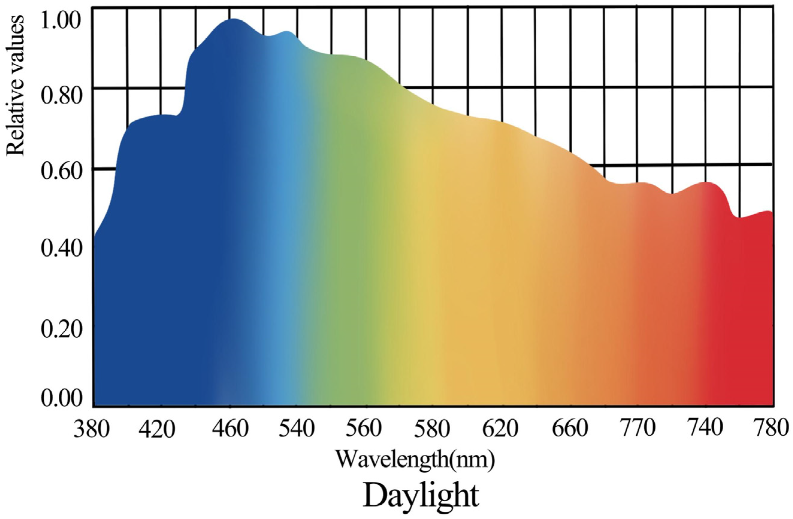
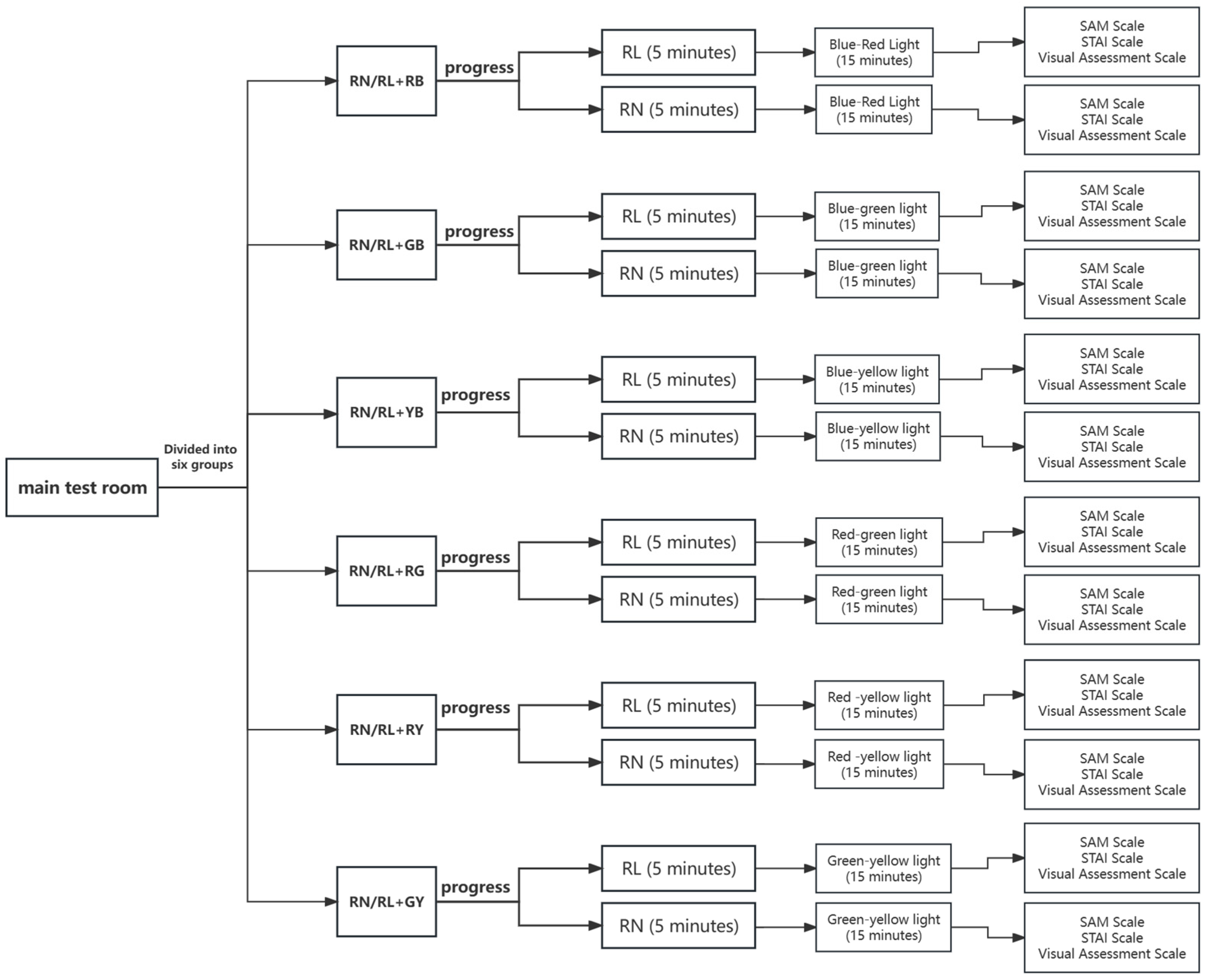
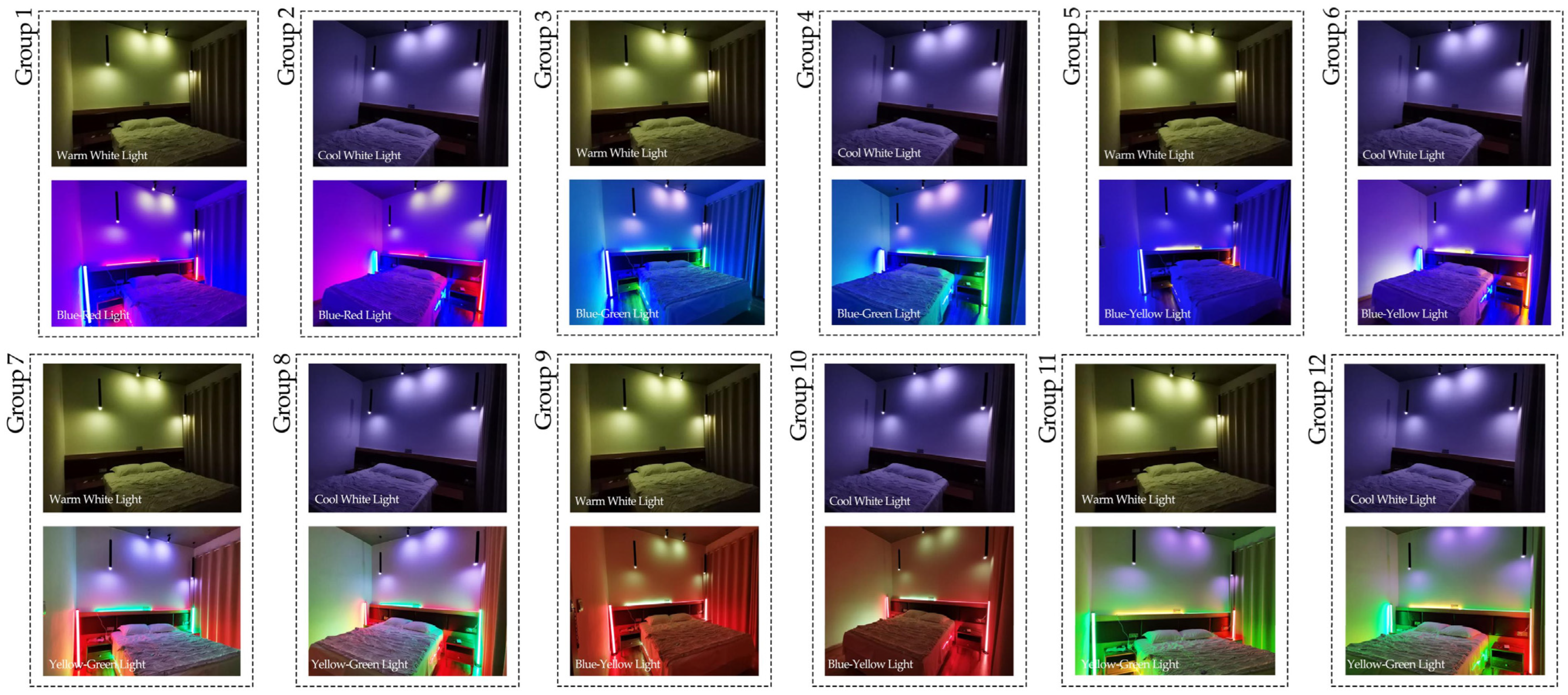
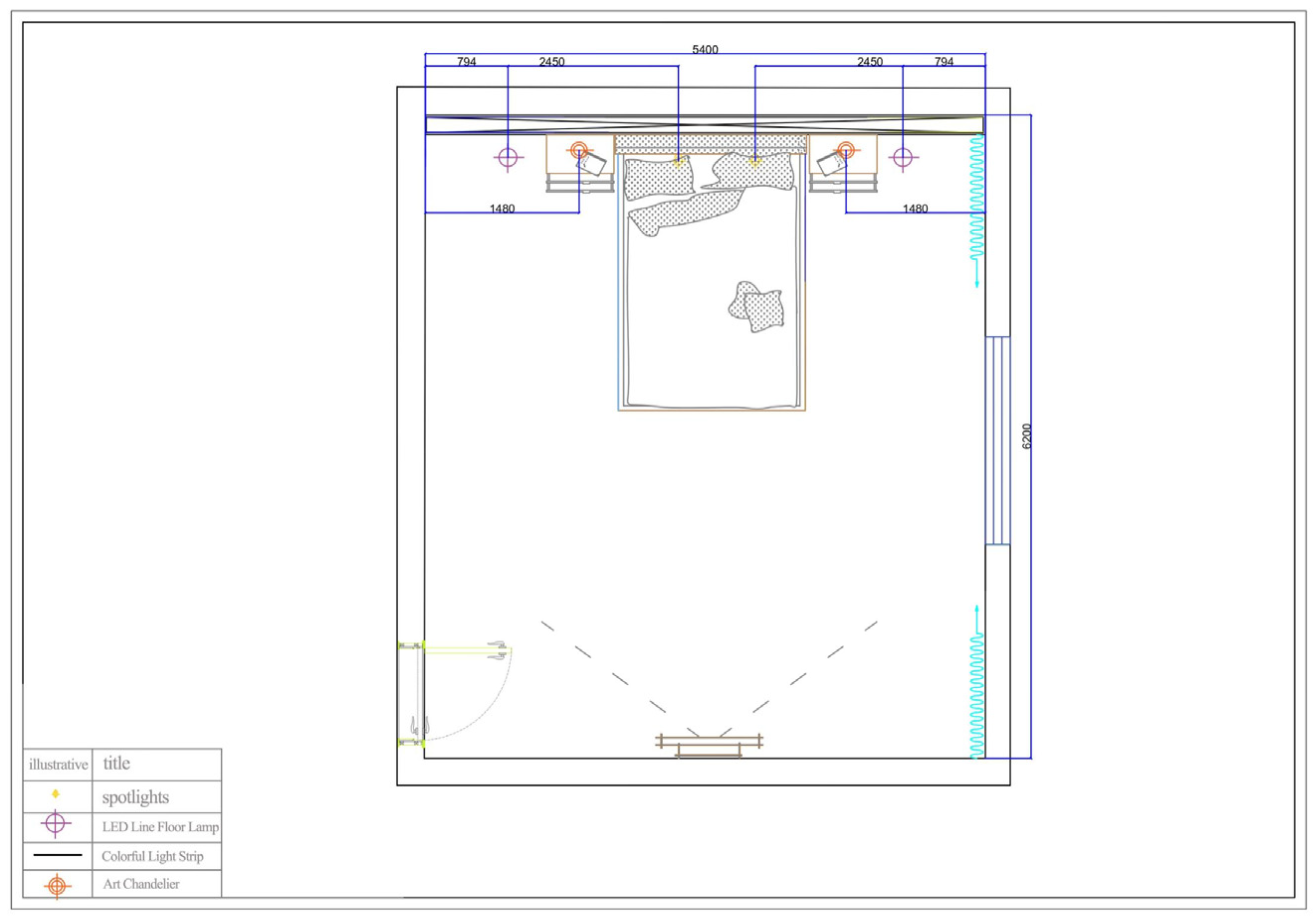
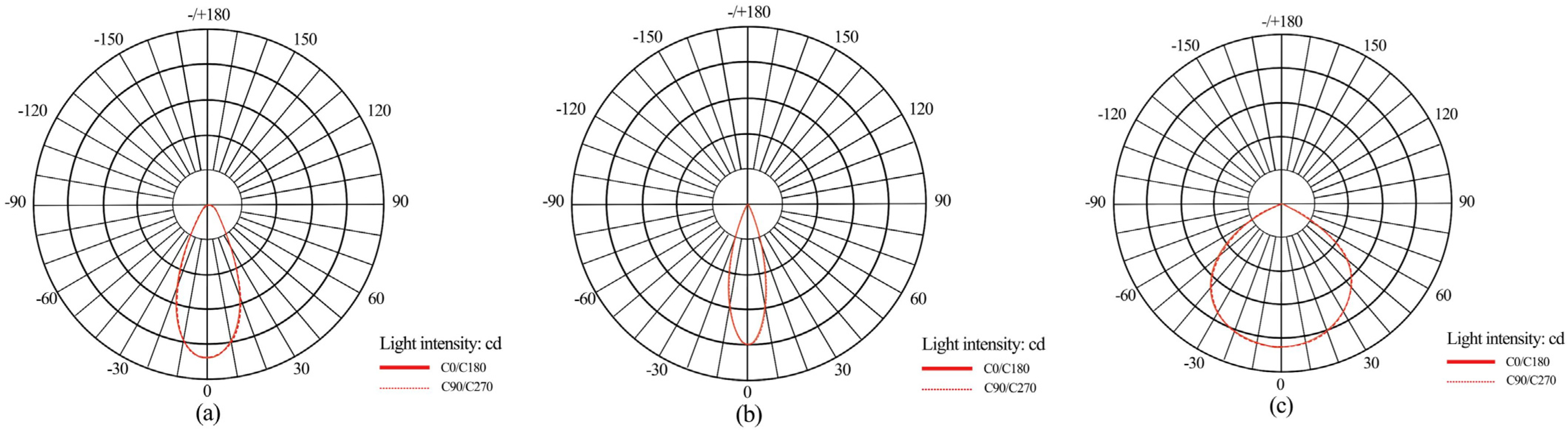
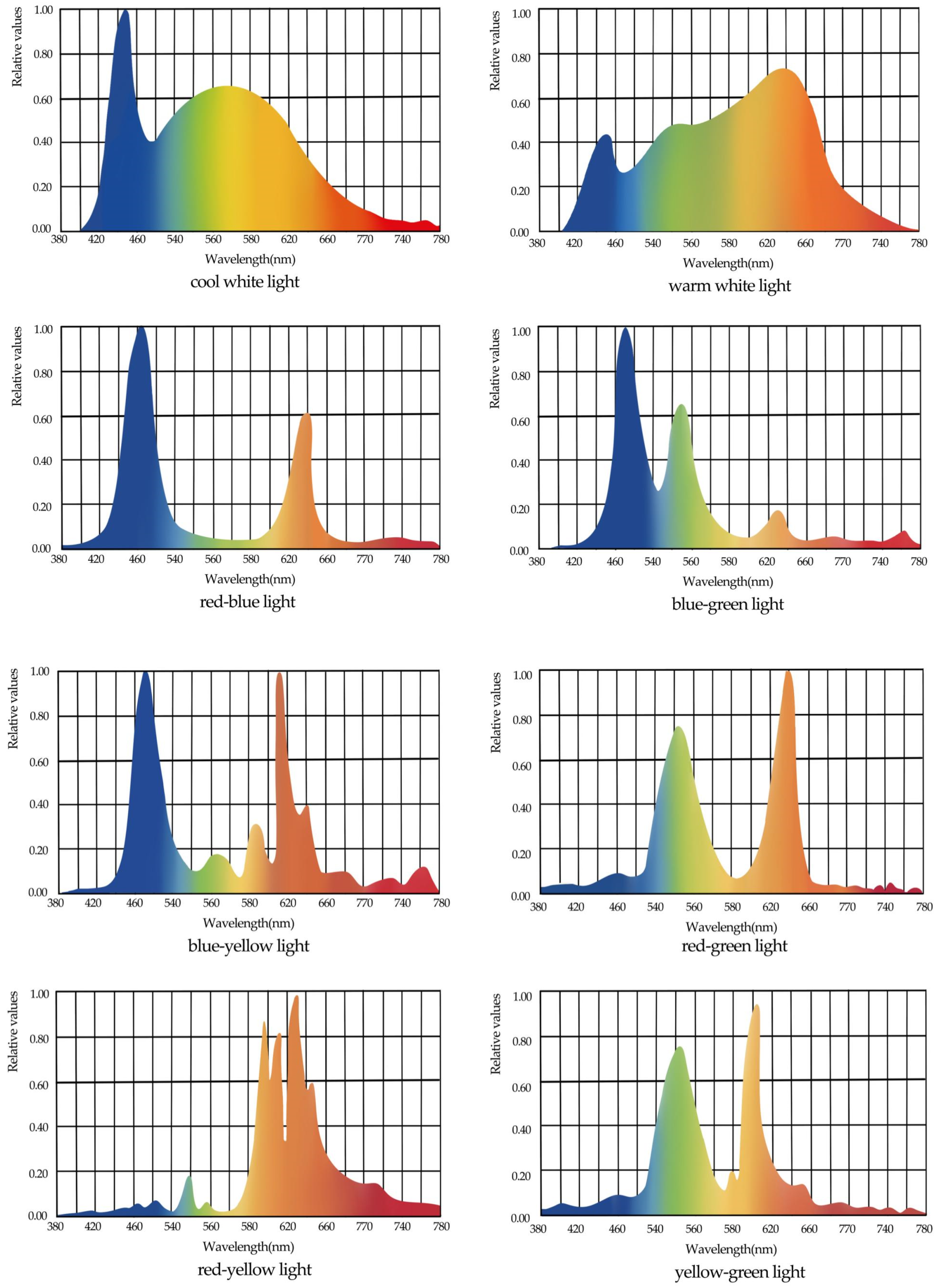
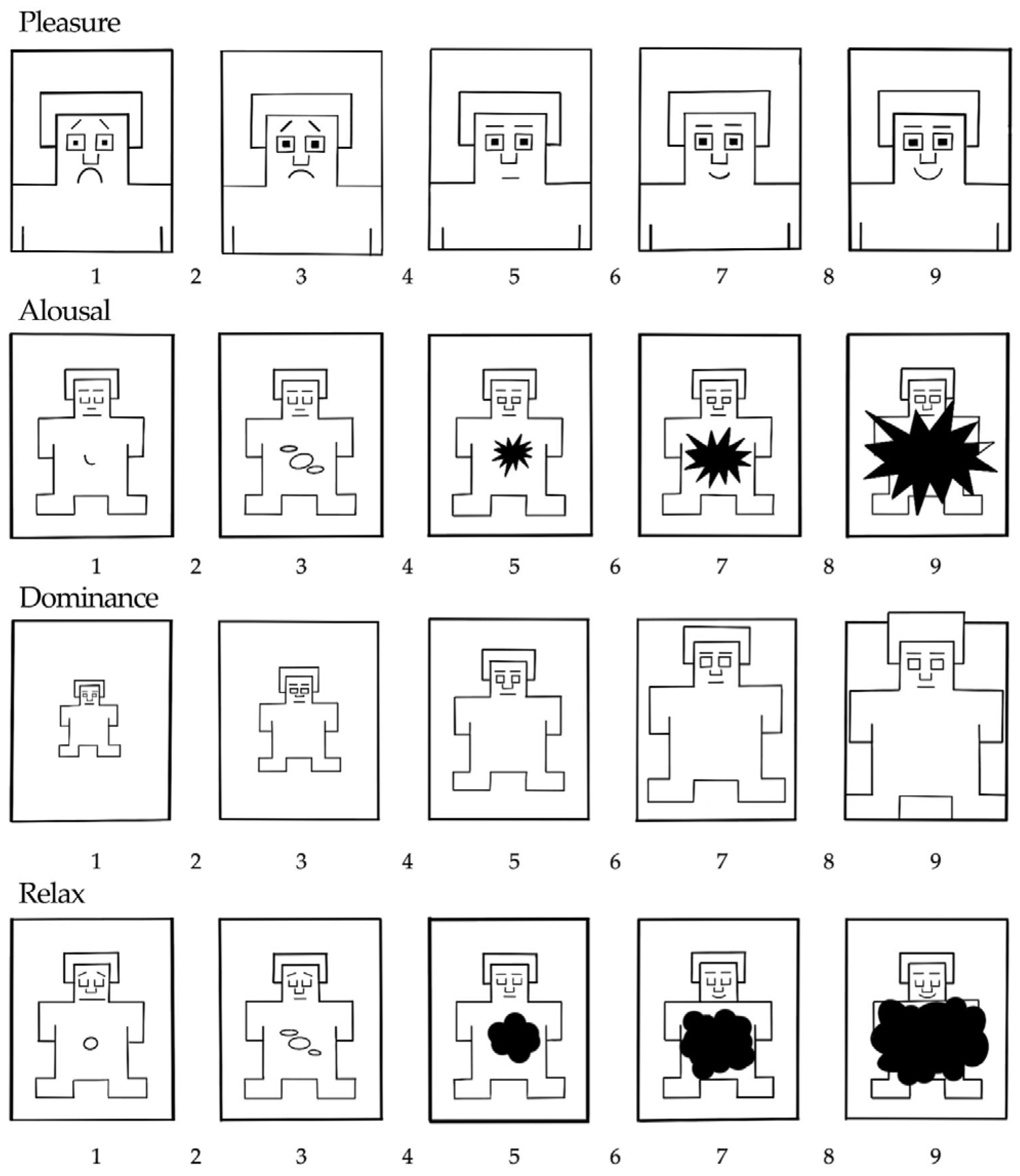
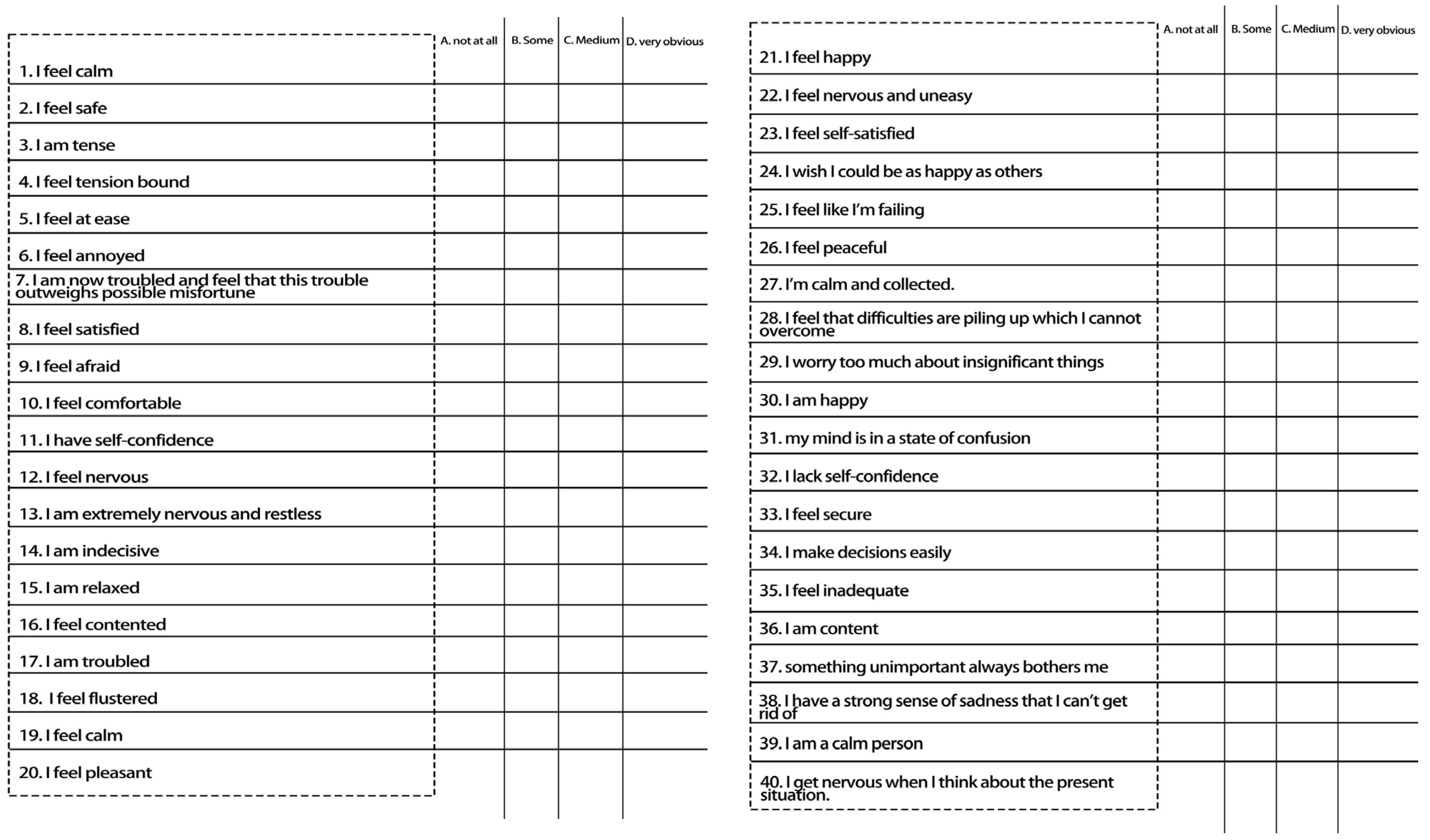
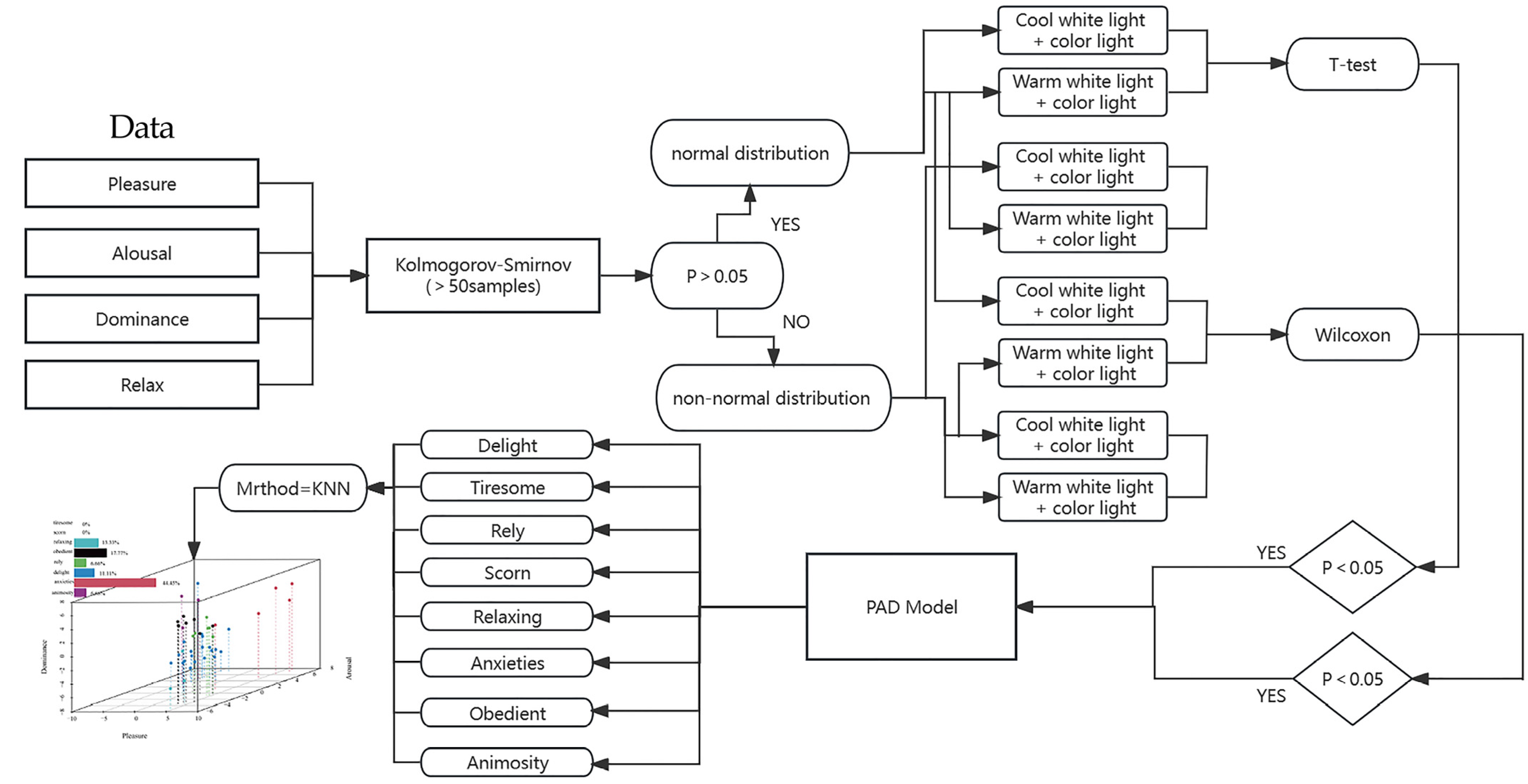
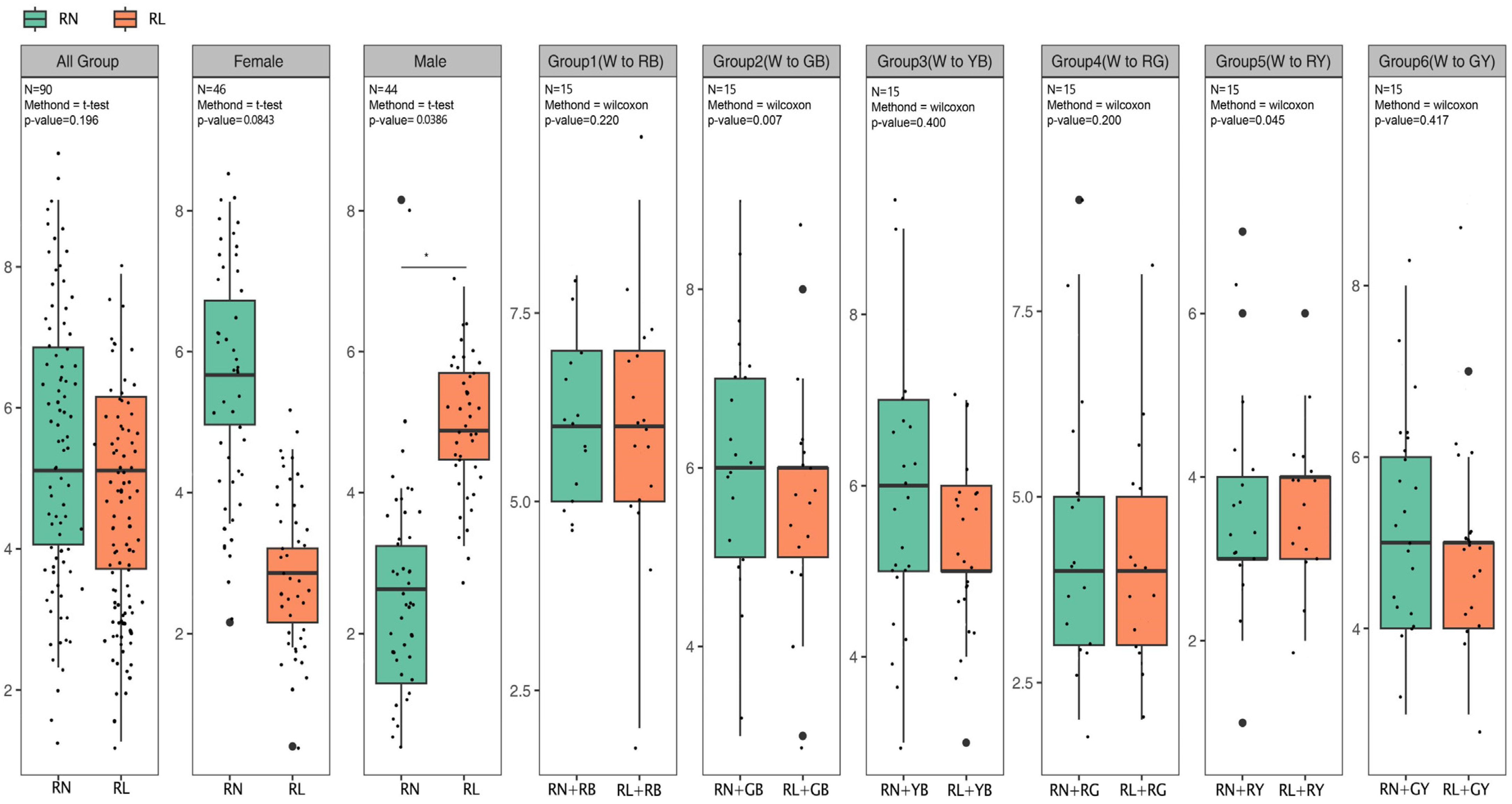
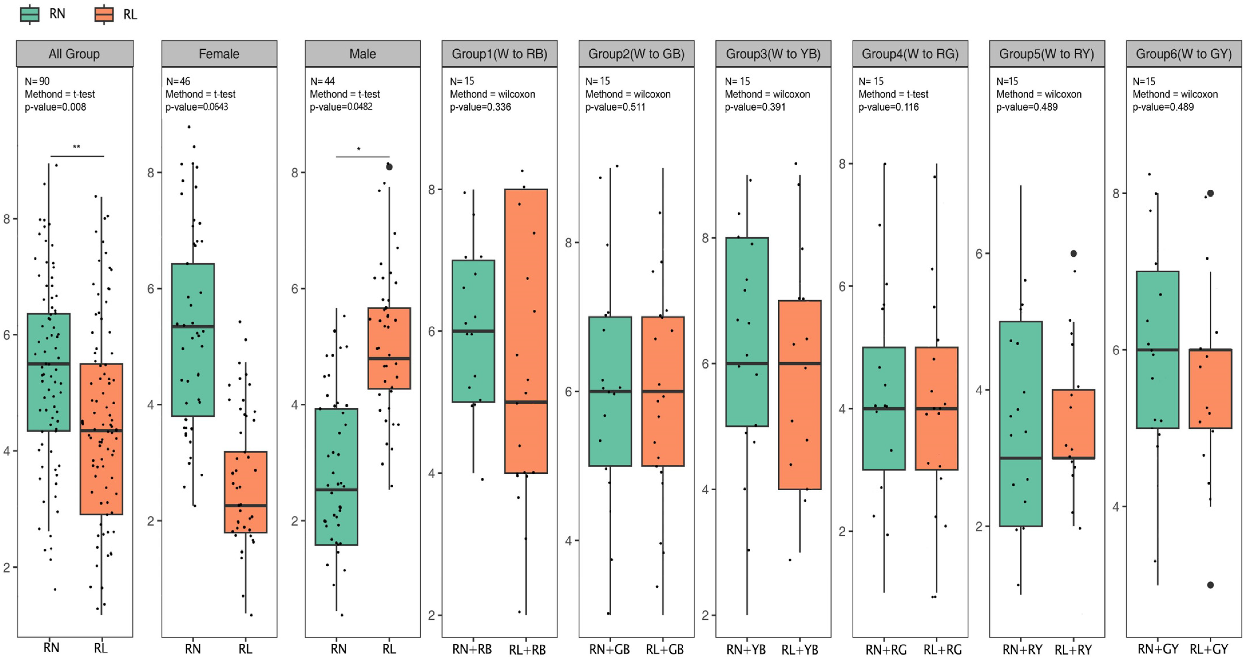
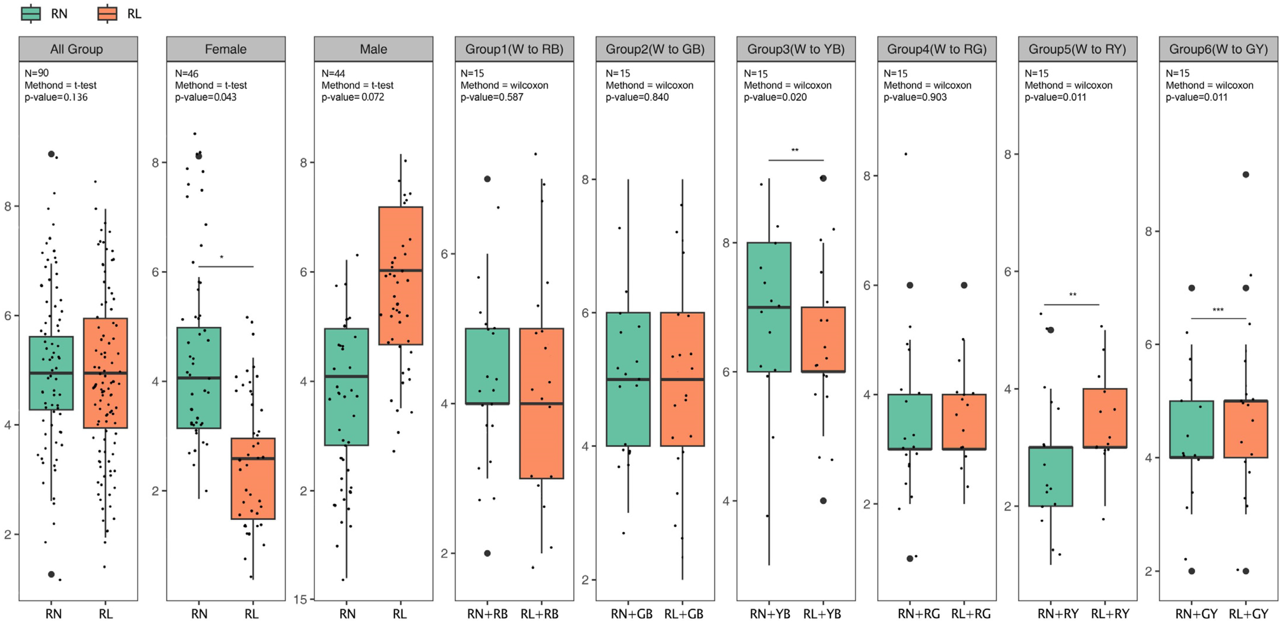
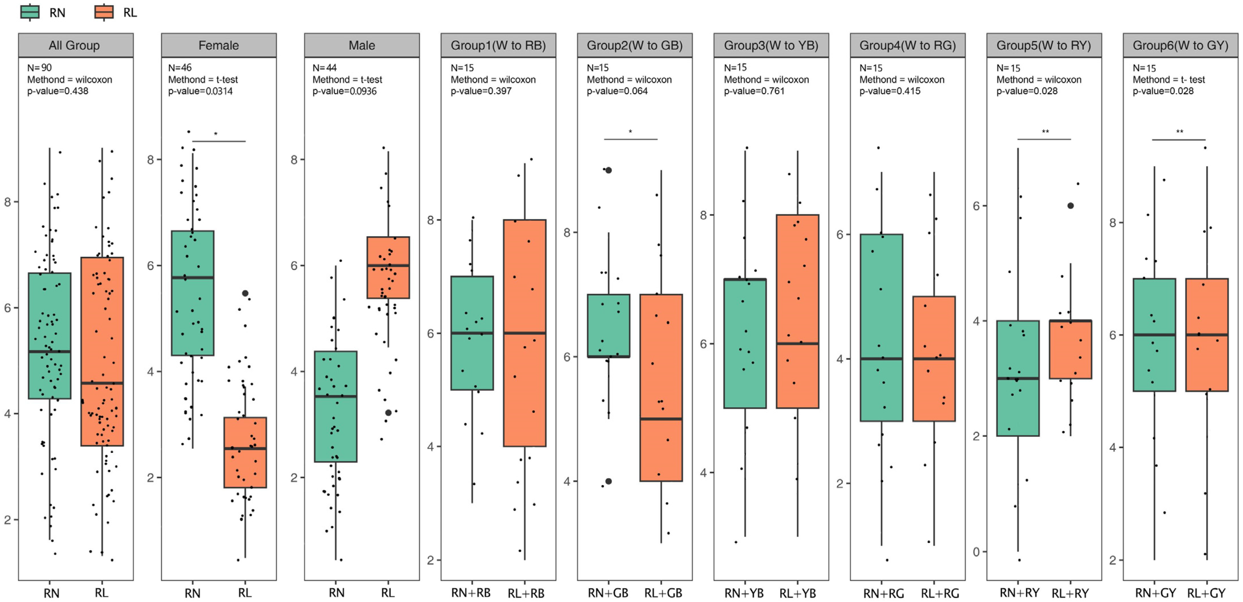
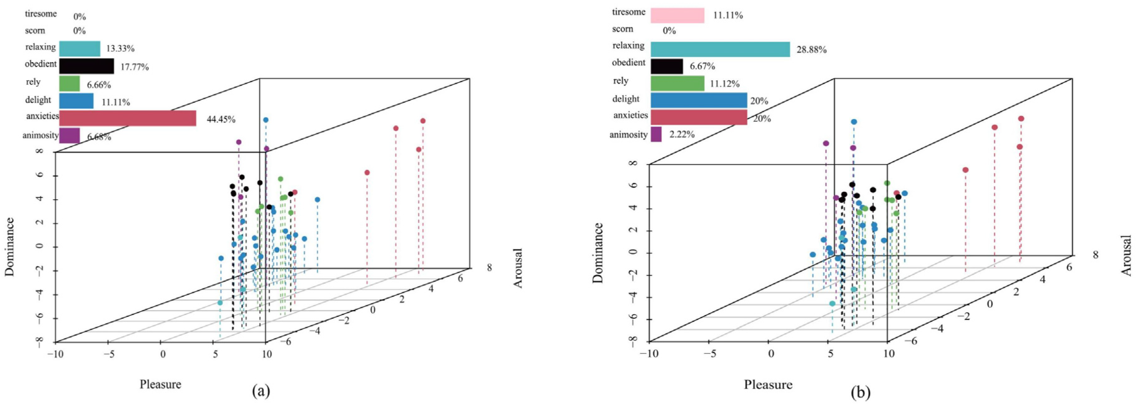
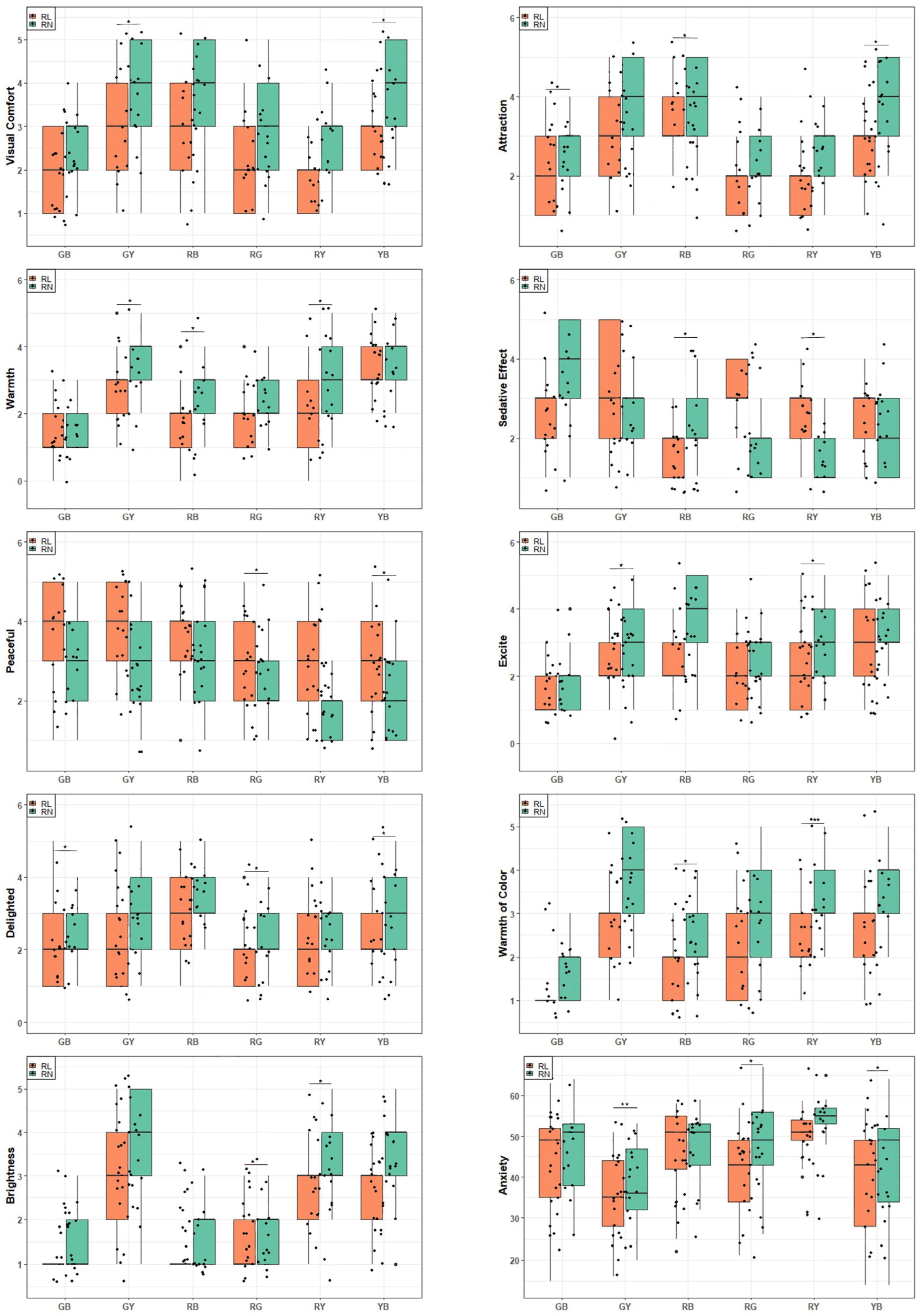
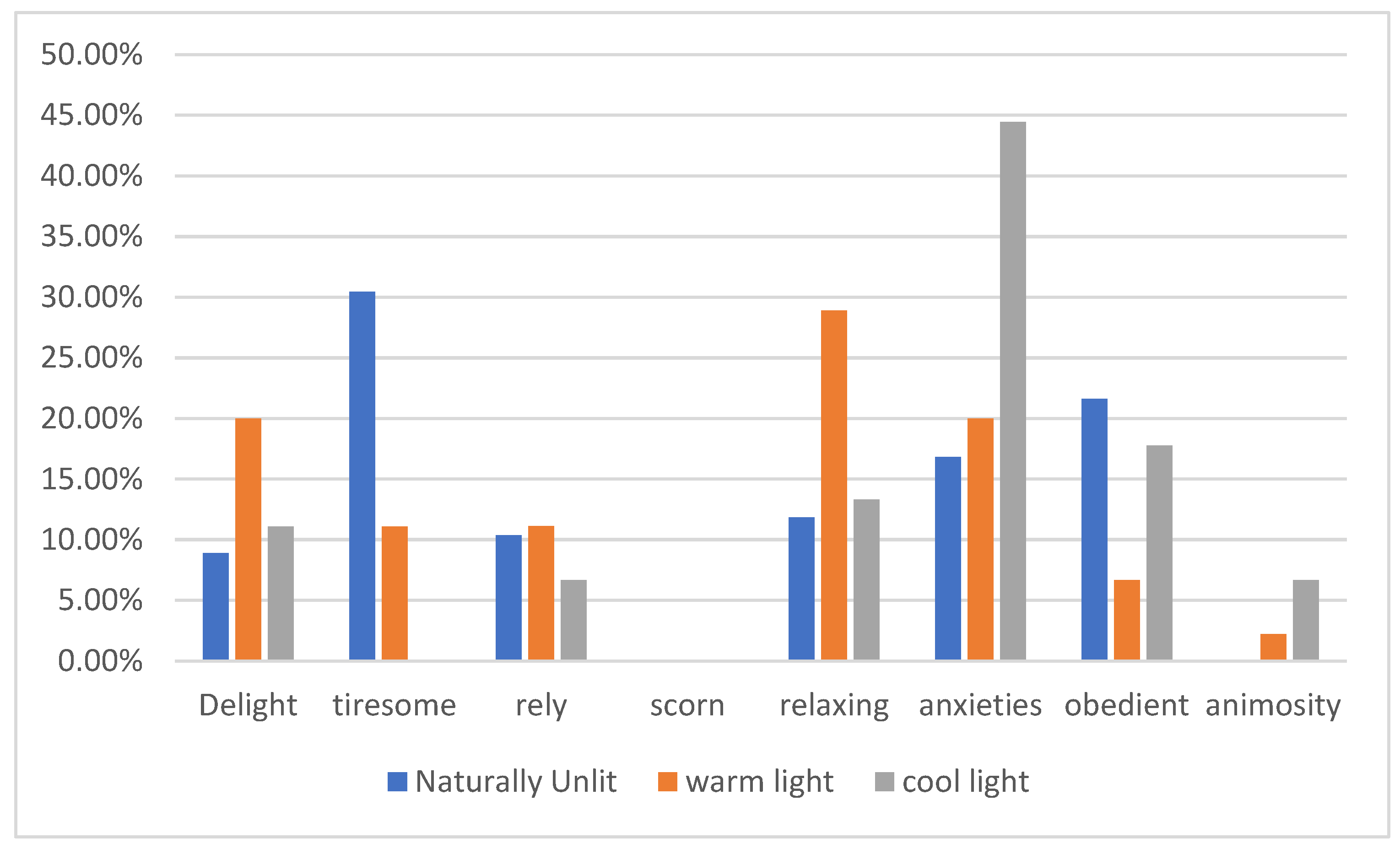
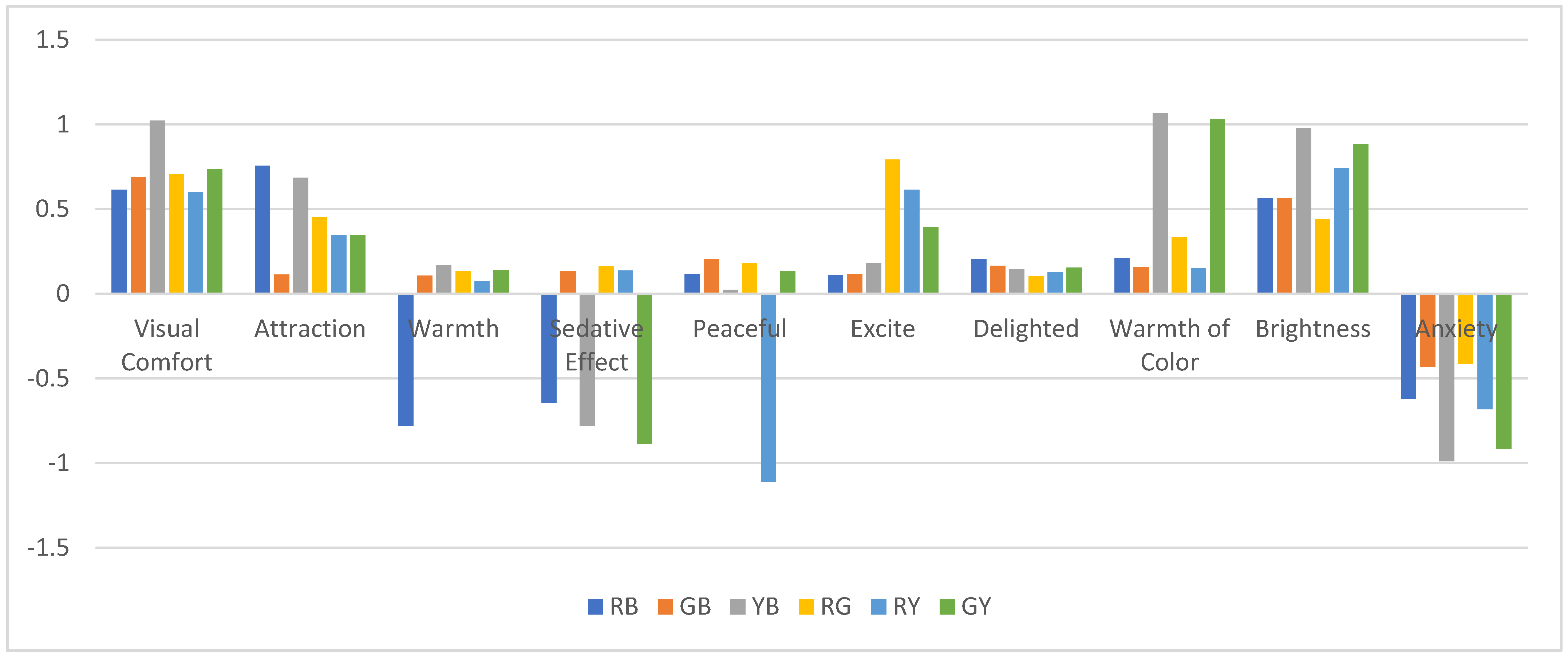
Table 1.
The selected parameters for the light source.
| LED Spotlight | Bedside Table Pendant Light | LED Strip | LED Strip Floor Lamp |
|---|---|---|---|
| CCT = 5300 K CCT = 3000 K CRI ≥ 80 220 V/50 Hz 800 LM 10 W | CCT = 6000 K CCT = 6500 K CRI ≥ 90 220 V/50 Hz 1000 LM 12 W | Color-Tunable (LED RGB) CRI ≥ 80 220 V/50 Hz 1200 LM 12 W | Color-Tunable (LED RGB) CRI ≥ 90. 220 V/50 Hz 1200 LM 12 W |
Abbreviations: Color Rendering Index (CRI).
Table 2.
Control and experimental group information table.
| Grouping | All Groups | Group I | Group II | Group III | Group IV | Group V | Group VI | |
|---|---|---|---|---|---|---|---|---|
| Males | 46 | 8 | 7 | 8 | 8 | 8 | 7 | |
| Females | 44 | 7 | 8 | 7 | 7 | 7 | 8 | |
| Age 18–30 | 36 | 6 | 6 | 6 | 6 | 6 | 6 | |
| Control subjects | Age 31–40 | 17 | 4 | 2 | 2 | 1 | 4 | 4 |
| Age 41–50 | 14 | 2 | 2 | 3 | 2 | 2 | 3 | |
| Age 51–60 | 15 | 2 | 4 | 2 | 2 | 3 | 2 | |
| Age over 60 | 8 | 2 | 1 | 2 | 1 | 1 | 1 | |
| Males | 44 | 8 | 7 | 7 | 7 | 8 | 7 | |
| Females | 46 | 7 | 8 | 8 | 8 | 7 | 8 | |
| Age 18–30 | 38 | 6 | 6 | 6 | 6 | 6 | 6 | |
| Experimental group | Age 31–40 | 18 | 4 | 2 | 2 | 4 | 4 | 4 |
| Age 41–50 | 12 | 2 | 2 | 2 | 2 | 2 | 2 | |
| Age 51–60 | 16 | 2 | 4 | 2 | 4 | 4 | 2 | |
| Age over 60 | 6 | 1 | 1 | 1 | 1 | 1 | 1 |
Table 3.
Values of the eight emotions in the emotion dimension.
| Emotion | Pleasure | Arousal | Dominance |
|---|---|---|---|
| Delight | 2.77 | 1.21 | 1.42 |
| Tiresome | −0.53 | −1.25 | −0.84 |
| Rely | 0.39 | −0.81 | −1.48 |
| Scorn | −1.58 | 0.32 | 1.02 |
| Relaxing | 2.19 | −0.66 | 1.05 |
| Anxieties | −0.95 | 0.32 | −0.63 |
| Obedient | 1.57 | −0.79 | 0.38 |
| Animosity | −2.08 | 1 | 1.12 |
Table 4.
Marginal means of visual assessment.
| Color | RN + RB | RL + RB | RN + GB | RL + GB | RN + YB | RL + YB | RN + RG | RL + RG | RN + RY | RL + RY | RN + GY | RL + GY |
|---|---|---|---|---|---|---|---|---|---|---|---|---|
| E.M S.E | E.M S.E | E.M S.E | E.M S.E | E.M S.E | E.M S.E | E.M S.E | E.M S.E | E.M S.E | E.M S.E | E.M S.E | E.M S.E | |
| Visual comfort | 3.69 0.17 | 2.91 0.12 | 2.58 0.14 | 1.89 0.12 | 2.53 0.17 | 1.93 0.12 | 2.98 0.16 | 2.02 0.12 | 2.53 0.17 | 1.93 0.12 | 3.78 0.16 | 2.93 0.17 |
| Attraction | 3.86 0.14 | 3.11 0.14 | 2.76 0.16 | 2.04 0.12 | 3.91 0.14 | 2.96 0.13 | 2.31 0.15 | 1.71 0.12 | 2.56 0.15 | 1.93 0.14 | 3.67 0.17 | 3 0.14 |
| Warmth | 2.51 0.16 | 1.73 0.13 | 1.58 0.1 | 1.29 0.81 | 3.51 0.15 | 3.29 0.16 | 2.44 0.14 | 1.78 0.12 | 3.09 0.18 | 2.11 0.15 | 3.23 0.15 | 2.62 0.14 |
| Sedative effect | 2.27 1.4 | 1.62 0.1 | 3.76 0.16 | 2.58 0.14 | 1.89 0.12 | 2.67 0.12 | 1.85 0.12 | 3.09 0.12 | 1.62 0.11 | 2.64 0.12 | 2.53 0.12 | 3.42 0.19 |
| Peaceful | 3.13 0.17 | 3.53 0.17 | 2.87 0.17 | 3.51 0.19 | 2.13 0.14 | 2.91 0.19 | 2.36 0.15 | 3.2 0.16 | 1.89 0.12 | 3 0.16 | 3.13 0.16 | 3.91 0.14 |
| Excite | 3.58 0.17 | 2.47 0.23 | 1.93 0.12 | 1.33 0.09 | 3.4 0.18 | 2.82 0.18 | 2.82 0.17 | 1.93 0.13 | 3.04 0.16 | 2.16 0.15 | 3.16 0.16 | 2.44 0.16 |
| Delighted | 3.29 0.16 | 2.71 0.17 | 2.42 0.17 | 2.33 0.17 | 3.33 0.18 | 2.47 0.16 | 2.2 0.14 | 1.73 0.12 | 2.73 0.15 | 2 0.14 | 3.13 0.19 | 2.13 0.14 |
| Warmth color | 2.47 0.15 | 1.76 0.12 | 1.6 0.1 | 1.24 0.65 | 3.49 0.17 | 2.42 0.14 | 2.8 0.15 | 2.02 0.13 | 3.29 0.17 | 2.18 0.12 | 3.89 0.15 | 2.76 0.14 |
| Brightness | 1.82 0.11 | 1.22 0.63 | 1.62 0.11 | 1.22 0.06 | 3.67 0.16 | 2.71 0.11 | 1.89 0.11 | 1.44 0.81 | 3.42 0.16 | 2.47 0.15 | 3.71 0.15 | 2.88 0.16 |
| Anxiety | 47.11 1.41 | 46.69 1.54 | 46.11 1.5 | 44.38 1.61 | 44.11 1.77 | 38.42 1.78 | 48.22 1.35 | 41.15 1.48 | 53.84 0.96 | 48.96 1.08 | 38.27 1.48 | 35.18 1.53 |
RN is warm white, RL is cool white, RB is blue–red, GB is blue–green, YB is yellow–blue, RG is red–green, RY is red–yellow and GY is green–yellow.
Table 5.
Results of correlation analysis of visual variables under six groups of cool and warm white + color light.
Table 5.
Results of correlation analysis of visual variables under six groups of cool and warm white + color light.
| Color | RB | GB | YB | RG | RY | GY | ||||||||||||
|---|---|---|---|---|---|---|---|---|---|---|---|---|---|---|---|---|---|---|
| Est | S.E | p | Est | S.E | p | Est | S.E | p | Est | S.E | p | Est | S.E | p | Est | S.E | p | |
| Visual comfort | 0.114 | 0.778 | 0.049 | 0.689 | 0.83 | 0.052 | 1.022 | 0.144 | 0.005 | 0.706 | 0.956 | 0.078 | 0.6 | 0.863 | 0.183 | 0.737 | 0.844 | 0.034 |
| Attraction | 0.756 | 0.115 | 0.001 | 0.113 | 0.711 | 0.961 | 0.684 | 0.956 | 0.002 | 0.451 | 0.6 | 0.135 | 0.348 | 0.622 | 0.064 | 0.346 | 0.667 | 0.065 |
| warmth | −0.778 | 0.083 | 0.539 | 0.108 | 0.289 | 0.843 | 0.168 | 0.222 | 0.032 | 0.135 | 0.667 | 0.067 | 0.074 | 0.978 | 0.071 | 0.14 | 0.933 | 0.096 |
| Sedative effect | −0.644 | 0.085 | 0.763 | 0.136 | 1.178 | 0.031 | −0.778 | 0.149 | 0.065 | 0.163 | −1.24 | 0.052 | 0.137 | −1.12 | 0.096 | −0.889 | 0.223 | 0.035 |
| Peaceful | 0.116 | 0.4 | 0.877 | 0.206 | −0.462 | 0.046 | 0.023 | −0.778 | 0.031 | 0.18 | −0.84 | 0.034 | −1.11 | 0.199 | 0.061 | 0.134 | 0.13 | 0.026 |
| Excited | 0.204 | −1.111 | 0.014 | 0.116 | 0.6 | 0.033 | 0.181 | 0.578 | 0.027 | 0.792 | 0.889 | 0.049 | 0.615 | 0.658 | 0.037 | 0.393 | 0.712 | 0.048 |
| Delighted | 0.112 | −0.58 | 0.033 | 0.164 | 0.889 | 0.572 | 0.144 | 0.867 | 0.038 | 0.103 | 0.467 | 0.037 | 0.129 | 0.734 | 0.049 | 0.154 | 0.142 | 0.069 |
| Warmth color | 0.211 | 0.068 | 0.657 | 0.156 | 0.908 | 0.963 | 1.067 | 0.086 | 0.024 | 0.334 | 0.778 | 0.067 | 0.15 | 1.111 | 0.034 | 1.031 | 0.603 | 0.049 |
| Brightness | 0.564 | 0.6 | 0.613 | 0.565 | 0.4 | 0.651 | 0.978 | 0.956 | 0.048 | 0.44 | 0.929 | 0.061 | 0.744 | 0.956 | 0.026 | 0.882 | 0.911 | 0.015 |
| Anxiety | −0.622 | 0.298 | 0.715 | −0.43 | 0.906 | 0.033 | −0.989 | 1.006 | 0.046 | −0.413 | 1.275 | 0.073 | −0.681 | 0.799 | 0.021 | −0.916 | 0.373 | 0.037 |
RB is blue–red, GB is blue–green, YB is yellow–blue, RG is red–green, RY is red–yellow and GY is green–yellow. Est = estimated; SE = standard error; significant differences are in bold.
Disclaimer/Publisher’s Note: The statements, opinions and data contained in all publications are solely those of the individual author(s) and contributor(s) and not of MDPI and/or the editor(s). MDPI and/or the editor(s) disclaim responsibility for any injury to people or property resulting from any ideas, methods, instructions or products referred to in the content. |
© 2023 by the authors. Licensee MDPI, Basel, Switzerland. This article is an open access article distributed under the terms and conditions of the Creative Commons Attribution (CC BY) license (https://creativecommons.org/licenses/by/4.0/).
Share and Cite
MDPI and ACS Style
Wei, Y.; Zhang, Y.; Wang, Y.; Liu, C. A Study of the Emotional Impact of Interior Lighting Color in Rural Bed and Breakfast Space Design. Buildings 2023, 13, 2537. https://0-doi-org.brum.beds.ac.uk/10.3390/buildings13102537
AMA Style
Wei Y, Zhang Y, Wang Y, Liu C. A Study of the Emotional Impact of Interior Lighting Color in Rural Bed and Breakfast Space Design. Buildings. 2023; 13(10):2537. https://0-doi-org.brum.beds.ac.uk/10.3390/buildings13102537
Chicago/Turabian StyleWei, Yangyang, Yuan Zhang, Yihan Wang, and Chajuan Liu. 2023. "A Study of the Emotional Impact of Interior Lighting Color in Rural Bed and Breakfast Space Design" Buildings 13, no. 10: 2537. https://0-doi-org.brum.beds.ac.uk/10.3390/buildings13102537
Note that from the first issue of 2016, this journal uses article numbers instead of page numbers. See further details here.