Article

Virtual Reality-Based Parallel Coordinates Plots Enhanced with Explainable AI and Data-Science Analytics for Decision-Making Processes

by
Szymon Bobek
1,*,†,
Sławomir K. Tadeja
1,2,†,
Łukasz Struski
3,
Przemysław Stachura
3,
Timoleon Kipouros
2,
Jacek Tabor
3,
Grzegorz J. Nalepa
1 and
Per Ola Kristensson
2
1
Institute of Applied Computer Science, Jagiellonian University in Kraków, 30-348 Krakow, Poland
2
Department of Engineering, University of Cambridge, Cambridge CB2 1PZ, UK
3
Faculty of Mathematics and Computer Science, Jagiellonian University in Kraków, 30-348 Krakow, Poland
*
Author to whom correspondence should be addressed.
These authors contributed equally to this work.
Submission received: 16 November 2021 / Revised: 16 December 2021 / Accepted: 25 December 2021 / Published: 30 December 2021
(This article belongs to the Special Issue Visual Analytics for Multidisciplinary Engineering Design)

Abstract

:
We present a refinement of the Immersive Parallel Coordinates Plots (IPCP) system for Virtual Reality (VR). The evolved system provides data-science analytics built around a well-known method for visualization of multidimensional datasets in VR. The data-science analytics enhancements consist of importance analysis and a number of clustering algorithms including a novel SuMC (Subspace Memory Clustering) solution. These analytical methods were applied to both the main visualizations and supporting cross-dimensional scatter plots. They automate part of the analytical work that in the previous version of IPCP had to be done by an expert. We test the refined system with two sample datasets that represent the optimum solutions of two different multi-objective optimization studies in turbomachinery. The first one describes 54 data items with 29 dimensions (DS1), and the second 166 data items with 39 dimensions (DS2). We include the details of these methods as well as the reasoning behind selecting some methods over others.

1. Introduction

Parallel Coordinates Plots (PCP) [1] is a well-known technique for the visualization and analysis of complex multidimensional datasets. However, it requires experience from the user in interpreting PCP output and often a deep domain knowledge in the subject of analysis in order to extract meaningful conclusions and new knowledge. Therefore, methods that aid experts and users in the process of analyzing the PCP visualization and developing a new understanding of a decision-making process are needed. Thus, in this paper, we present a refinement of a previously developed system called Immersive Parallel Coordinates Plots (IPCP) [2,3,4], which is now augmented with new and improved functionality. In our case, data visualization is presented to the user with the help of an interactive and fully immersive Virtual Reality (VR) interface. A previous exploratory and qualitative study carried out using the first version of IPCP demonstrated that users were able to successfully detect patterns in high-dimensional datasets visualized as-is [2,3,4], that is, without any prior analysis or data cleaning, using the IPCP system (see Figure 1) combined with a simple naive clustering algorithm applied to cross-dimensional 3D scatter plots data [2,3,4]. However, this basic IPCP system allowed users to rediscover the knowledge; specifically, patterns with the data items previously found by the domain experts and, more importantly, users were able to discover new knowledge in the dataset compared to original analyses carried out by experts using a more traditional 2D PCP system [3,4].
In comparison, the version presented in this paper has been extended with features and improvements of functionality bestowed by the IPCP [3,4] and supporting 3D scatter plots. Similar to prior work [3,4] we rely on two datasets to drive the system development process, which we will refer to as the Pareto front data (54 data items with 29 dimensions each) as dataset DS1 and the S-duct design optimization study (166 data items with 39 dimensions each) as dataset DS2.
There were two goals with the refinement of the system: (1) to better assist the user in the identification of clusters of data points in the scatter plots; (2) to help the user identify meaningful axes in the IPCP.
For the first goal, the system assumes clustering is performed only in three dimensions selected by the user to generate the scatter plot. This assumption is justified by the fact that clustering over a scatter plot’s data is meant to assist the user in inspecting the dataset, and, as a consequence, the clustering algorithm should not be applied to all dimensions as it causes interpretation problems if, for example, many axes contain merely noise or redundant data. We tested several clustering algorithms and concluded that only the Ordering Points to Identify Cluster Structure (OPTICS) [5], Density-Based Spatial Clustering of Applications with Noise (DBSCAN) [6], and Affinity Propagation [7] are sufficiently robust to work on our data, as they allow for automatic noise removal.
Furthermore, we applied to our data another clustering method called Subspace Memory Clustering (SuMC) [8]. This novel clustering algorithm is based on lossy compression and the Minimal Description Length Principle (MDLP), i.e., inductive inference. It looks for low-dimensional subspaces by minimizing the squared error (MSE) while keeping the total amount of memory fixed that it can use to describe the data.
For the second goal, we investigated two independent methods for generating explanations of axis importance. These were: (1) scoring the axis according to their correlations with other axes, favoring those that are not correlated; (2) using EXplainable Artificial Intelligence (XAI) methods to get an idea of which features are important in the current clustering with use of two interpretation methods, including (2a) logistic regression as a classifier and then Least Absolute Shrinkage and Selection Operator (LASSO) to detect important features, and (2b) random forest for classification to discover important features of the model. We included the details of these analyses as well as the reasoning behind selecting some methods over others.
In addition, instead of using hand-held controllers, this system iteration explores gaze-tracking coupled with hand-tracking supported by an additional sensor, namely the Leap Motion Sensor [9] attached to the VR head-mounted display to track and recognize the user’s hand gestures.

2. Related Work

To date, numerous attempts have been made to design and develop not only visually compelling but also an effective 3D PCP version. Here it is worth mentioning the work carried out in [10,11,12,13,14,15,16].
Furthermore, there are also a number of studies concerning the augmentation of PCP with other types of graphical and analytical aids. For instance, after describing various kinds of potential extensions of 2D PCP which goal was to aid the process of identifying patterns, Holten et al. [17] concludes that having additional scatter plots brings an added value. Dang et al. [18] describes Parallel Coordinate Dot Plots constructed out of 3D dots whereas Chang et al. [19] investigated individual and side-by-side visualization of 2D PCP and 2D scatter plot matrices of multivariate data. The authors remarked that joint visualization of these two techniques potentially has the most benefits for the users. Moreover, Johansson et al. [20] carried out a comparative study of 3D with 2D PCP that showed that the 2D version outperforms the 3D PCP. However, their study was executed using a standard computer screen and not an immersive interface such as the one bestowed by a VR headset.
The list of IPCP includes Rosenbaum et al. [21] in which the authors developed a system treating the user as a part of the visualization. Butscher et al. [22] describes a tool, i.e., the ART for collaborative data analysis leveraging the 3D PCP technique coupled with the AR environment. Cordeil et al. [23] discuss the VR-based ImAxes system for immersive analytics of multivariate data and propose a declarative spatial grammar to formalize the way in which the VR visualizations are generated and built upon [23]. Whereas Batch et al. [24] used the ImAxes software to conduct a case study in economics involving expert participants.
The way in which our implementation varied from the examples listed above was discussed in detail in Tadeja et al. [2,3,4]. However, the IPCP design presented in this paper was refined based on our prior findings revealed by the user studies [2,3,4]. For instance, we restricted the number of available 3D scatter plots to only one. This is due to the fact that having one such scatter plot composed of the criteria dimensions was enough to make an exhaustive search of the cluster given the exploration method suggested to the users [2,3,4]. Moreover, as the users can now use their hands [4,9] to manipulate the IPCP and scatter plot alike, they are no longer relying on any type of hand-held controller to select the interactive objects, and the movement facilitated with the controllers was also restricted to the head-mounted display (HMD)-tracking executed with the Oculus Rift sensors [25].

3. Datasets

Both datasets considered in this study were produced from separate multi-objective optimization processes for the aerodynamic performance improvements of different turbomachinery components.
The first dataset is the result of a design optimization study for the 3D geometrical shape of compressor blades of a jet engine [26]. This design problem is described with 26 design variables, and it is subject to many equality and inequality constraints considering the simultaneous optimization of three objective functions. The dataset represents the Pareto fronts containing a set of 54 equally optimum design configurations, and the 29 dimensional data items express the combination of the design parameters and the objective functions.
The second dataset represents the design configurations of the Pareto set as discovered from a multi-objective optimization study for the shape design of S-ducts [27]. In this study were considered three objective functions to describe in detail the aerodynamic behavior and 36 design variables to describe the 3D geometrical changes of the S-duct. There are 166 data items with 39 dimensions per element.

4. Data-Science Analytics

The main goal of the data analytics was to design a methodological pipeline that would assist the user in identifying interesting patterns in the data. The pipeline was designed to complement the visual enhancements achieved with 3D projections and VR. One of the main assumptions about IPCP is that it should help the user gain more knowledge about the data. The knowledge can be understood in terms of the identification of interesting patterns in the data. Here, we can look at the data in three ways.
First and foremost, we are concerned about identifying patterns of similar data items on the IPCP. Second, this task can be supported by finding clusters of similar data points on the 3D scatter plot generated out of three dimensions (axes) of the IPCP. Third, the IPCP axes, i.e., the data dimensions or features that are carriers of unique information (i.e., are not redundant), can be identified and ordered accordingly. The three main goals were defined as follows: (Goal 1—G1) aid the user in data clusters identification in the 3D scatter plot; (Goal 2—G2) provide explanations for cluster assignments made by the user or by an algorithm; (Goal 3—G3) identify features that may carry the most information and hence are potentially interesting to the user.
In the following paragraphs, we will discuss our research regarding achieving the three goals mentioned above.

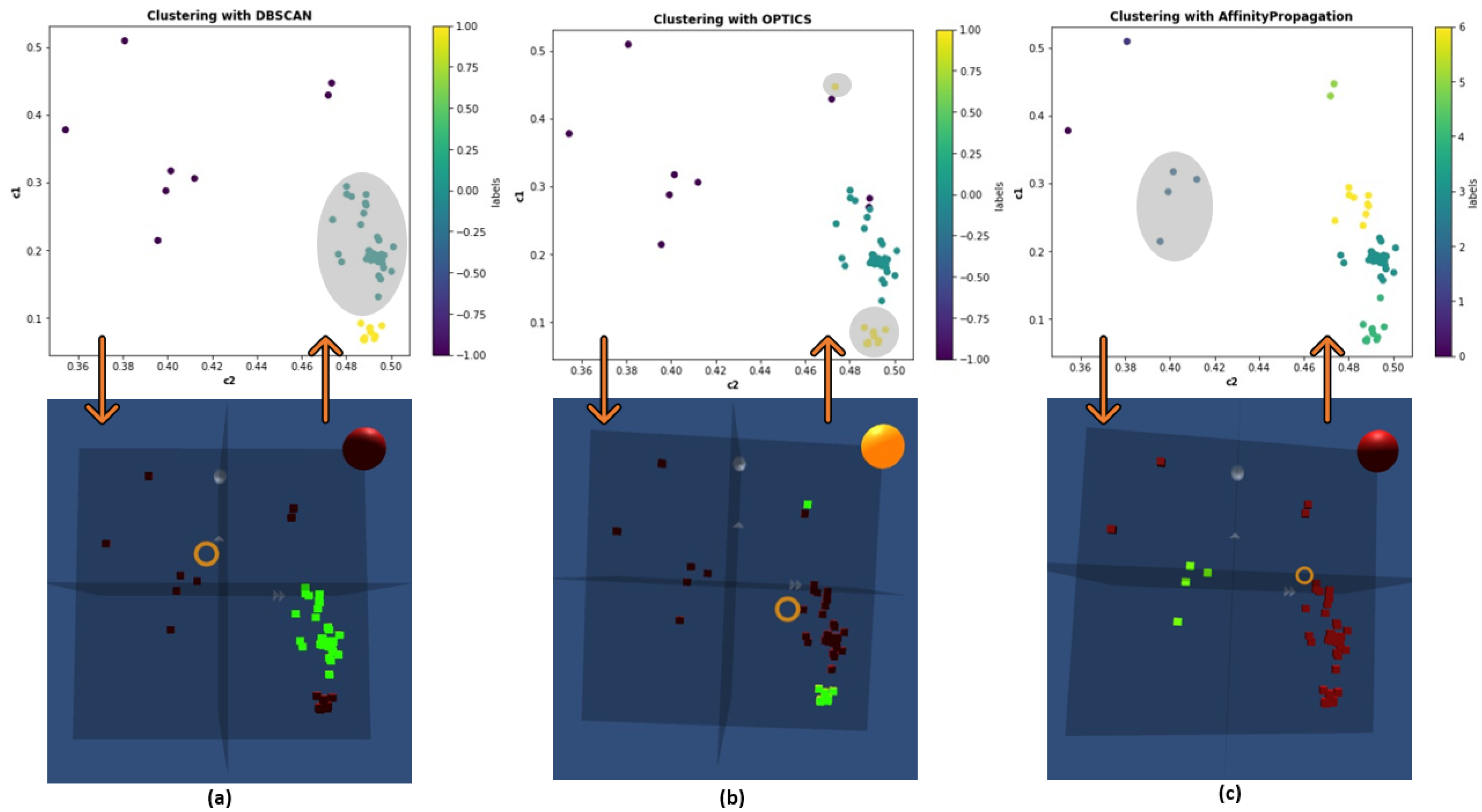
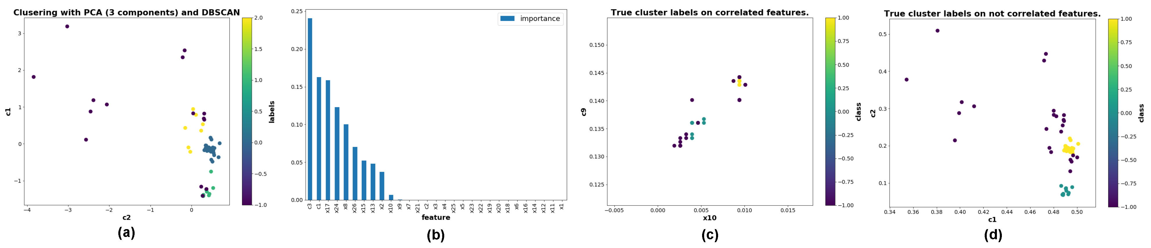
4.1. Goal 1—Cluster Identification

In G1 we addressed the first issue. In our approach, the user performs cluster identification in the 3D space of previously selected features. The user has access to 3D scatter plot of the points in this space and manually annotates data with cluster labels. During this phase, implicitly, the user detects a noise, which is not assigned to any of the created clusters.
We aimed at improving this stage by providing the user with an option of automatic cluster identification in a selected 3D space. In order to do that, we tested multiple clustering algorithms from the sklearn library [28] are evaluated them in the first approach against true cluster labels that we obtained from experts. Table 1 contains a comparison of tested algorithms in terms of homogeneity (each cluster contains only members of a single class), completeness (all members of a given class are assigned to the same cluster), and V-measure (harmonic mean of homogeneity and completeness) [29]. This allowed us to select potential candidates for further research and discard methods that did not perform well.
The main challenge in the data was that it contained noise, which is not handled well by most of the clustering algorithms. This narrowed us to three main clustering algorithms: DBSCAN [6], OPTICS [5], and Affinity Propagation [7] as they can handle noise by design. The results of the clustering sample dataset with these algorithms are presented in Figure 2.
The most important parameters that the user needs to specify in order to obtain correct results are ϵ and m i n _ s a m p l e s . First, define the maximal distance between points in order to merge them into one cluster. The latter defines how many points are required to form a cluster. These parameters have to be defined by the user either as a trial of tests, or with expert knowledge about the data characteristics such as noise density, cluster densities, or upper and lower bound of the possible number of clusters. In this paper, we used fixed values for all the datasets in order not to distract the user from the main evaluation goal.
Our primary aim in integrating machine learning with human interaction was to assist and not to replace the user. Hence, the clustering has to be made on the three IPCP dimensions selected by the user. Applying clustering algorithms to the whole dataset could result in cluster assignments that are not intuitive to the user as it does not align with clusters visible in 3D scatter plots. It does not mean that the clustering is incorrect, but it violates the primary goal of assisting the users in their decisions, not altering them.
Nonetheless, we performed tests of clustering dataset in all the dimensions, and after dimensionality reduction with the usage of Principal Component Analysis (PCA) [30]. This approach is based on lossy transformation to low-dimensional space by selecting new features defined by vectors along which the dataset exhibits the highest variance and discarding those with low variance levels.
We obtained similar results as in the case of clustering in 3D if the user selected the correct criterion. In instances where clusters cannot be approximated with the usage of 3D scatter plots, approaches that apply clustering in the entire feature space may be more desired. Figure 3a shows the 2D projection of clustering results in 3D space after applying PCA and selecting three main components.
In addition to these clustering results, we have also employed a state-of-the-art SuMC [8] clustering solution that belongs to the class of methods called subspace clustering [31]. The poor performance of the standard clustering algorithms applied to high-dimensional datasets is usually caused by curse of dimensionality [32]. The typical attempt in solving this issue is the application of some form of dimension reduction on the given dataset. These can be grouped in the feature selection and feature extraction methods. A well-known example of the latter is the PCA [30] method that we have previously applied in order to test other clustering algorithms on our datasets (see Figure 3a). In comparison, the SuMC method was specifically designed to deal with high-dimensional data without relying on dimension reduction as one of its steps. This method belongs to the so-called hard subspace clustering techniques whose main goal is to indicate the explicit subspaces to which the identified clusters belong.
We have deployed the SuMC method on various hand-selected subsets of DS1 and DS2 choosing 3, 5, and 7 as the number of desired clusters. As the SuMC is designed to operate on high-dimensional datasets we have run the method on the full datasets, as well as on subsets consisting only of criteria or design parameters for each dataset. In the case of both datasets, the criteria parameters are the objective functions, i.e., the last three right-most dimensions in Figure 1, whereas the design parameters are the remaining dimensions on the left. This choice of sub-datasets was dictated by the standard methodology of dataset analysis in the case of the 2D and 3D PCP users. Similar to the popular clustering method K-means, this technique starts with the random assignment of points to clusters. Using an iterative refinement technique (i.e., Hartigan’s method), it shifts points between clusters to optimize the cost function and obtain potential candidates for the patterns.
The most illustrative example of the SuMC application to our data can be seen in Figure 4. Here, the results of clustering for both 3 and 5 desired number of clusters carried out over only the 26 design parameters are compared against the patterns fund by the domain-experts in DS1. This result shows that that patterns identified by the human experts overlap substantially with clusters identified by the SuMC method. For instance, at the bottom of Figure 4 the whole pattern is embedded in one of the clusters (in light green). Such preselection of the pattern candidates can substantially trim the search space for the user. For instance, the IPCP system could, on-demand, carry out the clustering and automatically split the main plot into subsections in the 3D space or allow the user to select grouped data items in which the user can search for patterns by selecting or deselecting individual elements. For the detail information of the interaction interface bestowed by the IPCP please see [2,3,4].

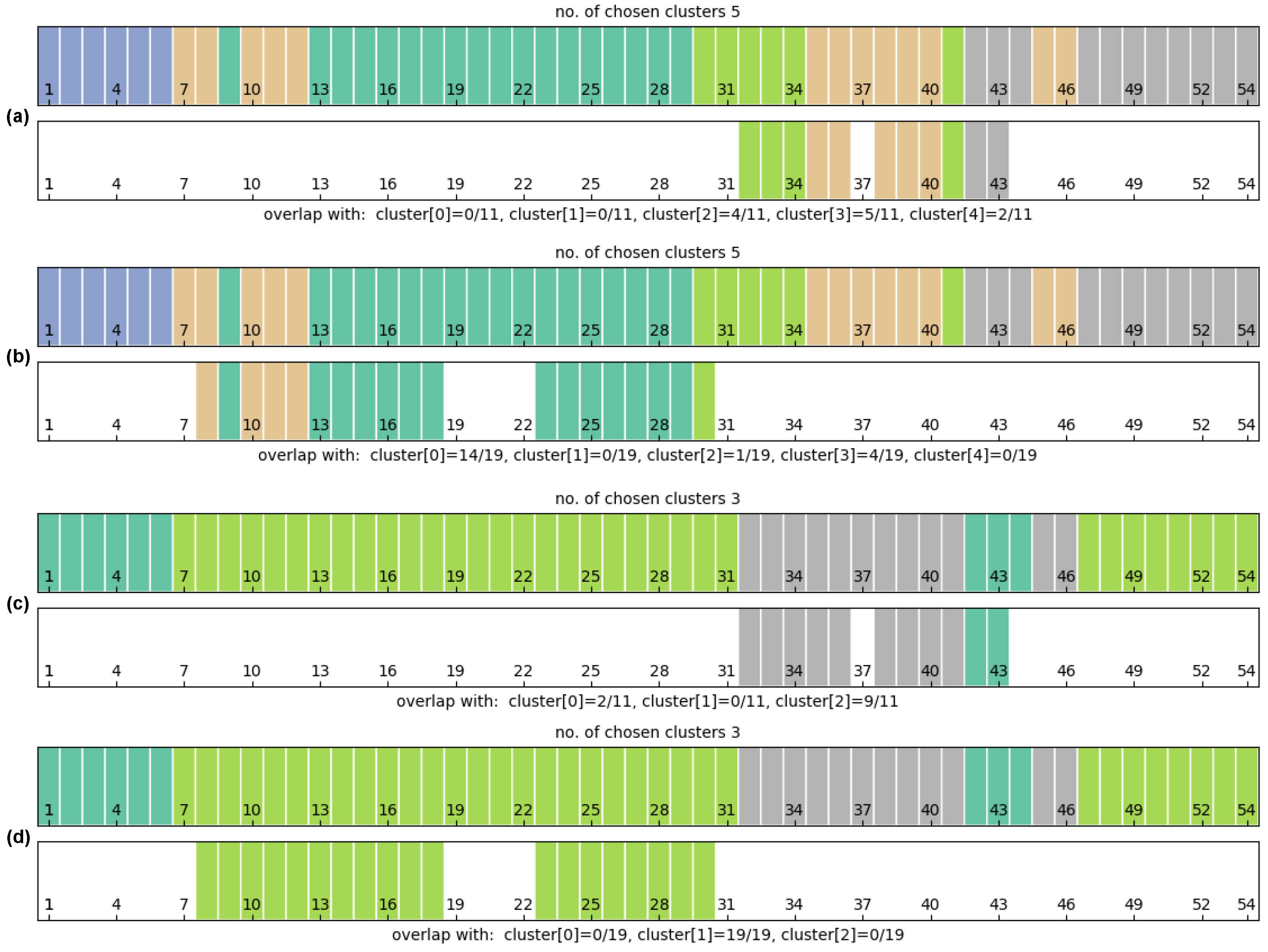
4.2. Goal 2—Explanations of the Clustering

The second goal G2 was to provide explanations of the clustering performed by the algorithm. By explanation in this particular case we mean, information about which features from the dataset could be used to divide the dataset into given clustering. Additionally, we would like to know what is the contribution of each of the features to such clustering.
To obtain that information, we transformed the problem into a classification task. We treated discovered cluster labels as class labels for the classification algorithms, and we trained the model with such data. In our approach, we used a random forest classifier [33]. We used feature importances to estimate feature weights in terms of their contribution to the classification. This approach can be effectively extended to any classifier accompanied by explainability frameworks such as LIME [34], SHAP [35], or Anchors [36].
Figure 3b shows feature importances discovered for cluster assignment from Figure 2b. The feature importances are calculated for all the features, although the clustering was performed only in 3D. This allows the user to identify an additional axis that might be valuable to investigate.

4.3. Goal 3—Identification of the Features’ Importance

G3, the last goal was to assist in identifying features that should be of potential interest to the user. We performed this task by clustering features that are highly correlated. Such clustering can have several benefits.
The user can treat it as an indicator of features that should be considered criteria for cluster detection (as shown in G1). Selecting features that are not correlated as criteria brings more information for clustering. Features that are highly correlated carry redundant information, and their discrimination power is lower than that of features that are not correlated. An example is shown in Figure 3c,d. In Figure 3c, one of the axes is redundant and can be removed, as it does not bring any new information for clustering. The same clustering (incorrect) can be obtained using a single axis. This is not true for data in Figure 3d, where both axes are not correlated, and clustering made with both of them cannot be achieved with just one axis.
Furthermore, feature importance based on the correlation indicator can be used as an ordering of axis on a PCP plot to improve the interpretation of PCP by the user [37]. We performed such clustering by calculating the correlation matrix among all the features using the Pearson coefficient. Then, for each feature, we count the number of correlated features for which the correlation exceeds a specified threshold. The inverse of this count is an indicator of the feature importance.

5. Apparatus and Visualization Framework
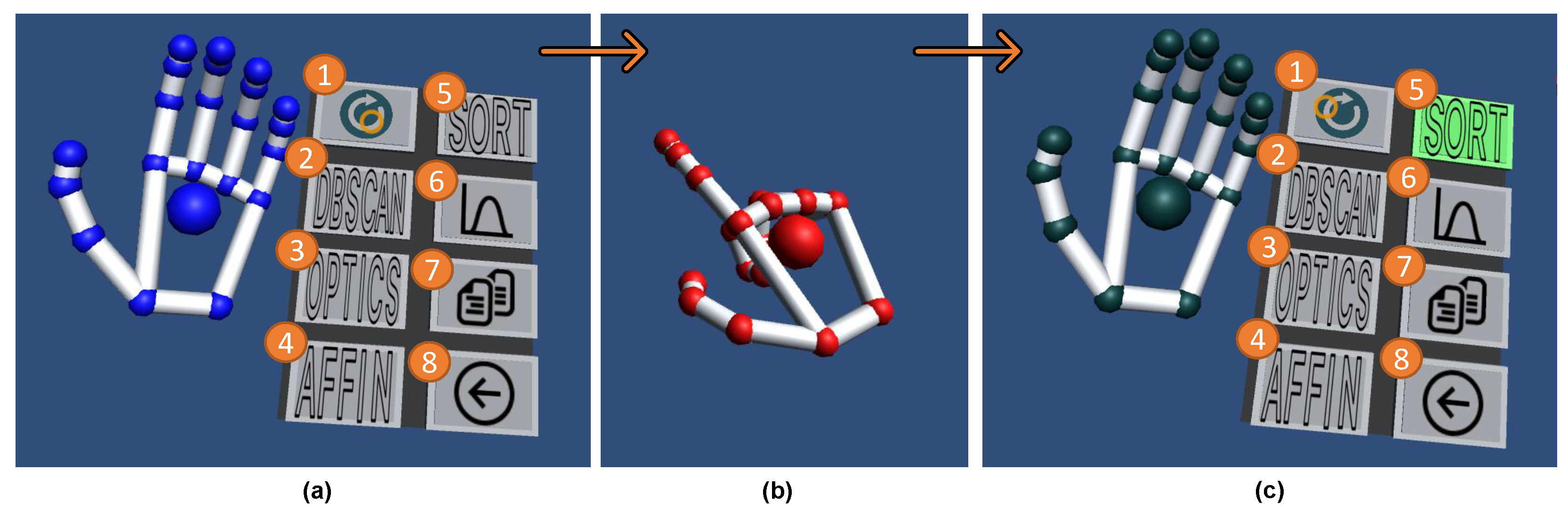
5.1. Apparatus

The development of IPCP was conducted on two computers equipped with NVIDIA GeForce GTX1070 and GTX1080 working under the Windows 10 64 bit. The VR-environment was facilitated with the Oculus Rift HMD [25] whereas the hand-tracking was supported by the Leap Motion [9] sensor attached to the front of the headset. The gesture recognition was built around the Leap Motion SDK [9]. The gestural input of the user is visualized and streamed to the VR headset in real-time, for instance, see Figure 5 where the user’s hand avatars and the left-hand palms-up gesture is shown.

5.2. Visualization

The development, design decisions and the majority of the IPCP visualization elements including the IPCP main plot design (see Figure 1), as well as the 3D scatter plot (see the right-hand side in Figure 1a,b) and the description of the mapping i.e., linking and brushing between all the visualization components can be found at Tadeja et al. [2,3]. Furthermore, the description of the gesture-based interaction with the IPCP main plot as well as generated on-the-fly 3D scatter plots can be found in Tadeja et al. [4]. Here, we provide only a short description of all the main visualization elements.
The manipulation of the visualization’s components, i.e., the main IPCP plot as well as the 3D scatter plots (see Figure 1) is composed of hand-gesture recognition and gaze-tracking. When gazing at an interactive object (e.g., data item on the IPCP or data point on the scatter plot), the user can take or release the control of this object by doing the single-pinch gesture [4].

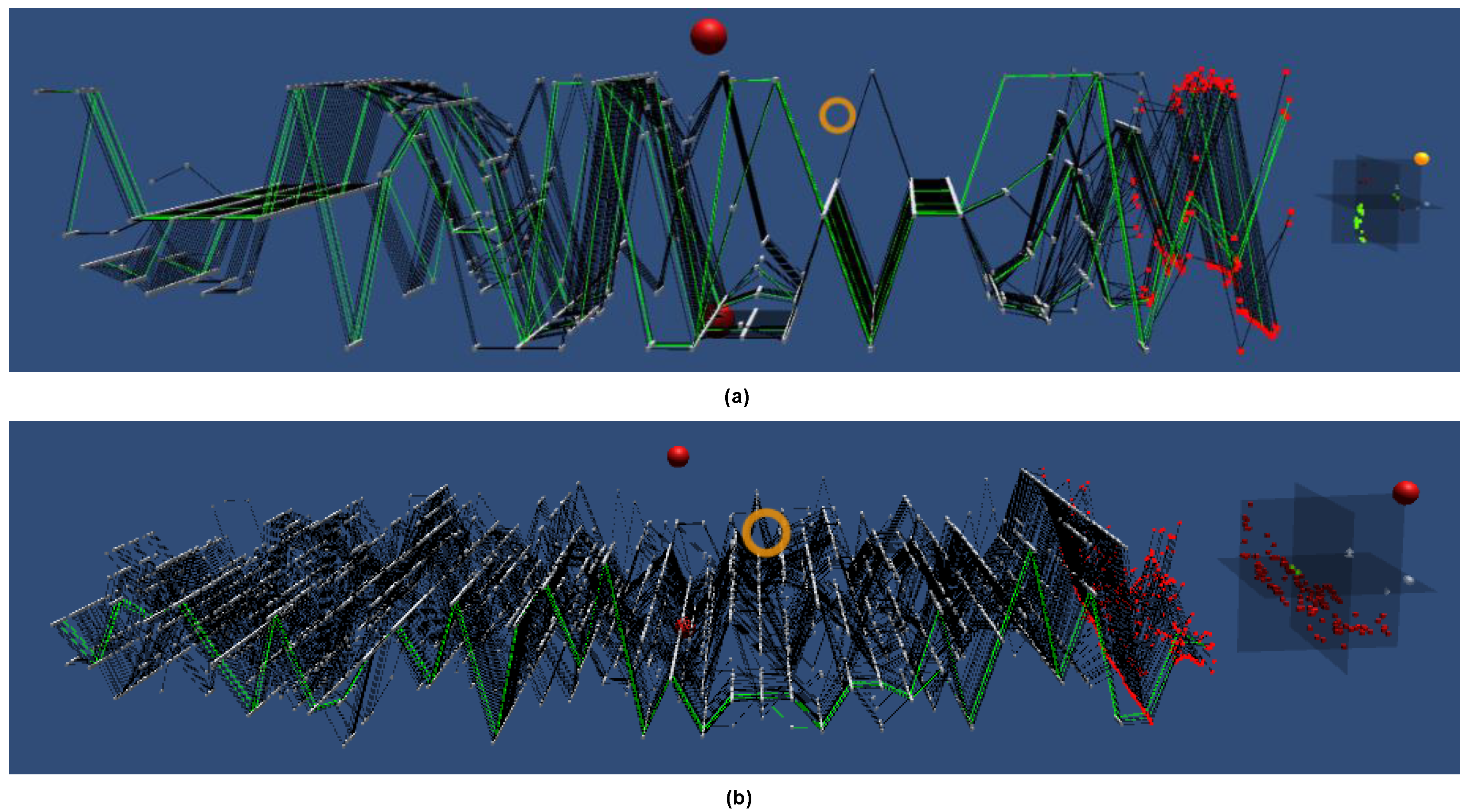
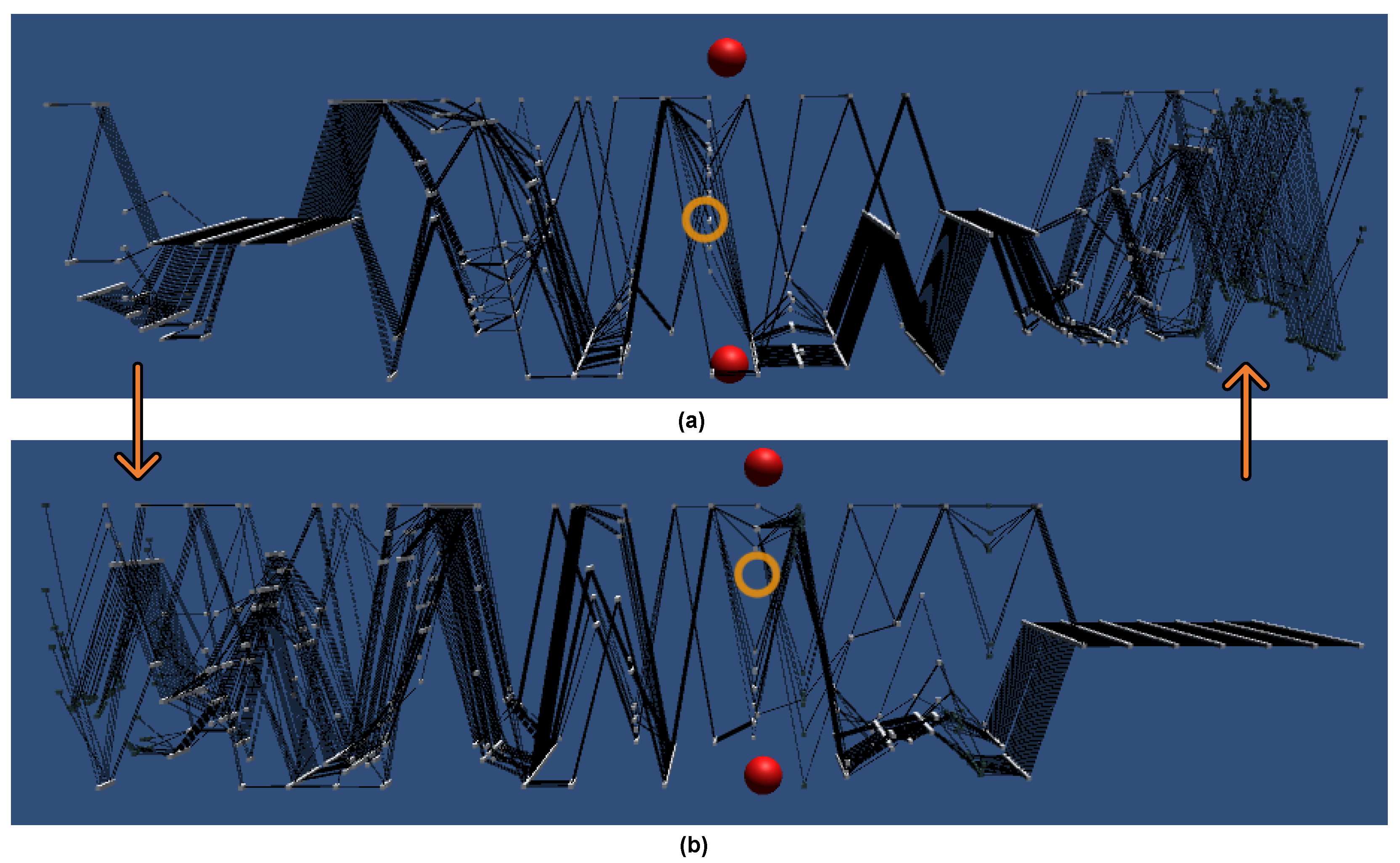
5.2.1. IPCP’s Main Plot

The IPCP’s main plot consists of a collection of data items (see Figure 1). Such data item is represented by an array of line-connected, interactive, unit-sized cubes. These data items are then arranged in equal steps the Z-axis (see Figure 1). Each interactive cube represents the particular value of a data item in a given dimension. There are as many rows of cubes as there are dimensions in the dataset. When gazing over these interactive cubes, the users can select either the data point on the IPCP (see Figure 1) or the entire dataset dimension throughout all data items by doing the single-pinch or double-pinch gesture, respectively [4].

5.2.2. 3D Scatter Plots

The 3D scatter plot can be created out of any three or fewer dimensions selected using the IPCP plot (see right-hand side in Figure 1a,b) [4]. The user can interact with the scatter plot analogically to the main IPCP [4]. Furthermore, the user can select a cluster of points based on a selected clustering algorithm (see Figure 5).

6. Data-Science Analytics Integration with IPCP

The data analytics features described in the previous section were integrated directly with the IPCP visualization (see Figure 5). These were twofold. The first was connected to the reorganization of the axes in accordance with the importance of the features. Secondly, we offered a selection of different clustering solutions to aid the user in searching for patterns in the IPCP.

6.1. Axes Ordering Based on Feature Importances

Pressing of the [ S O R T ] button allows the user to rearrange the IPCP axes in descending order, with the most important axes placed to the left of the main plot (see Figure 6). These will be sorted in accordance with the calculated on-the-fly correlation indicator as described in the G3 goal. We performed such ordering by calculating the Pearson coefficient’s correlation matrix among all the features. Then, for each feature, we count the number of correlated features for which the correlation exceeds the specified threshold. The inverse of this count is an indicator of the feature importance.

6.2. Clustering Solutions

The three available clustering algorithms are DBSCAN [6], OPTICS [5], and Affinity Propagation [7] (see Figure 2). Selection of those algorithms via the left-hand menu (see Figure 5a) will result in a change of the clustering applied onto the data points on the 3D scatter plot. Once the data point has been selected, all the other data points belonging to the same cluster given by the chosen clustering algorithm will be selected as well on both the 3D scatter plot and the IPCP main plot (see Figure 1). Furthermore, the data items will be sorted in accordance with the clustering solution moving the clustered points next to each other.
In addition, this set of algorithms can be freely exchanged for different ones. For instance, we can easily replace one of these algorithms with SuMC [8] by changing the text label on the chosen button, and by pressing this button simply call the Python script with the desired clustering solution.

7. Discussion

Coupling the IPCP with data-science analytics allowed us to equip the user with new, powerful capabilities that can directly impact how the user deals with the visualized data. They are also designed in such a way that gives us potential new research avenues. For instance, sorting the dimensions of the IPCP based on the correlation indicator (see Figure 6) gives flexibility related to the selection of the threshold. Here, we could add a slider to the left-hand menu (see Figure 5a) that would allow the user to choose the appropriate threshold value, which could be almost instantaneously reflected on the IPCP’s axes ordering.
On the other hand, allowing for calculation of feature importance based on clustering results allows for deeper insight into the relation of particular features to the cluster labels assignment. The strength of this method is that it is model agnostic with respect to the clustering algorithm. Therefore, it can be used with manual cluster label assignment done by the user as well as with automated clustering methods. In fact, these two methods can be combined in order to exploit user interaction with the IPCP for adaptive parameter tuning for clustering algorithms and thus reduce the number of interface elements.
The limitation of the above approach is that the explanations for the clustering are expressed through the prism of feature importance. This requires the expert interacting with the IPCP to be familiar with the features used in clustering. Otherwise, the explanations will not be understandable. When additional transformations have to be applied to the feature space prior to analysis, or additional data have to be used that is beyond the scope of the expert’s domain knowledge, our method may suffer from lower interpretability.
This is an open research problem in the area of explainable AI, which is based on the observation that human and AI methods operate on entirely different semantic levels. There is often a mismatch between the cause and effect in the AI model and the real world. Therefore, a correct explanation does not always imply the useful one in terms of human comprehension or domain knowledge. An explanation is an act of knowledge transfer. Hence, it imposes a need for research on methods that will allow bidirectional transfer between humans and XAI that will enable the users to formulate their expectations and needs to be addressed by the XAI algorithm and receive explanations on the desired level of abstraction. However, this is clearly beyond the scope of the work presented herein.

8. Conclusions

The previously executed formative studies with a small group of domain experts [2,3,4] has shown that it is possible to design an effective and immersive version of the Parallel Coordinates Plots that can be used to identify patterns in a complex and multivariate dataset. Hence, an updated version of the IPCP was proposed in this paper, which is enhanced with new features and functionality.
A new data-analytics toolkit has been integrated with IPCP and offers three additional functionalities. These are the automated ordering of the axes based on a correlation indicator property (see Figure 6), the ordering of the axes based on the importance with respect to a chosen cluster labels assignment, and a method for automated clustering. All of these features assist and prompt the user for pattern identification in multidimensional datasets.
The hardware used for the interaction between the system and its user was based on gestural input coupled with gaze tracking discussed in detail in Tadeja et al. [4].
Furthermore, this research opens up new avenues for future investigations. For example, we could enhance our data-analytics toolkit with a number of new functionalities from XAI methods [34,35,36]. As suggested in Tadeja et al. [4], such an extension would permit the user to answer more complex queries. For example, the user could ask: “Why were these particular data points excluded from the identified clusters?” (see Figure 2).
Another interesting avenue for further research is to use the voice-operated interface in which the user’s speech could be coupled with gestural input to operate the system. [4,38]. Here, we can build a bespoke, immersive environment enhanced with the knowledge database containing complex domain knowledge [38]. As the context in which the user operates is finite and constrained by the particular use case as well as by possible interaction techniques, such a solution can also be applied in visual analytics, including IPCP [38]. A similar approach for a voice-operated aeroengine health monitoring system realized with the help of a VR environment was proposed in Tadeja et al. [38].

Author Contributions

Conceptualization, S.K.T., T.K. and S.B.; methodology, P.O.K. and J.T.; software, S.K.T., S.B., Ł.S. and P.S.; validation, T.K., J.T. and G.J.N.; formal analysis, S.B. and Ł.S.; investigation, S.K.T., S.B. and Ł.S.; resources, T.K., P.O.K., J.T. and G.J.N.; data curation, T.K.; writing—original draft preparation, S.B., Ł.S. and S.K.T.; writing—review and editing, P.O.K., T.K., J.T. and G.J.N.; visualization, S.B. and S.K.T.; supervision, P.O.K., J.T. and G.J.N.; project administration, P.O.K., J.T. and G.J.N.; funding acquisition, P.O.K., J.T. and G.J.N. All authors have read and agreed to the published version of the manuscript.

Funding

The work of Sławomir K. Tadeja was supported by the Cambridge European and Trinity Hall and the EPSRC (1788814) scholarships. The work of Szymon Bobek and Grzegorz J. Nalepa was funded from the PACMEL project funded by the National Science Centre, Poland under the CHIST-ERA programme (NCN 2018/27/Z/ST6/03392).

Conflicts of Interest

The authors declare no conflict of interest. The funders had no role in the design of the study; in the collection, analyses, or interpretation of data; in the writing of the manuscript, or in the decision to publish the results.

Abbreviations

The following abbreviations are used in this manuscript:
AIArtificial Intelligence
DBSCANDensity-Based Spatial Clustering of Applications with Noise
DS1Dataset 1 (Pareto front data; 54 data items with 29 dimension each)
DS2Dataset 2 (S-duct design optimization study; 166 data items with 39 dimensions each)
HMDHead-Mounted Display
IPCPImmersive Parallel Coordinates Plots
OPTICSIdentify the Clustering Structure
PCAPrincipal Component Analysis
PCPParallel Coordinates Plots
SDKSoftware Development Kit
SuMCSubspace Memory Clustering
VRVirtual Reality
XAIExplainable Artificial Intelligence

References

  1. Inselberg, A. Parallel Coordinates: Visual Multidimensional Geometry and Its Applications, 1st ed.; Springer: New York, NY, USA, 2009. [Google Scholar]
  2. Tadeja, S.K.; Kipouros, T.; Kristensson, P.O. Exploring Parallel Coordinates Plots in Virtual Reality. In Proceedings of the Extended Abstracts of the 2019 CHI Conference on Human Factors in Computing Systems, Scotland, UK, 4–9 May 2019; Association for Computing Machinery: New York, NY, USA, 2019; pp. 1–6. [Google Scholar] [CrossRef] [Green Version]
  3. Tadeja, S.K.; Kipouros, T.; Kristensson, P.O. IPCP: Immersive Parallel Coordinates Plots for Engineering Design Processes. In Proceedings of the AIAA Scitech 2020 Forum, Orlando, FL, USA, 6–10 January 2020. [Google Scholar] [CrossRef] [Green Version]
  4. Tadeja, S.K.; Kipouros, T.; Lu, Y.; Kristensson, P.O. Supporting Decision Making in Engineering Design Using Parallel Coordinates in Virtual Reality. AIAA J. 2021, 59, 5332–5346. [Google Scholar] [CrossRef]
  5. Ankerst, M.; Breunig, M.M.; Kriegel, H.P.; Sander, J. OPTICS: Ordering Points to Identify the Clustering Structure. SIGMOD Rec. 1999, 28, 49–60. [Google Scholar] [CrossRef]
  6. Ester, M.; Kriegel, H.P.; Sander, J.; Xu, X. A Density-based Algorithm for Discovering Clusters a Density-based Algorithm for Discovering Clusters in Large Spatial Databases with Noise. In Proceedings of the Second International Conference on Knowledge Discovery and Data Mining, Portland, OR, USA, 2–4 August 1996; AAAI Press: Palo Alto, CA, USA, 1996; pp. 226–231. [Google Scholar]
  7. Frey, B.J.; Dueck, D. Clustering by passing messages between data points. Science 2007, 315, 2007. [Google Scholar] [CrossRef] [PubMed] [Green Version]
  8. Struski, Ł.; Tabor, J.; Spurek, P. Lossy Compression Approach to Subspace Clustering. Inf. Sci. 2017, 435, 161–183. [Google Scholar] [CrossRef]
  9. Ultraleap. Leap Motion Controller. Available online: https://www.leapmotion.com (accessed on 1 September 2019).
  10. Wegenkittl, R.; Loffelmann, H.; Groller, E. Visualizing the behaviour of higher dimensional dynamical systems. In Proceedings of the Proceedings. Visualization ’97 (Cat. No. 97CB36155), Phoenix, AZ, USA, 24 October 1997; pp. 119–125. [Google Scholar] [CrossRef]
  11. Gröller, E.; Löffelmann, H.; Wegenkittl, R. Visualization of Analytically Defined Dynamical Systems. In Proceedings of the Scientific Visualization Conference (dagstuhl ’97), Dagstuhl, Germany, 9–13 June 1997; p. 71. [Google Scholar]
  12. Streit, M.; Ecker, R.C.; Österreicher, K.; Steiner, G.E.; Bischof, H.; Bangert, C.; Kopp, T.; Rogojanu, R. 3D parallel coordinate systems—A new data visualization method in the context of microscopy-based multicolor tissue cytometry. Cytom. Part A 2006, 69A, 601–611. [Google Scholar] [CrossRef]
  13. Falkman, G. Information visualisation in clinical Odontology: Multidimensional analysis and interactive data exploration. Artif. Intell. Med. 2001, 22, 133–158. [Google Scholar] [CrossRef]
  14. Ribarsky, W.; Ayers, E.; Eble, J.; Mukherjea, S. Glyphmaker: Creating customized visualizations of complex data. Computer 1994, 27, 57–64. [Google Scholar] [CrossRef]
  15. Fanea, E.; Carpendale, S.; Isenberg, T. An interactive 3D integration of parallel coordinates and star glyphs. In Proceedings of the IEEE Symposium on Information Visualization, 2005, INFOVIS 2005, Minneapolis, MN, USA, 23–25 October 2005; pp. 149–156. [Google Scholar] [CrossRef] [Green Version]
  16. Johansson, J.; Ljung, P.; Jern, M.; Cooper, M. Revealing Structure in Visualizations of Dense 2D and 3D Parallel Coordinates. Inf. Vis. 2006, 5, 125–136. [Google Scholar] [CrossRef]
  17. Holten, D.; Wijk, J.J.V. Evaluation of Cluster Identification Performance for Different PCP Variants. Comput. Graph. Forum 2010, 29, 793–802. [Google Scholar] [CrossRef]
  18. Dang, T.N.; Wilkinson, L.; Anand, A. Stacking Graphic Elements to Avoid Over-Plotting. IEEE Trans. Vis. Comput. Graph. 2010, 16, 1044–1052. [Google Scholar] [CrossRef] [PubMed]
  19. Chang, C.; Dwyer, T.; Marriott, K. An Evaluation of Perceptually Complementary Views for Multivariate Data. In Proceedings of the 2018 IEEE Pacific Visualization Symposium, Kobe, Japan, 10–13 April 2018; pp. 195–204. [Google Scholar] [CrossRef]
  20. Johansson, J.; Forsell, C.; Cooper, M. On the usability of three-dimensional display in parallel coordinates: Evaluating the efficiency of identifying two-dimensional relationships. Inf. Vis. 2014, 13, 29–41. [Google Scholar] [CrossRef]
  21. Rosenbaum, R.; Bottleson, J.; Liu, Z.; Hamann, B. Involve Me and I Will Understand!: Abstract Data Visualization in Immersive Environments. In Proceedings of the 7th International Conference on Advances in Visual Computing—Volume Part I, Las Vegas, NV, USA, 26–28 September 2011; Springer: Berlin/Heidelberg, Germany, 2011; pp. 530–540. [Google Scholar]
  22. Butscher, S.; Hubenschmid, S.; Müller, J.; Fuchs, J.; Reiterer, H. Clusters, Trends, and Outliers: How Immersive Technologies Can Facilitate the Collaborative Analysis of Multidimensional Data. In Proceedings of the 2018 CHI Conference on Human Factors in Computing Systems, Montreal, QC, Canada, 21–26 April 2018; ACM: New York, NY, USA, 2018; pp. 90:1–90:12. [Google Scholar] [CrossRef] [Green Version]
  23. Cordeil, M.; Cunningham, A.; Dwyer, T.; Thomas, B.H.; Marriott, K. ImAxes: Immersive Axes As Embodied Affordances for Interactive Multivariate Data Visualisation. In Proceedings of the 30th Annual ACM Symposium on User Interface Software and Technology, Quebec, QC, Canada, 22–25 October 2017; ACM: New York, NY, USA, 2017; pp. 71–83. [Google Scholar] [CrossRef]
  24. Batch, A.; Cunningham, A.; Cordeil, M.; Elmqvist, N.; Dwyer, T.; Thomas, B.H.; Marriott, K. There Is No Spoon: Evaluating Performance, Space Use, and Presence with Expert Domain Users in Immersive Analytics. IEEE Trans. Vis. Comput. Graph. 2019. [Google Scholar] [CrossRef] [PubMed]
  25. Oculus, V.R. Oculus Rift. Available online: https://www.oculus.com (accessed on 1 November 2018).
  26. Kipouros, T.; Jaeggi, D.M.; Dawes, W.N.; Parks, G.T.; Savill, A.M.; Clarkson, P.J. Insight Into High-Quality Aerodynamic Design Spaces through Multi-Objective Optimization. CMES Comput. Model. Eng. Sci. 2008, 37, 1–44. [Google Scholar]
  27. D’Ambros, A.; Kipouros, T.; Zachos, P.; Savill, M.; Benini, E. Computational Design Optimization for S-ducts. Designs 2018, 2, 36. [Google Scholar] [CrossRef] [Green Version]
  28. Pedregosa, F.; Varoquaux, G.; Gramfort, A.; Michel, V.; Thirion, B.; Grisel, O.; Blondel, M.; Prettenhofer, P.; Weiss, R.; Dubourg, V.; et al. Scikit-learn: Machine Learning in Python. J. Mach. Learn. Res. 2011, 12, 2825–2830. [Google Scholar]
  29. Rosenberg, A.; Hirschberg, J. V-Measure: A Conditional Entropy-Based External Cluster Evaluation Measure. In Proceedings of the 2007 Joint Conference on Empirical Methods in NLP and Computational Natural Language Learning (EMNLP-CoNLL); Association for Computational Linguistics: Prague, Czech Republic, 2007; pp. 410–420. [Google Scholar]
  30. Ding, C.; He, X. K-means clustering via principal component analysis. In Proceedings of the Twenty-First International Conference on Machine Learning, Banff, AB, Canada, 4–8 July 2004; ACM: New York, NY, USA, 2004; p. 29. [Google Scholar]
  31. Agrawal, R.; Gehrke, J.; Gunopulos, D.; Raghavan, P. Automatic Subspace Clustering of High Dimensional Data for Data Mining Applications. SIGMOD Rec. 1998, 27, 94–105. [Google Scholar] [CrossRef] [Green Version]
  32. Moise, G.; Sander, J. Finding Non-Redundant, Statistically Significant Regions in High Dimensional Data: A Novel Approach to Projected and Subspace Clustering. In Proceedings of the 14th ACM SIGKDD International Conference on Knowledge Discovery and Data Mining, Las Vegas, NV, USA, 24–27 August 2008; Association for Computing Machinery: New York, NY, USA, 2008; pp. 533–541. [Google Scholar] [CrossRef]
  33. Breiman, L. Random Forests. Mach. Learn. 2001, 45, 5–32. [Google Scholar] [CrossRef] [Green Version]
  34. Ribeiro, M.T.; Singh, S.; Guestrin, C. “Why Should I Trust You?”: Explaining the Predictions of Any Classifier. arXiv 2016, arXiv:1602.04938. [Google Scholar]
  35. Lundberg, S.M.; Lee, S.I. A Unified Approach to Interpreting Model Predictions. In Advances in Neural Information Processing Systems 30; Guyon, I., Luxburg, U.V., Bengio, S., Wallach, H., Fergus, R., Vishwanathan, S., Garnett, R., Eds.; Curran Associates, Inc.: Red Hook, NY, USA, 2017; pp. 4765–4774. [Google Scholar]
  36. Ribeiro, M.T.; Singh, S.; Guestrin, C. Anchors: High-Precision Model-Agnostic Explanations. In Proceedings of the AAAI Publications, Thirty-Second AAAI Conference on Artificial Intelligence, New Orleans, LA, USA, 2–7 February 2018. [Google Scholar]
  37. Guo, H.; Xiao, H.; Yuan, X. Scalable Multivariate Volume Visualization and Analysis Based on Dimension Projection and Parallel Coordinates. IEEE Trans. Vis. Comput. Graph. 2012, 18, 1397–1410. [Google Scholar] [CrossRef] [PubMed] [Green Version]
  38. Tadeja, S.K.; Kutt, K.; Lu, Y.; Seshadri, P.; Nalepa, G.J.; Kristensson, P.O. Jarvis for Aeroengine Analytics: A Speech Enhanced Virtual Reality Demonstrator Based on Mining Knowledge Databases. arXiv 2021, arXiv:2107.13403. [Google Scholar]
Figure 1. The Immersive Parallel Coordinates Plots (IPCP) of the (a) DS1 and (b) DS2 datasets respectively with the accompanying 3D scatter plot generated by mapping onto it the three criteria dimensions (selected in red). Both the IPCP and scatter plots selectors are visible (red spheres) as well as the orange cross-hair used for the user’s gaze tracking. The observable difference in the size of the scatter plots is caused by the different perspectives from which the screen-shots were captured.
Applsci 12 00331 g001
Figure 2. Comparison of clustering results obtained with selected algorithms: (a) DBSCAN; (b) OPTICS; (c) Affinity Propagation. The top row presents the 2D plots, whereas the bottom one shows 3D scatter plots as the headset wearer sees them. The selected clusters are marked gray hulls (in 2D) and green (in 3D), respectively. These clustering examples were done over the DS1.
Applsci 12 00331 g002
Figure 3. (a) DBSCAN clustering after dimensionality reduction with PCA to 3 components.; (b) feature importances obtained with random forest classifier. Difficulties in proper cluster identification on the correlated axis are shown in (c). Choosing the set of the uncorrelated axis (d) allows for a better overview of data. The presented clustering was done over the DS1.
Applsci 12 00331 g003
Figure 4. Comparison of clustering results with a given number of the desired clusters (top rows) obtained with the Subspace Memory Clustering (SuMC) algorithms with respect to ground truth (bottom rows). (a,b) contain the results for selected 5 clusters; (c,d) contain the results for selected 3 clusters. The clusters are color-coded (top rows) and put against the patterns recognized by the domain-experts. Each bar constitutes a single point in the DS1 dataset and each cluster is represented by a different color.
Applsci 12 00331 g004
Figure 5. (a) The left-hand menu with all the implemented data-science analytics: (1) [ R E S T A R T ] restarts the visualization, (2–4) are the 3D scatter plot clustering solutions attached to individual labeled buttons [ D B S C A N ], [ O P T I C S ], and [ A F F I N ], (5) [ S O R T ] sorts the axes (i.e., IPCP’s dimensions) using their calculated importance, (6) [ T O G G L E ] toggles between the selected and unselected at the moment data items, (7) [ D U P L I C A T E ] duplicates the selected data items, and (8) [ U N D O ] undoes the most recent manipulation result. (b) presents the finger-press gesture used to select a button on the menu. Whereas (c) shows the highlighted [ S O R T ] after the user pressed that button which cased the importance sorting to be executed on the IPCP as shown in Figure 6. Icons by Icons8 (https://icons8.com, accessed on 23 September 2019).
Applsci 12 00331 g005
Figure 6. The IPCP visualization of the DS1 dataset presented in original (a,b) sorted order. The rearrangement of the axes was carried out based on the importances. As it can be seen in (b) the axes containing no knowledge i.e., constant data, were moved on the right of the IPCP main plot, thus reducing the amount of data that has to be visually analyzed by the user. The user can toggle between sorted and unsorted i.e., the original organization of the axes.
Applsci 12 00331 g006
Table 1. Comparison of clustering algorithm on sample dataset with known cluster labels assignment. The higher the value, the better. The comparison was done over the DS1 as it contained the data labeling required by the used metrics.
AlgorithmV-MeasureHomogeneityCompleteness
Gaussian Mixture0.550.500.62
Spectral Clustering0.130.090.24
Agglomerative Clustering0.550.500.62
Affinity Propagation0.590.700.50
Mean Shift0.170.130.23
Birch0.130.090.24
OPTICS0.580.540.61
DBSCAN0.780.780.78
Publisher’s Note: MDPI stays neutral with regard to jurisdictional claims in published maps and institutional affiliations.

