1. Introduction
Presently, it is easy to obtain and display information in any format and on any platform. Innovative approaches for displaying information on a user interface are essential for encouraging people to interact with it. Touch and sensor technologies, whether on mobile phones and tablets, navigation systems, or even kitchen appliances, can be represented by a larger interface with more inputs [
1]. A good interface consists of components that help users comprehend the conceptual framework and give meaningful information. A visible indicator, also known as a signifier, aids in navigation and sometimes provides information for the next action while observing an interface that is dependent upon the type of application and input mode [
2,
3]. The signifier sometimes termed perceivable affordance, displays the conceivable activities that users may execute with an item, or, in other words, what the item can allow the user. This is regarded as a major objective for interfaces that give relevant information for a superior comprehension of the shown information, hence aiding in the improvement of interaction. That is, the signifier is a terminology used by interface designers to describe a visible indicator of an input interaction [
4]. Some of the most popular signifiers allegedly employed by users are clickable buttons, emphasized text signals [
5], and arrows as navigation for users to engage with on the interface [
6].
An interface display in the range of 13” and above is considered a large size display [
7] and this large display provides an opportunity for large information space. However, there are a few challenges in interacting with and navigating such a large display. According to Huang et al. [
8], the challenge of navigating on a large display is when the form factor of a large display provides various types of interactions and visibility. A large display is larger and more viewable than desktop groupware and multiple users can simultaneously view and interact with a large display. A larger display requires high resolution and a great visualization effect to assist users’ interaction. Good visualization could assist users better and help to understand the information displayed on the screen conveniently [
9,
10]. However, it may be a hindrance if the visualization on a large display interface was subpar and unable to have a significant impact on users, so distorting how users perceive and interact with the display [
11,
12,
13]. For instance, a large display may necessitate the user to manoeuvre around it and exert some effort to access the button.
Users are faster while performing complex tasks on large displays. This advantage could be achieved when related graphical elements on the interface can assist users to navigate the interface well. However, there are a few issues on interfaces for large displays that should be aware of and taken into consideration. As reported, Endert et al. described how the distance of a viewer affects the visual aggregation of information and discovered that colours aggregate well for visual search functions across viewing distances [
14]. Colour is also influenced by the size of the object and the condition of the environment.
As stated by Stone, the size of the object results in different colour perceptions [
15]. For instance, with a powerful colour, a tiny object would appear more distinct, while powerful colour could be overwhelming on a big screen. The same objects will cover distinct dimensions on the retina as spectators of a wall display visualization will take viewing positions at separate distances from the screen. Thus, when one moves nearer or further away from an item, colour perception may differ. While for the surrounding environment, depending on the type of light shining on the display region, the colour will look different. For example, rooms with bright lighting, direct sunlight, and next to, or in front of the wall may all vary. Colour may also look different depending on the layout of the space whether the painting of the walls is light or dark. To what extent, even on a normal desktop monitor, do these environmental circumstances affect colour perception for visualization? The impact can be lower, larger or not noticeable in wall-sized viewing settings [
14]. These related features should be found on the signifier to make it appear to guide the users.
In addition, labelling also plays a significant role in big-screen interfaces. Within the various sizes of display, a label is considered a signifier that can help users interact and navigate. According to Badam et al. [
16], users like to zoom in and out as much as they want on the large display. Generally, they will learn the content manipulation technique beforehand to use it more efficiently. Particularly, minimal false gestures appeared when they performed the technique because of the visual feedback provided which comes in the form of a textual label. This shows how the textual label guides the user properly while giving them a clue or hint about what they have been working on.
However, regardless of the objective to enhance interaction, researchers have harshly criticized signifiers since the idea still causes user confusion while engaging in a virtual world [
17]. Confusion may result in user irritation since their expectation to apply action from the actual world is not precisely the same as when it comes to the virtual world. In the actual world, both hands are needed and utilized to give a solid hold, but in the virtual world, more hands do not imply more force. However, in the virtual world, a single touch may be sufficient.
Several research studies, such as [
14,
15,
16,
18], have investigated the usage of signifiers in museum applications. Specifically, Bastanlar [
18] employed a multi-touch tabletop surface to explore historical information in public areas. The authors focused on the design of the multi-touch tabletop and discussed the design concepts employed during the development process. The design incorporates icon buttons that serve as signifiers in the museum application. Like [
14], Stone, Szafir and Setlur [
15] utilized the usage of a multi-touch tabletop surface, but this time the gadget was used for cultural learning through exploring museum picture collections. It was stated that users may navigate the picture database using both hand motions. For instance, to rotate and resize an image, a user must use two fingers. Cho and Choi [
19] agrees with the method used, claiming that the key affordance of a touch device is touch gesture.
Consequently, studies have examined the characteristics of a signifier, but its characteristics in terms of being visually apparent over a wide interaction area were not well recognized. As a result, the notion is misapplied and academics are perplexed, particularly when applied to user interfaces. The touch ability feature, which serves as an affordance for touch technology, has received the greatest attention. Meanwhile, when it comes to signifiers, most investigations focused on text and icon buttons. Since the characteristics of the signifier are not well researched and understood in terms of visually apparent, this issue is addressed to be poorly implemented on big multi-touch devices [
19,
20]. As a result, this implies that there are even more signifiers that might be investigated.
Hence, this research work aims to investigate the suitable set of visual signifiers that support interaction in the context of the museum environment.
The following are the key contributions of this research work:
Identification of visual signifiers and associated features utilized in designing a virtual museum interface for a large display.
Integration of suitable graphical features and visual signifiers into a museum interface on a large multi-touch display.
Validation of the visual signifier of a virtual museum interface to support interaction on a large multi-touch display using the Analytical Hierarchical Process (AHP).
The remainder of the article is structured as follows:
Section 2 highlights and examines related works on visual signifiers on a multi-touch display.
Section 3 presents the methodology for identifying visual signifiers of museum interfaces for large displays.
Section 4 presents and discusses the experimental findings while
Section 5 concludes the research work.
2. Related Works
This section includes existing research on signifiers used in museum applications. Specifically, this section discussed the design interface and navigation on a large display for a virtual museum. This involves two or more people moving around navigating to find the information and browsing certain images by having cues from signifiers. Previous work did claim the existence of visual signifiers improves users’ interaction on multi-touch displays but with the right feature to make the signifiers appear obvious and understandable to the users.
Cafaro and Roberts [
21] examined tactics for captivating museum attendees with interactive data visualizations, approaches that might drive the layout of hand signals and body motions for integrated exhibits, and how human–data interaction (HDI) can enhance people’s understanding of data. Ciocca et al. [
22] and Hornecker [
23] used a variety of signifiers in navigating the interface such as text as label signs, icon buttons with pictorial representation [
22,
23,
24,
25,
26,
27] and audio [
27]. These signifiers facilitate users to navigate the interface better. However, a lack of suitable features on the signifiers prevents them to appear visible to the users. The limited number of signifiers used in the interface lead users to have a problem while performing the task [
24]. Two users who perform a task have a conflict when there is one icon button to click before they can proceed to the next stage. The button is positioned on one of the user place settings where another user will feel the burden to touch the button that is a bit far from her reach. This situation could be simplified if an icon button is placed on each corner of the interface, thus facilitating the users better in navigating the interface [
28].
In addition, a lack of proper features on the signifier such as small text as a label or an unfamiliar visual icon used on the signifier causes users to have difficulty recognizing and understanding the sign displayed [
29,
30,
31]. The signifier used is not fully understood by the users when a signifier used should be something discoverable and understandable by the users [
6]. It needs to signal things to determine what actions are possible and how the navigation should be performed properly. Apart from this issue, ambiguous signifiers also can cause users to misinterpret the appropriate action. According to Patsoule [
27], the participant in the reported study are having wrong expectations of the signifiers applied. Participants were observed tapping in a non-interactive signifier or attempting to move or maximize a signifier that could not be moved or maxed [
27]. The study involved participants using audio together with visual output to provide cues to consumers. This is either to get the user’s attention or to show them how to engage properly. This implementation delighted people by providing helpful hints on functionality, allowing them to have more control over the encounter.
Furthermore, Creed et al. [
25] conducted a case study where a multi-touch tabletop is placed in a large open space of a library. The issue that occurred while organizing the study was several users tend to look at the content without making any interaction. This problem happened because of the missing label that could give a signal to the users to interact with the tabletop. There is nothing on the interface that could inform the users to make an interaction, considering the physical structure of the tabletop is horizontal and the content cannot be seen from afar [
25]. This can be solved if proper signage is designed on the interface to provide cues to the users. Rubegni et al. [
32] in their study examined avatar-based touchless gestural interfaces from the standpoint of a child–display interaction. They felt that huge exhibits provide an opportunity to promote the experience and participation of children, such as when they are learning about art, while also posing a variety of problems. The objective of their study is to detect the pertinent features of children’s interactions with a big display based on a touchless avatar-based interface and to determine the effect of the interaction on the memory of the information.
Meanwhile, a study conducted by Hornecker [
23] also had a similar concern in which a few users did not seem to notice the signifier provided. The signifier used in the study were text and icon buttons which the users seem to have problems with the arrow used. The arrow used should be something that provides cues for users to touch them instead the arrow is less discovered, and users seem not to notice it. In addition, the absence of a visible frame around the text floating provides no clue where the active region stops. Thus, sometimes users tend to drag the text beyond the active region and cause other outputs to come out [
23]. This conflict could be solved by setting a proper feature such as increasing the size or giving a bright colour to the arrow and another conflict could be solved by creating a visible frame to sign the users the limit of the active region.
Table 1 summarizes the visual signifiers as used in existing studies.
Summarily, using improper signifiers in the interface could mislead users in their navigation which may lead to frustration for the users. Meanwhile, the ambiguous feature used on the signifier could also create confusion and wrong expectation for the users. Hence, this research work aims to identify the suitable features a signifier should have where the physical appearance of the signifier can attract attention and assist the user to navigate. In addition, the lack of good features on the signifier could confuse users on whether the signifiers can be operated or not. In other words, this research work seeks to identify the visual signifier and their associated features used in designing a virtual museum interface of a large display and to integrate a suitable set of visual signifiers into a museum interface through interaction among users while performing tasks on a large multi-touch display.
4. Results
This section discusses the observed findings obtained based on the experimentation conducted.
4.1. Results of the Preliminary Study
This sub-section presents the findings in achieving the first goal of the preliminary study. The analysis discussed in this sub-section is based on 2 post-questions asked of the participants during the preliminary study. The questions were:
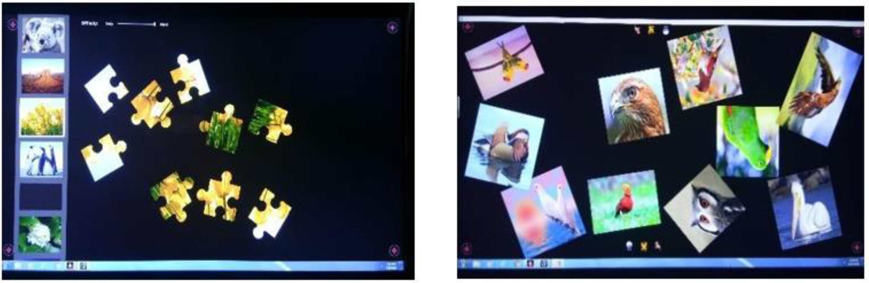
Based on the two information visualization approaches that have been introduced (Structured type and Scattered type), which approach do you think could help your interaction on a large display?
Based on two information visualization approaches, which approach do you think is suitable to be applied to museum application?
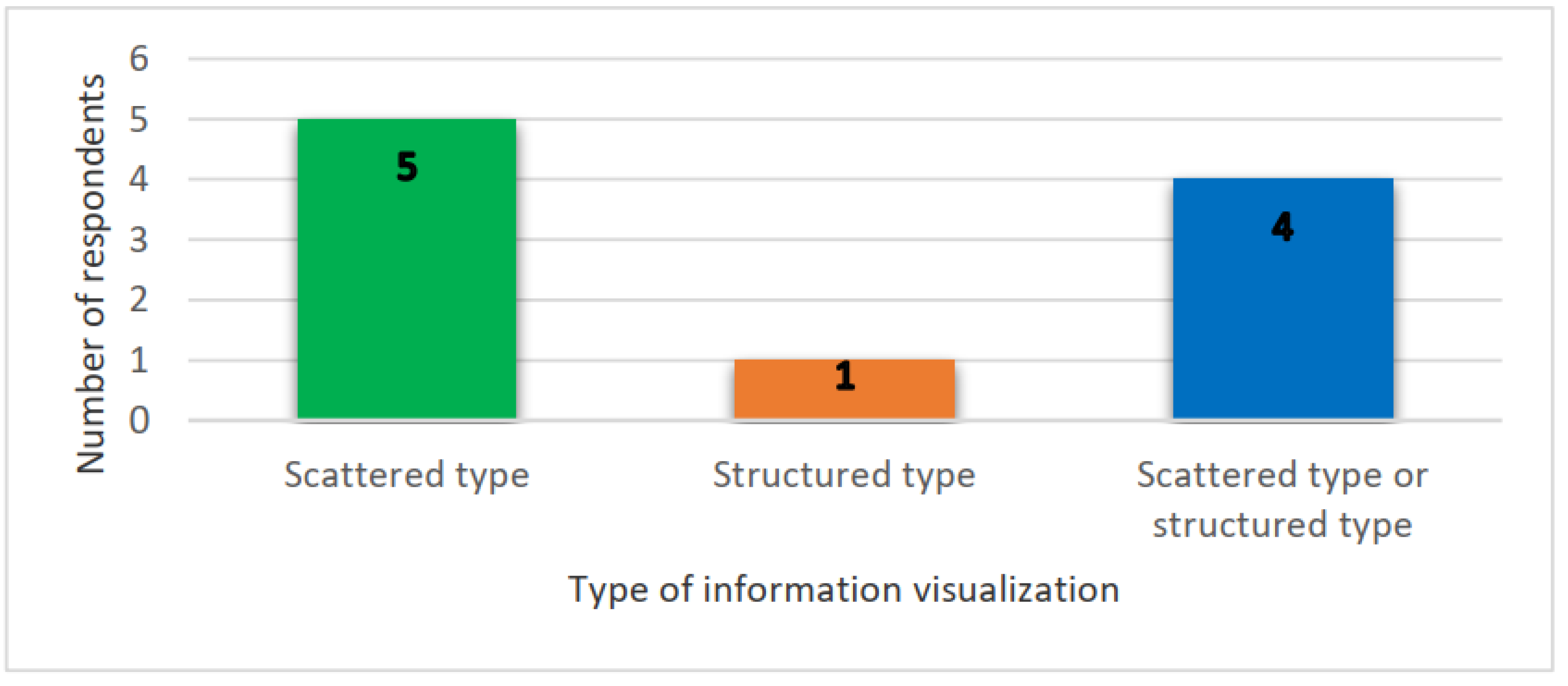
The data presented in
Figure 4 was based on the first (i) post-question being asked during the preliminary study. The significance of determining the concept is that a different domain of application may hire a different way of presenting the information, especially on a large display. Having a specific structure for organizing the information, may help users to focus and complete a task more efficiently.
From
Figure 4, a pattern of user interaction on a large display for the museum environment can be seen. With five participants, the number of persons who chose a scattered format to provide information is higher than the one who chose a tree concept. In the meantime, four more participants decided between a scattered or structured information visualization. This demonstrates that during their study of the sessions, users favoured the scattered type for the museum application. This may be the case since the scattered type is the default information visualization for the museum application interfaces being researched. This choice may indicate that the participants enjoyed engaging with the museum interfaces throughout the investigation. Four participants favoured either a scattered or structured type of information visualization for the environment, demonstrating the value of both types of presentation. To put it another way, both forms of information visualization should be considered during the design process.
A secondary evaluation was conducted to substantiate the participants’ decisions, which were based on the second (ii) post-question of the preliminary survey. This aimed to see if there is a link between the preferences of participants for information visualization and their collaborative engagements with the museum environment. The observed outcomes are represented in
Table 5.
Participants 2, 4, 8, 9 and 10 as shown in
Table 5 chose a scattered type of information visualization since the concept is fascinating and enjoyable to them. There are various elements of the study that need participants to comprehend the museum’s chronological history. The images in this section are dispersed; however, they are labelled with numbers to help participants follow the story. When the participants arrived at the segment, they spontaneously structured the tale in the manner they desired. This demonstrates that the concept can connect several individuals to interact with the interface since they can assist one another in plotting the story (Participant 8). For Participant 2, arranging the images was exciting because scattered information is like a puzzle, and it serves as motivation to find and finish the task. Participants 9 and 10 said that the scattered type is intriguing and that learning through pictures is simple. Participant 1 stated that a scattered type has a good presentation because all the information is displayed on a single screen. When a section is accessed, for example, all of the graphics in that area are grouped in the centre. In general, respondents prefer the scattered form of information visualization because of its unique manner of displaying information and its ability to get others to interact well while doing the assignment. The participants were more engaged when they were shown pictorial representations while learning about history; therefore, the atmosphere employed could be a factor as well.
Participant 7, who appreciated the structured information technique, claimed it was more methodical since the information was shown correctly when the interface was accessed. Based on the structured type displayed, a participant was able to get a concise form of the information needed. The museum’s extensive information may have affected Participant 7’s viewpoint. Participant 7 mentioned that the scattered type can be a pain to work with, meaning that the idea could limit information retrieval. Participants 9 and 10, on the other hand, who like a scattered style of information, expressed their concerns. They believed that an organized approach could be chaotic and perplexing.
They noted that the type of information visualization employed is determined by the navigation’s goal and the level of knowledge displayed by Participants 1, 3, 5 and 6. If a large amount of information needs to be shown and transmitted, they prefer to utilize a structured type. It will appear more organized and well-arranged. It is well suited to the task of information retrieval when large amounts of data are involved. On the other hand, a scattered type is preferable for showing a small amount of information that is appropriate for discovering a specific object (Participants 2, 5, 8, 9 and 10). The presentation may engage users by transmitting information through scattered visuals, allowing them to get a general sense of the history portrayed.
Participants 7 and 8 advised combining both concepts in one application to maximize the benefits of both types of information visualization display, based on the study findings. Both participants had never interacted with a tabletop surface before, yet they are both interested in cultural heritage.
4.2. Findings of the Preliminary Study on the Proposed Visual Signifier from the Literature Review
The result of the demographic background and the revised set of proposed signifiers were presented in this section.
4.2.1. Demographic Background Analysis
Most participants had previously used multi-touch gadgets. Smartphones, tablets, multi-touch desktop computers, touch screen computers, and automatic teller machines (ATMs) are among the devices used. Only 40% of people have interacted with a multi-touch tabletop surface. Nonetheless, as part of the study, all participants were trained to use the device and were exposed to a virtual museum environment. The demographic background survey also demonstrates that all participants have a strong interest in art and history, especially those associated with museums. According to the participants, the motivations for visiting a museum are to learn about its history, to see the sculptures on show, to get environmental experience, to have fun, and to organize future field trips for school students. According to the participants, museums serve as a platform for knowledge dissemination. Eight out of ten participants thought the museum websites may be useful, while the other two disagreed. The information given is obsolete and sometimes too brief to be understood, which is why there is such a debate. Nonetheless, if given the chance, most participants would prefer to come and experience the physical museum space for themselves.
4.2.2. Visual Signifier for Museum Environment Analysis
Table 5 summarizes the conclusions of the investigation for an appropriate visual interface signifier. These are the signifiers that respondents wanted to be incorporated into the interface so that they could navigate it. According to
Table 6, the signifiers are an arrow, text or number, an icon button, and floor maps.
A signifier can be words, a graphical representation, or any other clear indicator [
6]. To traverse an interface, more signifiers that offer cues to the user of various actions that may be applied while engaging with the interface are required. The absence of a signifier is a significant issue in the interface since it stops users from discovering potential actions.
If there is no adequate label, text or number (Participant 1 and Participant 2), arrow, or any other possible symbol to navigate the interface during the research, solving the specified job would be difficult (Participant 1). A floor map should also be included in the interface, according to the respondent, for easier museum navigation. Users can obtain a better image of the real museum without having to go there if a floor map is included in the interface (Participant 3 and Participant 5). To traverse an interface, text or iconic labels were necessary, and users might depend on their instincts or intuition to perform the task. To offer users direction while engaging with the interface, it is necessary to provide extra icon buttons and provide relevant interpretations for them (Participant 1 and Participant 7). Since one good signifier may keep individuals focused on learning rather than learning how to utilize an interface, having an icon button on an interface is essential [
5].
4.2.3. Features of Museum Signifier Analysis
Table 7 shows the results of determining the visual signifier’s characteristics. The three characteristics shown in the table represent the qualities identified by respondents and should be added to the signifiers to make them more visible. To increase user performance, respondents requested that the size of the arrows, icon buttons, or any other signifier be addressed later (Participant 1), as well as labelling (Participant 1 and Participant 2). Colour can also assist users in explaining what a signifier means (Participant 9 and Participant 10). This is because when users press a button, the colour changes.
These characteristics are supposed to aid interface navigation since the signifiers become visible and palpable when they are included. If a signifier cannot be perceived, it will not serve its purpose. It should also be noticeable and loud enough to capture attention and convey details about the essence of the event being recognized. In the absence of these features, there will be a lack of access to content, which may constitute a design defect [
6].
4.3. Analysis of Detailing the Visual Signifier for a Museum Environment
Table 7 lists the findings, which include arrows, text or numbers, icon buttons, and a floor map. However, to stay within the scope of this study, which is to find out more about the artefact, the arrow and floor map was removed from future testing. This is because the arrow and floor map were viewed as virtual tour navigation components [
18]. Detailing the visual signifier is concentrating on the icon buttons for the museum environment. Using the card sorting approach to produce a visual signifier for a museum environment generates a complete information structure.
Table 8 shows a variety of inputs based on the card index, card label, and category label, respectively. It depicts data acquired by a single person. The card number in the online card sorting queue is referred to as the card index, whereas the category label refers to either existing categories or categories developed by participants.
Some of the data obtained from some of the participants are displayed in
Appendix A (
Table A1). Following the card index and card label columns, the findings of each participant are reported in the corresponding columns. The gathered categories that had comparable meanings were then aggregated and labelled consistently. It was constructed with analogous words and concepts. This is because, even when referring to the same topic, participants choose to construct various categories.
The co-occurrence of a card can be visualized using a variety of methods. Dendrograms, similarity matrices, word frequency clouds and histograms matrix are just a few of the qualitative and quantitative analysis tools that could be applied. Depending on their aim, different methods resulted in different analyses for display. The card’s co-occurrence is used to demonstrate card agreement among players. By assessing the confidence level, the co-occurrence value is used to determine the degree of link among the cards or the authenticity of a card or theme [
20,
40]. A greater degree of confidence means that the participants concur. The co-occurrence of a card within the linked fields is displayed in
Appendix A (
Table A2).
The inquiry began with a look at the groups created by the participants. This is intended to examine how the participants sorted the cards and thought about them.
Appendix A (
Table A2) indicates how frequently a card was assigned to a category. The first column is a list of all 30 cards in the research. Medical, education and leisure entertainment are the second, third, and fourth pre-defined categories provided to participants for card sorting exercises. On their own, the participants formed seven new groups. These new categories were quite diverse, demonstrating that card content may be categorized in a variety of ways. The seven new categories are transportation, nature, information, navigation, user support, software and editing, education and leisure entertainment.
According to the produced groupings, the transportation group consists of seven individuals who consistently classify “taxis” into the category. Most of the time, participants formed comparable groups of cards. This shows that everyone is familiar with the groupings and has comparable expectations. Participants’ notion that they needed to establish a group for the card to fit neatly into its category resulted in the formation of new groupings. Aside from that, twenty-nine participants consistently describe “eraser” as education and “first aid” as medical. The “first aid” and “eraser” cards were discovered to be classified based on the type of the objects in their respective areas. Cards with the most types in the leisure entertainment category were “speaker,” “play, pause, stop,” “movie,” and “restaurant”. Before data collection, it was anticipated that all three cards, apart from the “speaker” card, would be classified as leisure entertainment. The observed outcome of the investigation validates the hypothesis. This implies that the participants’ perspectives on card sorting were relatively comparable. Furthermore, aside from cards such as “snowflake,” “satellite,” and “taxi,” the cards used in this card sorting activity were remarkably comparable to those experienced by the participants when engaging with the interface. Participants must be able to provide grouping ideas if the cards used are comparable [
41]. This helps categorize the cards easier.
A histogram matrix indicating the percentages of card placement in each group is presented in
Appendix A (
Table A3). It is determined by converting the frequency of co-occurrence of a category in
Appendix A (
Table A2) into percentages. The percentage of the card represents the value of the confidence level in terms of the user agreement. Several groupings of cards in the three core categories of medical, education, and leisure entertainment are highlighted with colour fill. Three distinct colour fills represent three distinct levels of confidence in these categories. The blue fill signifies a high degree of confidence, the yellow fill a moderate level, and the white fill a low one. Potentially high confidence is defined as 75% agreement or above on the icon buttons, moderate confidence as 50% to 74% agreement, and low confidence as 49% agreement or lower.
From
Appendix A (
Table A3), it can be observed that the medical category contains a lot of viable cards, with 75% of them agreeing on the “first aid” card. This is highlighted with blue fill. According to the study, the “ear” and “cut” cards have intermediate degrees of confidence ranging from 50% to 75%. Cards with less than 49% confidence are defined as having a low degree of confidence. The “eraser,” “print,” and “copy” cards are among those in the education category with a high level of card agreement, according to the data. The cards “save,” “attach,” “satellite,” “book-mark,” “reread,” and “recycle” were recognized under a moderate degree of confidence card agreement. High confidence cards in the
leisure entertainment category include “play, pause, and stop,” “speaker,” and “video,” while moderate confidence cards include “restaurant,” “taxi,” “image,” “Avatar,” and “snowflake.” Some cards with poor card agreements were also discovered, however, they were most likely unclear or problematic cards.
The examination of cards in the leisure entertainment area is the objective of this research work. This is due to the museum’s classification as leisure entertainment. Leisure entertainment is a sort of activity that maintains the concentration and enthusiasm of its congregation or delivers delight via recreation tasks. Concerning the outcome of the high degree of confidence, which was highlighted in blue, three cards (“play, pause, and stop”, “speaker”, and “video”) were recognized. The co-occurrence rate for all three cards was between 76% and 94%, suggesting that almost all the participants classified the same card as leisure entertainment. This indicates that almost all the participants had the same conclusions on the groupings of the cards. The leisure entertainment category cards were predominantly made up of entertainment aspects, which accounted for most of the participant’s selections.
Participants are drawn to visuals and music, where the attention mechanism may help them perform better [
42]. When visiting a museum without audio accompaniment for the exhibits, one used to read all the information on the display board. For some years, museums have begun to include these elements in public information transmission using games, film, and even virtual reality technology. As a result, visitors’ curiosity is sparked and sustained throughout their visit to the museum. Consequently, the exploratory analysis of the study discovered potential high confidence, moderate confidence and low confidence agreements on icon buttons in each application area.
4.4. Result of Verification and Validation Phase
4.4.1. User’s Preferences for Museum Signifier
Study 1 relates to users’ preferences for museum signifiers that are aimed at verifying the visual signifiers and their features on a large display. The verification is needed to integrate the supported visual signifiers in interaction with the high-fidelity prototype. There are two calculations derived for this sub-section by using the Analytical Hierarchical Process (AHP) method. The first calculation is presented in “User Preferences and Ranking Using Analytical Hierarchical Process (AHP) Analysis” and used to rank the three features (size, colour and label) involved. All these three features are regarded as important to the museum signifier but among these, the study wants to know which feature the user believed to be the most significant for the museum signifier of a large display. The second calculation is presented in “Alternative Ranking of User Preferences using AHP Analysis”. It is used to rank the alternative sizes (small, medium and large) involved in undersize features. These three sizes of the touch target are considered convenient based on the display size because the target is to be sufficiently discriminatory but not overly distracting. Hence, the size was limited to only three sizes (small, medium and large) that could be easily differentiated.
User Preferences and Ranking Using Analytical Hierarchical Process (AHP) Analysis
The Analytical Hierarchical Process (AHP) analysis was conducted to identify a ranking of the features involved that shows the significance of the features on the signifiers through their priority. Three features were chosen to indicate the features that should be included in a museum signifier. Each feature consists of two to five alternatives that will be compared to each other to know which alternatives can support the user’s interaction. Features that are considered able to support user interaction on a large display in a museum environment were listed as Size, Colour and Label.
Based on the findings reported in
Section 4.2.3, each of these proposed features can make the signifiers visible and help users to interact. It is believed that these features are important for the large display. To identify which feature contributes the best to the signifier, a multi-criteria decision-making technique such as AHP is adapted to determine the hierarchy of the features. The steps to conducting the AHP analysis together with the output are explained further as follows.
The first step involved defining the objective. Identifying a ranking for three features (colour, label and size) of a museum signifier on a large display brings the objective for this calculation.
The second step involved structuring the features into criteria, sub-criteria and alternatives. In this case, the criteria are defined as follows: Criteria A = Colour; Criteria B = Label; and Criteria C = Size. Subsequently, all the criteria will be presented as thus: A—Color, B—Label and C—Size.
The third step involved the comparisons of the criteria with each other in the AHP analysis.
Therefore, there are 3 comparisons in this context.
The first comparison is between criteria A (colour) and B (label).
The third comparison is between criteria B (label) and C (size).
The second comparison is between criteria A (colour) and C (size).
This involved the scoring of each criterion by test participants to represent their significance. The scoring was given according to the degree of their importance using the interval of 1 to 9 scale. After scoring all the criteria, a matrix table was created and a rating datum of 1 was entered diagonally from the top-left corner to the bottom-right corner, as shown in
Table 9. A score of 1 indicates that each of the criteria is equally essential. The rating values collected from the test participants for each criterion are then inserted as indicated in
Table 10. The remaining empty area was then filled by the inverse of its reverse comparisons, i.e., if a label is 6 times more significant than the colour, the colour would be 1/6 times more important than the label. The complete comparison Matrix A1 is represented in
Table 10.
Using Saaty’s nine-point of ratio scale, the comparison started with the A criterion and is compared with the other criteria. Criterion B is considered strongly favoured compared to A which is represented with a score of 6 points and criterion C was slightly favoured than B being scaled with 3 points. C was strongly favoured between the criteria involved and being dominant with a score of 8 points when compared with A.
To interpret and give relative weights to each criterion, it is necessary to normalize the pairwise matrix. These steps are used to calculate the weights of the new matrix of A2. It started with each value for each row from
Table 10 will be multiplied by each other using formula [
43,
44]:
where
n = number of rows and
m = number of criteria.
The total of each row is derived in
Table 11. The total sum of all rows will have a value of 4.419. Then, the total of each row in
Table 11 will be divided by the total sum of all rows (4.419).
The value obtained for the weight’s column derived a new matrix of A2 as shown in
Table 12. The summation of the weights will obtain the value of 1. The value summation of 1 indicates that the problem that was being solved was in the right direction. The A2 matrix is considered the weight for the selection of the museum signifier problem. The weights obtained need to be checked whether it is consistent or not, thus a proper weight will be assigned to the system. The consistency of the weights is checked by the multiplication of matrix A1 to matrix A2 to obtain a new matrix of A3 (See
Table 13).
The tabulated A3 matrix will then be further calculated to get a new A4 matrix. The A4 matrix is the ratio of the A3 matrix to the A2 matrix (See
Table 14). Based on the A4 matrix, it can be observed that all the values started with a value of 3. The values indicate the number of criteria involved in the study.
Alternative Ranking of User Preferences using AHP Analysis
The second AHP analysis is conducted to identify a ranking of alternative sizes for museum signifiers based on the user’s perspectives. The aim of finding the suitable size of the visual signifier is adequately discriminatory but not distracting. The result will show the favoured size relevant to the size of the display and within the museum environment. Based on the reports of Chattopadhyay [
35], three different alternative sizes were adopted and experimented with in this study. In addition, the test participants in the investigation evaluated the different sizes. The process for conducting the AHP analysis and its results are further detailed in the following subsections.
The problem, in this case, is that only certain sizes are convenient for the interface. Some sizes are appropriate and preferred by the user to improve their efficiency while not distracting the navigation of the interface. The goal of the study is to obtain the rank of the alternative sizes of museum signifiers for a large display.
The second step involved structuring the features into criteria, sub-criteria and alternatives. In this case, the criteria are defined as follows: Criteria X = Small; Criteria Y = Medium; and Criteria Z = Large. Subsequently, all the criteria will be presented as thus: X—Small, Y—Medium and Z—Large.
Step 3: Pairwise comparisons
The third step involved the comparisons of the criteria with each other in the AHP analysis.
Therefore, there are 3 comparisons in this context.
The first comparison is between criteria X (small) and Y (medium).
The second comparison is between criteria X (small) and Z (large).
The third comparison is between criteria Y (medium) and Z (large).
Rating
The participants’ evaluations were scored based on Saaty’s nine-point system. The scoring was given according to the appropriateness of the size of the museum signifiers on a large display. A matrix table was set up and inserted a rating data of 1 was from the top-left corner of the matrix diagonally to the bottom-right. It is followed by inserting the rating values collected from the test participants for each criterion as shown in
Table 15. The remaining space was then filled by the inverse of its reverse comparisons.
Table 15 is considered as matrix A5.
Saaty’s nine-point scale is used to compare the X criterion with the Y criterion, with the Y criterion being highly favoured and representing the highest possible order of affirmation with a score of 8 points. As a result, criterion Z receives 3 more points than criterion X. Criterion Y is given a far higher priority and recorded a score of 5.
Forth step shows a consistency ratio (normalization) is calculated and the new matrix of A6 is formed which is computed based on Equation (1).
Table 16 presents the normalization results for each row with a total summation of 4.610.
The weights obtained are considered as an A6 matrix and also the weight selection of the suitable size of museum signifier for a large display. As depicted in
Table 17, the summation of the weights will obtain the value of 1 which indicate that the issue solved was in the correct direction. The weights obtained are checked for its consistency before being assigned to a system. Multiplication of matrix A5 to matrix A6 checks the consistency of the weights to acquire a fresh matrix of A7 which is presented in
Table 18.
The tabulated A7 matrix will then be further calculated to get a new A8 matrix. The A8 matrix is the ratio of the A7 matrix to the A6 matrix (See
Table 19). Based on the A4 matrix, it can be observed that all the values started with a value of 3. The values indicate the number of criteria involved in the study.
Based on the results from
Table 19, it can be concluded that the Medium criterion is the highest priority, whereas the Large criterion is of lower priority than the Medium criterion, followed by the Small criterion of lower priority in decision-making.
4.4.2. Findings from Study 1
Based on the AHP analysis conducted which was used to determine the ranking of features and ranking of the alternative sizes involved. From the first calculation of AHP, it can be deduced that size feature has the highest priority compared with the other two features, followed by the label feature and colour feature. This could be because the users require a feature to distinguish the signifiers during large displays. From the user’s perspective, the ranking obtained shows the priority of the feature to be integrated into the signifiers used. Analysis of the AHP results showed that the size feature affords a huge need to improve the visibility of the signifiers. In addition, the need for text as a label on the icon button is also able to help users in their navigation. This label can provide a cue to comprehend well the signifiers they have seen. This is because there might be a possibility for them to come across an unfamiliar signifier.
Meanwhile, for the second calculation of AHP analysis, it can be deduced that the medium size (100%) is found to be the best for a signifier, followed by large size (200%) and small size (50%). The medium size obtained is suitable for the screen size used and is seen to distinguish the signifier well and help it appear obvious. Participants involved agreed that the signifier need to be large but become a distraction to the user, thus medium size was chosen. These findings will be applied to the high-fidelity prototype. It will be further tested by the test participants.
4.4.3. User’s Interaction with Museum Signifier
This sub-section presents the findings that correspond to Study 2 of
Section 3.3.2 which required free interaction with the museum application. The objective is to support users’ interaction using integrated visual signifiers while completing a task.
Users’ sense of touch with the interface is highly influenced by their previous experiences and their exposure to various interfaces. These relative experiences create an expectation and become a reference to the users during the navigation of other interfaces. Three scenarios will be discussed concerning users’ responses to the interfaces. Each scenario is intended to look at usability, collaboration and emotional measure.
Scenario 1—interaction with the museum
The first scenario is when users started to interact with the museum interface. They began touching a START button and there was no trouble in figuring out the signifier that provide a hint to their navigation. The confusion comes later when they started to interact on the second interface when two groups barely figure out the functionality behind the four buttons that each represent a section of museum information. They expected nothing behind the buttons when they thought that the label on the buttons were the answers to all the questions.
Additionally, two participants took some time on the second interface to grasp the idea or clue for the navigation. Their actions halted and they hardly looked around for some clues. Whereas other participants were able to grasp the idea of the four buttons through their prior experiences with interfaces and succeed to proceed to the next interface. The buttons with the label were able to provide hints to them as they were not hesitant to touch the signifiers and they just knew the buttons had functionality.
Nevertheless, the multi-touch interface enables a group’s partner to collaborate in behaviours that strengthen collaborative thinking and cooperative interaction. Participants were able to communicate, examine stuff together, and collaboratively read and solve. Two foreign participants were performed in the study, each of them being paired with a local participant. For both groups, both circumstances allowed us to observe the local user helped the foreign participant in achieving a better comprehension of the displayed data. In addition, the gestures of people would show distinct surface feelings or insecurities around the technology. The interaction gradually developed with participants normally beginning to interact with very small movements, exposing an actual surface arrangement. They would improve the expressiveness of their movements a few seconds after the first or second contact, thus expressing their passion for the implementation opportunities. People were seen using either one or both hands to communicate, based on how much control they wanted while interacting with each other.
Scenario 2—interaction with proposed visual signifiers
The second scenario is related to users having an interaction with the proposed visual signifiers. The situation occurred when they were able to detect the speaker button and noticed a few pictures that cannot be moved around. Some of the participants managed to recognize the images were fixed once they touched and displayed the interface. All participants succeed to obtain the information needed without any problem. In addition, the label on the icon button helps the respondents to navigate although they had previously experienced the icon button. They said it needs to still insert labels on the icon buttons. For example, when using a BACK button, although they knew the arrow was intended for back action, they did think that it could mean other activities as the icon button was put between other buttons. To avoid confusion, it would be best to insert a label on the icon button.
On the other hand, this study involved participants aged between 17 and 37 years old and a few of them had yet to be exposed to the Human-Computer Interaction (HCI) subject. However, their interaction with the application was like one who had learned the subject. The interface design elements did not invite any unique kinds of gestures, so their experiences with comparable interfaces would seem to influence the gestures of people on the tabletop. However, an experienced student with an HCI subject tends to relate the design element and the visualization to the subject matter. They mentioned how the graphical user interface (GUI) the interface and the resolution of the image used were able to attract people and stay focused on the application.
However, there is one participant that seems inconvenient with the signifier. He seems to understand all the functions of the signifier and the possible reason for his dissatisfaction might be due to the unattractiveness of the signifier which implies a less attractive image. This feedback could be related to the user’s satisfaction which will be taken into consideration for improvement and future work.
Scenario 3—interaction with signifiers that suits the context of a museum
The third scenario is when users interacted with signifiers that suit the context of the museum application. The situation happened when they chose to touch the video button over the history button. All the participants’ interactions with the interface were based on what they had experienced before. In the experiment, they were free to interact with all four sections. There were no rules or restrictions on which section should they explore first or second. There is one section with three icon buttons: the back button, the history button, and the video button. They were knowing the function of the back button, so there were left either to choose the video button or the history button. A few participants chose to touch on the video button first rather than the history button because they were more familiar with the video button. The answer they were searching for was inside both buttons where the difference was how the information was being visualized.
If they chose to touch the video button, they needed to spend about 2 to 3 min to get the answer. After a minute, they felt impatient and looked for other alternatives to get the answer and which lead them to figure out the content inside the history button. Afterwards, they realized they should have figured out all the buttons at first some of the participants, immediately touch the history button when the video appeared because they knew they need to watch it, whereas there are several participants were not even touched the video button. This is because they navigated the other interface which consists of two icon buttons which are the back button and the history button before navigating the interface. Hence, when they navigate the three-icon button interface, they already had an idea of what the history button is inside.
4.5. Discussion
4.5.1. Affordance versus Signifier
An affordance is an interface design that is not as obvious as a signifier in the virtual world. Affordance refers to what the object could afford based on a user interaction while signifiers describe what an object can do. For instance, a chair shows its affordance by design and the users’ interaction with the chair determines what the object could afford which is to be sat on. Signifiers that defined affordance explain what a chair could do. Some chairs have concave seats which shows the design detail is indirect but clarifies the object’s purpose [
45].
Affordance is best implemented in the physical world which in interface design, it depends strongly on signifiers which being discovered based on user experiences. In the touch screen interfaces, the gesture of the users is the affordance of the object whereas the users depend on signifiers to reveal the object’s affordance. For example, the common signifiers on interfaces such as labels, colour and shape are implemented to determine the user’s interaction. Therefore, a signifier is believed to be a vital element of an interface to provide a usable hint or cues to users for smooth interaction, thus comprehending the information displayed accordingly.
4.5.2. The Need for a Visual Signifier on a Multi-Touch Tabletop for a Museum Environment
Signifiers were claimed to be important and beneficial in supporting user interaction on large displays [
35]. The study also found that the visual element on the signifier can provide strong cues to guide users in understanding the information displayed and in the right direction. This research study focused on the museum environment as the domain and the multi-touch tabletop as the device platform because the capability of the tabletop as a social device encourages people to enhance their knowledge interestingly. Currently, the technology of multi-touch tabletop has been utilized in various fields including a museum. However, the utilization of the signifier on the large display of the museum environment was not comprehensively explored and understood in terms of their features on the museum signifiers.
The study by Patsoule et al. [
27] mentioned that the issue occurs when people tend to attempt moving or maximizing an element that could not be moved or tapped. The users made a wrong interpretation and expectation of interactivity. This happened when users probably do not get a hint or clue from the signifier provided or it appeared ambiguous to them. Furthermore, the study highlighted that interactive displays should not be designed in a manner that is too complicated for consumers to comprehend. Since there is no restriction or specific manner to interact with the interface, it seems important to provide an obvious hint to the users. Therefore, when it comes to the first contact, it is essential to determine whether the user’s experience was positive or negative.
Another study by Steier et al. [
24] specified a limited number of signifiers used which leads to disturbance of the user’s movement. This situation happened when the partner felt burdensome to reach a button on her partner’s side. The tabletop’s size was not that big, but it is not convenient for her to bend a bit to touch the button. The authors also recognize that the space in front of her belongs to her partner and that she did not intend to disturb her partner’s movement.
Both works mentioned were regarded as this study’s reference. Although the works were not specifically focused on museum signifier design on a large screen, understanding the participant’s technique and feedback assisted in the process of suggesting museum signifiers to promote large-screen interaction. This is the main purpose of this study is to have a niche focus of study on the museum signifier for the large display.
This study has proposed a set of signifiers for a museum environment running on a multi-touch surface. Results show the components that consist of size, label and colour should be included on the museum signifier. The findings show the medium size (100%) rather than the large size (200%) or a small size (50%) of the signifier is said to be appropriately respected with the size of a large display without decreasing user efficiency. This is because the medium size is sufficiently discriminatory but not too distracting to the user’s navigation of the interface. In terms of labelling, inserting a label on the signifier prevent confusion and ensure the efficiency of the interaction. Lastly, the finding shows that the contrasting colour of the background and the colour of the icon button affect the user’s attention to stay focused on the navigation. These features are thought to be wise to implement for practices within the museum domain. Therefore, the other application in different domains such as healthcare, education, architecture, and others may have a different set of signifiers but the process of finding them can be replicated from this particular study.
Overall, the findings show that the proposed set of museum signifiers can improve users’ interaction with the multi-touch display. Based on the findings, the proposed set of museum signifiers was perceived as easy to recognize and use on the museum application through the experiment with a high-fidelity prototype. All test participants involved seemed confident and comfortable with the signifier used. In addition, they felt that the features on the signifiers are useful in supporting their interaction to complete the task around the collaborative space. The proposed signifiers are easy to learn and understand. Although some of them had their first experience on a big display in a museum setting, the respondents felt acquainted with the suggested signifiers and the signifiers are very helpful during navigation. The outcome alludes that the proposed set of museum signifiers on the large display was successful in supporting user interaction.
5. Conclusions and Future Works
This research work was motivated by insufficient visibility and the appearance of the signifiers on a large display. Designing a multi-touch tabletop could be a challenging task due to its large display. This shows the advancement of technology has widened its power by enabling people around the world to communicate easily using the various platforms provided. The existent technology widespread has increased the opportunity in preserving cultural heritage. Nowadays, the heritage culture has become less to be implemented due to the current lifestyle. Thus, an opportunity to penetrate the current lifestyle in preserving the cultural heritage needs to be used through technology by using the tabletop as the medium of viewing to the public.
Additionally, people are still unfamiliar with the term signifier and looking more toward affordance rather than the signifier. Existing work on signifiers of museum environment was not much highlighted on the features of the signifier and could be used for gathering design requirements needs for large displays in general. However, it was unclear the extent to which existing signifiers can support users’ interaction on a large display.
The main goal of this research work was to develop a set of suitable signifiers of the museum environment for a large display. It has been achieved through different phases followed by the objectives of the study. The first phase of the research work was to identify the visual signifier and features used in designing a virtual museum interface for a large display. The second phase was to integrate a suitable set of visual signifiers into a museum interface to support interaction among users while performing tasks. The third phase was to validate the visual signifier for a multi-touch surface to support interaction in a virtual museum interface. These phases were to build visibility of visual signifiers in a museum setting for a large display. The research methodology was proposed to address the problem statement and hierarchically accomplish the objectives.
Although the audio feature is outside the purview of this study, it may be used as a multimodal cue to strengthen the visual signifier in further research. User engagement on a large display can be improved by adding sounds. Furthermore, future research may compare all suggested features, including size (big, medium and tiny), and may offer a numerical analysis of the connection. It is possible to recognize the extent to which each attribute supports the interaction by comparing them.

 ,
, 


