Visualizations Out of Context: Addressing Pitfalls of Real-Time Realistic Hazard Visualizations


1
Rhode Island School of Design, Providence, RI 02903, USA
2
Department of Marine Affairs, University of Rhode Island, Kingston, RI 02881, USA
*
Author to whom correspondence should be addressed.
ISPRS Int. J. Geo-Inf. 2019, 8(8), 318; https://0-doi-org.brum.beds.ac.uk/10.3390/ijgi8080318
Submission received: 23 May 2019
/
Revised: 18 June 2019
/
Accepted: 20 July 2019
/
Published: 24 July 2019
(This article belongs to the Special Issue Natural Hazards and Geospatial Information)
Abstract
:Realistic 3D hazard visualizations based on advanced Geographic Information Systems (GIS) may be directly driven by hydrodynamic and wind model outputs (e.g., ADCIRC, the ADvanced CIRCulation Model) and hazard impact modeling (e.g., predicting damage to structures and infrastructure). These methods create new possibilities for representing hazard impacts and support the development of near-real-time hazard forecasting and communication tools. This paper considers the wider implications of using these storm visualizations in light of current frameworks in the context of landscape and urban planning and cartography that have addressed the use of realistic 3D visualizations. Visualizations used outside of engagement processes organized by experts risk misleading the public and may have consequences in terms of feelings of individual self-efficacy or perception of scientists behind the visualizations. In addition to summarizing the implications of using these visualizations outside of recommended practices, a research agenda is proposed to guide the development of real-time realistic and semi-realistic visualizations for future use in hazard communication. Development of a clearer use-case for real-time visualization capabilities is an essential first step if such work is to continue.
1. Introduction
The combination of hurricanes and increasing sea levels will subject low lying coastal areas to increased but uncertain risks from flooding, wave related damage and erosion [1,2]. This creates a range of problems for coastal and emergency managers, who have identified gaps regarding how the impacts of hurricanes (e.g., flooding from heavy rains, storm surge) and sea level rise are communicated to the public [3]. Research suggests that the public, for instance, tends to underestimate the power of a storm surge, potentially causing them to discount the risk [4].
In an effort to respond to this gap, researchers are employing visualization architectures that allow outputs from simulations such as hydrodynamic models (e.g., ADCIRC, Advanced Circulation Model) and hazard impact modeling (e.g., damage to structures) to be linked directly to realistic 3D hazard visualizations using advanced geographic information systems (GIS) [5]. This allows for rapid visualization of multiple time incremented storm scenarios and creates the potential for the creation of real-time impact forecasting systems that use realistic visualizations as primary outputs. These systems make it possible to model and depict damages to individual structures and to contextualize inundation in recognizable landscapes [6] (Figure 1 and Figure 2).
Images of flood consequences have been shown to enhance risk perception by making it easier to bring exemplars of events to mind (the availability heuristic), stimulating subconscious reactions that increase risk perception [7,8]. These effects, combined with the relatability of representing known places [9], may make realistic visualizations of hazard impacts set in local contexts powerful tools for risk communication.
The utility of any increase in risk perception, however, largely hinges on the ability to evaluate the effect of the visualizations on those perceptions [10,11]. Absent a means of evaluation, it is extremely difficult to determine whether these representations of risk are appropriate (overstating or understating risk) or effective (achieving their desired communication effect) [11,12]. Moreover, evoking a heightened response in and of itself does not necessarily motivate action and can be counterproductive (e.g., by overwhelming the viewer and demotivating action) [13,14,15].
Researchers in climate communication and landscape and urban planning that use similar visualizations emphasize the role of reflexive processes such as iterative workshops in shaping visualization outputs [16]. Involving audiences in shaping model inputs increases both the salience and perceived legitimacy of outputs [17]. In these engagement processes visualizations are not used in isolation, but rather in concert with other exhibits and direct interpersonal interactions [18,19]. Through these processes, individuals incorporate perceptions of visualizations with their own experience to form new conceptions of risk [12,19]. This approach to risk communication reflects a larger understanding of risk perception as being dependent on a variety of social, cultural and situational factors [12]. It also reflects a recognition that factors like relative expertise, instantaneous subconscious emotional responses (affective response), and numeracy inherently complicate the understanding of any graphic or image that attempts to communicate uncertain events such as storm surge [10].
What then, are the implications of using these visualizations outside of the context provided by local workshops and adaptation processes in which they are currently used? This question is provoked by the narrowing distance between modeling, geographic information systems, and advanced visualizations. Advancements in technology make it increasingly possible for modelers to control and update visualizations more directly [5]. This raises a series of related issues that researchers engaged in hazard modeling should consider before deliberately distributing realistic simulation-based 3D hazard visualizations to the public at large (see Table 1):
Questions of status and perceived legitimacy. To the extent that these storm visualizations are indistinguishable from other forms of visual rhetoric [20], any effect on risk perception is likely moot. 2D graphics used for hazard communication already raise concerns when they are decontextualized and politicized [21]. Without establishing the efficacy and perceived legitimacy of realistic simulation-based visualizations, the effort placed into creating them may be questionable.
Uncertainty and effect. Realistic 3D hazard visualizations have been criticized for potentially misleading the public when used for hazard communication [10]. The use of realism overstates the certainty of outcomes and the resolution of underlying models, causing audiences to infer higher degrees of knowledge [10]. As previously argued, however, the relevance of effects on the perception of risk depends to a large degree on assessing response to the visualizations [11]. It is thus unclear to what extent these visualizations may be misleading, and if they are more or less misleading than other forms of visualization that similarly crystalize outcomes.
The use of persuasive visualizations. Current paradigms for the use of realistic visualizations that otherwise accommodate realistic visualizations advocate the use of iterative processes that allow stakeholders to shape the focus of the visualization and in some cases the underlying modeling [16,17,22,23]. While these paradigms create clear pathways for the use of these visualizations, it is unclear how such processes could be scaled beyond local contexts to accommodate broader distribution.
These issues raised by realistic simulation-based 3D visualizations surface issues that are fundamental to the use of visualizations, and visual rhetoric made by scientists more generally. Namely:
- The perceived status and legitimacy of visualizations. The question of status includes whether viewers perceive these visualizations as products of scientific or technical processes, and how factors such as labeling, association with an institution, or visual quality affect those perceptions [20,24].
- The extent to which contextual, social, cultural, and situational factors are considered in shaping the design and implementation of visualizations.
2. Background
Realistic simulation-based visualizations connect realistic 3D virtual contexts (e.g., 3D representations of real places) with predictive models created by scientists [5]. Once the virtual context is created (e.g., using GIS and LiDAR), content represented in that context may be continually updated as the underlying simulation changes [31]. This allows for the rapid production of still visualizations and the creation of interactive tools using game engines and other technologies [32]. Although current uses do not operate in real-time, the real-time potential of models like ADCIRC combined with GIS to predict impacts in advance of storms has long been recognized [31].
Visualizations meeting the definition of being realistic and simulation-based have been utilized as part of a recent US Federal Emergency Management Agency Community Specific Integrated Emergency Management Course (FEMA-IEMC) conducted by the Emergency Management Institute and the University of Rhode Island [5]. The Water Institute and Deltares, a Dutch consulting firm, have announced a project to depict model outputs in Louisiana, USA [33]. This tool combines model outputs with 3D terrain and representations of structures [33]. The Massachusetts Institute of Technology (MIT) (USA) and the University of Prince Edward Island (Canada) have created the Coastal Impacts Visualization Environment (CLIVE), an interactive tool to visualize sea level rise scenarios [32]. This tool uses a game engine to display model outputs [32]. Similar tools are also being used to depict outputs of the Coastal and Environmental Risk Index (CERI). CERI is a GIS based tool that combines ocean simulations, databases of structures and their attributes, and building performance studies to predict damage outcomes for multiple storm surge, wind, and sea level scenarios as a means to better quantify risk [6].
Realized applications of simulation-based visualizations emphasize the use of local workshops [16,32]. Processes used in FEMA IEMC, for instance, included multiple meetings with end users as part of developing the basis of impact assessments and damage visualizations [5]. CERI outputs are currently used in local stakeholder processes conducted by Rhode Island Shoreline Change Special Area Management Plan in Rhode Island, USA (Beach SAMP) [34,35].
These interactions resemble broadly recommended practices that embed communication processes in local contexts [22,23,36]. This allows for critical interactions between the science communicators (persons responsible for creating the visualizations), the audience, and scientists, which allows for the calibration of messaging and consideration of local cultural issues pertinent to the visualizations [12,22,37]. To the extent that these interactions allow for user input into the underlying models, they likely have effects on the perceived legitimacy of those models, and the process as a whole [17,38]. These processes thus not only affect perceptions of the visualizations, but also affect perceptions of the underlying science [37].
What, however, is the status of these simulation-based realistic 3D hazard visualizations absent this contextualization? This question is provoked by the growing possibility of realizing real-time hazard visualizations. The stakes are illustrated by a recent newspaper article on CERI. Newspaper editors juxtaposed a null scenario (one without any impacts shown) with the most extreme scenario produced by the index, and further chose to combine and crop both so that the extreme scenario showed only devastation. This comparison was featured on the front page with a bold “Rising Seas Rising Stakes” headline in red [39] (Figure 3).
This emphasis on the dramatic and the extreme comparison likely has negative effects on people’s feelings of self-efficacy causing them to discount or dismiss the risk [15,40]. This is contrary to the stated intentions of the Beach SAMP, which aspires to provide useful information to the public to support constructive engagement with issues that arise out of the impacts of storm surge and sea level rise [34,35].These unintended consequences, however are only the tip of the iceberg when one considers the broader potential for uncontextualized realistic 3D hazard visualizations to mislead the public. Visualizations that make outcomes appear more certain than they are may, for instance, impact property values or imply support for a particular political outcome [10,41]. An unqualified model may include uncertainties that are not adequately explained (See for instance, Figure 4).
3. Elaboration of the Issues
3.1. Perceived Status and Its Influence on Perceptions of Legitimacy
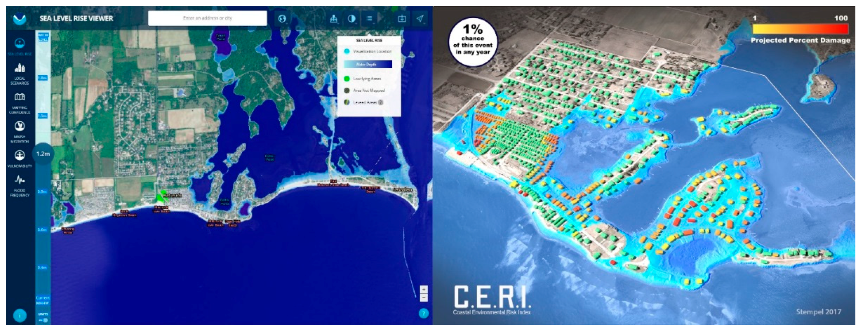
Simulation-based realistic 3D hazard visualizations may appear to be distinct from map-based tools involving simulations by virtue of employing realistic perspectival 3D representations (Figure 5). However, 3D hazard visualizations fall on a larger continuum of 2D and 3D representations employing differing degrees of abstraction and potentially filling different roles in risk communication. Sea level rise viewers (see e.g., NOAA’s viewer at https://coast.noaa.gov/slr/), for instance help to localize and make potential impacts tangible by allowing individuals to examine their own town, significant landmarks, and in some cases their own street [43]. Experimental 3D hazard visualizations such as those made for CERI take this another step by making geographic landmarks recognizable and representing tangible consequences in the form of structural damages [6]. These visualizations also tend to use evocative coloration and shading.
Norms for scientific visualization emphasize the clear, nondramatic presentation of data. Similarly, a significant amount of cartographic research emphasizes clarity and accuracy [45]. Although these norms likely over-emphasize cognitive and analytical aspects of how information is perceived [45], they may nonetheless create audience expectations of authority that in themselves alter perceptions of risk. If, for instance, evocative 3D representations are categorized as “artists interpretations”, audiences that are prone to discount risk information due to motivated reasoning and political identity may discount it even more [46]. Conversely, inscrutable graphics may be seen as an emblem of scientific authority and seriousness [47,48]. In either case, we have failed to account for how the visual rhetoric itself is effective or ineffective as a tool for its intended purpose [45].
This issue is complicated by the sheer volume of depictions of sea level rise and storm surge in both 2D and 3D formats [43]. It is still unclear to what degree the public perceives distinctions among different typologies of representation [20,49]. Whether viewers distinguish these visualizations from other realistic imagery and graphics depicting sea level rise, for instance, may hinge more on the reputation of the organization that produced it than any underlying technical process [24]. Audiences are similarly prone to trust familiar mobile interfaces and maps applications and view them as being objective [50].
While a direct connection to technical processes may seem to ascribe a greater level of legitimacy to these visualizations, what scarce evidence there is about the way simulations are perceived suggests that a range of factors unrelated to underlying technical processes may have a greater effect, and that the perceived credibility of computers is overstated [24,51]. In fact, it is possible that the visual quality and level of detail displayed in realistic visualizations may have a substantial effect on perceived legitimacy [51,52]. This suggests that a well-made but misleading visualization may be judged by the viewer as credible [27,53]. Research in the context of still visualizations and virtual environments supports the importance of level of detail, and conformance to observed conditions as significant factors [52,54,55]. It is therefore important to determine how viewers perceive the connection to the underlying simulation in relation to other factors influencing perceptions of legitimacy.
In the context of expert-led workshop processes, the questions of status and legitimacy are addressed, at least in part, through interaction [23]. For example, climate visioning workshops conducted by the Center for Advanced Landscape Planning at the University of British Columbia (CALP), used a combination of diverse stakeholder input, expert elicitation and mathematical modeling (a form of simulation) to predict future conditions using multiple climate scenarios [16,56]. This process, which is described under the larger umbrella of integrated assessment [16], included:
The use of stakeholder input in the creation of models tempered the impression that models created by experts were “black boxes” [16,38]. This kind of engagement in the creation of simulations and technical processes has further been shown to enhance the perceived legitimacy of those models and outcomes [17]. Perceptions of legitimacy may thus depend on interactions between experts and the public and the ability to shape inputs to the underlying models.
To the extent that modeling and visualization processes are linear and do not allow for direction on the part of stakeholders there is a danger of bias. [57]. Simulation-based visualizations, through their emphasis on complex scientific processes and use of advanced visualization methods, are inherently not transparent to the public and favor expertise [57,58]. This bias potentially affects every aspect of what is visualized, from the determination of what areas are focused on to the specific hazard scenario chosen [57]. It is therefore necessary to consider how the development of simulation-based visualizations used outside of local workshop processes may incorporate direction from stakeholders. In the case of the FEMA IEMC exercise this was accomplished by pre-establishing qualitative thresholds that could be tested against models as will be discussed in a subsequent section [5,59].
3.2. Obscuring Uncertainty
Like other visual rhetoric (e.g., graphics, maps) used to communicate with the public regarding climate change, realistic 3D hazard visualizations concretize science in a way that can obscure uncertainty and overstate confidence [20]. These effects are magnified in the case of realistic visualizations [10,60], especially those that incorporate the depiction of hazard impacts. The inclusion and aggregation of multiple kinds of modeling (such as wave, inundation, erosion, and damage modeling) compounds multiple kinds of uncertainty [10,61]. Erosion and inundation, for example, are predicted using different methods [6], and thus have differing levels of uncertainty associated with the prediction (Figure 6). Similarly, expressing the temporal uncertainty of the storm event (a 1% chance of occurrence), is fundamentally different than expressing a likelihood that the water and terrain will interact in a particular way (natural uncertainty) [10].
The use of realism in visualizations compounds this problem because it can imply higher levels of resolution and confidence than exist by contextualizing abstract modeling in highly detailed 3D representation [10,60]. Although the high resolution of modeling used in some visualizations (e.g., [5,6]) avoids some of the gravest pitfalls of mismatching data scales and types (e.g., areal and point data) [27,53], there is still the problem of reification: the potential that an abstract scientific model is treated as equivalent to reality [10,64]. Regardless of resolution, the level of detail and exactitude of realistic visualizations implies levels of certainty and confidence beyond the capability of the underlying model.
In cartographic contexts, these problems are addressed in several ways, including careful evaluation of the intended audience, modulating the level of detail, emphasizing the non-dramatic depiction of uncertainty, and avoiding realism or visualizations with an excessive “wow” factor that might otherwise distract from the intended risk messaging [10,11]. Even with these steps, however, there is still the fundamental question of how these visualizations are perceived, and whether they are effectively communicating probability (the possibility that less detailed visualizations are failing to communicate consequences adequately is seldom, if ever made in the literature) [11]. This surfaces a long-standing research gap regarding the perception of graphics used for risk communication [11].
Without testing the effects of realistic visualizations, it is difficult to assess to what extent that these distortions alter perception of risk. While it is very likely that these misleading effects exist, it is unclear whether realistic visualizations are in practice necessarily more or less misleading than other forms of less dramatic representation (including written and verbal communication [65]). For instance, to the extent that less evocative representations are viewed as having a higher degree of authority [41], it is entirely possible that the crystalizing effects of those representations may have an equal or greater capacity to mislead [66].
It is also worth considering that choice of representation may signal intentions of the designer that alter the way information is understood and assessed [67]. A realistic representation may signal a degree of deliberate dramatization that makes the resulting visualization seem less authoritative. The degree to which such a visualization is misleading may thus be a question of whether other factors, such as institutional affiliation or being perceived as the product of a technical process, are perceived to confer legitimacy. If this is the case, the question of whether or to what degree realistic visualizations are intrinsically misleading is closely connected to both questions of status and questions of how visualizations alter perceptions of risk.
Risk is distinct from uncertainty and probability because it fundamentally involves values and judgements related to people and places [68]. While the desire to leverage the effects of realistic imagery and place attachment to elicit a response from an audience would seem to place these visualizations firmly in the category of persuasive media [14], the notion of dividing persuasive media from other forms of representation may be a matter of degrees. All representation, at some level, aspires to persuade in order to be an effective communication tool [69,70]. It may therefore be a mistake to view conventional disciplinary approaches to representation as somehow less transformed by perception and outside of the bounds of rhetoric [49]. Maps and graphs are not immune from the problem of being decontextualized, misunderstood, and potentially misused [20,21]. Technical uncertainty is distinct from and transformed by personal and political uncertainty [65].
3.3. Use of Persuasive Media to Communicate Uncertain Future Events
Guidance for the creation and use of visualizations in the context of landscape and urban planning provides insights relevant to hazard communication. That guidance has explicitly evolved to accommodate potentially persuasive imagery including realistic 3D hazard visualizations [23]. The judicious use of drama, and the capacity of realistic and semi-realistic visualizations to elicit emotional responses is cited as a reason that visualizations may be more effective at engaging the public and potentially inspiring behavior change [9,71]. In this context, visualizations are seen as an important means to localize, and make tangible the abstract effects of climate change that are otherwise difficult to imagine [22,72].
The use of visualizations in this way is a departure from earlier standards that were proposed in the context of landscape and urban planning [71]. Those standards emphasized dispassionate representation, and were imagined in the context of representing more conventional planning alternatives (e.g., a proposed bridge) [58]. While such standards were useful for near term planning alternatives, they did not accommodate the broader range of uncertainty regarding outcomes associated with climate change [9,71]. To the extent that visualizations are used to promote positive responses to climate change, they further depart from the notion of a dispassionate representation by virtue of advocacy [9,71], a new framework was therefore necessary.
The practices that subsequently evolved in the context of landscape and urban planning are exemplified by the special role Sheppard, a leading proponent of the use of visualizations, imagines for landscape architects [22,71]. He proposes that landscape architects, through their capacity to “visualize and spatialize future conditions”, act as connectors that facilitate the integration local cultural knowledge and technical knowledge provided by experts [22,23]. This approach conforms to a larger view of science communication that suggests that science communication is best accomplished by collaborative mixed teams that involve scientists, stakeholders, and visual communicators [37]. Such an approach recognizes that the process of creating visual media often involves decisions by visual communication experts that profoundly affect the resulting communication, and that engagement provides an important means to calibrate these decisions among scientists, visual communicators, and stakeholders [23,37].
Sheppard and others have provided clear roadmaps for the use realistic visualizations [22,36,73], including the use of simulations [16]. As previously indicated, this involves engaging stakeholders in the formation of the models and visualizations using, for example, an iterative workshopping process. These processes emphasize interaction between stakeholders and experts, and attention to the specific cultural and situational contexts that alter risk perception [12]. The use of attuned local communicators in these processes accounts for some of these effects and serves to tailor visualization outputs to the audience [22,23]. The challenge, insofar as supporting the broader distribution of realistic simulation-based visualizations, is the emphasis on locality [23,74].
Work undertaken in support of FEMA IEMC, for instance, enlisted local emergency managers to identify specific modeling priorities, including quantifiable thresholds at which a hazard compromised a site or piece of infrastructure. These local priorities were then combined with other statewide databases to produce a real-time training exercise that was relevant at multiple scales [5]. The methodologies utilized demonstrate approaches that reflexively engage representative stakeholders across a region to generate relevant data and visualizations, and thus may be scalable [59].
4. Steps to More Broad Use of Simulation-Based 3D Hazard Visualizations
Contemplating the broader dissemination of realistic simulation-based 3D hazard visualizations, whether by mass media such as a newspaper or deliberate distribution for hazard communication, raises fundamental questions about the perceived status of visual rhetoric, perceptions of legitimacy, and the ways in which visualizations alter perceptions of probability and risk. This suggests that, despite the existence of clear and practical roadmaps for some uses, research needs to address fundamental questions regarding the ways in which viewers perceive visualizations in very specific use cases prior to using real-time visualization capabilities [26].
A research agenda to address these questions should begin by clarifying the role and use-case of realistic or semi-realistic visualizations in hazard communication. For example, an imagistic visualization that is an exemplar of storm damages in context (Figure 7) [7], serves a very different role than a visualization intended to convey the extent of storm surge and structural damages across a community (e.g., Figure 1). The exemplar makes damages tangible in a recognizable context, but does not seek to communicate spatial extents or quantified damage. It does not adopt norms of scientific or technical representation. Although Figure 1 and Figure 7 are different, the models and technology used to drive them are the same. Clearly identifying the use-case (e.g., exemplar image) raises the essential questions of how a visualization style was chosen, what representations are being implicitly made by the visualization (e.g. in Figure 1 by selectively adopting norms), and how its rhetorical characteristics are shaped.
The role visualizations play and the audiences’ perceptions of them is also highly context dependent [26] and influenced by factors such as interface design and presentation format [75,76]. These contextual factors influence the extent to which the misleading nature of visualizations may be problematic. Context also includes social, cultural and situational factors such as race, gender, wealth, social capital, expertise, and experience [10,12]. These characteristics vary with places and audiences, and argue against making wide generalizations regarding how visualizations are perceived, especially across cultures [77]. We thus propose that developing broader applications of realistic hazard visualizations be conducted in collaboration with identified audiences in the following ways:
1. Test the perceived status of simulation-based realistic visualizations intended for hazard communication. Are these visualizations regarded in the same way as other visual rhetoric [20], or is there a distinction based on their underlying connection to scientific and technical processes, specific institutions, or authors? The considerable effort placed into developing fine grained simulations [6], and visualization architecture more generally, is potentially misplaced if the resulting visualizations are indistinguishable from more arbitrary visualizations. Visualizations perceived to be deliberately fear provoking may undermine the credibility of authors by making them appear to be advocates [15].
2. Determine the effect of realistic visualizations and graphics more generally on perceptions of risk as compared to other forms of representation for individual use-cases. Heuristics of availability have long been cited by proponents of using imagery and visualizations (e.g., [8,9]). Yet, our knowledge of the effects of visualizations of specific places on risk perception is largely unexplored outside of case studies that explore the potential role of affective (subconscious emotional instantaneous) response (e.g., [78]). Work that has been done on testing imagery should be repeated for contemplated applications of visualizations (e.g., [7]). The following considerations should be addressed:
- Query perceptions of the likelihood of an event and the severity of an event separately to not conflate perceptions of risk with probability alone.
- Where possible, distinguish between confidence in the projection, the probability of the event, and other forms of uncertainty.
- Account for contextual factors, such as relative expertise, and recognize that contextual factors transform perceptions of technical uncertainty and probability in addition to risk.
Moreover, uses should recognize that graphic, representational, and contextual differences will cause visualizations that are categorically or technologically similar to be perceived differently. Until there is a broad base of experience across multiple contexts, it will be difficult to generalize due to the heterogeneity of practices and contexts [28].
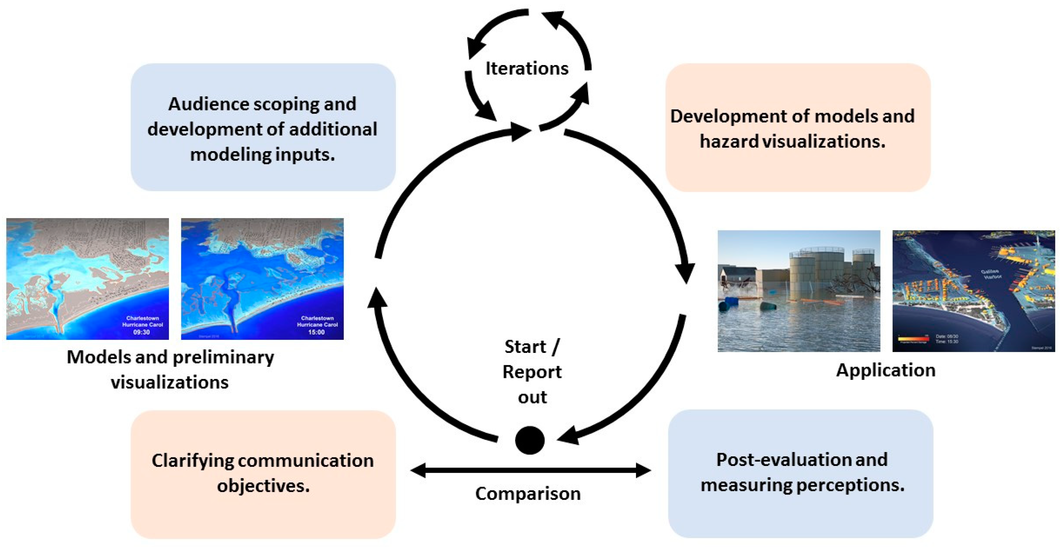
3. Build reflexivity into communication design by creating feedback mechanisms. This involves three steps in addition to the development of the models and visualizations:
- Identify visualization objectives at the outset of processes, recognizing that expert stakeholders that typically shape visualizations and audiences have distinct perceptions of risk and priorities [57].
- Involve audiences in scoping what is visualized and developing or shaping modeling inputs as suggested in earlier sections of this paper. Although much attention has been paid to the notion of creating user/audience controllable visualizations, users/audiences should shape what is controlled and the extent of scenario choices [79];
- Conduct post-surveys that measure the perception visualizations and their effects on perception in conditions that approximate use, including using representative samples. Compare results to the identified objectives [26].
This process, as envisaged and currently being implemented by the authors, is diagramed in Figure 8.
This approach conforms to guidance by the United States National Academy of Sciences in the report “Communicating Science Effectively, a National Research Agenda” that promotes testing visual rhetoric in specific application rather than attempting generalizations [26]. It has the potential to inform both the development of real-time hazard visualizations and existing frameworks for the use of visualizations in cartographic, climate communication, and landscape and urban planning contexts.
5. Conclusions
Real-time or near-real-time technology combined with advancing software is closing the distance between model, geographic information, and visualization. The danger inherent in the development of real-time semi-realistic simulation-based hazard visualizations is the presumption by scientists, coastal managers, and other experts that these visualizations are ergonomically better or inherently more effective communication tools [80,81]. As elaborated here, this presumption brings with it the possibility that scientists and other experts mislead the public and undermine their own credibility. Caution is thus warranted, and it falls to those intending to develop real-time capabilities to identify a clear role for these visualizations and demonstrate both the efficacy and ethics of their use.
If researchers and creators of visualizations can understand the dimensions of these issues, it may be possible to expand the boundaries of current guidelines for the use of these visualization technologies. If for instance, the potentially misleading effects of realistic visualizations can be understood and mitigated, it may be possible to hybridize the uses of these visualizations with existing applications of 2D map representations to make spatial orientation easier. It is similarly conceivable that better understanding factors contributing to perceived legitimacy of visualizations may suggest ways of expanding current workshop processes. Moreover, there may be applications for which real-time 3D visualization is particularly suited. For instance, in emphasizing the damaging effects of storm surge in a location to communicate its power, or showing the damages resulting from wind and surge in a single visualization so as not to cause audiences to have misplaced feelings of safety when viewing surge only visualizations.
Exploring these potentials has wider implications for more conventional forms of representation. The lack of clarity regarding how the public perceives visual rhetoric produced by scientists in relationship to other forms of visual rhetoric (e.g., advocacy, journalism) highlights the extent to which frameworks for visualization are configured based on disciplinary conventions [20]. Although these conventions establish self-reinforcing expectations on the part of the public [82], better understanding how visual rhetoric produced by scientists, coastal managers and other experts is perceived has the potential to inform and improve existing frameworks. We thus advocate for moving from expert-out and generalized paradigms to paradigms that are reflexive, self-correcting, and able to accommodate diverse and changing perceptions.
Author Contributions
Conceptualization, Peter Stempel, Austin Becker; Literature Review, Peter Stempel; Writing-Original Draft Preparation, Peter Stempel; Writing-Review & Editing, Peter Stempel, Austin Becker; Visualization, Peter Stempel; Project Administration, Austin Becker; Funding Acquisition, Austin Becker, Peter Stempel.
Funding
This research was funded by Rhode Island Sea Grant, The Coastal Institute-University of Rhode Island, and the USDA National Institute of Food and Agriculture, Hatch project 1014166. Work and models pertaining to FEMA IEMC were supported by the U.S. Department of Homeland Security under Grant Award Number 2015-ST-061-ND0001-01. The views and conclusions contained in this document are those of the authors and should not be interpreted as necessarily representing the official policies, either expressed or implied, of the U.S Department of Homeland Security.
Acknowledgments
Thank you to partners at the Rhode Island Coastal Resources Center, Rhode Island Coastal Resources Council, University of Rhode Island Department of Ocean Engineering and University of Rhode Island Graduate School of Oceanography.
Conflicts of Interest
The authors declare no conflict of interest. The funders had no role in the design of the study; in the collection, analyses, or interpretation of data; in the writing of the manuscript, or in the decision to publish the results.
References
- Woodruff, J.D.; Irish, J.L.; Camargo, S.J. Coastal flooding by tropical cyclones and sea-level rise. Nature 2013, 504, 44–52. [Google Scholar] [CrossRef] [PubMed] [Green Version]
- Romero, R.; Emanuel, K. Climate Change and Hurricane-Like Extratropical Cyclones: Projections for North Atlantic Polar Lows and Medicanes Based on CMIP5 Models. J. Clim. 2017, 30, 279–299. [Google Scholar] [CrossRef] [Green Version]
- Morrow, B.H.; Lazo, J.K.; Rhome, J.; Feyen, J. Improving storm surge risk communication: Stakeholder perspectives. Bull. Am. Meteorol. Soc. 2015, 96, 35–48. [Google Scholar] [CrossRef]
- Morrow, B.H.; Lazo, J.K. Emergency Managers On-Line Survey on Extratropical and Tropical Cyclone Forecast Information: Hurricane Forecast Improvement Program/Storm Surge Roadmap; NCAR Technical Note NCAR/TN-497: Boulder, CO, USA, 2013; Available online: https://opensky.ucar.edu/islandora/object/technotes%3A508/datastream/PDF/view (accessed on 24 July 2019). [CrossRef]
- Stempel, P.; Ginis, I.; Ullman, D.; Becker, A.; Witkop, R. Real-Time Chronological Hazard Impact Modeling. J. Mar. Sci. Eng. 2018, 6, 134. [Google Scholar] [CrossRef]
- Spaulding, M.L.; Grilli, A.; Damon, C.; Crean, T.; Fugate, G.; Oakley, B.; Stempel, P. STORMTOOLS: Coastal Environmental Risk Index (CERI). J. Mar. Sci. Eng. 2016, 4, 54. [Google Scholar] [CrossRef]
- Rickard, L.N.; Schuldt, J.P.; Eosco, G.M.; Scherer, C.W.; Daziano, R.A. The proof is in the picture: The influence of imagery and experience in perceptions of hurricane messaging. Weather. Clim. Soc. 2017, 9, 471–485. [Google Scholar] [CrossRef]
- Keller, C.; Siegrist, M.; Gutscher, H. The role of the affect and availability heuristics in risk communication. Risk Anal. 2006, 26, 631–639. [Google Scholar] [CrossRef] [PubMed]
- Sheppard, S.R. Landscape visualisation and climate change: The potential for influencing perceptions and behaviour. Environ. Sci. Policy 2005, 8, 637–654. [Google Scholar] [CrossRef]
- Kostelnick, J.C.; McDermott, D.; Rowley, R.J.; Bunnyfield, N. A cartographic framework for visualizing risk. Cartographica Int. J. Geogr. Inf. Geovisualization 2013, 48, 200–224. [Google Scholar] [CrossRef]
- Bostrom, A.; Anselin, L.; Farris, J. Visualizing seismic risk and uncertainty. Ann. N. Y. Acad. Sci. 2008, 1128, 29–40. [Google Scholar] [CrossRef]
- Morgan, M.G.; Fischhoff, B.; Bostrom, A.; Atman, C.J. Risk Communication: A Mental Models Approach; Cambridge University Press: Cambridge, UK, 2001. [Google Scholar] [CrossRef]
- Weber, E.U. What shapes perceptions of climate change? Wiley Interdiscip. Rev. Clim. Chang. 2010, 1, 332–342. [Google Scholar] [CrossRef]
- Nicholson-Cole, S.A. Representing climate change futures: A critique on the use of images for visual communication. Comput. Environ. Urban Syst. 2005, 29, 255–273. [Google Scholar] [CrossRef]
- O’Neill, S.; Nicholson-Cole, S. “Fear Won’t Do It” Promoting Positive Engagement With Climate Change Through Visual and Iconic Representations. Sci. Commun. 2009, 30, 355–379. [Google Scholar] [CrossRef]
- Schroth, O.; Pond, E.; Sheppard, S.R. Integration of Spatial Outputs from Mathematical Models in Climate Change Visioning Tools for Community-Decision Making on the Landscape Scale. In Proceedings of the DLA-Digital Landscape Architecture, Dessau and Bernburg, Germany, 26–28 May 2011; pp. 246–255. [Google Scholar]
- White, D.D.; Wutich, A.; Larson, K.L.; Gober, P.; Lant, T.; Senneville, C. Credibility, salience, and legitimacy of boundary objects: Water managers’ assessment of a simulation model in an immersive decision theater. Sci. Public Policy 2010, 37, 219–232. [Google Scholar] [CrossRef]
- Becker, A. Using boundary objects to stimulate transformational thinking: Storm resilience for the Port of Providence, Rhode Island (USA). Sustain. Sci. 2017, 12, 477–501. [Google Scholar] [CrossRef]
- Schroth, O. From Information to Participation: Interactive Landscape Visualization as a Tool for Collaborative Planning; VDF Hochschulverlag AG: Zürich, Switzerland, 2010; Volume 6. [Google Scholar]
- Deitrick, S.; Edsall, R. Mediated Knowledge and Uncertain Science: Maps in Communicating Climate Change in Mass Media. In Proceedings of the 24th International Cartographic Conference, Santiago, Chile, 15–21 November 2009. [Google Scholar]
- Bica, M.; Demuth, J.L.; Dykes, J.; Palen, L. Communicating Hurricane Risks: Multi-Method Examination of Risk Imagery Diffusion. 2019. Manuscript submitted for publication. [Google Scholar] [CrossRef]
- Sheppard, S.R. Making climate change visible: A critical role for landscape professionals. Landsc. Urban Plan. 2015, 142, 95–105. [Google Scholar] [CrossRef] [Green Version]
- Sheppard, S.R. Visualizing Climate Change: A Guide to Visual Communication of Climate Change and Developing Local Solutions; Routledge: Abingdon Oxon, UK, 2012. [Google Scholar] [CrossRef]
- Fogg, B.; Tseng, H. The elements of computer credibility. In Proceedings of the SIGCHI conference on Human Factors in Computing Systems, Pittsburgh, PA, USA, 15–20 May 1999; pp. 80–87. [Google Scholar] [CrossRef]
- Yates, J.F.; Stone, E.R. The risk construct. In Risk-Taking Behavior; Yates, J.F., Ed.; John Wiley: Chinchester, UK, 1992; pp. 1–25. [Google Scholar]
- Leshner, A.; Scheufele, D.; Bostrom, A.; Bruine de Bruin, W.; Cook, K.; Dietz, T.; Hallman, W.; Henig, J.R.; Hornik, R.; Maynard, A.; et al. Communicating Science Effectively: A Research Agenda; National Academies of Sciences, Engineering, and Medicine: Washington, DC, USA, 2016. [Google Scholar] [CrossRef]
- Sheppard, S.R.; Cizek, P. The ethics of Google Earth: Crossing thresholds from spatial data to landscape visualisation. J. Environ. Manag. 2009, 90, 2102–2117. [Google Scholar] [CrossRef]
- Lovett, A.; Appleton, K.; Warren-Kretzschmar, B.; Von Haaren, C. Using 3D visualization methods in landscape planning: An evaluation of options and practical issues. Landsc. Urban Plan. 2015, 142, 85–94. [Google Scholar] [CrossRef]
- Couclelis, H. The certainty of uncertainty: GIS and the limits of geographic knowledge. Trans. Gis 2003, 7, 165–175. [Google Scholar] [CrossRef]
- Moser, S.C. Reflections on climate change communication research and practice in the second decade of the 21st century: What more is there to say? Wiley Interdiscip. Rev. Clim. Chang. 2016, 7, 345–369. [Google Scholar] [CrossRef]
- Brecht, H. Geo-technologies in hurricane research. Cartogr. Geogr. Inf. Sci. 2007, 34, 153–154. [Google Scholar] [CrossRef]
- Fenech, A.; Chen, A.; Clark, A.; Hedley, N. Building an adaptation tool for visualizing the coastal impacts of climate change on Prince Edward Island, Canada. In Climate Change Adaptation in North America; Springer: New York, NY, USA, 2017; pp. 225–238. [Google Scholar] [CrossRef]
- Sneath, S. Predicting flood locations, depths, is aim of new computer simulation. In NOLA.com | The Times Picayune; NOLA Media Group: New Orleans, LA, USA, 2017. [Google Scholar]
- McCann, J.; Schumann, S.; Fugate, G.; Kennedy, S.; Young, C. Ocean SAMP: The Rhode Island Ocean Special Area Management Plan-Managing Ocean Resources Through Coastal and Marine Spatial Planning. A Practitioner’s Guide; University of Rhode Island Coastal Resources Center: Narragansett, RI, USA, 2012. [Google Scholar] [CrossRef]
- Crean, T. RI Shoreline Change Special Area Management Plan. Available online: http://www.beachsamp.org (accessed on 16 August 2018).
- Sheppard, S.R.; Shaw, A.; Flanders, D.; Burch, S.; Schroth, O. Bringing Climate Change Science to the Landscape Level: Canadian Experience in Using Landscape Visualisation Within Participatory Processes for Community Planning. In Landscape Ecology for Sustainable Environment and Culture; Springer: New York, NY, USA, 2013; pp. 121–143. [Google Scholar] [CrossRef]
- Trumbo, J. Essay: Seeing science: Research opportunities in the visual communication of science. Sci. Commun. 2000, 21, 379–391. [Google Scholar] [CrossRef]
- Salter, J.; Robinson, J.; Wiek, A. Participatory methods of integrated assessment—A review. Wiley Interdiscip. Rev. Clim. Chang. 2010, 1, 697–717. [Google Scholar] [CrossRef]
- Kuffner, A. Rising Seas, Rising Stakes. Providence Journal, 20 November 2016. [Google Scholar]
- Howe, P.D. Hurricane preparedness as anticipatory adaptation: A case study of community businesses. Glob. Environ. Chang. 2011, 21, 711–720. [Google Scholar] [CrossRef]
- Crampton, J.W.; Krygier, J. An introduction to critical cartography. ACME Int. E-J. Crit. Geogr. 2005, 4, 11–33. Available online: https://acme-journal.org/index.php/acme/article/view/723 (accessed on 24 July 2019).
- Ullman, D.S.; Ginis, I.; Huang, W.; Nowakowski, C.; Chen, X.; Stempel, P. Assessing the Multiple Impacts of Extreme Hurricanes in Southern New England, USA. Geosciences 2019, 9, 265. [Google Scholar] [CrossRef]
- Retchless, D.P. Sea level rise maps: How individual differences complicate the cartographic communication of an uncertain climate change hazard. Cartogr. Perspect. 2014, 17–32. [Google Scholar] [CrossRef]
- NOAA Digital Coast. Available online: https://coast.noaa.gov/slr/#/layer/slr/4/-7963929.398098727/5068391.795277364/15/satellite/none/0.8/2050/interHigh/midAccretion (accessed on 20 September 2017).
- Muehlenhaus, I. The design and composition of persuasive maps. Cartogr. Geogr. Inf. Sci. 2013, 40, 401–414. [Google Scholar] [CrossRef]
- Kahan, D.M. Ideology, motivated reasoning, and cognitive reflection: An experimental study. SSRN Electron. J. 2012. [Google Scholar] [CrossRef]
- Walsh, L. ‘Tricks,’Hockey Sticks, and the Myth of Natural Inscription: How the Visual Rhetoric of Climategate Conflated Climate with Character. In Image Politics of Climate Change: Visualizations, Imaginations, Documentations; Schneider, B., Nocke, T., Eds.; Transcript Verlag: Bielefeld, Germany, 2014; Volume 55, pp. 81–104. [Google Scholar] [CrossRef]
- Walsh, L. Visual Invention and the Composition of Scientific Research Graphics: A Topological Approach. Writ. Commun. 2017. [Google Scholar] [CrossRef]
- Walsh, L. The visual rhetoric of climate change. Wiley Interdiscip. Rev. Clim. Chang. 2015, 6, 361–368. [Google Scholar] [CrossRef]
- Farman, J. Mapping the digital empire: Google Earth and the process of postmodern cartography. New Media Soc. 2010, 12, 869–888. [Google Scholar] [CrossRef]
- Couture, M. Realism in the design process and credibility of a simulation-based virtual laboratory. J. Comput. Assist. Learn. 2004, 20, 40–49. [Google Scholar] [CrossRef] [Green Version]
- Orland, B.; Budthimedhee, K.; Uusitalo, J. Considering virtual worlds as representations of landscape realities and as tools for landscape planning. Landsc. Urban Plan. 2001, 54, 139–148. [Google Scholar] [CrossRef]
- Liu, S.B.; Palen, L. The new cartographers: Crisis map mashups and the emergence of neogeographic practice. Cartogr. Geogr. Inf. Sci. 2010, 37, 69–90. [Google Scholar] [CrossRef]
- Appleton, K.; Lovett, A. GIS-based visualisation of rural landscapes: Defining ‘sufficient’realism for environmental decision-making. Landsc. Urban Plan. 2003, 65, 117–131. [Google Scholar] [CrossRef]
- Lange, E. The limits of realism: Perceptions of virtual landscapes. Landsc. Urban Plan. 2001, 54, 163–182. [Google Scholar] [CrossRef]
- Schroth, O.; Hayek, U.W.; Lange, E.; Sheppard, S.R.; Schmid, W.A. Multiple-case study of landscape visualizations as a tool in transdisciplinary planning workshops. Landsc. J. 2011, 30, 53–71. [Google Scholar] [CrossRef]
- MacFarlane, R.; Stagg, H.; Turner, K.; Lievesley, M. Peering through the smoke? Tensions in landscape visualisation. Comput. Environ. Urban Syst. 2005, 29, 341–359. [Google Scholar] [CrossRef]
- Sheppard, S.R. Guidance for crystal ball gazers: Developing a code of ethics for landscape visualization. Landsc. Urban Plan. 2001, 54, 183–199. [Google Scholar] [CrossRef]
- Witkop, R.; Becker, A.; Stempel, P.; Ginis, I. Developing Consequence Thresholds for Storm Models Through Participatory Processes: Case Study of Westerly Rhode Island. Front. Earth Sci. 2019, 7. [Google Scholar] [CrossRef]
- Zanola, S.; Fabrikant, S.I.; Çöltekin, A. The effect of realism on the confidence in spatial data quality in stereoscopic 3D displays. In Proceedings of the 24th International Cartography Conference, Santiago, Chile, 15–21 November 2009; pp. 15–21. [Google Scholar]
- MacEachren, A.M. Visualizing uncertain information. Cartogr. Perspect. 1992, 13, 10–19. [Google Scholar] [CrossRef]
- Kruse, R.; Schwecke, E.; Heinsohn, J. Uncertainty and Vagueness in Knowledge Based Systems: Numerical Methods; Springer Science & Business Media: New York, NY, USA, 2012. [Google Scholar] [CrossRef]
- Coulbourne, B.; Headen, F.L.; Jones, C.; Kennedy, A.; Pagano, M.; Ramanathan, K.; Rogers, S.; Soucy, J.; Young, J. North Atlantic Coast Comprehensive Study: Resilient Adaptation to Increasing Risk; Physical Damage Function Summary Report; United States Army Corps of Engineers, 2015. Available online: https://www.nad.usace.army.mil/CompStudy/ (accessed on 24 July 2019).
- Wynne, B. Sheep farming after Chernobyl: A case study in communicating scientific information. Environ. Sci. Policy Sustain. Dev. 1989, 31, 10–39. [Google Scholar] [CrossRef]
- Walsh, L.; Walker, K.C. Perspectives on Uncertainty for Technical Communication Scholars. Tech. Commun. Q. 2016, 25, 71–86. [Google Scholar] [CrossRef]
- Monmonier, M. How to Lie with Maps, 3rd ed.; University of Chicago Press: Chicago, IL, USA, 2018. [Google Scholar] [CrossRef]
- Elzer, S.; Green, N.; Carberry, S.; Hoffman, J. Incorporating perceptual task effort into the recognition of intention in information graphics. In Proceedings of the International Conference on Theory and Application of Diagrams, Cambridge, UK, 22–24 March 2004; pp. 255–270. [Google Scholar] [CrossRef]
- Frost, E.A. Transcultural Risk Communication on Dauphin Island: An Analysis of Ironically Located Responses to the Deepwater Horizon Disaster. Tech. Commun. Q. 2013, 22, 50–66. [Google Scholar] [CrossRef]
- Tufte, E.R.; Weise Moeller, E. Visual Explanations: Images and Quantities, Evidence and Narrative; Graphics Press: Cheshire, CT, USA, 1997; Volume 36. [Google Scholar]
- Latour, B. Visualization and Cognition: Drawing things together. In Representation in Scientific Activity; Lynch, M., Woolgar, S., Eds.; MIT Press: Cambridge, MA, USA, 1990; pp. 19–68. [Google Scholar]
- Sheppard, S.R.; Shaw, A.; Flanders, D.; Burch, S. Can visualization save the world? Lessons for landscape architects from visualizing local climate change. In Proceedings of the Digital Design in Landscape Architecture, Anhalt University of Applied Sciences, Dessau, Germany, 29–31 May 2008; pp. 29–31. [Google Scholar]
- Moser, S.C.; Dilling, L. Communicating climate change: Closing the science-action gap. In The Oxford Handbook of Climate Change and Society; Oxford University Press: Oxford, UK, 2011; pp. 161–174. [Google Scholar] [CrossRef]
- Sheppard, S.R.; Shaw, A.; Flanders, D.; Burch, S.; Wiek, A.; Carmichael, J.; Robinson, J.; Cohen, S. Future visioning of local climate change: A framework for community engagement and planning with scenarios and visualisation. Futures 2011, 43, 400–412. [Google Scholar] [CrossRef]
- Star, S.L. This is not a boundary object: Reflections on the origin of a concept. Sci. Technol. Hum. Values 2010, 35, 601–617. [Google Scholar] [CrossRef]
- Stephens, S.H.; DeLorme, D.E.; Hagen, S.C. Evaluating the Utility and Communicative Effectiveness of an Interactive Sea-Level Rise Viewer Through Stakeholder Engagement. J. Bus. Tech. Commun. 2015, 29, 314–343. [Google Scholar] [CrossRef]
- Griffin, A.L.; White, T.; Fish, C.; Tomio, B.; Huang, H.; Sluter, C.R.; Bravo, J.V.M.; Fabrikant, S.I.; Bleisch, S.; Yamada, M.; et al. Designing across map use contexts: A research agenda. Int. J. Cartogr. 2017, 3, 90–114. [Google Scholar] [CrossRef]
- Henrich, J.; Heine, S.J.; Norenzayan, A. The weirdest people in the world? Behav. Brain Sci. 2010, 33, 61–83. [Google Scholar] [CrossRef] [PubMed]
- Lewis, J.L.; Sheppard, S.R.J. Culture and communication: Can landscape visualization improve forest management consultation with indigenous communities? Landsc. Urban Plan. 2006, 77, 291–313. [Google Scholar] [CrossRef]
- Stephens, S.H. Designer perceptions of user agency during the development of environmental risk visualization tools. In Proceedings of the 35th ACM International Conference on the Design of Communication, Halifax, NS, Canada, 11–13 August 2017; pp. 1–7. [Google Scholar]
- Harold, J.; Lorenzoni, I.; Shipley, T.F.; Coventry, K.R. Cognitive and psychological science insights to improve climate change data visualization. Nat. Clim. Chang. 2016, 6, 1080. [Google Scholar] [CrossRef]
- Smallman, H.S.; John, M.S. Naive Realism: Misplaced Faith in Realistic Displays. Ergon. Des. 2005, 13, 6–13. [Google Scholar] [CrossRef]
- Kostelnick, C.; Hassett, M. Shaping Information: The Rhetoric of Visual Conventions; Southern Illinois University Press: Carbondale, IL, USA, 2003. [Google Scholar]
Figure 1.
Excerpt from time incremented 3D hazard visualization series of Galilee Harbor, South Kingstown, RI, USA, depicting the progressive impacts (%structural value) of Hurricane Carol (1954) at current sea level on present build-out. The impact modeling system used to drive this visualization is currently adapted to real-time deployment for use by emergency managers. Image: Authors.

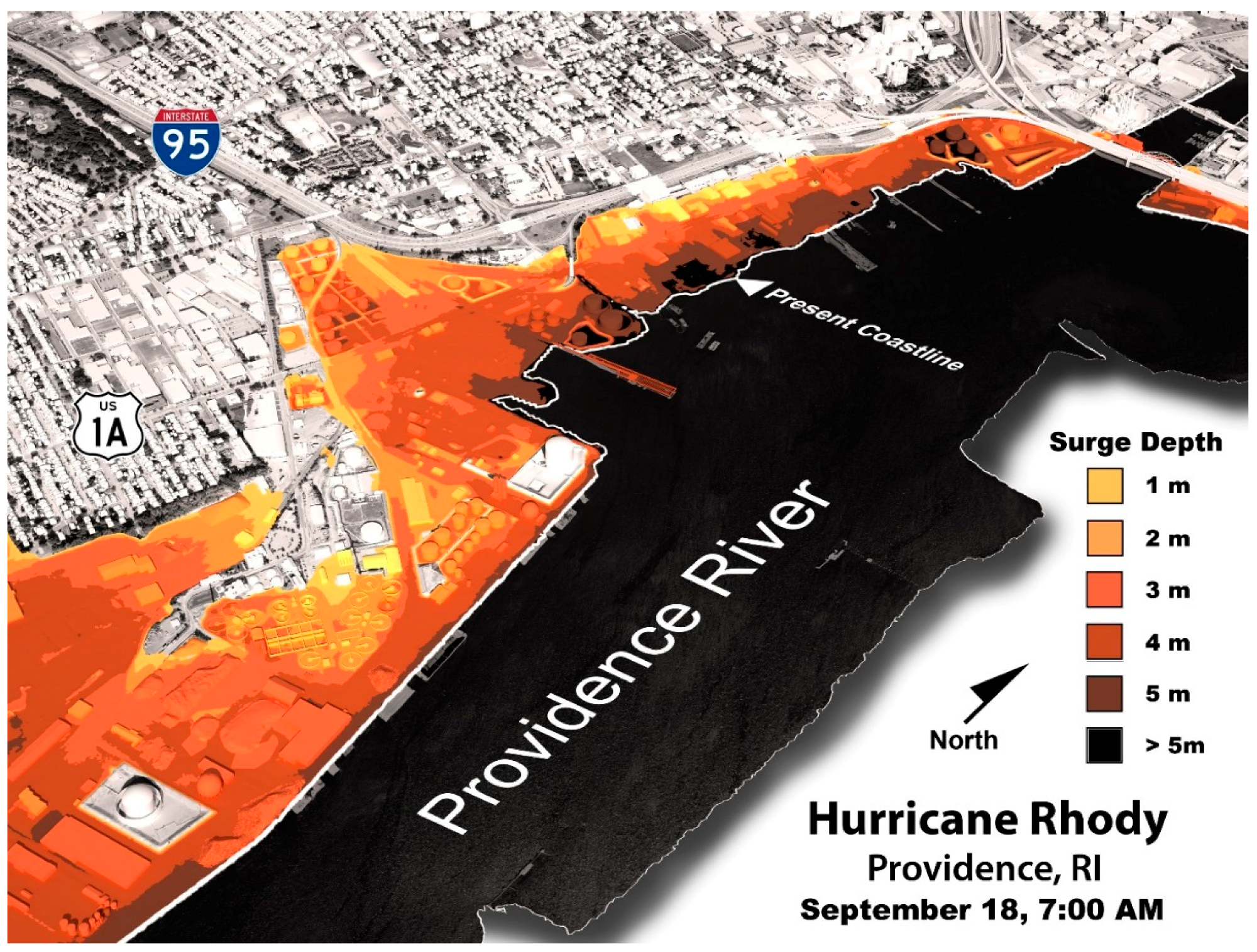
Figure 2.
Visualization depicting inundation of energy infrastructure in Providence, RI, USA, used for a training exercise (FEMA IEMC) that took place in June of 2017. This training exercise used time incremented 3D models of coastal communities and infrastructure to depict the landfall of a modeled extreme storm event. Although structures were individually modeled and tested, specific representations of damage were not included to avoid creating misleading impressions. The presence of recognizable landmarks and highway interchanges orients local viewers. Image: Authors.

Figure 3.
Cropped comparison of Warwick, RI, USA, as used on the front page of the Providence Journal newspaper juxtaposing the no inundation scenario with a scenario depicting 7’ of sea level rise and a storm event with a 1% chance of occurrence [6,39]. The comparison and cropping of the image emphasizes the already extreme scenario. Image: Authors.

Figure 4.
A FEMA IEMC visualization of downtown Providence, RI, USA as a result of failed flood control systems and 46" of rainfall [5,42]. The unfolding of this scenario requires the alignment of several events (e.g., failure of flood control measures); without this qualification, this visualization could foster a range of misleading interpretations. The term “Table Game” used in the visualization is a reference to the specific time increments of the exercise (visualizations made in series). Image: Authors.

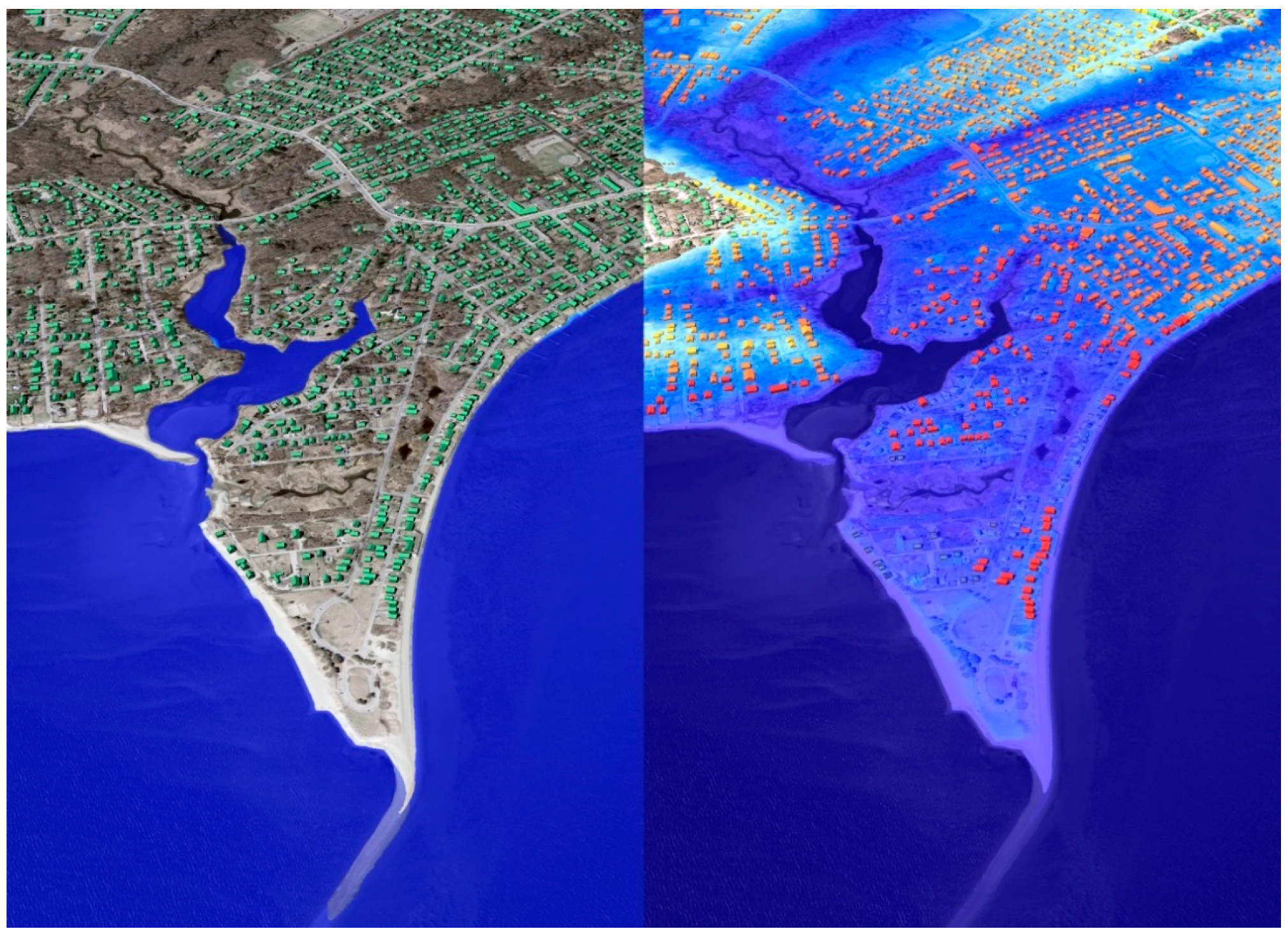
Figure 5.
Comparison of map based NOAA Sea Level Rise Viewer and Semi-realistic 3D model output based on the Coastal and Environmental Risk Index (CERI) demonstrating the distinction between them. Both depict Matunuck, RI, USA [6,44]. Image left: NOAA. Image right: Authors.

Figure 6.
an example of damage modeling (similar to methods used in CERI [6]), in which a final level of damage is determined by testing building characteristics against a series of models to determine which model produces the highest and therefore controlling level of damage. Each model introduces unique assumptions and uncertainties. Unmodeled or unknowable conditions and interactions between the model create additional uncertainties [10,29]. In addition to this, the use of forensic studies introduce the problem of making calculations with vague data—that is data that is expressed in ranges rather than as a single figure [62,63]. The specificity of the numerical outcome for a specific structure, thus may create an inappropriate impression of certainty, which is further compounded by the level of detail in a realistic visualization [10]. Image: Authors.

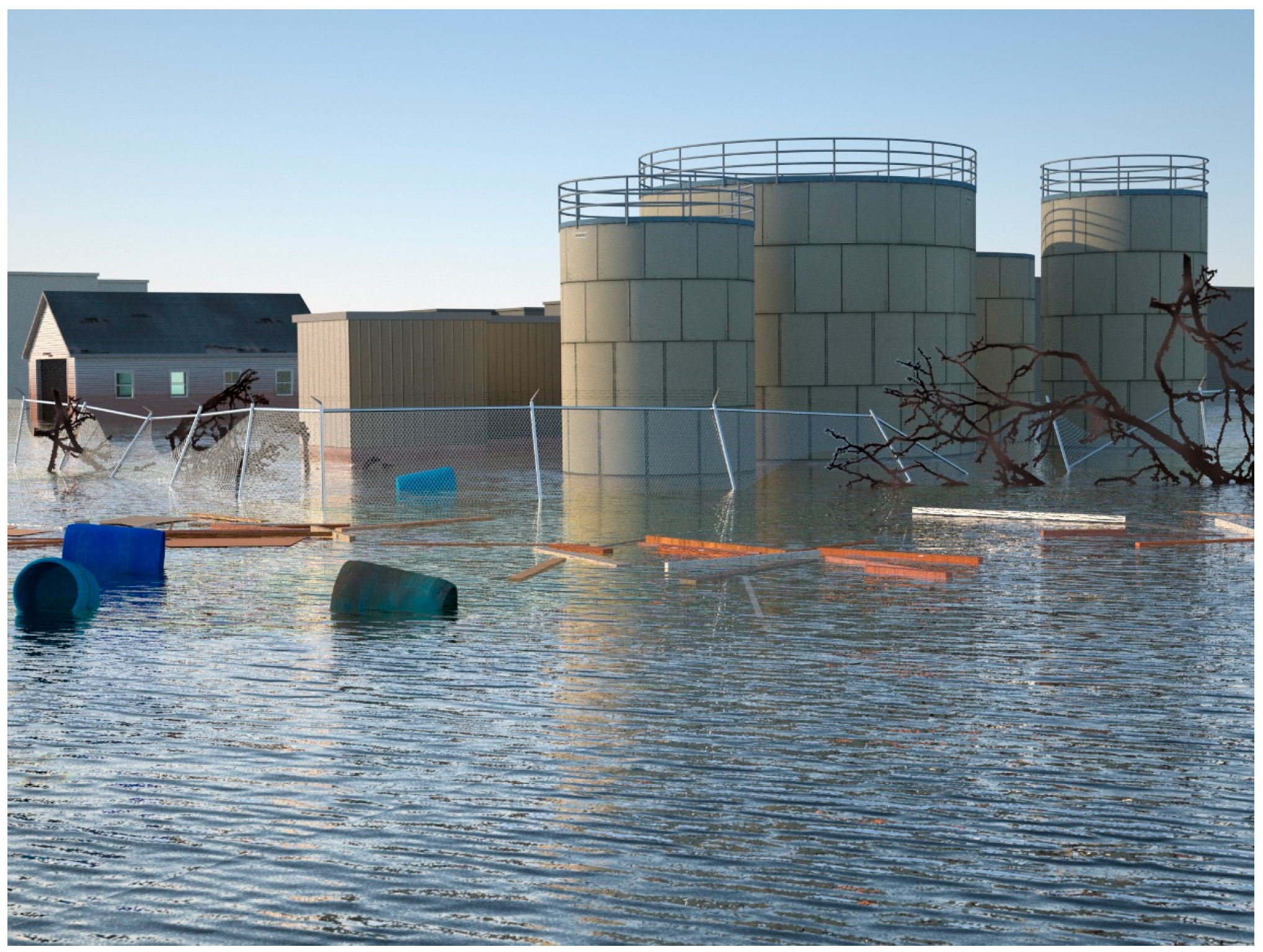
Figure 7.
a realistic ground level visualizations of water treatment tanks in Galilee, Rhode Island, USA, intended to serve as an exemplar of damages post-storm. This depiction is controlled by the same underlying ocean and impact models used to create Figure 1.
Figure 7.
a realistic ground level visualizations of water treatment tanks in Galilee, Rhode Island, USA, intended to serve as an exemplar of damages post-storm. This depiction is controlled by the same underlying ocean and impact models used to create Figure 1.

Figure 8.
a diagram of the reflexive process advocated by the authors that facilitates comparison of objectives to results and the ability of audiences to shape visualization outputs. Image: Authors.
Figure 8.
a diagram of the reflexive process advocated by the authors that facilitates comparison of objectives to results and the ability of audiences to shape visualization outputs. Image: Authors.


Table 1.
Summary of issues raised by use of realistic simulation-based visualizations outside of expert-led workshop processes. These issues may apply more broadly to other types of visualizations.
Table 1.
Summary of issues raised by use of realistic simulation-based visualizations outside of expert-led workshop processes. These issues may apply more broadly to other types of visualizations.
| Outside of Reflexive Processes (e.g., Workshops) | Inside Reflexive Processes | |
|---|---|---|
| Status and legitimacy | Unclear whether model driven visualizations are distinguishable from other forms of visual rhetoric [20]. | Perceived saliency and legitimacy is enhanced by stakeholder input and transparency of technical processes [16]. |
| Uncertainty | Certainty regarding outcomes and resolution of models is overstated implying greater degrees of knowledge than exist [29]. | Perceptions of risk are developed and qualified through interaction between stakeholders and experts [12]. |
| Use | Exceeds the boundaries of frameworks for visualizing risk [10]. | Guided by well established guidelines and best practices [30]. |
© 2019 by the authors. Licensee MDPI, Basel, Switzerland. This article is an open access article distributed under the terms and conditions of the Creative Commons Attribution (CC BY) license (http://creativecommons.org/licenses/by/4.0/).
Share and Cite
MDPI and ACS Style
Stempel, P.; Becker, A. Visualizations Out of Context: Addressing Pitfalls of Real-Time Realistic Hazard Visualizations. ISPRS Int. J. Geo-Inf. 2019, 8, 318. https://0-doi-org.brum.beds.ac.uk/10.3390/ijgi8080318
AMA Style
Stempel P, Becker A. Visualizations Out of Context: Addressing Pitfalls of Real-Time Realistic Hazard Visualizations. ISPRS International Journal of Geo-Information. 2019; 8(8):318. https://0-doi-org.brum.beds.ac.uk/10.3390/ijgi8080318
Chicago/Turabian StyleStempel, Peter, and Austin Becker. 2019. "Visualizations Out of Context: Addressing Pitfalls of Real-Time Realistic Hazard Visualizations" ISPRS International Journal of Geo-Information 8, no. 8: 318. https://0-doi-org.brum.beds.ac.uk/10.3390/ijgi8080318
Note that from the first issue of 2016, this journal uses article numbers instead of page numbers. See further details here.