The Influence of Map Projections on People’s Global-Scale Cognitive Map: A Worldwide Study


Department of Geography, Ghent University, 9000 Ghent, Belgium
*
Author to whom correspondence should be addressed.
ISPRS Int. J. Geo-Inf. 2020, 9(4), 196; https://0-doi-org.brum.beds.ac.uk/10.3390/ijgi9040196
Submission received: 24 February 2020
/
Revised: 20 March 2020
/
Accepted: 22 March 2020
/
Published: 26 March 2020
Abstract
:Map projections are required to represent the globe on a flat surface, which always results in distorted representations of the globe. Accordingly, the world maps we observe in daily life contexts, such as on news sites, in news bulletins, on social media, in educational textbooks or atlases, are distorted images of the world. The question raises if regular contact with those representations of the world deforms people’s global-scale cognitive map. To analyze people’s global-scale cognitive map and if it is influenced by map projections, a short playful test was developed that allowed participants to estimate the real land area of certain regions, countries, and continents. More than 130,000 people worldwide participated. This worldwide dataset was used to perform statistical analyses in order to obtain information on the extent that map projections influence the accuracy of people’s global-scale cognitive map. The results indicate that the accuracy differs with the map projection but not to the extent that one’s global-scale cognitive map is a reflection of a particular map projection.
1. Introduction
Developing a cognitive map requires spatial knowledge, which humans achieve by moving in and through space, and as well via observing maps, imagery, 3D models, virtual reality, etc. Through experiences and processes of learning this spatial knowledge evolves over time. As Montello [1] states geographers are interested in how these different media influence the nature of acquired knowledge. In this paper we aim to focus on one of these possible influencing media: the map and, in particular, its map projection. To what extent do map projections impact the development of the global-scale cognitive map?
1.1. Map Projections and Their Controversy
A large number of map projections are developed by mathematicians or cartographers to represent (a part of) the globe on a flat surface.
However, all distort the earth’s representation in specific ways: through angles, areas, distances, or a combination of these three elements. For decades, cartographers and mathematicians have expounded upon these distortions. For instance, at the end of the 19th century, Nicolas Auguste Tissot characterized local distortions due to map projections by a mathematical contrivance, named the Tissot indicatrix [2].
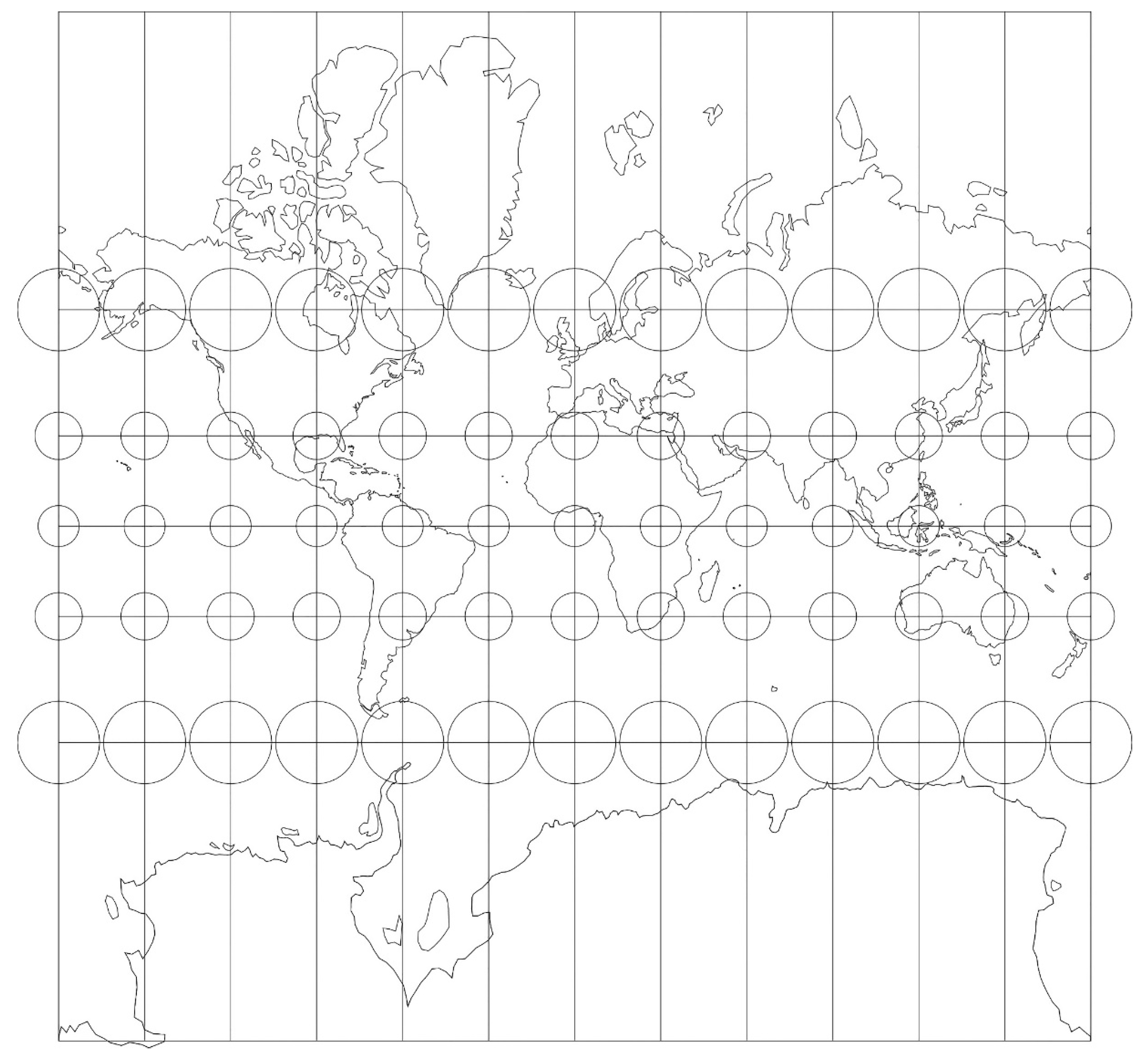
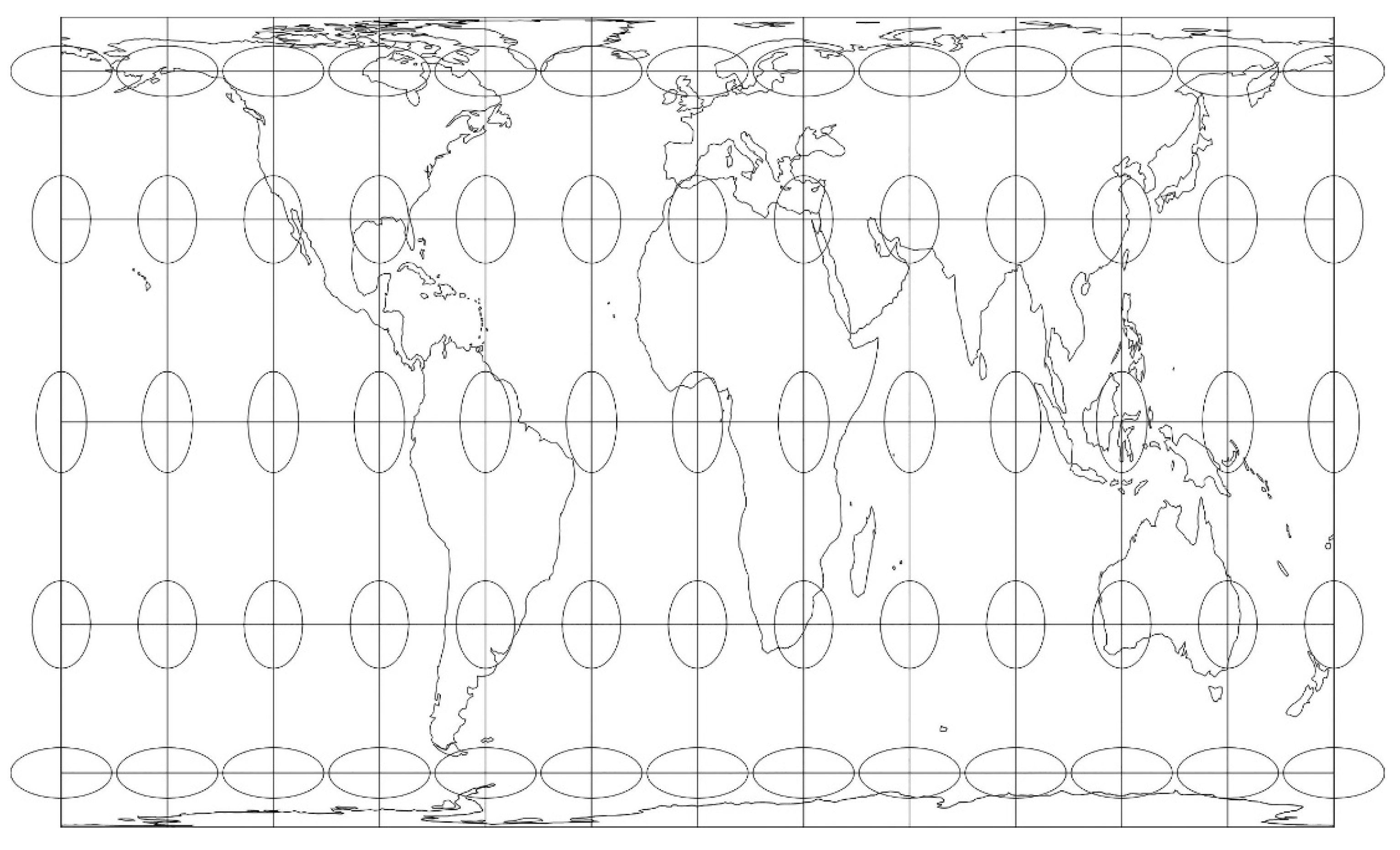
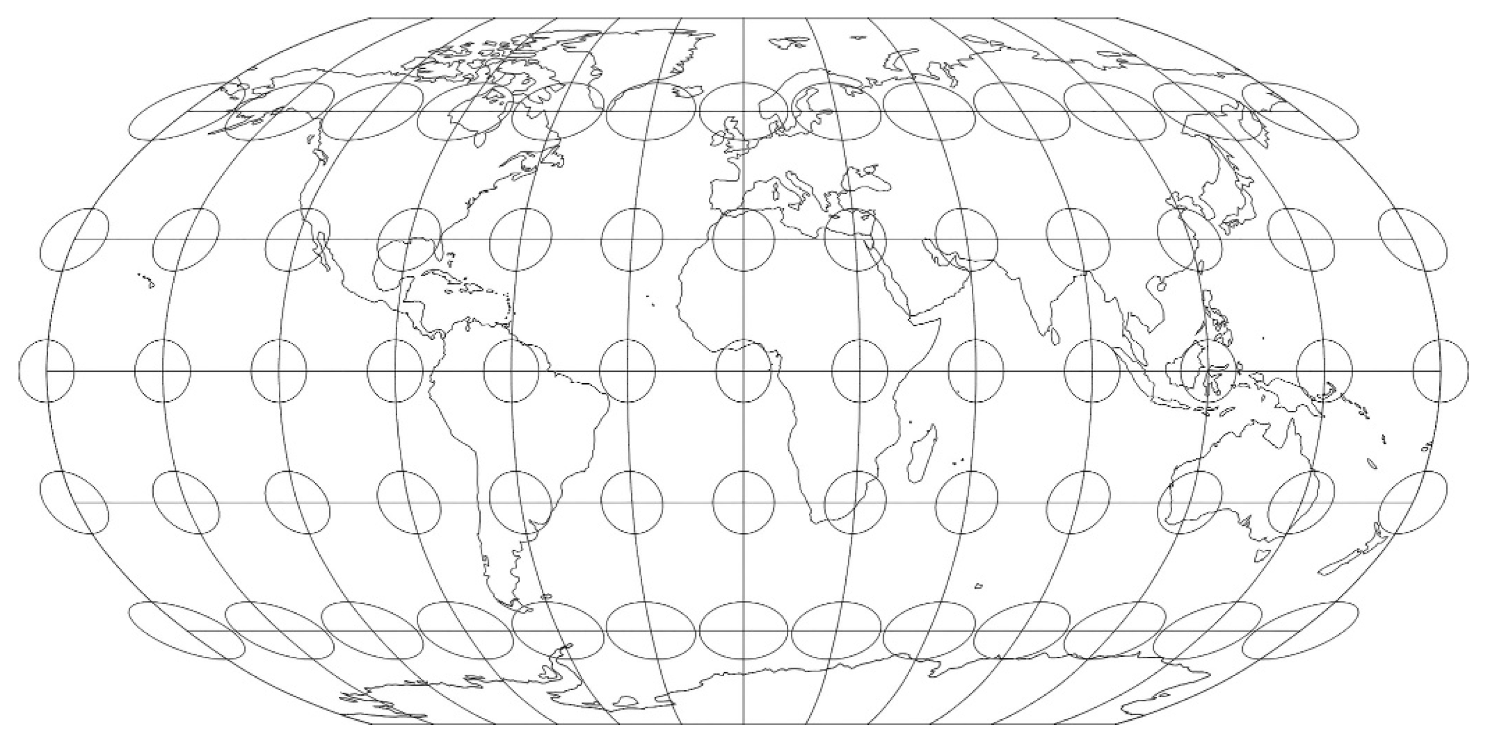
Moreover, map projections are designed with a particular purpose. For example, the Mercator projection was designed for navigation, the Robinson projection as an attempt to find a compromise for distortions, the equal-area Gall–Peters projection as counter-reaction to the area-distorted but well-known and frequently used Mercator projection (Figure 1, Figure 2 and Figure 3).
For decades, the political significance of maps has been discussed, including the Mercator projection as a construction of a Eurocentric world view [3] and whether maps can become a means of empowerment and serve only the interests of elites in society. Nonetheless, all maps serve some interest, regardless of their creators. Since mapmakers are not machines but humans, maps reflect objective realities and subjective elements that are inevitably influenced by human shortcomings. Moreover, because maps have a certain amount of scientific authenticity that is often not questioned [4,5], such shortcomings and map distortions must be considered while analyzing and using maps.
1.2. The Mercator Effect
The ways to represent the earth are innumerable. The best-known is most likely the Mercator projection, designed in the 16th century by the Flemish Gerardus Mercator. It is a cylindrical conformal map projection, preserving the angles as they are on the globe. The projection method was especially valuable for maritime navigating, because the direction of a line between two locations on a map is the same direction that has to be followed while navigating [6,7].
However, the Mercator projection is much debated because of its particular distortions that inflate the areas toward the poles. Due to the widespread and longtime use of this map projection, it is argued that the cognitive map of people might be most similar to this distorted map projection, which is referred to as the Mercator effect. Due to the specific area distortions of the Mercator projection, several scientists argue that this projection influences the shape and structure of an individual’s cognitive map. Moreover, the familiarity with the Mercator projection may have an impact on the geographical knowledge and cognitive map of individuals [8,9]. Although the misuse of the area distorting Mercator projection has been debated intensely among the cartographic community for decades, for a long time, it remained a commonly used map projection in textbooks, wall maps, atlases, etc. At the instigation of some scientists and the National Cartographic Association, compromise map projections came into use in the 1980s [10], which are still the primary projections used in textbooks and atlases for world maps today. Despite the shift toward other projections in educational materials, the Mercator projection was still used by national news agencies up until recently, e.g., VRT NWS (Flemish Radio and Television Broadcasting Organization).
Moreover, with the development of web map services in the beginning of the 21st century, a new variant is now commonly consulted: the Web Mercator projection. Despite some mathematical differences between the Mercator and the Web Mercator projection, visually, on a global scale, these two map projections are indistinguishable [11]. This Web Mercator projection is appropriate for web mapping because of the simpler calculations, continuous panning and zooming to any area regardless of the location or scale, and fixed north direction. However, this choice can also be questioned since global-scale web maps are often consulted to evaluate distance and compare area. Google Maps did not communicate their motives clearly, but this drawback could have been one of the reasons why in August 2018, Google Maps decided to change the projection of their navigation tool. Currently, the global view of the desktop version shows an orthographic projection. When looking at the map on a global scale, simulating a globe when looking at the map on a global scale [12]. The Google Maps version on mobile devices still uses the Web Mercator projection for the global view.
1.3. Previous Research about the Influence of Map Projections on Our Cognitive Map
Confirmation for the existence or non-existence of the Mercator effect is weak [11,13]. Although some studies suggest a measurable Mercator effect [14,15,16], little to no quantitative comparison is provided. Therefore, some researchers [13,17,18] questioned the Mercator effect in a quantitative way, and also could not find any evidence of its existence. Besides the influence of the Mercator projection, the research of Battersby and Montello [17] aimed to reveal the possible similarities between people’s global-scale cognitive map and the Robinson projection and the real areas (as on the globe).
However, some remarks can be made about this previous research. Battersby and Montello [17] executed their study with students when web map services were not yet widespread. Moreover, Fest [18] and Lapon, De Maeyer, Vanhaeren, Battersby, and Ooms [13] did their research with a limited group of participants. The enormous and varied dataset collected in this research would serve to further validate their statement. Therefore, we aim to investigate the existence of the Mercator effect. Moreover, we aim to evaluate if the global-scale cognitive map has more similarities with the areal proportions on a globe or on the Robinson map. Furthermore, we will investigate if the Lambert or Gall–Peters projections are a solution to gaining a better idea of the size of countries and continents.
1.4. New Research Questions
To investigate the influence of map projections, five research questions are raised. First, to what extent does people’s global-scale cognitive map comply with the Mercator map, the Robinson map, or the globe? Second, are the estimates of Lambert-conformal-conic-projected countries more or less accurate than Mercator-projected countries? Third, which continents are estimated more accurately: those projected in the Mercator or Gall–Peters projection? Fourth, is there a link between the over- and underestimations of countries and their latitude and/or size? Finally, does being more familiar with a particular map projection influence the accuracy of the estimates?
2. Methodology
2.1. Development of the Test Application
With the development of the test application (www.maps.ugent.be) data was collected about people’s view of the world. Several objectives were considered: collect data about the geographical knowledge from participants around the world by analyzing their cognitive map and defining their personal characteristics; create an interactive and joyful test that will likely be shared via social media; combine this joyful element with an educative aspect to create an awareness about map projections and its distortions; and promote the application—after the data collection—as an educational tool in secondary school classes.
Therefore, the test application and its design must be attractive, user-friendly, and straightforward. Moreover, to reach as many people as possible with a variety of backgrounds and interests it demands a joyful element and to be limited in time. Accordingly, the interface was designed to be colorful and plain, the task was made as obvious as possible with an instructive video of 30 s, and only seven additional questions were added to collect the most necessary information of the participants. After this questionnaire, the personal score was displayed to encourage people to answer both the test and the questions completely. To avoid people guessing or becoming nervous, no time limit was added. Nevertheless, completing all of these steps (instructions, test, and questionnaire) took on average only 5 min.
The feedback and information pages provided supplementary information to the participants. A Facebook-button made it possible to easily share the test on the participant’s personal social network. To avoid excluding any Internet user or possible participant, the test was developed to be compatible for every browser, every operating system (Android or iOS) and every screen size (laptop, desktop, or smartphone).
2.2. Tasks and Questionnaire
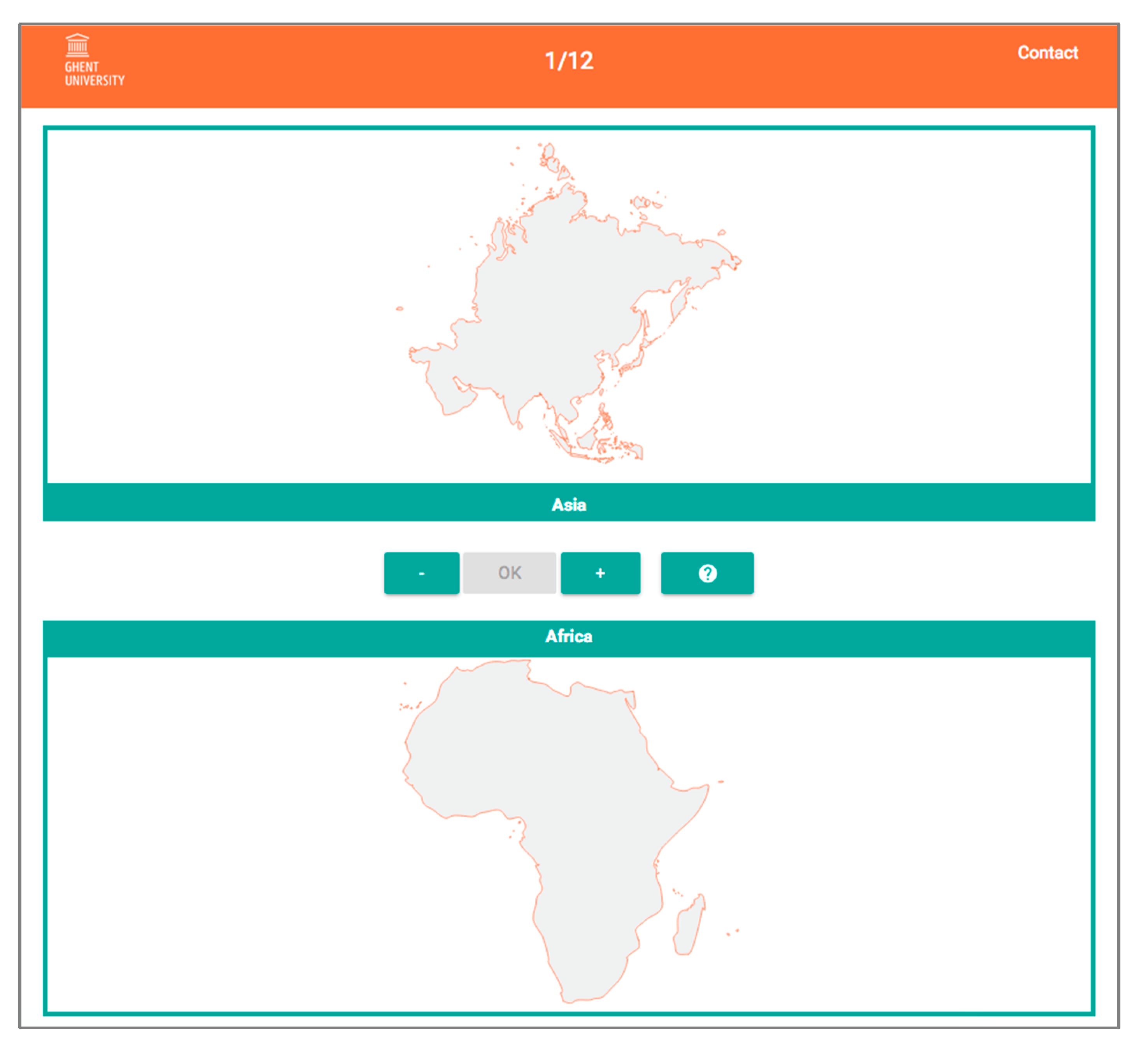
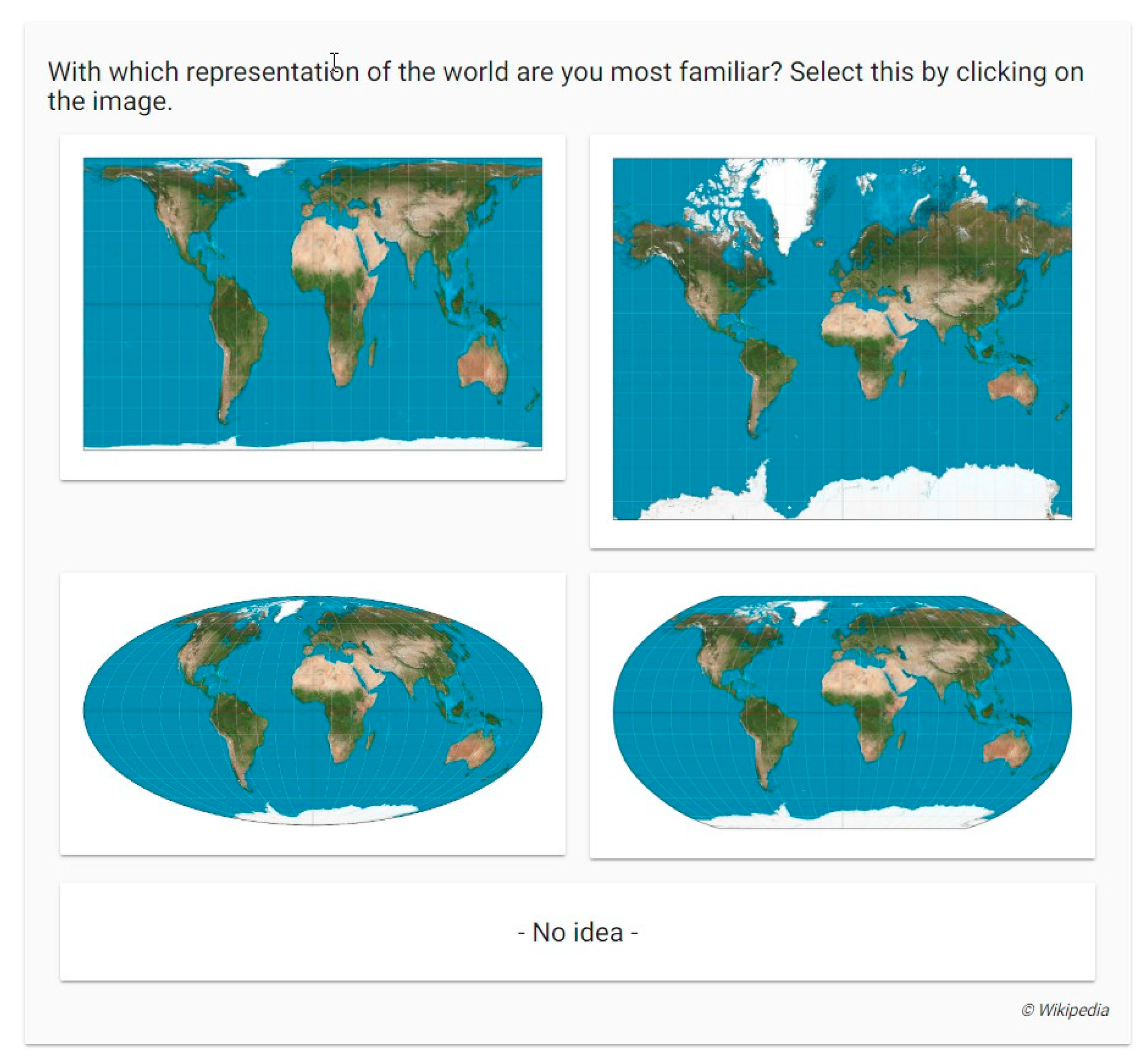
The test starts with a language selection: Dutch, English, French, Spanish, Portuguese, Chinese, Russian, or Arab. This is followed by a short instructive video (30 s) showing an example of estimating the real size of two objects (a tree compared to a flower). After this illustration, the actual test starts in which participants have to compare the sizes of 10 pairs of two countries, regions, or continents by using the plus and minus buttons (Figure 4). With the ok button, they confirm their estimation. Afterwards, they receive the question ‘With which representation of the world are you most familiar?’ accompanied with four different images of map projections: the Gall–Peters projection (a cylindrical equal-area projection), the Mercator projection (a cylindrical conformal projection), the Mollweide projection (a pseudo-cylindrical equal-area projection), and the Robinson projection (a pseudo-cylindrical compromise projection) (Figure 5).
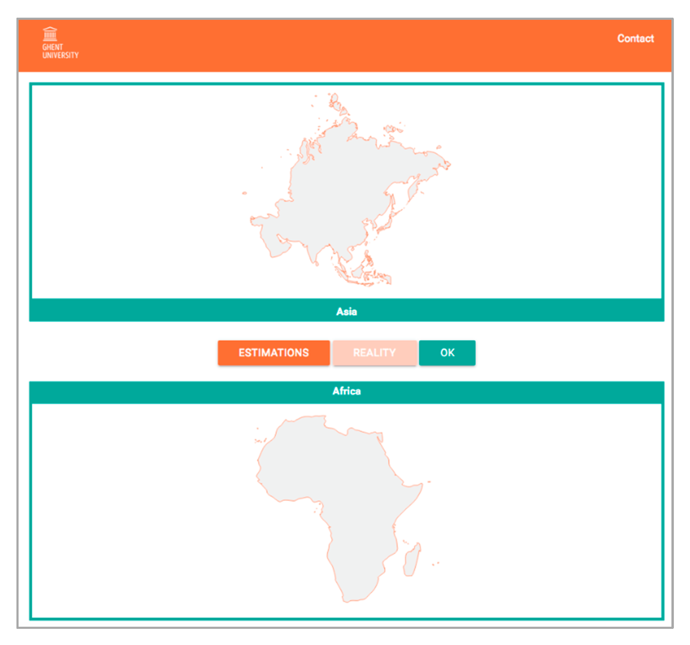
By clicking on one of the images or on ‘No idea’, the participants reach the final questionnaire comprising seven clear questions about their gender, age, educational level, profession, map use, residency, and place of education. Finally, they can evaluate their score with the interactive feedback-tool (Figure 6) that demonstrates their estimation (orange button ‘estimations’) with the real proportions (orange button ‘reality’).
2.3. Stimuli: Selection of Test Regions
A previous pilot project [13] illuminated some disadvantages related to the study design, such as the use of a fixed reference region Europe or Conterminous United States. Not every participant worldwide is equally familiar with one of these reference regions, so it is preferable to obtain pairs of test regions (countries, regions, and continents), that both change with every estimation. This adaptation would make the test accessible internationally. Accordingly, in this more elaborate study participants have to compare the size of two different test regions—countries, regions, or continents. The purpose is to estimate the real relative proportions of these two test regions.
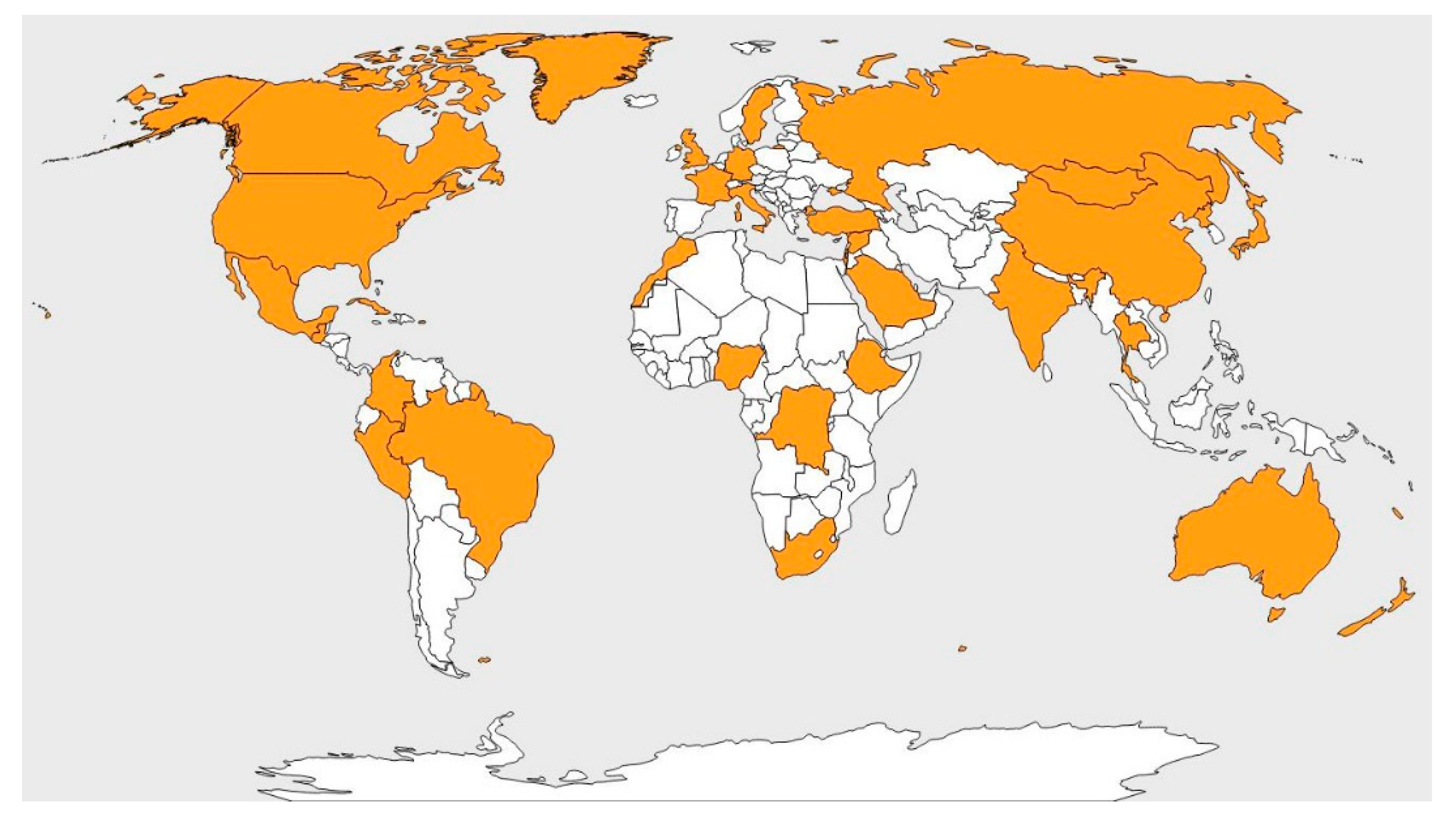
The selection of the 37 test regions (32 countries/regions and five continents) (Figure 7) is based on three criteria: a variety of sizes, a variety of latitudes, and a variety of locations across the continents (taking into account the actual amount of countries per continent). These 37 test regions were used to combine 32 sets of 10 pairs of countries, regions, or continents. Every set needs to encompass a variation in aspects: small and large countries, near and far from the equator, and of every continent. Additionally, every continent itself is represented in every set. Several pairs of countries were available in more than one set, to obtain enough valuable data to compare participants worldwide.
2.4. Participants
The goal was to collect data of a few thousand people with a varied profile: experts versus non-experts, different age groups, men versus women, and a variety of countries of residence or education. The test application was spread with modern media techniques (e-mail, mailing lists, and social media platforms) and by dissemination on conferences and contact days, so participants could not be selected beforehand. By focusing on the development of an attractive and short test and using modern tools to spread the test, the ambition was to reach as many people as possible worldwide. After three months more than 130,000 people participated worldwide. A total of 102,839 participants fulfilled the test completely (10 estimations and all answers on the personal questions). These datasets were removed: indication of guessing (all 10 estimations resulting from just one click on the plus and minus buttons), unrealistic ages or countries of residence, the countries of residence with less than 20 participants. The original dataset was reduced to 97,082 participants, resulting in 970,820 estimations to analyze.
Table 1 shows the variety of characteristics within the group of 97,082 participants. For every category, data from more than 1000 participants was collected, except for people without a diploma (N: 475) and participants older than 70 years (N: 806).
2.5. Data Collection and Processing
All estimates were collected in a PostgreSQL-database as values between 0 and 200. The value 100 indicates the initial phase, whereas the largest width or height (depending on its shape) of the test region takes the complete vertical or horizontal space of the box. Values between 0 and 100 are obtained when minimizing the test region above the buttons (tr1), whereas, minimizing the test region at the bottom (tr2) gives a value between 100 and 200.
As in previous research [13,17], the relative estimated accuracy for every estimate was calculated to define the accuracy of every estimate, and identify an over- or underestimation of every test region. This index of relative estimated accuracy provides a standardization of the estimates: the value 0.00 is an accurate estimate, negative values are underestimations of tr1, and positive values overestimations of tr1. The formulas are defined in such a way that over- and underestimation are equally approached and can be infinite. For example, a value of 3.00 signifies an overestimation of three times of test region 1, whereas a value of −2.00 means that test region is underestimated by two times its size.
When comparing groups of estimates, the negative and positive values will cancel each other out and therefore the absolute values of the index were used to calculate for example averages per gender. These absolute values give a sense of how correct the estimation was, but not in which direction.
2.6. Methodology and Statistics for Each Research Question
The Mercator effect is reflected in our global-scale cognitive map as an overestimation of regions close to the poles. To analyze the existence of the Mercator effect, seven pairs of countries were selected based on two criteria: the centroids of the two test regions had to be at least 35° different in latitude, and one of the two had to be located on or near the equator (Table 2). Should the Mercator effect exist, the test regions close to the poles would be overestimated and those near the equator underestimated.
The value ‘modulus area’ for test region 1 was set to 1000; the modulus area for test region 2 was the relative areal proportion as on the globe. For example, India has a surface of 3,287,263 km2 (‘modulus area’ = 1000), while Canada is more than three times bigger with a surface of 9,984,670 km2 (‘modulus area’ = 3037). The value ‘Mercator area’ and ‘Robinson area’ represent the relative proportions as displayed on a Mercator and Robinson projected map, respectively, compared to the ‘modulus area.’ Canada is displayed 3.8 times too large on the Mercator map (3037 + (3037*3.80) = 14,587) and 0.5 times too large on the Robinson map (3037 + (3037*10.5) = 4647).
First, the estimated values were log-transformed since these values were not normally distributed. Second, the Pearson correlation was used to evaluate the correlation between estimates of map proportions and the real proportions or the proportions presented on a Mercator or Robinson map.
2.6.1. Countries in Mercator Projection versus in Lambert Conformal Conic Projection
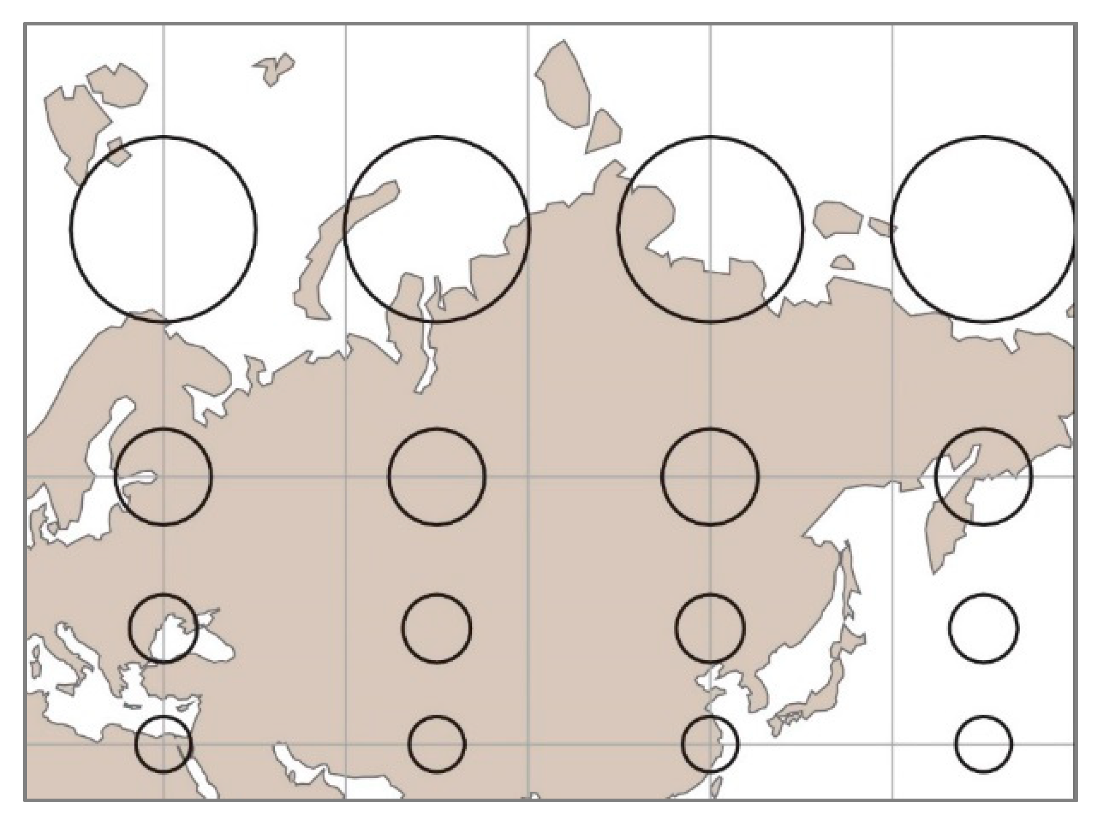
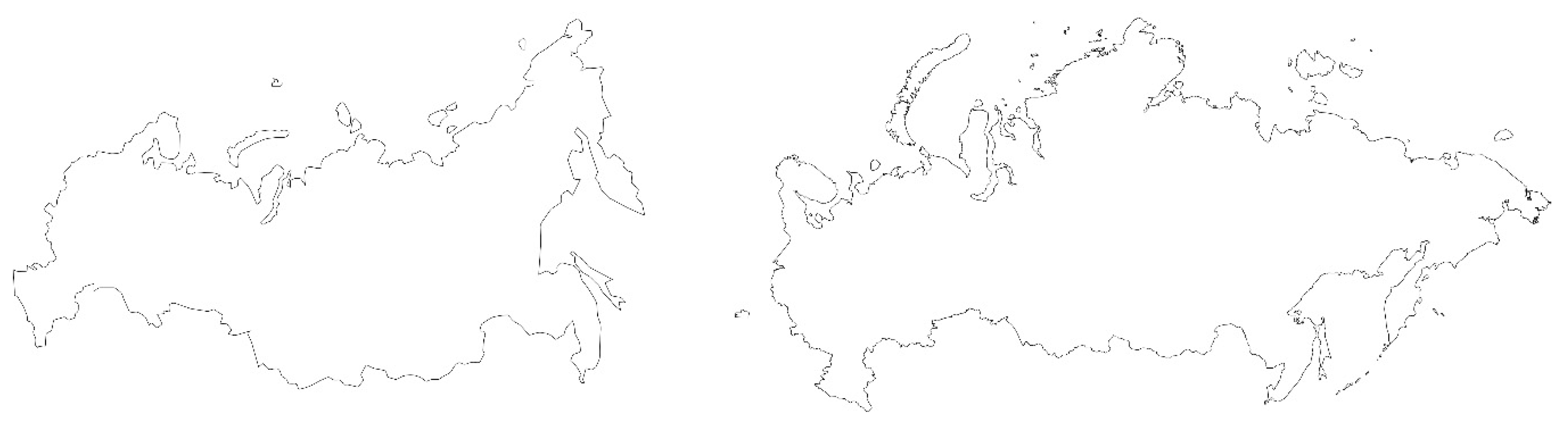
The distortions of shape caused by the Mercator projection are limited for countries or regions between the tropics. However, on a Mercator world map, the areas toward the poles are inflated. This means that the shape of individual countries may be deformed as well, especially when covering a broad latitude range (e.g., large countries/regions, such as Greenland, Canada, and Russia). Their northern territories are more inflated compared to the areas situated toward their southern boundaries (Figure 8). Therefore, these three countries/regions are projected either in the Mercator or the Lambert projection, which are both conformal projections (Figure 9). The Lambert-projected areas are projected with two standard parallels. Along these standard parallels, the scale is accurate, which results in a fair preservation of shape.
A relative estimated accuracy value was calculated for each estimation. After a log-transformation, these values were normally distributed. Since there is a difference in number of values between the two groups (Mercator projection N = 117,004; Lambert projection N = 13,911), the values were weighted. With these weighted and transformed values, the statistical difference between the groups was calculated with an independent samples t-test.
2.6.2. Continents in Mercator Projection versus in Gall–Peters Projection
In addition to some countries, the continents were also projected in two variants: the Mercator projection and the Gall–Peters projection. Many scientists claim that the Eurocentric Mercator projection causes a distorted perception of how large continents are compared to each other. For example, Africa is too small compared to Europe or North America. The aim of this study was to investigate if this is the case when participants compared Mercator-projected continents and if this is different when they were projected with an equal-area map projection. In this case, the Gall–Peters projection was chosen because this projection is often used for humanitarian reasons, as well as currently in the Boston Public School system (US).
Since the over- and underestimations of continents were analyzed, the relative estimated accuracy values were considered for this part of the study. For each combination of two continents, the over- or underestimation was calculated, and an average was determined for each continent.
2.6.3. Influence of Size and Latitude of Countries
To make valid statements about the influence of size or latitude, it is essential to compare test regions with a fixed reference. Three countries were selected as reference regions: Japan, South Africa, and the United States of America. For these countries, several combinations of countries that varied in size (small and large) and in latitude (far and near the equator) were available.
In this analysis, the relative estimated accuracy values were used, since over- and underestimations are needed to be linked to latitude and size of the test region. Furthermore, correlation coefficients were calculated between the relative estimated accuracy values and the latitude and area. Since the data were not normally distributed, the Spearman correlation was used.
2.6.4. Familiarity with Map Projection
The relative estimated accuracy values of a limited group of participants (educated males between 18 and 25 years old that have the same residency as place of education) were averaged per country of residence and compared to the familiarity of map projections of the particular country. As a result, the relation between the familiarity with a map projection and the accuracy of people’s global-scale cognitive map could be evaluated. An ANOVA and an independent t-test were executed to analyze the differences between the countries/regions and their familiarity with a particular map projection.
3. Results
3.1. Correlation between Estimates and the True, Mercator, or Robinson Area
Normality tests and plots revealed that the data of the estimates were not normally distributed (Kolmogorov–Smirnov test (p < 0.01)). After log-transformation, these values were normal, and so the Pearson correlations were calculated to evaluate the relationship between the participants’ estimates and the true proportions (1), the proportions corresponding to the Mercator map (2), or those corresponding to the Robinson map (3).
3.1.1. Selected Countries
The Pearson correlations were calculated for all the estimates of the seven selected country combinations (see Table 2), based on more than 35° difference in latitude and one of the countries being located near the equator.
Table 3 shows that all the correlations were significant with p < 0.01 and that the ‘Modulus area’ of the selection of regions had a high correlation with the ‘Robinson area’ (5) (r = 0.964) but slightly less with the ‘Mercator area’ (4) (r = 0.893). However, the estimates were less correlated with the Mercator projection (2) (r = 0.636) and clearly more with reality (1) (r = 0.807) and with the Robinson-projected areas (3) (r = 0.756). This result indicates that how people perceive the world does not seem to be influenced by the Mercator projection.
Today’s educational materials use compromise map projections, such as the Robinson projection. However, this was not always the case, as in the 20th century the Mercator projection was often used to convey world maps in school books, atlases, or on wall maps [17]. Therefore, the question arises if the estimates of older people correlate more with the ‘Mercator area’ than those of younger people.
Table 4 demonstrates a negligible difference between the correlation coefficients of the two age groups for all three projections. Therefore, there was no clear link between age and the influence of a map projection or the Mercator projection in particular.
3.1.2. Continents
No Mercator effect was observable on country level, but when consulting a world map, the size of the continents is the most eye-catching element. Therefore, the correlation coefficients for the Mercator and Gall–Peters-projected continents were also calculated (Table 5).
It is remarkable that the estimates of the Mercator-projected continents were more correlated with reality (r = 0.843) than those of the Gall–Peters-projected continents (r = 0.826). Moreover, the Mercator-projected continents were less correlated with the Mercator area (r = 0.651) than those projected with the Gall–Peters projection (r = 0.688).
3.2. Mercator Projection versus Lambert Projection (Countries/Regions)
The setup of the test provided two variants for three selected countries/regions: three large areas close to the poles (Canada, Greenland, and Russia) were projected either in the Mercator projection, which deforms the shape of the country, or with the Lambert conformal conic map projection, which takes the difference in latitude into consideration.
The results (Table 6) show that the test regions projected with the Mercator projection were estimated more accurately than the Lambert-conformal-projected areas. An independent samples t-test indicated that the difference between these two groups was significant (p < 0.01).
3.3. Mercator Projection versus Gall–Peters Projection (Continents)
The setup of the test provided two variants for the continents: the participants had to estimate the continents projected either in Gall–Peters projection or in the Mercator projection. On average, they estimated the continents a little more accurately when projected in the Mercator projection. The difference between the two datasets was significant at 0.01 level (Table 7).
When analyzing the data of all the participants for each continent separately, there were some remarkable results. Table 8 shows the results for the Mercator-projected continents. First, Europe was overestimated substantially, compared to every other continent. Second, apart from the comparisons with Europe, the other four continents were estimated fairly accurately (from −0.55 until 0.55), with Africa overestimated and Asia underestimated. Third, Africa is overestimated except when compared to Europe.
Table 9 shows that the estimates of the Gall–Peters-projected continents were more inaccurate than those projected with Mercator projection: Europe was even more overestimated. Only the comparisons between South America and Africa, and Asia and Africa were more accurate. Therefore, in two of the four possible combinations, the accuracy was higher for Africa when projected in the Gall–Peters projection.
3.4. Influence of Latitude and Size of Countries
In Table 10, the test regions are ranked by their areal size. The table indicates that the lowest rea values correspond with the largest countries, and they do not correspond with a particular section of the latitude range. This is, again, an indication of the non-existence of the Mercator effect, since regions toward the poles are not inflated, as is the case on a Mercator-projected map.
Spearman correlation coefficients were calculated between the accuracy of the estimates (rea) and the latitude and size of the countries. These coefficients were significant and demonstrate that there was no correlation between the latitude of a test region and the accuracy of the estimates (Japan: r = 0.321; South Africa: r = −0.036; USA: r = 0.234 with p > 0.05), but there was a high correlation with the areal size of the countries (Japan: r = −0.893; South Africa: r = −0.679; USA: r = −0.893 with p < 0.01). This undermines the existence of a Mercator effect but stresses the importance of the psychophysical function that describes that small objects are systematically overestimated compared to large objects.
3.5. Familiarity with Map Projections
For the analyses of these values, the largest homogenous participant group was selected: male participants between 19 and 25 years old with the same place of residence as place of education and who achieved a higher educational diploma, to avoid influences of other characteristics such as age and educational level. Table 11 gives an overview of the averages of the absolute values of the relative estimated accuracies (ABSrea). The absolute values of the relative estimated accuracy (ABSrea) indicate how well people estimated the real size of countries and continents: the closer the value to zero, the better the estimation. For each country, the most familiar projection was added to Table 11. Additionally, the percentage of countries that chose Mercator or Robinson projection as principal map projection was calculated as well.
The percentages show that a higher estimation accuracy corresponds with a higher percentage of participants selecting the Robinson projection as most familiar. Moreover, in the group with the least accurate estimates, most of the countries selected the Mercator projection as most familiar.
The results of the ANOVA test between the four groups demonstrate significant differences between all of the four groups, meaning that the participants of the countries/regions of Group 1 estimate the countries and continents significantly more accurately than the other three groups. Accordingly, Group 2 estimates more accurately than Group 3, and Group 3 more accurately than Group 4.
Moreover, the result of the independent samples t-test between the countries/regions that are most familiar with the Robinson projection and those most familiar with the Mercator projection implies that the countries or regions opting for the Robinson projection are significantly better in estimating the accurate size.
4. Discussion
For the framework of this study, a short, playful test was developed in which participants were asked to compare the size of two countries, regions, or continents and estimate the correct proportions. Test results provided a large, worldwide dataset that could be used to analyze several elements that may influence the development of people’s global-scale cognitive map. To evaluate the influence of map projections, five different analyses were performed.
4.1. Are Estimates Correlated with the Reality, the Mercator, or the Robinson Map?
For decades, there have been discussions on whether or not map projections influence how people perceive the world [6,7,14]. The research in this paper aimed to deliver a quantitative answer in this debate. Therefore, correlations were calculated between people’s global-scale cognitive map, represented by the area estimates and the globe, the Mercator map, and the Robinson map. Surprisingly, the areal proportions of individual’s global-scale cognitive maps were more closely related to the area proportions as represented on the globe than either of the map projections. This was not only the case for some particular combinations of countries (with one of the two countries near the equator) but also in the comparisons of the continents. Furthermore, the estimates of elderly people were not more correlated with the Mercator projection, although they were regularly confronted with this map during childhood, more so than the following generation. These correlations indicate that people are quite adept at estimating the real sizes of countries, regions, and continents and they are able to adjust for the distortions linked to map projections. This was once more confirmed by the fact that continents represented with the Mercator projection were estimated more accurately than those represented with the Gall–Peters projection. Even when continents were shown in the Mercator representation, these seemed easier to adjust for the actual size.
4.2. Do the Mercator, the Lambert, or the Gall–Peters Projections Have an Influence on the Areal Estimations of Countries, Regions, or Continents?
The choice of map projection for the presented regions in the test could influence how accurately people estimated the size of regions. Therefore, some large northerly countries/regions were projected either in the Lambert conformal conic map projection or in the Mercator projection. Both projections are conformal, but the Mercator projection deforms the shape of areas in the north, whereas the Lambert projection preserves the shape reasonably well due to two standard parallels. People estimated differently depending on the map projection they received in their test, with more accurate estimates for the countries/regions projected in the Mercator projection.
While observing a world map, at first glance, people see the proportions of the continents. Therefore, estimating the proportions of continents may be a good indicator of the accuracy of people’s global-scale cognitive map. Thus, besides the countries, the continents are projected in two map projections: the Mercator and the Gall–Peters projection. In this case, the groups are also significantly different, with a difference that is more pronounced in favor of the Mercator projection with, on average, a higher accuracy. This seems to indicate that the map projections indeed influence how people estimate proportions of areas. The data demonstrate that on average the countries, regions, and continents projected with the Mercator projection are estimated with a higher accuracy.
4.3. Which Continents Are Over- or Underestimated?
The averages of the accuracy values for the continents were consulted as well. In the case of a Mercator effect, Europe and North America would be overestimated, and Africa would be underestimated. Notably, Europe was overestimated, while all other continents were estimated fairly accurately. Is the overestimation of Europe a result of being familiar with the Mercator projection, on which Europe is overestimated and centralized? This centralized position on the Mercator projection is often criticized by several scientists [7,9,19]. However, the influence of the Mercator projection is questionable since Africa is not underestimated as on the Mercator map, and North America is not overestimated either. It seems that these under- and overestimations are not a result of exposure to a particular map projection.
Another possible explanation for the overestimation of Europe that requires further research is whether the overestimation of Europe may be the result of its topicality and frequent mention in the news. Presumably, ‘Europe’ as an entity is mentioned more than other continent names, such as North America or South America.
4.4. Is the Accuracy of the Areal Estimations Related with the Latitude or the Size of Countries?
Another way to analyze the existence of the Mercator effect is to combine the accuracy level and the latitude of the country. Are countries with a higher latitude overestimated and countries closer to the equator underestimated? In previous research [13,17], the USA or Europe was selected as a fixed reference region, but in this study setup, no fixed reference region was selected but rather a changing selection of test regions. Therefore, three of these test regions were selected, from which several combinations were included in the study. The over- and underestimations for each combination was not related to the latitude of the test region but instead to the size of the test regions. Small countries were overestimated, while larger countries were less overestimated or even underestimated. Previous research [13,17] also discovered the overestimation of small countries. This is in line with the findings of psychophysical research that states that small objects, figures, or regions are systematically overestimated [20]. This applies to the countries in this study but not to the continents previously discussed. For example, South America is the most underestimated but second smallest continent.
4.5. Can the Familiarity with a Map Projection Be Related with the Accuracy of the Areal Estimation?
The results to the question ‘With which representation of the world are you most familiar?’ showed remarkable and significant confirmation of the accuracy of people’s estimations. When the selected participants (men, 19–25 years old, with a high school diploma) of a country on average selected the Robinson projection as most familiar, they were more likely to estimate the proportions of countries, regions, and continents more accurately than those who selected the Mercator projection. Accordingly, Battersby and Kessler [21] discovered that people consider the Robinson projection as the least distorted projection.
The selection of the most familiar projection is likely related to country of residence. There does not seem to be a continental trend—several European, Asian, and South American countries have chosen either the Robinson or Mercator projection. Nor is there a relationship between neighboring countries of the same latitude. For example, Norway and Sweden selected the Mercator projection, while Finland selected the Robinson projection. Furthermore, the policy of a country seems to have an influence on the estimations. The Chinese government decided to use and develop their own social media (WeChat, Sina Weibo) and web map services (Baidu Maps). As a result, participants of China Mainland, Taiwan, and Hong Kong predominantly chose the Robinson projection, while participants of other Asian countries (Indonesia, Japan, and Russia) chose the Mercator projection. However, this suggestion is questioned by the fact that participants of the United States and Canada, countries where Google Maps is established, are as well more familiar with the Robinson projection. Moreover, in the case of Jamaica, which estimated the land areas poorly but of which 50% of participants selected the Robinson projection as most familiar, demonstrates that it is not easy to make clear conclusions about why some of these countries are more familiar with the Robinson or the Mercator projection. In previous research [13,22] a relationship between education and the familiarity with the Robinson projection was suggested, since this map projection is often used in textbooks or school atlases.
5. Conclusions
The influence of map projections is a much-debated subject in cartography. In particular, the impact of the Mercator projection has been discussed extensively among experts [6,7]. However, an influence of map projections specifically on the development of the global-scale cognitive map could not yet be found [17,23]. This could be the result of datasets which were limited in variance and number of participants. Therefore, the dataset described in this paper was thought to perhaps provide significant proof, as it covers more participants worldwide with a wider background.
With a small, playful test, we collected data from more than 100,000 participants worldwide. We examined five different analyses to detect any influence of map projections on how people estimate the proportions of countries, regions, and continents. Evidence indicates that knowledge of the world is influenced by map projections but not to the extent that the global-scale cognitive map looks similar to a specific map projection. This is confirmed by the fact that we could not find any quantitative proof for the Mercator effect. Moreover, since smaller countries were clearly overestimated, it influenced the accuracy of estimates and their correlation with map projections. The overestimation of small countries is not only the result of small objects being overestimated, but also influenced by the specific setup of the test with isolated countries removed from any context. It would be interesting to research whether the overestimation of small countries would have a lower impact while drawing a sketch map of the world. Nevertheless, one’s idea of the world and its proportions, and thereby the study of a global-scale cognitive map, is certainly not as simple as drawing a sketch map. There are many more aspects that may define a global-scale cognitive map, such as distances between places, proportions of areas, and orientation.
Remarkably, people more familiar with the Robinson projection estimated the size of countries, regions, and continents, on average, more accurately than those selecting the Mercator projection. This result emphasizes the need to use less area distorted map projections in, for example, (social) media and in educational materials. This shows that map projections indeed influence the accuracy of people’s mental map, but that it can also vary depending on the place one lives. This finding leads to an interesting new research question: ‘Why are some countries more familiar with the Robinson or the Mercator projection?’ There are several possible influences: national policy, cartography in educational curriculum, the map projection used in books and atlases, and those used in media (news, journals etc.).
Author Contributions
Lieselot Lapon set up the experiment, analyzed the data, and wrote the paper; Philippe De Maeyer and Kristien Ooms gave some valuable input during the experiment and revised the text where needed. All authors have read and agreed to the published version of the manuscript.
Funding
This research was funded by the Special Research Fund of Ghent University (BOF) with Grant code BOF.24J.2015.0018.01.
Conflicts of Interest
The authors declare no conflict of interest.
References
- Montello, D.R. Spatial Cognition. In International Encyclopedia of the Social & Behavioral Sciences; Smelser, N.J., Baltes, P.B., Eds.; Elsevier: Amsterdam, The Netherlands, 2001; p. 17500. [Google Scholar]
- Brainerd, J.; Pang, A. Interactive map projections and distortion. Comput. Geosci. 2001, 27, 299–314. [Google Scholar] [CrossRef]
- Vujakovic, P. Damn or be damned: Arno Peters and the Struggle for the ‘New Cartography’. Cartogr. J. 2003, 40, 61–67. [Google Scholar] [CrossRef]
- Wright, J.K. Map makers are human. Geogr. Rev. 1942, 32, 527–544. [Google Scholar] [CrossRef]
- Wood, D. The Power of Maps; The Guilford Press: New York, NY, USA, 1992; p. 248. [Google Scholar]
- Monmonier, M.S. Rhumb Lines and Map Wars: A Social History of the Mercator Projection; University of Chicago Press: Chicago, IL, USA, 2004; p. 256. [Google Scholar]
- Wood, D.; Kaiser, W.L.; Abramms, B. Seeing Through Maps: Many Ways to See the World; New Internationalist Publications Ltd.: Oxford, UK, 2006; p. 152. [Google Scholar]
- Monmonier, M. Drawing the Line: Tales of Maps and Cartocontroversy; Henry Holt & Co.: New York, NY, USA, 1995; p. 368. [Google Scholar]
- Robinson, A.H. Rectangular World Maps—No. Prof. Geogr. 1990, 42, 101–104. [Google Scholar] [CrossRef]
- American Cartographic Association. Geographers and cartographers urge end to popular use of rectangular maps. Am. Geogr. 1989, 16, 222–223. [Google Scholar]
- Battersby, S.E.; Finn, M.P.; Usery, E.L.; Yamamoto, K.H. Implications of Web Mercator and Its Use in Online Mapping. Cartogr. Int. J. Geogr. Inf. Geovisualization 2014, 49, 85–101. [Google Scholar] [CrossRef]
- Parsons, E.; (Google, London, UK). Geospatial Technologist Google (Google Maps). Personal communication, 2018.
- Lapon, L.; De Maeyer, P.; Vanhaeren, N.; Battersby, S.; Ooms, K. Evaluating Young People’s Area Estimation of Countries and Continents. ISPRS Int. J. Geo-Inf. 2019, 8, 125. [Google Scholar] [CrossRef] [Green Version]
- Saarinen, T.; Parton, M.; Billberg, R. Relative Size of Continents on World Sketch Maps. Cartographica 1996, 33, 37–48. [Google Scholar] [CrossRef]
- Saarinen, T. The Euro-Centric Nature of Mental Maps of the World. Res. Geogr. Educ. 1999, 1, 136–178. [Google Scholar]
- Chiodo, J.J. Improving the Cognitive Development of Students’ Mental Maps of the World. J. Geogr. 1997, 96, 153–163. [Google Scholar] [CrossRef]
- Battersby, S.E.; Montello, D.R. Area Estimation of World Regions and the Projection of the Global-Scale Cognitive Map. Ann. Assoc. Am. Geogr. 2009, 99, 273–291. [Google Scholar] [CrossRef]
- Fest, I. The World in Minds and Maps: Education in Map Projections and World Perceptions. Master’s Thesis, Uniwersytet Jagielloński w Krakowie, Kraków, Poland, 2018. [Google Scholar]
- Klinghoffer, A.J. The Power of Projections. How Maps Reflect Global Politics and History; Praeger: Westport, CT, USA, 2006; p. 192. [Google Scholar]
- Battersby, S.E. Distortion of Area in the Global-Scale Cognitive Map—A Geographic Perspective; University of California: Santa Barbara, CA, USA, 2006. [Google Scholar]
- Battersby, S.E.; Kessler, F.C. Cues for Interpreting Distortion in Map Projections. J. Geogr. 2012, 111, 93–101. [Google Scholar] [CrossRef]
- Lapon, L.; Ooms, K.; De Maeyer, P. The influence of the Web Mercator projection on the global-scale cognitive map of web map users. In Proceedings of the International Cartographic Conference, Washington, DC, USA, 2–7 July 2017. [Google Scholar]
- Lapon, L.; De Maeyer, P.; De Wit, B.; Dupont, L.; Vanhaeren, N.; Ooms, K. The influence of web maps and education on adolescents’ global-scale cognitive map. Cartogr. J. 2020. [Google Scholar] [CrossRef]
Figure 1.
Mercator map projection with as overlay the Tissot indicatrix.

Figure 2.
Gall–Peters map projection with as overlay the Tissot indicatrix.

Figure 3.
Robinson map projection with as overlay the Tissot indicatrix.

Figure 4.
An example of the initial interface with as ‘test region 1’ Asia and as ‘test region 2’ Africa. The height of Africa corresponds with the maximum height of the box, while the width of Asia fits in the maximum width of the box.
Figure 4.
An example of the initial interface with as ‘test region 1’ Asia and as ‘test region 2’ Africa. The height of Africa corresponds with the maximum height of the box, while the width of Asia fits in the maximum width of the box.

Figure 5.
Question: ‘With which representation of the world are you most familiar?’ and five possible answers: Gall–Peters projection, Mercator projection, Mollweide projection, Robinson projection, or ‘No idea’.
Figure 5.
Question: ‘With which representation of the world are you most familiar?’ and five possible answers: Gall–Peters projection, Mercator projection, Mollweide projection, Robinson projection, or ‘No idea’.

Figure 6.
Feedback-tool demonstrating the estimated (button “ESTIMATIONS”) and real (button “REALITY”) proportions of two test regions.
Figure 6.
Feedback-tool demonstrating the estimated (button “ESTIMATIONS”) and real (button “REALITY”) proportions of two test regions.

Figure 7.
Selection of the countries or regions as test regions.

Figure 8.
Russia as on the Mercator projection with Tissot indicatrix.

Figure 9.
Russia represented with Mercator versus Lambert projection (with standard parallels at 15° N and 65° N).
Figure 9.
Russia represented with Mercator versus Lambert projection (with standard parallels at 15° N and 65° N).


Table 1.
Overview of the 97,082 participants.
| Gender | Male | Female | X | |||||
| 68,484 | 26,994 | 1604 | ||||||
| 71% | 28% | 2% | ||||||
| Age Groups | 12–18 | 19–25 | 26–30 | 31–40 | 41–50 | 51–60 | 61–70 | 70 + |
| 5275 | 20,145 | 17,579 | 28,168 | 14,234 | 7475 | 3400 | 806 | |
| 5% | 21% | 18% | 29% | 15% | 8% | 4% | 1% | |
| Diploma | None | Primary | Secondary | Higher | ||||
| 475 | 4257 | 14,910 | 77,440 | |||||
| 0.5% | 4% | 15% | 80% | |||||
| > 20 Participants | > 100 Participants | > 1000 Participants | ||||||
| Residency | 76 countries | 55 countries | 15 countries | |||||
| Place of Education | 79 countries | 53 countries | 17 countries | |||||
Table 2.
Selection of pairs of test regions (tr1 and tr2) to analyze the Mercator effect.
| Tr1 | Latitude | Modulus Area | Tr2 | Latitude | Modulus Area | Mercator Area | Robinson Area | N |
|---|---|---|---|---|---|---|---|---|
| Colombia | 4° N | 1000 | Canada | 60° N | 8767 | 42,108 | 13,399 | 18,092 |
| DR Congo | 0° N | 1000 | Greenland | 72° N | 924 | 13,601 | 1806 | 18,173 |
| DR Congo | 0° N | 1000 | Sweden | 62° N | 192 | 867 | 284 | 6069 |
| Ethiopia | 8° N | 1000 | South Africa | 29° S | 1104 | 1461 | 1176 | 5916 |
| Nigeria | 10° N | 1000 | Sweden | 62° N | 487 | 2199 | 720 | 18,154 |
| India | 20° N | 1000 | Russia | 60° N | 5201 | 23,227 | 7655 | 18,486 |
| India | 20° N | 1000 | Canada | 60° N | 3037 | 14,587 | 4647 | 12,148 |
Table 3.
Overview of the Pearson correlation coefficients (cc) between the estimates and the true, Robinson, and Mercator areas.
Table 3.
Overview of the Pearson correlation coefficients (cc) between the estimates and the true, Robinson, and Mercator areas.
| (1) | cc estimates—Modulus | 0.807 * |
| (2) | cc estimates—Mercator | 0.636 * |
| (3) | cc estimates—Robinson | 0.756 * |
| (4) | cc Modulus—Mercator | 0.893 * |
| (5) | cc Modulus—Robinson | 0.964 * |
| (6) | cc Robinson—Mercator | 0.964 * |
* Correlation is significant at the 0.01 level (two-tailed).
Table 4.
Overview of the Pearson correlation coefficients per age group.
| Estimates—Modulus Area | Estimates—Mercator Area | Estimates—Robinson Area | |
|---|---|---|---|
| 12–40 Years Old | 0.806 * | 0.635 * | 0.753 * |
| 41–80 Years Old | 0.808 * | 0.638 * | 0.763 * |
* Correlation is significant at the 0.01 level (two-tailed).
Table 5.
Overview of the Pearson correlation coefficients (cc) between the estimates and the ‘Modulus’, ‘Robinson’, and ‘Mercator areas’ (for the continents).
Table 5.
Overview of the Pearson correlation coefficients (cc) between the estimates and the ‘Modulus’, ‘Robinson’, and ‘Mercator areas’ (for the continents).
| Mercator-Projected Continents (N: 94,447) | ||
| (1) | cc estimates—Modulus | 0.843 * |
| (2) | cc estimates—Mercator | 0.651 * |
| (3) | cc estimates—Robinson | 0.821 * |
| Gall–Peters-Projected Continents (N: 84,706) | ||
| (4) | cc estimates—Modulus | 0.826 * |
| (5) | cc estimates—Mercator | 0.688 * |
| (6) | cc estimates—Robinson | 0.805 |
* Correlation is significant at the 0.01 level (two-tailed).
Table 6.
Average relative estimated accuracy (rea) values for countries/regions projected with Mercator or Lambert map projection.
Table 6.
Average relative estimated accuracy (rea) values for countries/regions projected with Mercator or Lambert map projection.
| N | Average Rea | Significantly Different | |
|---|---|---|---|
| Mercator Projected Countries/Regions | 117,004 | 0.29 | at 0.01 level |
| Lambert Conformal Projected Countries/Regions | 13,911 | 1.30 |
Table 7.
Average relative estimated accuracy (rea) values for continents projected with Mercator or Gall–Peters projection.
Table 7.
Average relative estimated accuracy (rea) values for continents projected with Mercator or Gall–Peters projection.
| N | Average Rea | Significantly Different | |
|---|---|---|---|
| Mercator-Projected Continents | 97,391 | 1.16 | at 0.01 level |
| Gall–Peters-Projected Continents | 96,758 | 1.54 |
Table 8.
Average relative estimated accuracy values for each continent (Mercator projection), in positive values are overestimations, negative values are underestimations.
Table 8.
Average relative estimated accuracy values for each continent (Mercator projection), in positive values are overestimations, negative values are underestimations.
| Europe Compared to… | / | 1.65 | 1.01 | 1.43 | 2.05 | 1.49 |
| South America Compared to… | −1.65 | / | −0.26 | −0.52 | 0.06 | −0.60 |
| North America Compared to… | −1.01 | 0.26 | / | −0.33 | 0.18 | −0.11 |
| Africa Compared to… | −1.43 | 0.52 | 0.33 | / | 0.55 | −0.04 |
| Asia Compared to… | −2.05 | −0.06 | −0.18 | −0.55 | / | −0.45 |
| … Europe | … South America | … North America | … Africa | … Asia | … All | |
| Area (km2) | 6,002,353 | 17,747,529 | 24,702,443 | 30,318,411 | 44,783,781 |
Table 9.
Average relative estimated accuracy values for each continent (Gall–Peters projection), in positive values are overestimations, negative values are underestimations, in grey: more accurate values compared to the Mercator projection (Table 8).
Table 9.
Average relative estimated accuracy values for each continent (Gall–Peters projection), in positive values are overestimations, negative values are underestimations, in grey: more accurate values compared to the Mercator projection (Table 8).
| Europe Compared to… | / | 2.58 | 3.31 | 2.46 | 2.12 | 2.62 |
| South America Compared to… | −2.58 | / | 0.68 | −0.28 | −1.75 | −0.61 |
| North America Compared to… | −3.31 | −0.68 | / | −1.06 | −0.92 | −1.28 |
| Africa Compared to… | −2.46 | 0.28 | 1.06 | / | 0.19 | −0.27 |
| Asia Compared to… | −2.12 | 1.75 | 0.92 | −0.19 | / | −0.04 |
| … Europe | … South America | … North America | … Africa | … Asia | … All | |
| Area (km2) | 6,002,353 | 17,747,529 | 24,702,443 | 30,318,411 | 44,783,781 |
Table 10.
Three reference regions (Japan, South Africa, USA) compared to certain test regions (with area as size of the country in km², latitude, and rea as the average of the relative estimated accuracy values for that particular test region), grey = least accurate estimations, smallest countries, and highest latitude.
| Reference Region Japan versus Test Region | Rea | Area of Test Region (km2) | Absolute Latitude of Test Region |
| China | 0.47 | 9,326,410 | 35° |
| United States | −0.65 | 9,147,593 | 38° |
| Saudi Arabia | 1.61 | 2,149,690 | 25° |
| Nigeria | 2.49 | 910,768 | 10° |
| Sweden | 1.71 | 410,335 | 62° |
| Germany | 6.97 | 348,672 | 51° |
| North Korea | 6.77 | 120,480 | 40° |
| Reference Region South Africa versus Test Region … | Rea | Area of Test Region (km2) | Absolute Latitude of Test Region |
| China | −1.96 | 9,326,410 | 35° |
| Australia | −1.42 | 7,682,300 | 27° |
| Peru | −1.67 | 1,279,996 | 10° |
| Ethiopia | −0.18 | 1,096,570 | 8° |
| Colombia | −1.13 | 1,038,700 | 4° |
| Japan | −1.61 | 364,485 | 36° |
| Italy | 0.34 | 294,140 | 42° |
| Reference Region USA versus Test Region … | Rea | Area of Test Region (km2) | Absolute Latitude of Test Region |
| China | 0.23 | 9,326,410 | 35° |
| Mongolia | 1.01 | 1,553,556 | 46° |
| Turkey | 2.14 | 769,632 | 39° |
| Italy | 2.73 | 294,140 | 42° |
| Japan | 0.65 | 364,485 | 36° |
| North Korea | 12.69 | 120,480 | 40° |
| Syria | 12.07 | 185,180 | 35° |
Table 11.
Number of participants (N), the average absolute values of the relative estimated accuracy (ABSrea), and the most familiar map projection per country/region. The data are ranked by ABSrea.
Table 11.
Number of participants (N), the average absolute values of the relative estimated accuracy (ABSrea), and the most familiar map projection per country/region. The data are ranked by ABSrea.
| N | ABSrea | Continent | Percentages per Map Projection | Most Familiar Map Projection | |||||
|---|---|---|---|---|---|---|---|---|---|
| Robinson | Mercator | Gall-Peters | Mollweide | Robinson ** | Mercator ** | ||||
| Switzerland | 32 | 1.80 | Europe | 59.4 | 21.9 | 15.6 | 3.1 | X | |
| Hungary | 48 | 1.97 | Europe | 41.7 | 41.7 | 10.4 | 6.3 | ||
| Canada | 284 | 2.02 | N America | 46.1 | 41.5 | 6.3 | 6.0 | X | |
| Austria | 37 | 2.04 | Europe | 37.8 | 43.2 | 10.8 | 8.1 | X | |
| China | 41 | 2.05 | Asia | 48.8 | 39.0 | 7.3 | 4.9 | X | |
| United States | 1311 | 2.06 | N America | 49.3 | 36.9 | 6.5 | 5.0 | X | |
| Hong Kong | 28 | 2.07 | Asia | 50.0 | 28.6 | 10.7 | 10.7 | X | |
| Colombia | 45 | 2.07 | S America | 37.8 | 24.4 | 24.4 | 13.3 | X | |
| New Zealand | 27 | 2.11 | Oceania | 44.4 | 33.3 | 14.8 | 3.7 | X | |
| Finland | 36 | 2.12 | Europe | 55.6 | 36.1 | 2.8 | 2.8 | X | |
| Germany | 182 | 2.12 | Europe | 45.1 | 38.5 | 11.5 | 3.8 | X | |
| Group 1 * | 91% | 18% | |||||||
| Chili | 35 | 2.15 | Asia | 37.1 | 25.7 | 22.9 | 11.4 | X | |
| Indonesia | 20 | 2.24 | Asia | 30.0 | 50.0 | 20.0 | X | ||
| Rumania | 37 | 2.24 | Europe | 37.7 | 37.9 | 10.8 | 10.8 | X | |
| Great Britain | 536 | 2.25 | Europe | 35.1 | 47.9 | 7.5 | 8.2 | X | |
| Sweden | 86 | 2.34 | Europe | 31.4 | 53.4 | 10.5 | X | ||
| Brazil | 424 | 2.38 | S America | 52.1 | 26.2 | 13.0 | 7.1 | X | |
| Japan | 34 | 2.38 | Asia | 26.5 | 41.2 | 11.8 | 11.8 | X | |
| Italy | 235 | 2.39 | Europe | 43.0 | 33.6 | 13.2 | 8.9 | X | |
| Poland | 1425 | 2.42 | Europe | 52.8 | 18.2 | 20.6 | 6.9 | X | |
| Spain | 199 | 2.43 | Europe | 29.7 | 51.2 | 7.5 | 10.6 | X | |
| Denmark | 30 | 2.47 | Europe | 33.3 | 46.7 | 16.7 | 3.3 | X | |
| France | 445 | 2.49 | Europe | 36.4 | 33.5 | 19.1 | 10.3 | X | |
| Turkey | 88 | 2.52 | Asia | 35.2 | 34.1 | 14.8 | X | ||
| Group 2 * | >42% | >58% | |||||||
| Ireland | 40 | 2.66 | Europe | 42.5 | 35.0 | 15.0 | X | ||
| Taiwan | 113 | 2.68 | Asia | 57.5 | 27.4 | 7.1 | 2.7 | X | |
| The Netherlands | 1336 | 2.76 | Europe | 37.6 | 43.2 | 8.4 | 8.7 | X | |
| Greece | 42 | 2.77 | Europe | 42.9 | 21.4 | 16.7 | 16.7 | X | |
| Mexico | 77 | 2.77 | M America | 29.9 | 45.5 | 14.3 | 9.1 | X | |
| Czech Republic | 61 | 2.80 | Europe | 34.4 | 49.2 | 9.8 | 6.6 | X | |
| Portugal | 69 | 2.83 | Europe | 40.6 | 40.6 | 5.8 | |||
| Saudi Arabia | 55 | 2.87 | Asia | 38.2 | 45.5 | 9.1 | X | ||
| Russia | 80 | 2.90 | Asia | 33.8 | 48.8 | 7.5 | 6.3 | X | |
| Malaysia | 31 | 2.90 | Asia | 41.9 | 29.0 | 16.1 | X | ||
| Belgium | 1407 | 2.92 | Europe | 39.2 | 41.1 | 11.3 | 7.0 | X | |
| Group 3 * | >45% | >64% | |||||||
| Argentina | 44 | 3.27 | S America | 22.8 | 63.6 | 2.3 | 6.8 | X | |
| Australia | 134 | 3.38 | Oceania | 42.5 | 42.5 | 6.7 | 7.5 | ||
| Morocco | 70 | 3.43 | Africa | 27.1 | 32.9 | 20.0 | 15.7 | X | |
| Norway | 50 | 3.54 | Europe | 28.0 | 52.0 | 12.0 | 6.0 | X | |
| India | 57 | 3.55 | Asia | 22.8 | 43.8 | 14.1 | X | ||
| Israel | 27 | 3.56 | Asia | 44.4 | 44.4 | 3.7 | |||
| Bulgaria | 23 | 3.83 | Europe | 21.7 | 34.8 | 34.8 | 8.7 | X | |
| Jamaica | 28 | 4.23 | M America | 50.0 | 10.7 | 10.7 | X | ||
| Group 4 * | 13% | 63% | |||||||
* significantly different from the other groups at the 0.01-level. ** significantly different (Mercator versus Robinson) at the 0.01-level.
© 2020 by the authors. Licensee MDPI, Basel, Switzerland. This article is an open access article distributed under the terms and conditions of the Creative Commons Attribution (CC BY) license (http://creativecommons.org/licenses/by/4.0/).
Share and Cite
MDPI and ACS Style
Lapon, L.; Ooms, K.; De Maeyer, P. The Influence of Map Projections on People’s Global-Scale Cognitive Map: A Worldwide Study. ISPRS Int. J. Geo-Inf. 2020, 9, 196. https://0-doi-org.brum.beds.ac.uk/10.3390/ijgi9040196
AMA Style
Lapon L, Ooms K, De Maeyer P. The Influence of Map Projections on People’s Global-Scale Cognitive Map: A Worldwide Study. ISPRS International Journal of Geo-Information. 2020; 9(4):196. https://0-doi-org.brum.beds.ac.uk/10.3390/ijgi9040196
Chicago/Turabian StyleLapon, Lieselot, Kristien Ooms, and Philippe De Maeyer. 2020. "The Influence of Map Projections on People’s Global-Scale Cognitive Map: A Worldwide Study" ISPRS International Journal of Geo-Information 9, no. 4: 196. https://0-doi-org.brum.beds.ac.uk/10.3390/ijgi9040196
Note that from the first issue of 2016, this journal uses article numbers instead of page numbers. See further details here.