
Design Element Preferences in Public Facilities: An Eye Tracking Study

1
College of Fashion and Design, Donghua University, Shanghai 200051, China
2
School of Design, Shanghai Jiao Tong University, Shanghai 200240, China
*
Authors to whom correspondence should be addressed.
Land 2023, 12(7), 1411; https://0-doi-org.brum.beds.ac.uk/10.3390/land12071411
Submission received: 9 June 2023
/
Revised: 11 July 2023
/
Accepted: 12 July 2023
/
Published: 14 July 2023
(This article belongs to the Special Issue Landscape Architecture and Design in Urban and Peri-Urban Environment)
Abstract
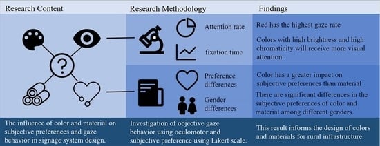
:As a highly used form of architecture, public facilities are closely related to people’s daily lives. The aesthetic level of their design greatly affects the quality of people’s lives and interactions, as well as the appearance of the whole area. However, research on their design elements has not received enough attention, and few quantitative studies on the design of public facilities simultaneously focus on multiple influencing factors such as color and material. Therefore, this study uses eye-tracking technology and audience aesthetic preference evaluation to explore the appropriate combination of color and materials in sign design. This study found that, in the design of public facilities and in terms of aesthetic preference, firstly, color has more influence on subjective preference and objective gaze behavior than material. Secondly, men prefer technological and changeable colors and materials, and women prefer soft and uniform materials. Finally, visitors spend more time gazing at their preferred signs, which means that visitors’ top-down gaze behavior and bottom-up psychological perception are highly unified. Regarding material perception, visitors’ subjective preferences are influenced by the physical or cultural properties of the material itself. This study’s results will provide suggestions for future urban and landscape architecture design in terms of color and material aesthetics, and the research methodology can be applied to more scenarios in environmental spaces.
1. Introduction
Landscape architecture aesthetics and science techniques, two hotly discussed topics in contemporary design, have long been widely discussed by architects and designers. As a discipline combining art and technology, it involves many aspects of architectural design, spatial planning, and urban and landscape architecture design [1]. In the process of small-scale urban design, after satisfying the function and the needs of users, the discussion of architectural aesthetics is conducive to enhancing the users’ positive feelings towards the space and then enhancing the usage rate of the space [2].
As an important part of street-level urban design combined with infrastructure, public facilities have the potential to enhance the quality of efficient and modern services. At the same time, public facilities show the characteristic cultural landscape of the local area, and as markers of citizens’ impressions of the area, they need to be both recognizable and symbolic [3], so their design aesthetics cannot be ignored. The signage system, as an important branch of public facilities, demonstrates the characteristic cultural style of the region and has a high degree of unity with the social environment and the ideology of the region [4]. It is indispensable in guiding the way and improving the quality of the tourism experience [5,6]. An excellent entrance design will greatly contribute to the revenue of the tertiary industry [7]. Consequently, the signage system has received full attention from the local community as an important promotional outlet for the area. Signage should be designed to blend in with the streetscape and make the street attractive. In contrast, poorly designed and visually unattractive signs can discourage people from entering [8]. Whereas in designing public facilities, design factors such as color and material determine the aesthetic quality of the exterior of the building [9]. Therefore, this paper conducts a corresponding study on the design of public facilities through color and material to derive information about the visitors’ aesthetic preferences for the design of public facilities and to provide a reference for the design of their appearance.
1.1. Color Research in Public Facility Design
Physically, color is the most intuitive landscape element in visual perception [10]. Due to the mechanisms of human visual perception, color contrast is considered to provide the most obvious and noticeable difference in environmental perception, especially in terms of visual detection thresholds [9]. Thus, color has a tremendous impact on the “quality of appearance” of design and even on human physiological health [11]. However, despite the increasing number of studies pointing to the importance of color in environmental perception, there is still a lack of research to support color selection in guiding design practice [12].
On a psychological level, color also has a significant impact on the subjective emotions of visitors. Red space corresponds to joy and passion and blue space corresponds to sadness, and these colors will prompt the crowd to produce corresponding behavioral feedback to the space [13]. Moreover, since environmental landscape color is a man-made product, the existing color environment not only reflects the humanistic inference of the designer, but also causes the audience to change their inner emotions and aesthetic feelings [14]. Existing studies point out that in signage design, colors are more likely to achieve visual harmony when there is little chromaticity or a large difference in luminance [11]. Brightness differences have a stronger effect on harmony and legibility, while chromaticity has a lesser effect [15]. Different gender labels affect the degree of subjective preference for color and the response to the environment [16]. In addition, extracting colors according to the local environment can help enhance the harmony of sign design [17]. The review shows that color significantly affects the visual appeal, subjective preference, and visual harmony of environmental signage design, but few articles discuss the quantitative relationship between gaze behavior and subjective preference.
1.2. Material Research in Public Facility Design
Current global research on materials focuses on physical properties, such as environmental friendliness, durability, etc. Regarding physical properties, it has been pointed out that the selection of materials should be based on the unique local ecological environment and physical facility conditions [18]. In recent years, scholars focused on the introduction of life cycle assessment into material selection began to pay attention to material sustainability [19,20], such as recyclable design, biodegradability, and disassembly design, so that economic development and the ecological environment can coexist in harmony [21,22].
In terms of emotional properties, materials possess symbolic qualities. In facility design, materials constitute people’s memories of culture and place [23]. And, in the context of rapid urbanization, traditional materials are beneficial in addressing the serious homogenization and weakening of the cultural landscape in localities [24]. In addition, there are gender differences in material preferences, with women preferring recyclable and green materials [25]. Therefore, the choice of materials must fully account for users’ physical and psycho-emotional needs [18]. However, there are fewer studies on subjective preferences and visual attributes due to the wide variety of materials and the difficulty in conducting a controlled variable analysis. This gap exists in the academic literature.
1.3. Application of Eye-Tracking Technology in the Design of Public Facilities
In recent years, eye tracking, a technology that records human visual data to measure human behavior and psychology, has become an integral approach for examining how people perceive their surroundings [26,27]. Quartier et al. suggest that color is an essential element in the design of interior living spaces that impacts mood and spatial perception [28]. Bogucka researched the preferences for interior spaces with varying proportions, lighting, and color schemes and discovered that soft hues could induce favorable emotions in humans [29]. Chen et al. pointed out that people prefer to look at trees rather than buildings in outdoor activities [30]. Song investigated color preferences in dental hospitals and found that brown stabilized patients more effectively than the traditional blue [31]. Zhang discovered that subway rooms with too much or too little color saturation and brightness might be unsettling, and the most popular colors are not always the most visually pleasing for people [13].
Regarding gaze behavior, the Suarez study indicated that neither the path taken to examine the building nor the route’s starting point affected the time participants spent viewing various architectural components, and those architectural components that the participants deemed aesthetically attractive were noticed for a longer duration [26]. According to the research of Li et al., most people were drawn to text in landscape photographs [32]. Rusnak assessed the visual reaction skills of experts and found that they could perform a fundamental analysis but could not predict more complex responses [9]. Regarding gender differences, Sargezeh et al. found that females exhibited more exploratory gaze behaviors, as evidenced by greater eye-hopping amplitude and longer scan paths [33]. Through the existing literature, current empirical research guided by stress recovery theory (SRT) [34] and attention restoration theory (ART) [35] has focused on stimulus-driven bottom-up processes while experiencing nature. However, a comprehensive evaluation of the signage system is based on the bottom-up visual gaze process and the top-down subjective preference factor, and the correlation between the two deserves further study [36].
Although there has been much research on color in environmental space, there is a need for additional research on elements (substance and size). Due to the limitations of research methods and the number of investigations, it is challenging to undertake variable studies on morphology, but it is easier to conduct quantitative research on the change of color and material [9]. Given the above research gaps, this paper focuses on the changes in visitors’ preferences and eye-movement data for different colors and materials under the premise of fixed forms to infer the selection of design elements in environmental design. This paper also tries to deduce the general color and material selection rule in environmental signage design.
2. Materials and Methods
2.1. Conceptual Framework
Under the premise of form determination, the most important design aspects for designers to consider were color and material. Varied color and material combinations can provide different visual perception impacts, influencing the visitors’ preference and interest in public facilities. Increased gaze behavior is the initial goal of sign design, which is a prerequisite for impressing visitors in sign design. Moreover, a more significant degree of preference indicates a greater readiness to travel and explore, which is beneficial to inciting further purchasing behavior [17].
On the other hand, a high level of gaze does not necessarily indicate a strong subjective preference for the entrance but also a long glance due to unpleasant emotions such as perplexity, fear, or rage [37]. Visitors may devote more time to visual perception in an unsettling color environment and have a more extended first stare [38]. Therefore, the link between gaze time and subjective preference becomes an essential criterion for determining the success of a signage’s design, and an outstanding sign’s design should unite gaze ability and subjective preference. Based on such arguments, this paper put forward the following four hypotheses:
Hypothesis 1.
The signage’s color could affect visitors’ visual attention and subjective preferences.
Hypothesis 2.
The signage’s material could affect visitors’ visual attention and subjective preferences.
Hypothesis 3.
The subjective preference was positively correlated with gaze time for signage.
Hypothesis 4.
There are differences in the subjective preferences of men and women regarding color and material.
2.2. Selection of Research Subjects
This study aimed to alter the color and material of the entry signs based on their fixed shape. The object of the study was the signage of Xiafang Village, Fengjing Town, Jinshan District, Shanghai, China, which arrived in 2021. Xiafang Village was successfully established as a model village of Shanghai Beautiful Village in 2021, a model-shaped epitome in rural revitalization in economically developed areas of China. Moreover, Xiafang Village represents the fusion of urban and rural styles in suburban areas of China. Therefore, the village logo of Xiafang Village was chosen as the object of this study. The signs mix traditional Chinese sloping roof components with contemporary design language, which locals and tourists highly appreciate (Figure 1).
In this work, simulation trials were conducted using photos [39]. The Lumion 11 program, often used for architectural landscape rendering, was employed to create simulations of signage to control the variables better and demonstrate a more uniform visual appearance [14]. It aided in avoiding the impact of season, weather, light, and other environmental conditions on the signage. At the end of the experimental design, eight logos from different Jiangnan regions were selected for research verification to ensure that the results of this design are generalizable for logo design in the Jiangnan cultural context.
This study focused on the logo design in the design of the entrance signage space. Our pre-experimental study found that the logo had the highest attention rate in the overall signage (Figure 2). In addition, the preference for the logo largely influenced the perception of the region [40]. Environmental identity design was closely tied to the brand concept. It can generate positive emotions and communicate brand meaning when the design helps establish an environment that provides an image and experience consistent with and appropriate for the organization’s or place’s goals [41,42]. A highly identifiable and effective logo can significantly enhance the brand’s value [43]. This logo’s design was a Chinese variant of the term “Xia fang” that uses a circle to convey its inclusive nature. The green areas in the center emphasized the indigenous traits of the tea garden’s culture.
2.3. Sampling and Data Collection
2.3.1. Color Changes of the Logo
Color has three measurable attributes: hue, brightness, and saturation [44]. To better merge with the local environment, lessen the feeling of abruptness, and more easily conjure the cultural identity of local people and visitors [17], the colors used in field design are frequently derived from traditional local palettes. Consequently, in terms of color extraction, environmental color mapping (a method for objectively identifying and recording color features) [45,46] was used to extract seven local traditional representative Gangnam colors: white for exterior walls (RGB255, 255, 255), red for lanterns (RGB169, 55, 56), yellow for plaques (RGB205, 181, 141), black for the roof (RGB65, 63, 70), brown for the wall pillar (RGB84, 65, 55), brown for the gate (RGB77, 45, 45), and grey for the wall base (RGB100, 103, 108). Following preliminary research, it was determined that the yellow color of the plaque, the gray color of the wall base, the brown color of the gate, and the brown color of the wall pillar were too similar. Therefore, the most visually prominent lantern was red. The yellow color of the plaque, the white color of the exterior wall, and the black color of the roof were selected as the color variables (Figure 3).
2.3.2. Material Changes to the Logo
The materials were selected from the eight materials commonly used for local logo design: brick, wood, stone, tile, concrete, metal, plaster, and glass. After preliminary research, it was found that, because some materials such as plaster, concrete, brick, and stone present effects too close to the subjects’ visual and subjective judgments that are difficult to distinguish, aluminum alloy with noticeable luster changes was chosen among metals. Therefore, acrylic, metal, wood, and plaster were finally selected as the material variables (Figure 4).
2.3.3. Crossover Effect
In the formal experiment, a full 4X4 factorial experimental design was utilized to present 16 logo forms (Figure 5).
2.4. Experimental Design
To test the hypothesis, we conducted this study in two steps: an eye movement experiment to explore physiological gaze behavior and a subjective questionnaire to explore subjective preference behavior. Based on G*Power’s sample size estimation, we required at least 15 people [47]. From a demographic point of view, the eye movement experimental design was divided based on gender, professionals (design juniors and above), and non-professionals based on professional ability. There were 15 male professionals, 15 female professionals, 15 male non-professionals, and 15 female non-professionals, for 60 subjects in the four categories (each category was randomly selected while supplies lasted, and there were no significant differences in the remaining demographic characteristics). All subjects were 18–35 years old (the subjects had a more obvious perception of color and material, and good feedback on the calibration of the eye movement experiment). A total of 123 valid questionnaires were collected, among which 81 were from design majors, 42 were from non-design majors, 44 were from males, and 79 were from females.
2.4.1. Eye Movement Experiment
The eye movement device is an SMI RED250 desktop eye-tracking device with a sampling frequency of 250 HZ and a screen resolution of 1980 × 1080. Eye-tracking sensors were used to collect information on the average gaze duration.
Subjects were instructed to sit 70 cm in front of the eye-tracking device. Before undertaking the eye movement experiment to see the photos, subjects were only instructed to relax, and the experiment’s goal was not apparent [31]. Before starting the formal experiment, a five-point calibration method controlled the subject’s line of sight shift to within 0.5°. In the formal experiment, an “X” image was first displayed on the screen for 6 s to determine that the subject’s initial line of sight was controlled in the center of the frame. The visual in the eye movement experiment ran for 12 s and contained 16 logos. The uniform design principle was applied (Figure 6) by combining four layouts to distribute distinct logos in the image evenly and then calculating the average value of each region of interest to eliminate the influence of reading sequence in the same photo owing to visual habits. Moreover, 15 individuals were tested for each of the four types of arrangement to prevent viewing different photographs in succession from influencing the experimental results.
2.4.2. Subjective Questionnaires
After completing the eye movement experiment, the participants were invited to complete a questionnaire regarding their preferences for 16 logos. A five-point Likert scale was utilized, with values from 1 to 5 denoting “strongly dislike” to “strongly like”, respectively. This item was used to determine the visitors’ preferred logos. After completing the questionnaire, the subjects were informed in detail about the study and were given a subjective evaluation of their personal preferences.
2.4.3. Data Analysis
In terms of physiological data, the eye movement data of the subjects were first analyzed. From the gaze report generated by the SMI BeGaze program, the average gaze data of 60 subjects were extracted to extract the gaze rate and gaze times of each logo to determine the relationship between logo gaze groups under different colors and material logo backgrounds. Using IBM SPSS 22 software, a multi-factor ANOVA on subjective preferences was conducted on psychological data to investigate the effect of visitors on the efficiency of the logo display under different conditions. The association between physiological and psychological impulses was determined by analyzing the correlation between objective gaze behavior and subjective preferences.
3. Results
3.1. Physiological Aspect—Objective Attention to Data
3.1.1. Attention Rate
The ease of discovery of the environmental signage system was a primary concern in the design, so the average attendance rate at each location in the experiment was concentrated. The data were obtained by dividing the number of people who gazed by the total number of subjects. From the data presented in Figure 7, against the same material background, red is the color with the highest view rate, followed by white, both of which are of high brightness, while red is relatively more saturated. Black and gold have low gaze rates, and are less saturated colors [48].
3.1.2. Attention Time
Gaze behavior is the process through which the central open visual field focuses for a long time on a target to gain sufficient visual picture detail. According to a previous study, the fixation time (FT) can indicate a subject’s familiarity and attention to a piece of information, and the total fixation time (TFT) index is essential for evaluating the user’s proficiency [49]. The final attention time is obtained by calculating the average attention times for the same sign at different locations.
As shown in Figure 8, the average gaze duration for red is longer than for other colors. Red, a highly saturated color, tends to be the visual center of attention. Next is black. The lowest are white and yellow, which are similarly bright and saturated, distract attention, and attract less visual attention.
As demonstrated in Figure 9, the eye movement indicators varied less in the background of different materials, and there was no significant variation among the materials. In comparison, wood received the most attention, and acrylic received the least gaze time. Metal and plaster had relatively stable eye movement indicators.
3.2. Psychological Dimension—Subjective Evaluation Data
3.2.1. Multi-Factor Analysis of Variance
According to the scale’s reliability test, the standardized Cronbach alpha coefficient was 0.839, and all reliability coefficients were more than 0.8, indicating excellent intrinsic reliability and steady test results. Both color (F = 53.605, p < 0.001; SD = 54.54) and material (F = 10.456, p < 0.001; SD = 11.307) exhibited significant differences via multi-way ANOVA. However, there was no interaction between them (p = 0.286). The effect of color was more substantial than the effect of material differences.
3.2.2. Color
With the same material, red scored the highest, followed by black, white, and yellow (Figure 10). Among these colors, red plaster scored the highest and yellow acrylic scored the lowest. Regarding subjective preferences, colors with high saturation scored higher than those with low saturation, and colors with high contrast with the surrounding environment scored higher than those with low contrast.
3.2.3. Materials
As shown in Figure 11, plaster scored the highest under the same color, metal scored second, and wood scored third. The lowest score is the acrylic material, which was considered an inappropriate logo material under various colors.
3.3. Demographic Differences
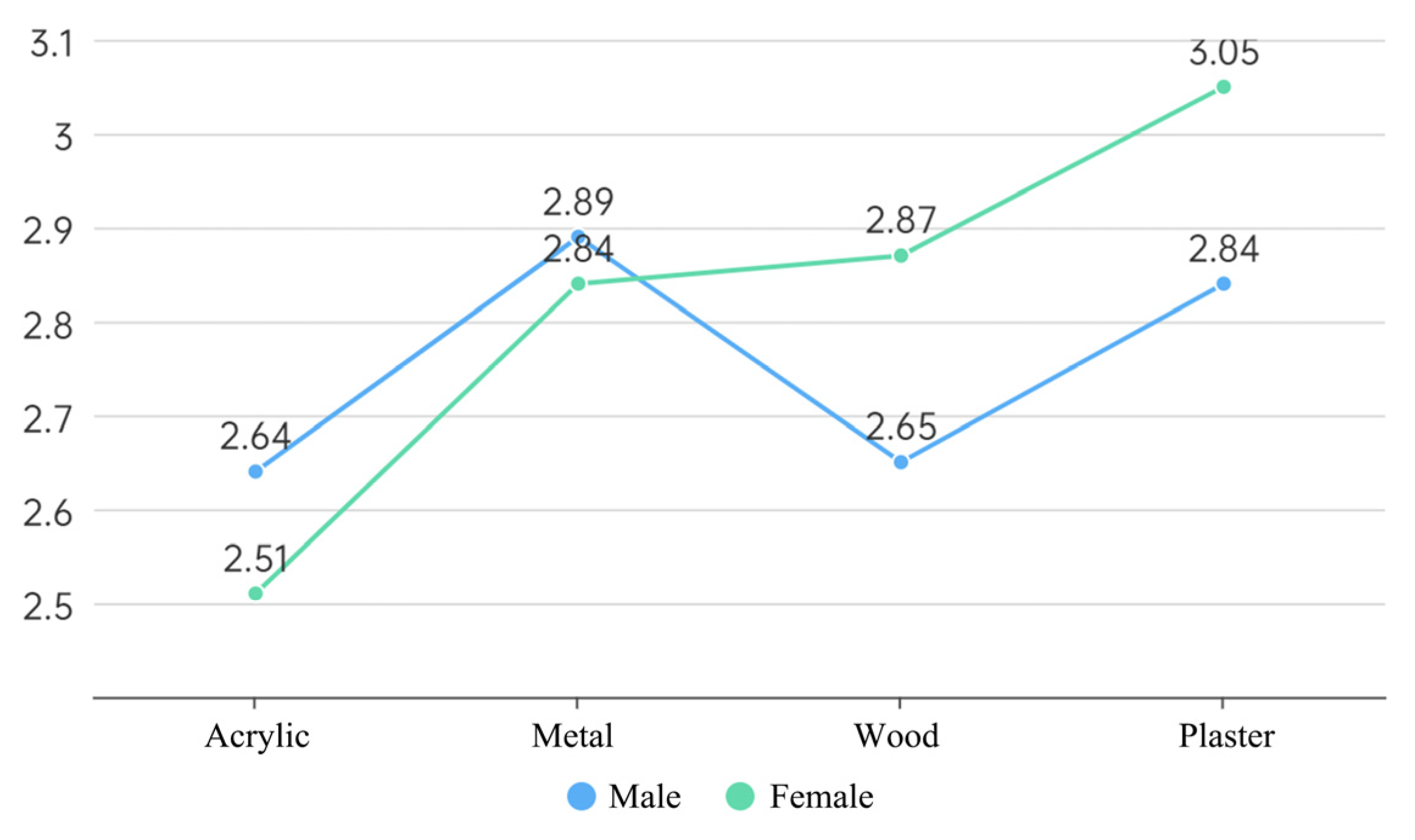
In terms of demographics, color preferences (F = 3.221, p = 0.022; SD = 3.277) and material preferences (F = 3.419, p = 0.017; SD = 3.697) varied significantly according to gender. Regarding ratings, there was a statistically significant difference between the professional and non-professional groups (F = 9.304, p = 0.004, SD = 9.271).
3.3.1. Gender and Color
As shown in Figure 12, some differences in preferences between genders exist. Both men and women chose red as their favorite color, while the greatest difference was in white, which was significantly preferred by women than men, with smaller differences according to gender between black and yellow.
3.3.2. Gender and Material
As depicted in Figure 13, persons of different genders have distinct material preferences. Men mostly prefer metal, and women mostly prefer plaster. In addition, men have a higher preference for metal and acrylic than women, and women have a higher preference for plaster and wood than men.
3.3.3. Professionalism
Figure 14 demonstrates that there is no significant difference in subjective preferences between the two categories, indicating that designers can judge visitors’ preferences through subjective judgments and that their preferences are highly congruent with those of the non-design category (mean non-professional = 2.89, SD = 1.01, mean professional = 2.75, SD = 1.07, p = 0.004). However, non-design professionals scored their preferences slightly higher overall than design professionals, partly because designers believed that there was a best option among them, and thus the rest of the ratings were correspondingly low. In contrast, non-design professionals thought there were multiple favorites, and thus the ratings were higher overall.
3.4. Correlation between Objective Gaze and Subjective Preferences
Pearson’s correlation coefficient analysis showed a significant positive correlation between preference and gaze time (r = 0.584, p = 0.017). It showed that the sign design unified the top-down objective gaze and bottom-up subjective preference indicators. While receiving the most attention, red is also the most preferred sign color, indicating the need for a bright and traditional cultural color as the main factor in designing environmental signage systems. Therefore, there is a need to balance recognition and culture in environmental signage design to enhance visitors’ satisfaction.
3.5. Verification
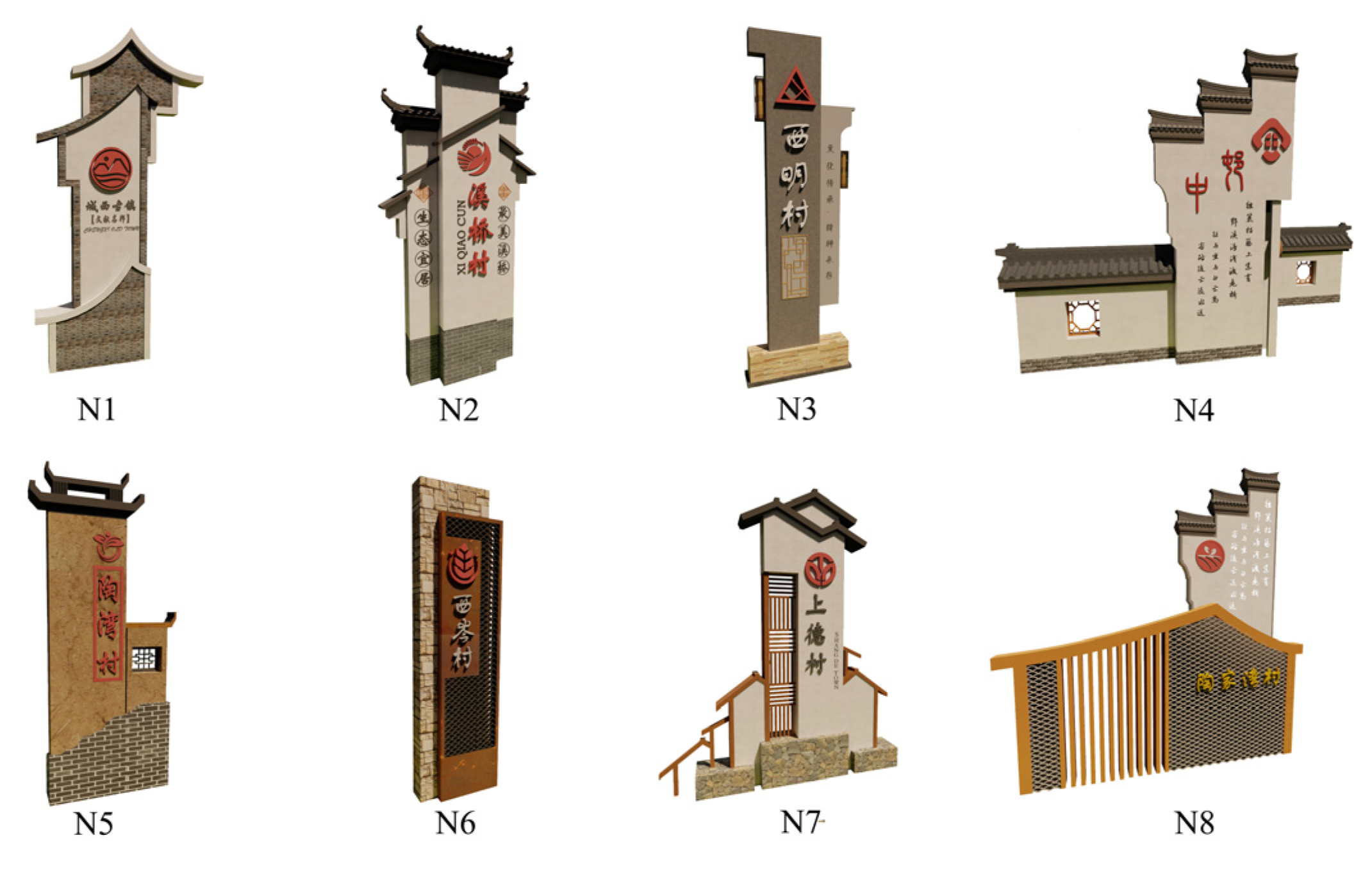
This study selected eight signs in the Jiangnan region to evaluate the visual comfort of color and material to verify the universality of color and material in design (Figure 15). The selected logo includes a combination of different materials, colors, and shapes commonly used in Jiangnan. A total of 60 valid questionnaires were obtained. The results show that 87.5% of tourists believe red gypsum is the most suitable color and material combination for a logo. However, in N5, red is too close to the background color, so it is not the best choice for the logo. According to the comprehensive verification results, it was found that the subjective evaluation results are consistent with the original experimental results.
4. Discussion
This study explored the influence of color and material on the perception of design elements via subjective preferences and objective gaze indicators in the design of public sign facilities. Four hypotheses were formulated and tested in the paper. The study showed that material and color significantly differed in subjective preferences, with color having a more pronounced effect. This study validates Rusnak’s conclusion that color is the most critical influence on visual response in environmental spaces [9], and the paper additionally verifies that color has a greater impact on subjective preference than material.
This study verified hypothesis 1, that color influences visual attention and subjective preferences. In the process of completing this experiment, some of the subjects answered, “The red one is the most noticeable”. “The red one is the most favored.” and “They will ultimately choose the red one, right?”. It was determined that red was the most noticed and preferred logo color after combining the gaze and preference data. In a sense, it demonstrated that the subjects’ attention and significance were unified, and it also indicated that red, a prevalent accent color in traditional Chinese culture, evoked the most intense emotions and influenced people’s evaluation of cultural aesthetics [50]. Unlike the Western cultural environment where red is seen as dangerous and as a warning, the people of the East see red as a color of celebration. Red has been mostly used as a decorative accent color in space design since ancient times, such as traditional lanterns and window flowers, and its strong contrast with the saturation of the main colors of black, white, and gray in the traditional Jiangnan countryside makes it easier to become the visual center. As the colors used in a large area in the design in the Jiangnan region of China, the use of black and white in the logo has been tested. Although they can achieve the harmony of visual properties, they lack highlights and do not meet the characteristics of the visual center and cannot highlight the characteristics of the logo. The yellow is too close to the wood tone used in the design and the overall logo, and it is not distanced in brightness and lacks visual stimulation, so it also fails to gain favor. It was further supported by the fact that they chose red plaster for the logo, which was well-received by residents and tourists alike.
The study verified hypothesis 2, stating that the material influences visual attention and subjective preferences. However, few participants in the trial mentioned materials, indicating that the perception of materials is foreign to non-professional designers. Male subjects occasionally remarked, “Preferring black metal.” meaning that men are more susceptible to visual aspects with a sense of technology and contrast [51]. Otherwise, it showed that the visual representation of the material still falls on the color contrast of the surrounding environment. In the interview afterward, it was found that plaster scored the highest in subjective preference, and its steady texture best fits the culture of Jiangnan and meets the impression of tourists for the white walls in the Jiangnan area. Next is metal, whose luster will give people a bright, refreshing, and prominent intuitive feeling, full of technology and modernity, contrasting with the surrounding materials and more likely to highlight the main position of the logo. Wood has relatively more grain and raw materials, is easy to decay, has unfavorable preservation, and has a relatively low rating. The lowest rating was for acrylic gloss because the too-obvious plastic texture is often subjectively added to the “cheap” or “old” label, the visual effect is not prominent enough, and the logo design’s eye-catching positioning does not match.
In addition, the experiment verified hypothesis 3, a positive relationship between subjective preference and visual gaze, indicating that visitors will look at the preferred signs longer, and those signs are more likely to leave an impression in their minds [52]. The experiment proves that the use of accent colors in the Chinese Jiangnan culture is reasonable and has developed a certain degree of recognition in the memory of contemporary people. It also proves that the colors or materials from the traditional culture can be used in the subsequent design process for secondary innovation.
Finally, the experiment partially verified hypothesis 4. Men and women are similar in color and material preferences, but some differences exist. In terms of color, Asian females seem to favor a more Western pattern of preference, while males favor a more traditional mindset regarding architectural aesthetics [53]. There are both cultural and gender-specific reasons for this. Regarding color, women’s preference for white was significantly higher than men’s. In the post-event survey, women thought “White is a clean and fresh color.”, while men thought “White is inauspicious”, “White is too rational and calm.”, and from a cultural perspective, white symbolizes purity and beauty in the West, while it symbolizes death in East Asia [53]. In terms of materials, men preferred metal and acrylic, mainly because “It differentiates from the surroundings.” and “The shine of metal is more eye-catching.”. Women preferred plaster and wood mainly because “They are more harmonious with the overall environment.”, “They use similar materials around them.” and “Wood is softer.”. Regarding gender characteristics of materials, men prefer hard, technological, and contrasting materials, while women prefer soft and warm materials [54] and pay more attention to the harmony of the overall environment.
4.1. Theoretical Significance
This study made a theoretical contribution to the research methodology and research content. In terms of research methods, this study increased the experiment’s dimensions. Traditional eye-movement experimental research has concentrated univariately on color [13,31], but this paper used software simulation to achieve an intercomparison of various parameters to improve the experiment’s dependability. Due to many tests in the experimental process, presenting each logo to the same subject could cause visual fatigue or test content awareness in the subjects, which could affect the findings. Therefore, the innovation of this experiment was to present different variables on the same effect map in a focused manner, effectively compensating for the drawbacks of existing eye movement experimental methods.
In conventional signage design, designers must balance subjective preference and recognizability in an excellent logo design. In this study, subjective preference and recognizability were researched under the premise of controlling variables, and it was determined that attention time and subjective preference had a high correlation in signage design. This article revealed that people preferred to observe the subjectively preferred signs in the signage system. The top-down attention of visitors was highly compatible with the bottom-up choice, giving a theoretical justification for the following environmental space signage design.
4.2. Practical Implications
According to the AIDA paradigm (attention, interest, desire, and action), consumers only become interested in visual materials and initiate additional responses after initially paying attention to them [55]. In the contemporary setting of Internet-driven tourism, customers are faced with an increasing number of options. Therefore, visually arresting signage can act as a promotional point for the region and encourage tourists to spend money there. This study’s findings and methodology allowed for the search for a more effective solution for signage in terms of color and material—using vibrant hues and relatively dense textures for logos to draw visitors’ attention.
The study’s conclusion demonstrated the significance of color and material in signage design. Furthermore, the effect of color is more than that of material, consistent with past research [9,11]. The subjects favored red as the logo’s hue considering the traditional Chinese cultural components and the logo’s recognizability. In terms of materials, the participants favored plaster and metal, as the plaster has the qualities of calmness and solidity, and metal has strong reflectivity, making the logo rich in light changes; therefore, these two materials can be widely used to create later logos.
In selecting experimental volunteers, eye movement tests conducted in the past have rarely compared genders. This study indicated that women were more attuned to material details than males and had color preferences that reflected this difference. For designs that demand a balance between men and women, neutral hues can be chosen. On the other hand, there was no significant difference in subjective preferences between the professional and non-professional groups, which indicates the professionalism of the designers, who can predict the subjective preferences of visitors relatively accurately to develop corresponding designs. However, the overall scoring of design practitioners was low. They usually only rated the most preferred ones the highest, presumably due to their sensitivity to design work, hence the need to classify professional and non-professional populations in subsequent design studies.
4.3. Limitations and Future Research
This study had some limitations. On the one hand, regarding demographic characteristics, the subjects were a group of university students aged 18–35 who were more sensitive to color perception. Factors such as cultural background [56], education level [57], and age [58] may affect people’s visual preference evaluation, and subsequent studies can be conducted for different subject populations. On the other hand, this paper mainly focused on the color and material of logos, and the change of color and material may differ in a large spatial area. However, the influencing factors included size, shape, luminosity, and other aspects, and more factors can be investigated in subsequent research.
5. Conclusions
This study used a typical public facility in Jiangnan, China, as the research object and used eye-tracking technology to obtain data on users’ physiological gaze indicators and subjective preferences for different colors and material backgrounds. The multi-factor ANOVA revealed the association between the subjective preferences of color and material in the Gangnam entry logo design to determine the optimal color and material combination scheme for the on-site entrance logo. The conclusions regarding the aesthetic design of public facilities are as follows:
- Both color and material affect gaze behavior, and color has more influence than material. The impact of color is primarily reflected in hue. The red logo receives the most attention from the audience. It demonstrates that high-luminance and -chromaticity colors will attract greater visual attention. The effect of the material is mainly represented in its texture and contrast with the surrounding environment; the more intricate the texture and the greater the contrast with the surrounding environment, the more visual attention the material will draw.
- Both color and material affect subjective preferences, with the influence of color being greater than that of material. Regarding color, tourists prefer red with high brightness and purity, which aligns with the traditional culture of Jiangnan, where red is used for decorative embellishments such as lanterns and window flowers. The visitor group perceives different materials, among which metal is loved due to its luminosity and technology, and plaster is loved due to its heavy, solid texture and being in line with Jiangnan culture.
- A considerable link exists between subjective preference and objective gaze (visitors will pay more attention to the preferred logo). It indicates that visitors prefer more visually striking colors and materials, which aligns with the need for the logo to stand out and draw attention to its function [42].
- The overall subjective preferences of color and material are similar, but there are a few differences in terms of gender. In terms of color, Asian women are more inclined towards Western color preferences. For example, women are significantly more receptive to white than men [53]. In terms of material, men prefer acrylic and metal, while women prefer wood and plaster. It indicates that men prefer relatively technological and contrasting colors and materials with their surroundings, while women prefer relatively natural and temperate colors and materials.
In summary, this paper investigates the relationship between the two design elements of color and material in facility design. Quantitative physiological and psychological measurements are introduced in the spatial study to examine several factors simultaneously. The results can be used as a reference for optimizing the future color and material design of public facilities and provide a research paradigm and data support for the subsequent design based on street-level urban and landscape architecture design aesthetics.
Supplementary Materials
The following supporting information can be downloaded at: https://0-www-mdpi-com.brum.beds.ac.uk/article/10.3390/land12071411/s1.
Author Contributions
Conceptualization, Y.L. and Z.Z.; methodology, Y.L.; software, Y.L.; validation, Y.L., Z.Z. and Y.X.; formal analysis, Y.L.; investigation, Y.L.; resources, Y.L.; data curation, Y.X.; writing—original draft preparation, Y.L.; writing—review and editing, Z.Z.; visualization, Y.L.; supervision, Z.Z.; project administration, Y.X.; funding acquisition, Z.Z. All authors have read and agreed to the published version of the manuscript.
Funding
This work was financially supported by the Shanghai Art Science Planning Project [No: YB2021G08].
Data Availability Statement
The data presented in this study are available in supplementary material. This non-interventive study does not require approval from the ethics committee locally.
Acknowledgments
The authors would like to acknowledge the support of the eye movement equipment provided by the International Center for Innovation and Design, Shanghai Jiao Tong University, and the experimental site and personnel provided by the College of Fashion and Design, Donghua University.
Conflicts of Interest
The authors declare no conflict of interest.
References
- Allen, E.; Rand, P. Architectural Detailing: Function, Constructibility, Aesthetics; John Wiley & Sons: Hoboken, NJ, USA, 2016. [Google Scholar]
- Scruton, R. The Aesthetics of Architecture; Princeton University Press: Princeton, NJ, USA, 2021. [Google Scholar]
- Lynch, K. The Image of the City; MIT Press: Cambridge, MA, USA, 1964. [Google Scholar]
- Aydoghmish, F.M.; Rafieian, M. Developing a comprehensive conceptual framework for city branding based on urban planning theory: Meta-synthesis of the literature (1990–2020). Cities 2022, 128, 103731. [Google Scholar] [CrossRef]
- Paliaga, M.; Franjić, Z.; Strunje, Ž. Methodology of valuation of cities’ brands. Econ. Res.-Ekon. Istraživanja 2010, 23, 102–111. [Google Scholar] [CrossRef] [Green Version]
- Ruan, L.; Long, Y.; Zhang, L.; Wu, X.L. A Geographic Analysis of Optimal Signage Location Selection in Scenic Area. Int. Arch. Photogramm. Remote Sens. Spat. Inf. Sci. 2016, 41, 477–481. [Google Scholar] [CrossRef] [Green Version]
- Qingjun, W. The scheme of Rizhao city brand. Oper. Manag. Coll. Int. Bus. Res. 2008, 1, 67–79. [Google Scholar] [CrossRef] [Green Version]
- Salleh, S.; Abdullah, N. Observation on signboard photographs in Kota Kinabalu, Sabah as indicator of change towards global business. J. Glob. Bus. Soc. Entrep. (GBSE) 2017, 1, 35–44. [Google Scholar]
- Rusnak, M. Applicability of eye trackers in marketing activities related to historical monuments Comparison of experts’ predictions and visual reactions of non-professionals. J. Cult. Herit. 2021, 49, 152–163. [Google Scholar] [CrossRef]
- Bell, S. Elements of Visual Design in the Landscape; Routledge: Abingdon, UK, 2019. [Google Scholar] [CrossRef]
- Emery, K.J.; Webster, M.A. Individual differences and their implications for color perception. Curr. Opin. Behav. Sci. 2019, 30, 28–33. [Google Scholar] [CrossRef] [PubMed]
- Kaiser, P.K. Physiological response to color: A critical review. Color Res. Appl. 1984, 9, 29–36. [Google Scholar] [CrossRef]
- Zhang, L.; Li, X.; Li, C.; Zhang, T. Research on visual comfort of color environment based on the eye-tracking method in subway space. J. Build. Eng. 2022, 59, 105138. [Google Scholar] [CrossRef]
- Cheng, Y.; Tan, M. The quantitative research of landscape color: A study of Ming Dynasty City Wall in Nanjing. Color Res. Appl. 2018, 43, 436–448. [Google Scholar] [CrossRef]
- Won, S.; Lee, Y.; Park, Y. The impact of signboard-building color combinations on color harmony and legibility. Color Res. Appl. 2020, 45, 527–541. [Google Scholar] [CrossRef]
- Knez, I.; Kers, C. Effects of indoor lighting, gender, and age on mood and cognitive performance. Environ. Behav. 2000, 32, 817–831. [Google Scholar] [CrossRef]
- Lin, Y.; Zeng, W.; Ye, Y.; Qu, H. Saliency-aware color harmony models for outdoor signboard. Comput. Graph. 2022, 105, 25–35. [Google Scholar] [CrossRef]
- Murphy, M. Landscape Architecture Theory; Island Press: Washington, DC, USA, 2016. [Google Scholar]
- Schneider-Marin, P.; Stocker, T.; Abele, O.; Margesin, M.; Staudt, J.; Abualdenien, J.; Lang, W. EarlyData knowledge base for material decisions in building design. Adv. Eng. Inform. 2022, 54, 101769. [Google Scholar] [CrossRef]
- Basbagill, J.; Flager, F.; Lepech, M.; Fischer, M. Application of life-cycle assessment to early stage building design for reduced embodied environmental impacts. Build. Environ. 2013, 60, 81–92. [Google Scholar] [CrossRef]
- Davis, B. The asymmetry of landscape: Aesthetics, agency, and material reuse in the Reserva Ecológica de Buenos Aires. J. Landsc. Archit. 2018, 13, 78–89. [Google Scholar] [CrossRef]
- Li, T.; Zou, G. Study of Waste Material Characteristics-Based Ecological Landscape Design. In Proceedings of the 2011 International Conference on Electric Technology and Civil Engineering (ICETCE), Lushan, China, 22–24 April 2011; IEEE: Piscataway, NJ, USA, 2011; pp. 1565–1568. [Google Scholar] [CrossRef]
- Lexcellent, C. Human Memory and Material Memory; Spring: Berlin/Heidelberg, Germany, 2019. [Google Scholar] [CrossRef]
- Suffian, S.; Dzombak, R.; Mehta, K. Future directions for nonconventional and vernacular material research and applications. In Nonconventional and Vernacular Construction Materials; Woodhead Publishing: Sawston, UK, 2016; pp. 63–80. [Google Scholar] [CrossRef]
- Xiao, C.; Hong, D. Gender differences in environmental behaviors among the Chinese public: Model of mediation and moderation. Environ. Behav. 2018, 50, 975–996. [Google Scholar] [CrossRef]
- De la Fuente Suárez, L.A. Subjective experience and visual attention to a historic building: A real-world eye-tracking study. Front. Archit. Res. 2020, 9, 774–804. [Google Scholar] [CrossRef]
- Kiefer, P.; Giannopoulos, I.; Raubal, M.; Duchowski, A. Eye tracking for spatial research: Cognition, computation, challenges. Spat. Cogn. Comput. 2017, 17, 1–19. [Google Scholar] [CrossRef]
- Quartier, K.; Vanrie, J.; Van Cleempoel, K. As real as it gets: What role does lighting have on consumer’s perception of atmosphere, emotions and behaviour? J. Environ. Psychol. 2014, 39, 32–39. [Google Scholar] [CrossRef]
- Tuszyńska-Bogucka, W.; Kwiatkowski, B.; Chmielewska, M.; Dzieńkowski, M.; Kocki, W.; Pełka, J.; Przesmycka, N.; Bogucki, J.; Galkowski, D. The effects of interior design on wellness–Eye tracking analysis in determining emotional experience of architectural space. A survey on a group of volunteers from the Lublin Region, Eastern Poland. Ann. Agric. Environ. Med. 2020, 27, 113–122. [Google Scholar] [CrossRef] [PubMed]
- Chen, B.; Gong, C.; Li, S. Looking at buildings or trees? Association of human nature relatedness with eye movements in outdoor space. J. Environ. Psychol. 2022, 80, 101756. [Google Scholar] [CrossRef]
- Song, E.-S.; Kim, W.-H.; Lee, B.-H.; Han, D.-W.; Lee, J.-H.; Kim, B. Assessment of Color Perception and Preference with Eye-Tracking Analysis in a Dental Treatment Environment. Int. J. Environ. Res. Public Health 2021, 18, 7981. [Google Scholar] [CrossRef]
- Li, Q.; Huang, Z.J.; Christianson, K. Visual attention toward tourism photographs with text: An eye-tracking study. Tour. Manag. 2016, 54, 243–258. [Google Scholar] [CrossRef]
- Sargezeh, B.A.; Tavakoli, N.; Daliri, M.R. Gender-based eye movement differences in passive indoor picture viewing: An eye-tracking study. Physiol. Behav. 2019, 206, 43–50. [Google Scholar] [CrossRef]
- Kaplan, R.; Kaplan, S. The experience of nature. In A Psychological Perspective; Cambridge University Press: Cambridge, UK, 1989. [Google Scholar]
- Ulrich, R.S. Biophilia, biophobia, and natural landscapes. In The Biophilia Hypothesis; Kellert, S.E., Wilson, E., Eds.; Island Press: Washington, DC, USA, 1993; pp. 73–137. [Google Scholar]
- Chen, W.; Ruan, R.; Deng, W.; Gao, J. The effect of visual attention process and thinking styles on environmental aesthetic preference: An eye-tracking study. Front. Psychol. 2022, 13, 1027742. [Google Scholar] [CrossRef]
- Kohout, S.; Kruikemeier, S.; Bakker, B.N. May I have your attention, please? An eye tracking study on emotional social media comments. Comput. Hum. Behav. 2022, 139, 107495. [Google Scholar] [CrossRef]
- Bohua, L.I.U.; Lishan, S.U.N.; Jian, R.O.N.G. Driver’s visual cognition behaviors of traffic signs based on eye movement parameters. J. Transp. Syst. Eng. Inf. Technol. 2011, 11, 22–27. [Google Scholar] [CrossRef]
- Szabo, F.; Bodrogi, P.; Schanda, J. Experimental Modeling of Colour Harmony; Wiley Online Library: Hoboken, NJ, USA, 2010; Volume 35, pp. 34–49. [Google Scholar] [CrossRef]
- Luffarelli, J.; Mukesh, M.; Mahmood, A. Let the logo do the talking: The influence of logo descriptiveness on brand equity. J. Mark. Res. 2019, 56, 862–878. [Google Scholar] [CrossRef]
- Calori, C.; Vanden-Eynden, D. Signage and Wayfinding Design: A Complete Guide to Creating Environmental Graphic Design Systems; John Wiley & Sons: Hoboken, NJ, USA, 2015. [Google Scholar] [CrossRef]
- Machado, J.C.; de Carvalho, L.V.; Torres, A.; Costa, P. Brand logo design: Examining consumer response to naturalness. J. Prod. Brand Manag. 2015, 24, 78–87. [Google Scholar] [CrossRef] [Green Version]
- Henderson, P.W.; Cote, J.A. Guidelines for selecting or modifying logos. J. Mark. 1998, 62, 14–30. [Google Scholar] [CrossRef]
- Dubois, E. The Structure and Properties of Color Spaces and the Representation of Color Images; Synthesis Lectures on Image, Video, and Multimedia Processing; Springer: Cham, Switzerland, 2009; Volume 4, pp. 1–129. [Google Scholar] [CrossRef]
- O’Connor, Z. Logo colour and differentiation: A new application of environmental colour mapping. Color Res. Appl. 2011, 36, 55–60. [Google Scholar] [CrossRef]
- Porter, T. Environmental colour mapping. Urban Des. Int. 1997, 2, 23–31. [Google Scholar] [CrossRef]
- Cohen, J. Statistical Power Analysis for the Behavioral Sciences; Routledge: Abingdon, UK, 2013. [Google Scholar] [CrossRef]
- Wang, H.; Luo, M.R.; Liu, P.; Yang, Y.; Zheng, Z.; Liu, X. A study of atmosphere perception of dynamic coloured light. Light. Res. Technol. 2014, 46, 661–675. [Google Scholar] [CrossRef]
- Lüdtke, H.; Wilhelm, B.; Adler, M.; Schaeffel, F.; Wilhelm, H. Mathematical procedures in data recording and processing of pupillary fatigue waves. Vis. Res. 1998, 38, 2889–2896. [Google Scholar] [CrossRef] [Green Version]
- Ram, V.; Schaposnik, L.P.; Konstantinou, N.; Volkan, E.; Papadatou-Pastou, M.; Manav, B.; Jonauskaite, D.; Mohr, C. Extrapolating continuous color emotions through deep learning. Phys. Rev. Res. 2020, 2, 033350. [Google Scholar] [CrossRef]
- Del Rio, D.F.; Sovacool, B.; Martiskainen, M. Controllable, frightening, or fun? Exploring the gendered dynamics of smart home technology preferences in the United Kingdom. Energy Res. Soc. Sci. 2021, 77, 102105. [Google Scholar] [CrossRef]
- Brams, S.; Ziv, G.; Levin, O.; Spitz, J.; Wagemans, J.; Williams, A.M.; Helsen, W.F. The relationship between gaze behavior, expertise, and performance: A systematic review. Psychol. Bull. 2019, 145, 980. [Google Scholar] [CrossRef]
- Al-Rasheed, A.S. An experimental study of gender and cultural differences in hue preference. Front. Psychol. 2015, 6, 30. [Google Scholar] [CrossRef] [Green Version]
- Mazzeo, R.; Cam, D.; Chiavari, G.; Fabbri, D.; He, L. Analytical study of traditional decorative materials and techniques used in Ming Dynasty wooden architecture The case of the Drum Tower in Xi’an, PR of China. J. Cult. Herit. 2004, 5, 273–283. [Google Scholar] [CrossRef]
- Wijaya, B.S. The development of hierarchy of effects model in advertising. Int. Res. J. Bus. Stud. 2015, 5, 34–49. [Google Scholar] [CrossRef]
- Yu, K. Cultural variations in landscape preference: Comparisons among Chinese sub-groups and Western design experts. Landsc. Urban Plan. 1995, 32, 107–126. [Google Scholar] [CrossRef]
- Molnarova, K.; Sklenicka, P.; Stiborek, J.; Svobodova, K.; Salek, M.; Brabec, E. Visual preferences for wind turbines: Location, numbers and respondent characteristics. Appl. Energy 2012, 92, 269–278. [Google Scholar] [CrossRef] [Green Version]
- Torku, A.; Chan, A.P.; Yung, E.H.; Seo, J.; Antwi-Afari, M.F. Wearable Sensing and Mining of the Informativeness of Older Adults’ Physiological, Behavioral, and Cognitive Responses to Detect Demanding. Environ. Cond. Environ. Behav. 2022, 54, 1005–1057. [Google Scholar] [CrossRef]
Figure 1.
Original picture.

Figure 2.
Heat map. (The warmer the color the longer it is watched.)

Figure 3.
Color variables.

Figure 4.
Material variables.

Figure 5.
Final effect.

Figure 6.
Schematic diagram.

Figure 7.
Attention rate.

Figure 8.
Gaze time for different colors.

Figure 9.
Gaze time for different materials.

Figure 10.
Average of subjective preferences under different colors.

Figure 11.
Average of subjective preferences under different materials.

Figure 12.
Gender differences in subjective preferences under different colors.

Figure 13.
Gender differences in subjective preferences under different materials.

Figure 14.
Professional differences in subjective preferences.

Figure 15.
The 8 different logo designs for validation.

Disclaimer/Publisher’s Note: The statements, opinions and data contained in all publications are solely those of the individual author(s) and contributor(s) and not of MDPI and/or the editor(s). MDPI and/or the editor(s) disclaim responsibility for any injury to people or property resulting from any ideas, methods, instructions or products referred to in the content. |
© 2023 by the authors. Licensee MDPI, Basel, Switzerland. This article is an open access article distributed under the terms and conditions of the Creative Commons Attribution (CC BY) license (https://creativecommons.org/licenses/by/4.0/).
Share and Cite
MDPI and ACS Style
Liu, Y.; Zhou, Z.; Xu, Y. Design Element Preferences in Public Facilities: An Eye Tracking Study. Land 2023, 12, 1411. https://0-doi-org.brum.beds.ac.uk/10.3390/land12071411
AMA Style
Liu Y, Zhou Z, Xu Y. Design Element Preferences in Public Facilities: An Eye Tracking Study. Land. 2023; 12(7):1411. https://0-doi-org.brum.beds.ac.uk/10.3390/land12071411
Chicago/Turabian StyleLiu, Yumeng, Zhicheng Zhou, and Yuanyuan Xu. 2023. "Design Element Preferences in Public Facilities: An Eye Tracking Study" Land 12, no. 7: 1411. https://0-doi-org.brum.beds.ac.uk/10.3390/land12071411
Note that from the first issue of 2016, this journal uses article numbers instead of page numbers. See further details here.