Article

Protected Areas from Space Map Browser with Fast Visualization and Analytical Operations on the Fly. Characterizing Statistical Uncertainties and Balancing Them with Visual Perception

1
Grumets Research Group, CREAF, Edifici C, Universitat Autònoma de Barcelona, Bellaterra, 08193 Catalonia, Spain
2
Grumets Research Group, Dep. Geografia, Edifici B, Universitat Autonoma de Barcelona, Bellaterra, 08193 Catalonia, Spain
*
Author to whom correspondence should be addressed.
ISPRS Int. J. Geo-Inf. 2020, 9(5), 300; https://0-doi-org.brum.beds.ac.uk/10.3390/ijgi9050300
Submission received: 6 March 2020 / Revised: 30 April 2020 / Accepted: 4 May 2020 / Published: 6 May 2020

Abstract

:
Despite huge progress in applying Earth Observation (EO) satellite data to protected areas, managers still lack the right tools or skills to analyze the data and extract the necessary knowledge. In this paper a set of EO products are organized in a visualization and analysis map browser that lowers usage barriers and provides functionalities comparable to raster-based GIS. Normally, web map servers provide maps as pictorial representations at screen resolution. The proposal is to use binary arrays with actual values, empowering the JavaScript web client to operate with the data in many ways. Thanks to this approach, the user can analyze big data by performing queries and spatial filters, changing image contrast or color palettes or creating histograms, time series profiles and complex calculations. Since the analysis is made at screen resolution, it minimizes bandwidth while maintaining visual quality. The paper explores the limitations of the approach and quantifies the statistical validity of some resampling methods that provide different visual perceptions. The results demonstrate that the methods known for having good visual perception, the mode for categorical values and the median for continuous values, have admissible statistical uncertainties.

1. Introduction

Protected Areas (PA) are dynamic systems that need to be studied and managed to preserve the ecosystem services they provide. Some parts of the areas are difficult to access and there is a limited budget for collecting comprehensive in-situ data for exhaustively covering the whole area. Remote sensing (RS) data offer an alternative way of obtaining a regular flow of information. Currently, many Earth Observation (EO) satellites provide a homogeneous coverage that, in some cases, is made available to everyone for free. For example, optical satellites return raw RS data that is structured in images to record the reflectance of the Earth at different wavelengths (one band for each). Reflectance cannot be directly interpreted and must be converted into a set of higher-level products estimating comparable variables or are proxies for the values measured with sensors on the ground. Some of these products are directly related to vegetation characteristics, such as leaf area index, gross primary production, vegetation wetness and height, tree cover density, vegetation composition, and classification, among others. Many of these are now considered essential biodiversity variables [1,2]. Potentially, the raw data is received at regular intervals and the products can be computed to obtain long time series of homogeneous variables. Provided the series is long enough, it can be used to separate seasonality and trends [3], study the impacts of climate change on the Earth’s ecosystems, its disturbances, resilience and adaptation. Examples of products that are only possible with the availability of time series are forest disturbances, phenology, fire occurrence, hydroperiod, etc.
Currently, the RS processing facilities are automated and the data are readily available on the Internet [4], but despite the great progress, PA managers face several problems when they try to use RS data that are related to big data issues: a huge amount of data needs to be stored and processed (volume), there is a diversity of formats (variety), and the uncertainty (veracity) is heterogeneous or unknown. In addition, the complexity results in slow processing (velocity) as a consequence of not having the right tools or technical skills for visualizing, analyzing and interpreting the data easily and thus extracting the necessary information [5]. Geospatial web services are particularly suitable for visualizing geospatial data and the results of analytical processes [5]. Open Geospatial Consortium (OGC) standards facilitate discovery, visualization, delivery and reuse of geospatial data [6]. OGC Web Map Service (WMS) [7] and Web Map Tile Service (WMTS) are common solutions applied in map clients that combine information coming from more than one server [8]. In WMS a pictorial representation at screen resolution is sent to a client, which presents it. This strategy has the inconvenience that the client does not receive the actual values of the spatial distribution of the variables. Following the statistics provided by Lopez-Pellicer et al. in 2011 [9], there are only 25% active downloading services as a proportion of the active WMS services. Assuming that the current situation persists, adding extra functionalities directly to WMS clients and services to support some analytical capacity could have a big impact.
The usefulness of a platform able to visualize vegetation indices, data filtering and time series analysis has been demonstrated [10]. Ideally, a frontend element should be a web client in conjunction with OGC services. One important limitation of the first version of web client languages, such as JavaScript, was the impossibility of getting additional data without giving up the current screen content. Some developers found a solution in a library that was originally designed for requesting additional XML data that is then combined with the data already present on the web page. This technique was used to create a desktop-like geospatial sharing and visualizing portal in the GeoBrain Online Analysis System (GeOnAS) [11]. In GeOnAS, the XMLHttpRequest() JavaScript function is used to request data asynchronously to a servlet that provides an XML answer. Once the data are received, the JavaScript code shows parts of the data in web forms, while other parts are sent to a Google maps API for graphical display. In the meantime, commonly used web map browser libraries, such as Leaflet, improved vector visualization in the client side (e.g., based on SVG) and vector analytical tools but raster manipulation is still rare. Fortunately, HTML5 incorporated the canvas API, which provides access to a comprehensive raster and vector graphics library for map browsers. Soon, developers realized the potential of this addition for displaying feature-based geospatial information as vectors [12]. The canvas API can also be used for representing raster based information (using putImageData()), but this has not been exploited much so far [13].
To exchange RS data, the geospatial standards define the concept of coverage. In a grid coverage, space is described by a set of dimensions that are sampled at defined intervals. Each position in the grid has a value. To be able to support coverages directly in a web browser, we need to deal with arrays of values. Arrays are an intrinsic part of the JavaScript data model and they are embedded in the code or can be delivered as lists of values in XML or JSON format [14]. These text-based encodings are considered to be inefficient. Instead, most coverage formats use binary arrays of a specific number of bytes. HTML5 can deal with binary arrays that are stored in buffers that can be queried using functions like getInt16(), getFloat32(), etc. This approach has been used by the creators of the open source geotiff.js library at the EOX IT company [15]. The library is capable of reading a GeoTIFF file directly in the browser and creating a dynamic visualization of it (with zoom and pan capabilities). Apart from building RGB compositions, when using plotty.js, a palette can be added to the data dynamically. The approach moves the grid transformation efforts from the server side to the client side [16].
In this paper, we propose a solution consisting of implementing a modern web client that is able to combine AJAX, binary arrays, canvas API and the OGC WMS protocol to manage RS data structured in coverages. The proposed solution empowers the client with functionalities that were reserved for desktop GIS, such as dynamic queries, spatial filters, enhance contrast, change palettes, generate diagrams (e.g., histograms and pie charts), animations, time series profiles and complex calculations using several bands or products of the different available datasets. Today, doing calculations and analysis on the client side is really innovative. One of the few available examples on the Internet doing something similar is the JavaScript walkshed.js library, which is able to perform a cost-distance raster calculation in the client side [17]. By using WMS, data are transferred at screen resolution. Resolutions of current screens are limited to a certain amount of pixels, and therefore, server-side generalization is necessary. Generalization is a cartographical tool that, in our case, reduces the amount of information by reducing the values in the coverage fitted in a single screen pixel to a single value by applying statistical interpolation. Some interpolation functions create a “nicer” visualization than others. The term “nice” is related to the human perception of the world, and the generalization method should obtain a visualization that resonates with our perception of reality. Human perception is good for identifying entities in images that fit with our mental model of reality. This is why we understand the classes obtained from image classification easily. Classes obtained from image classification do not always correspond to certain cartographic objects, as their spatial appearances are usually heterogeneous and their class membership may be uncertain [18]. It is necessary to preserve elements in images by grouping things in a way that creates a visualization that preserves features that humans find “natural” in a map and that fits better with our perception of the world [19]. Depending on the statistics that are applied to create the interpolated views, some elements will be removed, thus creating a more continuous view (e.g., mode interpolation), or some small structures will be partially saved, which might create artifacts in the pictorial representations (e.g., nearest neighbor).
In this paper, the generalized data will not only be used in visualizations, but we will also make some preliminary analyses on the simplified data. This study considers the impact that simplification has on both visualization and the statistical uncertainties induced when an analysis is made at screen resolution. In summary, the simplified map should have a low uncertainty interpolation system to ensure validity of the analysis (e.g., preserving the statistical proportions of the classes) and preserve visually satisfactory perception. While the first factor can be mathematically demonstrated and its uncertainties assessed, the second is related to subjective perception of continuity and connectivity. We will quantify the uncertainties of different interpolation methods to demonstrate that methods that are known to produce better visual perception still provide reasonably low uncertainties. The paper is structured as follows. Section 2 introduces the datasets collected or produced in ECOPotential and the functionalities implemented in the map browser. Section 3 quantifies the impact of generalization statistical operations depending on the interpolation strategy. Section 4 discusses the results, and Section 5 provides the main conclusions.

2. Materials and Methods

2.1. Datasets

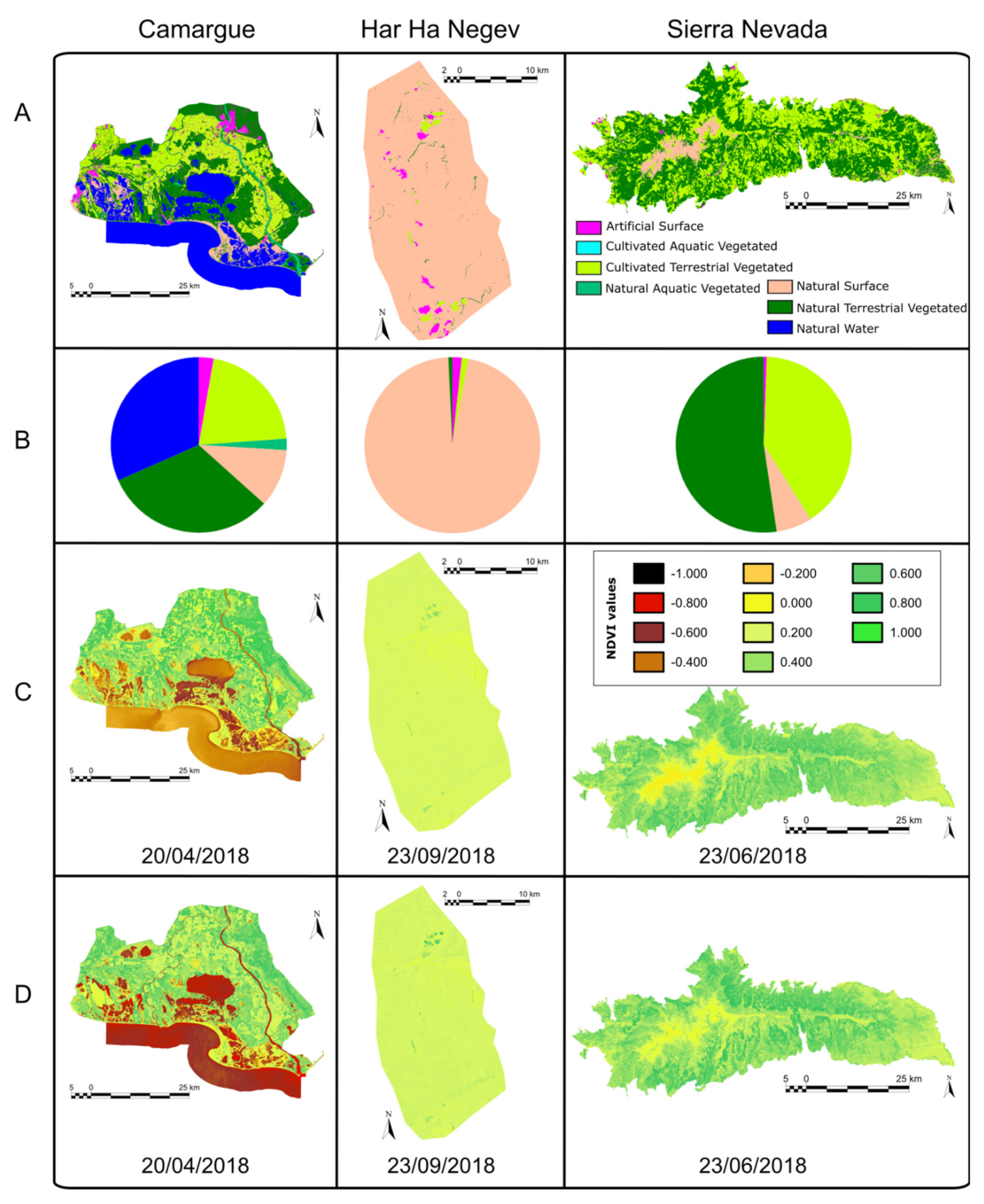
ECOPotential is a large European-funded H2020 project that focuses its activities and pilot actions on a targeted set of 23 internationally recognized PAs in Europe, European territories and beyond, blending EO from RS and field measurements, data analysis and modeling of current and future ecosystem conditions and services. These PAs include mountain (M), arid and semi-arid (A) and coastal and marine (C) ecosystem types (see Table 1). Annual average temperatures for the arid/semi-arid ecosystems considered in ECOPotential partly surpass 20 °C (e.g., Har HaNegev, Kruger National Park). Annual precipitation can even fall below 100 mm (Har HaNegev). The variability among the PAs is strongly dependent on differences in elevation (e.g., >2400 m for Samaria in comparison with <400 m in Alta Murgia or Kruger National Park). Climatic conditions for the coastal and/or marine PAs considered in the ECOPotential range from the boreal zone (Curonian Lagoon) to the tropics (Caribbean) with a strong contribution from the Mediterranean regions [20].
Several products have been elaborated or collected for these PAs by ECOPotential partners and presented in a map browser: leaf area index, biomass, indices such as Normalized Difference Vegetation Index (NDVI) and Enhanced Vegetation Index (EVI), fragmentation, disturbances, gross primary production, vegetation wetness, vegetation height, phenology, fire occurrence, normalized burn ratio, tree cover density, nutrients, vegetation composition, vegetation classification, habitat distribution, water turbidity, hydroperiod, snow cover, organic matter, chlorophyll-A, surface soil moisture, spectral soil quality index, surface albedo, land surface temperature, sea surface temperature, digital elevation model, bare ground, slope, etc. The browser also includes Landsat and Sentinel 2 imagery. Some of these datasets are arranged in time series of different temporal resolutions.
In the first months of the project, a questionnaire was given to 20 of the ECOPotential stakeholders to determine their level of interest in certain topics to guide the activities of the project. The results were collected in deliverable 11.1 [21]. The conclusion was that stakeholders were equally interested in data collection, data analysis, scientific results and application in PA management. Secondly, when asked for their opinion about the best way to communicate the project results to PA staff or to the general public, in both cases maps and graphics were the preferred media over videos, policy briefs, workshops or training sessions. This convinced us that the best vehicle to communicate the project results was an interactive map browser with different levels of functionality in which basic functions do not require training.

2.2. Map Browser with Analytical Capabilities

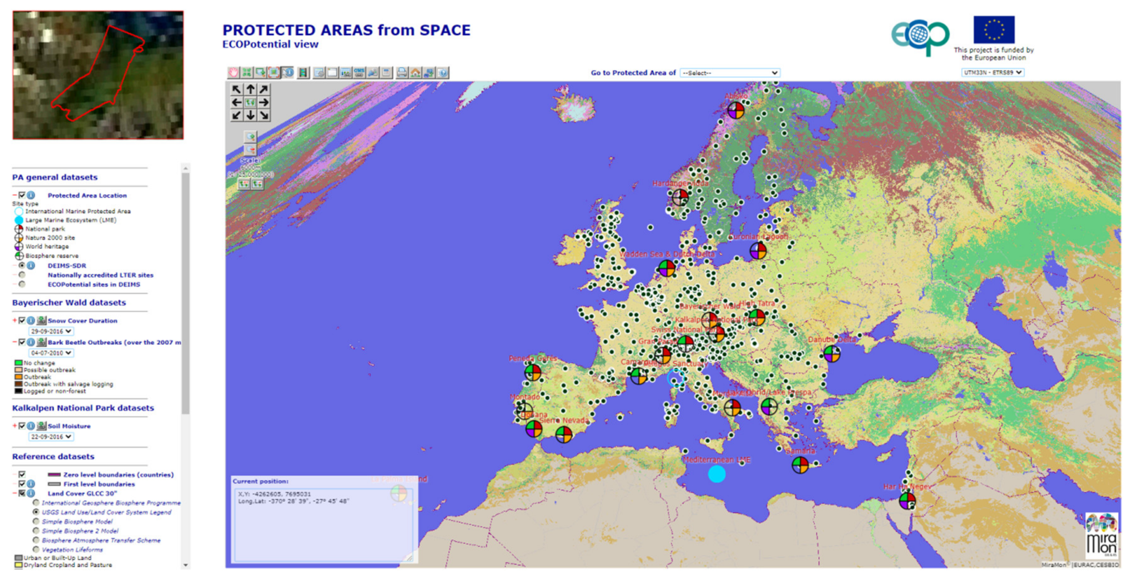
The ECOPotential map browser (available in http://maps.ecopotential-project.eu/) was created in response to user requirements as an evolution of the MiraMon map browser software. The Protected Areas from Space browser aims to provide a way to discover and explore the potential of RS data for the management of 23 PAs without requiring bulky downloads or setting up complex RS or GIS tools. About one hundred thousand individual RS items were organized in 138 layers, some of them consisting of time series, and thus there were a total of 4277 time frames (see Table 1). This structure is represented in a hierarchical legend, structured by PA, variable and time instant. Therefore, it is not necessary to elaborate a data discovery mechanism based on a metadata catalog and metadata queries. The map browser makes it possible to discover, visualize, query, animate and download datasets. It also integrates metadata and quality descriptions associated with each layer and the capability to link to the NiMMbus system (developed in the EU H2020 NextGEOSS project) to store geospatial user feedback (GUF). A set of products (extracted from available sources or generated during the project) were organized in a visualization and analysis map browser that lowers the technological barrier to make using RS data less complex. The map browser uses the spatial-cognitive abilities that humans have developed over centuries to navigate through the geographic space. This results in a natural interface in which spatial and thematic information is interlinked [22]. The technology described in this paper has been implemented in the MiraMon [23] map browser open-source code (https://github.com/joanma747/MiraMonMapBrowser). The hardware running the map services is hosted in CREAF facilities in a local installation on a 24 core Intel Xeon computer with 48Gb RAM. The server side is a CGI program maintained as part of the C language-based MiraMon developments. The client is a pure JavaScript composed of 28 modules with a total of 35000 lines of code. Both the service and the client are managed by Internet Information Services version 8.5.
The browser presents the data at predefined zoom levels of 10, 20, 60, 100 and 200 m for PA focused views and 600, 1000, 2000, 6000, 10,000, 20,000 and 60,000 m for general views. For most PAs, the entire extent of the PA fits into a 1000 pixel-wide screen at a 200 m zoom level, while for the smaller PAs, a 100 m zoom level will suffice. We selected 10, 20, 60, 100 and 200 m resolutions for this study because we consider that, at smaller resolutions, the PA looks too small on the screen. With histograms and pie charts, users can easily identify the distribution of the values for a certain layer. The produced histogram or pie chart covers the whole area visible in the map browser. This means that it can include the PA and the surroundings. To prevent the surroundings from contaminating the analysis, a selection operation can be made to exclude the area outside the PA. This is done by filtering out the pixels that are not inside the mask of the PA. This selection is made directly on the client side. The browser also incorporates other analytical functions, such as a layer calculator, confusion matrix assessment and video animations, among others, which are all carried out on the client side at screen resolution [24].
The target audience for the map browser includes PA managers, scientists and decision-makers. PA managers are concerned about their PAs, but scientists and decision-makers could be interested in comparing PAs or in conducting global studies. Therefore, while PA managers might be interested in monitoring specific aspects of their daily job, scientists and decision-makers might need a more general overview. For this reason, we concluded that the map browser should cover all PAs but be able to switch from one PA to another easily. Technically, each PA has its own bounding box and cartographic projection; however, it is possible to switch from one PA to another automatically by simply selecting the PA name in a dropdown list (see Figure 1).
RS data and derived higher-level products (by analysis or modeling) can be represented as coverages. In the OGC Coverage Implementation Schema (CIS) [25], a coverage dataset is represented as a range set, a range type and a domain. If the domain can be expressed as a grid, then the range set can be an array of values of a predefined data type (range type). In the presented map browser, data is structured in a set of layers. Each layer is mapped to a specialization of a coverage considered as a regular grid with at least 2 dimensions representing 2 coordinates over the Earth in one or more cartographic projections. Each layer can be represented by a set of range sets (the actual values of the grid), each of which is associated with a value for each extra dimension that the coverage may present. If we follow the GIS and RS tradition, a 2D range set should be transported in raster binary encoding. In this implementation of a map browser we have selected the simplest possible binary encoding, sometimes referred to as the “raw” format. In this format, the values of the grid are represented as an array of binary encoded numbers all of the same binary type. Using the new JavaScript array buffer object, this type of data can be stored in a JavaScript variable. A modified WMS server is used to generate the binary arrays as a return of a common WMS GetMap request with the desired bounding box and the format parameter set to “application/x-img”. In the client, a WMS request is made in an asynchronous mode using the XMLHttpRequest() function configured in a way that allows binary responses. The WMS request is tailored so that the received values correspond one-to-one to the pixels of a map area on the screen. When received, the binary data are stored in an array buffer for later use.
The next step is to represent the data in the map area of the screen. A canvas area is associated with the map area to create the view. By requesting an image to the canvas with the function createImageData(), an array of RGB values covering a predefined set of pixels in the screen is returned ready to be filled. The binary arrays returned by the WMS service are not directly applicable here but can be easily adapted. To allow maximum flexibility, each layer defines a set of styles that are a set of rules for transforming the binary arrays into the proper RGB values that form the colors of an image representing the data. In ECOPotential map browser, a style can have one of the following three modes: color palette, RGB or a more elaborated calculation among bands [24].
Besides visualization, having the actual array of values directly on the client side opens a new set of possible applications that were not available with a classical WMS approach. If the binary arrays are stored for later use, with a bit of programming, statistical summaries can be easily calculated by the JavaScript code, and one of the available open-source diagram libraries can be used to plot the graphical representations, such as histograms or a pie charts. In our case, we opted for chart.js because it easily allows each bar of a bar chart to have a different color. This characteristic makes it possible to assign a bar representing a range of values the same color, which represents the central value of the range in the map when the styling rules are applied. Another immediate operation that can be improved is the point query, as it does not have to rely on a WMS server-side request (GetFeatureInfo) to get the response. The response can be extracted directly from the store binary array used for creating the view and is fast enough to show the value of all visible layers when hovering over the map with the mouse. This technology also makes it possible to filter out some values of the image that do not meet a condition set by another layer (e.g., represent NDVI values only if the elevation is lower than a certain value or only for a certain land cover category). The style of the generated selection layer can also be edited to adjust the visualization among the values better.
Layers visualized in a single viewport in the overlaying stack are co-registered because they are requested in the same number of columns and rows and the same bounding box, and therefore, all cells have the same pixel size. This means that the JavaScript code can perform pixel by pixel layer calculations using the actual values of the binary arrays and immediately present the result at screen resolution to the user. Calculations can be relatively simple spectral indices, such as EVI or SAVI [26], or a complex model involving several layers. Internally, the JavaScript code benefits from the eval() function to evaluate any calculation that can be expressed as a pixel by pixel mathematical expression using generic names of layer bands. To visualize the results, a loop for all pixels is made in the viewport. For each pixel, the generic name of the layer bands are replaced by the actual values of that pixel before sending the expression to the JavaScript eval() function to obtain the resulting value of the pixel.
The described methodology executes complex operations at screen resolution on the client side. This has the advantage of giving the user virtual products that were not precalculated on the server side but rather are presented to the user on the fly each time they zoom or pan. This gives the user plenty of options to actually create new band combinations or request new calculations that go far beyond the ones initially foreseen by the map browser creator. Moreover, all the presented results (map visualizations, graphics and statistical summaries) are calculated at screen resolution. How well the calculated results represent the real values that should result from performing the same operations at full resolution on the server side depends on the interpolation method (performed by the server that provides the binary arrays in the first place), on how these uncertainties are propagated in the client’s calculations and on which generalization method is applied.

2.3. Interpolation on the Server Side

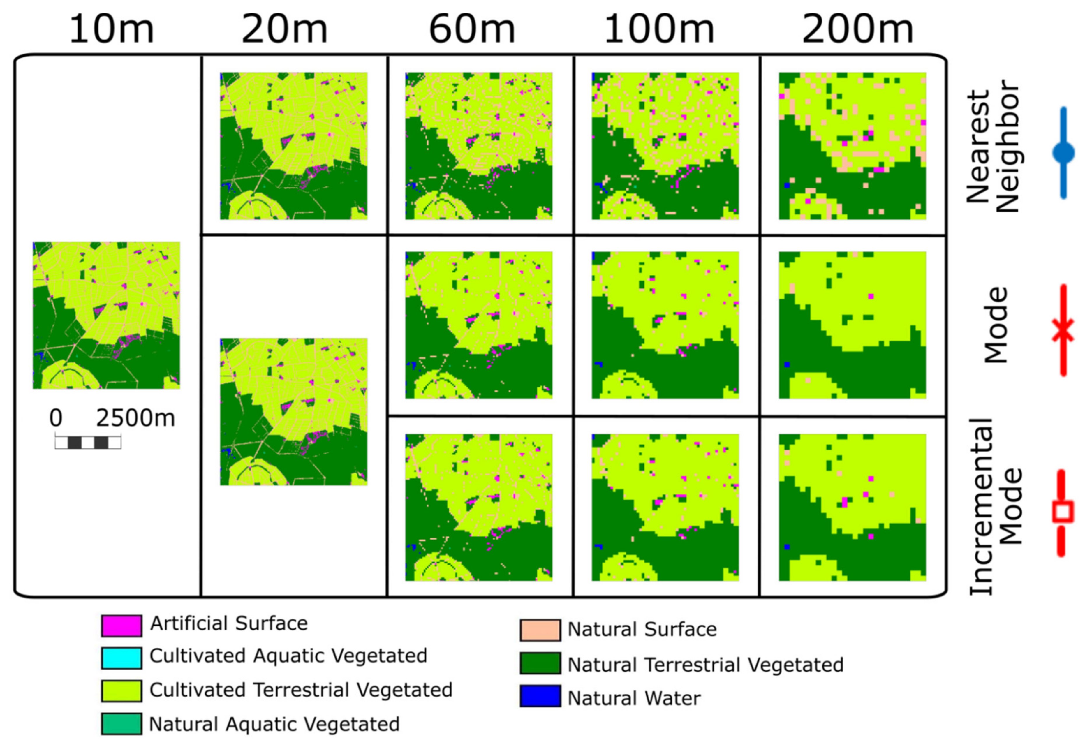
On the server side, each layer is associated with a coverage dataset that has a predefined resolution conditioned by the sensor limitations and the modeling algorithms. For example, a Sentinel 2 satellite image has a minimum pixel size of 10 m. Normally, a computer screen will present the map in an area no bigger than 1000 pixels so that the extent of the data presented is limited at full resolution to a 10 km wide area. However, the areas selected for the ECOPotential project are bigger than that. Therefore, to present the whole PA on the screen, a generalization needs to be made. Thus, in some extreme cases (i.e., Montado, Kruger and the Wadden Sea) a single pixel value is an average of 50 × 50 original cells. In order to respond to a WMS request covering the complete PA, the server needs to interpolate the values of the original coverage. In the second part of the paper we discuss in depth how well the interpolated values represent the real values and the uncertainties that this interpolation introduces.
In order to have fast delivery, our web map browser implementation needs a sequence of fixed interpolated zoom levels to be pre-computed. To minimize the interpolation effects, each less dense interpolated grid is created in a way that completely overlaps with the original grid. This is only possible if an exact multiple of the original resolution is selected for the interpolated grid [27]. As a consequence, each cell of the interpolated grid exactly overlays a predefined number of cells in the original grid. A common practice in map browsers (e.g., OSM tiles https://wiki.openstreetmap.org/wiki/Slippy_map_tilenames) is to recursively multiply the cell size by a factor of two [28,29]. Starting at 10 m, this results in a 20, 40, 80, 160, 320 and 640 m cell size. However, these cell sizes are not appropriate when trying to combine a diverse set of RS products, because most higher zoom levels do not correspond to the common medium resolution satellite product specifications. To mitigate this, starting with a 10 m resolution (used in Sentinel 2 data), we get the first interpolated zoom level by applying a factor of 2 (combining 4 original cells into one) and the next 2 levels by applying a factor of 3 (combining 9 original cells into one) and 5 (combining 25 original cells into one) to the first interpolated zoom level. Then, from the last resulting zoom level, we repeat the process resulting in 20, 60, 100, 200, 600 and 1000 m resolutions. An alternative could be to generate all zoom levels by direct interpolation of the original cells (e.g., generate the 100 m resolution by interpolating 100 cells of the original resolution instead of incrementally by interpolating 25 cells of the 20 m resolution). We call the first process “incremental”, being preferable because it is much faster as it involves less data. However, depending on the interpolation method, results are not identical to the “non-incremental” approach.
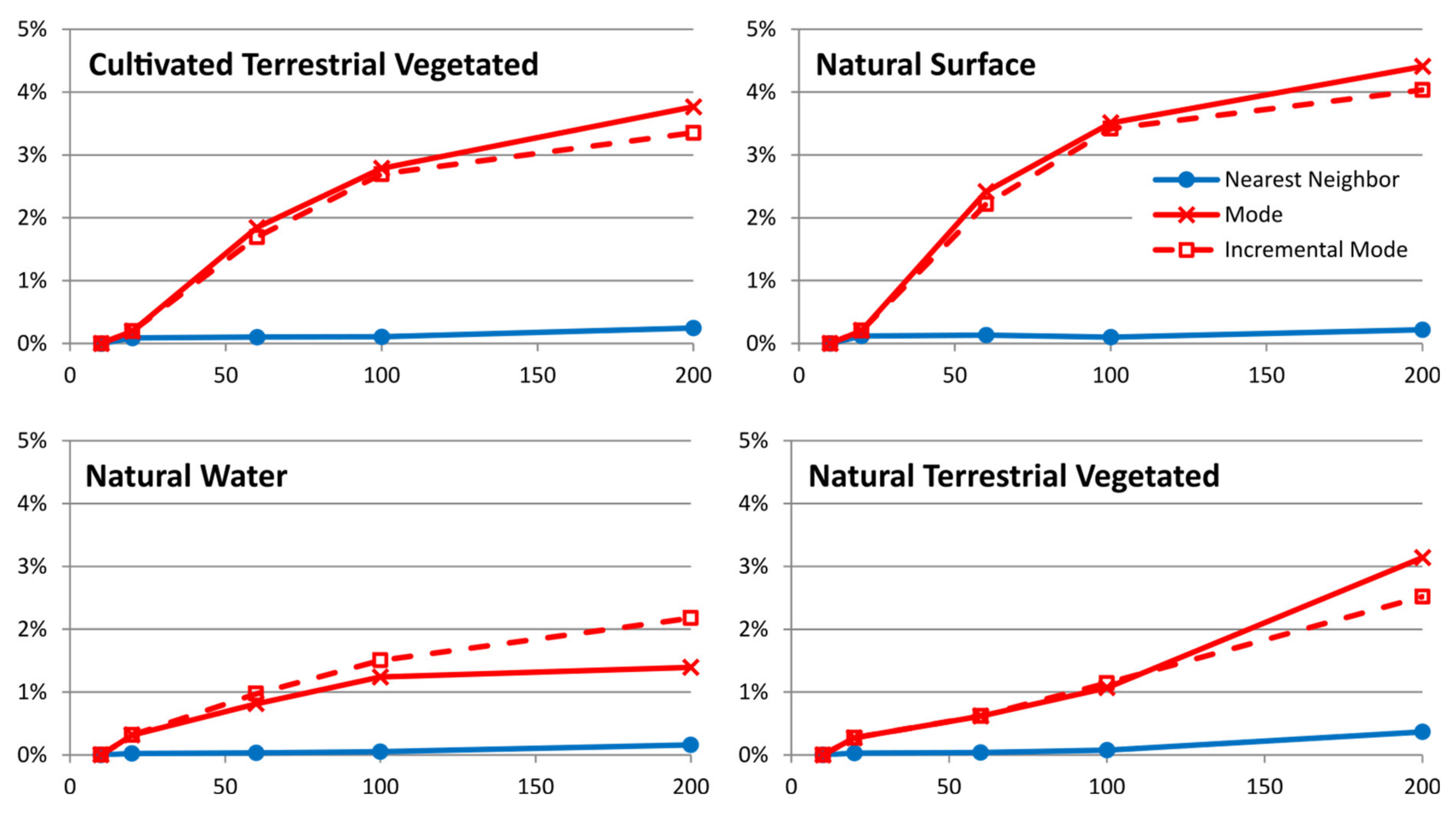
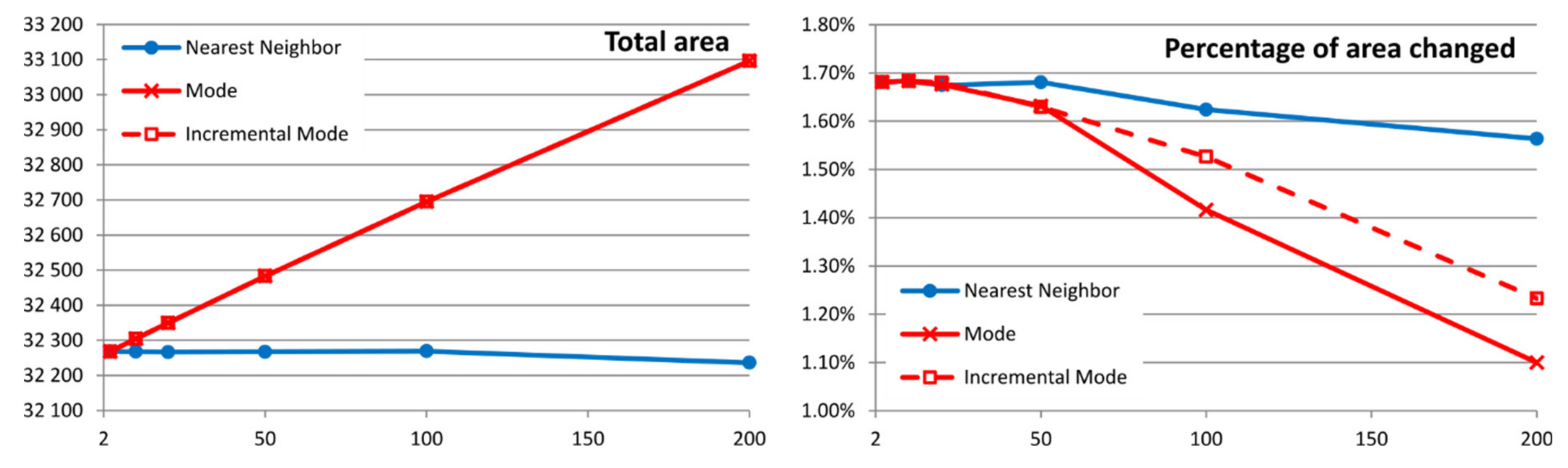
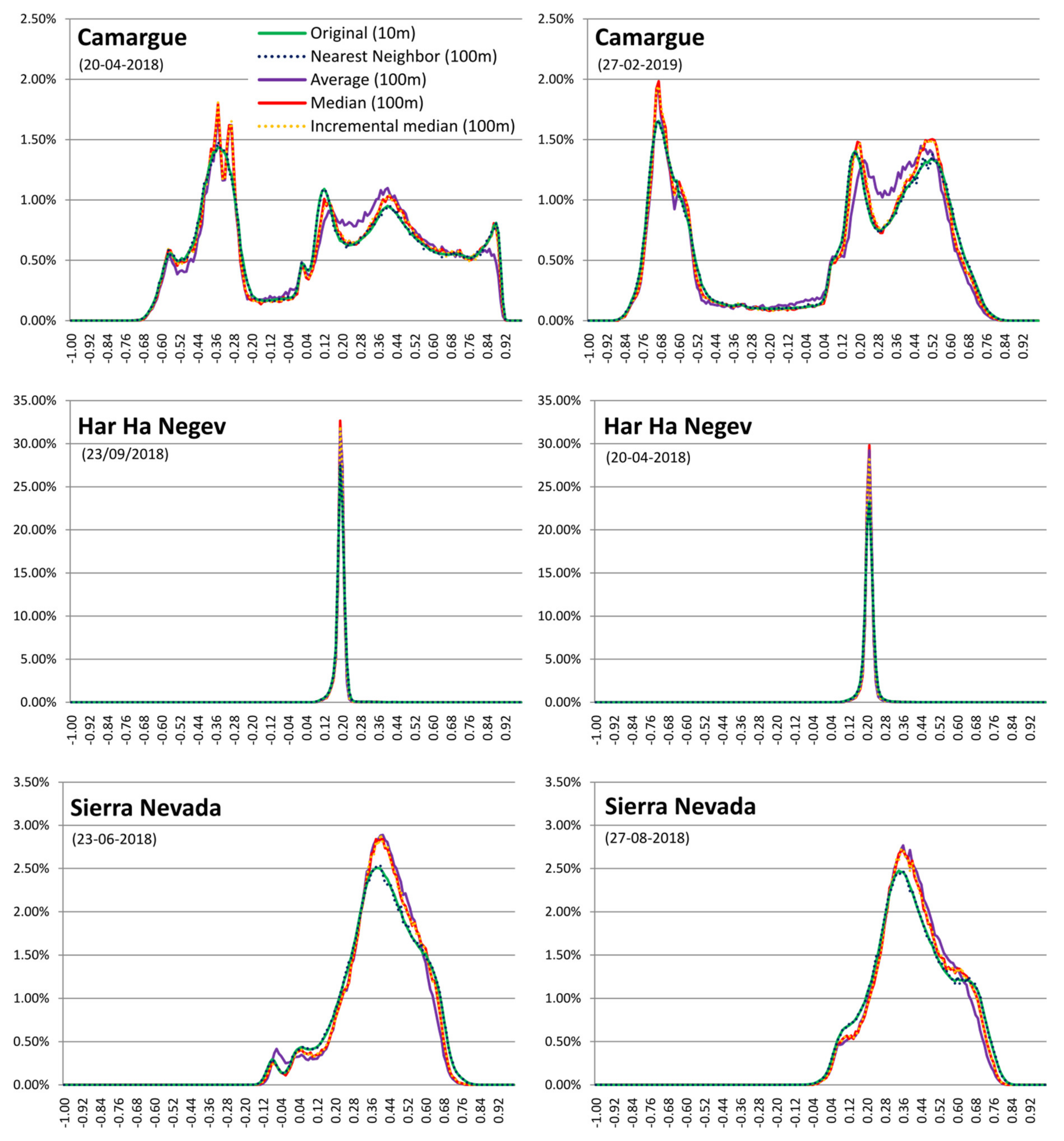
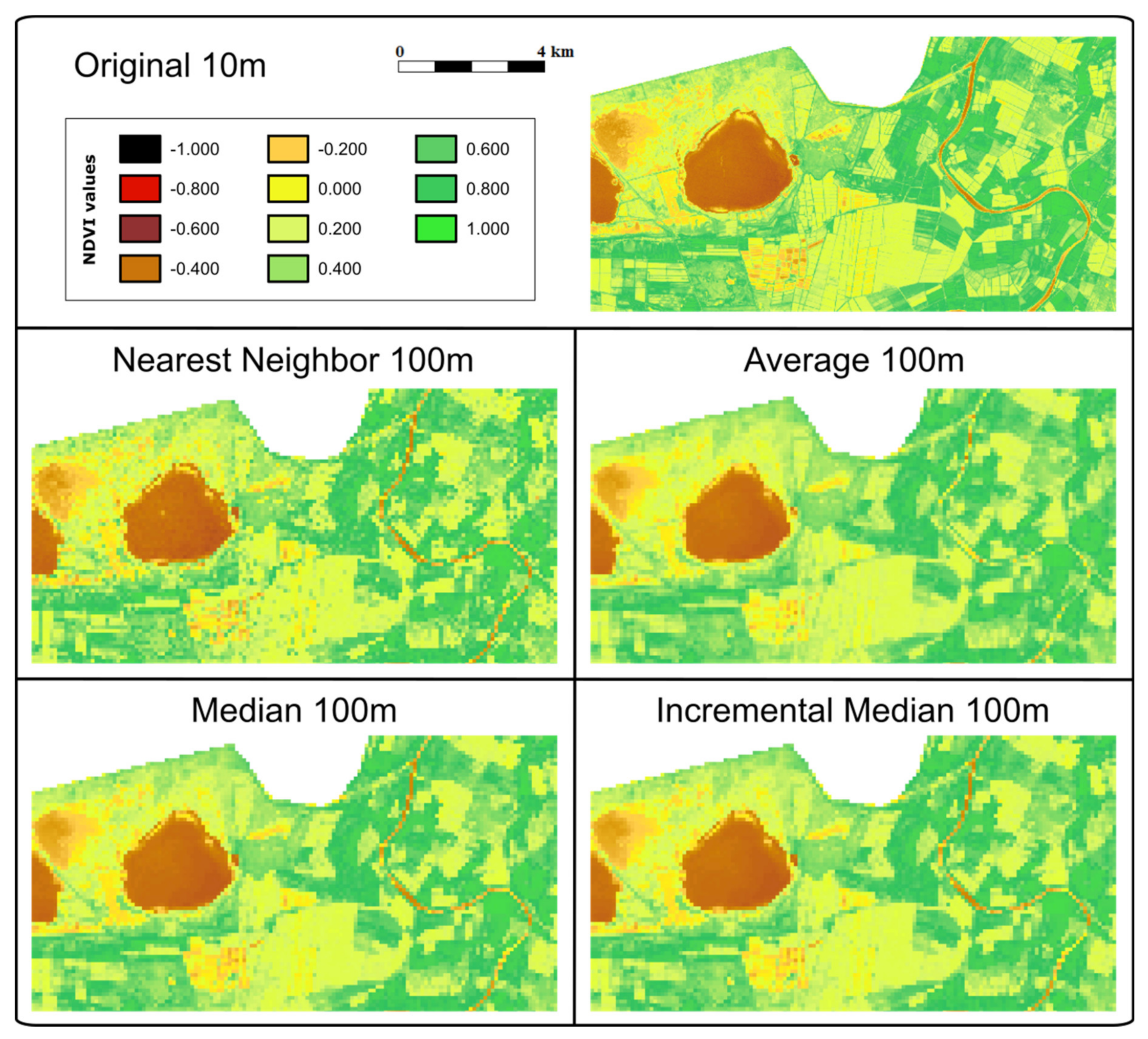
How the interpolated cells are derived from the original cells depends on the type of data. For categorical data, where numbers are actually representing concepts, only interpolations that preserve the individual values are possible, such as the nearest neighbor (NN) and the modal value (mode) generated from the original data (MD) or by increments from previous resolutions (MDi). For continuous values, the nearest neighbor (NN), the mean value (AV) and the median value generated from the original data (ME) or by increments from previous resolutions (MEi) can be used. For the AV and NN methods, results are not affected by using the original values or generating them by increments, and therefore, in practice, there is only one solution. Except for the trivial situation of an area with constant values, each method gives a different result, some methods being more visually appealing for human perception (AV, MD and MDi) but also introducing more statistical biases. Since the interpolations are pre-computed on the server side, our objective is to select a compromise between human perception and lower statistical uncertainties.
Computing the mean value and the median value is straightforward; however, the modal value needs additional consideration. Determining the mode in small samples is particularly tricky. The mode is the most present value, but when the sample is small there are several combinations of values that produce more than one modal value (e.g., with 4 values, 2 different values repeated twice). A normal procedure for calculating the mode consists of sorting the values and counting them. When two or more modal values are found, returning the first one introduces an unwanted bias towards categories represented by lower numbers. In the case of more than one modal value, it is important to select a good method for tie-breaking [30]. The routine used in this paper deals with this situation by selecting the mode randomly from among the tied modal values.

3. Results

Some use cases have been selected to evaluate the implications of generalizing RS derived products when they are transmitted to the client at generalized resolutions for visualization and analysis. In common WMS implementations, in which only a visual portrayal of the datasets is intended, the most important element is to obtain the generalized visual representation that is most appealing. Nevertheless, with the binary arrays approach, in which the data are available in the browser so that statistical analyses can be made (histograms or pie charts, for example), the statistical implications of this generalization also become important. Thus, the aim of these use cases is to quantify the changes that result from generalization with several available methods, to evaluate which method is most appropriate.

3.1. Thematic Case

In our thematic use case, we have a double objective: first, the resulting map should preserve the statistical proportions of the classes, and secondly, it should also be visually satisfactory. We will demonstrate the first factor mathematically later; however, the second factor is related to subjective perception and thus is difficult to assess numerically. In land cover mapping from RS images, classes obtained from image classification do not always correspond to certain cartographic objects, as their spatial appearances are usually heterogeneous and their class membership may be uncertain. In contrast, human perception is related more to identifying entities that represent pure classes obtained from image classification [18]. Entities are identified by mentally grouping conterminous pixels that together identify a basic ’natural’ element in the image. Objects with ’good continuation’ (free of “salt and pepper”) and clear, smooth borders with their neighbors are easier to identify and will result in a more satisfactory perception [19]. When thematic representations are generalized, they are altered by functions associated with raster representation, such as feature smoothing, which should minimize change in human perception.

3.1.1. Evaluation of a Single Thematic Dataset

The first use case focuses on categorical data and considers land cover maps elaborated with the Earth Observation Data for an Ecosystem Monitoring (EODESM) system, which facilitates the description and classification of sites according to the Food and Agriculture Organisation (FAO) Land Cover Classification System (LCCS; Version 2) with reference to environmental variables retrieved from EO [31].
The land cover product was produced for 15 PAs in the ECOPotential project at the original resolution of 10 m and generalized to 20, 60, 100 and 200 m pixel sizes, according to the zoom levels available in the Protected Areas from Space map browser using the common methods appropriate for categorical data: nearest neighbor from the 10 m dataset (NN), mode from the 10 m dataset (MD) and incremental mode (MDi). The incremental method was evaluated for a modal approach. This method is normally used in the prerendering process, because it decreases the creation time as it creates coarser zoom levels from the previous ones instead of the original resolution.
To reflect on the impact of generalization on visual perception, Figure 2 shows a detail of the Camargue PA at original and generalized resolutions (in columns) applying the three generalization methods (in rows). When the mode (MD or MDi) is used to assign the attribute to each pixel, the image contains more homogeneous patches that are better perceived as entities that are still recognizable at all resolutions. Therefore, if we only take visual performance into account, mode resampling methods are preferable.
We computed several results to reflect on the statistical impact of generalization. First, the percentage of each category in each PA at the original and generalized resolutions (applying the three resampling methods) was computed. As 15 PAs and up to 7 categories are studied for each PA, only aggregated results are provided in the main text (see Section S1 of Supplementary Material for all the disaggregated information, i.e., Tables S1.1 to S.1.15 show the percentage of each category in a PA at original and generalized resolutions applying the three generalization methods used). Figure 3 shows the first aggregated result, which describes the absolute maximum variation (in all PAs) of the area for each category related to the same category area at the original resolution (only categories with absolute maximum variations higher than 2% are shown, see Figure S.1.1 at the end of Section S1 of Supplementary Material for all categories’ graphics). In this figure, the color of the line represents whether the nearest neighbor (in blue) or mode/incremental mode (in continuous or dashed red) methods are used, while line style represents the generalization method: regular (solid line) or incremental (dashed line). The most prominent conclusion that can be drawn from this figure is that the variations of the area when the nearest neighbor-based method is used are clearly smaller than the variations that occur with the modal methods. In fact, the highest (absolute) variation when nearest neighbor-based methods are used is only −0.3670 percentage points for Natural Terrestrial Vegetation in the Peneda-Gerês PA when generalizing to 200 m pixel size (see Table S.1.12 in Supplementary Material), while the highest (absolute) variation when modal based methods are used is −4.4075 percentage points for the Natural Surface category in the Camargue PA when generalizing to 200 m pixel size using the non-incremental modal method (see Table S.1.4 in Supplementary Material). The variations are computed as percentage points, i.e., the percentage ratio between the total area covered by a certain category at original resolution and the percentage of the total area obtained by the same category at a certain resolution and using a certain resampling method.
To understand the highest variation value in the previous figure, the results for some of the categories in the Camargue PA are presented in Figure 4 (see Table S.1.4 in Supplementary Material for all the results for this PA). First, the Natural Surface category is presented, as it is the category with the maximum variation (in absolute value): −4.4075 percentage points. Two other categories are shown in the same figure, as they are the next two with the higher variations (in this case positive values): 3.7664 percentage points for Cultivated Terrestrial Vegetation and 0.9773 for Natural Terrestrial Vegetation (in both cases when generalizing to 200 m pixel size using a non-incremental modal method). Looking at the detail of generalized land cover maps of the Camargue PA included in Figure 2, the reason for this high variation is evident, as the Natural Surface category (salmon-colored) has a thin lineal distribution in certain areas at the original resolution (10 m), and when modal methods are used to make the generalization, these features are lost and gained by the surrounding classes, mainly Cultivated Terrestrial Vegetated (light green) and Natural Terrestrial Vegetated (dark green).
In addition to the maximum differences found and shown in the previous figures, Table 2 shows the maximum variation found for each PA in any category and at any resolution (again computed as the percentage ratio between the total area covered by a certain category at original resolution and the percentage of the total area obtained by the same category at a certain resolution and using a certain resampling method). Most of these maximum deviations are found at 200 m resolution, except the ones marked with an “*”, which are found at 100 m resolution. The table also shows the category that has the maximum variation. The table includes a total of 45 studied scenarios (15 PAs and three resampling methods, at only one resolution each—the one with most variation). Highlighted in yellow are the scenarios that have an absolute variation higher than 1 percentage point. Of the 45 scenarios, there are only 7 scenarios in which this is the case. Highlighted in red, we can see that only four scenarios have an absolute variation higher than 2.5 percentage points (with a maximum of 4.4075 percentage points). See the tables in Supplementary Material Section S1, for all the disaggregated results.
To better evaluate the modal interpolated scenarios, we can consider not only the worst scenario for each PA, but all the scenarios, i.e., the variations of all the categories at all resolutions for the two modal resampling methods. Table 3 shows the number of categories for each PA (not all categories are present in all PAs), the number of scenarios in each resampling method for this PA (i.e., number of categories * 4 resampled resolutions—20, 60, 100 and 200 m) and how many of these scenarios have a variation between 1 and 2.5 percentage points and higher than 2.5. For nearest neighbor interpolation none of these scenarios fall into the two variation categories, and therefore, this method has been removed from the table. The results of the other two modal resampling methods are quite similar as only 19 or 20 out of the 352 scenarios have a variation higher than 1 percentage point; thus, for 94.32% of the scenarios the variation is smaller than 1. These results are good enough because the total amount of variation due to resampling is not high and there is only a small number of scenarios that show this variation.
Moreover, if we take into account that in some smaller PAs to zoom out to 100 is enough to see the whole PA (and 200 m is not necessary), some of the worst scenarios are actually not needed. Table 4 shows not only the number of categories for each PA but also the coarsest zoom needed to zoom out to see the entire area. The number of scenarios per resampling is computed as the number of categories multiplied by the resampled resolutions actually used, e.g., for Sierra Nevada the whole PA can be seen at 100 m resolution, so the number of scenarios per resampling that are really used is 18 (6 categories * 3 resampled resolution: 100, 60 and 20 m). Thus, the one scenario with an area deviation higher than 1 percentage point due to resampling at 200 m is not included in Table 4. Taking this into account, only 13 or 12 out of 278 scenarios have a variation higher than 1 percentage point; thus, for 95.32% of the scenarios the variation is smaller than 1 percentage point. However, although the numerical results are better for nearest neighbor-based methods, modal interpolated scenarios are also acceptable. Based on this first evaluation of the categorical data, and considering both the visual and statistical evaluation of the land cover categorical dataset, the modal incremental interpolation method is the best option because it obtains similar results as the non-incremental mode, but it is faster to process.

3.1.2. Evaluation of Change Analysis between Two Thematic Datasets

The uncertainties created by generalization were found to be acceptable; however, propagation of the uncertainties could amplify them when analyses or comparisons are carried out. In this section we study the effects of interpolation when two land cover maps of different dates are compared to determine the land cover changes in that period. In this case, the Massís del Montseny PA extracted from the Land Cover Map of Catalonia (MCSC from its Catalan name) web map server (http://www.ogc.uab.cat/MCSC) will be used. In this web map service, land cover maps are available, dating from 1993, 2005-07 and 2009. The MCSC is a high-resolution thematic land cover product produced by photointerpretation and digitizing on a computer screen. The basic material for the photointerpretation was the aerial orthophotos in natural color from the Catalan Cartographic and Geologic Institute (ICGC). As the orthophotos used for the first version of the MCSC have a dramatically different resolution than the other versions (1:25000 for the 1993 edition, 1:5000 for the 2005-07 edition and 1:2500 for the 2009 edition), we consider that the 1993 edition is not comparable in terms of spatial resolution and thus the 2005-07 and 2009 versions were selected for the comparison (both have a 2 m original spatial resolution). The MSCS has a hierarchical legend, and for this work, the second less detailed legend (with 11 categories) was used.
Figure 5 shows the land cover map of the Massís del Montseny area (including a 2 km buffer) for the two editions (2006 and 2009) and the map of the changes. Table 5 shows the changes in ha (computed at 2 m original spatial resolution). In this table a confusion matrix is presented, where columns represent land cover for the oldest date and rows represent the same categories for the newest date. Thus, the matrix diagonal values represent the unchanged areas (grey background) and the non-diagonal values represent the differences between the two maps. The category with the largest change is the Clear Forest (green shaded in the table), which increased from 431.68 ha to 632.14 ha, mainly due to Dense Forest (193.60 ha) and Shrublands (33.86 ha). This means that from the clear forest in 2009 only 63.38% was already Clear Forest in 2006 and 36.62% is gained. The category with the second largest change is Meadows and Grasslands, which, although has slightly increased from 644.34 ha to 673.48 ha, has disappeared in several places (changed to Shrublands, Crops or Unproductive Artificial) and has appeared in others (Dense Forest, Crops and Shrublands). These percentages are relevant regarding the category; nevertheless, only 1.68% of the total studied area (i.e., only 542.43 ha out of 32268.06 ha) has changed in the studied period and extent.
As in the previous example, each land cover map has been resampled to several pixel sizes (according to zoom level in the web map browser) using three resampling methods: nearest neighbor (NN), mode (MD) and incremental mode (MDi) (see Section S2 of Supplementary Material for all the disaggregated information, i.e., Tables S2.1a and S2.1b show the percentage of each category at the original and generalized resolutions applying the three generalization methods used for 2006 and 2009 respectively). Figure 6 shows the total area of each scenario, which increases in modal-based scenarios because the areas without data turn into areas with data at the boundaries of the area due to the change in pixel size. The change in the total area reaches up to 827.94 ha in the modal interpolation scenarios, which represents 2.57% of the total original area. However, looking at the percentage of the area that has changed between the two periods, the original 1.70% decreases when the pixel size increases. This decrease is moderate for nearest neighbor scenarios (down to 1.56%) but is more significant for modal interpolation scenarios (down to 1.10% for mode and 1.23% for incremental mode when resampling to 200 m). Nevertheless, we need to take into account that the resampling in this scenario is greater than in the previous one. For previous PAs, the resampling was carried out from 10 m to at most 200 m, thus at a 1:20 ratio. In the Massís del Montseny PA, the original resolution is 2 m; therefore, getting to 200 m implies a 1:100 ratio. If we stick to a smaller resampling ratio (i.e., 50 m, 1:25 ratio), the results of the percentage of the area changed are quite similar to the original ones. See Tables S.2.2, S.2.3 and S.2.4 to see land cover changes (confusion matrices) when resampling using nearest neighbor, mode and incremental mode respectively at generalized resolutions.
Not only is the percentage of the area changed relevant, but also the nature of the changes. In order to determine the changes produced by resampling, we studied the category with the highest change, Clear Forest (CF). The rows in Table 6 represent the same as the green shadowed row in Table 5 (i.e., the category that was in 2006 the category of the CF areas in 2009), adding rows for different resampling sizes and using different resampling methods. The total area of this category for both years (2006 area of CF is the grey shadowed column, and the 2009 area of CF is the “Total” column) decreases when resampling size increases for modal interpolation methods. As the decrease is higher in 2006 (because the total amount of 2006 CF is lower than the amount of CF in 2009), the percentage of the category that “remained” decreases while the area “gained” increases. In any case, changes up to 50 m resampling resolution do not show a large deviation from the original values (only around 1.8 percentage points less for the “remained” percentage in modal based scenarios). Increasing the resampling method to higher than this would, however, introduce large changes when modal based methods are used. The tendencies are the same as the ones observed before, i.e., that less frequent categories and/or categories with thin spatial patterns are underestimated (in the area) when the resampling size is increased. In any case, if resampling does not increase more than a 1:25 ratio, the results are acceptably low. We find the same tendencies and conclusions as in the previous example, i.e., resampling has a low impact up to 50 m, when studying other categories (for example see Tables S2.5a and S.2.5b of Supplementary Material for the Meadows and Grasslands example).
Results from this use case are interesting as the ratio limit for the resampling can be set at 1:25. In fact, the zoom to 50 m is the lowest general one needed to see the entire Massís del Montseny PA in the web map browser. Therefore, the results, in this case, are still within a range of acceptable variations due to resampling using any resampling method.

3.2. Quantitative Case

The second use case focuses on quantitative data from the Normalized Difference Vegetation Index (NDVI) for two of the Sentinel 2 dates of three PAs: Camargue, Har HaNegev and Sierra Nevada. These three PAs were selected because they are an example of the three groups of PAs in the ECOPotential project: coastal/marine, arid and mountain areas respectively. Original Sentinel 2 bands (near-infrared: NIR B08; and red: R B04) at a 10 m resolution are used to compute two NDVI dates shown in Figure 7C,D. The land cover maps shown in Figure 7A,B complement the explanation of the NDVI responses that are highly related to the land cover type. The analysis of the quantitative variables was carried out by determining the changes in the NDVI values computed for each image individually by comparing original and resampled images at several resolutions and with four sampling methods.
This paragraph explains the overall characteristics of the three PAs studied in this section, by analyzing their statistical descriptive parameters, density functions, land use/land cover map and images at the original resolution. Table 7 shows the statistical descriptive parameters of the NDVI values computed for the six images studied at the original resolution, and Figure 8 shows in green the original resolution density functions. In terms of land cover, the most diverse PA is the Camargue, followed by the Sierra Nevada and then Har HaNegev with a clear dominance of the “natural surface” category, which covers 96.34% of the area (see Figure 7A,B and Table S1.8 in Supplementary Material). This can also be seen in the images (see Figure 7C,D) and in the density functions at original resolution in Figure 8 (i.e., the green line in each graphic), as the Har HaNegev has a distribution with a narrow curve centered at an NDVI of 0.2 with low standard deviations (0.0253 and 0.0382) in both images (see Table 7). Comparing the other two PAs, we can highlight that in the Camargue 31.59% of the area is covered by natural water, which can be seen in the density function as it produces an increase in low NDVI values (first peak within −0.8 to −0.2 approx.). These are the typical values of the deep-water index (certainly not all of the water area in the Camargue). Therefore, it has a higher standard deviation (0.4451 and 0.5021) for the two scenes than the Sierra Nevada, with a standard deviation of 0.1721 and 0.1743. See other values of land cover coverage for the Camargue and the Sierra Nevada in Table S1.4 and Table S1.14 of Supplementary Material respectively.
To analyze the impact of resampling over these areas, the original Sentinel 2 bands were resampled to several pixel sizes (20, 60, 100 and 200 m, according to the zoom levels available in the map browser) using the following methods: Nearest Neighbor (NN from 10 m dataset), Average (AV from 10 m dataset), Median (ME from 10 m dataset) and Incremental Median (MEi). Nevertheless, as stated in Table 4, the maximum zoom level needed in the web map browser to zoom out to the full PA is 100 m for the Camargue and the Sierra Nevada and 60 m for Har HaNegev. Therefore, in the main paper we only show the results at 100 m for the three PAs in Table 8 and Figure 8. Tables S3.1, S3.2 and S3.4 of Supplementary Materials show the characteristics of the NDVI values at the original 10 m and at 20 m, 60 m or 200 m resolutions respectively, using several resampling methods.
In the following paragraphs (until the end of the section), the effects of resampling (and several methods to perform this resampling) are analyzed under several approaches: visual perception of the images, statistical descriptive parameters of the images, visual perception and statistical description of the density functions and Root Mean Squared Error (RMSE) of the resampled images.
First, to reflect on the impact of generalization on visual perception, Figure 9 shows a detail of the Camargue PA at original (above) and generalized resolution (second and third rows) applying the four generalization methods. When the average method is used to assign the value to each pixel, the image retains the homogeneous patches more and better preserves hedges and paths between fields that are better perceived as entities that are still recognizable. However, as expected, mean tends to smooth local extreme values reducing the contrast of the river. The median method is creating a better compromise, preserving the maximum values in the river zone, better profiling borders between clusters but smoothing a bit more the hedges and paths between fields. Therefore, if we only take visual performance into account, median resampling methods are preferable followed by the mean method.
Second, to analyze the effect of resampling on the values of the images, their statistical descriptive parameters are shown in Table 8. Values in this table represent the NDVI values for each resampling and method, while the values in parenthesis represent the variation of these values compared to the equivalent value at the original resolution (i.e., the values in the first column of the table). In fact, Table 8 does not include all the descriptive statistics (minimum, mean, maximum, standard deviations, etc.) of each image, but only those for which absolute variations are at least higher than 0.025 with at least one of the resampling methods. Absolute variations between 0.025 and 0.05 are highlighted with yellow backgrounds and those higher than 0.05 are highlighted with red backgrounds. See Table S3.3 in Supplementary Material for the table including all the descriptive statistics at 100 m resolution. The results show that the minimum NDVI value is the parameter most affected by resampling, followed by the maximum NDVI value. Nevertheless, even when the impact on minimum and maximum values is significant (for example 1.0024 for a minimum NDVI value for the second image in Har HaNegev when it is resampled to 100 m using the average method, as the original was −0.9873 and the one in this resampling is 0.0150), the resampling does not have a great effect, except for the descriptive parameters, such as mean or median.
Third, the impact of resampling on the density functions is analyzed using two approaches: visual inspection of the density functions and the statistical description of these functions. The impacts of resampling on the visual inspection of the density functions are low, as the functions have the same shape with only some small variations (see Figure 8). The impact of resampling on the quantitative analysis of the density functions is shown in Table 9. The increase in the highest frequency of the most frequent class and the change of the most frequent class (but always with a small increase) stand out. However, when resampling methods are compared, the nearest neighbor method is the one that affects the statistical descriptive parameters of the images least, closely followed by the median interpolation methods, and the average method has the highest impact. The drawback of the nearest neighbor resampling method is, as stated before, that the results are not always visually satisfactory. While this is very true with categorical datasets, the visual inspection of the resampled images with all the methods (see Figure 9) shows that although the nearest neighbor resampling appears to be a bit noisier, it can be considered as satisfactory, as human perception will most likely accept local variability in quantitative variables.
Finally, to evaluate the impact of the resampling, not only on the statistical descriptive measures of the image, but on the whole image, the Root Mean Square Error (RMSE) for each resampled image was computed considering the original 10 m image as the certain value, and thus, the error was computed between each resampled image and the original one. The results are shown in Table 10 and indicate that the variations produced by the resampling are small or moderate and are usually below 0.1 (at most up to 0.15).

4. Discussion

The potential of JavaScript clients for map applications was been demonstrated by common JavaScript map libraries, such as Leaflet and Google maps, as well as by JavaScript web applications that enable the user to create, manipulate and study cartography, such as Carto (formerly CartoBD) [32] and Instamaps [33]. Most of these solutions can manipulate vector data directly in the browser. However, when dealing with raster data, they rely on server side rendering and transferring pictorial representations (e.g., using WMS and WMTS standards). One example of these current state-of-the-art solutions is MapML: a newly formulated proposal to extend HTML language to declaratively describe maps [34]. Perhaps, one of the reasons for this situation is that vector data can be encoded in text formats (such as GML or GeoJSON) that can be easily managed by the old and new versions of JavaScript. On the other hand, raster data is commonly encoded in binary format. One exception is the tile raster format designed by Mapbox for an interactive web presentation called UTFGrid. UTFGrid files use JSON to encode the rows of the grid as strings, each one containing a list of UTF-8 encoded codes. Each code is associated to a feature that has a list of numeric and alphanumerical properties that can be shown to the user when hovering over the image with the mouse pointer [35]. The encoding is only efficient for categorical raster data (or rendered vector data), but it is not appropriate for RS data. In the RS area the Sinergise Sentinel Playground (http://apps.sentinel-hub.com/sentinel-playground/) offers the possibility to do some raster operations such as to create band combinations and band indices in a similar way that we do in the map browser [36]. However, in the Sentinel Playground these operations are generated in the server side and sent to the client using an extension of WMS.
The potential of the web browser to deal with raster data remains underexploited. This paper has presented the MiraMon Web Map Browser, which takes advantage of some characteristics introduced in HTML5 (binary arrays and canvas) to transfer raster data to the client that is later transformed into visual 2D representations on the client side. This enables the client to provide alternative representations of the data as well as to do statistical analyses, time profiles, filters, layer combinations, pixel-based calculations, etc. without any further interaction with the server. Web map clients can provide a platform that is closer to a traditional GIS that also works with raster data. The main difference between a traditional GIS and this approach is that each time the user pans or zooms on the map, new binary arrays at screen resolution are requested, dividing the loading effort between the client and server. All operations are done in real time at pixel level, so the validity of the results of these operations are conditioned by the uncertainties generated during the server side interpolation to the screen resolution and the propagation of the uncertainty in the operations. This paper quantifies these uncertainties and assesses the validity of the results that can be extracted from the analysis of RS in the Protected Areas from Space application of the MiraMon Web Map Browser.
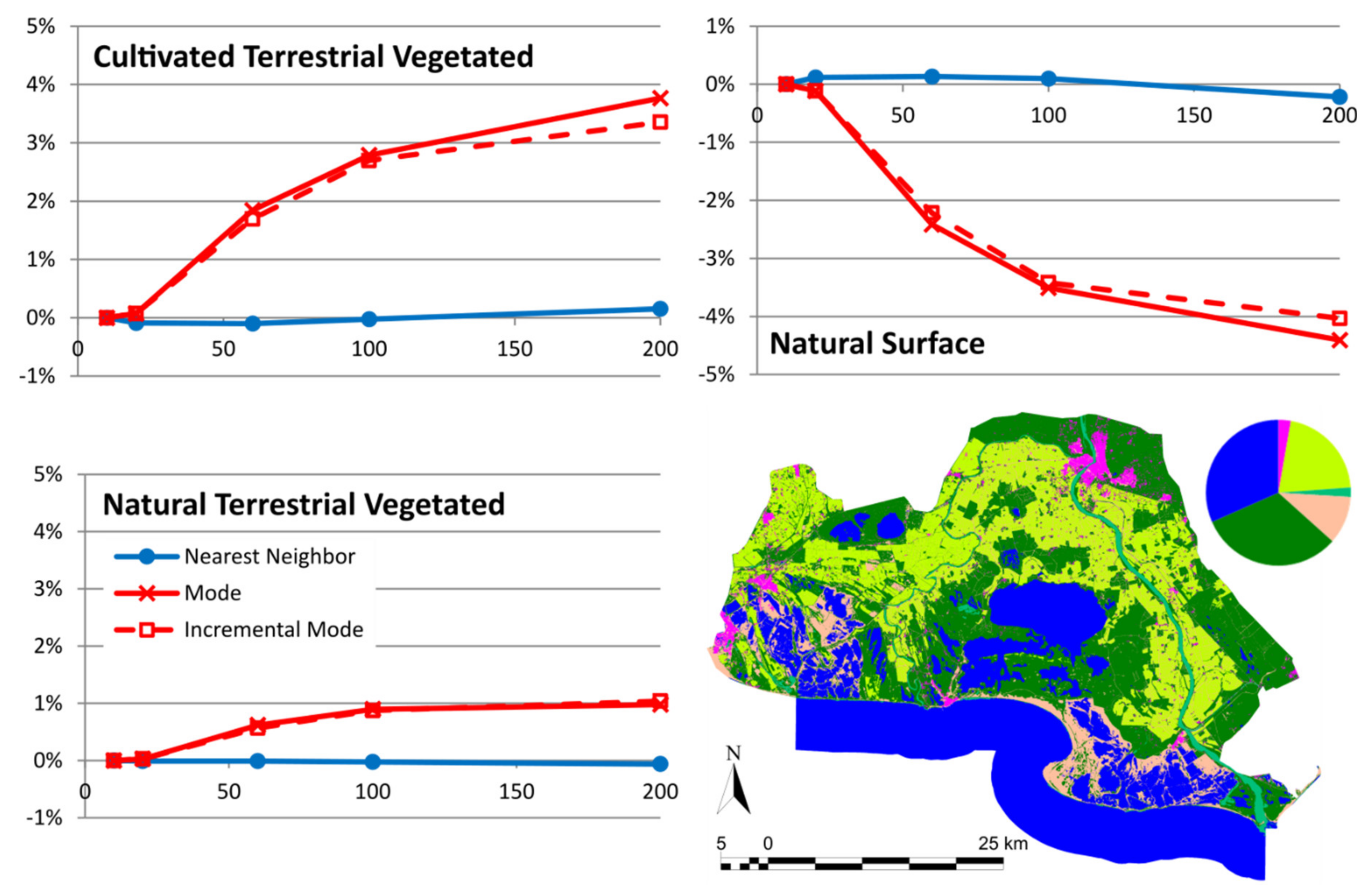
In a regular sized PA of about 100–200 km wide (10,000–40,000 km2), products derived from RS high-resolution data (e.g., Sentinel 2, 10 m cell size) require a factor 10–20 zoom level to fit in a regular screen of a map browser. At this zoom level (100–200 m pixel size), we have seen that common statistical analyses at screen resolution are still representative of the original data at full resolution. As a categorical data example (i.e., land cover data), uncertainties in the area covered by a class are normally below 1% and are never higher than 5% of the total PA area. Modal interpolation is preferable because it produces more homogeneous patches that are better perceived as objects and it does not create unreasonable uncertainties. As for a continuous data example (i.e., NDVI), common statistics, such as mean and standard deviation, do not vary by more than 1% of the NDVI range, although, not surprisingly, the maximum and minimum values are too sensitive to mean interpolation. Median interpolation is preferable because it produced more homogeneous patches than nearest neighbor, borders are better perceived as objects and it does not create unreasonable uncertainties.
Comparing two dates to determine changes could be more sensitive to uncertainty propagation. Nevertheless, the total number of changes in the land cover category in an example of a PA in Catalonia had a value of 1.7 ± 0.3% in a 50 zoom level factor. This demonstrates that operating at screen resolution is still useful. As a result of this study, our MiraMon map browser will include a warning message which informs users about possibly unacceptable uncertainties when they make an analytical operation at screen resolutions with ratios above 1:25 of the original resolution of the data.
Full resolution is needed only if precise values are required. Thus, making a preliminary exploration of data at a smaller resolution gives acceptable results and saves time and computing power. A hypothesis can be rapidly explored in the map browser and can be carefully quantified at full resolution later when necessary. This could be achieved by combining the current approach with a server-side analytical package implemented with a R library or using the OGC Web Coverage Processing Service (WCPS), which provides a standard language for analytical requests on the server side. Other similar languages for RS cloud processing facilities are currently emerging, such as OpenEO [37]. In the future, the presented approach could be combined with one of these server-side alternatives to obtain precise results once the client-side coarse analysis has shown the soundness of the analytical approach.
The study presented here demonstrated that the results extracted from the Protected Areas from Space map browser are of a reasonable uncertainty. Thanks to these results, it is fully justified that the map browser is transferred to the H2020 e-shape project for its continuation in selected PS. This ensures a continuation of the operations of the map browser for at least four more years. After this period, the technology can be transferred to the directors of PAs for their own management and sustainability. The software powering the map browser is part of the MiraMon GIS family of products that is maintained as an open source project and is also powering other data visualizations in other European projects such as the H2020 Ground Truth 2.0 citizen science datasets, the Catalan Data Cube map viewer as well as the Spanish project NEWFORLAND.

5. Conclusions

The approach of providing EO data and analytical capabilities at screen resolution was demonstrated as useful and practical for protected area managers. However, the validity and uncertainties of the results in the client side generated by the different interpolation methods need to be evaluated in comparison to the same analysis performed at full resolution on the server side and balanced with visual satisfaction of the maps.
The study presented in this paper validates the approach by concluding that in all categorical studied cases, uncertainties in the area covered by a class are normally below 1% and 5% in the worst scenario. For continuous values, uncertainties are always lower than 1% of the value range. When more sensitive situations to uncertainties are applied, such as comparing two dates, results extracted at screen resolution are valid and never fully eclipsed by uncertainties. The study also shows that the nearest neighbor interpolation is the least sensitive method regarding uncertainties, while it gives the least satisfactory visual perception. For categorical values, the incremental mode is the method that has the best balance between visual perception and less statistical uncertainty. For continuous values, the incremental median method is the one with a better balance.
These interpolation methods will be recommended in future map services data preparation phases. With the methodology presented here, a hypothesis can be rapidly explored in the map browser, saving time and money. Future work will be focused on automatically connecting the map browser with a processing facility that can be used to carefully quantify the conclusion of exploratory results obtained in the map browser. Moreover, we will extend the capabilities of the connection with the NiMMbus geospatial user feedback system, in order to allow the user to share the analytical operations created in the map browser.

Supplementary Materials

Author Contributions

Conceptualization, Joan Masό methodology, Joan Masó and Alaitz Zabala; software, Joan Masό; formal analysis, Alaitz Zabala; writing—original draft preparation, Joan Masό and Alaitz Zabala; writing—review and editing, Xavier Pons. All authors have read and agreed to the published version of the manuscript.

Funding

This work was supported by ECOPotential, e-shape and NextGEOSS. These projects have received funding from the European Union’s Horizon 2020 research and innovation programme under grant agreement No 641762-2, No 820852 and No 730329. This work was also supported by the Spanish MCIU Ministry through the NEWFORLAND research project (RTI2018-099397-B-C21/C22 MCIU/AEI/ERDF, EU) and by the Catalan Government (SGR2017 1690). Xavier Pons is a recipient of an ICREA Academia Excellence in Research Grant (2016–2020).

Acknowledgments

The map browser presented here was possible thanks to the contributions of many ECOPotential partners who created and collected all the data that the map browser presents.

Conflicts of Interest

The authors declare no conflicts of interest.

References

  1. Pettorelli, N.; Owen, H.J.F.; Duncan, C. How do we want Satellite Remote Sensing to support biodiversity conservation globally? Methods Ecol. Evol. 2016, 7, 656–665. [Google Scholar] [CrossRef]
  2. Wang, K.; Franklin, S.E.; Guo, X.; Cattet, M. Remote Sensing of Ecology, Biodiversity and Conservation: A Review from the Perspective of Remote Sensing Specialists. Sensors 2010, 10, 9647–9667. [Google Scholar] [CrossRef] [PubMed]
  3. Verbesselt, J.; Hyndman, R.; Newnham, G.; Culvenor, D. Detecting trend and seasonal changes in satellite image time series. Remote Sens. Environ. 2010, 114, 106–115. [Google Scholar] [CrossRef]
  4. Turner, W.; Rondinini, C.; Pettorelli, N.; Mora, B.; Leidner, A.K.; Szantoi, Z.; Buchanan, G.; Dech, S.; Dwyer, J.; Herold, M.; et al. Free and open-access satellite data are key to biodiversity conservation. Biol. Conserv. 2015, 182, 173–176. [Google Scholar] [CrossRef] [Green Version]
  5. Vitolo, C.; Elkhatib, Y.; Reusser, D.; Macleod, C.J.A.; Buytaert, W. Web technologies for environmental Big Data. Environ. Model. Softw. 2015, 63, 185–198. [Google Scholar] [CrossRef] [Green Version]
  6. Wei, Y.; Santhana-Vannan, S.-K.; Cook, R.B. Discover, visualize, and deliver geospatial data through OGC standards-based WebGIS system. In Proceedings of the 2009 17th International Conference on Geoinformatics, Fairfax, VA, USA, 12–14 August 2009; pp. 1–6. [Google Scholar]
  7. De la Beaujardiere, J. OGC Web Map Service (WMS) Interface, Ver.1.3.0, OGC 03-109r; OGC: Amherst, MA, USA, 2004. [Google Scholar]
  8. Hu, C.; Zhao, Y.; Li, J.; Ma, D.; Li, X. Geospatial Web Service for Remote Sensing Data Visualization. In Proceedings of the 2011 IEEE International Conference on Advanced Information Networking and Applications, Singapore, 22–25 March 2011; pp. 594–601. [Google Scholar]
  9. Lopez-Pellicer, F.J.; Béjar, R.; Florczyk, A.J.; Muro-Medrano, P.R.; Zarazaga-Soria, F.J. A review of the implementation of OGC Web Services across Europe. Int. J. Spatial Data Infrastruct. Res. 2011, 6, 168–186. [Google Scholar] [CrossRef]
  10. Freitas, R.M.D.; Arai, E.; Adami, M.; Ferreira, A.S.; Sato, O.Y.; Shimabukuro, Y.E.; Rosa, R.R.; Anderson, L.O.; Friedrich, B.; Rudorff, T. Virtual laboratory of remote sensing time series: Visualization of MODIS EVI2 data set over South America. J. Comput. Interdiscipl. Sci. 2011, 2, 57–68. [Google Scholar] [CrossRef]
  11. Han, W.; Di, L.; Zhao, P.; Li, X. Using Ajax for desktop-like geospatial web application development. In Proceedings of the 2009 17th International Conference on Geoinformatics, Fairfax, VA, USA, 12–14 August 2009; pp. 1–5. [Google Scholar]
  12. Boulos, M.N.K.; Warren, J.; Gong, J.; Yue, P. Web GIS in practice VIII: HTML5 and the canvas element for interactive online mapping. Int. J. Health Geogr. 2010, 9, 14. [Google Scholar] [CrossRef] [Green Version]
  13. Farkas, G. Possibilities of using raster data in client-side web maps. Trans. GIS 2020, 24, 72–84. [Google Scholar] [CrossRef]
  14. Blower, J.; Riechert, M. Coverages, JSON-LD and RDF data cubes. In Proceedings of the Workshop on Spatial Data on the Web (SDW 2016), Montreal, QC, Canada, 27–30 September 2016; pp. 9–16. [Google Scholar]
  15. Schindler, F.; EOX IT Services, GmbH. geotiff.js and plotty.js—Visualizing Scientific Raster Data in the Browser; FOSS4G; Open Source Geospatial Foundation (OSGeo): Boston, MA, USA, 2016. [Google Scholar]
  16. Baumrock, B. Client-Side Visualisation of Scientific Raster Data Using WebGL and Open-Source Web Mapping Technologies vorgelegt. Master Thesis, University of Geographical Information Science & Systems, Wien, Austria, 2018. [Google Scholar]
  17. Ogle, A. Walkshed.js: Client-side Raster Processing with OSM Data Tiles. Available online: https://vimeo.com/68095144 (accessed on 9 April 2020).
  18. Wang, M.; Gong, P.; Howarth, P.J. Thematic Mapping from Imagery: An Aspect of Automated Map Generalization. In Proceedings of the International Symposium on Computer-Assisted Cartography, Baltimore, Maryland, 2–7 April 1991; pp. 123–132. [Google Scholar]
  19. Thomson, R.C.; Brooks, R. Exploiting Perceptual Grouping for Map Analysis, Understanding and Generalization: The Case of Road and River Networks. In Proceedings of the Graphics Recognition Algorithms and Applications; Blostein, D., Kwon, Y.-B., Eds.; Springer: Berlin/Heidelberg, Germany, 2002; pp. 148–157. [Google Scholar]
  20. Provenzale, A.; Beierkuhnlein, C.; Ziv, G. Improving Future Ecosystem Benefits through Earth Observations: The H2020 Project ECOPotential. Geophys. Res. Abstr. 2016, 18, EGU2016-9012. [Google Scholar]
  21. Bonn, A.; Mantel, M.; Neumeier, V.; Jurek, M.; Nolte, A.; Alfthan, B.; Beltrame, C.; Geijzendorffer, I.; Danks, F. Research Outputs as Needed by Stakeholders; ECOPotential: Improving Future Ecosystem Benefits through Earth Observations; CNR: Rome, Italy, 2016. [Google Scholar]
  22. Skupin, A. From metaphor to method: Cartographic perspectives on information visualization. In Proceedings of the IEEE Symposium on Information Visualization 2000, INFOVIS 2000, Salt Lake City, UT, USA, 9–10 October 2000; pp. 91–97. [Google Scholar]
  23. Pons, X. MiraMon. Sistema d’Informació Geogràfica i software de Teledetecció; Centre de Recerca Ecològica i Aplicacions Forestals (CREAF): Barcelona, Spain, 2004; ISBN 84-931323-4-9. [Google Scholar]
  24. Masó, J.; Zabala, A.; Serral, I.; Pons, X. Remote Sensing Analytical Geospatial Operations Directly in the Web Browser. ISPRS Int. Arch. Photogramm. Remote Sens. Spat. Inf. Sci. 2018, 624, 403–410. [Google Scholar] [CrossRef] [Green Version]
  25. Baumann, P.; Hirschorn, E.; Masó, J. OGC Coverage Implementation Schema with Corrigendum, Ver.1.1.1, 09-146r8; OGC: Amherst, MA, USA, 2019. [Google Scholar]
  26. Huete, A.R. A soil-adjusted vegetation index (SAVI). Remote Sens. Environ. 1988, 25, 295–309. [Google Scholar] [CrossRef]
  27. McMaster, R.B.; Veregin, H. Visualizing cartographic generalization. In Proceedings of the International Symposium on Computer-Assisted Cartography, Seattle, WA, USA, 7–10 April 1997; pp. 174–183. [Google Scholar]
  28. Barclay, T.; Gray, J.; Ekblad, S.; Strand, E.; Richter, J. Designing and Building TerraService. IEEE Internet Comput. 2006, 10, 16–25. [Google Scholar] [CrossRef]
  29. Hu, C.; Zhao, Y.; Wei, X.; Du, B.; Huang, Y.; Ma, D.; Li, X. ACTGIS: A Web-based collaborative tiled Geospatial image map system. In Proceedings of the IEEE Symposium on Computers and Communications, Riccione, Italy, 22–25 June 2010; pp. 521–528. [Google Scholar]
  30. Orlowski, N.; Schlorff, D.; Blevins, J.R.; Cañas, D.; Chu, M.T.; Funderlic, R.E. The Effects of Ties on Convergence in K-Modes Variants for Clustering Categorical Data; Unpublished Manuscript. 2004. Available online: https://jblevins.org/research/kmodes/k-modes.pdf (accessed on 6 May 2020).
  31. Lucas, R.; Mitchell, A. Integrated Land Cover and Change Classifications. In The Roles of Remote Sensing in Nature Conservation: A Practical Guide and Case Studie; Springer International Publishing: Cham, Switzerland, 2017; pp. 309–318. ISBN 978-3-319-64332-8. [Google Scholar]
  32. Hanson, B.; Seeger, C. Online Mapping with CartoDB; Iowa State University, Extension and Outreach Publications: Ames, IO, USA, 2015; PM2082-15w. [Google Scholar]
  33. Roset, R.; Torres, M.; Szczerban, W.; Sena, J.; Pascual, V.; Ortega, M.; Besora, I.; Anguita, S. Service-Oriented Map Production Environments: The Implementation of InstaMaps. In Service-Oriented Mapping; Lecture Notes in Geoinformation and Cartography; Springer: Cham, Switzerland, 2019; pp. 107–123. ISBN 978-3-319-72433-1. [Google Scholar]
  34. Masó, J. Testbed-14 MapML Engineering Report; OGC: 18-023r1; OGC: Amherst, MA, USA, 2018. [Google Scholar]
  35. Fan, W.; Liu, H. Interactive visualization for massive POI using tiled feature strategy. In Proceedings of the 2015 23rd International Conference on Geoinformatics, Wuhan, China, 19–21 June 2015; pp. 1–5. [Google Scholar]
  36. Milcinski, G.; Batic, M.; Kadunc, M.; Kolaric, P.; Mocnik, R.; Repse, M. SENTINEL-2 Services Library—Efficient way for exploration and exploitation of EO data. Geophys. Res. Abstr. 2017, 19, EGU2017-19502. [Google Scholar]
  37. Gößwein, B.; Miksa, T.; Rauber, A.; Wagner, W. Data Identification and Process Monitoring for Reproducible Earth Observation Research. In Proceedings of the 2019 15th International Conference on eScience (eScience), San Diego, CA, USA, 24–27 September 2019; pp. 28–38. [Google Scholar]
Figure 1. A typical view of the Protected Areas from Space map browser showing most of the ECOPotential PAs forcing the projection to UTM33N while zooming out to 6000 m pixel size.
Ijgi 09 00300 g001
Figure 2. Detail of generalized land cover maps at several spatial resolutions (in columns) of the Camargue protected area obtained using three resampling methods (in rows). Despite the change in resolution, all the maps are presented at the same scale for visual comparison and use the same legend.
Ijgi 09 00300 g002
Figure 3. Absolute maximum variation (all studied protected areas) of each category area related to the same category area at original resolution. Same legend applies to all graphics. Only categories with variations higher than 2% are shown. Please refer to Section S1 of Supplementary Material for graphs of the other categories.
Ijgi 09 00300 g003
Figure 4. Variation of Cultivated Terrestrial Vegetated, Natural Surface and Natural Terrestrial Vegetated categories in Camargue protected area in relation to the area at original resolution of the same category. The original land cover map of the protected area, as well as a pie chart indicating the proportion for each category, are also shown (map legend is the same as in Figure 2).
Ijgi 09 00300 g004
Figure 5. Land cover map for 2006 and 2009 and changes in the Massís del Montseny protected area.
Ijgi 09 00300 g005
Figure 6. Total area and percentage of the area changed in the land cover change map in the Massís del Montseny protected area when resampling at several resolutions using different methods.
Ijgi 09 00300 g006
Figure 7. Protected areas studied in the Normalized Difference Vegetation Index (NDVI) computation use case. (A) Land cover map for the PA, (B) pie charts with land cover distribution in the PA (legend in A also applies for B), (C) NDVI values for the first date, (D) NDVI values for the second date (legend in C also applies for D).
Ijgi 09 00300 g007
Figure 8. NDVI density functions for the two scenes studied for each protected area (side by side in columns) and for the protected areas Camargue, Har HaNegev and Sierra Nevada at original 10 m and 100 m resolutions using several resampling methods. All density functions have the legend shown in the first function, describing the resampling methods.
Ijgi 09 00300 g008
Figure 9. Detail of the 20/04/2018 NDVI of the Camargue PA at original 10 m and 100 m resolution using four resampling methods. The scale and legend shown for the original images apply to all of them.
Ijgi 09 00300 g009
Table 1. Protected areas in the ECOPotential project. Longitude-latitude bounding box includes a 15 km buffer. Imagery time series are not added to layer number. Ecosystem type: M for mountain, A for arid and semi-arid and C for coastal and marine.
Protected AreaTypeUTM
Zone
Min. Long.Max. Long.Min. Lat.Max. Lat.WideLayer NumberTime Frames
AbiskoM33-N181,114192,360681,403685,12444182575
BayersicherWaldM33-N130,015137,857487,253492,62858,6209175
CamargueC31-N39,23051,193431,532438,55395,283730
Curonian LagoonC34-N202,669218,951547,526558,616123,527418
DanubeDeltaC35-N279,639300,206442,208455,675158,713857
DoñanaC29-N−69,830−58,422365,804374,919103,908741
Gran ParadisoM32-N68,85377,639452,589458,24369,90510415
Har HaNegevA32-N345,414350,618304,858310,69565,4986110
HardangerviddaM36-N64,57685,646597,033607,589119,3256172
High TatraM34-N193,565206,302489,108494,65393,628650
KalkalpenM33-N139,726147,531475,307479,92658,9119109
KrugerA36-S297,464322,003−260,961−222,088434,2374115
La PalmaM28-N−181,471−175,873282,906290,16279,1339138
Montado A29-N−94,267−67,098371,866397,853290,783788
Murgia Alta ParkA33-N158,887169,516406,610412,85988,298418
Ohrid PrespaM34-N204,311213,232405,284414,28399,785626
Peneda GerêsM29-N−85,819−76,844415,394422,13775,621563
SamariaA34/35-N236,569243,640350,618355,30462,7418159
Sierra Nevada M30-N−38,077−241,554367,772373,87951,88592358
Swiss National ParkM32-N98,387105,166464,421469,020123,818643
Wadden SeaC31/32-N44,83794,123527,583551,714308,012317
Total 1384277
Table 2. Absolute maximum variation for each protected area for all categories and resolutions. Variations are shown in percentage points. The yellow background highlights scenarios with an absolute variation between 1 and 2.5 percentage points, and the red background highlights scenarios with a variation higher than 2.5.
Ijgi 09 00300 i001 Nearest Neighbor Ijgi 09 00300 i002 Mode Ijgi 09 00300 i003 Incremental Mode
Murgia Alta0.2737%Natural Terrestrial Vegetated0.8139%Natural Terrestrial Vegetated−0.4391%Artificial Surface
Bayerischer Wald0.1949%Natural Terrestrial Vegetated0.6969%Natural Terrestrial Vegetated0.4976%Natural Terrestrial Vegetated
Curonian Lagoon−0.0564%Natural Water0.4363%Cultivated Terrestrial Vegetated0.3903%Cultivated Terrestrial Vegetated
Camargue−0.2190%Natural Surface−4.4075%Natural Surface−4.0339%Natural Surface
Danube Delta0.0403%Cultivated Terrestrial Vegetated0.7277%Natural Aquatic Vegetated−0.4494%Natural Water *
Doñana National Park−0.0371%Natural Terrestrial Vegetated *1.5490%Cultivated Terrestrial Vegetated1.3609%Cultivated Terrestrial Vegetated
Hardangervidda−0.0308%Natural Water3.1401%Natural Terrestrial Vegetated−2.9363%Natural Surface
Har HaNegev0.0528%Natural Surface *0.9155%Natural Surface0.7838%Natural Surface
KalKalpen National Park0.1109%Natural Terrestrial Vegetated1.3939%Natural Water2.1773%Natural Water
La Palma Island−0.1214%Cultivated Terrestrial Vegetated−1.9184%Natural Terrestrial Vegetated−2.2690%Natural Terrestrial Vegetated
Lake Ohrid and Prespa−0.0425%Artificial Surface0.4818%Natural Terrestrial Vegetated0.4729%Natural Terrestrial Vegetated
Peneda-Gerês−0.3670%Natural Terrestrial Vegetated0.7653%Natural Terrestrial Vegetated0.7043%Natural Terrestrial Vegetated
Samaria0.1702%Natural Surface−0.8135%Natural Surface−0.7935%Natural Surface
Sierra Nevada National Park−0.0761%Natural Surface−1.0301%Natural Surface−0.9647%Natural Surface
Swiss National Park0.0664%Natural Surface *0.7933%Natural Terrestrial Vegetated0.5384%Natural Terrestrial Vegetated
Table 3. Number of scenarios with an absolute maximum variation for each PA for all resolutions and for all categories that have a deviation between 1 and 2.5 percentage points and higher than 2.5 percentage points. The yellow background highlights scenarios with an absolute variation between 1 and 2.5 percentage points, and the red background highlights scenarios with a variation higher than 2.5.
Num. CategoriesNum. Scenarios per Resampling Ijgi 09 00300 i004 Mode Ijgi 09 00300 i005 Incremental Mode
Variation [1,2.5]Variation >2.5Variation [1,2.5]Variation >2.5
Murgia Alta5200000
Bayerischer Wald6240000
Curonian Lagoon7280000
Camargue7282434
Danube Delta7280000
Doñana National Park7282020
Hardangervidda6243222
Har HaNegev4160000
KalKalpen National Park5202030
La Palma Island5203040
Lake Ohrid and Prespa7280000
Peneda-Gerês4160000
Samaria5200000
Sierra Nevada National Park6241000
Swiss National Park7280000
TOTAL-352136146
Table 4. Number of scenarios with an absolute maximum variation for each PA for all resolutions and for all categories that have a deviation between 1 and 2.5 percentage points and higher than 2.5 percentage points, taking into account the minimum zoom out needed to see the complete PA. The yellow background highlights scenarios with an absolute variation between 1 and 2.5 percentage points, and the red background highlights scenarios with a variation higher than 2.5.
Num. CategoriesZoom to whole ExtentNum. Scenarios per Resampling Ijgi 09 00300 i006 Mode Ijgi 09 00300 i007Incremental Mode
Variation [1,2.5]Variation >2.5Variation [1,2.5]Variation >2.5
Murgia Alta5100150000
Bayerischer Wald660120000
Curonian Lagoon7200280000
Camargue7100212222
Danube Delta7200280000
Doñana National Park7200282020
Hardangervidda6200243222
Har HaNegev46080000
KalKalpen National Park560101010
La Palma Island5100151010
Lake Ohrid and Prespa7200280000
Peneda-Gerês4100120000
Samaria560100000
Sierra Nevada National Park6100180000
Swiss National Park7100210000
TOTAL- 2789484
Table 5. Land cover changes (in ha) in the Massís del Montseny protected area between 2006 and 2009. The total changed area is shown in the red shadowed cell in the bottom right area of the table (summing up the change value, i.e., all except for the grey shaded cells). Green shaded row highlights which category was in 2006 the area classified in 2009 as Clear Forests.
Land Cover Changes (in ha)2006
Dense ForestClear ForestShrublandsMeadows and GrasslandsUnproductive NaturalCropsUnproductive ArtificialInland WatersTotalRemainsGained
2009Dense Forest26650.3929.3331.159.877.914.650.060.0026733.3599.69%0.31%
Clear Forest193.60400.6333.862.690.351.010.000.00632.1463.38%36.62%
Shrublands21.570.482154.3632.301.8410.220.370.002221.1596.99 %3.01%
Meadows and Grasslands36.830.9425.66571.023.0735.720.240.00673.4884.79%15.21%
Unproductive Natural3.590.060.771.89337.910.970.000.00345.1997.89%2.11%
Crops5.830.002.9617.100.51830.650.470.00857.5296.87%3.13%
Unproductive Artificial7.600.262.689.480.563.90752.120.00776.6096.85%3.15%
Inland Waters0.000.000.000.000.090.000.0028.5528.6499.68%0.32%
Total26919.41431.682251.44644.34352.24887.13753.2628.5532268.06
Remains99.00%92.81%95.69%88.62%95.93%93.63%99.85%100.0% 542.43 ha changed
(1.68% of the area)
Lost1.00%7.19%4.31%11.38%4.07%6.37%0.15%0.00%
Table 6. Distribution of 2009 Clear Forest (rows) in 2006 categories (columns) in the Massís del Montseny protected area (in ha). Original resolution and resampled resolutions using different methods are shown. Original resolution is the green shadowed row (and corresponds to the green shadowed row in Table 5).
2006
Dense ForestClear ForestShrublandsMeadows and GrasslandsUnproductive NaturalCropsTotalRemainsGained
2009 Clear ForestOriginal2193.60400.6333.862.690.351.01632.1463.38%36.62%
Ijgi 09 00300 i00810193.61400.1033.542.710.371.06631.3963.37%36.63%
20192.88401.0034.362.720.321.00632.2863.42%36.58%
50191.00402.2534.753.000.000.75631.7563.67%36.33%
100178.00413.0026.004.001.001.00623.0066.29%33.71%
200192.00408.0028.000.000.008.00636.0064.15%35.85%
Ijgi 09 00300 i00910193.63399.0133.922.670.381.07630.6863.27%36.73%
20193.24396.9234.762.800.281.04629.0463.10%36.90%
50184.25354.0033.002.250.001.00574.5061.62%38.38%
100173.00239.0030.004.000.000.00446.0053.59%46.41%
200140.0096.0012.004.000.000.00252.0038.10%61.90%
Ijgi 09 00300 i01010193.63399.0133.922.670.381.07630.6863.27%36.73%
20192.80396.4434.482.600.361.20627.8863.14%36.86%
50185.00354.7532.253.000.001.50576.5061.54%38.46%
100171.00281.0031.004.000.001.00488.0057.58%42.42%
200128.00156.0031.004.000.001.00308.0050.65%49.35%
Table 7. Statistical descriptions of the NDVI values computed using two scenes per protected area at the original 10 m resolution.
NDVI ValuesCamargueHar HaNegevSierra Nevada
Image date20/4/201827/2/201923/9/201817/11/201823/6/201827/8/2018
Minimum−0.7728−0.9975−0.3945−0.9873−0.5226−0.9968
Mean0.13820.03790.19610.21410.40290.4129
Maximum0.93790.87110.69830.99460.99600.9928
Std. Dev.0.44510.50210.02530.03820.17210.1743
First quartile−0.3143−0.57310.18740.20180.30380.2936
Median0.17220.20720.19700.21320.41150.3991
Third quartile0.49720.46820.20690.22490.52760.5406
Abs. Dev. Median0.38660.42200.01500.01870.13550.1418
Table 8. NDVI values computed using two scenes per PA at the original 10 m and 100 m resolutions using several resampling methods. The values in parenthesis represent the variation of these values compared to the original resolution. Absolute variations between 0.025 and 0.05 are highlighted with a yellow background and those higher than 0.05 are highlighted with a red background.
PAImage DateNDVI ValuesOriginal (10m)Nearest Neighbor (100 m)Average (100 m)Median (100 m)Incremental Median (100 m)
Camargue20/04/2018Minimum−0.7728−0.7581 (0.0147)−0.7430 (0.0298)−0.7424 (0.0304)−0.7399 (0.0329)
Median0.17220.1722 (0.0000)0.2155 (0.0433)0.1909 (0.0187)0.1933 (0.0211)
27/02/2019Minimum−0.9975−0.8837 (0.1138)−0.8633 (0.1342)−0.8658 (0.1317)−0.8636 (0.1339)
Maximum0.87110.8566 (−0.0145)0.8377 (−0.0334)0.8477 (−0.0234)0.8472 (−0.0239)
Median0.20720.2066 (−0.0006)0.2354 (0.0283)0.2155 (0.0083)0.2176 (0.0104)
Har Ha Negev23/09/2018Minimum−0.3945−0.1140 (0.2805)0.0524 (0.4470)−0.1462 (0.2484)−0.1450 (0.2496)
Maximum0.69830.6210 (−0.0774)0.5207 (−0.1776)0.5324 (−0.1659)0.5270 (−0.1713)
17/11/2018Minimum−0.9873−0.9823 (0.0050)0.0150 (1.0024)−0.9588 (0.0286)−0.9560 (0.0313)
Maximum0.99460.9087 (−0.0859)0.8949 (−0.0997)0.8967 (−0.0979)0.8980 (−0.0966)
Sierra Nevada23/06/2018Minimum−0.5226−0.3980 (0.1246)−0.2900 (0.2326)−0.2922 (0.2304)−0.2883 (0.2343)
Maximum0.99600.8699 (−0.1261)0.9657 (−0.0303)0.9702 (−0.0258)0.9619 (−0.0341)
27/08/2018Minimum−0.9968−0.9886 (0.0081)−0.9571 (0.0397)−0.9905 (0.0063)−0.9902 (0.0065)
Maximum0.99280.8826 (−0.1101)0.8233 (−0.1694)0.8268 (−0.1659)0.8282 (−0.1645)
Table 9. Density function characteristics for two scenes per protected area at the original (10 m) and 100 m resolution using several resampling methods. The maximum number of classes in the density function is 200 (class width of 0.01, values from −1.00 to 1.00).
Original (10m)Nearest Neighbor (100 m)Average (100 m)Median (100 m)Incremental Median (100 m)
Camargue20/04/2018N. non-empty classes172169168169168
Highest frequency1.44%1.48%1.75%1.79%1.81%
Most frequent class[−0.350, −0.340)[−0.350, −0.340)[−0.350, −0.340)[−0.350, −0.340)[−0.350, −0.340)
27/02/2019N. non-empty classes184175171172172
Highest frequency1.65%1.66%1.91%1.98%1.94%
Most frequent class[−0.690, −0.680)[−0.690, −0.680)[−0.700, −0.690)[−0.690, −0.680)[−0.690, −0.680)
Har HaNegev23/09/2018N. non-empty classes9661475148
Highest frequency27.38%27.54%31.76%32.67%31.99%
Most frequent class[0.190, 0.200)[0.190, 0.200)[0.190, 0.200)[0.190, 0.200)[0.190, 0.200)
17/11/2018N. non-empty classes18096758788
Highest frequency23.25%23.33%29.21%29.82%28.45%
Most frequent class[0.210, 0.220)[0.210, 0.220)[0.210, 0.220)[0.210, 0.220)[0.210, 0.220)
Sierra Nevada23/06/2018N. non-empty classes152116111113111
Highest frequency2.51%2.53%2.89%2.84%2.89%
Most frequent class[0.380, 0.390)[0.400, 0.410)[0.410, 0.420)[0.400, 0.410)[0.400, 0.410)
27/08/2018N. non-empty classes200124107112113
Highest frequency2.47%2.47%2.77%2.71%2.73%
Most frequent class[0.340, 0.350)[0.360, 0.370)[0.360, 0.370)[0.360, 0.370)[0.360, 0.370)
Table 10. Root Mean Square Error (RMSE) for each resampled image, considering the original 10 m image as the certain value. The scenarios that do not need to zoom out to show the whole protected area in the web map browser have numbers in grey.
CamargueHar HaNegevSierra Nevada
Nearest NeighborAverageMedianIncremental MedianNearest NeighborAverageMedianIncremental MedianNearest NeighborAverageMedianIncremental Median
20/04/201823/09/201823/06/2018
200.06310.04490.04550.04550.01020.00730.00770.00770.04820.03410.03480.0348
600.11710.09830.10200.10240.01540.01180.01260.01300.08050.06270.00000.0650
1000.15100.12620.13130.13120.01810.01380.01450.01480.09600.07340.07500.0753
2000.20220.16590.17230.16930.02120.01620.01690.01710.11430.08570.08720.0873
27/02/201917/11/201827/08/2018
200.06250.04410.04480.04480.01680.01210.01270.01270.05180.03660.03750.0375
600.11550.09730.10090.10140.02440.01910.02010.02050.08660.06730.06920.0700
1000.15000.12590.13100.13100.02880.02270.02350.02370.10310.07890.08100.0813
2000.20270.16750.17360.17040.03400.02680.02790.02780.12380.09290.09500.0951

